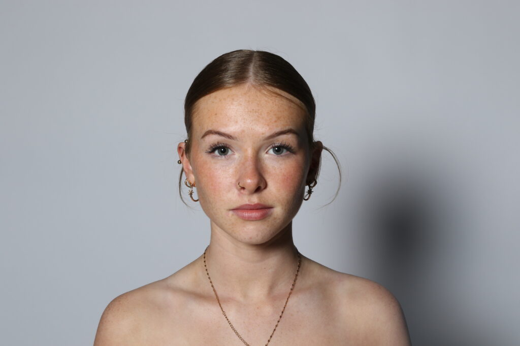
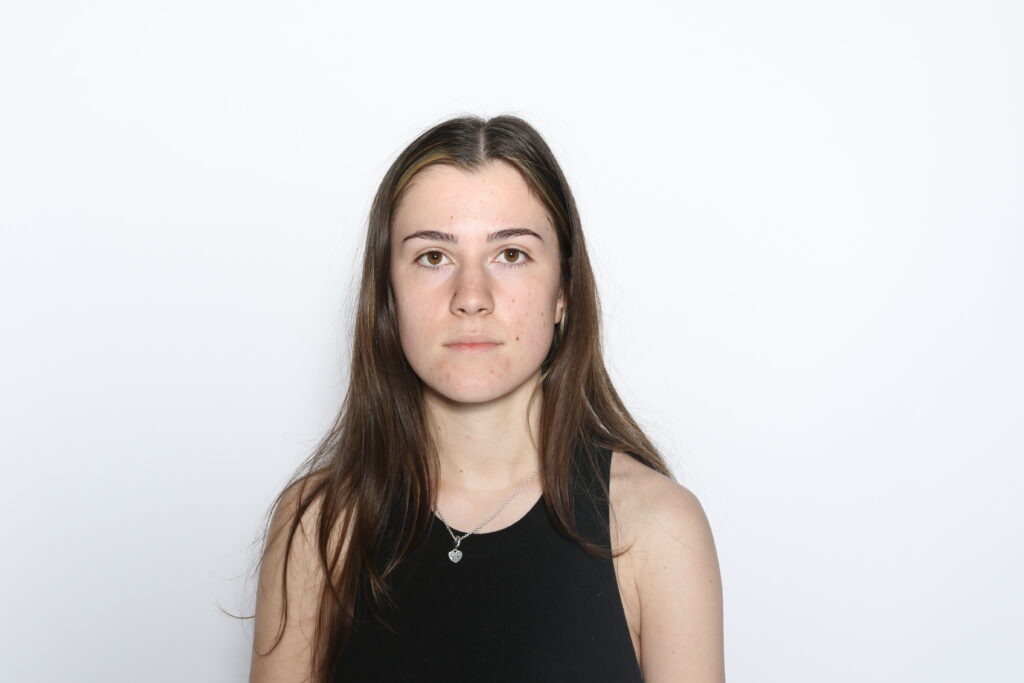
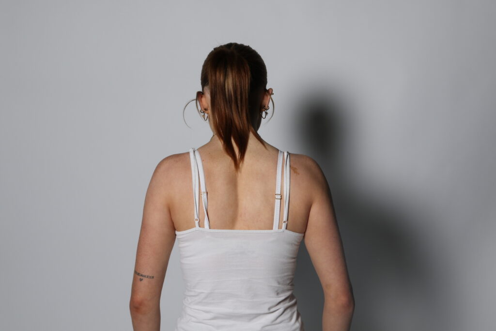
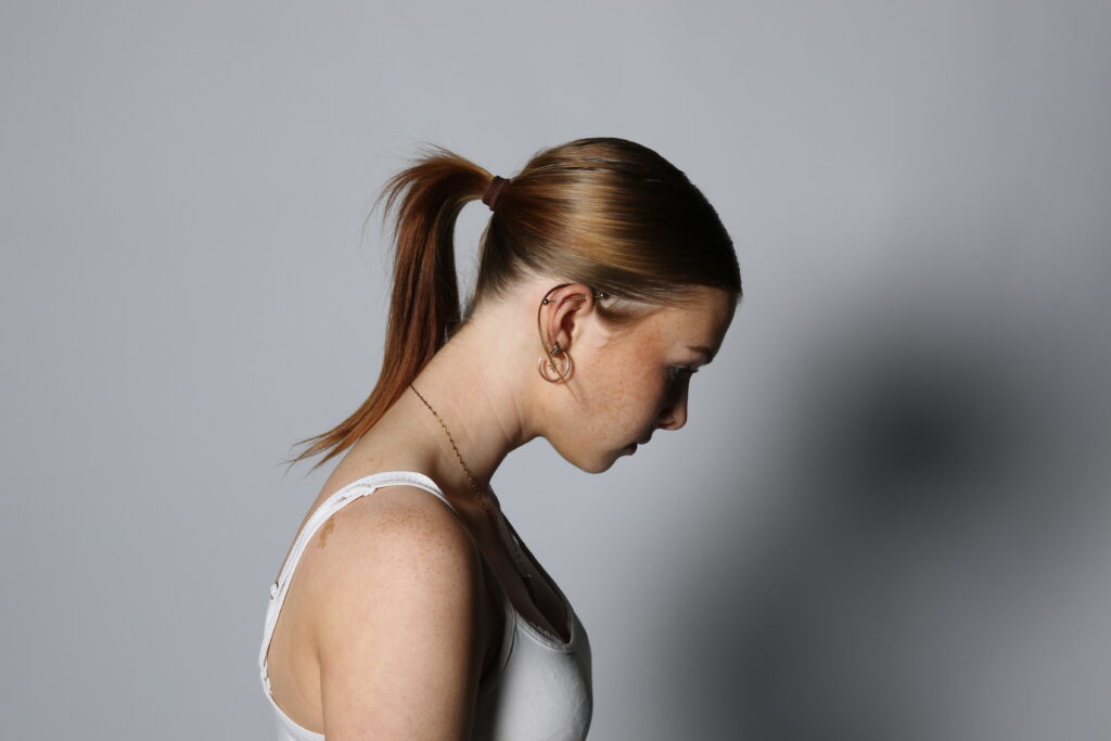
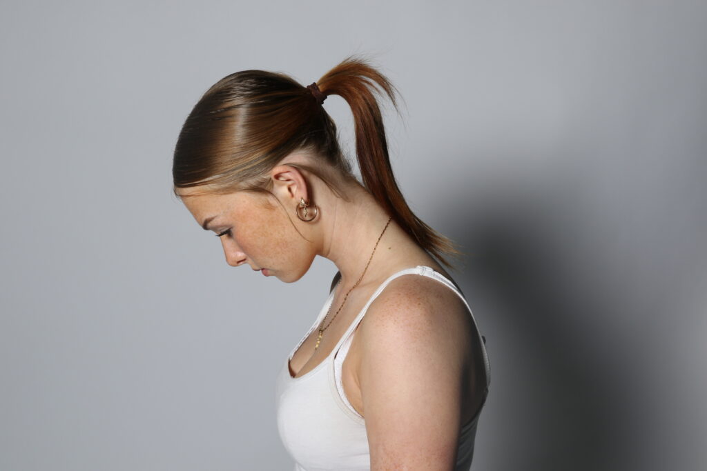
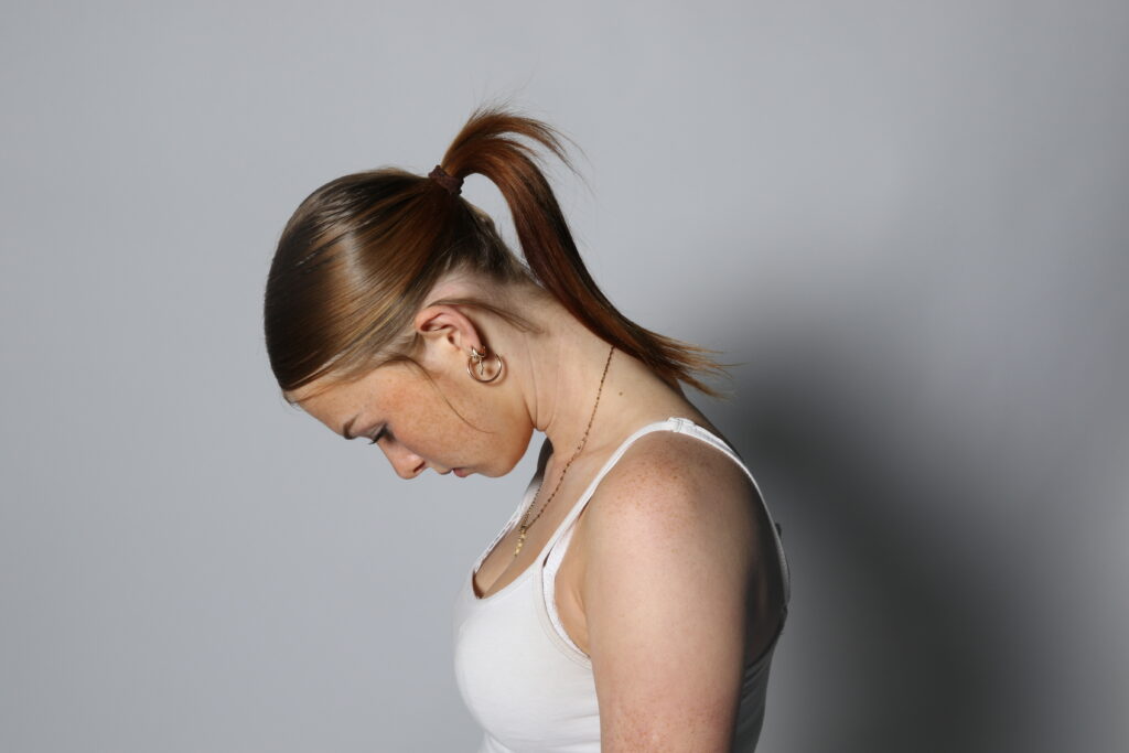
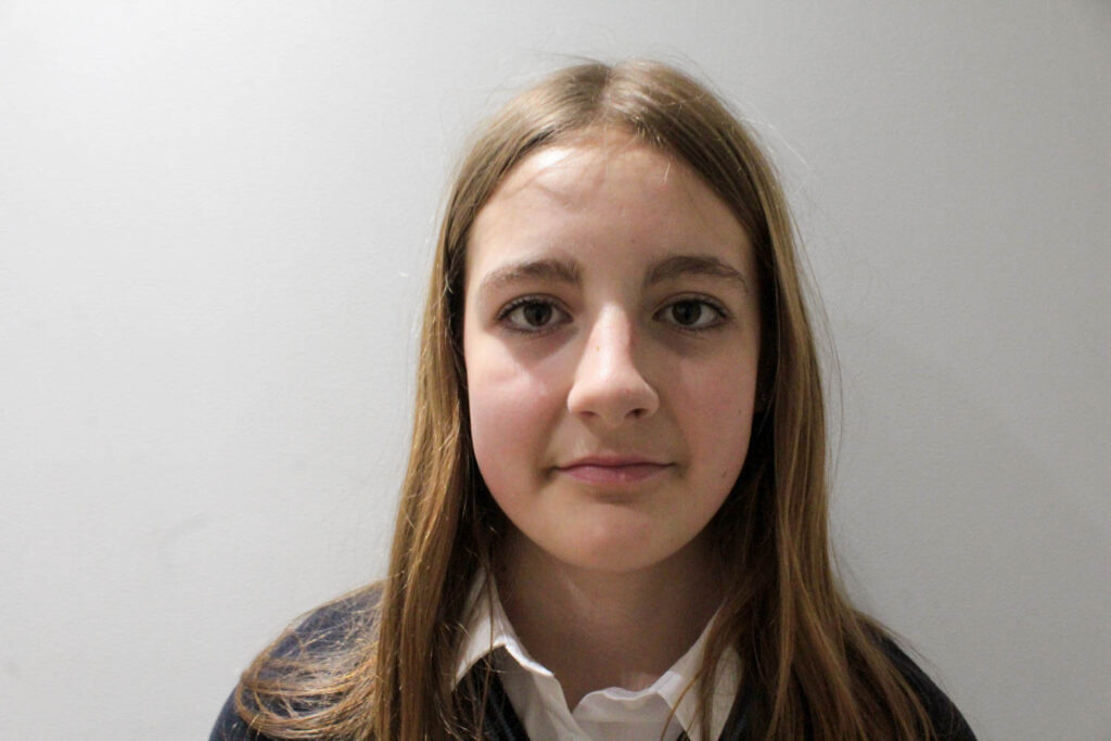
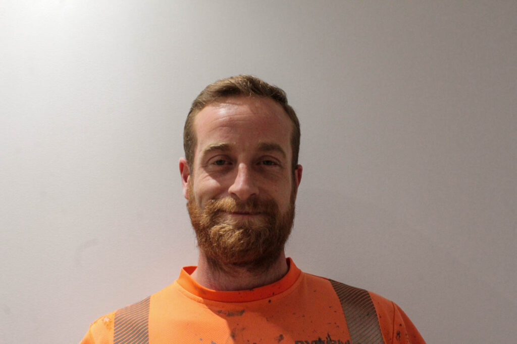
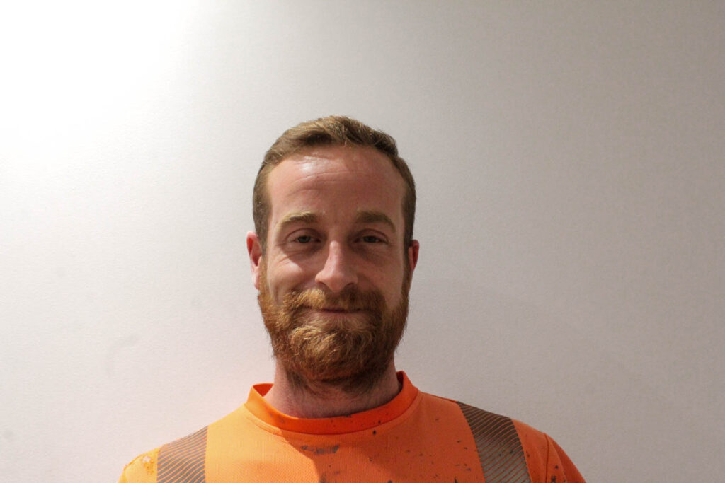
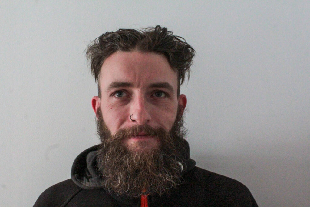
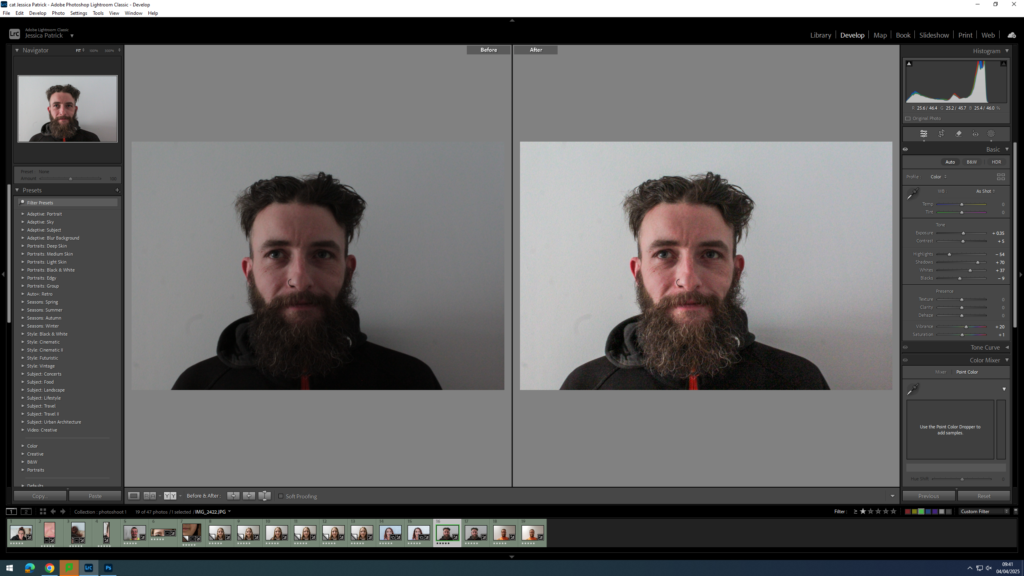
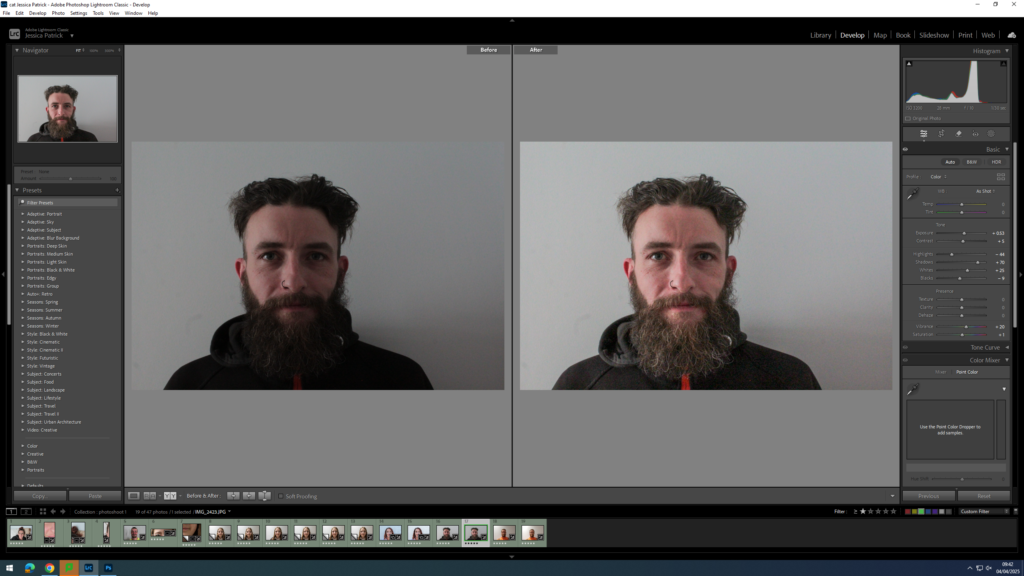
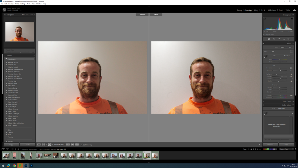
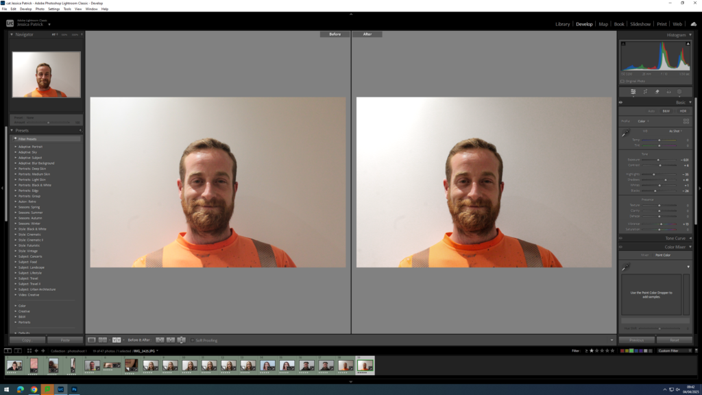
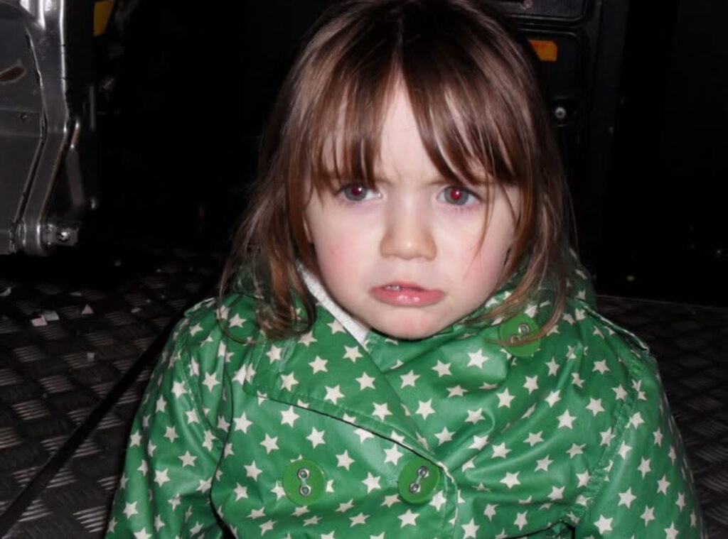
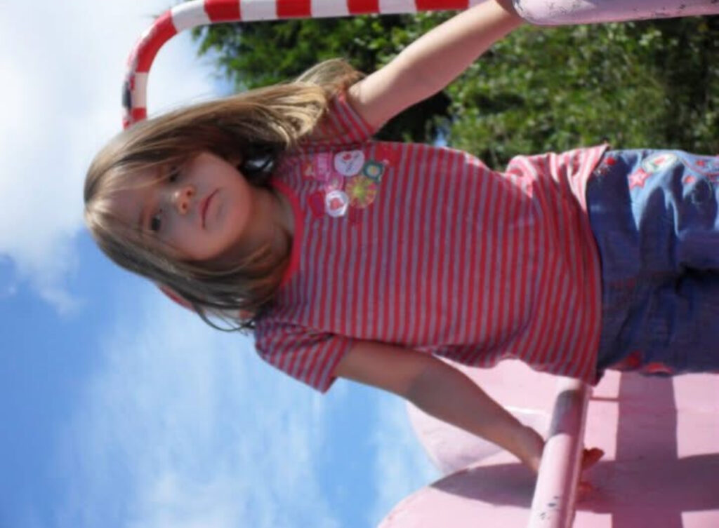
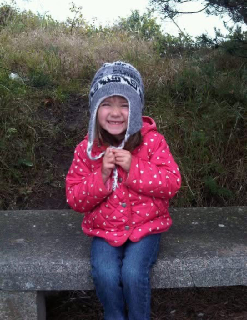
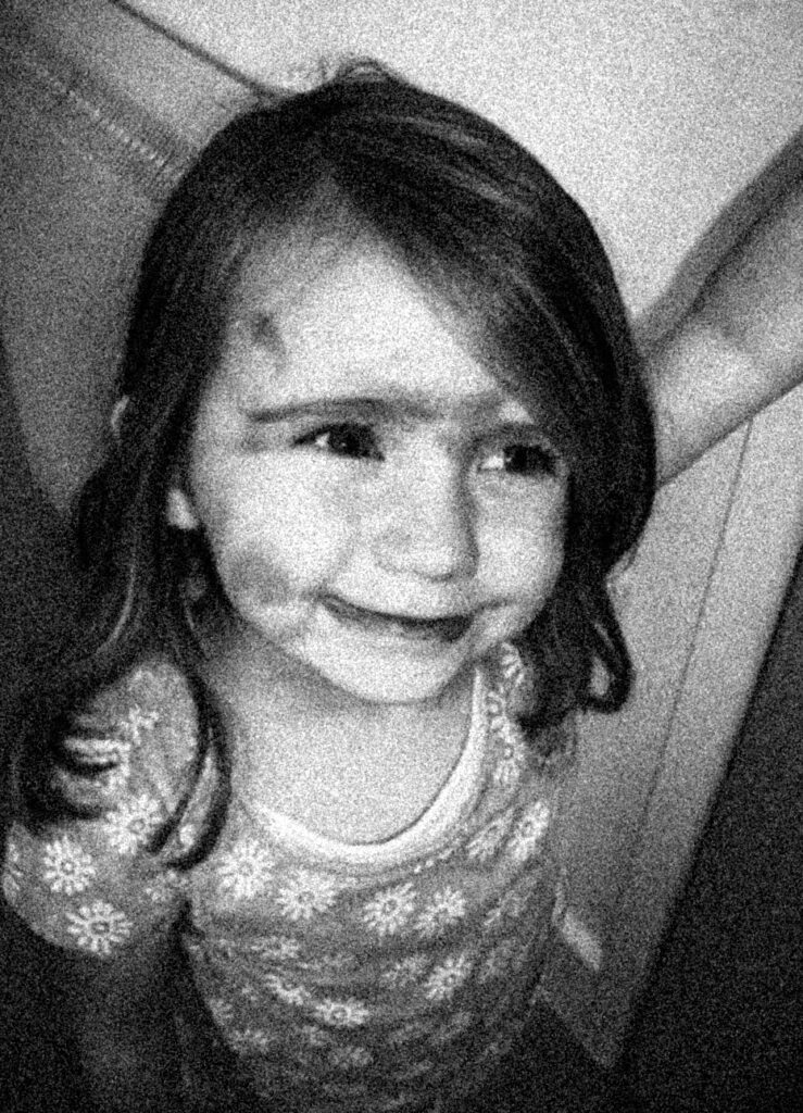
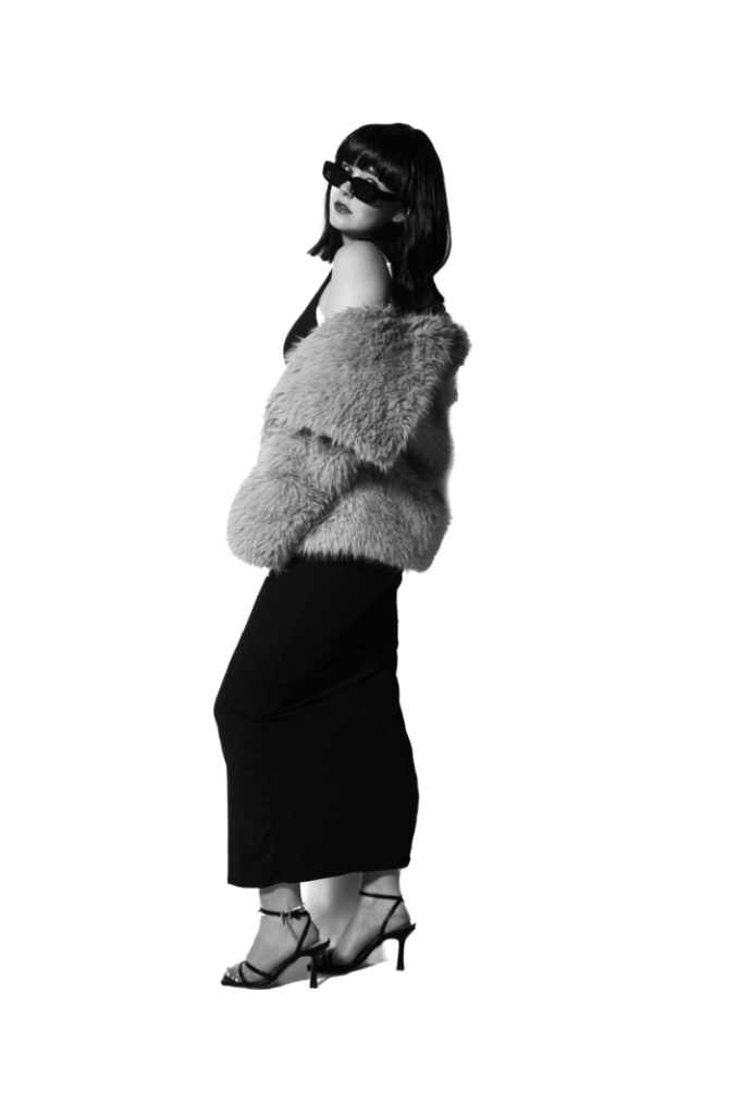
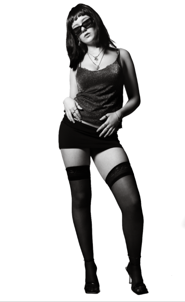
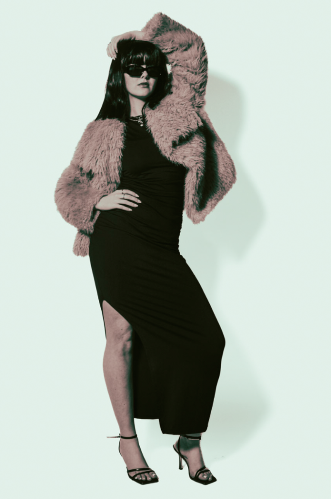
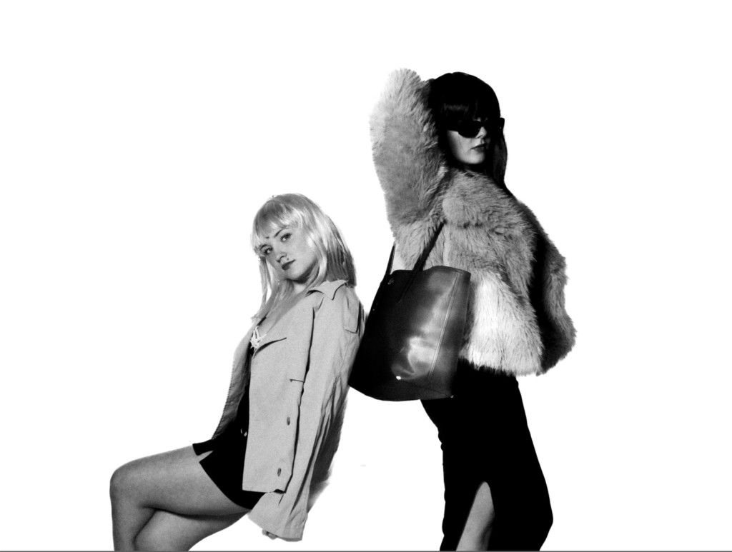
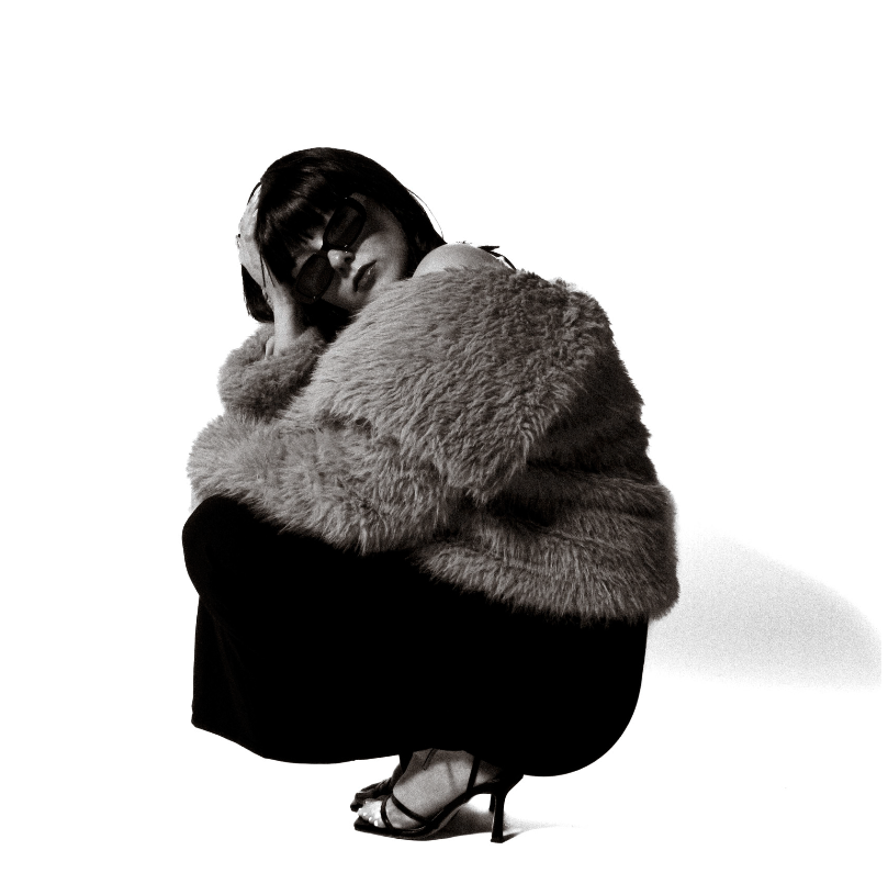
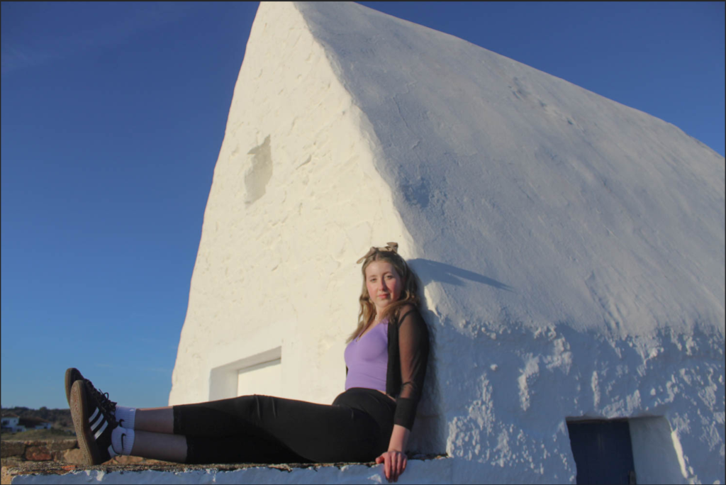
For this photoshoot, we went into the studio to take photos. I used artificial lighting with the studio light to create an even light in the images. When taking my images, I made sure that the light was behind the camera to prevent there being any unwanted shadows. I also used a plain white background to contrast with the people in the photos. I also used a white background as I felt that it would work best when I proceeded to edit my photos in photoshop. When I was in the studio, I took pictures of predominantly portrait photos, however I also took pictures of hands and backs to allow me to edit them together to create a union image. I like how my images turned out because I feel as though they will be effective when I start editing them together to create a photoshopped image. I also like the lighting of my images because they are bright to bring out the details in the peoples faces to enable me to merge them together. My aim was to take pictures that correlate with Tommy Inberg because I want to create surreal images to portray a sense of union between the different pictures coming together.
1st Photoshop Edit
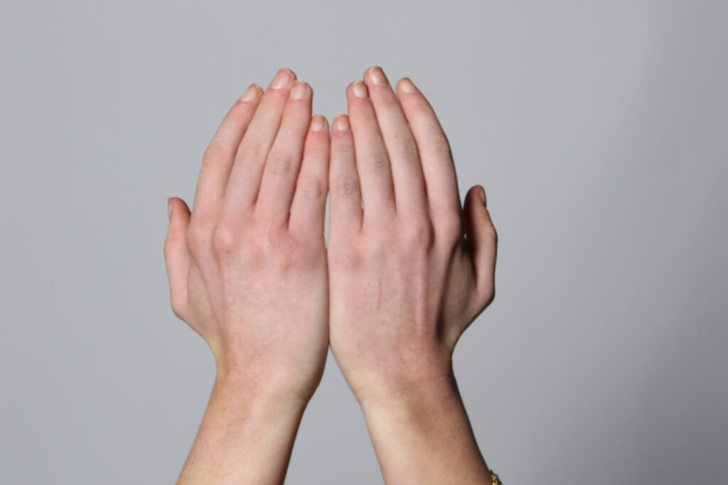
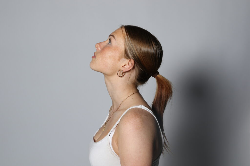
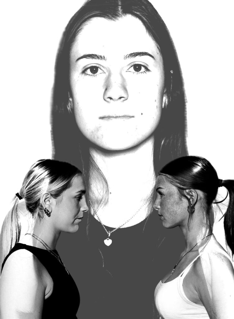
For this photoshopped image I used these images:
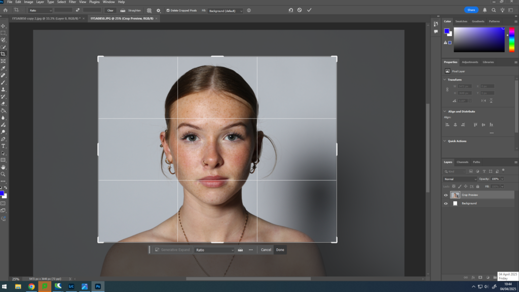
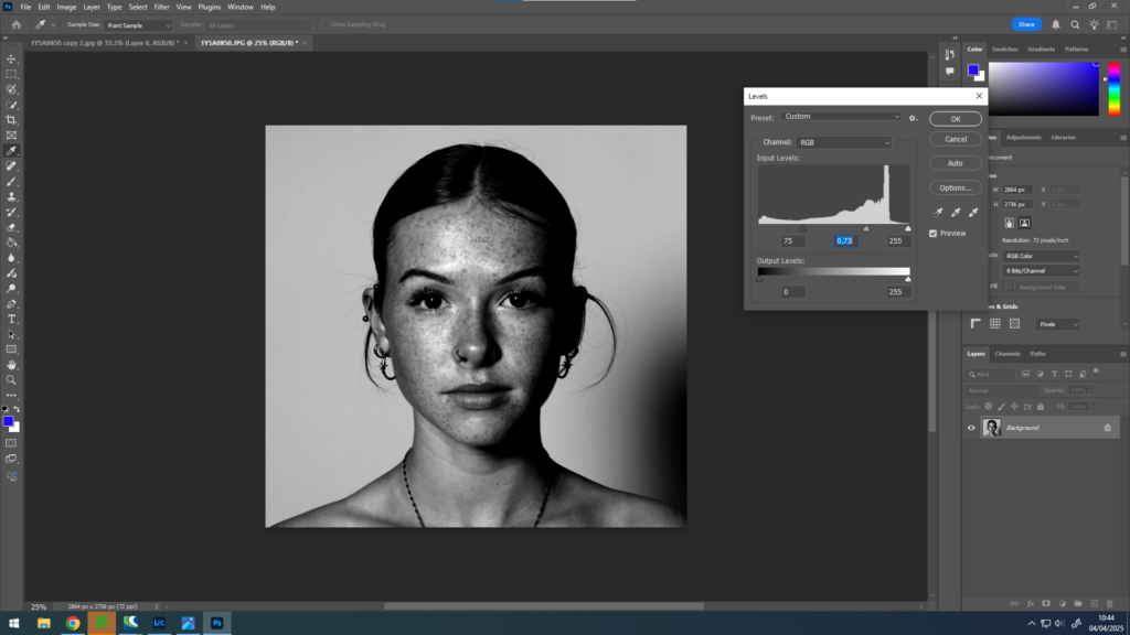
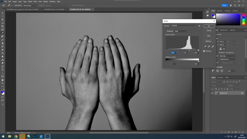
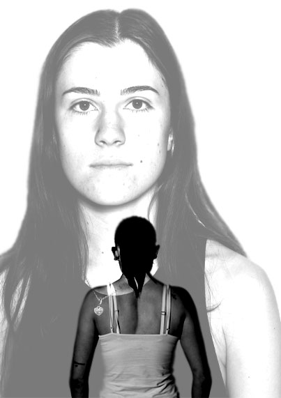
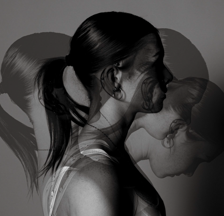
Firstly, I opened these two images on photoshop on a separate page. After this, I cropped the portrait image to get rid of the empty space around the face to enable the viewer to see the detailing of the image. After this I made both images black and white and levelled them to make them the same tone and texture.
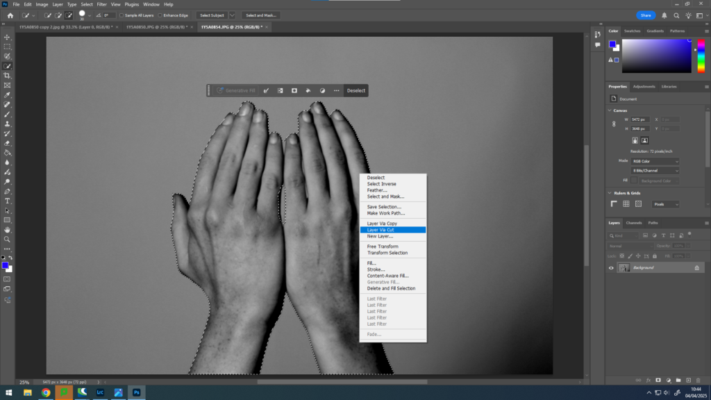
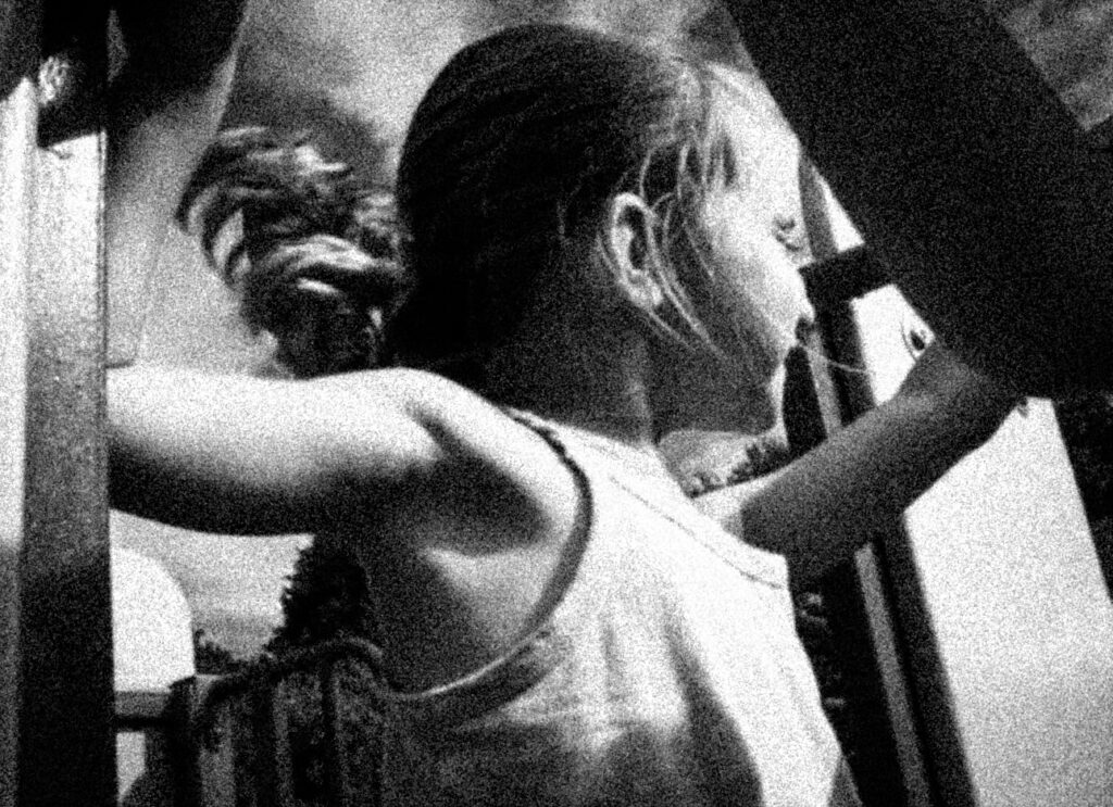
Once I had completed this, I used the Quick Selection Tool to select the hands and making sure that there were no areas that were selected incorrectly. I did this by zooming in and carefully selecting all of the areas I wanted to be selected. After I had done this, I “Layer Via Cut” the hands to enable me to move them onto the face.
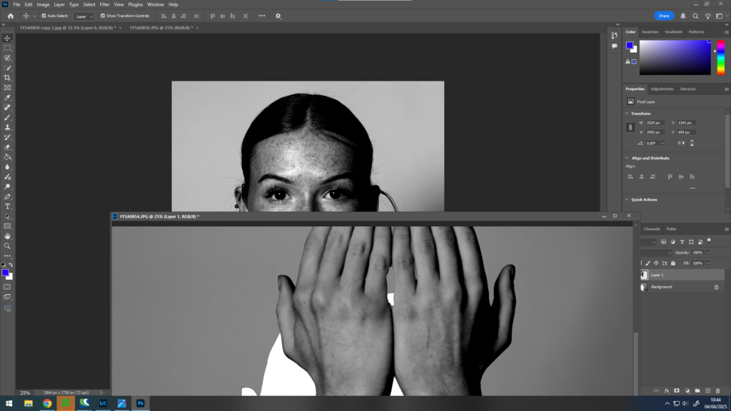
I then proceeded to place the hands over the face where I wanted them to go ensuring that the whole face was covered to allow me to change the opacity of the hands to create a surreal image.
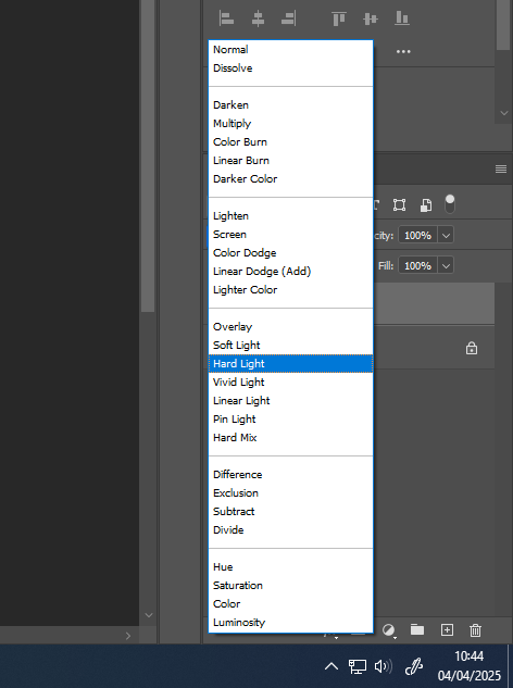
Once this was completed, I used the opacity tool to experiment with the edited image. I decided to select “Linear Light“, “Difference” and “Darken“. I used these three tools because I like how they sequenced together triadically.
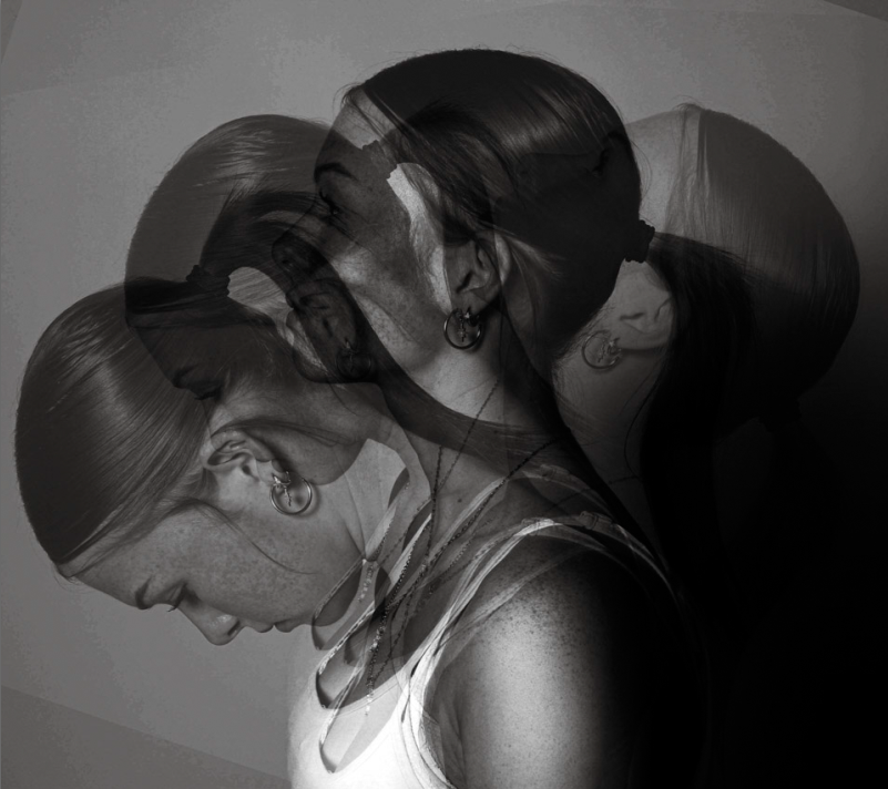
I really like how these images turned out because I like how they correlate with the word “union”. The reason as to why I think they fit in with the idea of union is because I have taken two images and merged them together to create one image. I also think this because I have created three of the same images with a slight difference. I have done this to unite the images together and when I display them I am going to stick them all together to create a final image like this :
This photoshop edit was inspired by Tommy Inberg and his surrealist artwork. He uses his thoughts and feelings within his imagination to create personal images and leaves the narrative up to the viewer. My interpretation of my images is that I have tired to portray a sense of union by using the face covered by the hands. I have tried to portray the feeling of isolation within people and the idea of someone trying to hide behind something, the idea of having three images correlates because it can be inferred with lots of people having the same feelings of feeling lonely or isolated but yet all unite together as one. despite still having our own differences within the same feeling. These images correlate to the idea of union because of the way that all the images are edited very similarly and look the same however have a slight difference. This has allowed me to present them together as one and I feel as though this is a good way to represent a union set of images.
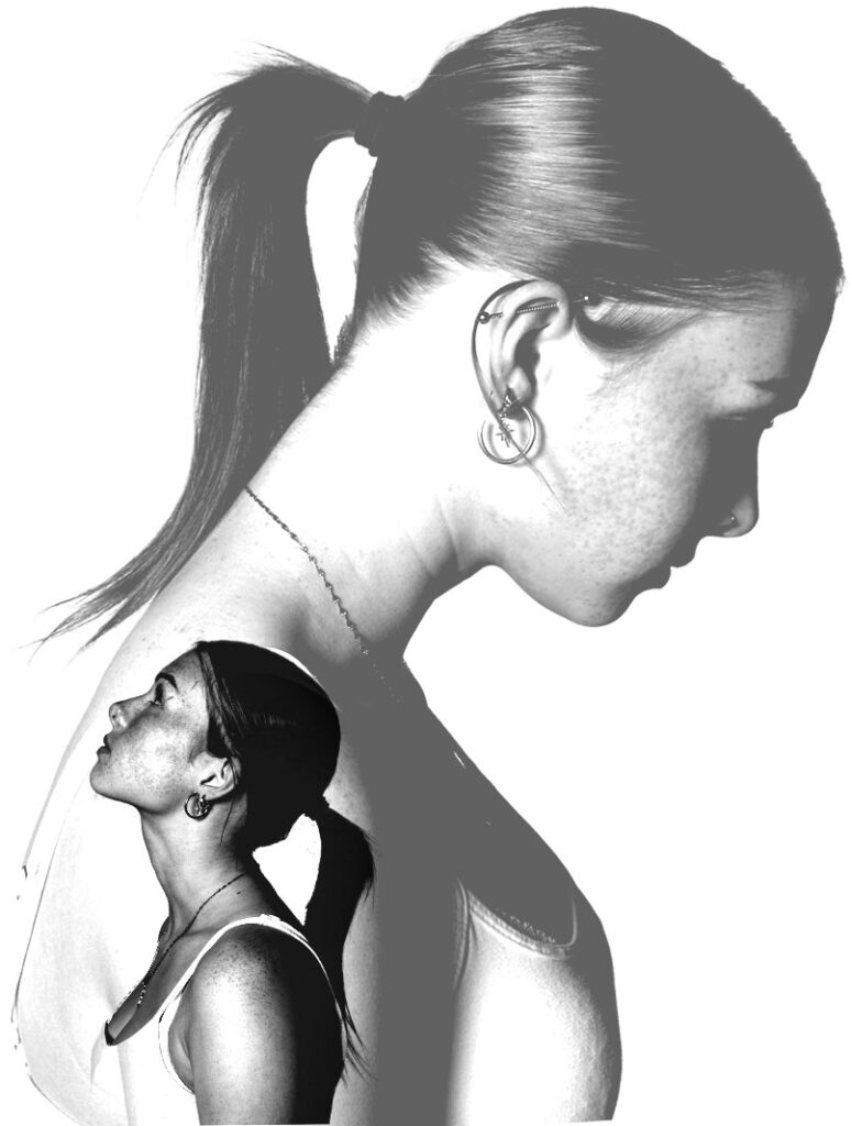
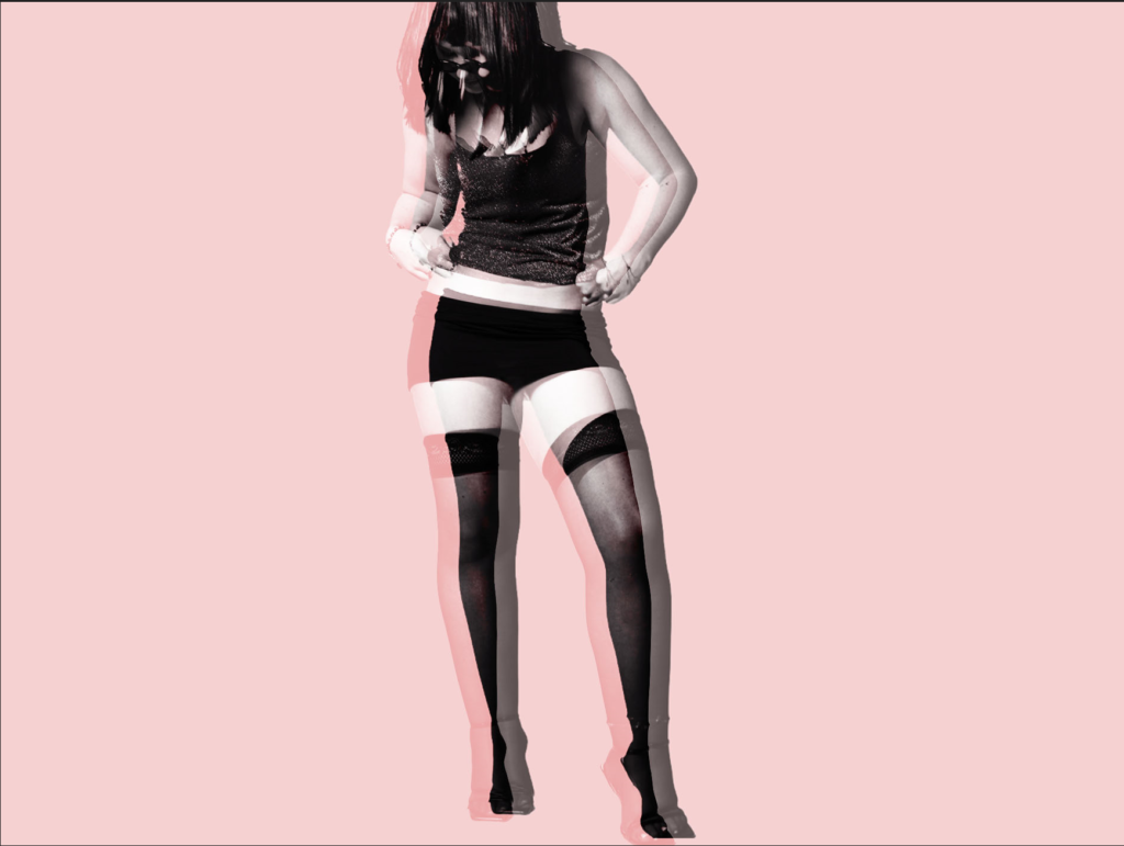
2nd Photoshop Edit
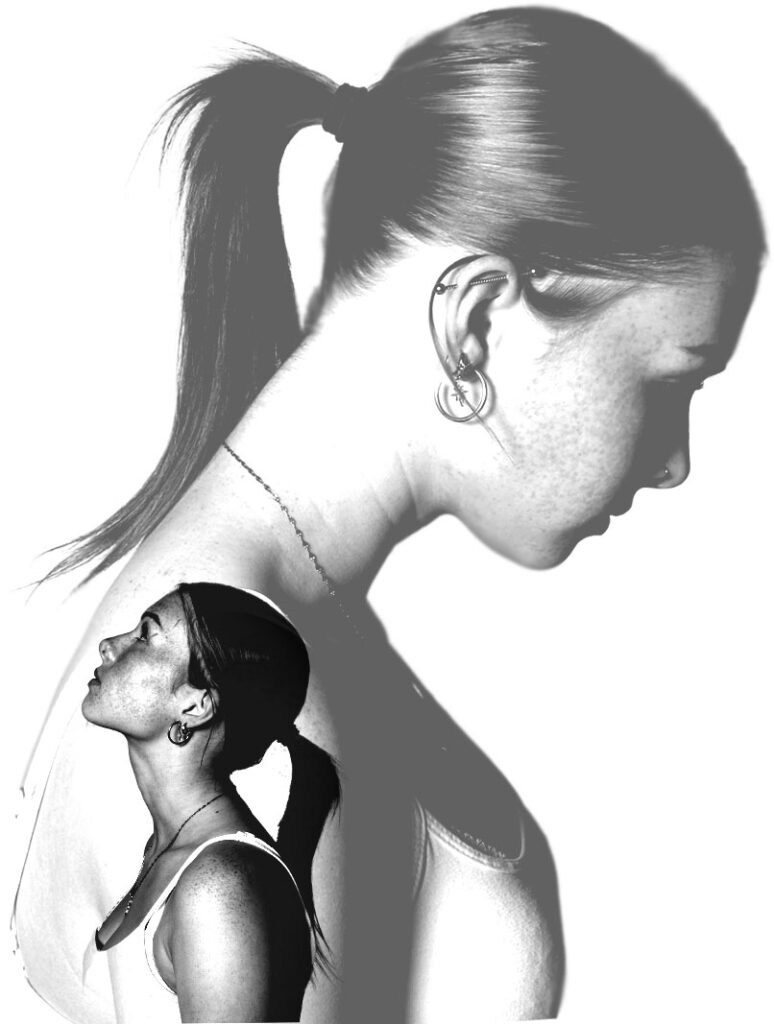
For these images, I transferred them onto photoshop. For the first image I used these two images:
Firstly, I made both images black and white and levelled them to get the desired lighting that I wanted. After this, I started with a blank template and made it portrait. After this, I went onto my image of the girl looking down and used the Quick Selection Tool to select her. I ensured to zoom in when doing this so that I didn’t miss any areas. Once I had completed this, I clicked “Layer Via Copy” and transferred it onto the blank template. I repeated this with the other image of the girl looking up. Once I had them both onto the blank template, I moved the images around experimenting on what looked the best. I decided that the two images facing away from each other looked the best so I ensured to make one big and one small. I put the big image behind the small one to ensure that both of them were the main focus point of the image. After I had done this, I proceeded to use the opacity tool to decide what type of opacity I wanted for each one. I decided on “Pin Light” and “Hard Light” because I wanted the opacity of the large image to be much less than the smaller image to create the sense of a shadow or a thought of the small image.
I really liked the way my images turned out because of the idea of two different images merged together to create a sense of union. I like the images in black and white because it gives it a gory yet subtle look because of the lighting of the images are still bright instead of being dull. When presenting my images once they are printed, I am going to stick them down on a black piece of card to ensure that the whites in the image stand out instead of blending in if I were to use a white piece of card. I am going to lay them out in this order:
I have chosen this order because I like the way that the middle one is slightly different to the other two. Therefore I feel as though that they correlate with the idea of union because of the middle one being slightly out of place however still having similar properties to the other two.
3rd Photoshop Edit
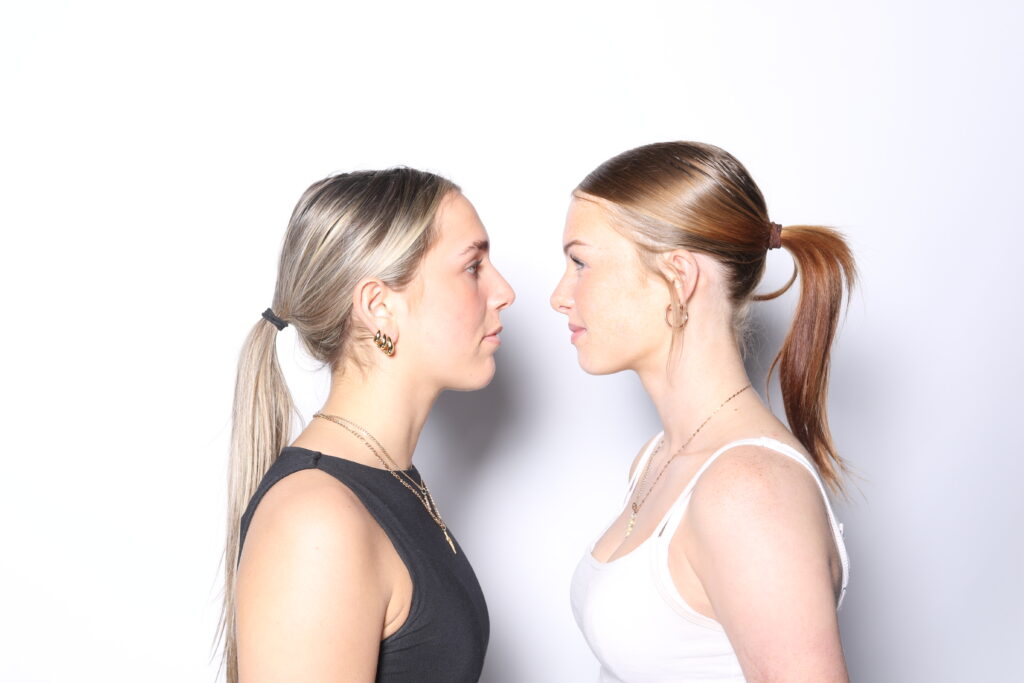
For this photoshop edit, I used these images :
I started by transferring these images onto photoshop one by one, and making them black and white before levelling them to get the same lighting for all of the images.
When presenting these images, I am going to put them on top of one another, as I feel as though they have a slight symmetry which is powerful when they are put together. I like the way that the images are reflecting each other and represents a slight sense of togetherness and allows the viewer to create their own narrative to the image as there isn’t an exact story to follow with them. I have taken this idea from Tommy Inberg who stated that he leaves the narrative up to the viewer to create their own meaning behind the images.
I really like how all my photoshop edits turned out. This is because I feel as though they all present the idea of union. I made all my images black and white because all the images are different however having them with no colour make them interlinked and come together as a union. I like this idea of black and white images because they infer that all the people in the image have similar features however they differ from each other in a slight way.
My book miles of boding was created so that I could add a more personal feel to my short documentary. I wanted to incorporate some behind the scenes action so that this context could elaborate on the idea of union.
Cover Page-
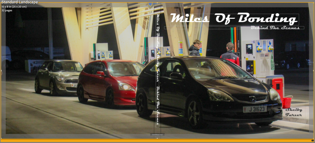
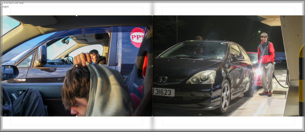
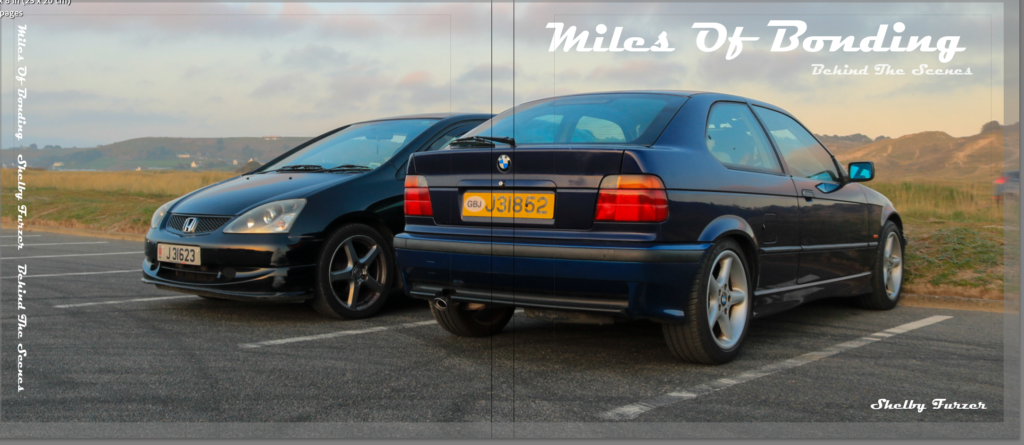
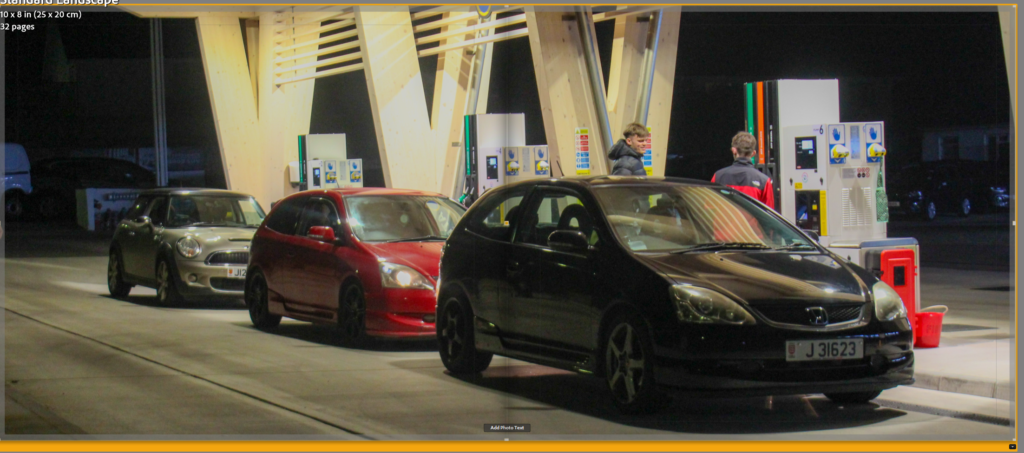
I decided to do a double page spread, so that I could show that my photo taking and filming process had come to an end by looping the start around to the back. I chose this image as it felt very personal and up-close, almost calming. The documentary is about cars being raced and contains footage of that, so by adding a personal image of them just simply filling up their cars it brings you back to basics. The normal things you need to do before their personality and passion takes over. My title was to connote to unity within the car scene. I have used a font which is seen within many different car magazines, which you can see I have assessed through my inspiration blog post.
1st Double Page Spread-
My first page spread contains a short description of why I have created the book and the documentary and how they both link to the exam criteria of union. I have decided to add this to give people more context about my title and about why I am doing this.
2nd Double Page Spread-
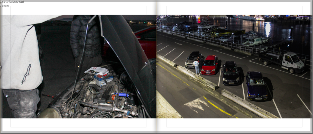
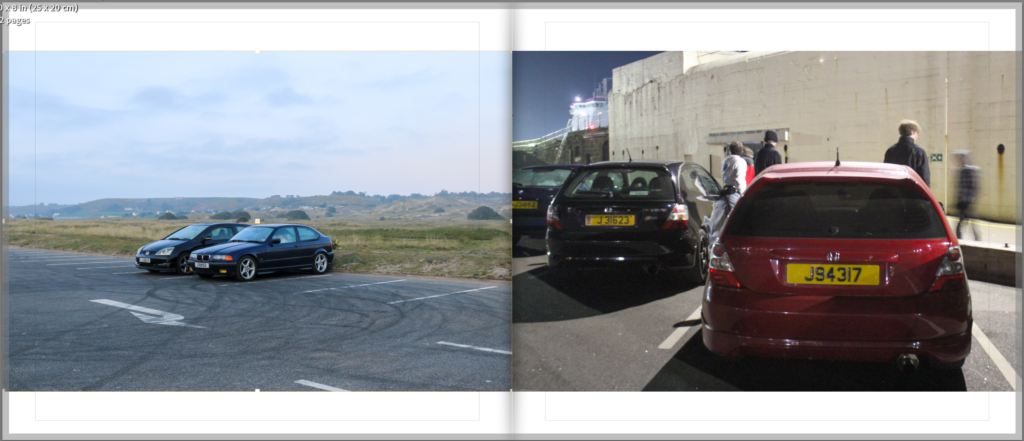
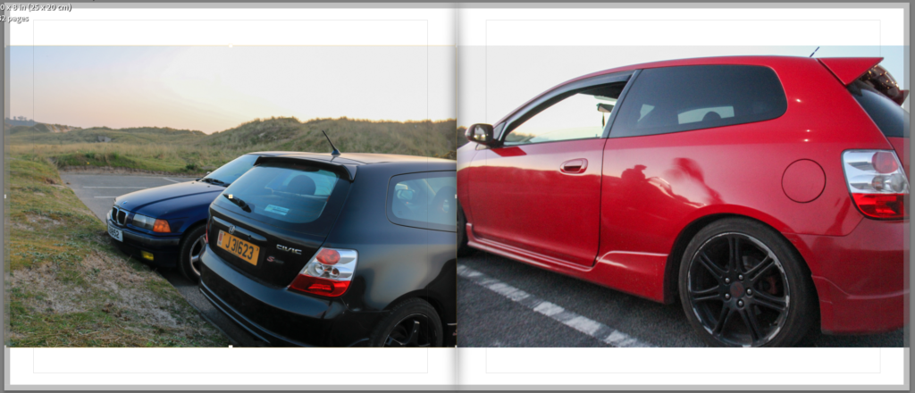
My images start off dark to link to how my documentary started, I have left white margins on all my pages to allow some space for noting, I felt that what I was doing was very heavy on which made it hard to keep focus and attention and I think that these margins help with that. My first image is one of them looking within a bonnet of a car and assessing work that they have just completed doing. The reason I chose this as my first image is because you can clearly see people gathered around to look, and I think that this connotates the idea of unity within the car scene very well. My second image is of all of their cars together, showing how no matter what they drive it still unites them all, and how they have created a friendship which stemmed on working on cars and helping each other with mods.
3rd Double Page Spread-
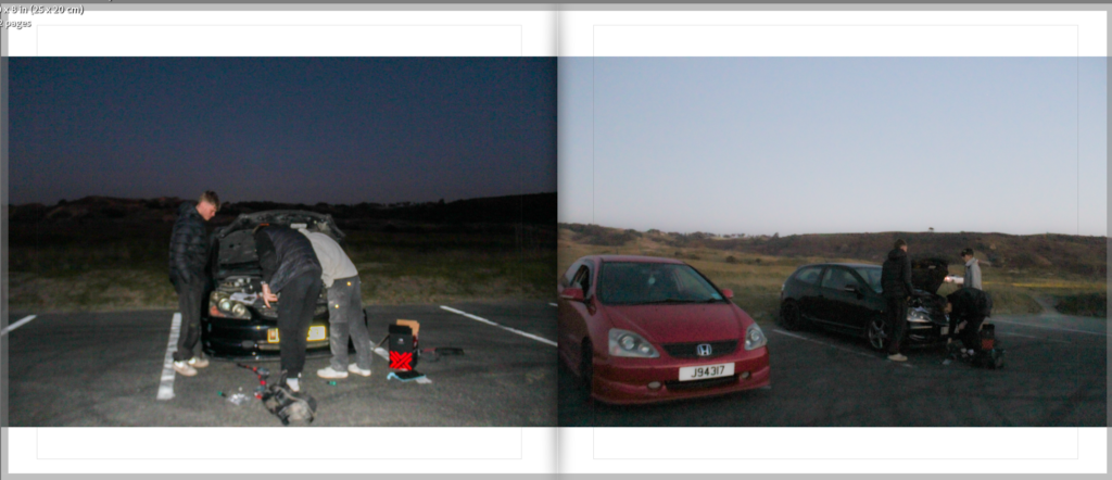
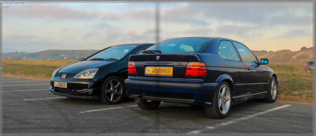
My third page spread start off with an image of them looking in the same bonnet as my first image, I have added this to create a wider viewpoint and clearly show how if they didn’t unite and work together then nothing would ever get done. My second image on this page spread shows how they have parked together, with the same car but he has left his car to go and help his friend, and it shows that dispersion from the love of your own car and wanting help on your own car to that kindness of helping others. All of these reasons are why I have chosen these images as they have a lighter background with a faded sunset, and they seem to be blurry and almost angelic like, showing the fade from just loving your own car to friendship.
4th Double Page Spread-
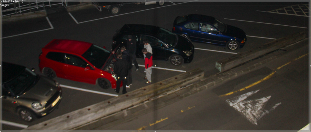
My fourth page spread consists of one image spread across the two pages from a bird’s eye view. I have done this to create a linking standpoint as my next pages are going to be text. This creates a break between the sets of photography and the close ups to a white background filled with text. By doing this I allow the viewers mind to break off and feel this shift. The image itself is quite dark, but it links back to that idea of all owning completely different cars to one another yet still all being friends. The idea of no judgment within the group. I chose this image as it contains all of them huddled together around one open bonnet. Providing more evidence of how they work together to create a special union.
5th Double Page Spread-
My fifth page spread contains my first interview which I have already analysed within my interview analysis blog post.
6th Double Page Spread-
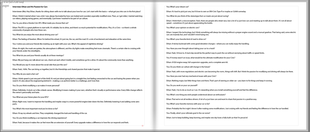
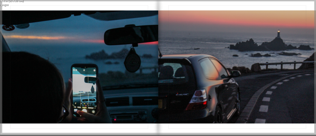
My fifth page spread starts with an image of someone taking a photo using their phone. This shows how the working together on the cars leads to more intimate experiences of being able to go out and enjoy the car together. This is also where my images start to get a bit lighter which corresponds with my video. The second image on this page spread is the outside view of what’s happening within the car, allowing a clear view of how if they didn’t work together to get the car running smoothly they wouldn’t be able to have experiences like this. In a way it is also showing off the car to show that all the work that they have done has improved this one drivers life / driving experience.
7th Double Page Spread-
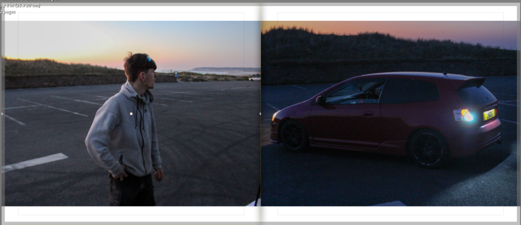
The first image within this spread contains a half body image, showing a more personal side to this journey. It allocated for some expression of personality which is important when trying to document how all these different people link up together. The second image contains a car pulling up and reversing, I have put the two together to show how they wait and rely on each other, creating unification where no progress would be made without it.
8th Double Page Spread-
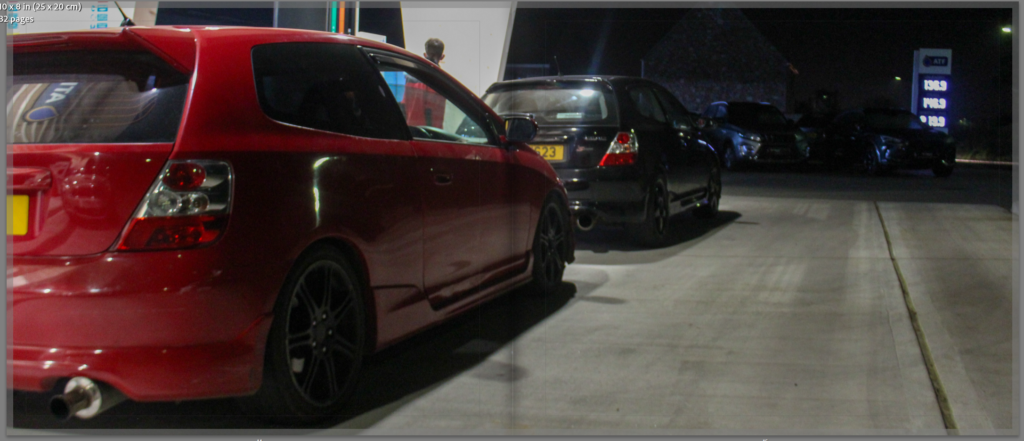
This double page spread is where the story line links back around to another shift to the next interview, by doing this I am keeping to that smooth clear and consistent pattern of repetition. The image itself is of the two people and their cars who I have just clearly focused on and locked into, the image links back to that calmness of filling up the cars, doing something which is basic and mandatory before the next rush of expression through personality.
9th Page Spread-
My ninth page spread contains my second interview which I have already analysed within my interview analysis blog post.
10th Page Spread-
I have used two similar photos within different settings for this page spread. The first image is one that is angled at an overview, seeing the progress that they have , made from far away, whereas the second one is angled very up close. By doing this I have created the illusion of them showing off these cars and their final products, and by keeping the cars within the images consistent it proves how this group will meet up almost everyday and do something car related. Whether that be gng on a drive, working on there cars or even just parking up and sitting in them. The first image is in very bright weather, to show how they generally get more busy at night which is stated within my interview, and the second image is in the dark with a background blur of them playing football, to show how they don’t need the cars to unite them.
11th Page Spread-
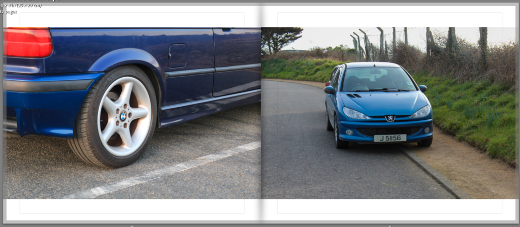
The first image on this spread is an upclose shot of the wheel, showing a deeper perspective of these cars by focusing on branding, this is so that who reads the book can link up within their minds who owns which car. The second image is a car which hasn’t been seen before within the book, this is to show the expansion, of how these cars have made them meet new people. Both the images are within the day to correlate to my video.
12th Page Spread-
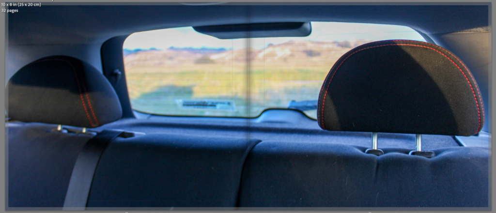
This is where my book yet again links around to another interview. I have used this as an opportunity to utilize an image that I took within the car. A landscape and environmental image to show a shift of how the book is almost coming to a close.
13th Page Spread-
My thirteenth page spread contains my third and final interview which I have already analysed within my interview analysis blog post.
14th Page Spread-
This page spread starts off with another image within the car, linking back to that double page spread before the interview. The reason that I have done this is to show how this group genuinely enjoy eachothers company and just like to sit in silence on their phones around another. They aren’t just friends to use each other to work on cars, they do genuinely get along as people. The second image on this spread links back to the calm of filling up the car, I have chosen to out many different angles of this within my book because I want to portray how this calmness actually means so much. Filling up the car is a staple and without it they wouldn’t be able to meet each other or do any of the work that they do.
15th Page Spread-
My last two image page spread consists of close ups of all the cars of the three people I have interviewed showing how the behind the scenes story is coming to an end and that they will continue to spend time together.
16th Page Spread-
My last page spread shows a final close up of the cars, reeling the story in.
Edits-
I ended up changing my front cover as I think that this image suited the title more, and I think that it was an overall better image.
Which in turn meant that I had to change my last page to this image.
I also changed all of my single images with the white backgrounds to have a 4% zoom so that I could cover up some of that white background.
End Result-
I overall think that my book making went extremely well and that I achieved my goal of making some behind the scenes content. I think that I have a good composition of images, and that all my images clearly flow together to create a much bigger picture. I don’t think that my short documentary could be read the same way if I didn’t add this short photobook to clear up some context and create a bassline structure. Creating this book has helped me to structure my video in a clear and consistent sense.
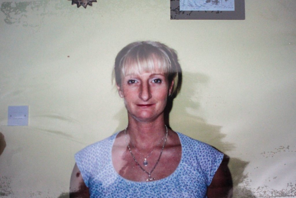
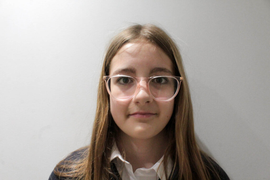
My mum (her daughter)My mum (her daughter) My sister (her granddaughter) My sister (her Granddaughter) My uncle Dan (her son)My uncle Dan (her son)My uncle Josh (her son)My uncle Josh (her son) My dad
Analysis of 2 Images
The lighting used in this image was natural daylight, as this photograph was taken in my garden. Therefore, there were low levels of control for the lighting. However, there were high levels of control with the composition of this image, as it is a staged image, where I directed my mum. I also had control over the distance and positioning of myself with the camera.
F-stop: f/10
Exposure time: 1/40 sec
ISO speed: ISO-100
This image contains mainly white, due to the background and the colour of my mums shirt. However some other colours that can be seen are red, pink, brown, blue, black and skin tone due to my mum features. Therefore, there is quite a lot of contrast between my mum and the white background. There are also lots of light tones in this image due to the amount of white. There isn’t a lot of texture in this image.
The composition of this image is simple as it is a portrait of my mum where she is in the centre of the frame looking directly forward. She is the main viewpoint of the image.
This image is a remake of an archive image of her mum when they were at very similar ages. The meaning for this is to present the similar characteristics that they share, so that I can present how family are unified through DNA, blood and other characteristics and that union can never be broken even if you wanted it to.
The lighting used in this image is artificial lighting due to the image being taken inside. However, there was still little control with the lighting as I had to use what I had at home, but there was high levels of control to the composition of the image, because it was a staged image, where I could manipulate the positioning of my model and the distance and positioning of myself with the camera.
F-stop: f/10
Exposure time: 1/40 sec
ISO speed: ISO-100
There are very few colours in this image as well, but they include the white background and shirt, the golden hair, black jumper and pink glasses. There are light and dark tones due to the lighting coming from one side of the image, rather than directly forward. There is also a lot of contrast between the white background and my subject in the black jumper. There is not a lot of texture in the photograph.
The composition of this image is a simple composition with the main viewpoint of the image being my subject in the centre of the frame.
This image is a remake of an archive image of my subjects grandma. The meaning for this is to present the similar characteristics that they share, so that I can present how family are unified through DNA, blood and other characteristics and that union can never be broken even if you wanted it to.
Evaluation
I think this photoshoot went well, because I was able to recreate the archive image chosen well with multiple family members. I was also able to experiment with my editing slightly, by selecting the background, as well as using the removing tool to remove any blemishes in my photographs. However, next time I would use the same background/ take the photographs in the same place, so that they would all have a plain white background and be more similar to each other, which would make it slightly easier for me when using photoshop.
These photographs link to the topic of union, because they present how similar all my family look, due to sharing DNA, blood and other characteristics. I am going to explore this theory more, by using photoshop to combine these characteristics together, by creating a collage of my families faces.
I have also taken an image of my dad that is not related to the archive image, because I want to create another collage using my mums image, my sisters image and his image to show the same concept.
For my first photoshoot, I wanted to focus my photoshoot on the friendship element of UNITY. Experimenting with touch and closeness through my sitters.
I made sure to gather individuals that were already friends, because this would help show the connection naturally, rather then the forced awkwardness you can often see in intimate photographs.
Technicalities –
With this photoshoot, I wanted to use the studio for lighting, and ease. With the use of snapshot lighting it helped the clarity and sharpness of the photographs outcome. Using a monitor accessory on the camera, it linked to the light, creating sharp bursts of light as each photo was taken.
I used the technique of portraiture for this photoshoot, I wanted to vary my technical ideas and as all my other photoshoots will be more candid. I wanted the inclusion of subject to camera eye contact in this photoshoot, this is because it connects the photos to whoever may see it, the saying ‘ eyes are the window to the soul ‘ resonates incredibly with this idea.
Photoshoot –
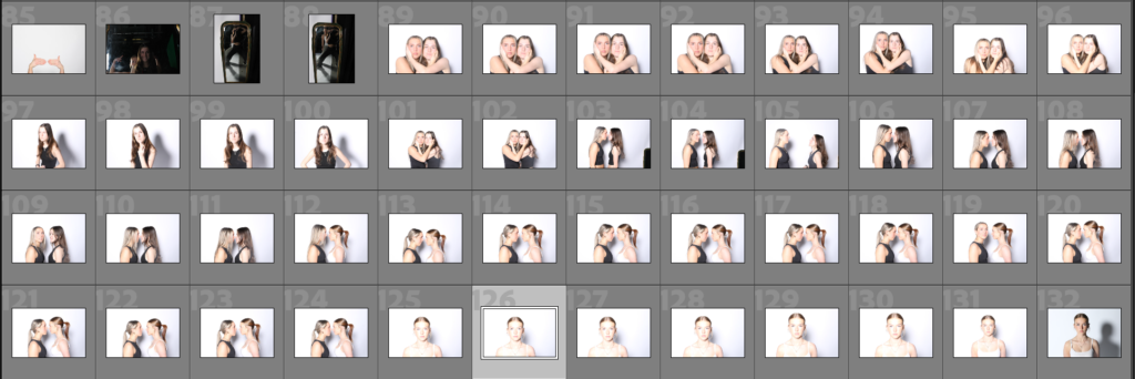
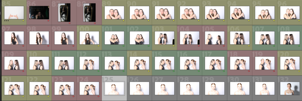
This photoshoot consisted of around 48 photographs, majority similar to each other, all portraits, in artificial lighting. I went through all photo, giving them a colour determining how successful I believe the photo is.
After colour labelling each photograph, all green photos will be edited as planned and will be put into a final group of photos to choose my favourites for my final prints.
After moving them into their own small folder, I’ve pinpointed what photos I will be editing it, just to make them easier to access.
For this photoshoot I have recreated the archive image below:
I have recreated this image using my mum (her daughter), my uncle Josh (her son), and my other uncle Daniel (her son).
Edits
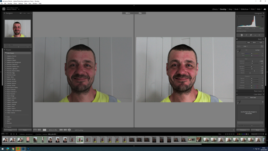
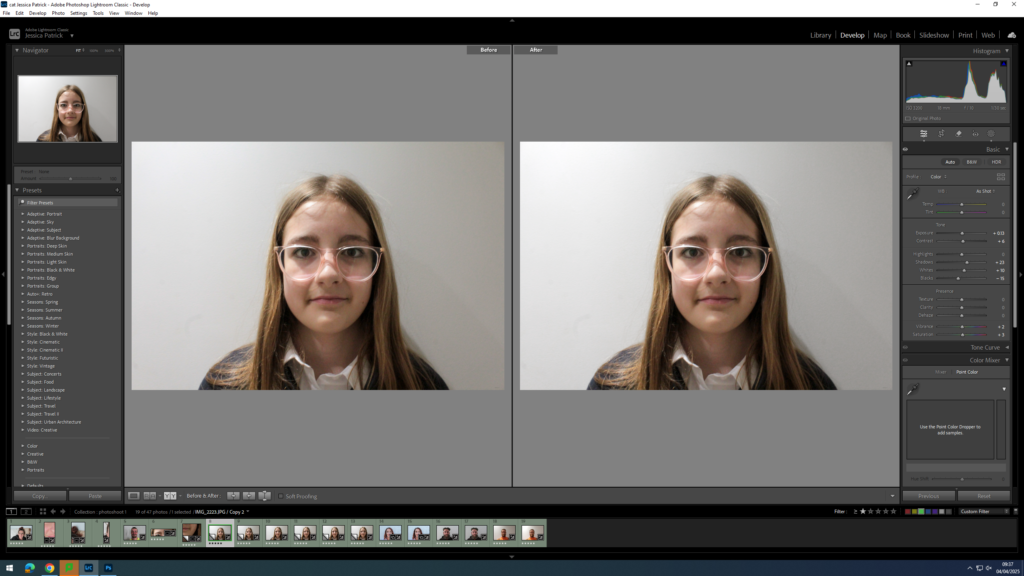
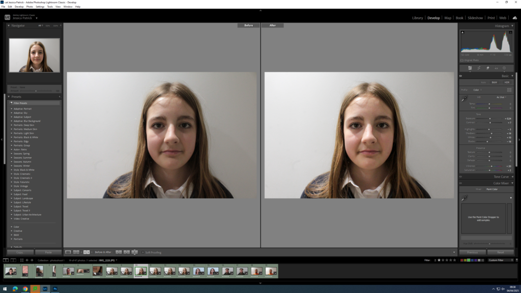
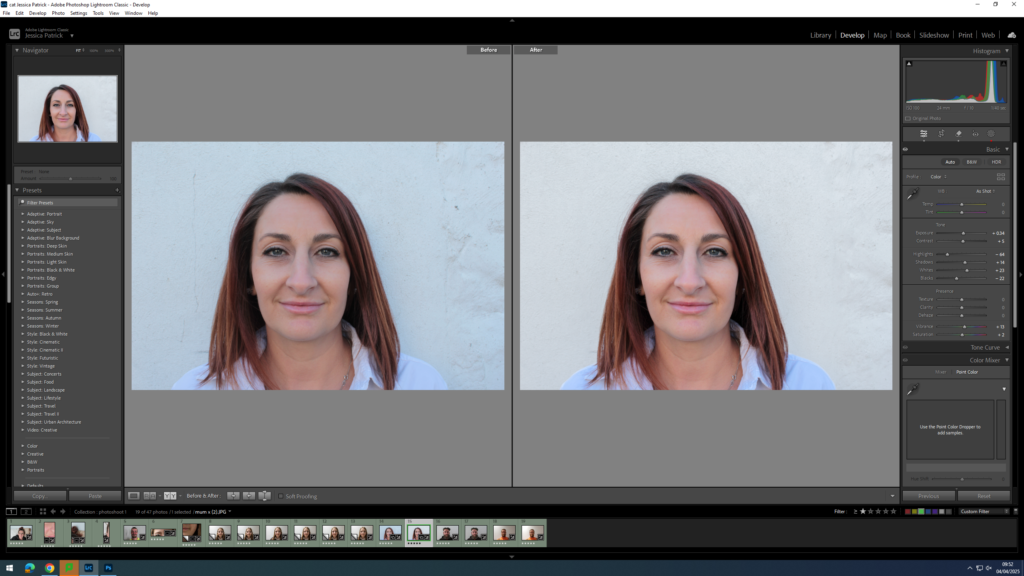
I edited this image by increasing the exposure, contrast, shadows and whites, while decreasing the highlights, blacks and vibrancy. I did this, so that the image would be slightly more exposed with better lighting.
I then attempted to even out my dad’s skin tone slightly, so I used the remove tool to remove any blemishes.
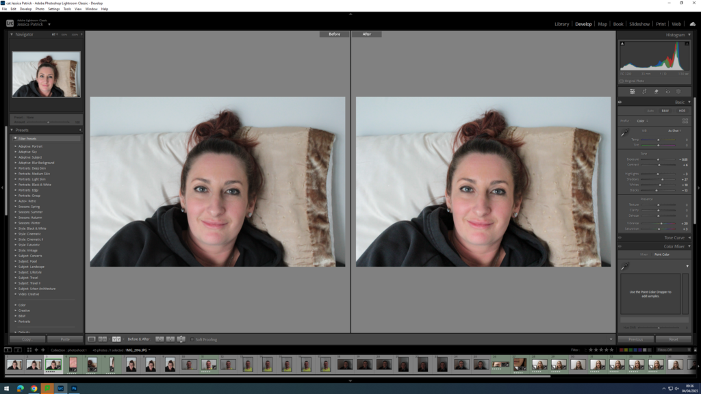
I edited this image by increasing the contrast, shadows, whites, vibrancy and saturation, while decreasing the exposure, highlights and blacks. I did this, so that my mum face would have a slight bit more colour in it.
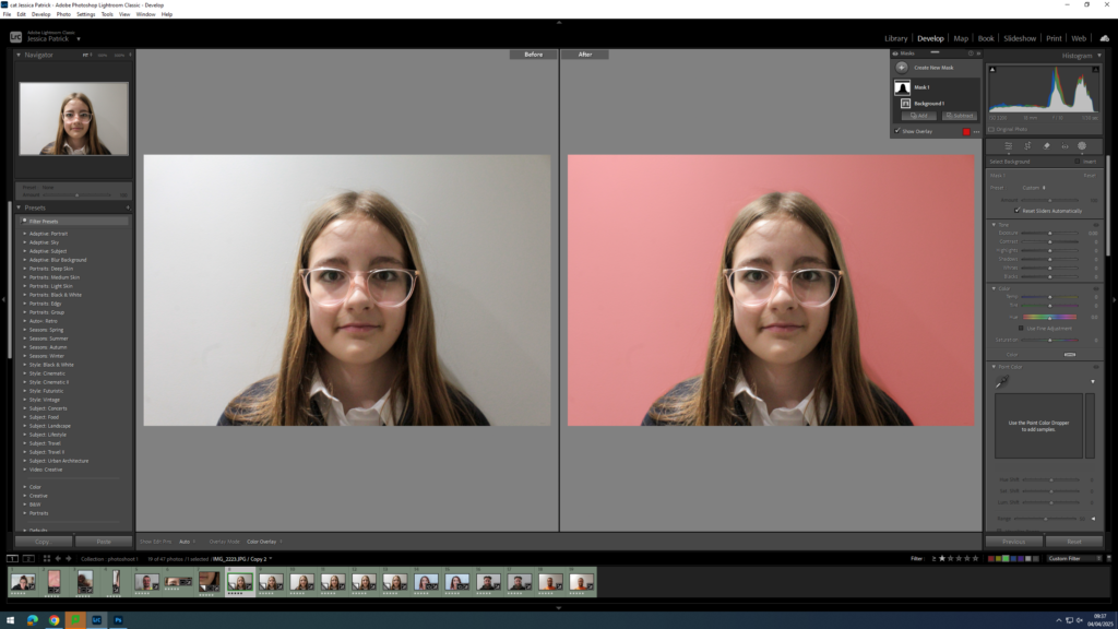
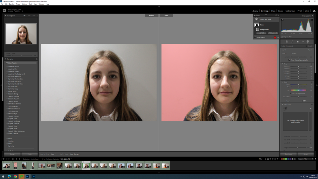
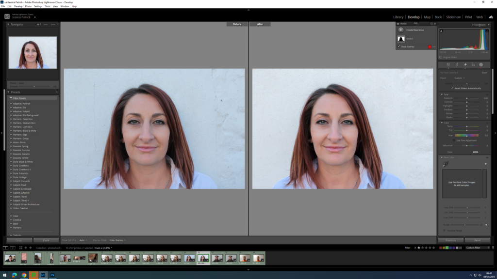
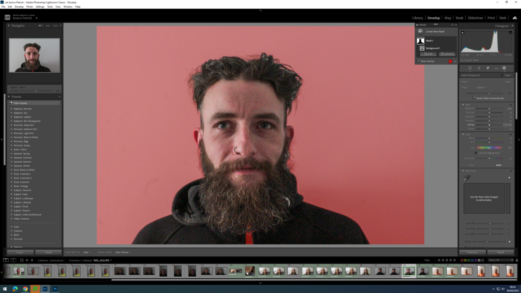
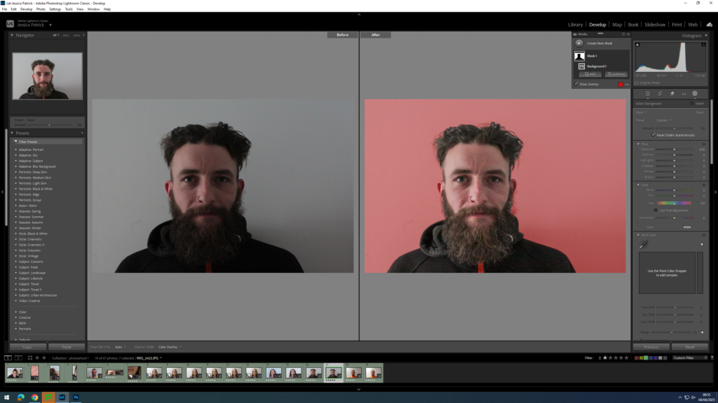
I edited this image by increasing the exposure, contrast, shadows, whites, vibrancy and saturation, while decreasing the highlights and blacks. I did this, so that the lighting was better. Then, I selected the background of the photograph and reduced the saturation and increased the whites, so that the background was less grey.
I edited this image by increasing the exposure, contrast, shadows, whites, vibrancy and saturation, while decreasing the highlights and blacks. I did this, so that the image was more exposed and therefore had better lighting. Then, I selected the background of the image and decreased the saturation and increased the whites, so that the background was less grey.
I edited this image increasing the exposure, contrast, shadows, whites, vibrancy and saturation, while decreasing the highlights and blacks. I did this, so that the lighting was slightly better.
Then, I selected the background and decreased the saturation and the whites very slightly and then increased the blacks. I did this, so that the black marks on the white wall were less obvious and so the background would be a brighter white, rather than grey.
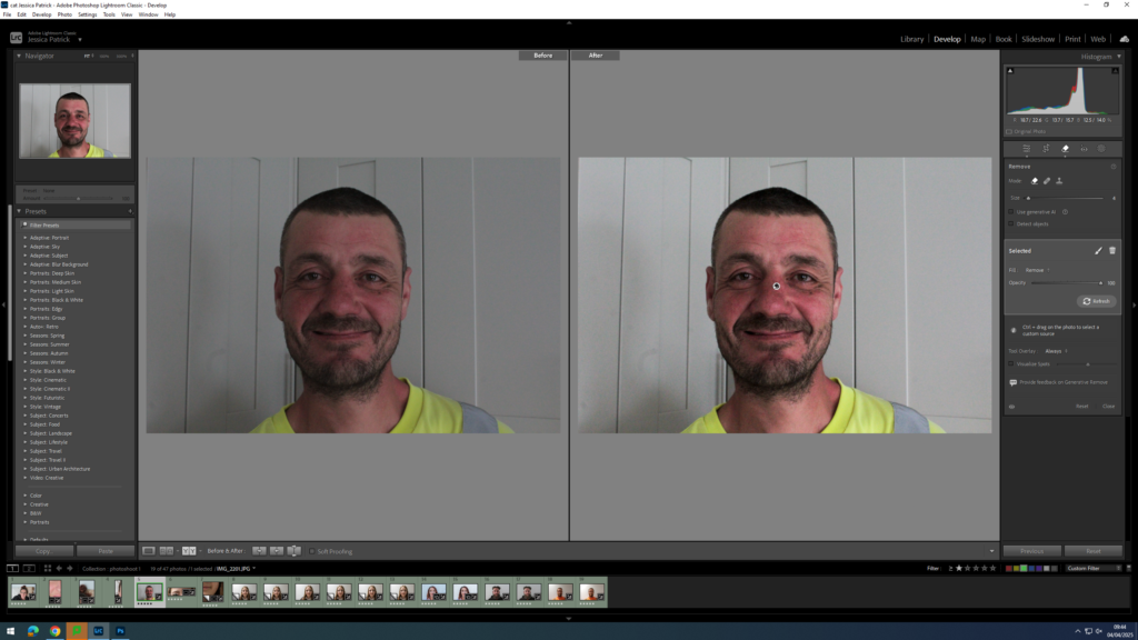
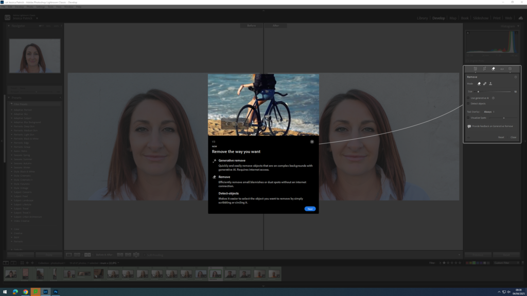
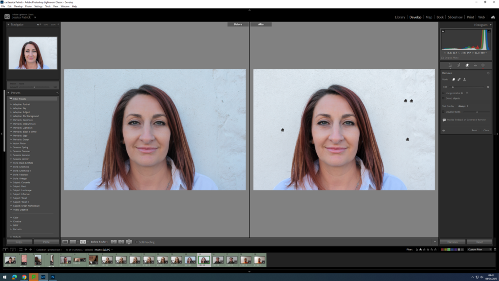
Next, I used the remove tool to remove any dark marks left behind on the white background.
I edited this image by increasing the exposure, contrast, shadows, whites, vibrancy and saturation, while decreasing the highlights and blacks. I did this, so that the image had better lighting as it was slightly more exposed. Then, I selected the background of the image and decreased the saturation and increased the whites in order to create a more white background, rather than grey.
I edited this image by increasing the exposure, contrast, shadows, whites, vibrancy and saturation, while decreasing the highlights and blacks. I did this, so that the image had better lighting as it was slightly more exposed. Then, I selected the background of the image and increased the whites in order to create a more white background, rather than grey.
I edited this image by increasing the contrast, shadows, whites, vibrancy and saturation, while decreasing the exposure, highlights and blacks. I did this, so that the lighting would be slightly better and less warm. Then, I selected the background and decreased the saturation and increased the whites, so that the wall was slightly less orange, due to the warm lighting and the reflection of the orange shirt.
I edited this image by increasing the contrast, shadows, whites and vibrancy, while decreasing the exposure, highlights and blacks. I did this, so that the lighting would be slightly less warm. Then, I selected the background and decreased the saturation and increased the whites, so that the wall was slightly less orange, due to the warm lighting and the reflection of the orange shirt.
The first page of my book is a short overview of what my book is actually about and why I have chosen to make it along side my film. I have answered questions within this such as why i chose to make the book but also why I chose to make the film.I have concisely analysed what is within this behind the scenes book as well. I have then gone on to create a short paragraph linking my photobook and my film to the exam theme of union, and how that is portrayed within my work. I have done this too add context to my book.
My first interview is my most important one, this is because the person that I am interviewing is the character who is seen the most within my film. I have put this interview first to correlate with the timeline of my film. I have made the interview very informal, and made sure to differentiate his questions as to not have him repeating himself. I have asked a range of different questions, ones about why he loves his car, some general knowledge onea about his car and then some linking questions to the idea of union and friendship.
Within my second interview I had to be very careful in differentiating the questions as he owns the same car as the person who I first interviewed. I did this by making his interview a lot more informal than my first one, and asking a lot more origin questions, for example why he drives this car and how he has modified it etc. I have still asked him, social questions which link to union such as what he would tell someone wanting to buy this car, but I have made them less about friendship and as I stated before more about the initial building of the car itself.
My final interview was a lot easier to ask as his car is completely different to the other two. I stuck with the theme of his origin story as he has very old and different car to the others. I made sure to still input some questions about unity such as, if he has ever met anyone cool through the car scene.
Interviews In Full-
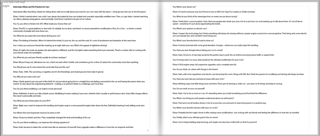
Interview: Ethan and His Passion for Cars Interviewer (Me): Hey Ethan, thanks for sitting down with me to talk about your love for cars. Let’s start with the basics—what got you into cars in the first place? Ethan: I think it started when I was a kid. I was always fascinated by how cars looked and sounded, especially modified ones. Then, as I got older, I started watching car videos, playing racing games, and eventually, I just knew I wanted to be part of car culture. You: So, you drive a Honda Civic EP2. What made you choose that car? Ethan: The EP2 is a great platform to start with. It’s reliable, fun to drive, and there’s so much potential for modifications. Plus, it’s a Civic—so there’s a whole community of people who love these cars. You: What do you enjoy the most about driving your car? Ethan: The feeling of freedom. When I’m behind the wheel, it’s just me, the car, and the road. It’s a mix of excitement and relaxation at the same time. You: I notice you and your friends like meeting up at night with your cars. What’s the appeal of nighttime driving? Ethan: At night, the roads are quieter, the atmosphere is different, and the city lights make everything feel more cinematic. There’s a certain vibe to cruising with your friends under the streetlights. You: What do you and your friends usually do at these meetups? Ethan: We just hang out, talk about our cars, check out each other’s builds, and sometimes go for a drive. It’s about the community more than anything. You: Would you say it’s more about the social side than just the cars? Ethan: Yeah, 100%. The cars bring us together, but it’s the friendships and shared passion that make it special. You: Why do you want a fast car? Ethan: I think speed is just one part of the thrill. It’s not just about going fast in a straight line, but feeling connected to the car and having the power when you need it. It’s also about the engineering behind it—making a car perform better is a challenge, and I love that. You: Do you think modifying a car makes it more personal? Ethan: Definitely. A stock car is like a blank canvas. Modifying it means making it your own, whether that’s visually or performance-wise. Every little change reflects the owner’s personality and taste. You: What are your future plans for your EP2? Ethan: Right now, I want to improve the handling and maybe swap in a more powerful engine later down the line. Definitely lowering it and adding some aero parts. You: What’s the most important mod you’ve done so far? Ethan: I’d say my wheels and tires. They completely changed the look and handling of the car. You: Do you think modifying a car improves the driving experience? Ethan: Yeah, because it makes the car feel more like an extension of yourself. Every upgrade makes a difference in how the car responds and feels.You: What’s your dream car? Ethan: It’s hard to pick just one, but I’d love to own an EK9 Civic Type R or maybe an S2000 someday. You: What do you think of the stereotype that car meets are just about racing? Ethan: I think that’s a misconception. Yeah, there are people who street race, but a lot of us just love cars and meeting up to talk about them. It’s not all about speed—sometimes it’s just about appreciating the builds. You: What’s your opinion on electric cars? Ethan: I respect the technology, but I think something will always be missing without a proper engine sound and a manual gearbox. That being said, some electric cars are insanely fast, and I wouldn’t mind trying one. You: What’s your favorite kind of road to drive on? Ethan: A twisty backroad with some good elevation changes—where you can really enjoy the handling. You: Have you ever thought about taking your car to a track? Ethan: Yeah, I’d love to. A track day would be the perfect way to push the car without worrying about traffic or speed limits. You: If money wasn’t an issue, what would be the ultimate modification for your Civic? Ethan: A K20 engine swap, full suspension upgrades, and a complete aero kit. You: Do you think car culture will change in the future? Ethan: Yeah, with more regulations and electric cars becoming the norm, things will shift. But I think the passion for modifying and driving will always be there. You: Have you ever had any mechanical issues with your Civic? Ethan: Nothing major, but little things here and there. That’s part of owning an older car—you learn to fix things and keep it running. You: Do you work on your car yourself? Ethan: Yeah, I try to do as much as I can. It’s rewarding when you install something yourself and feel the difference. You: What’s one thing you wish people understood about car enthusiasts? Ethan: That we’re not all reckless drivers. A lot of us just love cars and want to share that passion in a positive way. You: What’s your favorite memory with your car so far? Ethan: Probably the first night I drove it after making some modifications. Just cruising with my friends and feeling the difference in how the car handled. You: Finally, what’s your ultimate goal in the car scene? Ethan: Just to keep building, keep learning, and maybe one day have a fully built car that I’m proud of.
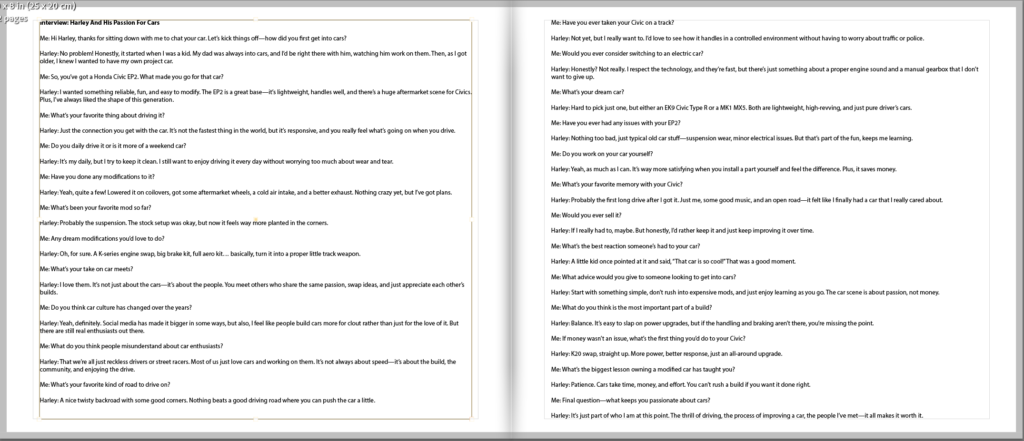
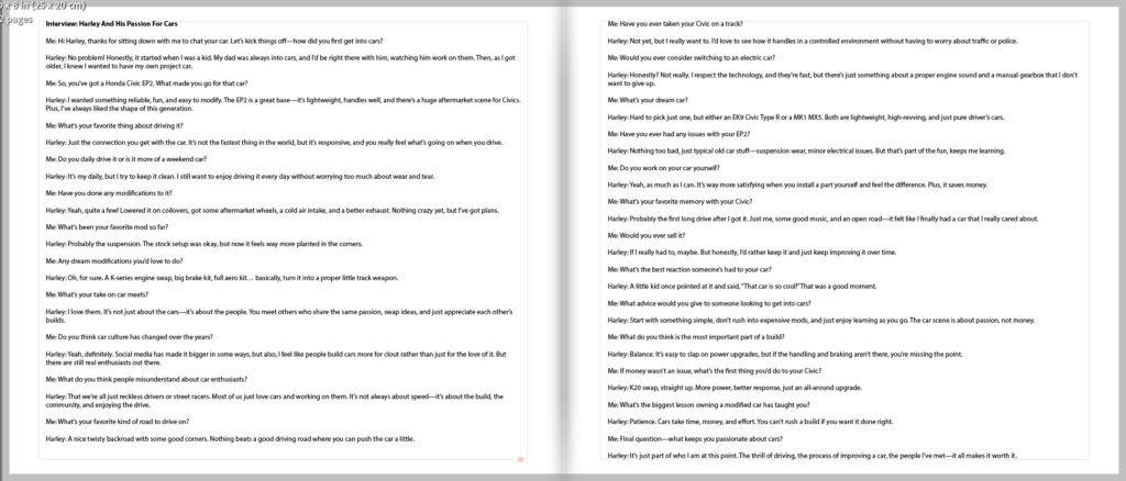
Interview: Harley And His Passion For Cars Me: Hi Harley, thanks for sitting down with me to chat your car. Let’s kick things off—how did you first get into cars? Harley: No problem! Honestly, it started when I was a kid. My dad was always into cars, and I’d be right there with him, watching him work on them. Then, as I got older, I knew I wanted to have my own project car. Me: So, you’ve got a Honda Civic EP2. What made you go for that car? Harley: I wanted something reliable, fun, and easy to modify. The EP2 is a great base—it’s lightweight, handles well, and there’s a huge aftermarket scene for Civics. Plus, I’ve always liked the shape of this generation. Me: What’s your favorite thing about driving it? Harley: Just the connection you get with the car. It’s not the fastest thing in the world, but it’s responsive, and you really feel what’s going on when you drive. Me: Do you daily drive it or is it more of a weekend car? Harley: It’s my daily, but I try to keep it clean. I still want to enjoy driving it every day without worrying too much about wear and tear. Me: Have you done any modifications to it? Harley: Yeah, quite a few! Lowered it on coilovers, got some aftermarket wheels, a cold air intake, and a better exhaust. Nothing crazy yet, but I’ve got plans. Me: What’s been your favorite mod so far? Harley: Probably the suspension. The stock setup was okay, but now it feels way more planted in the corners. Me: Any dream modifications you’d love to do? Harley: Oh, for sure. A K-series engine swap, big brake kit, full aero kit… basically, turn it into a proper little track weapon. Me: What’s your take on car meets? Harley: I love them. It’s not just about the cars—it’s about the people. You meet others who share the same passion, swap ideas, and just appreciate each other’s builds. Me: Do you think car culture has changed over the years? Harley: Yeah, definitely. Social media has made it bigger in some ways, but also, I feel like people build cars more for clout rather than just for the love of it. But there are still real enthusiasts out there. Me: What do you think people misunderstand about car enthusiasts? Harley: That we’re all just reckless drivers or street racers. Most of us just love cars and working on them. It’s not always about speed—it’s about the build, the community, and enjoying the drive. Me: What’s your favorite kind of road to drive on? Harley: A nice twisty backroad with some good corners. Nothing beats a good driving road where you can push the car a little.Me: Have you ever taken your Civic on a track? Harley: Not yet, but I really want to. I’d love to see how it handles in a controlled environment without having to worry about traffic or police. Me: Would you ever consider switching to an electric car? Harley: Honestly? Not really. I respect the technology, and they’re fast, but there’s just something about a proper engine sound and a manual gearbox that I don’t want to give up. Me: What’s your dream car? Harley: Hard to pick just one, but either an EK9 Civic Type R or a MK1 MX5. Both are lightweight, high-revving, and just pure driver’s cars. Me: Have you ever had any issues with your EP2? Harley: Nothing too bad, just typical old car stuff—suspension wear, minor electrical issues. But that’s part of the fun, keeps me learning. Me: Do you work on your car yourself? Harley: Yeah, as much as I can. It’s way more satisfying when you install a part yourself and feel the difference. Plus, it saves money. Me: What’s your favorite memory with your Civic? Harley: Probably the first long drive after I got it. Just me, some good music, and an open road—it felt like I finally had a car that I really cared about. Me: Would you ever sell it? Harley: If I really had to, maybe. But honestly, I’d rather keep it and just keep improving it over time. Me: What’s the best reaction someone’s had to your car? Harley: A little kid once pointed at it and said, “That car is so cool!” That was a good moment. Me: What advice would you give to someone looking to get into cars? Harley: Start with something simple, don’t rush into expensive mods, and just enjoy learning as you go. The car scene is about passion, not money. Me: What do you think is the most important part of a build? Harley: Balance. It’s easy to slap on power upgrades, but if the handling and braking aren’t there, you’re missing the point. Me: If money wasn’t an issue, what’s the first thing you’d do to your Civic? Harley: K20 swap, straight up. More power, better response, just an all-around upgrade. Me: What’s the biggest lesson owning a modified car has taught you? Harley: Patience. Cars take time, money, and effort. You can’t rush a build if you want it done right. Me: Final question—what keeps you passionate about cars? Harley: It’s just part of who I am at this point. The thrill of driving, the process of improving a car, the people I’ve met—it all makes it worth it.
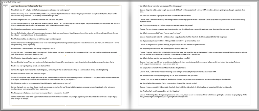
Interview: Connor And His Passion For Cars Me: Alright, first off—why the E36? What made you choose this car over anything else? Connor: I’ve always been a fan of 90s BMWs, and the E36 just has that perfect balance of old-school styling and modern-enough reliability. Plus, they’re fun to drive and not crazy expensive—at least, they weren’t when I got mine. Me: How long have you had it, and what condition was it in when you got it? Connor: I’ve had it for about three years now. When I bought it, it was… let’s just say “rough around the edges.” The paint was fading, the suspension was shot, and it had a few electrical gremlins. But the bones were solid, so I knew it was worth saving. Me: What’s been your favorite mod or upgrade so far? Connor: Definitely the coilovers. The stock suspension was so tired, and once I lowered it and tightened everything up, the car felt completely different. Oh, and the exhaust—hearing that inline-six sing is addictive. Me: What’s something about owning an E36 that people wouldn’t expect? Connor: They’re kind of like a project that never ends. Even when you fix one thing, something else will need attention soon. But that’s part of the charm—you’re always tinkering, always improving. Me: Be honest—how much time and money have you put into it? Connor: Oh man… I don’t even want to think about it. Probably over 200 hours of work, easy. And money-wise? Let’s just say I could’ve bought a decent used daily driver instead, but where’s the fun in that? Me: What’s the biggest headache you’ve had with it? Connor: Electrical issues. These cars are known for having weird wiring, and I’ve spent way too much time chasing down bad grounds and random shorts. Me: Do you ever regret getting an E36, or is it all worth it? Connor: No regrets at all. Even on the frustrating days, I remind myself that I’d rather be wrenching on a car I love than driving something boring. Me: How has this car helped you meet new people? Connor: It’s crazy how many people will come up and start a conversation just because they recognize the car. Whether it’s at a petrol station, a meet, or even just in a car park , there’s always someone who either used to have one, wants one, or just respects it. Me: What’s the coolest or most unexpected friendship you’ve made because of your car? Connor : I actually met one of my closest friends now because he had an E36 too. We started talking about our cars at a meet, helped each other with some repairs, and now we meet up all the time—cars or not. Me: Have you ever had a random stranger come up and start a conversation about it? Connor: All the time. Older BMW guys love to reminisce about when these were new, and younger guys always ask about mods. I’ve even had a couple of guys offer to buy it on the spot.Me: What’s the car scene like where you are? Are E36s popular? Connor: It’s pretty solid. A lot of people lean towards JDM stuff, but there’s definitely a strong BMW crowd too. E36s are getting rarer, though, especially clean ones. Me: Have you ever done a group drive or meet-up with other BMW owners? Connor: Yeah, a few times! It’s always fun seeing a line of E36s rolling together. We did a mountain run last year, and it was probably one of my favorite driving experiences ever. Me: Do you think owning an E36 has changed the way you see cars in general? Connor: For sure. It made me appreciate the engineering and simplicity of older cars, and it taught me a ton about working on cars in general. Me: What’s your dream BMW build if money wasn’t an issue? Connor: Probably an E36 M3 with a full track setup—cage, bucket seats, ITBs, the whole deal. Or maybe an E46 M3 CSL. Tough call. Me: If you could go back, would you still buy an E36, or would you go for something else? Connor: I’d still go E36, no question. Though, maybe I’d try to find one in better shape to start with. Me: Any funny or crazy stories that have happened because of the car? Connor: One time, my hood latch failed mid-drive, and the hood flew up while I was on the freeway. Scariest moment ever, but thankfully I managed to pull over without crashing or my windcreen shattering. Lesson learned—always check your latches! Me: What’s the best reaction you’ve gotten from someone about your E36? Connor: I had a guy in an M4 pull up next to me at a light, roll down his window, and tell me he used to have an E36 and missed it every day. That was cool—respect from someone in a much newer, faster car. Me: Do you have a name for the car? If so, what’s the story behind it? Connor: Yeah, I call it “Bruno.” No deep meaning, it just felt right for a slightly temperamental but lovable old BMW. Me: If someone was thinking about getting an E36, what advice would you give them? Connor: Do it, but be ready to work on it. And find the cleanest one you can—rust and electrical problems will make your life miserable. Me: If you had to daily drive the E36 for a year straight, do you think it would survive? Connor: I mean… probably? It’d complain the whole time, but I think it’d make it. I’d definitely have to keep a tool kit in the boot though. Me: Finally, what’s next for you and the car? Any big plans? Connor: I’m thinking about doing an engine swap at some point, maybe an S52 or even an LS if I feel wild. Or even getting the whole car re-sprayed grey. But for now, just keeping it running strong and enjoying it as much as possible.
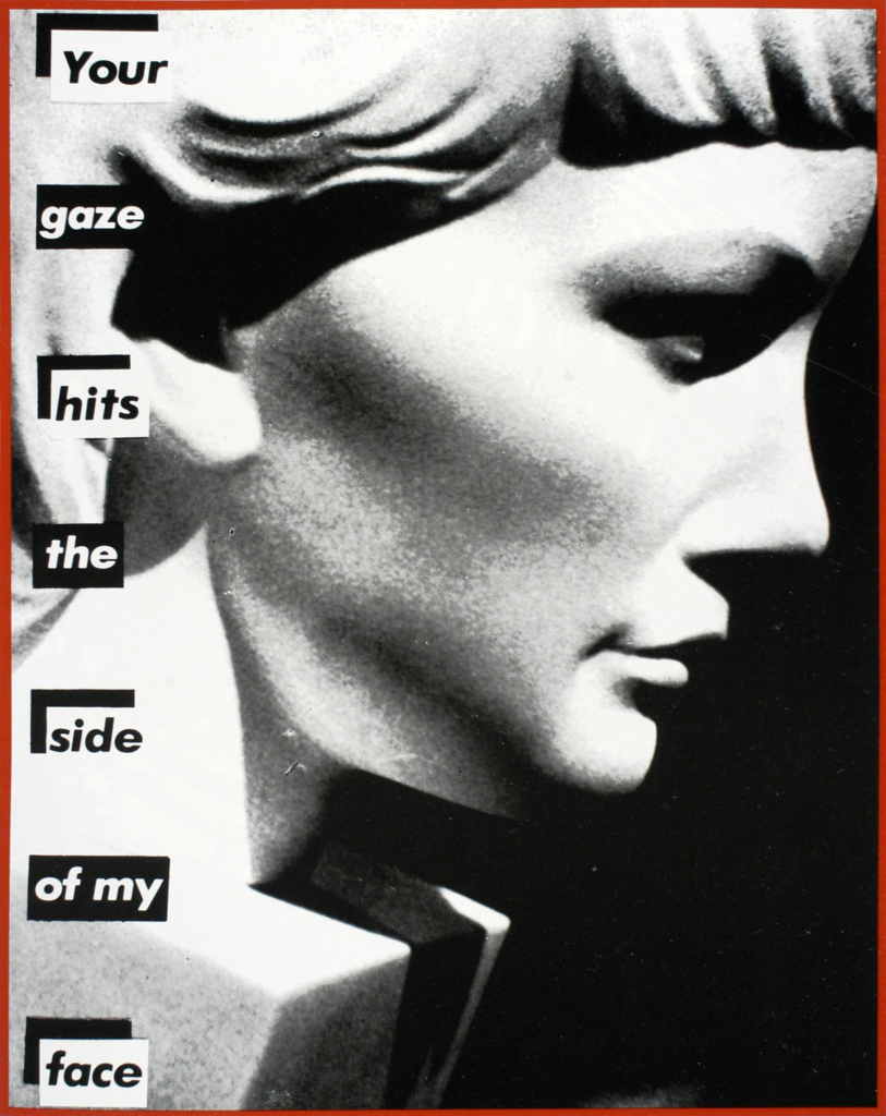
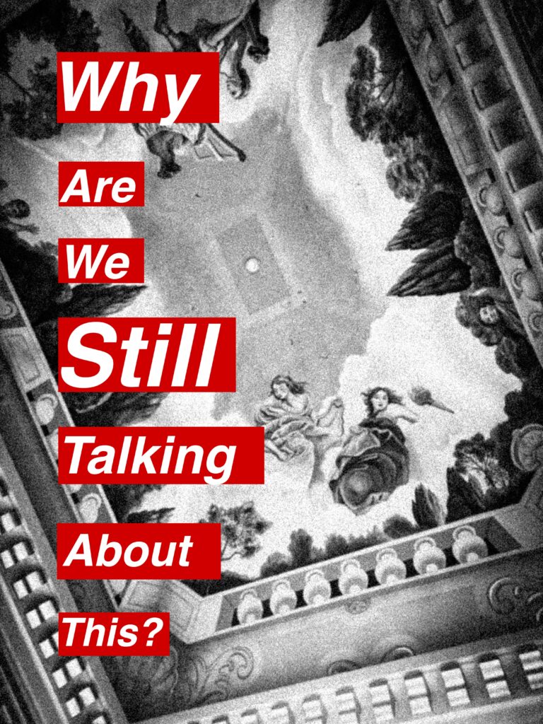
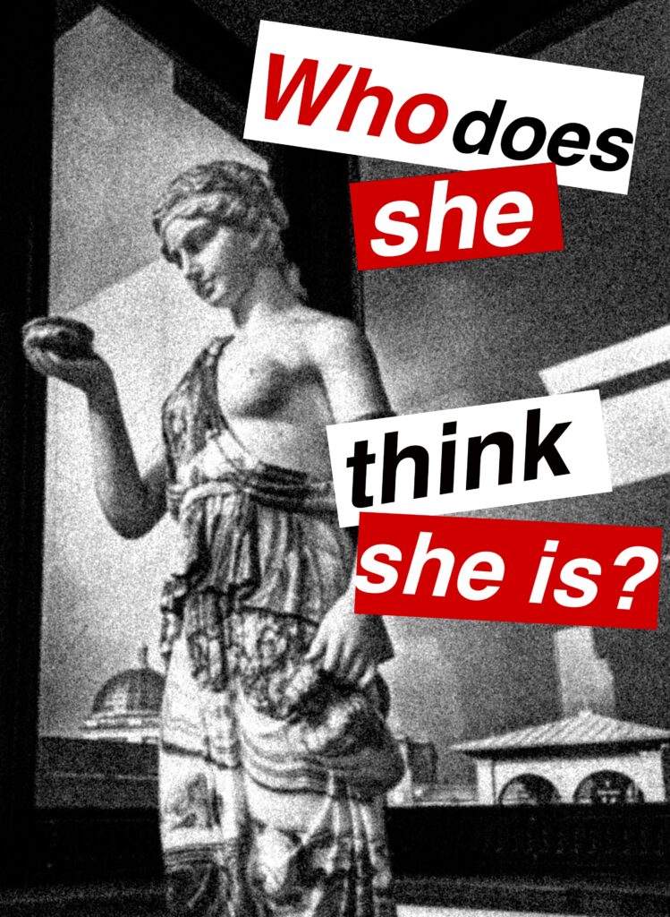
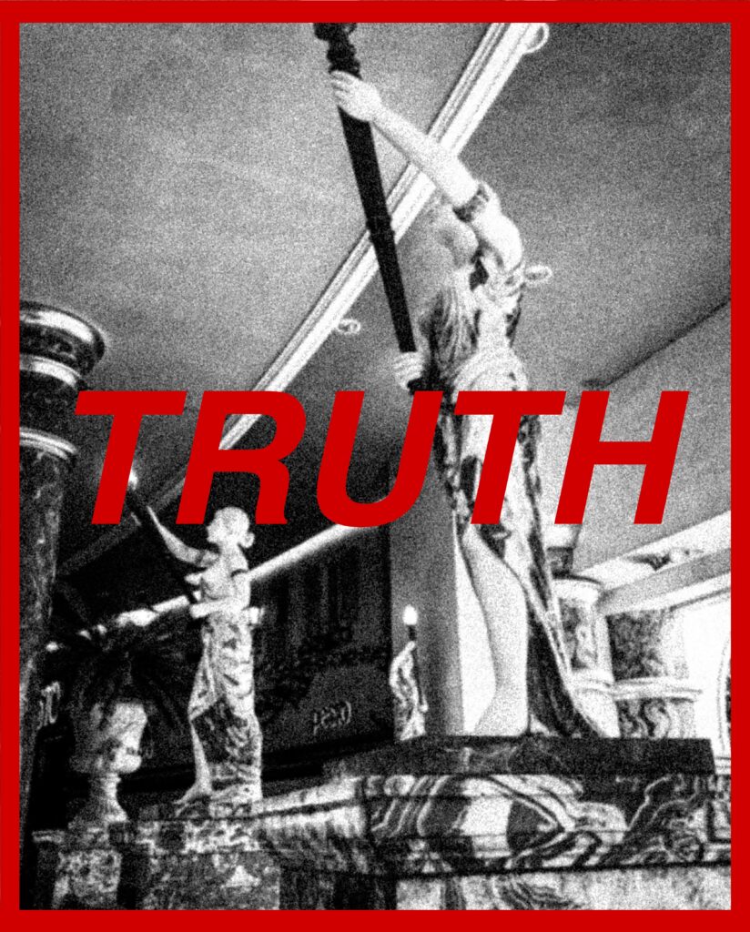
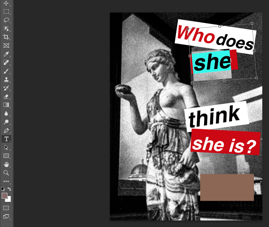
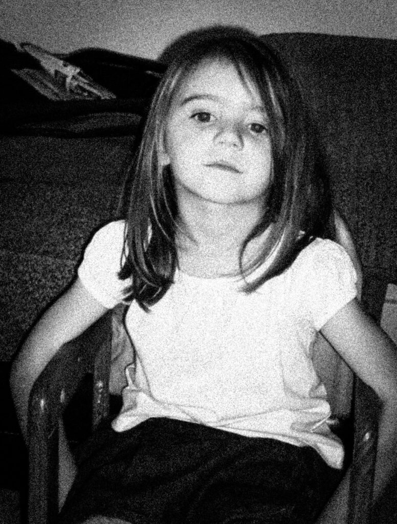
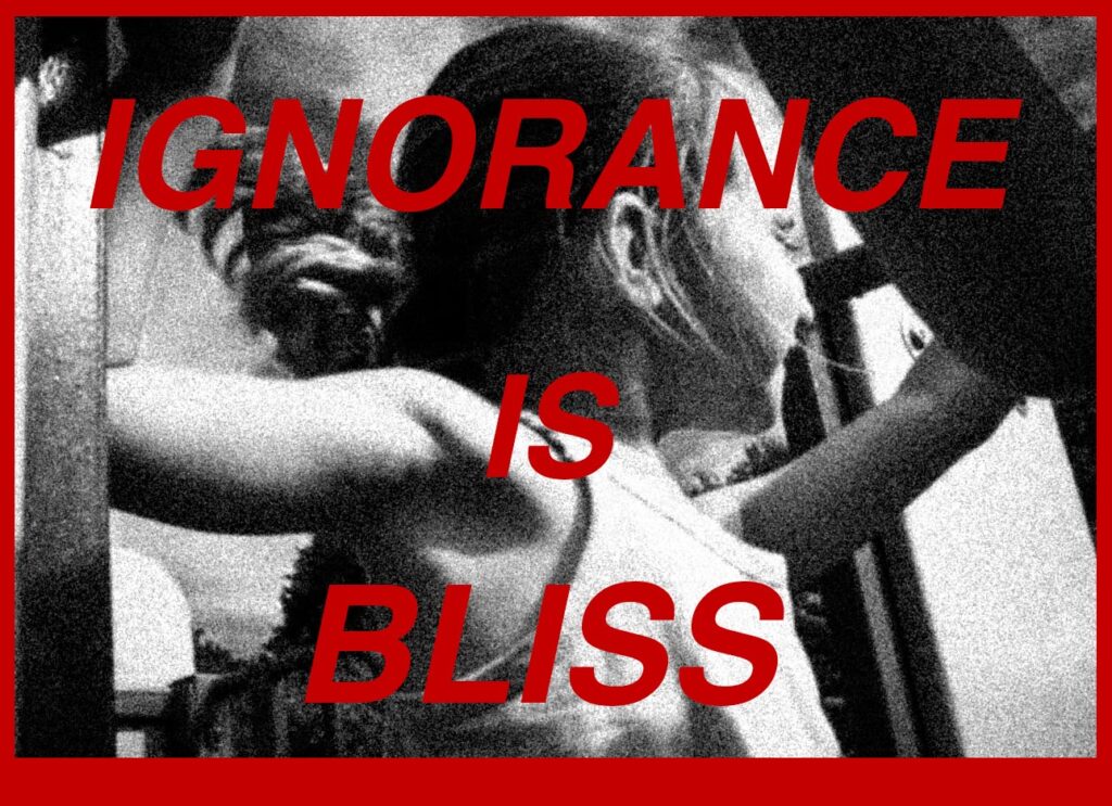
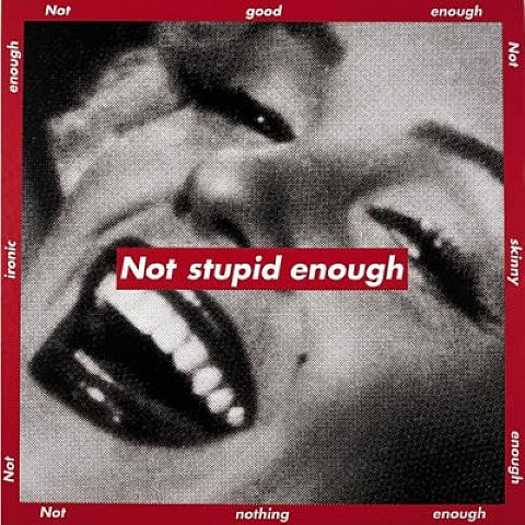
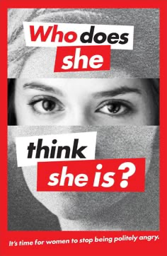
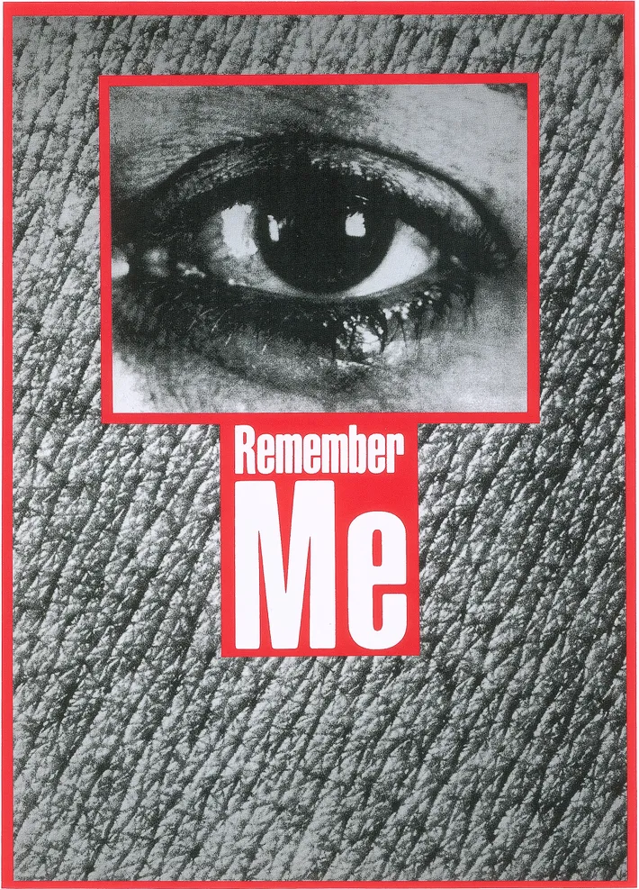
For this photoshoot, I was inspired by Barbara Kruger’s work where she writes direct and accusatory statements across her images in a bold red. I used archived images that I had found and experimented with Kruger’s methods using Photoshop.
Initial images:
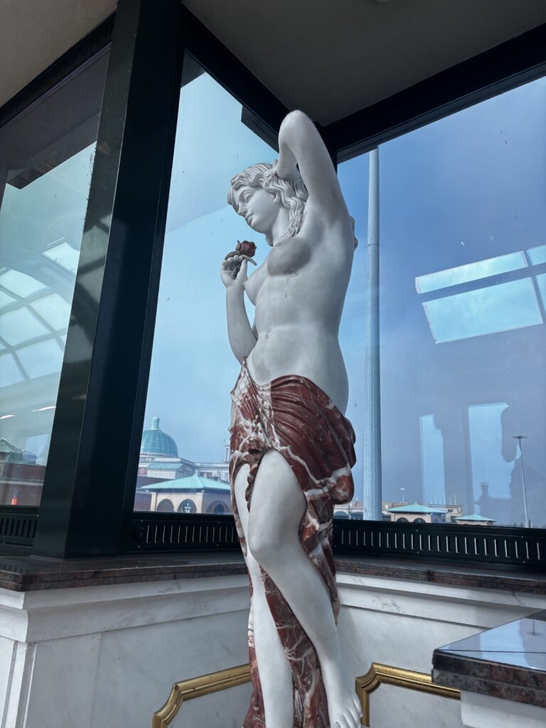
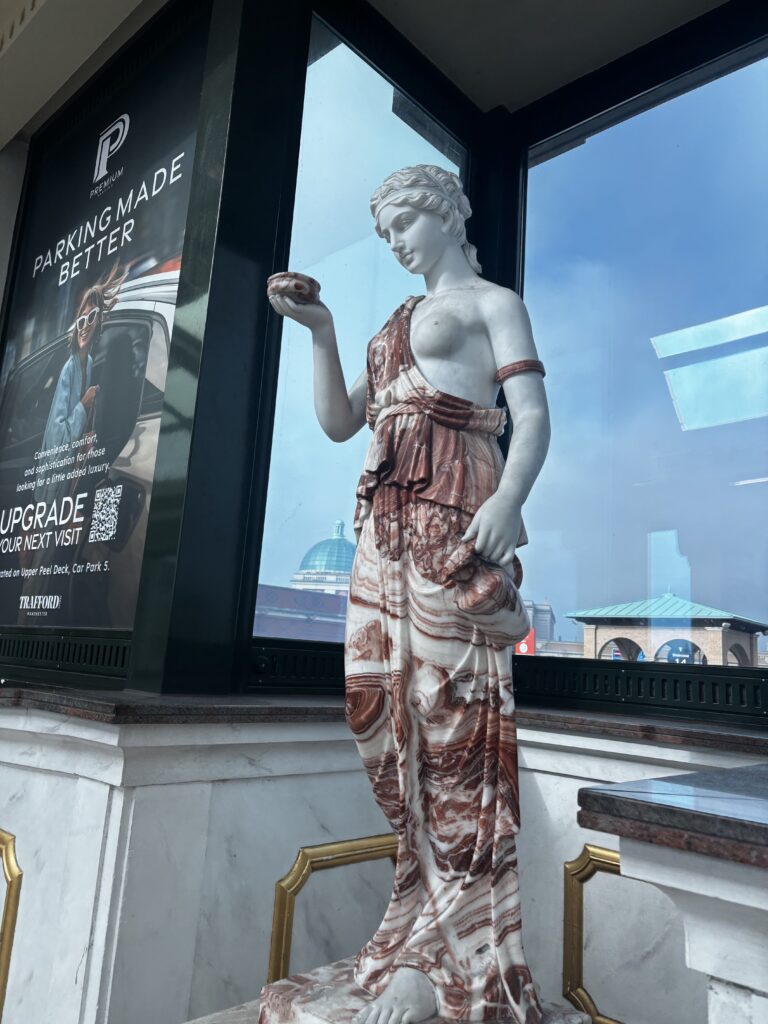
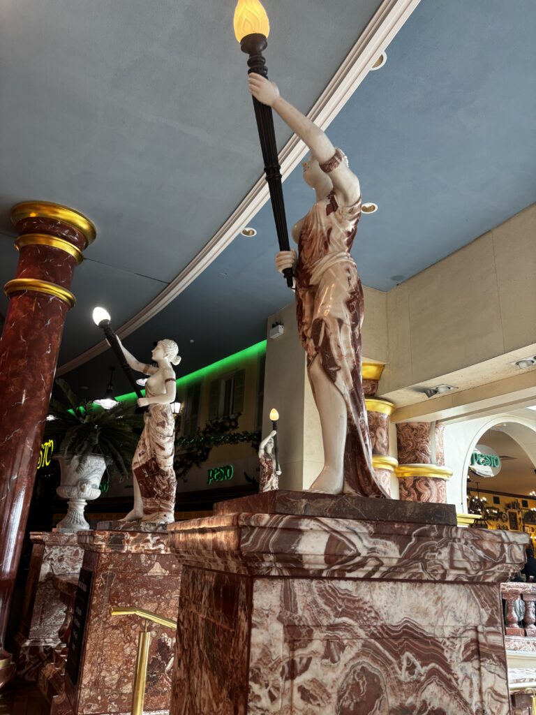
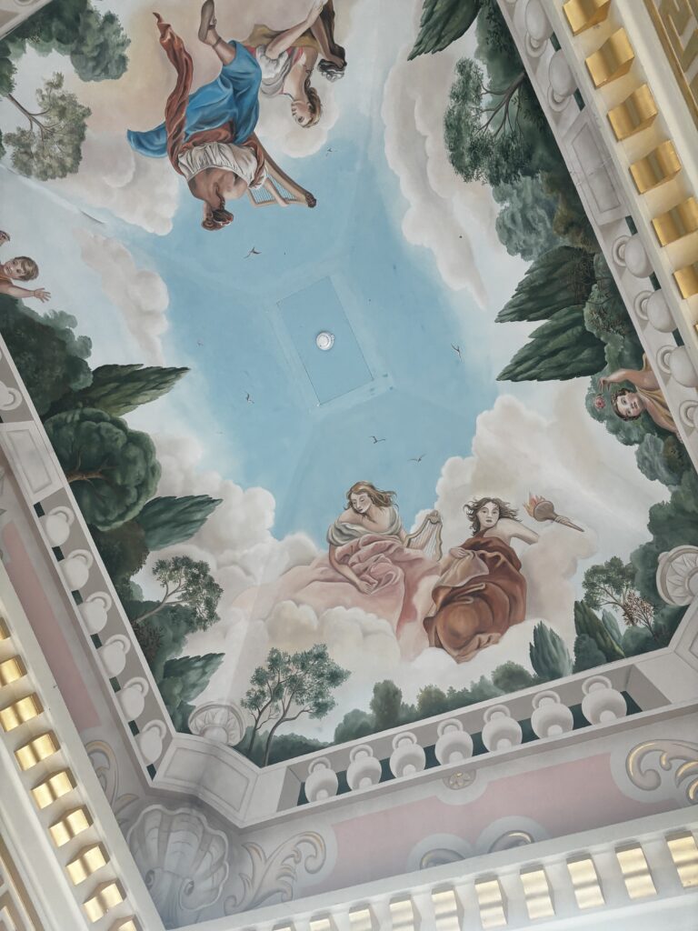
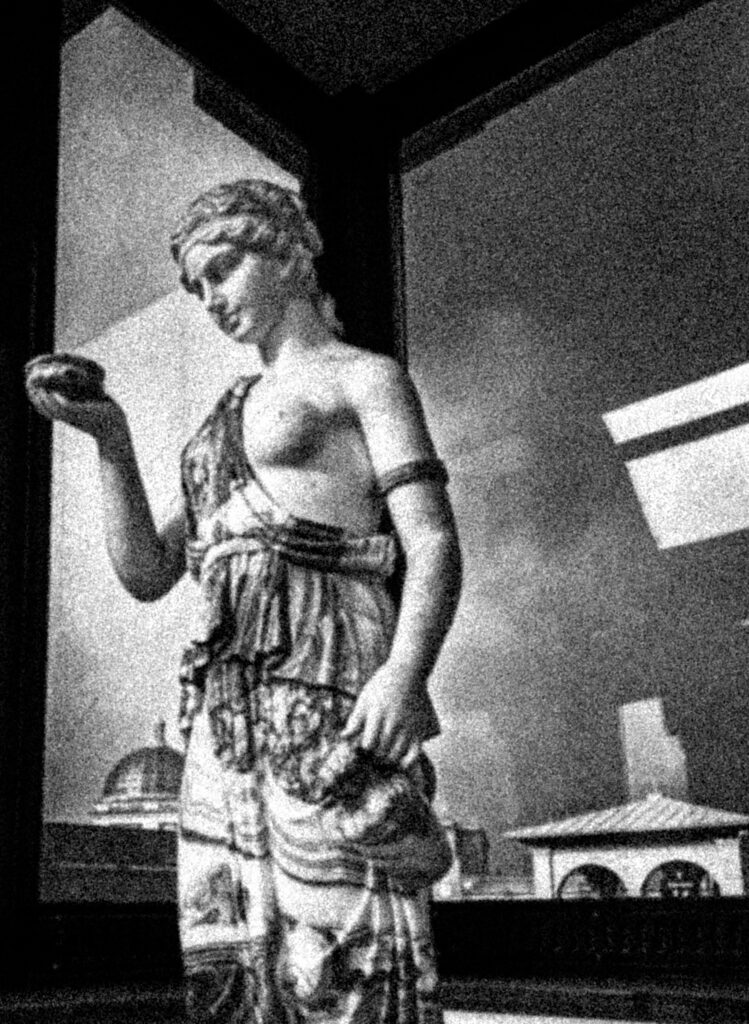
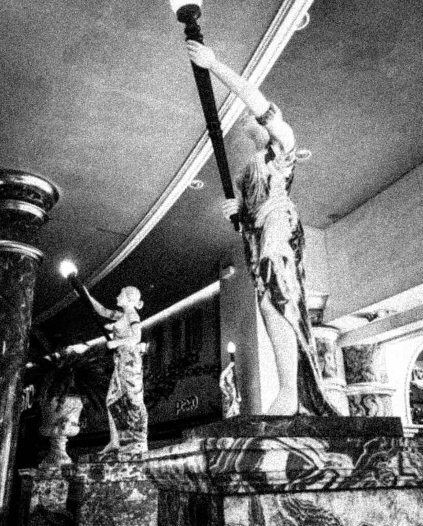
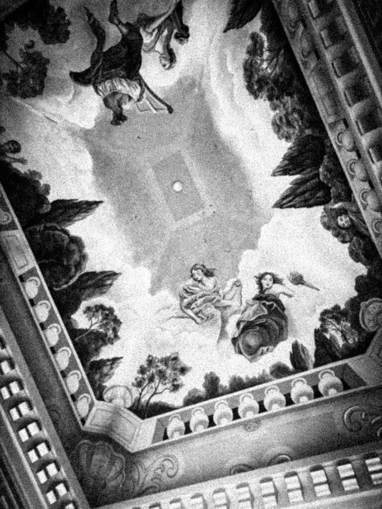
I first took these four images during my trip in Manchester as they idolise greek women in the form of Romanticism due to their dream-like nature consisting of a clouded, ethereal fantasy aesthetic. There was also a ceiling mural which I decided to photograph as it relates to the paintings of the Romanticist era.
I wanted to photograph these statues specifically because they represent the beauty standard during the Roman era, established by their hairstyles and clothing. These statues are typically nude or partially nude as a form of art, studying the anatomy. However, these statues of women often get treated inappropriately, for example taking photos of each other touching the statue’s naked body. This is a complete misinterpretation of what the statues were initially placed there for, taking an expression of art into a sexual way which demeans the female body and objectifies it.
Barbara Krueger often incorporates these statues into her work, so I felt that this would be a good nod towards some of the photographic content in her images:
Example:
First Edit:
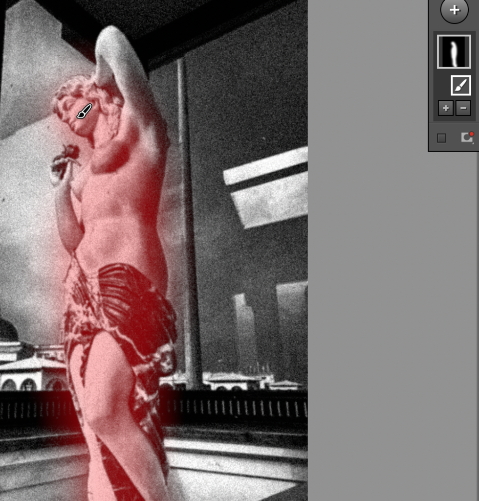
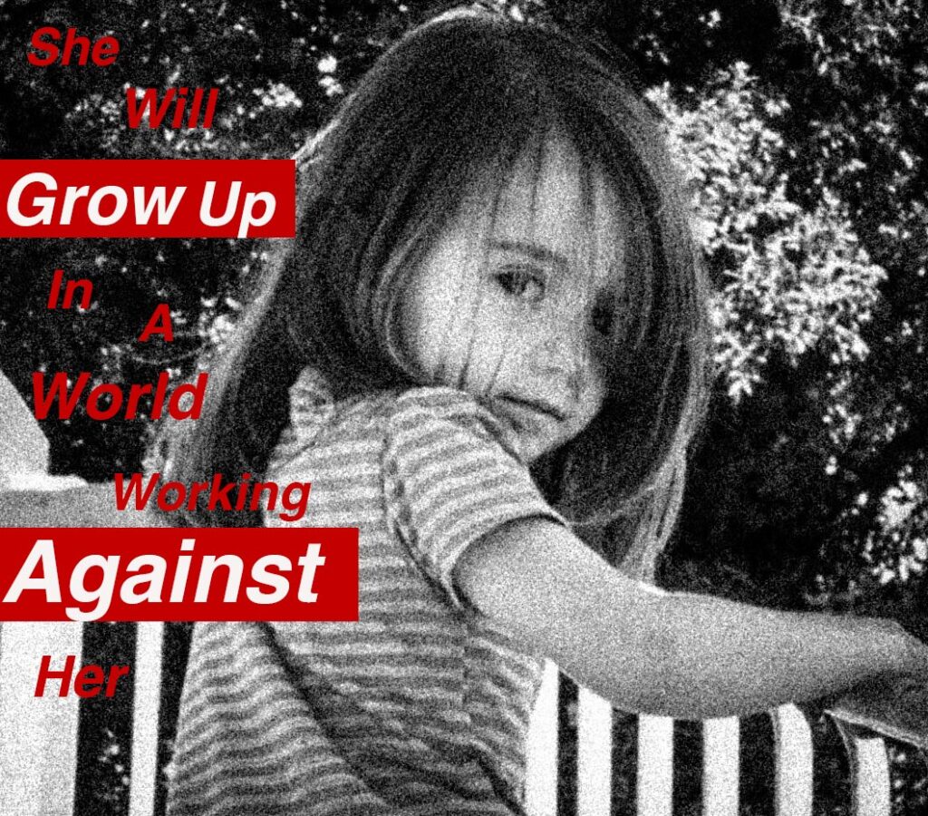
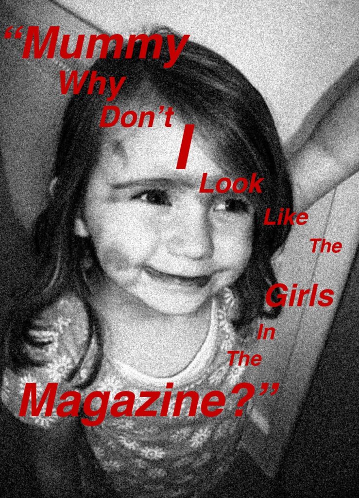
Upon editing these images, I wanted to make them black-and-white as this is a running theme in Kruger’s work so I felt that this would be able to clearly show relation. As Kruger tries to make her images look old and archival, I decided to increase the grain of the images fully to get this effect, then playing around with the size and amount to see what best suited the exposure of the images to make sure it wouldn’t look too dramatic or over-emphasised.
After this, I also added a slight vignette to all four images to make the edges of the image darker to centralise the focus of them. I paired this with editing a high contrast on all the images as Kruger uses a deep black-and-white tonality in all images that I felt wouldn’t be reflected in my images otherwise as all the blank-and-white filters made each image’s tonal range too vast, instead of a more blocked-colour approach.
Final edits:
To do these captions in a similar way the Barbara Kruger does in her work, I used the rectangle tool to create these, then used the colour wheel to select a shade of red the most similar I could. I used this to create rectangles of different widths and lengths, then rotated them depending on which image I was gaining inspiration from.
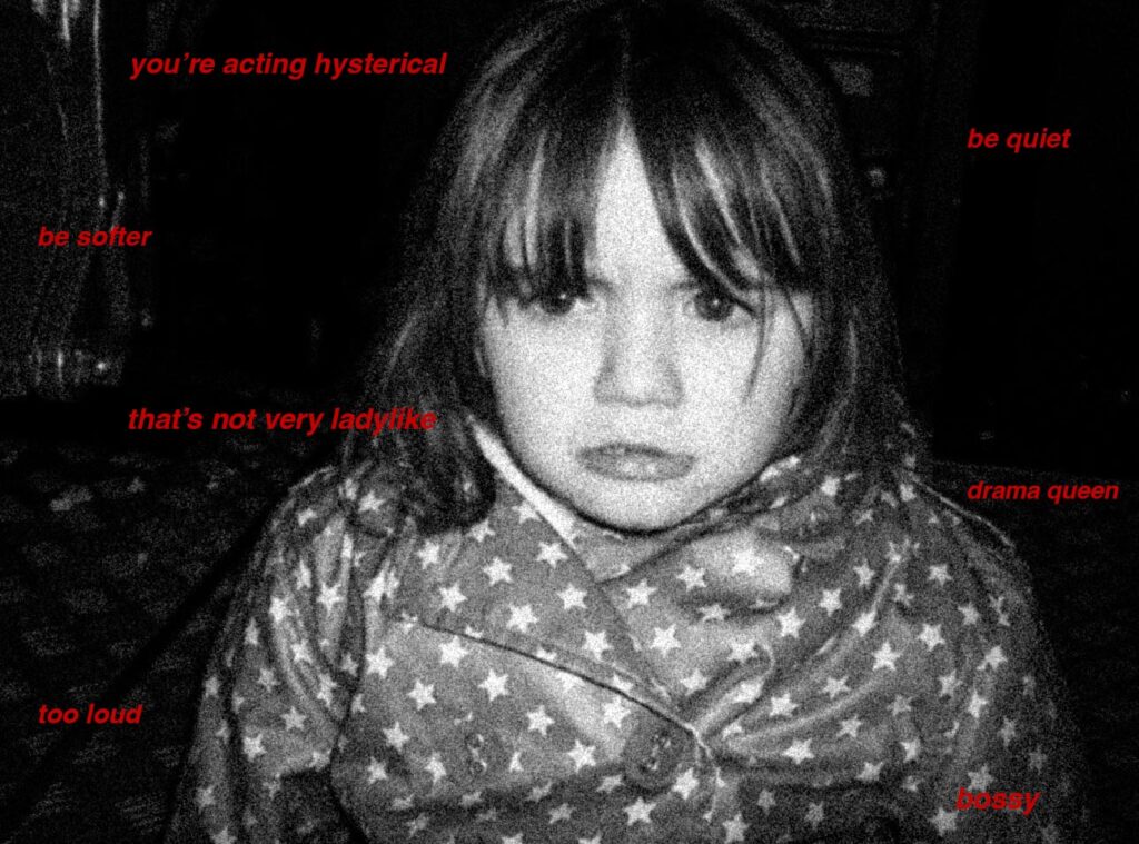
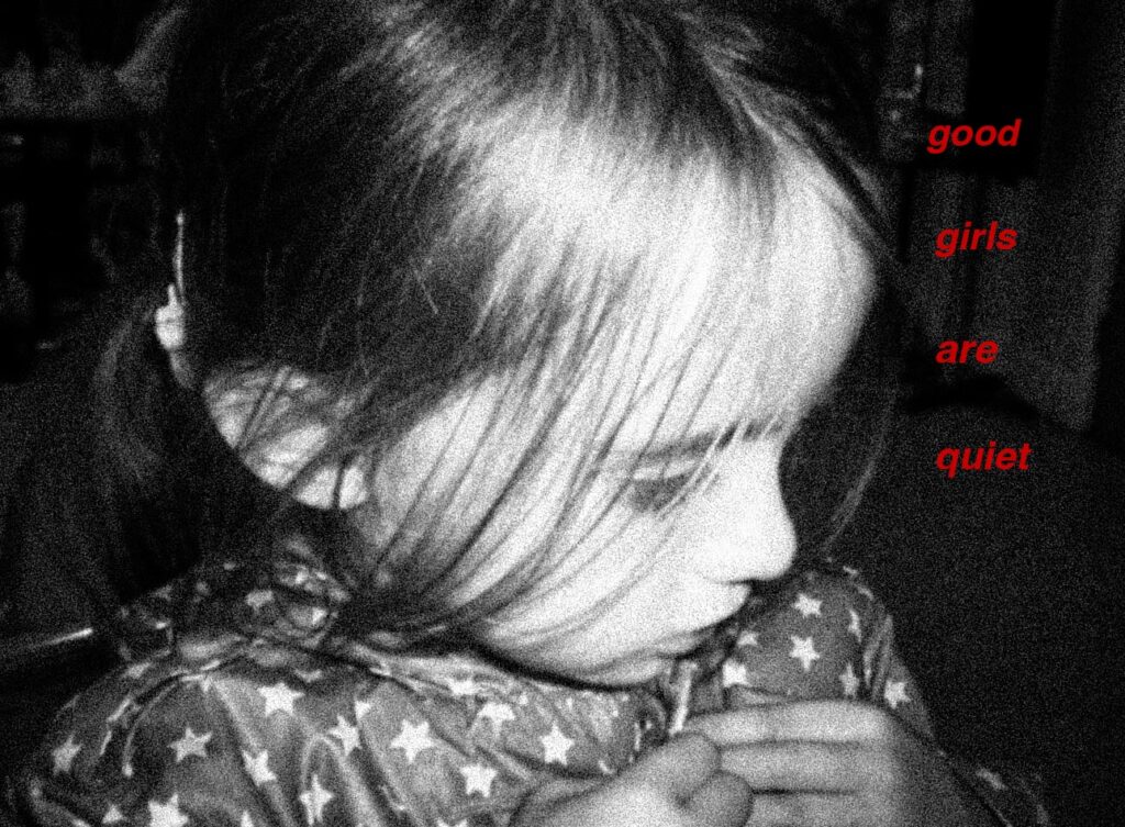
I then would use the text tool to create either 1-2 words and put them into the caption, however I would only input one word into each text box so that I had entire control over the colour and angle I wanted each word to go into. I used inspiration from Kruger’s similar images, however for some images I created my own captions that I felt related to the Feminist movement in brief but direct ways.
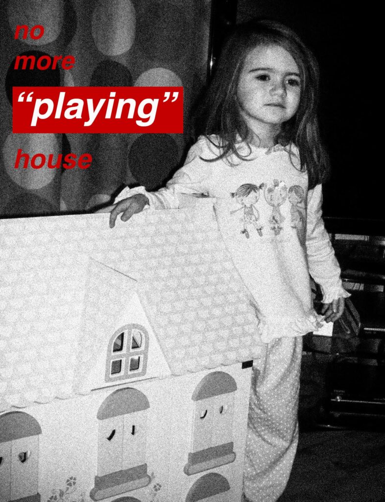
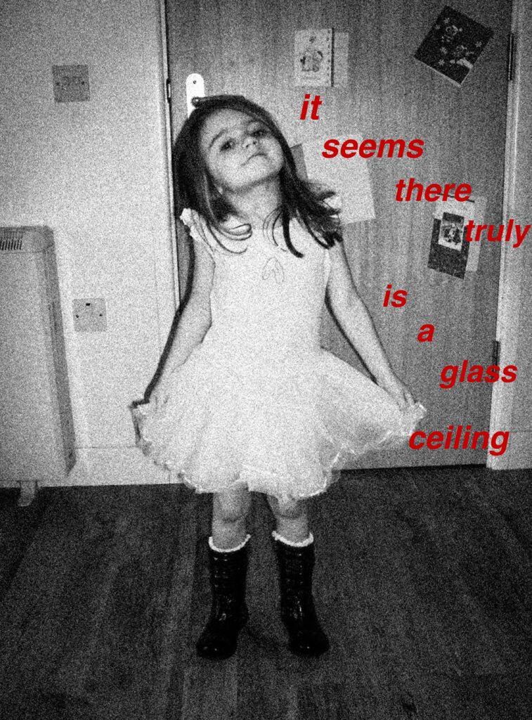
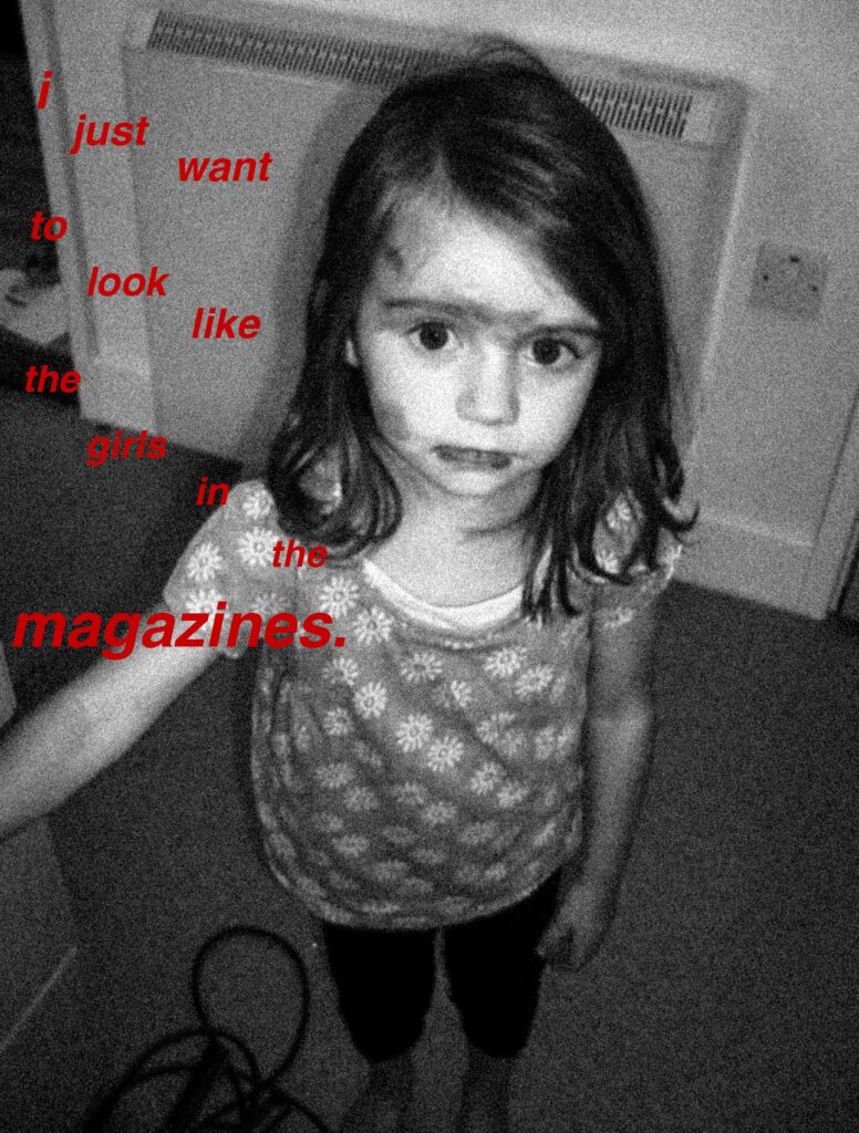
I didn’t want my work to be too explicitly related to Kruger’s images as this could come across as very basic or simple so I began to think of other images that I could use. I decided to begin compiling not just archived images of myself, but other women and girls that I know and use their childhood images as this is would be emotionally-provoking when paired with similar interrogatory phrases that Kruger uses linked to feminism.
I also wanted to incorporate the childhood images that I have from my family archives because this is an issue that is extremely relevant to me and actively affects me in my day-to-day life. I wanted to involve those around me to show how this is a universal issue that isn’t restrictive to me only. Following this, I decided I also would like to do a vertical linking of me, my mum and my gran to show this generational development of the beauty standard, and how many of the battles that the Suffragettes fought are still rife in society, and how even the progress that they fought for is going back in time in many countries.
I followed the exact same procedure for each of my images during this photoshoot and ensured I used the same shade of red across all the images, being #c40000, and pasted this so that I wouldn’t accidentally use a different shade and make the images inconsistent.
Throughout my further images, I varied between black, white and red like Kruger, however I used different phrases to make my work separate from hers.
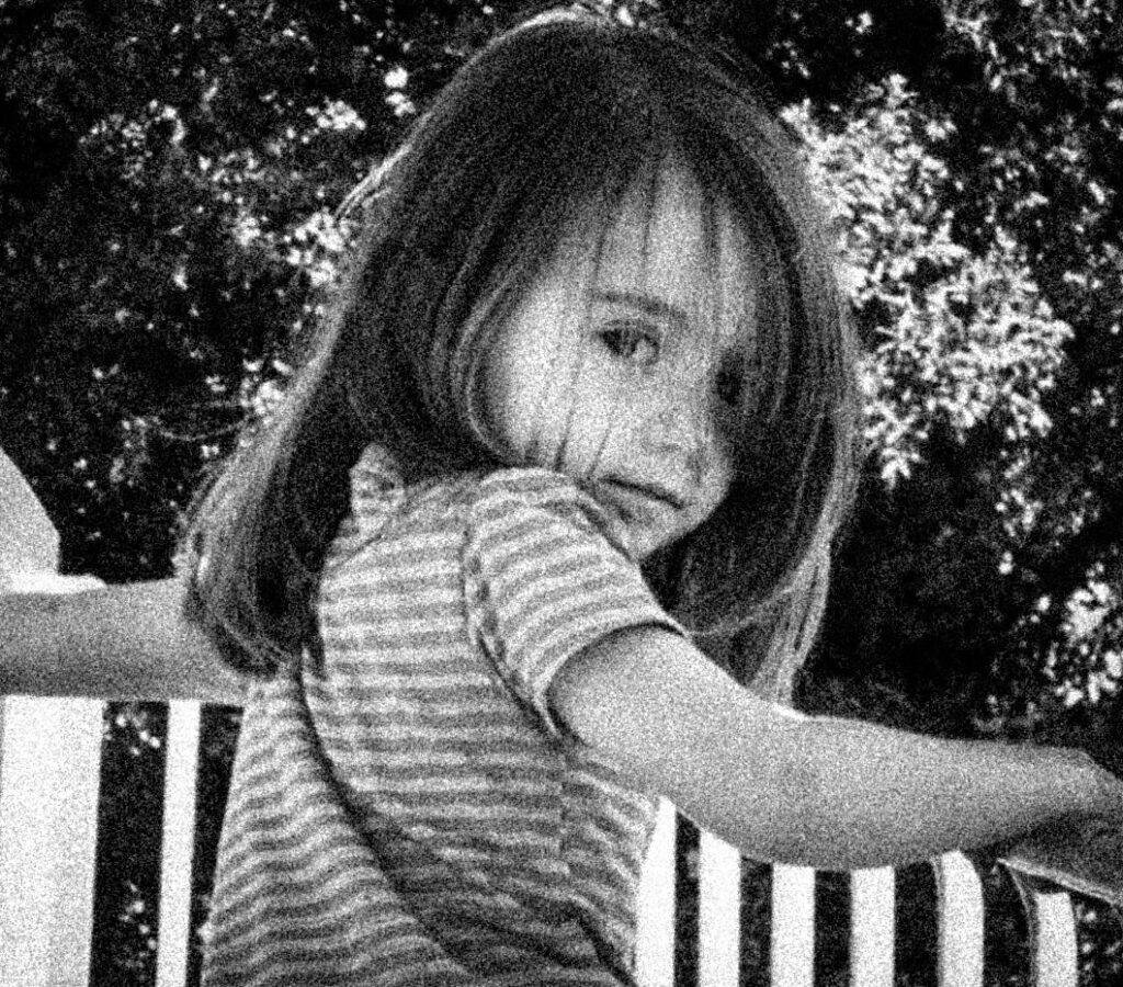
Original images of me:
Some of the images had poor resolution whilst others were actually quite high, however this wouldn’t affect the final outcome of the images as there was a grain added to all of them as well as a monochrome tone to recreate the Kruger aesthetic.
Initial edits:
Final edits:
I also wanted to include more contemporary-styled edits of archived images as Barbara Kruger created these images in the 80s, styled in the way that magazines and different media was during this period. As there was no social media when she created these images, I wanted to hone in on Instagram as this is where many of these unrealistic standards are portrayed in the modern world.
This will allow me to make comparisons between then and now in my photobook, and how these different issues have festered and grown through the decades. This will enable me to highlight how many of these issues have not been tackled even though they have been challenged for a long time, as well as the new issues that have grown and been created. By doing this, I can also show how the beauty standard has been changed over time and how different features become more or less ‘desirable’ in the public eye.
The specific images that I was inspired by for this photoshoot:
I started to look for material that I could use to link me, my mum and my gran to this topic. I was able to find many images, both physical and digital, of my mum and gran in the past in order to link this.
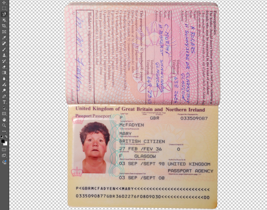
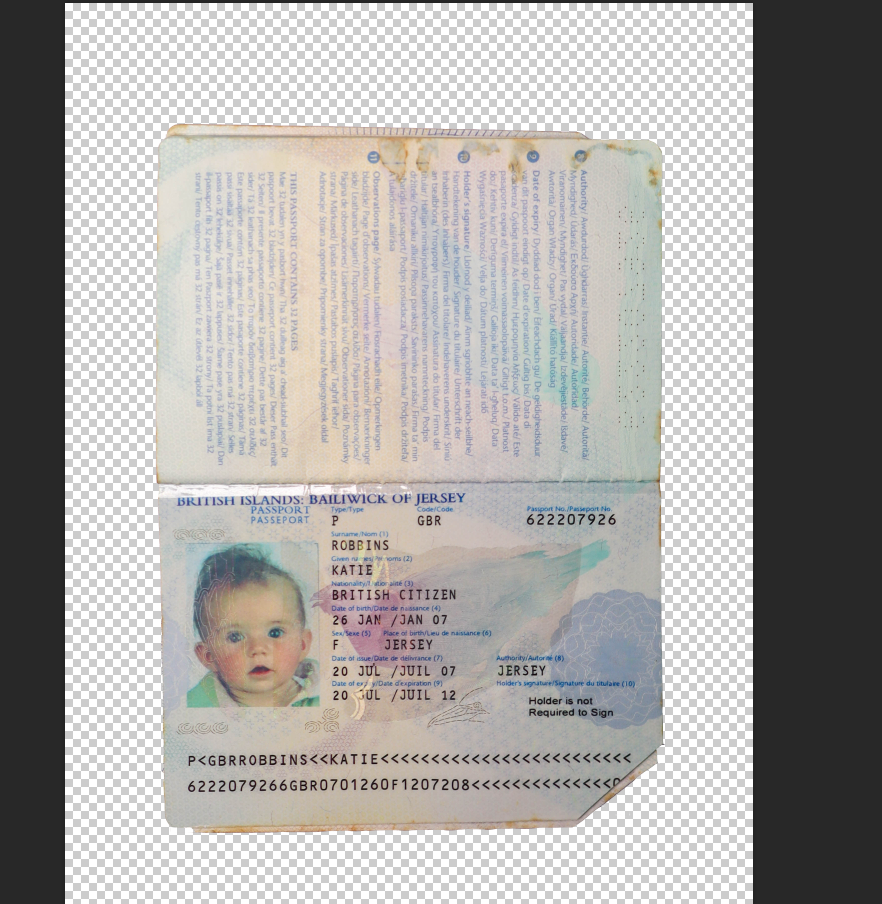
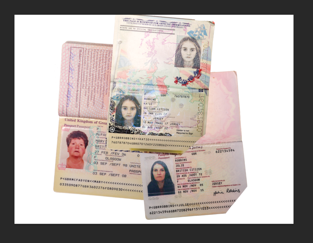
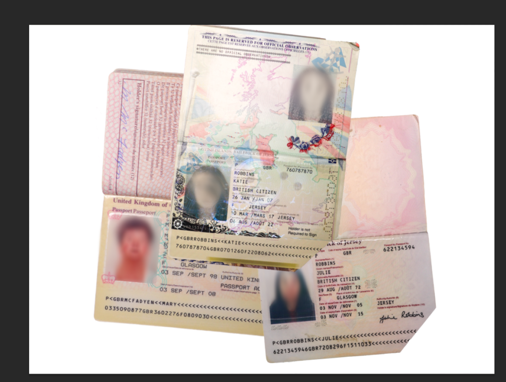
I wanted to gather images of my mum and gran with my dad and graded too as this way, I can use this to question traditional marital roles and stereotypes, especially when my gran was growing up. I also gathered a range of passports that my mum had kept which I think will be very useful in my experimentation.
Contact sheet:
I wanted to create more experiments in relation to Barbara Kruger’s work so that I could show a generational link using the women in my family to show that not only is Feminism crucial in a universal way, but also how times have changed from then and now – this will allow me to explore different timelines of Feminism and the variation of attitudes and opinions towards women. However, I have already created images that are closely linked to Kruger’s, so now I am looking to develop on these ideas more through these experiments.
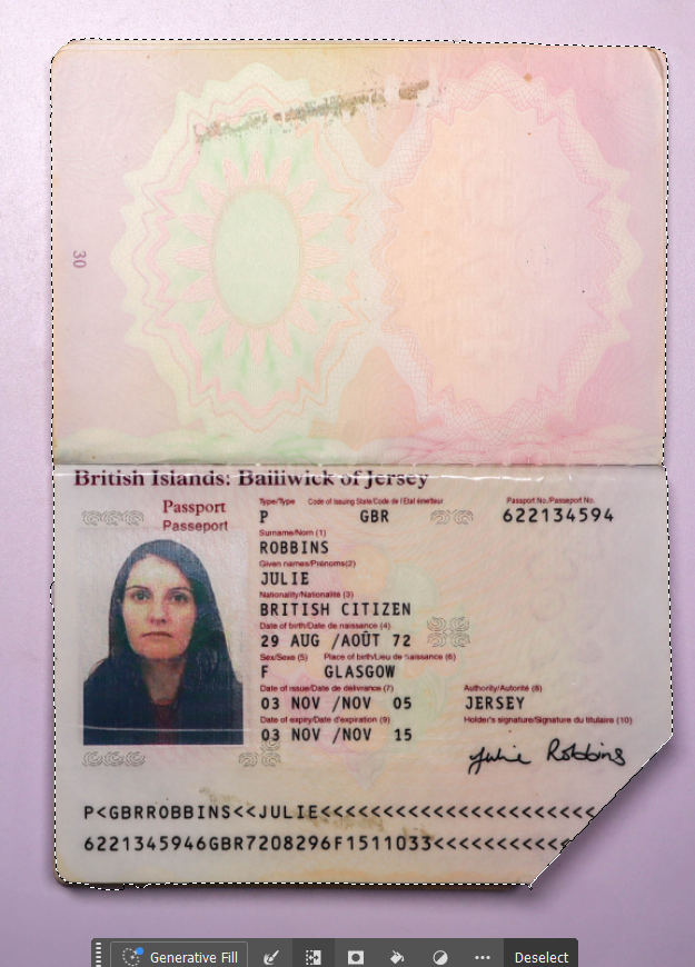
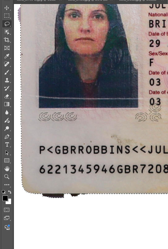
I used the magnetic lasso tool to cut out my gran’s passport as this tool sticks to the sides of what is trying to be cut out so that I can ensure that the lines are accurate and straight. I then repeated this with my childhood passport as well as my mum’s when she was younger.
I did this by outlining what I wanted to keep, and then using the invert selection option on the tool bar so that I would be able to delete the background. This made it easier for me s otherwise I would have had to cut the background out individually which could have made the image come out messy.
I then went and refined any edges that hadn’t been cut out using the magnetic tool. I wasn’t sure whether to use a baby passport or a child passport for this idea, so I just cut both out as whichever one I don’t use can be used for another idea.
I decided to use the childhood passport as I think it is able to align with the topic of feminism more than a new born would. Whilst I am using baby pictures, this idea is more suited with a child’s photograph.
I layered the three passports and began to think about what I could do next to them.
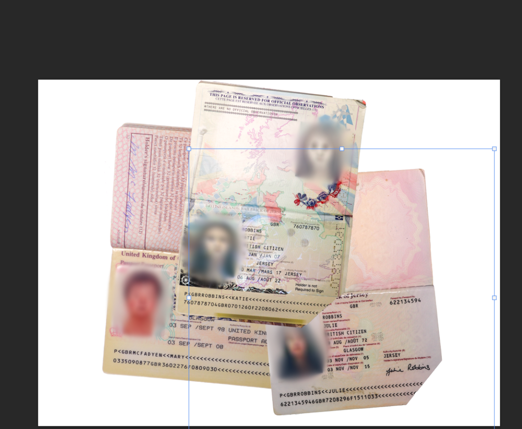
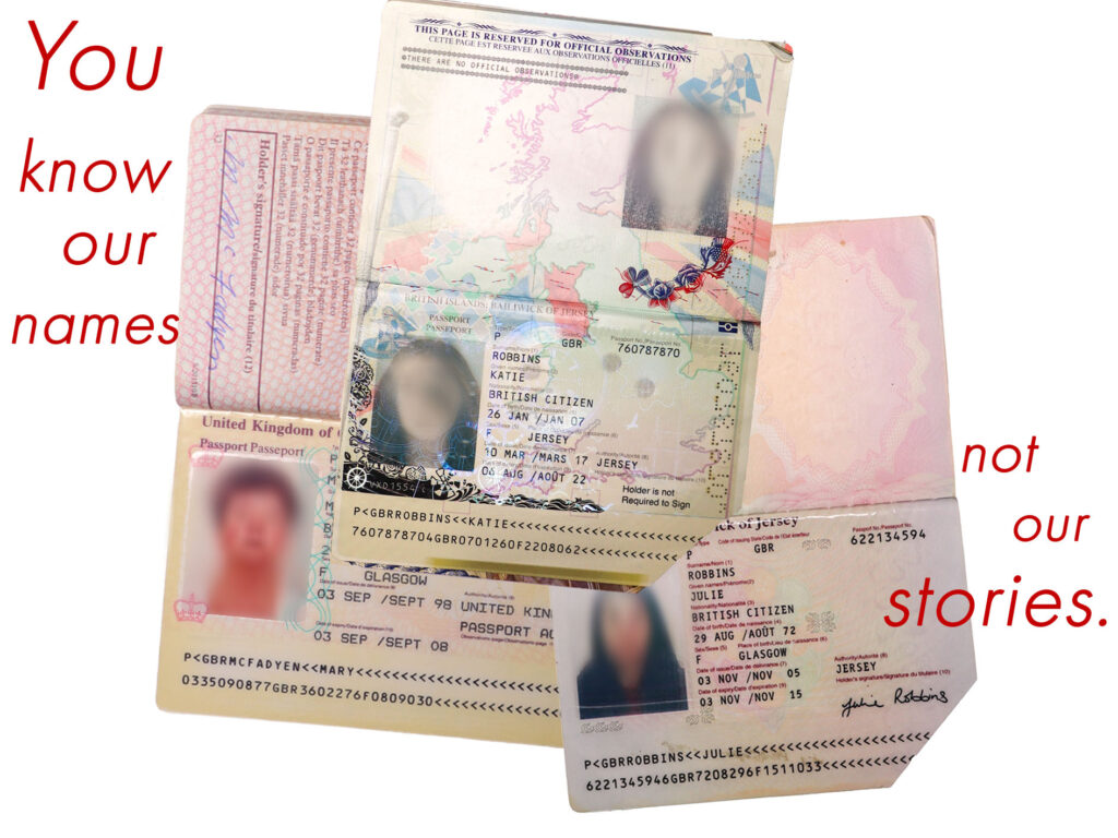
My first intial idea was to use the brush tool in the same shade of red that I used in all of my other Barbara Kruger experiments, however this looked strange and out of place. I also couldn’t really make it look right and I didn’t want to waste time trying to make it look suitable. I also tried to use generative Ai to get a realistic enough red string, however this was difficult to do and did not give me my desired result:
I then changed the pen mode to clean the brush after each stroke, meaning that I could make the images blur together instead of using a vibrant colour that would look out of place. I initially began by moving the mouse in circular motions around each subject’s face within the passport to get a blurred effect on each face:
This was quite messy due to the flow however it was necessary in order to make the blurring soft instead of harsh as this would have made the image look too exaggerated. I then used the healing brush tool to clean up the edges.
I then decided how I would like this to be laid out:
Using Photoshop, I experimented further with my edited photos from Lightroom.
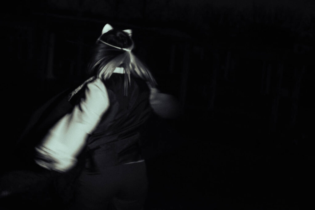
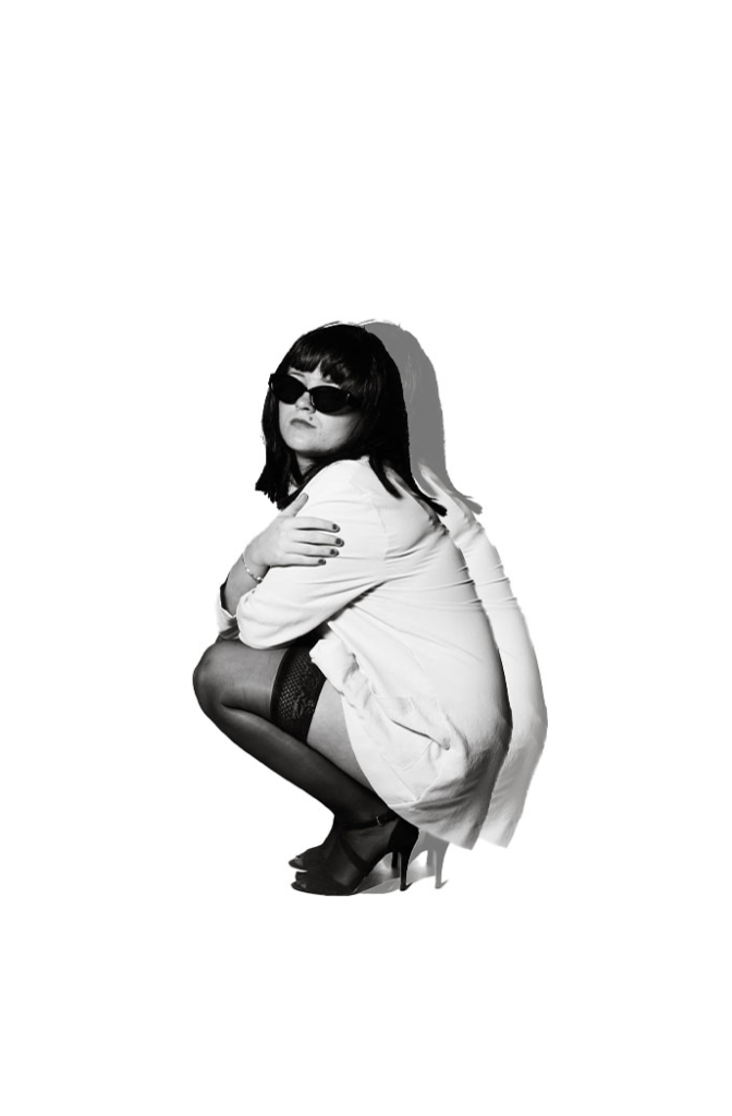
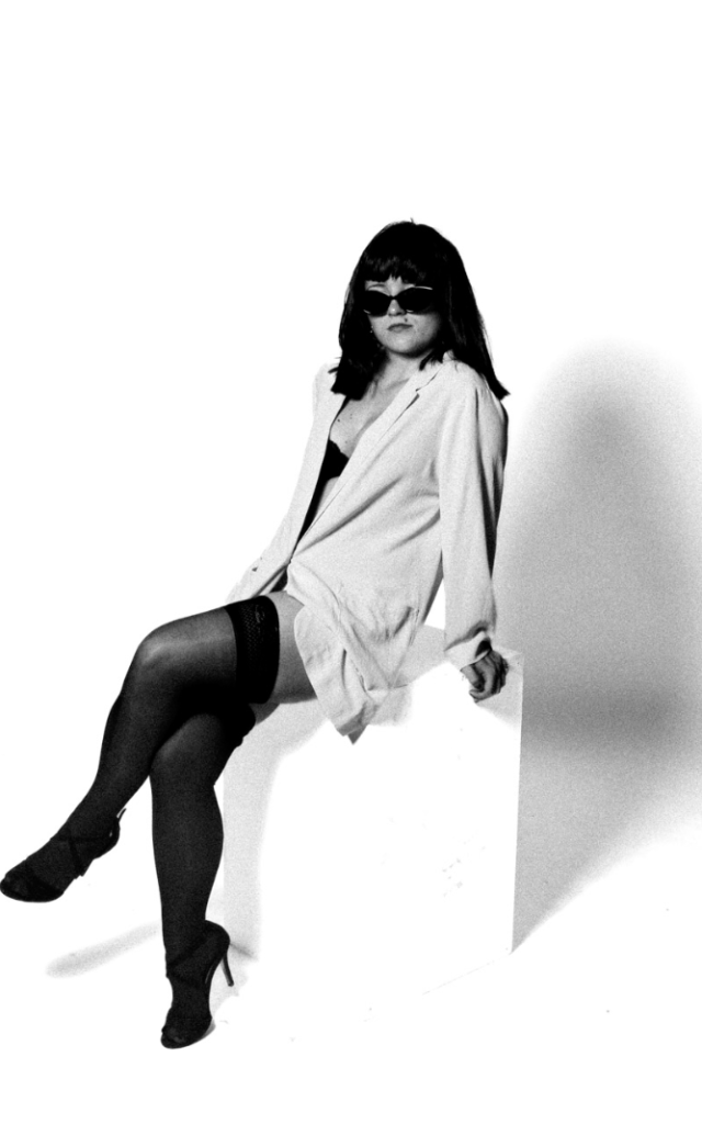
Selection of photos:
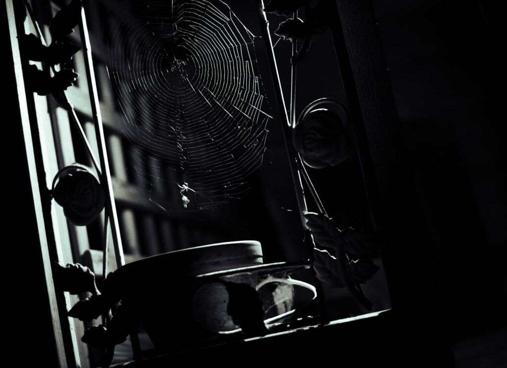
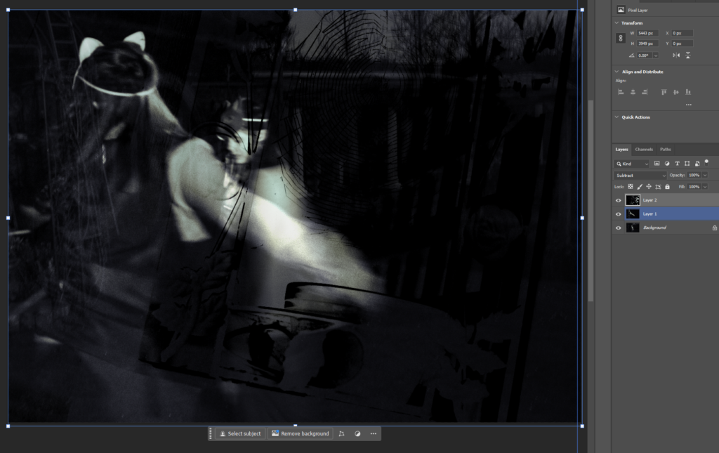
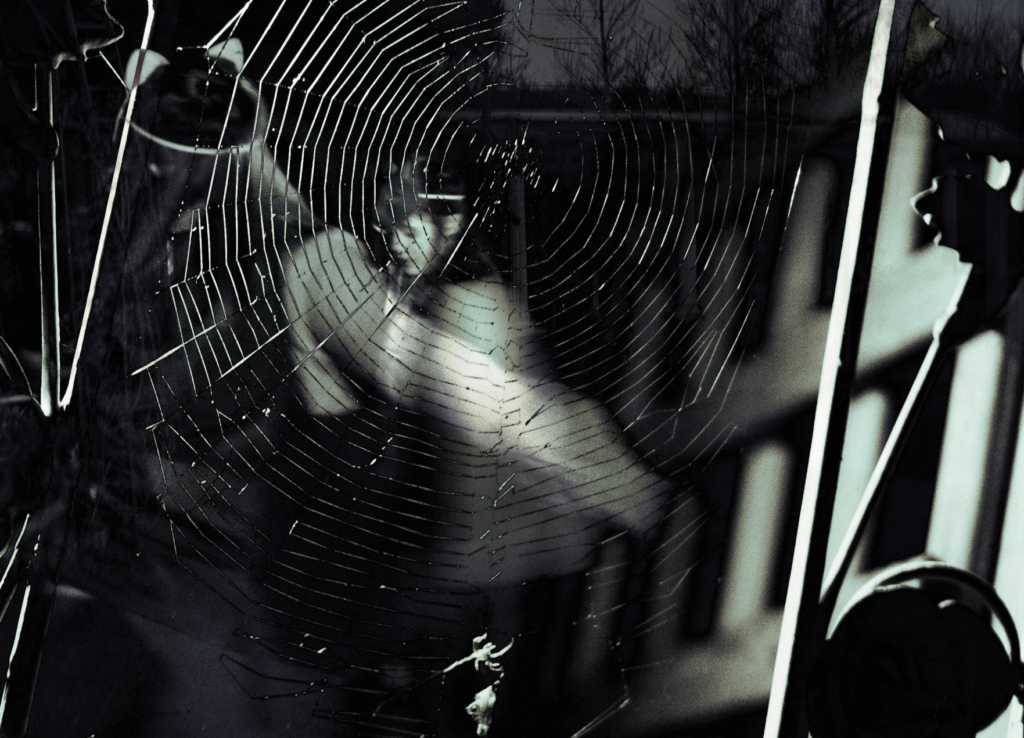
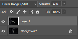
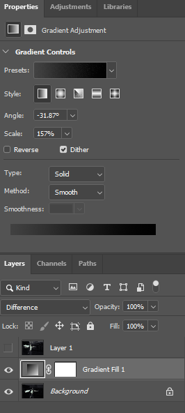
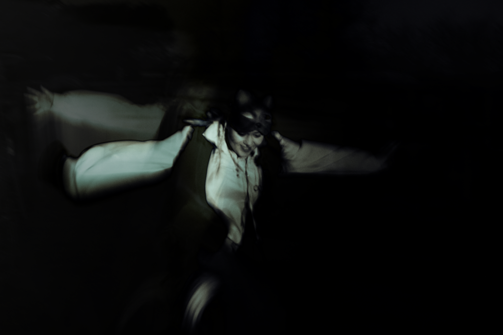
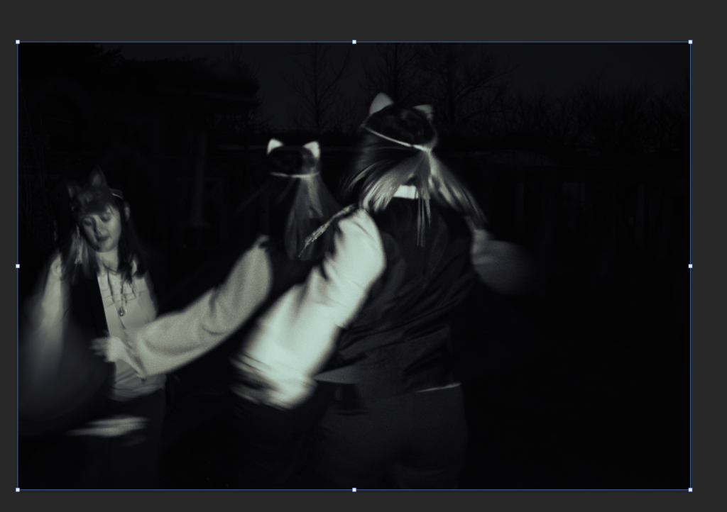
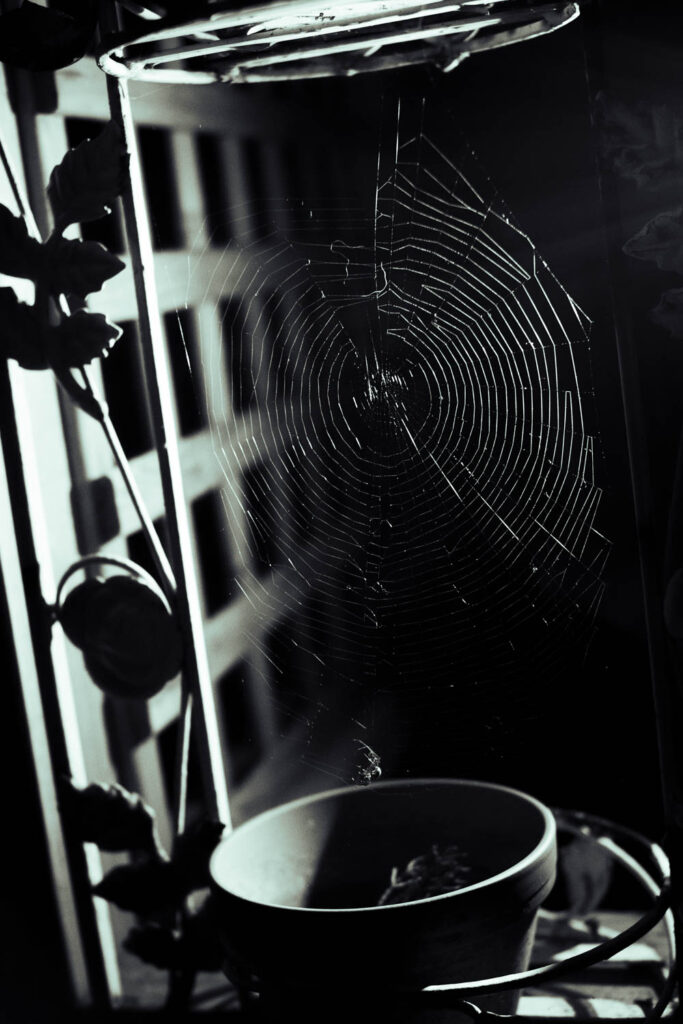
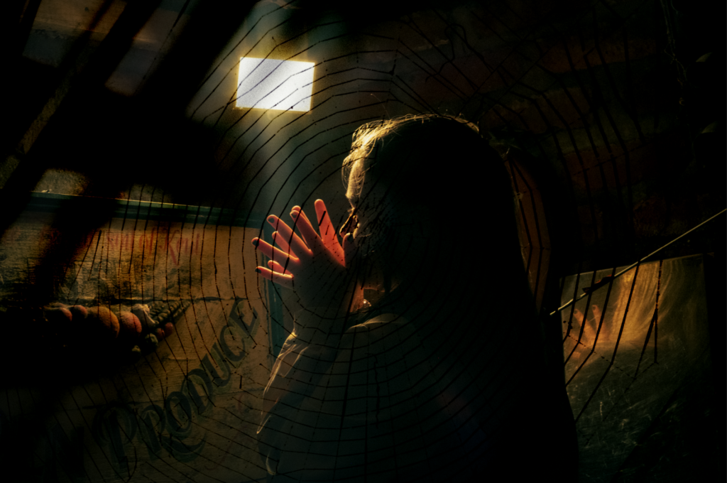
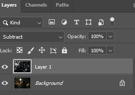
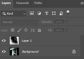
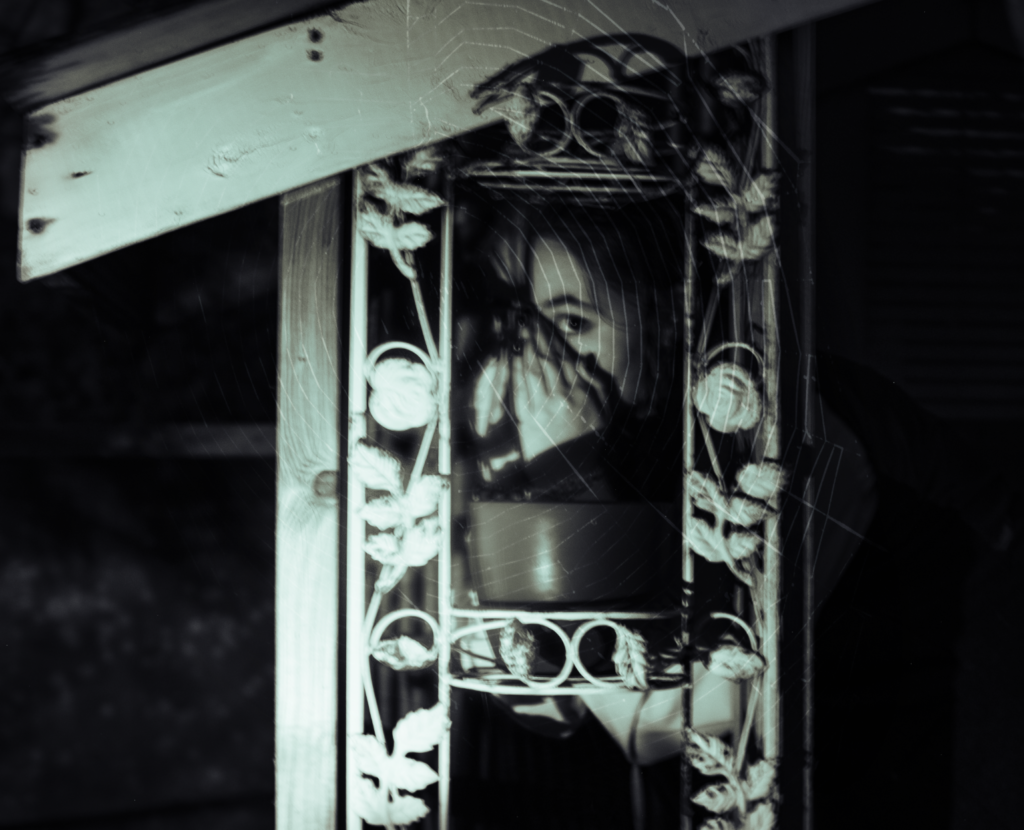
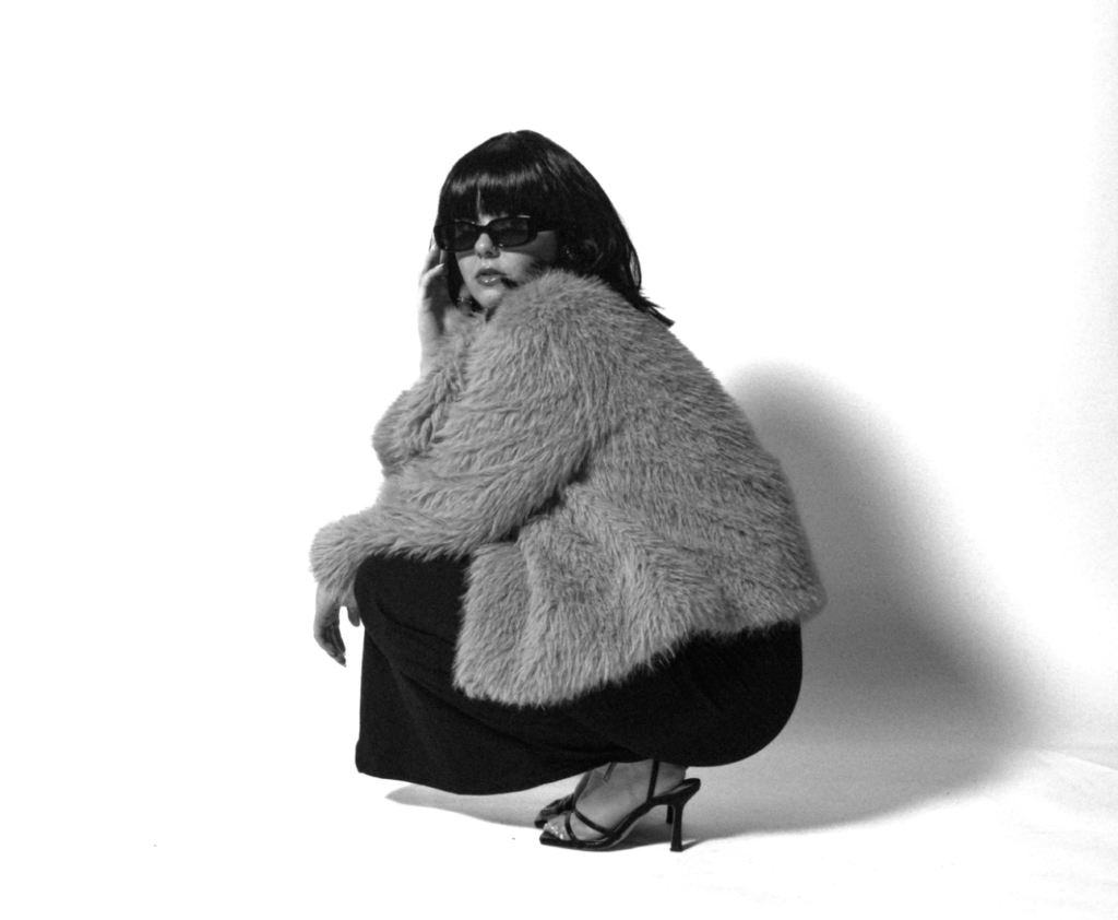
For this edit, I had an idea to make it look like the figure was being trapped or round up by another- using my photo of a spiderweb as a source of inspiration. Once I decided on how I would merge the first two photos, I changed the second photo to a linear dodge (add) layer and decreased the opacity to 83%. Finally, I flipped and positioned my photo of the spiderweb to where I felt it fit best, where the spider at the bottom of the photo is still visible, and changed it to be a difference layer.
Final edit:
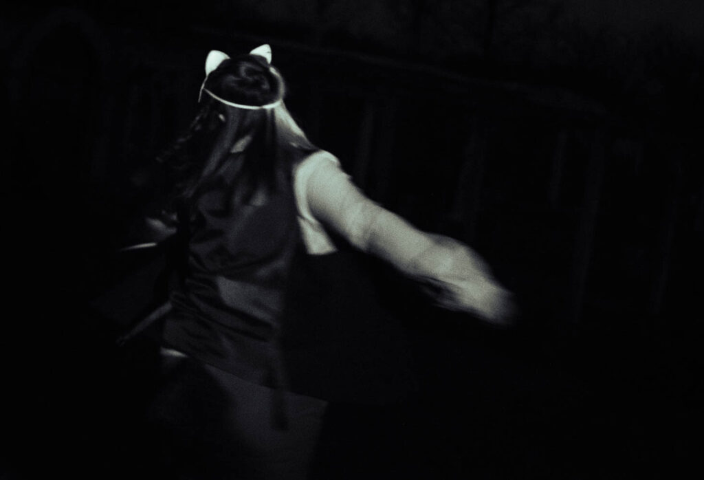
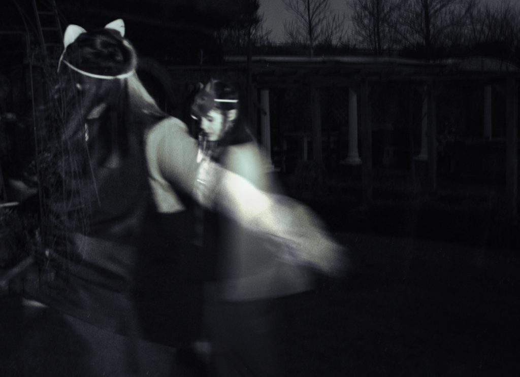
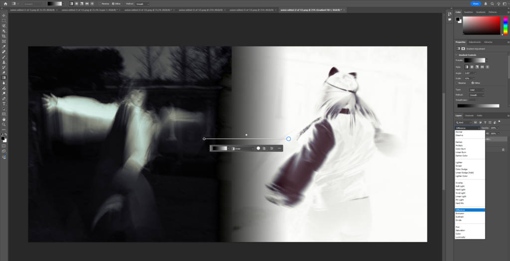
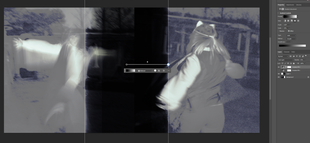
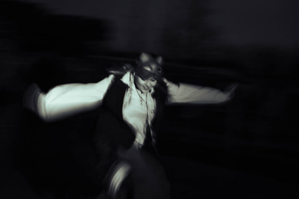
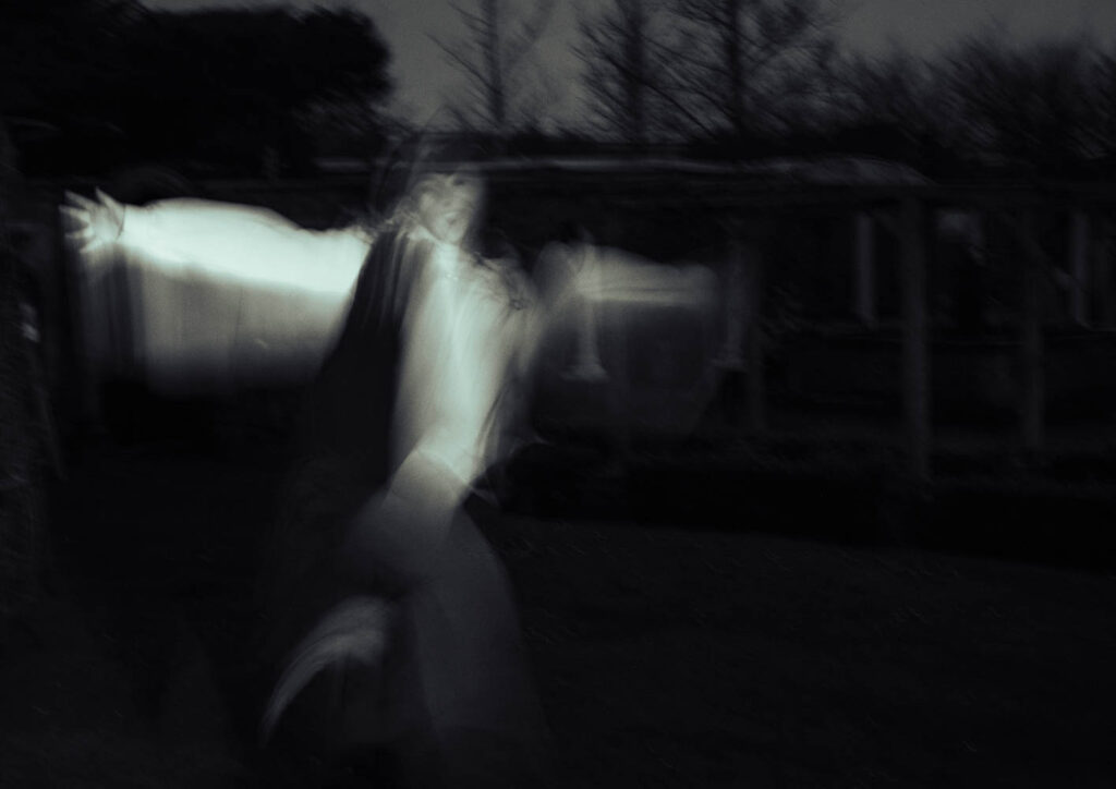
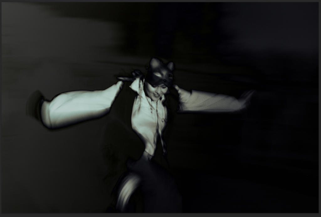
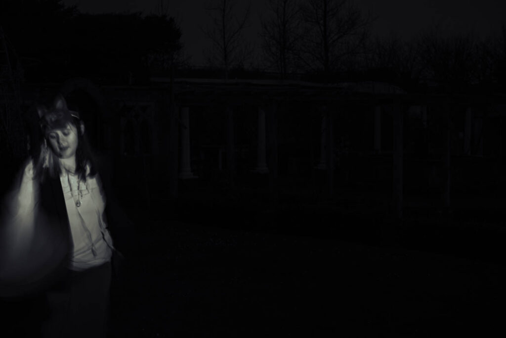
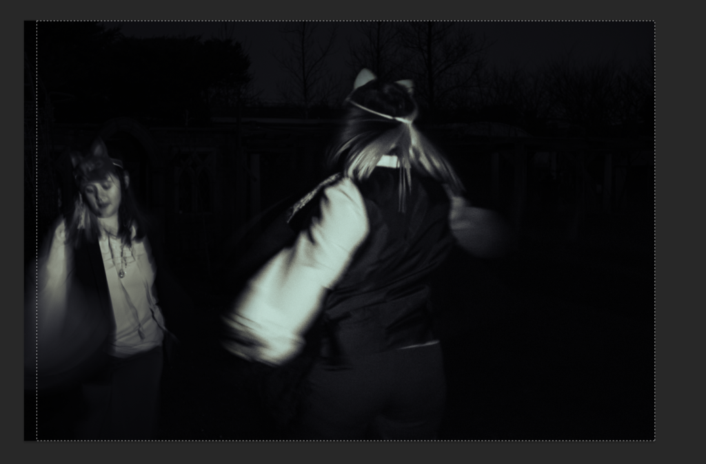
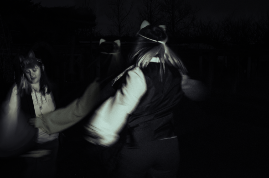
Selection of photos:
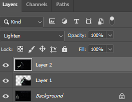
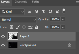
For this edit, I wanted to get the feeling of a greater sense of movement from my slow shutter speed photos, which I would do by having an image which seems like a previous frame behind a frame which looks more recent. To make the merged image more visible, I added a gradient overlay, and set the layer to ‘difference’. However, as I wish to use the merged photo elsewhere I did not want to make it too visible.