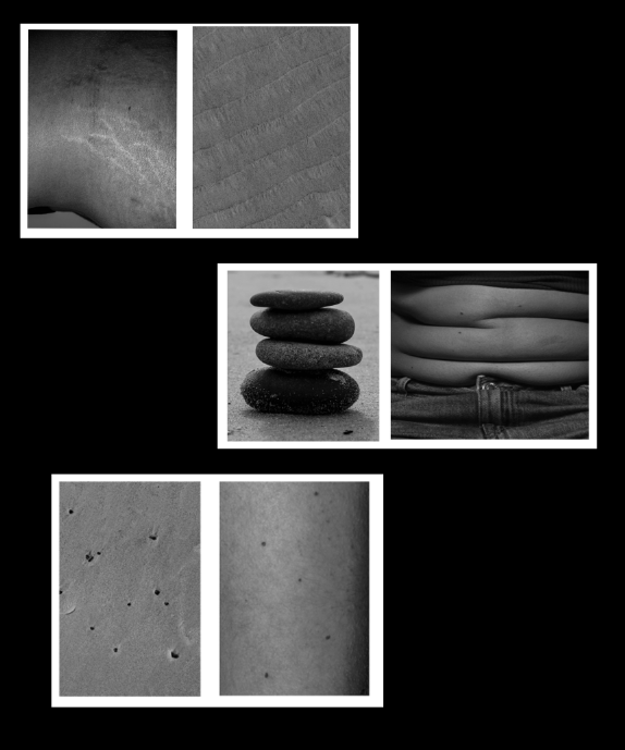
Selection 1– A5
Selection 2– A5
Selection 3- A5
Selection 4- A5
Selection 4– A5 –
Selection 5– A4
Selection 6– A5
Selection 8- A4–
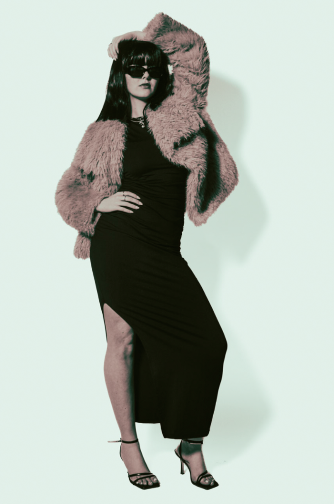
Selection 9- A4–
Selection 10- A4–
Selection 11- A4–

Section 12- A3

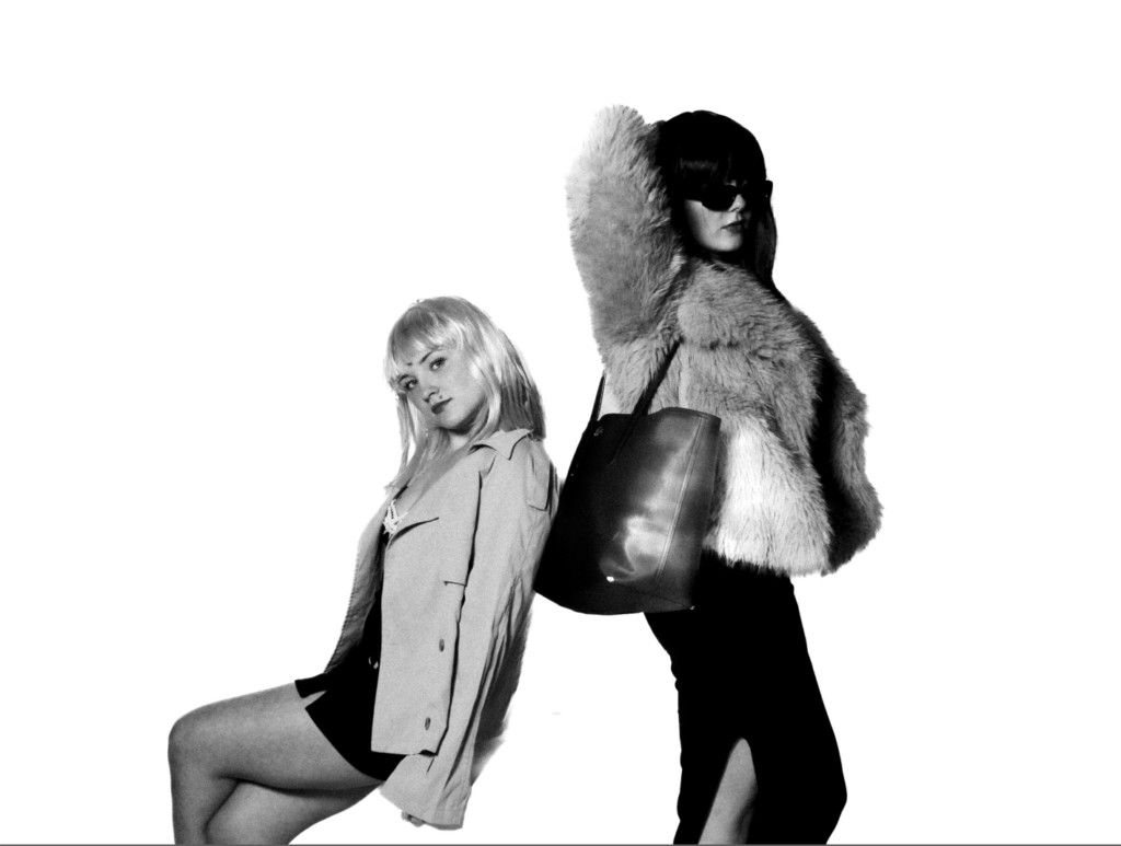
Selection 1– A5
Selection 2– A5
Selection 3- A5
Selection 4- A5
Selection 4– A5 –
Selection 5– A4
Selection 6– A5
Selection 8- A4–
Selection 9- A4–
Selection 10- A4–
Selection 11- A4–
Section 12- A3
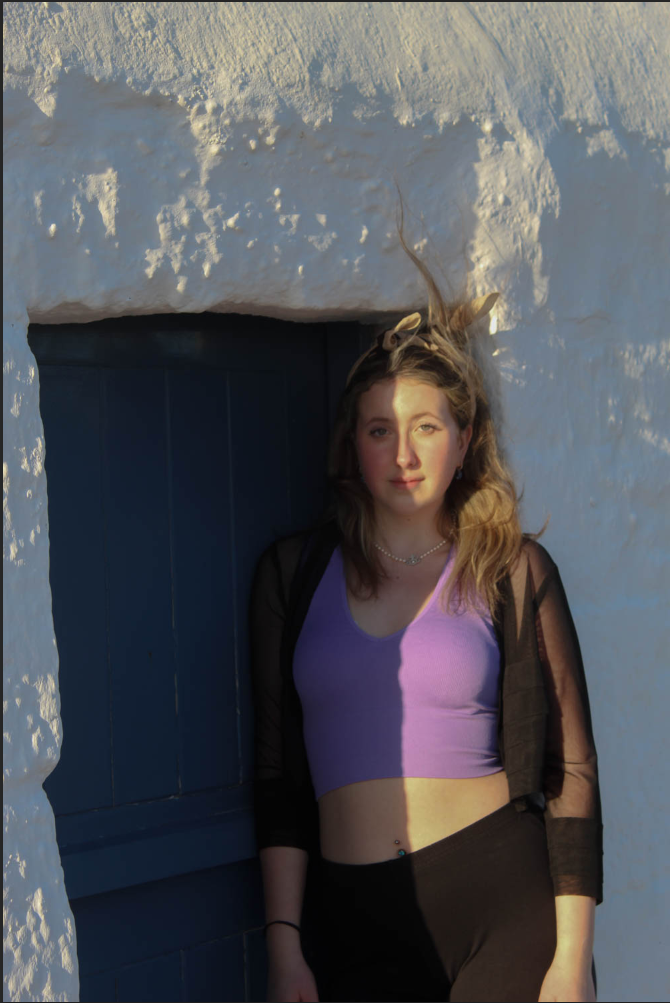
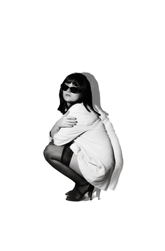
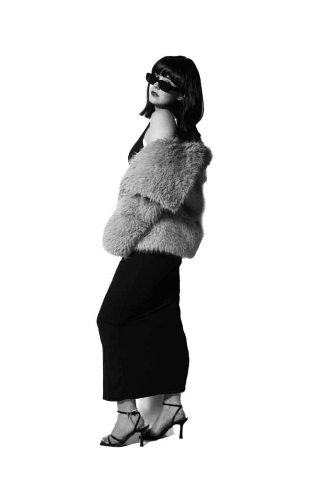
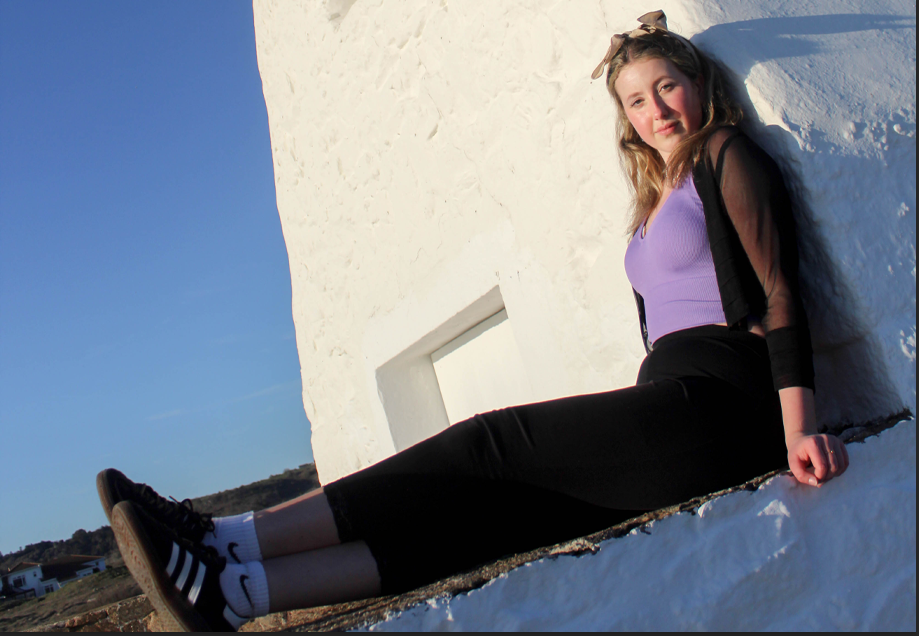
This is one of my best images in photoshoot 3 because of the lighting across my face, it makes the image really unique and interesting.
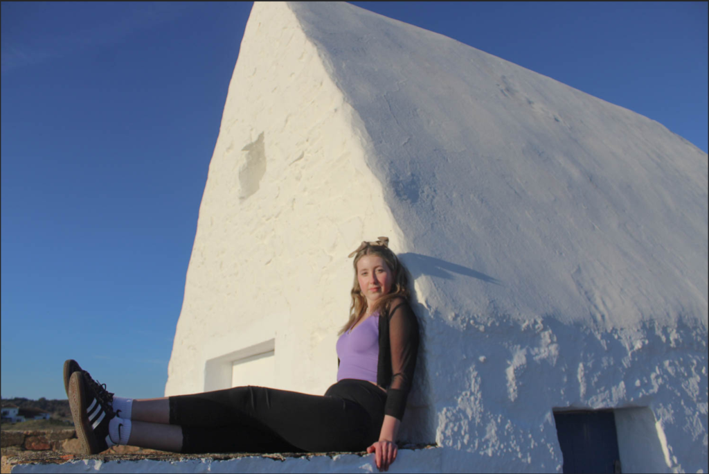
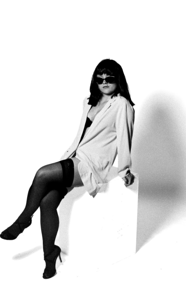
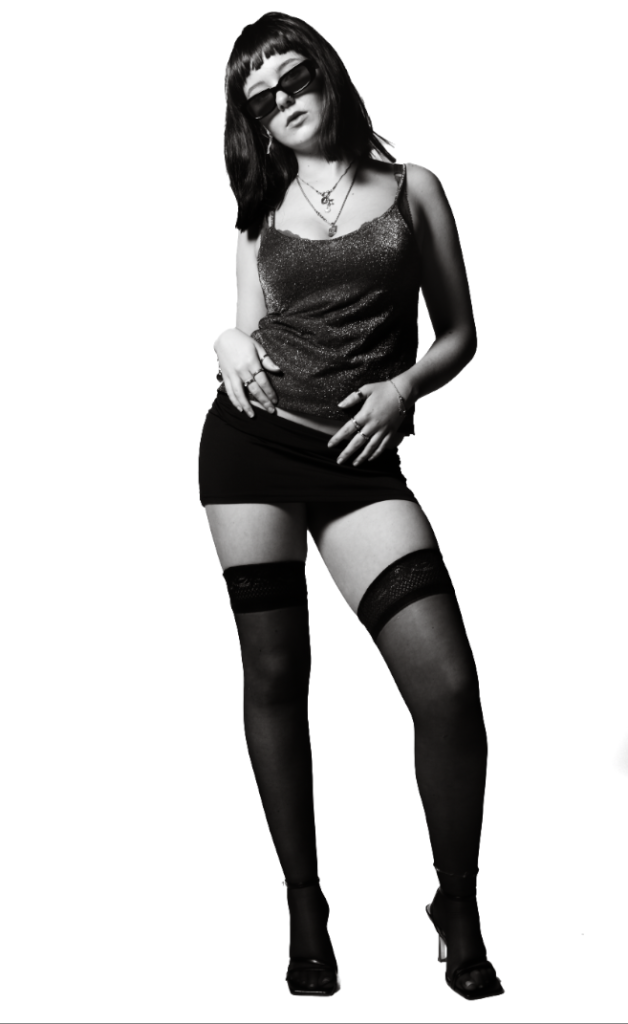
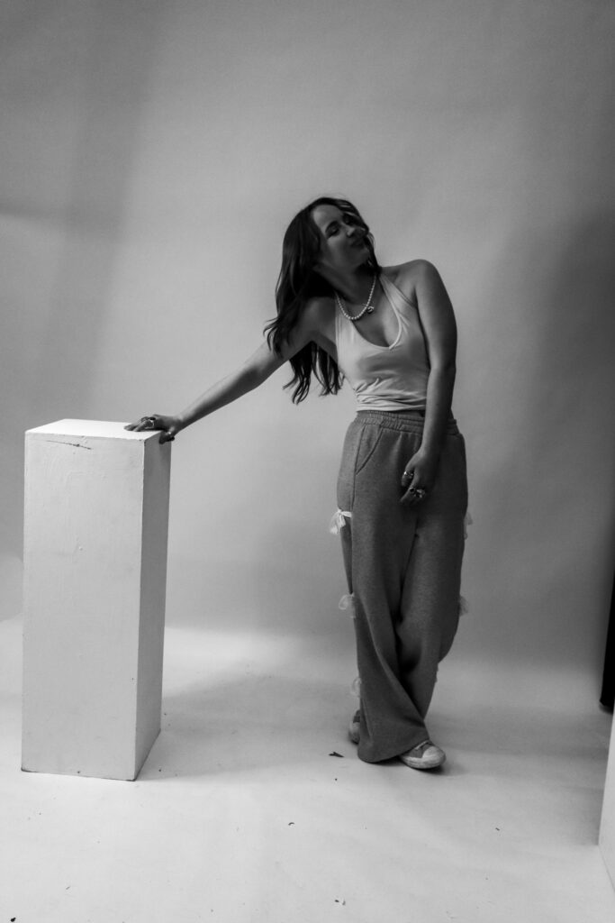
This is another one of my strongest images as the white house contrasts against the bright top that I’m wearing and makes the outfit look really bold.
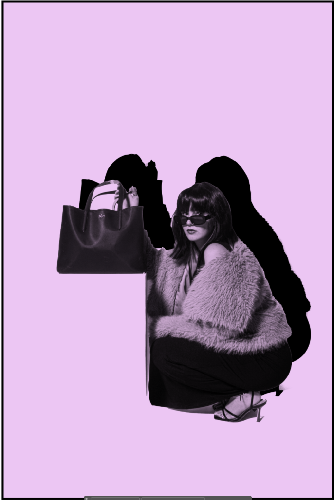
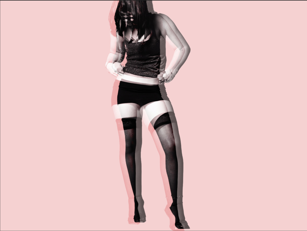
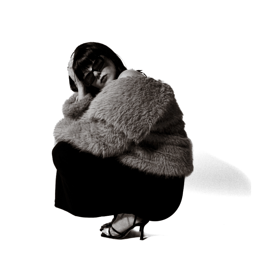
Virtual Gallery
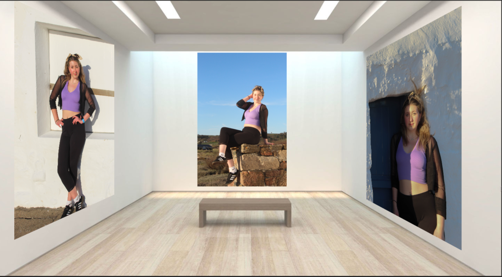
This is my Virtual Gallery for photoshoot 3 of my best images in the shoot.
Mock Ups
This image is going to be by itself as one A4 print.
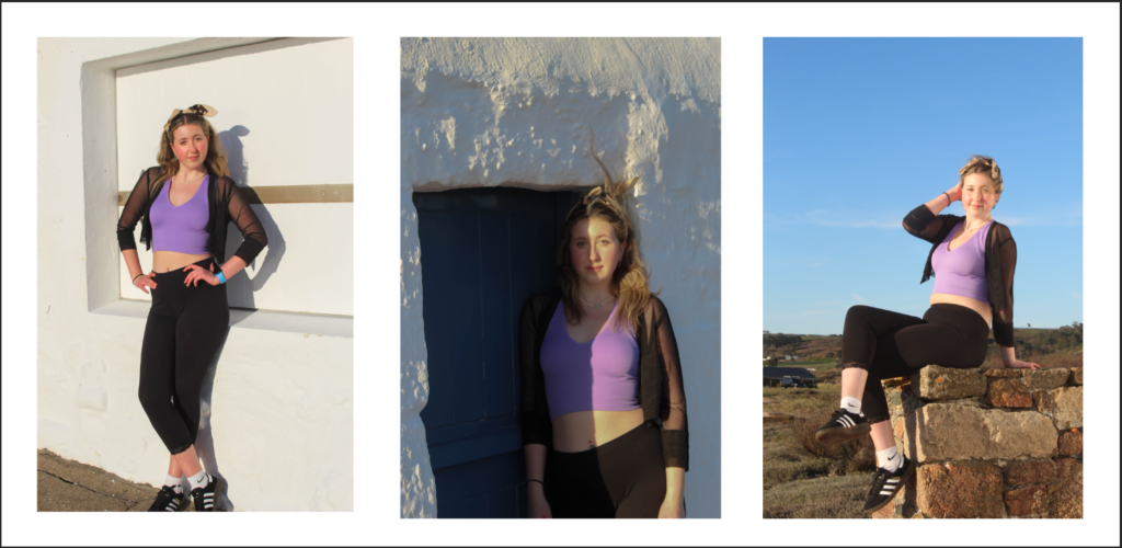
This is going to be another one of my Mock Ups and I’m going to do a tryptic of another 3 of the best images from the third photoshoot.
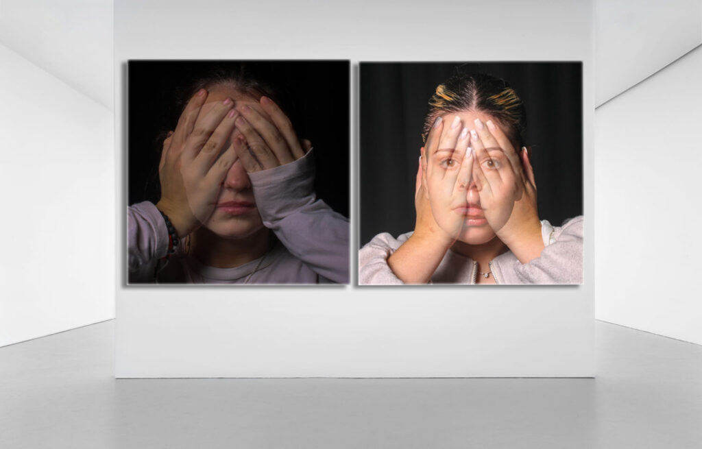
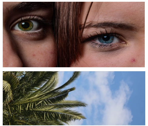
These images are probably my favourite throughout the collection, however there is still room for improvement the photo on the left is a little dark in comparison to the one on the right, to improve this is could either increase the ISO when taking the photo or when in Lightroom lighten the image further, I believe the image on the right is the more successful of the two when experimenting with merging alike photos to recreate the surrealist uncanny, dream like effect.
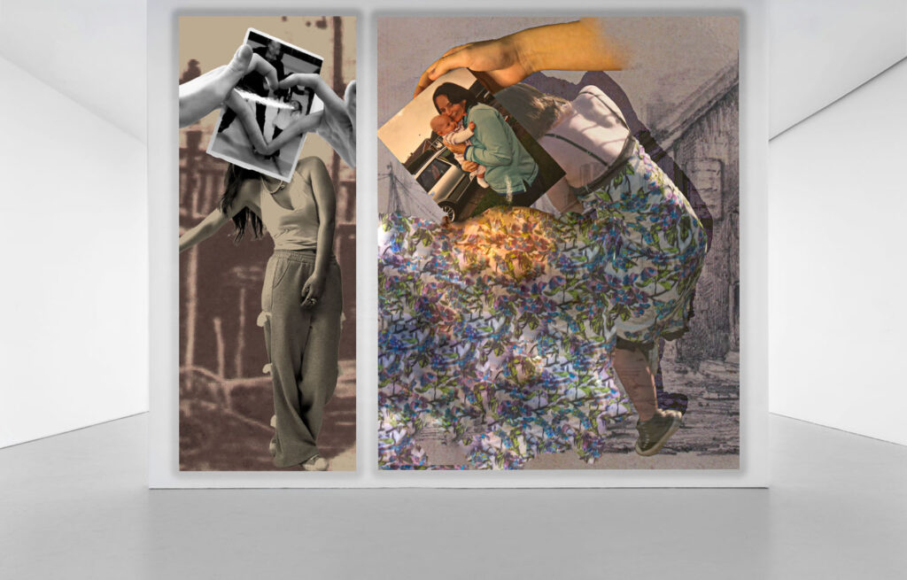
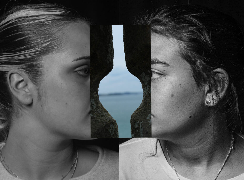
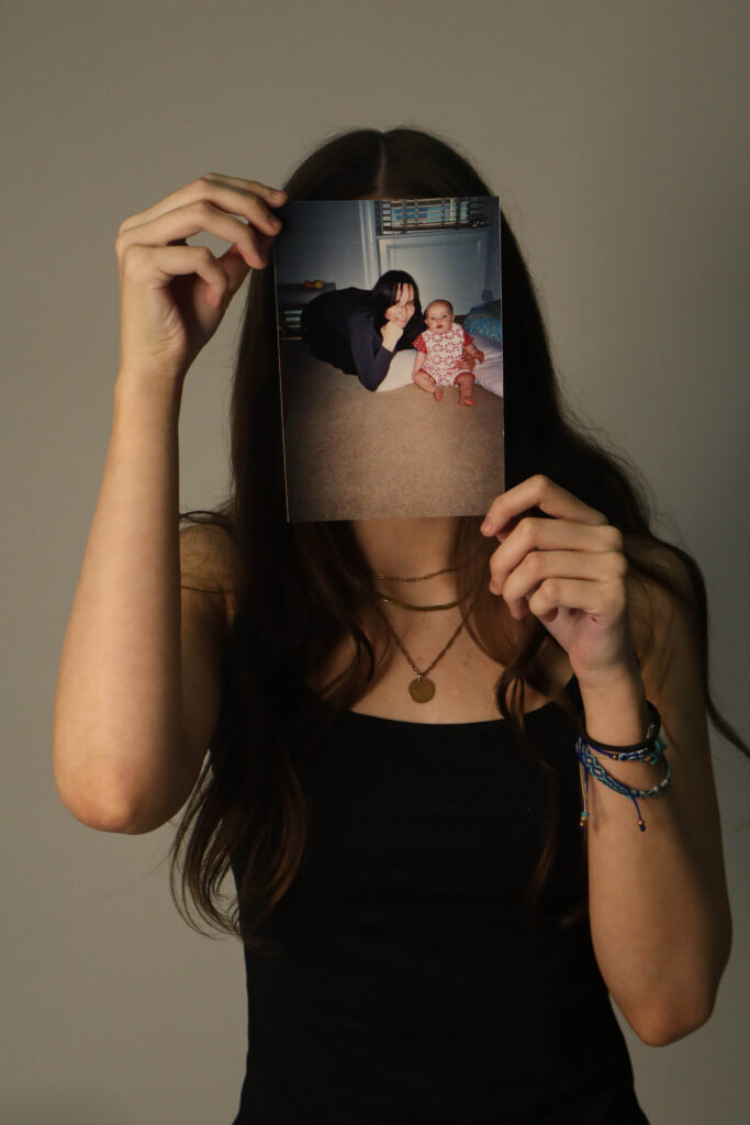
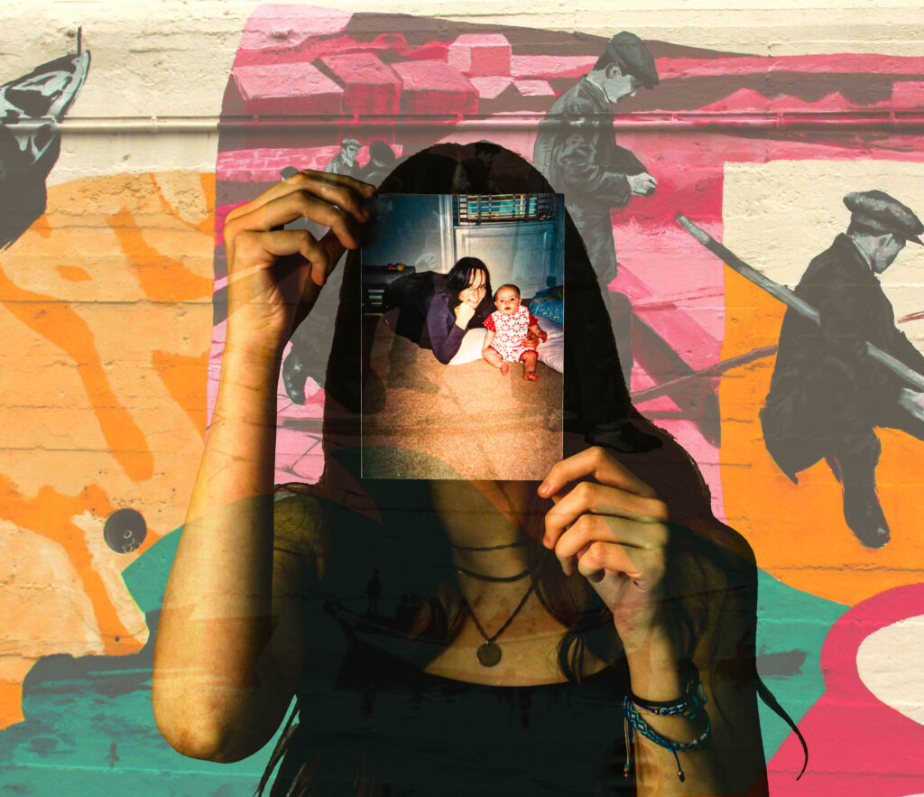
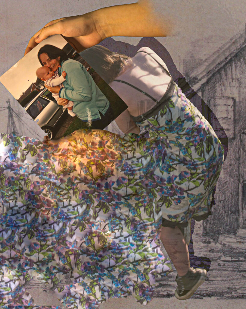
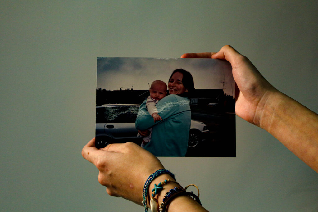
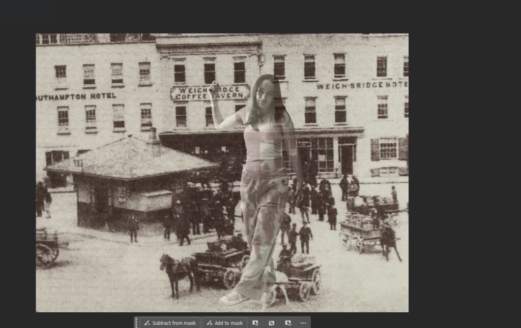
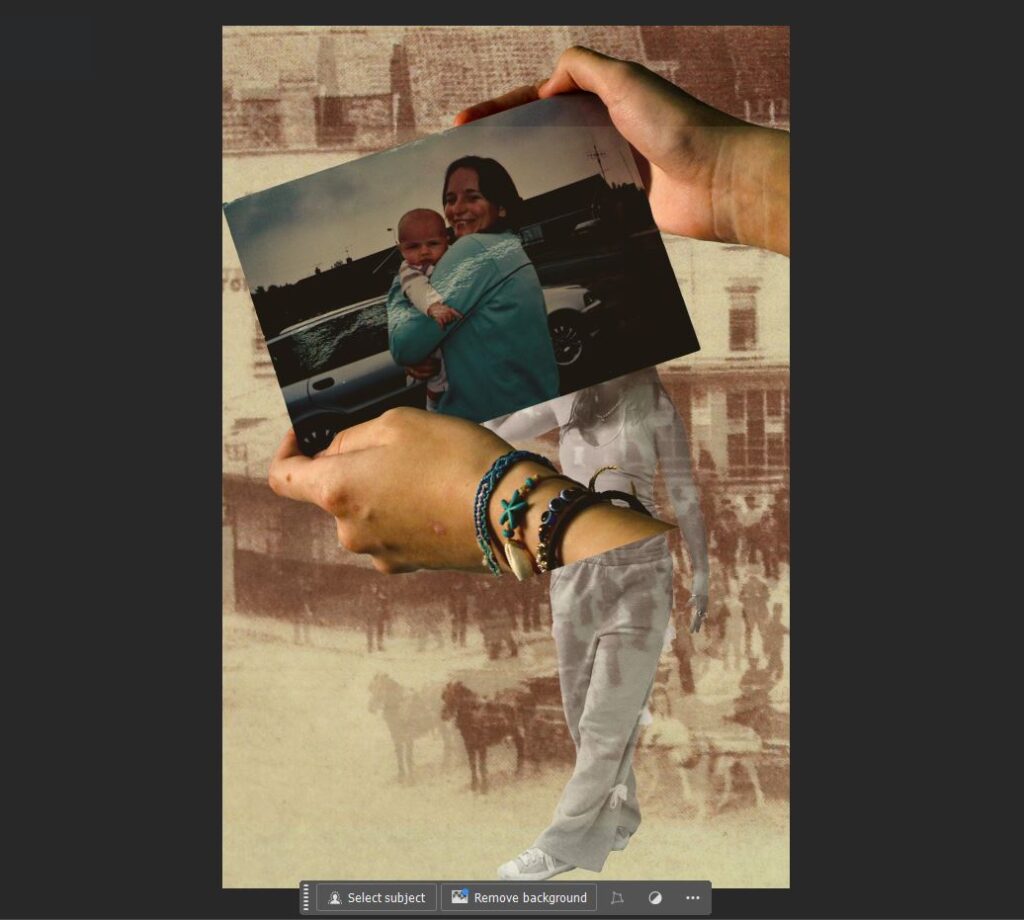
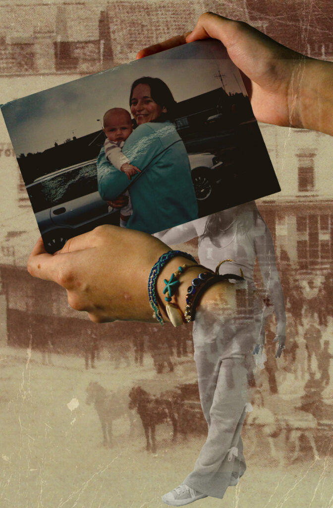
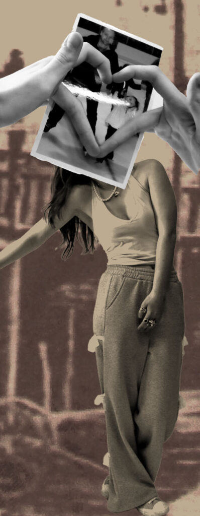
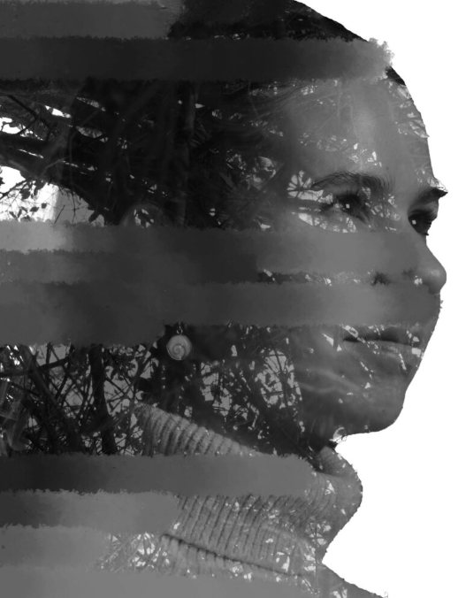
the images presented above are strategic collage intended to create a blend between the outside natural world and the human experience. I wanted to create a feeling of nostalgia throughout the photographs by using old secondary source family photos and having a model pose with them, I think two out of the three were incredibly successful however the photograph presented on the bottom left is the one I feel requires the most improvement. the aim was to have the stone gate replace the shoulders of a modern age appearing women in colour and the same women who appears from an earlier time in black and white, however I feel that although I achieved this the composition of the photograph could have been more seamless.
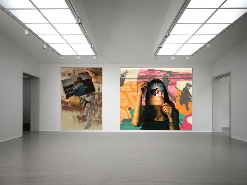
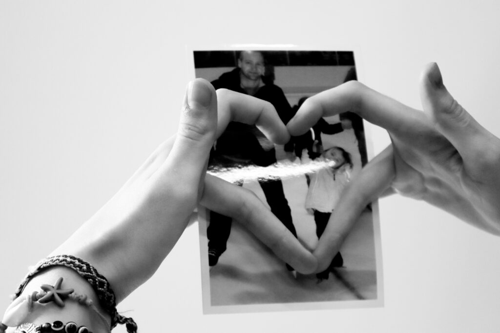
i believe the photomontages above are very successful my personal favourites from the set of images are the image on the bottom right and the top left.
I believe the image on the bottom right is very successful because through overlaying the images I managed to get the colour grading throughout the image very vivid without completely obscuring the centre figure and focal point of the image.
the image on the top left is inspired heavily by Dora mar and her believable surrealist photography and I consider this image very successful because I think I have emulated the atmosphere of Dora Maars photography well within it.
the compositions appears like it could potentially appear without extreme editing, via perspective, whilst also appearing uncanny.
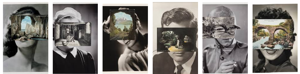
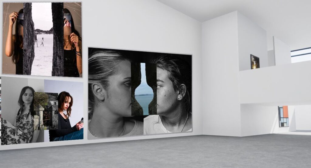
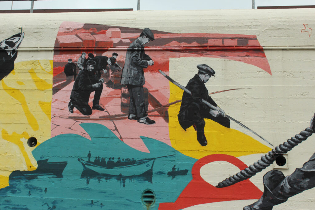
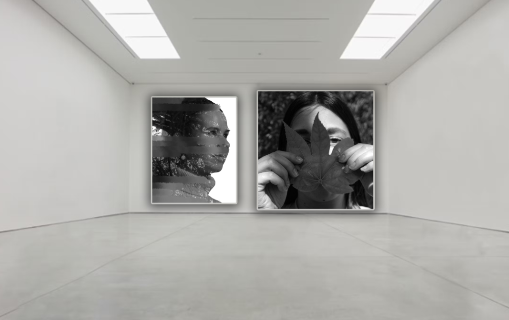
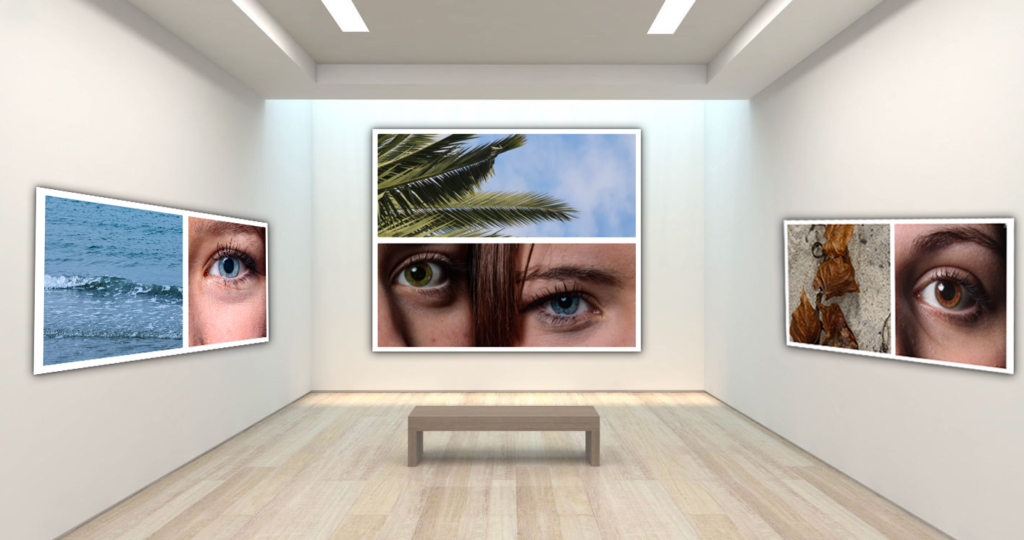
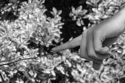
In this set of photo montage and editorial images i am drawing influence from Stezakers ‘mask series’ using abstract and unassuming photos to complete the image with layering photos.
I believe I was most successful in recreating Stezaker’s signature Style in this image, combining both coloured images with black and white and alluding the the framing of the ocean view finished the models faces.
In this photo I attempted to recreate a similar effect but overall found it less successful, the combined photos feel less harmonious although the photo does create the effect of the gate pillars finishing the models arms i fell overall it is a slightly less successful image.
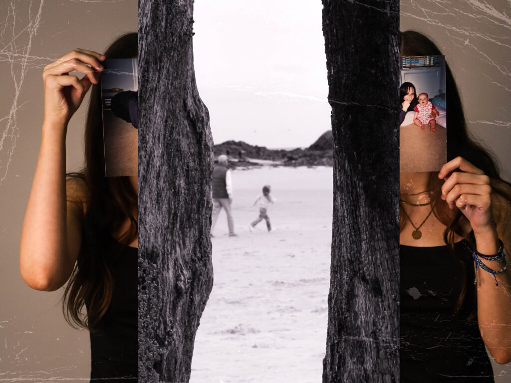

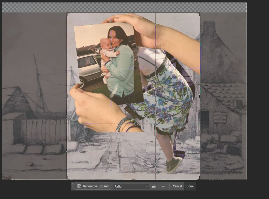
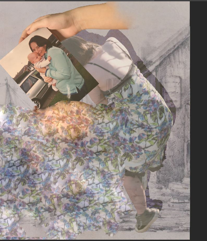
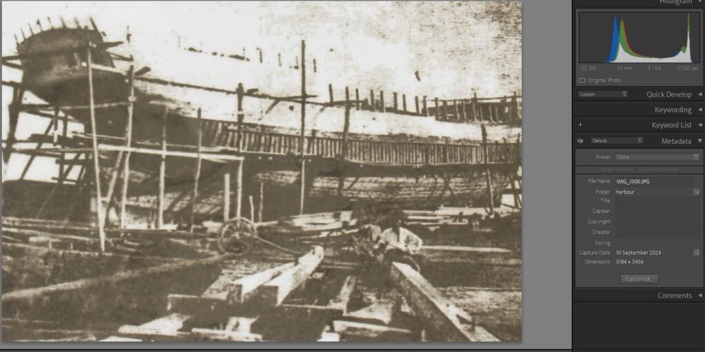
This series of photo edits was inspired by Dora maars photomontages combining childhood photos with recent modern photos and laying to create an old and weathered yet visually interesting effect


Evaluation:
Overall, I am really satisfied with my final presentations as a virtual gallery. I think that the structure of my virtual gallery is smooth and constructed. The images presented in each different virtual gallery evidently link to each other which shows that I have clear understanding of what I am doing and want to show. The structure of my virtual galleries also show how organised and systematic my images are, which is one of my strengths.
Furthermore, I believe that my final outcomes presented in a virtual gallery, give my outcomes and more real feel to them. It enables me to be more interacted and emerged to my outcomes, which is a strength because it also makes audience feel like the virtual gallery is real, like they are standing in a gallery, looking at my final outcomes.
Lastly, I strongly trust that my virtual gallery is accurate and real through editing. My editing that I have used in my virtual galleries allow my outcomes to come to life. The use of shadows and outer glows in my outcomes, to make it look like my images are planted on the wall, allows audience to fully believe that my outcomes are in what looks like a real gallery. This is one of my strengths because I am confident that my editing skills are strong and engaging and really bring my outcomes to life, especially when creating a virtual gallery and trying to make it look like an actual gallery and a ‘real life’ experience.
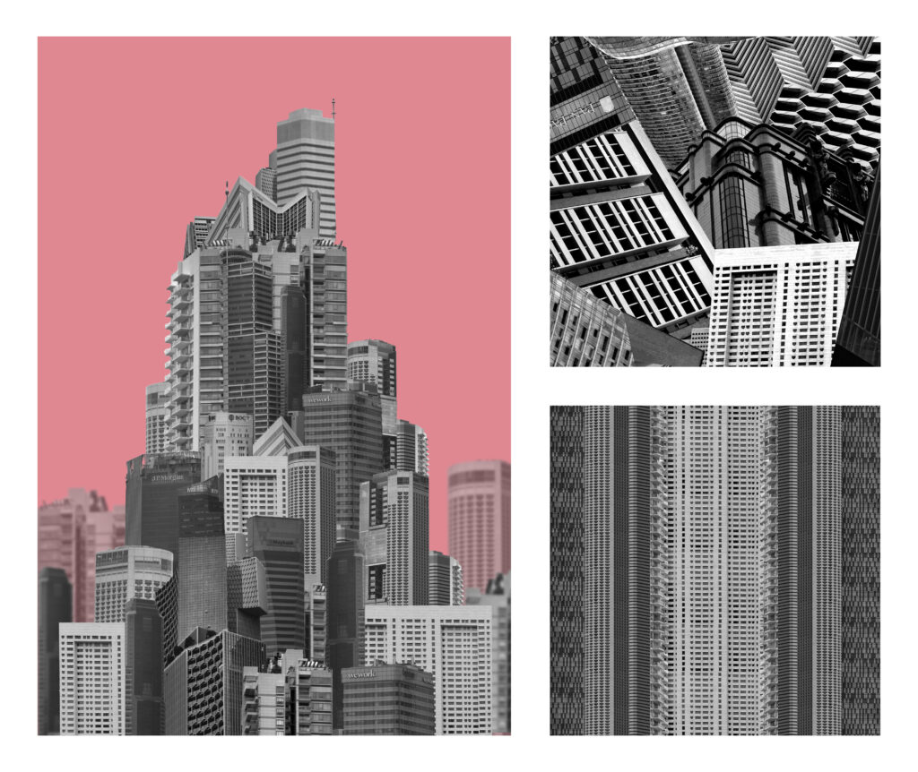
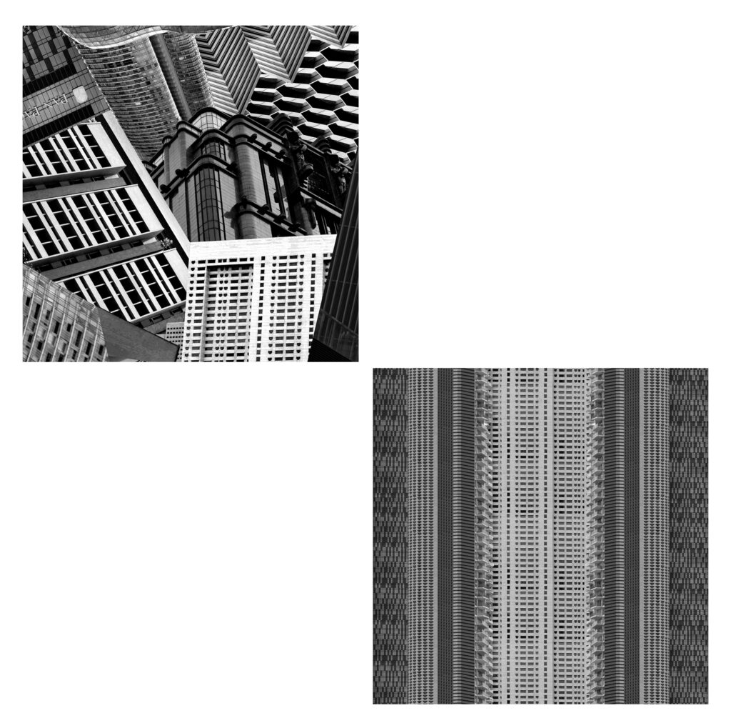
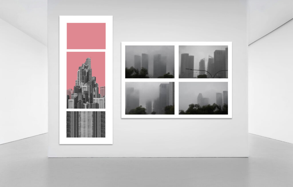
The first layout that I thought of was all the edits together. I tried this first layout in front of both a white background and a black background. I don’t think I like how window mounting on black card looked because none of the images had particularly high contrast and are made up of more mid-toned greys. I would print the building on A4 and the two squares on A5. I like how this layout looked but I wanted to experiment and see what else might work better. The additional images to the side looks a bit like a zoom in from a textbook of what’s going on with the first image.
I would print the squares on A4 for this layout and the building on A5. I didn’t like how the images looked laid out horizontally so I tried arranging them differently again. This layout made the mega-structure look small and unimportant which I don’t think matches the message i’m trying to portray.
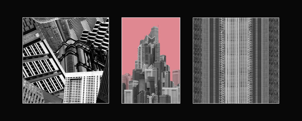
I decided to try a layout where it was just the two squares instead. Although both edits are square their not particularly similar in any other way so I decided to change this layout by adding back in the building.
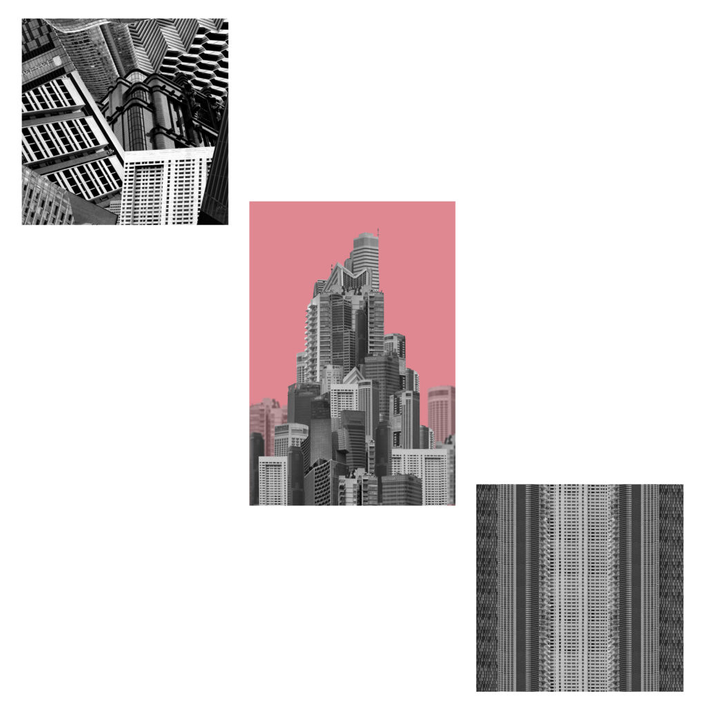
I think this one looks better then previous because the colourful pop of the background looks good in the centre however there is a lot of wasted space. While the building and the stripes match the collage doesn’t so it looks odd all together.
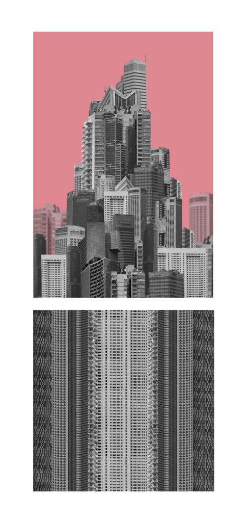
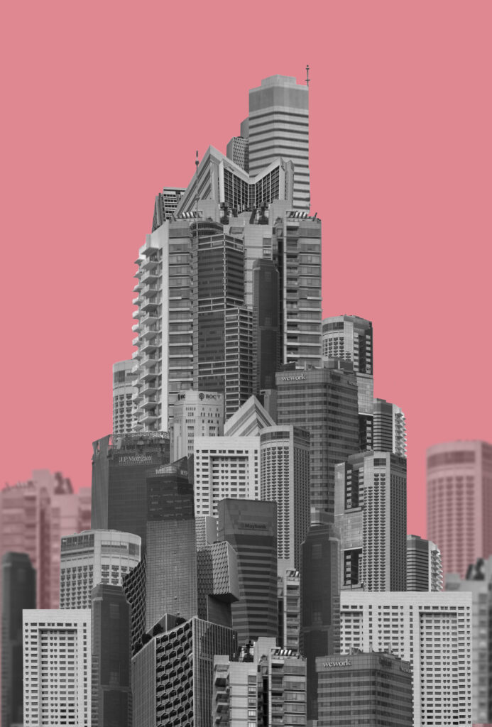
I decided to remove the other square image and arrange these two together instead. I like how the building looks like its sat on top of an elongated structure as it makes the building look even taller and unrealistic.
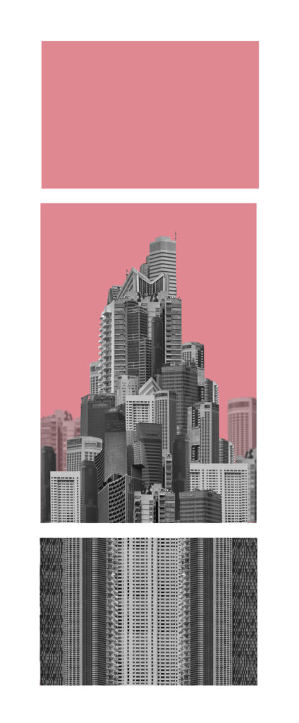
I liked how layout 5 looked overall It just looked a little off so I tried to balance out the layout by adding an additional section on top with the background colour to both elongate the shape and create a symmetrical layout. Both smaller images would be a size down from the central building and creates a clear distinction between the buildings and the background/sky. The square edit wont be square for this image as I didn’t want the layout to be too long.
I wanted to arrange these images into more of a grid to show the overall aesthetics instead of individual images. When making these I was unsure whether to present them as a grid of final prints or an arrangement in a photobook so I tried both.
When creating this larger grid of images they didn’t all match overly well so Ill keep most of them for the photobook instead and narrowed the selection down.
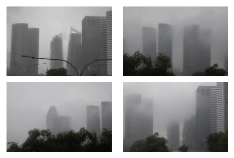
I downsized the nine images into a grid of four instead so that all the images were more similar and I could arrange the images into a typography.
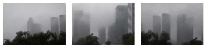
I removed the darker image because it didn’t fit as well with the other three but I’m unsure if I want to present two triptychs.
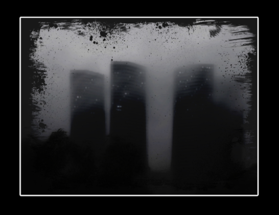
I liked how this image turned out and I decided to mount it up. I didn’t think it matched with the other images so I decided to mount it up on its own. Since this image was so much darker I decided that an A4 window mount would look best. I like the relatively chunky border around the image as it makes the overall appearance a bit darker which I think looks better than one which would be too thin. Since the image is so dark on its own, the window mount makes sense and the white strip breaks up the overwhelming dark.
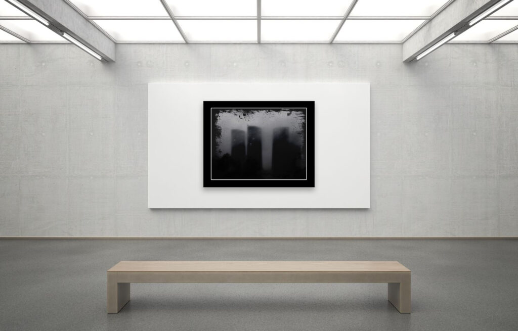
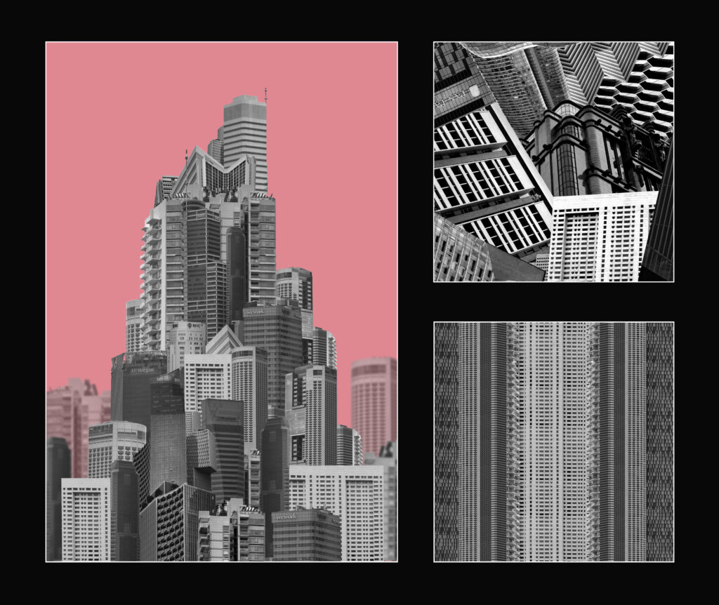
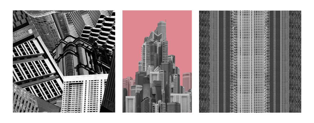
For the final layouts I decided on number 6, 8 and 10. I will be presenting layout 6 with small frames between each image and a wide border around the whole thing. The building will be printed A3 while the other two sections will be A4. I will mount them on mountboard in front of a white background. For layout 8 I will be printing each image in A5 and mounting them on mount board on a white background also. After mounting up I realised that for layout 6 I should have printed the largest image in A4 and the other two in A5 as the mount board was not big enough to fit all 3 images and the line left when stitching two together looked a bit odd. Additionally When printing a size down there is an additional few centimetres of border added to the smaller images so they don’t align perfectly with the A5 image. I presented layouts 6 and 8 separate from 10 because of the difference in darkness. The window mount is so much darker that it looks odd putting all 3 together.
I had 3 main outcomes from this project which I think all turned out well. They each portrayed the message I had intended in different ways:
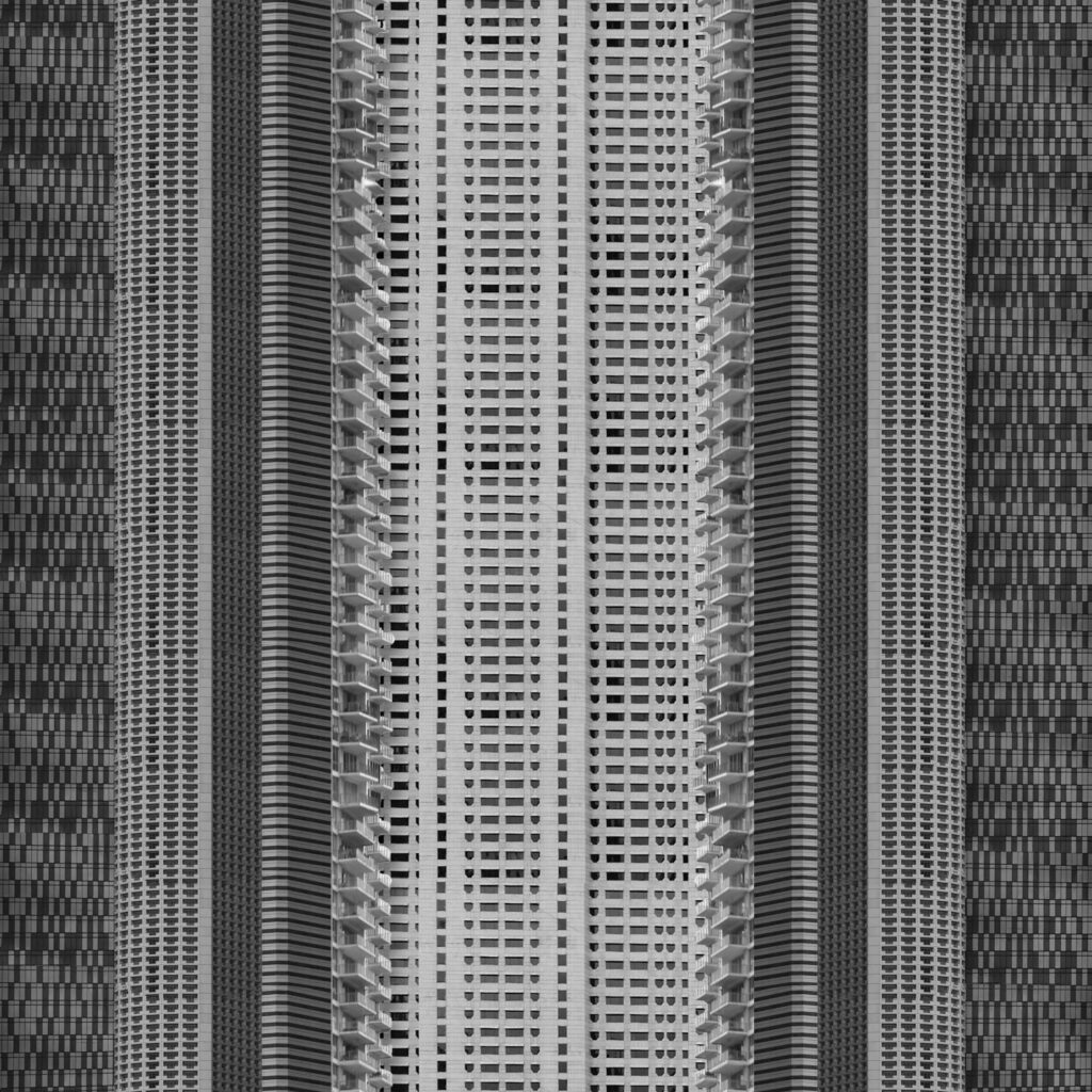
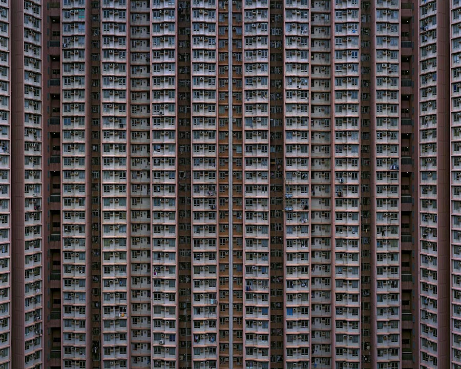
These images were inspired by Michael Wolf with different approaches. I think these both portray the message of overpopulation and overproduction well which was important for me to show in a few key images for my photobook. The main difference between them is that I set my images in black and white and I combined multiple different buildings into one strip. Had I kept using the same building at different angles, I might have been able to easily uniform the colour. If I was going to experiment further than I would have tried this as well. I do think that by using multiple different buildings in the stack it creates a more reasonable layout as different buildings are built together not by aesthetic choice but because the land is close by.
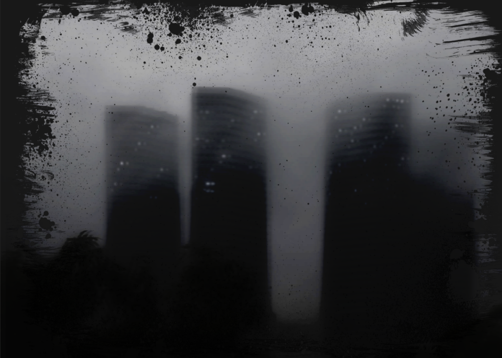

I was inspired by Lewis Bush for this image to show the synthetic nature of buildings. The lights are a physical representation of how people have overcome the dark and the haziness creates an ominous, unnatural appearance. The biggest difference visually is my image has more mid-tone grey and the artists has more near-black grey. I think that for my image the mid-tones work better as it makes the buildings stand out more as something emerging from behind the smog where as Lewis Bushes has more emphasis on the setting sun and artificial lights.
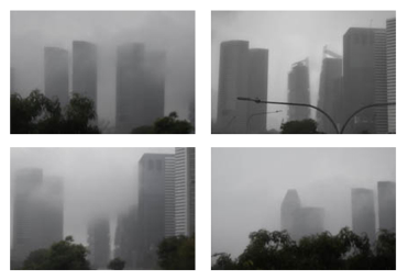
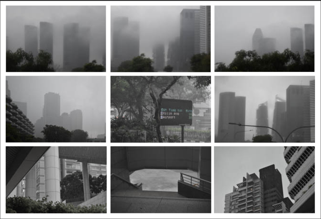
With these images I was inspired by typology and arranged all these images into a grid. They are all similar in location, subject and lighting which makes them all fit together well. Additionally they are all images of the same type: high-rise buildings. Overall these images together create a sense of scale and show architectural the feats as something somewhat sinister.
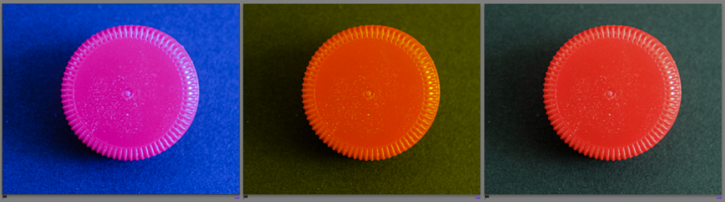
For my second collage I am going to experiment by using the ‘tint’ tool to change the colours of my bottle caps so then I have a range of different ones to create my second collage from.
1:
For example, this one I changed the temp to -67 and the tint to -61.
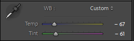
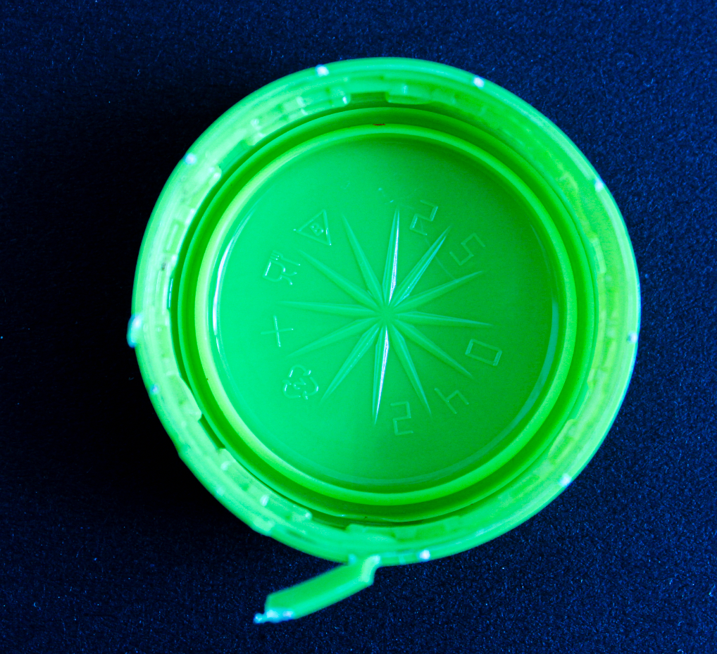
This allowed me to change the colour of the bottle cap to green.
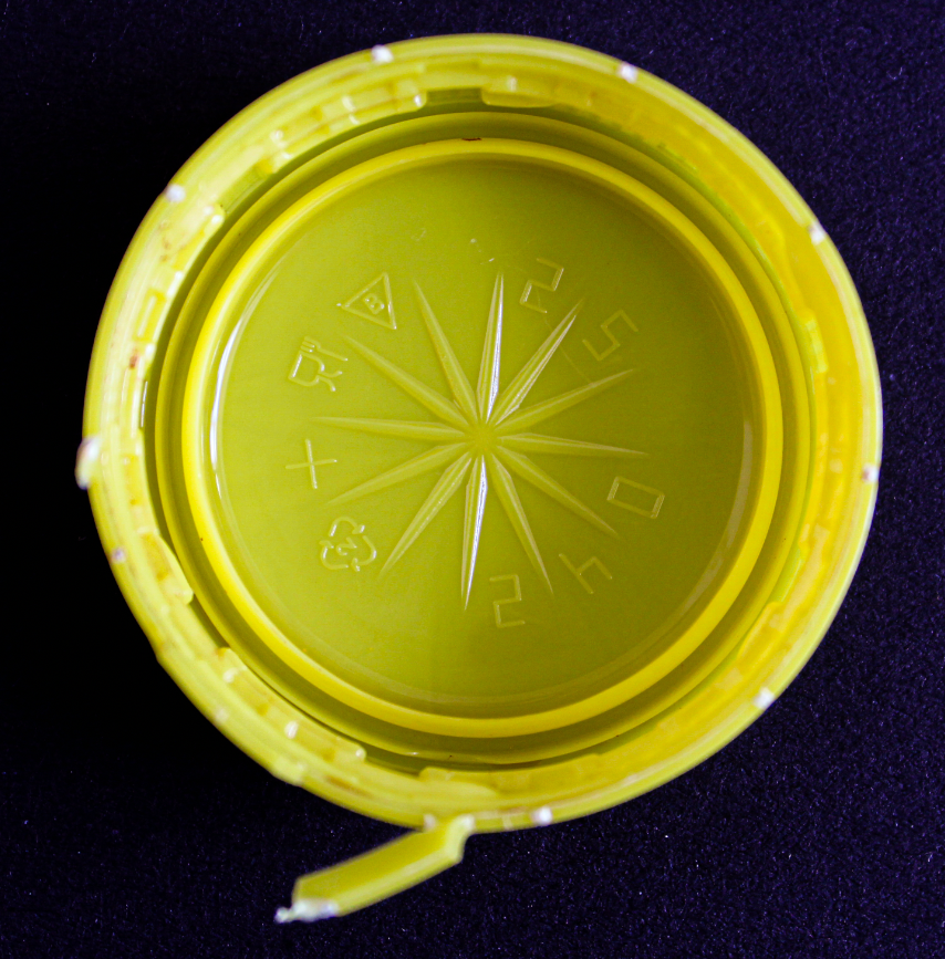
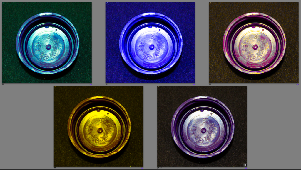
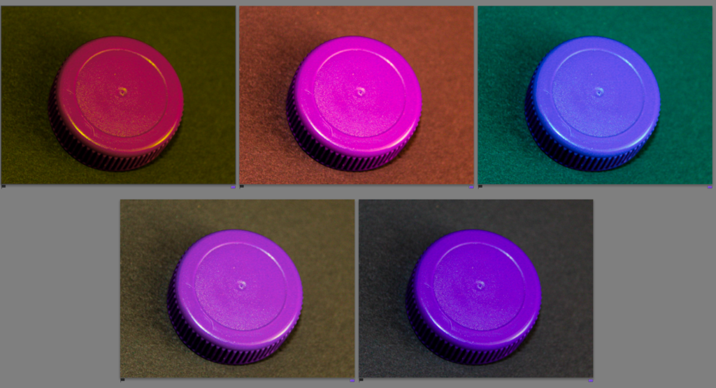
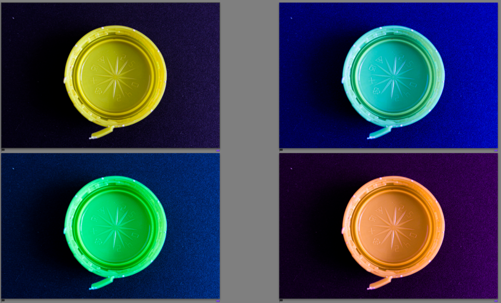
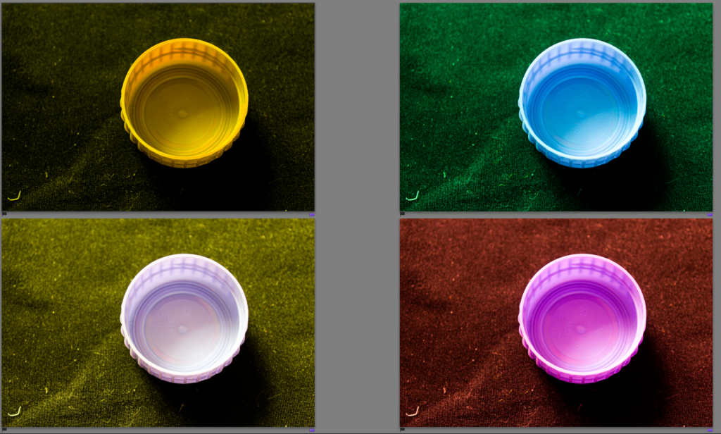
2: These are all the varieties of colours which I was able to create using the tint and temp option in lightroom.
3: My aim for this collage will be to use the bottle caps and create a similar style collage to this one produced by Mandy Barker.
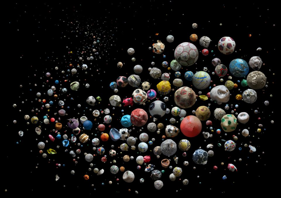
Final Product:
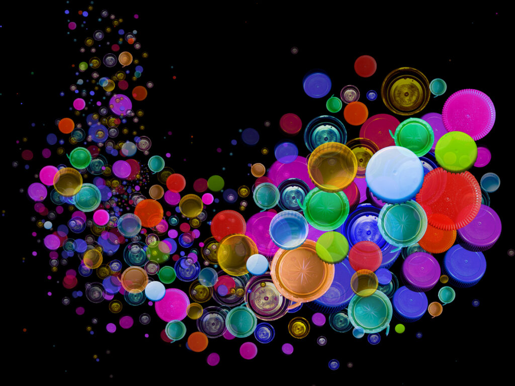
Overall I like how my piece has turned out and I think I managed to capture the same movement that Mandy Barker’s piece has.
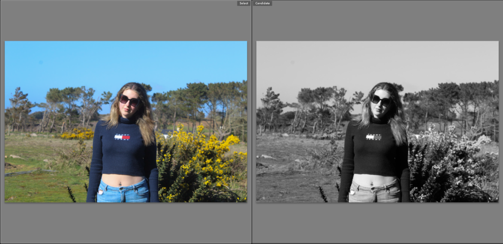
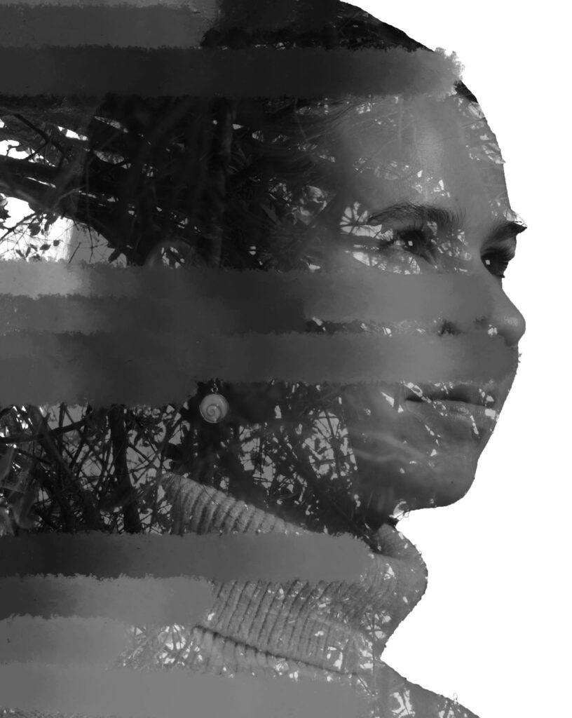
I have chanced a few of my photos into black and white images because it brings out the texture of my clothing and because the lighting is so strong changing the images to black and white makes me stand out.
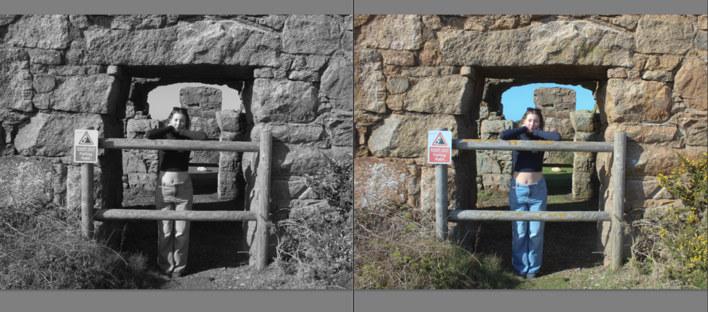
This is another image I changed to black and white and by doing so it enhances the features of the rocks in the structure behind me and also the plants that are in front and overall it gives the image more texture.
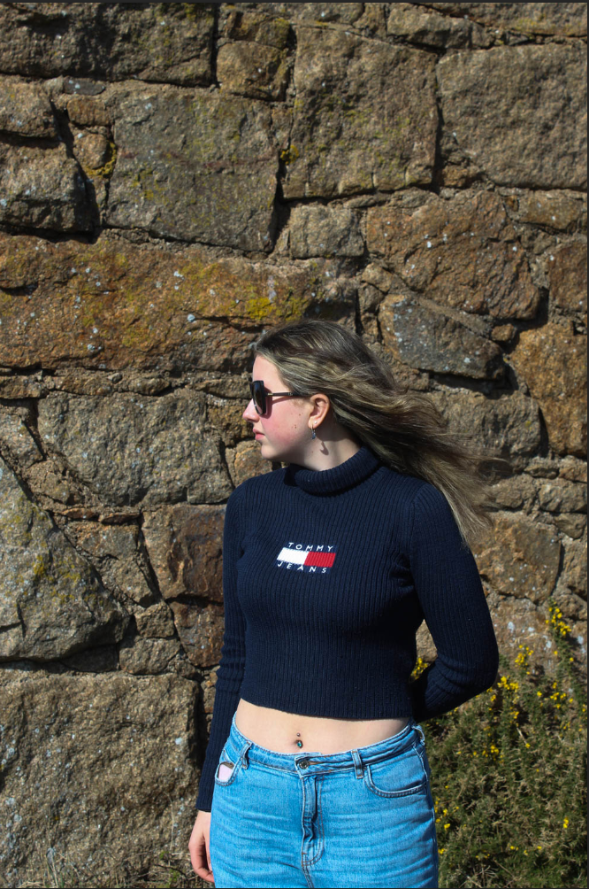
I increased the contrast of this image and increased the blacks so that my jumper would stand out more and the colour of my jeans stands out and contrasts against the dark background of the rocks.
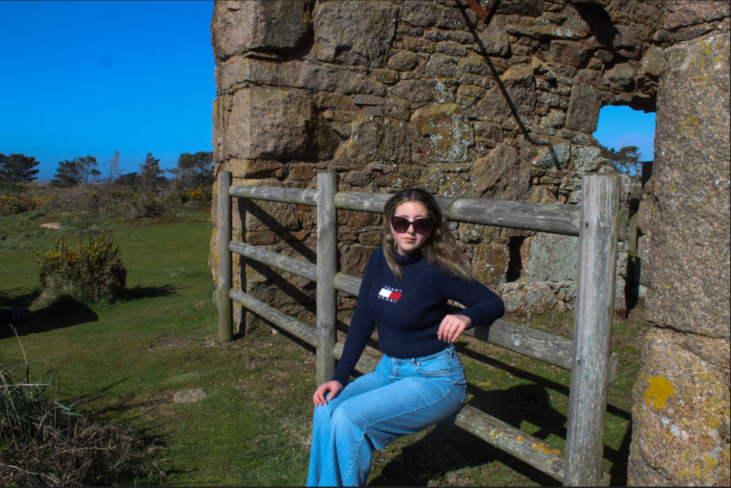
This is another one of my best images as the composition of the image works really well and the colour match between the sky and my blue jeans contrasts with the browns from the granite rocks.
Virtual Gallery
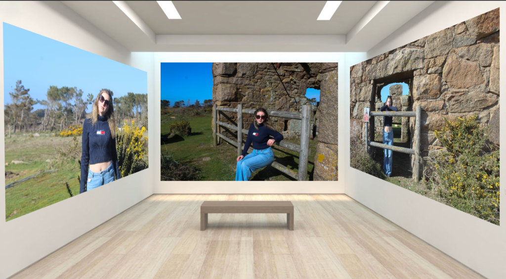
This is a Virtual Gallery of some of my best images from photoshoot 2.
Mock Ups
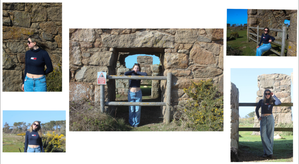
This is my Mock Up for my second photoshoot and its a similar concept to my first Mock Up for photoshoot 1 with one big image in the middle and 4 surrounding images around the outside.
A3 prints:
A4 prints:
A5 prints:
Digital presentation:
Presentation 1:
Presentation 2:
Presentation 3:
Presentation 4:
Presentation 5: