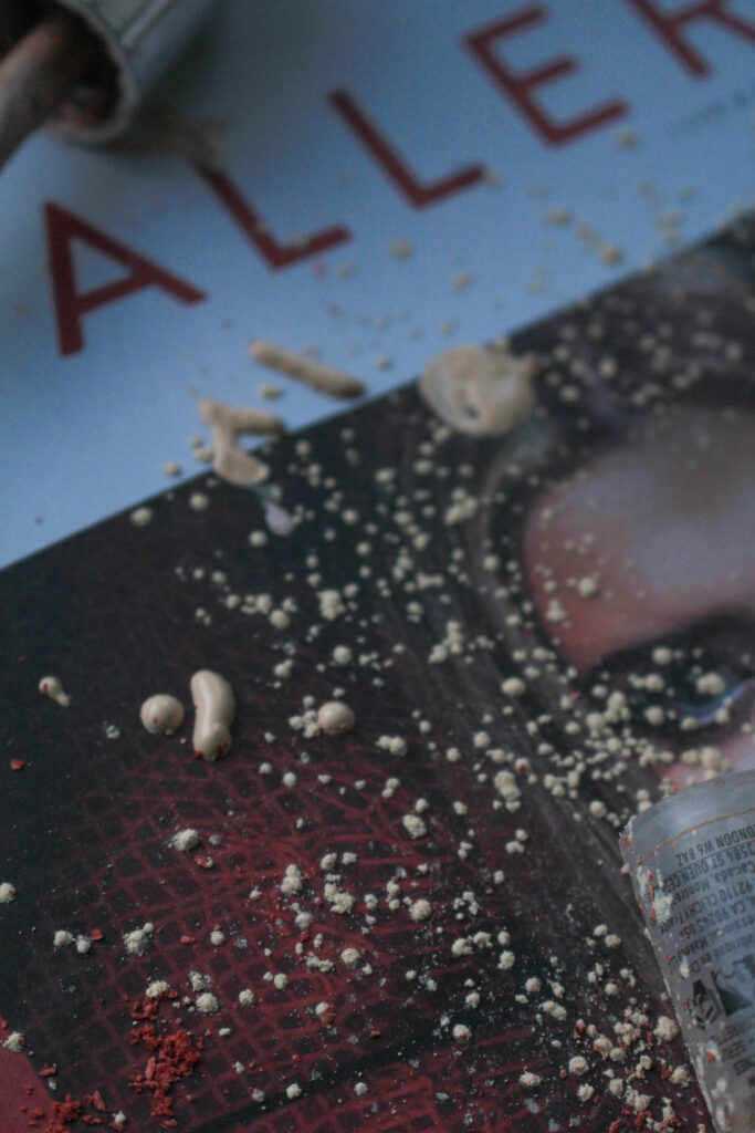
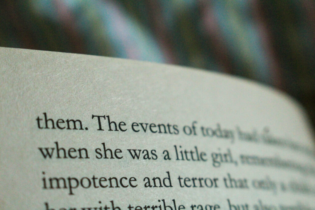
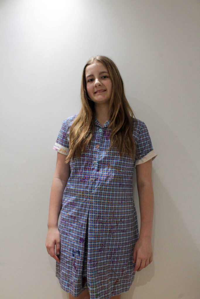
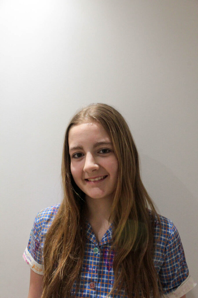
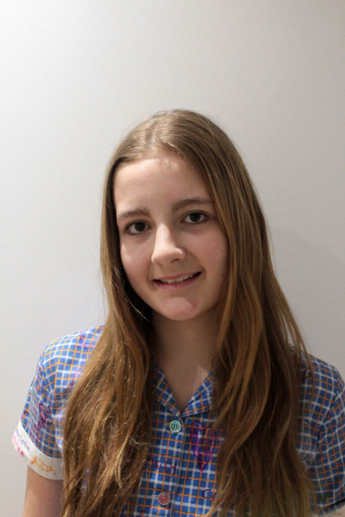
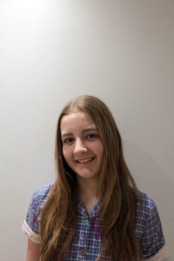
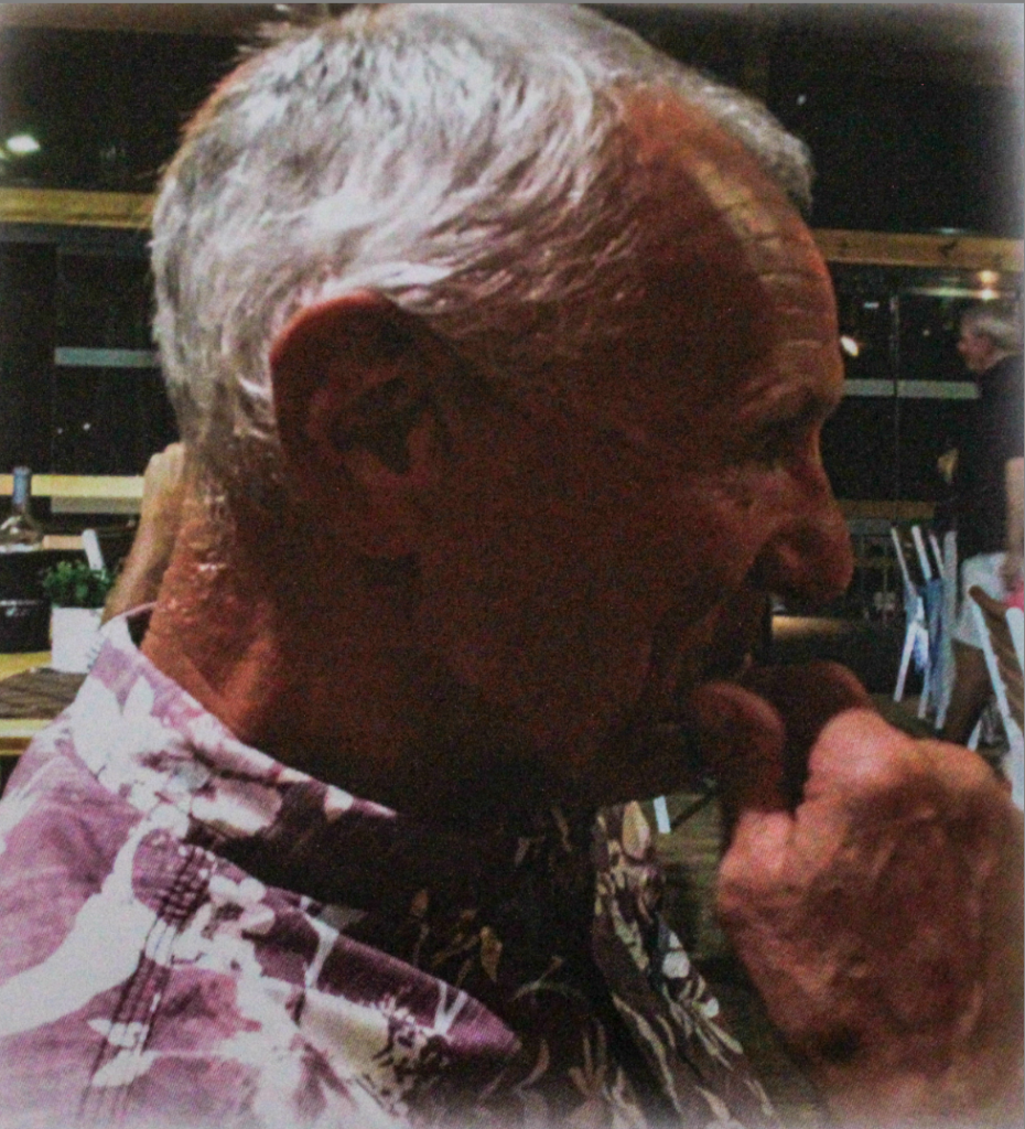
Edited Photoshoots – Coco Moore

Photoshoot 1:

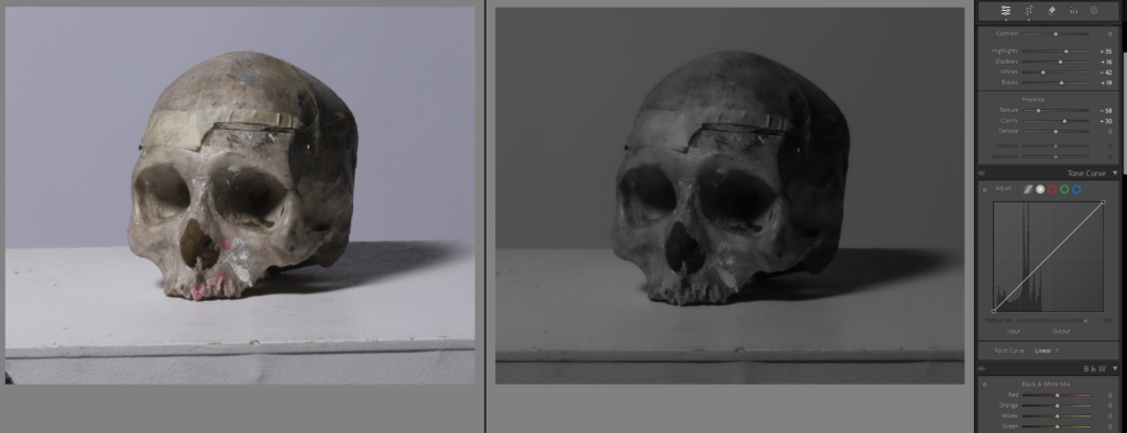
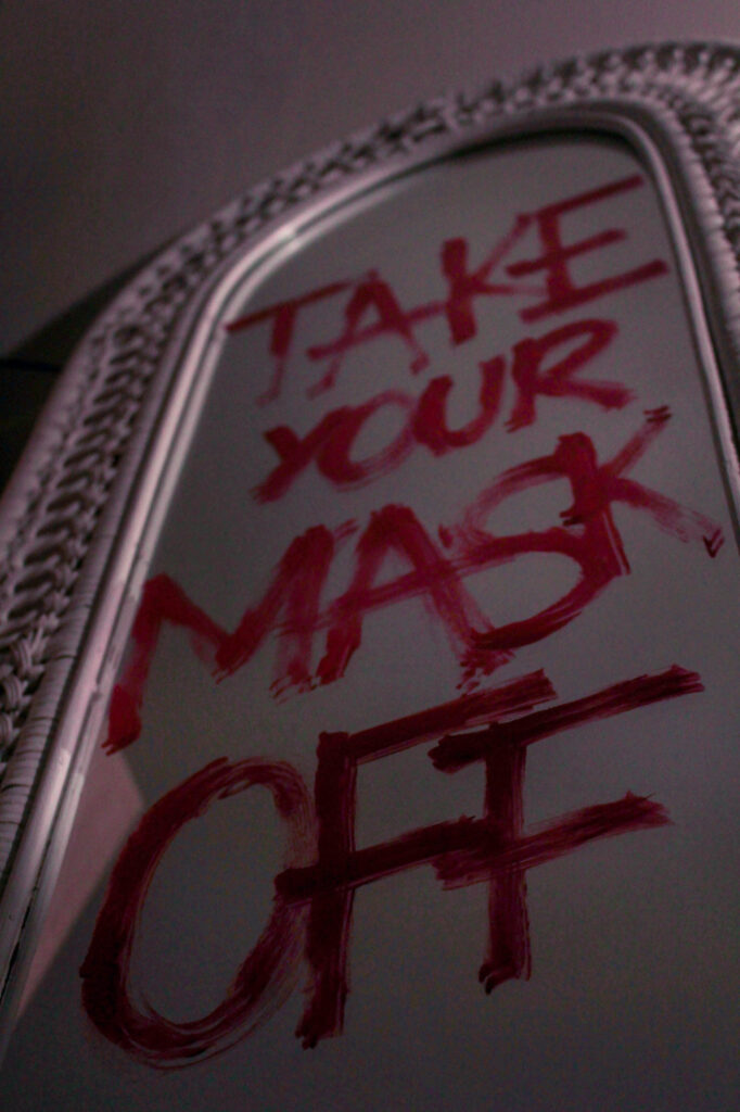
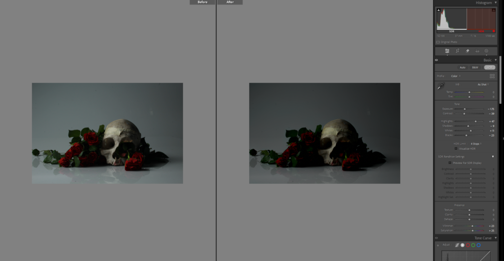
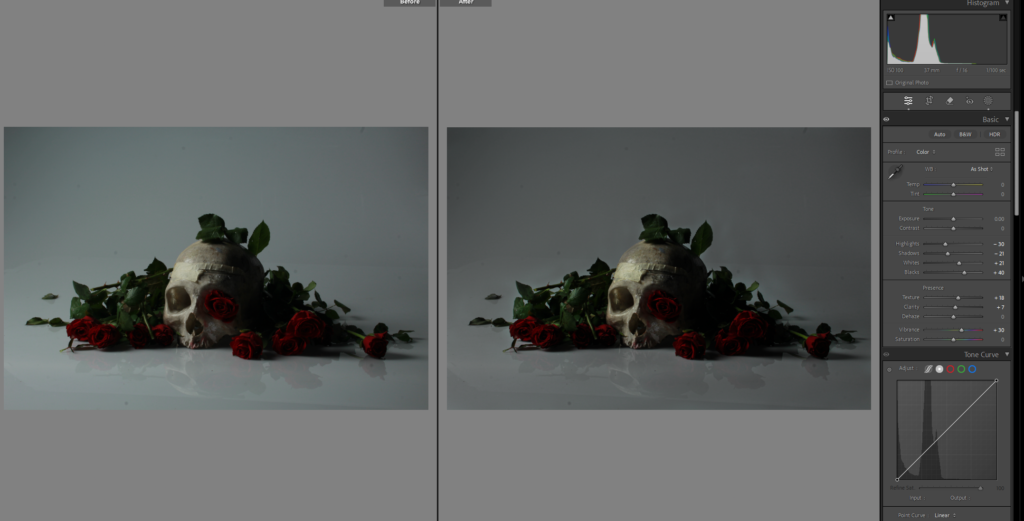
I edited this photo by changing the basics to give it better lighting and more the effect of dark and gloomy I was going for. I still don’t think it is perfect and didn’t love the background because I wanted it to be black. the main point of this skull is to symbolise the death especially the death of romance.

I have the way I edited it next to the image, and the rest of the images like this I plan on editing in similar ways. but for this one to experiment I brought it into photoshop to attempt to change the background.

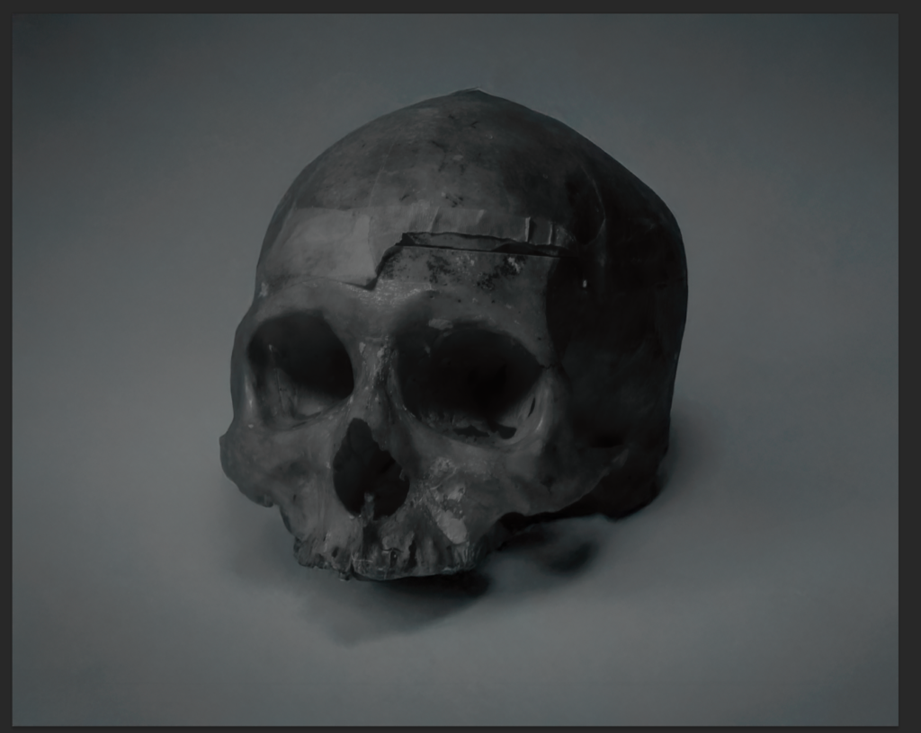
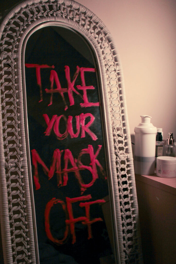
This was my first attempt of a back ground I wanted it to be black but I thought this looked cool.

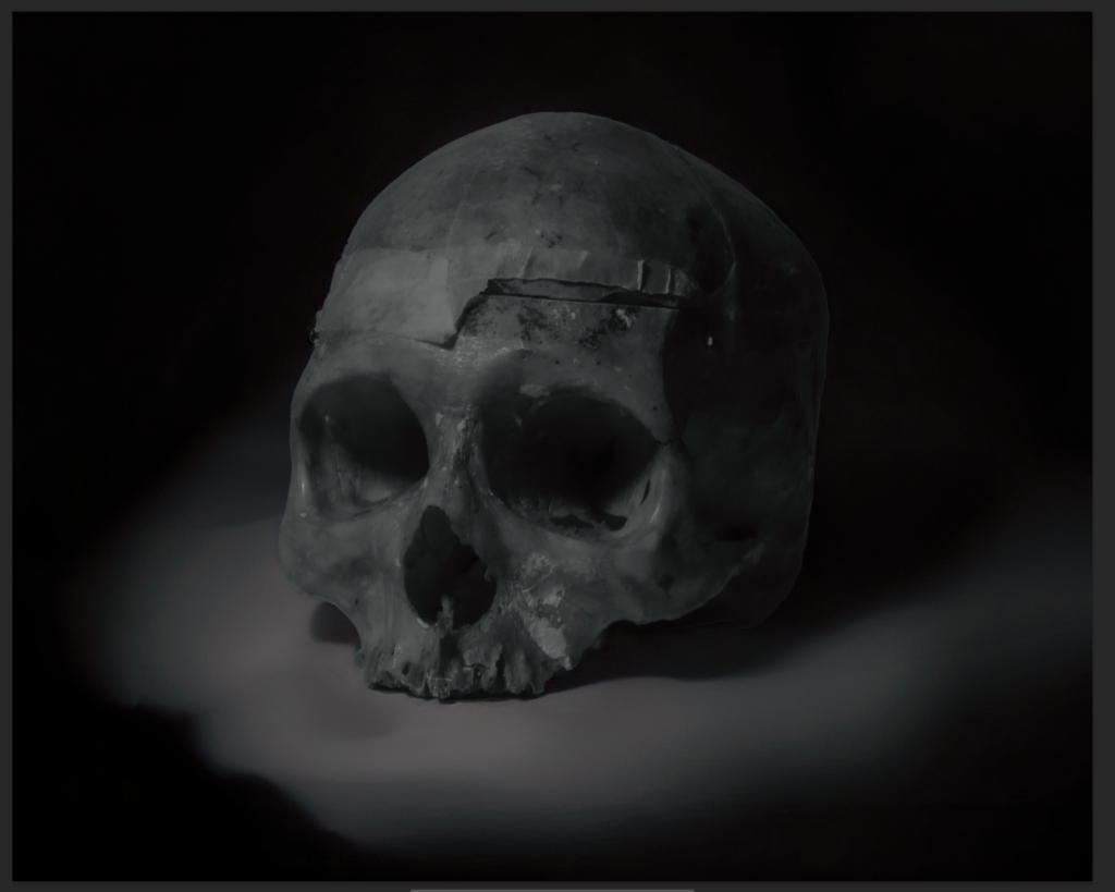
This was my second attempt.

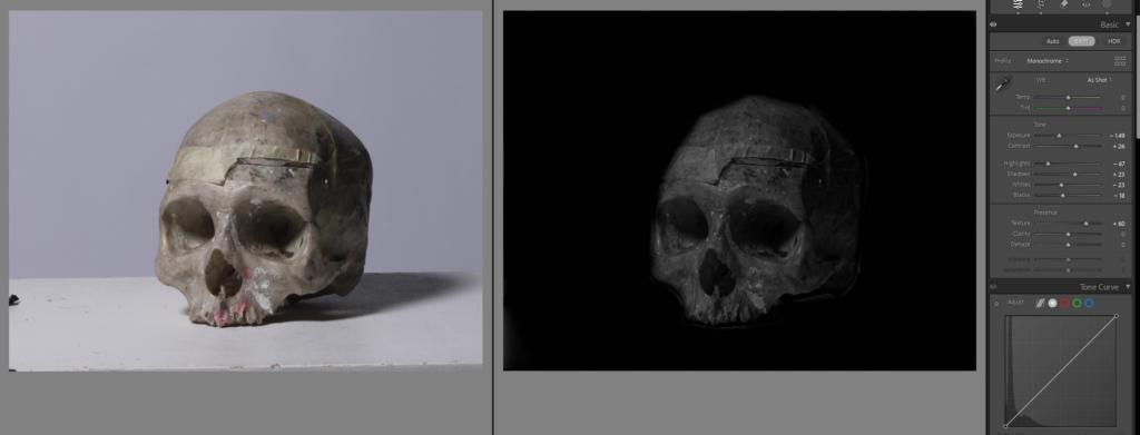
This is another photo of the skull I edited but instead of going to photoshop I edited the black background in Lightroom by using the brush filter and bringing down the exposure and blacks, and contrast.

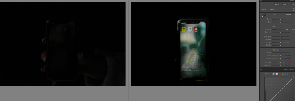
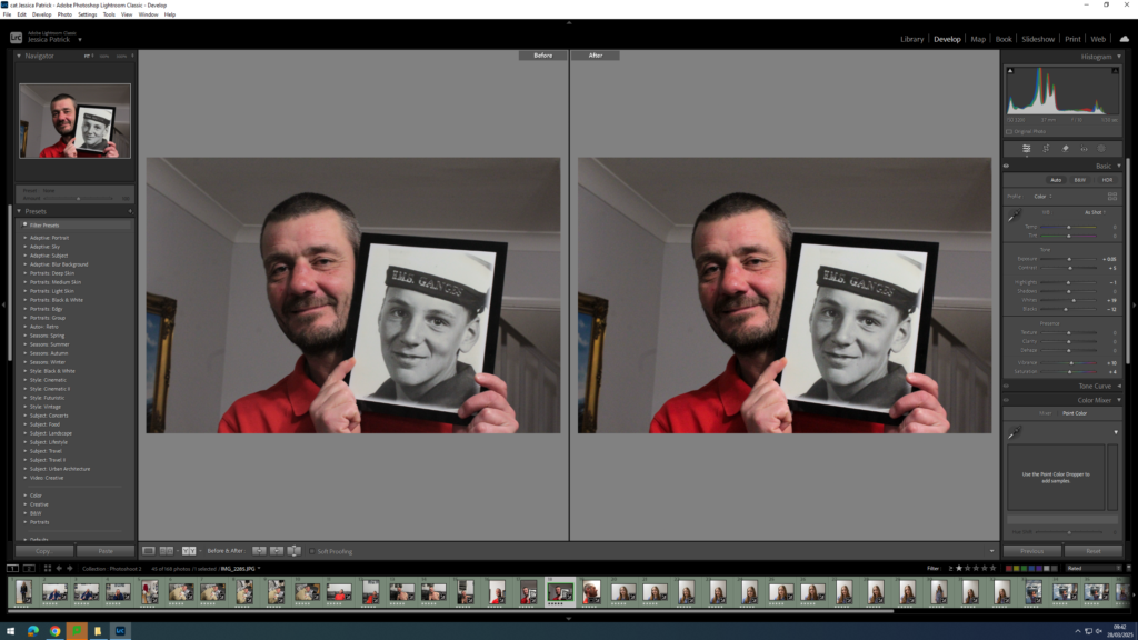
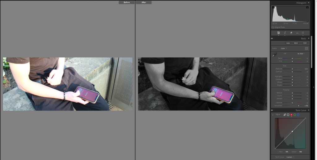
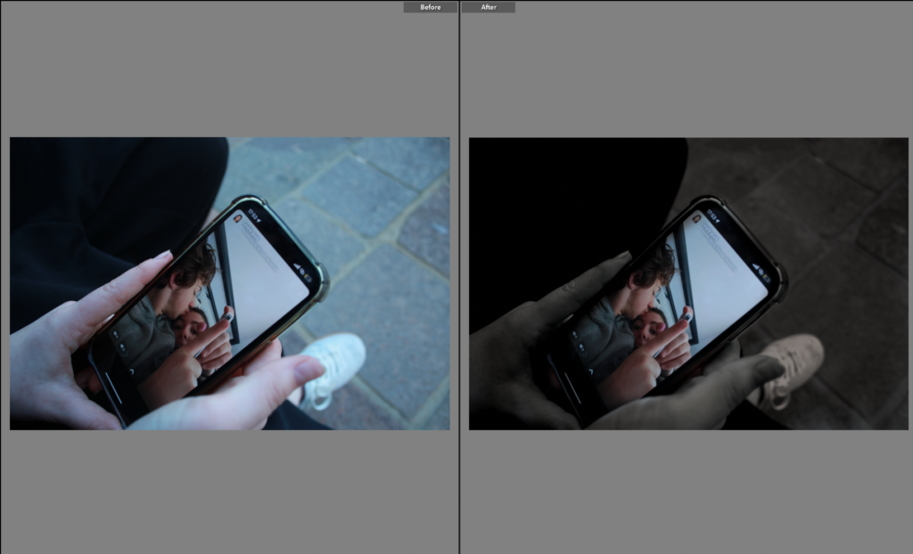
This was my first attempt to edit this image of my phone to make it more obvious what was on the screen, as you can see from the first photo it is not clean what’s happening in the image, so I used the brush tool again, I used it to make the background around the phone dark, and the used it again to make the phone light. but I just didn’t light the photo because of the lighting and graining in it.

I tried again with this image, and cropped it so it was more focused on the phone, I lowered the texture to not give the grainy affect which still didn’t work because the lighting in the studio wasn’t right for taking photos of the phone, it worked better in this image but still not clear enough with what’s going on in the image.

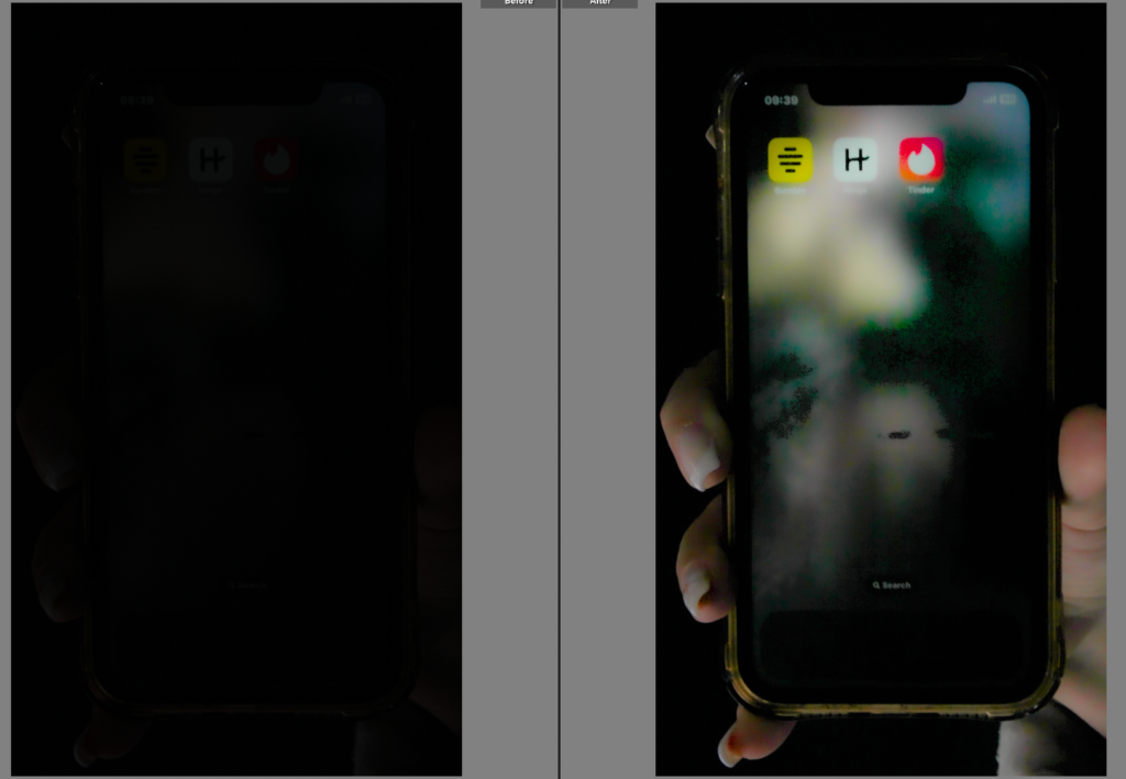
Did the same with this image, which worked better because my screen was brighter but my phone looks very grubby with all the marks on it so I will take it in photoshop to try and remove them.

I removed most the scratches but there is still some and I’m just not sure it looks great.

Photoshoot 2:

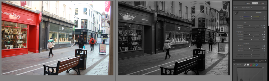
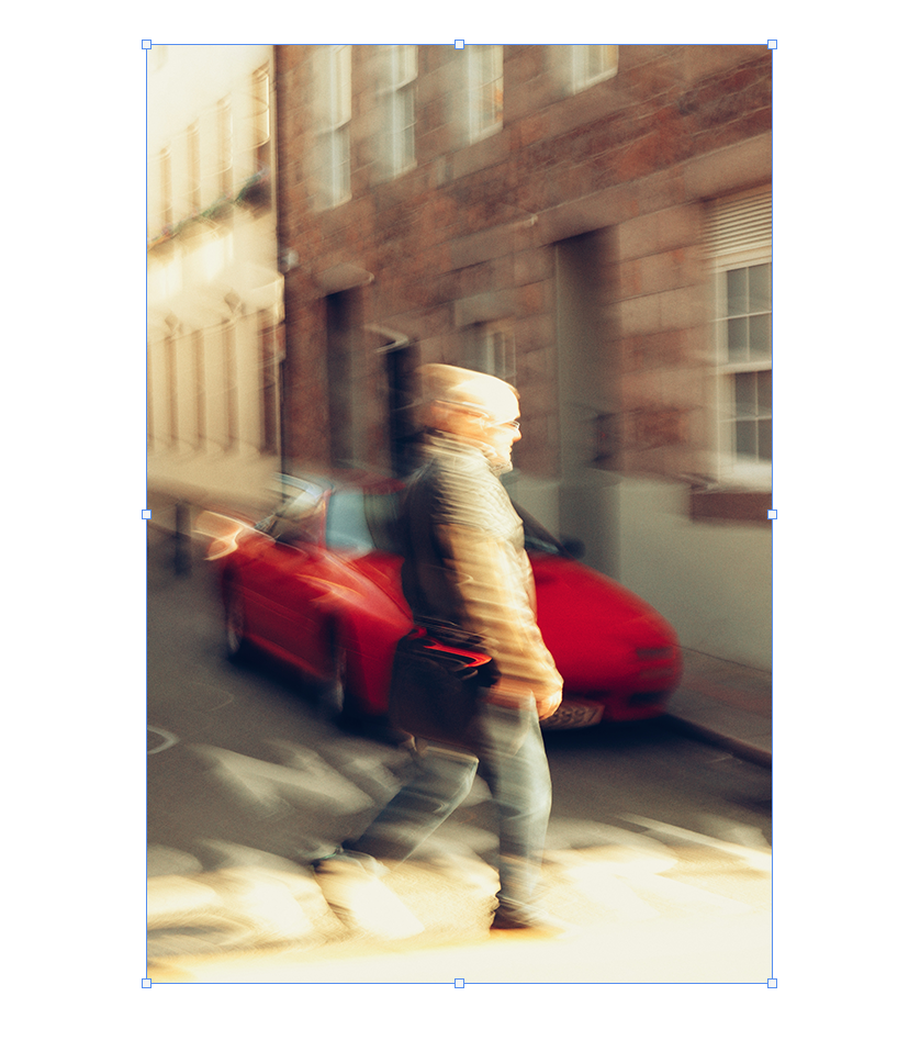
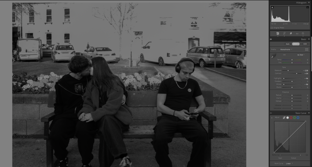
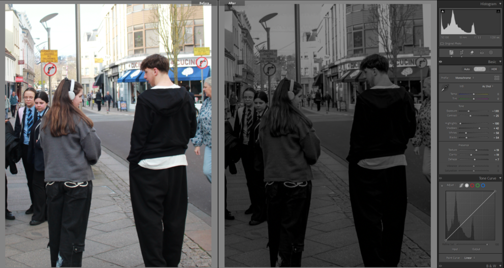
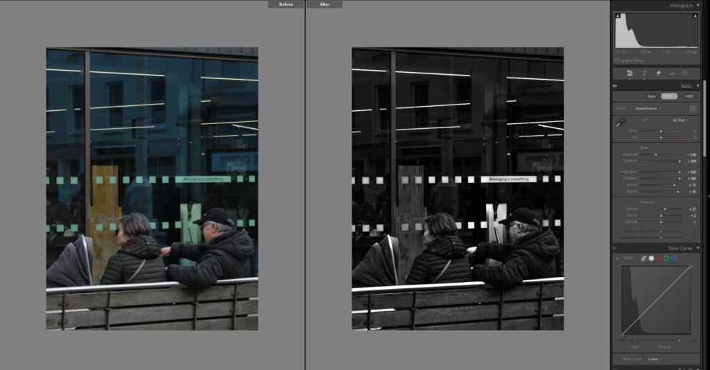
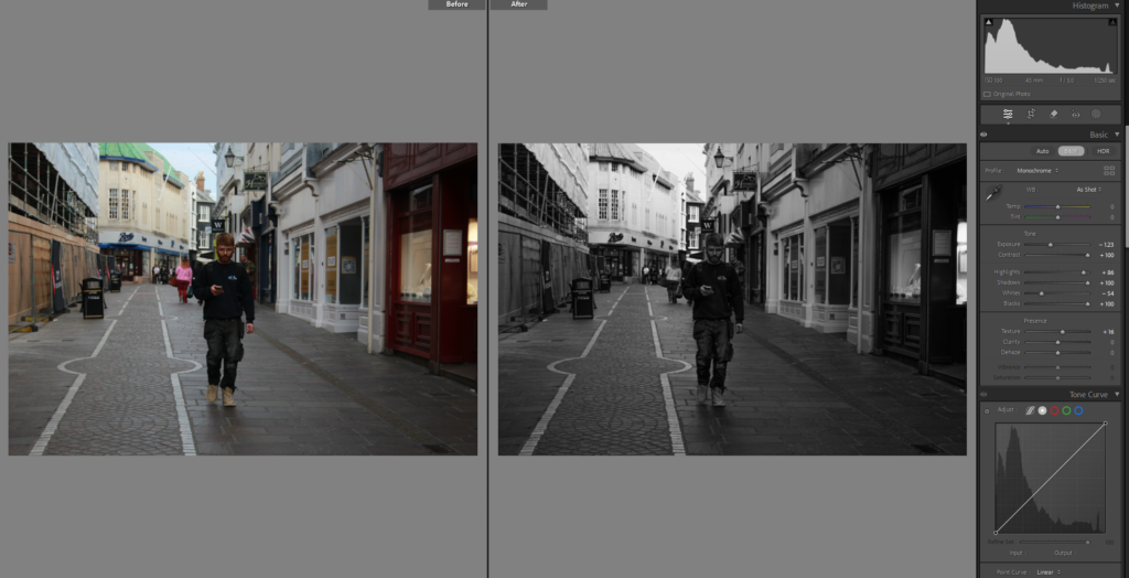
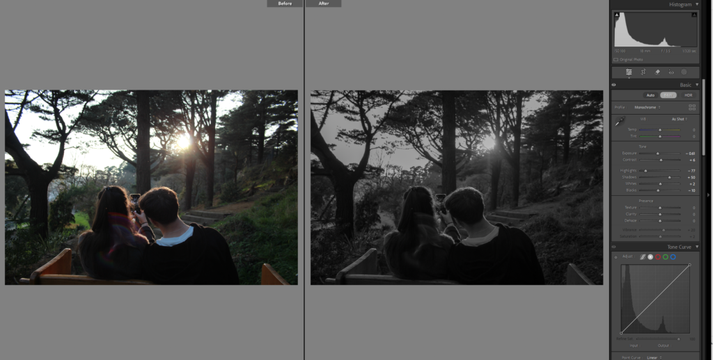
I do like this image, and fits well into the street photography aspect and inspiration from Henri Cartier Bresson, but it isn’t perfectly edited it was a bit rough just to test out the tools on how I wanted it to look. Mainly turned it black and white and adjusted the exposure and contrast and used the brush tool a little in the top where it was brighter from the sun.

I edited this in black and white as well which is what I think most of my images will be, I decided to crop this one, and used linear gradient instead of the brush tool to darken where the sun was shining brightly

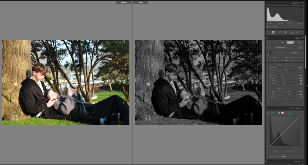
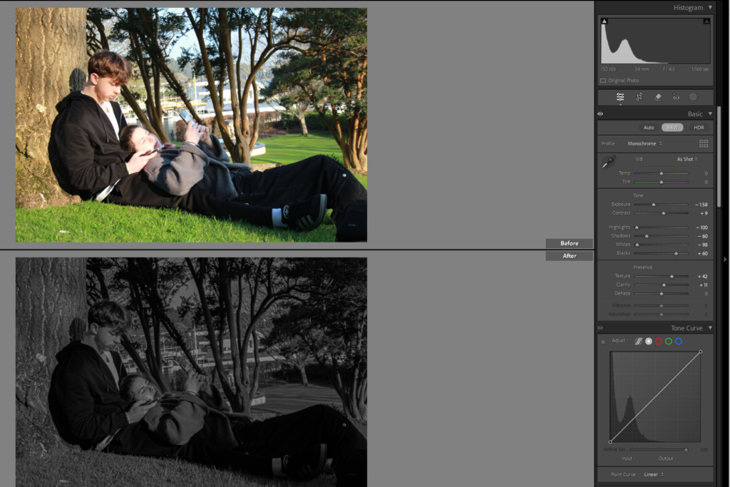
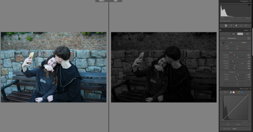
I wanted to make this image look like an old in time image, so edited in Lightroom, I liked it but didn’t think that it gave the right affect still.

I attempted again by putting the image into photoshop and using another image of a textured old time affect, and then lowered the opacity, but it was a little too faint the actual image, so then I added the same background image again on top and lowered the opacity of that image.

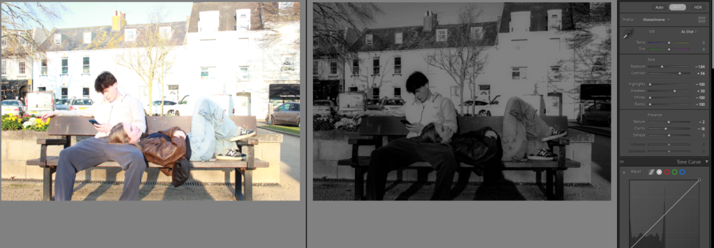
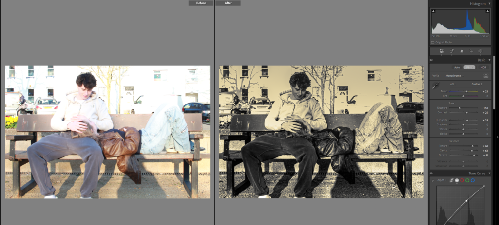
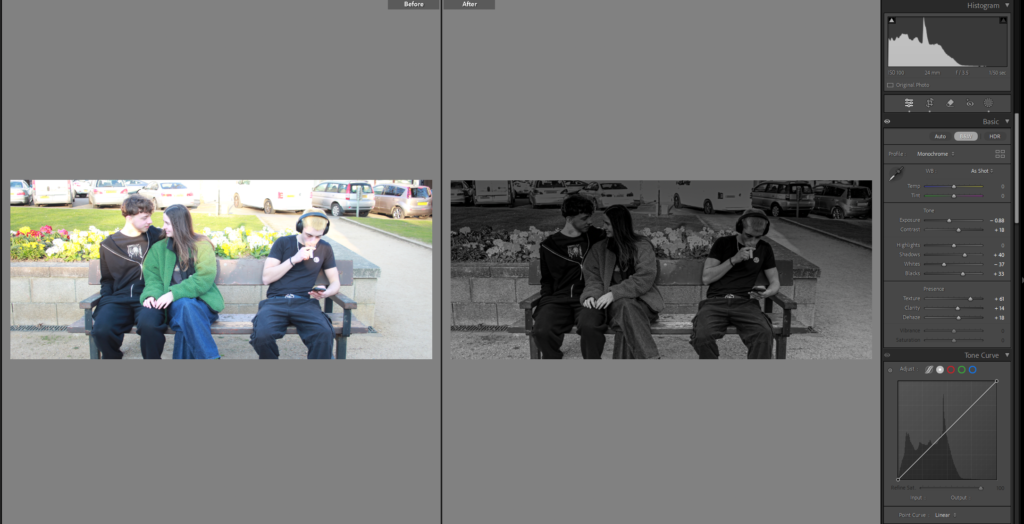
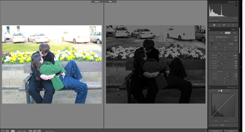
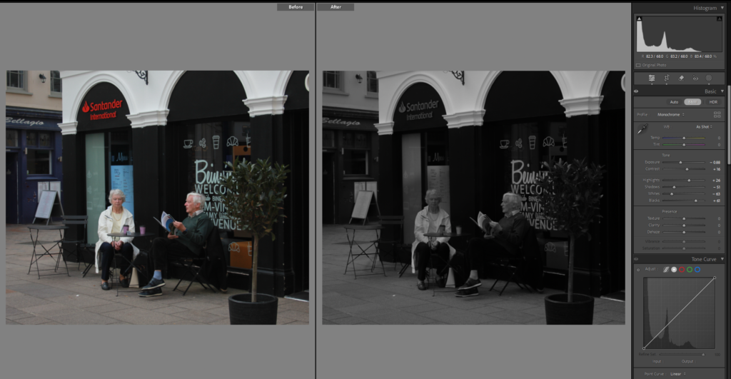
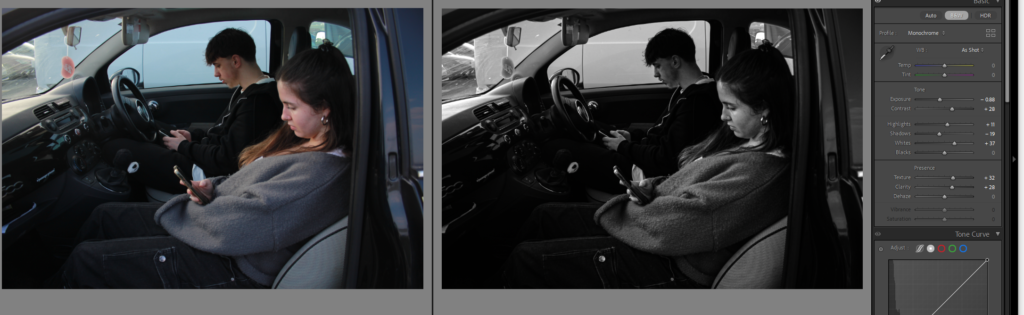
On this image I used the linear gradient, to make it so half the screen was black and white where harry the guy is sitting because he is on his phone and it gives a symbolic effect that the darker side is the falling out of love or less invested in the relationship while Martha the girl has colour but its slowly fading, because she is getting fed up.

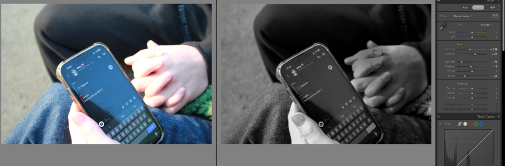
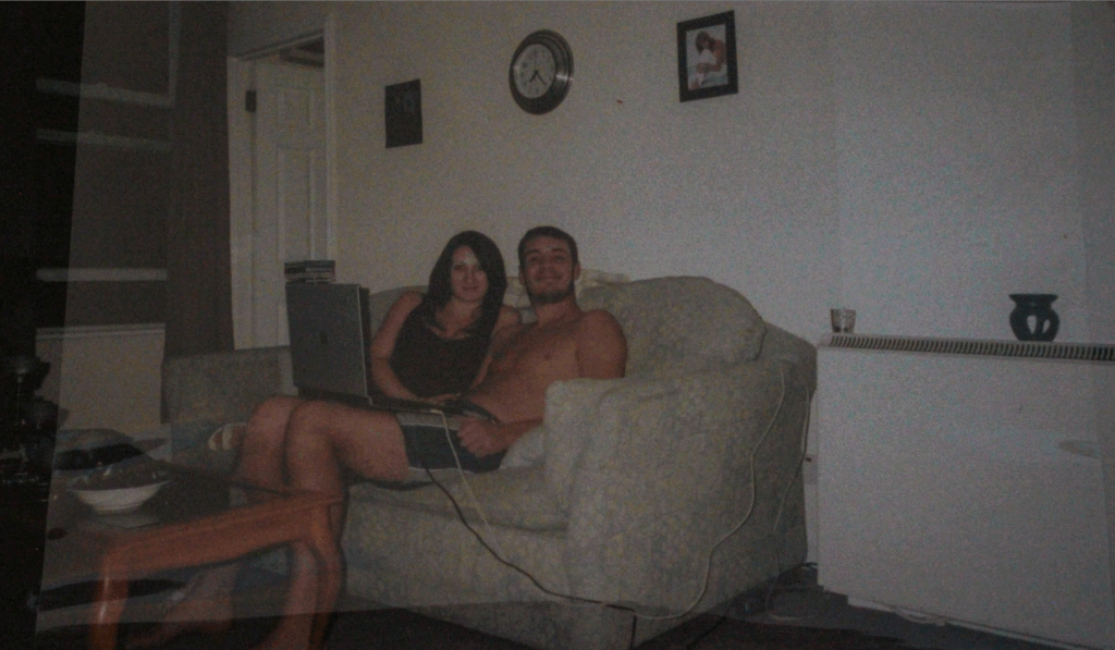
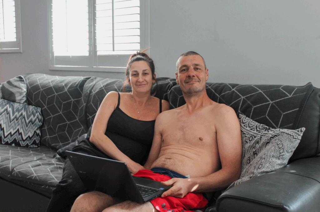
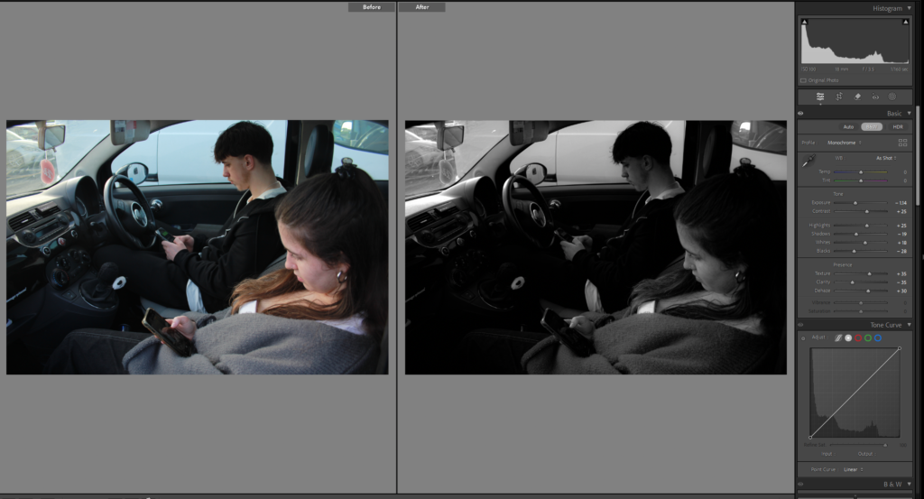
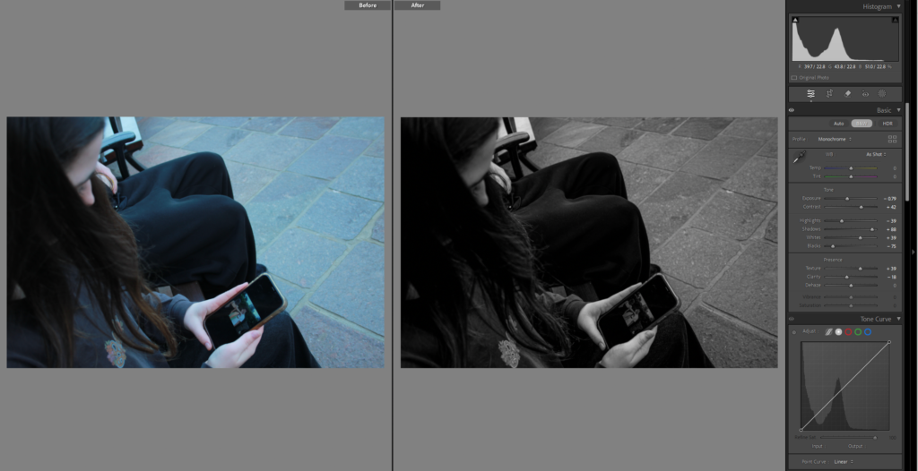
Again I made it black and white and changed the exposure used the brush tool on the hand to change the lighting a little because it was very bright, don’t love this image just because I think it should be on messages, but I liked the editing and how clear it was that was said.

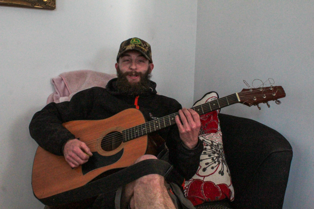
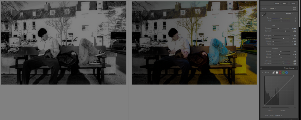
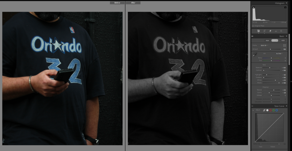
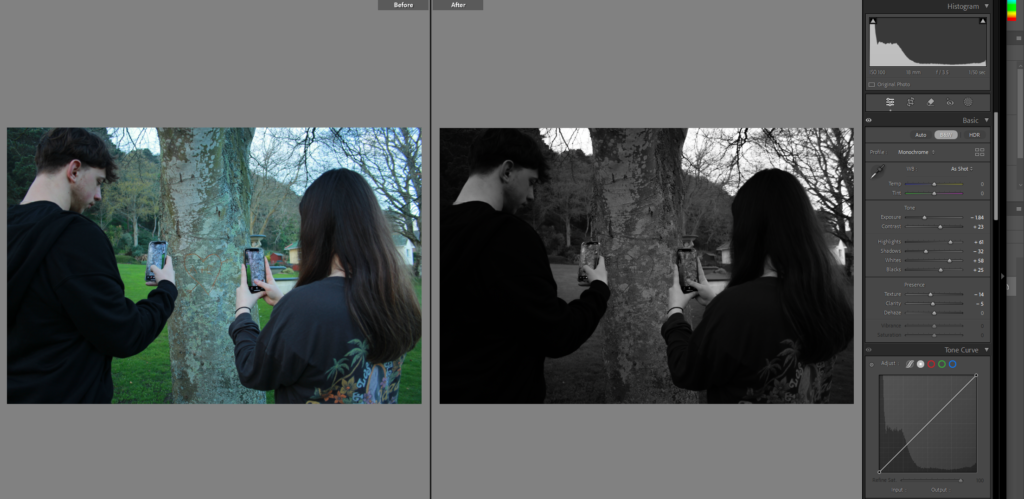
I made this image completely black and white using the brush tool but kept the phone bright and upped the saturation a little to make it brighter and more visible.

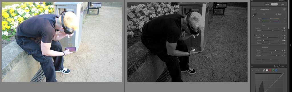
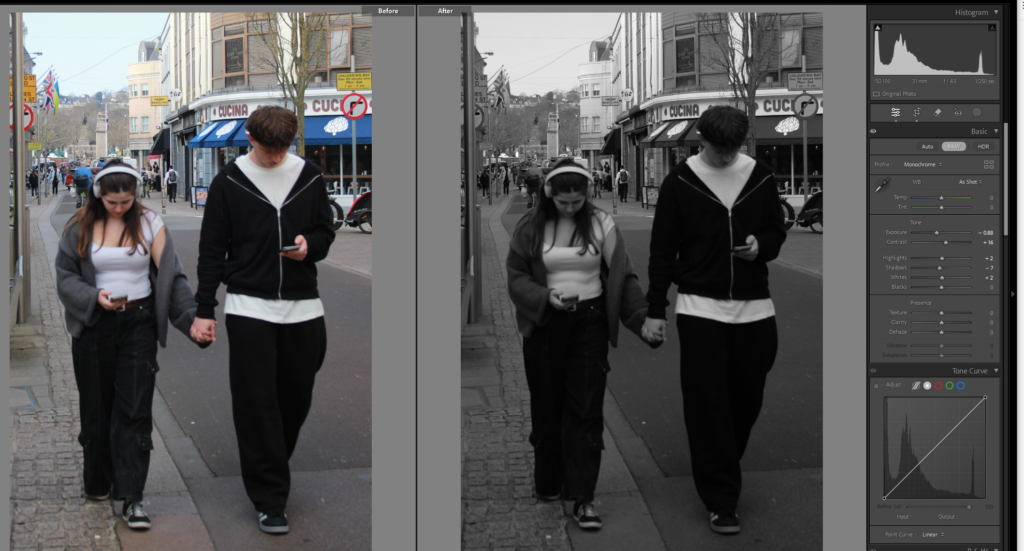
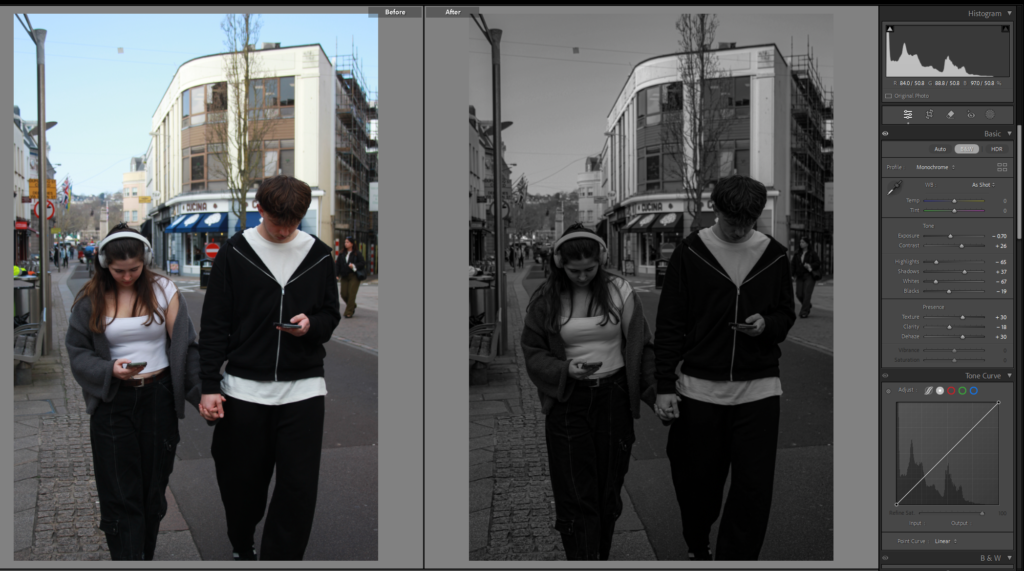
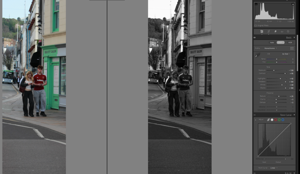
Again with this photo I edited the exposure and contrast especially for the hair as it is very bright and blonde, I made it black and white because I think it looks better and gives a cooler more dingy affect on my images, contrasts everything better, but I want the phone to stand out more, so might consider cropping it, trying again with that being the only part with colour its still not obvious enough though.

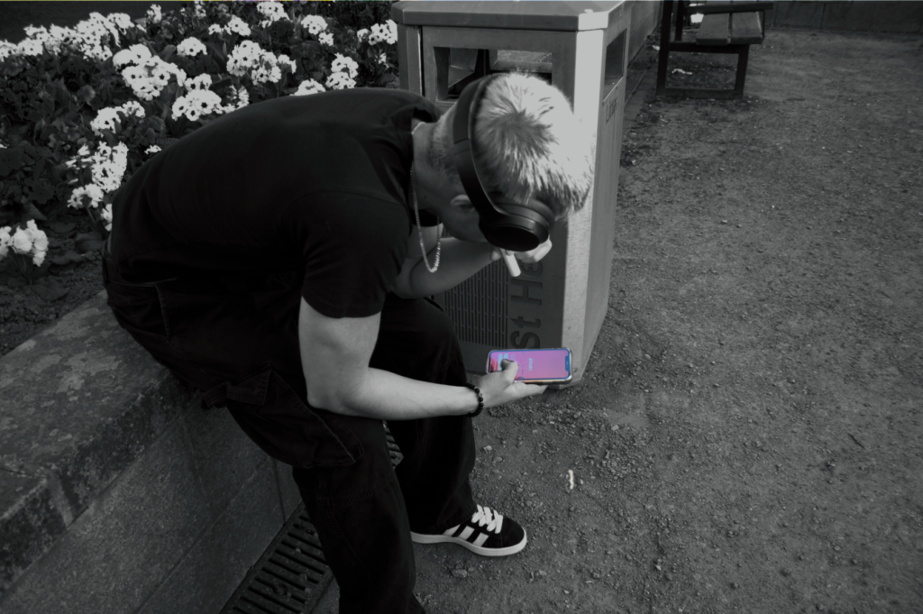
This was my attempt in photoshop and it looks a lot better.

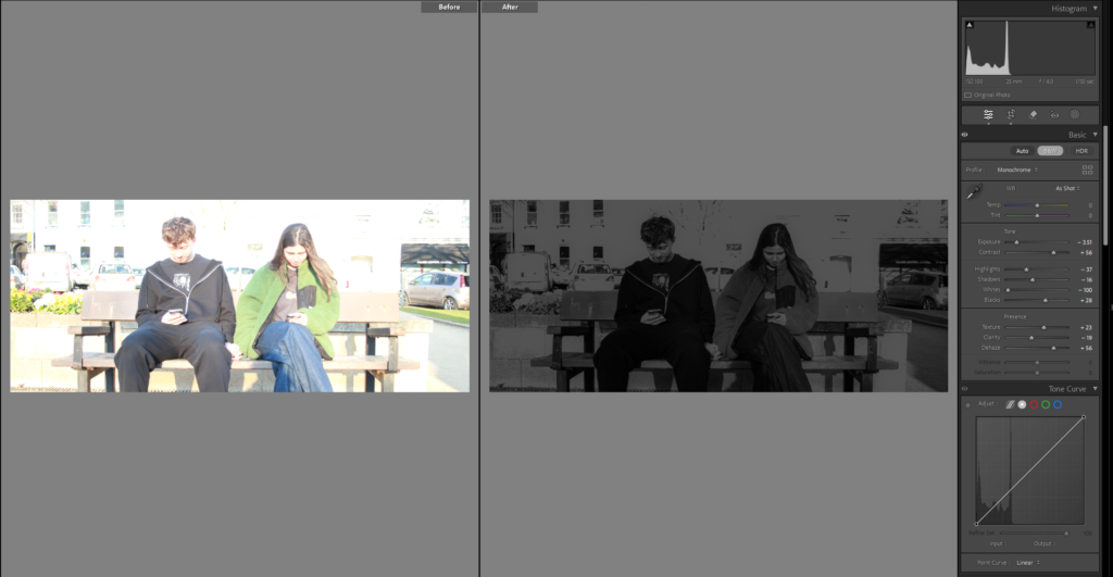
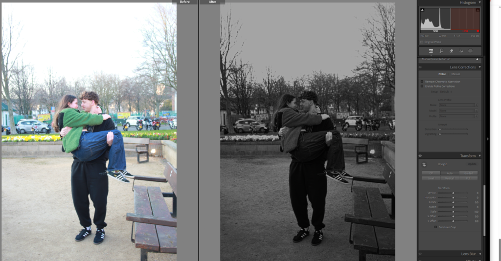
Liked this image, just made it black and white, and if I wanted to add it into my book I thought I would have there fold of the pages right down the middle to show the juxtaposition between the people more clearly. Decided to edit it in some different way.

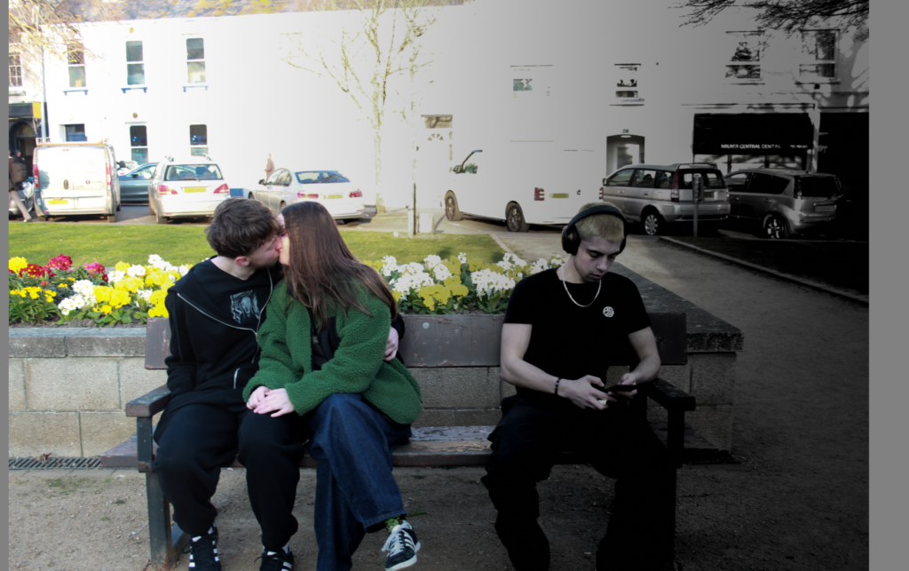
I then tried it using the linear gradient tool again on the side of the single man to give the dark cold black and white affect on his side and a colourful side on the couple.

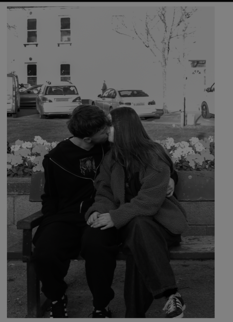
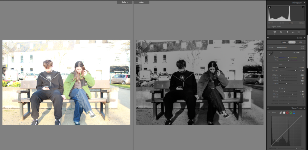
I then cropped it so it was only the couple and the other crop is only the single man.

I cropped this image as well, made it black and white and this will be an image that correlates with another image from the old days, possibly.

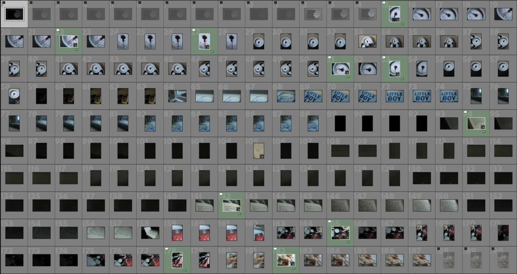
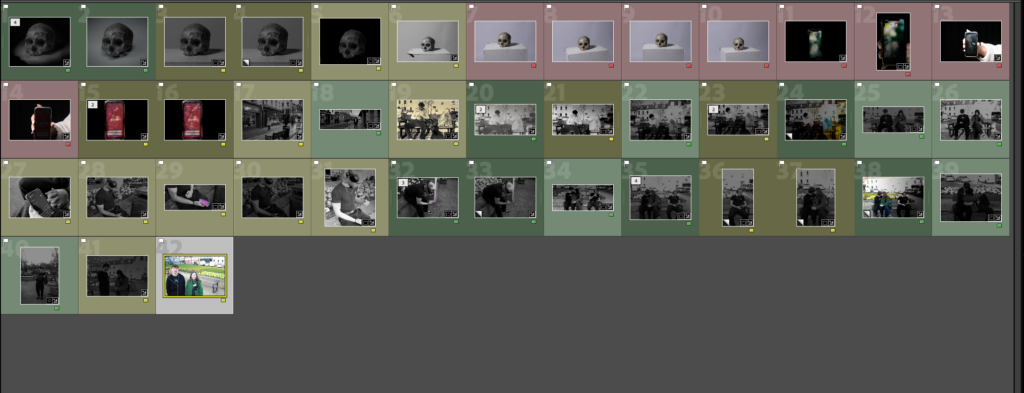
After going through and editing all my current images I coloured the either, red, yellow, or green, I did this to show which ones I really like and want to keep or the ones I hate.

Red = I don’t like it don’t use

Green = love it, definitely using it

Yellow = I do like it not certain though, maybe ill use maybe I wont.

Photoshoot 3:

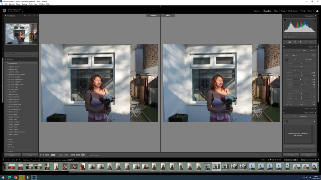
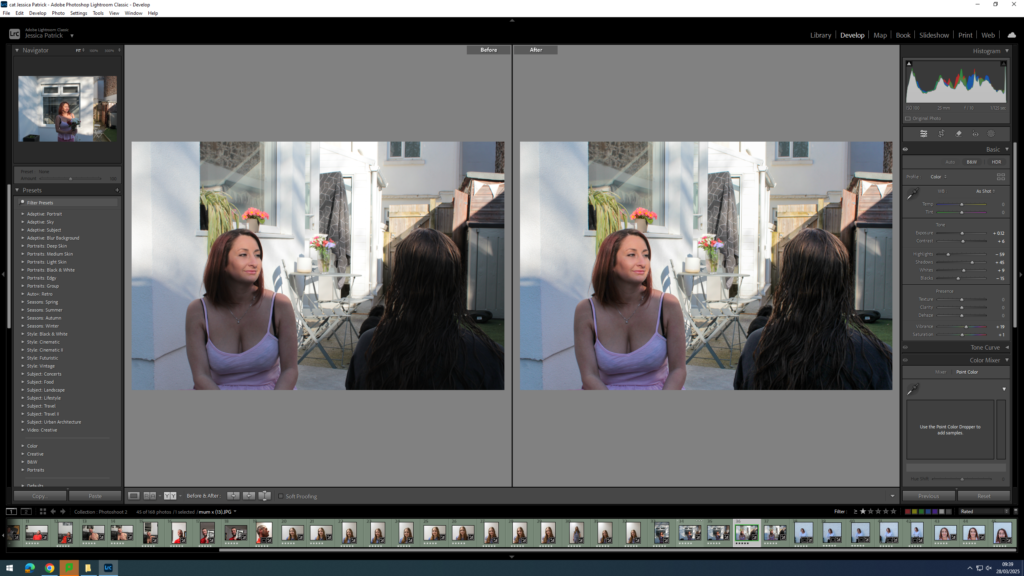
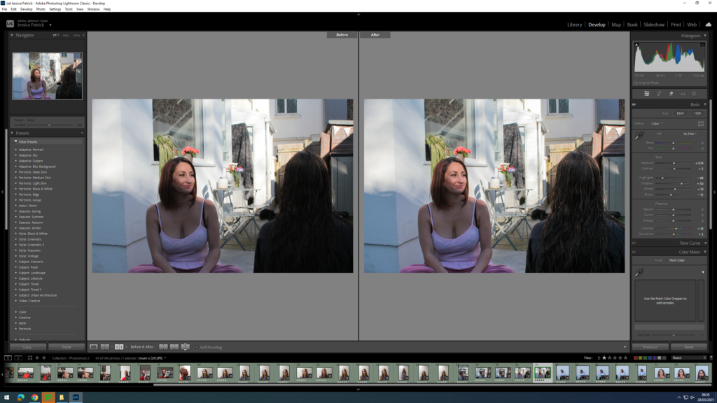
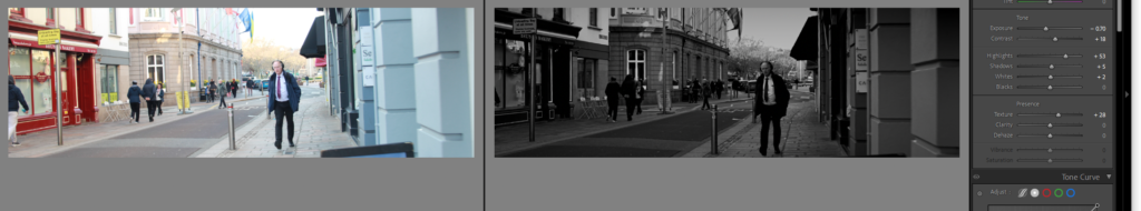
At first I edited this image making it black and white, I didn’t like all the people in the background though and attempted to get rid of them in photoshop but it did not work as well as I wanted.

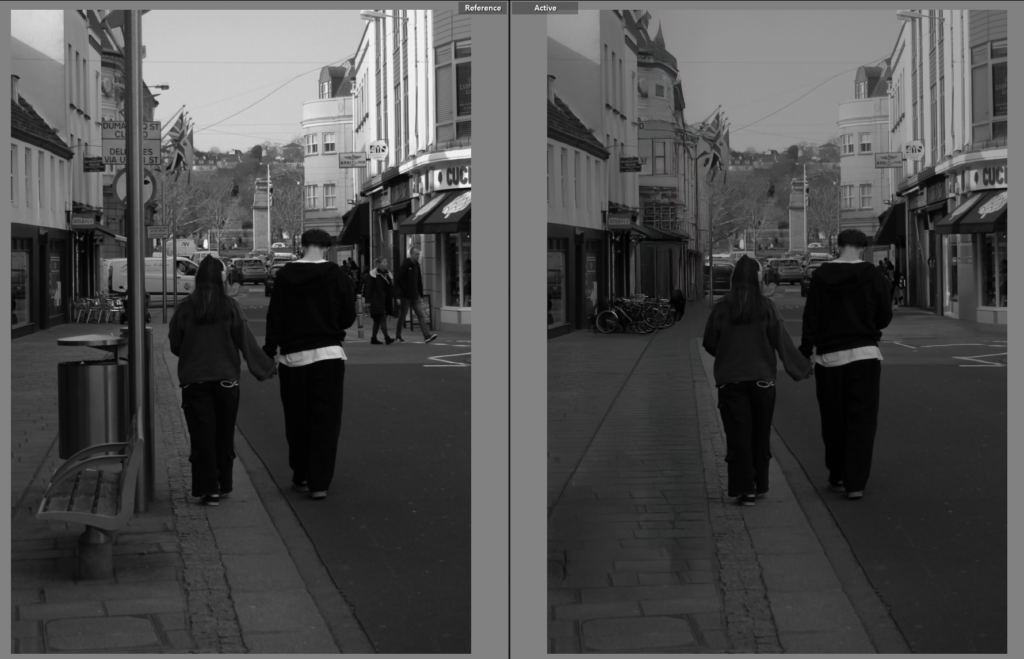
Got another photo from the couple on the street but instead for this one I moved it to photoshop and removed the people, the bin, bench and pole. so to not take away focus from Ellen and Tony.

This image I once again removed things from the background but don’t love how it worked out and think its still gives a cool affect when it is next to the comparison photo.

This image I turned black and white, and did the basic edits as you can see of the exposure and contrast, but then I also specifically used the brush tool on the ladies face because she was very bright which isn’t a bad thing just think their wasn’t any shading or texture to her face and it looked odd.

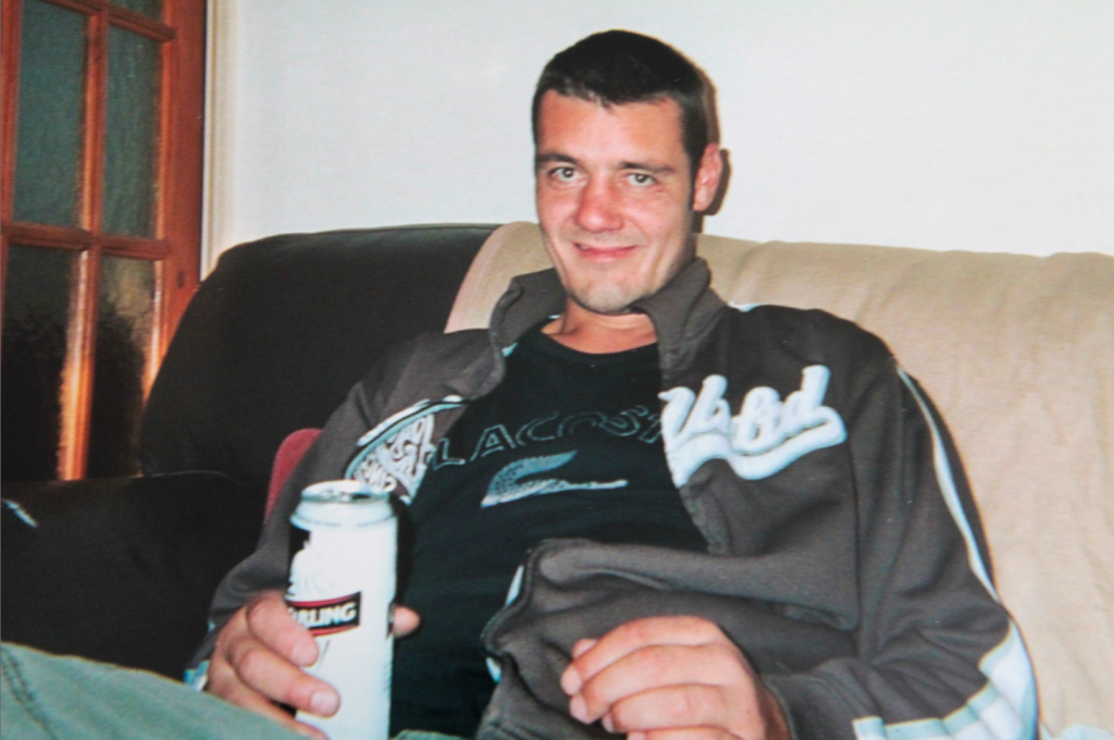
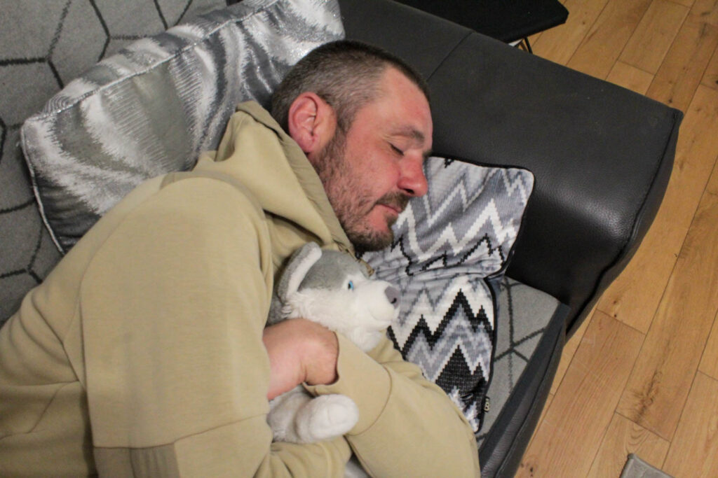
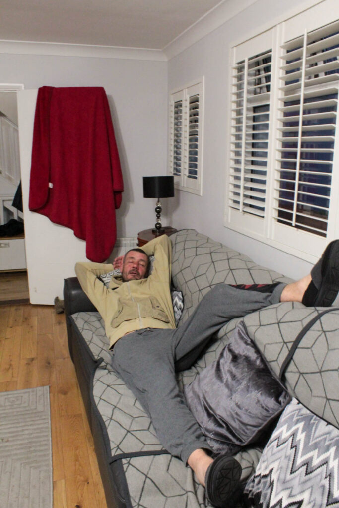
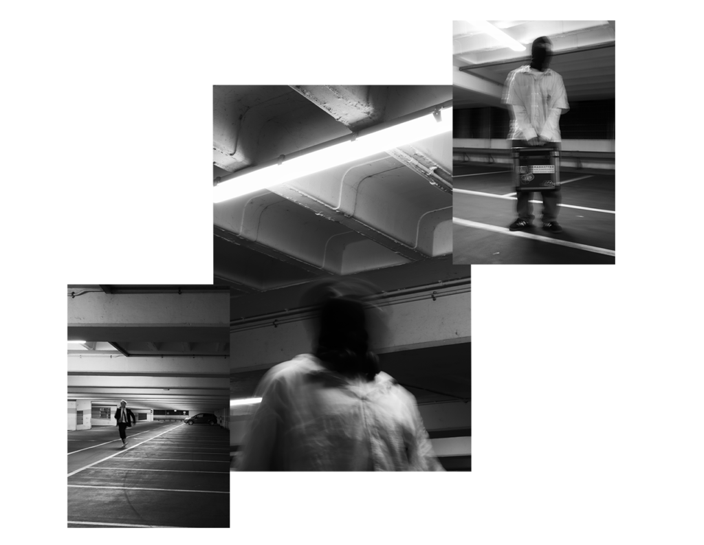
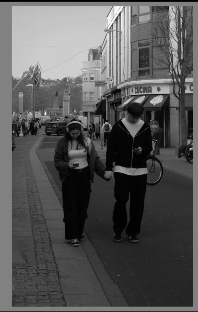
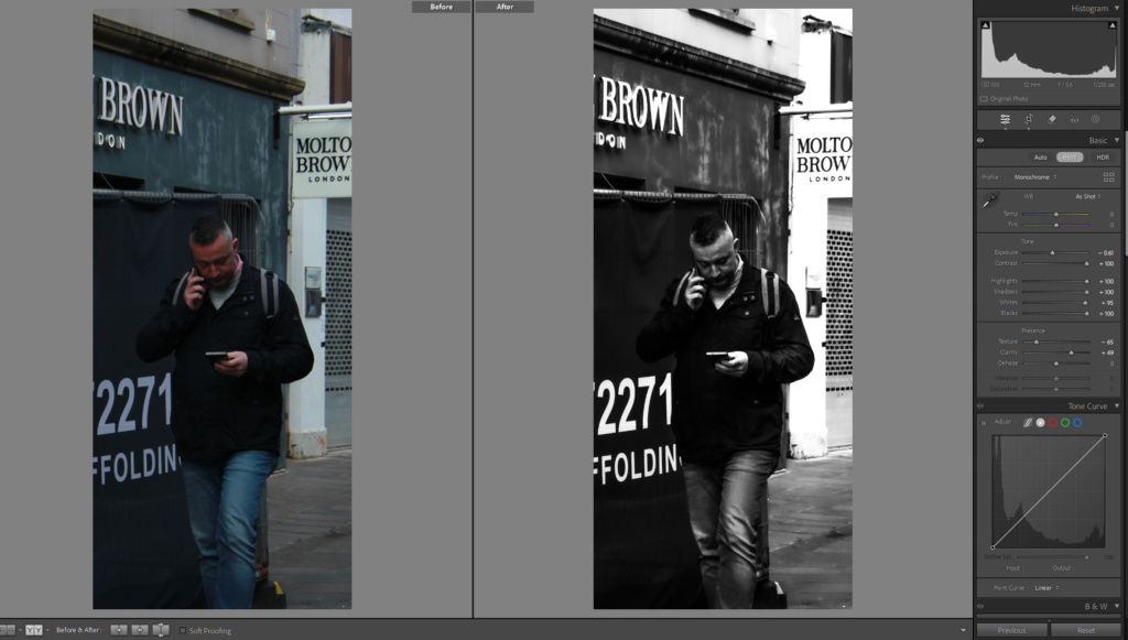
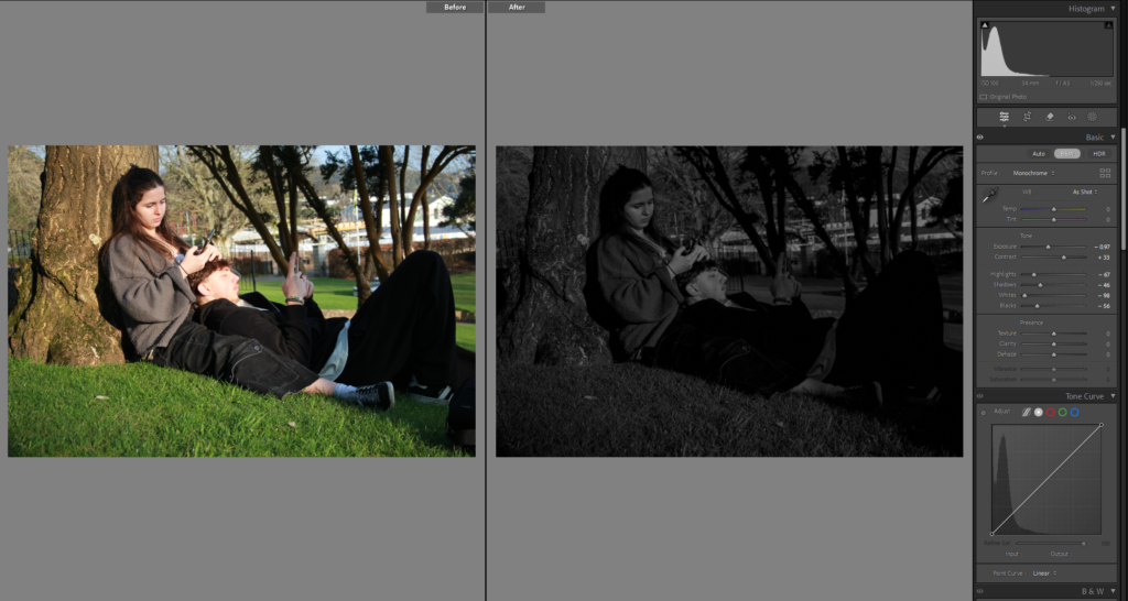
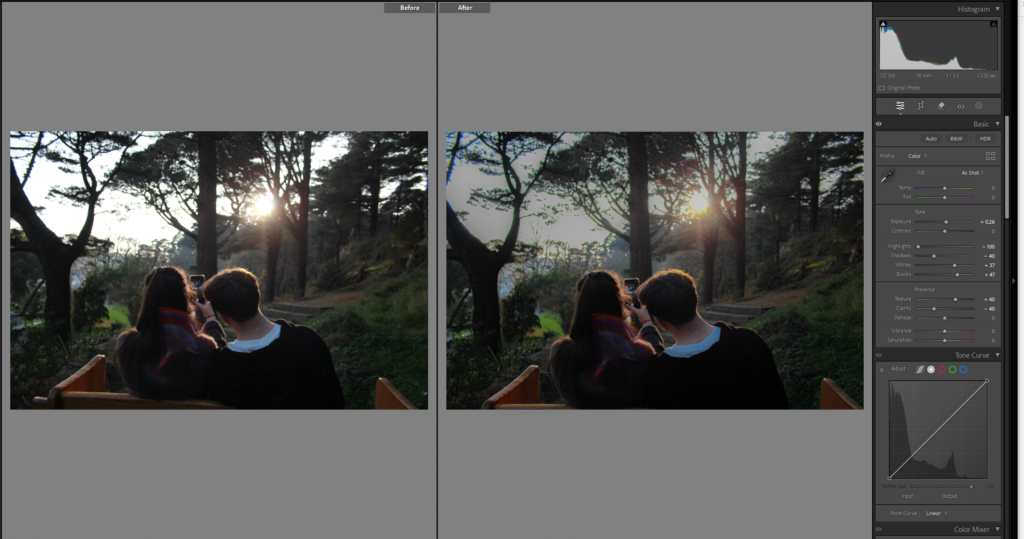
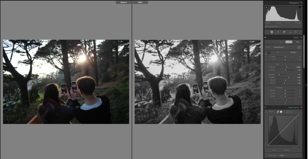
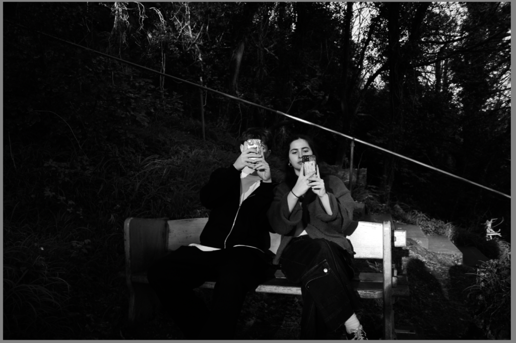
these are my street photography of couple or people on their phones and I don’t have a specific way of editing I am making them all black and white and then playing around with all the other tools until I think it looks and gives the right affect.

Photoshoot 4:

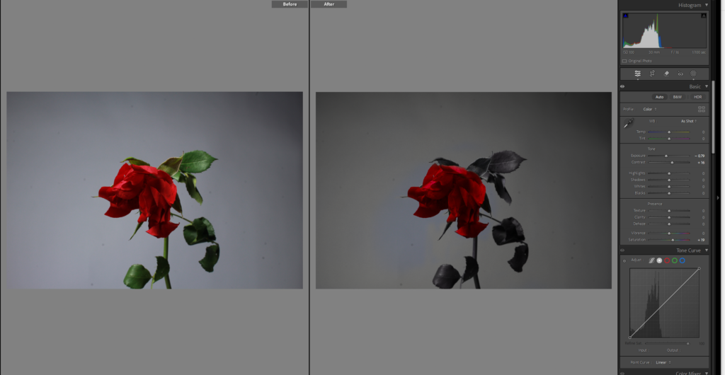
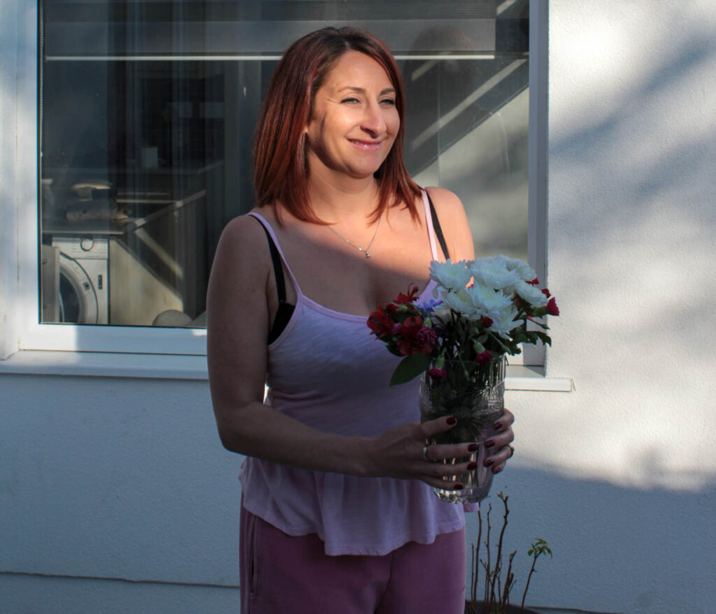
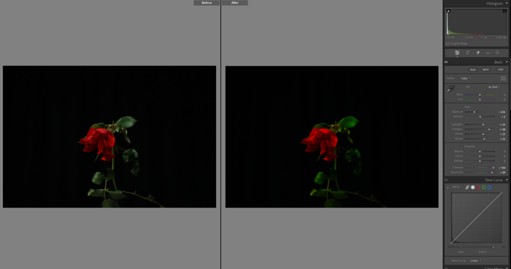
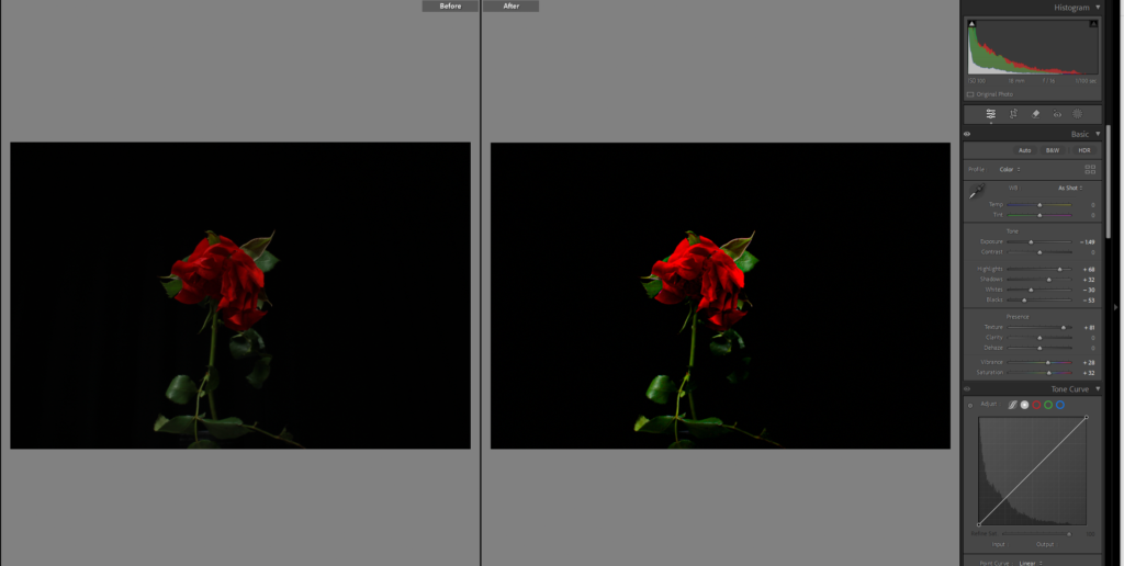
I edited this image by making the surrounding black and white using the brush tool, and then I decided to bring the saturating up for the rose to add to it standing out but I don’t love it.

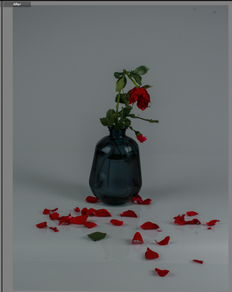
I moved this photo into photoshop to change the vase.

Photoshoot 5:

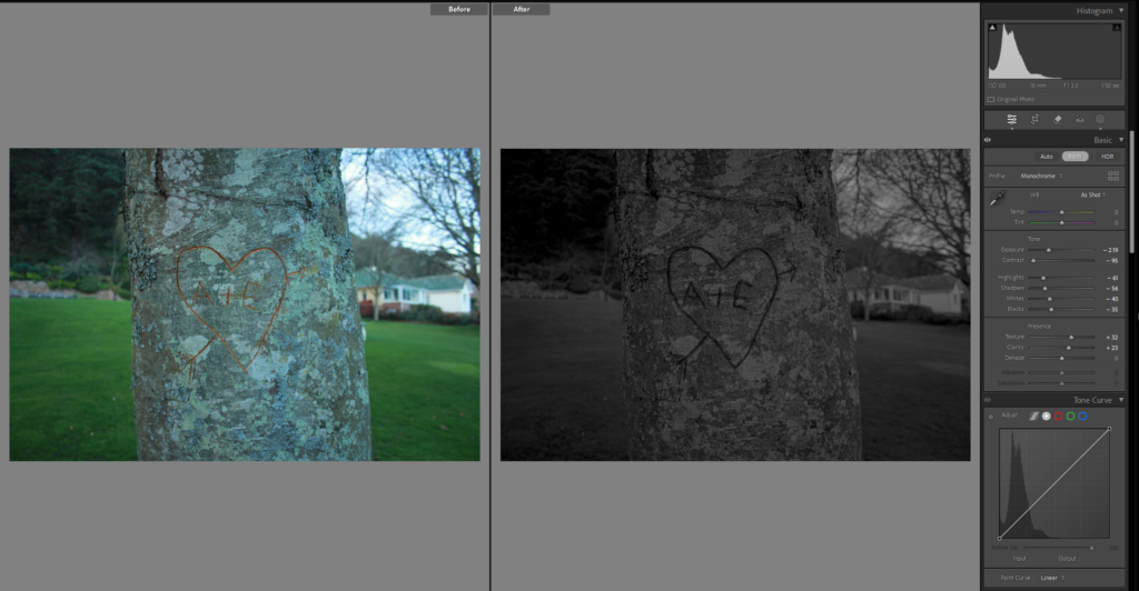
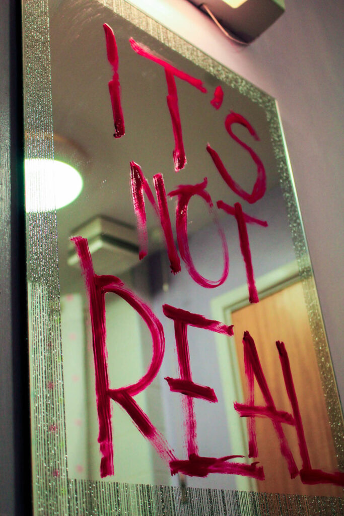
In this image I wanted the heart to stand out so outlined it with the brush tool and darkened the exposure, didn’t pop out as much as I wanted.

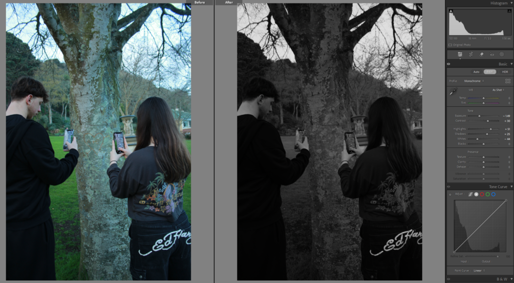
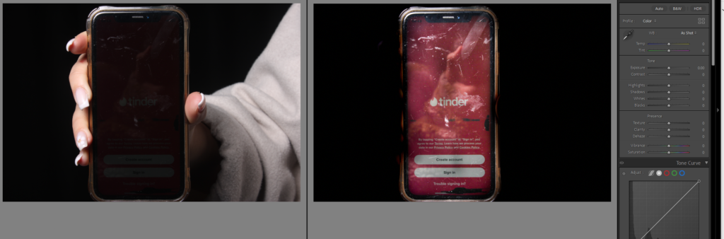
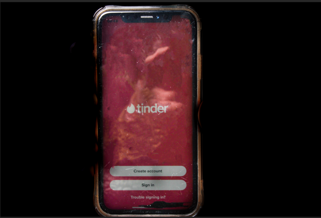
This photo I used the brush on both the phone and the background, the brush tool used on the phone was to make it brighter and slightly more visible and full of colour, when the brush tool on the background was used to make it black and white.

Then I decided to crop the photo so you can see the phone and the photo on the phone more clearly to see what’s being looked at.

And this image I am editing in photoshop and it is incomplete right now as I plan on adding different text messages and more above the girls head but need to select them first.

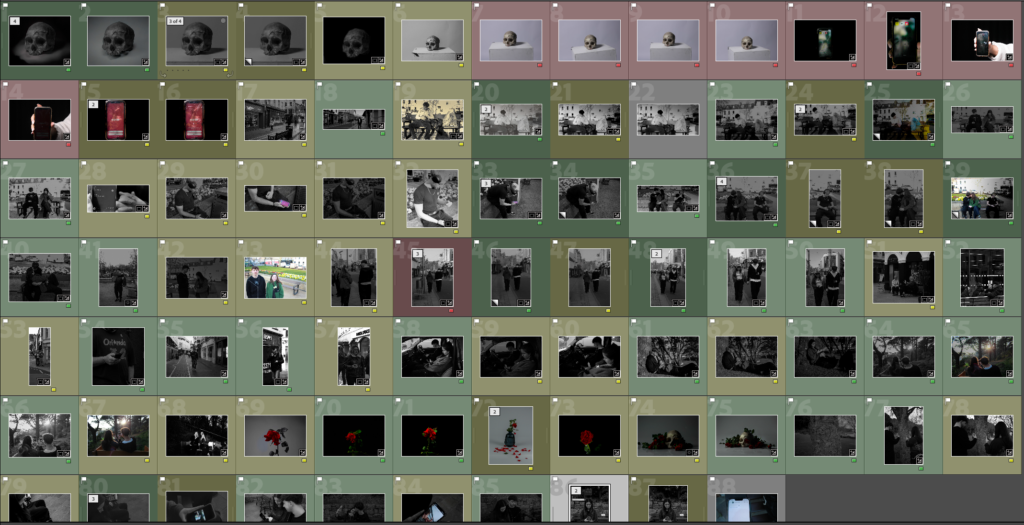
Finally I have the last 88 images, either in green, yellow or red, to be selected and chose for my photobook.

Editing images :

These are some of my other edits of images I took during my photoshoot in response to Mandy Barker.

1:

Before and after:

For this image I wanted to capture the writing about recycling as that links to my project and the idea of anthropocene. I wanted to take the photo off centre to create an interesting composition and to allow to space as the red lid is quite bright so it needs space to make it not too intense.

2:

I took this image close up to the rubbish (crisp packets). I wanted to take a close up image as it causes the focus to be in the viewers face. I made it slightly brighter and more colourful as I found the original one to be quite dull.

3:

For this image I used a similar idea to the last when taking it close up. I also edited it in the same way as the last image.

Photoshoot 3

Contact sheet:

The three images below are some of my favourites I have shot so far as I think that I have composed them really well, as well as having a strong concept behind them that I find has been demonstrated well.

These images are symbolic towards the impact that airbrushed beauty and fashion magazines have on women’s and young girls’ perception of themselves and their self-esteem. As well as this, I wanted to curate images that created an overdramaticised, visual epresentation of pro-ana websites which are targeted towards young girls and promotes unhealthy eating habits that perpetuate eating disorders. I used a grain of rice and put it onto a plate with cutlery in alternating positions to show how extreme this issue is, and that women are not nourishing themselves with enough food to function properly. Due to the promotion of unrealistic body standards in the media, this leads to an internalised self-hatred due to wanting to have this unobtainable body, distoring their perception of themselves. I think these images are really powerful because it means that these habits can be demonstrated, even in a melodramatic way. Of course, nobody is actually having a meal like this however this is a visual depiction of the idea that a lack of food won’t cause the body to deterioriate, however when presented in this format then we can truly see how devastating it is that there are young girls being motivated to restrict themselves of fuel just because of society’s expectations of what woman should look like, making it almost impossible to feel comfort in being natural.

This is one of my favourite images because I have used a soft focus on the background through my short depth of field, and when paired with the bold silver of the fork, this means that the image is balanced between blurred and sharp. I removed all small specks that may have been on the camera when I shot this photoshoot, however of course I left the reflection of the fork into the place as otherwise, this may have looked really strange or it could have meant that the viewer would not know that the fork is resting on a plate, confusing the concept behind the image. However, I also really like this because adds direction into the image, where the end of the fork and it’s reflection oppose. This adds line into the image, which means the viewers eyes can be drawn through the image to flow easier.

The fork is highly contrasted against itself, meaning that it appears almost black instead of a light silver. I think that this is crucial to the image because it means that the foreground and background of the image can be distinguished easier, making the focal point of the image more bold so that I can further create a focus around the concept of eating disorders. I zoomed in very close to the fork so that I could use this image as a detail shot in my photobook. As this is a sensitive topic that I am focusing on, I think it is crucial that I incorporate this into my work because it will allow me to pick apart the structures in society and focus on the small clues in the environment that point to the feminist movement or stereotypes in general.

Similarly with this image, I zoomed out from the previous angle and put the grain of rice in the middle of the plate to be more emotionally provoking. This is because the sight of the empty plate with just a grain of rice on may be more compelling than the previous image as it is more direct in showing that this is the only thing being provided as food. I used a short depth of field again to blur out the rest of my table as this is not relevant to the concept of the photo so I didn’t want this to distract the viewer from the message that I am trying to send.

I held up the fork in a hesitant way, kind of drifted away from the grain as if it was being ‘played’ with. This is metaphorical towards the way that eating disorders are still psychological issues, even though the consequences are physical, where the patient feels restricted in her eating by her brain believing that she shouldn’t, leading her to struggle and hesitate when about to eat. I wanted to do this as eating disorders are so detrimental to the mind, body and soul so that, even over something as small as a grain of rice with little to no calories in, there is still a significant struggle to feel able to actually eat it. I slightly got the top of the knife in on the right side of the image so that I could almost pretend that this was an actual meal with the table set as I feel that this is more compelling in making the viewer feel sympathetic, as this is such an abnormal scene.

Finally, I also took a horizontal shot as I wanted to be able to vary the direction of my images in my photobook and I wasn’t sure which way I wanted to place them yet. For this, I just simply crossed over the knife and fork on the plate as if the subject was finished. I did this leading on from my previous image concerned with the hesitancy that eating disorder victims may face even when trying to eat something with practically no nutrition at all. In this image, I have staged the knife and fork into a ‘finished’ position to act as if the hesitancy had won over, leading this ‘meal’ to being finished before it even started. This image uses a sharper focus to provide a different perspective into my work, however the exposure is still low to provide that ominous tone I wanted in this set of images because it is such a deep and dark topic that I am representing, therefore I wanted the aesthetic to be linked with this to make it flow more.

For the next few images, I shot different angles of a broken scale that I have in my bathroom. I included multiple versions of this because I think that there are multiple successful images here that I could also experiment with if I don’t end up incorporating these into my photo book the way that they are. As the plastic on the scale is smashed, I wanted to use this as it can represent the anger that loved ones may feel when supporting a family member with an eating disorder or body image issues as the victim wouldn’t have the same perception of themselves as their families would. This could also be representative of the frustration that a victim may feel in their suffering because they are aware of what this illness is doing to them, however their brain becomes programmed to act in this way, making the scales smash as they are so outraged that they are experiencing this.

As the scales were broken the arrow would go onto random weights, however I feel that this contributed to the concept of the photographs as it points at 1 stone which is an incredibly low weight, as if someone struggling with these issues is stood on it. I took this image horizontally as I know that the image or scales when associated with eating disorders is extremely emotionally-provoking meaning that, depending on the quality of my other images, this may be able to be used as one of my defining images in my photo book – a double-spread image to validate the viewers preconceptions of what they believe the photo-book to be about. I used natural lighting for all of the images of this nature as the scales are white, so I wanted this to be enhanced with natural shadows which aren’t as deeply contrasted. I used the spot corrector tool in Lightroom to remove some of the obvious particles that had been on the scales, however I didn’t remove all of them because I feel that the dirt on here may be relevant to the way a victim of an eating disorder will be frequently using the scales in order to keep up with the progression of their illness.

I took a few more images at different angles to try and see which would be best. This would also allow me to be more creative when designing and sequencing my photobook as I can alternate whether I want a full-page spread or pairing it with other images.

Barbara Kruger Extension:

For these three images below, I utilised the red, direct and interrogatory messages that Kruger incorporates into her work and wrote different statements in red lipstick across different mirrors. As Kruger’s work tends to challenge aspects of the beauty standard and targets the medias inaccurate representation of women, I wanted to write these phrases onto mirrors as this is the environment of which women would be comparing themselves to these airbrushed images – being in a bathroom or bedroom mirror and feeling defeated in themselves due to this unrealistic and unfair comparison.

I though that I could employ this by acting as if the mirror was repeating these phrases, for example the third image states ‘It’s not real’ which is a message to how women may develop body dysmorphia due to their distorted perception of themselves and what they believe they should look like. With the statement ‘Take your mask off’, I put this because it acts as a statement to remind her that there is no need to hide behind poor self-esteem at the hands of media and magazine outlets because it sets unrealistic and unobtainable expectations about themselves and other, being that there is no need to hide behind insecurities that have arisen from a photoshopped image.

With the 2nd image, I put ‘Who is she?’ as a link to Barbara Kruger’s work as one of her popular images consist of a woman’s face with the words ‘Who does she think she is?’. I saw this as an effective way to make sure that my work still resonates with Kruger’s, however not exactly in the same way or using the same phrases as I don’t want it to be too direct. When I wrote each of these, I was cautious with how much product I applied to the mirror as I didn’t want it to look thick or neat, I purposefully made the letters have gaps in or look rushed because this emphasises the message. This way, the words come across intense and as if they have been written erratically to push the severity of this issue that I am targeting. This could also be interpreted as the ‘subject’ (being a woman or young girl) writing this on her own mirror in order to avert her mind from focusing on what has been dictated to be ‘undesirable’ by these standards, therefore she has written this really quickly on her mirror before her brain can begin to insult her.

I think that this will work really nicely with my Barbara Kruger photoshoot experiments as the red can be a predominant factor that is clearly linked all throughout, which will also help me convey anger and rage as if ‘enough is enough’. I think that I am going to take more photos in this way to make sure I can include them at balanced intervals in my photobook.

In this image, I shot from a low angle almost at the floor in order to gain depth in the image, seeing as the word ‘off’ looks larger than the initial word of ‘take’ although they are the same size. I used artificial lighting for this by setting up my lamp a bit further away and pointing it diagonally to the writing on the mirror. As this was a warm toned light, I then went into Lightroom and decreased the temperature so that the image would look more balanced as the saturated yellow tinge that the lighting gave clashed with the writing, making it more difficult to read. By doing this, I neutralised the temperature of the image so that it appears as if I’ve used a regular lamp for this. Once again, I have employed a short depth of field in order to make the writing zoom out of focus the further away it was, however I was careful to not make this too short as otherwise it may have made the image confusing if it meant that the writing was difficult to read until the very end, defeating the whole purpose.

I also took this image using the same mirror from a different angle. I wanted to include this image too as the background has become blacked out due to the direction of the lighting being pointed in the opposite direction. I also really like the way that there is a large cluster of skincare next to the mirror as if this has been excessively used in order to try and heal these insecurities. I think that I am going to experiment with what I can do with this image as my other composition is better, however I still feel that this image will be useful.

Similarly, I used a smaller mirror for this to include different types of mirrors as this is a universal issue rather than just specialised to one person, meaning that I can act as if these different scenes are representing different women’s lives. I also wanted to use this mirror as it has a similar aesthetic to old Hollywood mirrors with lights all around the side, which is beneficial to the concept as the beauty standard has evolved since this period. With the lipstick, I wanted to really exaggerate this phrase as I feel it can be interpreted as an internal question, such as a young girl looking at her reflection in the mirror and not recognising herself after the distress of trying to alter her appearance in order to try and meet these standards. This is a very important issue that is growing more common, where girls are having issues with their self-esteem at an incredibly young age when this should not be their concern, explaining why she asks who she is because appearance should not be a priority or insecurity for such a young person.

For this image, I used the same methods as before, however this didn’t require a temperature change in terms of lighting as I just used my bathroom lighting which was the correct tone that I wanted. I liked using this mirror because it has glitter around the edges, sort of romanticising the idea that there is this false beauty standard that appears to be solely about fashion and beauty, when in reality it is truly just a form of demeaning women based on just appearance.

Hannah Altman extension:

Looking further into Hannah Altman’s work, I experimented around with liquid highlighter as a replacement for glitter in some of my images as I wanted to see how this would look, as I was able to manipulate it more due to it being liquid. Whilst I really like the technical elements of the two images below, being that the short depth of field has been really effective on honing in on the highlighter, however I am not sure if I would like to develop this further as I feel that it seems more muted when this project is about challenging these problems directly.

However, this led me to start thinking deeper about the beauty standard and more specifically, how I could represent this in terms of magazines in a more direct way as I felt that my current work hadn’t quite targeted that explicitly yet.

I bought a local magazine that didn’t use specialised paper so that I could manipulate makeup into it. Within this, I tended to use a short depth of field as I wanted to focus on the nature of the makeup rather than the actual components of the composition. My goal here was to make it appear as if a girl had been looking at the cover of this edited magazine and erratically was putting on makeup in order to try and look like her, coming from a place of insecurity and a persistent need to want to fit into what society expects rather than being an individual.

I shot this with the camera placed on the magazine and directed slightly to the cover so that I would be able to include the model’s face using depth, but still being able to keep the focus on the concealer that I dropped. I began this by gathering lots of different makeup, and then splattering and dropping it in a randomised way so that it would fall naturally without me having to touch it as then this would look too staged and distort the concept that I had initially planned for. As you can see, in-front of the concealer, there’s a thick patch of concealer which means I can begin to reinforce the idea that a thick amount of makeup has been layered on over this girls face in order for her to feel the slightest bit confident. I used natural lighting for these images as I wanted to use natural shadows rather than artificial.

It is more visible in this photograph to see the way that the makeup particles are spread out as if they have been used in a rush and discarded carelessly. I incorporated the model’s eye into the right edge of the image so that it would be clearer to the viewer that this is targeting the unrealistic expectations that magazines push. I used similar techniques in the rest of my photographs of this style:

I took inspiration from my previous photoshoot, where I layered multiple cotton pads on top of each other lathered in foundation. Whilst I liked these images, I wanted to find a way to add more texture into the composition of these images as they came out looking relatively flat. Here, I used my own old makeup wipes and gathered them as they were dried out, meaning that they had more shape to them and would stay in whatever position I put them in – giving me more freedom to be creative.

I crushed a handful of them into a ball, and then let them slowly unravel themselves as they wouldn’t move very quickly or drastically. As I shot this in natural lighting, the shadows that each crease has made off of each other is more gentle rather than having a high contrast so that all of the old makeup is visible. I still used a short depth of field to blur the background, however the centre of the image has high definition which means there is a lot of texture within the composition, for example I have been able to capture the small fibres on the edge of the makeup wipes.

I took this photograph of one of my primary school projects that my teacher made, where my picture was in the middle and other students gave compliments to write around the edge. I wanted to photograph this one specifically as a kind of experiment to see how applicable this is to my topic. Whilst I understand that this is something that had positive intentions to uplift me, however I felt that this could be relevant to the stereotypes that have developed over the years since this time. For example, this was an alternative way of stating helpfulness, however (whilst this wasn’t too long ago either), in society now this may be perceived as a role that I should possess even at such a young age due to the traditional idea that women should stay at home and tidy up. This could be seen as a self-fulfilling prophecy, meaning that I would help people tidy up because I believed that was my role and purpose in society.

Of course, the actual intention was not this and was just a genuine nod to helpfulness, however I feel that this can be interpreted this way in modern society as issues within feminism begin to unravel.

For these two images below, I started thinking about how I could further the concept of male violence and how young children are very susceptible to being influenced by these predetermined stereotypes and misogynistic ideologies about women, for example a young boy may become influenced by these statements and begin to act on them against young girls through violence as this can be highly influential in furthering the idea that women should be seen as lesser than men. This got me thinking into how I could connote the topic of male violence or domestic abuse into my images because it is such a sensitive topic, so I didn’t want to go with such an obvious perspective as it is so heavy and could be regarded as offensive if I didn’t do it right.

The first idea that came to mind was to use written words out of books, and using a soft focus to create a short depth of field in natural lighting so that this can act as an emotional trigger for the viewer to sit back and evaluate what they have just seen. I think that the short depth of field contributes greatly to this as it will allow me to highlight certain areas to almost symbolise ‘blocking out the noise’ of all else around individual when they experience male violence or domestic abuse, representing the disorientated thoughts and feelings that would arise. This could also be highly representative of how this could cause a numbness, meaning a woman is so used to facing this kind of abuse from being trapped in this relationship that she fades out from reality when it occurs to almost ‘cope’ better.

As this was at the top of the page, I was able to effectively blur out the other words that were not relevant to my photoshoot, and capture ‘when she was a little girl’ above the words ‘impotence’ and ‘terror’. I think that this combination of words within one section is very powerful because we wouldn’t want to feel as if these two phrases would ever be associated together, however they are due to this kind of violent behaviour that can be seen to be increasing against young girls. For example, stories have began to arise more frequently in the news about young boys having violent actions or even fantasies towards young girls due to an emerge of podcasts and YouTube videos promoting misogynistic comments of hate against women, which impressionable minds come across and become influenced by. This is extremely dangerous as it begins a new generational perspective of hate against women that can become out of control, to the extent that there is now male violence between schoolchildren.

For this image, I am going to experiment on Photoshop to try and blur the irrelevant words out also that the viewers focus is on the words ‘her grave’. This is a more direct approach to the topic of male violence as it explicitly talks about a woman dying, w which is why I wanted to involve it. Whilst there is no other context, I think that this will be able to speak for itself and that the viewer will be able to interpret it in the way that I have intended once the other words are removed. I tried to use a short depth of field on this, however I found it very difficult as this was towards the back of the book so it would not lie flat, so I could only use one hand.

I used this tool to try and highlight the words instead as it would have looked strange if I had blurred out all the other irrelevant words apart from ‘her grave’.

Outcomes:

These were the results as I found it quite difficult to work with the dodge tool so I decided to just not use this image.

Photobook – Research and Analysis

“Pictures for Charis” by Kelli Connell

The book by Kelli Connell is a love letter to Charis Wilson, the author and wife of Edward Weston, an early adopter of modern photography, whose photographs and nudity she starred in from 1934 to 1945. It tells the story of Connell’s pilgrimage to the places both of them travelled to while travelling across the country, bringing Betsy, her then-partner, into the scenes. Along with historical pictures and Charis’s story, Connell’s half-ghosted photographs are filled with visual divisions and rhymes which mix fantasy and reality, respect and humility.

Kelli Connell’s “In Pictures for Charis” is a photobook that mixes personal narrative, art, and looking at confusing relationships, with a focus on affection, identity, and self-representation. Connell uses self-portraiture in this piece to show an invented connection with Charis. A number of photographs in the book seem to capture relations between Connell and Charis, but they are actually Connell’s own portrayals of both characters. Topics of self-perception and the complicated nature of identity are shown in a multi-layered story where the lines between the artist and her subject are blurred. The images staged shows the exciting nature of relationships and encourages viewers to consider how personal connections are created. The book’s themes of desire and the problem of emotional connections are made clear by its elegant arrangement and thorough analysis of private moments. Connell explores how relationships are shown and understood by using both real and the imagined, reflecting human connections. The visual story in “In Pictures for Charis” encourages the audience to think about the observer’s act and how we create identity in our relationships with others and with ourselves.

Artist Research – John Stezaker

The renowned British artist John Stezaker Known for his idiosyncratic approach t photography through collage and his manipulation of secondary source photographs (as I will attempt to draw keen inspiration from throughout this project).  

Stezaker is best known and most acclaimed for his remarkable ability to re-contextualise and mold recognisable images to fit his specific and surreal artistic vision. 
Stezaker’s work is cryptic and obscure, he is often challenging the viewers perception of passing time, identity and memory, and effect I am hoping to recreate throughout my personal photography and photomontage, Stezaker’s artistic expression is tightly connected and inspired by the surrealist movement; in specific his interest narrows into the unconscious, juxtaposition and subversions of reality. 

Stezaker was born in 1948 in post world-war two England, this in particular has a notably strong impact on the photography he later went on to produce as British society was undergoing significant social and cultural changes throughout Stezaker’s younger years that would motivate and inform his interest in the intersection of history, memory and identity. 

 
Interestingly Stezaker’s early education was primarily focused on the fine arts, which in turn created the groundwork for his later incredibly successful career in photography and collage.
 
Stezaker studied in one of the most esteemed art schools in the United Kingdom, Slade school of fine art In London which is known for its emphasis on conceptual thinking and building fundamental and refined fine art techniques in order to build and strong technical foundation in drawing, painting , here he competed an undergraduate degree in the late 1960’s, although he carried this fundamental fine art technique and refinement throughout his lifetime, his later artworks and take a unexpected experimental turn n collage and photography, this unusual approach is what I find most intriguing when using Stezaker as a key inspiration for my photography. 

In the 1970’s Stezaker became increasing interested in the avant-garde movement of the 20th century including both Dadaism( a movement in art and literature based on deliberate irrationality and negation of traditional artistic values) and surrealism(a style in art and literature in which ideas, images and objects are combined in a strange way, like in a dream), this sparked an interest in the unconscious mind, dreams and the irrational which fuelled Stezaker as he began his mission to construct and re-imagine images from popular culture and history in his own work.  

To imitate this in a way that is personal to me and my project I will be using personal childhood photographs instead of popular culture to represent personal history and bonds instead of worldly history. 

Stezakers artistic practice uses careful and deliberate cutting layering and juxtaposition of photographs, many of which were found in post cards, film stills and old portraits photographs. These re-crafted and original images often included obscured or fragmented faces which create eerie compositions that delicately combine the human form with natural landscapes and architecture or other obscure and seemingly random yet specifically chosen elements. This approach produced compelling and disconcerting photographs that create mystery and evoke depth of thought and questioning regarding the human experience. 
 

In stezakers ‘portraits’ series he cuts and rearranges old photographs that are both alien and familiar. 
Stezaker is also known for his “mask series” which he began in the late 1990s and is a significant body of work where Stezaker focuses on  faces often obscuring the eyes or mouth in order to disrupt recognisable identity and highlights that personal identity is shaped by external elements and inferring that the face is both a window and mask to the self by obscuring the face he draws attention to how it effects our perception of a person. 
 

In another series “Movie Star” (1970s-1990s)  Stezaker began experimenting with overlaying portraits of glamorous actors like Greta Garbo and Cary Grant from old vintage films with landscapes or other images to partially obscure or combine the faces of the actors, this created a disorientating effect by disrupting the viewers perception of both the recognisable Hollywood actor by  calling attention to the tension between the public and private identities, fame and anonymity and the fabricated nature of the media image, and the landscape (a representation of the world around us).Stezaker defamiliarizes iconic images, in order to create new meaning and emotional depth. 

As Stezaker began to shift away from traditional media he began to engage with photography as an artistic medium both technically as discussed above but also conceptually, he began to recognise the power art and photography has on public opinion and politics and that cultural and historical artifacts could be repurposed to create new meanings. 
 
Stezaker decided to work with secondary source images in particular post cards, film stills, and portrait photographs pronounced his direct departure from conventional and traditional artist values and practices, this indicates his infatuation with the role of photography as not on a form of recording and capturing reality but as a malleable medium that he could shape to capture his mind and his self-expression. 
 

This explains the philosophical underpinning of Stezaker’s work as he often engaged with the ideas of Jacques Derrida ((1930–2004) was the founder of “deconstruction,” a way of criticizing not only both literary and philosophical texts but also political institutions.), Sigmund Freud ((1856-1939)known as the father of psychoanalysis and one of the most influential figures in psychology with theory’s about the unconscious mind, childhood experience, defence mechanisms and human behaviour that shaped modern psychology, literature and in this case art.) and Michel Foucault((1926-1984) a French historian and philosopher best known for his analysis of power, knowledge and discourse. He was critical of power and led to the concept of ‘disciplinary power’, which examines how institutions exert control over individual’s trough disciplinary practices). He creates rich and multilayered works that follow his fascination with identity and memory as he explores broader existential questions about the unknown and known self its interconnection with the presented external image and representations.

 
Stezaker uses collage as a metaphor for an individual’s fragmented identity that reflects the convoluted ways in which people begin to understand themselves on an introspective and deeper level and how people perceive others in shallow and presumptuous ways through the media and how perception of others can infect the understanding of the self. 

In addition Stezaker used portraits intentionally as portrait is one of the most personal types of photography, it captures the human identity and memory, by altering and reshaping these portraits Stezaker’s emphasises the fragility of a person’s identity, the ever moving passage of time and how memory can be distorted changed and reconstructed through physical and surface level alteration. 

Throughout Stezakers career he gained significant recognition, his work was exhibited in major galleries and museums across the world like the Whitechapel Gallery in London, the Tate Britain, and the British Museum. His individual approach to photography and collage earnt him a title as one of the most important contemporary artists working within the medium because of this in 2011, Stezaker was honoured with the Deutsche Brose Photography Prize, which is one of the most prestigious awards in contemporary photography, his work has an incredible capacity to evoke memory, identity and emotion, his mind enriching and thought provoking work continues to resonate with themes involving the fragmented self, the uncanny and the nature of visual culture as well as inspire important conversations about the nature of visual representation and the power of transformation. 

In conclusion John Stezaker’s background (his extensive education, his vulnerability to the zeitgeist of the time and his evolving artistic vision) played a decisive role in shaping his approach to collage and photography. He draws evident inspiration from the avant-garde movements in particular surrealism he uses photography to explore themes of identity, memory and the passage of time.

Stezaker created a unique niche in contemporary art, his work continues to challenge traditional notions of portraiture and image distortion that invites the viewer to properly consider how images shape our understanding of the world around us  

Photoshoot 2- Plan

For this photoshoot I am using an archive image of my mum’s mum (Sarah). I then plan to recreate this image with my 2 uncles (her sons), just like I have done with my mum. I am doing this, so that I can present similar physical features between them all, so that I can really stress how everyone in a family union are linked together through blood and DNA and how that bond can never be broken.

Archive I am referring to:

To present these similar characteristics I am going to create a collage of the images I take similarly to the image below:

In order to do this I am going to use Lightroom to edit my photographs and then use photoshop to combine them all together like so. I am going to use facial features from my two uncles, my mum and their mum to create a face.

This will help me present their similar facial features. The collage also metaphors the union of the family, as all the pieces of my photographs are unified together, just how family is.

Photoshoot 1- Final Images

Final Images

For this photo I had my sister wear her new secondary school uniform, but I also had her wear the old primary uniform as well.

For this photograph, I had my sister wear her Summer uniform, which is similar to the primary uniform I am wearing in the archive. I also had her wear my old primary school uniform, which has signatures on from everyone I went to primary with.

Analysis of 2 Images

The lighting used in my image is artificial lighting. This photograph has high levels of control, because it is a staged image, where I have manipulated the position of my dad, as well as myself with the camera.

F-stop= f/10

Exposure time= 1/15 sec

ISO speed= ISO-3200

The colours in this image include more neutral tones, such as black, white, grey and beige. The colour of the couch is different to my archive photo, due to us having a new couch 18 years later. The teddy my dad is holding is also a different teddy, due to us no longer owning the original teddy and the colour top my dad is wearing is also a different colour, which I would correct if I were to do this again.

This image has lots of light and dark tones, due to all the white and black in the images. This creates contrast. There is also a lot of shapes and patterns in this image, due to the patterned pillows and blanket, which is on our couch.

The composition of this image is extremely similar to the original archive, as this was what I was aiming to achieve. The main viewpoint of this image is my dad holding a teddy and he is in the centre of the frame.

This photograph presents my father 18 years after the original archive was taken and presents how he has grown and changed since the archive was taken. It also represents things that are still similar about him from when he was younger. He was 26 years old in the first archive and he is now 44 years old today. This image also presents how our home is different, as we now have a new couch as the background.

The reason I have chose to recreate this archive of my dad is because I am exploring my family through archives and my own photographs, so that I can explore the union that is my family. I am exploring archives, so that I can present how our family union has changed and grown and how we are all linked together through blood and DNA. I have chosen to use archives from years ago, so that I can present how even though the individuals have grown and changed the family union stays strong and unbroken.

The lighting used in my image is artificial lighting. This photograph has high levels of control, because it is a staged image, where I have manipulated the position of my dad, the prop used and the distance and position of myself with the camera.

F-stop= f/10

Exposure time= 1/15 sec

ISO speed= ISO-3200

The colours in my photograph include blue, red, grey, black and white. Due to all the dark and light tones of the blacks, whites and greys this image has high contrast, especially against the brighter colours of the blue dressing gown. Due to the pillows and blankets draped on the couch there is lots of patterns and shapes in this image.

The composition of this image is very similar to the composition of the archive image, because this is what I was trying to achieve. The colour of the couch is the same and the blanket on the couch is even thrown over the back of the couch in the same way. My dad is also sat very similarly with a beer in his left hand resting on his lap and his right arm leaned up. The only difference in this image is the type of beer used and the outfit my dad is wearing, which if I was to do this in the future again I would amend this. The main viewpoint of this image is my father in the centre of the frame.

This photograph presents my father 18 years after the original archive was taken and presents how he has grown and changed since the archive was taken. It also represents things that are still similar about him from when he was younger. He was 26 years old in the first archive and he is now 44 years old today.

The reason I have chose to recreate this archive of my dad is because I am exploring my family through archives and my own photographs, so that I can explore the union that is my family. I am exploring archives, so that I can present how our family union has changed and grown and how we are all linked together through blood and DNA. I have chosen to use archives from years ago, so that I can present how even though the individuals have grown and changed the family union stays strong and unbroken.

Evaluation

I think this photoshoot went well, as I was able to successfully recreate old archive images of my family members and myself. I was also able to use some of the same clothes/ props used in the original images, such as my primary school dress and my uncles guitar. However, in some of these images I did not use the same clothing/ props as I was unable to as we didn’t own them anymore. Furthermore, in some images my subjects also were not in the correct colours etc, so if were to do this again I would focus more on the fine details of the images, such as the outfits which were worn in the original archive images, so that the photographs I take would like as identical as possible to the archive. I would also focus on which way to position my model, because in some of my images my dad is facing the opposite way to the archive images. I would also like to focus on adjusting my camera settings slightly, as one or two of my images were slightly out of focus. I would also like to focus on my lighting in the next photoshoot, so that I can improve it.

I also think I have presented how the individuals in my family have changed and grown, but how the family union stays united and unbroken even after all these years that have passed from when the original photographs were taken. I think the experience of actually taking these images have unified us even more as everyone came round to support my school work and be a part of it.

For my next photoshoot I would like to focus more on taking family shots with multiple people, rather than focusing on individuals. I would also like to possibly redo some of these photographs, so I can have the subject in more similar clothing and facing the correct direction, so that the photographs I take will be more identical to the archive photographs.

Artist Research – Jerry Uelsmann

Jerry Uselmann was born on June the 11th and is an American photographer known for is individual and unique woke in surrealist photography. He is best known for pioneering darkroom techniques and image manipulation, his photographs combine multiple exposures, photomontage all done by hand to create dreamlike and often wonderous landscapes the challenge the public’s perception of reality

Uelsmann was born in Detroit, Michigan and developed an early interest in art, in particular photographer and as he grew up, he later went on to study at the Rochester Institute of Technology and the University of Indiana, there he earned both his bachelor’s and master’s degrees. 
Uelsmann’s academic background in photography, in combination with is innate interest in surrealism (artists like Salvador Dali-a Spanish surrealist painter and printmaker renowned for exploring subconscious imagery) laid out the groundwork for his innovation within the medium of photography and darkroom craftsmanship. 

His career lasted over six decades, and his photographs have been exhibited across the world in museums and galleries. His work has had an incredibly notable influence on contemporary photographers, and he has been noticed for his mastery of both technical and conceptual aspects of photography. His works continually inspire artists over many decades and will continue to inspire many in the future to push the boundaries of photography, surrealism and visual story telling. 

Uelsmann’s work developed when photography was considered a medium for recording the world around through photo documentation, despite this he ignored the conventuall limits of photography using the dark room for personal exploration and experimentation instead of technical execution.  
he combined multiple negatives into one combination, and he created photographs that aligned better within the expected realms of painting and surrealism not traditional photographic expectations. 

He creates wonder throughout his photography and captures a sense of mystery with landscapes that include disorientating elements with floating objects, dreamy juxtapositions and altered perspectives. 

Some of Uelsmann‘s most notable works include: 
”double exposure “(1974) which is a surreal image where the subjects face merges into a vast background, 

” The Bus” (1967) which is a photo of a large, impending bus in a large and empty landscape with surreal elements  

“Hands” (1980) this incredibly impactful image shows and holding various natural elements, blending the human form with nature in a beautiful and serein way  

And finally, “untitled” (1969) a photo featuring a man’s face merging seamlessly with the natural elements like trees, rocks and water. 

The face is both a central focal point of the photograph and a part of the wider landscape this technique creates a dreamlike effect and otherworldly aspects that is completely characteristic of Uselmanns work.  

Surrealism  emerged in the 20th century and was primarily driven by Salvador Dali, Max Ernst and Rene Margritte, it aimed to explore the unconscious mind, dreamlike states and irrational and often uses juxtaposition of objects and altered perceptions of reality. They were not trying to depict the world as it is and as it is perceived but to challenge traditional forms of art and provoke new ways of thinking. 

Despite Uelsmann using photography as his chosen medium rather than painting embraced surrealisms ethos by using refined techniques that pushed the boundaries of the medium to is limits “untitled” (1969) is an extremely useful example of why his work decisively belongs within the artistic subcategory of surrealism. 

One of the most important characteristics of surrealism is the juxtaposition of ostensibly unrelated elements, this a key feature within Uelsmanns work as discussed above in my analysis, in “untitled” (1967) the face appears organic yet disembodied and this suggests a deep connection between humans and the world around us. 

The dreamlike aspect of this photograph draws heavily on surrealist inspiration and its use of contrast to inspire new interpretations   
the surrealist movement frequently revolves around the examination of the unconscious mind and logic where societal conventions are not adhered too, in the relevant art work the seamless transition between the presented elements mirrors the fluid sifting of nature in dreams. The face merges with the surrounding landscape suggests consciousness and nature are fundamentally inseparable yet the fusion between them is unnatural and unusual and this creates a sense of disorientation throughout the image. 

Uelsmans work often delves into metaphysical and psychological themes as many surrealist artists work does. 

The surreal quality of “untitled” (1969) creates a sense of mystery and a foreboding atmosphere, the unsettling quality of this work is a recognized Hallmark of Surrealist values that draws the viewer into a psychological space where boundaries are no longer clear. 
This work creates questions with the viewer ‘what happens when becomes intertwined with the world around us? Are humans simply products of nature? Or is there for to humans’ consciousness that is not replicated in nature? These questions mirror the unsettling exploration found within surrealist art. 

Photoshoot 1- Edits

In this photoshoot, I focussed on recreating old archive images of my dad when he was younger. I also wanted to use my dad to recreate images of his dad (my grandad), who has passed away, because I could not use my grandad. My dad and my grandad also have lots of similar characteristics that I want to present as well, as they look very alike.

I also found archive images of myself at a similar age to my sister, so I recreated the images of myself, but with my sister. I did this, so that I could present the similarities my sister and I share due to our shared DNA.

Archive Images Used

Grandad Tom in 1967 when he was 17 years old
Grandad Tom in 2019
Myself in 2012
My dad in 2006
My dad in 2007
My dad in 2007
My dad in 2006
My dad in 2006
My dad in 2006
My sister in 2017

My uncle Dan aged 9

My uncle Josh in year 6 aged 10

My uncle Dan aged 6

My uncle Josh in 2006
My mum and dad in 2006

Edits

I edited this image by increasing the contrast, shadows, whites, vibrancy and saturation, while decreasing the exposure, highlights and blacks. I did this, so that the image was slightly more vibrant and looked less dull and grey.

I edited this image by increasing the contrast, shadows, whites and vibrancy, while decreasing the exposure, highlights and blacks. I did this, so that the image was slightly more vibrant and had less of a grey wash.

Next, I cropped the photograph, deleting the negative space around my dad, so that the image was more similar to the archive image.

I edited this image by increasing the contrast, shadows, whites, vibrancy and saturation, while decreasing the exposure, highlights and blacks. I did this, so that the image would be slightly more vibrant and my dad would have some more colour in his face.

I edited this image by increasing the exposure, contrast, shadows, whites, vibrancy and saturation, while decreasing the highlights and blacks. I did this, so the image would be slightly more vibrant.

I edited this image by increasing the exposure, contrast, shadows, whites and vibrancy, while decreasing the blacks. I did this, so that the lighting would be slightly more exposed and the colours slightly more vibrant.

I edited this image by increasing the exposure, contrast, shadows, whites and vibrancy, while decreasing the blacks. I did this, so that the lighting would be slightly more exposed and the colours slightly more vibrant.

I edited this image by increasing the contrast, shadows and vibrancy, while decreasing the exposure, highlights, whites, blacks and saturation. I did this, so that the red top my dad is wearing would be slightly more vibrant and the lighting would be slightly less exposed.

I edited this image by increasing exposure, contrast, shadows, whites and vibrancy, while decreasing the highlights, blacks and saturation. I did this, so that the image is slightly warmer and less dull.

I edited this image by increasing the exposure, contrast, shadows, whites, vibrancy and saturation, while decreasing the highlights and blacks. I did this, so that the image would be slightly more vibrant.

I edited this image by increasing the exposure, contrast, shadows, vibrancy and saturation, while decreasing the whites and blacks. I did this, so that the image would be slightly more exposed, with slightly more contrast between the black and white images and my dad’s red top.

I edited this image by increasing the exposure, contrast, whites, vibrancy and saturation, while decreasing the highlights and blacks. I did this, so that the image would be slightly more exposed and vibrant, with more contrast between the black and white images and the colour around it.

I edited this image by increasing the contrast, shadows, whites, vibrancy and saturation, while decreasing the exposure, highlights and blacks. I did this, so that I could attempt to improve the lighting.

I edited this image by increasing the exposure, contrast, shadows, whites, vibrancy and saturation, while decreasing the blacks. I did this, so that the image would have more exposure and better lighting, so it looked more similar to my archive image of my school photo.

I edited this image by increasing the contrast, shadows, whites, vibrancy and saturation, while decreasing the exposure, highlights and blacks. I did this, so that the image was slightly more exposed, so that the lighting was improved. I did this, so that it would look more similar to my school photo archive.

I edited this image by increasing the exposure, contrast, shadows, whites, vibrancy and saturation, while decreasing the highlights and blacks. I did this, so that the image was slightly more exposed, so that the lighting was improved. I did this, so that it would look more similar to my school photo archive.

I edited this image by increasing the exposure, contrast, shadows, whites, vibrancy and saturation, while decreasing the blacks. I did this, so that the image is slightly more exposed with better lighting.

I edited this image by increasing the exposure, contrast, shadows, whites, vibrancy and saturation, while decreasing the highlights and blacks. I did this, so that the lighting is better as it is slightly more exposed.

I edited this image by increasing the contrast, shadows, whites and vibrancy, while decreasing the exposure, highlights and blacks. I did this, so that the image lighting is improved, because the levels of light and shade are not what I intended for this image.

I edited this image by increasing the exposure, contrast, shadows, whites, vibrancy and saturation, while decreasing the highlights and blacks. I did this, so that the lighting in this image could be improved, because the levels of light and shade are not what I intended for this photograph.

I edited this image by increasing the exposure, contrast, shadows, whites and vibrancy, while decreasing the highlights and blacks. I did this in order to improve the lighting, because the levels of light and shade from the sun are not what I intended.

I edited this image by increasing the exposure, contrast, shadows, whites, vibrancy and saturation, while decreasing the highlights and blacks. I did this in order to improve the lighting, because the levels of light and shade from the sun are not what I intended.

I edited this image by increasing the exposure, contrast, shadows, vibrancy and saturation, while decreasing the highlights, whites and blacks. I did this, so that the wall would be more white, compared to grey and so the image would have better lighting.

I edited this image by increasing the exposure, contrast, shadows, whites, vibrancy and saturation, while decreasing the highlights and blacks. I did this, so that the background would be more white compared to grey.

I edited this image by increasing the exposure, contrast, shadows, whites, vibrancy and saturation, while decreasing the highlights and blacks. I did this, so that the background wall would be more white, compared to grey and so my mum would have more colour in her face.

I edited this image by increasing the exposure, contrast, shadows, whites, vibrancy and saturation, while decreasing the highlights and blacks. I did this, so that the image would be more exposed and therefore have better lighting.

I edited this image by increasing the exposure, contrast, shadows, whites, vibrancy and saturation, while decreasing the highlights and blacks. I did this, so that the image would be more exposed and therefore have better lighting.

I edited this image by increasing the exposure, contrast, shadows, whites, vibrancy and saturation, while decreasing the highlights and blacks. I did this, so that the image would have better lighting.

I edited this image by increasing the exposure, contrast, shadows, whites, vibrancy and saturation, while decreasing the highlights and blacks. I did this, so that the image would have better lighting. I also cropped the negative space out from the top of the frame, so it was more similar to the archive photograph.

I edited this image by increasing the exposure, contrast, shadows, whites and vibrancy, while decreasing the highlights and blacks. I did this to try and correct the lighting coming from one side, rather than straight forward. I also selected the background and decreased the saturation, so that the background would be more white, compared to the orange colour it was before hand due to the warm lighting and the reflection of the orange top.

I edited this image by increasing contrast, shadows, whites, vibrancy and saturation, while decreasing the exposure, highlights and blacks. I did this to try and improve the lighting that was coming from one side, rather than straight forward. I also selected the background and decreased the saturation, so that the background would be more white, compared to the orange colour it was before hand due to the warm lighting and the reflection of the orange top.

I edited this image by increasing the exposure, contrast, shadows, whites, vibrancy and saturation, while decreasing the highlights and blacks. I did this, so that the image would look less dull and be slightly more vibrant.

Then, I selected the background of the image and decreased the highlights and whites and increased the blacks, so that the light coming through the window was less bright.

Union: Physical presentation – planning + design – George Blake

For my project, as well as creating my magazine, I wish to create some images I can present physically. For this I will create a plan on how I wish to present them for me to create them during the exam. I plan to present my images within their own aesthetics and cut down the images I have used to make them presentable in a physical form.

Due to the amount of photoshoot images I have produced and edited, and the time constraints of the exanimated period, I have chosen to only create a few physical outcomes of some of the images I made.

The aim is to have a lot of my images presented in a physical final outcome, but condensed enough to not be to much. These physical prints will be a merge of my blurred impressionist images and my candid social realist images.

Large centre image – A3 size.

surrounding images – A4 size.

  • When constructing these images as a physical presentation, I will mount the larger A3 image to a large piece of foamboard using the spray-glue, I will cut and shaped it to fit within it normally, then I will use strong tape on the under side and back of the A4 images I wish to attach on the bottom left and top right.

Larger image – A3 size.

smaller image – A5 size.

  • For constructing these images, I will mount the larger A3 to some foamboard, having it bleed into its edges with the spray-glue, Then I will stick the smaller A5 onto it with double-sided tape.

A3 size – trimmed down after to the images square size – replicates the size and shape of a vinyl.

  • For this image, I will have it printed out in A3 with the excess parts, chopped off. Then I will mount it to either foamboard or a thinner card to replicate a Vinyl sleeve effect.

A4 size. – Image by itself.

  • For this I will cut down some foamboard to A4 size and mount it as I will with the others.
  • presented together with the images below, it works as good comparison to show my influence from both of my artist studies into impressionism and social realism.

All A5. – placed in this exact layout.

  • For these images I will position them as to how I have arranged them and will do the process of mounting them individually to a larger backing of either foamboard or card.

After the photos have been printed I will produce them into the psychical presentations I have planned.