
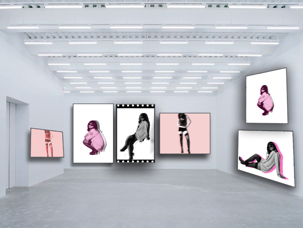
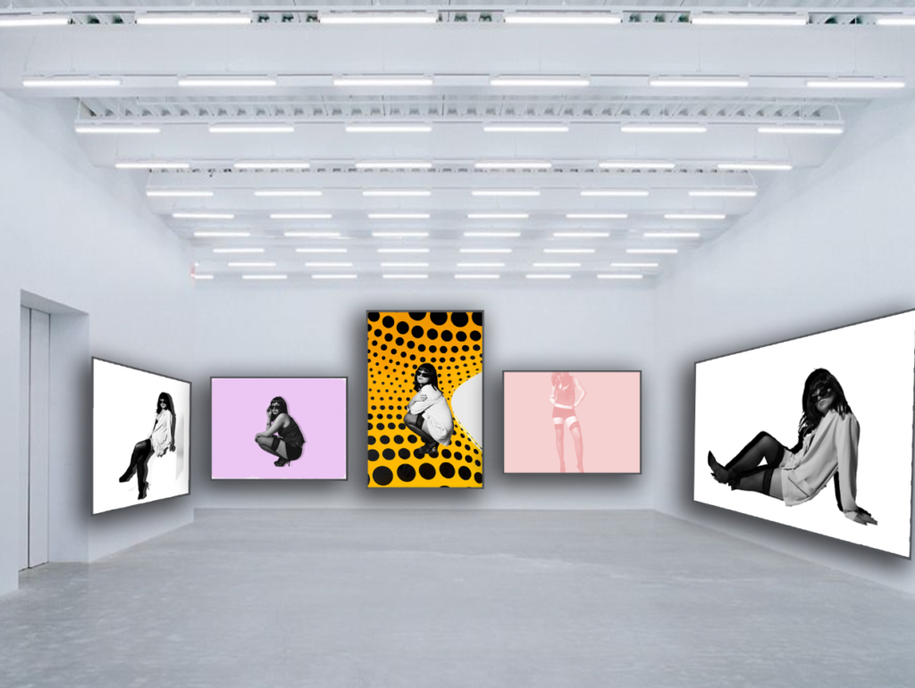
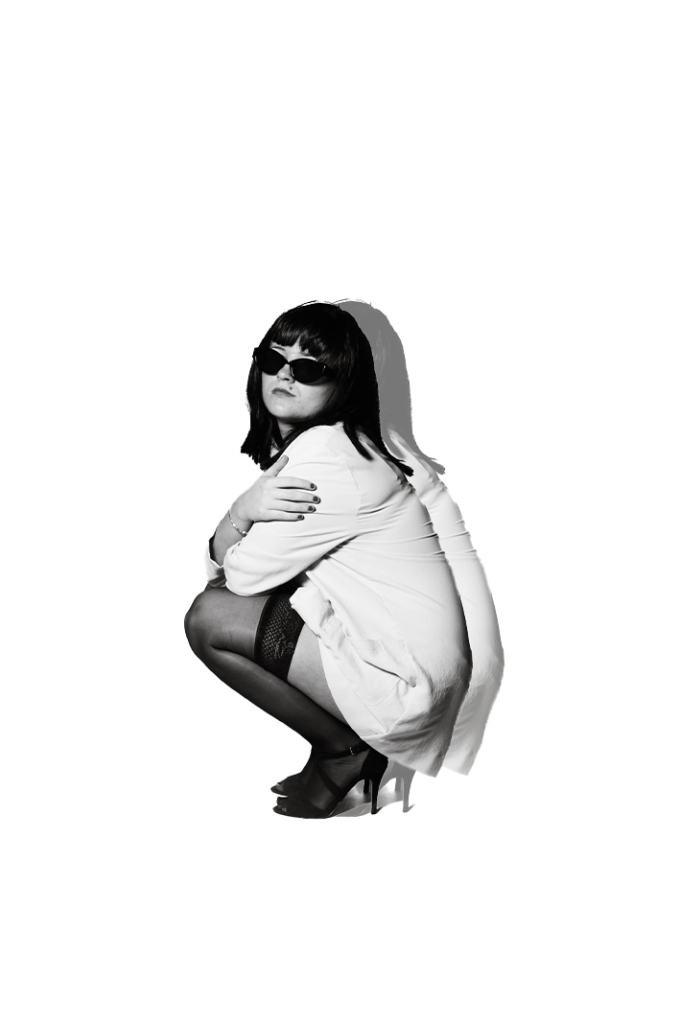
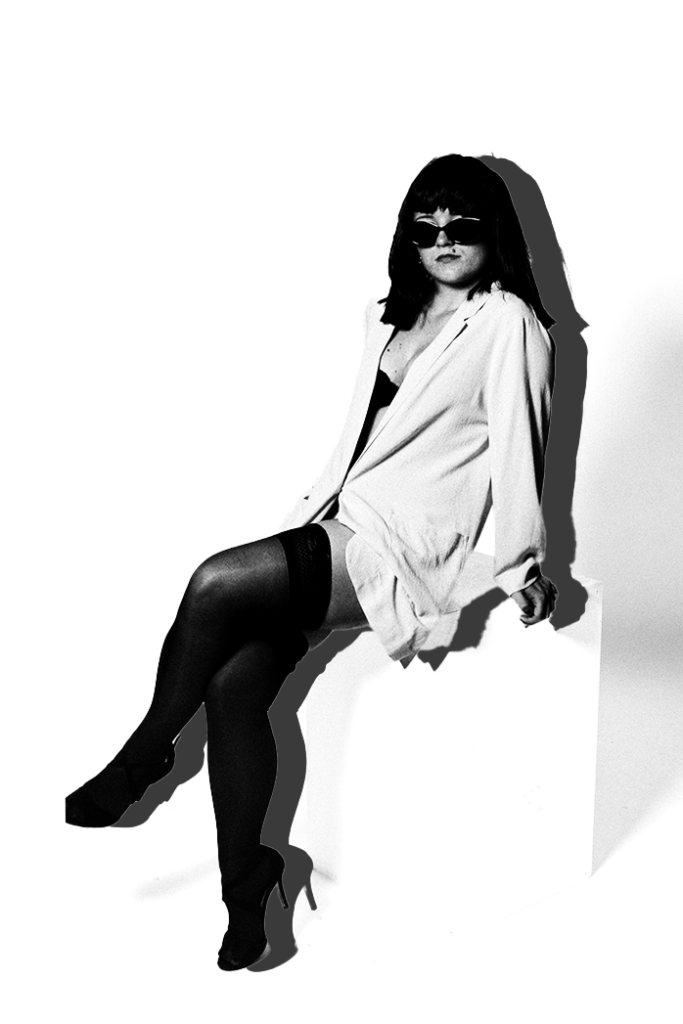
Here above, are all my preferred experiments and development. I’ve chosen these images to be in my virtual gallery as I like them the most. They add an element of an unique aesthetic linking significantly to Yayoi as she was known for her distinct, vibrant and abstract work. However, the posing, clothing and lighting links to Helmut as the posing portrays an element of dominance and the angle from below rather from straight on or above, differs from the typical stereotype of women being weak and submissive. The clothing is seen as glamour and luxurious which Helmut did by maintaining a theme of high- fashion and media. Newton photographed women differing from the typical stereotypes during a time when it was not normalised for women to be in the main stream media. I wished to accomplish this by making the photos look as if they are for a fashion magazine through white backdrops and forced shadows through duplication. Therefore, my project is based around the revolution of women within media and how they grew, whilst linking to Yayoi’s unique elements, such as my developing. These images I aim to develop into a photoshoot, into a magazine type of boom to express the revolution of women in the media, and how it is normalised now, which it was not during Helmut’s era. Therefore, ultimately illustrating expression and empowerment.
Images I want to print:
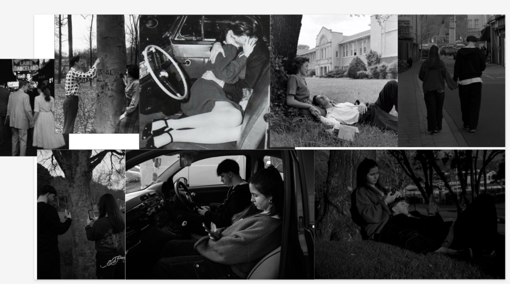
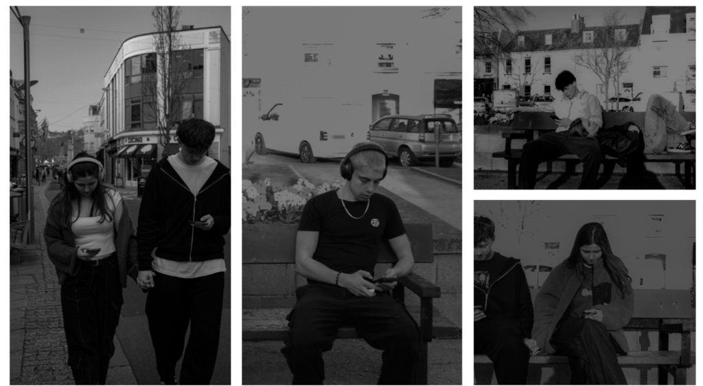
This is my first mood board of images I am going to print, these all go together on this slide because these are my comparison picture, the ones I plan of putting together in the prints.
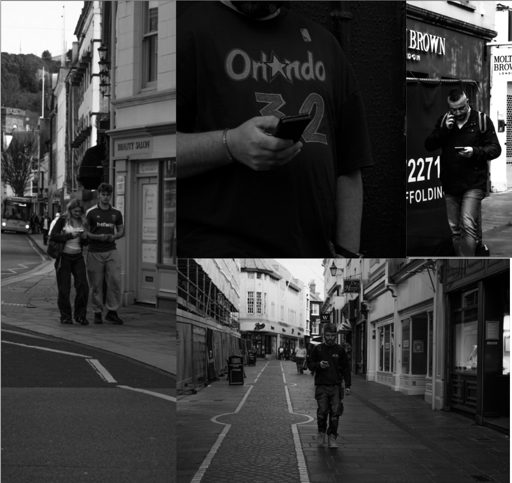
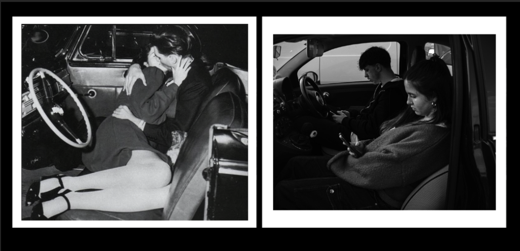
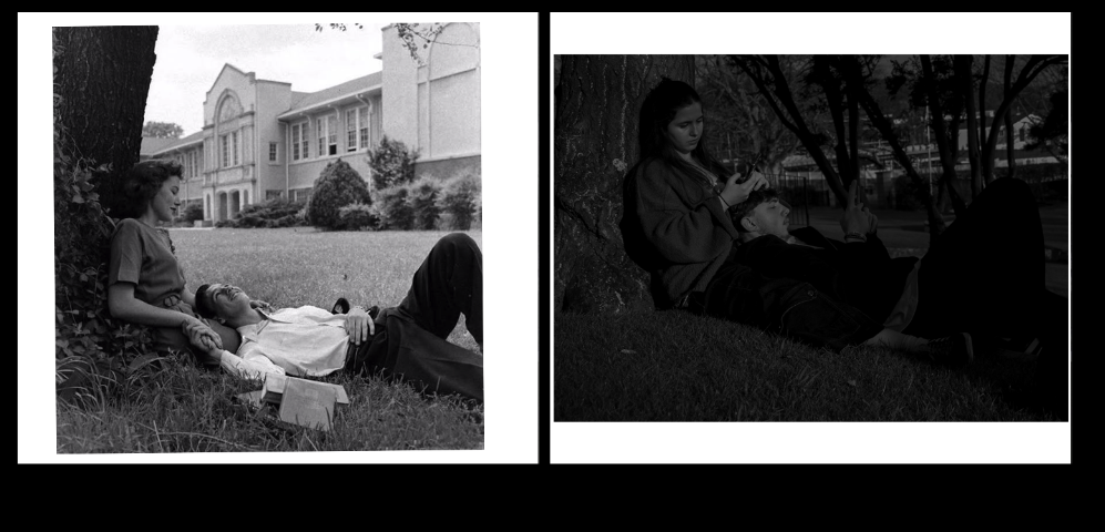
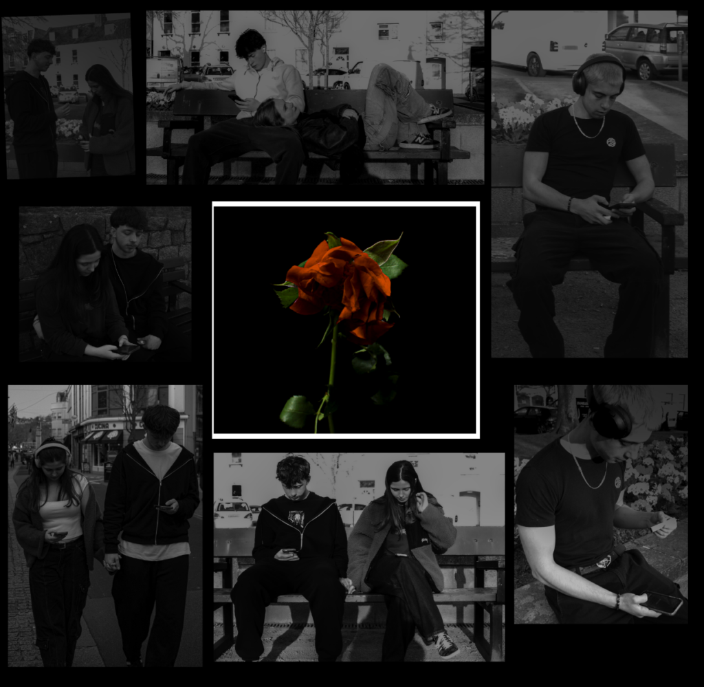
These are some more images that if I was going to print them they would all go together to show the obsession and evolvement over phones and how they consume are day to day life.
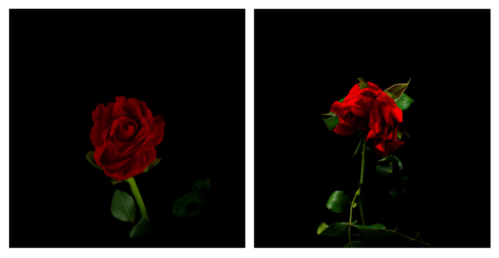
I really like these images and want to print them but I would probably print them next to other images, maybe the alive rose surround by happy loving images and the dying rose next to the opposite.
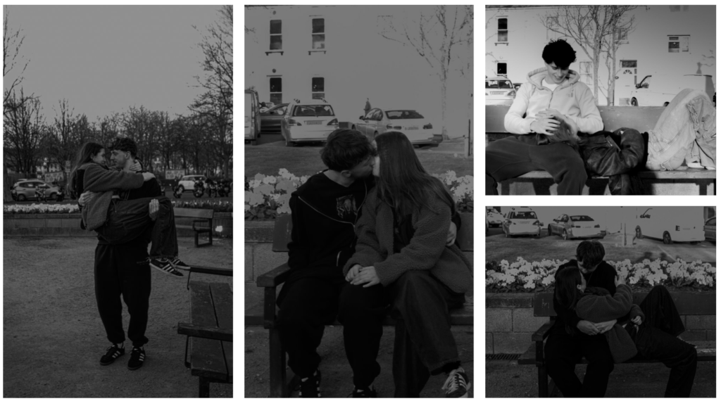
Next to loving images like this.
Next to some not so loving images.
Now that I have selected all the images I want to print I am going to go into photoshop and show you how I want to present them once they are printed and the sizes I want to print them as.
Print presentment:

these are draft examples of how I will present it when printed, but for all the comparison photos I think with the white foam paper I will give this polaroid affect then place it on top of the black card paper, I am going to show the other comparisons then, when I actually print them out I will decide if I keep them all together on one big board or separate them. I am thinking of doing them A5.

This is another draft of the comparison print photo, for the actual thing I will size it better so that the boarder matches correctly but here is my experiment of what I will attempt and have it try to look like and if I actually want to have it like that.
These are all my comparison photos done.
Then I have all these images together, will probably print them all A4 or the two in the middle A5 but I think that will then leave them quite disproportioned. I might board the two in the middle with a white boarder or window cut them.
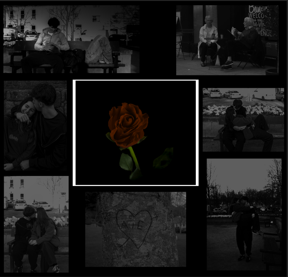
for this print presentation the rose in the middle is going to be A4 and the photos around with be A5. I plan on having the rose in the middle as a window cut to give it its on way of standing out which is what I tried to present here in this virtual one.
This is the same but of the dying love.
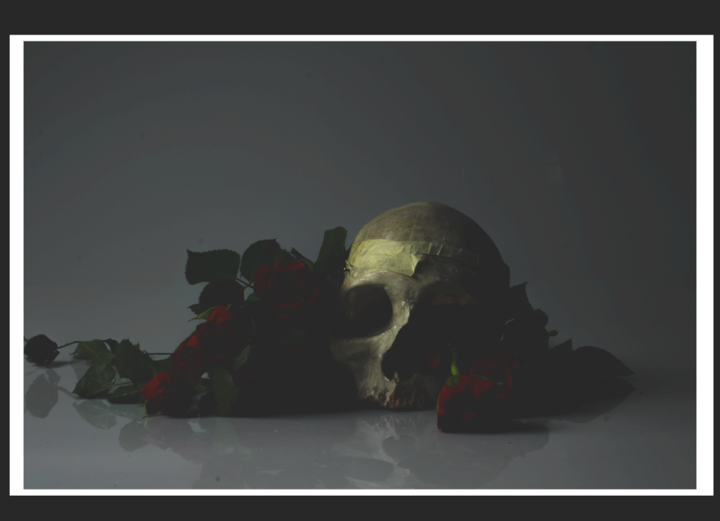
This is my final image I would print and present as an A3 print and have a window cut to present it.
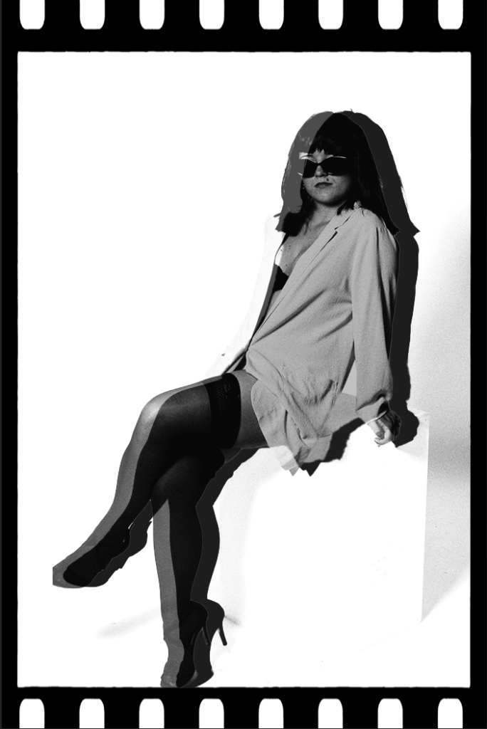
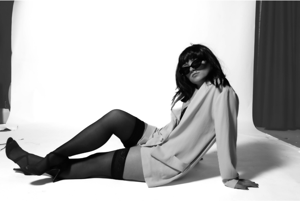
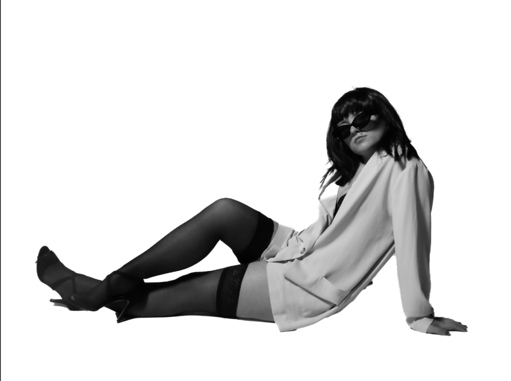
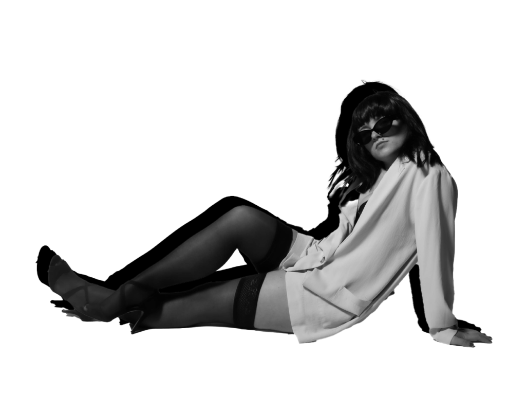
Portrait 1
Experimentation 1:
Experimentation 2:
Experimentation 3:
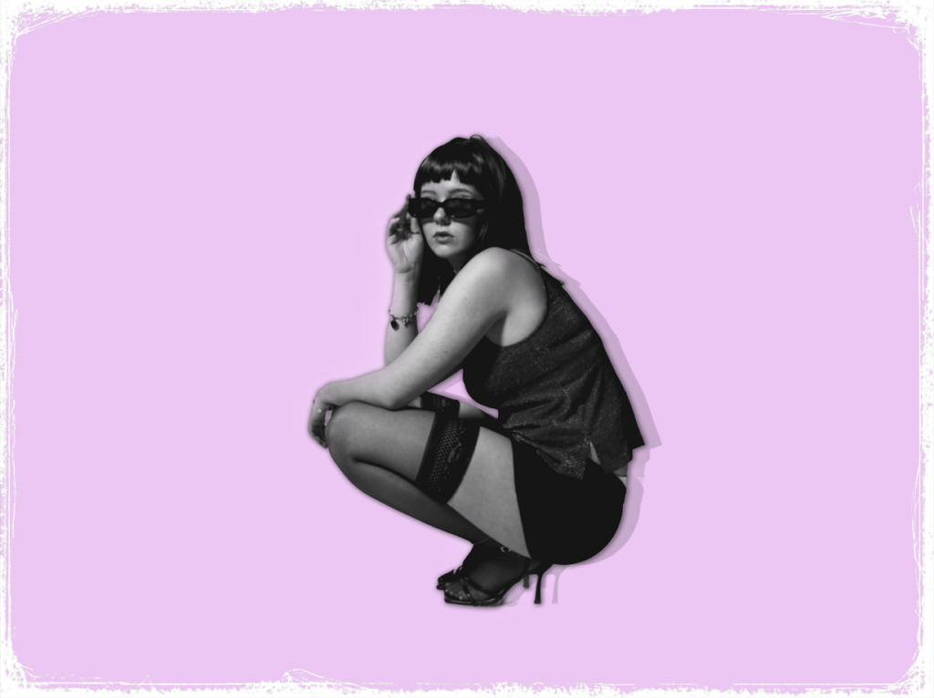
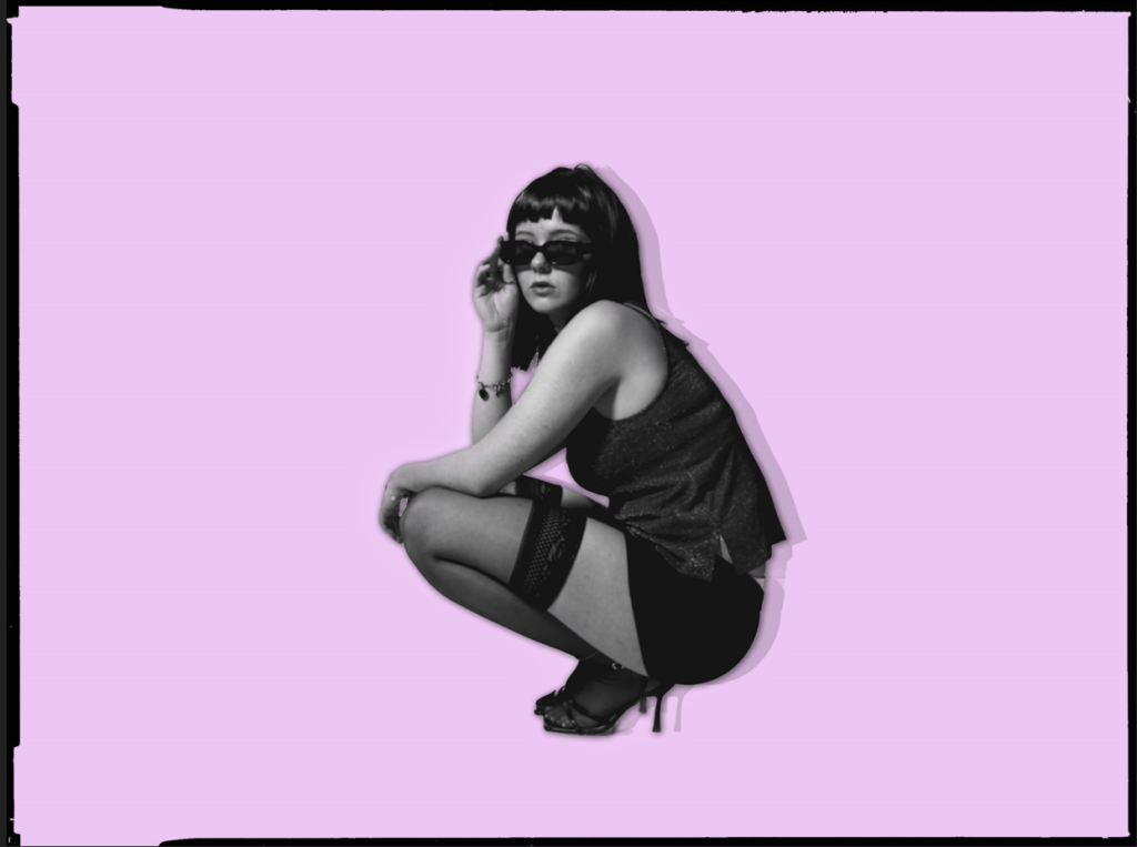
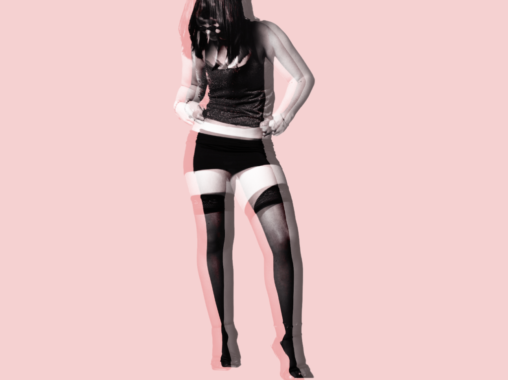
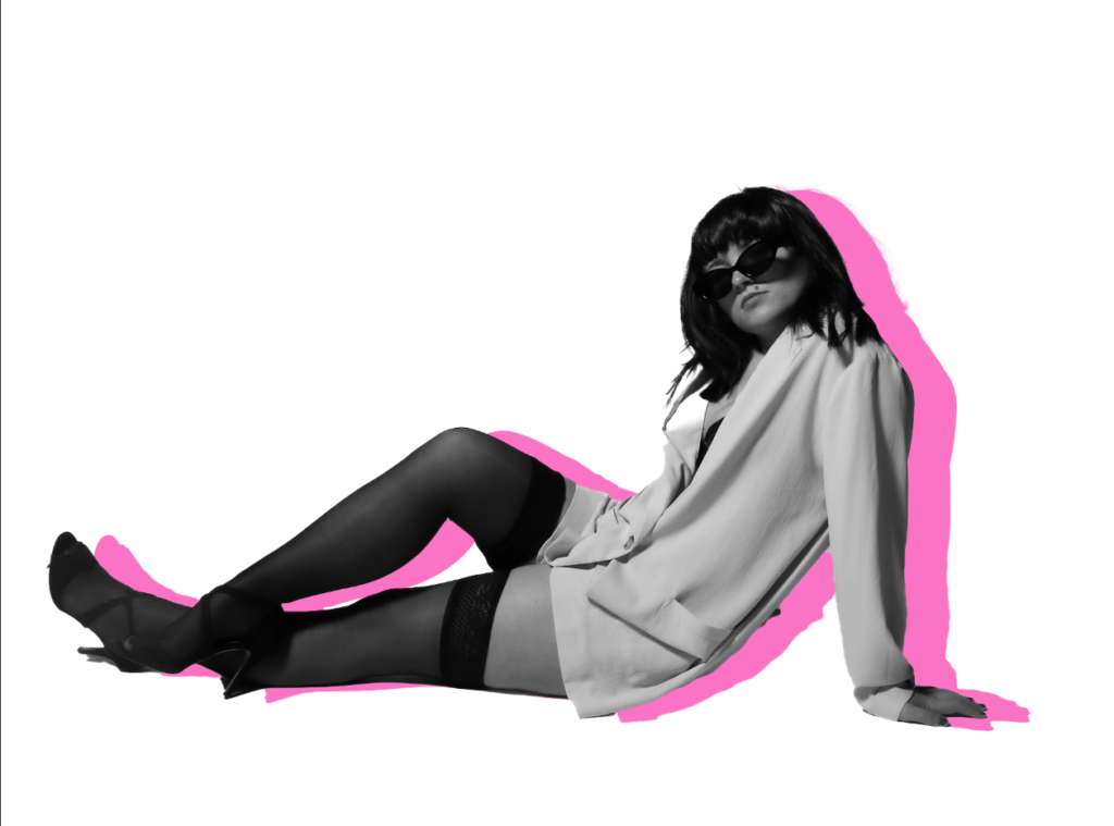
Within this development and experimentation, I started off by colour overlaying the background to make the background a purple. First, I had to make sure all of the background became purple and didn’t miss any spots. Once I had achieved this, I experimented more on the subject using drop shadows, outer glows and even duplicating her. Once duplicating her, I could make a shadow when decreasing the capacity which makes her 3D dimensional. Once I was satisfied with the effects on the subject, I then began to test out different boarders to fit into my theme. My choice of boarders were a type of vintage aesthetic which fits my theme significantly. Therefore, I experimented with multiple to decipher which one I prefer the most.
Portrait 2:
Experiment 1:
Experiment 2:
Experiment 3:
Experiment 4:
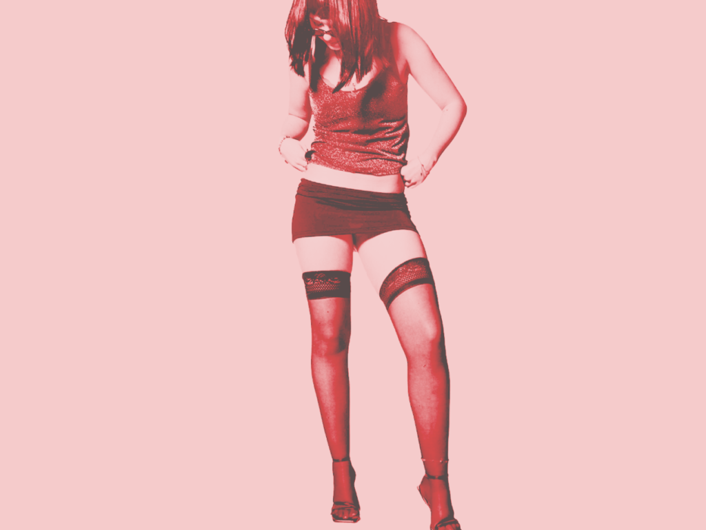
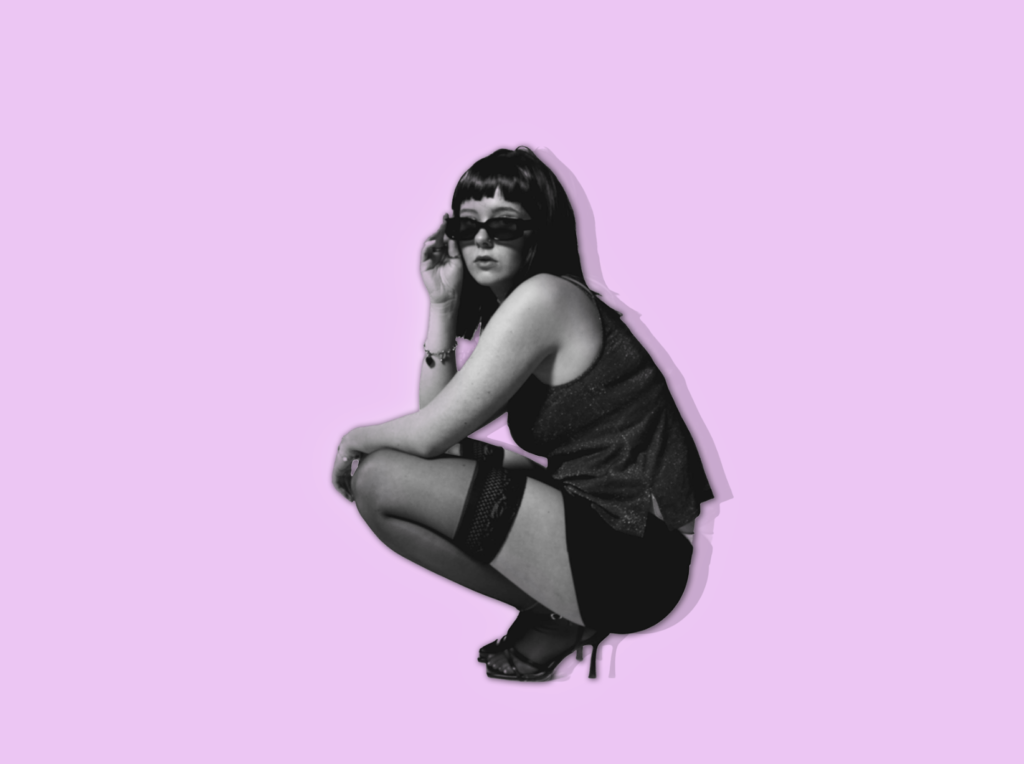
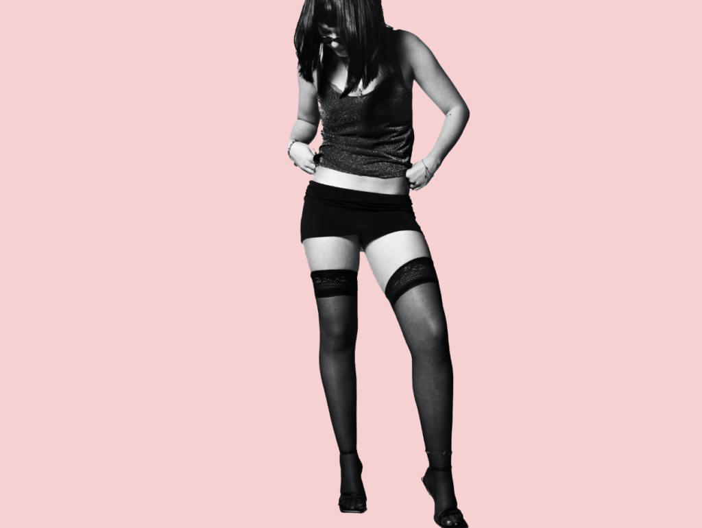
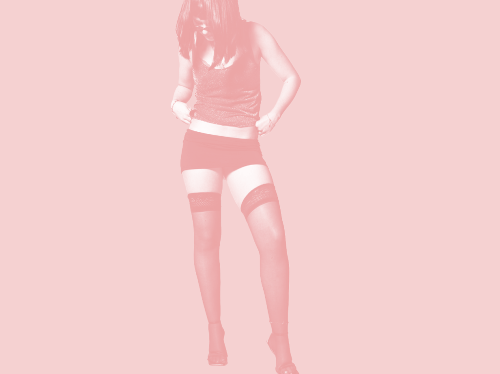
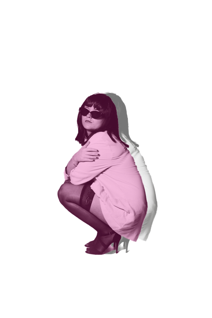
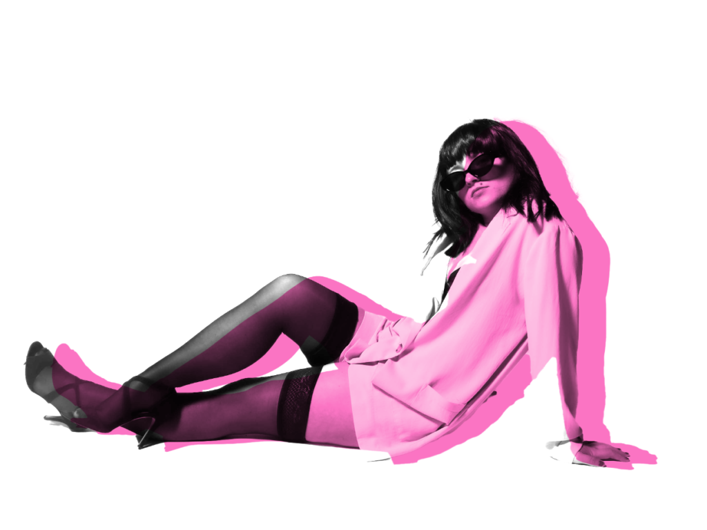
Within these experiment versions, I began by colouring the background with a light pink, considering my theme is femininity and empowerment. Then, I decided to colour overlay my subject. I then duplicated my original onto this for my next image which I think the 3D affect looks really unique. Lastly, I went through the layered filters and decided on which one I preferred the most which was this red colour as it could symbolise sexuality and it worked seamlessly well with my backdrop colour.
Portrait 3
Experiment 1:
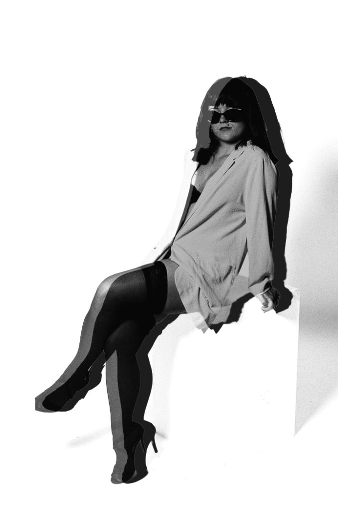
This experiment, I made the background a purple- pink colour and then experimented along the way. I decided to feather my subject which made a slight white feathering aspect surrounding her subtly. I liked this as I thought it fit into the magazine theme as it attracts viewers straight to the subject, rather than being distracted.
Portrait 4
Experiment 1:
Experiment 2:
Experiment 3:
Experiment 4:
Portrait 5:
Experiment 1:
Experiment 2:
Experiment 3: Adding a boarder
Portrait 6:
Original:
Removing the background:
Experiment 1:
Experiment 2:
Experiment 3:
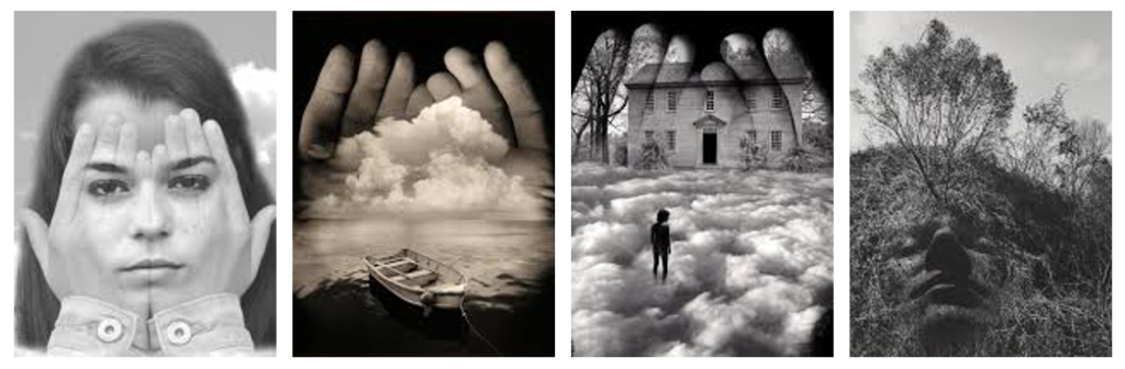
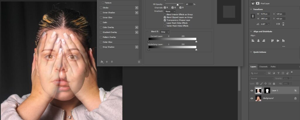
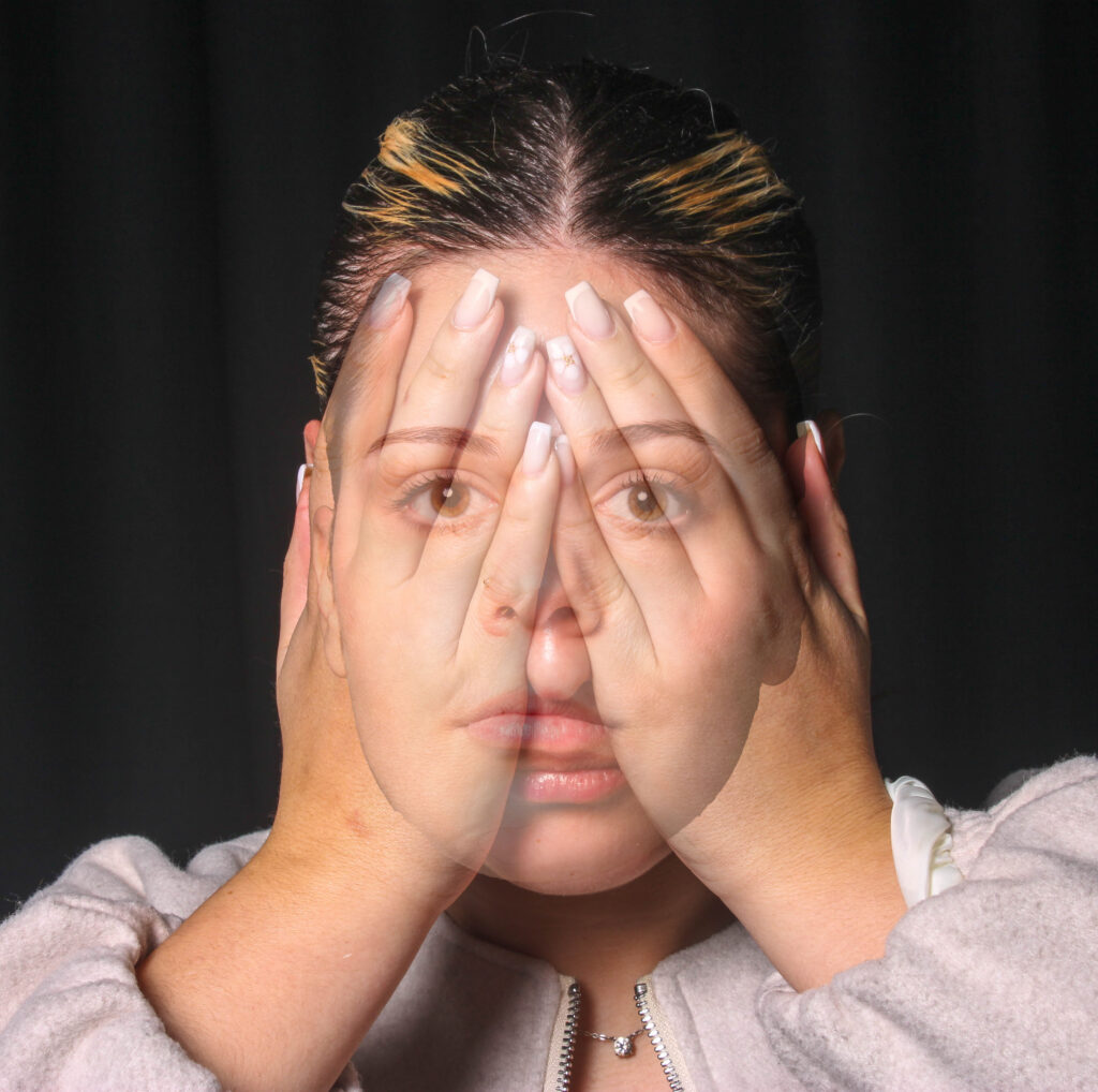
when considering Uelsmann’s photography I found most inspiration in his images were a face emerges from the hands
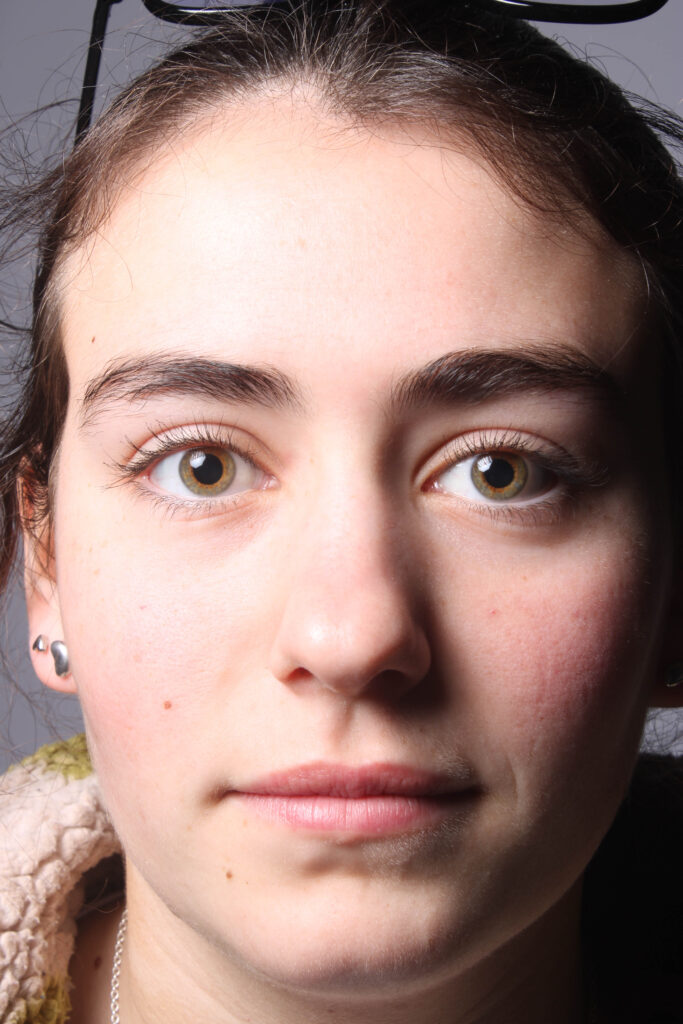
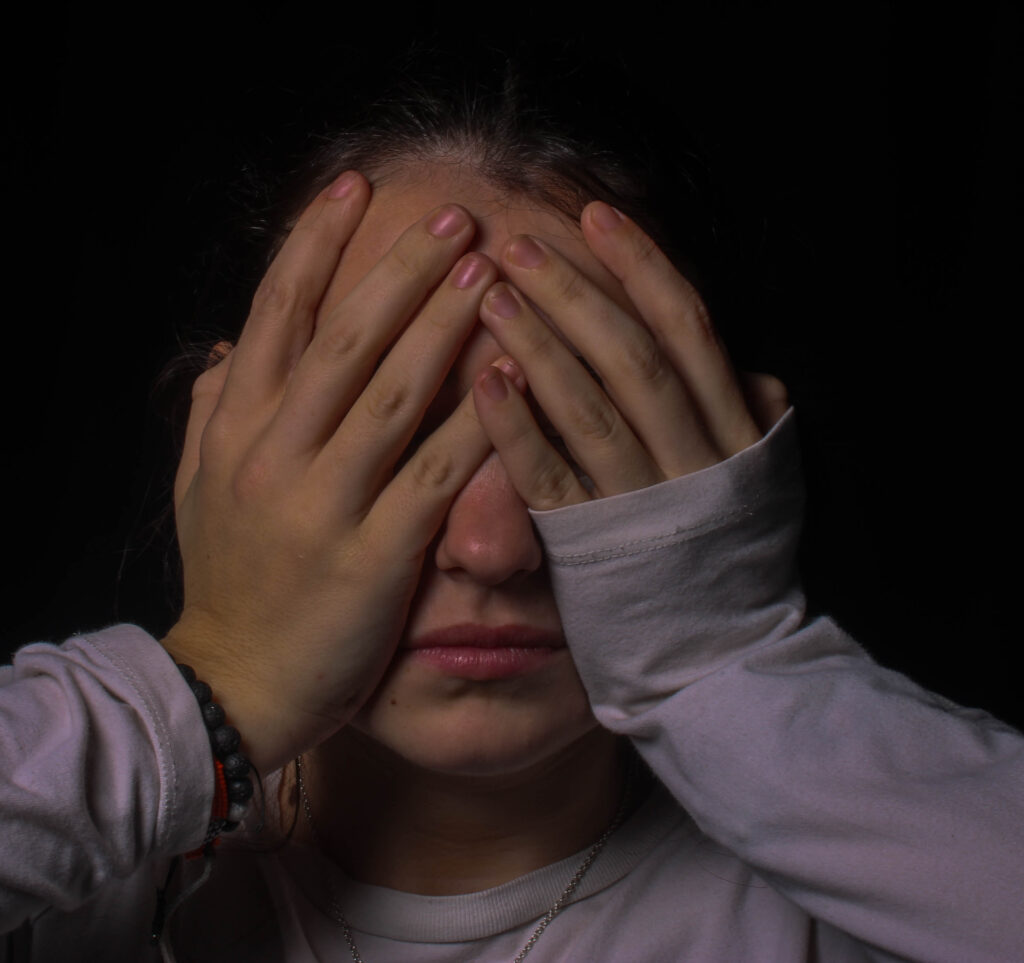
to begin i used two images, one a close of of a neutral face thee other with hands pressed across the face, in Uelsmanns photography he covered the entire face with flat hands in front of it, instead I opted to round the hands round the face and leave some centre features of the face revealed.
I did this in order to align the two photos and create a sense of unity between them.
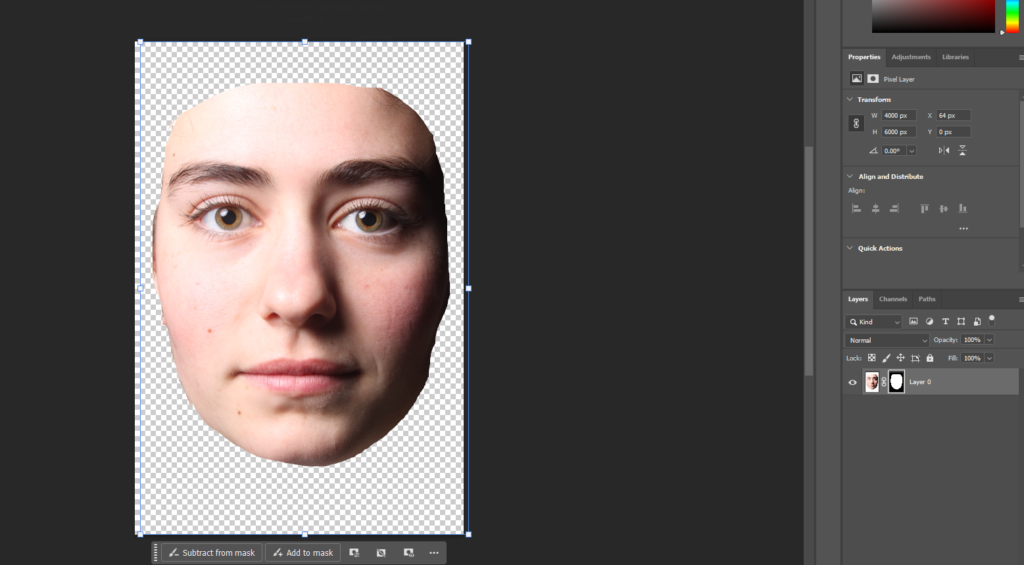
In order to combine the two photos I used Adobe Photoshop to create a layer mask in order to remove the excess from the photo, removing hair, neck, ears, background and clothing.
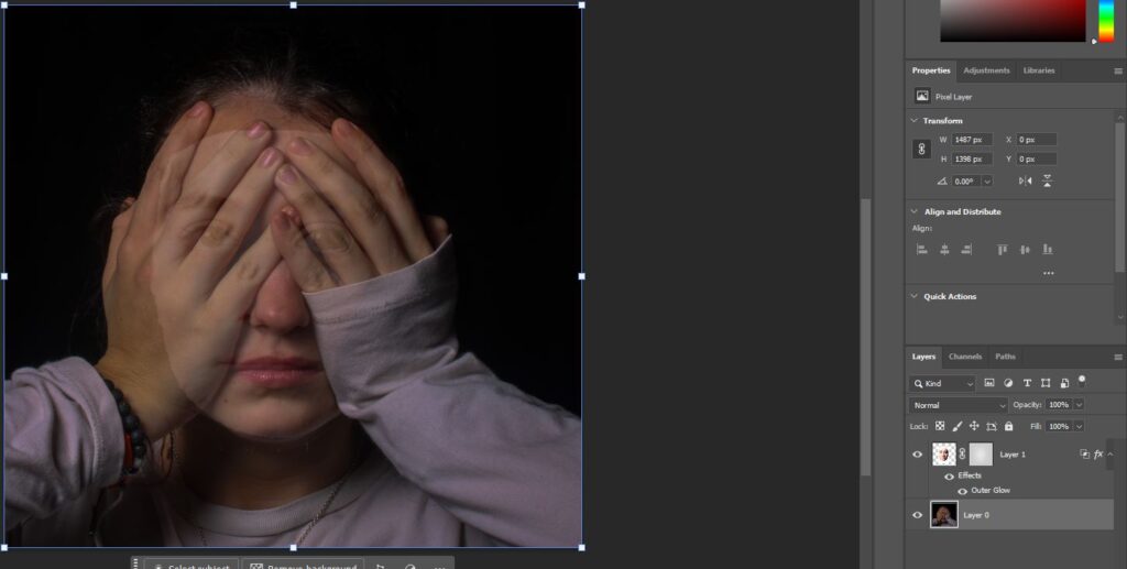
I then transferred the image on top of the unedited photo and adjusted the opacity accordingly so both layers were visible.
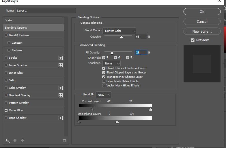
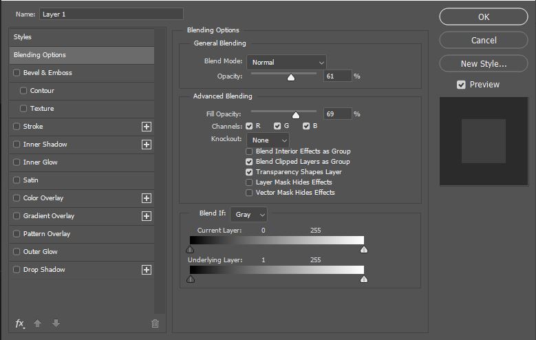
then using the tab ‘blending options, i went into more detail efficiently blending the two photos using the blend mode ‘light color’ to soften the layered image.
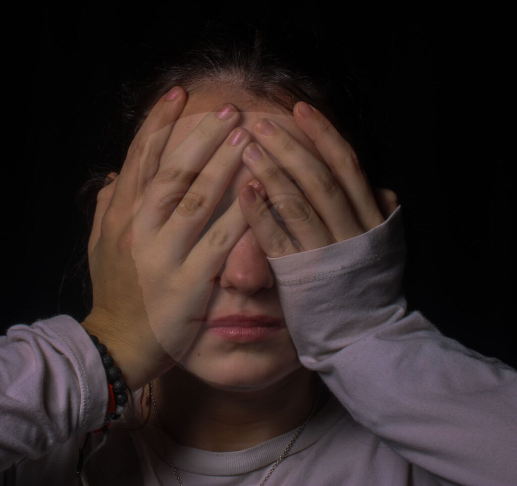
This resulted in my final image, although i am pleased with the outcome, in this image the edges and visible and harsh and create a masking effect, despite this being a diversion from Uelsmanns work I believe it aligns well with my project as I am investigating how people change over time and this represents the inner self being hidden and the outward mask being visible
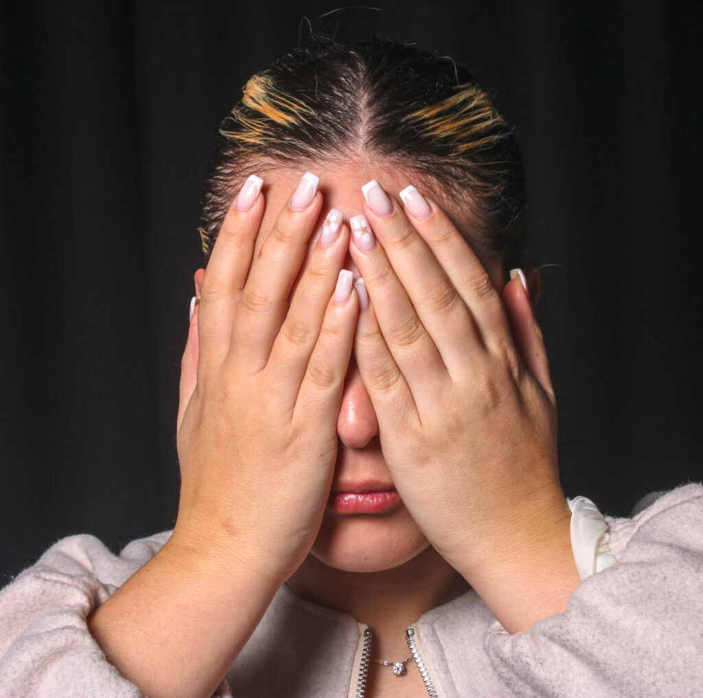
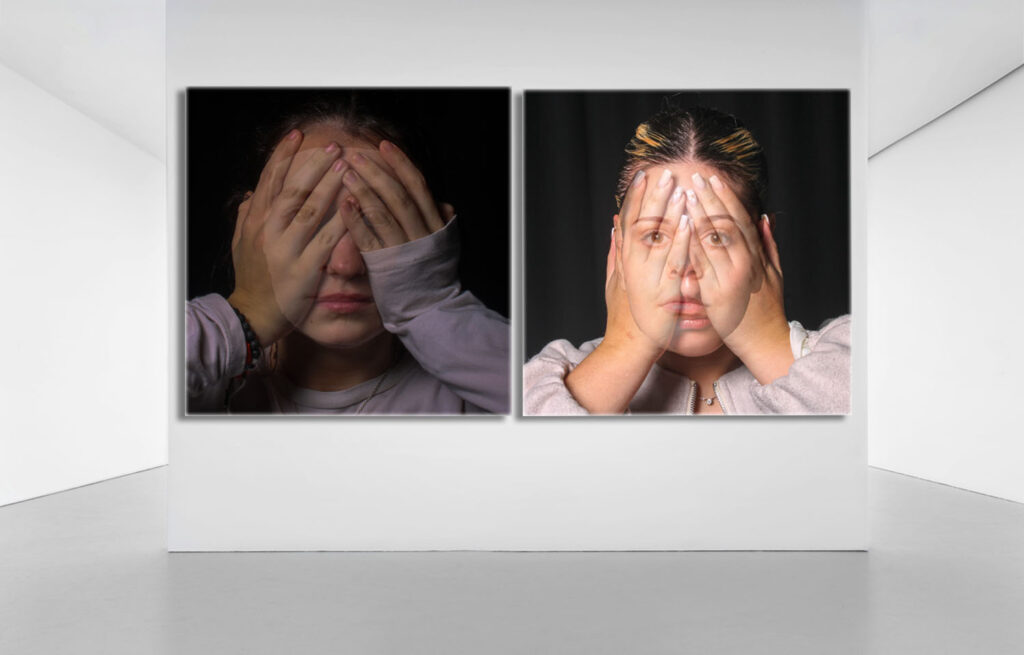
I then repeated this process and refined it with my second attempt.
I believe this image the more successful of the two, because of the aligned jaw line and seamless blending towards the forehead
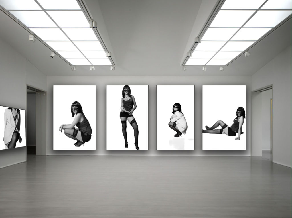
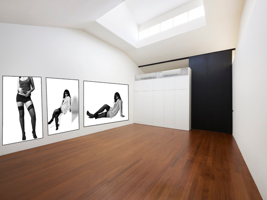
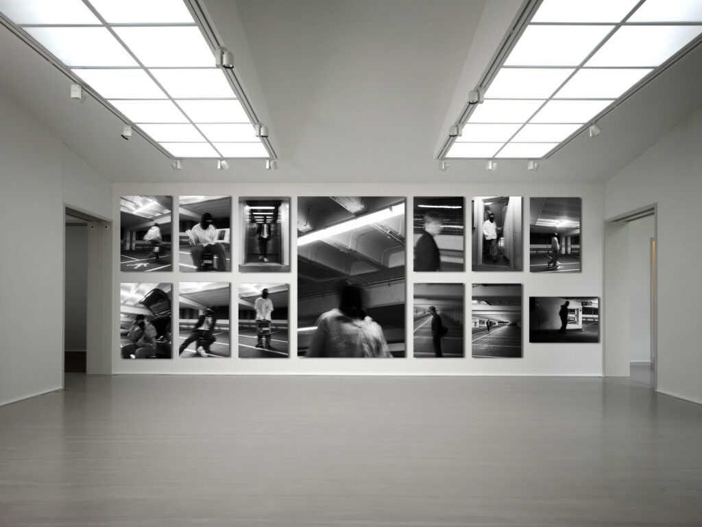
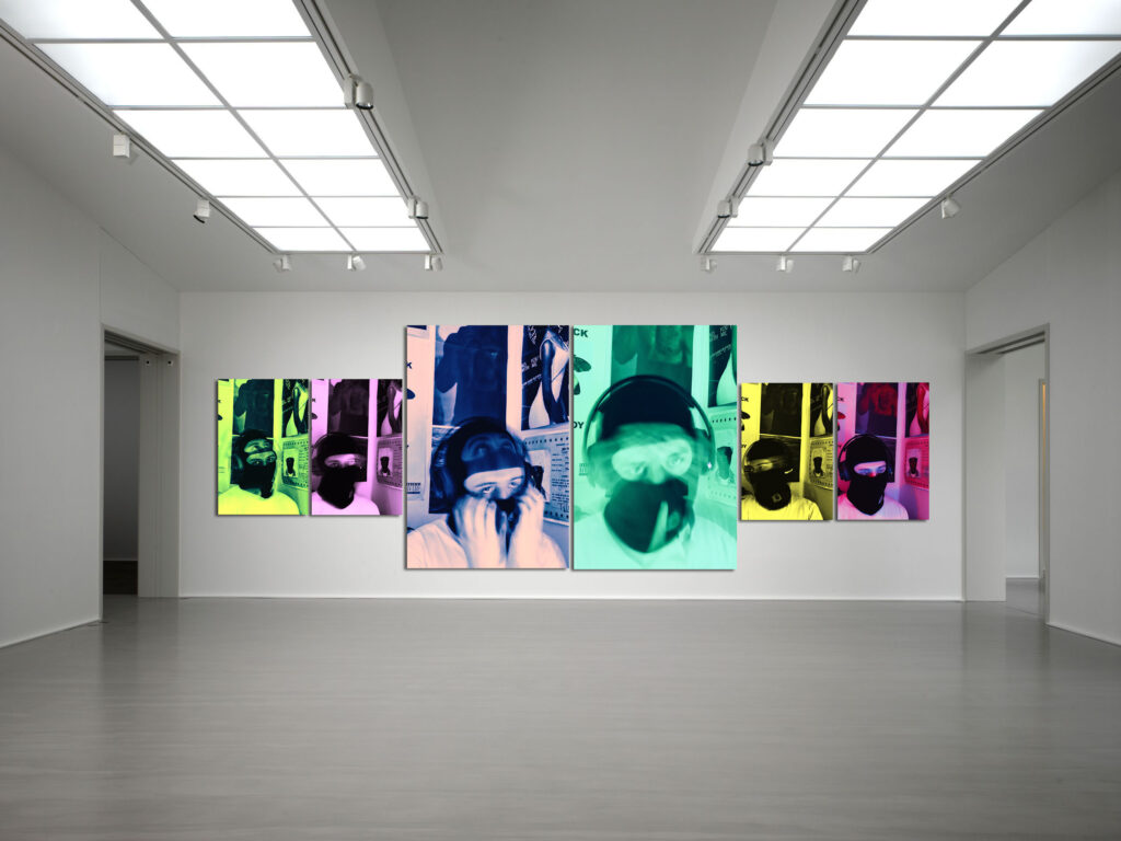
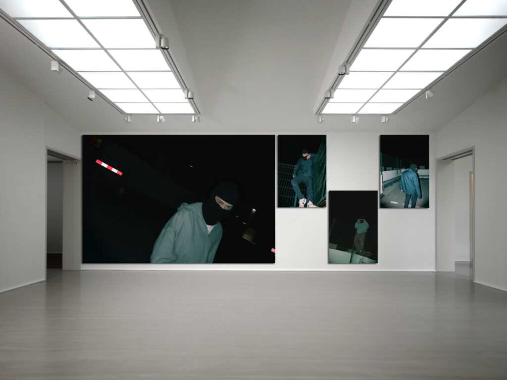
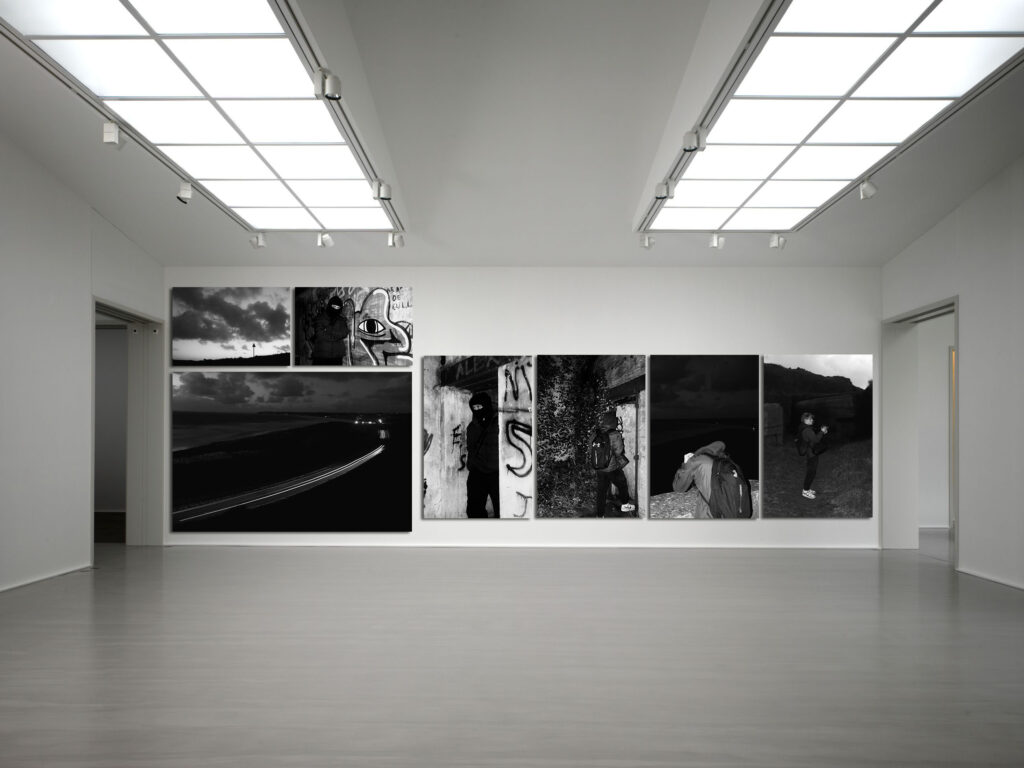
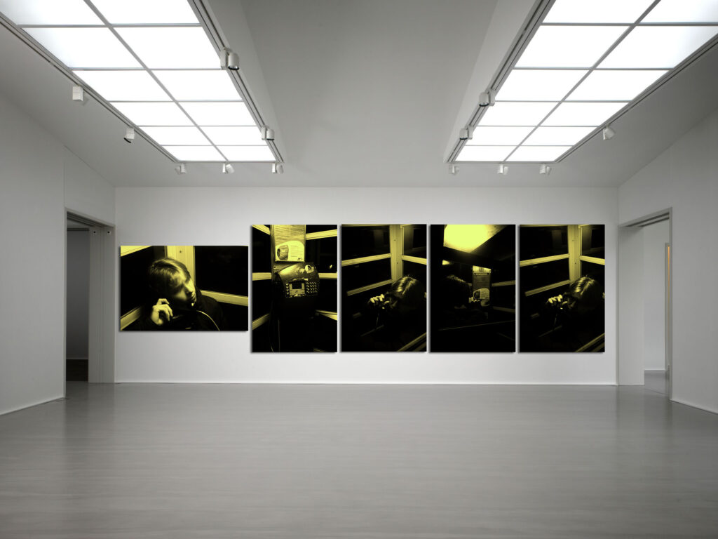
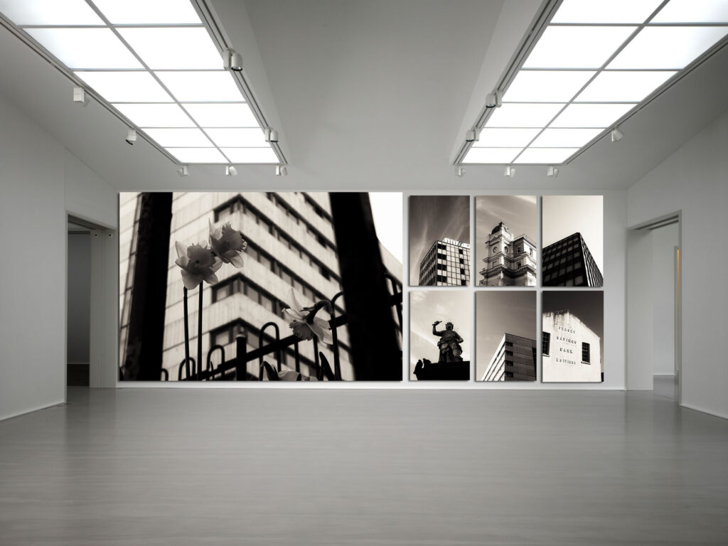
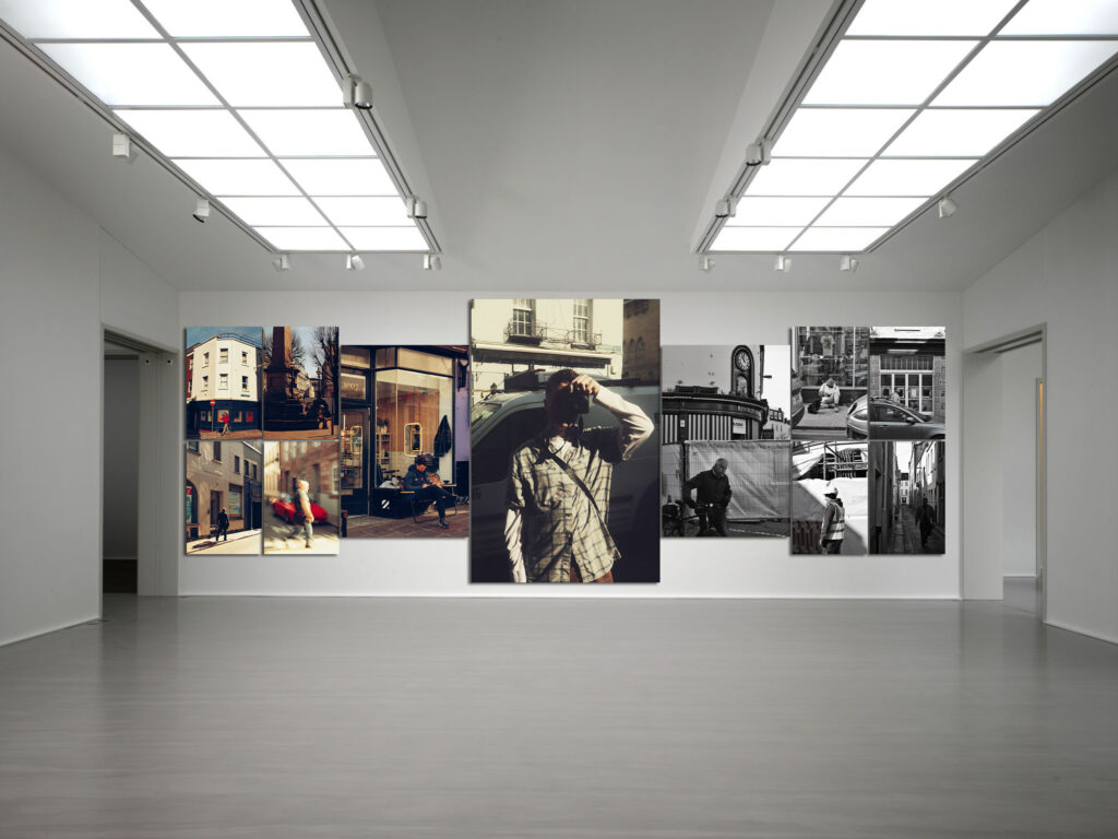
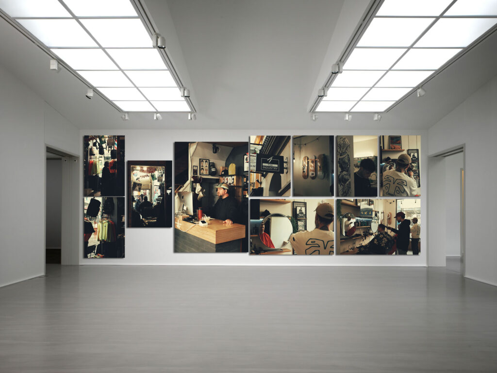
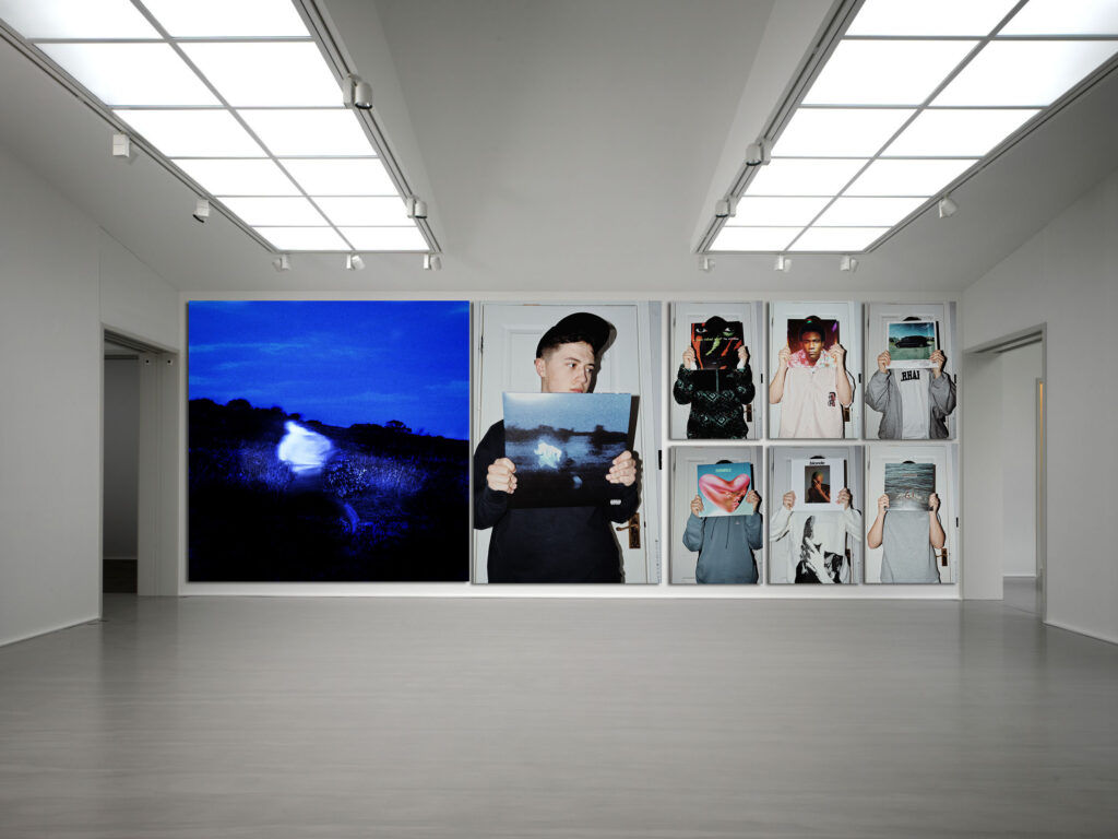
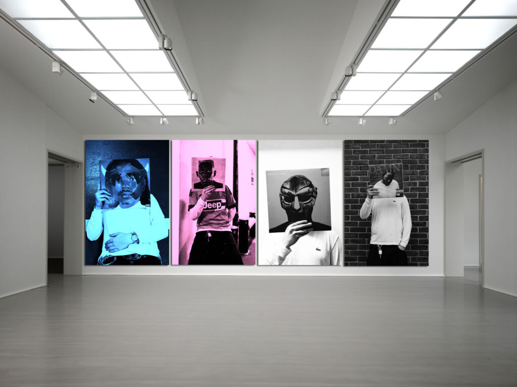
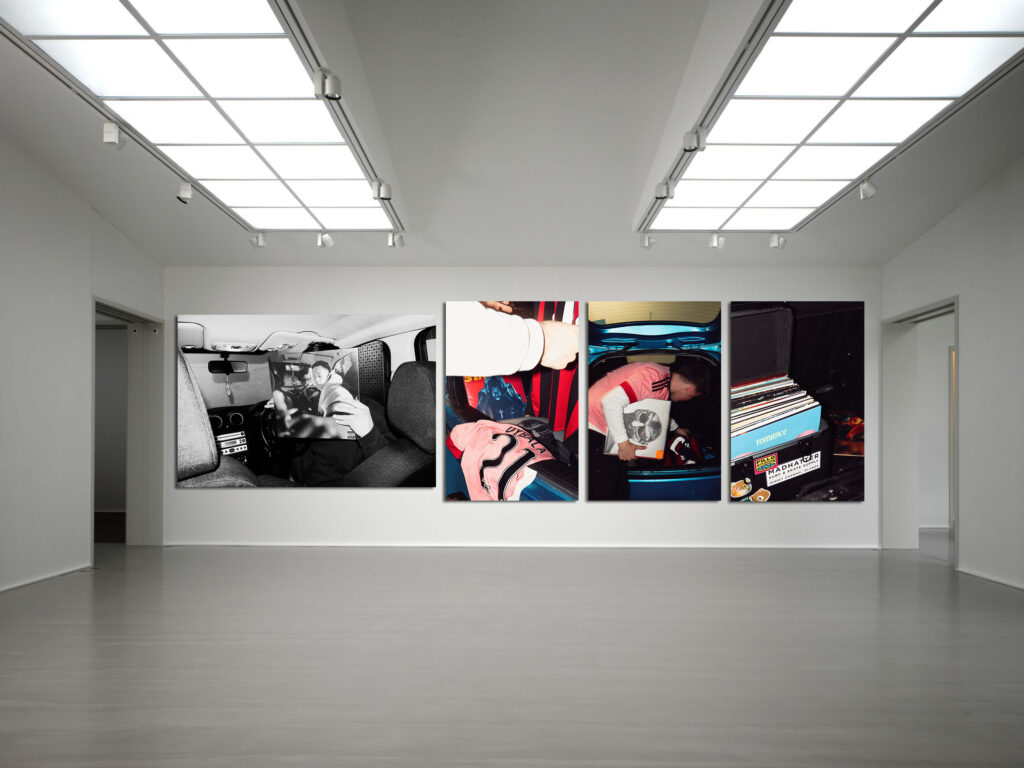
Here is my collection of Images I have produced over the course of this project. They are arranged in their individual shoots as Virtual Galleries.
1:
Firstly I selected the object using the ‘object selection tool’, I then selected the ‘select subject’ option and I chose ‘layer via copy’. This created a layer which only had the object in it.
2:
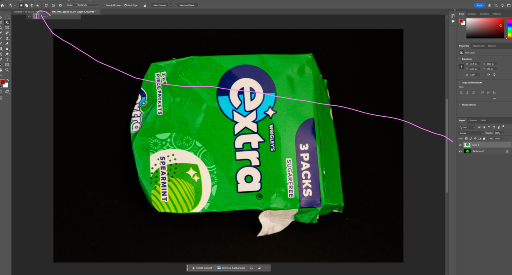
Then I dragged the layer including the object to my base. To create my ‘base’ I made a document which had a black background.
3:
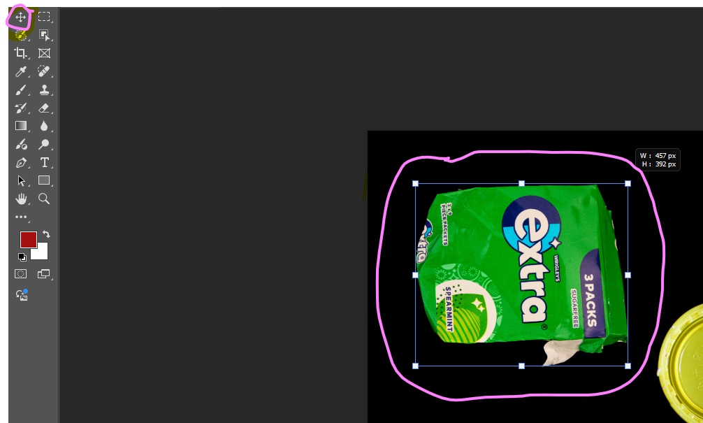
Next, I used the move tool to move and resize my image.
4:
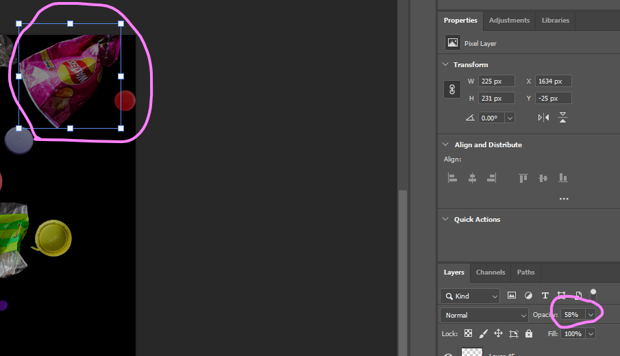
An import step when creating these collages is to adjust the opacity. This is because it makes the objects look further away creating depth to the image. This is what Mandy Barker does when creating her pieces in her ‘soup’ series to create pieces which look like parts of the ocean or space. It also gives the image movement.
Final product:
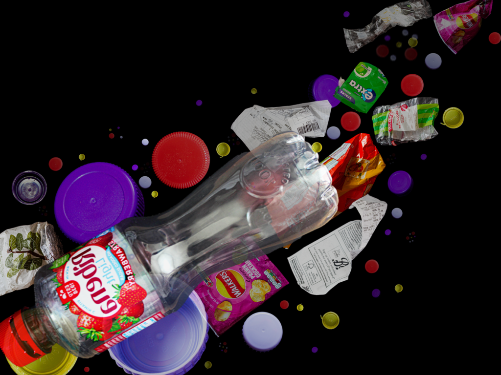
Before editing I selected the images which I am going to edit and collage by setting the colour label blue so that it is easy to find them. The images which I selected are surrounded by black space as I am going to use them to create a collage in a similar way to Mandy Barker, which is why I needed the images to be surrounded by nothing.
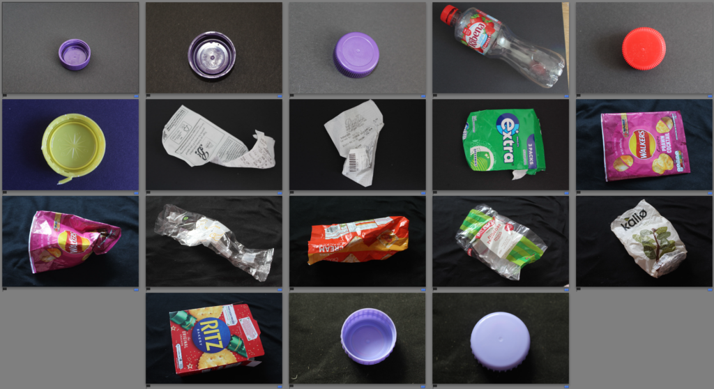
There are a total of 18 images which I plan to edit to then combine using photoshop.


For all of my images I edited them in the same way to make the background darker, this is so that when I combine them on a dark background they will all blend nicely. I also increased the saturation as this is what Mandy Barker’s images are like. They are all bright and colourful which catches the viewers attention.
For most of my images I used the same edits and copied them from one image to another as it is more time efficient, however I did adjust some settings depending on the image such as cropping and saturation.
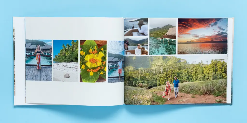
What is a photobook?
A photobook more or so refers to a book that holds a collection of photographs put together for the specific purpose of telling a story or investigating a manner in which they exist. Unlike a normal photo album, a photobook has lots of thought put into how the images are arranged in terms of layout and the overall aesthetics, allowing for a creative presentation in which photographs complement each other. Photobooks could be either personal projects or by renowned photographers, but either way, they provide an exciting medium to show off photography while exploring some idea or expression of a feeling.
Photorahers known for their photobooks:
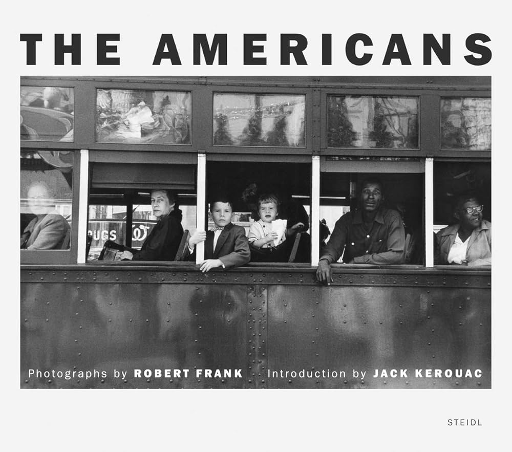
Robert Frank – His photobook The Americans (1958) is one of the most influential in the history of photography; it bears the documentary style of rawness which portrays the postwar life in America.
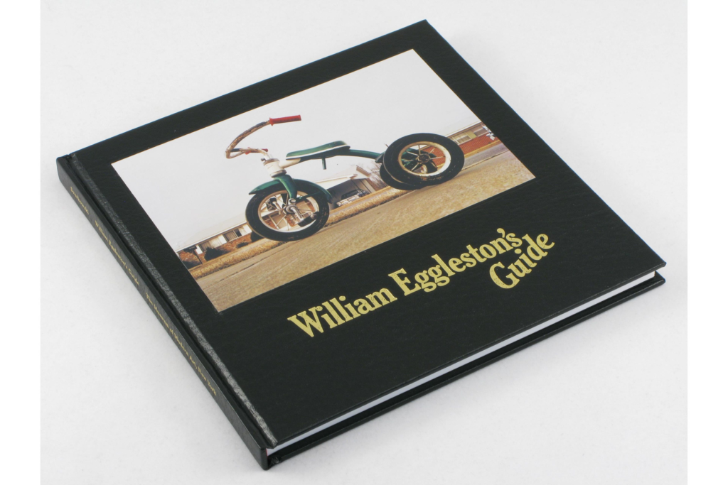
William Eggleston – He is most known for his radical use of color in photography. His photobook William Eggleston’s Guide (1976) is regarded as one of the significant births in the history of color photography.
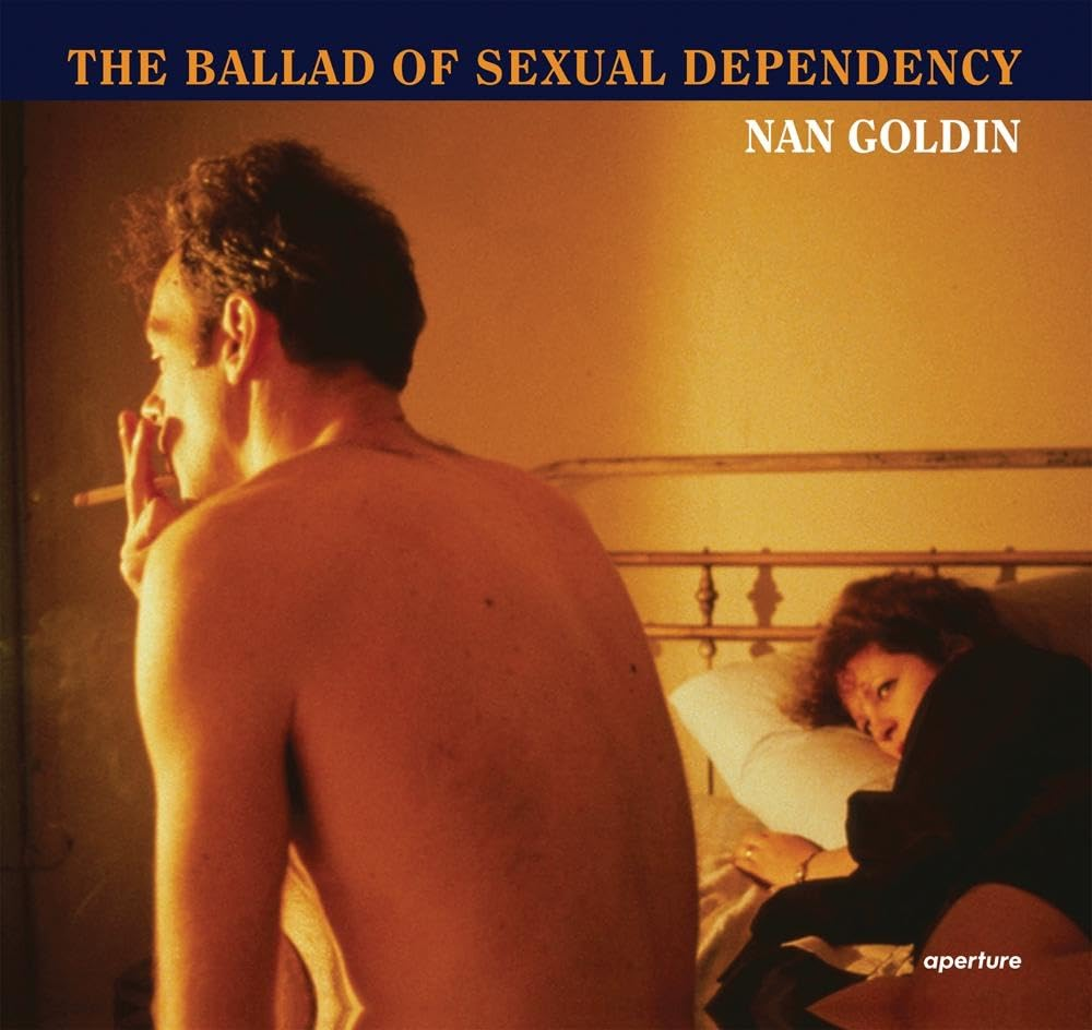
Nan Goldin-her photobook-The Ballad of Sexual Dependency-is a visual diary that touches powerful, personal, and raw moments in the life of the artist as well as that of her friends.
Why are photobooks important to the world of photography?
In fact, photobooks are so important in photography that they give the photographer an opportunity to narrate or convey a message through the images in a more intimate and thoughtful way than a single photograph. Instead of making random pictures, the photobook is a convenient medium for creating a larger picture or an emotional experience by letting the photographer choose and arrange their photos carefully. It is also another option for photographers to show their style, message, or even a theme they are very passionate about, all within the reach of people outside galleries or exhibitions. As for the moment preserved and shared, they also make photobooks historic and artistically synonymous in the photography world.
The evolution of photobooks:
The progress of photobooks changes a lot with time. It all began with the early decades in the 20th century when photographers such as Alfred Stieglitz and Edward Weston turned books into new avenues to display photography work in something more artistic than just random snapshots. In the 1950s and 60s, photobooks gained such great resonance when photographers like Robert Frank and William Eggleston would make them containers of epics or time-catchers, usually questioning the traditional ways of photography. Over the years, innovations have not been set aside, including all modernization with the coming up of new technologies, printing techniques, new layout approaches, and overall freedom photographers have with experimenting. Today they are the avenue that opens to everyone wanting to show their personal vision and arts-one-of-the-best venues that have grown to be photography culture.
Shoot place 1
For this shoot, I used my two models in a more of a built up area. I had them chill and relax, by acting normal and just chatting. I did this by getting them to sit down on stone and benches.
Shoot place 2
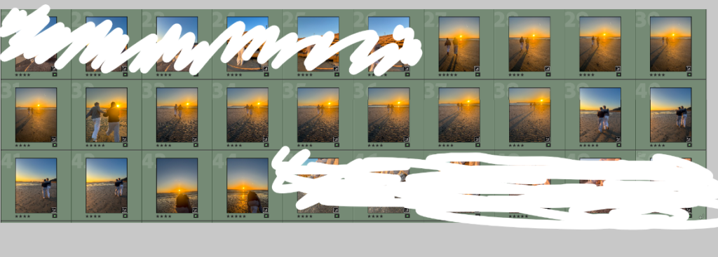
For this shoot, i focused on the beach. I wanted to take my images outside as i wanted to get the idea of being active with a friend, instead of sat inside on the phones.
Shoot place 3
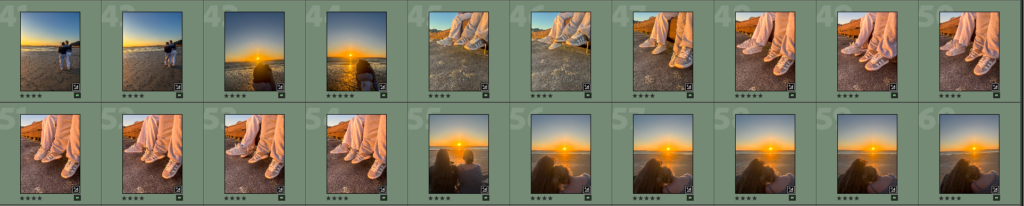
For this area of my shoot, I wanted to capture something more metaphorical. I took pictures of both the models feet, dangling together. I wanted to create an idea in peoples heads of the simplicities in life when you have a good trusting friend. I tried to create this by having the feet just hang aimlessly, with the wind blowing the trousers. I believe this creates simplicity as there’s no pressure in doing anything or creating a certain set up to show it.
Shoot place 4
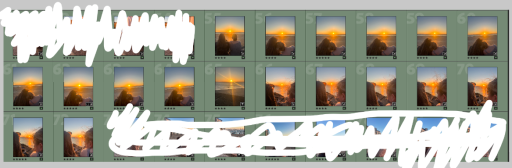
I used a beach wall for this part of the shoot. I really liked how I could capture a sentimental moment of my two models just chilling on the wall watching the sunset. I also got one of my models to start taking pictures of the sunset with the other model looking over her shoulder. I did this to show how good friends take interest in what their friends do.
Shoot place 5
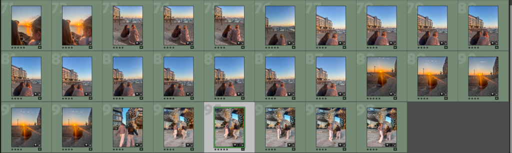
For this shoot, we walked round to a built up flat area. I got my models to watch the sunset from a different view. I also captured candid images of my models at a statue. I liked this area due to difference scenery. I liked how I could capture my models in a more natural way just laughing and having fun.