
Monthly Archives: April 2025
Filters
Virtual Gallery’s
1-
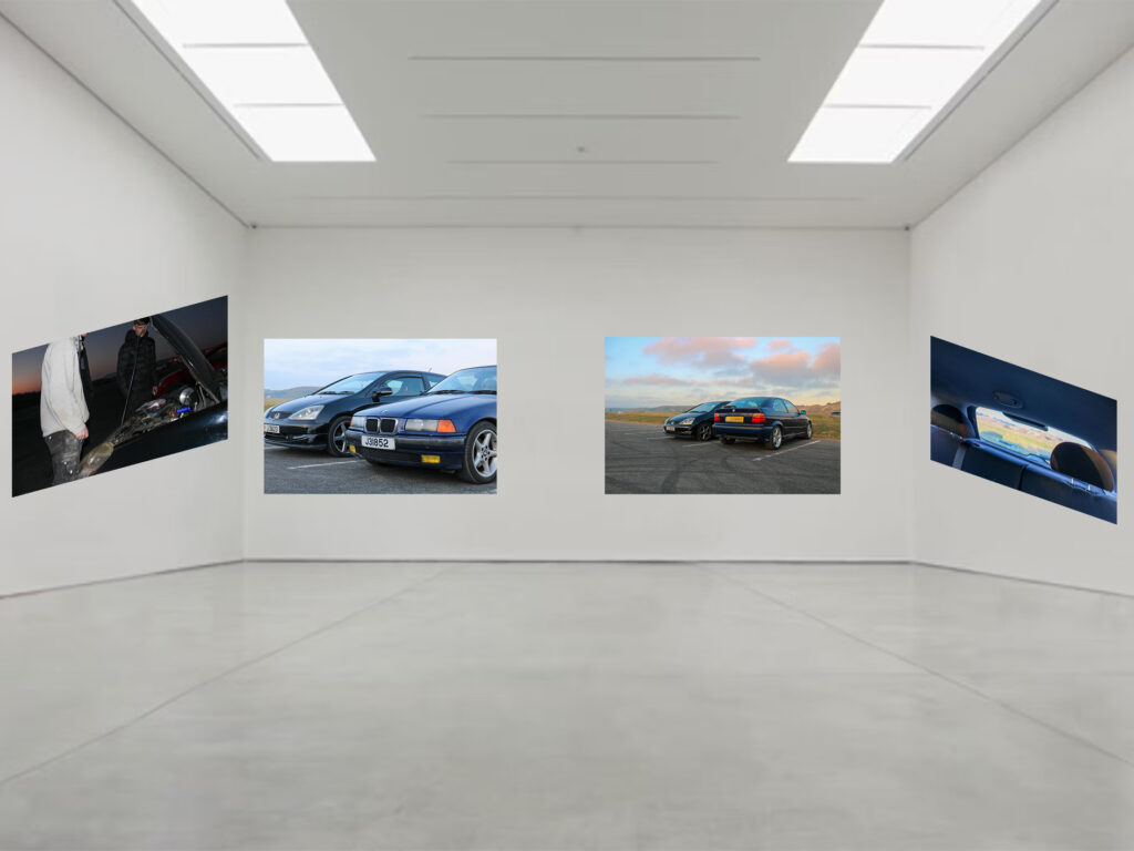
This virtual gallery is of my A3 images.
2-
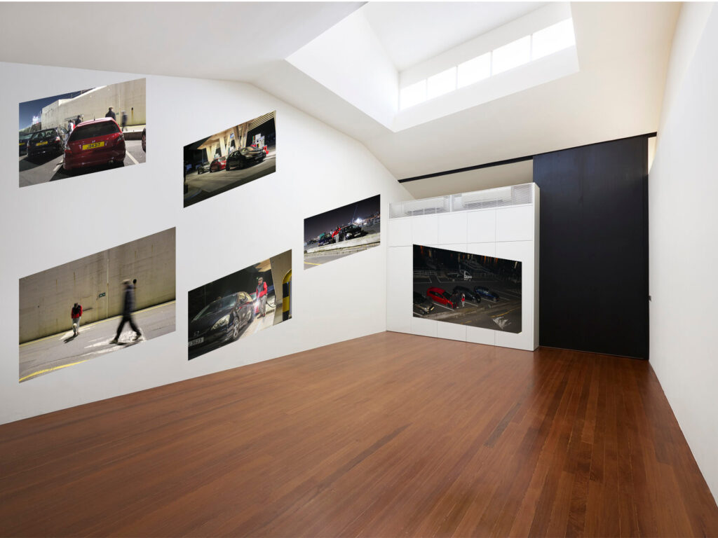
This virtual gallery is of my A5 images.
3-
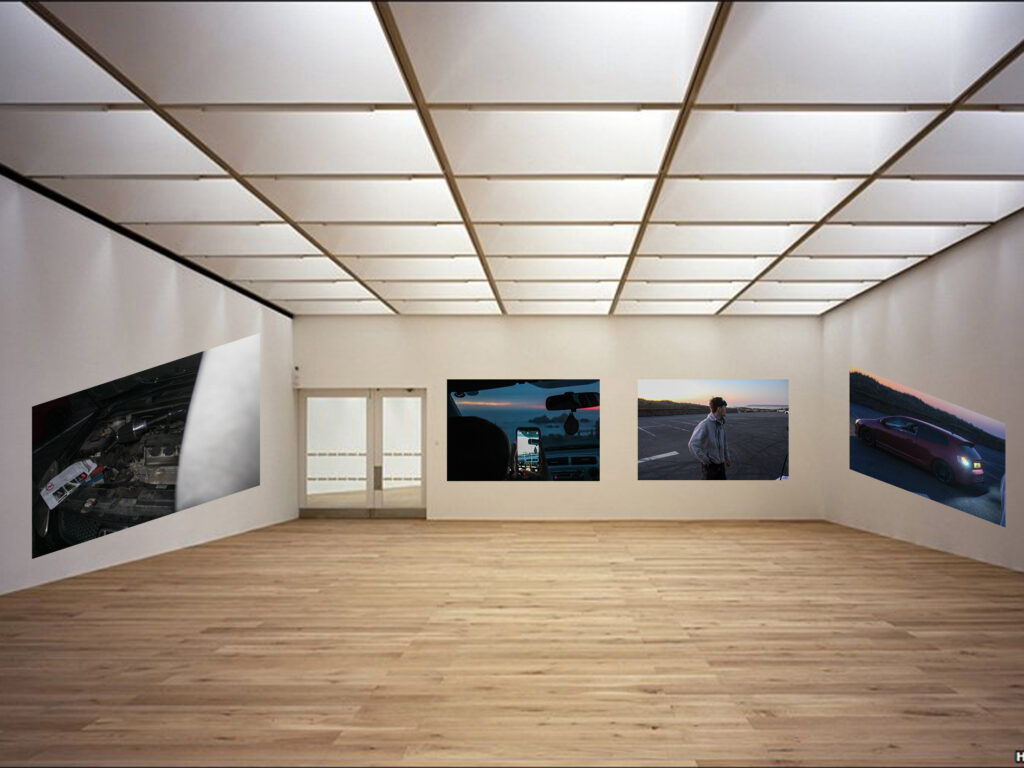
This virtual gallery is of my A4 images.
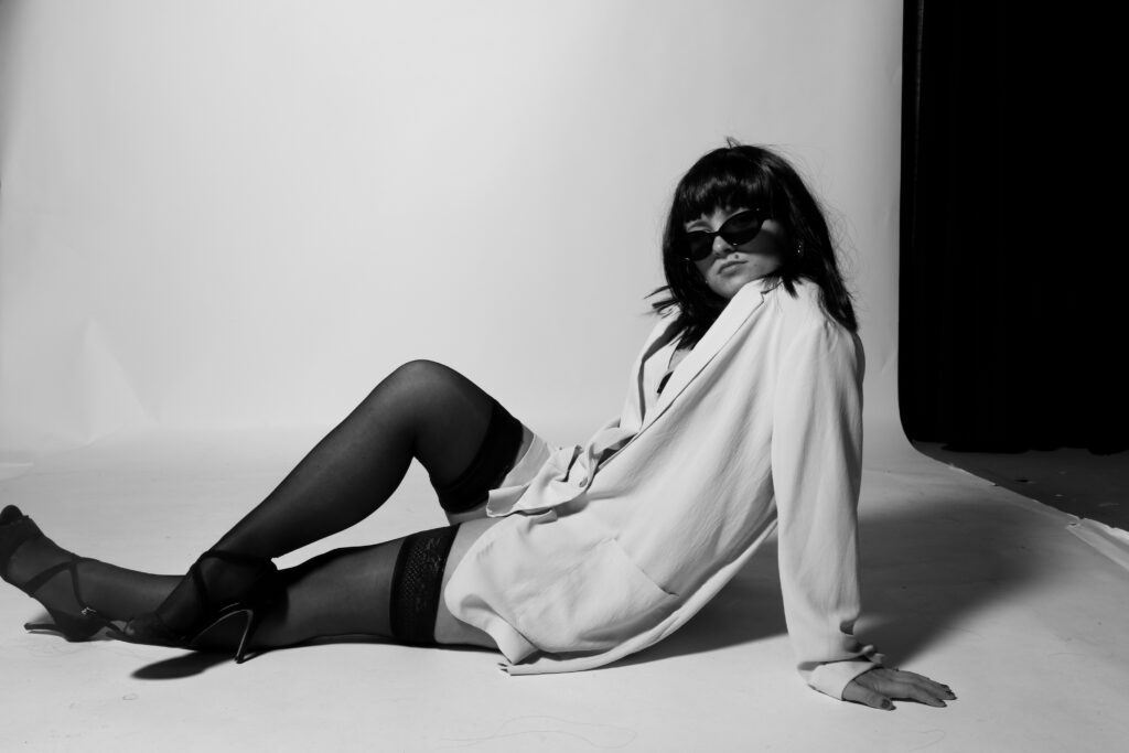
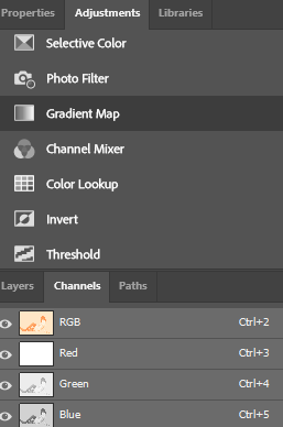
Further editing experiments from phootshoot 3
Cropping in photoshop:
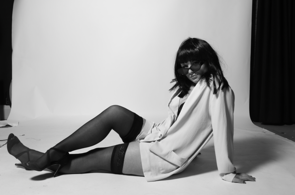
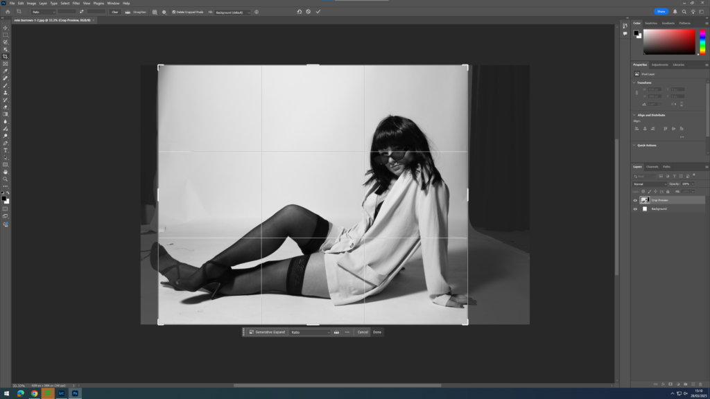
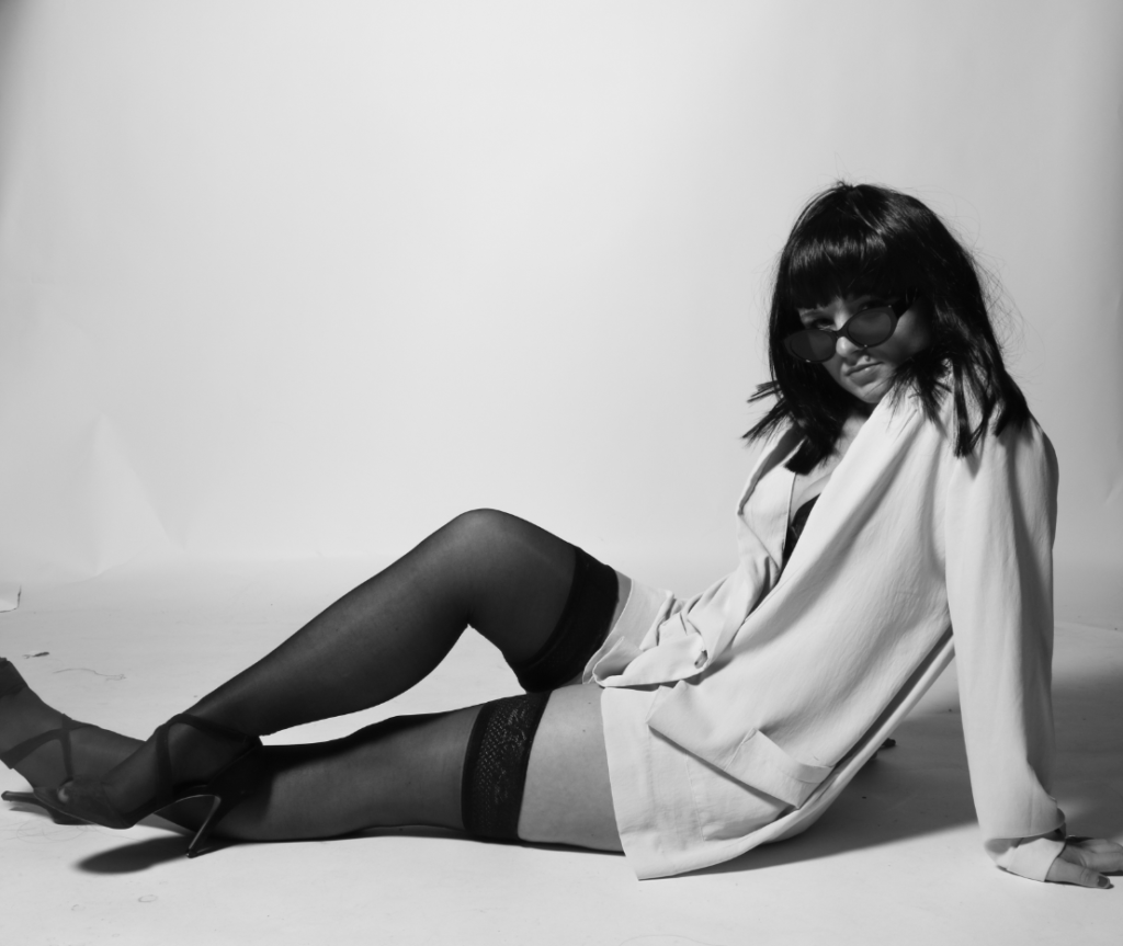
I chose to crop this image using photoshop rather than Lightroom. This is because photoshop allows you to crop certain areas within your image without cropping the whole thing, so by doing this I was able to crop out some of the unwanted material on the left side near the model’s feet, yet keep the image to a good size so all the elements I want to be included are.
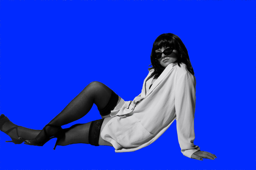
Background editing using photoshop – E.g. :
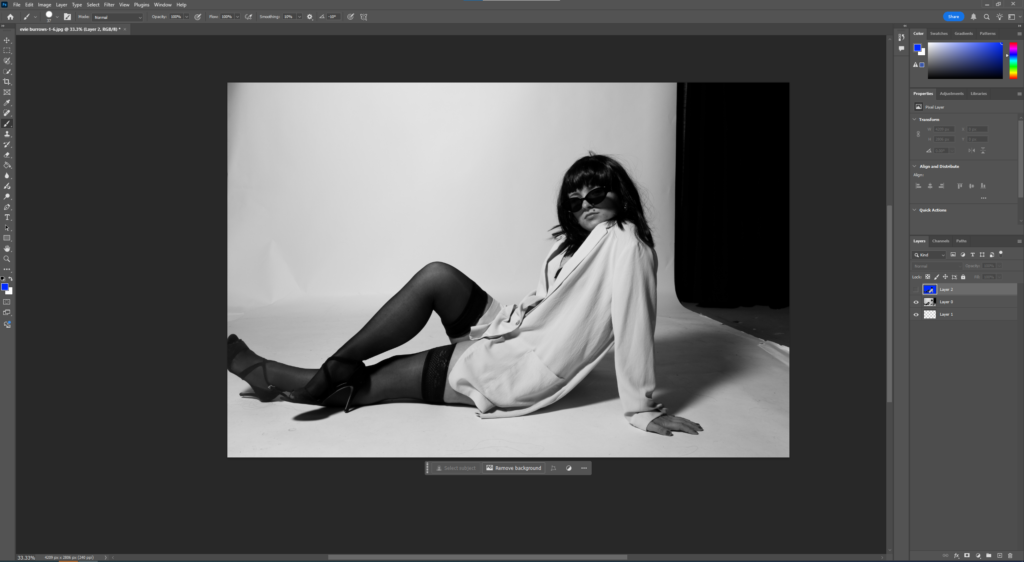
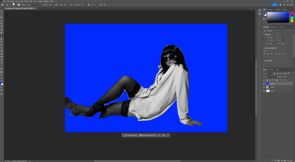
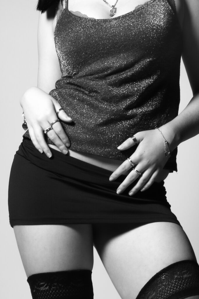
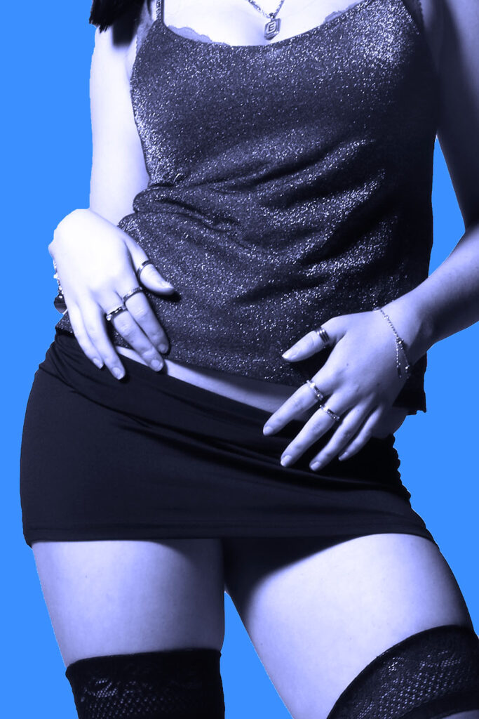
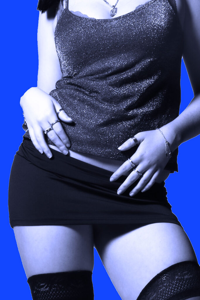
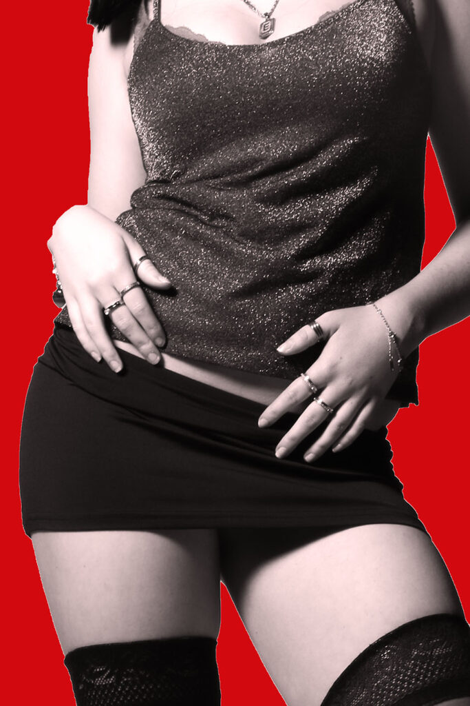
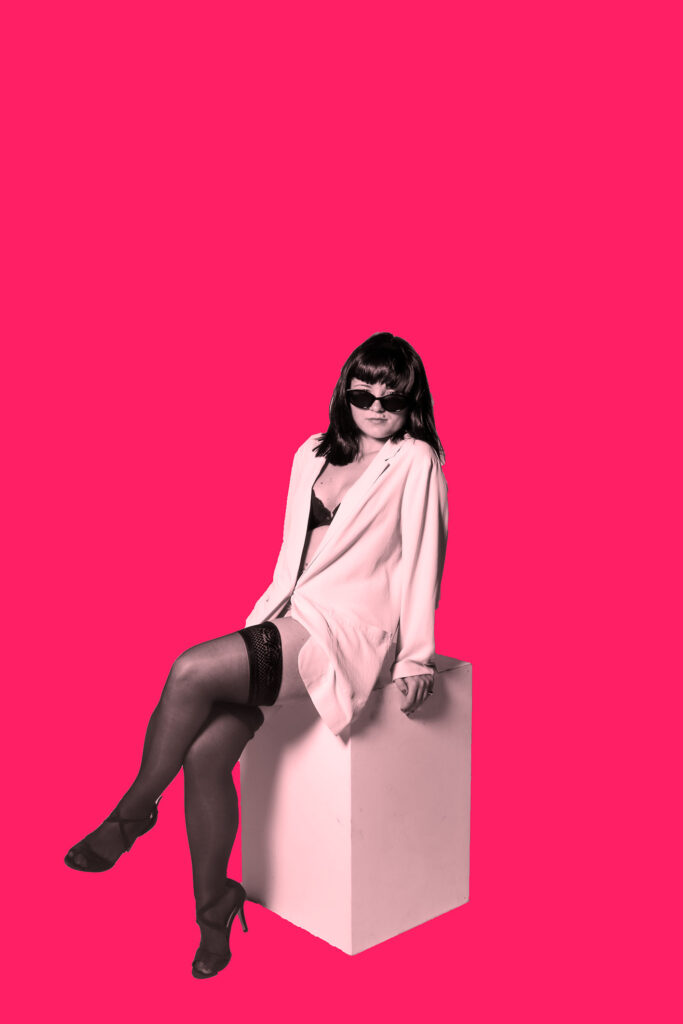
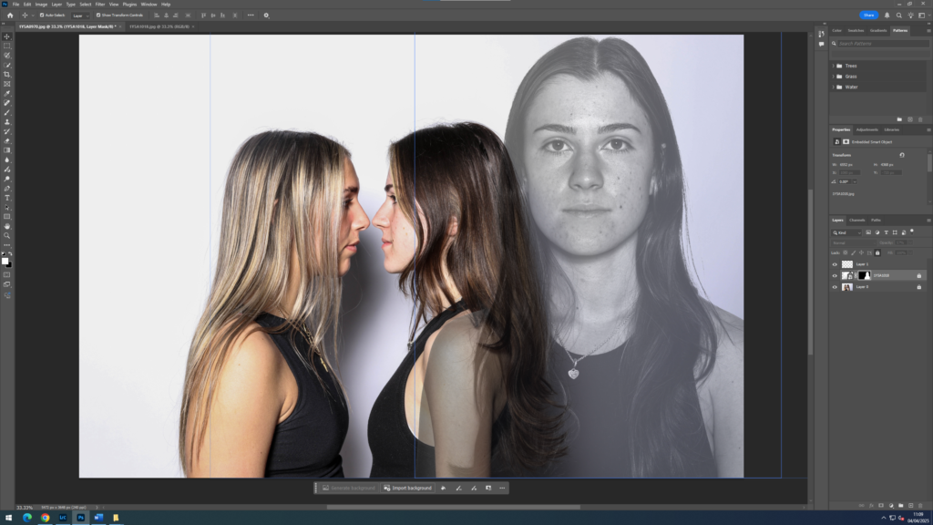
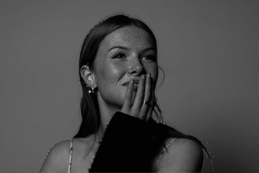
To achieve a plain blue background, I followed the same process that I have explained previously in one of my editing blog posts. In order to make the outcome look as realistic as possible, I had to carefully colour in all of the edges of subject to prevent a harsh outline. I used the pen brush tool, and adjusted the size of the brush so I can be more precise and make it look neat. I also adjusted the hardness to 100% to enhance the preciseness, and allow for no messy or white edges between the subject and the background.
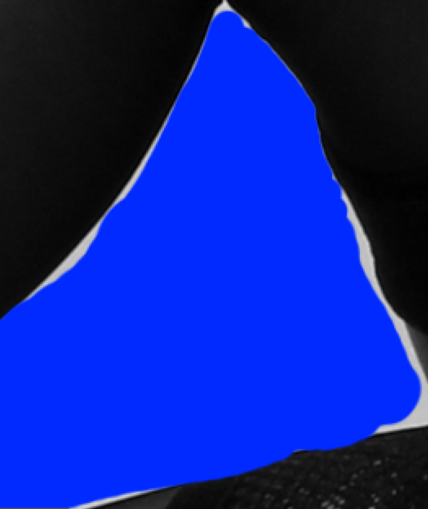
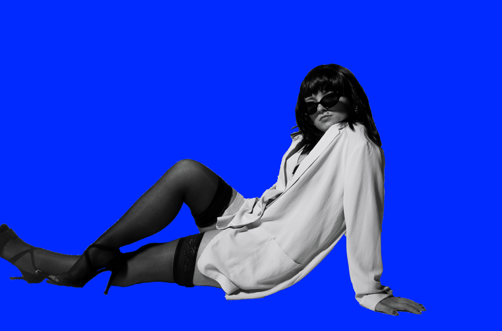
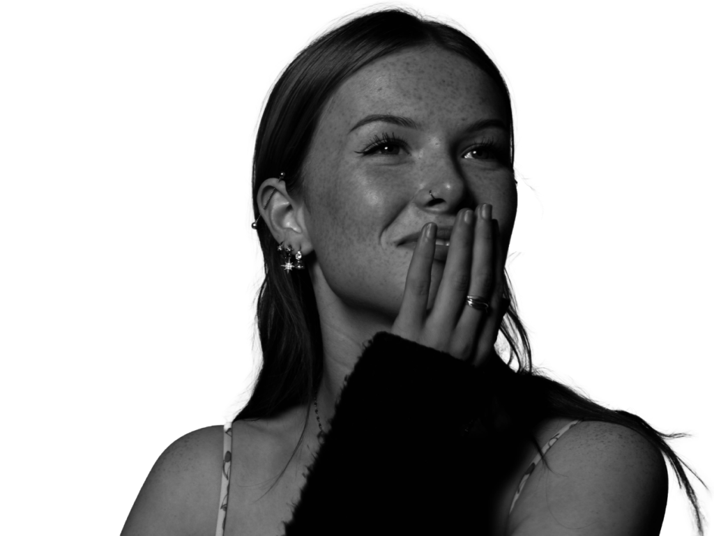
Here is what my image looked like after using the brush tool and removing all of the white edges, which I think looks a lot more successful and realistic.
Finally, I decided to add a simple filter that would enhance my outcome further. This way, it gives the effect that everything is merged and blended together subtly, rather than it looking very separate and unprofessional.
Edit 1 with random experimentations:
version 1:
version 2:
version 3:
version 4:
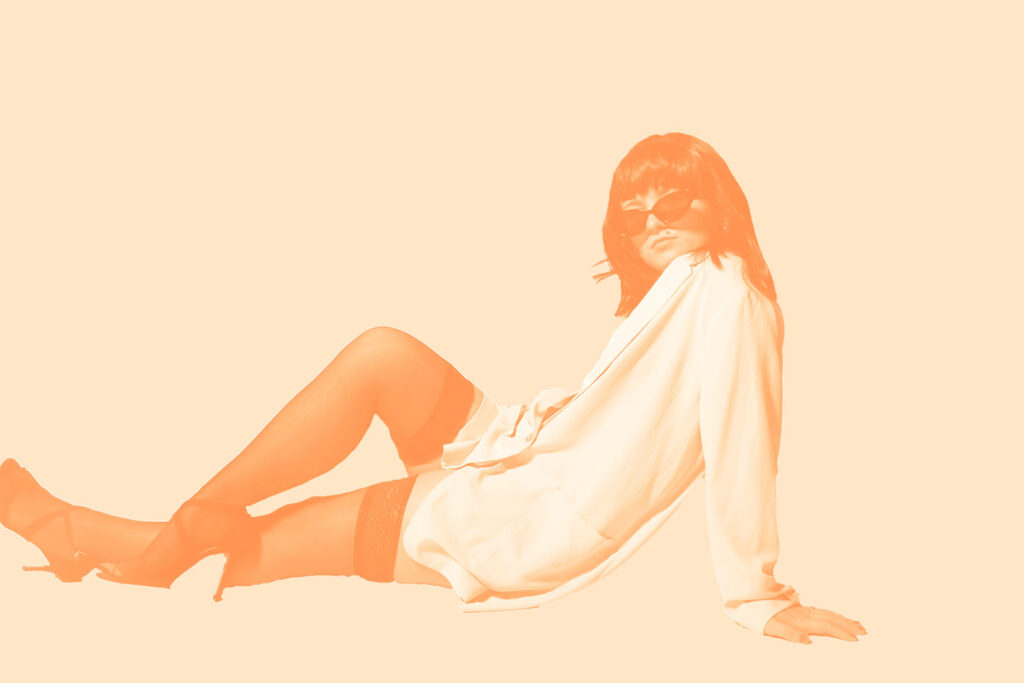
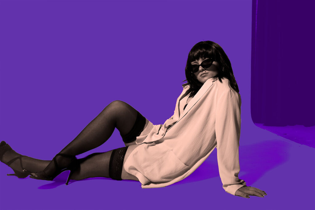
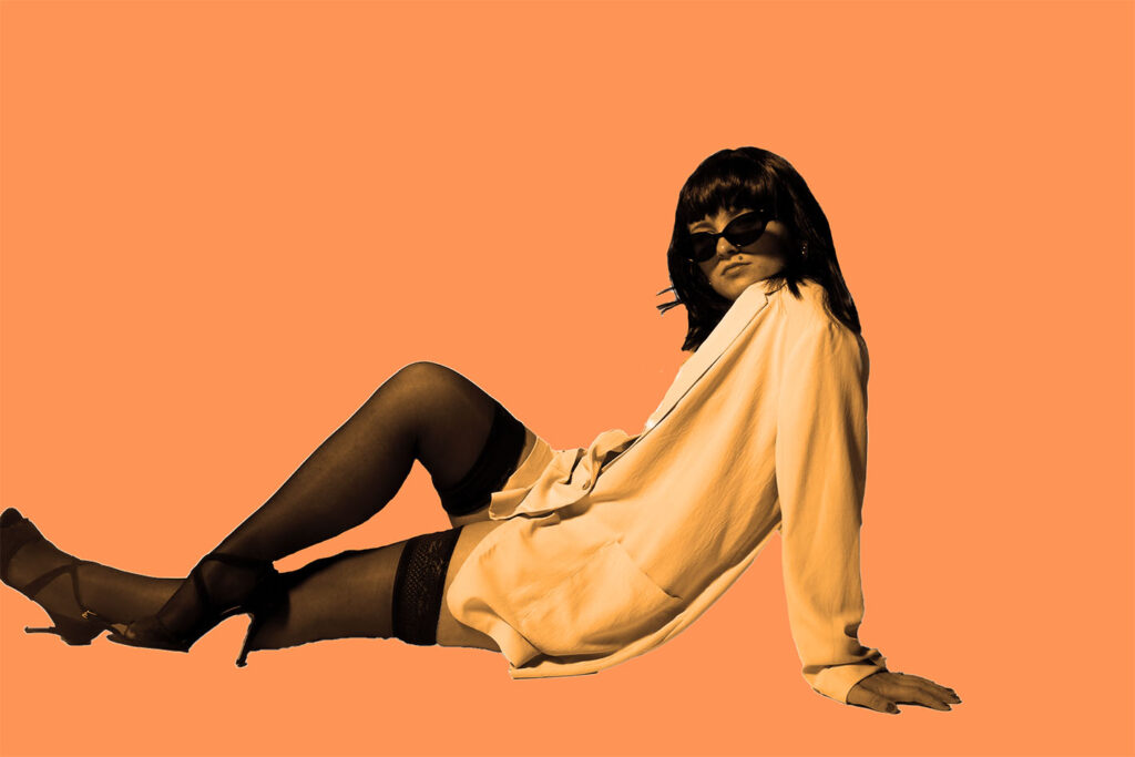
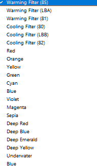
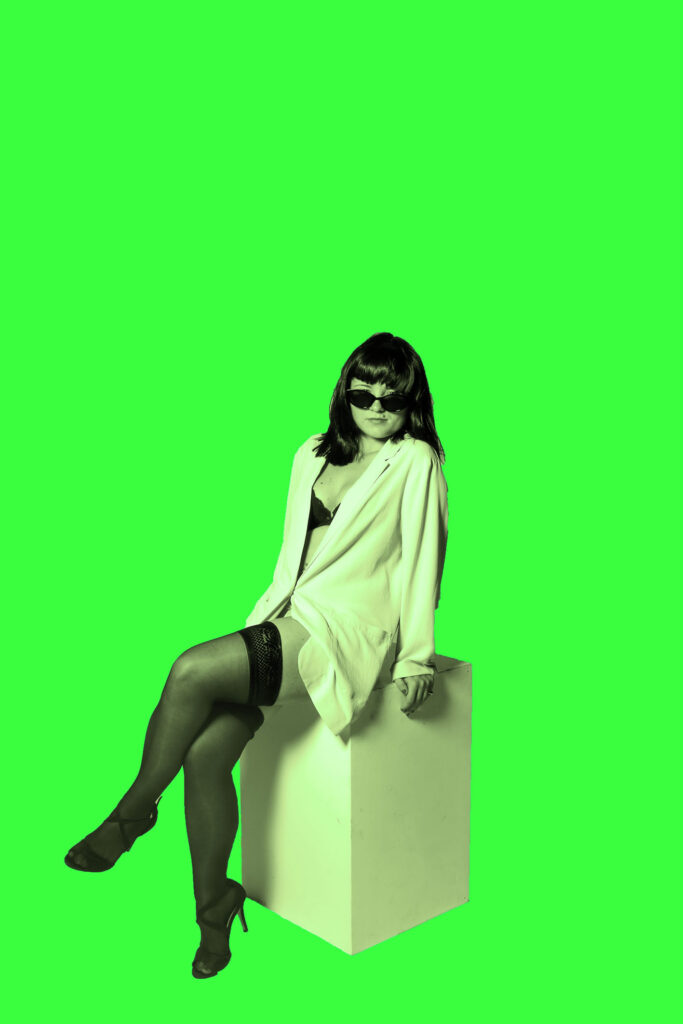
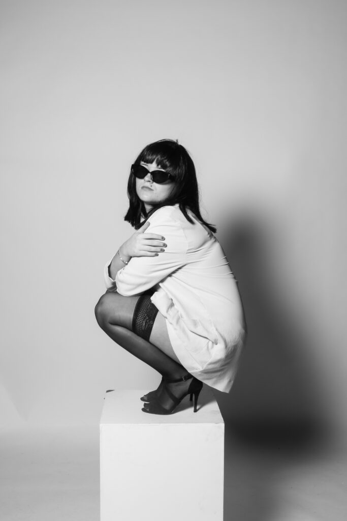
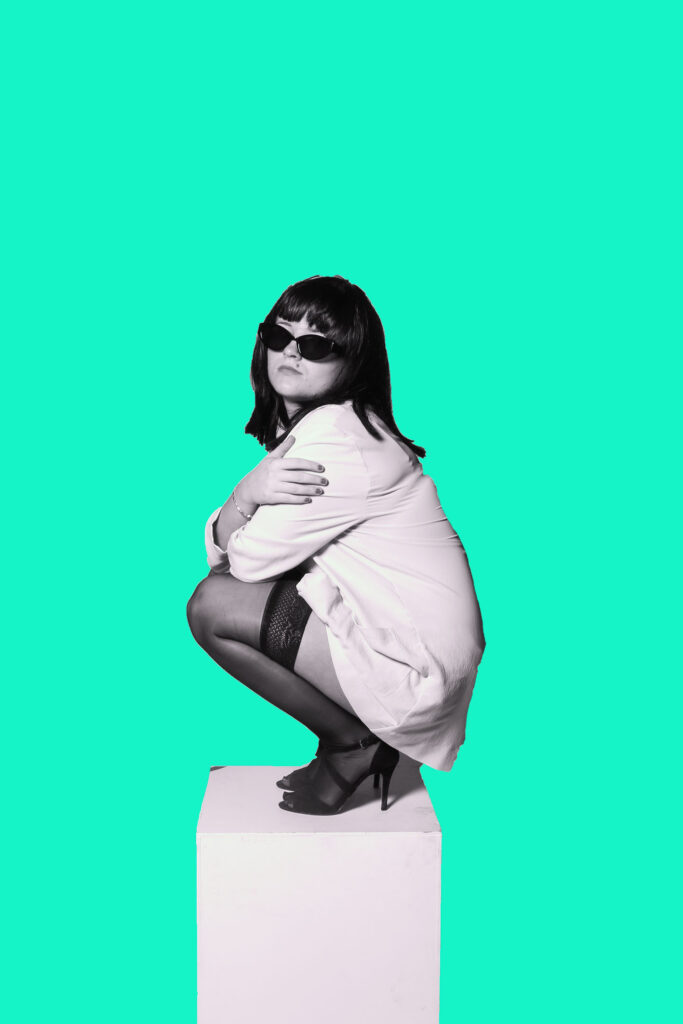
Furthermore, I selected the adjustments so I could subtly change the colour of the subject so that it matches the colour of the new backdrop. I selected the photo filter tool, where I could then decide which filter would suit the tones within each individual image
Edit 2:
version 1:
version 2:


version 3:
version 4 – (additional experiment) :
Edit 3:
version 1:
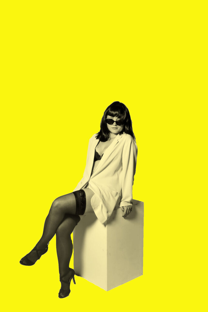
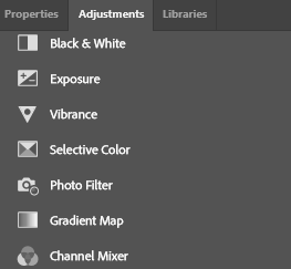
To achieve the different colour filters, I selected the adjustments tool and scrolled down to the photo filter. By doing this, my selected subject can blend seamlessly into the background as she will pick up a slight tint that matches the background, and this prevents harsh lines and the image from looking too artificial.
version 2:
version 3:
Edit 4:
version 1:
Same image but using the gradient map tool:
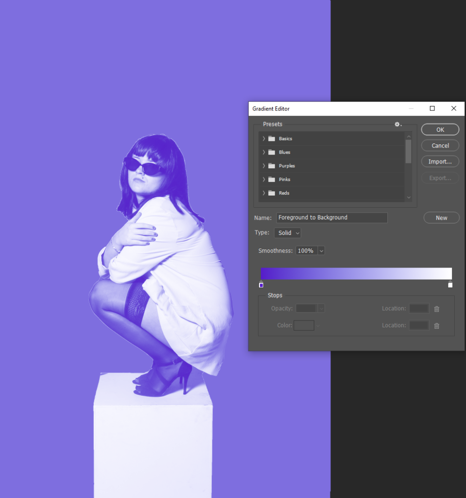
The gradient map tool further blends the selected subject into the background, which I like as it doesn’t allow for the image to appear too vibrant and fake. However, my artist inspiration Yayoi Kusama only uses bold colours in the backgrounds of her images, presenting a more real life effect. This filter makes my images feel more staged due to the excessive use of colour and editing, which could ultimately subtract my aim of creating raw images. Therefore, I will only use this filter on a small amount of my final outcomes for my photobook, this way I can present my raw and realistic approach, yet also showing some experimentations I conducted along the way.
version 2:
version 3:
Extra edits for my photobook:
Most successful outcomes from editing:
Photoshoot 1 edits –

I will be editing all Green coded photographs. I’ve been exploring the idea of surrealism through my work, and wanted to incorporate that into some of my edits through trial and error.
Photographs to be edited –
With these photos, I incorporated 2 old photographs I took a year ago while working on the portraiture topic, to give one photo idea some depth.
Edit 1 –
I first imported this photograph into Lightroom, after editing it to my desire, using portrait filters, and changing the tones and highlights to best fit the photo.
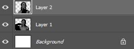
I then imported it to photoshop while I edited the layers I want to add to the photo, in Lightroom.
Photo 1 –
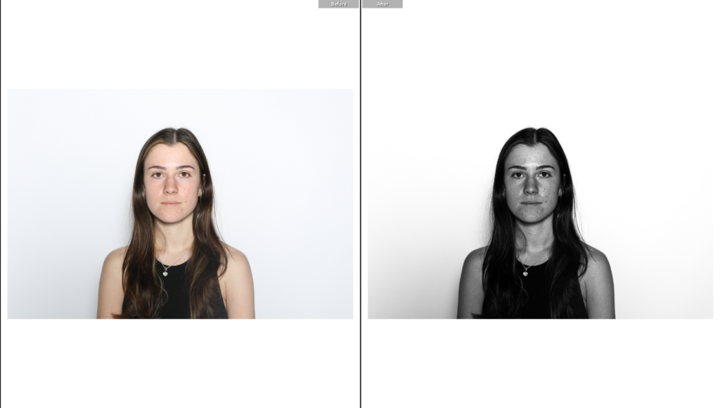
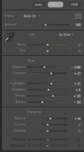
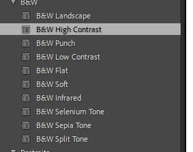
Photo 2 –

Photoshop edits –
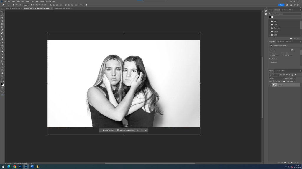
I placed the initial photo into its own layer, locking it. Then in a new layer, imported the first edited photo, I positioned it above the sitter and began to play around with opacity. Since I didn’t want the layer to be so harsh, I wanted the second photo to almost look faded, so I set the opacity on 57%.
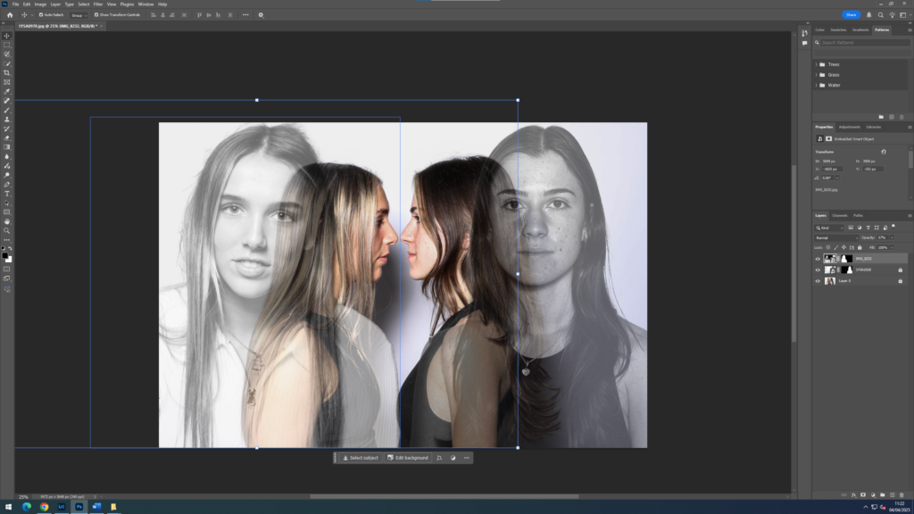
Doing the same to the 3rd photo, imported and positioned exactly where I wanted it, then putting the opacity at 57% to mirror, image 2, bringing the whole finished edit together.
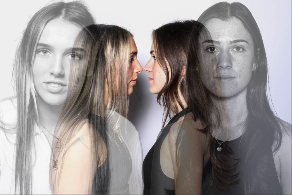
Final edit –
Edit 2 –
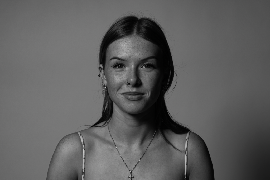
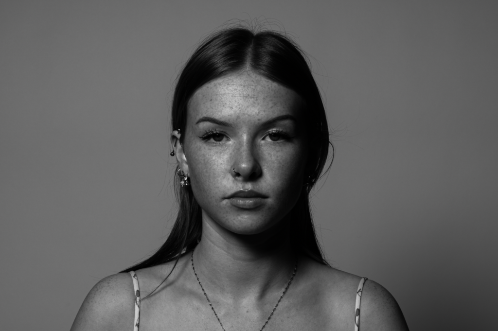
With this photograph being my base photo for this edit, I decided to edit it black and white, almost opposite from the previous edit
Photo 1 –
For a little bit more contrast on this photo, I edited it slightly to bring out some of the natural highlights a little more, enhancing the texture and colour to bring some life into the picture that was taken from the studio lighting.
Photoshop edits –
After I finished editing the photos in light room, I exported them to photoshop, in different sections.

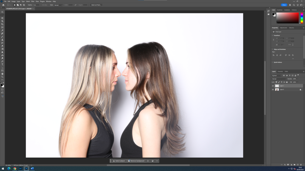
I cut, cropped and edited the side profile photo again in photoshop due to some technical difficulties and then duplicated it to use in the final process.
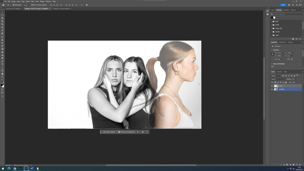
I mirrored the photo and set the opacity to 57% for the perfect contrast to my background photo. Placing the photo along the side of the portrait of the sitters.
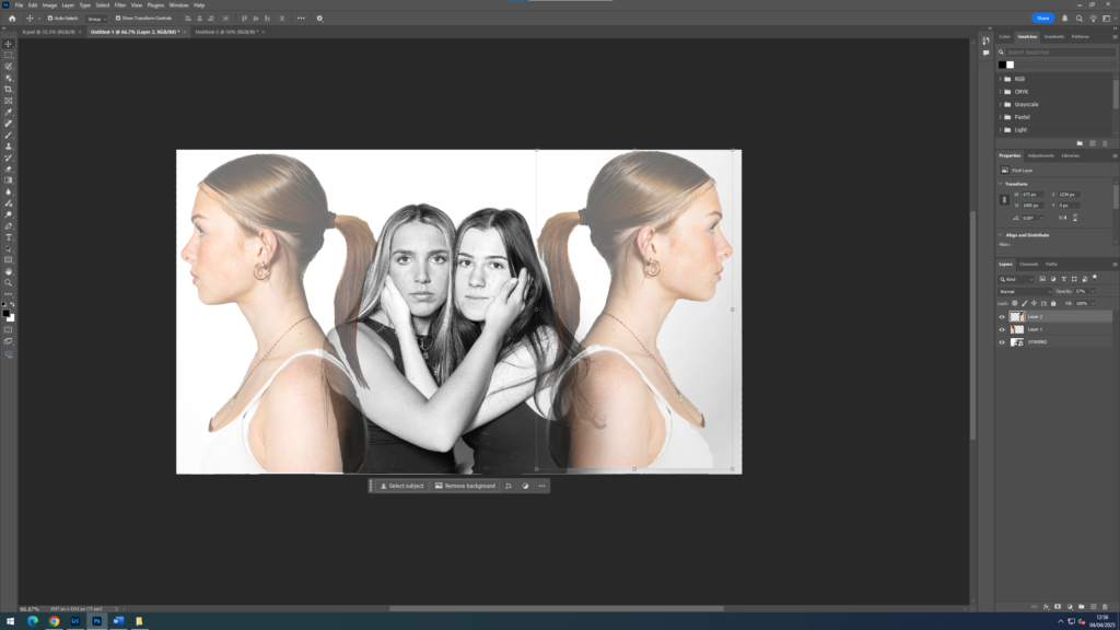
Finally, doing the same again with the side profile photo to have each have their back to the main subjects.
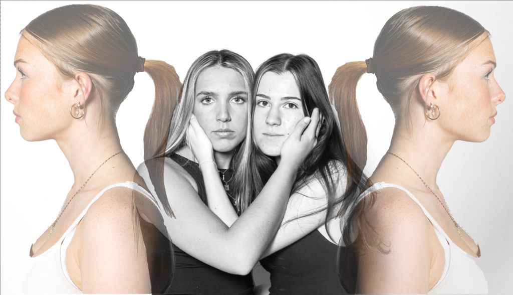
Final edit –
Virtual gallery and evaluation –
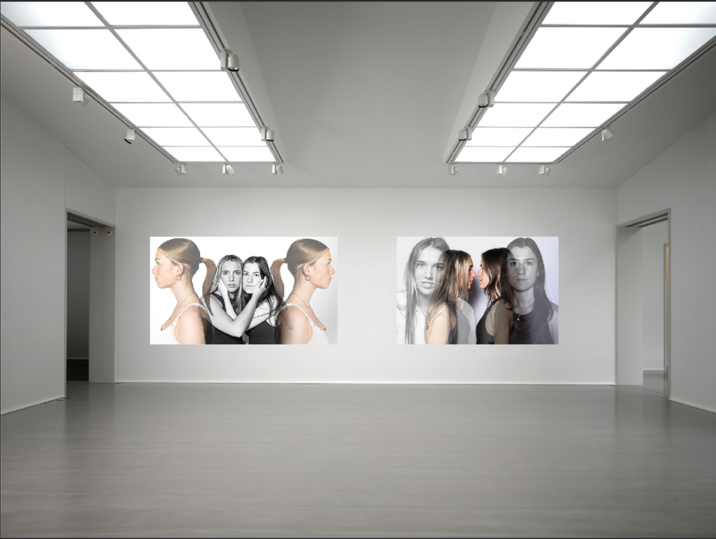
With the limited amount of photos I gathered for this photoshoot, I’m very happy with the outcomes of my edits. The use of layering and playing around with opacity complimented my idea and the photos I included very well. The reverse editing and similarities between them send a familiarity feel to all my photos collectively, especially with the wide range of photos I have overall.
The took full use of eye contact and touch, that I included in these photos as that is such an effective way to show unity and intimacy through people. I focused on not just the touch and contact in my edits, but direction. The way I edited subjects to face away or together, close or far, really helps tell my idea to the viewer.
Photoshoot 1: Development and experimentation
After editing:


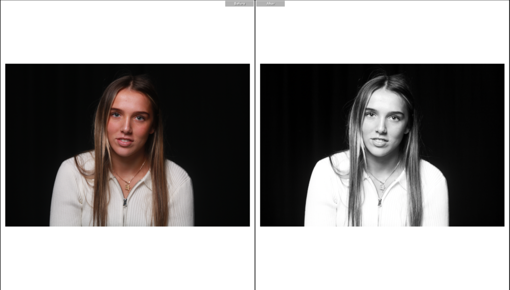
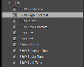
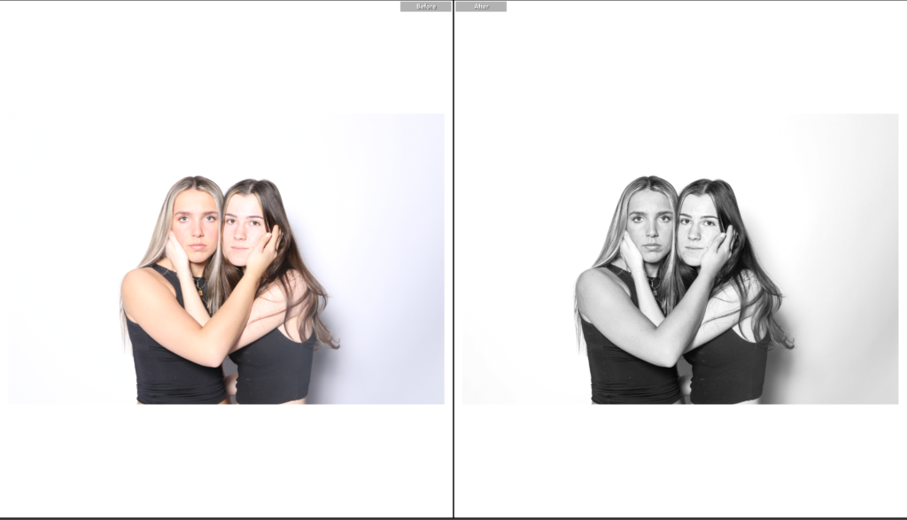
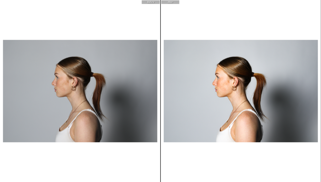
I decided to edit all these images in black and white using similar adjustments so that they look simple and sharp, which will support my editing process in Photoshop. The black and white tones exaggerate the shadows around or within the subject, adding depth to the image and enhancing the texture.
Photoshop edit processes:
Edit 1:


Initial edit:
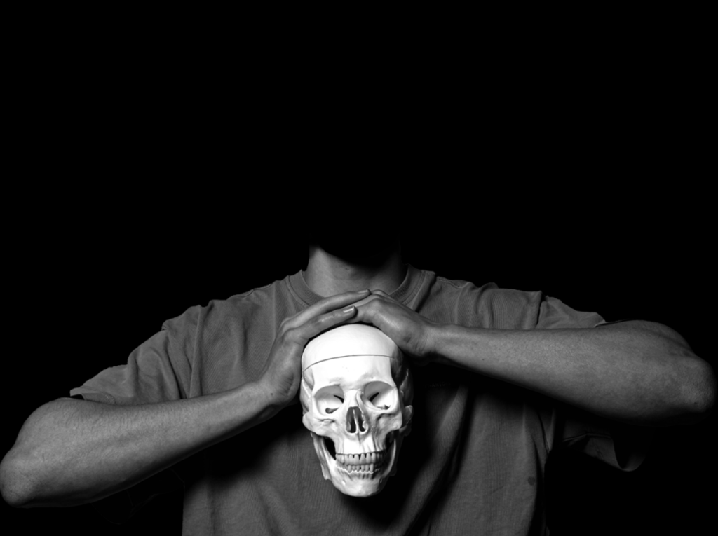
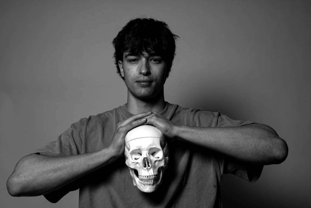
To edit this image, I imported the edited black and white image from Adobe Lightroom Classic to Adobe Photoshop. I then started by cutting out the subject’s body (using the quick selection tool) and placing it onto a new blank document.
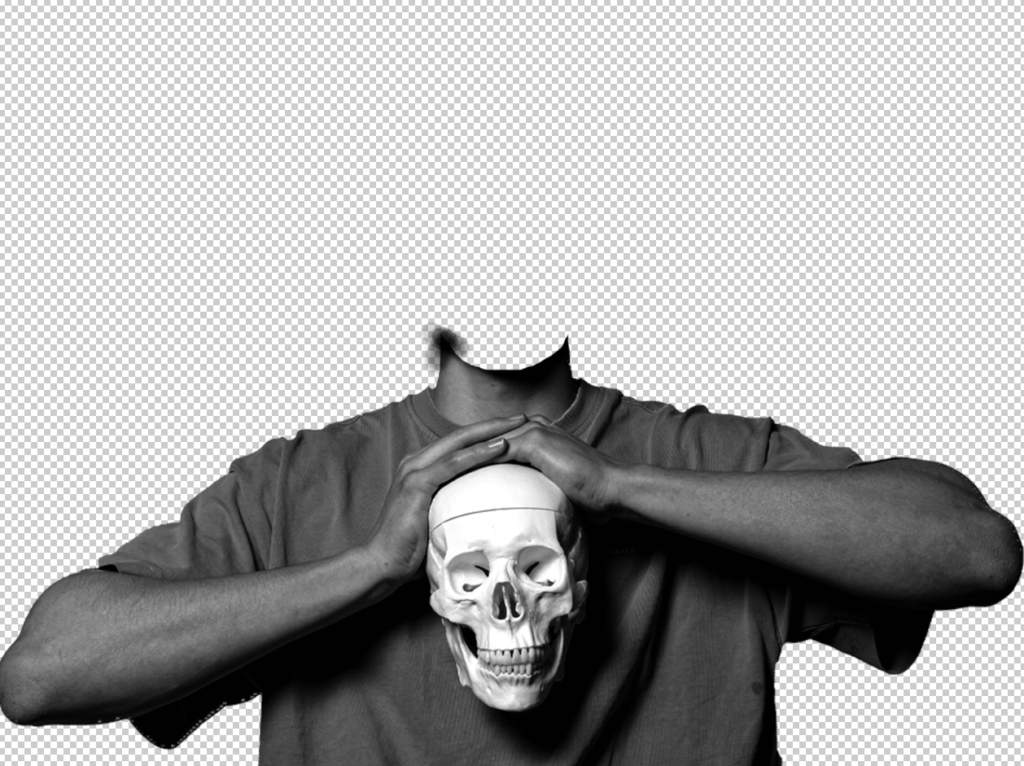
I then selected the background layer and used the paint bucket tool to create a black background behind the subject.
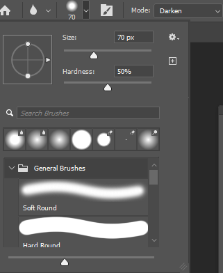
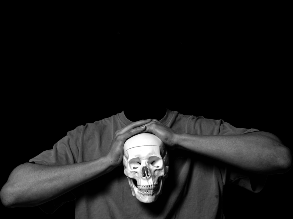
Finally, to make sure the image looked sharp and well edited, I used the blur tool to blend the neckline into the black background.
However, I wasn’t pleased with how it turned out, so I decided to remove the subject’s neckline in order to create a clear, surrealistic image. To do this, I used the selection brush tool to carefully remove the neckline, as this tool was easier to use rather than the quick selection tool for a precise cut. Once the neckline was completely coloured in, I pressed ‘Delete’ on my keyboard, which removed the selected piece.
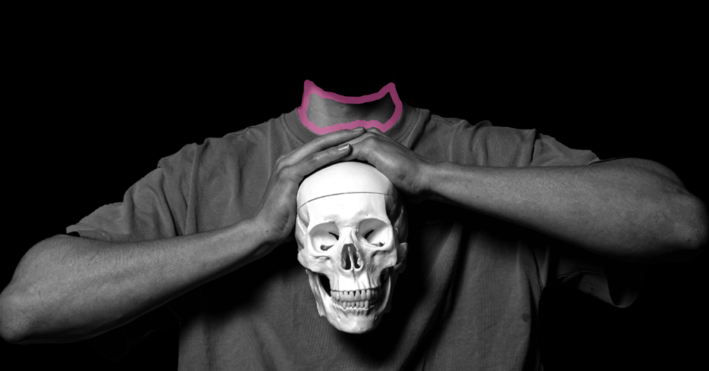
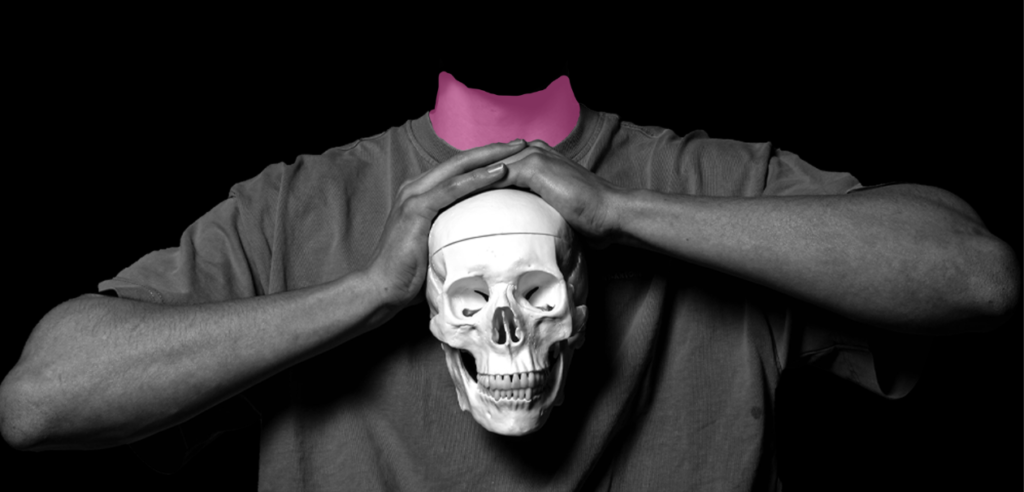
Final outcome:
Edit 2:
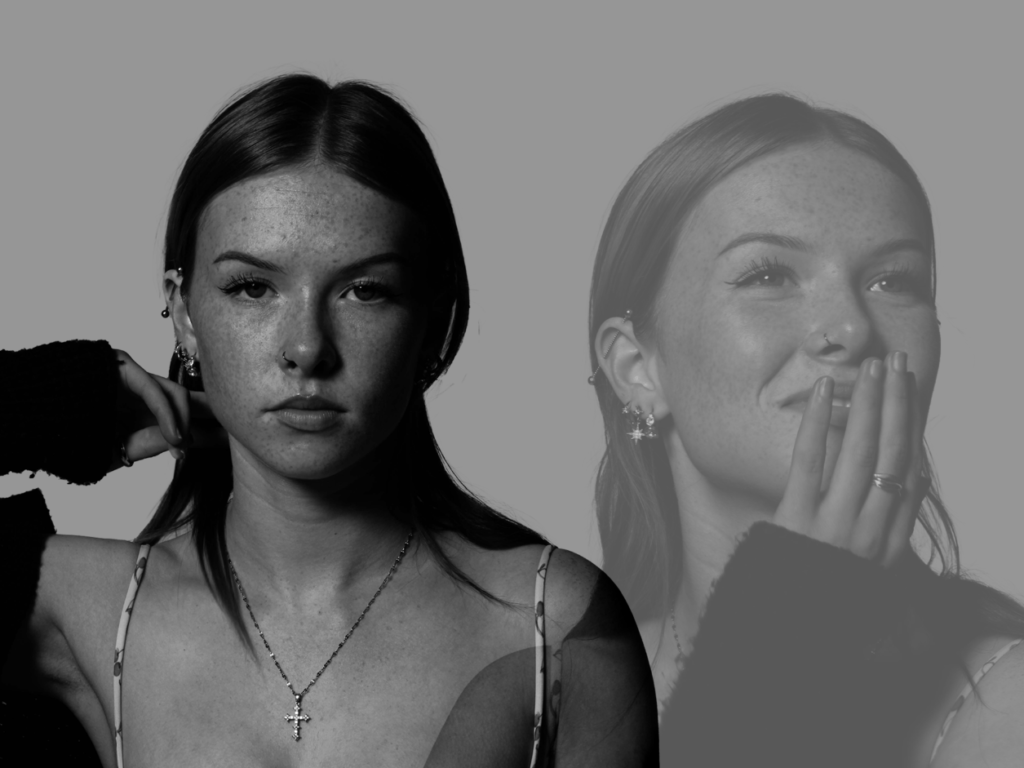
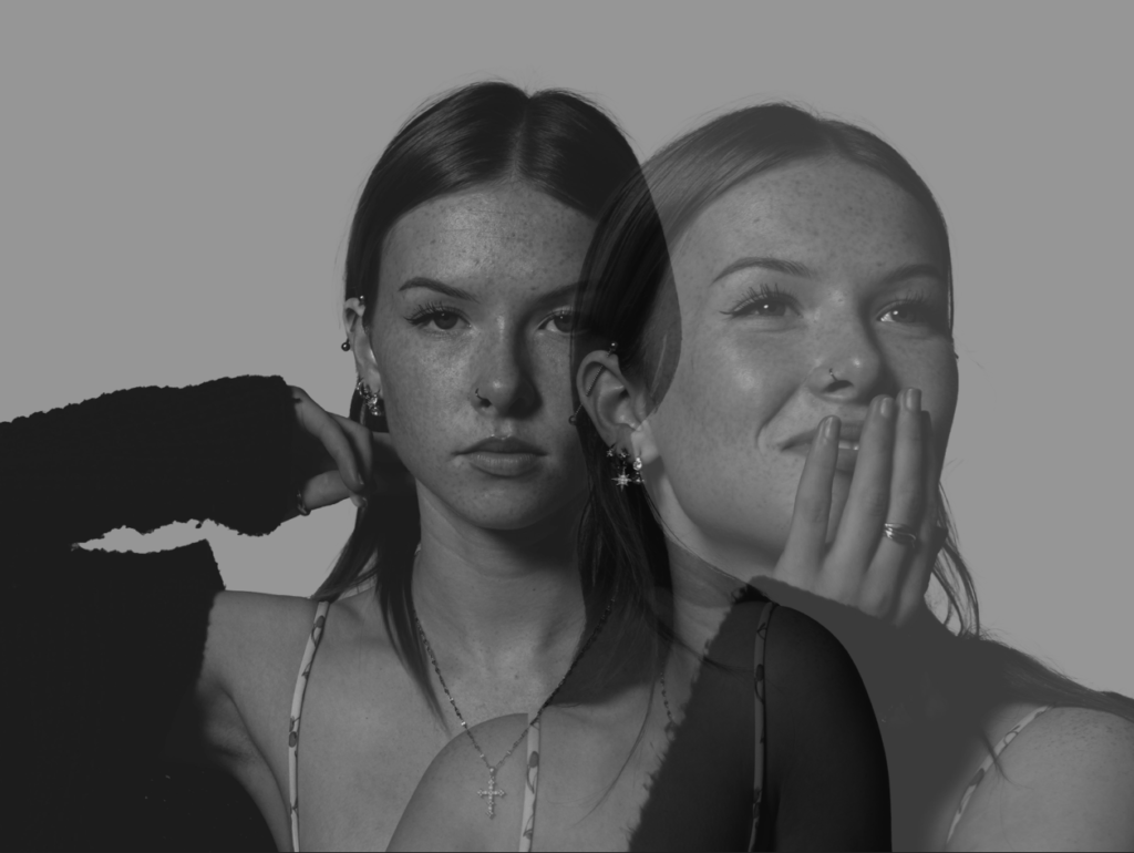
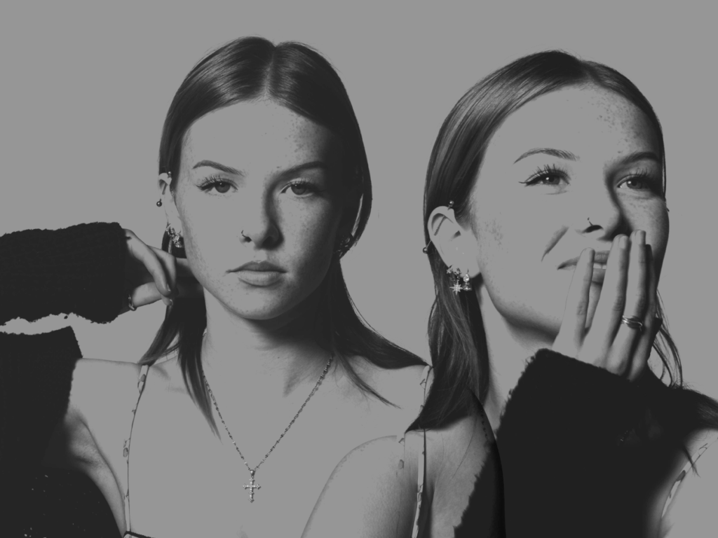
For this edit, I am planning on blending these two images together to create one, where the subject is portraying opposite facial expressions and direct/indirect eye contact.
Initial edit:
First of all, I started with the first image in Photoshop. I used the quick selection tool to carefully select the outline of the subject’s face and body:
I then copied the layer and transferred it onto a new, blank document:
Onto the second image, I repeated these steps in Photoshop:
Now that both of the images are on one document, I selected the paint bucket tool and chose a colour that I think would work nicely against the tones of the images.
Now that the colour is selected, I placed the paint bucket tool onto my selected layer (background).
Finally, I experimented with the layout of the images, as well as the opacity:
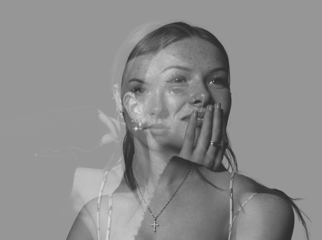
Final edit:


Evaluation:
Overall, I am really happy with how these images turned out as they link really nicely to the theme of union. I feel that surrealism reinforces this idea around unity because it is the photographic process of bringing things together, which I have tried to attain in my photos. I am also glad that I created a plan before taking the photos as it supported my organisation within the photoshoots.
Photoshoot 1: Planning and recording
My plan:
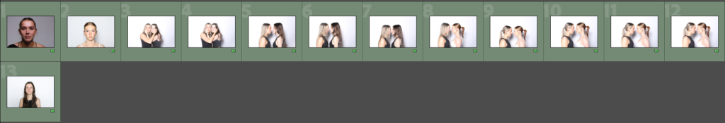
Contact sheet:
Firstly, I went through my contact sheet and organised the photos into different groups:
1 or 2 stars = Red- the worst photos and I will most likely not use them
3 stars = Yellow- photos that aren’t the best quality but I may use them
4 or 5 stars = Green- my best photos and will definitely use
This way of sorting my images helps me to keep them organised.
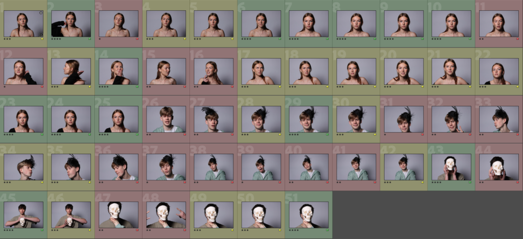
For this photoshoot, I went to the photography studio, as I planned, to experiment with different ideas and images that could be successful to edit for surrealism. Within the photos, I decided to keep these images as portraits of the subjects, as I would like to experiment with different tools in Photoshop, using inspiration from Tommy Ingberg’s Surrealism photography.
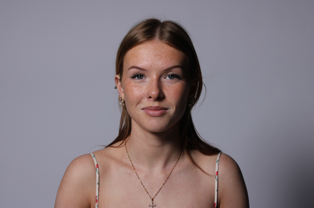
My best images:
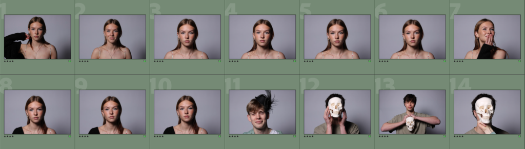
Before editing:
Photoshoot plan
Idea
For my photoshoots I will be taking photos of women’s faces. I will be taking inspiration from Barbara Kruger who took portraits and body shots of women and put bold red slogans on top of them images to show that women’s rights in politics are not respected, and the bold red writing represents the anger and consumerism where it looks like the title of a magazine. I will also be using my artist reference of Jenny Holzer who used projections and text in her work to also provide insight on consumerism and feminist activity, where it challenges the roles of traditional women in society and how males can control women.
For my final images I want to have women looking a mixture pf casually and angry at the camera with text over the top of some of my pictures to show the two different types of people I’m representing within my book. I want my final outcome to show the struggles and anger of feminism and consumerism and being a women in our modern generation with social expectations.
Photoshoots
For my first photoshoot I will be taking portraits of women’s faces in the studio with the plain backdrop behind the model so that there are no details in the background of the images. I will be taking pictures with all the lighting techniques that I have learnt like butterfly, Rembrandt, chiaroscuro and just the average portraits with the camera straight in front of the model. I will do photoshoots each with a different model to show my two ideas of feminism and consumerism within the theme of union.
Editing
I will edit my images to be in black and white as I want to make the pictures all the same for both photoshoot. I want my images to be in black and white and some will either be in large bordered writing or large black writing over the images. For the bordered writing I will be using a red border for the feminism aspect of my project. This is because red is a colour that shows anger, strength and passion, its boldness shows that it wants to be seen and heard by the audience, then contrast the bold red writing with the black and white background shows that its not about the image its about the text on top of it.
Statement of intent
What I want to explore
For my project of the theme ‘Union’ I will be exploring femininity and consumerism and from that the power, identity and stereotypes that come from it. I will be exploring this as I think that femininity is strongly linked to the theme of Union as women have been sticking together and fighting for rights all throughout time. I want to explore this because I like the work that has stemmed from feminism and consumerism and the story behind it then linking the two together where the consumerism links to feminism and the feminism links to consumerism. I am exploring feminism as the work is powerful and with that has created a ‘Union’ with women all around the world.
Why it matters to me
This matters to me because as a woman and seeing different things that go on in the world with women in places like The Middle East where women cant wear what they want, cant work or go to school and America where abortions have been banned by men in charge and male roles in politics who are controlling what women can and cant do. Women should be allowed to do the bare minimum without being controlled. Anti-feminism is a large problem in the world since the start of time, where men have control over women and their bodies. I am also basing my work off consumerism and the intent to buy things, as it is also linked to a stereotype of being a woman and wanting to spend money, buy and have a lot of things. I am doing this because I want to present final images with words that can mean buying things and over-consuming but also link it back to the feminism side and use words like ‘Greed’ which can link to both consumerism and feminism. I want to make my work to circle consumerism, and the male view on women and use quotes and words from what I feel empowers femininity and layer them on top of my pictures I take of women’s faces.
How I will develop my project
I wish to develop my project by creating images where I take pictures of women’s faces, and putting text over the image with strong statements and quotes from feminist articles or words that I would use to associate feminism and consumerism. I will do this by taking pictures of different girls and present them in two different ways of consumerism and feminism. I will then have my final outcome being a mounted pieces of the two (consumerism and feminism) and created different mounts with my final images.
How I will start my study
I intend to begin my study by researching ideas from Barbara Kruger and Jenny Holzer and follow their ideas of what they represent and created when they made their work of feminism and consumerism. I want to have strong quotes, statements and symbols to put over the top of my images that I think link to my idea feminism and consumerism, then take inspiration from my two artists I studied and create slogans from that. I then need to take photos of women’s faces and combine the images and text together to create my final piece.
Artist Reference: Jenny Holzer
Jenny Holzer is an American neo-conceptual artist. Her work focuses on the delivery of words and ideas in public spaces and includes large-scale installations, advertising billboards, projections on buildings and other structures, and illuminated electronic displays. Holzer belongs to the feminist branch of a generation of artists that emerged around 1980
Holzer is known as a neo-conceptual artist. Most of her work is presented in public spaces and includes words and ideas, in the form of text art. Her large installations have included advertising billboards, projections on buildings and other architectural structures, and illuminated electronic displays. LED signs have become her most visible medium, although her diverse practice incorporates a wide array of media including street posters, painted signs, stone benches, paintings, photographs, sound, video, projections and the Internet. Text-based light projections have been central to Holzer’s practice since 1996. From 2010, her LED signs started becoming more sculptural.
Jenny Holzer only uses capital letters in her work and frequently words or phrases are italicized. She has stated before that this is because she wants to “show some sense of urgency and to speak a bit loudly”.
The subject of Holzer’s work relates to feminism and sexism. Her work discusses subjects such as sexual assault against women. She has said that she gravitates towards subjects such as this due to family dysfunction she has experienced and because she claims “we don’t need work on joy.”
Mood Board
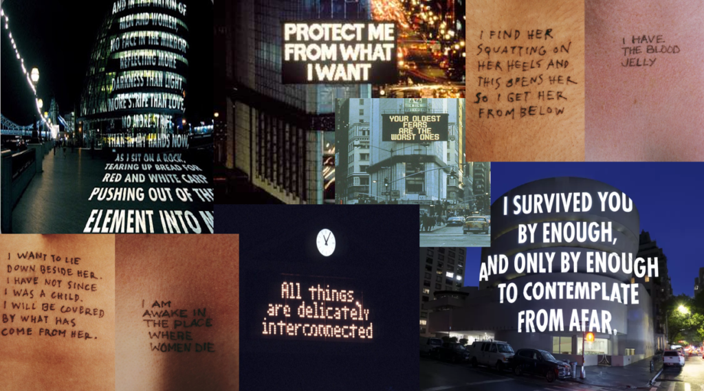
Image analysis
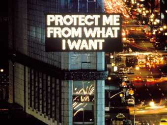
This image quoting ‘Protect me from what I want’ is a statement which can be interpreted in many ways. The first thing I thought of when I read this statement was consumerism as its in big bold writing on a billboard in a busy city. It can be meaning purchasing something and wanting someone to stop you from buying that and I view it as a form of self-sabotage from wanting someone to protect you from buying something. But knowing her work on feminism and sexual assault it can also mean the thought of wanting a relationship but doubting or regretting that thought as the person knows its wrong but wants it anyway. This being advertised on a large building in a busy city represents the fact that this may happen to so many people or that so many people can see this but nobody wants to help, as it is on a large billboard sign and being shown to a whole city.
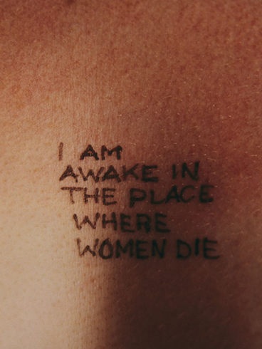
These images are from Jenny Holzer’s “Lustmord” work. The word “Lustmord” is a German word translating to ‘sexual murder’ in English. This work shines a light on sexual assault. Her work is viewed in three different perspectives of the crime, the offender, the victim and an observer. I have chosen to analyse an image that has an objective perspective where it can be written by all three. It can be from the offenders of him being in a place where only women die from as he has sexually assaulted her. The victims perspective, where she is in a position where she is still alive but about to be assaulted, or the observers where he is observing the assault and stating that he is watching the assault happen. The pen ink written on the skin shows a permanent mark left on all three perspectives from being involved in this crime.
Photoshoot 3- Plan
For this photoshoot I want to recreate the archive image below:
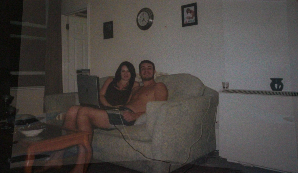
This archive is an image of my mum and dad in 2006.
I would also like to take photographs not inspired by an archive of my mum, dad and sister all sat together.
Aim
My aim for this photoshoot is to create joiners, which are inspired by my artist research on David Hockney. In order to do this, I am going to need to recreate this image multiple times from different angles/ perspectives. In order to achieve this, I am going to take this image every day for a week from a slightly different angle each day. After doing that I will either have to print of all these images and piece them together to create a unique image, or use photoshop to do so.
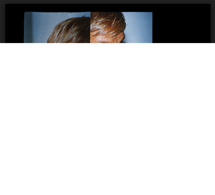
Examples of a Joiner:
This experimentation also links well with the Art Movement I researched, which is cubism.
Why?
I want to experiment with joiners, because it is a type of cubism and I think multiple different images being unified into one image symbolises how there are multiple different members of a family, but they are all unified together through love, blood, DNA, heritage etc. I also think the process of taking the images at different times and then having to print them off and arrange them together, or using photoshop to do so takes a lot of time, which symbolises how a family is unified until the end of time and how even though time passes the family union never breaks, it just grows.
I also want to recreate the archive above for this, so that I can create a joiner that includes my own photographs as well as an archive.