Photoshoot 2: Planning and recording

My plan:

Contact sheet:

I started by selecting my favourite images and giving them 4 or 5 stars, meaning they would be colour coded to green. Then my least favourite/ worst were given 1/2 stars and colour coded red. Finally, the rest of the images were given 3 stars and colour coded yellow, which means that they weren’t the best photos but can still be used. This helped me to stay organised with all of my photos.

For this photoshoot, I used the studio with the professional lighting and backdrop, as I felt my images would come out clearer and easier to use and edit.

My best images:

Before editing:

photoshoot recording and editing

for my first photoshoot I wanted to photograph objects that I would say are “gender locked”, meaning that it would be seen as quite strange by the majority of public if the opposite gender were to use them this include objects such as perfumes, fragrances, loafers, high heels. My thought process behind this was that id edit some of the images with colours opposing the gender that would normally use them. For example, with a picture of loafers i would change the background of the image to blue and then create a contrasting image with pink as the background. The reason for this is because i want people to look at these images and challenge the stereotypes that people often make and have been making for a very long time.

this batch of images I think didn’t come out well in this photoshoot as I didn’t have the right set up when taking these images as the lighting was off and the canvas I was taking the pictures on didn’t help much either as it looked to tacky. so to help create better images I went to a studio for my second portion of images from this photoshoot.

like previously stated I managed to create far superior images in the second batch as I had a proper set up for my images the images came out with a much better quality, and a lot more detail on the objects which is exactly what I wanted to achieve.

the reason why I believe these three were the best from the photoshoot is because they came out exactly how i wanted them as I needed the images to look a certain way for my editing process, as I needed the object to have a plain white background with minimal shadows as I would be able to take the shadows out through Lightroom.

for this image I didn’t touch the basic parts of the image I just added two mask to adjust the appearance of the heel and the background of the image, the reason I decided to change the colour of the shoe was because I thought it would look to plain and boring if it was just the same shoe over and over again across all images. I also made sure the colour of the heel wasn’t to similar to the background so it wouldn’t be to hard to tell apart.

the editing process of this image is fairly similar to the first one as I wanted to make sure to keep a pattern in the book as I didn’t want anything to look out of place. as you can see by the adjustments I made to the image I focused on just changing the colour of tint of the loafers as they are black I couldn’t change the colour of it without it looking odd so I decided to add a pink tint over the shoe to go with the pink background.

for this image I decided to work on more than just the masking of the image as I wanted to make sure the colours were going to pop all over image and not just the background hence the saturation and vibrance being substantially increased in the editing settings.

when editing the objects of the image I wanted to try something a little bit different instead of having the objects the same colour as the background I decided to change the colour of them to something a little different to the background but not to far off so it wouldn’t look to off the colour scheme of the image which is why I adjusted the heel to be red still fitting with the colour scheme of pink .

This is the reason why i though these were the best images from the photoshoot as they allowed me create exactly what I wanted to the best out of all the other images as I was able to make the images have near to none shadows with the coloured background to make the objects pop out the image as much as possible which was what I wanted to create. However if i was to do this photoshoot again I would have taken a lot more images from different angles accompanied with different forms of lighting to bring out a different type of image, this could have consisted of the objects having different things around them to help bring a different meaning to the image/understanding of it.

Experimenting with Stitching

To experiment with stitching I am going to be using archive images and stitching them with red string/ thread. I have chosen this colour for the stitching, because it represents love and the blood that unifies us all together. I am going to be stitching myself when I was a baby, so that I could present that I am the result of my mum and dad’s union together and how I am surrounded by their love and share their blood. I will also be stitching photographs that I have taken of my mum, dad and sister together, so that I am able to stitch around my sister in the same coloured thread to present the same thing.

Photos Used?

Archive Images:

Photoshop

First, I screen shot the image I wanted to use.

Then, I used the red ballpoint pen to draw the stitches.

digital Mounting layout

I decided to plan how I’m going to mount my printed images by using Adobe InDesign, all in three different categories, Individualism, Socialism and Realism.

Virtual Gallery

Photoshoot 3 – Socialism

I explored the theme Socialism by taking photoshoots of a group of friends and family doing any sort of activity such as, going bowling, park, town, going on a walk etc. This symbolizes Socialism since socialism is all about socialising, making memories, having fun and being with people you enjoy spending your time with. For this photoshoot I decided to go explore different locations around jersey, for example St Peter, St Helier etc. Exploring Socialism brings attention to collective experiences, social justices, working-class and communities. Showing how people with different backgrounds and different environments can unit and the importance of equality and justice in society.

Best Images:

I decided yo leave some of my images in black and white because I think it gives a stronger connection to the theme society and it makes the images more un-posed. It shows how positive society can be when united.

Photoshoot 2 – Realism

I explored the theme Realism by taking photoshoots of nature, the environment, and daily uses. I also explored realism by taking portraits of people are work showing their environment, where they are most of the day and from face expressions if they enjoy their job. By taking images of people at their work can show realism since that’s the reality of like cant be always going away or having fun, got to go back to reality which is work and which people spend most of their day. Realism can also show historical aspects, everything changes overtime but sometimes the special places don’t.

Best Images:

In my opinion these images these are my best image because they show the best three different aspects of realism. The first one lose detailed plants/flowers, second one daily life use/routine, and thirds nature. I love how they are set and how the colour blend so well with each other, all with different shades and colours making it more lively. I left the second images black and white because it shows the different shades of black and white which make it more interesting than editing it with colour.

Photoshoot 1 – Individualism

For my first photoshoot I explored the theme Individualism. I went to different places and took photoshoots of different people at places they love most and where they like to spend most of their day. I took portrait of where people feel comfortable and at peace such as at the beach, shopping, doing make up, around their childhood plushies etc. In my opinion taking portraits of people where they most love being is a very important part of individualism because it sometimes can show how someone’s personality is by just a image. For example taking a portrait of someone on a tree can show that they are adventurous and like exploring. Exploring individualism allows to show different personal identity, unique perspectives and self-expression. It gives individuals the power to tell their own experiences, passions, likes, dislikes and stories, through portraits or candid moments. It can also express a sense of freedom and show everyone’s different beauty.

For my individualism photoshoot I decided to try use as bright colours and possible so the images give it a positive mood. Three photos are black and white but I left it like that because I think it feels more powerful an highlights more the theme individualism. The images show everyone what she enjoys doing and independence. For my other photoshoots I increased the exposure to make it look more bright but not too bright that you cant see the different shades and colours. Below are some of the best images that I took in my opinion. I love how they are set and show the theme individualism very well and with different expressions.

Best images:

Union: Evaluation

Prints:

Photobook Final Layout:

Evaluation:

This is the final layout design of my photobook – which I am telling a story through, explored by three different sections of the book. The first section is called Folly, composed of various monochrome images, with motifs such as cobwebs and animalistic features and props. There is movement and photos with a slow shutter speed in this section of the book, which is momentarily disrupted when the cobwebs are introduced. The second section is called Prudence, composed of colour images, most keeping a similar combination of tones. I wanted to create a stark difference between the two sections. The third section is called End.

Evaluation of photobook

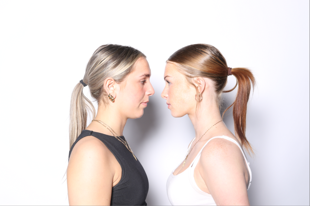
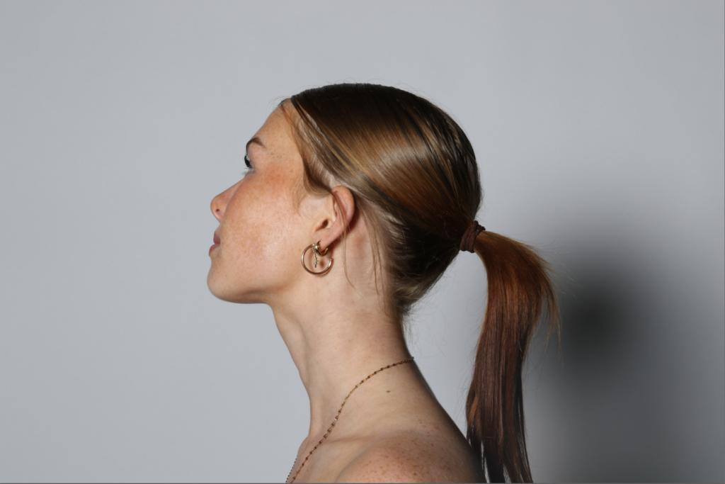
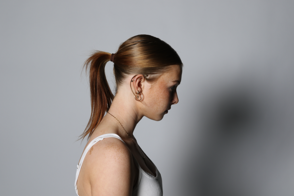
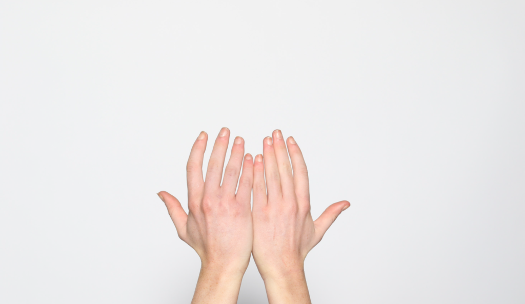
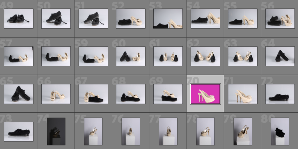
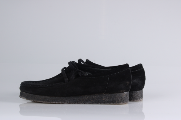
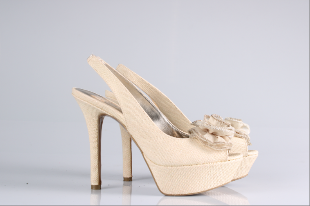
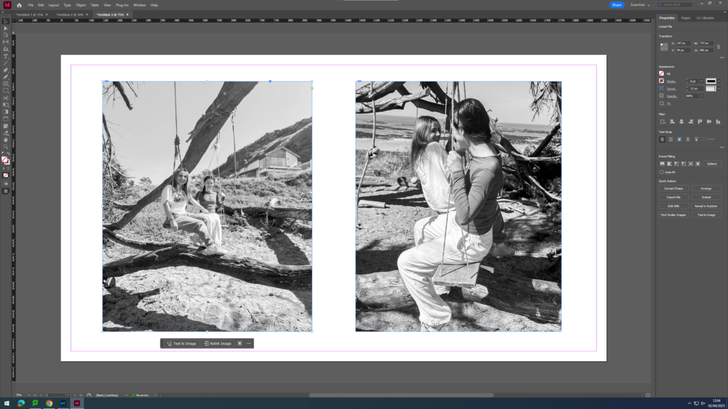
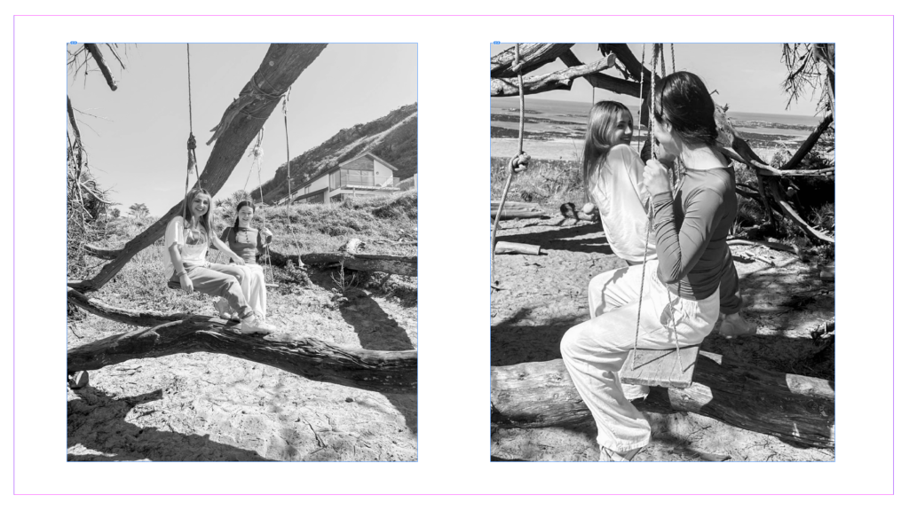
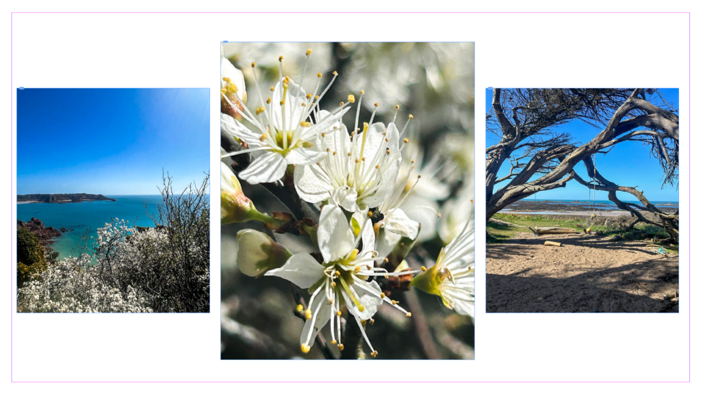
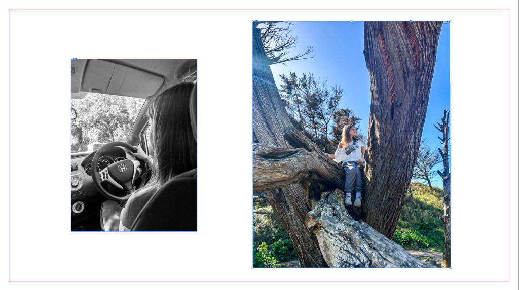
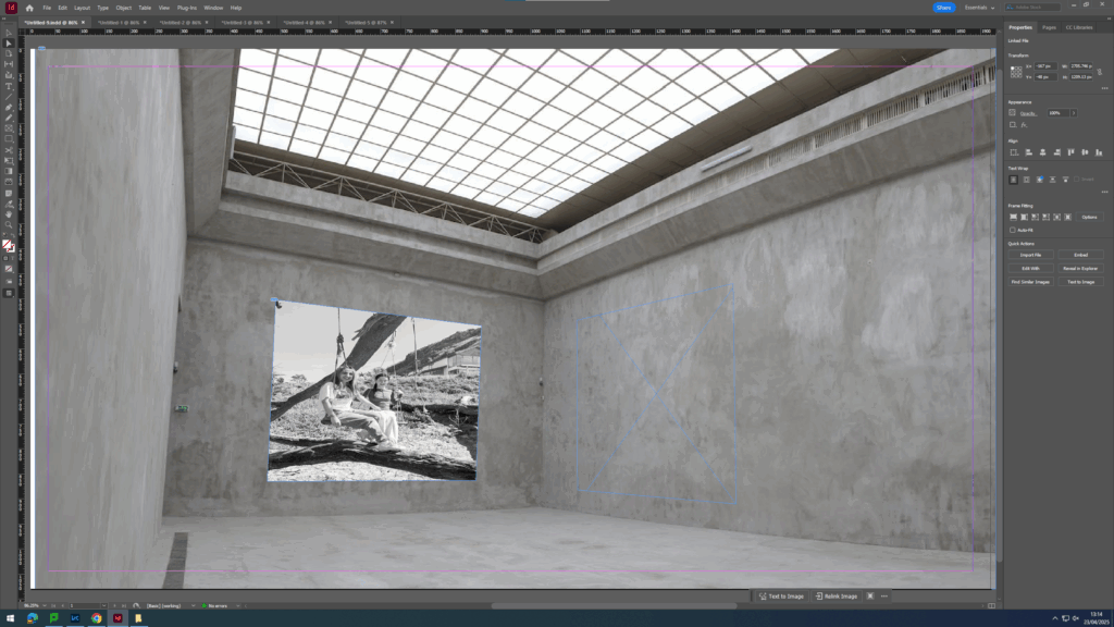
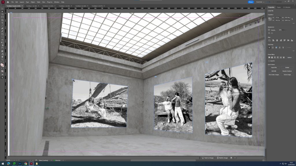
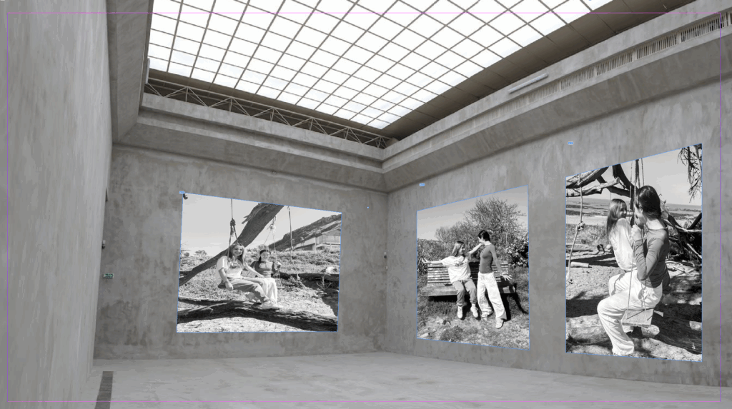
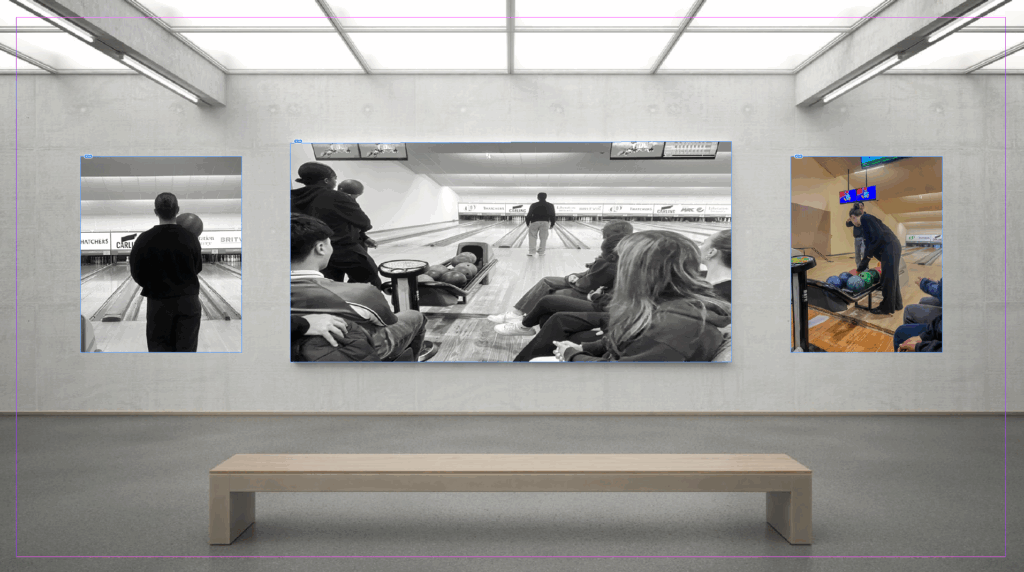
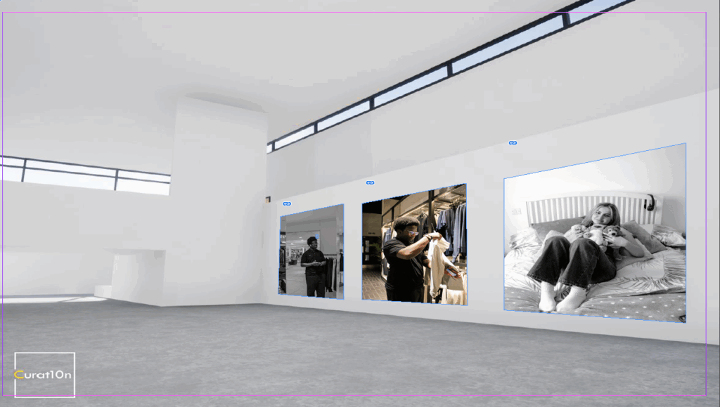
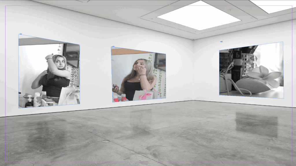
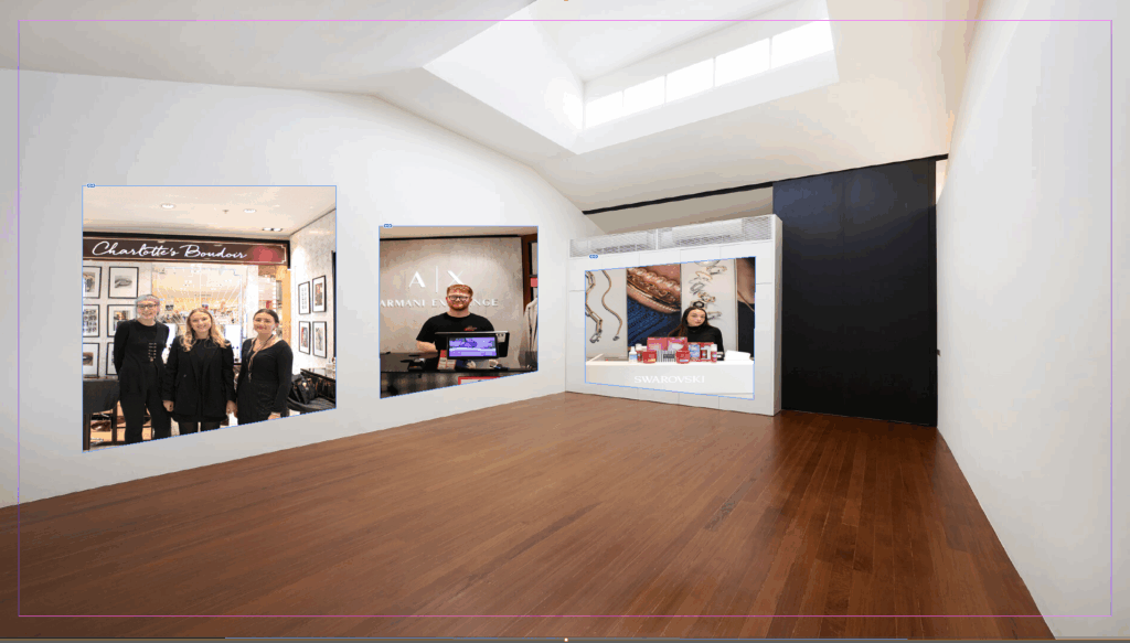
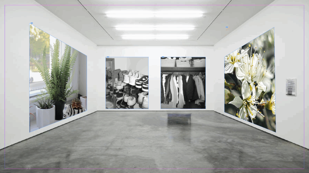
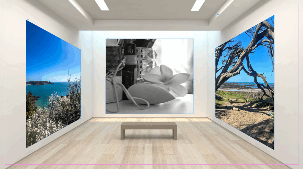
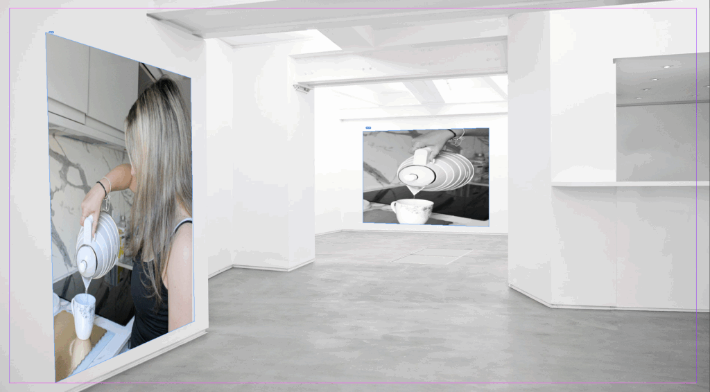
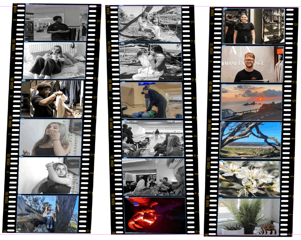
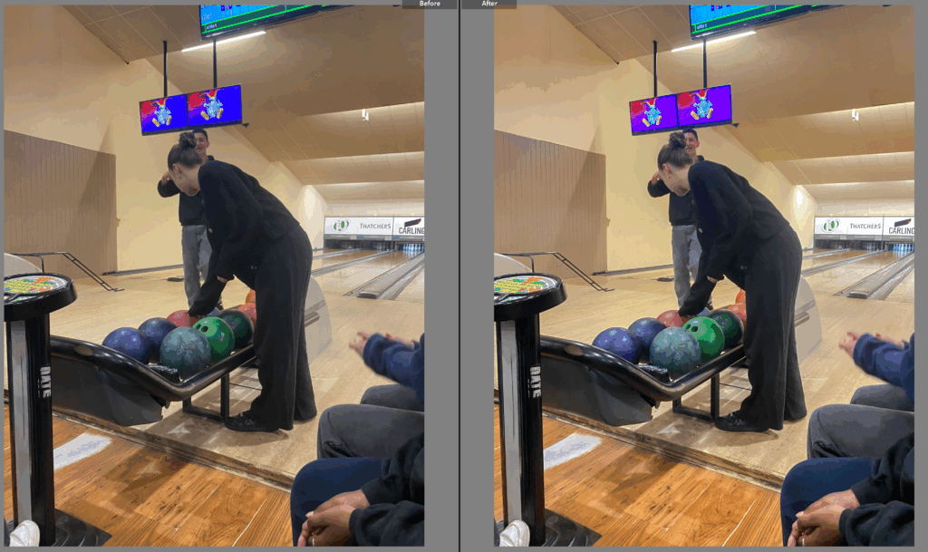
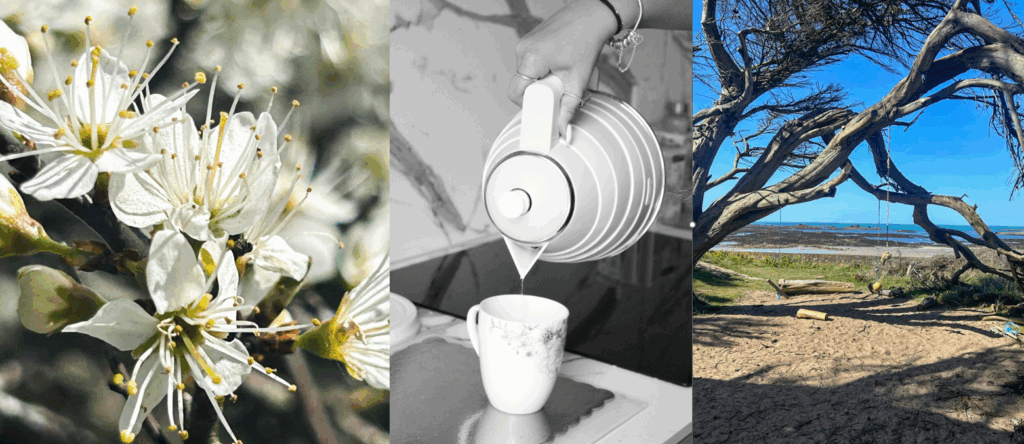
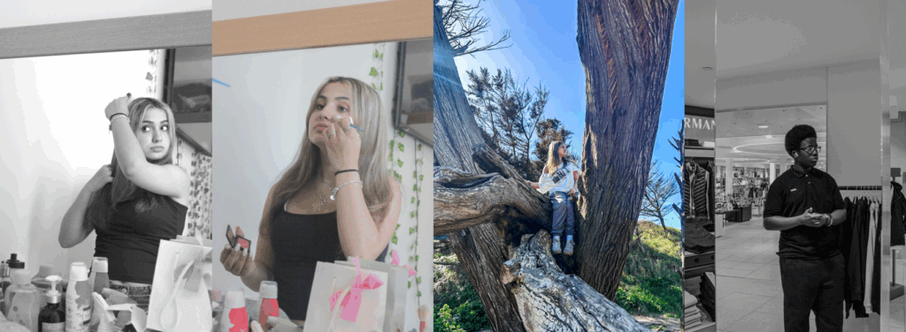
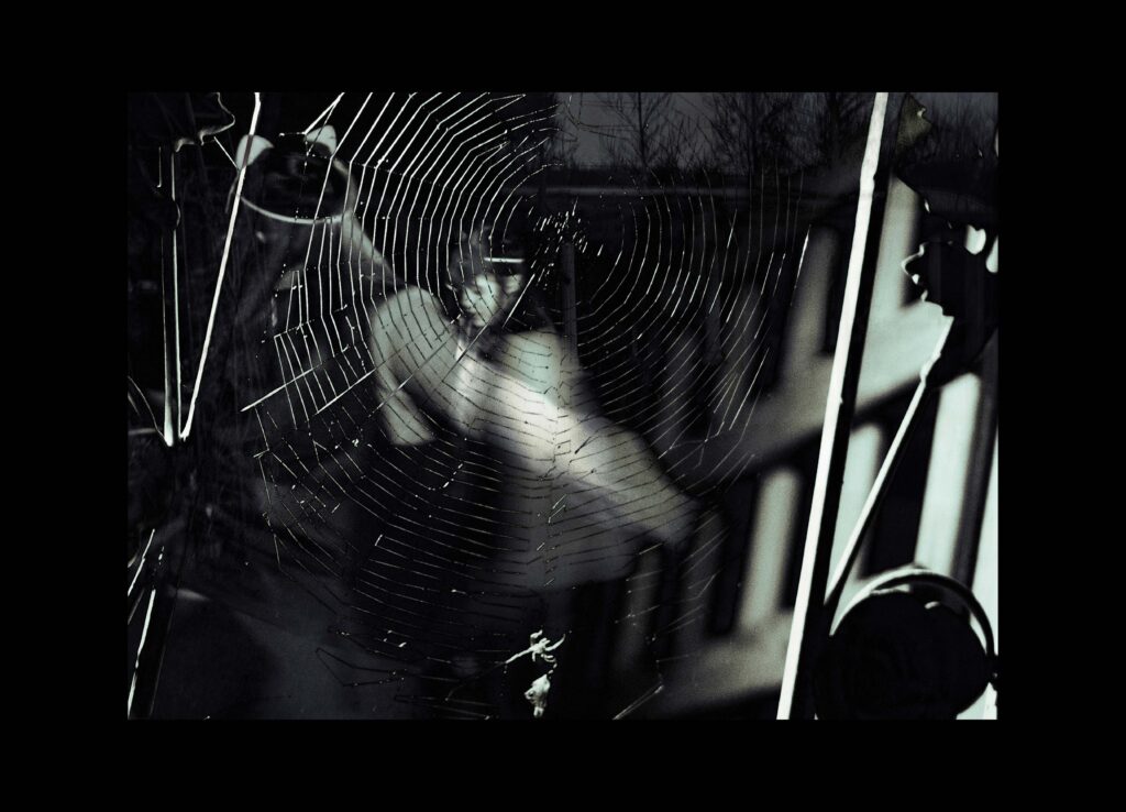
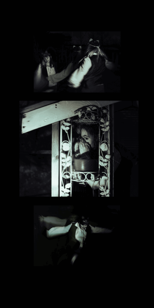
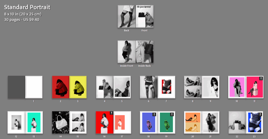
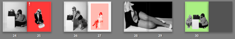
Final design layout:

In comparison to my statement of intent:

Before conducting my project, my statement of intent consisted of a few paragraphs stating what I wished to achieve through this exam project. I stated that I aimed to closely follow themes of power roles and femininity, through photographing women and depicting them as equal to men, as this has been a reoccurring struggle in society for centuries. I aimed to illustrate the theme of union by tying in power roles to unity, through creating images that perfectly present women as a community, and how they have come together to defeat traditional expectations and stereotypes. I knew I needed to link my artist inspirations: Yayoi Kusama and Helmut Newton, to the theme of union as well as incorporating my own ideas based on experience of being a young woman.

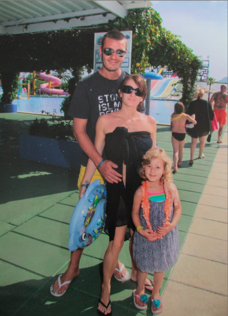
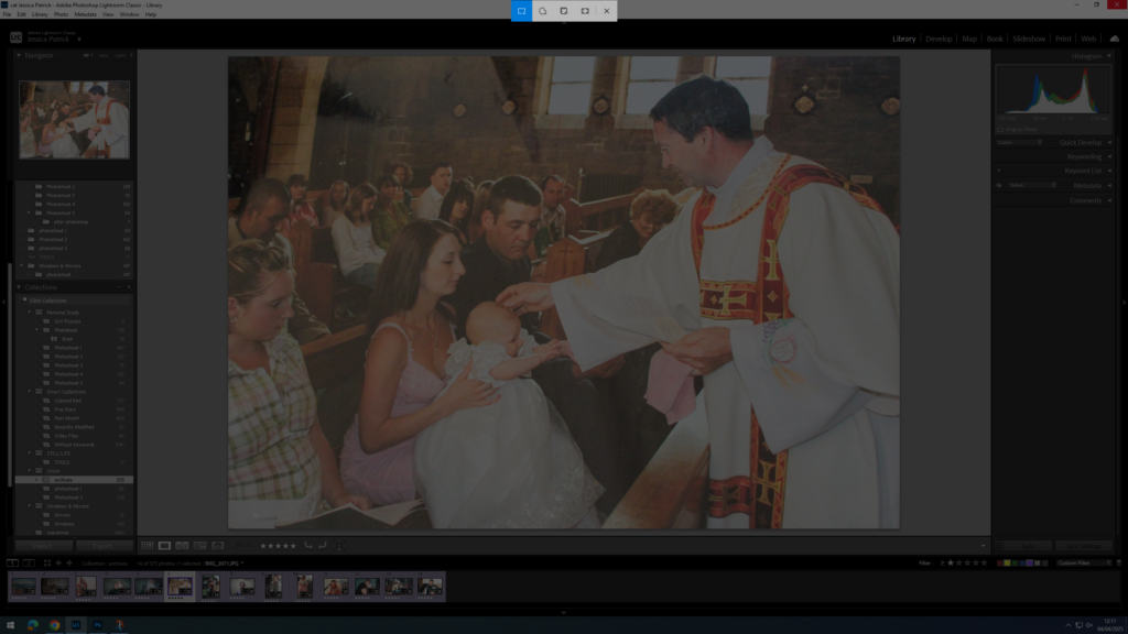
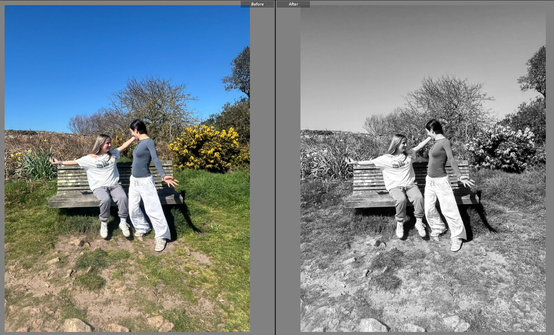
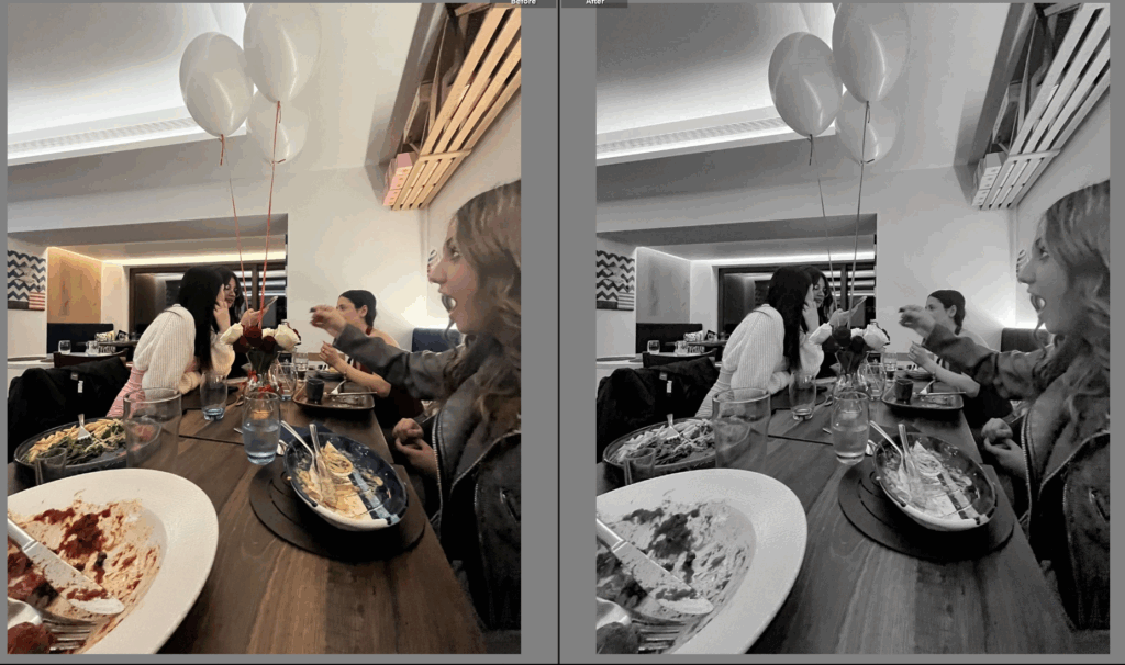
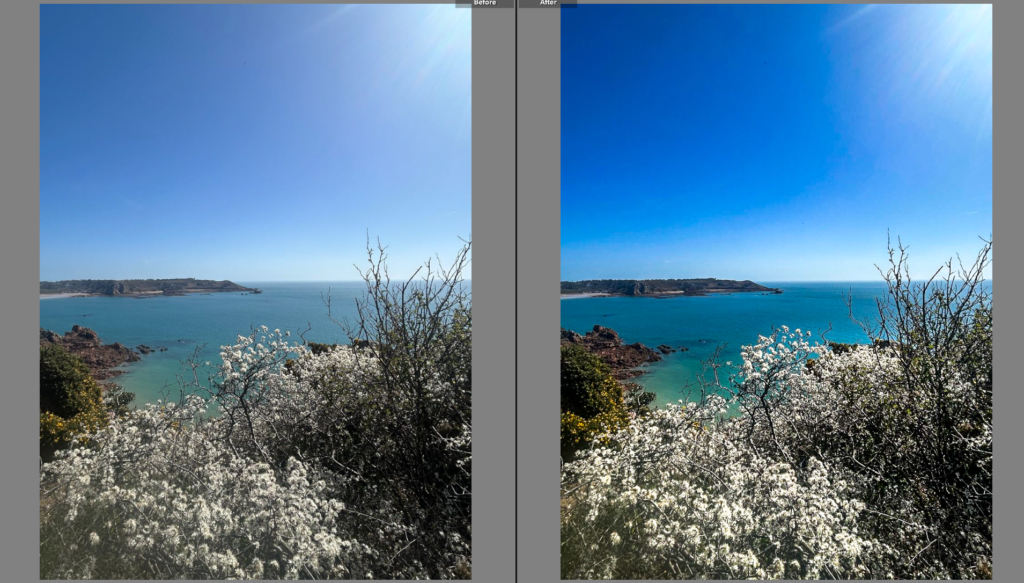
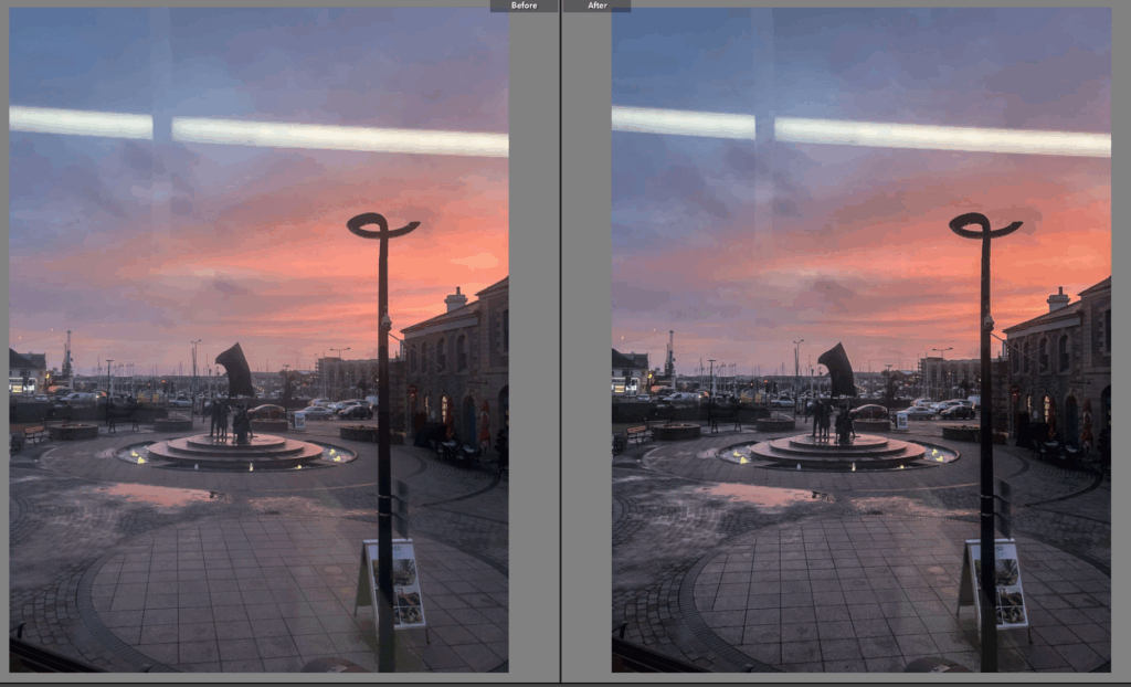
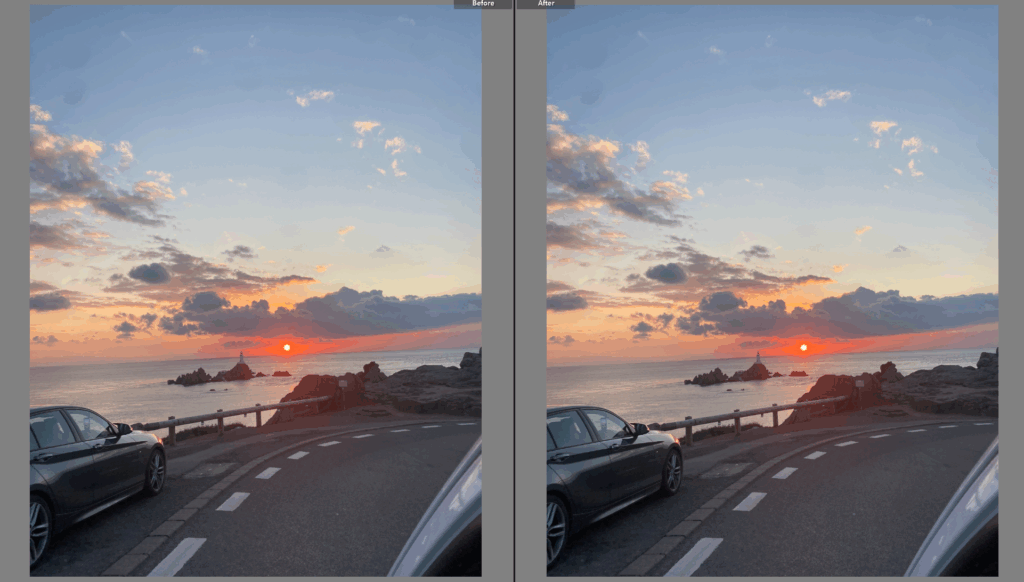
I crafted my photoshoots in a way that I had originally planned to, exploring indoor and outdoor scenes, as well as photographing in places that my artist studies did. This way, I was able to carefully resemble my inspiration’s work, as well as including unique and personal ideas to develop this project. Helmut Newton is renowned for his provocative style of imagery, delving into themes of eroticism and power. Yayoi Kusama is well known for her distinctive use of repetition of colourful backgrounds with lots of pattern, where she explores self-obliteration and mental health. She uses the busy backgrounds to symbolise her mental state, after growing up suffering with hallucinations. Despite both of my artists being extremely inspiring and successful, they uniquely portray hidden messaged through their work, which is what originally inspired me to merge them together into my project.

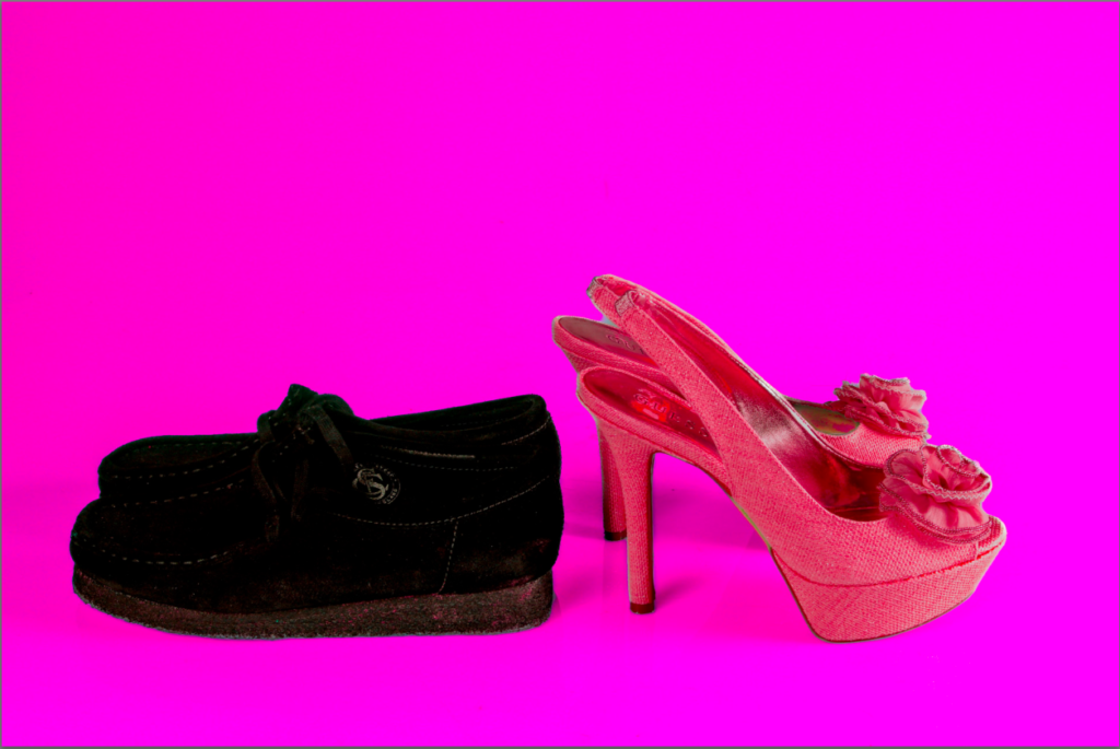
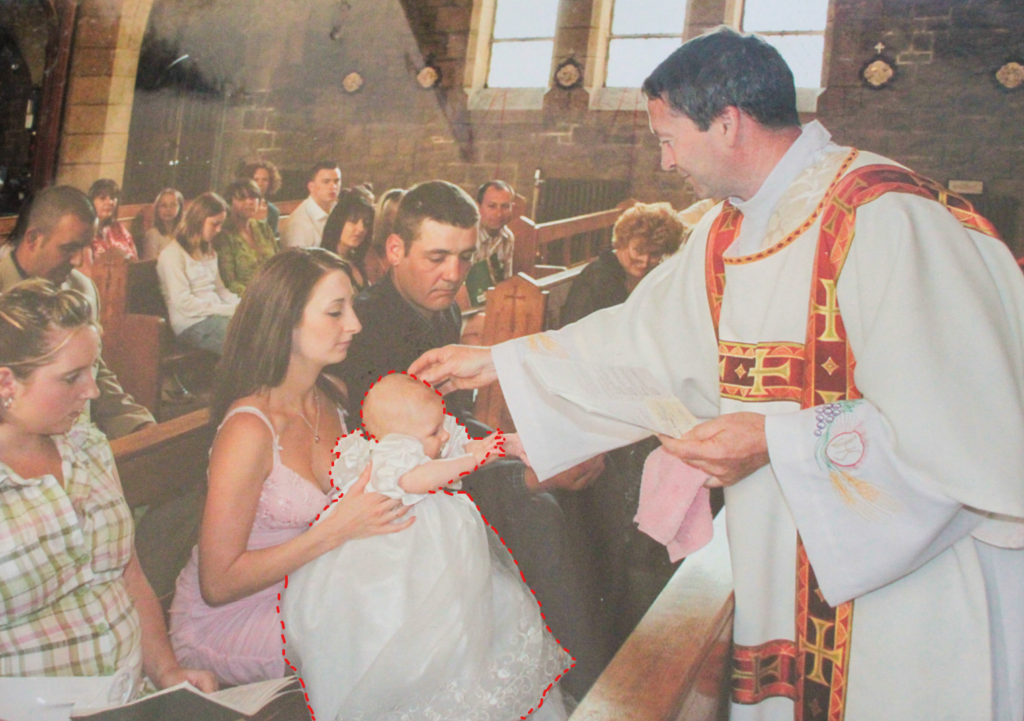
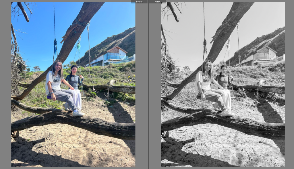
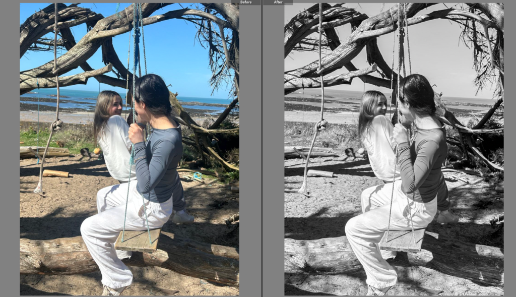
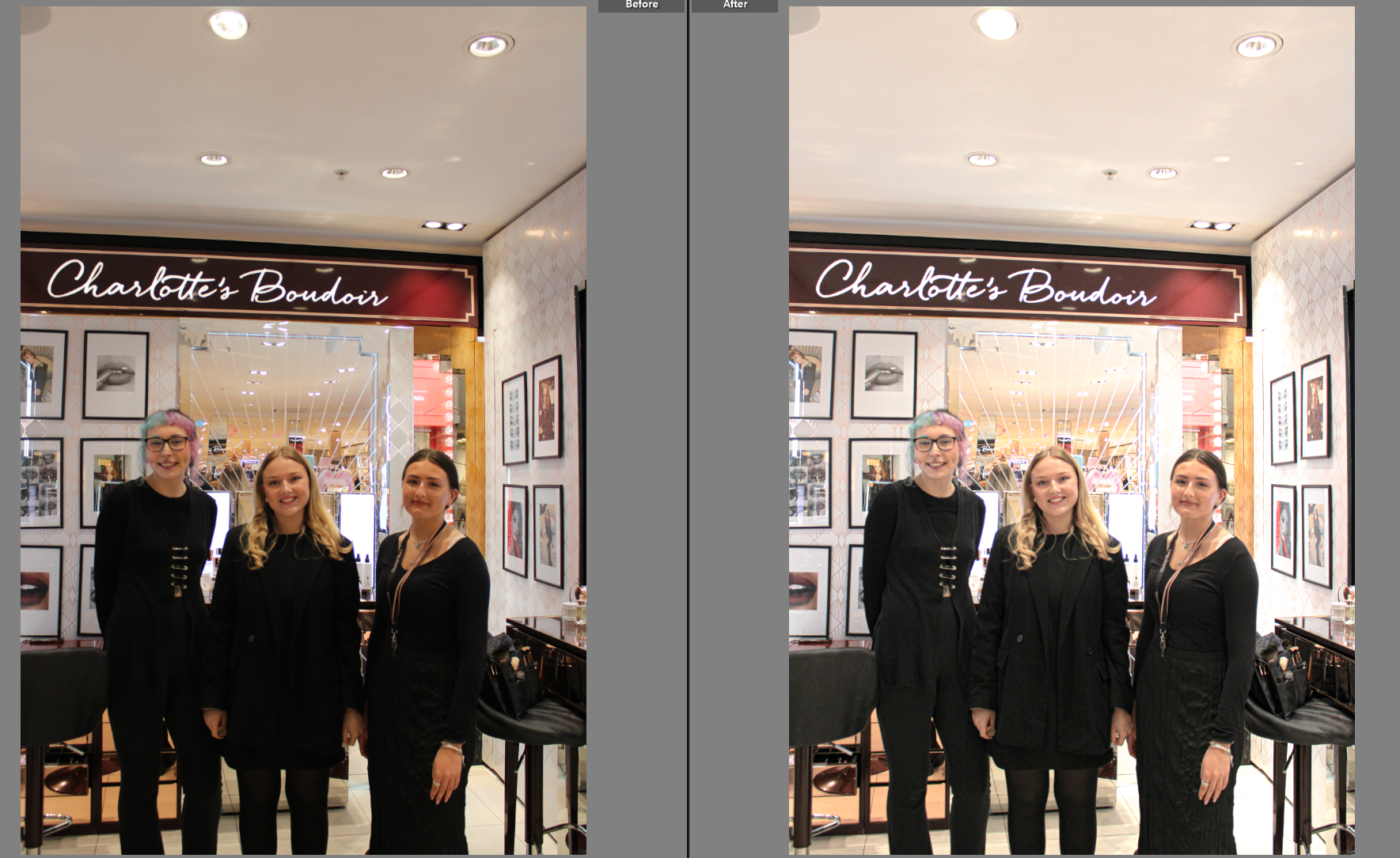
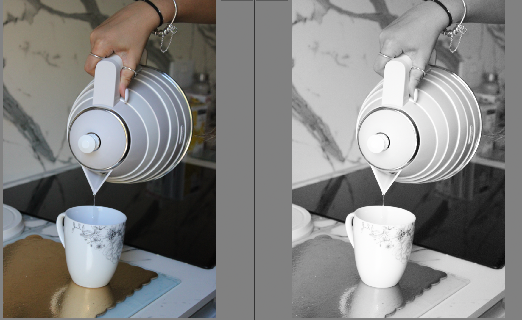
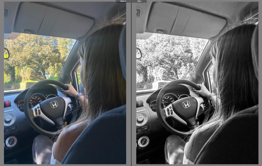
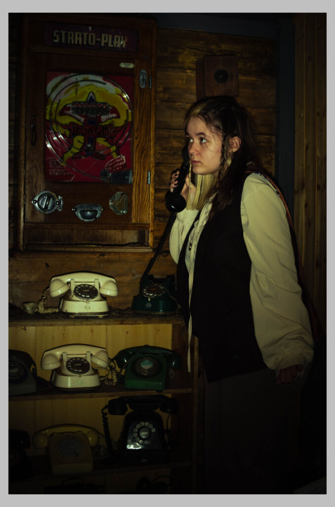
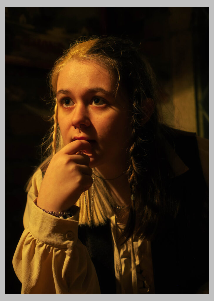
Gender inequalities have created a strong narrative that women should not be allowed to have important roles or a high status, but I have always wanted to challenge this idea. Therefore, I want to show a modernised version of how the world views women, yet depicting them as powerful and dominant throughout my own work, despite not having lived through the 60s and 70s when these issues were at an all time high. I want to successfully demonstrate my understandings of these societal problems through presenting my work as a way of comparison, highlighting the change and how far women have come since the 60s, while also expressing my knowledge on how the world has changed to view women as equal to men. This effectively links to the theme of union, by highlighting the unity of men and women, not only women. Newton managed to help push this shift, as he demonstrates his feminist beliefs in an appropriate way that women can appreciate, which shows that many men in the world do believe in gender equality. In relation to Helmut Newton, my project follows his values as I used techniques that would allow the females in my images to appear how I want them to: confident. I used low camera angles in many of the photographs, to allow the model to be viewed as a character that holds power and dominance, this is because the use of a low angle physically makes them appear bigger in the frame.In relation to Yayoi Kusama, my developing and editing aspect of my project is mainly inspired by her bold approach to photography. Although I did not have vibrant backdrops or even set ups of installations, I used Photoshop to add in pops of colour to create luminosity, which I think turned out successful. I believe my work illustrates clear themes of femininity, power roles and even identity through my different approaches to each shoot.

What would I have changed:

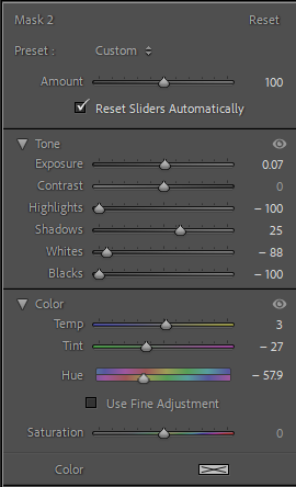
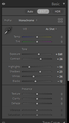
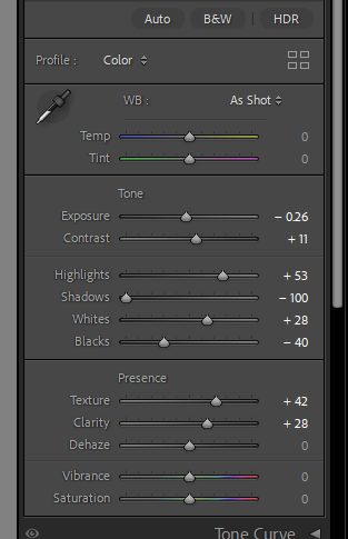
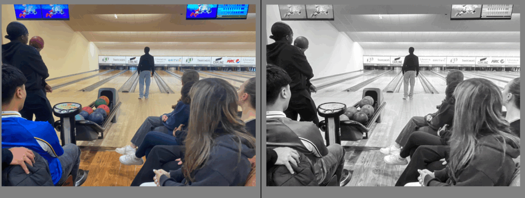
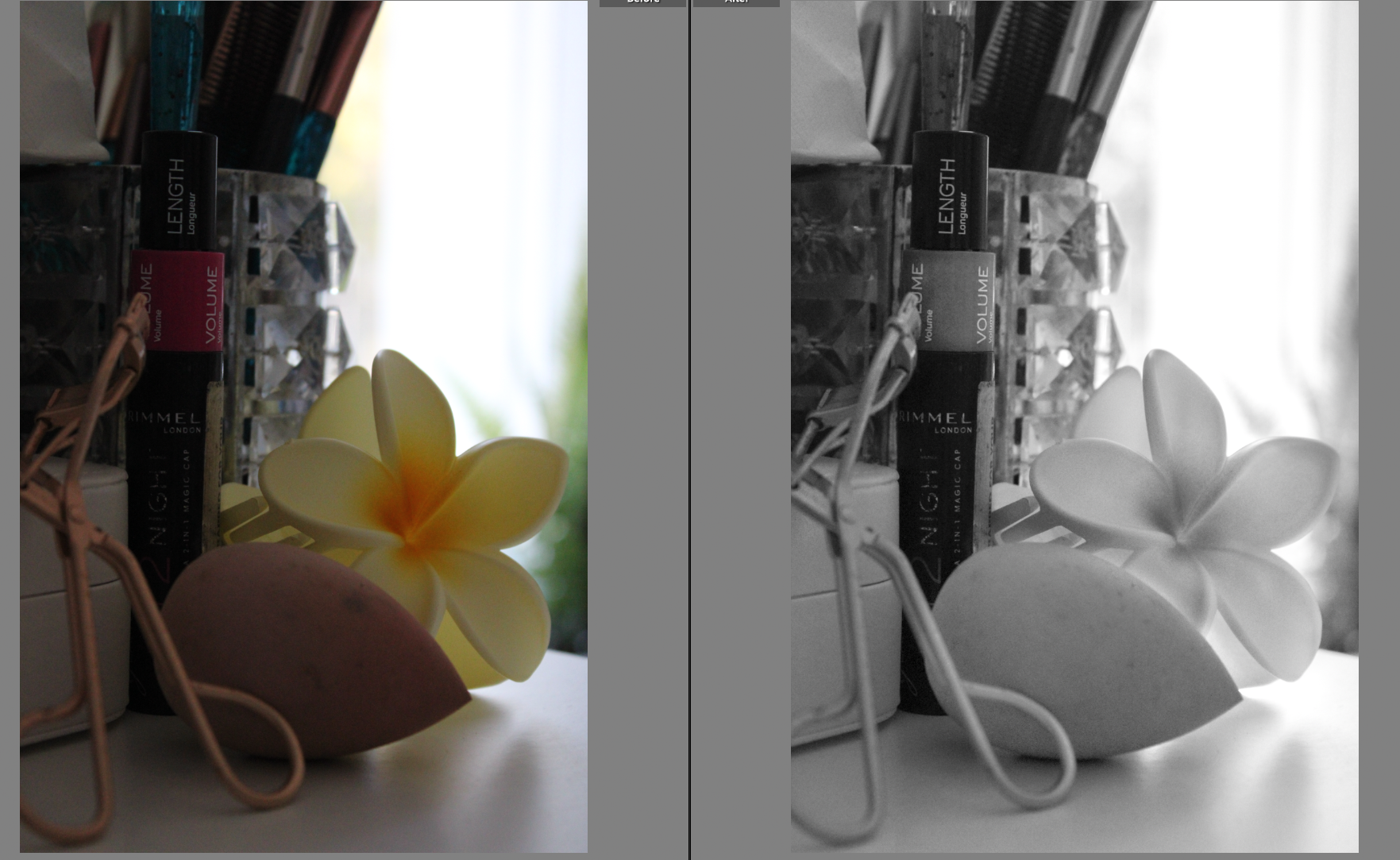
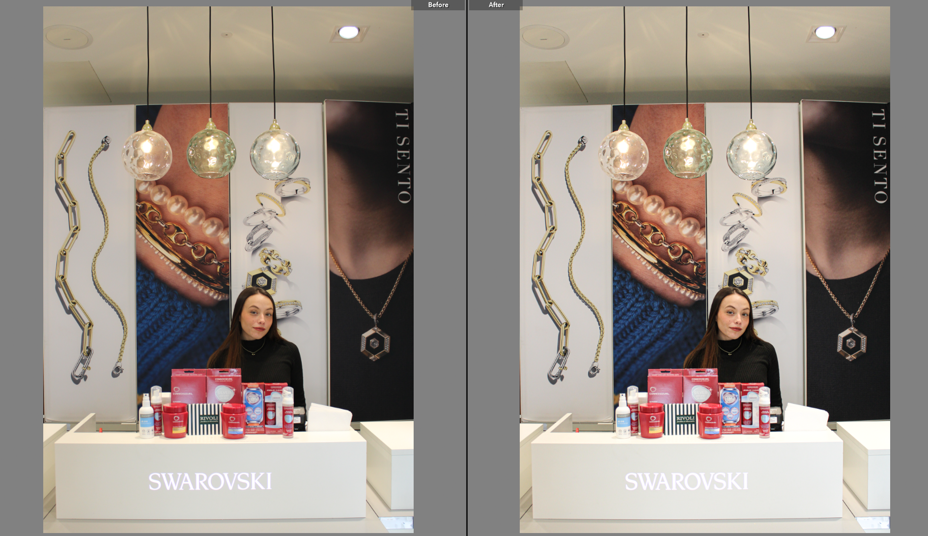
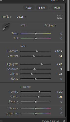
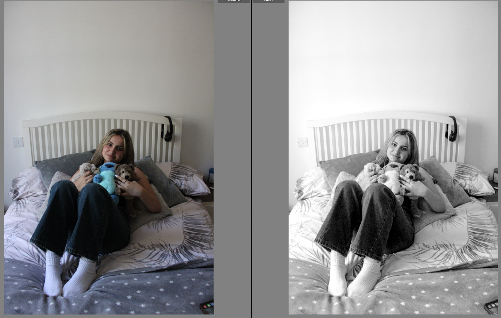
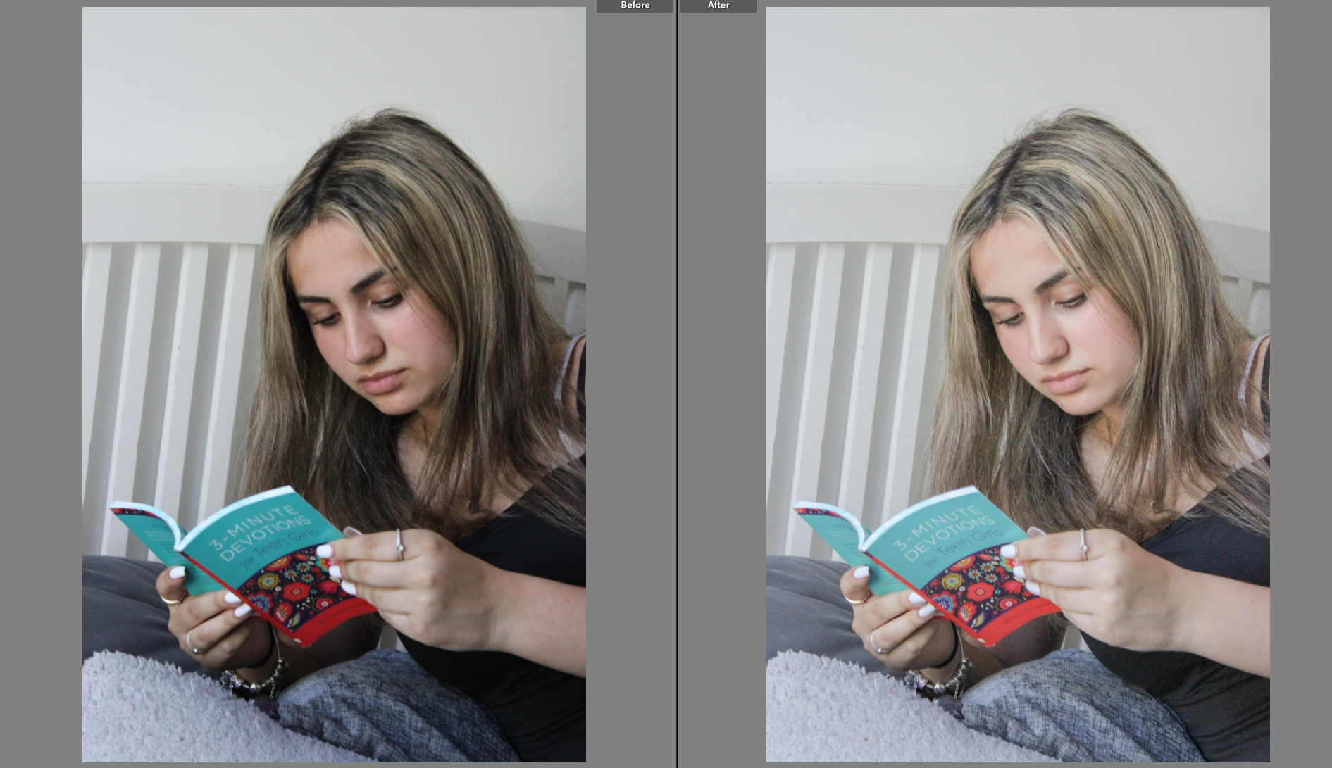
Overall, my project as a whole has been successful. I demonstrated understanding of my artist inspirations and linked them to the theme of union, whilst also incorporating originality. However, one of the main aspects that brought my project down is my editing skills as I am not as comfortable with Photoshop than I am with Lightroom. This limited my ability to edit my images effectively, with patterned backgrounds. This meant that all of my final images that I edited using Photoshop were plain, and arguably dull.

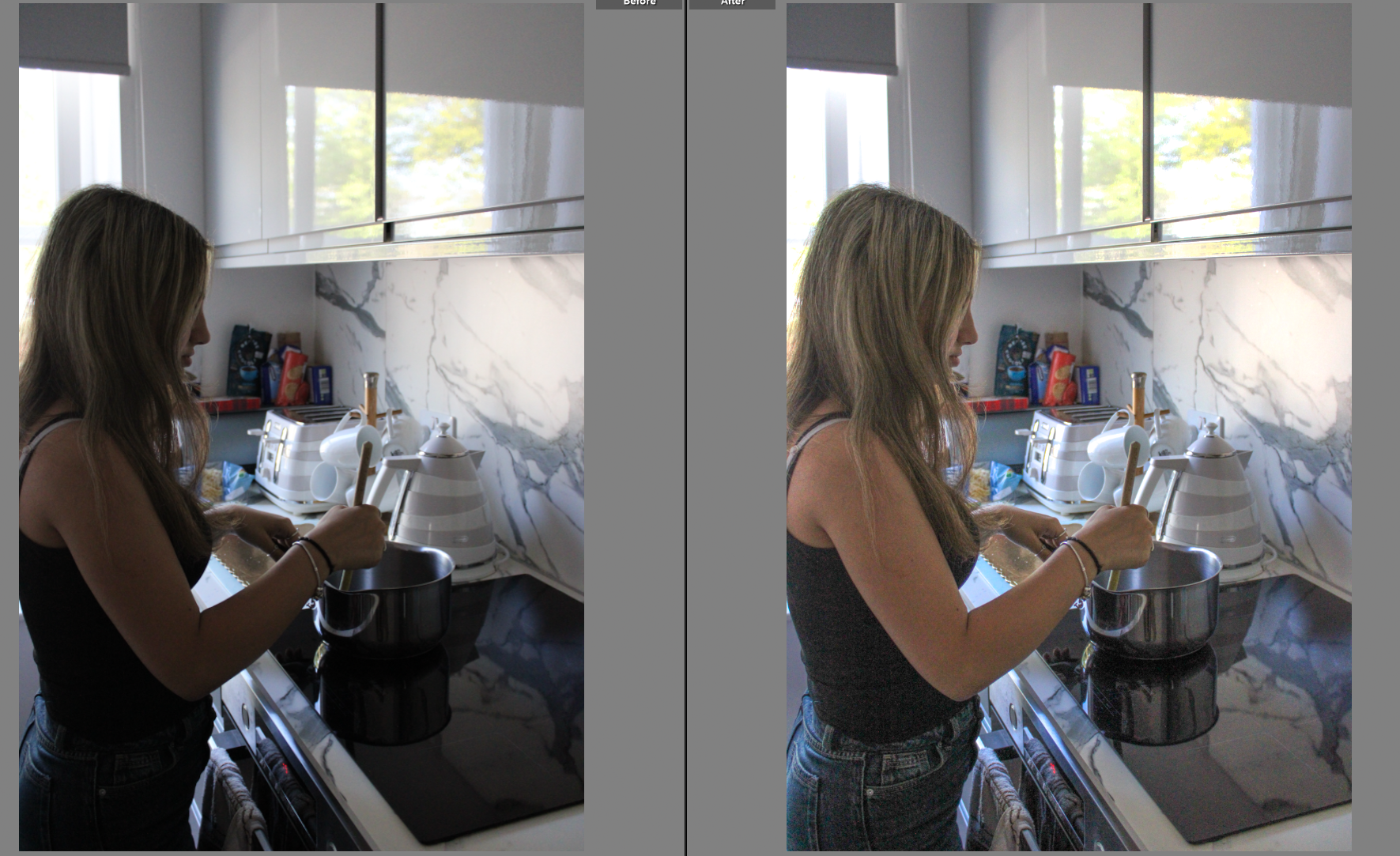
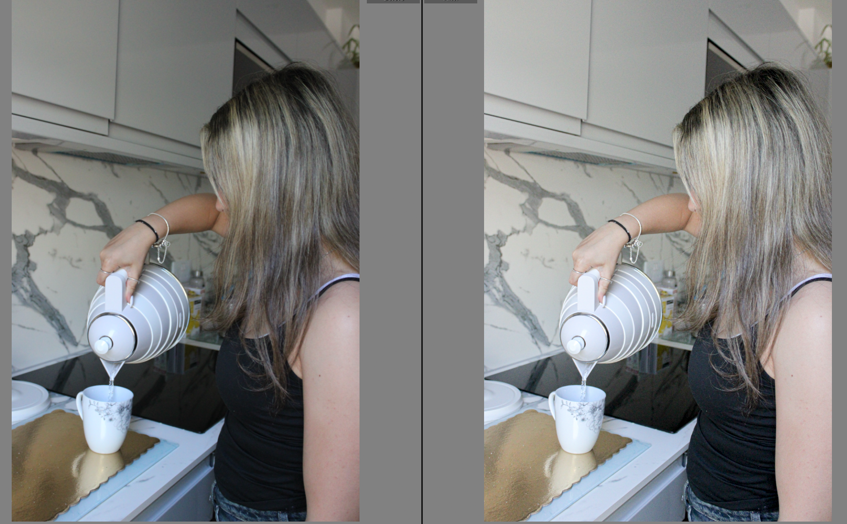
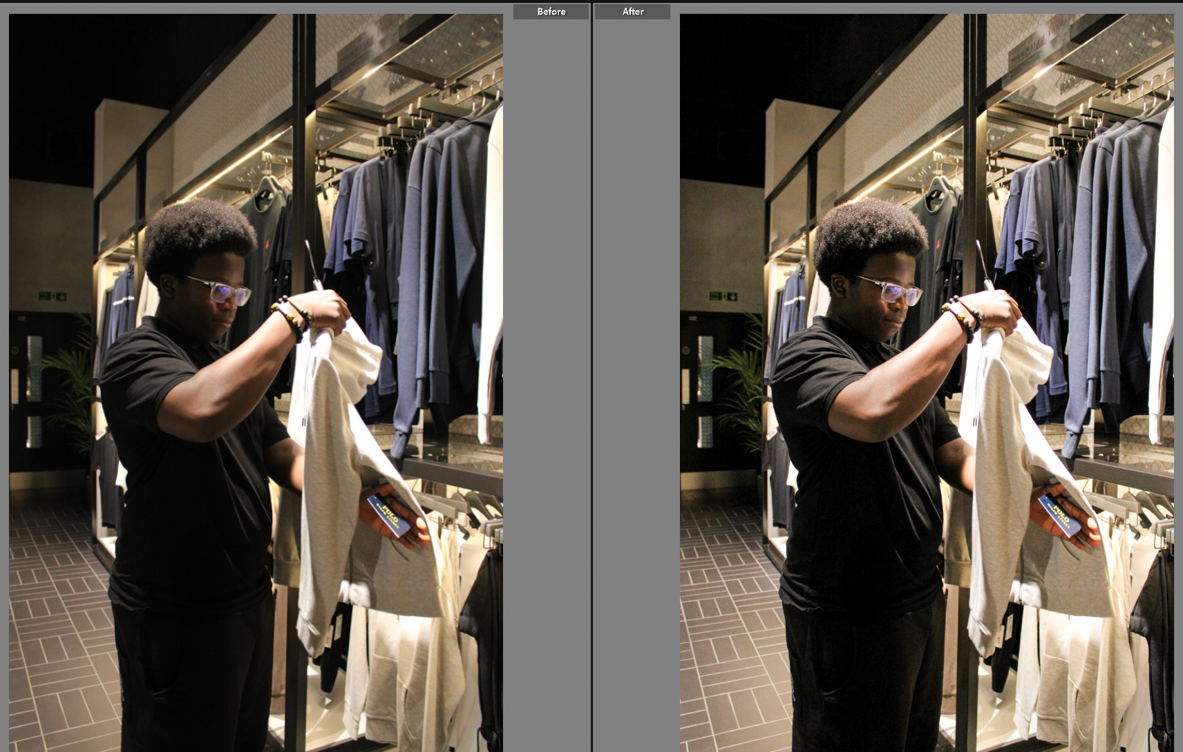
Another element within my project that I would change is my camera skills. Sometimes I am not careful enough with the camera settings, meaning some images were underexposed and some were overexposed etc. Therefore, this made my editing process a lot longer because I had to fix simple mistakes that could have been avoided.

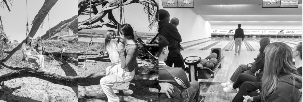
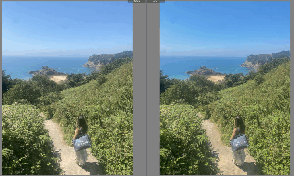
Lastly, I would change the style of my first photoshoot and also carry out more photoshoots. If I had completed a few extra photoshoots in the time given, this would mean my final outcomes would vary a lot more, displaying different aspects of the themes. Also, my first photoshoot was an experiment photoshoot, where I did not yet have a clear enough idea on how my images resonated with the theme union etc. This meant that by not doing enough research ands analysis before photographing, my photoshoot appears random and perhaps irrelavent.