
front & back cover -
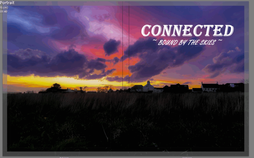
For the front cover of my photobook, I chose an eye-catching image of a bold sunset, where the sky is painted with hues of blues and oranges. The intense contrast of these colours creates a visual tension that immediately draws the viewer in and captures their eyes towards the book, my goal was to do this to create a strong feeling of curiosity to drag the viewer in and get them to open it. The largely dramatic tones not only represent and show the beauty of the moment but it also set the tone for the journey the viewer is about to go on when flipping through the pages. which is where they will experience a full full range of emotions and grasp the stories captured throughout the pages.
PAGE 1-2:
PAGE 3-4
PAGE 5-6
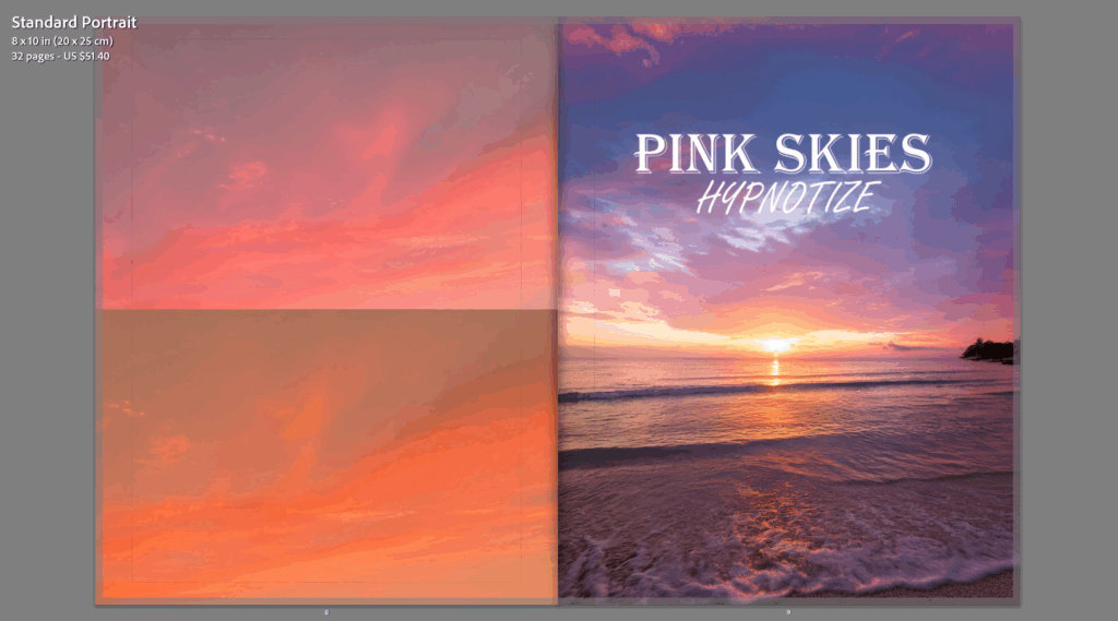
PAGE 7-8
PAGE 9-10
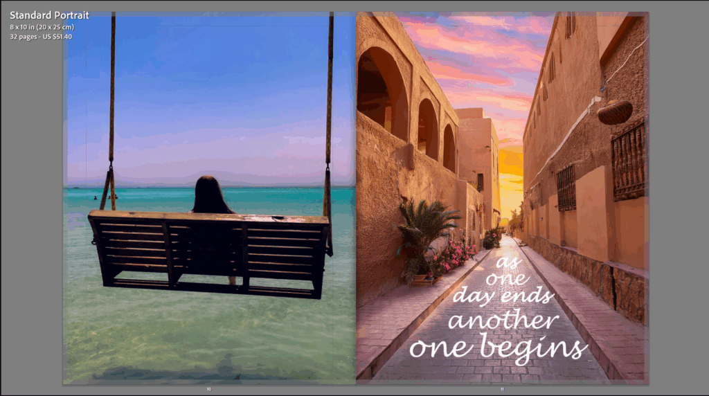
PAGE 11-12
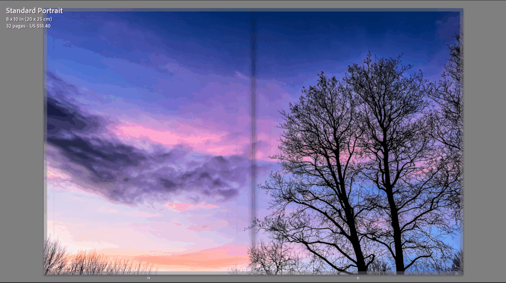
PAGE 13-14
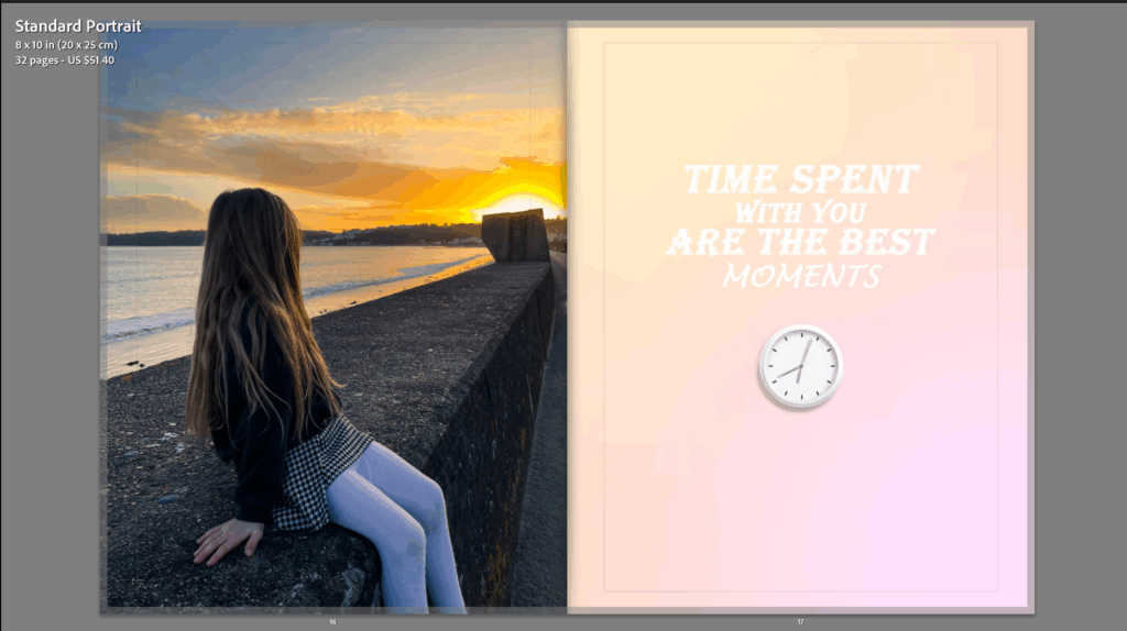
PAGE 15-16
PAGE 17-18

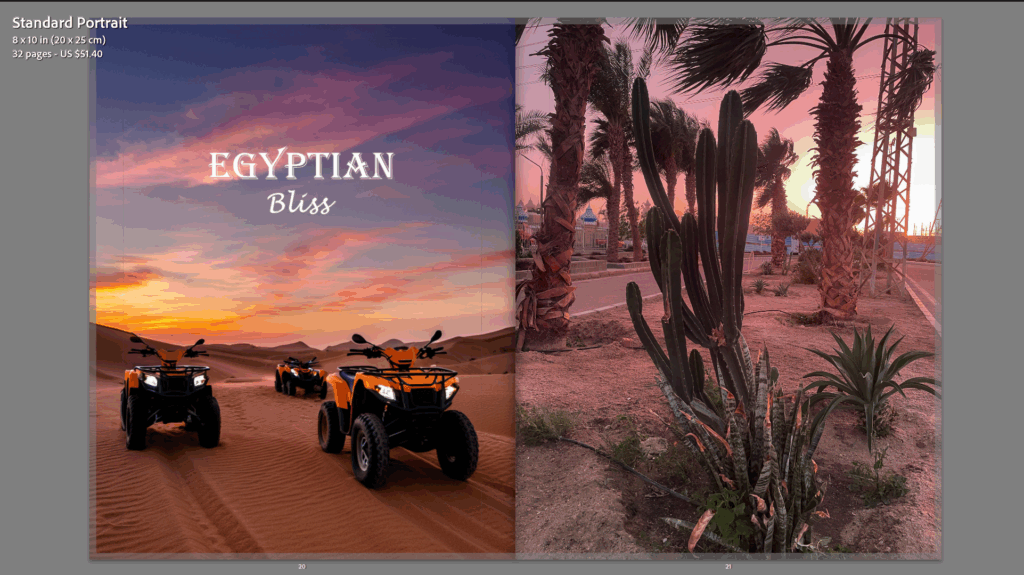
PAGE 19-20
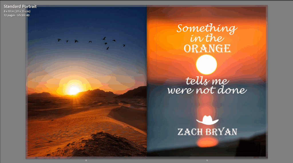
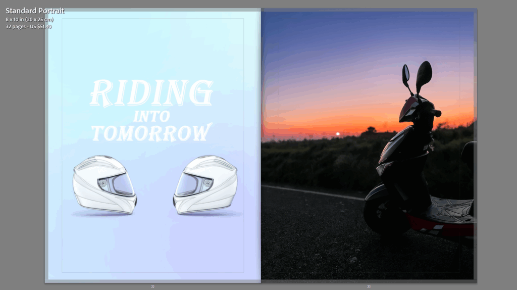
PAGE 21-22
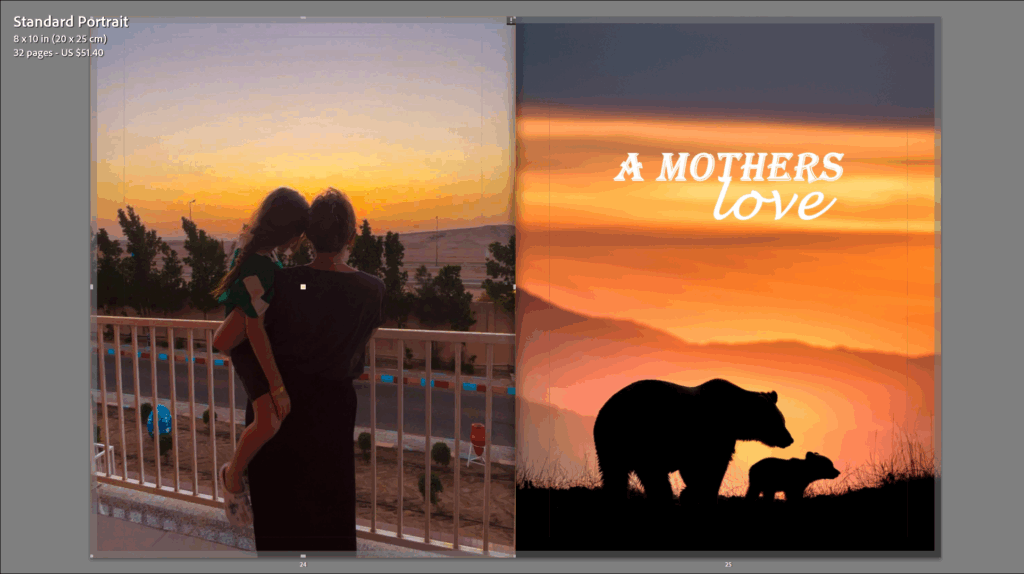
PAGE 23-24
PAGE 25-26
PAGE 27-28
PAGE 29-30
Evaluation & Overview -
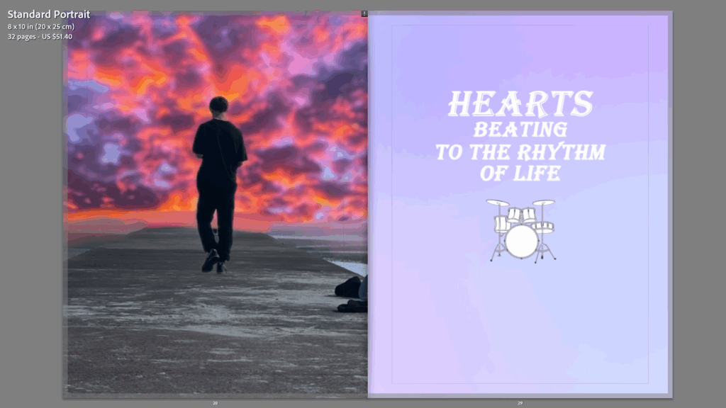
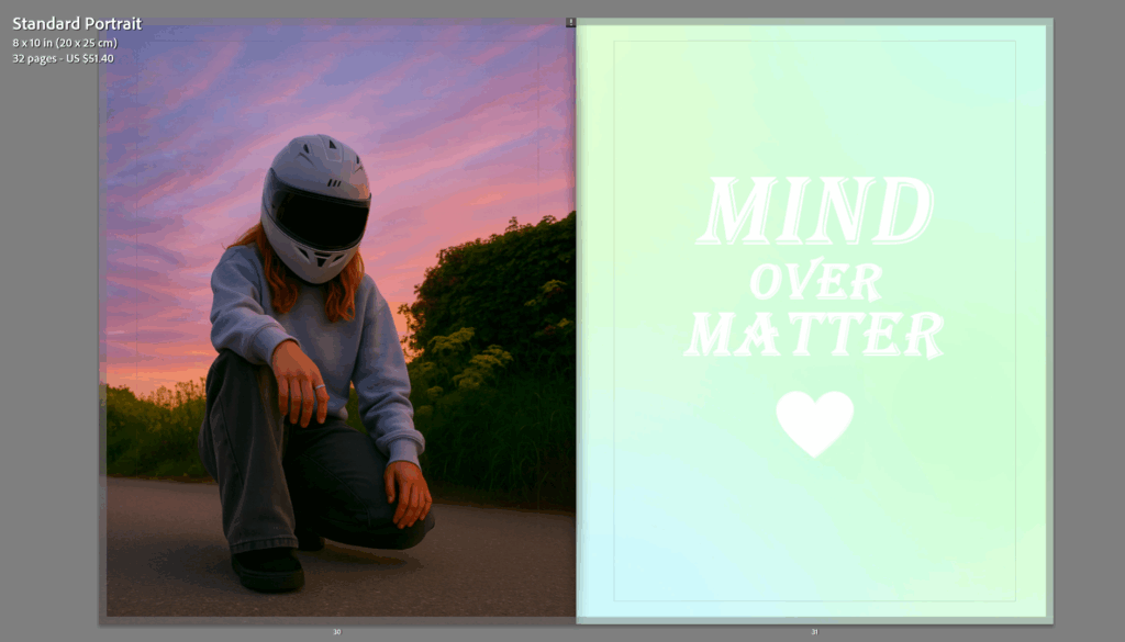
For my final evaluation of the photobook layout, I am very happy with how it turned out, for the pages I designed each page to represent a new day and a new story, with every image giving off different emotions and feelings that go hand in hand with the theme of personal growth and discovery and how the photos made me feel in the moment. Starting on the very first page, my photobook takes the reader on a journey of what connections within union look like to me and the variety of ways the simple word ‘UNION’ can be put into so many different moments and relationships within our daily lives.
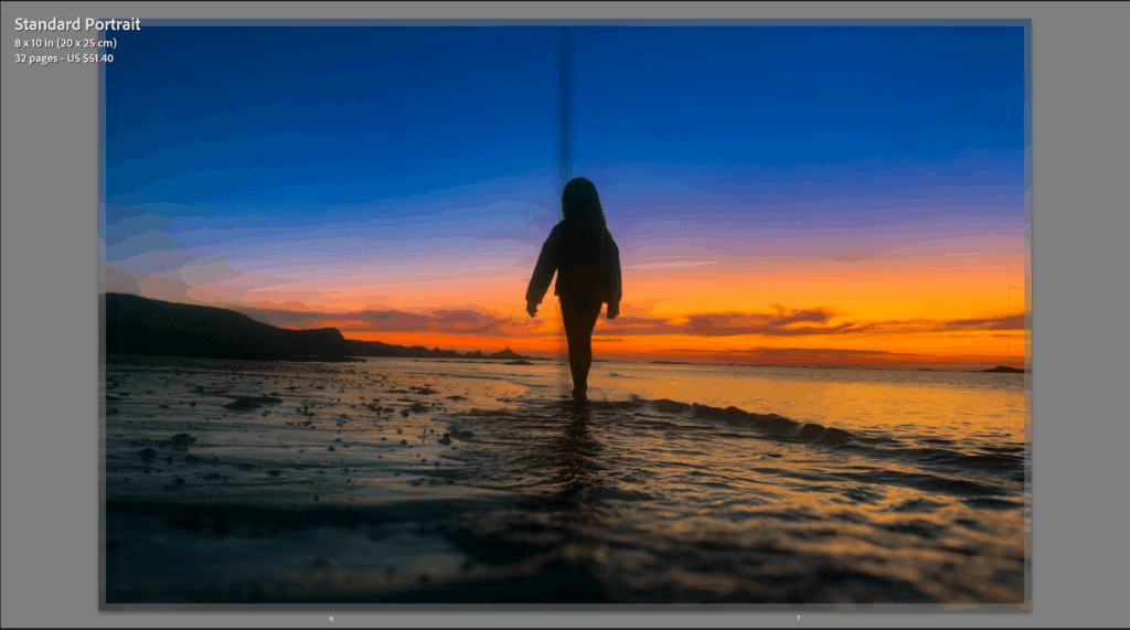
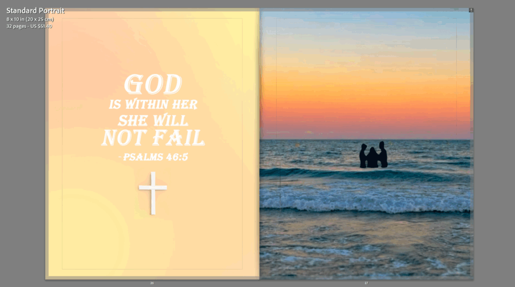
In the photobook, the transition from one image to the next shows a different connection sharing a quote or phrase about what each of them represent. with each photograph capturing a specific moment. whether that being the simple colours of a sunset blending together to show that union and bond or even the relationship of how a sunset brings both humanity and nature together creating memories as the two combine. or even as a third example of the mum and daughter I have in one of the images which represents the unique and special bond between them but also with the representation of the union of colours within the sunset too. I created a layout that would showcase a different storyline for each double page spread as I wanted each page to feel unique.
The overall layout of my photobook creates a different view of connections on each page as I wanted to show that there are many different ways to represent the word ‘UNION’ in our every day lives, also giving the viewer a real deep sense of feeling like they should perhaps take more time to truly focus on the connections we have in front of us daily. when it comes to the sunsets I wanted the reader to feel as though they are part of a journey, hopefully giving them the same feelings I felt while in the moment of these sunsets but just through an image.