
For my photobook I want to use premium lustre paper to give the paper that good quality feel and so the pages have a bit of a shine to them. I also want the book to be a hardback book so the book has that thickness and weight to it.
After a lot of consideration I am deciding to go with standard portrait for the orientation as it is better for creating double page spreads and it means I can put two images on a page if I want to.
At this point I began to design my photobook, but I needed to come up with a title and after a lot of thought I came up with ‘Mother Nature’s beauty’ as it best describes the intentions of my photobook and also fits the theme of romanticism which is what this all is about.
For my photobook I want to include a lot of double page spreads as I have a lot of landscape photos which I feel like deserve a whole page however not all my pages can be double page spreads as I want a variety of layouts so I am also going to have pages with one image per side and some with two images a side.
Making the book
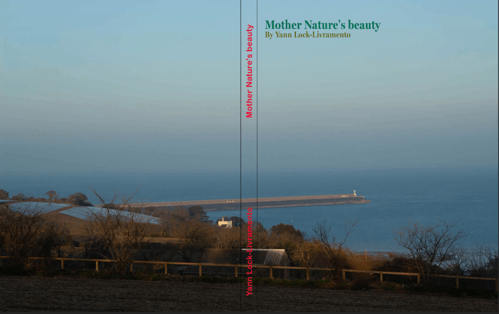
First I started with the front cover which I spent some time on, I was originally going to have a solid green background however it looked much better having this photo of the sea as an image wrap. Then I started with the text it took me a while to chose the font but I wanted a serif font as romanticism started in the 18th century and serif fonts have that old feel to them. I chose the green for the font colour as green is commonly associated with nature and I used two shades to distinguish between the book title and the author name. For the spine I wanted to have the same font and text in the same position as my previous photobook so my book can be part of collection and if they are on a book shelf you can tell its me who made them.
In the end this is the front cover I came up with, I added a little drop shadow to the title to make it pop out a bit and. I also Made the spine text green like the title because the colour I had before didn’t go with the design too well and it’s all about aesthetics. I am happy with how the front cover looks now and thinks it looks better then it did before.
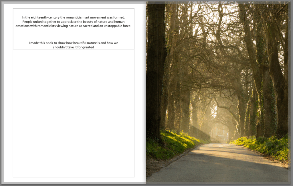
For my first page I created a little opening talking about romanticism and why I created the book, I think it is a nice touch to the book and provides a nice bit of context and thought.
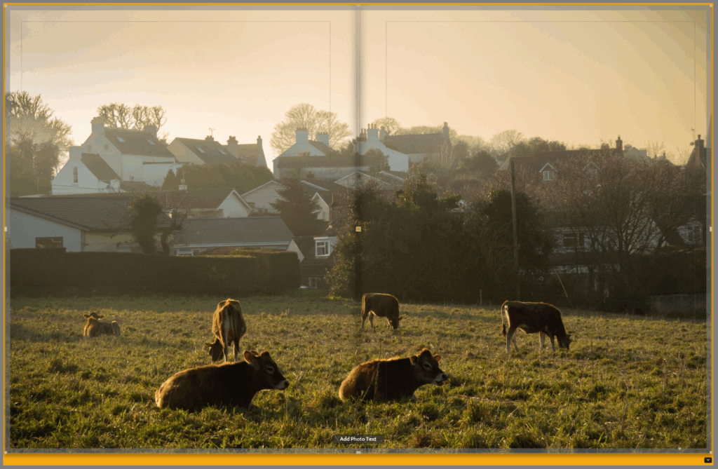
I was going to put this photo of the cows on a single page but I really like the photo and think it looks much better as a double page spread.
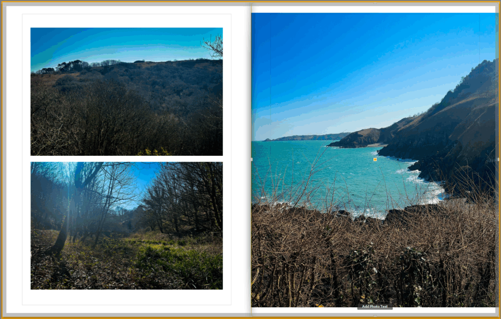
These images were taken from the same photoshoot down by wolf’s lair so I wanted to include them on the same page I decided to put the image of the coast on the right as it has a nice landscape view of the area which sets the scene and by having it on the right means it is the first photo the person looking at my book will see when they turn the page. The two photos on the right I put together and kind of act like detail shots of the area and look good both being the same size and they fit the page well.
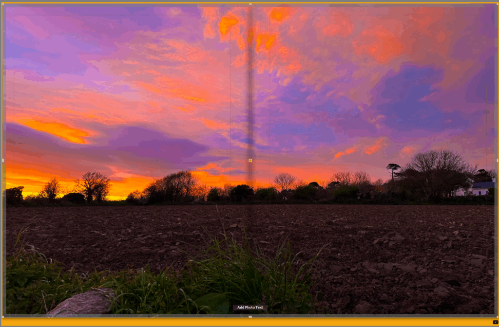
I made this the last full page in my book as I think it is a really beautiful photograph and is one of my favourites and also because I want to end my photobook on a high note as not only is it the last page of the book but it is also nearly the end of my time doing A level photography.