
How?
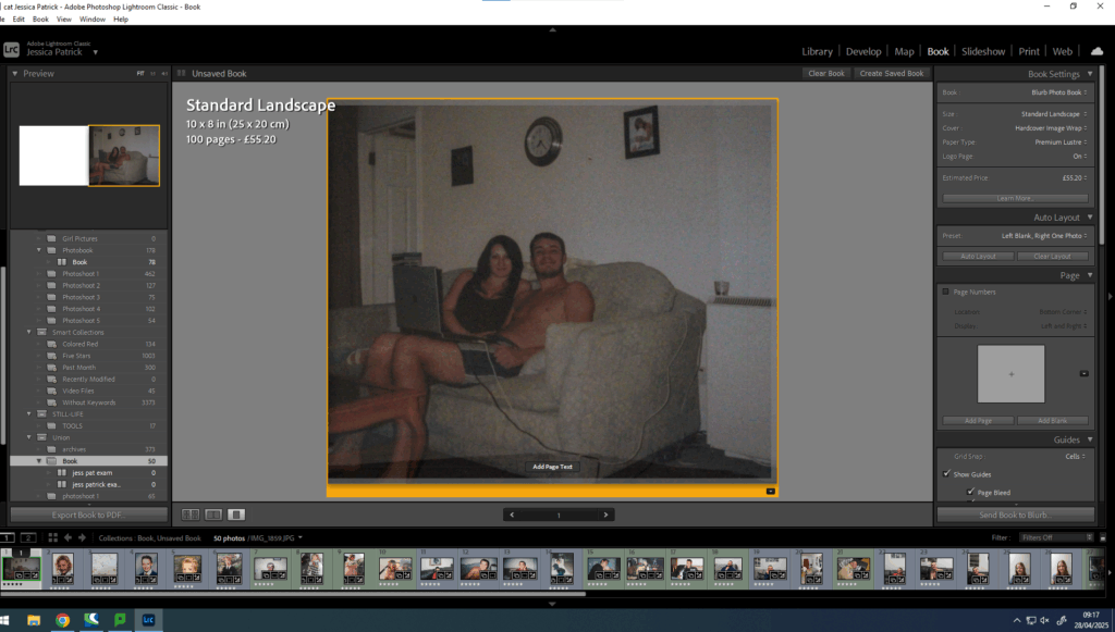
Firstly, I select my final images that I am wanting to use in my photobook in Lightroom and click book.
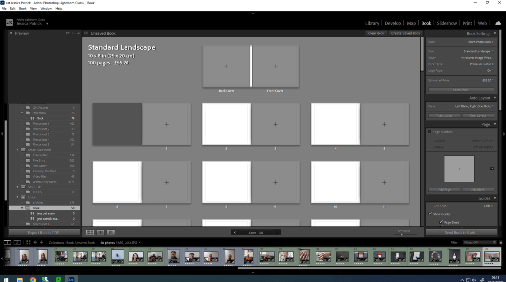
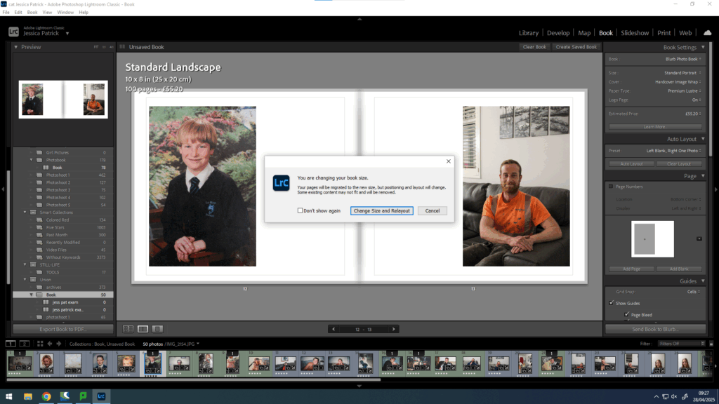
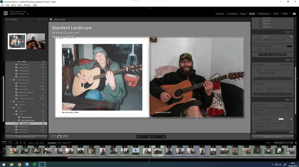
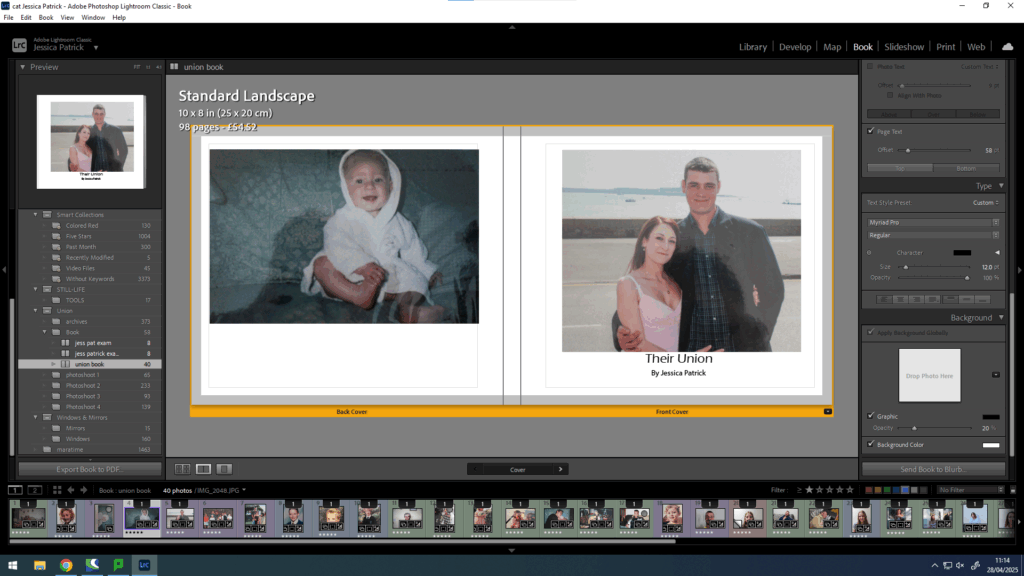
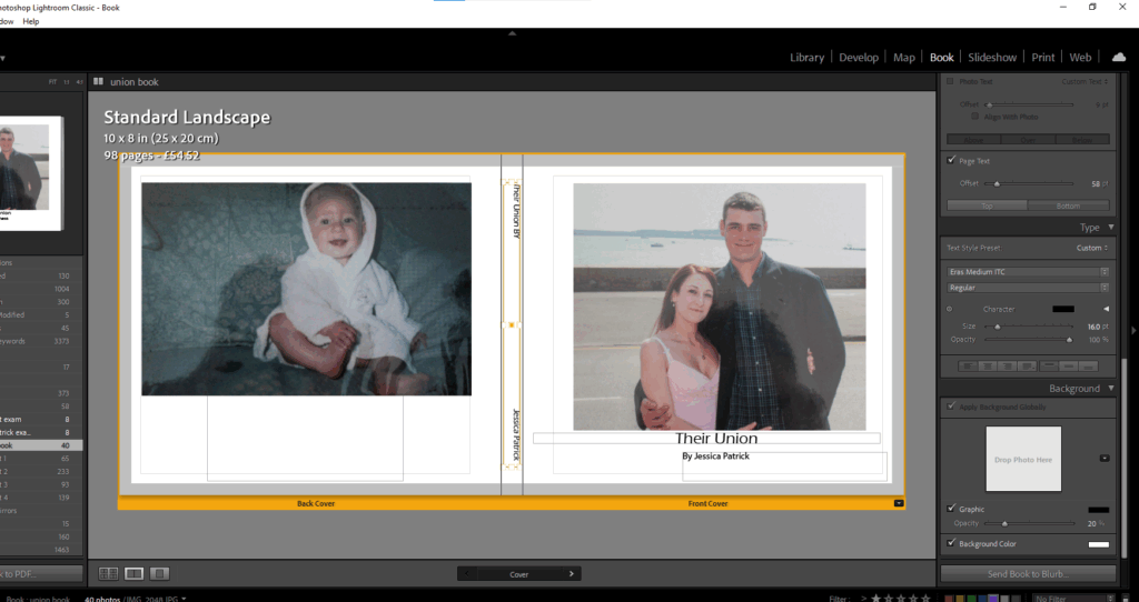
Then, I select whether I want my book landscape or portrait. I decided on the standard landscape.
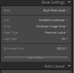
I would then also choose which type of front cover I want and what kind of paper I wanted to be used in my photobook. I chose a hard cover image wrap and premium lustre paper, because I wanted glossy pages, rather than matte.
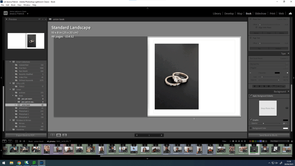
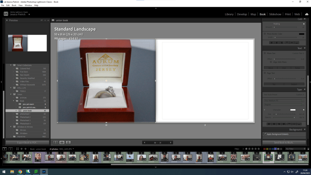
Then, I can drag the image to the page I want it to be on and I can change the layout of the image.
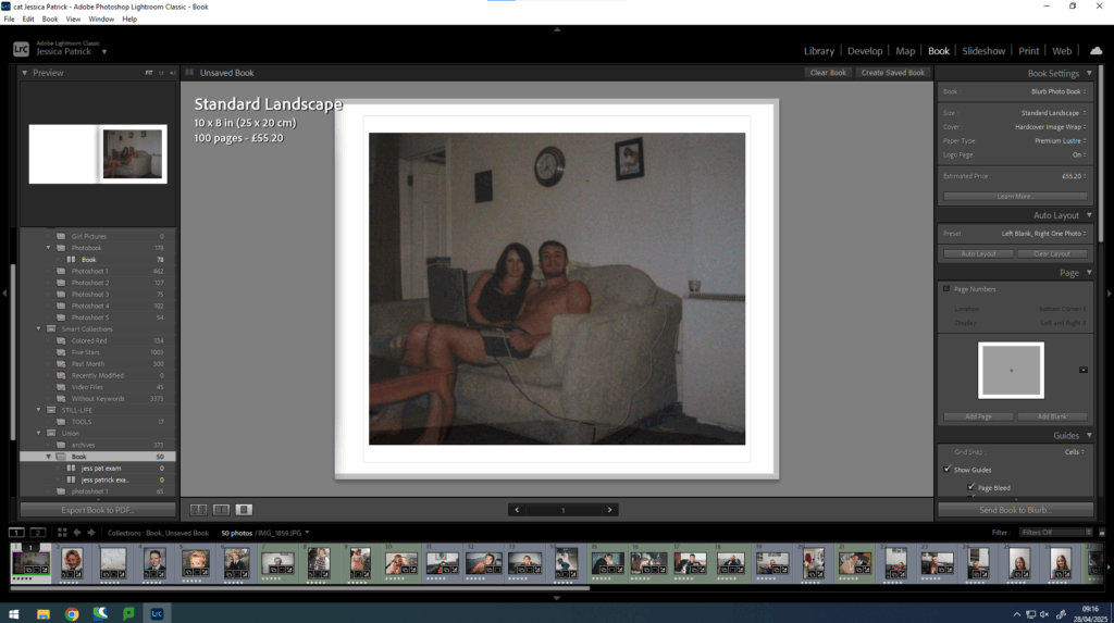
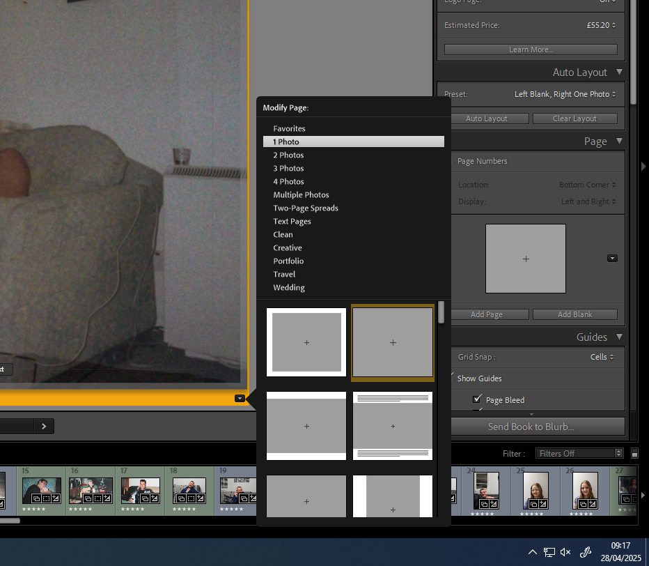
Then, I did this with all my photographs and experimented with the layout and design.
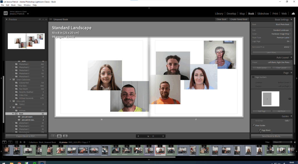
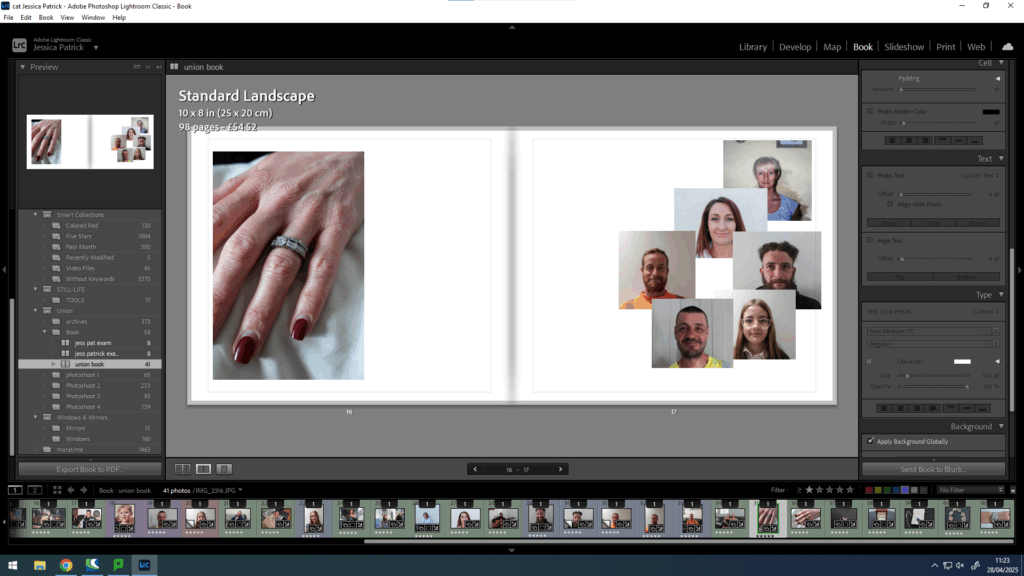
Then, I experimented with including a collage in my book, because when I researched Larry Sultan’s book, I thought it looked very aesthetically pleasing.
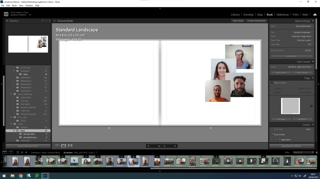
I also experimented with making it a double page spread collage as I hadn’t done that before.
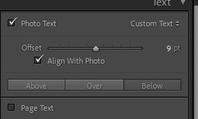
Then, I started to experiment with text.
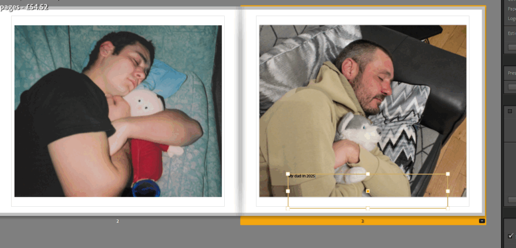
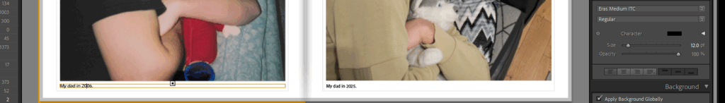
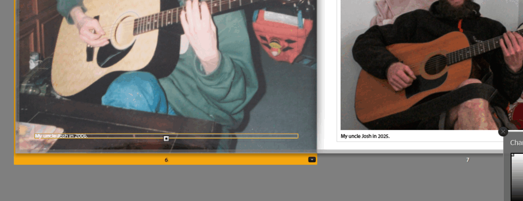
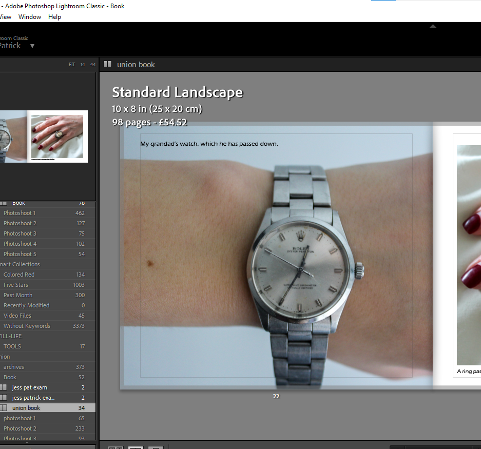
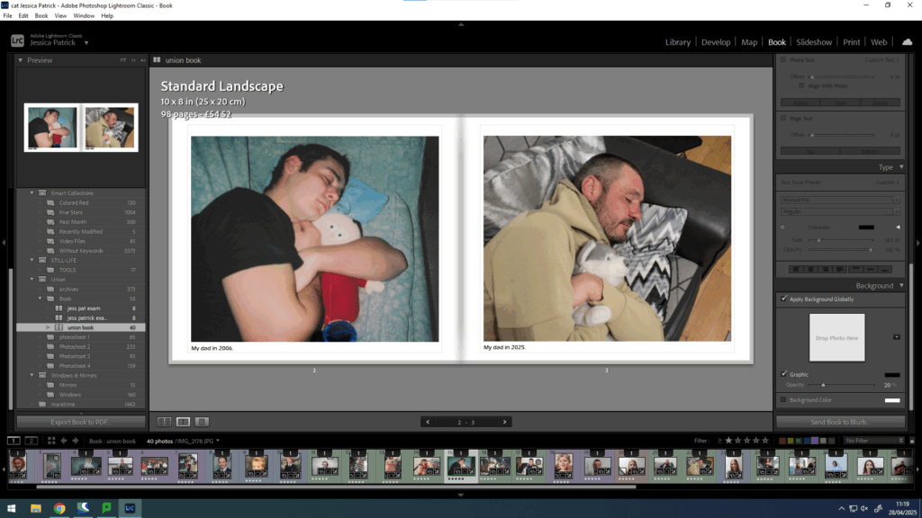
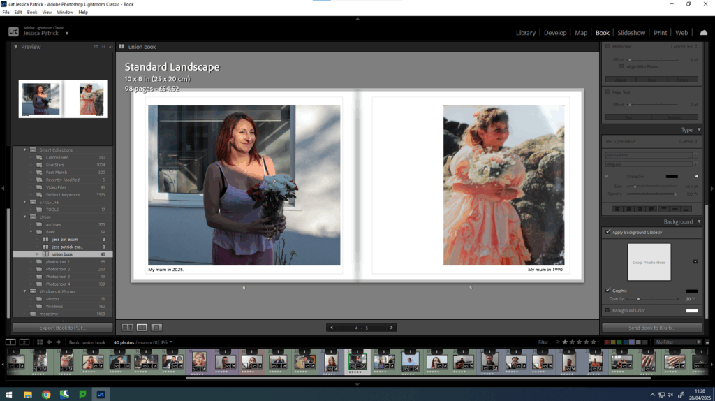
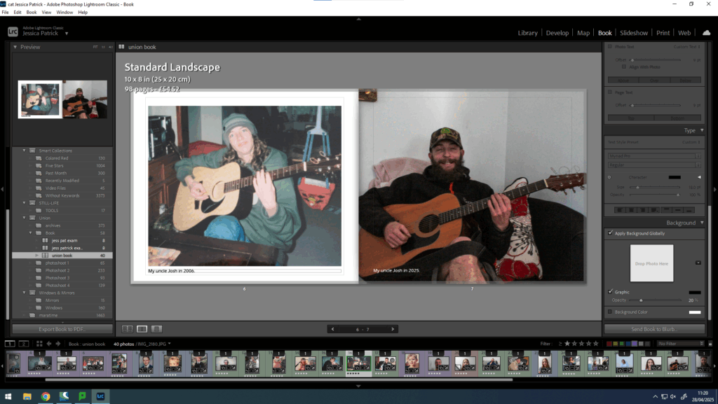
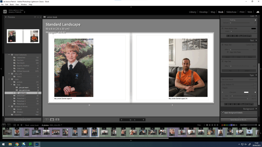
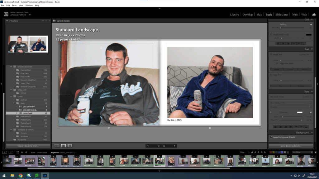
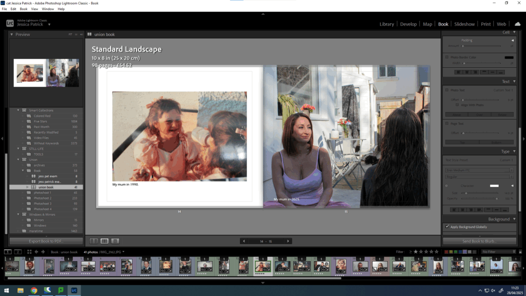
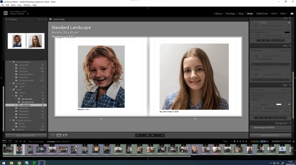
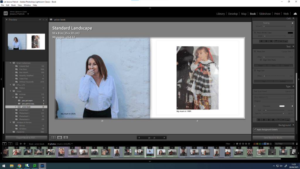
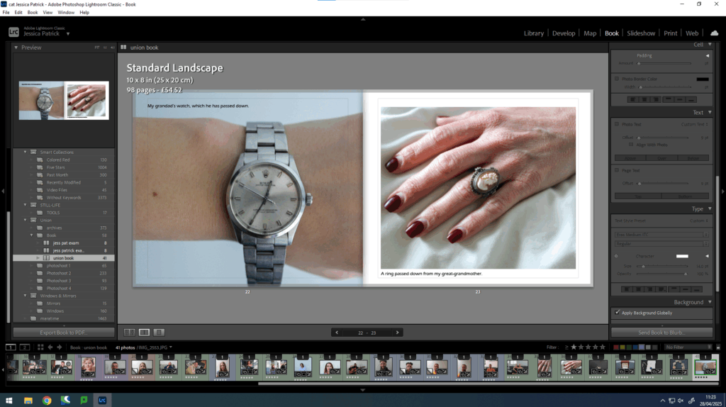
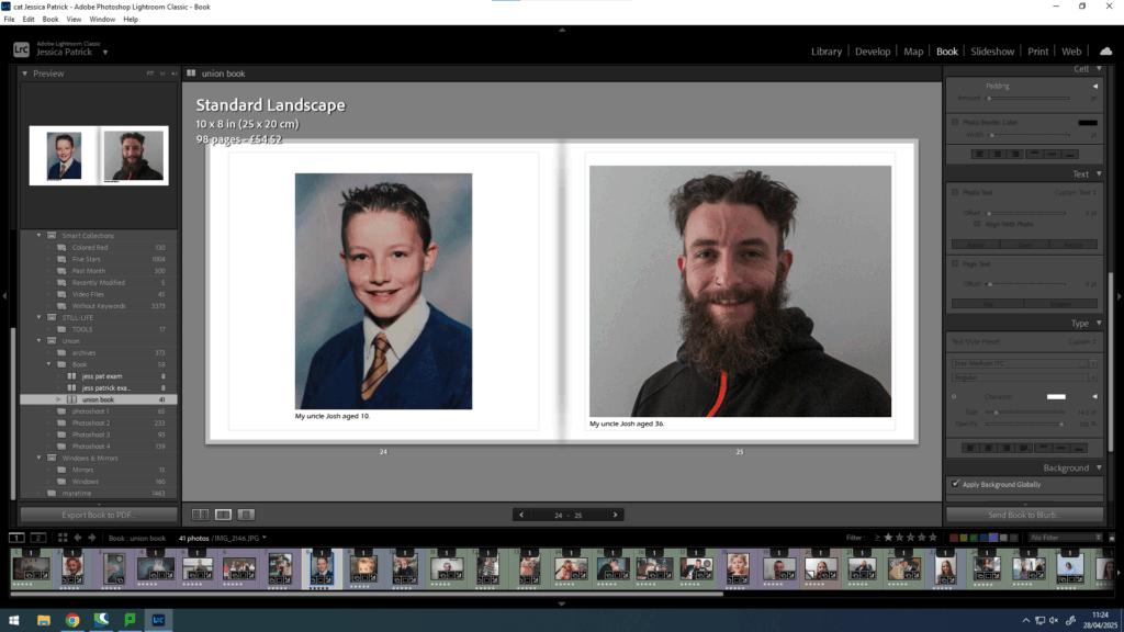
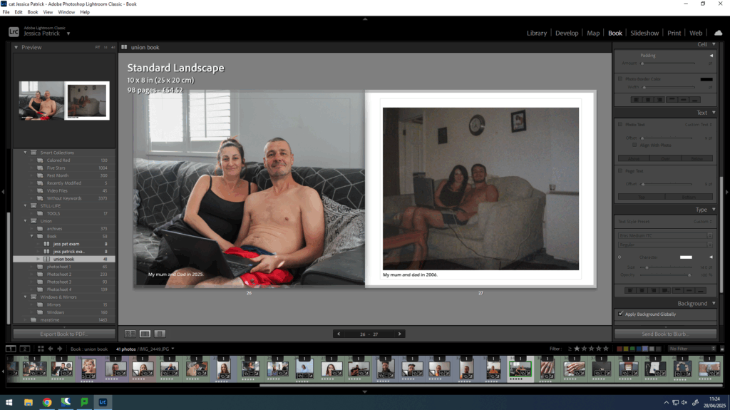
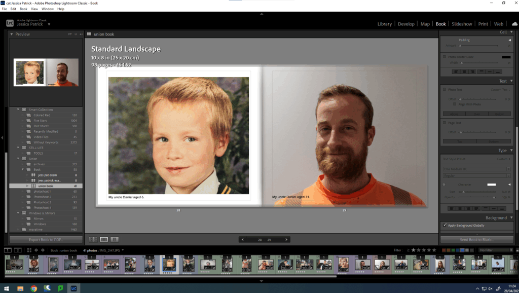
First, I wanted to caption the year of my photographs, so that the archives could be distinguished from my photographs.
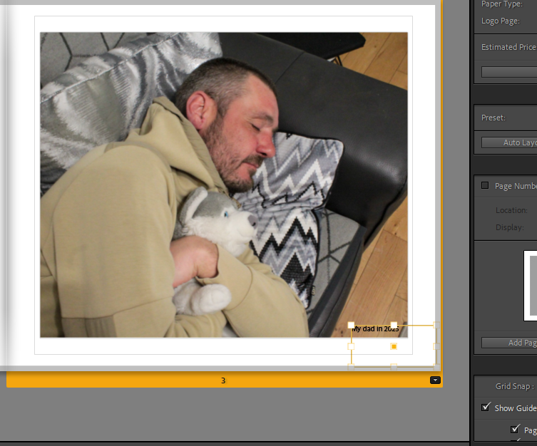
Then, I experimented with the placing, until I selected align with photograph, because I thought that looked the best.
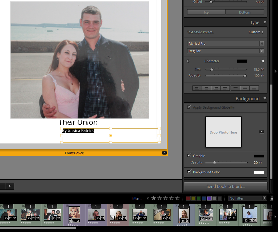
Once I had added all the text I thought neccesary I experimented with the colour, font and size of the text.
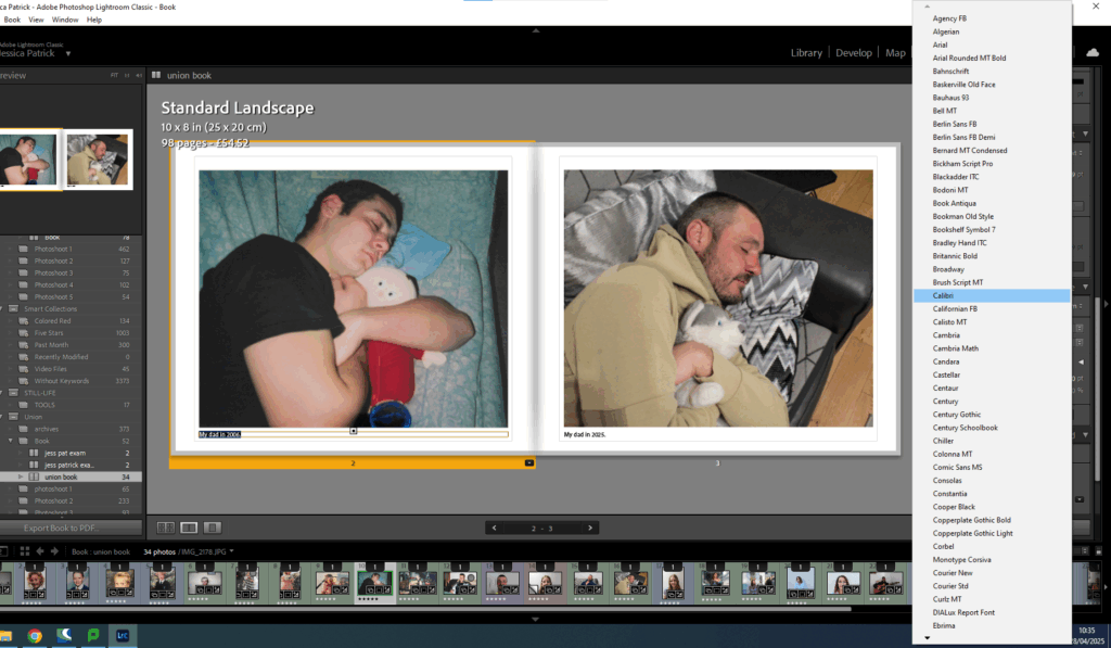
First, I looked through all the fonts to see which one I liked the most. I decided on Eras Medium ITC.
Then, I experimented with the colours.
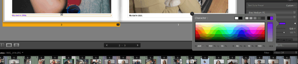
In the end I decided on black, as I thought it looked best, but I did have to go through my book and change the writing to white in some images, as the black writing couldn’t be seen as clear on the darker images.
However, I still found this quite hard to see in some of the images, so I had to alter my layout slightly more.
I also had to change the layout of the writing from the bottom to the top of the page for some images in order for them to be more visible.
Finally, I experimented with the size of the text.
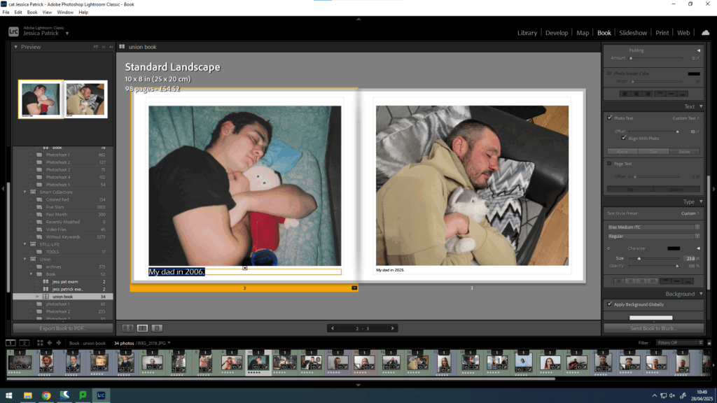
It was originally on 12pt, but I decided it looked better on 14pt.
Next, I started to work on my front and back cover pages. At first, I experimented with creating a collage of my family archive images on photoshop.
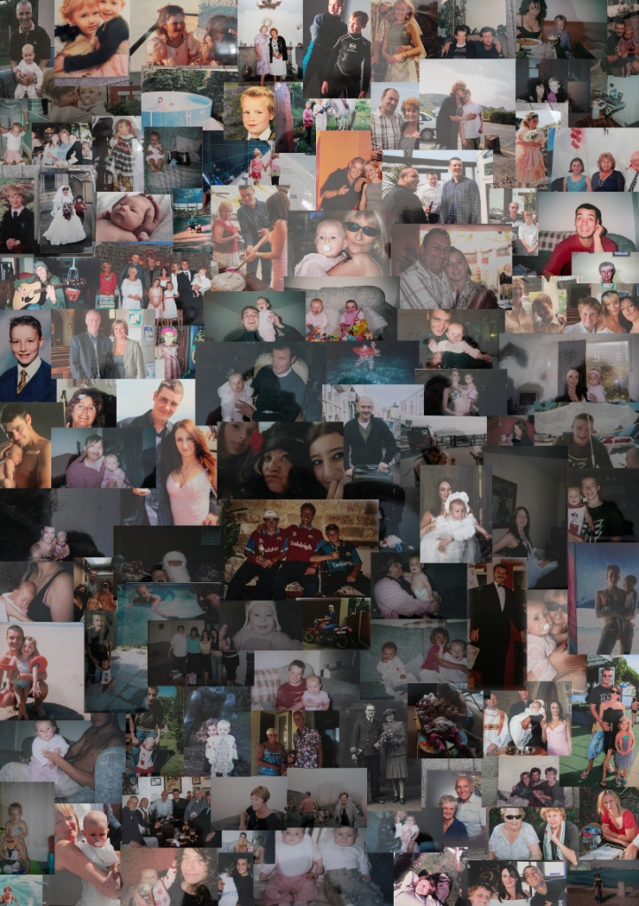
This was the collage that I had created. However, it wasn’t the best quality and it was made in portrait, but I decided on having my photobook landscape.
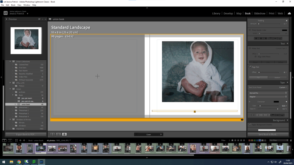
Instead, for my front cover I decided on just using one archive image, instead of lots.
Then, I experimented with different titles. I selected the same font as all my other writing, but the size of the title was 20pt and the size of my name was 18pt.
Then, I experimented with putting text on the spine of the book.
Then, I cantered it.
Finally, I wanted to do one more experimentation with the opacity of the writing, so I played around with that, but ultimately decided on it being 100% opacity.
Final layout

Evaluation
Overall, I think this photobook went well, because I was able to creating an aesthetically pleasing layout of images, using my best final images. I also used quite a bit of experimentation throughout the making of this photobook. I was also able to include some text as well as just images, which I quite like, because I didn’t use any text in my previous photobook.
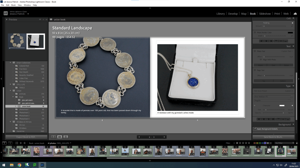
I also feel this photobook displays many different members of my family and shows how we were unified years ago and still are today. I also feel like the process of making these images has brought us all a little closer together, which I think can be seen in this photobook.