
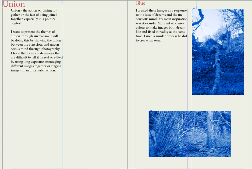
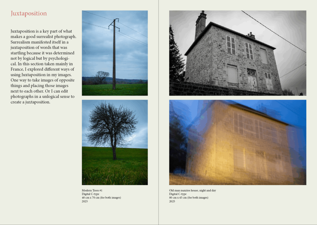
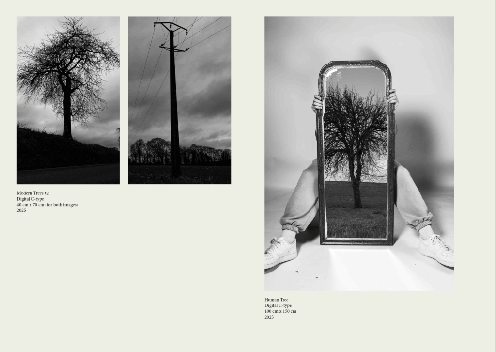
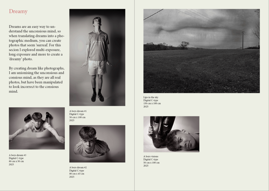
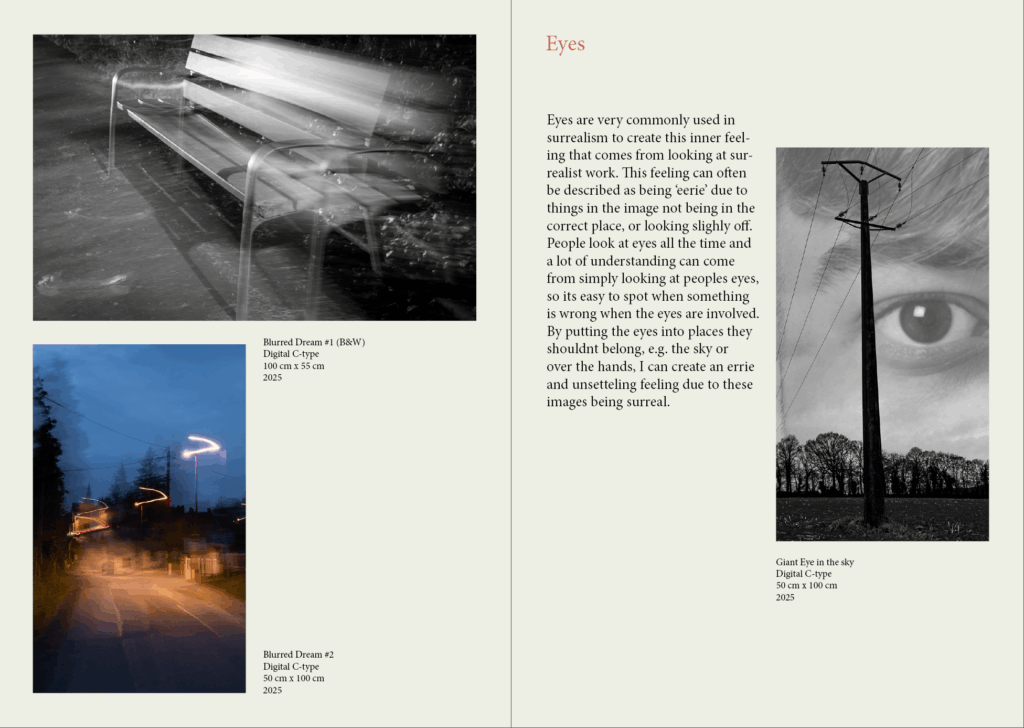
After researching a few exhibition catalogues, I have decided the best way to lay out the catalogue is though categorising each section. The categories I have chosen are “blue”, “Juxtaposition” , “dreamy”, and “eyes” in that order. I have done it in this order to follow the layout of the ‘virtual’ gallery. “Juxtaposition” will include montages of images that don’t go together, like light and dark images, or electricity poles and trees, ext. “blue”, will contain images from the work I did that takes inspiration from Mourants project. “dreamy” will use the images of my subject flying, and other images that look “dreamy” in a way. Then finally, “eyes”, will include my best images that contain the eye.
Another Thing I learned from researching different exhibition catalogues is to always include the meaning behind the work at the start of the catalogue, as well as including the title of images and the size of the image if I where to create a real gallery. I can also go more in-depth which why I took the photos for each section I will create.
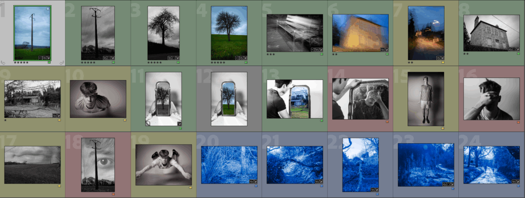
Above I planned out the images I will be using, using colour coding in light room to categorise them. I will be using InDesign to create my exhibition catalogue.
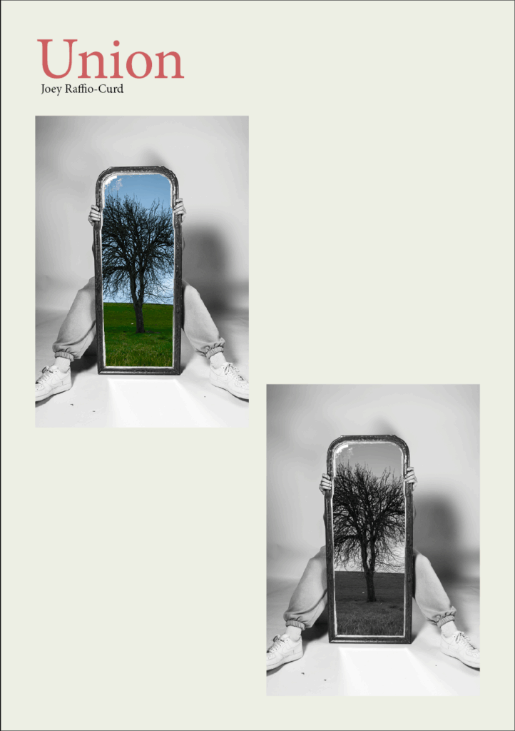
For the front cover I used my strongest image, in black and white and in colour to allow viewers to understand what kind of photos will be in the exhibition . I’m calling this exhibition ‘union’ as that is what my whole project is based on. I might change the name later to a more create one. I also coloured every page slightly yellow to give the exhibition catalogue an ‘ancient’ look, as well as making white images easier to see. I’ve also made titles red instead of the traditional bold because I think it looks better and makes the pages less cluttered and clearer.
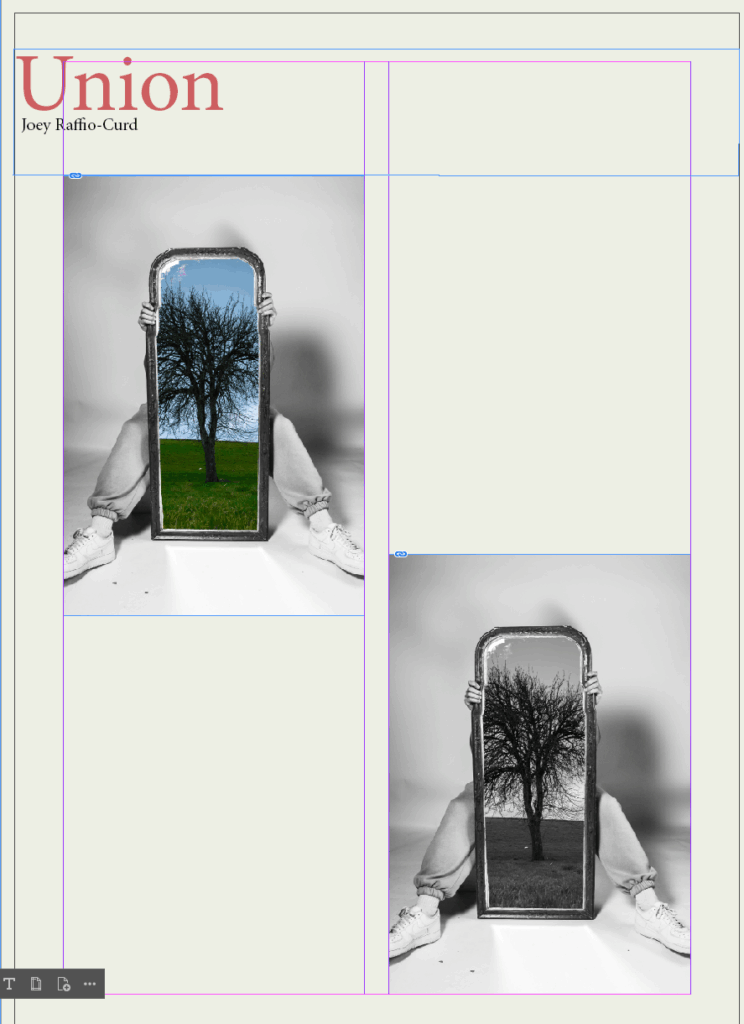
For the first and second page I placed where I want my images to be (in a logical manner), as well as adding some text which I will improve towards the end. I did this for the book, to get an Idea of what it will look like:
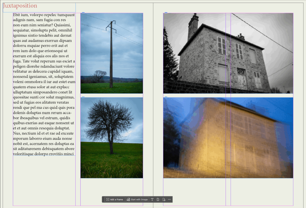
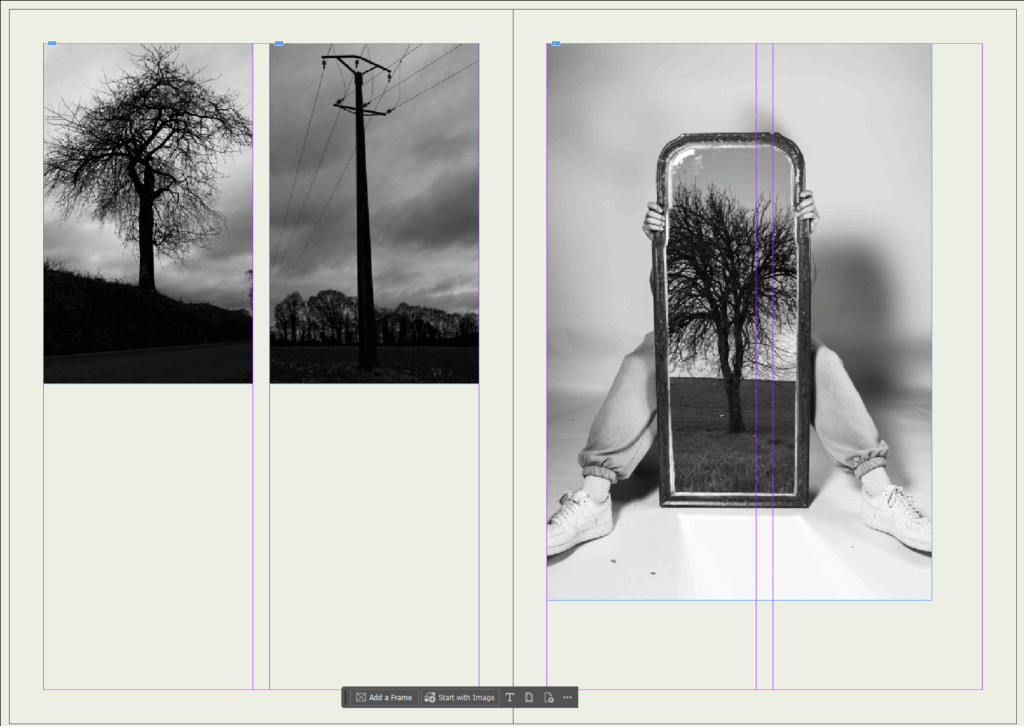
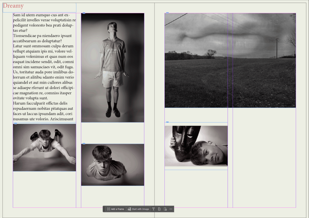
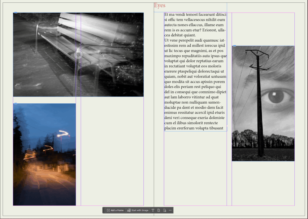
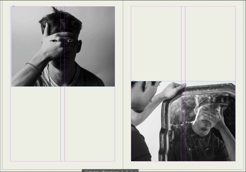
I have laid it out this way to give more important images more space on the page. Below is the final layout with text included:
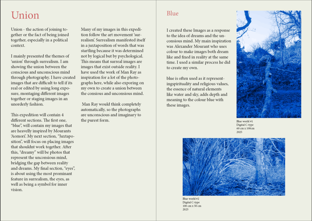
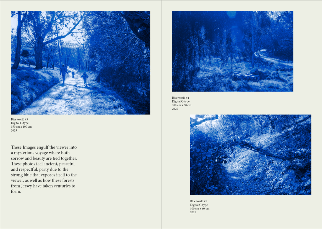
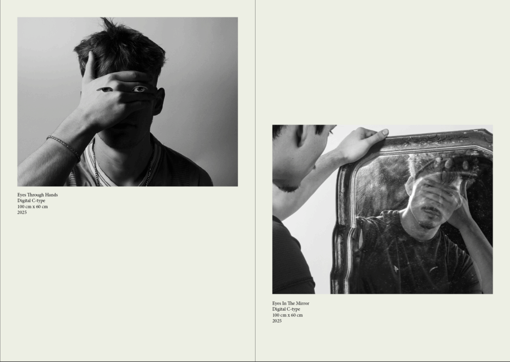

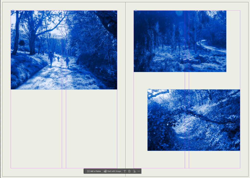
I have chosen to leave the back cover black as it’s not suppose be a book but a small paper catalogue which is simply used to show the photos around the exhibition , as well as a small amount of information on why I’ve taken some of the photos. Some things I’ve changed in the final addition above is that I’ve added some info on each photo (the name, how its printed, size, and when it was taken). I’ve also moved the titles down and to the right more to keep a consistent boarder around the pages.