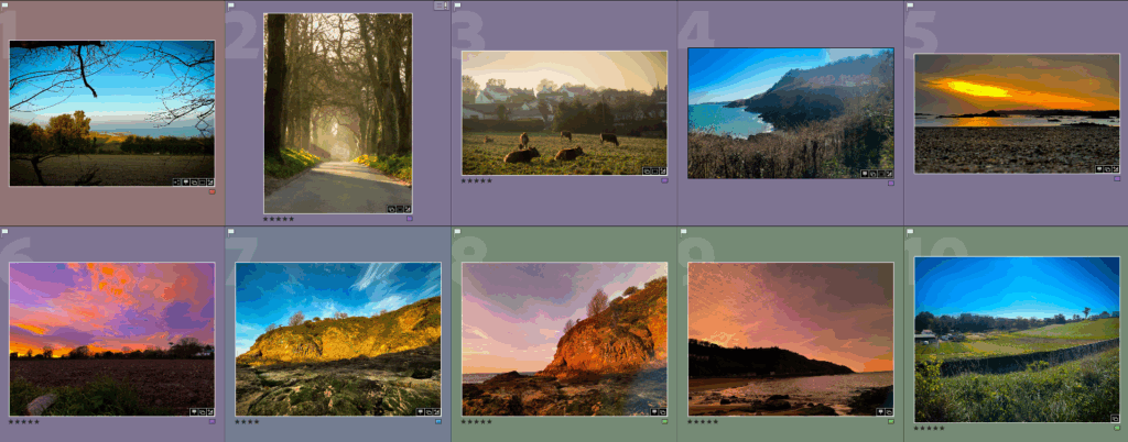
It was a hard decision to make but these are my ten final images. I chose these images based on multiple factors such as how much I like them, how well they look and how relevant they are to Romanticism and the artists I chose. Overall I am happy with how everything turned out from my photobook which I think looks great to my final images which I really like. I think the whole project is a success on my behalf if I do say so myself and I believe it all turned out way better than I imagined.
Comparing my photos to my artists
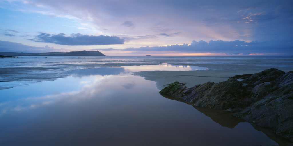
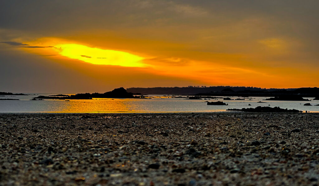
I also think my photographs look similar to my chosen artists such as this photograph Joe Cornish took vs mine. It has a lot of similarities such as the wide low angle shot of the sea. There are also some differences which is good as you don’t want to blatantly copy a photographer’s style such as how Joe’s photo has a smooth feel to it due to the soft sand and calm sea, while mine has a rough feel to it due to the rocky beach and the small but frequent waves in the sea which gives it a bumpy texture. The colours are also different in both photos as Joe’s photo use colder colours such at the blues and white while mine uses warm orange colours and darker browns.
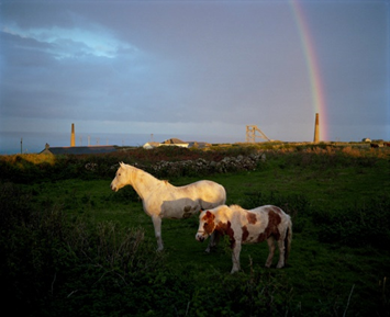
This photo is also similar to the artist Jem Southam which I chose as they both have a similar vibe to it and both contain two animals in a field while Jem’s photos contains a big and small horse my contains a big and small cow, however there is still a bit of difference such as how my photo is a lot more brighter and warmer due to it being taken during golden hour compared to Jem’s photo which looks like it was taken after a storm as there is a rainbow in the background and the clouds are dark which also make the image a bit darker.
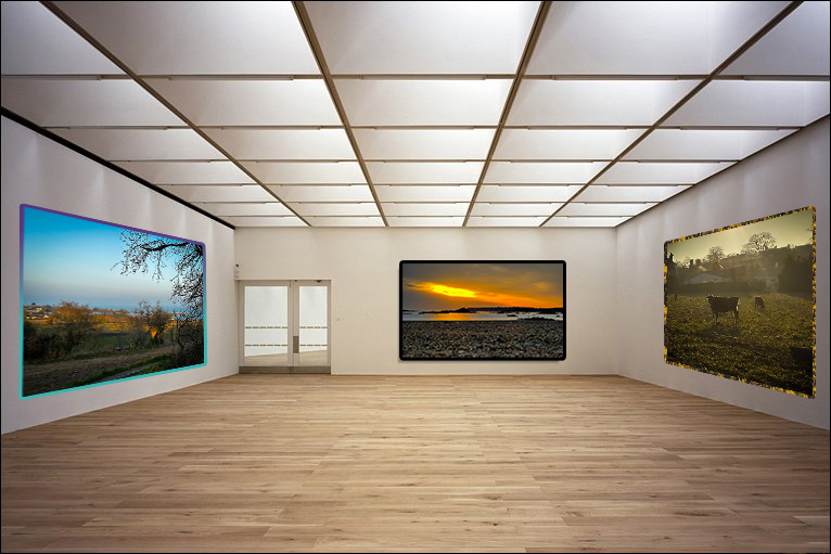
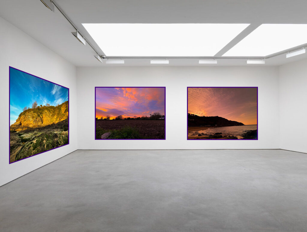
Virtual gallery
Below is a virtual gallery with my final images to see how they would look if they were in an art gallery.