Development
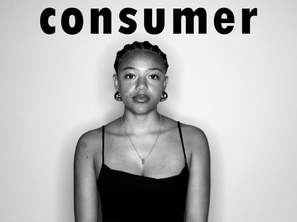
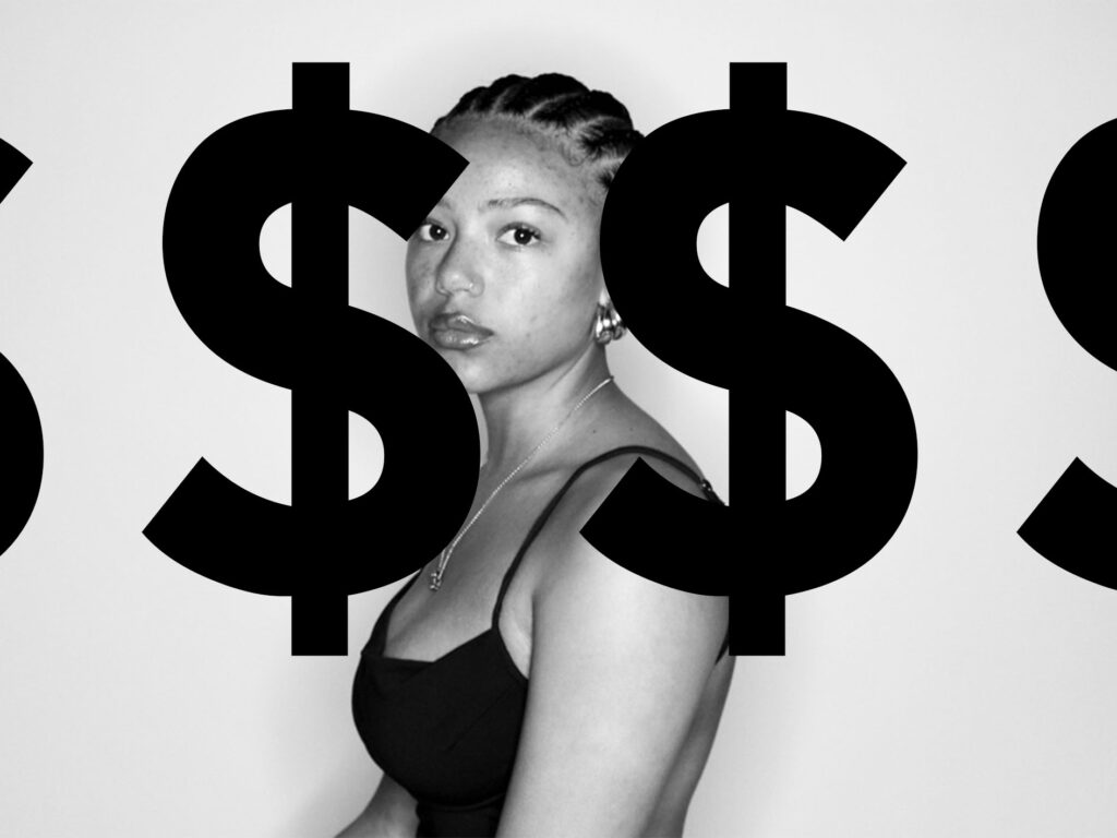
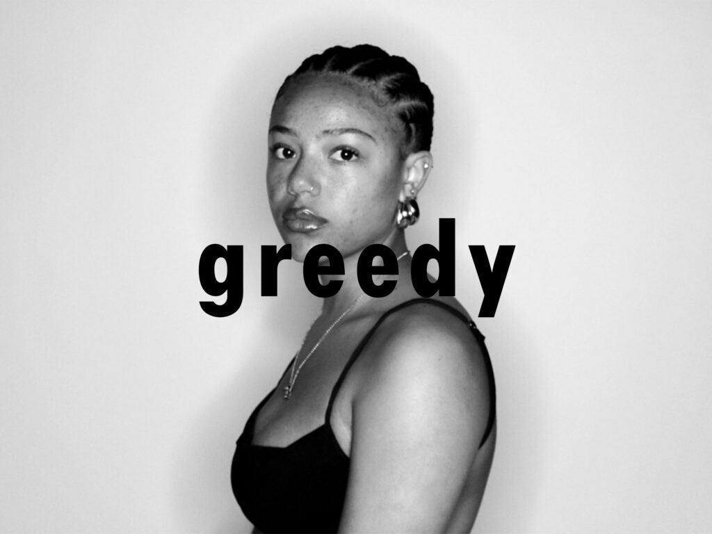
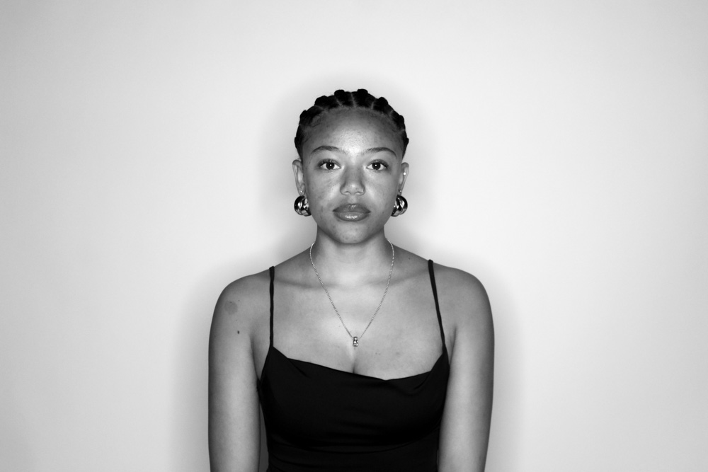
I again began with editing my images in Lightroom to become black and white. For these images I made sure that the contrast was high, and the black and white features were prominent within these as I wanted the different shades to be harsh from the background.
Experimenting
After edited on Lightroom, I moved on to photoshop where I add text. I again experimented with borders and non-bordered text, but I chose for non-bordered text as I wanted to differentiate my first photoshoot from my second so that there is an obvious divide between the feminism aspect and the consumerism aspect of my work.
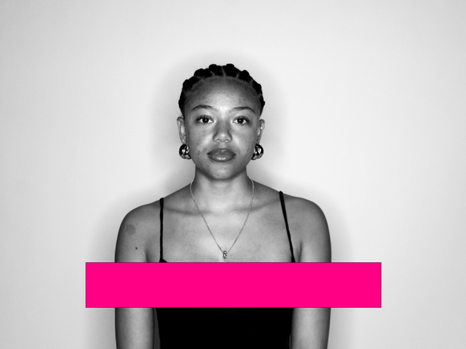
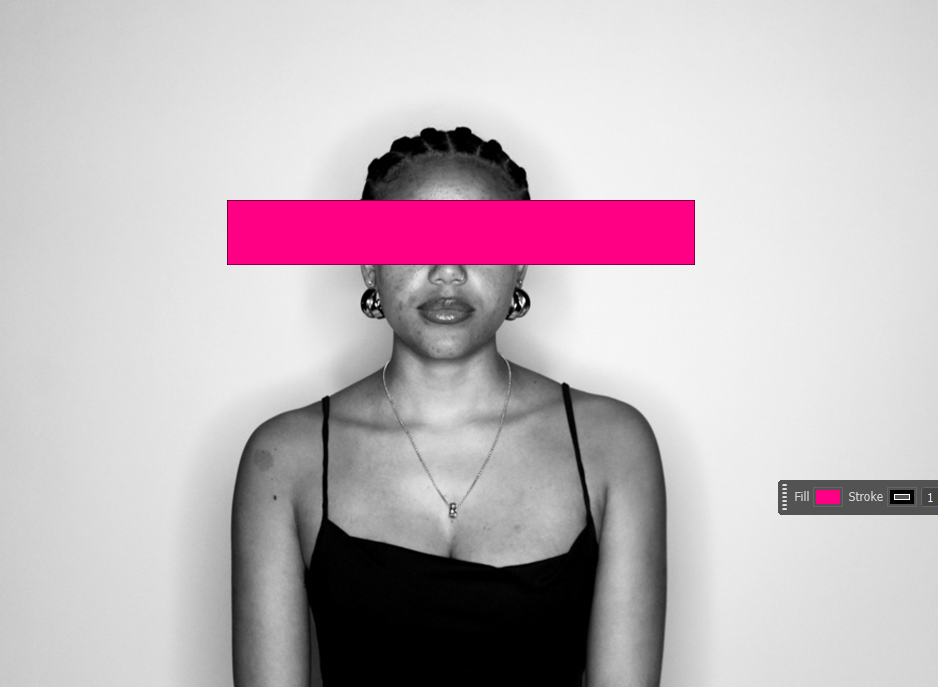
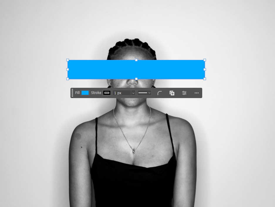
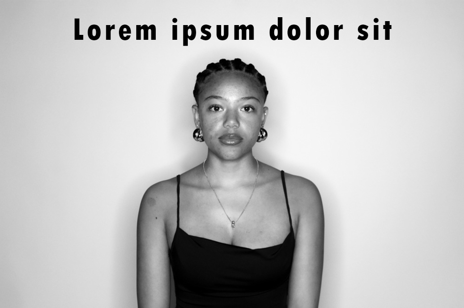
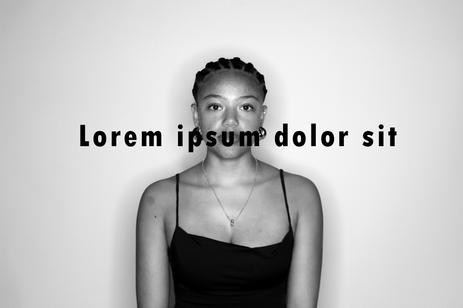
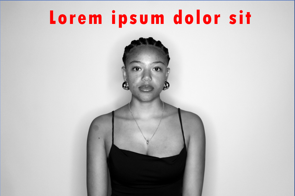
For each imagine I experimented with different text, styles, borders and colours, but I decided I wanted it to be bold, simple but the statement, phrase or symbol to still come across quite aggressively. I have done this by putting the text into black large writing with a bold font but in lower case letters. The lower case letters create a casual style of saying these words but the large, black text makes it seem aggressive.
Final look