
Barbara Kruger
This is my mood board of Barbara Kruger’s work which I have taken inspiration from. My comparison to Barbara Kruger is that we both have similarities and differences within our work.
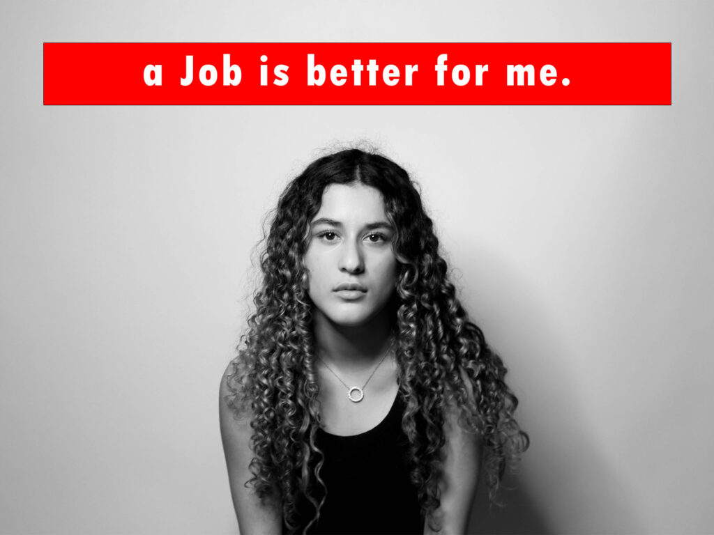
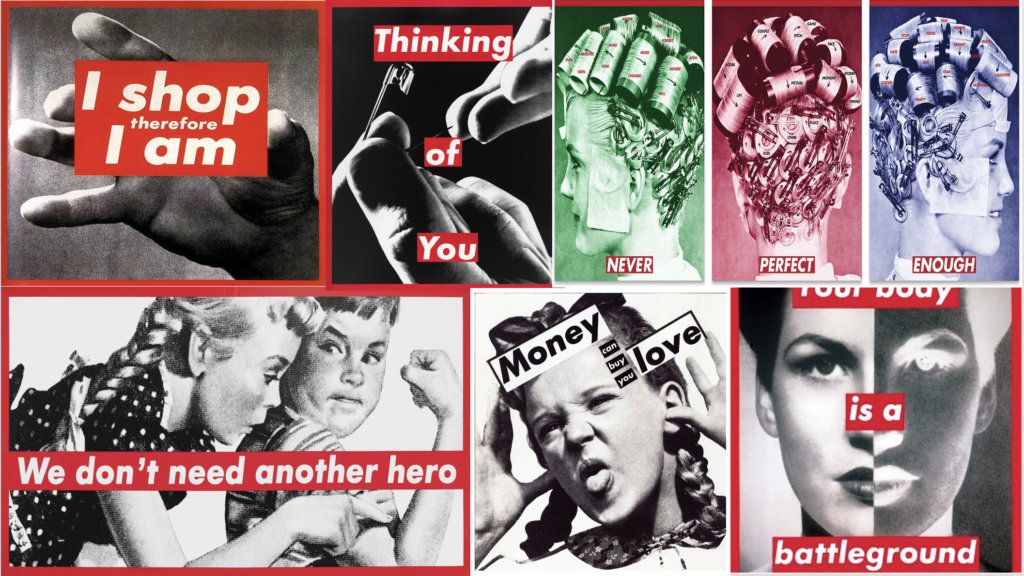
A similarity we both have is that our images are in black and white with red bordered writing over. I have taken this inspiration as it strongly resembles my idea of being angry with the media and society as a whole with the stereotypes of women, and what women ‘should do’. A reason the red border worked for my project as well as Barbara Krugers is that red is a colour that can symbolise different types of emotions, some that can contrast one another for example, love/hate, anger, passion and strength. These are all emotions that I feel go well with my work, and the final theme of Union as there are so many emotions linked with and can be stemmed from the word. Both pieces of work, show the strengths and struggles of being a woman with the statements over the top of them, my slogan states that a job would be more fulfilling and better for her than a man would be, but also shows that getting a job is hard for a woman as well due to the stereotypes of women in a mans field of work. A difference with my work and Barbara Krugers is that she took photos of body parts, like hands, which I did not do as I wanted to have the womans face be my main focus as it can show many different emotions and stories.
Jenny Holzer
This is my mood board of Jenny Holzers work which I also have taken inspiration from, although I have presented my work differently there is a similar message behind the work.
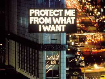
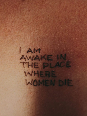
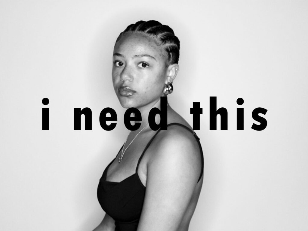
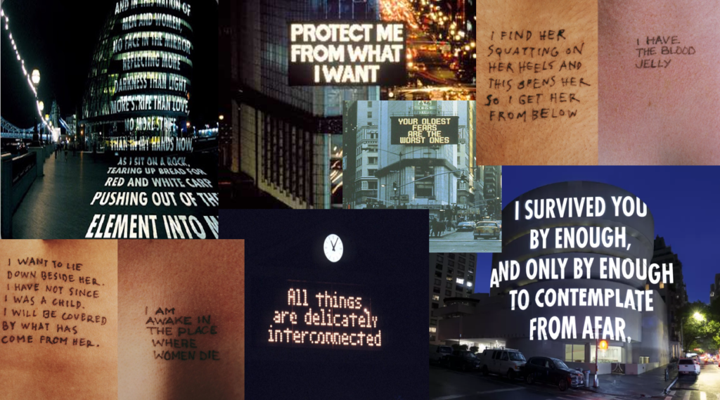
A similarity with my work and Jenny Holzers is that both short slogans can have two meanings behind them, both about consumerism and also relationships. ‘Protect me from what I want’ can be about wanting to buy something, but also about wanting a relationship, which is like my statement ‘I need this’. Both images have large text over, but a difference with the two is that Jenny Holzers is in all capital letters while mine are all lower case, but both have a sense of urgency and need projecting emotions that come with a relationship, and over-consumption, due to the large bold writing. Another difference is that Jenny Holzer specifically used large billboards and projections for her work while mine is over the top of a womans face. A lot of Jenny Holzers work circles feminism but also sexual assault, which is an everyday problem which occurs to women and men all the time. A difference with her work and mine is that Holzers can be viewed from three different perspectives of crime; the victim, observer and the person who has committed the crime, which can be seen in the second image in the gallery where it can be seen from all different perspectives.