
For this photoshoot I have taken images of family heirlooms, which have been passed down on both my mum’s and dad’s side of the family. I have also taken pictures of my mum and dad’s wedding rings to signify their union.
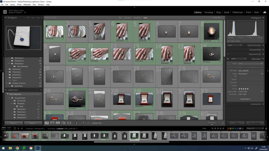
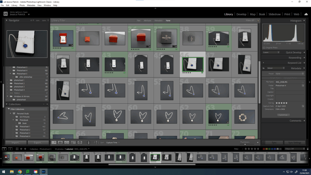
Contact Sheet

Edits
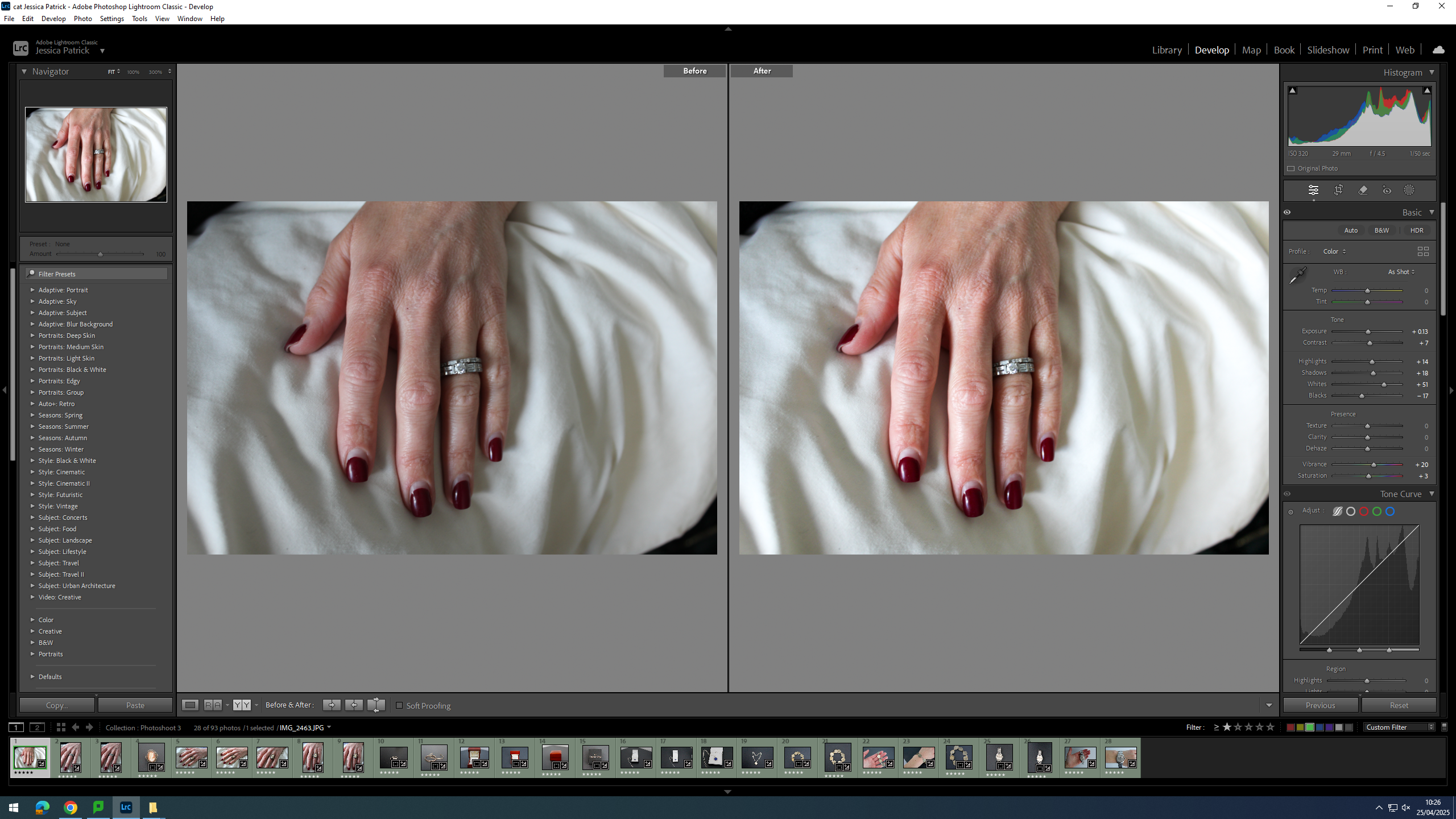
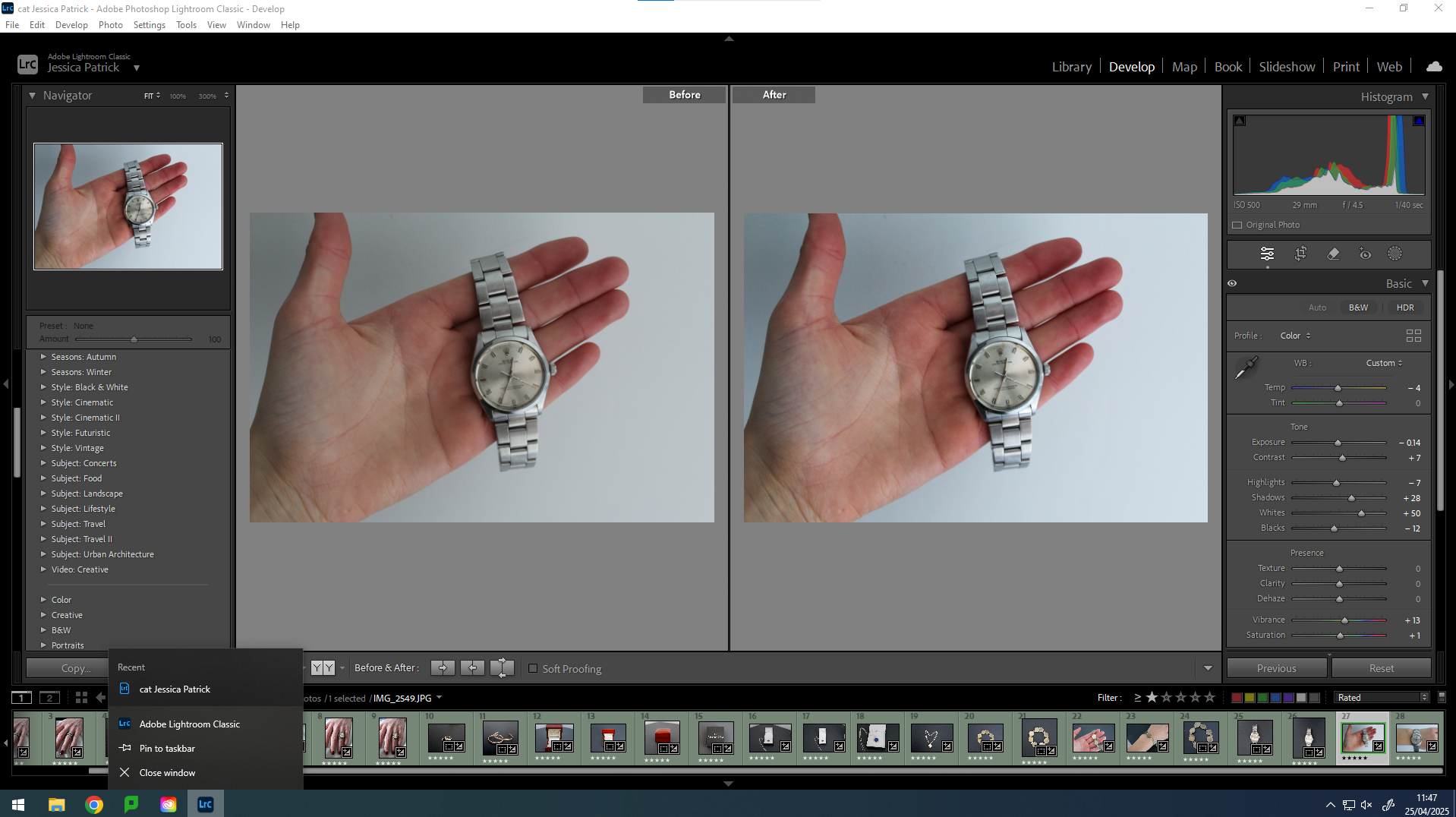
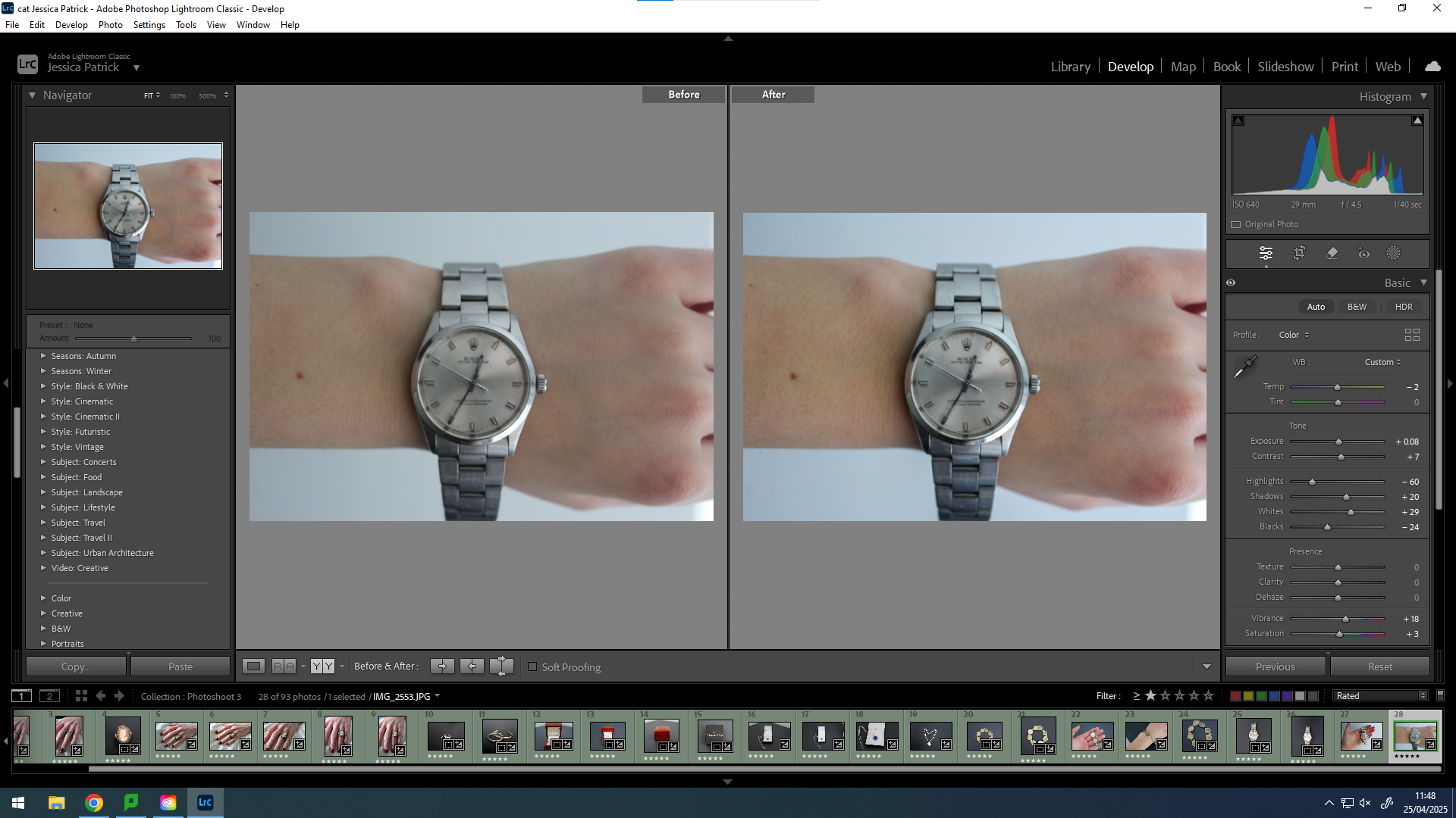
I have edited this photo by increasing the exposure, contrast, shadows, highlights, shadows, vibrancy and saturation, while decreasing the blacks. I did this, so that the image would be slightly more exposed and more vibrant, so that it looks less dull.
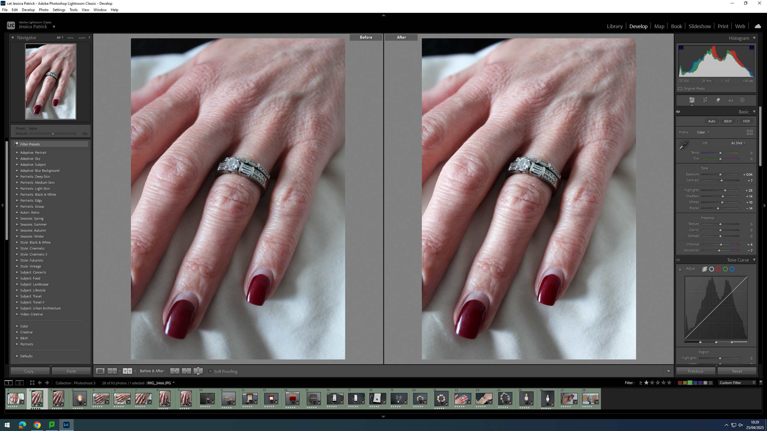
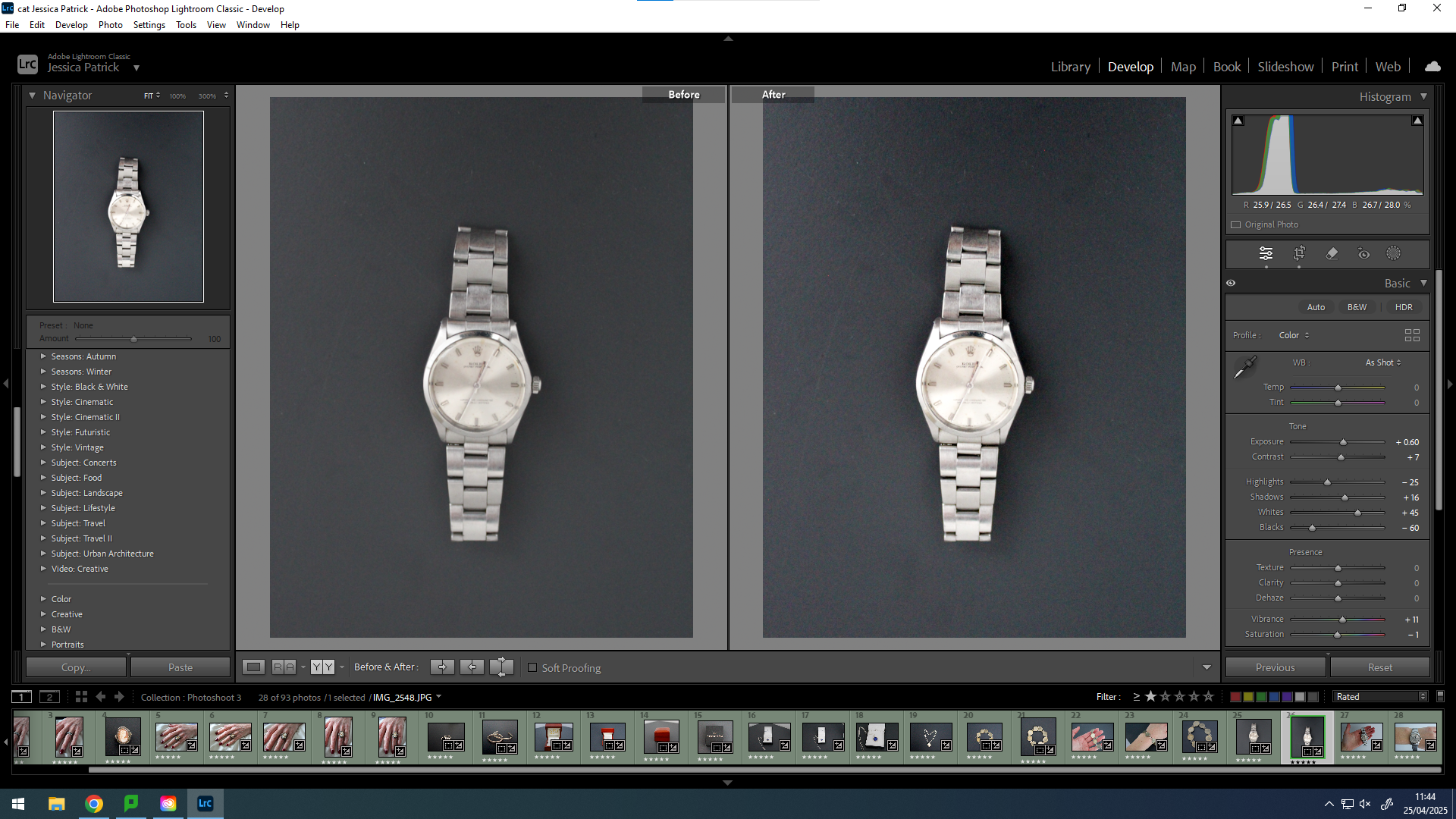
I edited this image by increasing the exposure, contrast, highlights, shadows, whites and vibrancy, while also decreasing the blacks and saturation. I did this, so that the image would be more vibrant and have more colour, so that it looks less dull and grey.
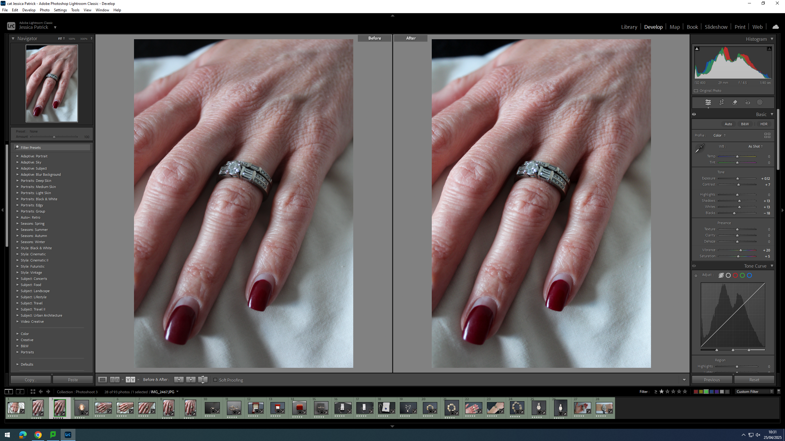
I edited this image by increasing the exposure, contrast, shadows, whites, vibrancy and saturation, while decreasing the blacks. I did this, so that the image would be slightly more exposed and have more colour, so that it looked less dull.
First, I cropped this image to crop out all the negative space in the image, so that the subject would take up majority of the frame and not get drowned out my the background.
I edited this image by increasing the exposure, contrast, shadows, vibrancy and saturation, while decreasing the highlights and blacks. I did this, so that the subject of the image would be more vibrant.
Then, I selected the background of this image and decreased the blacks, so that the background was more black, which created more contrast between the background and the subject.
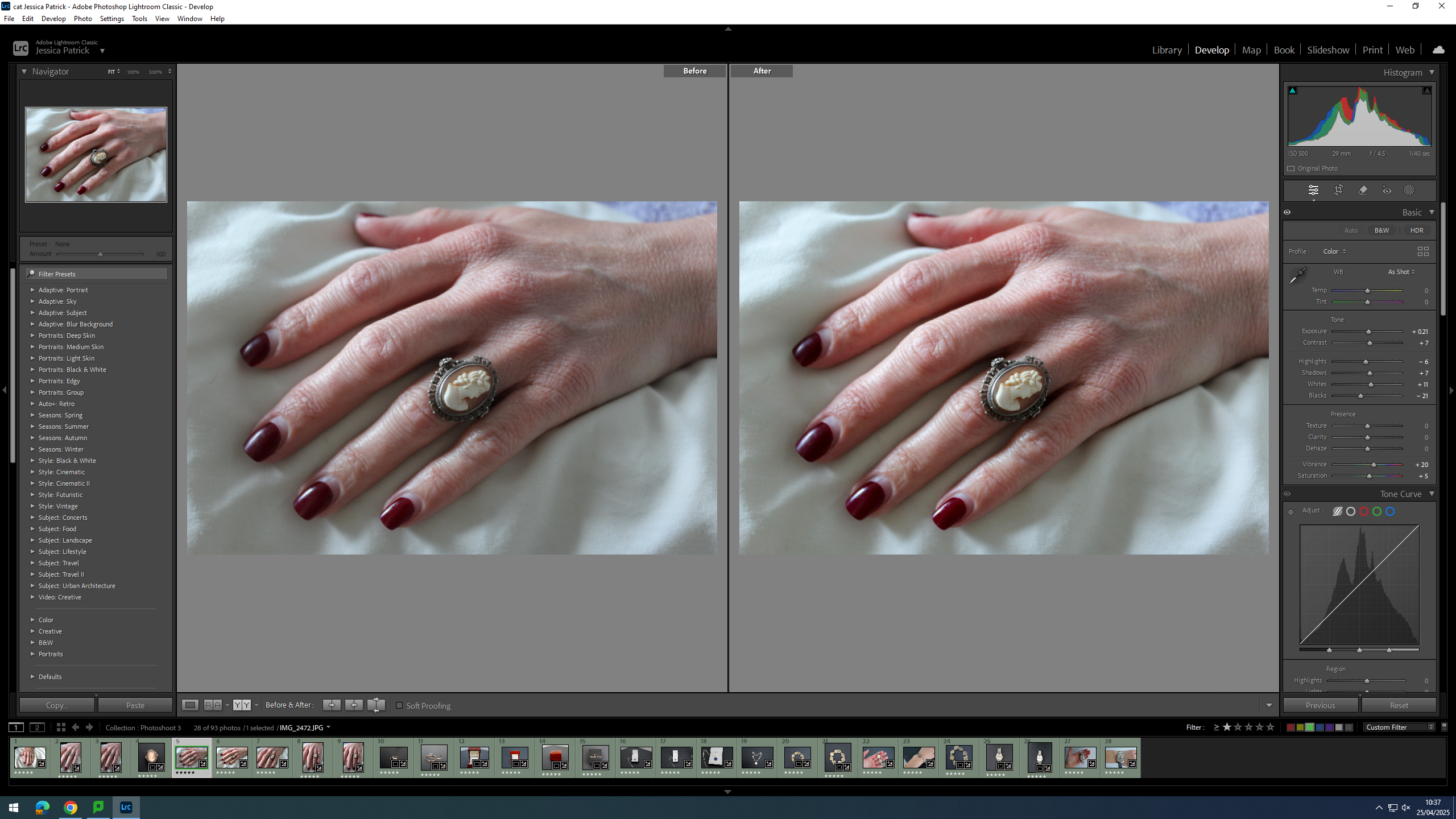
I edited this image by increasing the exposure, contrast, shadows, whites, vibrancy and saturation, while decreasing the highlights and blacks. I did this, so that the image would be more vibrant and less dull.
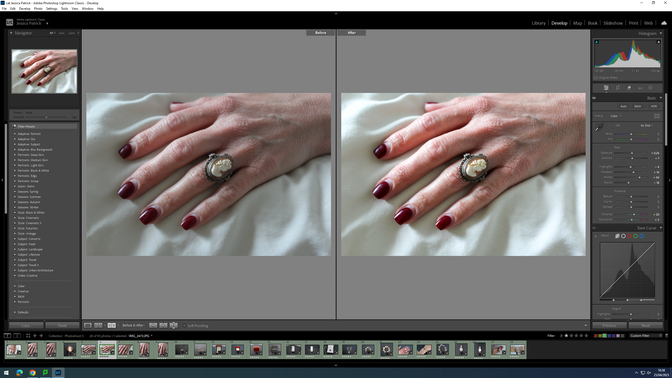
I edited this image by increasing the exposure, contrast, shadows, whites, vibrancy and saturation, while decreasing the highlights and blacks. I did this, so that the image would be more vibrant and less dull.
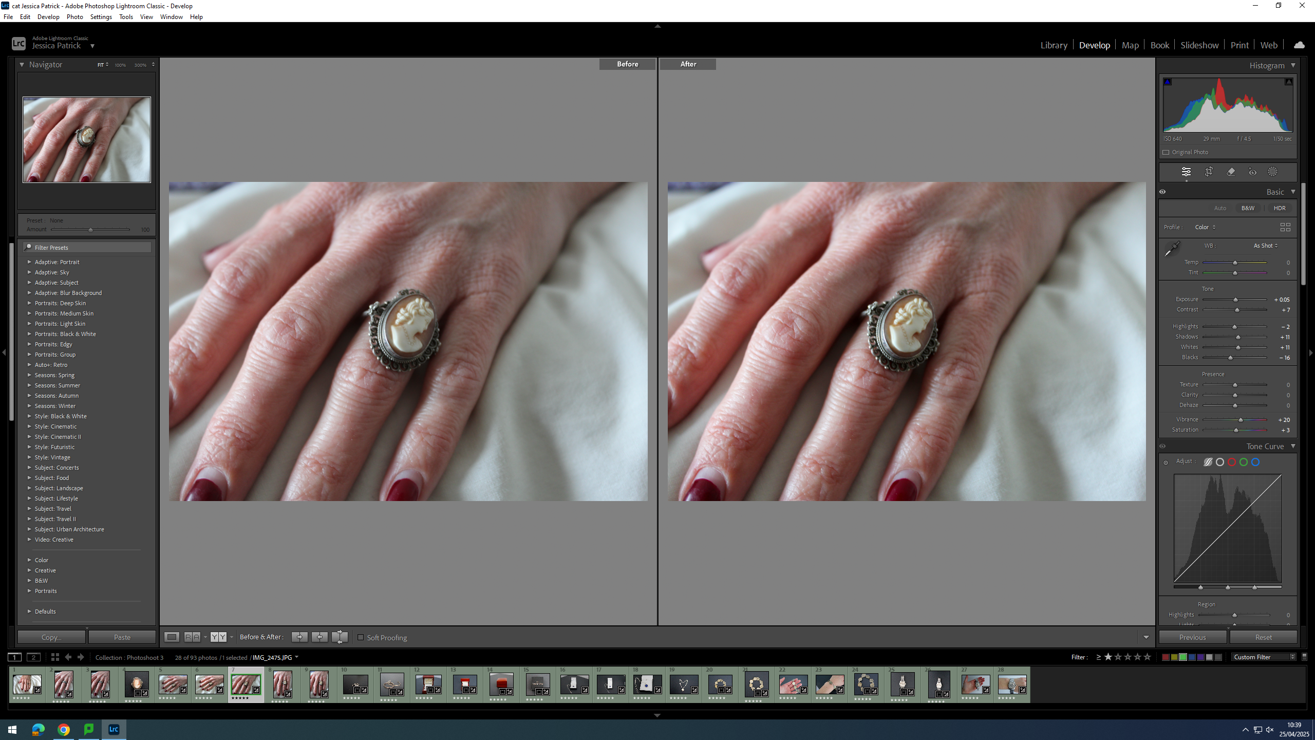
I edited this image by increasing the exposure, contrast, shadows, whites, vibrancy and saturation, while decreasing the highlights and blacks. I did this, so that the image would be more vibrant and less dull.
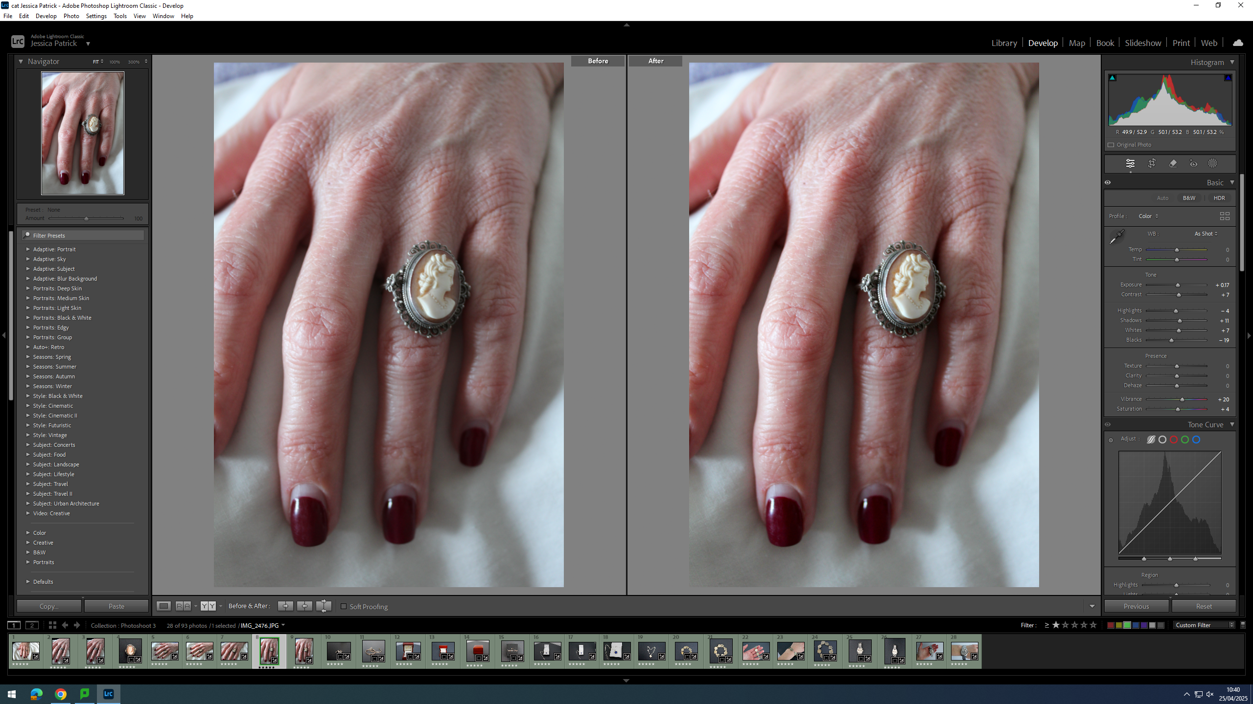
I edited this image by increasing the exposure, contrast, shadows, whites, vibrancy and saturation, while decreasing the highlights and blacks. I did this, so that the image would be more vibrant and less dull.
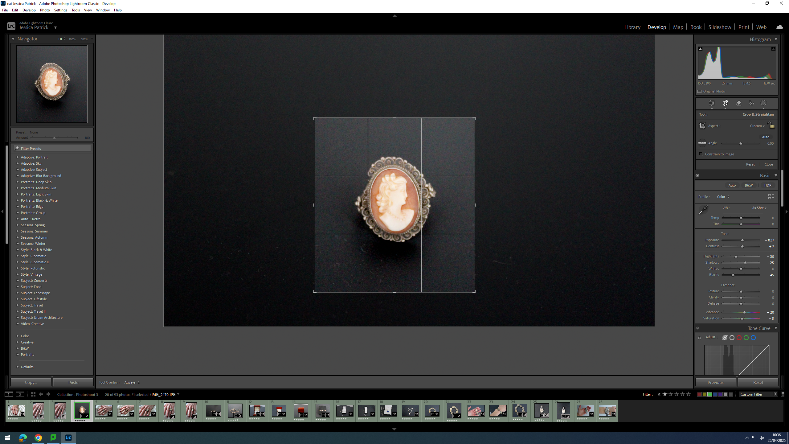
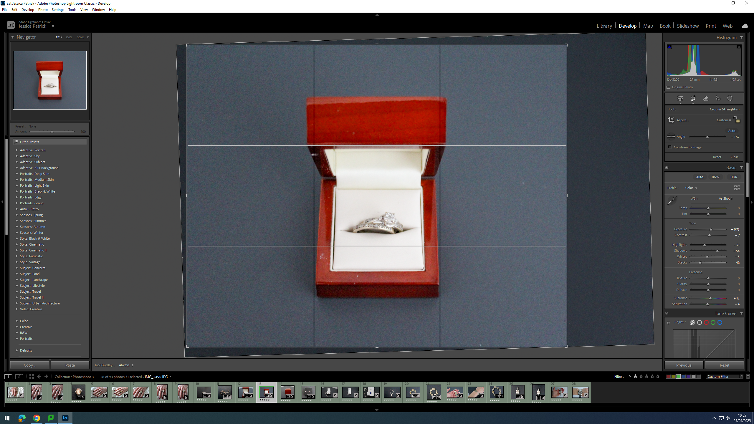
Firstly, I cropped this image, so that the main viewpoint of the image would be in the centre of the frame, following the rule of thirds, which can be seen by the grid.
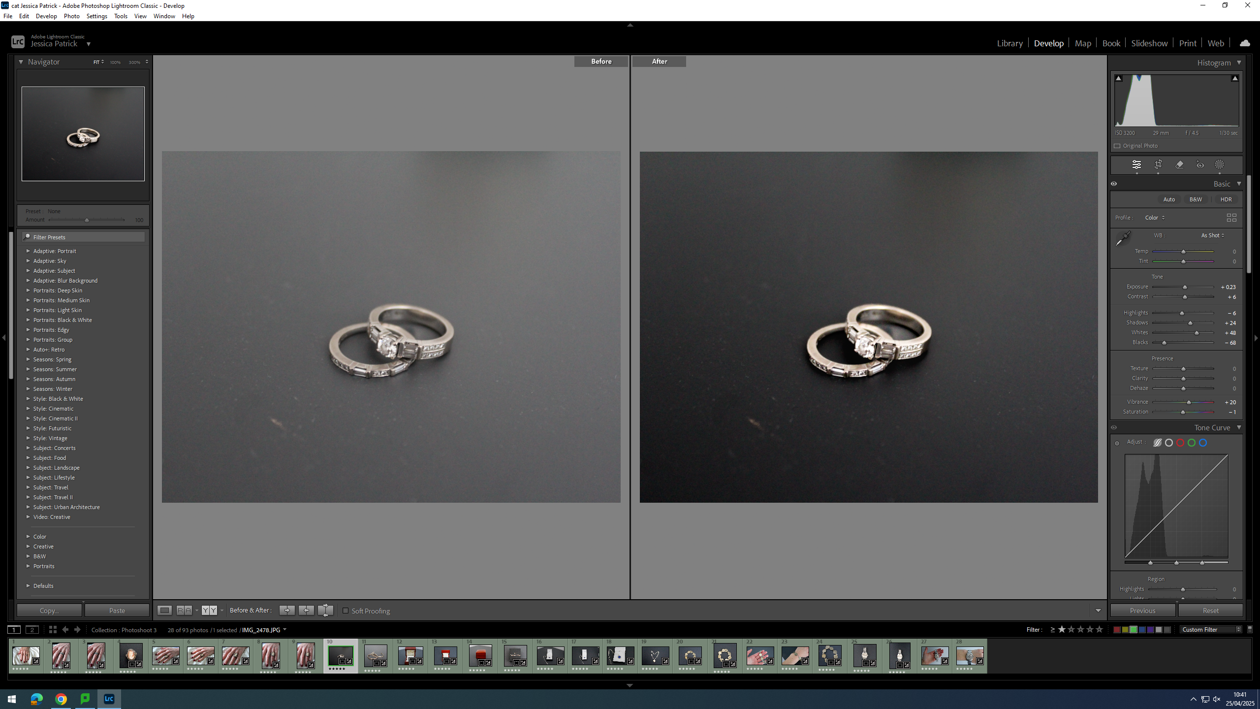
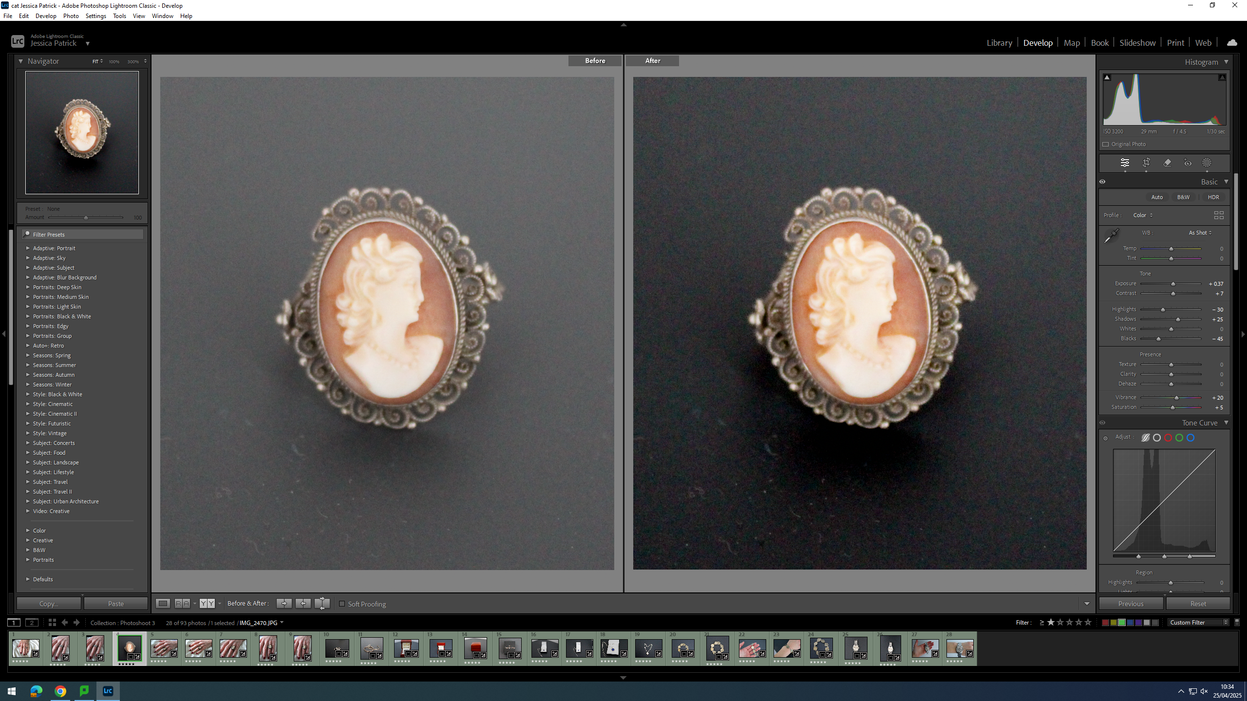
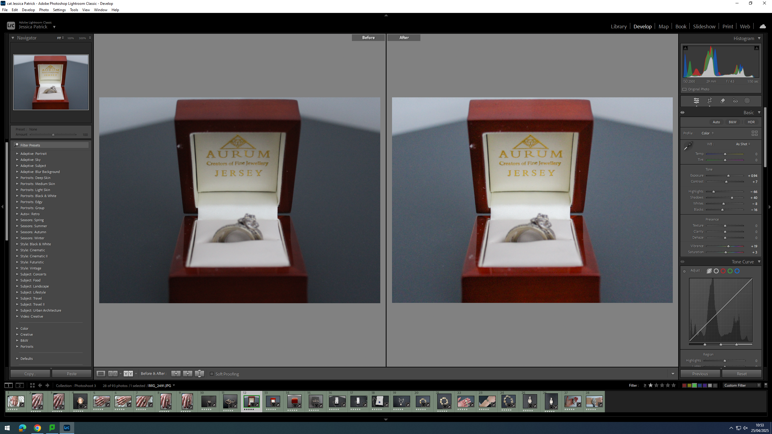
Then, I edited this image by increasing the exposure, contrast, shadows, whites and vibrancy, while decreasing the highlights, blacks and saturation. I did this, so that the rings looked less dull and had more highlights to them.
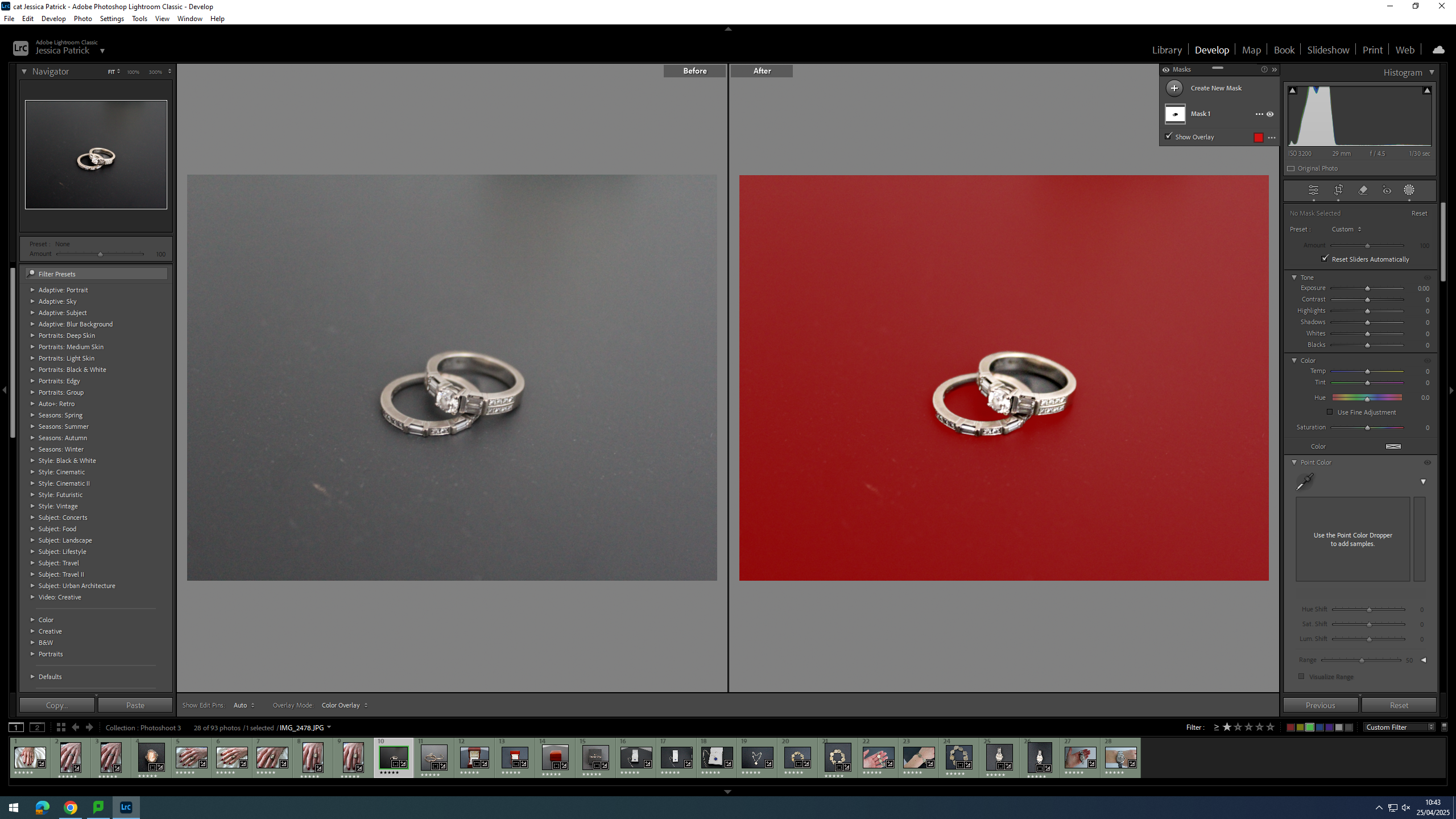
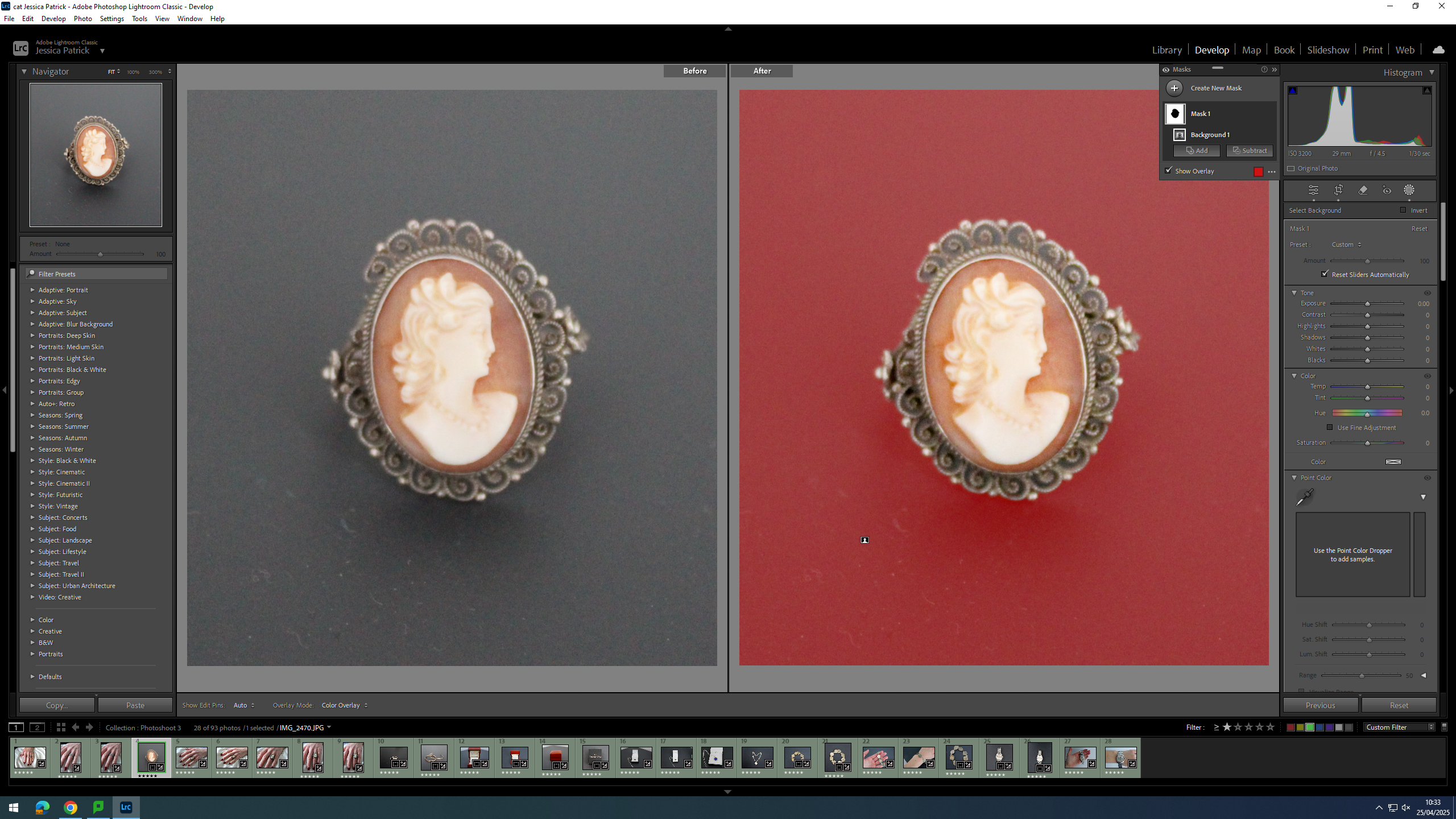
Then, I selected the background of the image and decreased the whites, shadows, exposure and highlights, while increasing the blacks and contrast. I did this, so that the background would be more black, and the try and hide some of the dust on the surface.
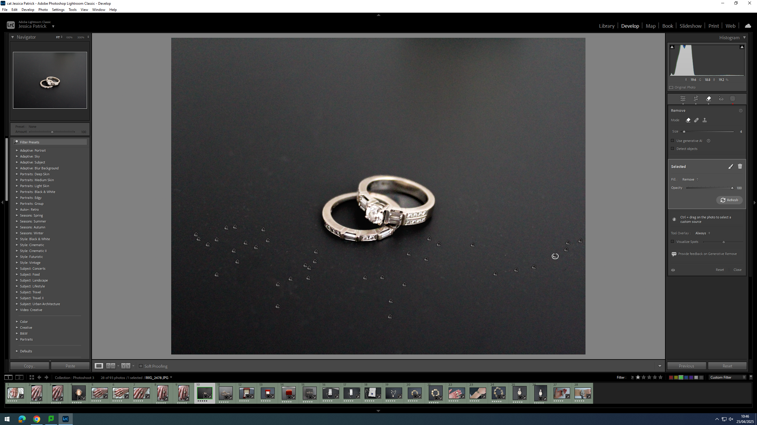
Finally, I used the correction tool to try and remove the dust.
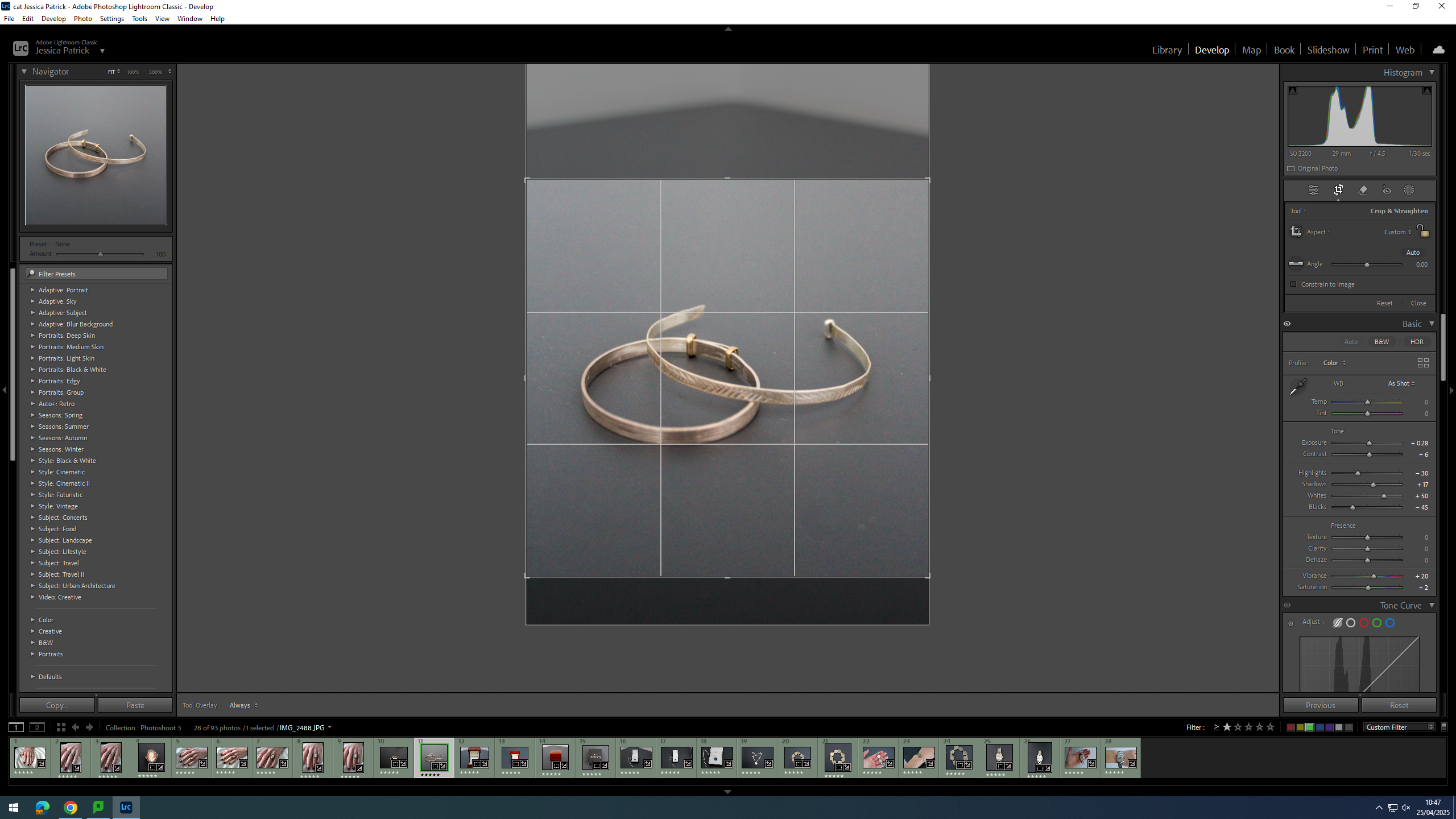
Firstly, I cropped the image, so that the main viewpoint of the image was in the centre of the frame, and so the background of the image didn’t have the white wall and the triangle shape in the background.
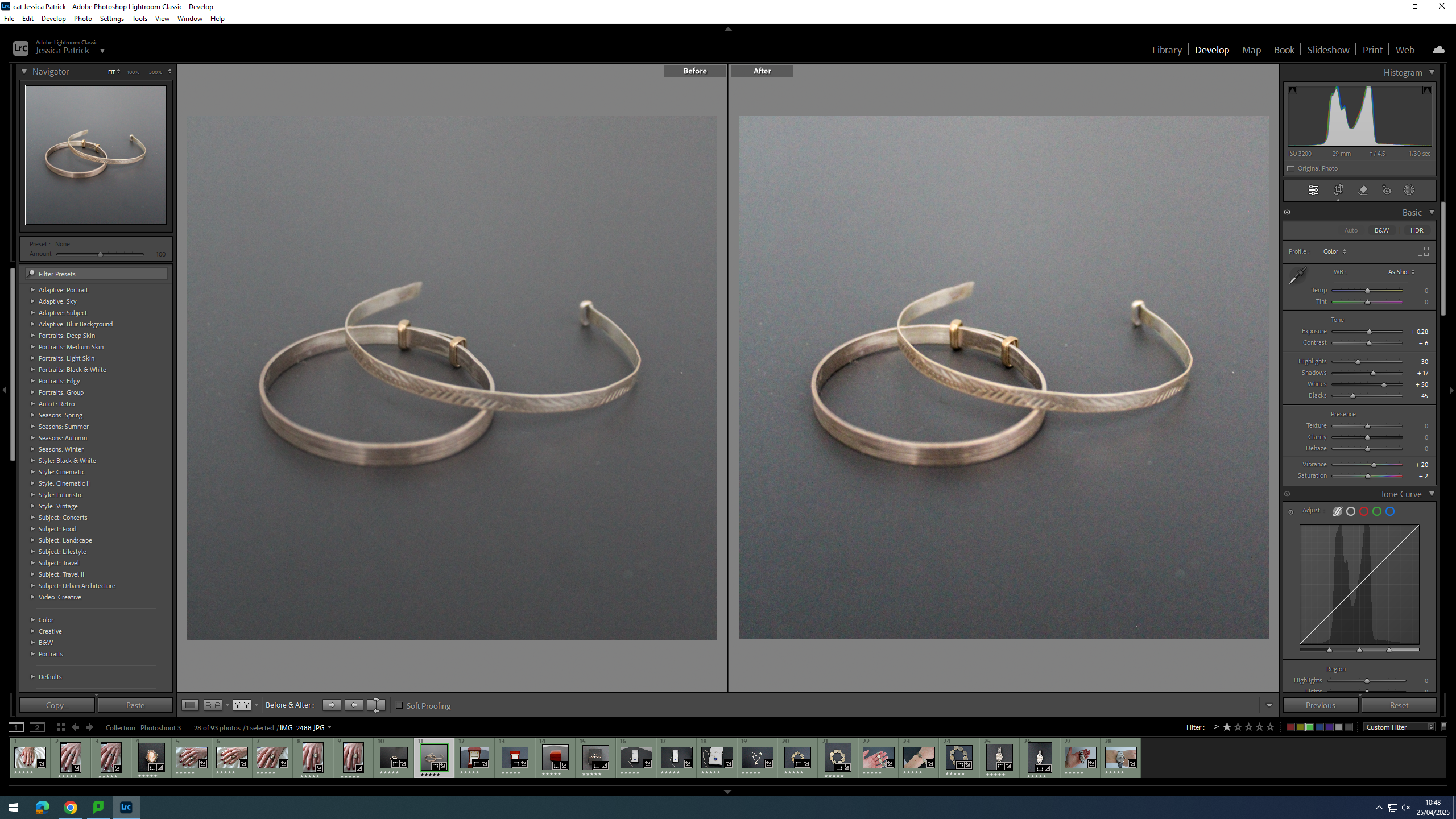
Then, I edited the image by increasing the exposure, contrast, shadows, whites, vibrancy and saturation, while decreasing the highlights and blacks. I did this, so that the bracelet’s were brighter and looked more rustic.
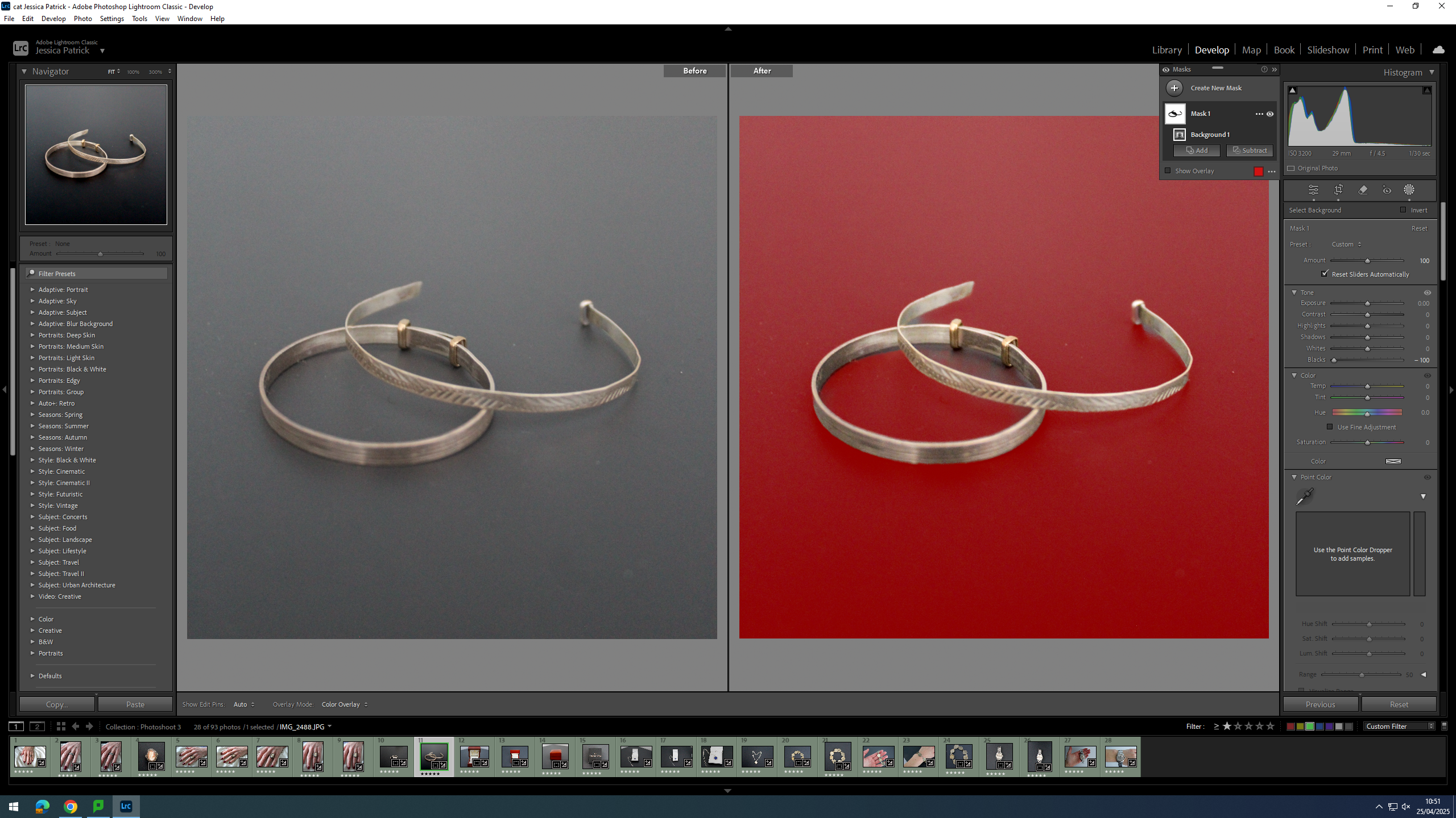
Finally, I selected the background of the image and decreased the blacks, so that the background was more black, which creates more contrast between the bracelets and the background.
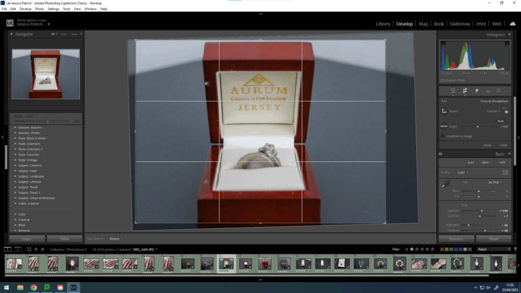
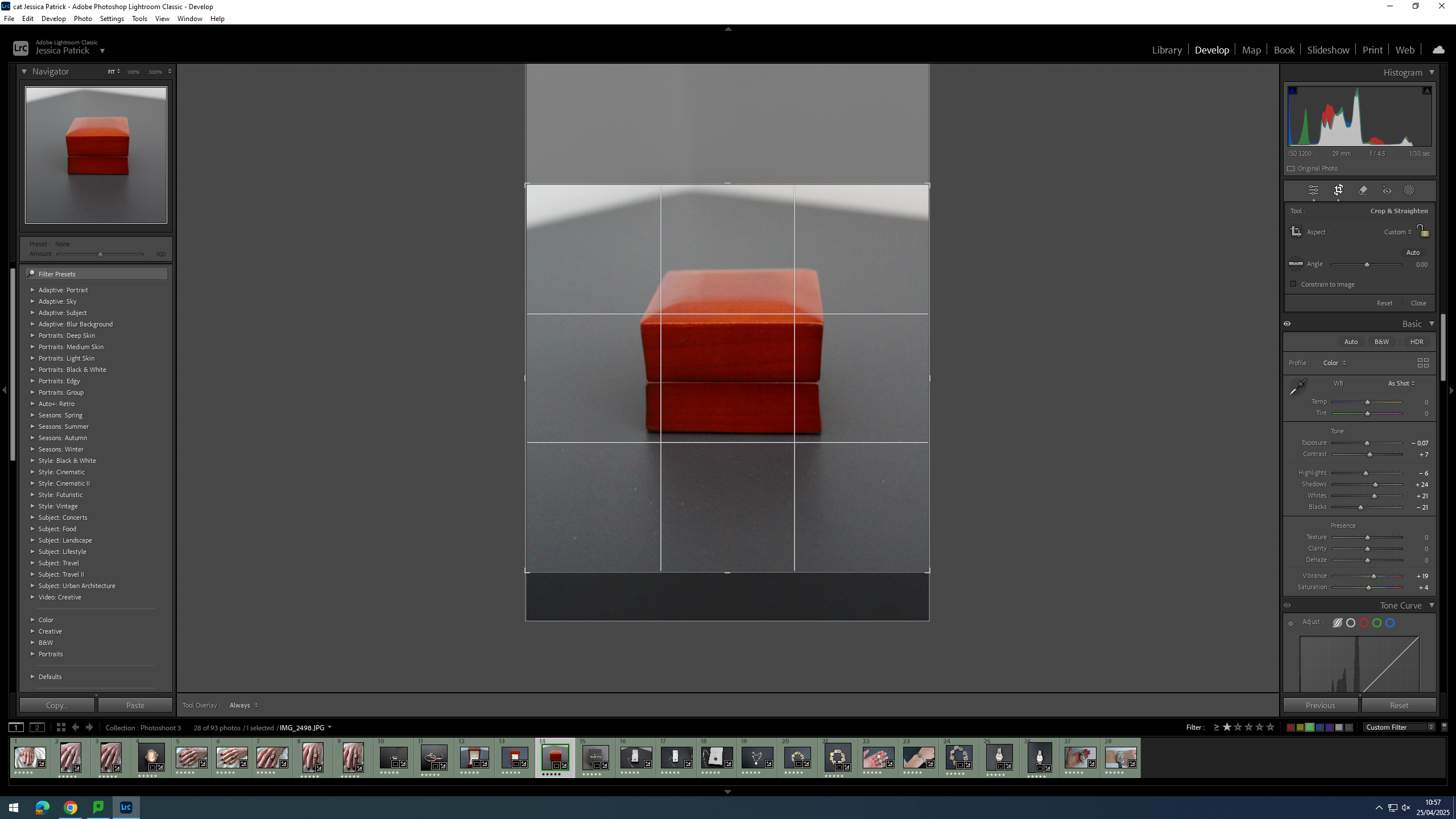
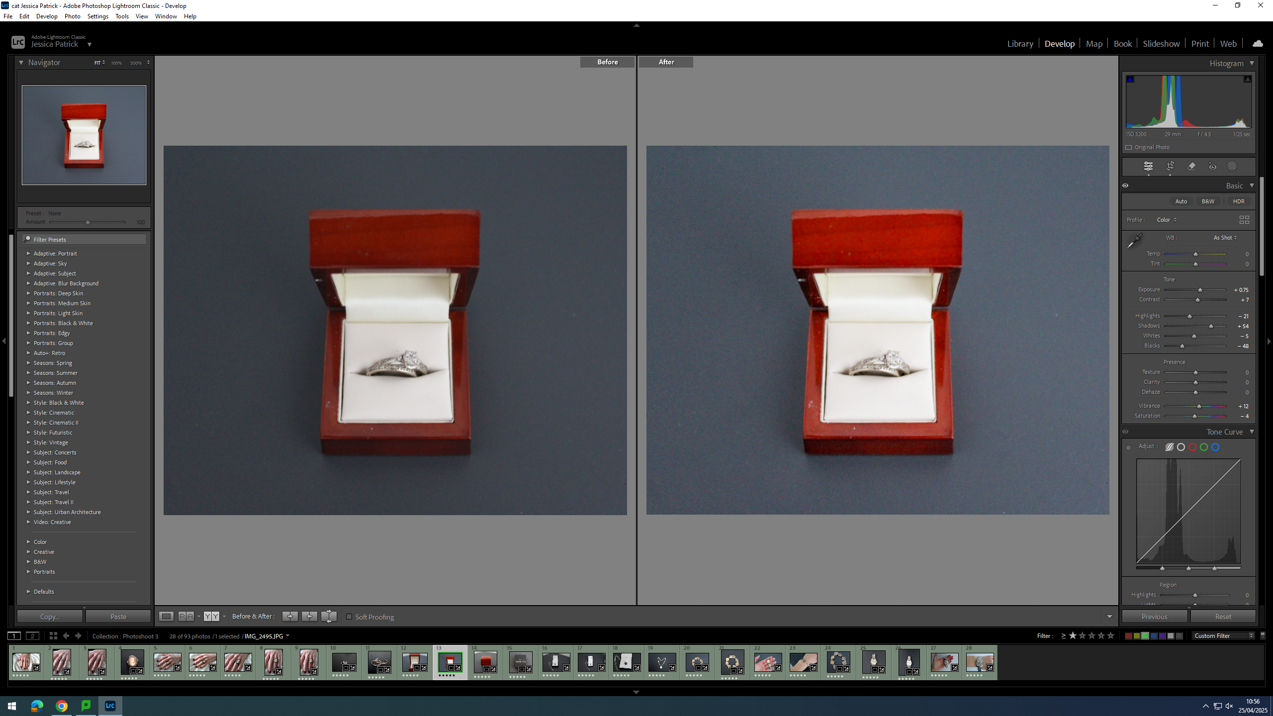
Firstly, I cropped the image slightly, because I manipulated the angle of the image, so that the wedding ring box was straight on, instead of slanted to one side.
Then, I edited this image by increasing the exposure, contrast, shadows, vibrancy and saturation, while decreasing the highlights, whites and blacks. I did this, so that the image was slightly more exposed and more vibrant.
Firstly, I cropped this image by manipulating the angle of the image, so that the wedding ring box was centre in the frame and positioned straight, instead of slanted.
Then, I edited this image by increasing the exposure, contrast, shadows and vibrancy, while decreasing the whites, highlights, blacks and saturation. I did this, so that the image would be slightly more exposed and vibrant.
First, I cropped this image, so that the wedding ring box would be in the centre of the frame.
Then, I edited this image by increasing the contrast, shadows, whites, vibrancy and saturation, while decreasing the exposure and highlights. I did this, so that the image was slightly more vibrant.
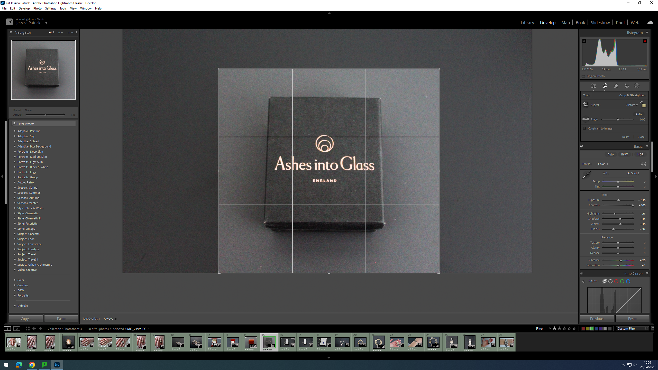
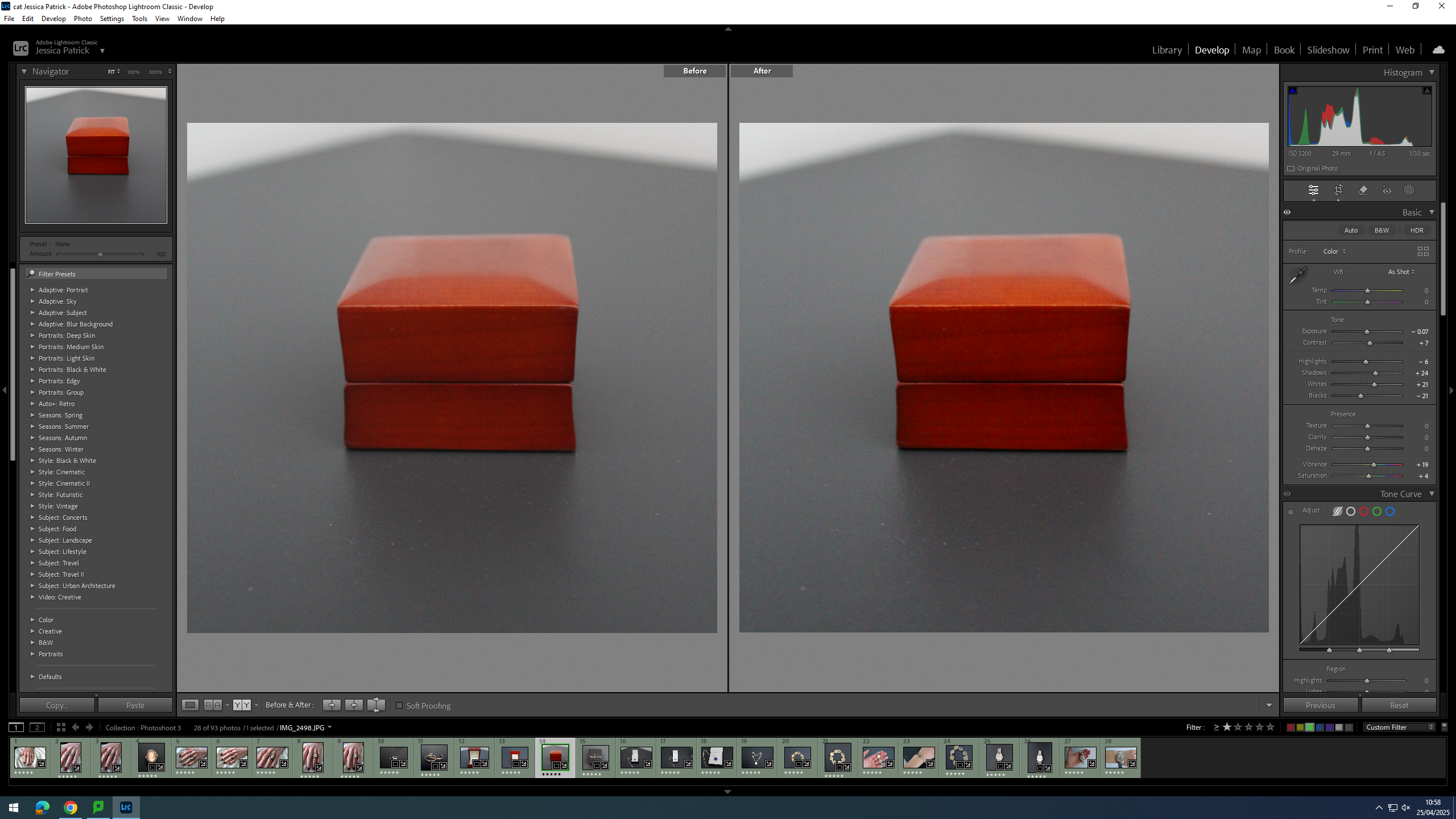
Firstly, I cropped this image, so that the jewellery box would be in the centre of the frame.
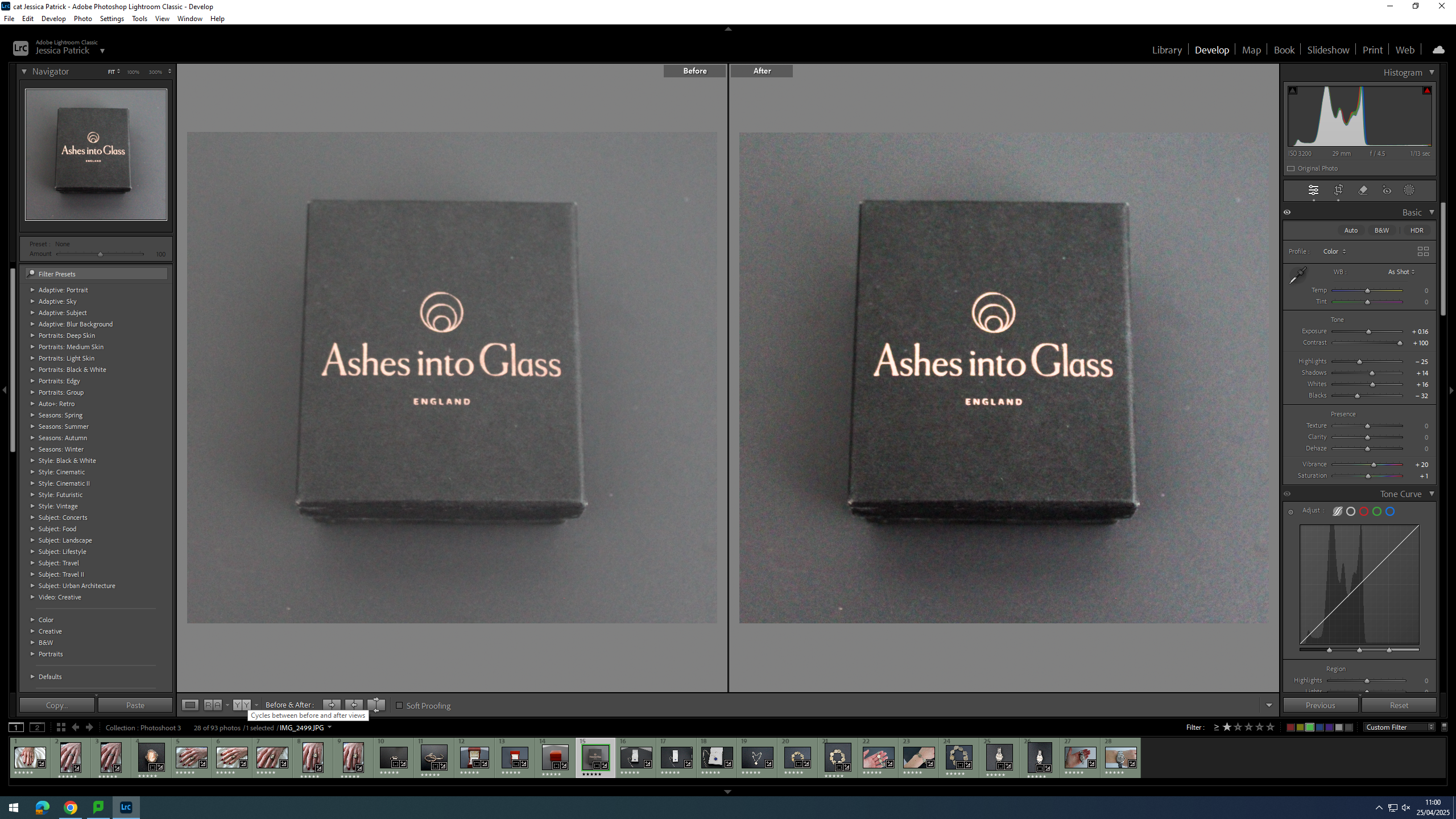
Then, I edited this image by increasing the exposure, contrast, shadows, whites, vibrancy and saturation, while decreasing the highlights and blacks. I did this, so the jewellery box would stand out more from the background, as they are very similar colours.
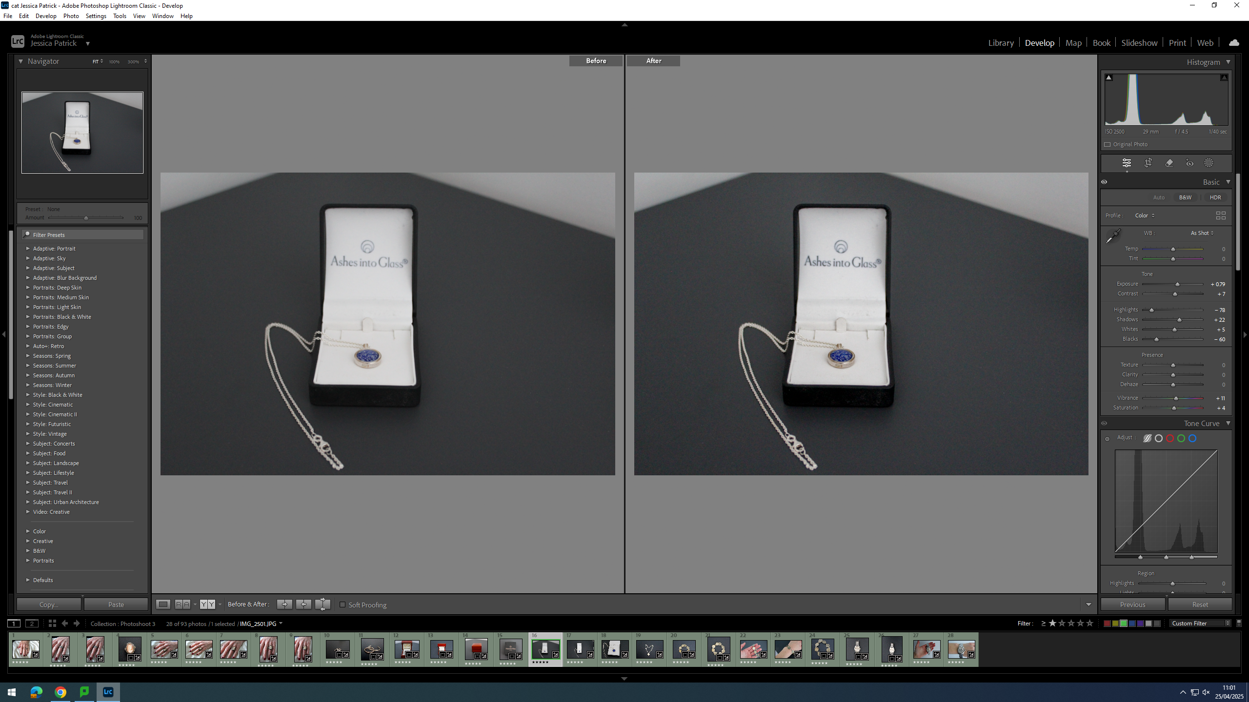
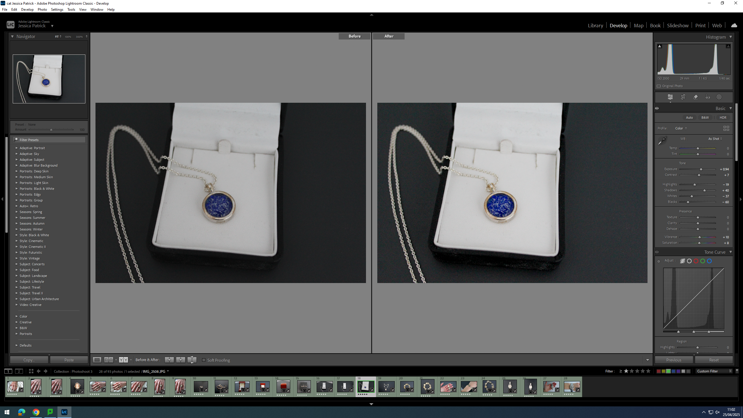
I edited this image by increasing the exposure, contrast, whites, shadows, vibrancy and saturation, while decreasing the highlights and blacks. I did this, so that t more contrast and the necklace was more vibrant and stood out more.
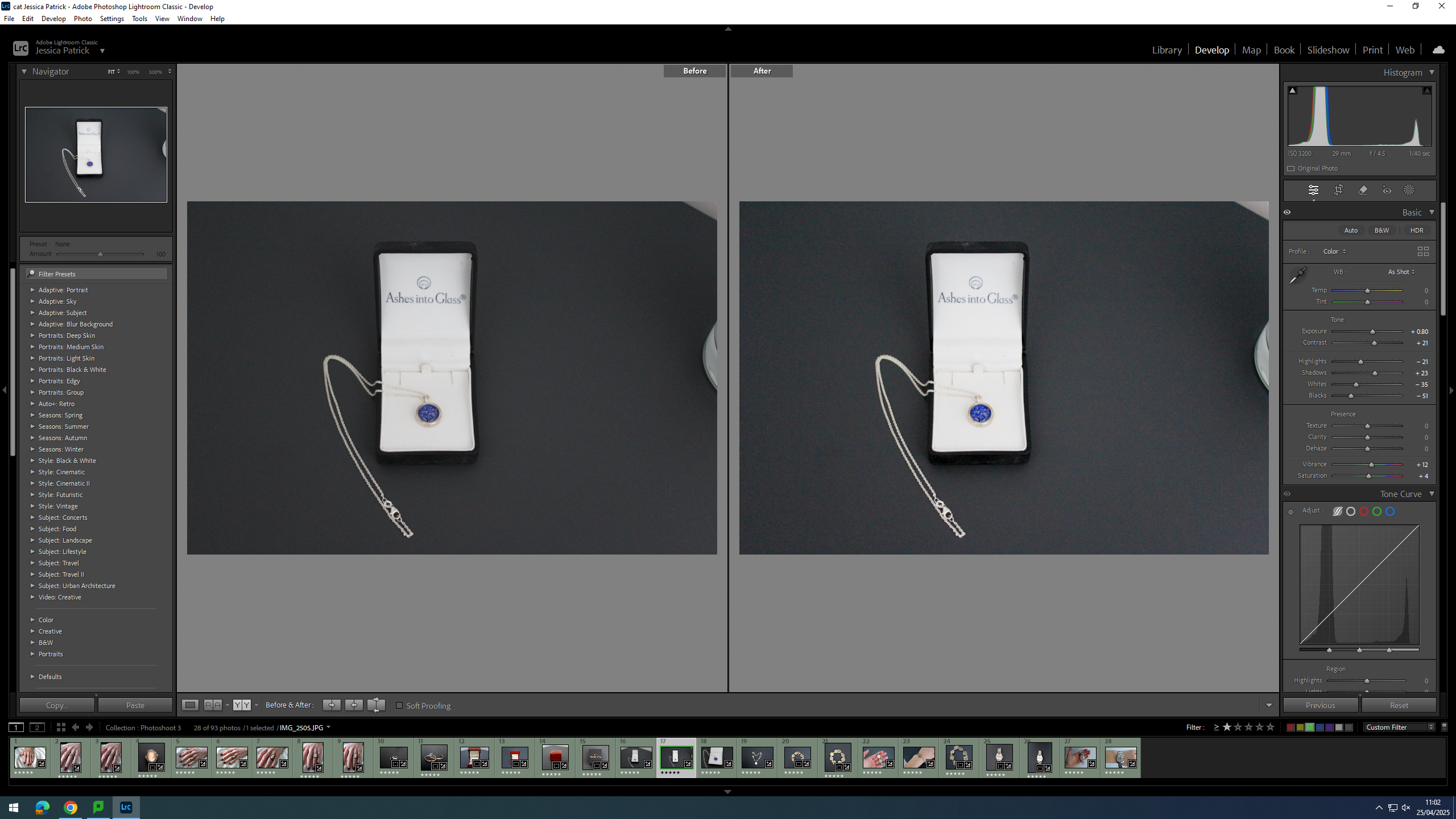
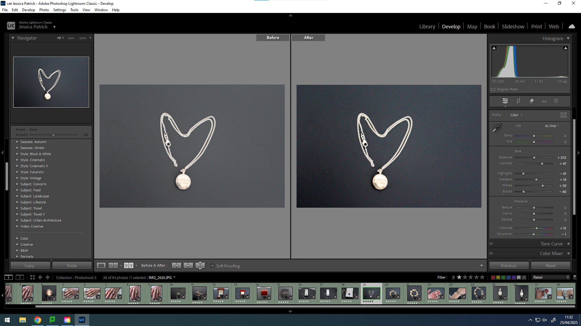
I edited both these images by increasing the exposure, contrast, shadows, whites, vibrancy and saturation, while decreasing the highlights, whites and blacks. I did this, so that there were more dark tones to create more contrast and so the necklace was more vibrant.
I edited this image by increasing the exposure, contrast, shadows, whites and vibrancy, while decreasing the highlights, blacks and saturation. I did this, so that the background was more black, so it would create contrast between the background and the necklace. I also wanted the necklace to look brighter/ shinier.
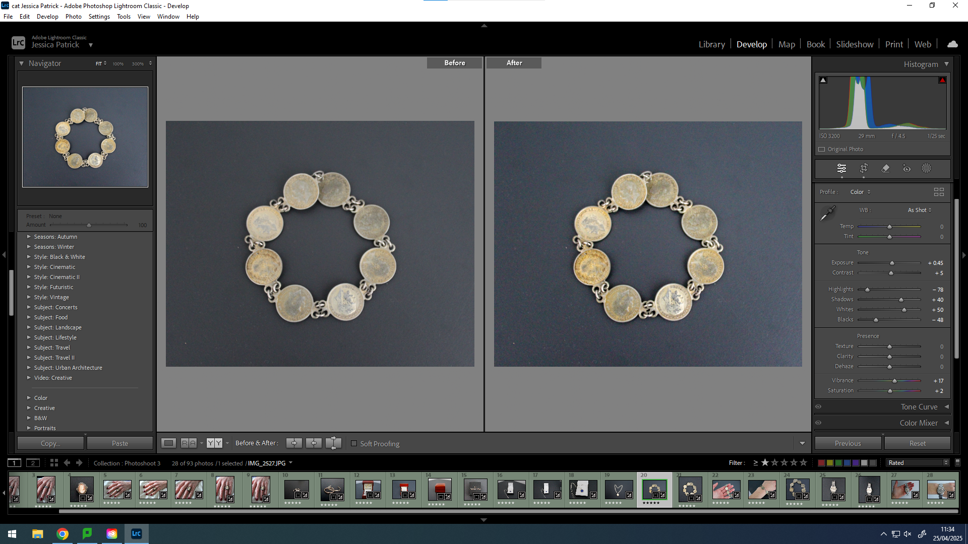
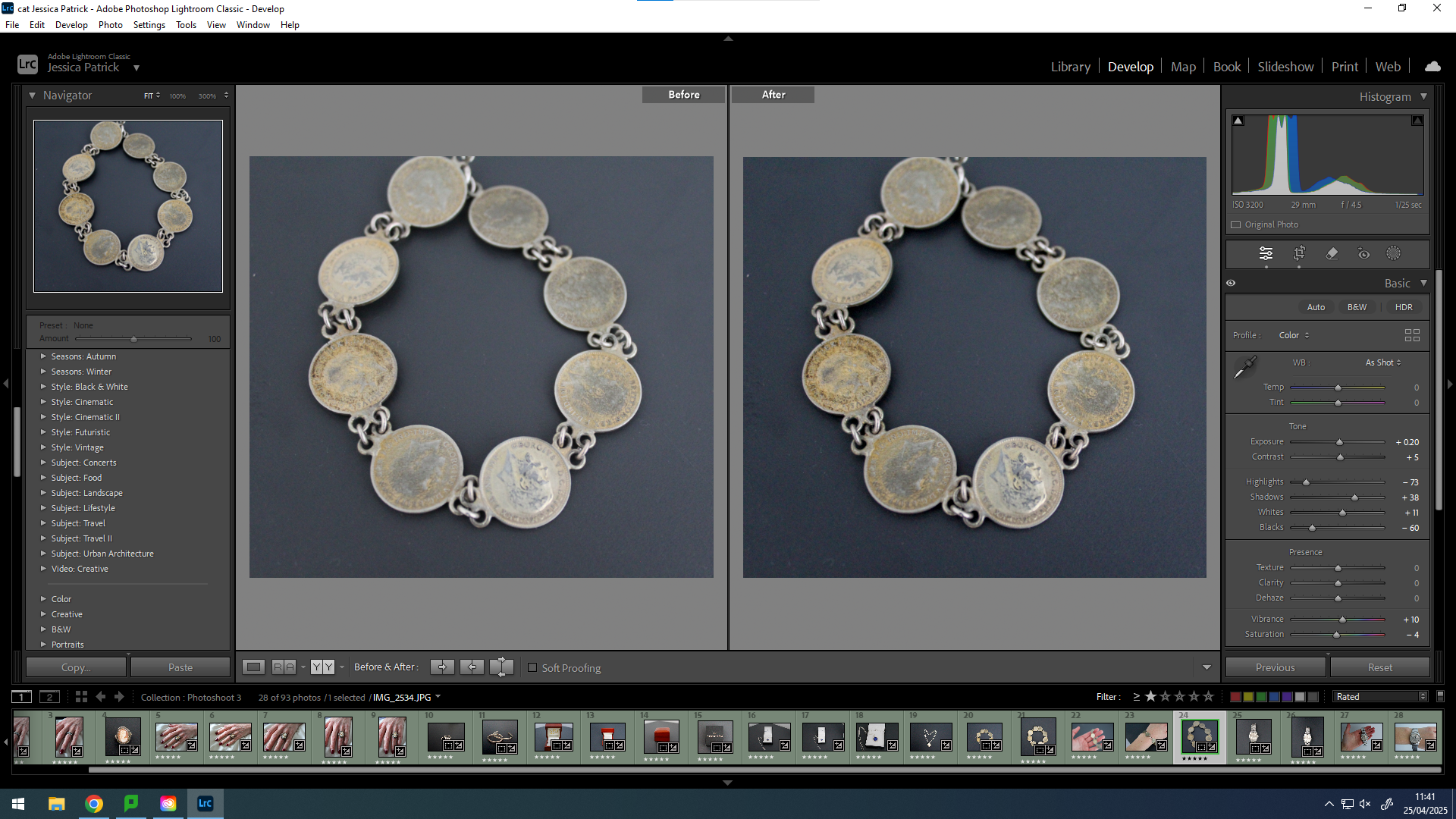
I edited this image by increasing the exposure, contrast, shadows, whites, vibrancy and saturation, while decreasing the highlights and blacks. I did this, so that the background was more black to create contrast between it and the bracelet and so the bracelet was more vibrant with a more rustic look.
I edited this image by increasing the exposure, contrast, shadows, whites and vibrancy, while decreasing the highlights and blacks. I did this, so that the image would be more vibrant.
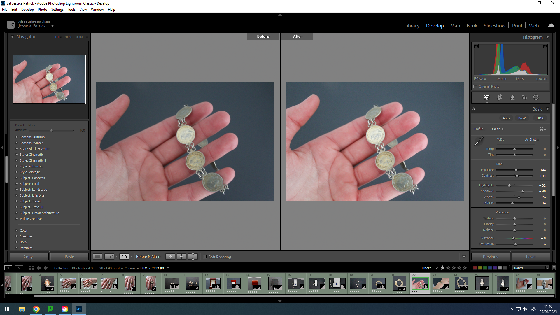
I edited this image by increasing the exposure, contrast, shadows, whites and vibrancy, while decreasing the highlights, blacks and saturation. I did this, so that the background would be more black, which would create more contrast between the background and the bracelet. Also to make the bracelet more vibrant and detailed.
I edited this by increasing the exposure, contrast, shadows, whites and vibrancy, while decreasing the highlights, blacks and saturation. I did this, so that the image would be slightly more exposed and have more contrast.
I edited this image by increasing the contrast, shadows, whites vibrancy and saturation, while decreasing the exposure, highlights and blacks. I did this, so that the image would be more vibrant.
I edited this image by increasing the exposure, contrast, shadows, whites, vibrancy and saturation, while decreasing the highlights and blacks. I did this, so that the image would be slightly more exposed and vibrant.