
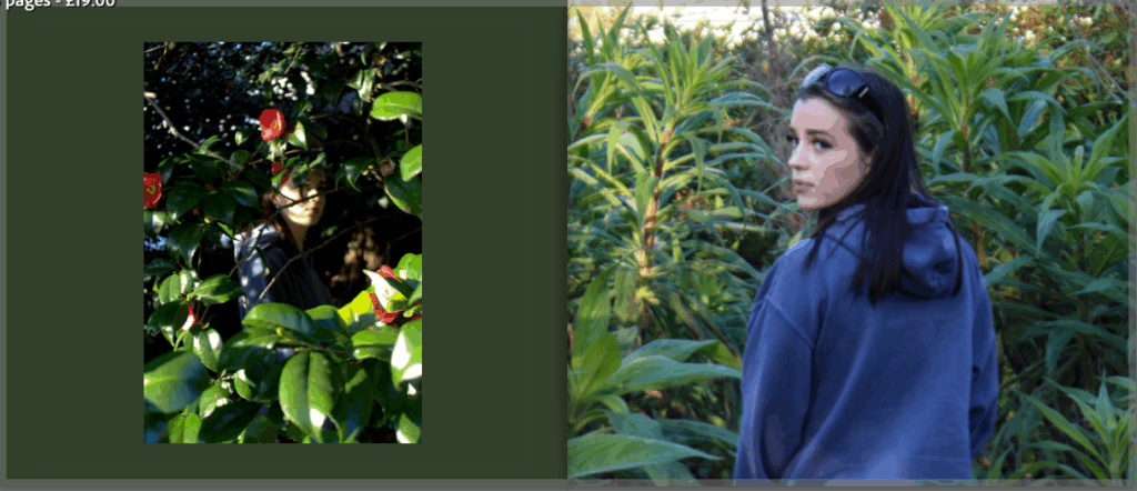
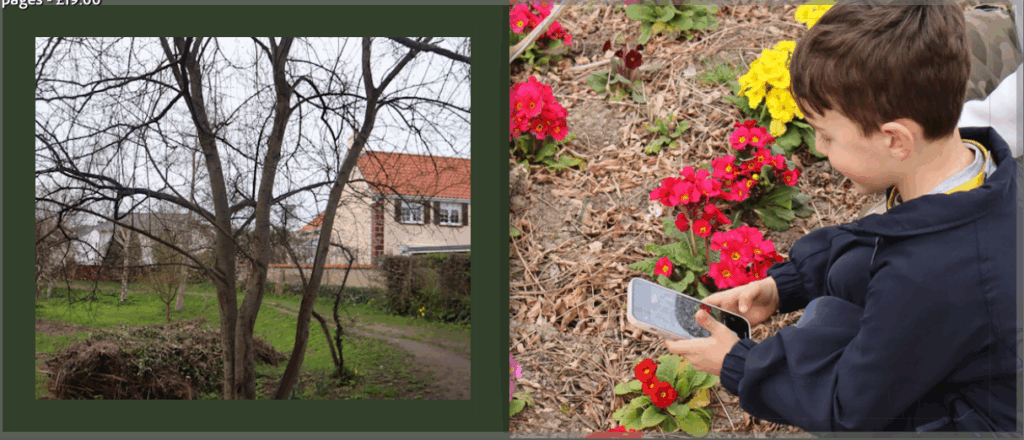
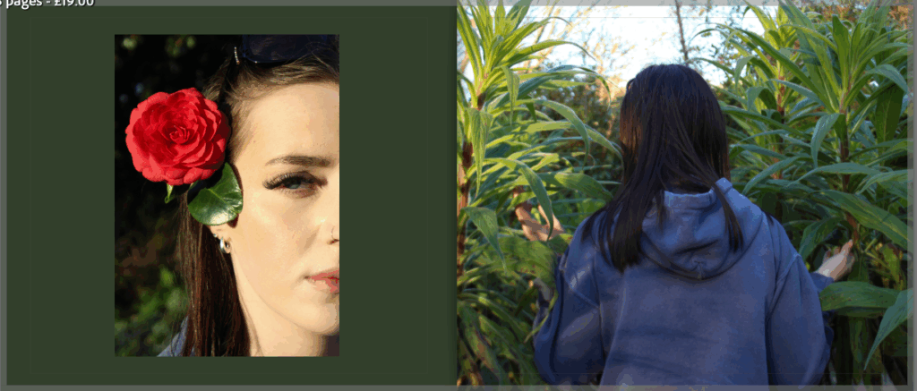
For this project I have decided to make a photobook as well as mounting my final images. This book consists of some of the same and some different images from across my project. The reason I have made a photobook is to be able to present some more images from my photoshoots, and to show some photographs I have already printed but in a different layout or with different editing styles.
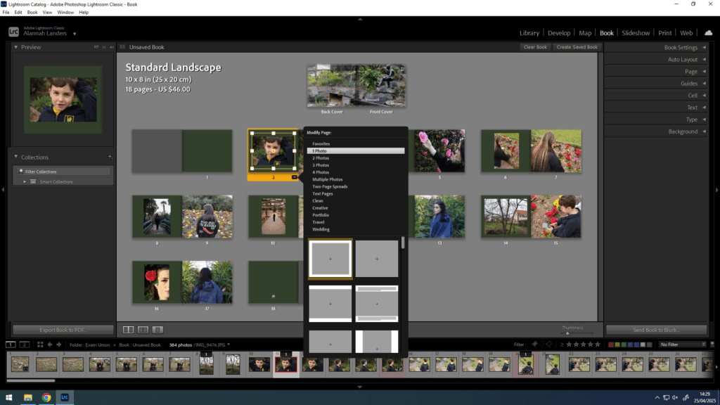
To start, I created the book in Lightroom and went through my images deciding which ones to keep or discard. Once I had chosen my first draft of photographs, I moved them around into different places next to different images. Eventually, when I had chosen my final images along with their placements, I experimented with different ways that the image could be placed on a page, for example if I wanted the photograph to cover a whole page or have a border around it.
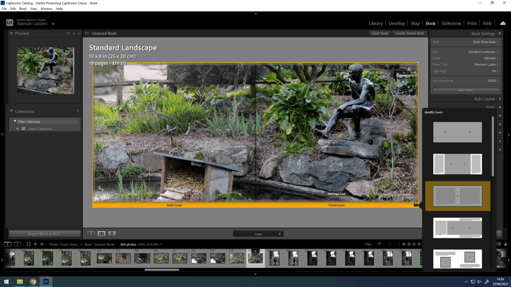
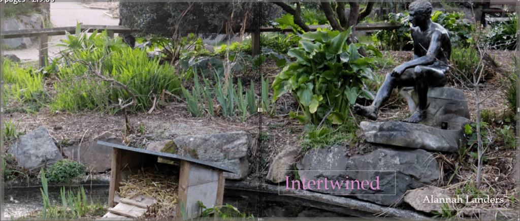
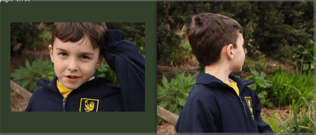
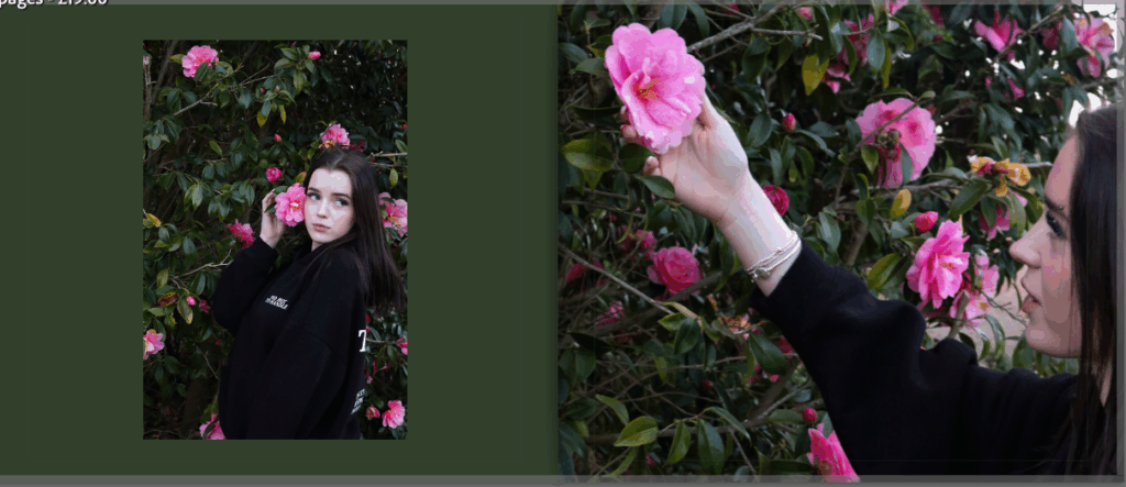
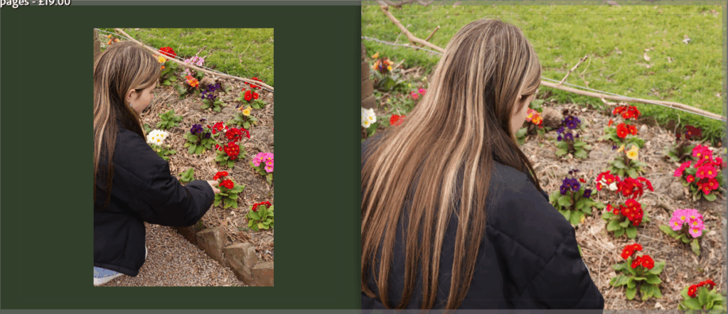
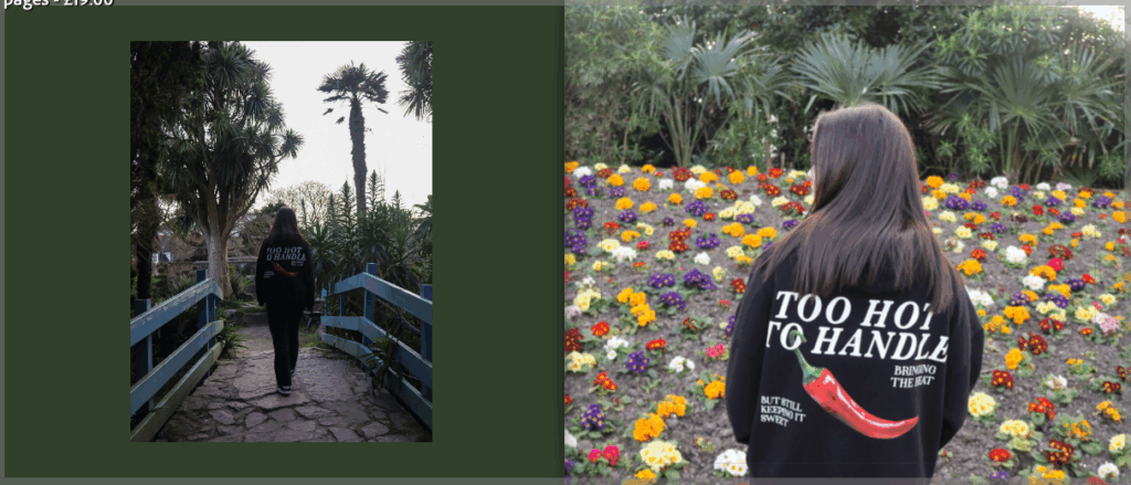
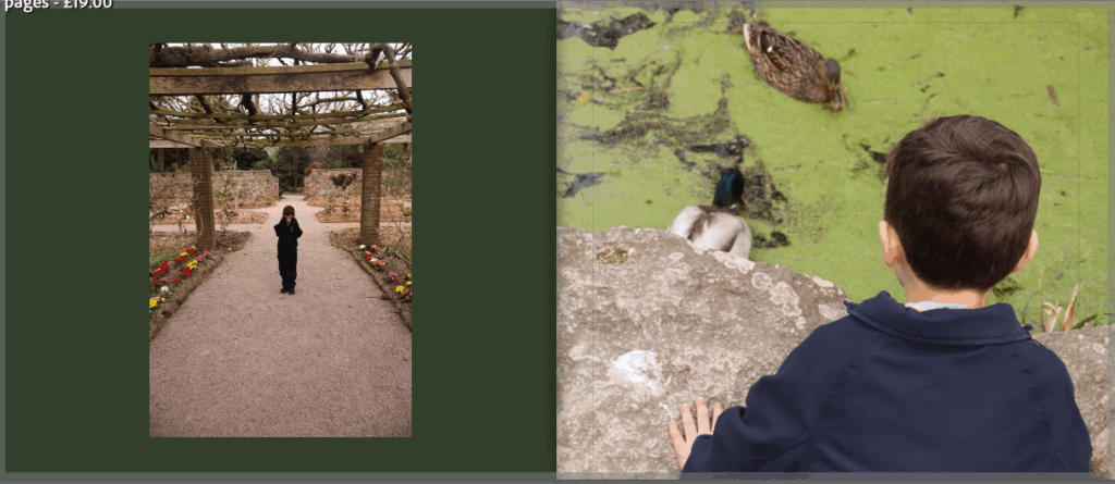
Once the order and positionings were complete, I then went on to create the front and back cover. After trying different images, some being a double page spread, or two individual images for each side, I decided to choose the image below across both the front and back cover to keep it consistent. I also went on to change the background colour of the pages as I found that the white pages didn’t work as well as I had hoped. So, after trying a number of different colours and shades, I chose a darker green colour as it ties in with the green nature in the photographs, letting the brighter colours stand out.
Finally, I chose a title and placement for the title to finish up the whole book. The title is ‘intertwined’ to represent the images all aiming to portray the unity between nature and humankind and how they are and could be more intertwined with one another.
My final photobook:

Evaluation
I really like how this photobook turned out, I think the layout of the images being in a consistent pattern presents the photographs in an organised but eye-catching way. Making this photobook, I was able to present images that I haven’t already printed and mounted on foam board or black card, allowing more of my photographs to be shown. I will print this photobook with a soft cover, using premium lustre paper as I feel that the images will look best with the glossed sheets.
I feel that this photobook has successfully followed my narrative of this project which was the photograph and capture the union between nature and humankind. I think that the flow of images follows this nicely as well as the dark green colour of the pages being a naturalistic colour to consistently portray this narrative.