
The zine is overall quite small with 16 pages.
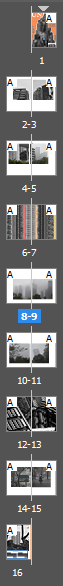
Final layout:
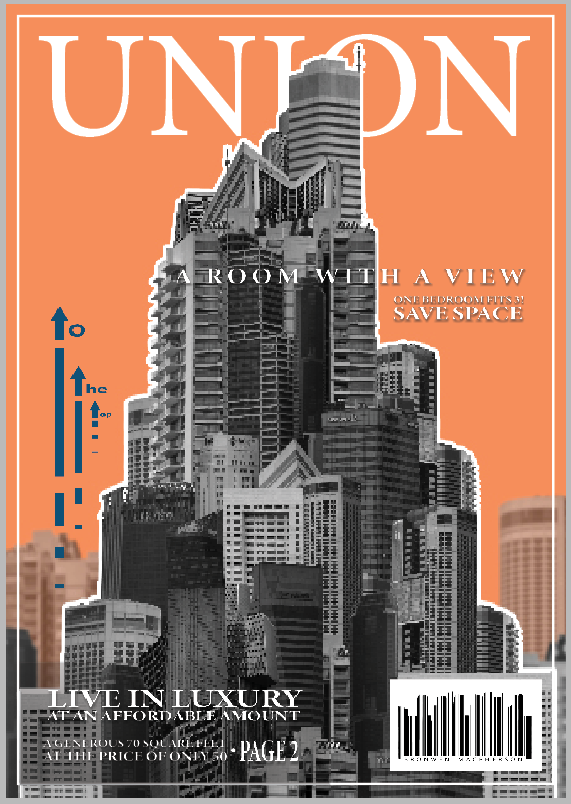
The cover is the only part of the book that resembles a magazine. I had a clear vision for how I wanted the cover to turn out which I think helped it turn out well. I tried to make it appear like a magazine that you would purchase despite the rest of the zine made to appear more like a free hound out to sell a product.
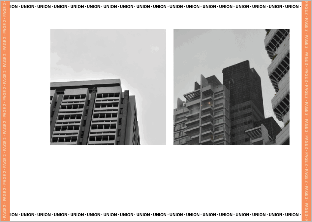
I wanted to start with the clearest pictures first which were these two I took in the style of Kenneth Frederick where the angle encourages upward growth. I matched these two images also due to their similar angles, shapes and lighting.
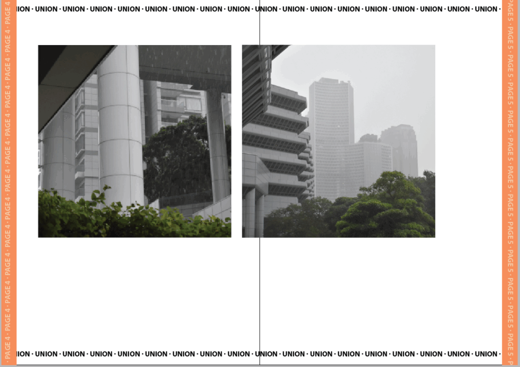
In the next pair the weather had begun to change for the worse. I matched these two because they had a similar foreground and all the buildings were a similar style.
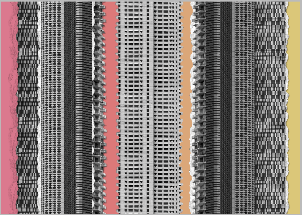
For the first intersection I wanted to use the most colourful edit. I decided to extend this edit and make it look like a more traditional collage by adding colour card and tearing. I think this captures the chaotic miss-match of densely build locations as well as identity-less advertising.
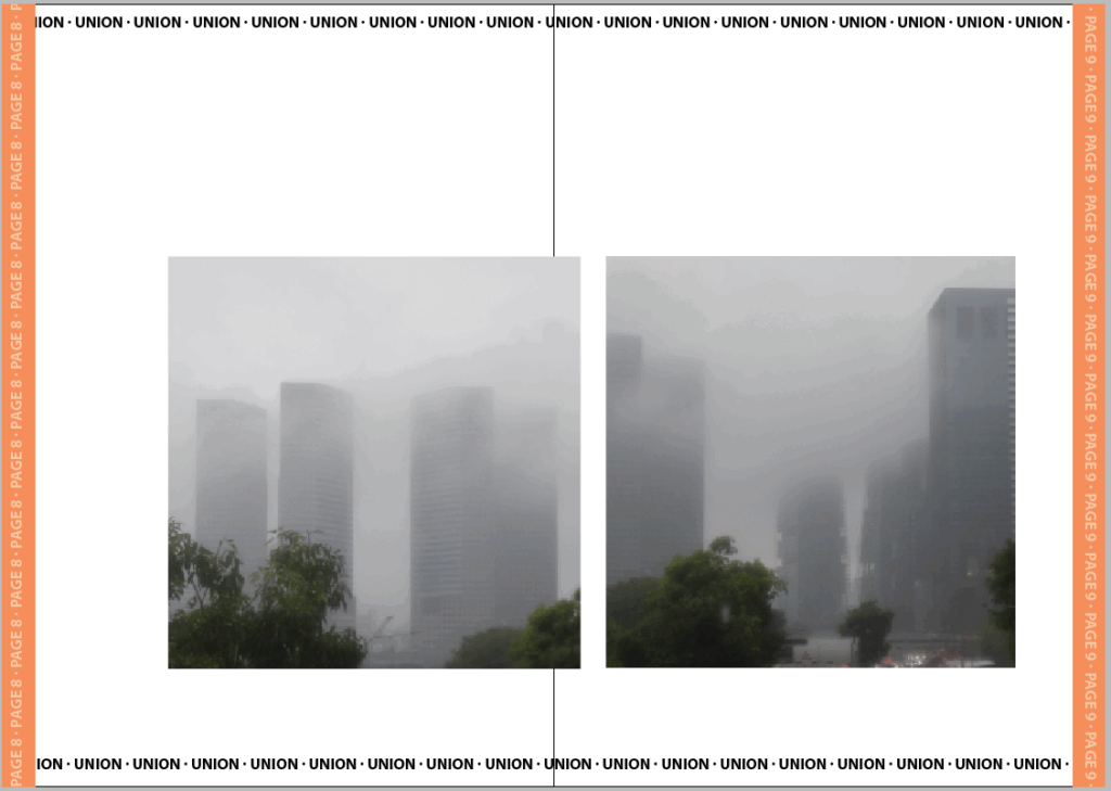
I matched these two images together because of their similar fog levels. I didn’t put these as the last buildings however because they are still identifiable buildings .
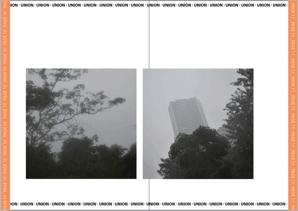
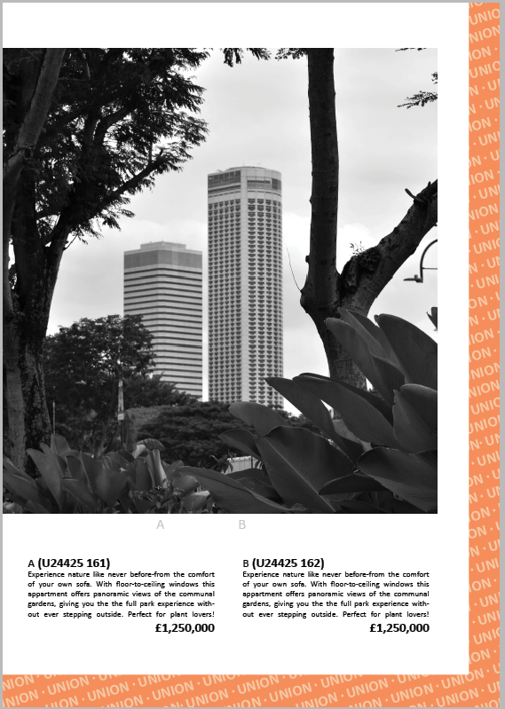
For the final buildings I put these two last because there is less focus on the buildings and more on the space around with the trees and even a fairest wheel. I matched both of these because they are equally foggy and focus the least on the buildings.

For the second intersection I chose the messier and duller of the two. I think that the overwhelming choice of buildings is representative of the choice pushed by advertisements.
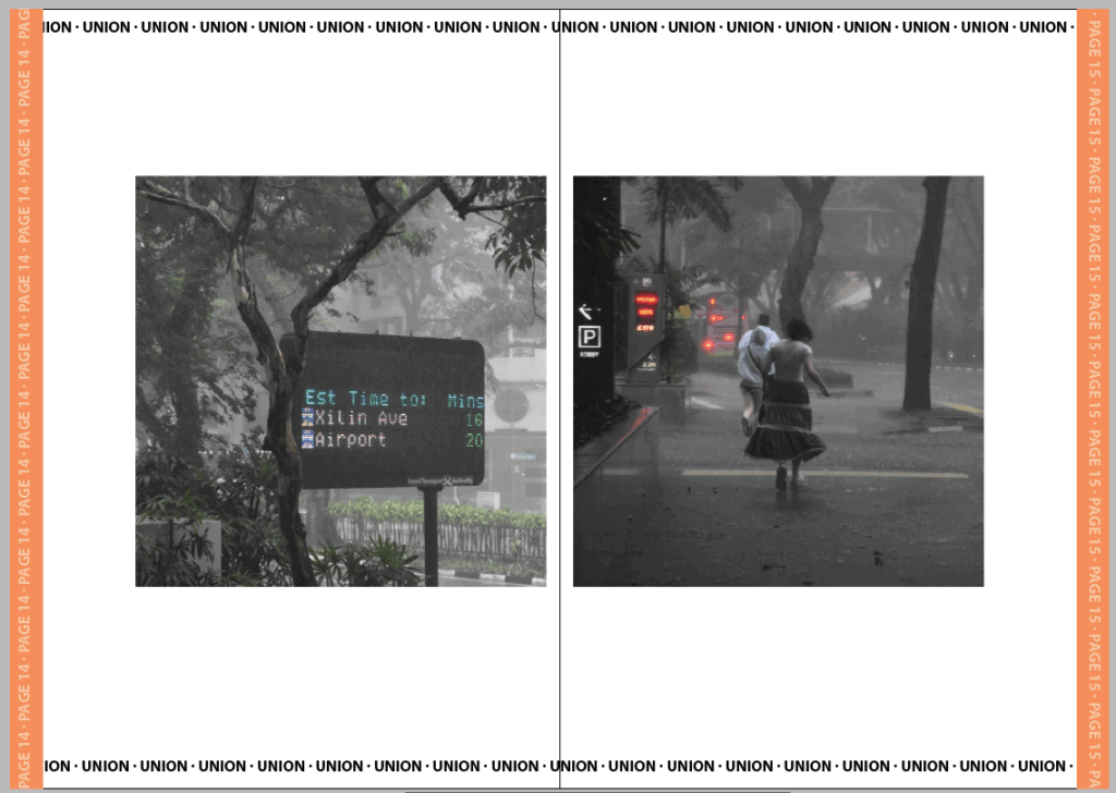
For the final pair I chose these two because they both have colour and show the weather effects on the ground like its been disillusioned by the buildings. They show leaving both with the mention of an airport and visual que of running. I tried to set it up like they’re running from the obsceneness of the cities/effects they’ve caused such as poorer weather.
For the final page I wanted to contrast it with the previous by using another advert but this time clearly marked as one. I like this juxtaposition and Its complete missing the point or ignorance of the rest of the images isn’t an irregular occurrence in marketing.
Evaluation
I think the zine turned out well. If I was going to adapt it further I would have created actual adverts for the intersections and maybe even adjusted the background so the pages didn’t look so blank. I don’t mind this space though as I think it helps the images stand out better but it is something I would have liked to experiment with further. The strongest section of the zine is defiantly the cover page because I spent much longer on each detail. Had I made the zine any longer I think I would have instead tried making a full A4 photobook instead where I could add some additional layout and sizes of images but for the small selection I made I think keeping each image to the same dimensions helps make the zine look more cohesive. I made sure to arrange each set of images differently also so that each page feels unique despite having the same template otherwise which I do think was a good choice as my previous draft with all the images arranged the same felt repetitive and tedious to get through. I did like the dullness of the repletion in relation to the narrative of the zine however I figured I could still tell the same narrative while making the arrangements more interesting.