
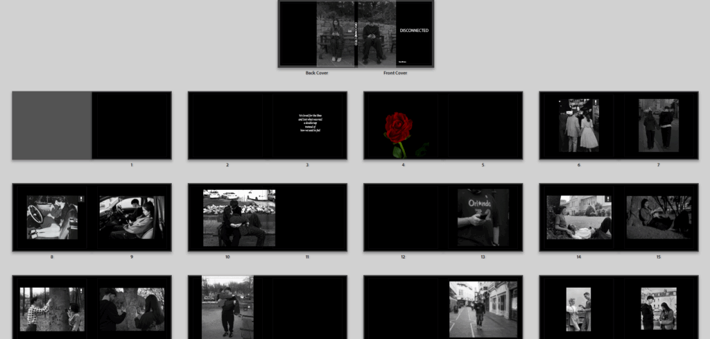
This is the final layout of my photobook, I do really like how it turned out. My photobook is a symbolic piece of work all about how social media ruined and killed romance, I show this throughout the book of comparisons photos I took, photos of street photography, and staged photos of my friends posting and focuses all on social media and not their partner. After about five photoshoots and over 700 photos, I came out with a 44 page book, I would like to say I’m very proud of and clearly shows what I intending to demonstrate through photography and photography skills. Of course there has been some hiccups through the way, especially when making my photobook, and starting to criticise how it looked, but that’s all now going to be part of my evaluation.
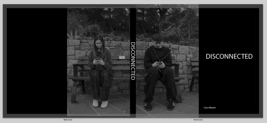
Lets start with my front and back cover. I really wasn’t sure on how I was going to do this, and didn’t think any of my images would work on the front and back cover, I firstly wanted to go for one image of the couple holding hands, or taking a photo of the view so they are on their phones but between the couple they are split up by the gap from the spine. Then I thought to have a completely black cover which just looked very plain and boring and I am very opposite to that, I tried making it the background, or playing around with images, and well if anyone has used adobe Lightroom to make a book they know that sometimes it just does not go well, I had glitches all over the place ands I was stressing out. Then I stumbled across these two images I took in one of my photoshoots, which I did not end up using in the actual book, and I thought hey these two together would really work, I wont need to mess around making them a background or attempting to make the photo perfectly cross over the spine. it took a little bit of editing to make the photos perfectly match the black and white editing, the contrast and exposure, once I completed that they still weren’t a specific match and needed to be slightly cropped so they fit together like puzzle pieces. when the title wasn’t on the spine is looked a bit odd having a black line split the images up, but I knew it would work well once it was actually printed and split up between a real spine instead of looking online which isn’t always the best. I came up with the title by just thinking about my project, I struggled a bit and it was actually one of the last things I decided, I was planning on having a much longer title, but something about the one word ‘disconnected’ hit a lot better. the one word was more powerful and explained the book in one word, as we are disconnected from each other from social media, and disconnected is almost a technology term.
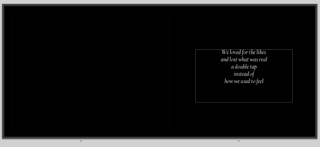
then its the start of my book, with the first pages, I don’t have much to say as this isn’t my photos, but it does have a little poem I made to some up my photobook in a way, saying what is happening now that social media is involved it love. I do like it but not sure its the best poem I have written.
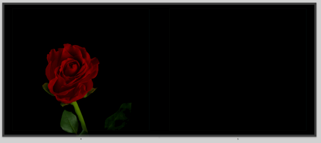
I decided to have this rose as my first image, this was to create a story starter, roses symbolise love, this rose it well, alive, beautiful and full of colour, symbolising the same for love, I wanted to start my story with a strong image of love, to show that once it was strong and powerful, it could still be, but as you continue through my book you will see how that is not so much. I really like this image, because its really bright and stands out with the background, and it looks lonely which I just thought was more powerful having one singular rose stand out to begin my story.
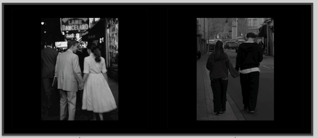
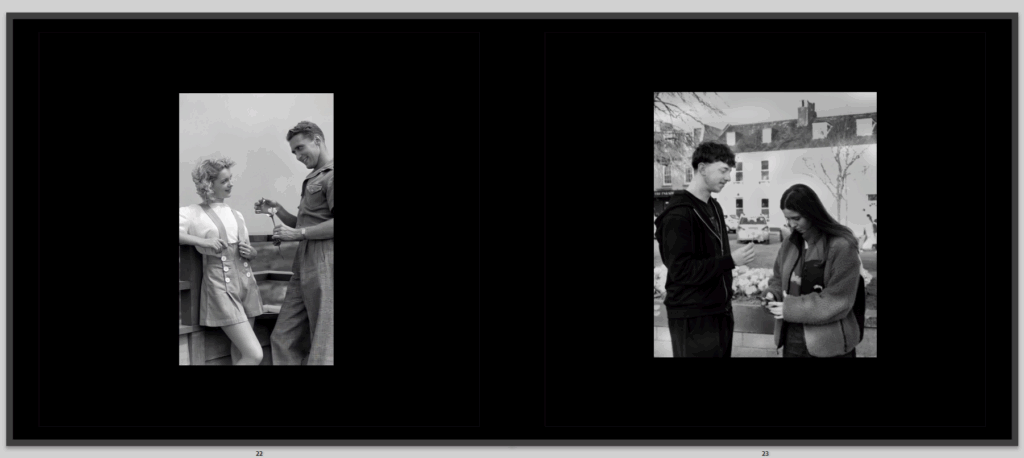
After you turn the page you continue you on to these images, they are a comparison photo, and I really liked my comparison images, as this one very much shows an old image, from the 60’s/70’s of a couple in love ignoring the world around them and focuses on each other, the background is blurred and they are looking lovingly into each others eyes, while holding hands and laughing not involved in their phones or anything else, I wanted to clearly show how love used to be and how we all thought it would be or wanted it to be. As you can see it goes onto my image, right next to it which is a replicate of the other image, also in black and white which I liked as it gives a better affect, but instead of looking lovingly to each other they are walking on their phones not involved in the world around them because they are too focused on their phones, no longer in each others presence, all to know they are a couple is to see they are holding hands, but almost with distance between them. Both the images are places the same on each page perfectly opposite to show a very clear comparison to those who see it.
Then I moved on to this second comparison, again giving the same vibe as before which is what all my comparison images do, I think these ones go particularly well together because apart from the difference in sky they match quite well with their colourings with the same deep contrast of lightness from the skin and darkness from the car and clothes, I also liked that both the men are wearing black and the women wearing grey, to make it even more symmetrical.
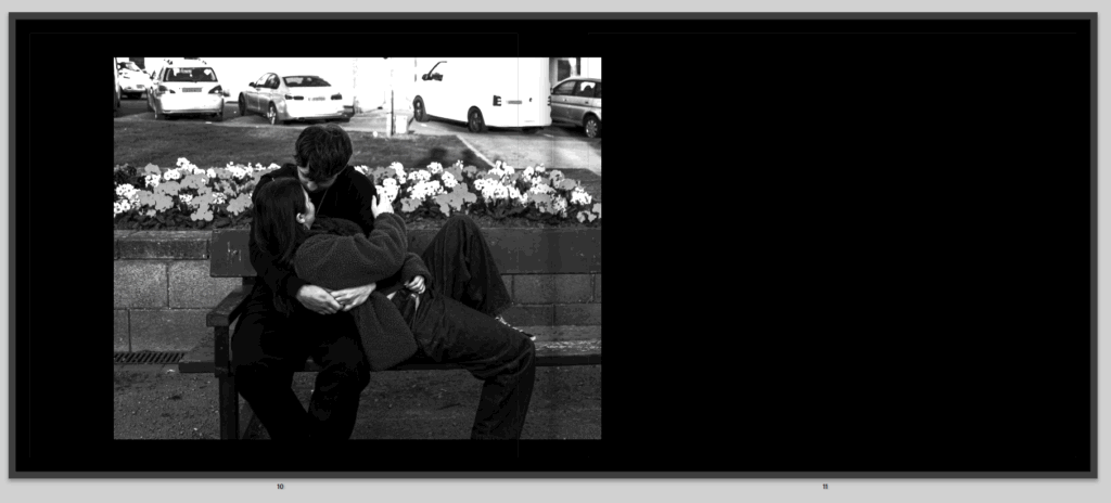
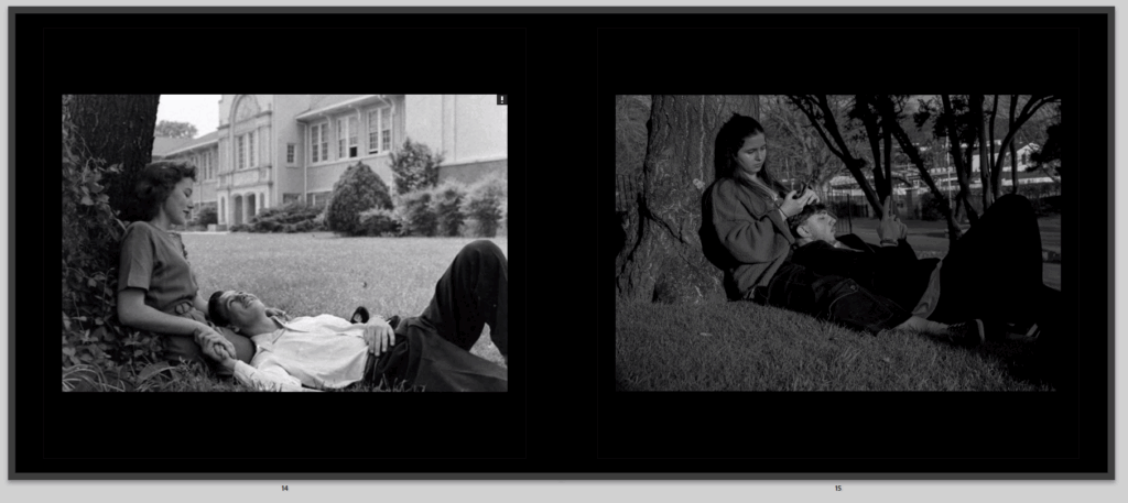
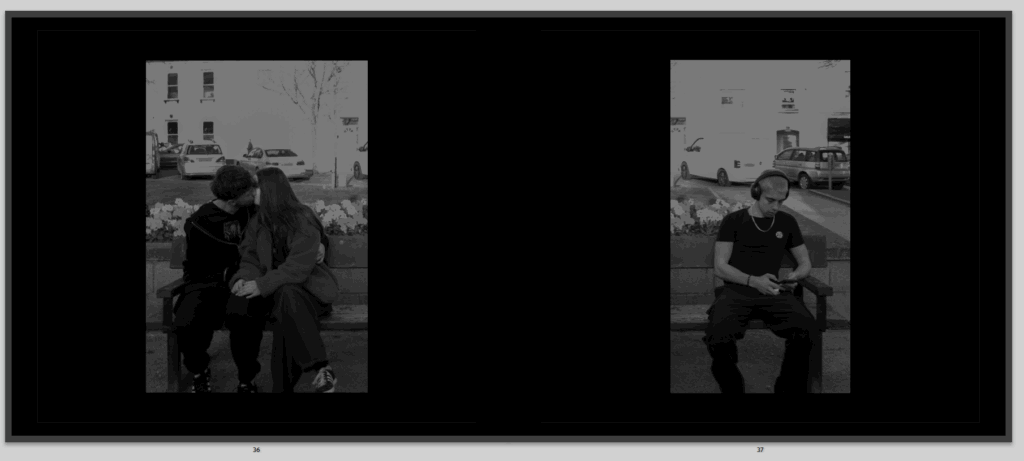
I then decided to break up the comparisons to not have to all at once because then I think the book looked a bit clunky and odd so added in a sequence to make the book flow better and show more of my images, and also have stories within stories, leading to the same outcome, like as you can see here this image comes in on mainly the left side of the pages, where a couple look very in love and are cuddling to and kissing to show their romance, they are the start of the book to show the strength and love of romance that is still around or that has been and is slowly dying depending on how the viewer takes it in.
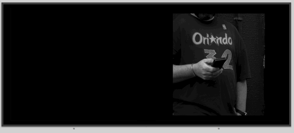
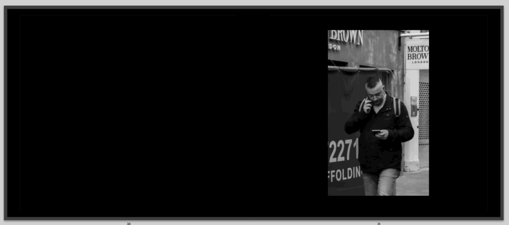
Then on the right side and next pages, I have a photo of a man on his phone, this isn’t my favourite photo but it is here to also continue to tell the story of how social media is slowly sneaking its way into our lives, destroying our romance.
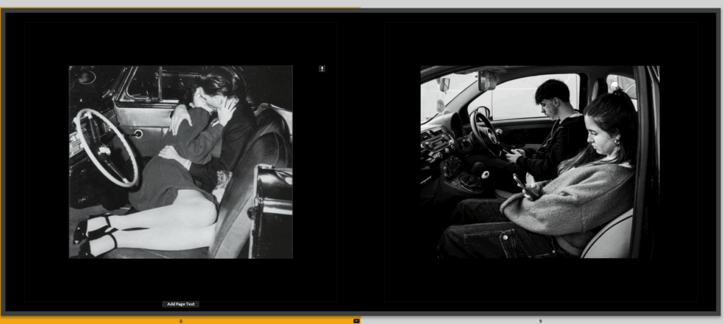
We then go back to comparisons, to continue that sequence of two comparisons then a romantic photo and then a phone photo, I really liked this comparison once again having the images the exact same opposite, only slight differences between them
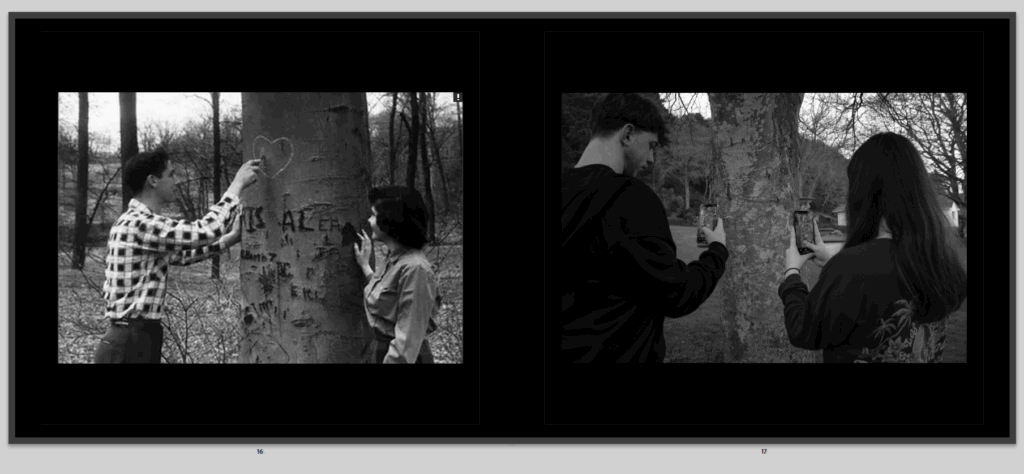
Then we move onto another comparison where in this one it shows a couple carving their heart together, knowing that only those two will know what it means and other people will just see it and wonder who this couple was, when in my photo its the same but they are taking a photo of their heart to post on social media to let the whole world see their cute private moment which now because of social media i snot so private, the main thing I don’t like about my image is because its not clear enough to see the heart, it does not stand out enough, like it does in the other photo, but you can see it an because of the first image I think it makes it more clear what is going on.

We then move on to another romantic picture of this couple showing that love is alive, and well, but not for long.
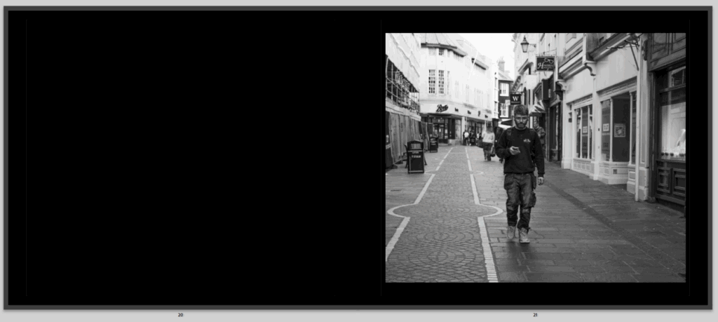
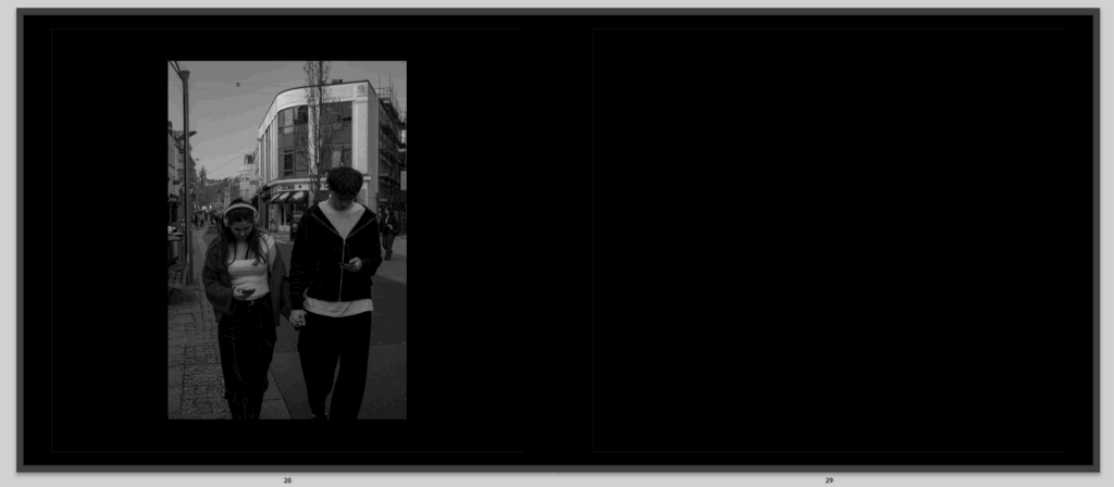
Then on the right side is more street photography of once again another person walking on their phone oblivious to the world around them, continuing to show the poisonous affect of social media that is creeping upon us that we don’t even realise, and that I hope to show throughout my book as a I realised it even more when taking the street photography, the one factor I don’t love of this image is that its quite bright, and I did have it a lot darker before, but once I printed some of my images for the print folder and in my last book I made a lot came out a lot darker then how they looked on the screen, so to be safe I brightened most of my images.
Then I have my final comparison which I actually my least favourite comparison and I wasn’t sure on but I mainly like all my comparison photos, but I don’t love the first photo, but there isn’t anything I can really change about it and I wasn’t planning on using it, I did have it saved for just in case and inspiration then accidentally I made a perfect comparison image. I would liked if I had another one of giving a slower and instead of her just on her phone ignoring him she is taking a photo to post on social media but I liked this one as well and its almost coincidental on how it came to be. I also don’t love my image because of how bright it is and it isn’t particularly clear that there is s a flower there, but I made it brighter for the book when it is printed and after lots of editing I couldn’t really find a way I wanted it to go apart from this.
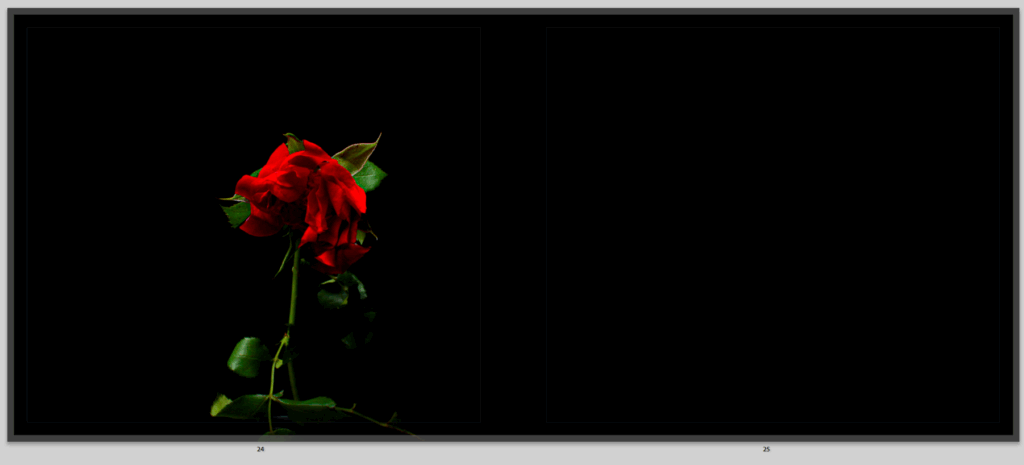
After that I have this image which shows the same rose, but now it is slowly starting to die just like romance which I think is really good and I actually really like this page and genuinely this idea in my book, and if I had more photos or pages I would have added this more.
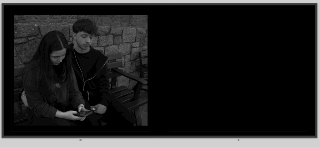
Then these pages, which again tell their own story and have their own symmetry, to me it is quite clear, and shows the girl seeing a couple on social media and getting jealous or comparing her relationship to that, it shows that one couple isn’t very private either, so she decided to take the exact same image with her boyfriend, to also make other people feel the same way she did or show that her relationship is cute just like how other people show theirs. but no one sees the other side of it.
Then we go back to the loving couple and sequence we had throughout the book but only now the couple is not so loving and look more involved in their phones, and that’s showing how social media has come into their relationship and suddenly its not just about them two being together its about everything else.
And right after those pages is this one, that shows a man walking texting on one phone and calling on the other which I think fit well because as you see people on their phones and the couple slowly more involved on their phones and the rose slowly dying from social media, this man is on two phones showing how social media is completely surrounding us.
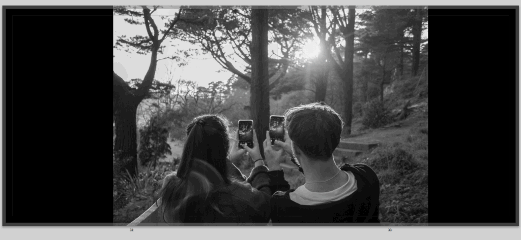
Then this image, which I just really like as an image in general the couple are together, looking at a beautiful view but instead of look at this view and saving this cute moment they are taking photos ready to post on social media and continue to be involved by their phones, I also really like how I decided to present it in the image, because it is full bleed but the image is split in half by the fold of the book to continue to show how they are disconnected and split apart from social media.
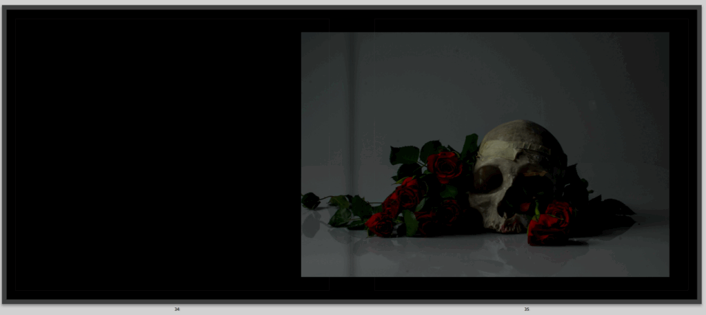
Then this image, which the image I genuinely really like as it shows death and love together symbolising love is dead or just showing opposites together which I think gives a powerful metaphor to anyone who sees it, I don’t love it here in the book think it is randomly placed and really debating on whether it stays in or not but I like the image a little too much and think it shows so much using symbolism which is a massive part of my book.
After is these images, which where taken together, of one guy sitting alone and single looking for love, sat on his phone slightly resenting the relationship he sees around him, wondering how he can find that him self, and also slightly represent that depending on all the social media is how that couple might end up. I do like how the images are opposites of each other on the page they are perfectly symmetrical and show a very clear opposite images.
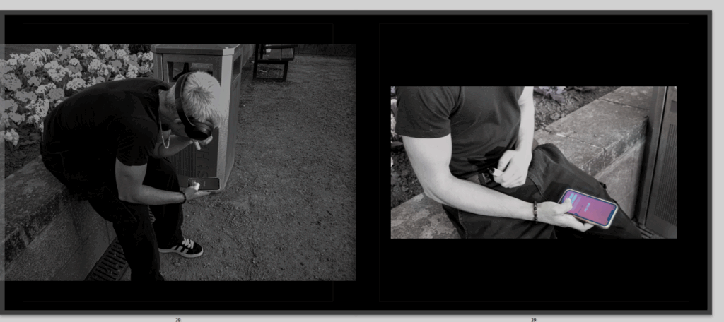
then these images, of the same alone an. who sat on his phone not going out to look for love in reality but resorting to a dating app, so using more social media thinking that it isn’t fake and dishonest, when reality you see the real person, but he might be stuck talking to someone through a screen and never knowing what the reality of this person is. I had the first image like that so you can see he’s look on his phone to then have the second image more zoomed in an standing out so you can see what he’s on on his phone.
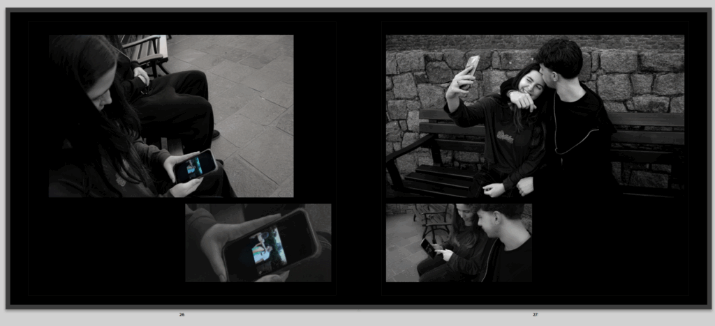
Then this image, which I really like because its that same couple, now with the girl on her phone not only not paying attention and giving affection to her boyfriend but he is also paying attention what’s on her phone because it has made him jealous and paranoid wondering what she is looking at, who she is texting.
Then this final image of the same rose, now completely dead just like love and romance now on the right side of the book, to be closing off the story.
All in all I really like this book, because it shows everything I wanted to and gives a story and sequence throughout, there is things that could be better but like all work that is, but apart from the little tweaks there is nothing really I want to change massively as I am pleased about how it ended up.