
On Photoshop, I wanted to start creating ideas for my layouts in mounting up my final images as this will give me a clear sense of direction when I finally do this. I wanted to do this alongside my photobook as I want to be able to represent my images in different ways to be separate from each other, and be able to make smaller, more specific storyboards and narratives. I think that my photobook will be able to provide a basic overview, however these final prints can give more detail.
Usually I create a lot of mount-ups, however I think that the meaning behind these images is best represented in a book rather than displayed as story boards, for example, as it is quite a sensitive topic.
1:
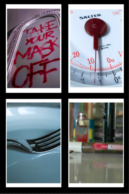
This is my first mount-up, where I have selected 4 images that symbolise different issues that I have investigated within the Feminism movement. I think that these four images work really well with each other too, being that they all are quite focused on one aspect of the environment and all use a short depth of field to pick apart the pieces that build society up. This allows me to give the viewer a rich insight into what my project is about and the different issues that this movement strives to tackle.
I am really happy with this layout because I have also included images that are associated with the project’s of my artist reference’s, the lip gloss being related to Hannah Altman’s ‘And Everything Nice’ exploration of the beauty standard and the writing on the mirror being a more direct inspiration of Barbara Kruger. This is combined with two image concepts that I came up with myself, which means that I can show where all of my ideas have come from on one story board.
I am going to mount each image onto foamboard, however I am going to leave a white edge around each one of around half a centimetre to create a divide between the image and the black card. I am then going to use double sided tape and stick these to black card with a border of a centimetre at the side and from each other.
2:
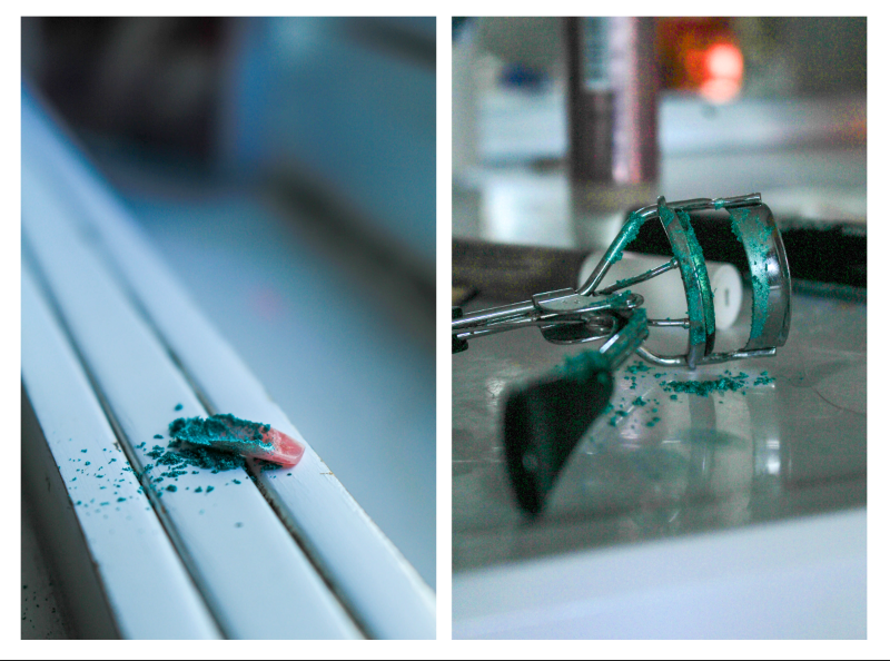
This mount-up is only two images inspired by Hannah Altman where I have used glitter to represent the pain of being held against the unachievable beauty standard. I think that these two images go really well together as they share the same level of vibrancy as well as the same colour palette, meaning that they link smoothly. I also used a short depth of field in both of these images so it allows me to sequence them in a more meaningful way. These two images of course also share the same concepts behind them so it makes it easy for the viewer to understand what my intention was.
I am going to mount these images onto foam board and then cut them out again completely in order to create a platform for them to be raised off of the page. I am then going to remount these onto another piece of foam board with about a centimetre border as I feel that these images would look best with a white background in comparison to a black one as they are both quite light themselves.