
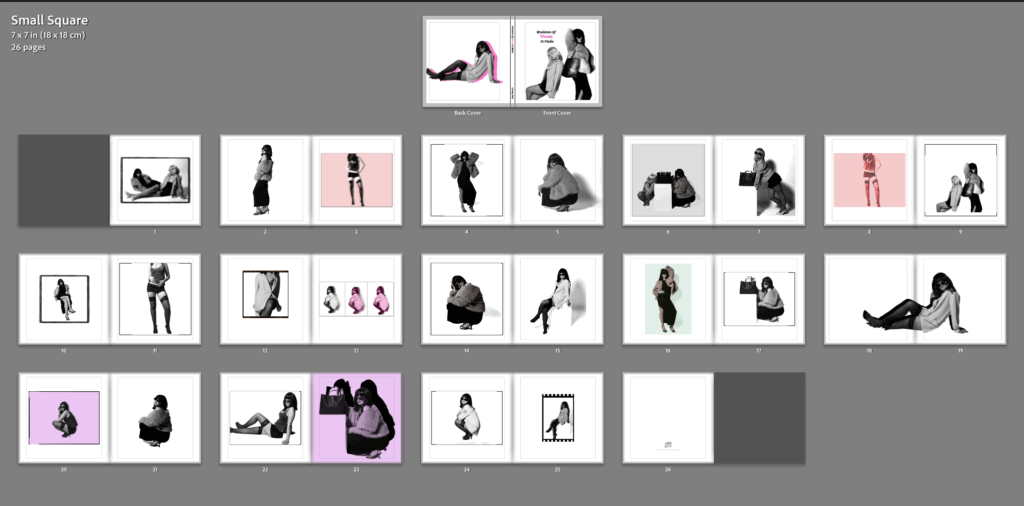
Final Design and Layout for photobook:
In comparison to my statement of intent:
In my statement of intent, I stated I wanted to express my inspiration through the two artists I studied – being Kusuma Yayoi and Helmut Newton and illustrate the theme of union. I personally believe through my crafting of photoshoots and using the correct lighting and props to portray what I wanted. Being in admiration for the women’s anatomy and expressing this in a way to make women look powerful, confident and dominant to which women were not viewed as in the 1980s and 90’s when Helmut did his photoshoots. Therefore, I wanted to show a modernised version to illustrate the present and employ the evolution of women in the media. I knew I wanted to do this because it was not normalised for women to be in the media during this time, as they were only viewed for traditional values such as the house wife and conceiving. However, over time this changed and debatably Newton pushed this shift. Therefore, I wanted to show straight-forwardly and simply how these times have change, as women are now more in the main-stream media than men. However, sometimes for the wrong reasons such as over sexualising them or wearing revealing clothes to satisfy the male gaze to gain awareness on their brands. This links to my development of being a fashion magazine to express these factors significantly. My photoshoots itself represent Helmut Newton. I did them in a studio trying to gain the correct lighting to make them look staged, this linking to cinematic and theatre play. This itself contrasts to Cindy Sherman’s work as she did the same style, yet portrayed typical stereotypes rather than disobeying them. This is useful as Helmut Newton disobeyed them in my opinion, which feminist critiques may argue. This is because Helmut Newton took images of women from a lower angle, signifying dominance and confidence, and sometimes even took images of women in suits, which definitely was not normalised around this time. To me, this tells me what Helmut was attempting to do by disobeying the typical stereotypes. However, this differs from his over sexualised and objectifying images containing voyeurism as he only took images of the same body type. However, I believe he was in admiration for the female body and was trying to stop these stereotypes as he saw potential in the female body for the main stream media. I believe this all links to the theme of union as women fought together as a minority group t gain equal rights through the feminism movements, and gained more awareness and eventually gained other aspects and characteristics other than traditional values. Through my statement of intent, I believe I did this look successfully whilst keeping it appropriate as I think I portrayed similar things to what I wanted to achieve.
Moreover, I did a high fashion and glamorous look as Helmut Newton executed this successfully. From what I take from this, Newton felt as if women should be dressed up in powerful clothes to emphasise their feminine characteristics. Therefore, I attempted to do this through blazers, long black dresses, fur coats, accessories and mini dresses. This added a wealthy type lifestyle which is what I gained from Newtons aesthetic. This links to my fashion magazine as it is suppose to express as if it is an actual fashion magazine, therefore expressing the paradigm shift in the main stream media of women. The use of feminine posing, photos taken from below or straight on and clothing still obtains a girly look which I wanted to portray as women do not have to ultimately change themselves to disobey the stereotypes of women. Therefore, I think I did what my statement of intent illustrated successfully within Newton’s aspect.
I was heavily inspired by how Yayoi confidently showed her struggles being a woman conveying the theme of identity, female body and mental health issues. I personally find this brave as her work, specifically her images including nudity was seen as controversial considering her Western culture and timeline. Yet she still successfully demonstrated what she was aiming to on a deeper level, despite the backlash. Her work shows some attributes of feminism, minimalism, surrealism, art brut, pop art and abstract expressionism and is infused with autobiographical, psychological and sexual content. Her work was very unique and I personally believe her work showed her mental health issues and struggles of being a woman. For example, her famous and mesmerising polka dots symbolising the growth of being a woman. I wanted to edit and experiment and make it unique. This seemed like a struggle to me as I was not sure what to expect. However, once I began I feel as if i got the hang out of it and attempted to make unique designs and layout to bring out an interesting factor for my end result of being a fashion magazine. I knew I did not want all my images in back and white as I thought this would make it look dull and boring, and have no link to Yayoi.
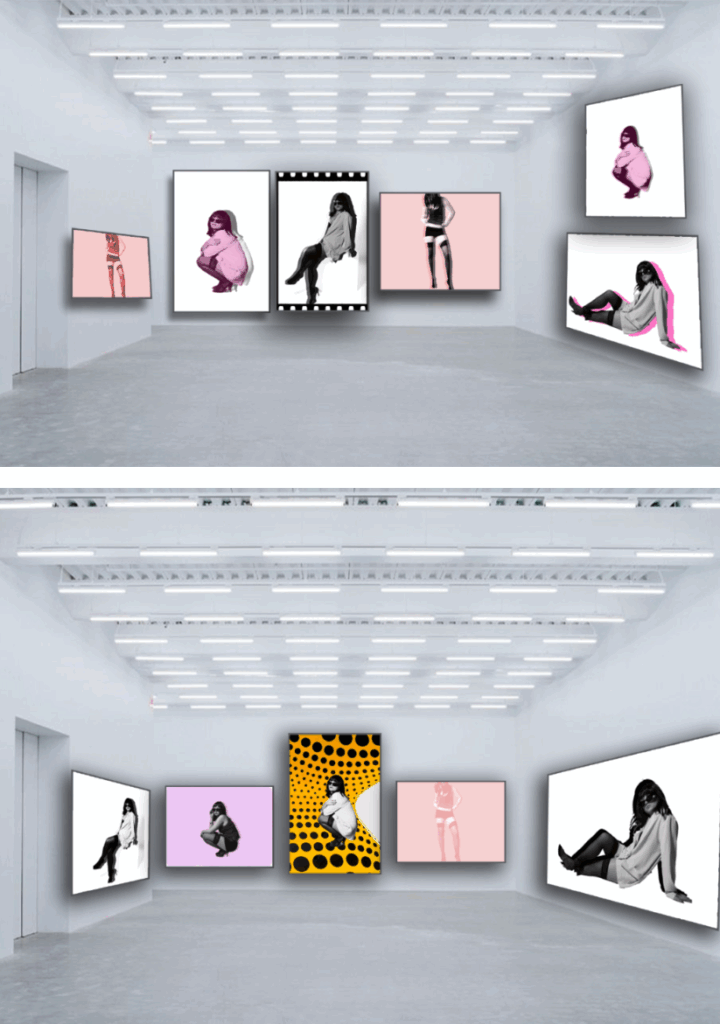
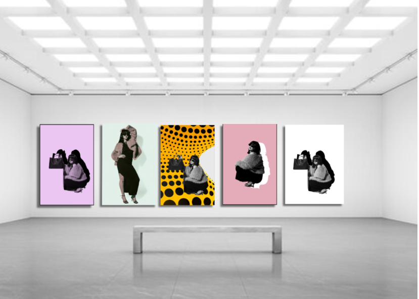
As shown above, I even experimented with Yayoi’s backgrounds to show psychedelic patterns to symbolise the mental issues. I knew I wanted my editing to link to Yayoi, so I did a diversity of vibrant colours, 3D allusions, forced shadows with different colours, and different backgrounds. This links to Yayoi Kusuma especially the 3D allusions as it adds a psychedelic element which Yayoi was very open about sharing. Although I used multiple colours, a lot were a girly colour like pink and purples to make awareness that it is a feminine project about women in the main stream media. Although I did not use all of my experiments, I used a lot to make my end outcome diversified and to catch the eye, like Yayoi’s work did successfully which I was heavily inspired by. Although the wigs are just a prop, they are a unique hair style and just like Yayoi’s. Yayoi collaborated with Louis Vuitton for her infamous polka dots symbolisation with handbags. Therefore, in some images I added a handbag to look as if we are attempting to sell it through the fashion magazine, like Yayoi.
What I could of changed:
Newtons work is surrounded through a diversity of places and surroundings, mostly in public. I did think of doing these photoshoots in public to add diversity and possibly more to look at, however I didn’t believe it would be seamless in my fashion photobook. This is because, most fashion magazines have a backdrop with zero shadows to make it less distracting and only focus on the subject and the clothing. Therefore, I wanted my images to look as professional as possible and eye catching. Not only this, but it would of made it more difficult to edit as I frequently edited the backdrop in photoshop and changed the colour to make the B&W subject stand out more vibrantly, as they wouldn’t stand out against the white. This work obviously links to Yayoi, therefore my images would not be evenly spread out across both of my inspirations which I ultimately wanted to achieve. Therefore, I prefer how my images work seamlessly together when merged together and is not distracting to surroundings or anything like that.
Another thing, I could of done better was the lighting and how close my subject stood to the backdrop. At times, my subject stood too close to the white or black backdrop, which emphasised shadows which was not exactly my aim. This is because it can be distracting and doesn’t make the subject pop. However, It was fixable in photoshop or Lightroom which I did successfully and beneficially. I did this by selecting the background and increasing the exposure, decreasing the shadows and added whites. If the shadows were in too much depth, I had to move the images to photoshop and do it there or even change the backdrop. This pushed me to experiment and develop my images and I believe I did this successfully.
Lastly, a thing I feel as that I could of benefitted from is the angles. All images were taken straight on or slightly below, however I don’t feel this was as obvious as I wished it to be. I wanted my subject to literally be looking down and the heels to be emphasised to illustrate this dominance and empowerment theme. However, most of the times I was as crouched as I could be to take these images. This is something I think definitely did not come out as much as I wanted it to be. However, with the subject crouching, I think this was successful as it was taken from the same height, avoiding it from above and fitting that typical submissive and weak stereotype. This was good as I was avoiding that factor and did not want to accidently express that. Other than this, I believe I executed my vision successfully and achieved what I wanted.
The photobook development:
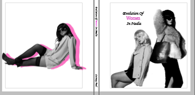
I began by putting all the images into a photobook folder in Lightroom, this automatically made a book. I then arranged what should go where and what image it should be next to, to contrast nicely, almost like ‘ This or that’. Once I did this, I then added some borders to emphasise the contrast or because some of my images are white so had to separate them. My book title choice was simple yet expressed every theme I wanted to cover ‘ The Evolution Of Women In Media’. After doing this, I added a feminine font and made the word ‘ women’ in pink to match my back cover and also straight away employ to viewers what my book is about and the concept and narrative behind it. I chose the front cover of two people to cover the theme of ‘union’ to express what women fought for as a whole. This therefore, linked to the title ‘ women’
I believe my photobook went successfully and I would not change anything within my design and layout as It is exactly what I envisioned.