
Research
Cover
Since the cover is the first part of the book someone will see they need to stand out and portray as much information to pull someone in. This is done in many ways. To stand out they use mostly one colour with the rest being black and white to make it simple and brighter as the colours aren’t competing with one another. The title is the largest part also so that it can be identified instantly. The main focus is a relatively simple image which portrays the overall message of the book such as a supermodel for a fashion magazine. These identifiers also act as a way to quickly portray information. Additionally to this the covers also include small snippets of text with page pointers and flashy deals. To highlight these snippets some covers also use small icons to draw attention.
Some additional details covers include are for convenience such as a barcode and edition details instead. I would like to include small details such as barcodes and edition details to make my cover look more like a realistic cover. Additionally this will make the zine appear like a product which I think fits into the overall message of my photobook.
Inside
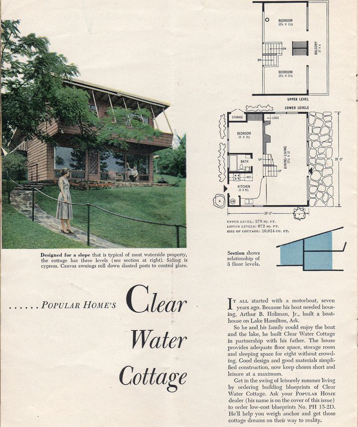
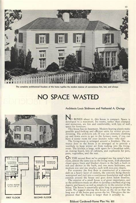
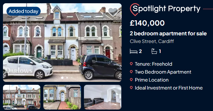
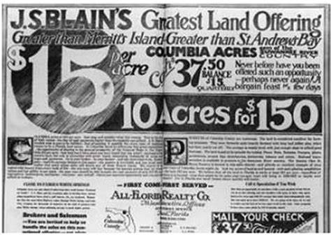
I want the pages to resemble a catalogue or a leaflet. Houses aren’t sold via catalogues anymore and instead usually have online presences as the market moves much faster with mass production of generalized building estates etc. For the overall appearance of these catalogues I had to use older scans and try to combine them with modern website layouts.
Deconstruct
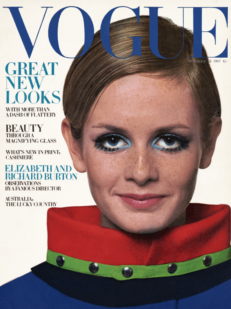
I deconstructed a Vogue fashion magazine I used as inspiration. The book overall felt floppy and disposable because it is released on a monthly cycle and is made up of thin pages and a soft cover. The paper used is a thin material with a glossy shine over the top. It is bound in signatures and glued together underneath the cover. The books format is arranged in a unique order where large, multi-paged advertisements are placed both at the beginning and between sections. Pages used for text are arranged into columns and formatted around images. The size is an A4 page with 100+ pages. The cover has a quickly recognisable title which is sometimes set behind a section of the cover. There are also a few pieces of text on top of the image to quickly point viewers towards useful pages.
Features that differ between magazines are; the binding: smaller magazines are stapled twice with every page included in the single signature; the overall layout: there are significantly fewer adverts in normal magazines and adverts often only take up a portion of the page;
Specification
Binding: As I’ve kept my image selection limited and specific the overall volume of images is low. This means I wont have many pages and could potentially get away with staples. I will only have a small 12-20 pages overall.
Format: Portrait A5 to emphasise the height of the buildings and have landscape A4 for any double page spreads to cover.
Paper: I will use A4 paper which can be folded half way to create both A5 pages.
Size: I am going to keep the images and page count limited so that the point of these images remain clear. I don’t want to fill space for the sake of it as I want every single image to be one I am happy with.
Cover: For the cover I am using a collage I made and turning it into a magazine cover by adding texts and graphic elements.
Title: The title needed to be short and snappy so I just decided to keep the project name of ‘union’ as it has 5 digits like vogue so I can lay it out in the same way.
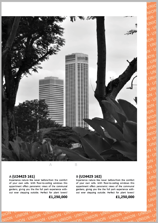
Design: The overall design is a mix of a catalogue, magazine and online retail site. Each image is numbered and described like a catalogue serving the purpose of showing stock, the cover, text chunks and intermissions act like a magazine and with descriptions and details from a retail site. Catalogues are arranged with an image and the description which I will be laying out however instead of just the name and price I will include a clipping of a home listing. No more than 2 images will fill a page as I don’t want to over crowd the pages. Each image will be a square to generalise the layout.
Editing: Although the images aren’t black and white they will have low saturation and similar dull low contrast. I will adjust the edited images I plan on using to make them seem more like adverts.
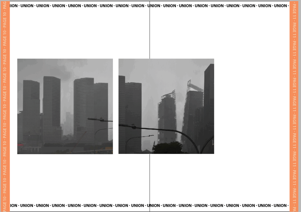
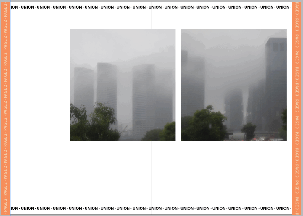
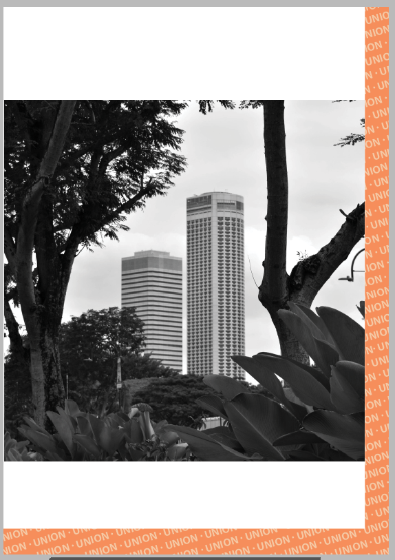
Sequencing: I will arrange each image in a pair with an image that looks similar in some way be it shape, subject or weather. Between pages I would like to start with the images that most obviously resemble a house for sale and then shift to images that act more of commentary of issues such as overpopulation and climate change.
Text: Each page will contain text. Some of the bodies of text will be there for the aesthetics but it will still be inline with the theme. I could use the text fill for the aesthetics however I don’t want the text if it isn’t going to be adding to the images.
Narrative: I want to showcase how consumerism in the subject of housing and architecture affects cities, the climate and population. For this purpose I gradually shift from buildings to other subjects as well.
Planning
Layout
I decided to create a brief mock up in in-design which I could then use if I settled on creating a zine. Otherwise I would develop further in Lightroom once I’d settled on a plan as texts and images are easier to move and format in other software.
Features I wanted to try out were a barcode:
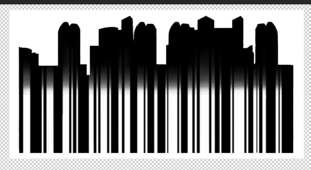
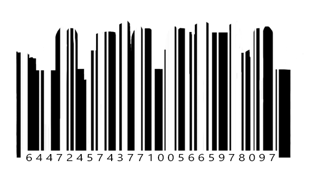
I was unsure how to make the building shapes obvious enough but also still look like a real barcode. Initially I tried using a gradient however this didn’t work. I also tried just using a barcode and placing the buildings on top however this also didn’t work. Once I combined the barcode and the building thought it started to look much better. I used an image of the city scape and removed the background. Once I had the shape I added a barcode shape over the top as a mask and began adjusting a few details until I think it looks enough like a realistic barcode.
text options:

I wanted to add a graphic element to my cover which I decided to try with some arrows following the building up. I wanted the arrows to point up with the building to emphasise the growth upwards. An arrow on its own though would have been out of place so I added a small slogan where the arrow would act as a ‘t’. Overall I wanted this section to emphasise the growth so I chose to the top to showcase the competitiveness countries had with building the highest building despite its un-usability. Making it clear that the arrow was a ‘t’ was difficult though. Overall I chopped each arrow head into a size similar to the text. I tried removing the triangle and sitting it on top also but this looked bizarre and didn’t resemble much of an arrow anymore.
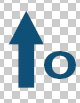
I tiered the arrows so that they would line up better with the building too as I didn’t want too many elements overshadowing the image I was using on the cover.
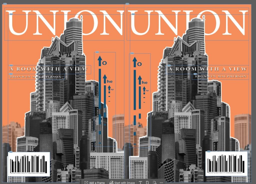
I began developing this cover further where I added a border so that the cover looked fancier, I added more text so that the cover looked more like a magazine trying to be sold and I added a drop shadow behind text so that it could be easily read. The text in the bottom corner was still difficult to read so I added a text box with a gradient so that the bright whites could stand out better against it. In terms of the text, I settled on 4 sentences: ‘A room with a view’ due to its height, ‘One Bedroom fits 3, save space’ because space is getting smaller and smaller, ‘Live luxury at an affordable amount’ because similar contradictory claims are often told like this one, and ‘A generous 70 sq ft for the price of only 50.’ because its a stupid deal which saves nothing and doesn’t make sense but sounds enough like a deal for someone to without thinking go along with.
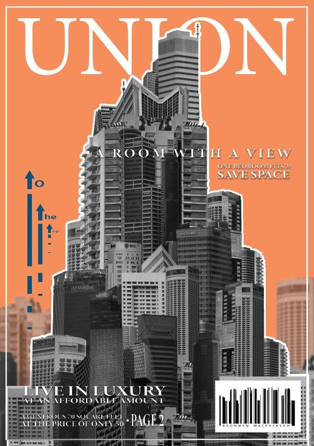
For the cover I decided to set the title behind the image like other magazine covers do. Additionally I wanted to add more graphics typically seen on normal covers such as page directories, barcodes and additional writings. When it came to these details I wanted them to still make sense with the book so the barcode I created with the silhouette of my images. I ended up switching out the numbers and replaced them with the letters of my name instead so it would blend into the cover much more seamlessly.
I started by simply choosing the images I wanted to use and tried arranging them together. My initial plan was to create squares that left room at the bottom for descriptions, page numbers etc. I thought this would be useful when making a magazine.
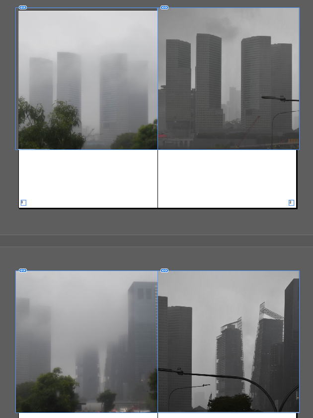
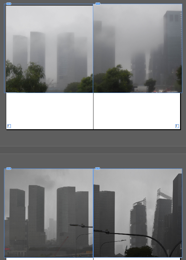
I had some of the same locations photographed in the different weather conditions which I wanted to compare in the photobook. I considered both putting them directly next to one another as well as split across the pages. I liked splitting them however I don’t think directly together looks particularly good so I spilt them across the book.
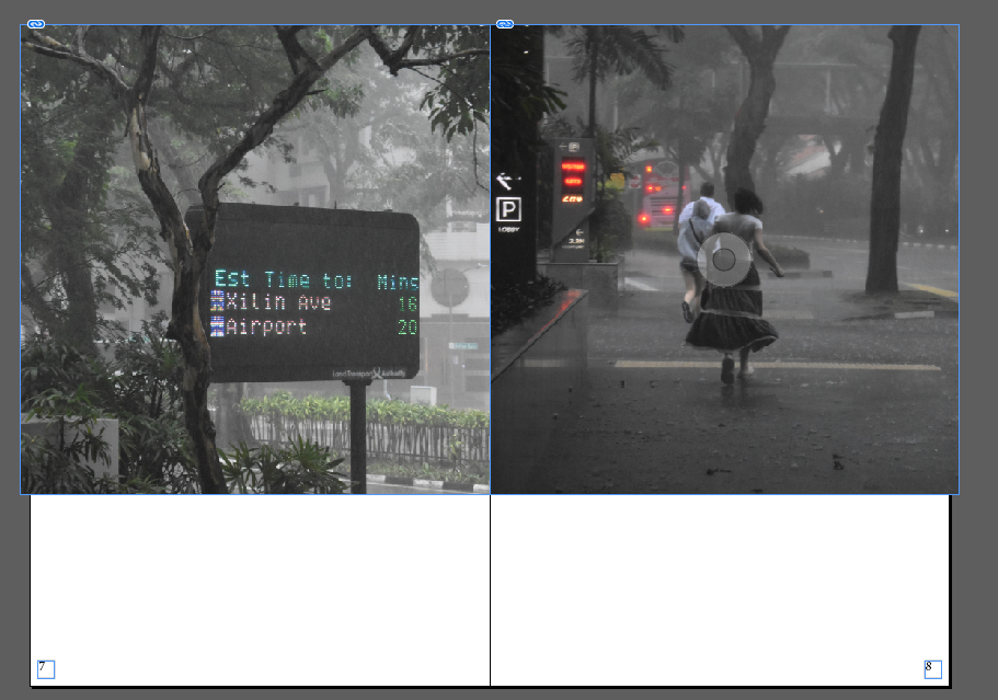
I considered putting in these two images as they show the effects on people however I was unsure of they fit into the book as every other image is of a building with minimal greenery.
I thought this layout looked too bland to be any sort of advertising so I tried out a different layout instead:
For this layout I used the same orange from the front on each page for continuity. Additionally I wanted to create some level of branding/copyright tags so I added a bar of the title along each page. I broke up each set of images with a double page spread to resemble advertisement breaks through magazines. I also think this worked well to add some variety to each page. After id chosen the page template I began adding in the images. I only put two on each page set and made sure to size/format them all the same in small squares. In the empty space around the images I was going to add descriptions of the images/potential listings and some general text.
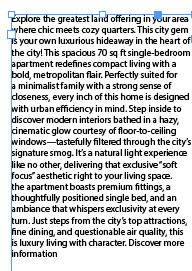
I made each set of text without the intentions of them actually being read as they were just there as a way to format the layout like a real magazine. I made all the text small and contradictory like irrelevant waffle that fills housing listings and fine print attached to advert.
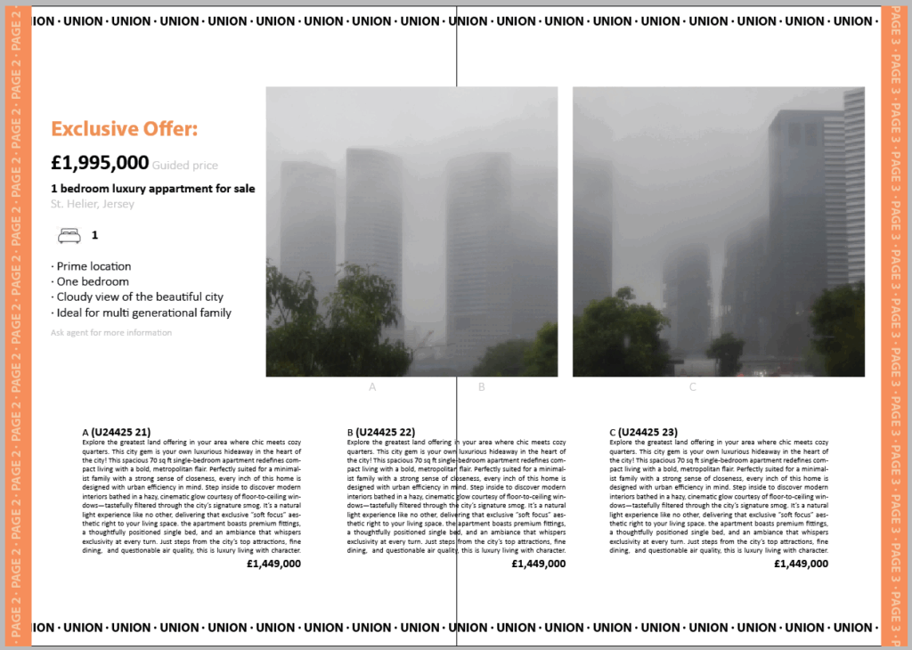
I tried adding descriptions and prices like a real catalogue/magazine however I thought the page was a little too busy and the images weren’t big enough on the page. When I made the images bigger there wasn’t enough space for all the additions so I just removed them instead and made the images bigger. I did like the idea of this layout still so I adapted it onto the back page instead.
For the final page I wanted it to somewhat resemble the cover as it also needs to summarise the book but without the need to draw people in. It can be more honest and avoid flashy misinformation added just to attract a viewer. I included the orange edge and combined it with a bottom also like a tape used to rule a page at the end. I added the union banner again because its similar to a watermark but also the repetitive nature of advertising.