
To create my photobook…

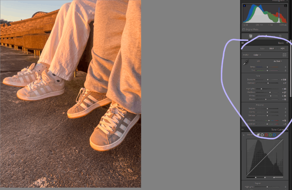
To edit the chosen images for your book you go to the develop department and can edit all the images there just to the right of the image. That being shape, style, size, angle etc.
After editing all your pictures, you then press book.

This will put all of your images in to a book format.
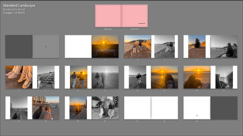
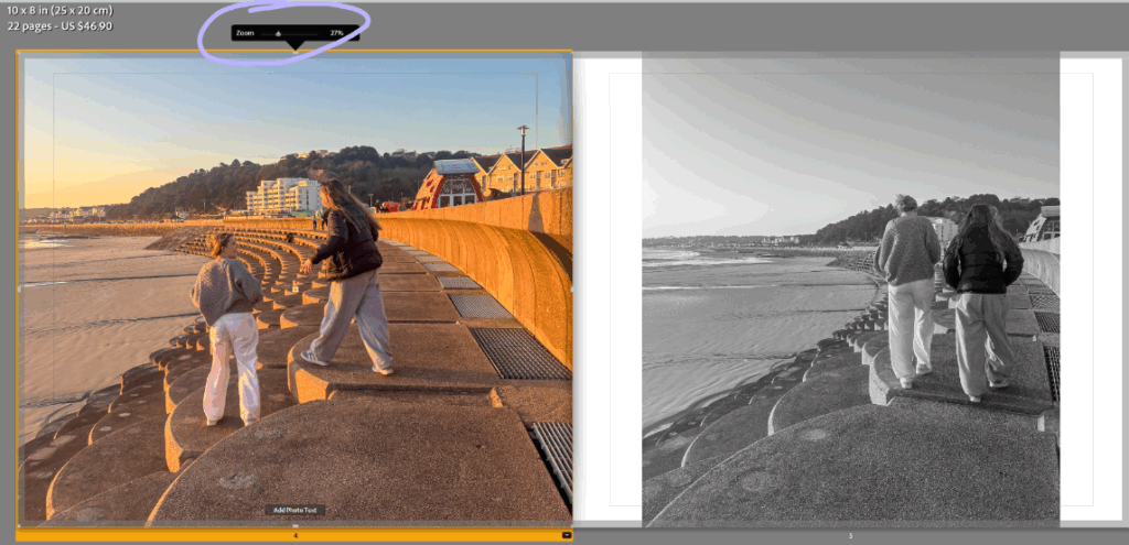
You can then move around your images, adjusting the size of your images, depending on if your wanting them to fill the whole page or not.
After all that, your photobook will be done and your ready to send it to blurb to get it printed.
Front and back cover.
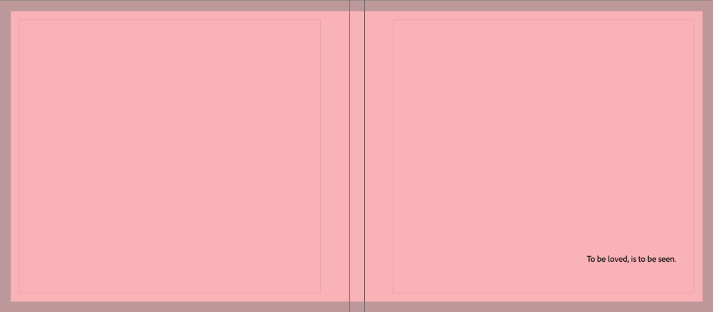
For the front and back cover, I just chose a pinky/peachy colour to reflect a girly effect. I like that there’s no pictures so it doesn’t give anything away. I also have the title ‘To be loved, is to be seen,. This is to create an idea on what the book is really trying to get across to the audience.
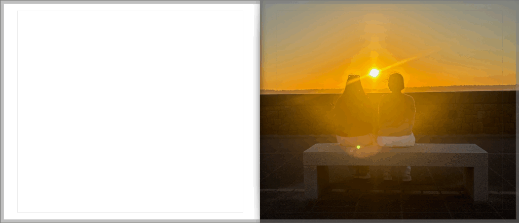
For my first page spread, I left the first page blank. I did this as there was no image I truly believed to be paired with this one that would make sense. It’s an effective photo which came off of an inspirational artist reference, so I was very keen to use it as i liked the way it turned out.
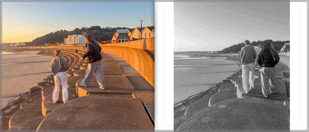
For this page spread, I’ve added in a black and white image (which you’ll see throughout the book). I added in black and white so the audience don’t solely focus on the sunset as that’s not my main focus. I wanted to draw a more serious and real image to show union/friendship.
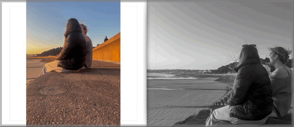
This page spread is probably one of my most successful. I really think it focuses on the friendship between these two girls. I also like how the image has a pretty background. I wanted the backgrounds to reflect the purity of their friendship with the nice colours too.
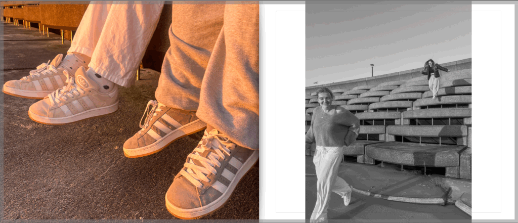
For this page spread, I decided to focus on the more simpler image. I believe the image to the left is so effective. The colours, simplicity and girly-ness of the picture really draws me in. I do love the right image as its pure and candid, however made it black and white to snap back in to the reality of the friendship again.
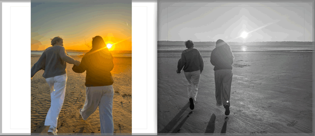
I think this page spread is very aesthetic. I wanted to capture a moment where the girls could just let go and be free. I made the bigger image black and white here as I think it creates the idea that their walk is now a memory and not in the present. However, a happy memory to look back at.
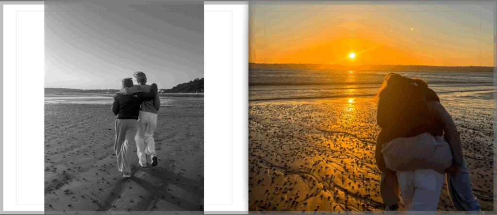
I looked more at creating an image to represent the friendship in a more announced way for this spread. I captured more acts of physical touch and fun for this set. I like the way my book has a structure of them walking across the beach.
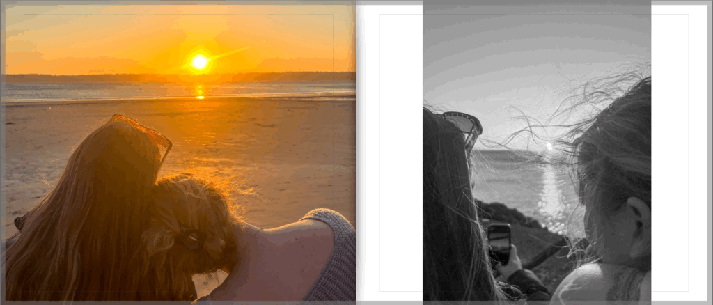
I wanted to focus on the softer aspects of friendship for this page spread. Instead of laughing and having fun in the images, I captured a relaxing moment where the models are just appreciating each other and the view.
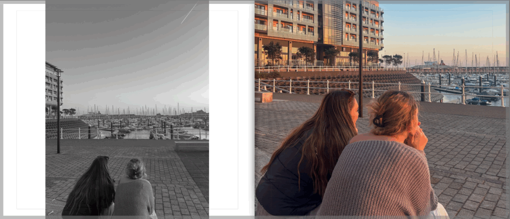
For this page spread I liked the contrast of everything in these images. I like the scenery, the colours, and the position the models are in. Everything about these two images comes together.
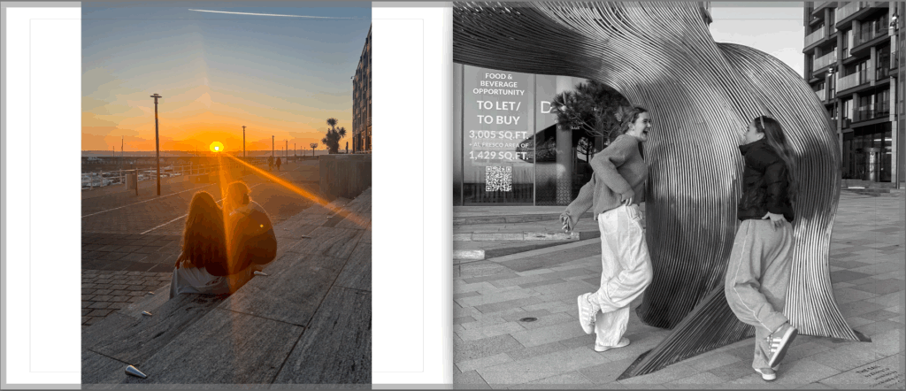
For my final page spread, I captured one last image of them just being girls sat together, then ended it off with a picture of them laughing and having fun in black and white, just to remind the audience of their fun, loving and caring friendship, as if it were a memory.
