Here I will be experimenting using photoshop to create more ‘surrealist’ work. I will be trying to unite the real and imaginary through photography.
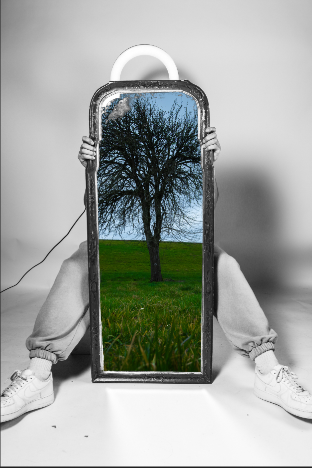
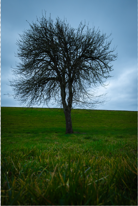
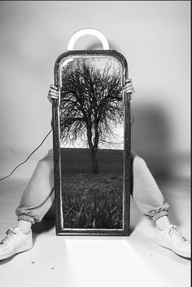
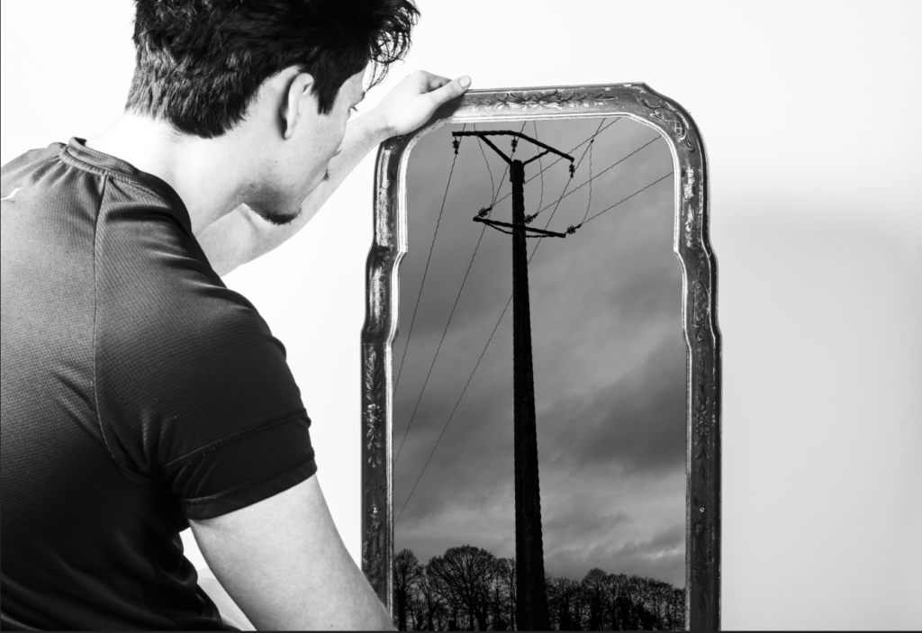
Above I tried to put together 2 sets of images a took. A studio Image which resembles an Image I found online (look at previous blog post), and a photo that I took from my France photoshoot. I used a tree as looks correct compositionally, as it looks like the ‘soul’ of the human. This links very closely to surrealism as the image is both imaginary and real at the same time.
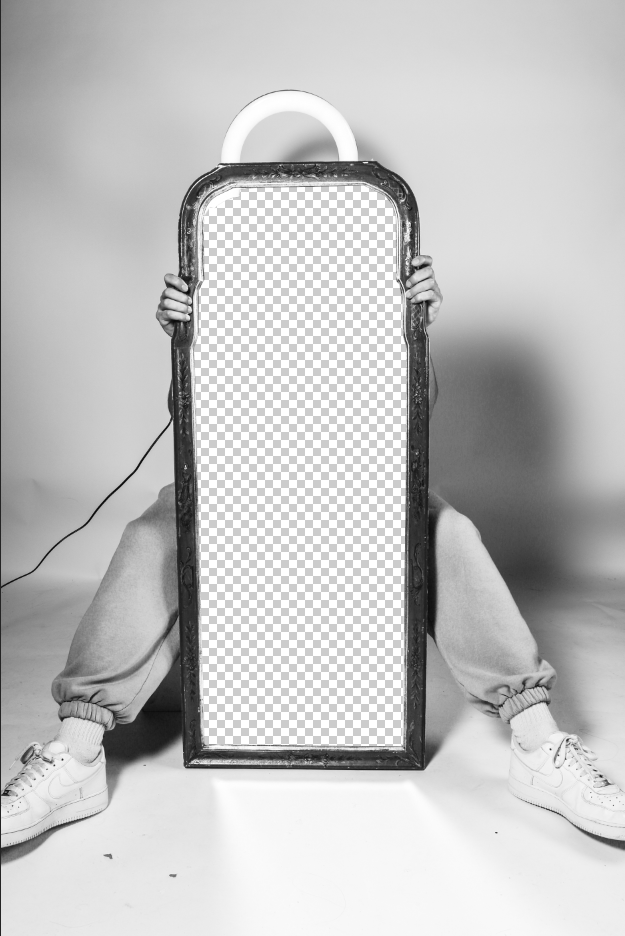
To edit, I created multiple different layers. The first layer is the studio image with the mirror cut out:
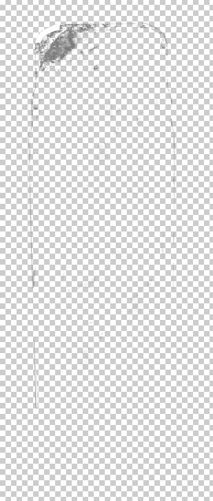
Then I cut out the highlights in the mirror, so hopefully the imperfections in the mirror can stay (like smudges and dust) using colour select tool in photoshop, making it look more believable:
Then I put this all together with this image:
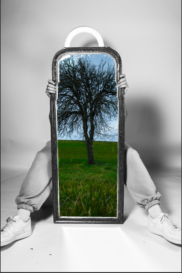
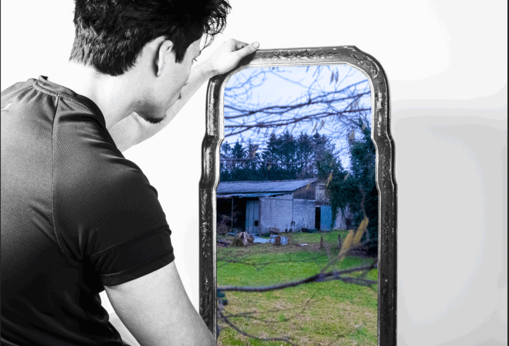
However, I will now try use a mirror texture instead as I think it will look better, I will also try creating a green shadow to make it seem like this tree is actually there.
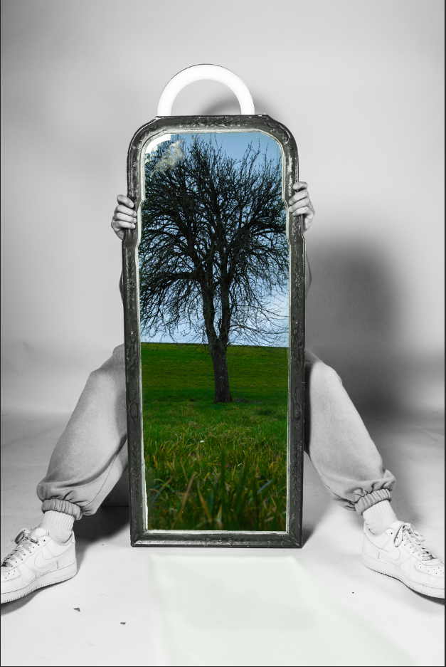
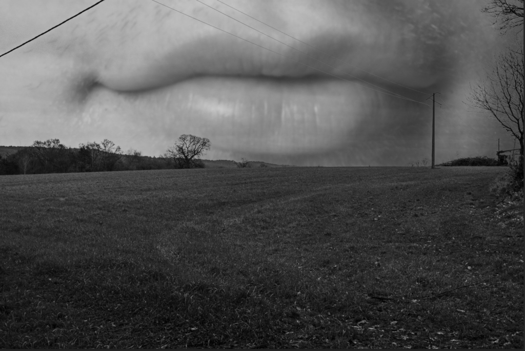
For this image above I did the same method of cutting out the mirror and placing the landscape photo behind the foreground layer. But I tried the ripped filter on photoshop to create some sort of distortion through the mirror. It sort of worked.
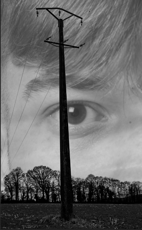
For the image above, I used a similar technique from above by using the colour select tool and selecting the shadows on the environment photo. I then deleted the selected parts but on the face layer instead, This is to keep the face behind the trees and electricity poles, making it look like it comes from the sky. I have done this as this image becomes very surreal with these edits.
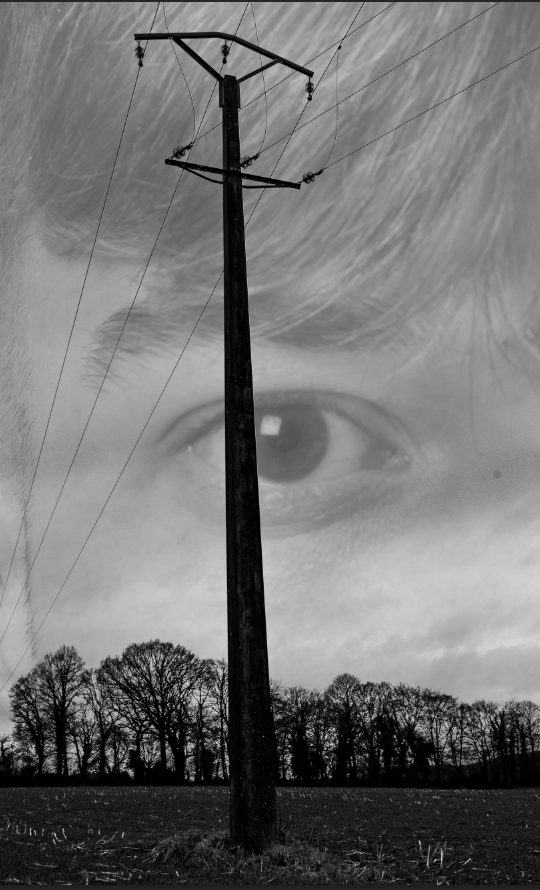
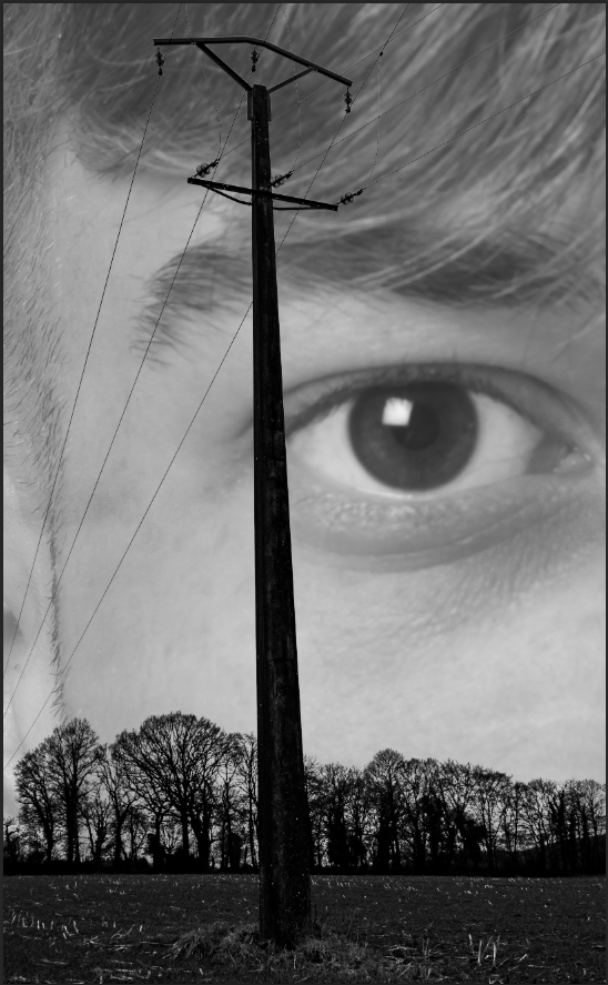
Here I tried moving the eye to the left as I think the pole in front of the eye takes away the power the eye has over this image. I also used the dodge tool to make the eye brighter, standing it out more.
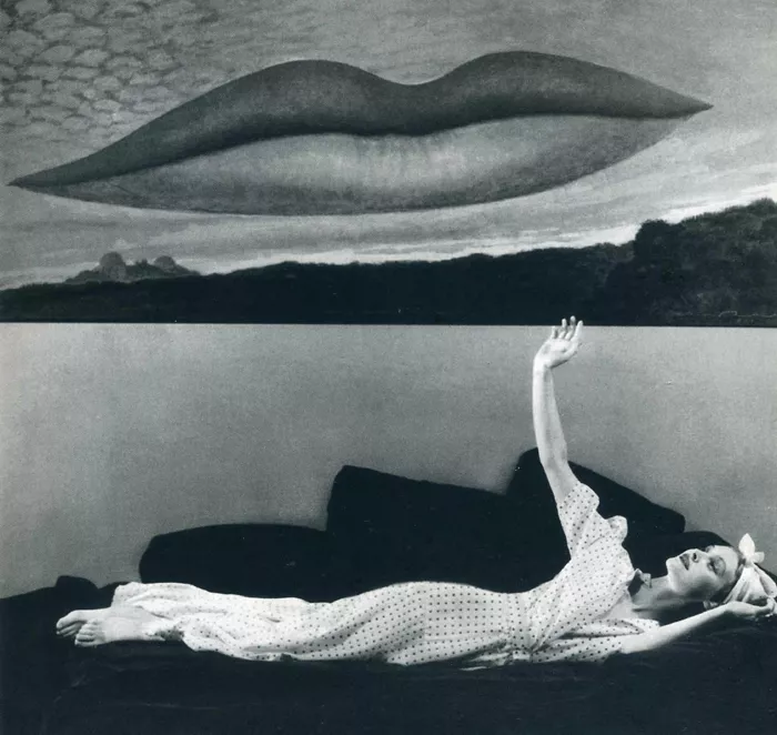
Images like Alexander Mourant (Aomori)
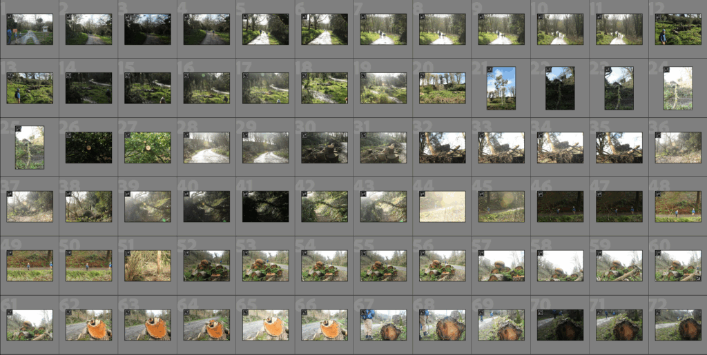
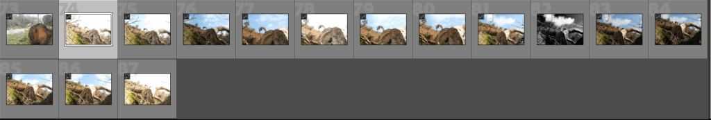
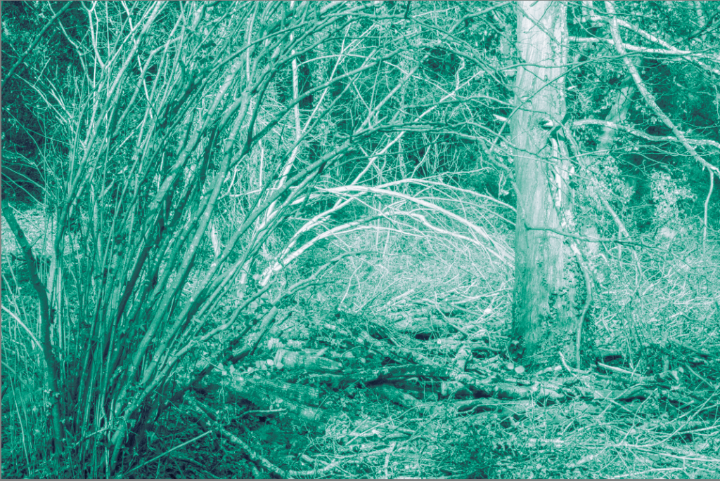
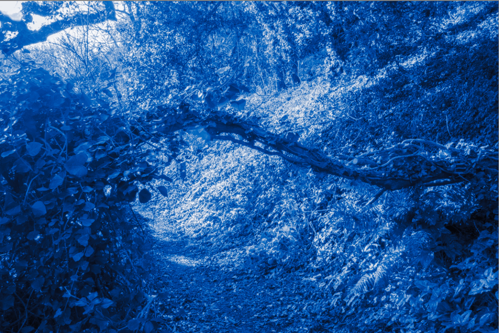
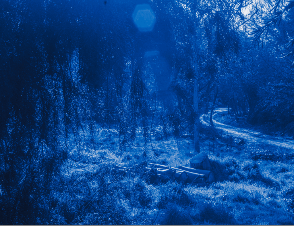
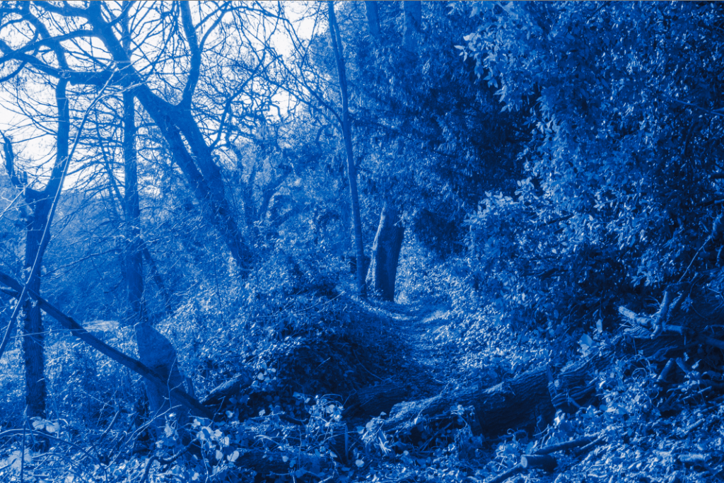
Above are a few photos I took a few months ago and I think will work well to create similar images to Alexander Mourant. I took these photos after a storm that happened in late 2024 in Jersey.
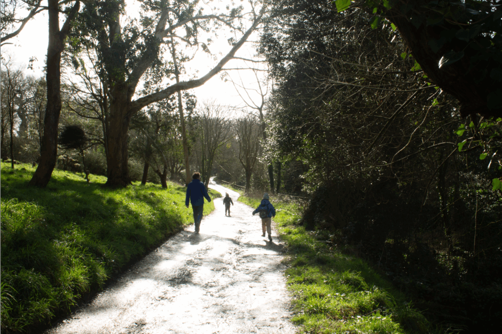
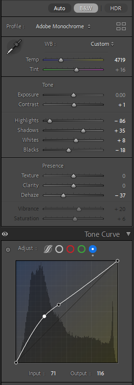
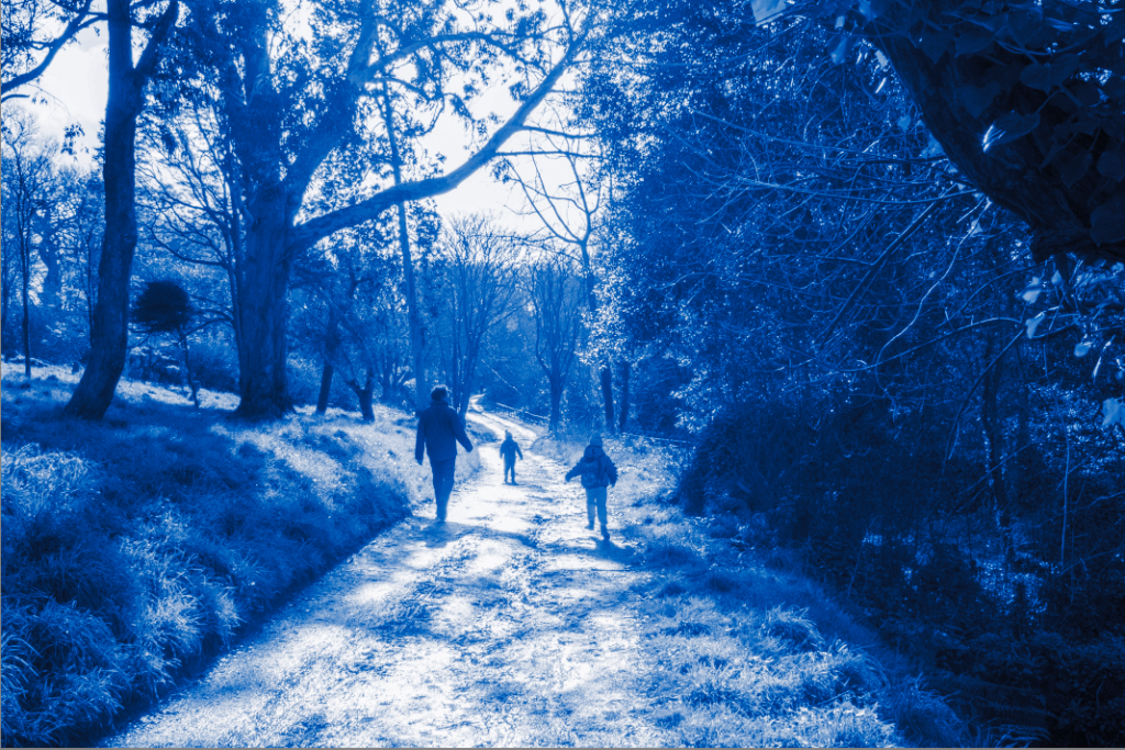
Here is my first image, which I edited after playing around with the mid tones and the tone curve for a while until I got something that I liked. I chose this Image as its got kids running around and the light reflecting off the dirt road makes it very ‘dreamy’ looking. There are many other reasons why blue adds to this ‘dreamy’ looks which I’ve explained in my Alex Mourant blog post.
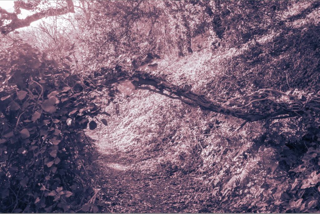
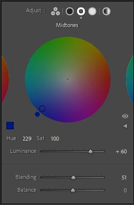
Here I tried it using the other end of the colour wheel (Brown/Red). It gives a very different emotion to the blue images from above. This emotion can be interpreted differently depending on the viewer and how they process this colour.