Using photoshop to design front covers-
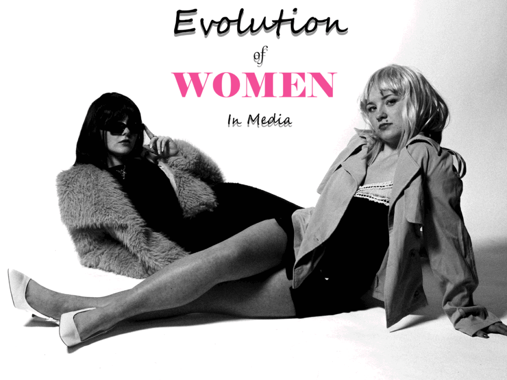
Version 1:
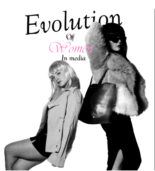
Version 2:

Version 3:
Overall:
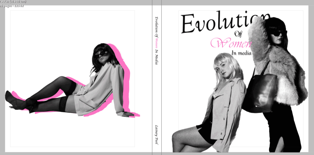
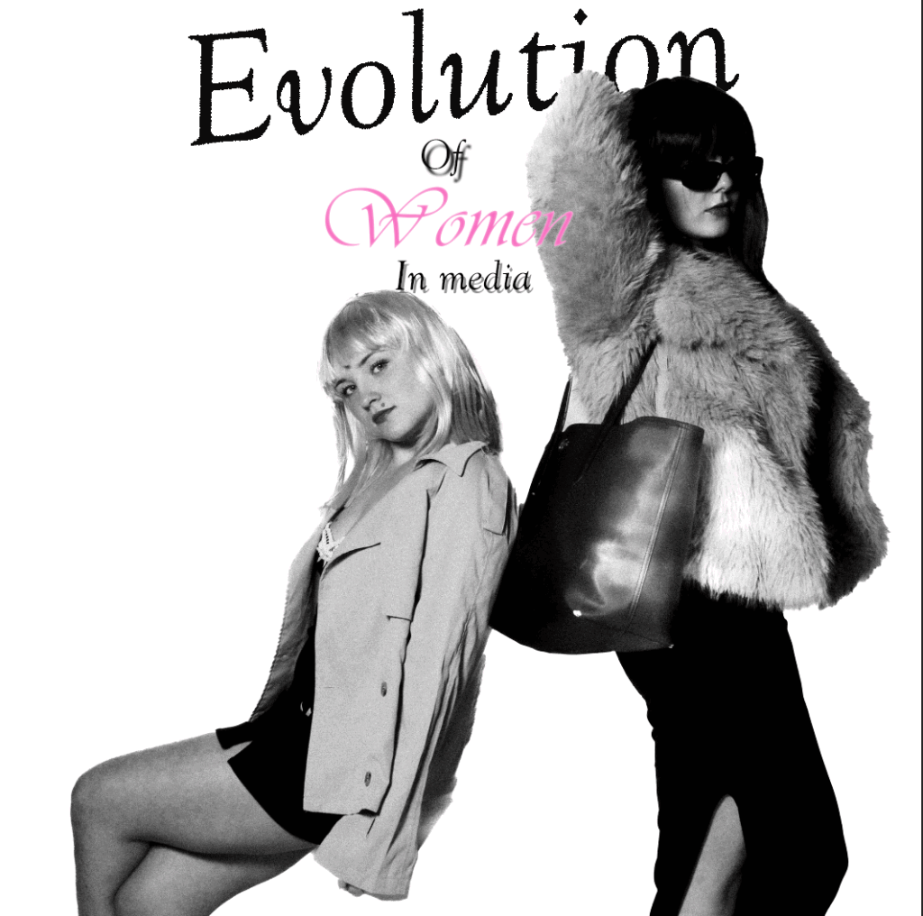
The front cover is important as magazines are always the first impression. I want my front cover to have the two of us included. This is because it links to the theme of union and tells the viewers immediately what my magazine is about. Not only this but it seems more powerful, and fits into the plural phrase of ‘ women’ for my title. I wanted my title to be clear and simple expressing what my book is about. I had many ideas such as – ‘Power in Heels’, ‘The Gaze Reversed’ etc. However, I liked how mine was simple yet straight forward and involved my project surrounding the main stream media and the shift women faced. I wanted my font to be rather feminine and I knew I wanted the word ‘ women’ to be in pink as it would make it stand out vibrantly and straight away express that my book is surrounding the theme of femininity. My favourite experimented version would be the first one as it is my favourite image and the font goes seamlessly behind the subject.
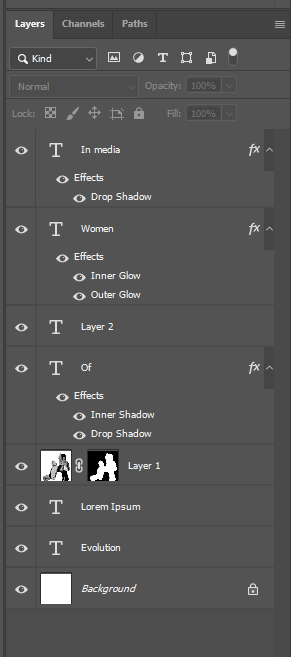
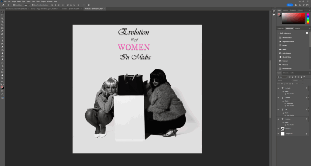
I wanted the word evolution to be bold and noticeable, but the font keeping it clear and eye catching. The font being slightly slanted and going behind the subject adds a little edge to it and professionalism. For the ‘ Of’ and ‘ In Media’ I added a drop shadow to make it look 3D. This is beneficial as inside my book, obtains 3d allusions linking to Yayoi. Therefore it contains a successful link seamlessly. Lastly, I will change this image to be my front cover as it looks rather professional and I like the other effects such as the drop shadows and strokes etc because you cannot do that on Lightroom.
Final Outcome-