
Evaluation of Photobook
Overall, I think my photobook turned out well and how I wanted it to.
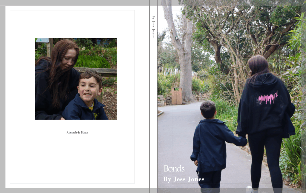
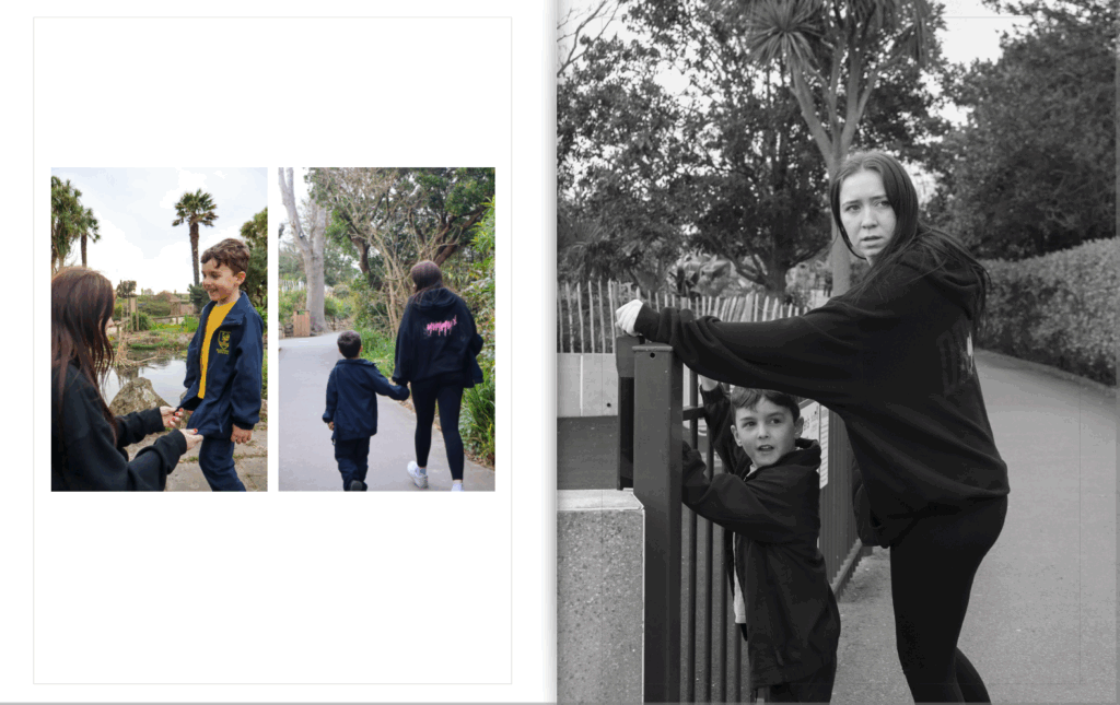
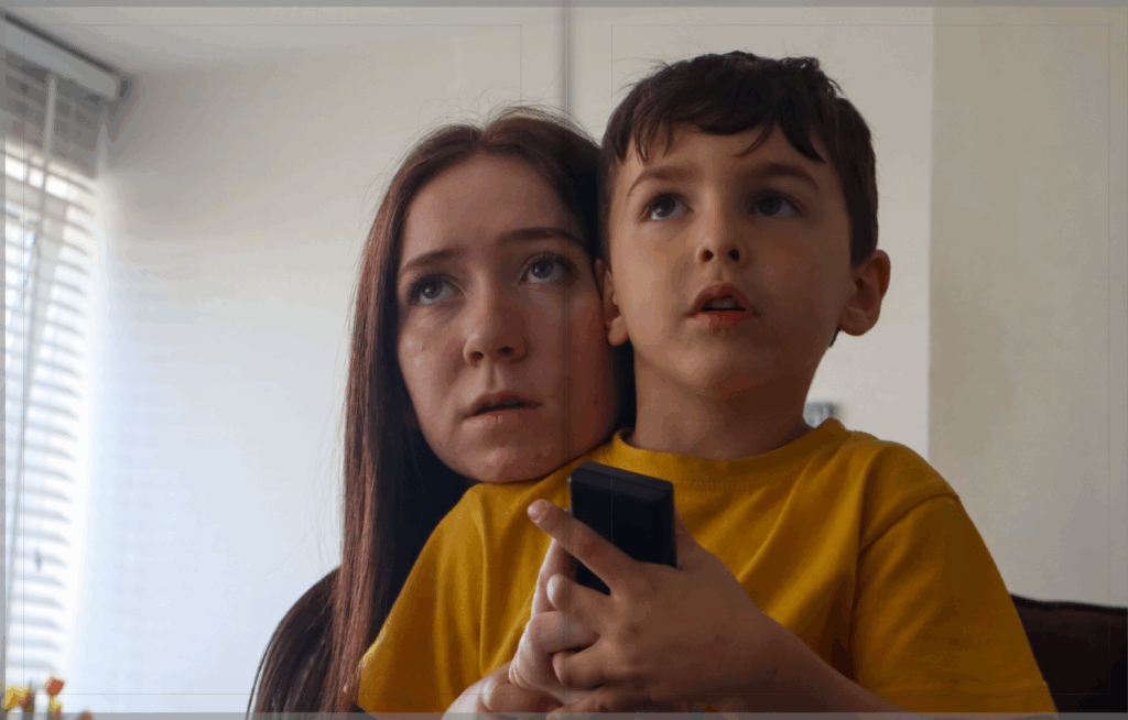
In terms of the front cover, I decided to make the title of my photobook ‘Bonds’ I chose this as I am showing the bond between two individuals through their relationship with each other. As the whole project is Union I thought bond was a good synonym and works well with the project. I like the front and back cover and I think they both work well together. On the back I added ‘Alannah & Ethan’ under an image of them. I really like how this touch looked as it makes the book more special and personal when the individuals on the pages can be named and recognised. I think the front cover is a good photo as it shows the two in quite a wide frame so that there is empty space around them to make the cover look more interesting. you don’t see their faces in this image which would have probably looked better so that it was clear who the book focussed on, however, I also like the position of the camera as it is only showing their backs but still showing their connection and bond through them holding hands and walking together. I think showing their backs and not having their faces shown invites the viewer to want to open the book so explore their bond more further.
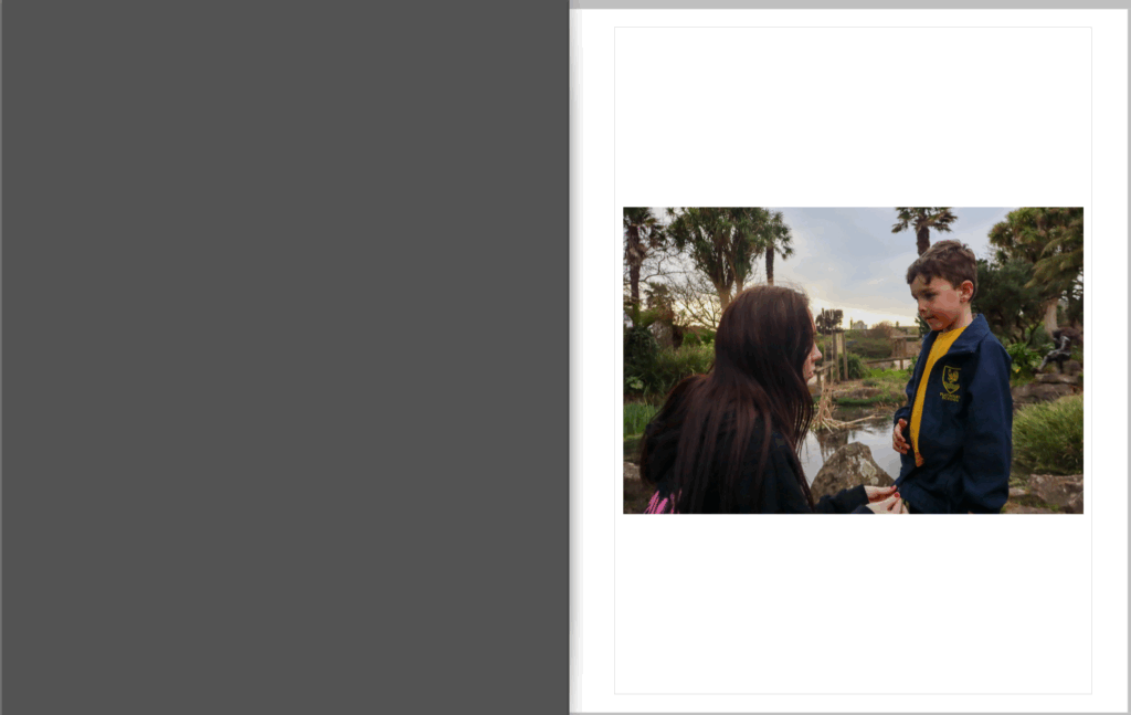
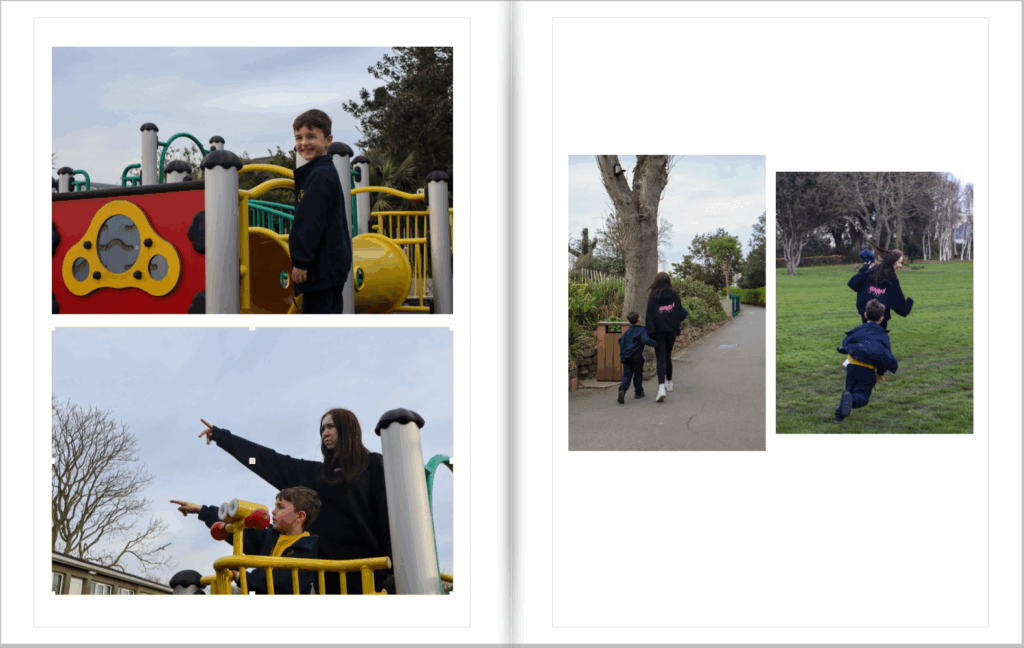
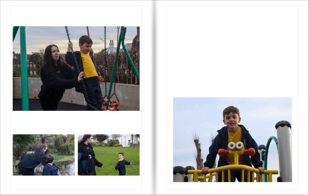
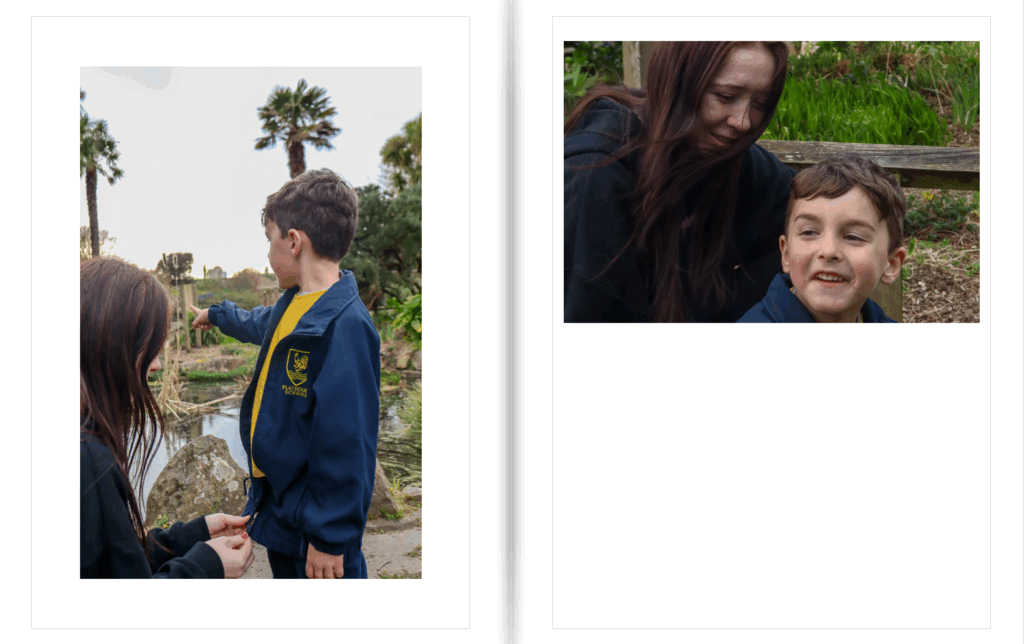
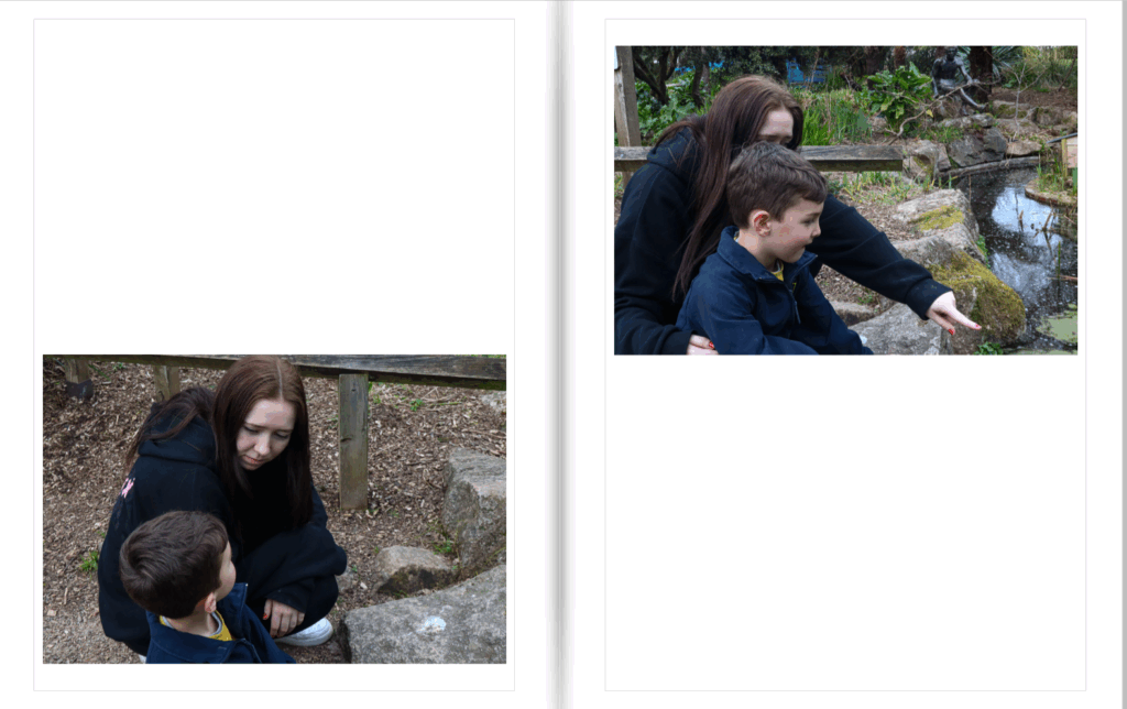
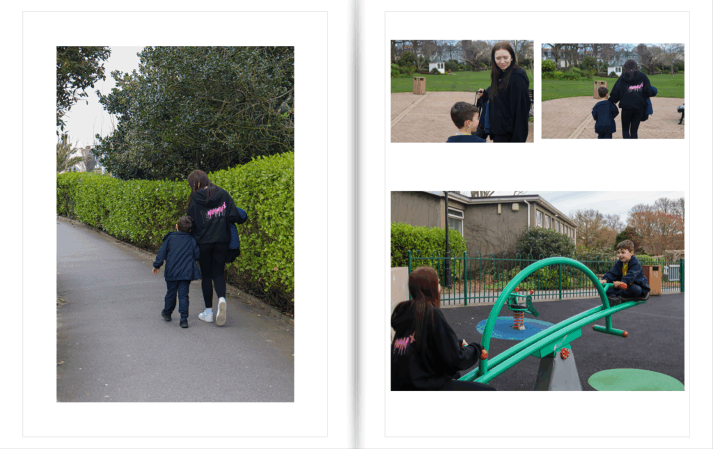
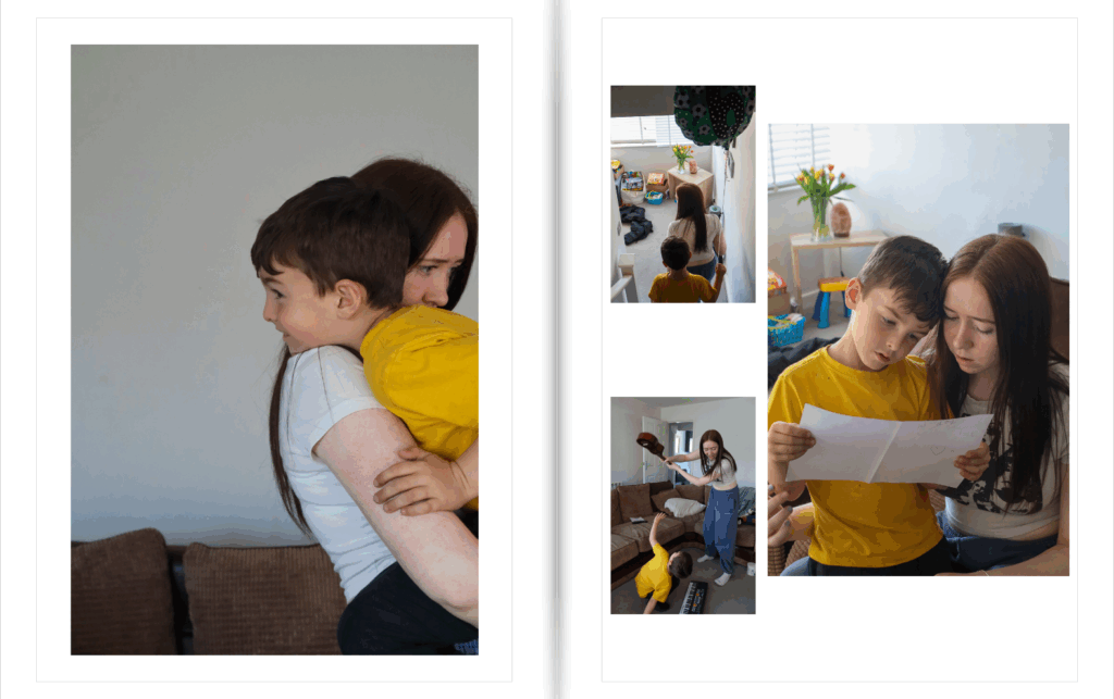
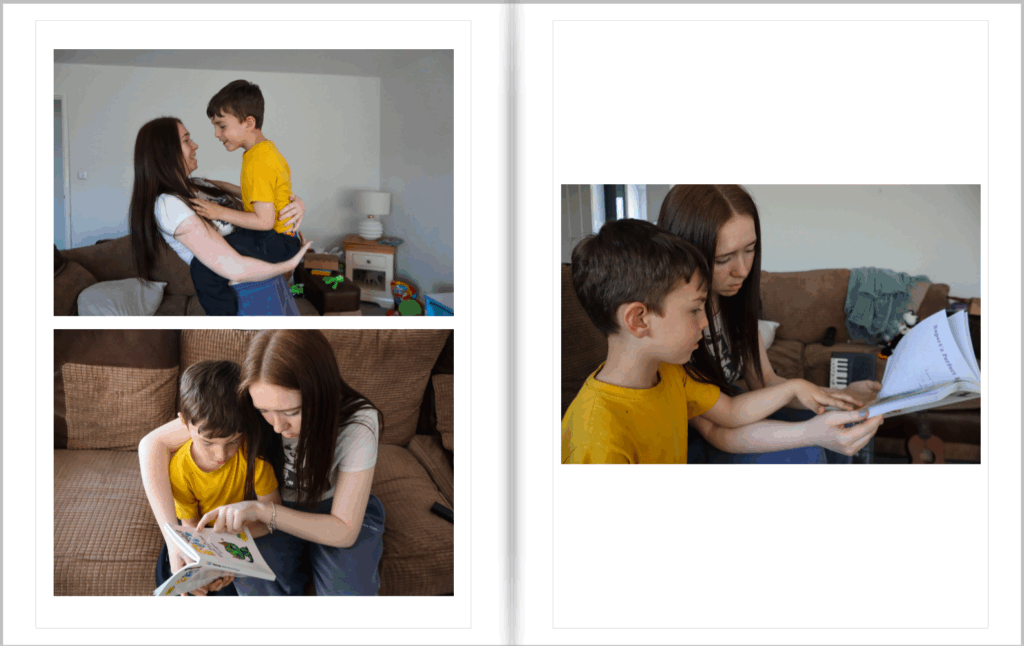
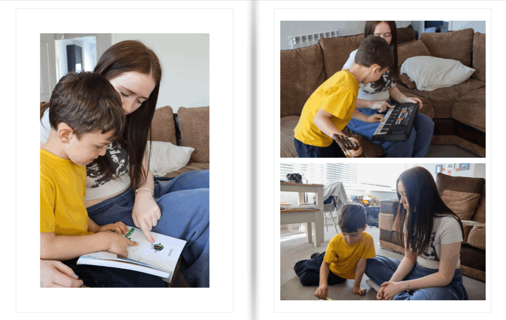
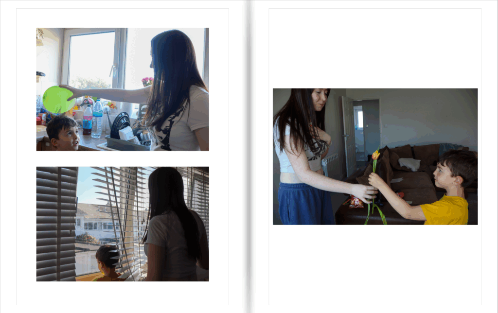
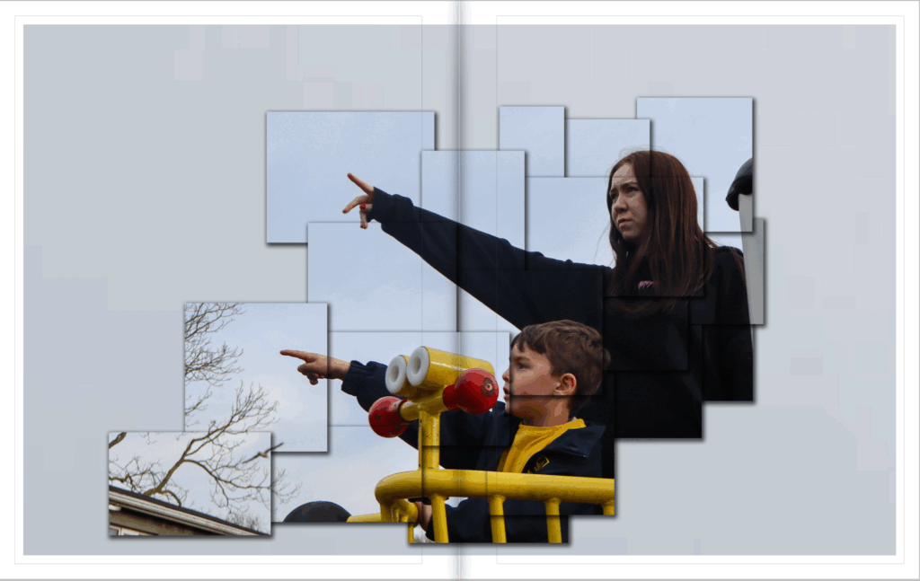
Throughout the book, I like the variation of layouts I used on each page. this meant the photobook wasn’t very repetitive which could lead to the viewer being bored throughout. I liked the use of the two-page spreads in my photobook as it meant I was able to show my favourite photos as a larger image so that they were seen more than just being put on a page with other images around it. The photobook works in order of the two photoshoots I produced. I made sure to add the outdoor environment photoshoot at the start of the book as that was my first shoot I made. It then goes on and transitions into the second photoshoot where I focussed on the personal environments and more connections between the two. I think this works well as it shows the connections get deeper and more personal the further you go into the book. A negative of this is by having the photoshoots with each other it could cause repetition as its the same forest/park environment for a while and then the same with the individuals home environment in the second shoot. This may have been better if I switched up the order and created more of a mix of images.
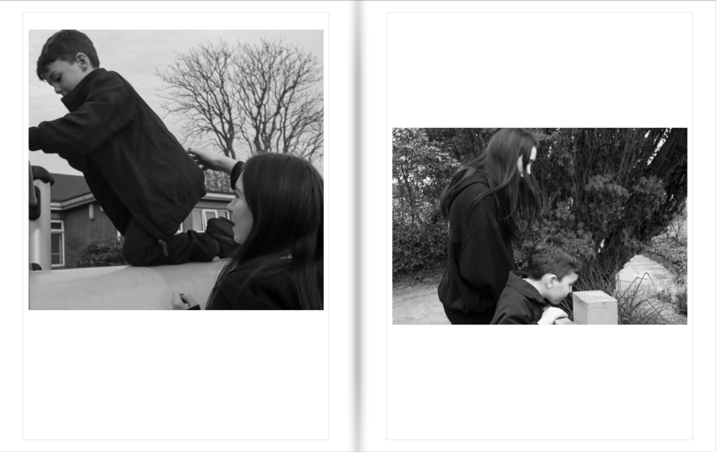
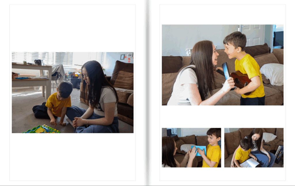
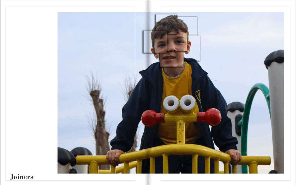
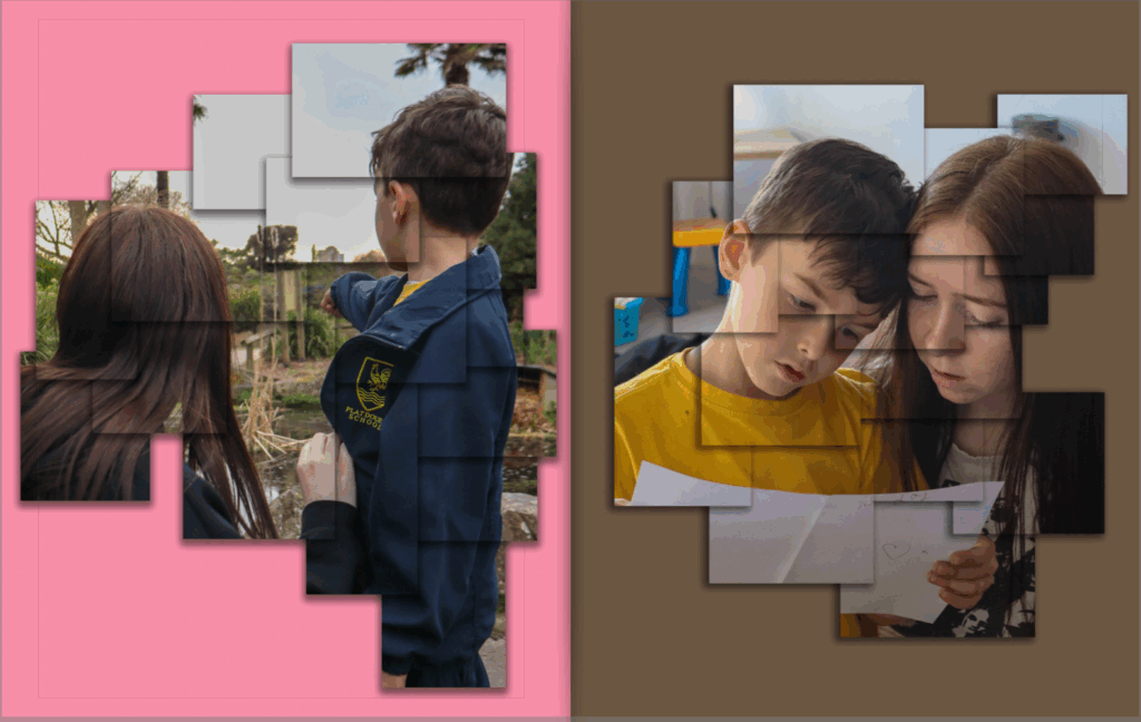
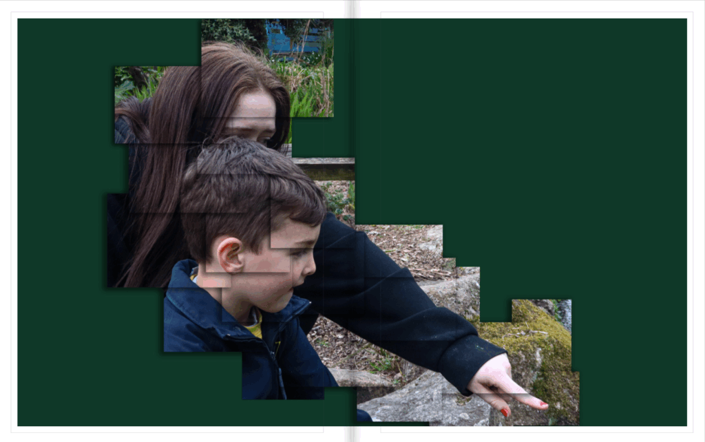
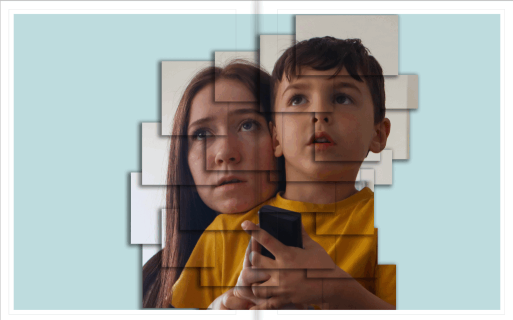
At the end of the book I decided to add my edits into my project. Even though I printed some of these, I still wanted them to be represented in the photobook to show what I was able to do with the image. I think using a subtitles on the page where the joiners start works well as it introduces the net part of the book to the viewer and so it makes sense why there would be some photos they have already seen.