
Layouts
Layout 1:
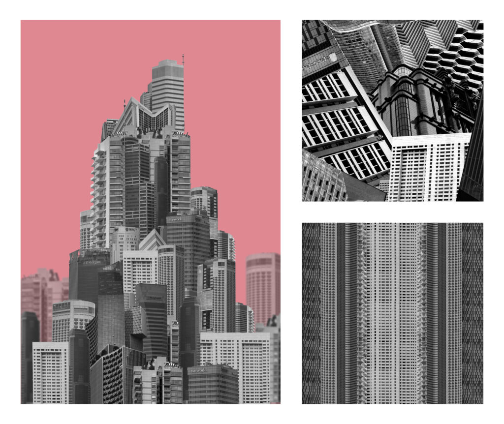
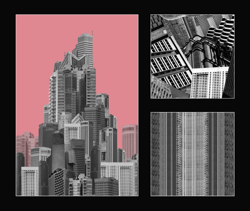
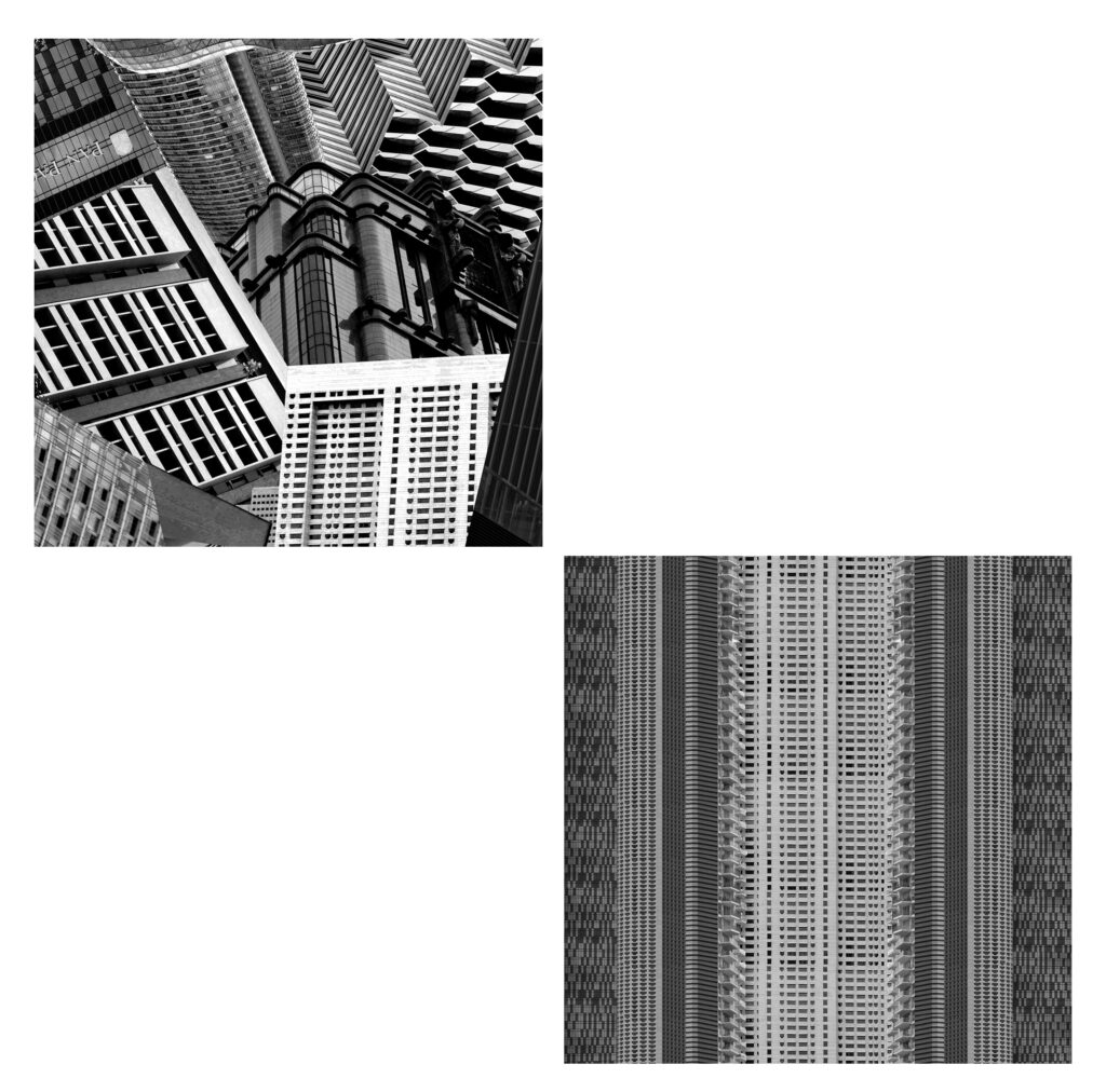
The first layout that I thought of was all the edits together. I tried this first layout in front of both a white background and a black background. I don’t think I like how window mounting on black card looked because none of the images had particularly high contrast and are made up of more mid-toned greys. I would print the building on A4 and the two squares on A5. I like how this layout looked but I wanted to experiment and see what else might work better. The additional images to the side looks a bit like a zoom in from a textbook of what’s going on with the first image.
Layout 2:
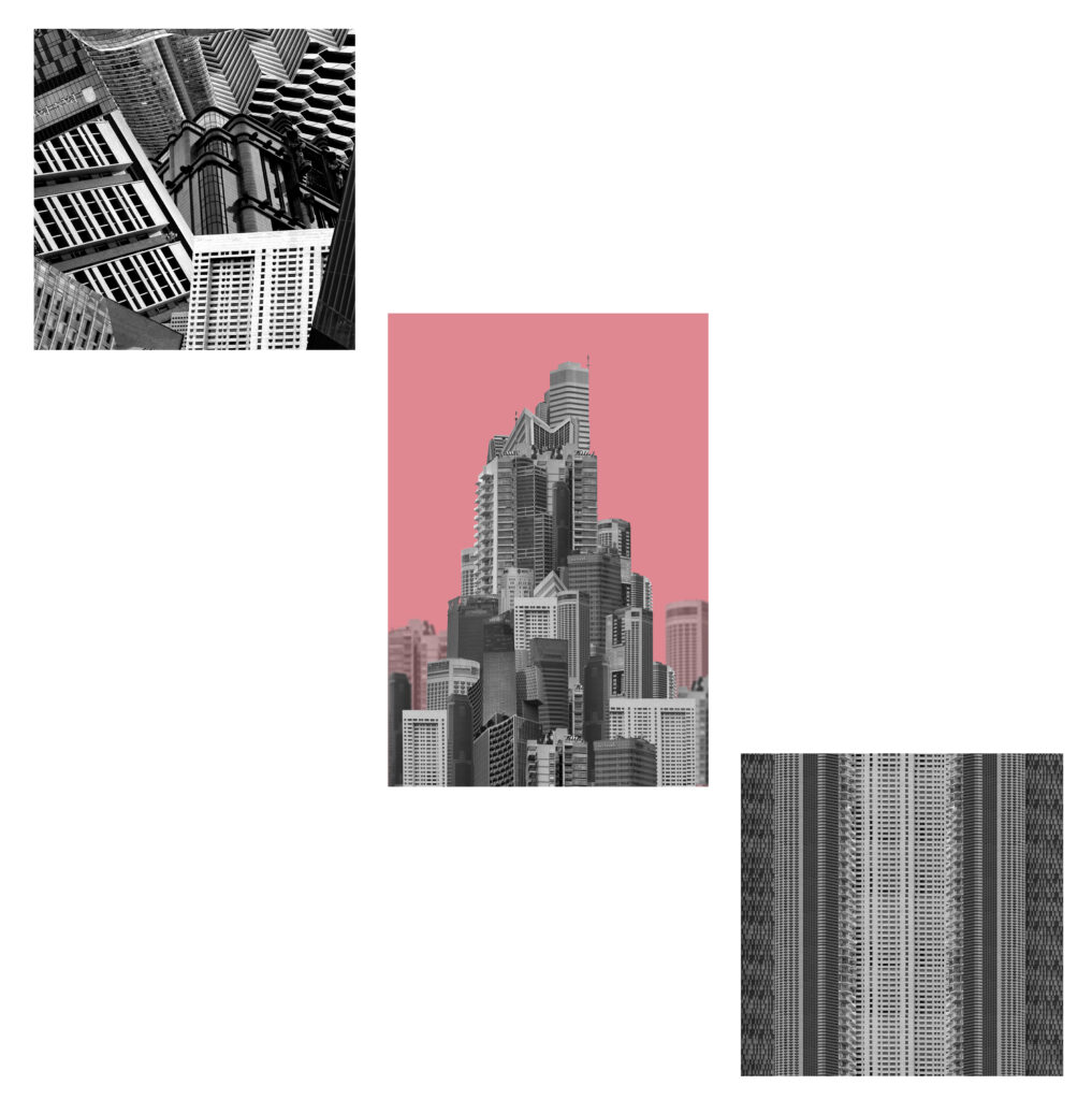
I would print the squares on A4 for this layout and the building on A5. I didn’t like how the images looked laid out horizontally so I tried arranging them differently again. This layout made the mega-structure look small and unimportant which I don’t think matches the message i’m trying to portray.
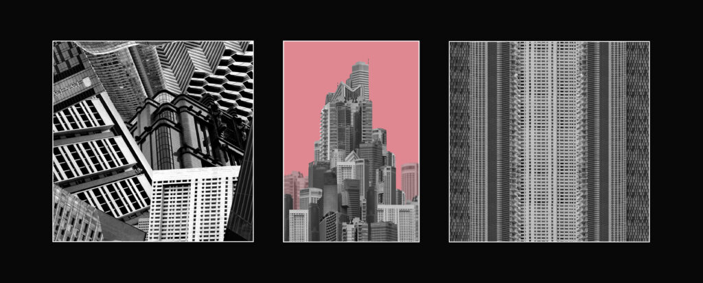
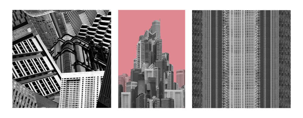
Layout 3:
I decided to try a layout where it was just the two squares instead. Although both edits are square their not particularly similar in any other way so I decided to change this layout by adding back in the building.
Layout 4:
I think this one looks better then previous because the colourful pop of the background looks good in the centre however there is a lot of wasted space. While the building and the stripes match the collage doesn’t so it looks odd all together.
Layout 5:
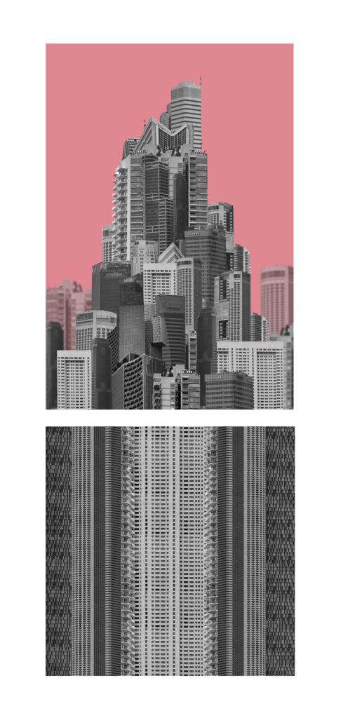
I decided to remove the other square image and arrange these two together instead. I like how the building looks like its sat on top of an elongated structure as it makes the building look even taller and unrealistic.
Layout 6:
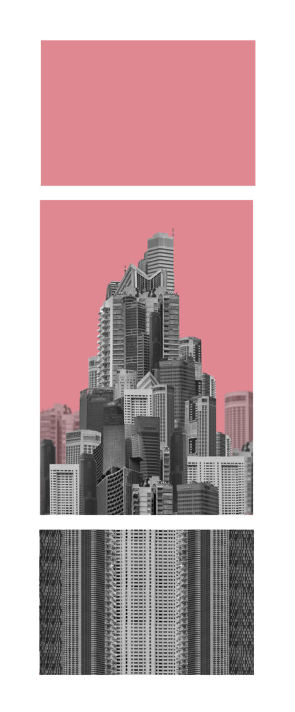
I liked how layout 5 looked overall It just looked a little off so I tried to balance out the layout by adding an additional section on top with the background colour to both elongate the shape and create a symmetrical layout. Both smaller images would be a size down from the central building and creates a clear distinction between the buildings and the background/sky. The square edit wont be square for this image as I didn’t want the layout to be too long.
Layout 7
I wanted to arrange these images into more of a grid to show the overall aesthetics instead of individual images. When making these I was unsure whether to present them as a grid of final prints or an arrangement in a photobook so I tried both.
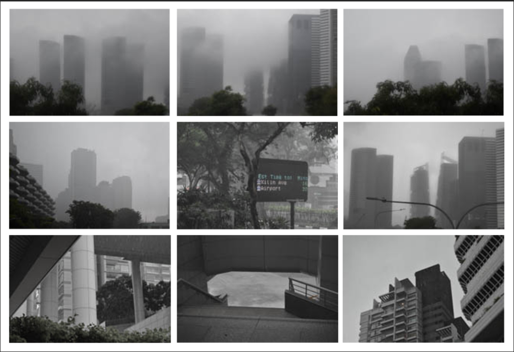
When creating this larger grid of images they didn’t all match overly well so Ill keep most of them for the photobook instead and narrowed the selection down.
Layout 8:
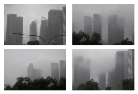
I downsized the nine images into a grid of four instead so that all the images were more similar and I could arrange the images into a typography.
Layout 9:
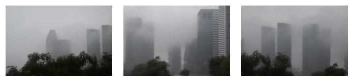
I removed the darker image because it didn’t fit as well with the other three but I’m unsure if I want to present two triptychs.
Layout 10:
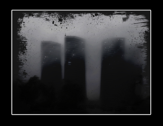
I liked how this image turned out and I decided to mount it up. I didn’t think it matched with the other images so I decided to mount it up on its own. Since this image was so much darker I decided that an A4 window mount would look best. I like the relatively chunky border around the image as it makes the overall appearance a bit darker which I think looks better than one which would be too thin. Since the image is so dark on its own, the window mount makes sense and the white strip breaks up the overwhelming dark.
Virtual Gallery:
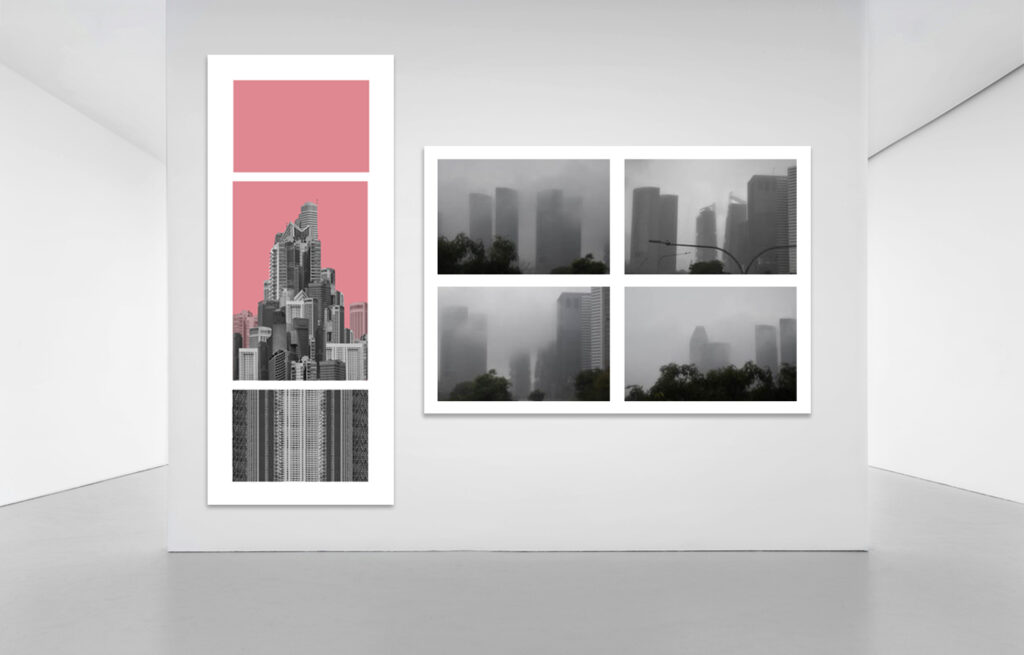
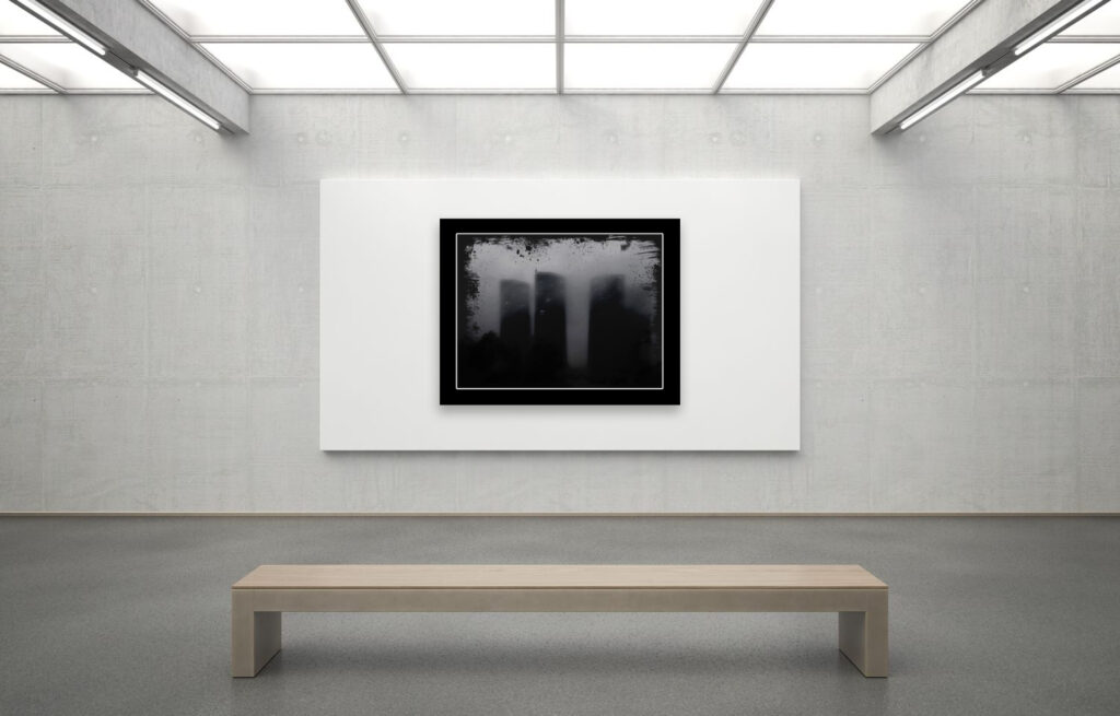
For the final layouts I decided on number 6, 8 and 10. I will be presenting layout 6 with small frames between each image and a wide border around the whole thing. The building will be printed A3 while the other two sections will be A4. I will mount them on mountboard in front of a white background. For layout 8 I will be printing each image in A5 and mounting them on mount board on a white background also. After mounting up I realised that for layout 6 I should have printed the largest image in A4 and the other two in A5 as the mount board was not big enough to fit all 3 images and the line left when stitching two together looked a bit odd. Additionally When printing a size down there is an additional few centimetres of border added to the smaller images so they don’t align perfectly with the A5 image. I presented layouts 6 and 8 separate from 10 because of the difference in darkness. The window mount is so much darker that it looks odd putting all 3 together.
Evaluation
I had 3 main outcomes from this project which I think all turned out well. They each portrayed the message I had intended in different ways:
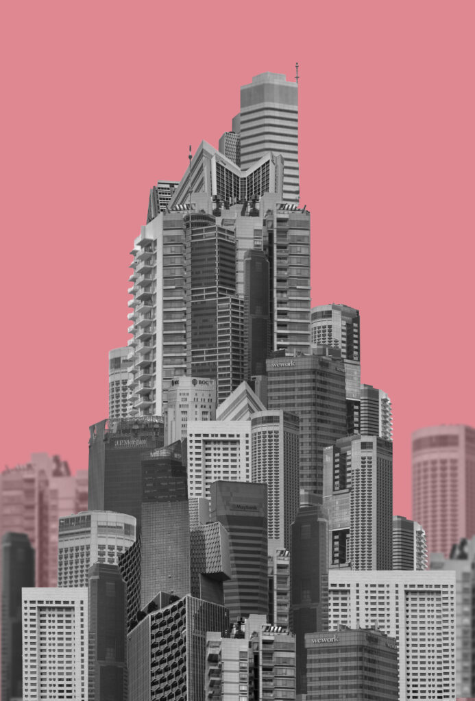
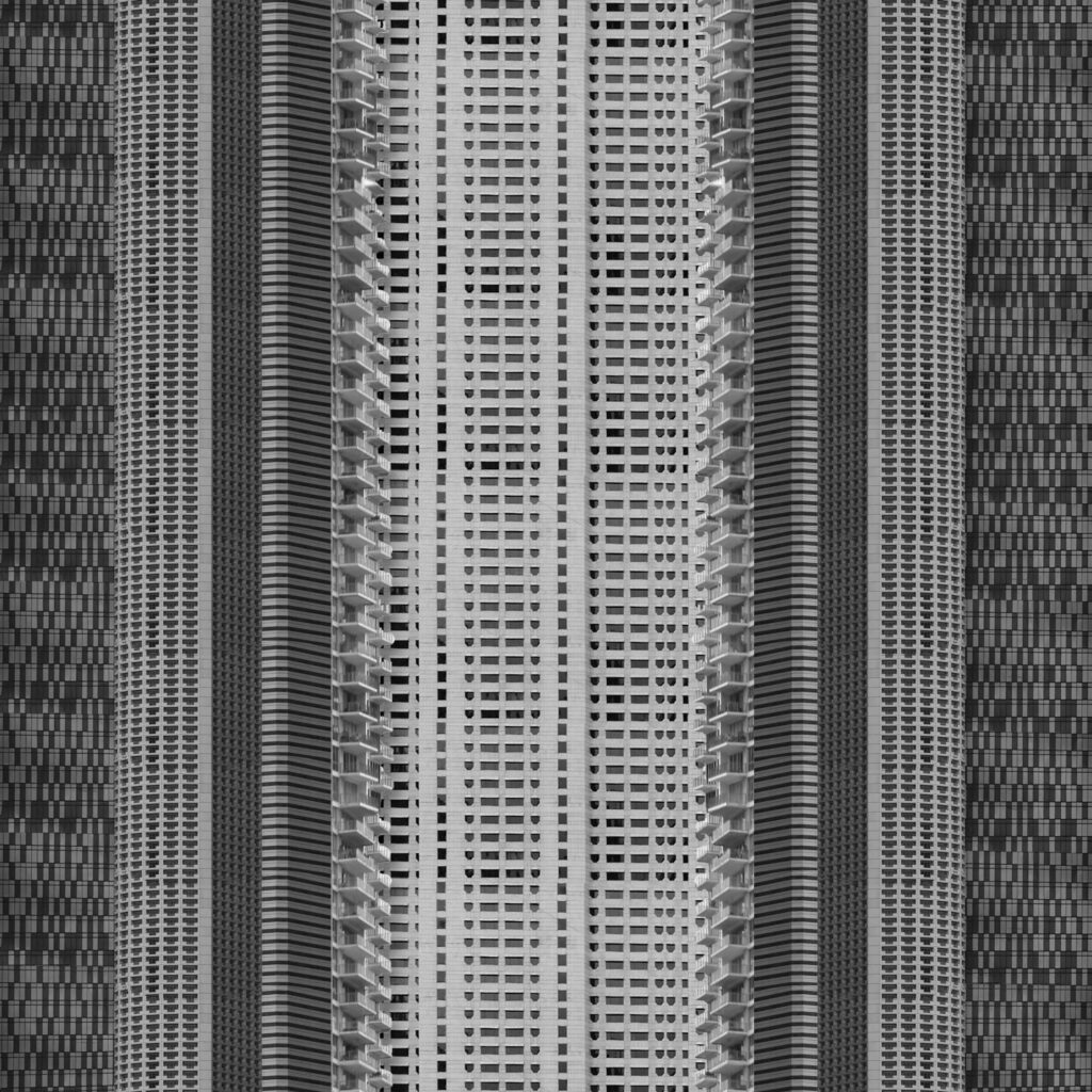
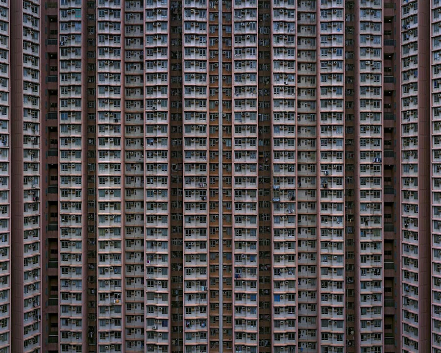
These images were inspired by Michael Wolf with different approaches. I think these both portray the message of overpopulation and overproduction well which was important for me to show in a few key images for my photobook. The main difference between them is that I set my images in black and white and I combined multiple different buildings into one strip. Had I kept using the same building at different angles, I might have been able to easily uniform the colour. If I was going to experiment further than I would have tried this as well. I do think that by using multiple different buildings in the stack it creates a more reasonable layout as different buildings are built together not by aesthetic choice but because the land is close by.
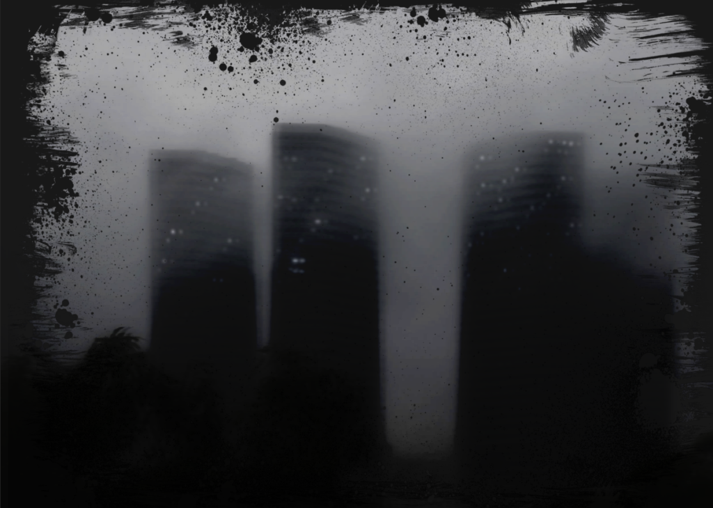

I was inspired by Lewis Bush for this image to show the synthetic nature of buildings. The lights are a physical representation of how people have overcome the dark and the haziness creates an ominous, unnatural appearance. The biggest difference visually is my image has more mid-tone grey and the artists has more near-black grey. I think that for my image the mid-tones work better as it makes the buildings stand out more as something emerging from behind the smog where as Lewis Bushes has more emphasis on the setting sun and artificial lights.
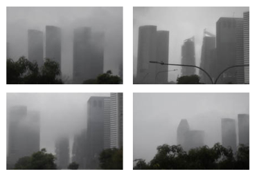
With these images I was inspired by typology and arranged all these images into a grid. They are all similar in location, subject and lighting which makes them all fit together well. Additionally they are all images of the same type: high-rise buildings. Overall these images together create a sense of scale and show architectural the feats as something somewhat sinister.