Photoshoot 1:
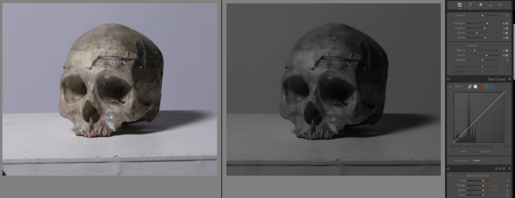
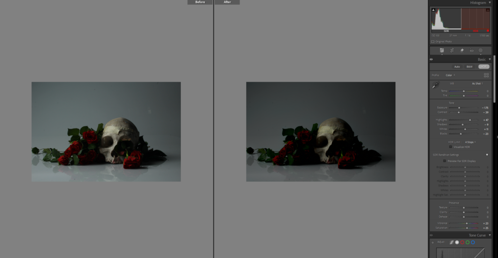
I edited this photo by changing the basics to give it better lighting and more the effect of dark and gloomy I was going for. I still don’t think it is perfect and didn’t love the background because I wanted it to be black. the main point of this skull is to symbolise the death especially the death of romance.
I have the way I edited it next to the image, and the rest of the images like this I plan on editing in similar ways. but for this one to experiment I brought it into photoshop to attempt to change the background.
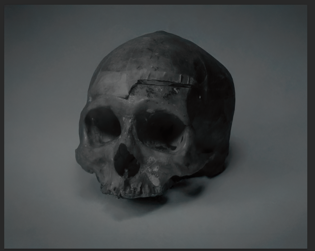
This was my first attempt of a back ground I wanted it to be black but I thought this looked cool.
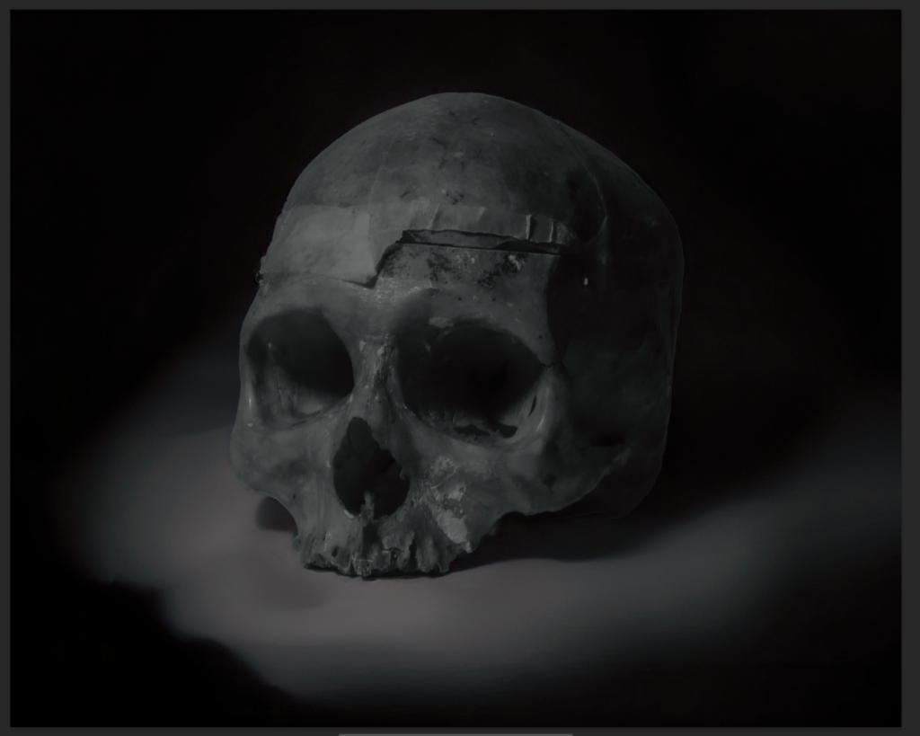
This was my second attempt.
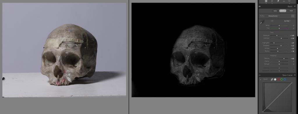
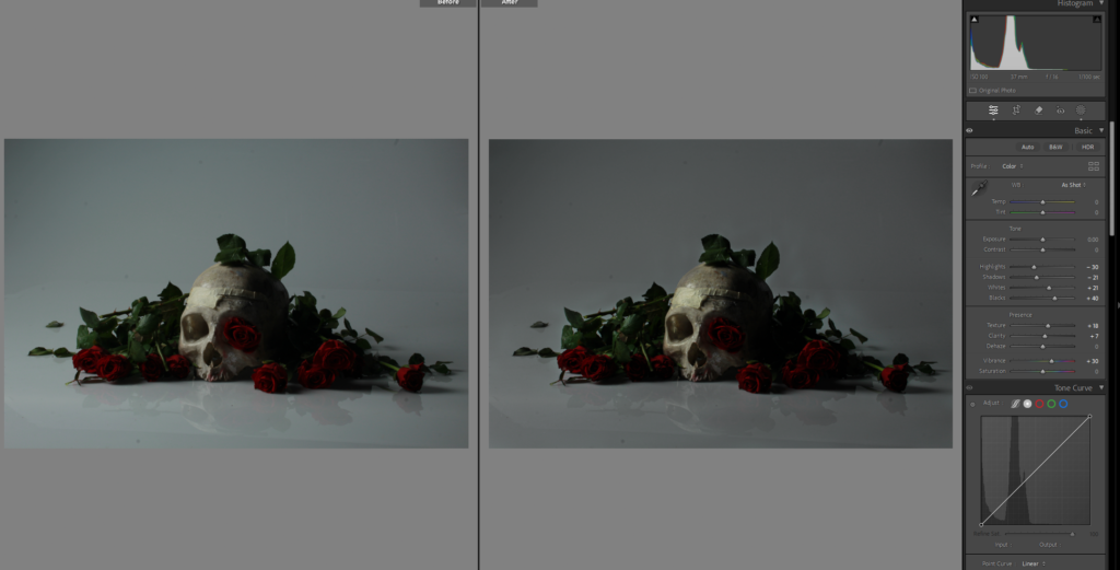
This is another photo of the skull I edited but instead of going to photoshop I edited the black background in Lightroom by using the brush filter and bringing down the exposure and blacks, and contrast.
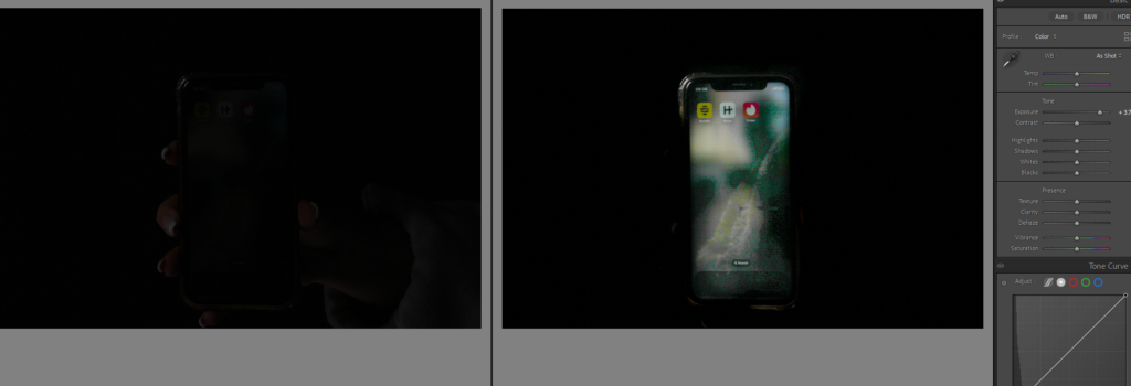
This was my first attempt to edit this image of my phone to make it more obvious what was on the screen, as you can see from the first photo it is not clean what’s happening in the image, so I used the brush tool again, I used it to make the background around the phone dark, and the used it again to make the phone light. but I just didn’t light the photo because of the lighting and graining in it.
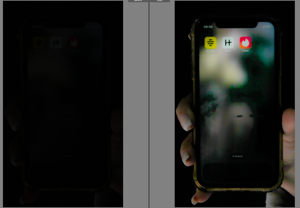
I tried again with this image, and cropped it so it was more focused on the phone, I lowered the texture to not give the grainy affect which still didn’t work because the lighting in the studio wasn’t right for taking photos of the phone, it worked better in this image but still not clear enough with what’s going on in the image.

Did the same with this image, which worked better because my screen was brighter but my phone looks very grubby with all the marks on it so I will take it in photoshop to try and remove them.
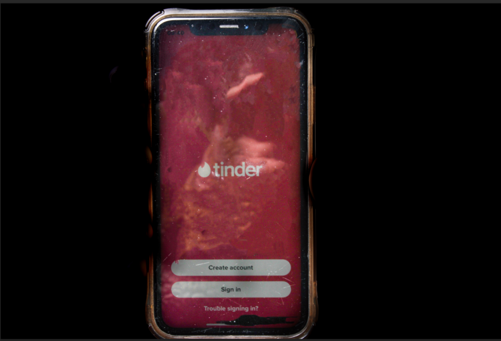
I removed most the scratches but there is still some and I’m just not sure it looks great.
Photoshoot 2:

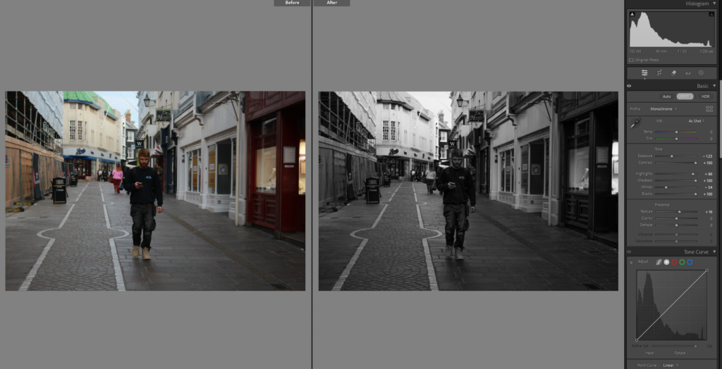
I do like this image, and fits well into the street photography aspect and inspiration from Henri Cartier Bresson, but it isn’t perfectly edited it was a bit rough just to test out the tools on how I wanted it to look. Mainly turned it black and white and adjusted the exposure and contrast and used the brush tool a little in the top where it was brighter from the sun.

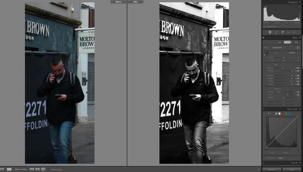
I edited this in black and white as well which is what I think most of my images will be, I decided to crop this one, and used linear gradient instead of the brush tool to darken where the sun was shining brightly
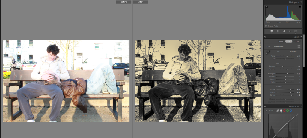
I wanted to make this image look like an old in time image, so edited in Lightroom, I liked it but didn’t think that it gave the right affect still.
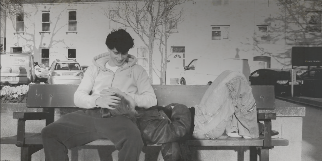
I attempted again by putting the image into photoshop and using another image of a textured old time affect, and then lowered the opacity, but it was a little too faint the actual image, so then I added the same background image again on top and lowered the opacity of that image.
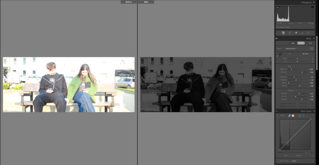
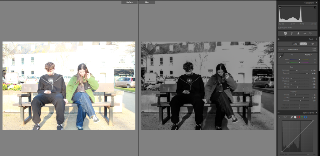
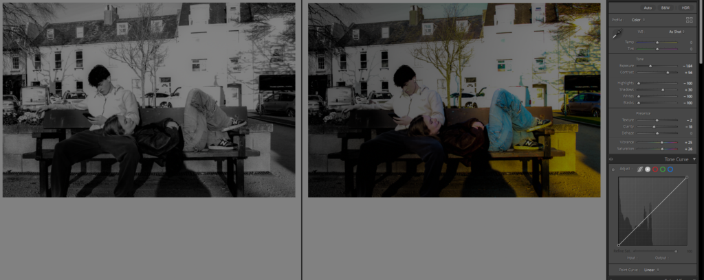
On this image I used the linear gradient, to make it so half the screen was black and white where harry the guy is sitting because he is on his phone and it gives a symbolic effect that the darker side is the falling out of love or less invested in the relationship while Martha the girl has colour but its slowly fading, because she is getting fed up.

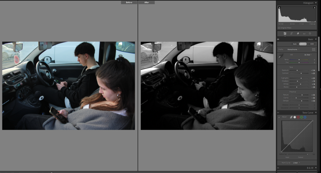
Again I made it black and white and changed the exposure used the brush tool on the hand to change the lighting a little because it was very bright, don’t love this image just because I think it should be on messages, but I liked the editing and how clear it was that was said.
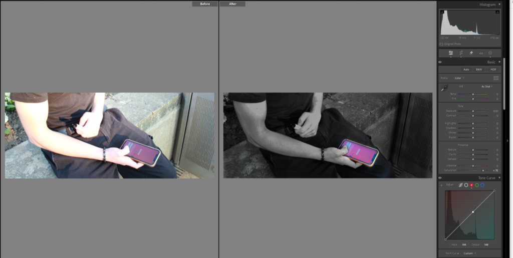
I made this image completely black and white using the brush tool but kept the phone bright and upped the saturation a little to make it brighter and more visible.

Again with this photo I edited the exposure and contrast especially for the hair as it is very bright and blonde, I made it black and white because I think it looks better and gives a cooler more dingy affect on my images, contrasts everything better, but I want the phone to stand out more, so might consider cropping it, trying again with that being the only part with colour its still not obvious enough though.
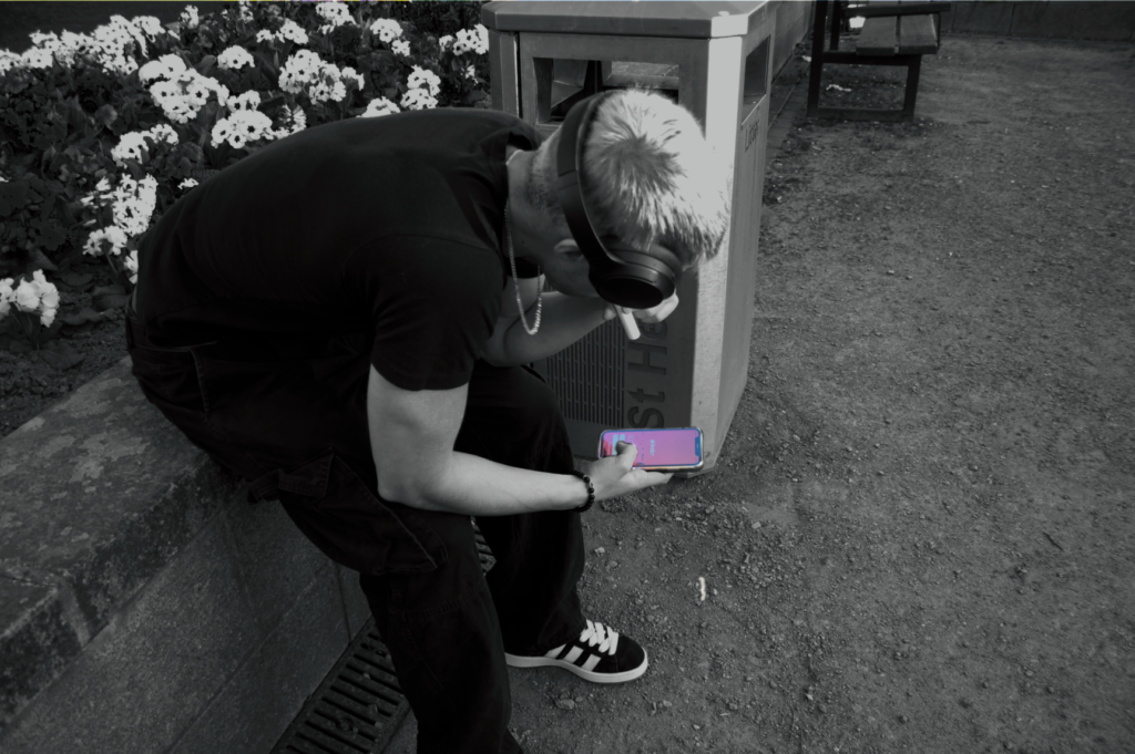
This was my attempt in photoshop and it looks a lot better.
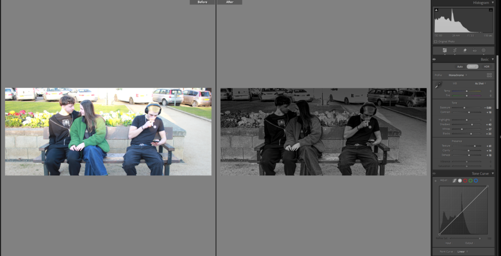
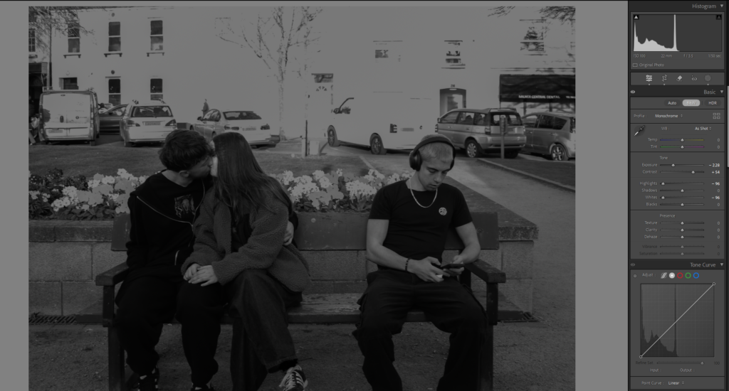
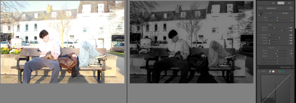
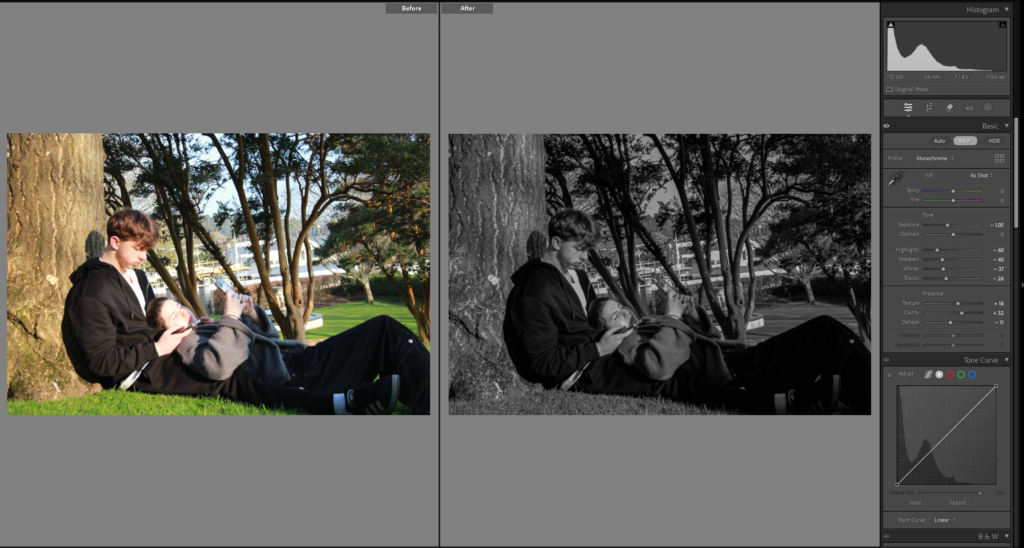
Liked this image, just made it black and white, and if I wanted to add it into my book I thought I would have there fold of the pages right down the middle to show the juxtaposition between the people more clearly. Decided to edit it in some different way.
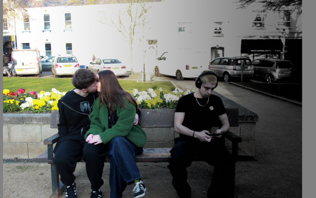
I then tried it using the linear gradient tool again on the side of the single man to give the dark cold black and white affect on his side and a colourful side on the couple.
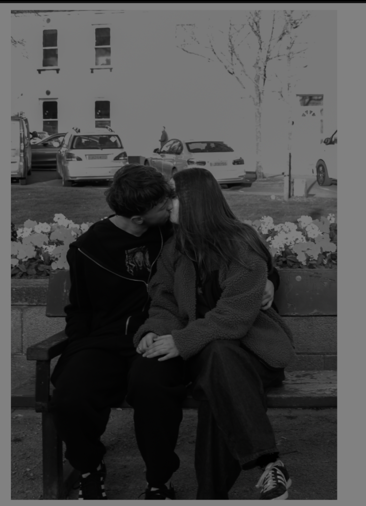
I then cropped it so it was only the couple and the other crop is only the single man.
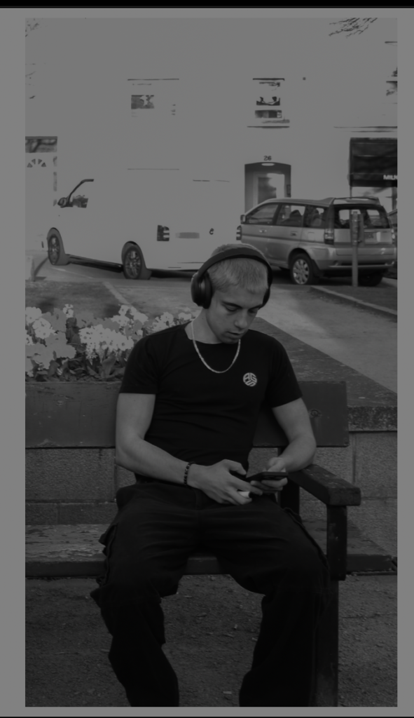
I cropped this image as well, made it black and white and this will be an image that correlates with another image from the old days, possibly.
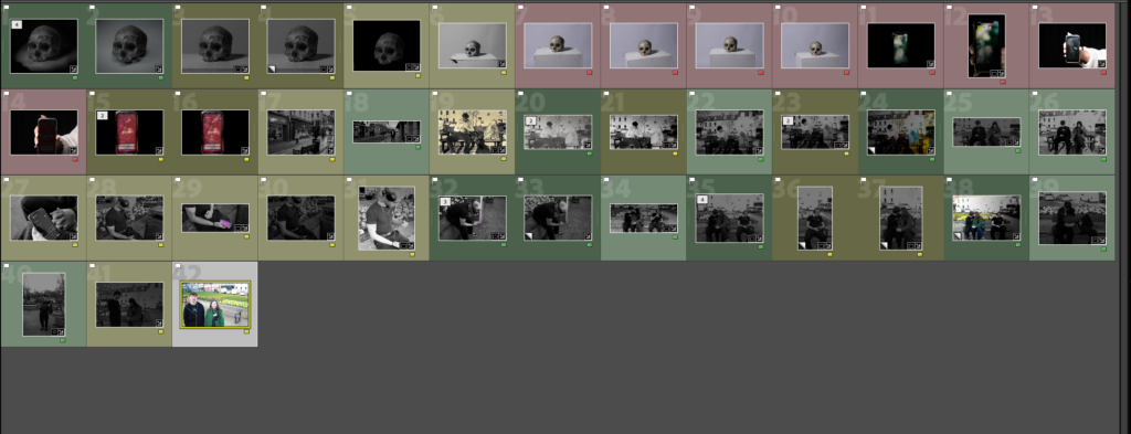
After going through and editing all my current images I coloured the either, red, yellow, or green, I did this to show which ones I really like and want to keep or the ones I hate.
Red = I don’t like it don’t use
Green = love it, definitely using it
Yellow = I do like it not certain though, maybe ill use maybe I wont.
Photoshoot 3:
At first I edited this image making it black and white, I didn’t like all the people in the background though and attempted to get rid of them in photoshop but it did not work as well as I wanted.
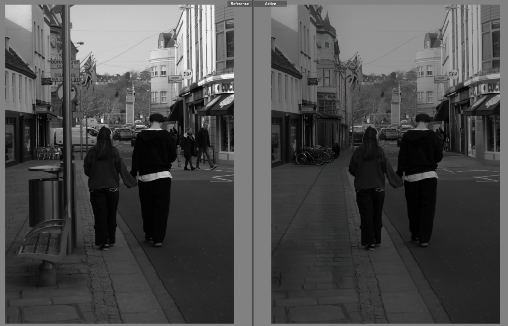
Got another photo from the couple on the street but instead for this one I moved it to photoshop and removed the people, the bin, bench and pole. so to not take away focus from Ellen and Tony.
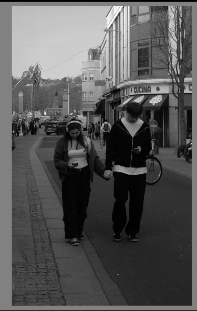
This image I once again removed things from the background but don’t love how it worked out and think its still gives a cool affect when it is next to the comparison photo.
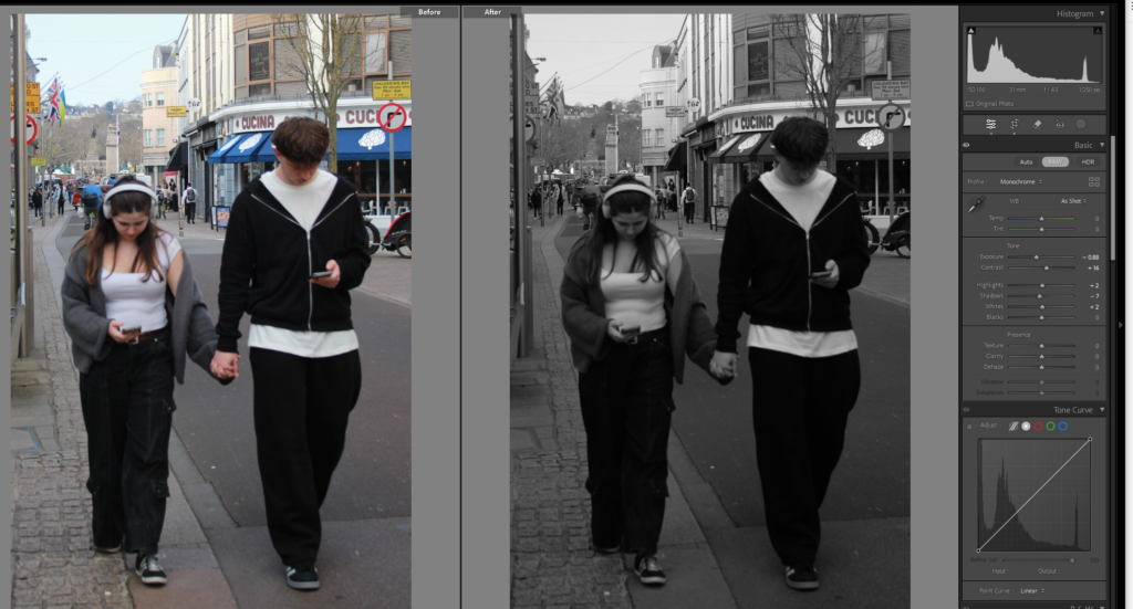
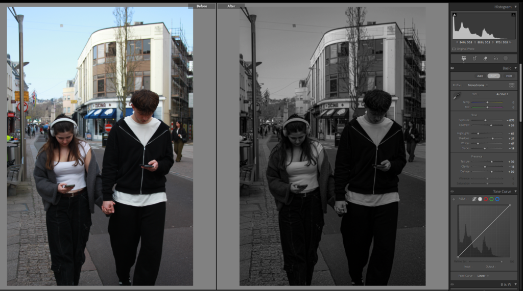
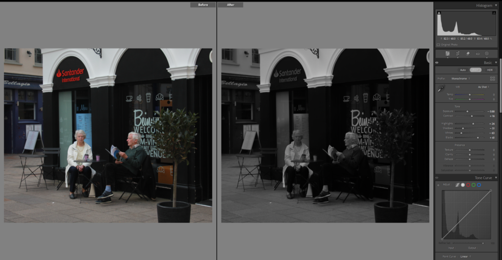
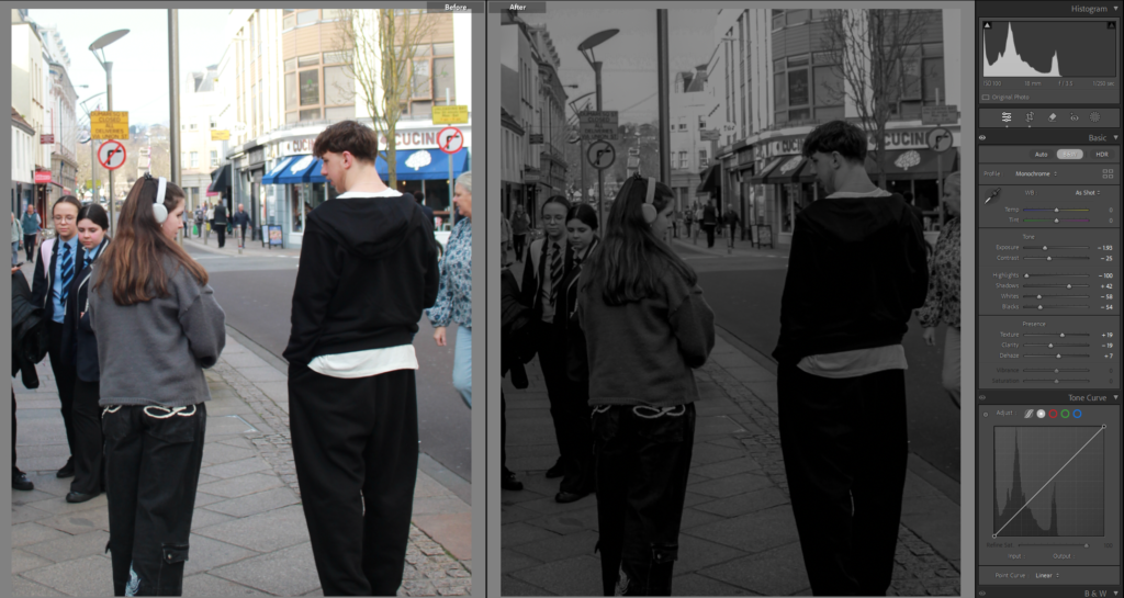
This image I turned black and white, and did the basic edits as you can see of the exposure and contrast, but then I also specifically used the brush tool on the ladies face because she was very bright which isn’t a bad thing just think their wasn’t any shading or texture to her face and it looked odd.
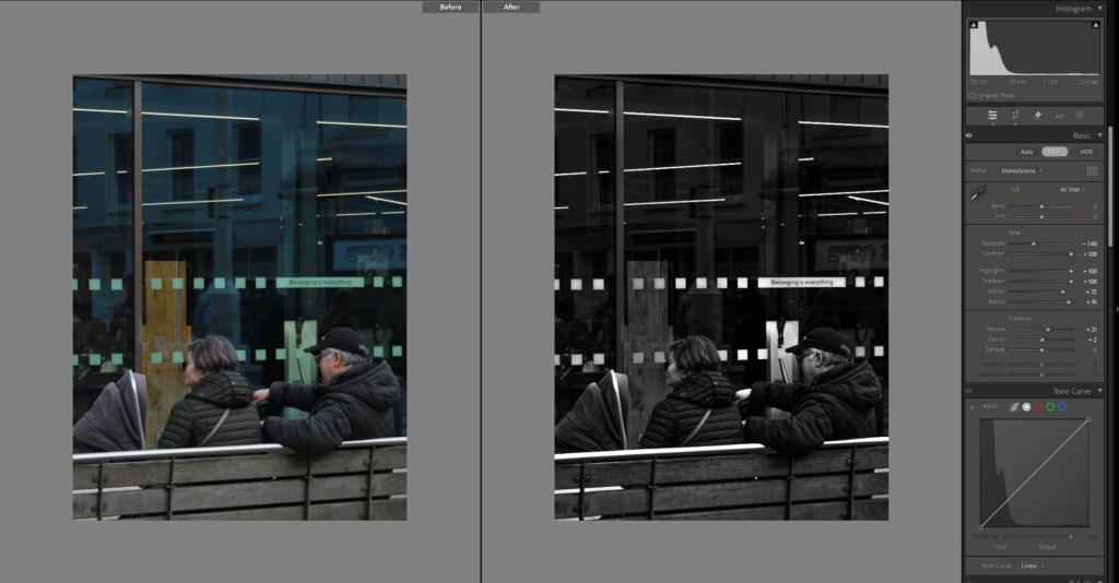
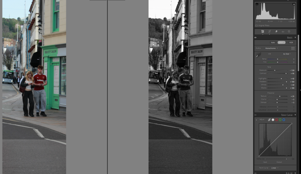
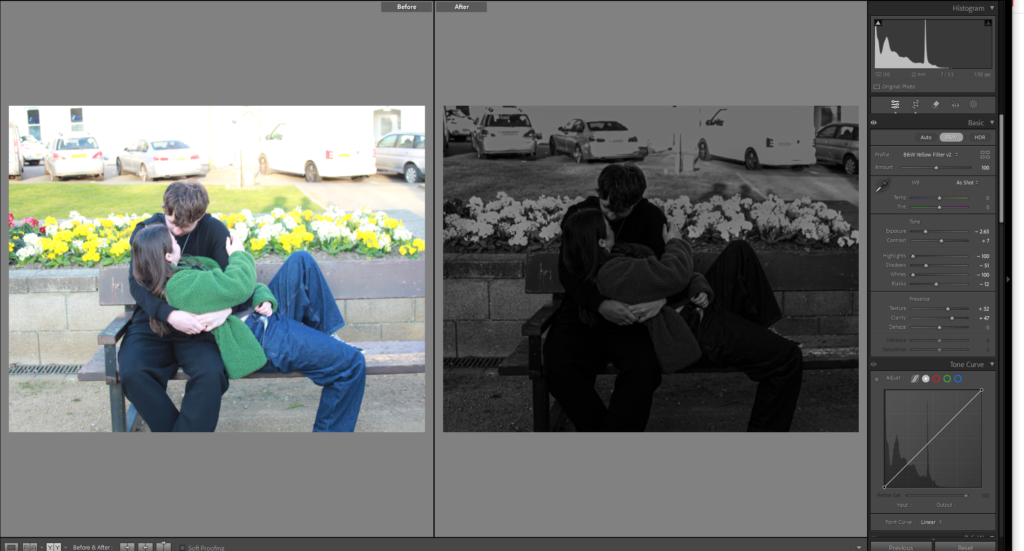
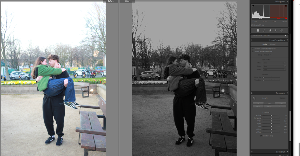
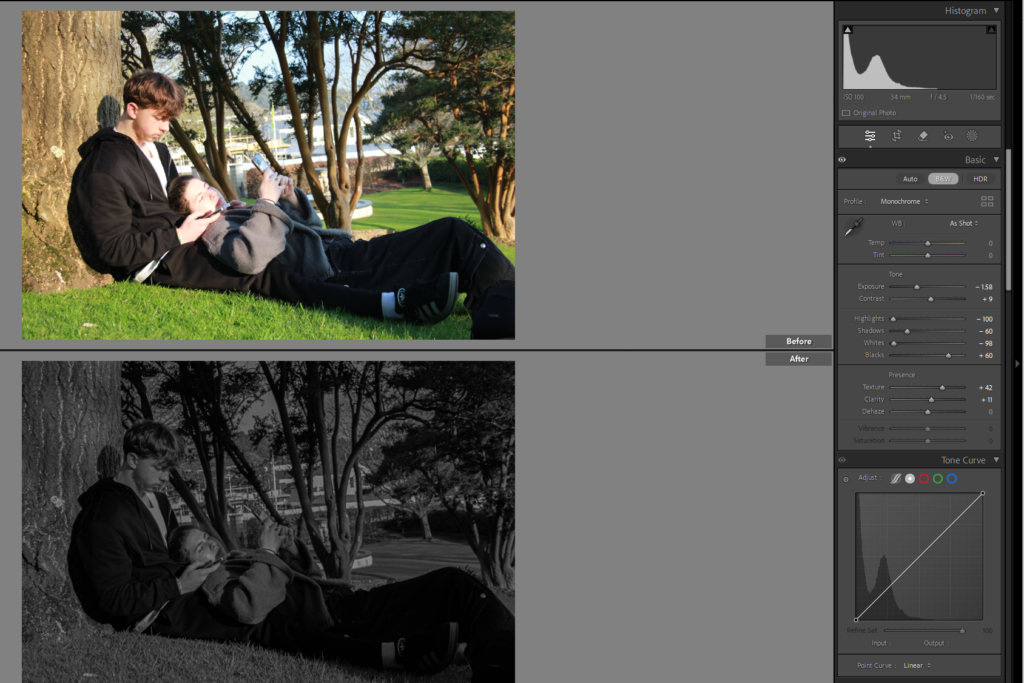
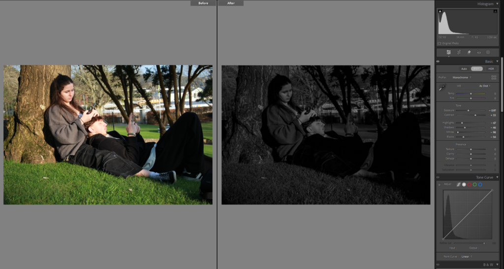
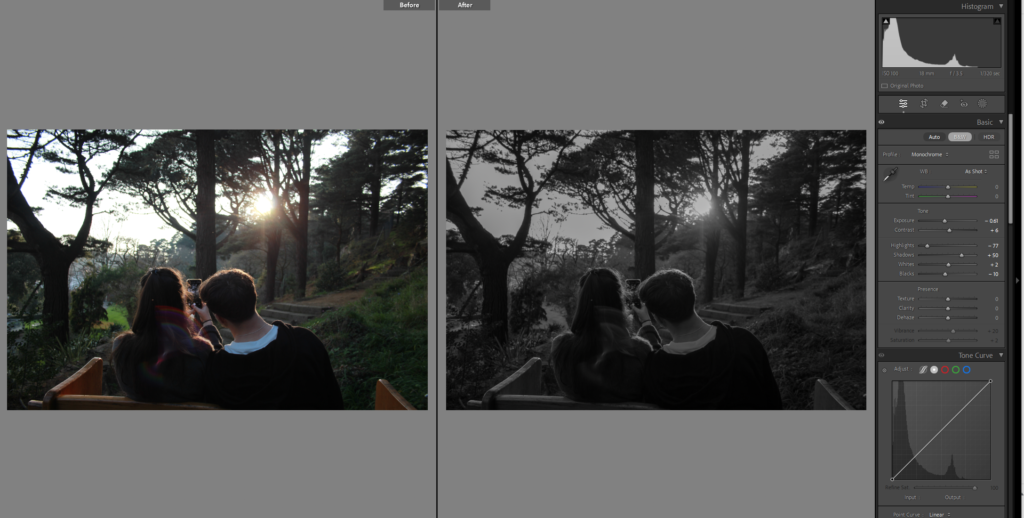
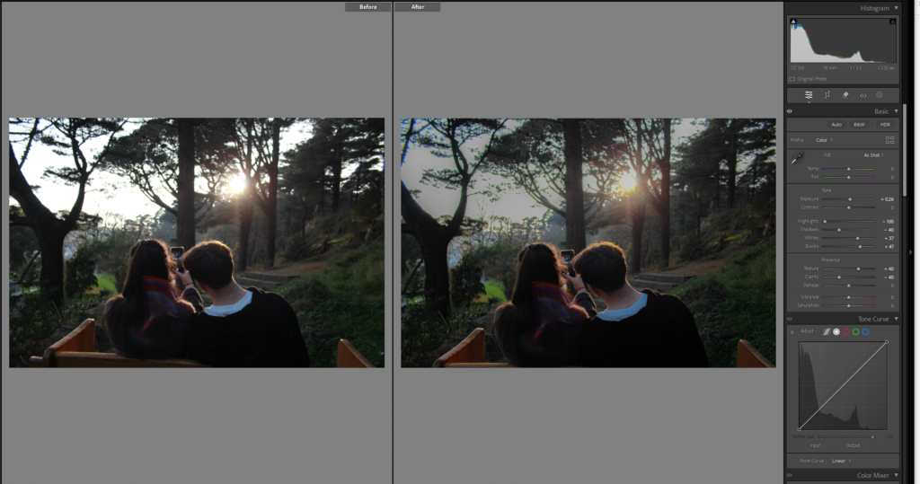
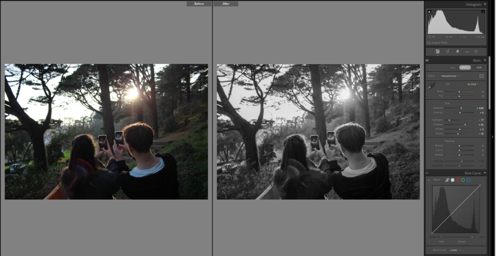
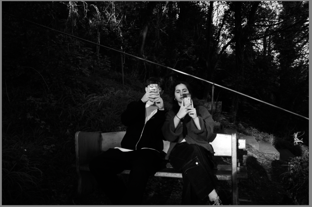
these are my street photography of couple or people on their phones and I don’t have a specific way of editing I am making them all black and white and then playing around with all the other tools until I think it looks and gives the right affect.
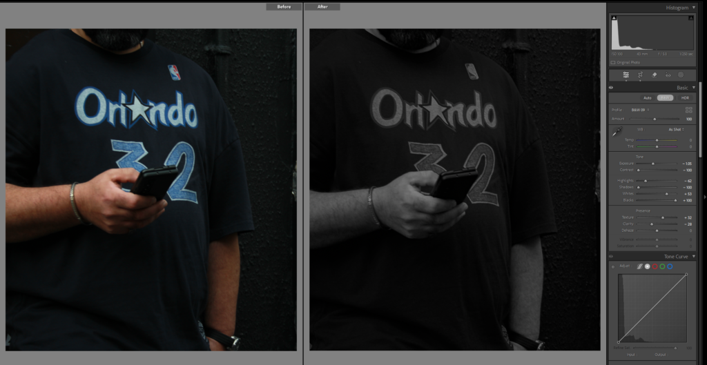


Photoshoot 4:
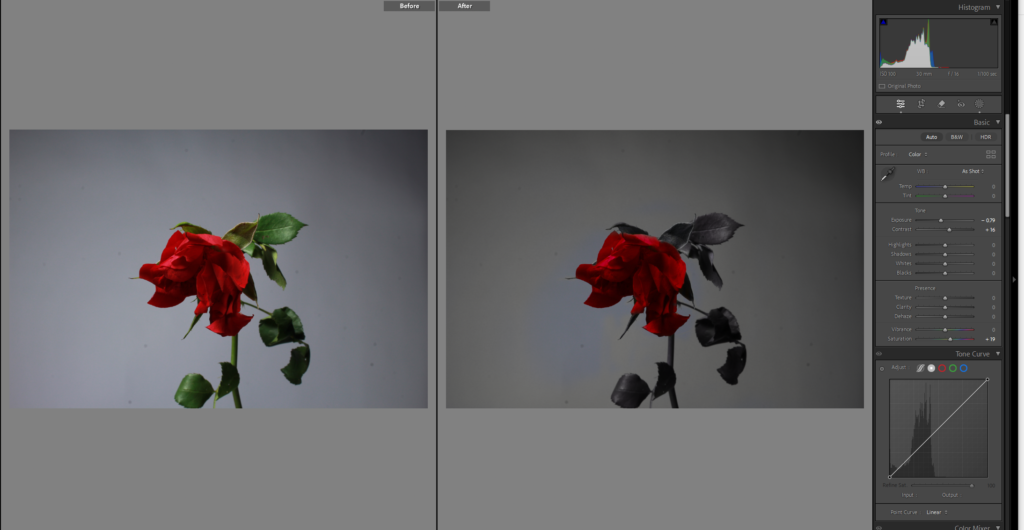
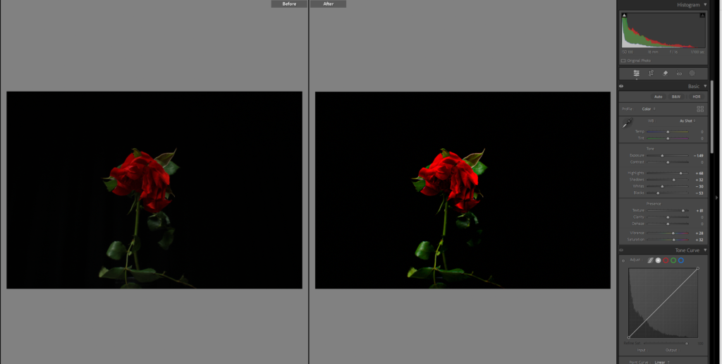
I edited this image by making the surrounding black and white using the brush tool, and then I decided to bring the saturating up for the rose to add to it standing out but I don’t love it.
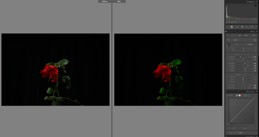
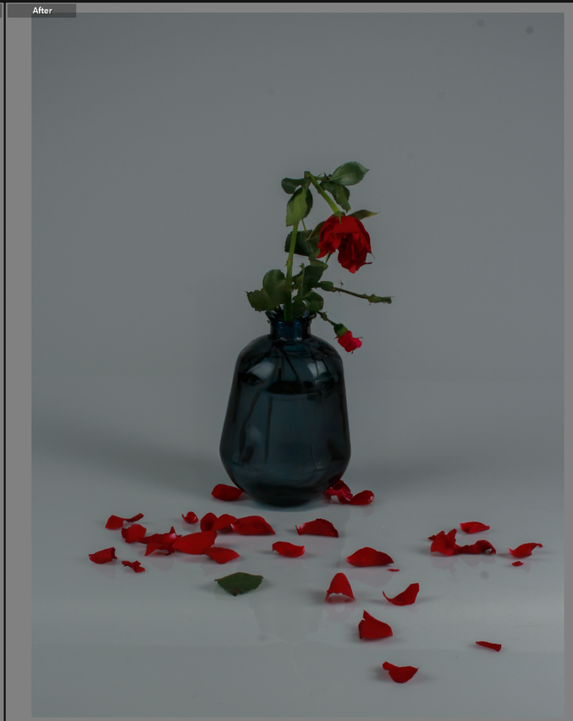
I moved this photo into photoshop to change the vase.

Photoshoot 5:
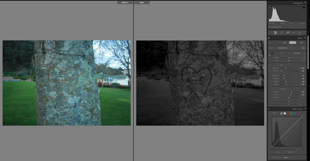
In this image I wanted the heart to stand out so outlined it with the brush tool and darkened the exposure, didn’t pop out as much as I wanted.
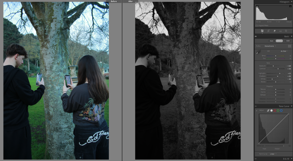
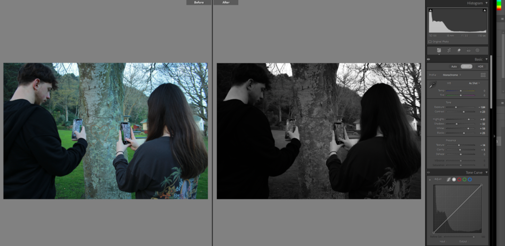
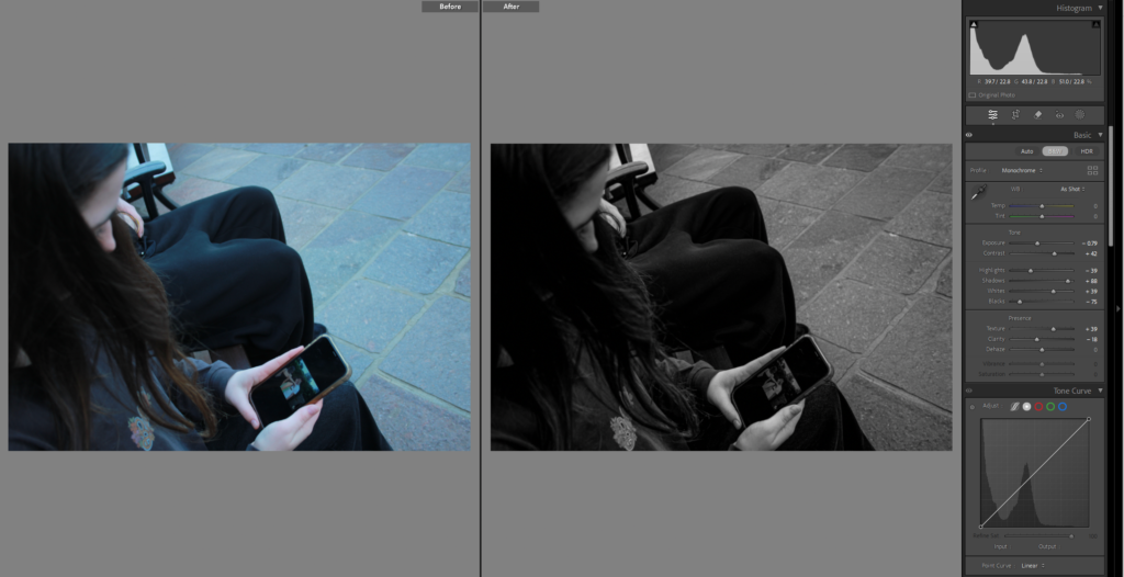
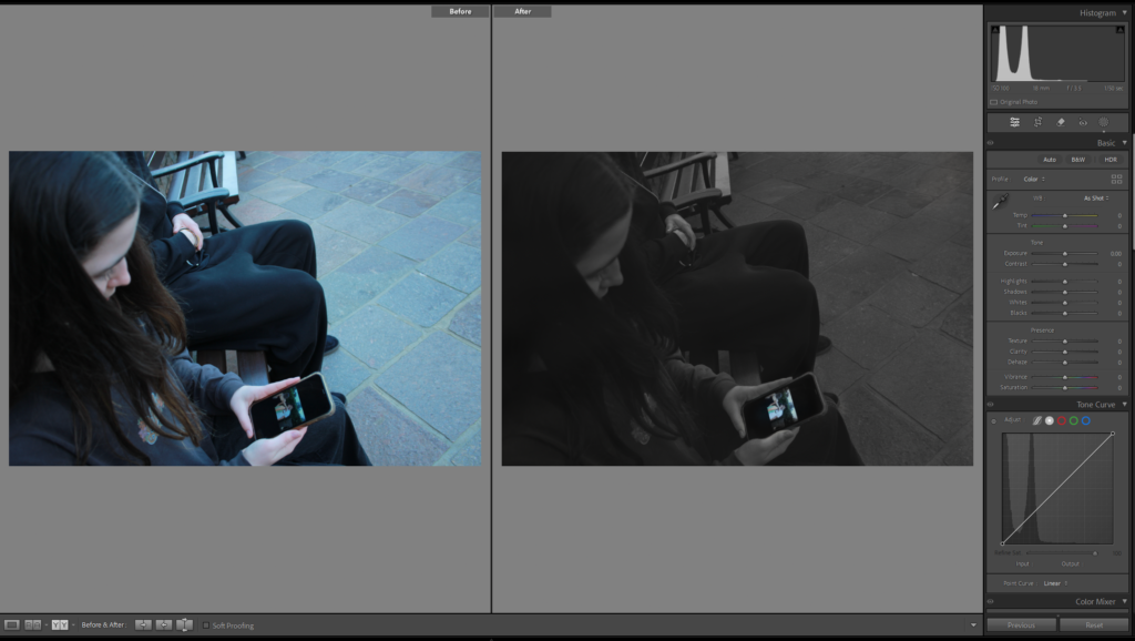
This photo I used the brush on both the phone and the background, the brush tool used on the phone was to make it brighter and slightly more visible and full of colour, when the brush tool on the background was used to make it black and white.
Then I decided to crop the photo so you can see the phone and the photo on the phone more clearly to see what’s being looked at.
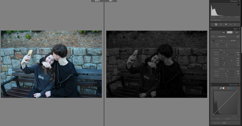
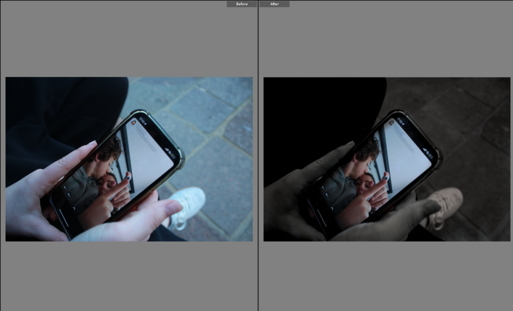
And this image I am editing in photoshop and it is incomplete right now as I plan on adding different text messages and more above the girls head but need to select them first.
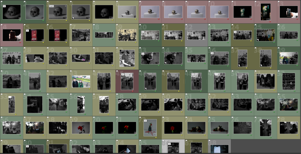
Finally I have the last 88 images, either in green, yellow or red, to be selected and chose for my photobook.
