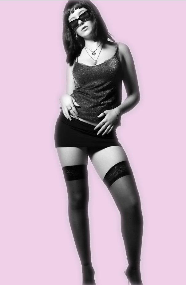
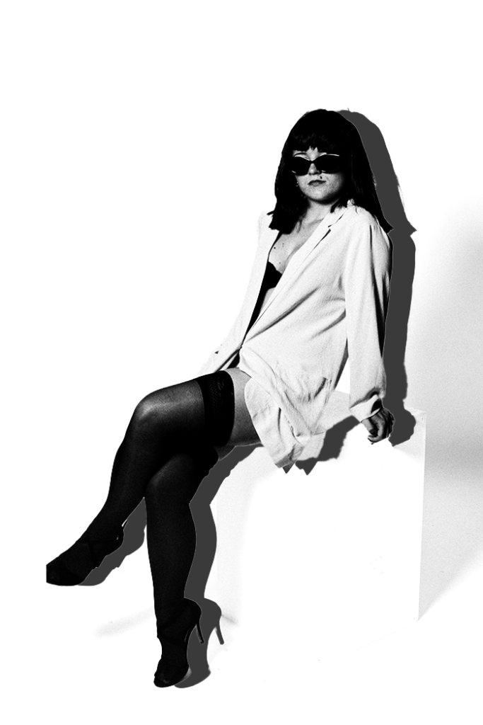
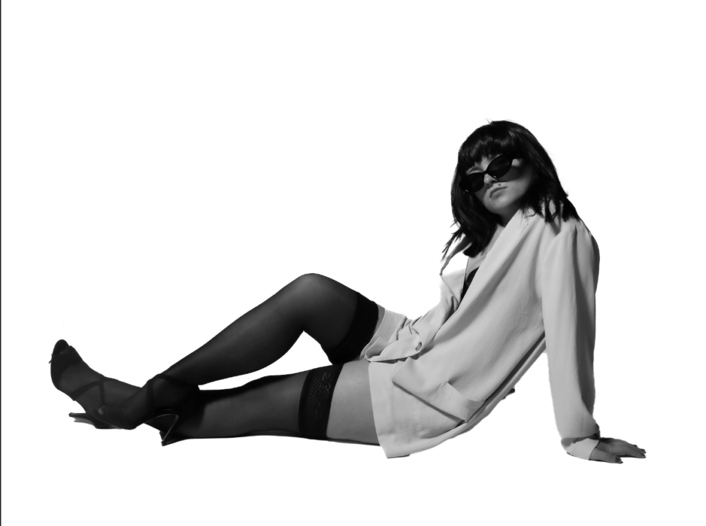
Portrait 1
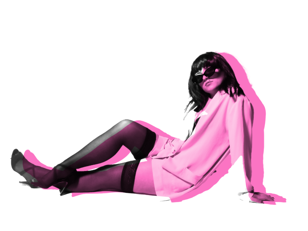
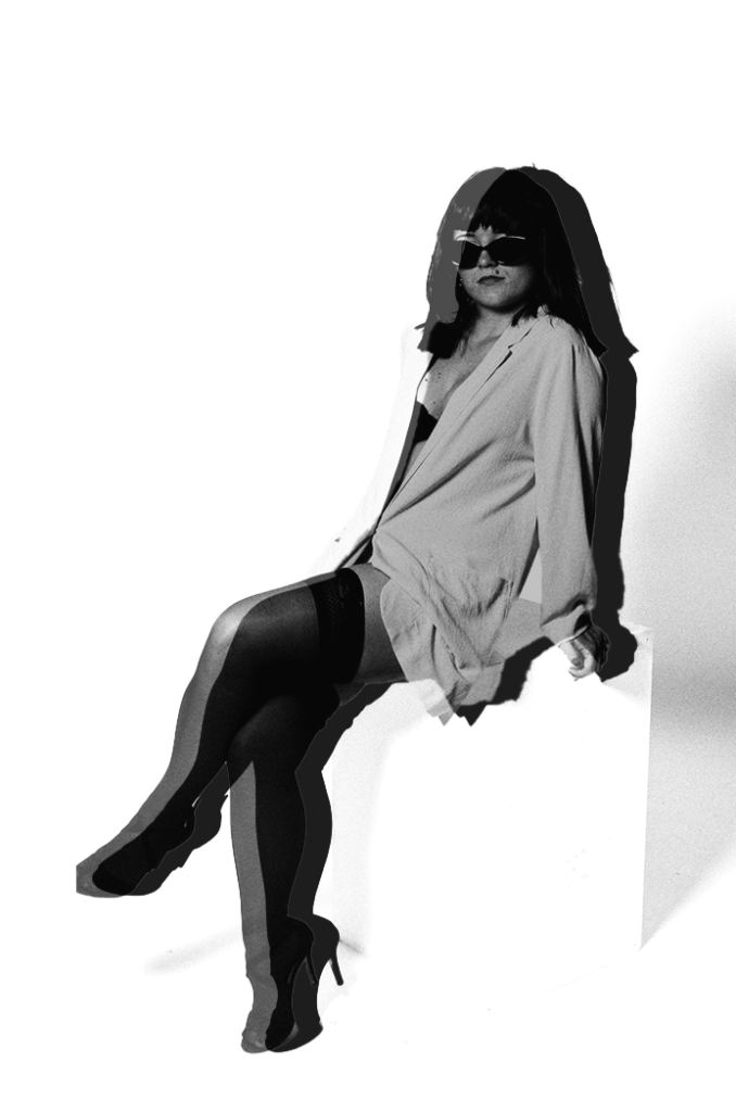
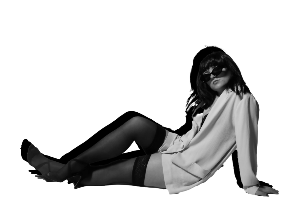
Experimentation 1:
Experimentation 2:
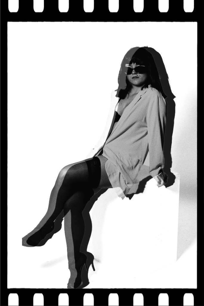
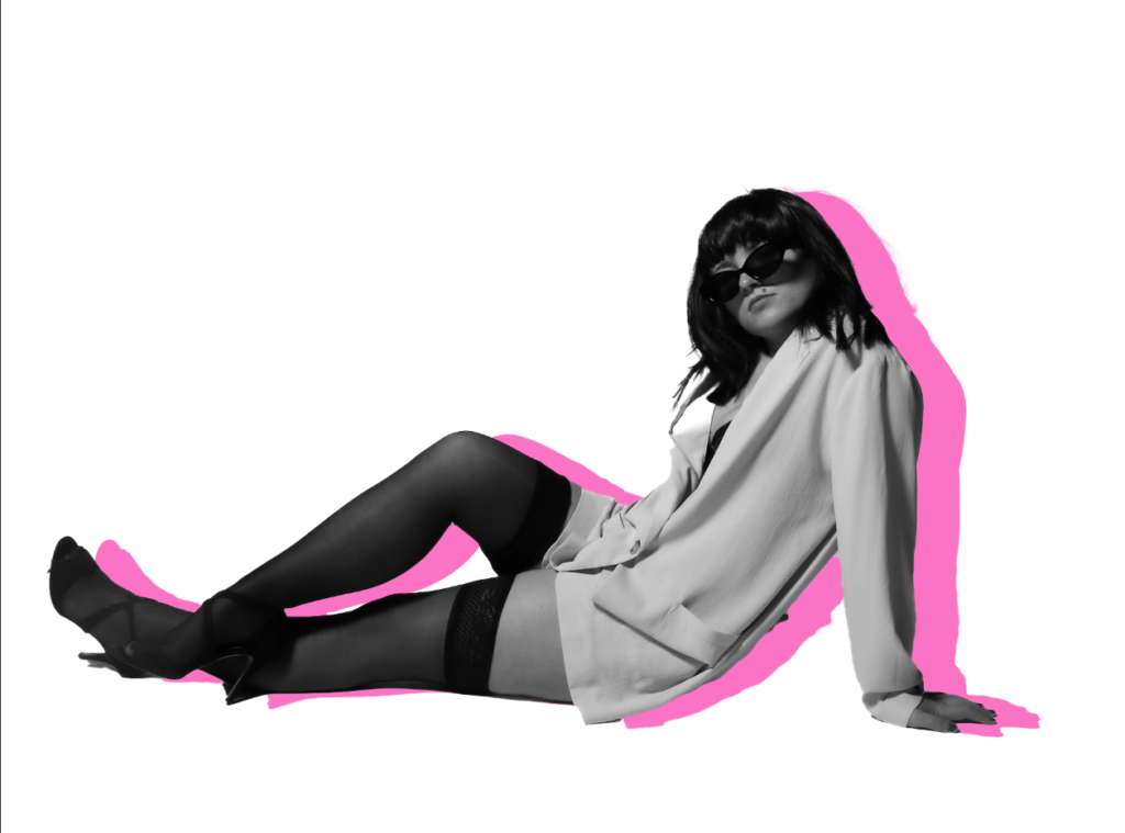
Experimentation 3:
Within this development and experimentation, I started off by colour overlaying the background to make the background a purple. First, I had to make sure all of the background became purple and didn’t miss any spots. Once I had achieved this, I experimented more on the subject using drop shadows, outer glows and even duplicating her. Once duplicating her, I could make a shadow when decreasing the capacity which makes her 3D dimensional. Once I was satisfied with the effects on the subject, I then began to test out different boarders to fit into my theme. My choice of boarders were a type of vintage aesthetic which fits my theme significantly. Therefore, I experimented with multiple to decipher which one I prefer the most.
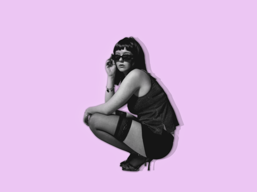
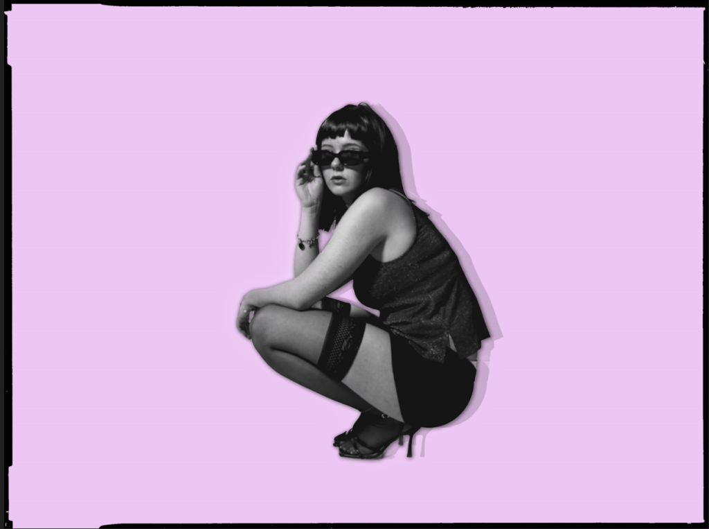
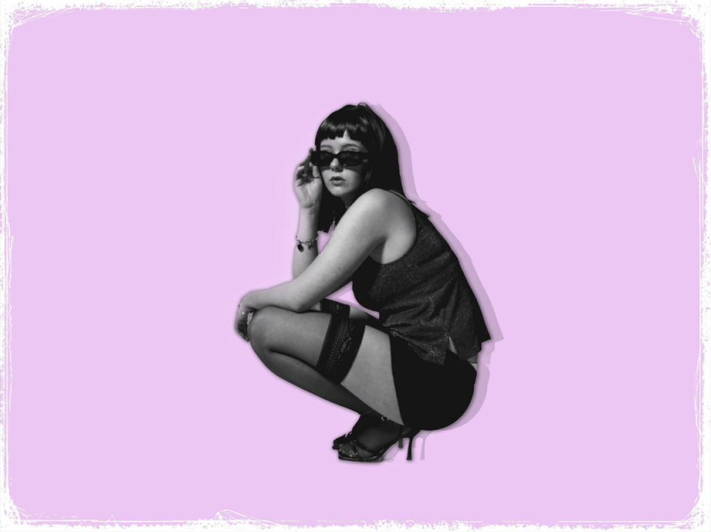
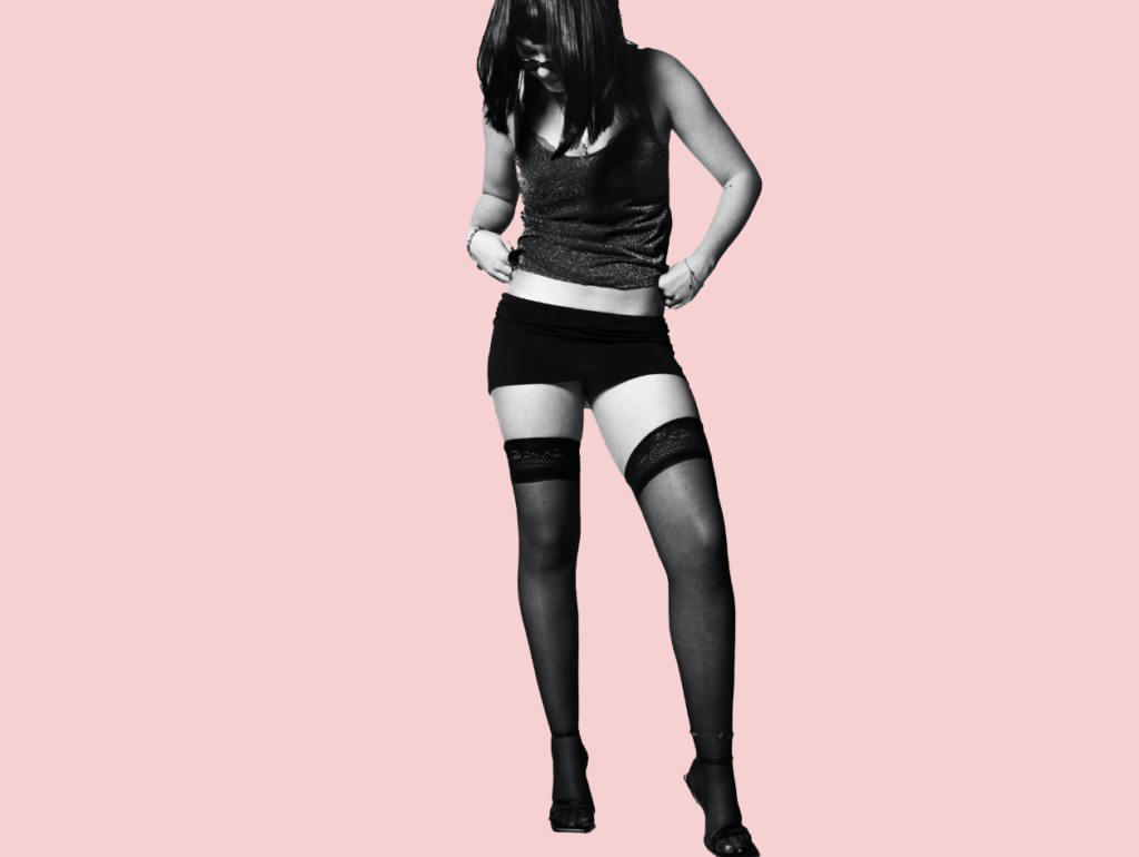
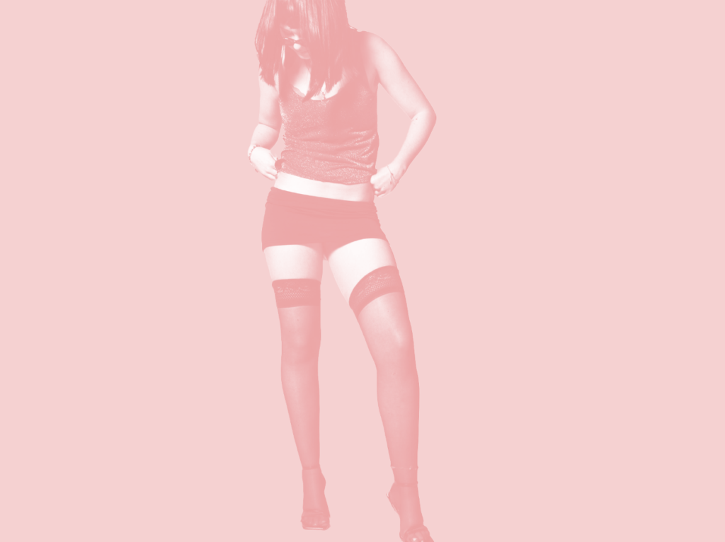
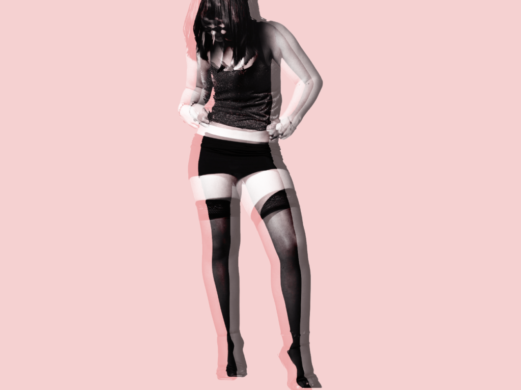
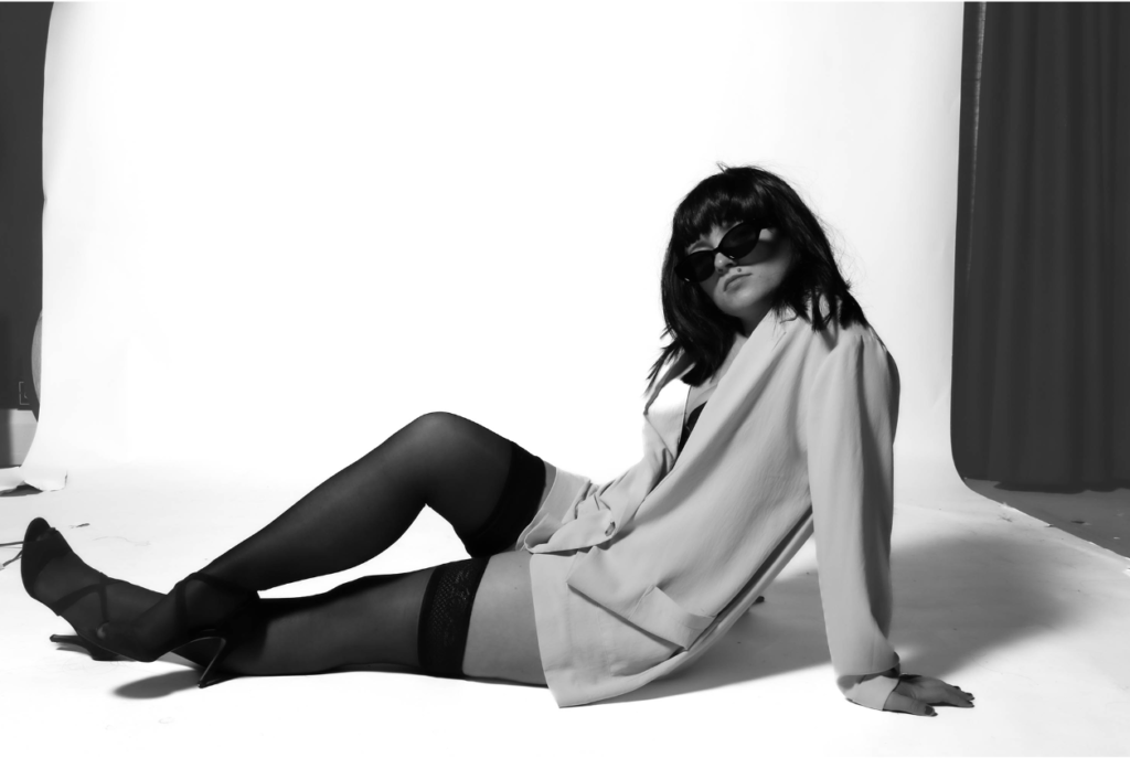
Portrait 2:
Experiment 1:
Experiment 2:
Experiment 3:
Experiment 4:
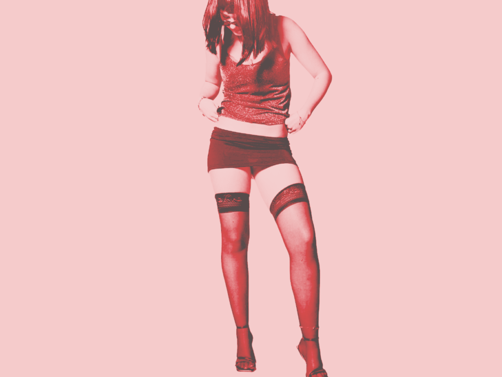
Within these experiment versions, I began by colouring the background with a light pink, considering my theme is femininity and empowerment. Then, I decided to colour overlay my subject. I then duplicated my original onto this for my next image which I think the 3D affect looks really unique. Lastly, I went through the layered filters and decided on which one I preferred the most which was this red colour as it could symbolise sexuality and it worked seamlessly well with my backdrop colour.
Portrait 3
Experiment 1:
This experiment, I made the background a purple- pink colour and then experimented along the way. I decided to feather my subject which made a slight white feathering aspect surrounding her subtly. I liked this as I thought it fit into the magazine theme as it attracts viewers straight to the subject, rather than being distracted.
Portrait 4
Experiment 1:
Experiment 2:
Experiment 3:
Experiment 4:
Portrait 5:
Experiment 1:
Experiment 2:
Experiment 3: Adding a boarder
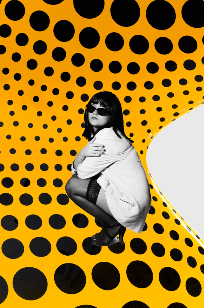
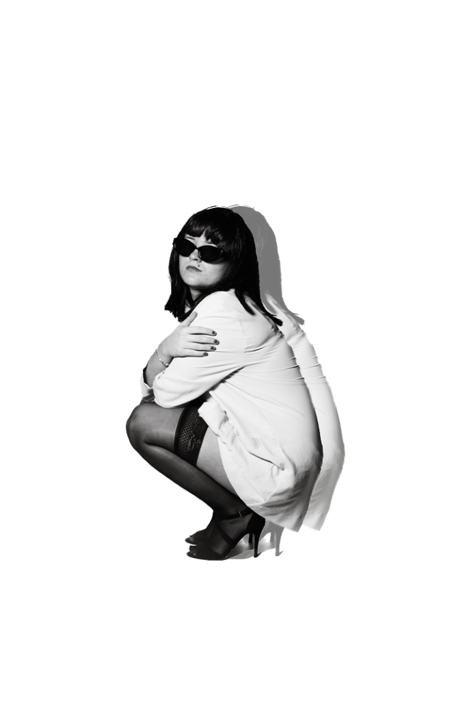
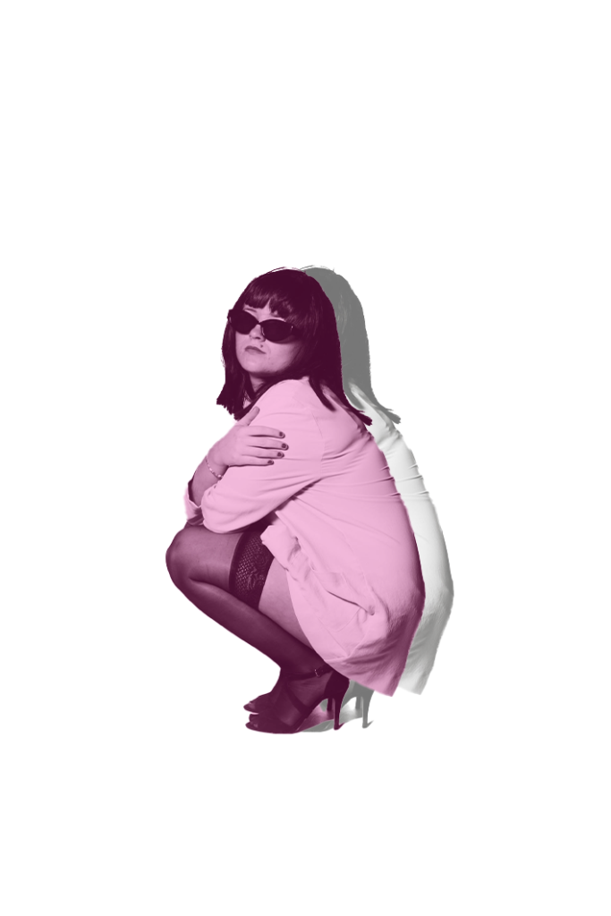
Portrait 6:
Original:
Removing the background:
Experiment 1:
Experiment 2:
Experiment 3: