
Contact sheet:
The three images below are some of my favourites I have shot so far as I think that I have composed them really well, as well as having a strong concept behind them that I find has been demonstrated well.
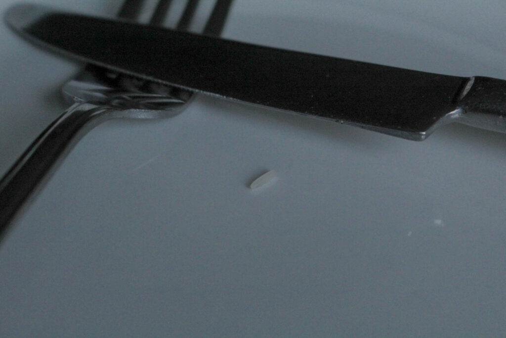
These images are symbolic towards the impact that airbrushed beauty and fashion magazines have on women’s and young girls’ perception of themselves and their self-esteem. As well as this, I wanted to curate images that created an overdramaticised, visual epresentation of pro-ana websites which are targeted towards young girls and promotes unhealthy eating habits that perpetuate eating disorders. I used a grain of rice and put it onto a plate with cutlery in alternating positions to show how extreme this issue is, and that women are not nourishing themselves with enough food to function properly. Due to the promotion of unrealistic body standards in the media, this leads to an internalised self-hatred due to wanting to have this unobtainable body, distoring their perception of themselves. I think these images are really powerful because it means that these habits can be demonstrated, even in a melodramatic way. Of course, nobody is actually having a meal like this however this is a visual depiction of the idea that a lack of food won’t cause the body to deterioriate, however when presented in this format then we can truly see how devastating it is that there are young girls being motivated to restrict themselves of fuel just because of society’s expectations of what woman should look like, making it almost impossible to feel comfort in being natural.
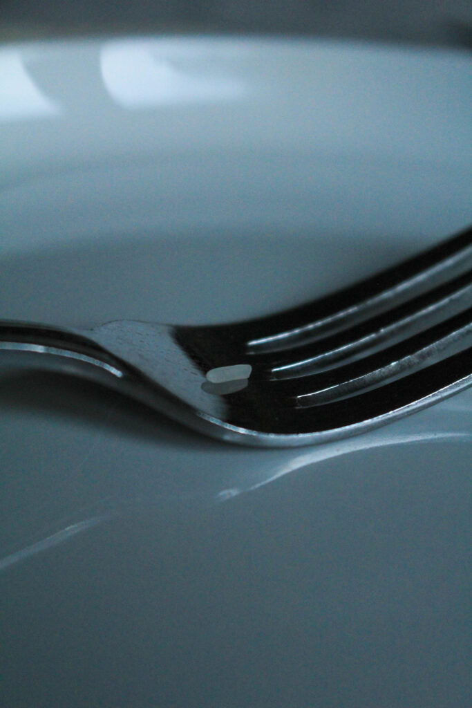
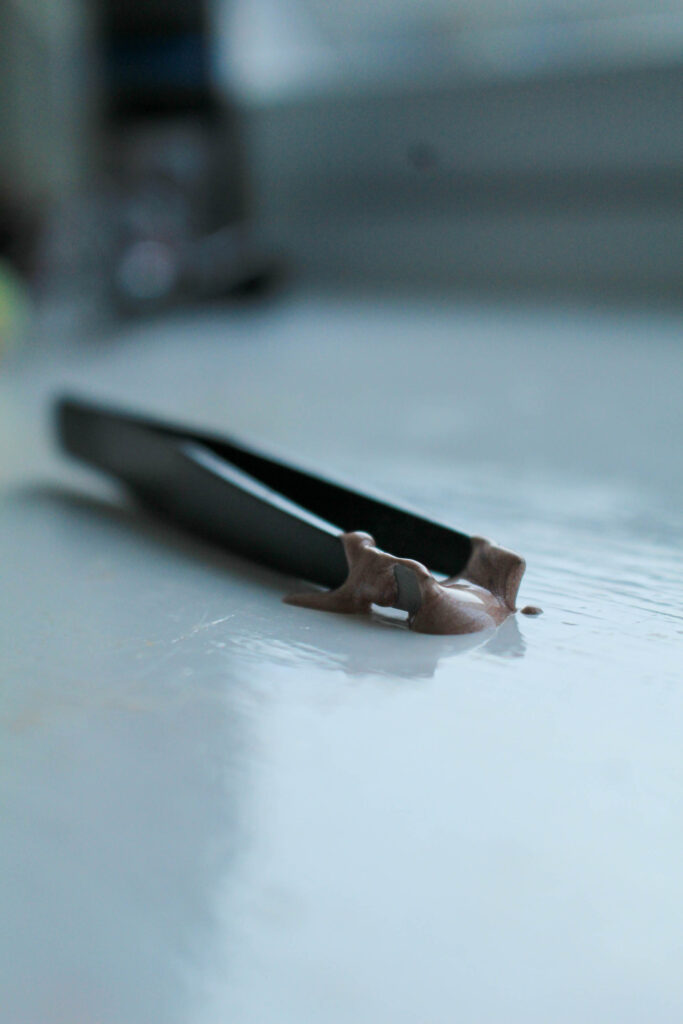
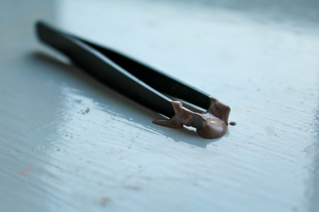
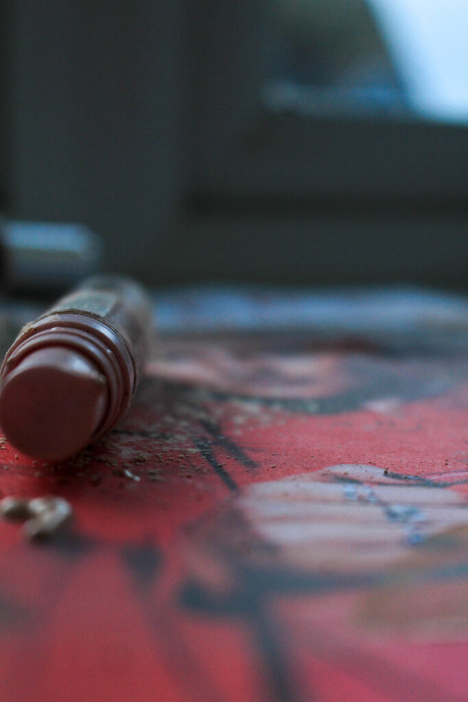
This is one of my favourite images because I have used a soft focus on the background through my short depth of field, and when paired with the bold silver of the fork, this means that the image is balanced between blurred and sharp. I removed all small specks that may have been on the camera when I shot this photoshoot, however of course I left the reflection of the fork into the place as otherwise, this may have looked really strange or it could have meant that the viewer would not know that the fork is resting on a plate, confusing the concept behind the image. However, I also really like this because adds direction into the image, where the end of the fork and it’s reflection oppose. This adds line into the image, which means the viewers eyes can be drawn through the image to flow easier.
The fork is highly contrasted against itself, meaning that it appears almost black instead of a light silver. I think that this is crucial to the image because it means that the foreground and background of the image can be distinguished easier, making the focal point of the image more bold so that I can further create a focus around the concept of eating disorders. I zoomed in very close to the fork so that I could use this image as a detail shot in my photobook. As this is a sensitive topic that I am focusing on, I think it is crucial that I incorporate this into my work because it will allow me to pick apart the structures in society and focus on the small clues in the environment that point to the feminist movement or stereotypes in general.
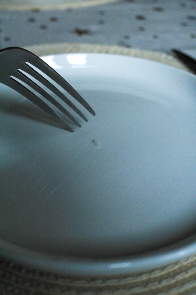
Similarly with this image, I zoomed out from the previous angle and put the grain of rice in the middle of the plate to be more emotionally provoking. This is because the sight of the empty plate with just a grain of rice on may be more compelling than the previous image as it is more direct in showing that this is the only thing being provided as food. I used a short depth of field again to blur out the rest of my table as this is not relevant to the concept of the photo so I didn’t want this to distract the viewer from the message that I am trying to send.
I held up the fork in a hesitant way, kind of drifted away from the grain as if it was being ‘played’ with. This is metaphorical towards the way that eating disorders are still psychological issues, even though the consequences are physical, where the patient feels restricted in her eating by her brain believing that she shouldn’t, leading her to struggle and hesitate when about to eat. I wanted to do this as eating disorders are so detrimental to the mind, body and soul so that, even over something as small as a grain of rice with little to no calories in, there is still a significant struggle to feel able to actually eat it. I slightly got the top of the knife in on the right side of the image so that I could almost pretend that this was an actual meal with the table set as I feel that this is more compelling in making the viewer feel sympathetic, as this is such an abnormal scene.
Finally, I also took a horizontal shot as I wanted to be able to vary the direction of my images in my photobook and I wasn’t sure which way I wanted to place them yet. For this, I just simply crossed over the knife and fork on the plate as if the subject was finished. I did this leading on from my previous image concerned with the hesitancy that eating disorder victims may face even when trying to eat something with practically no nutrition at all. In this image, I have staged the knife and fork into a ‘finished’ position to act as if the hesitancy had won over, leading this ‘meal’ to being finished before it even started. This image uses a sharper focus to provide a different perspective into my work, however the exposure is still low to provide that ominous tone I wanted in this set of images because it is such a deep and dark topic that I am representing, therefore I wanted the aesthetic to be linked with this to make it flow more.
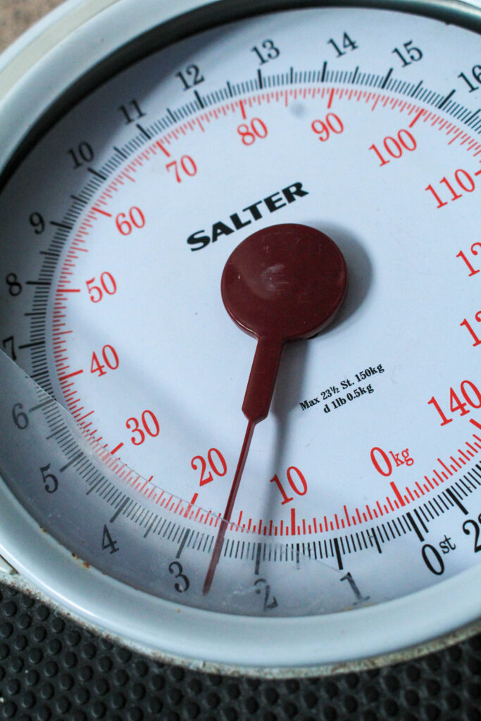
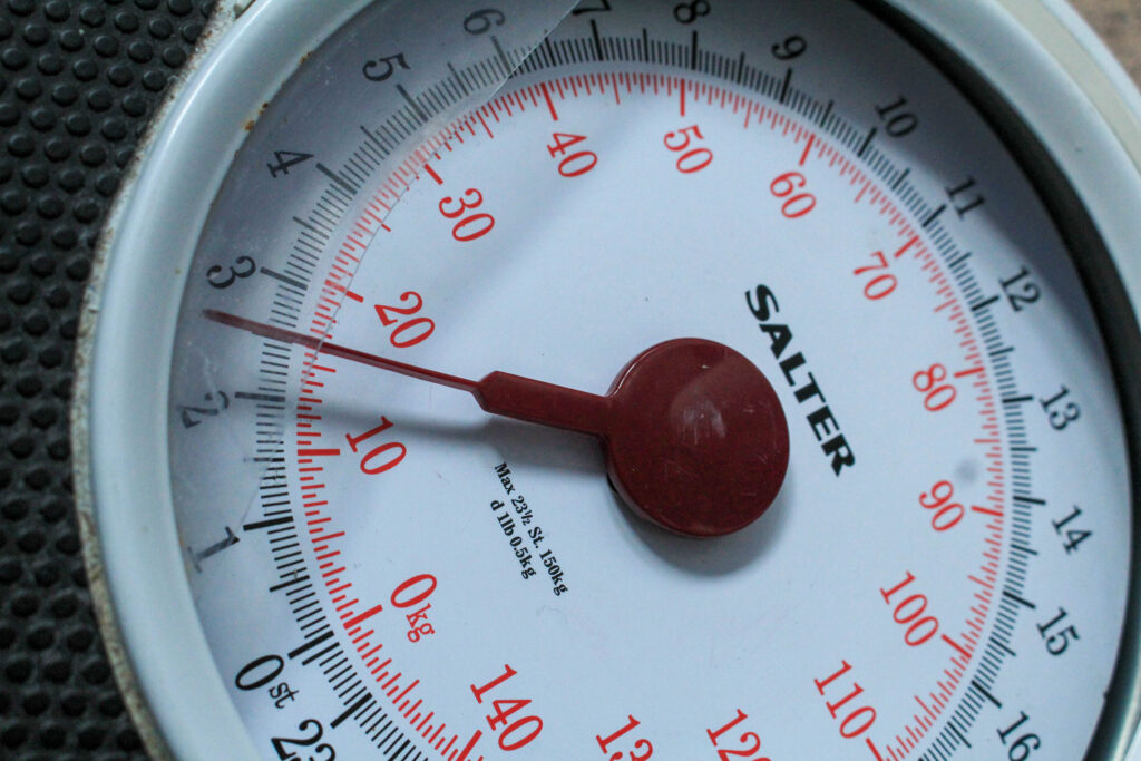
For the next few images, I shot different angles of a broken scale that I have in my bathroom. I included multiple versions of this because I think that there are multiple successful images here that I could also experiment with if I don’t end up incorporating these into my photo book the way that they are. As the plastic on the scale is smashed, I wanted to use this as it can represent the anger that loved ones may feel when supporting a family member with an eating disorder or body image issues as the victim wouldn’t have the same perception of themselves as their families would. This could also be representative of the frustration that a victim may feel in their suffering because they are aware of what this illness is doing to them, however their brain becomes programmed to act in this way, making the scales smash as they are so outraged that they are experiencing this.
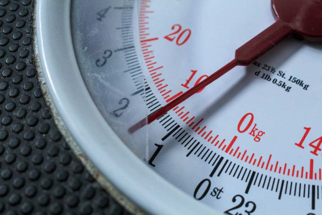
As the scales were broken the arrow would go onto random weights, however I feel that this contributed to the concept of the photographs as it points at 1 stone which is an incredibly low weight, as if someone struggling with these issues is stood on it. I took this image horizontally as I know that the image or scales when associated with eating disorders is extremely emotionally-provoking meaning that, depending on the quality of my other images, this may be able to be used as one of my defining images in my photo book – a double-spread image to validate the viewers preconceptions of what they believe the photo-book to be about. I used natural lighting for all of the images of this nature as the scales are white, so I wanted this to be enhanced with natural shadows which aren’t as deeply contrasted. I used the spot corrector tool in Lightroom to remove some of the obvious particles that had been on the scales, however I didn’t remove all of them because I feel that the dirt on here may be relevant to the way a victim of an eating disorder will be frequently using the scales in order to keep up with the progression of their illness.
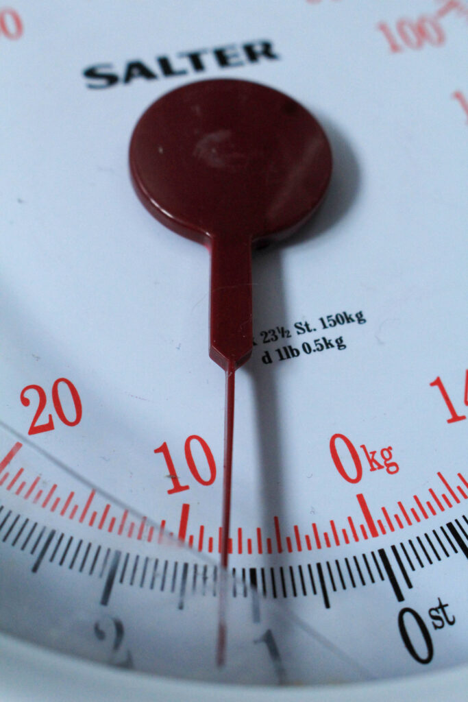
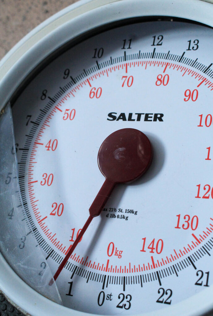
I took a few more images at different angles to try and see which would be best. This would also allow me to be more creative when designing and sequencing my photobook as I can alternate whether I want a full-page spread or pairing it with other images.
Barbara Kruger Extension:
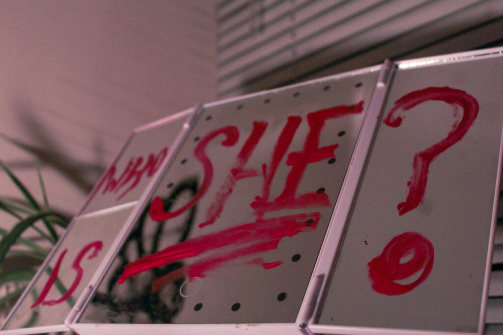
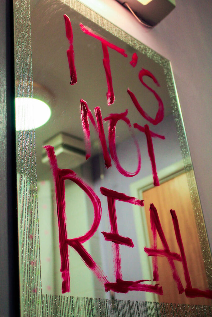
For these three images below, I utilised the red, direct and interrogatory messages that Kruger incorporates into her work and wrote different statements in red lipstick across different mirrors. As Kruger’s work tends to challenge aspects of the beauty standard and targets the medias inaccurate representation of women, I wanted to write these phrases onto mirrors as this is the environment of which women would be comparing themselves to these airbrushed images – being in a bathroom or bedroom mirror and feeling defeated in themselves due to this unrealistic and unfair comparison.
I though that I could employ this by acting as if the mirror was repeating these phrases, for example the third image states ‘It’s not real’ which is a message to how women may develop body dysmorphia due to their distorted perception of themselves and what they believe they should look like. With the statement ‘Take your mask off’, I put this because it acts as a statement to remind her that there is no need to hide behind poor self-esteem at the hands of media and magazine outlets because it sets unrealistic and unobtainable expectations about themselves and other, being that there is no need to hide behind insecurities that have arisen from a photoshopped image.
With the 2nd image, I put ‘Who is she?’ as a link to Barbara Kruger’s work as one of her popular images consist of a woman’s face with the words ‘Who does she think she is?’. I saw this as an effective way to make sure that my work still resonates with Kruger’s, however not exactly in the same way or using the same phrases as I don’t want it to be too direct. When I wrote each of these, I was cautious with how much product I applied to the mirror as I didn’t want it to look thick or neat, I purposefully made the letters have gaps in or look rushed because this emphasises the message. This way, the words come across intense and as if they have been written erratically to push the severity of this issue that I am targeting. This could also be interpreted as the ‘subject’ (being a woman or young girl) writing this on her own mirror in order to avert her mind from focusing on what has been dictated to be ‘undesirable’ by these standards, therefore she has written this really quickly on her mirror before her brain can begin to insult her.
I think that this will work really nicely with my Barbara Kruger photoshoot experiments as the red can be a predominant factor that is clearly linked all throughout, which will also help me convey anger and rage as if ‘enough is enough’. I think that I am going to take more photos in this way to make sure I can include them at balanced intervals in my photobook.
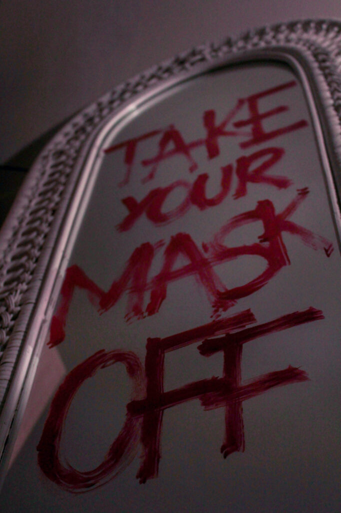
In this image, I shot from a low angle almost at the floor in order to gain depth in the image, seeing as the word ‘off’ looks larger than the initial word of ‘take’ although they are the same size. I used artificial lighting for this by setting up my lamp a bit further away and pointing it diagonally to the writing on the mirror. As this was a warm toned light, I then went into Lightroom and decreased the temperature so that the image would look more balanced as the saturated yellow tinge that the lighting gave clashed with the writing, making it more difficult to read. By doing this, I neutralised the temperature of the image so that it appears as if I’ve used a regular lamp for this. Once again, I have employed a short depth of field in order to make the writing zoom out of focus the further away it was, however I was careful to not make this too short as otherwise it may have made the image confusing if it meant that the writing was difficult to read until the very end, defeating the whole purpose.
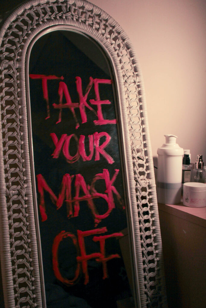
I also took this image using the same mirror from a different angle. I wanted to include this image too as the background has become blacked out due to the direction of the lighting being pointed in the opposite direction. I also really like the way that there is a large cluster of skincare next to the mirror as if this has been excessively used in order to try and heal these insecurities. I think that I am going to experiment with what I can do with this image as my other composition is better, however I still feel that this image will be useful.
Similarly, I used a smaller mirror for this to include different types of mirrors as this is a universal issue rather than just specialised to one person, meaning that I can act as if these different scenes are representing different women’s lives. I also wanted to use this mirror as it has a similar aesthetic to old Hollywood mirrors with lights all around the side, which is beneficial to the concept as the beauty standard has evolved since this period. With the lipstick, I wanted to really exaggerate this phrase as I feel it can be interpreted as an internal question, such as a young girl looking at her reflection in the mirror and not recognising herself after the distress of trying to alter her appearance in order to try and meet these standards. This is a very important issue that is growing more common, where girls are having issues with their self-esteem at an incredibly young age when this should not be their concern, explaining why she asks who she is because appearance should not be a priority or insecurity for such a young person.
For this image, I used the same methods as before, however this didn’t require a temperature change in terms of lighting as I just used my bathroom lighting which was the correct tone that I wanted. I liked using this mirror because it has glitter around the edges, sort of romanticising the idea that there is this false beauty standard that appears to be solely about fashion and beauty, when in reality it is truly just a form of demeaning women based on just appearance.
Hannah Altman extension:
Looking further into Hannah Altman’s work, I experimented around with liquid highlighter as a replacement for glitter in some of my images as I wanted to see how this would look, as I was able to manipulate it more due to it being liquid. Whilst I really like the technical elements of the two images below, being that the short depth of field has been really effective on honing in on the highlighter, however I am not sure if I would like to develop this further as I feel that it seems more muted when this project is about challenging these problems directly.
However, this led me to start thinking deeper about the beauty standard and more specifically, how I could represent this in terms of magazines in a more direct way as I felt that my current work hadn’t quite targeted that explicitly yet.
I bought a local magazine that didn’t use specialised paper so that I could manipulate makeup into it. Within this, I tended to use a short depth of field as I wanted to focus on the nature of the makeup rather than the actual components of the composition. My goal here was to make it appear as if a girl had been looking at the cover of this edited magazine and erratically was putting on makeup in order to try and look like her, coming from a place of insecurity and a persistent need to want to fit into what society expects rather than being an individual.
I shot this with the camera placed on the magazine and directed slightly to the cover so that I would be able to include the model’s face using depth, but still being able to keep the focus on the concealer that I dropped. I began this by gathering lots of different makeup, and then splattering and dropping it in a randomised way so that it would fall naturally without me having to touch it as then this would look too staged and distort the concept that I had initially planned for. As you can see, in-front of the concealer, there’s a thick patch of concealer which means I can begin to reinforce the idea that a thick amount of makeup has been layered on over this girls face in order for her to feel the slightest bit confident. I used natural lighting for these images as I wanted to use natural shadows rather than artificial.
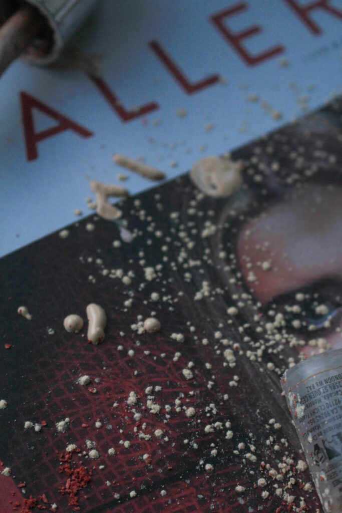
It is more visible in this photograph to see the way that the makeup particles are spread out as if they have been used in a rush and discarded carelessly. I incorporated the model’s eye into the right edge of the image so that it would be clearer to the viewer that this is targeting the unrealistic expectations that magazines push. I used similar techniques in the rest of my photographs of this style:

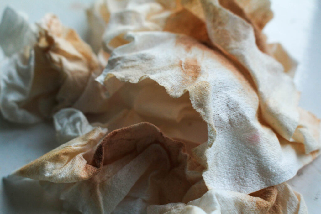
I took inspiration from my previous photoshoot, where I layered multiple cotton pads on top of each other lathered in foundation. Whilst I liked these images, I wanted to find a way to add more texture into the composition of these images as they came out looking relatively flat. Here, I used my own old makeup wipes and gathered them as they were dried out, meaning that they had more shape to them and would stay in whatever position I put them in – giving me more freedom to be creative.
I crushed a handful of them into a ball, and then let them slowly unravel themselves as they wouldn’t move very quickly or drastically. As I shot this in natural lighting, the shadows that each crease has made off of each other is more gentle rather than having a high contrast so that all of the old makeup is visible. I still used a short depth of field to blur the background, however the centre of the image has high definition which means there is a lot of texture within the composition, for example I have been able to capture the small fibres on the edge of the makeup wipes.
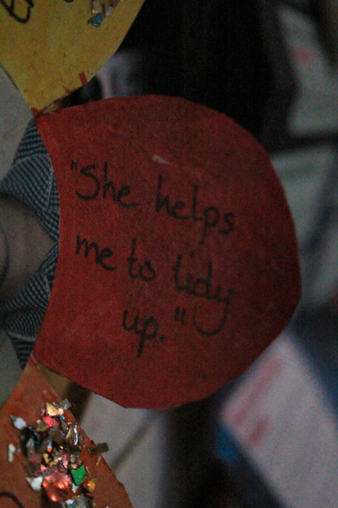
I took this photograph of one of my primary school projects that my teacher made, where my picture was in the middle and other students gave compliments to write around the edge. I wanted to photograph this one specifically as a kind of experiment to see how applicable this is to my topic. Whilst I understand that this is something that had positive intentions to uplift me, however I felt that this could be relevant to the stereotypes that have developed over the years since this time. For example, this was an alternative way of stating helpfulness, however (whilst this wasn’t too long ago either), in society now this may be perceived as a role that I should possess even at such a young age due to the traditional idea that women should stay at home and tidy up. This could be seen as a self-fulfilling prophecy, meaning that I would help people tidy up because I believed that was my role and purpose in society.
Of course, the actual intention was not this and was just a genuine nod to helpfulness, however I feel that this can be interpreted this way in modern society as issues within feminism begin to unravel.
For these two images below, I started thinking about how I could further the concept of male violence and how young children are very susceptible to being influenced by these predetermined stereotypes and misogynistic ideologies about women, for example a young boy may become influenced by these statements and begin to act on them against young girls through violence as this can be highly influential in furthering the idea that women should be seen as lesser than men. This got me thinking into how I could connote the topic of male violence or domestic abuse into my images because it is such a sensitive topic, so I didn’t want to go with such an obvious perspective as it is so heavy and could be regarded as offensive if I didn’t do it right.
The first idea that came to mind was to use written words out of books, and using a soft focus to create a short depth of field in natural lighting so that this can act as an emotional trigger for the viewer to sit back and evaluate what they have just seen. I think that the short depth of field contributes greatly to this as it will allow me to highlight certain areas to almost symbolise ‘blocking out the noise’ of all else around individual when they experience male violence or domestic abuse, representing the disorientated thoughts and feelings that would arise. This could also be highly representative of how this could cause a numbness, meaning a woman is so used to facing this kind of abuse from being trapped in this relationship that she fades out from reality when it occurs to almost ‘cope’ better.
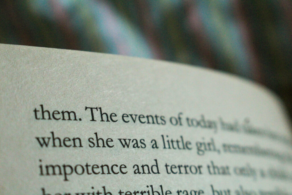
As this was at the top of the page, I was able to effectively blur out the other words that were not relevant to my photoshoot, and capture ‘when she was a little girl’ above the words ‘impotence’ and ‘terror’. I think that this combination of words within one section is very powerful because we wouldn’t want to feel as if these two phrases would ever be associated together, however they are due to this kind of violent behaviour that can be seen to be increasing against young girls. For example, stories have began to arise more frequently in the news about young boys having violent actions or even fantasies towards young girls due to an emerge of podcasts and YouTube videos promoting misogynistic comments of hate against women, which impressionable minds come across and become influenced by. This is extremely dangerous as it begins a new generational perspective of hate against women that can become out of control, to the extent that there is now male violence between schoolchildren.
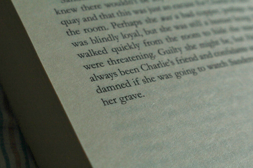
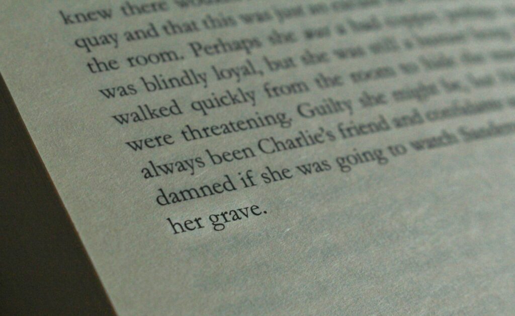
For this image, I am going to experiment on Photoshop to try and blur the irrelevant words out also that the viewers focus is on the words ‘her grave’. This is a more direct approach to the topic of male violence as it explicitly talks about a woman dying, w which is why I wanted to involve it. Whilst there is no other context, I think that this will be able to speak for itself and that the viewer will be able to interpret it in the way that I have intended once the other words are removed. I tried to use a short depth of field on this, however I found it very difficult as this was towards the back of the book so it would not lie flat, so I could only use one hand.
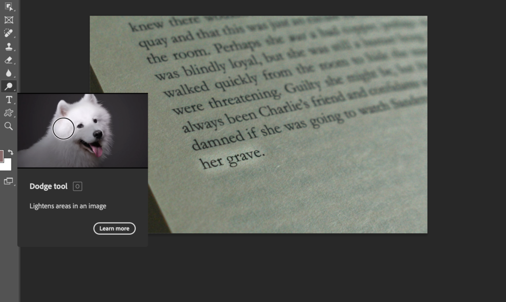
I used this tool to try and highlight the words instead as it would have looked strange if I had blurred out all the other irrelevant words apart from ‘her grave’.
Outcomes:
These were the results as I found it quite difficult to work with the dodge tool so I decided to just not use this image.