Planning:
Concept-
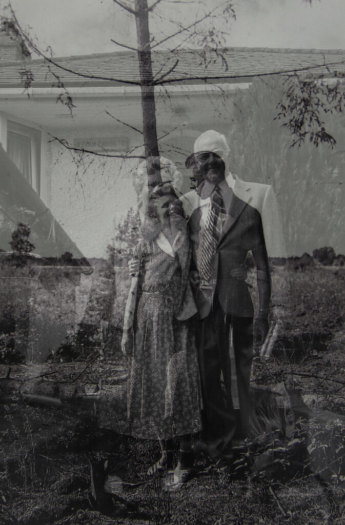
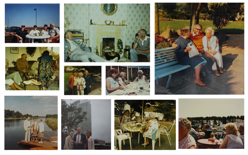
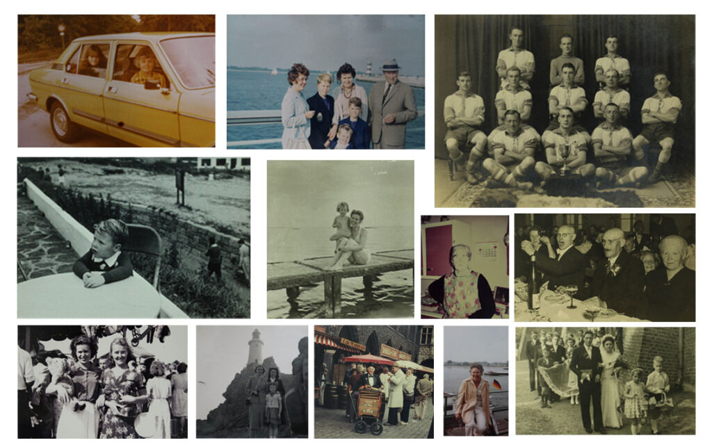
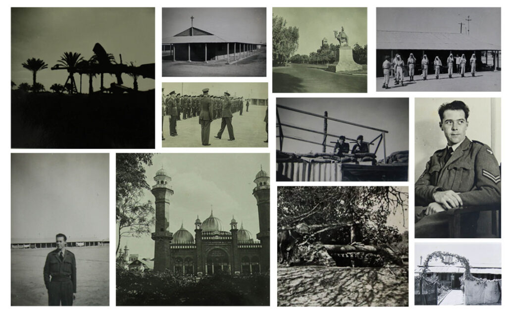
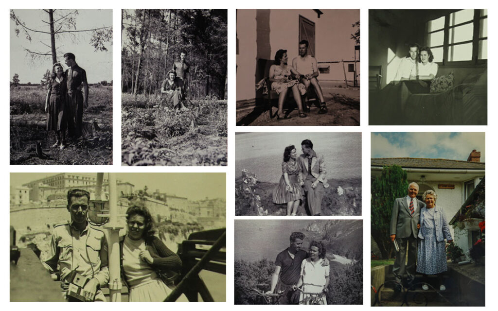
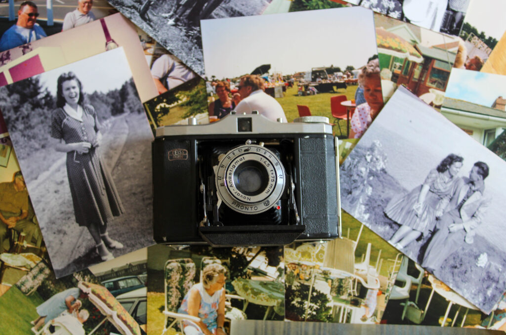
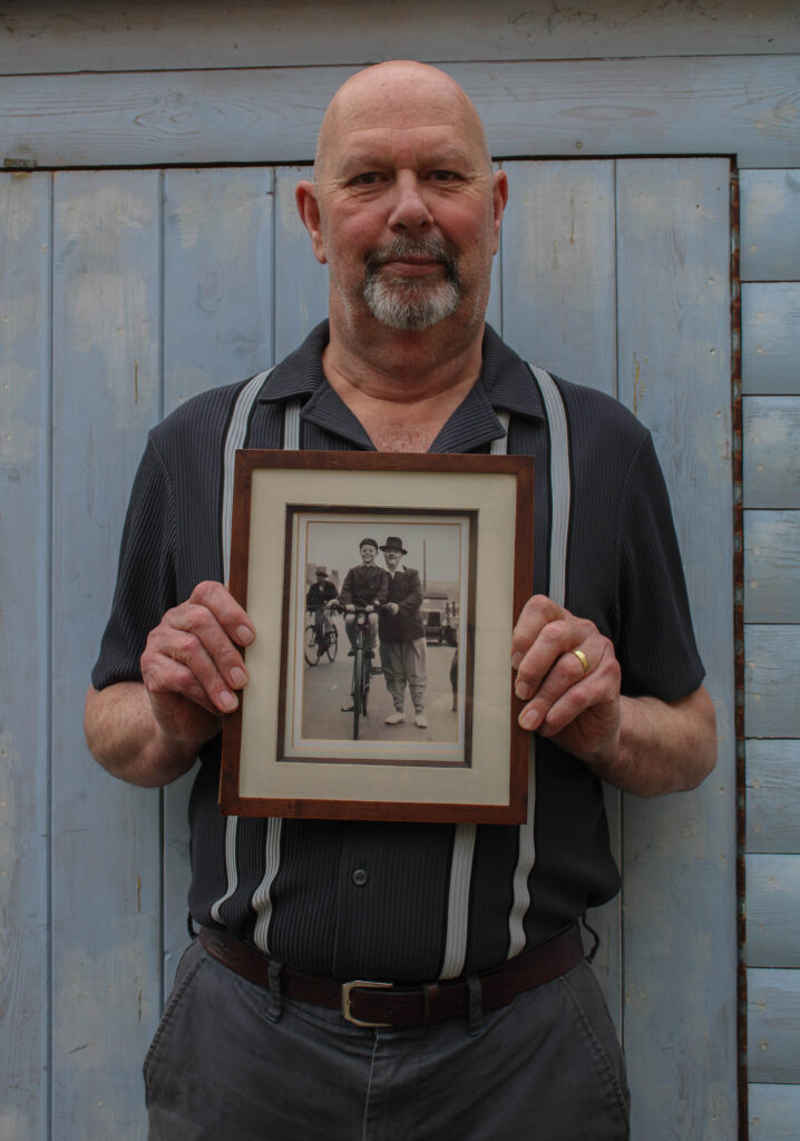
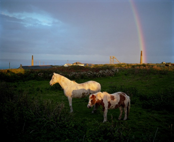
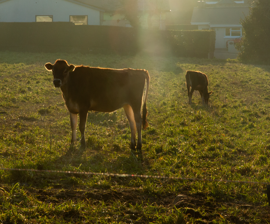
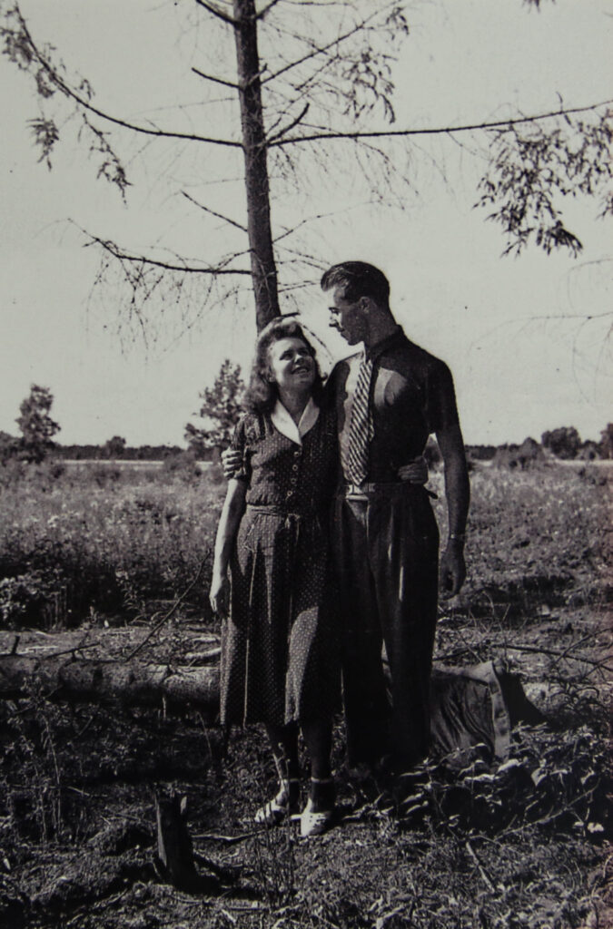
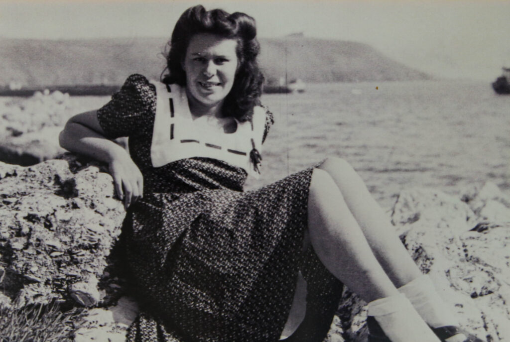
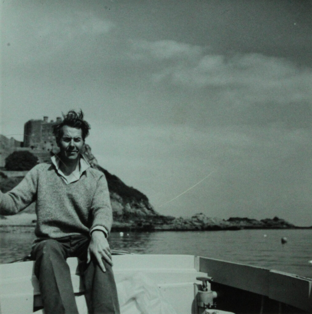
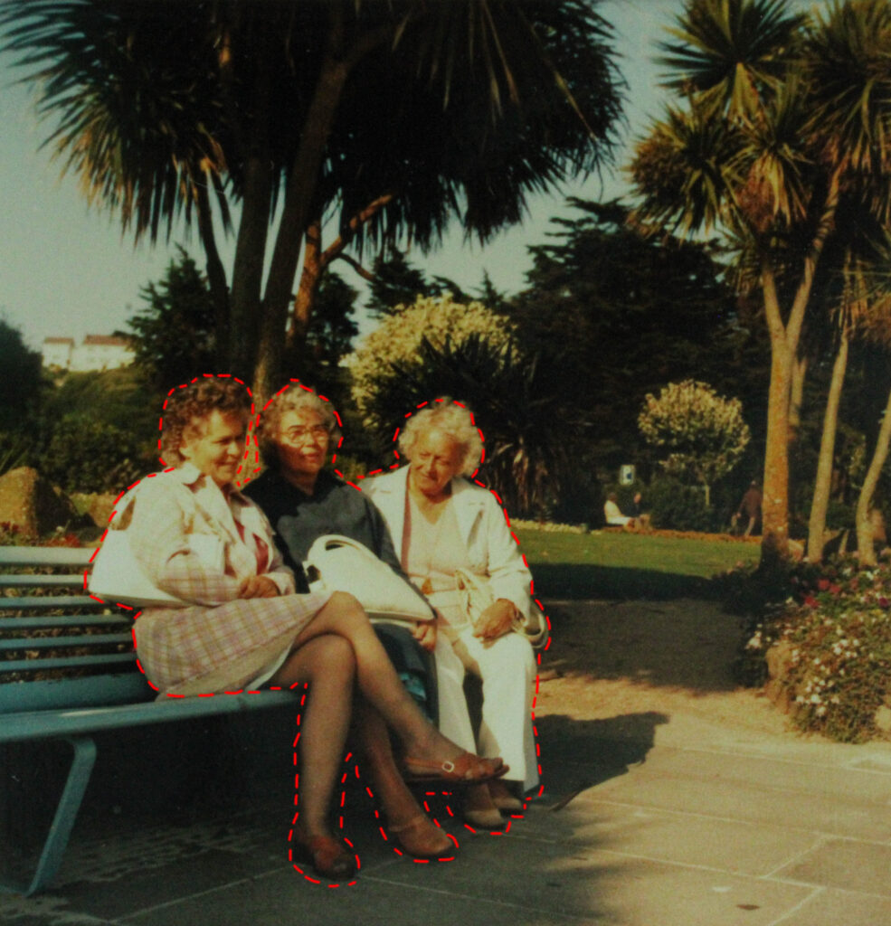
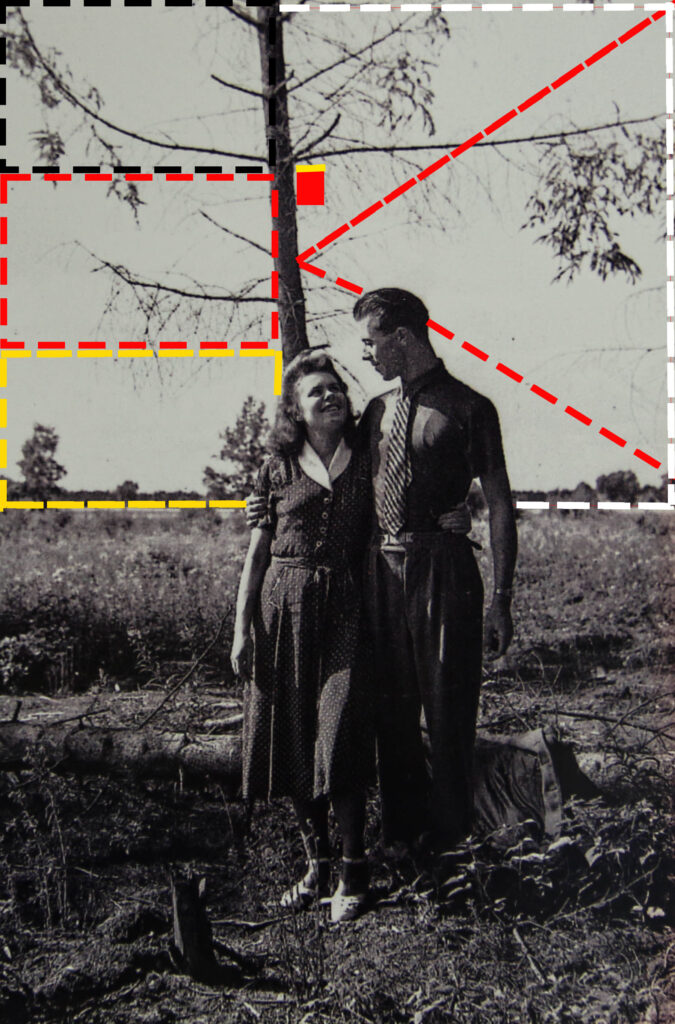
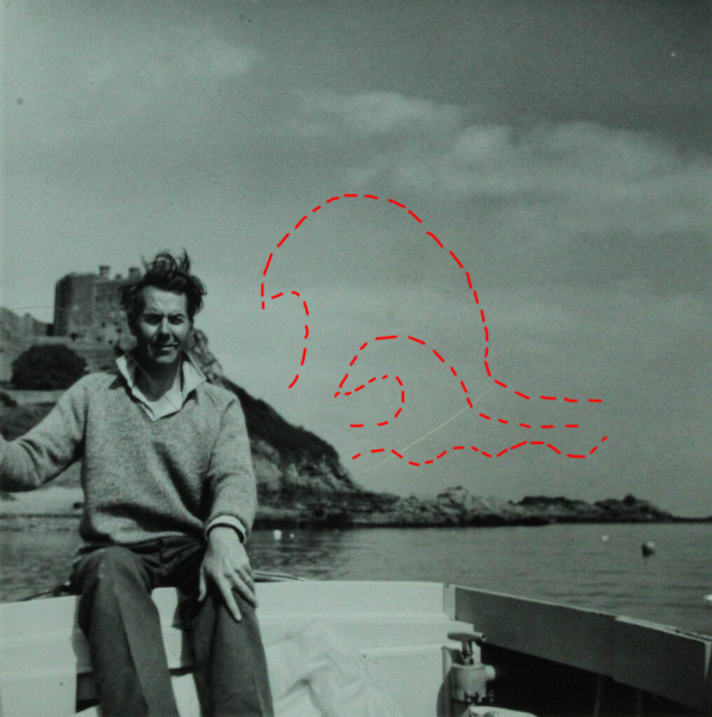
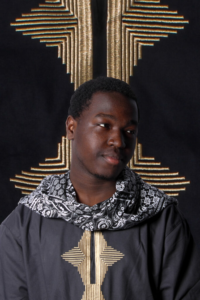
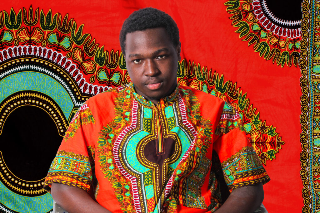
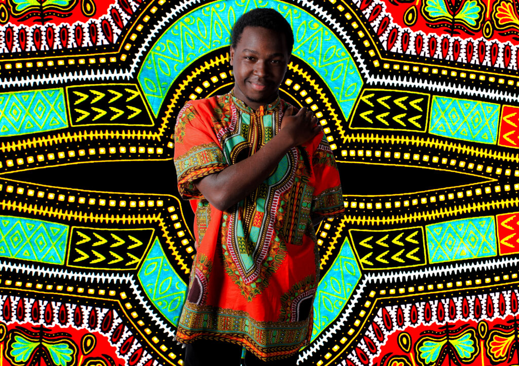
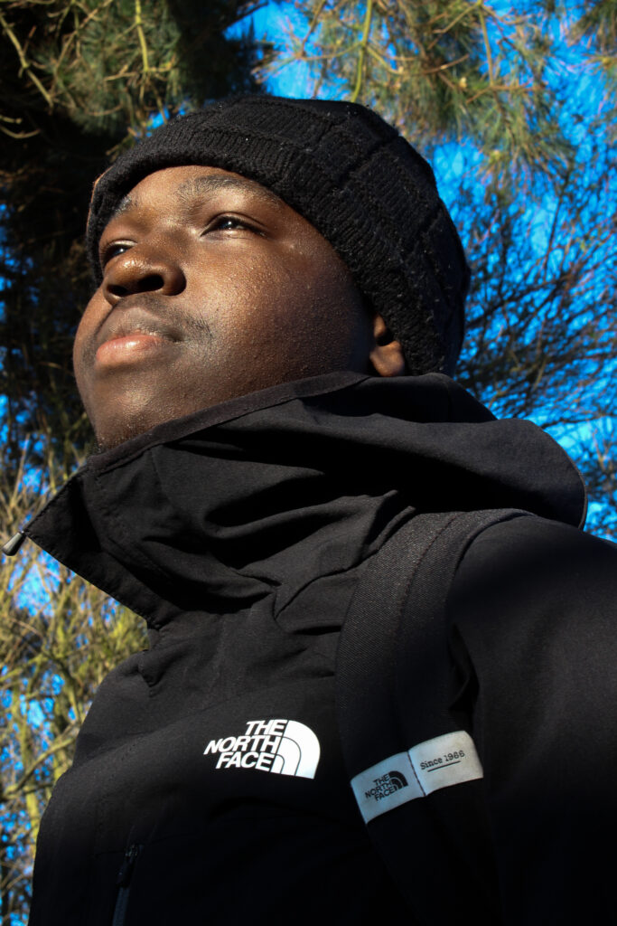
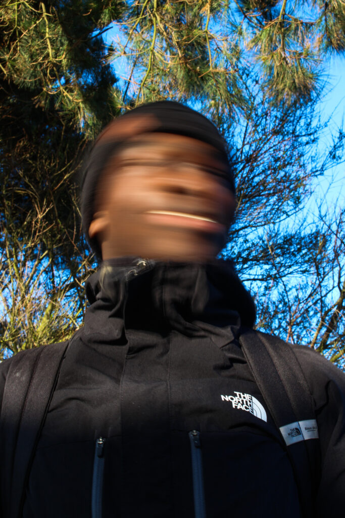
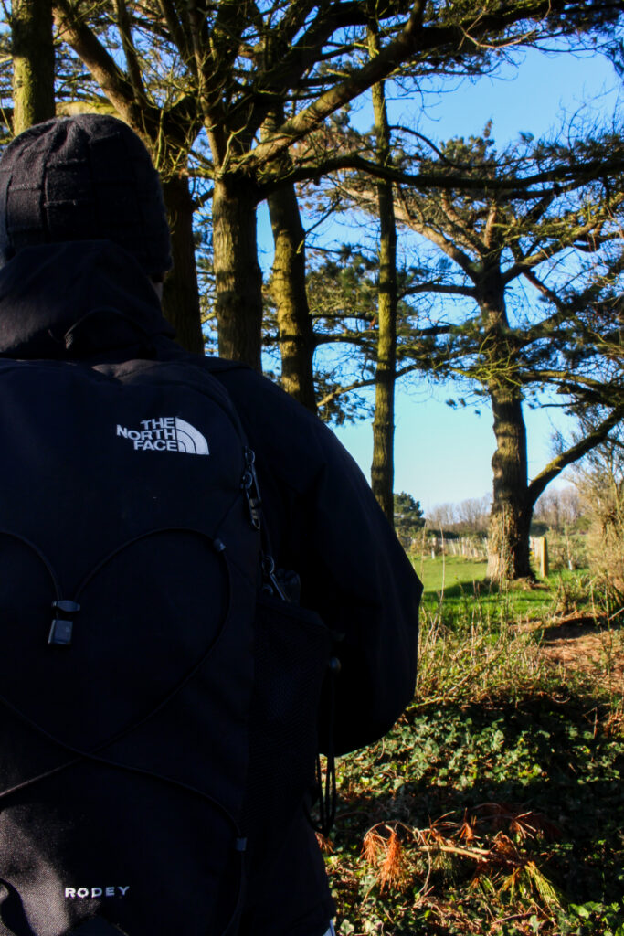
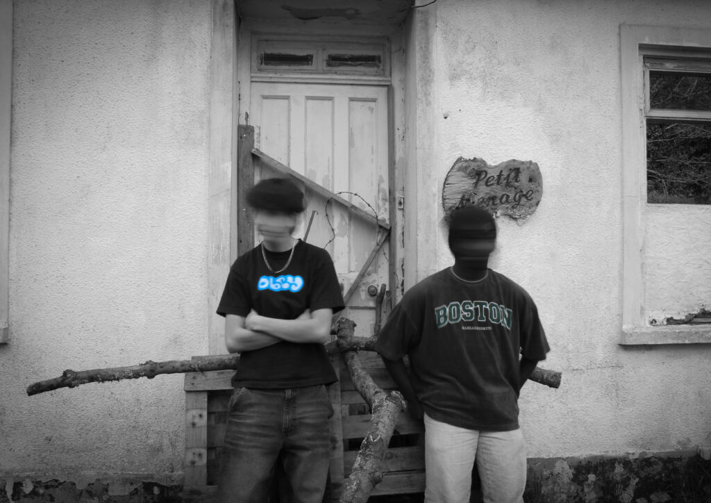
For my photobook I’m basing it off of my grandparents marriage and the idea of their two very different cultures coming together and them forming this new life together as a union. My grandmother is from Germany and my grandfather is from jersey this is very important because they met very shortly after WW2 this meant their relationship was very frowned apon due to being on “different sides of history” however this didn’t stop their love and their marriage. Therefore i would like to show aspects of their culture and families but also what they have in common despite their differences for examples their love of sailing.
editing and sequencing:
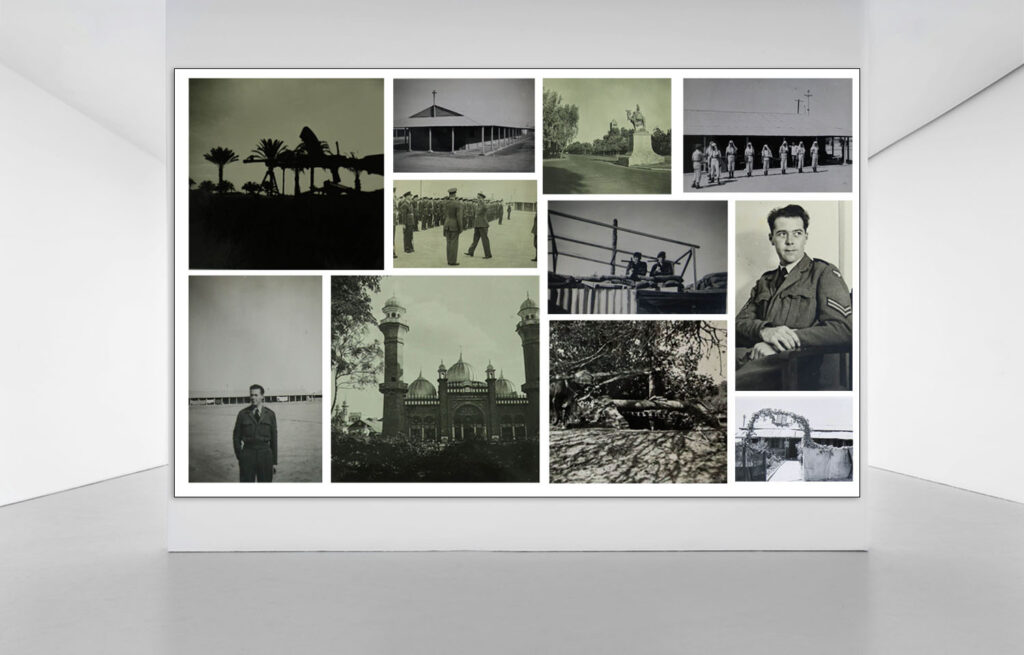
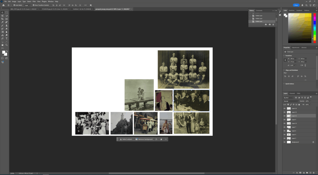
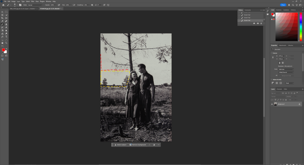
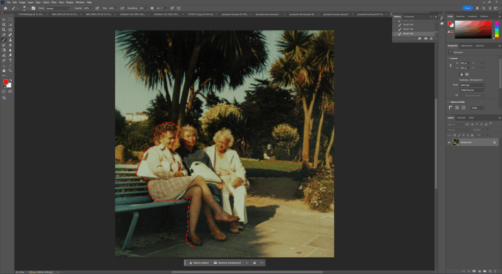
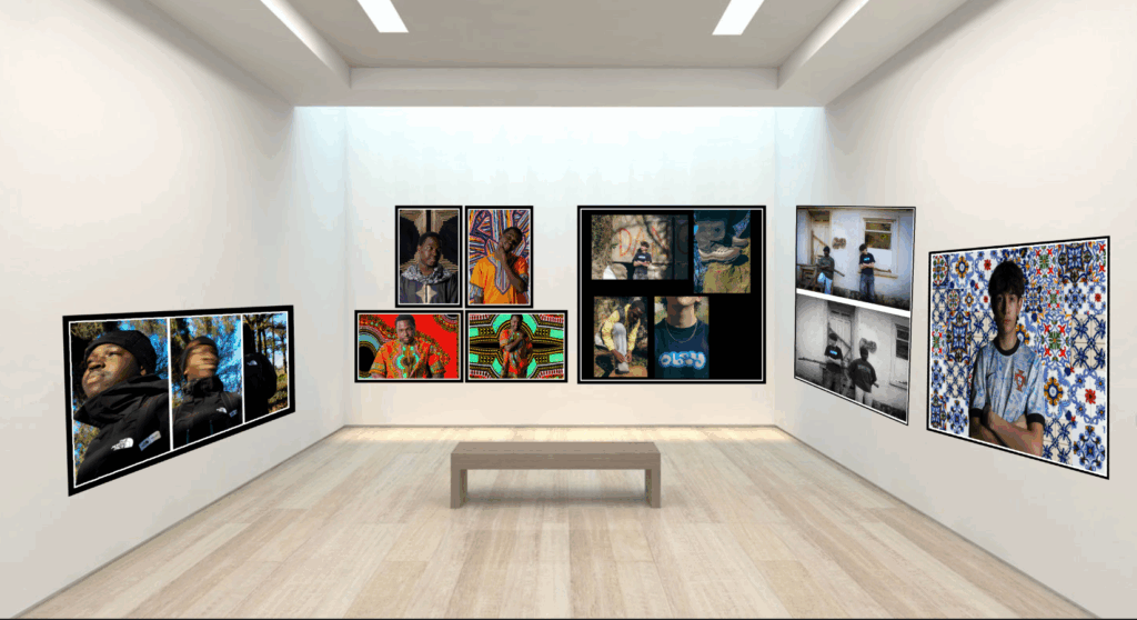
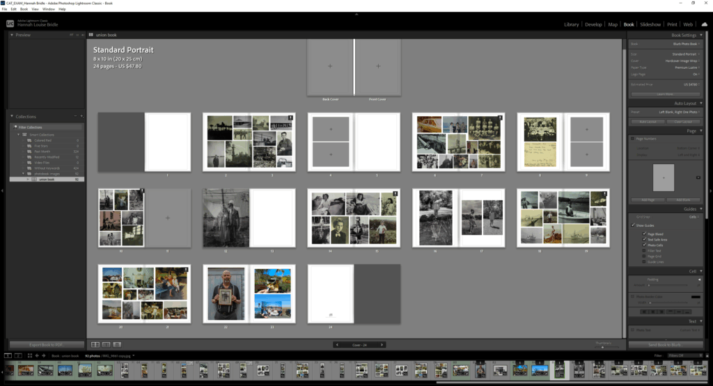
For my photobook the layout is very important I would like to try and use the collages I did inspired by Christian Boltanski almost like chapters to separate my images and show what they are centred around.
Process:
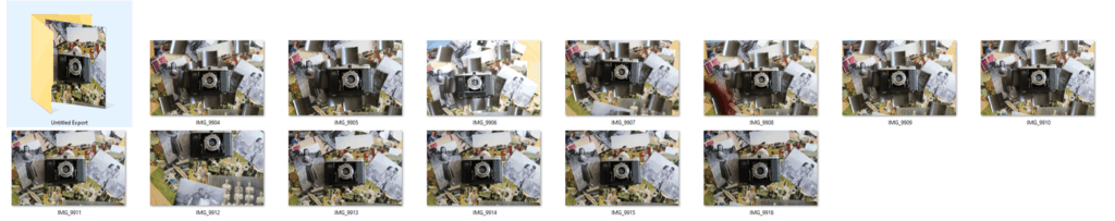
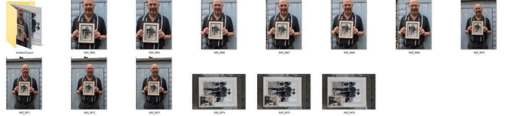
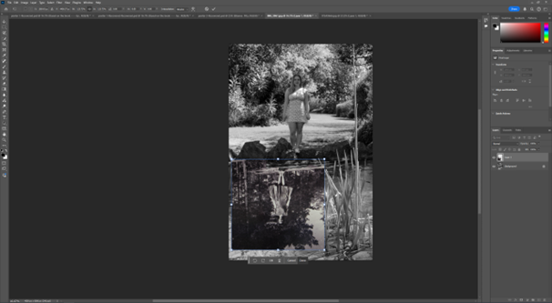
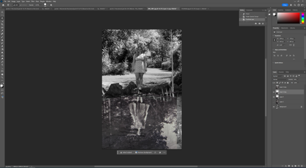
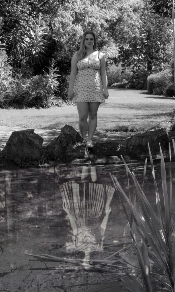
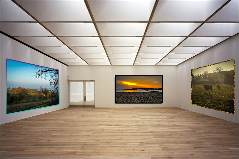
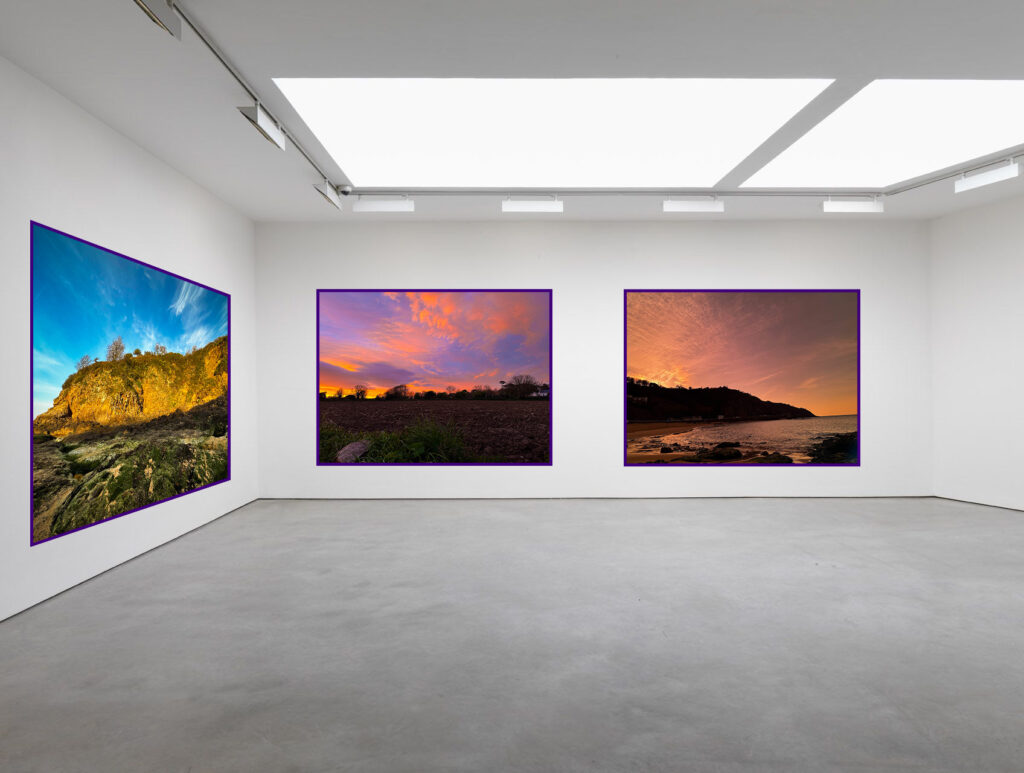
For my photobook I had explored many different ideas surrounding how I wanted to present my image. For example, I originally used a single page for these collages however after looking at Duane Michals work, they use double page spreads within their photobook. I thought this would work best for these pictures inspired by Christian Boltanski as he used incredibly big canvas’s when presenting his work so I liked the idea of imitating that style.
Finished Product:
Evaluation:
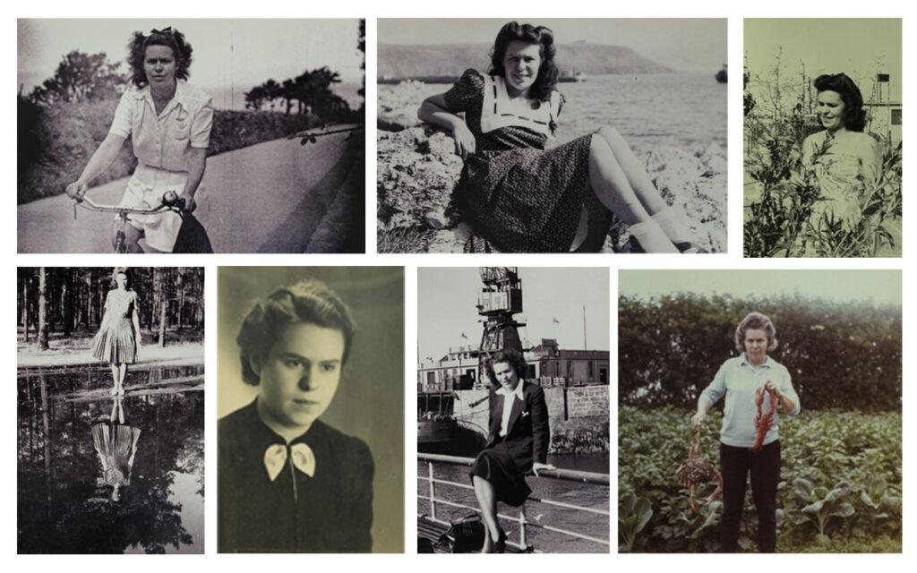
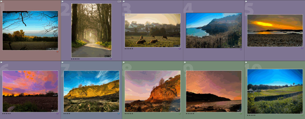
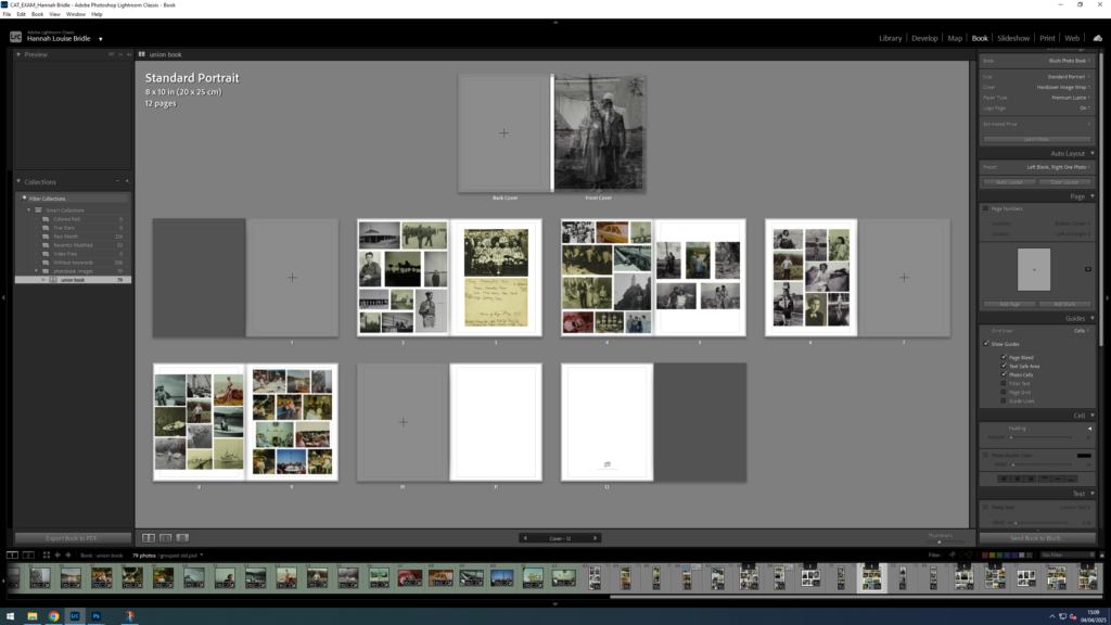
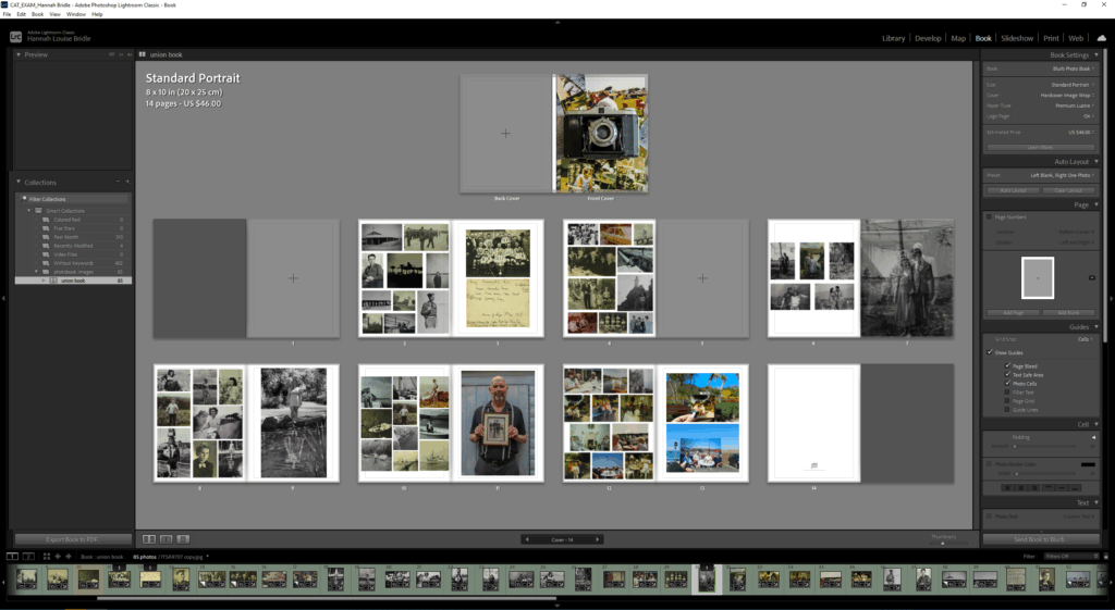
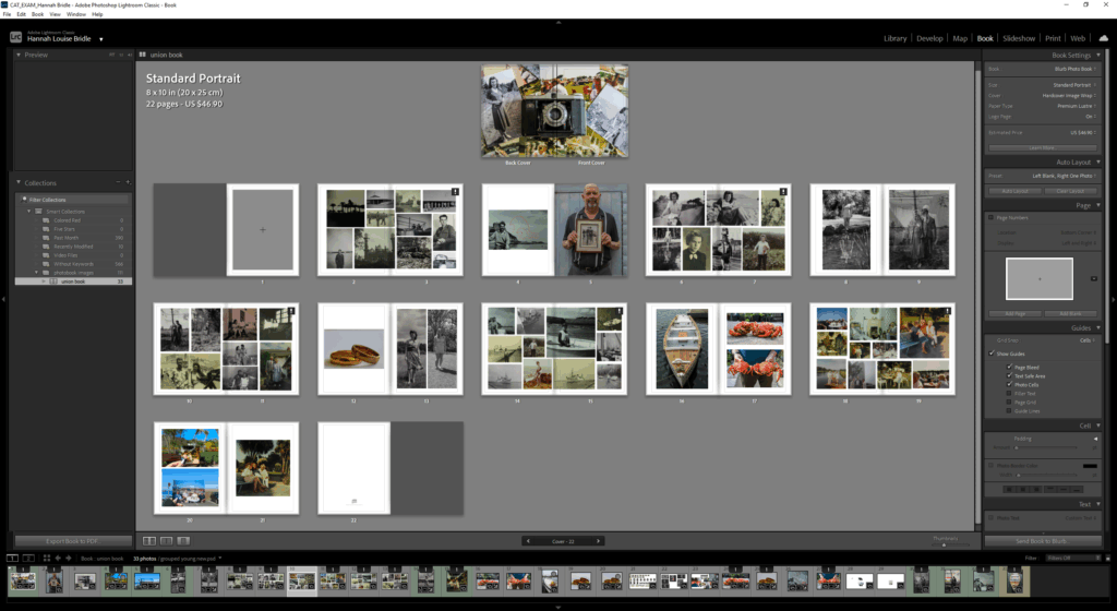
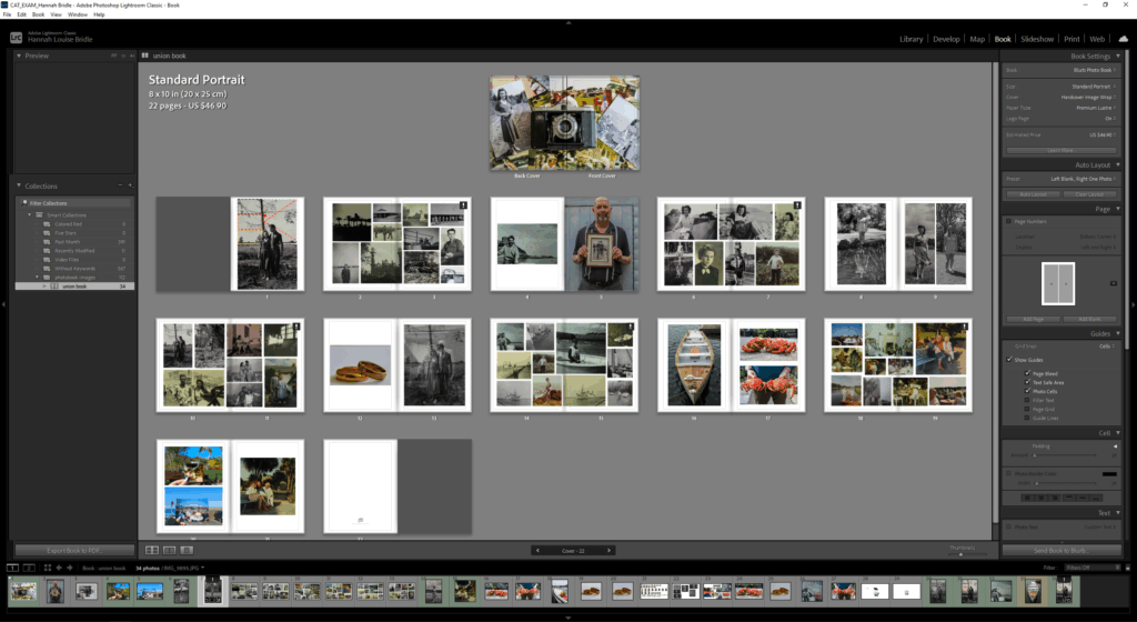
Overall I’m extremely happy with how my photobook has come out. The only thing I would have liked is for it to have been a bit longer for me I initially wanted to have around 25-30 pages however I felt that I needed to cut out some of the images in order to make the book look cleaner and more effective. I’m happy with my decision to organise it by doing a collage on a double page spread and then having two pages of my own image by doing this is creates this rhyme when looking and going through my book.