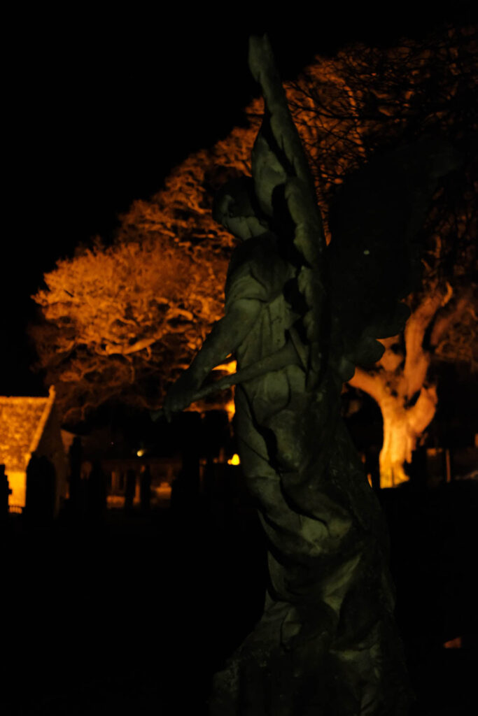
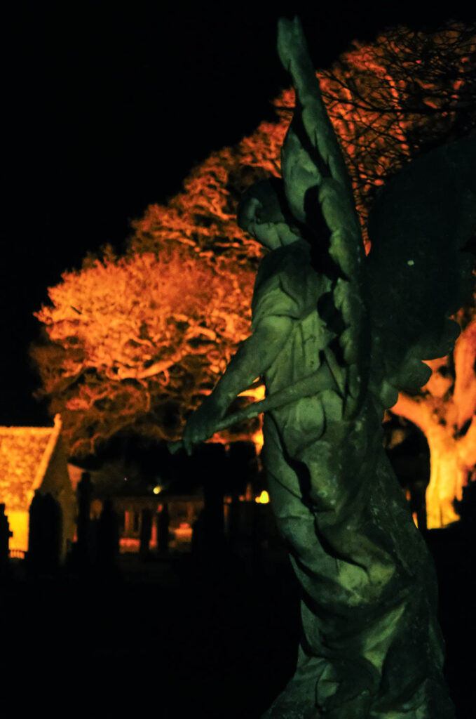
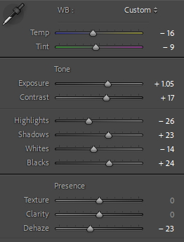
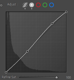
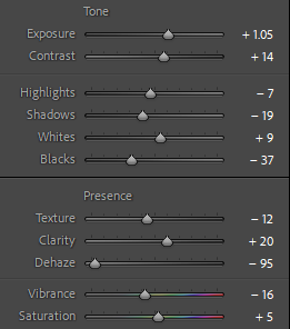
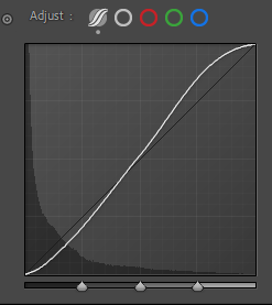
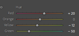
Edits
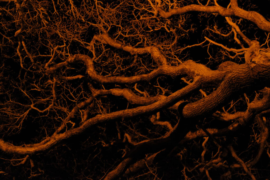
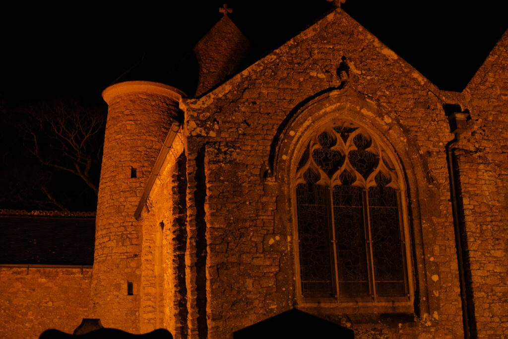
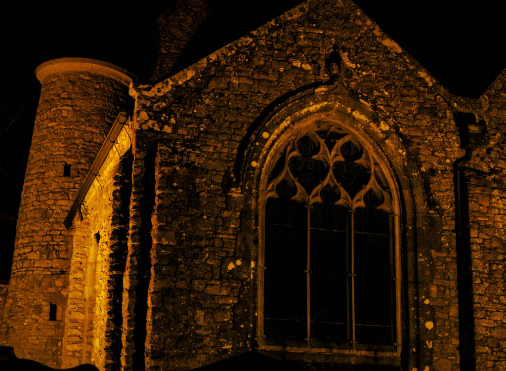
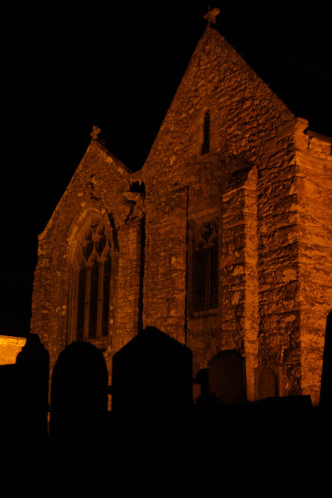
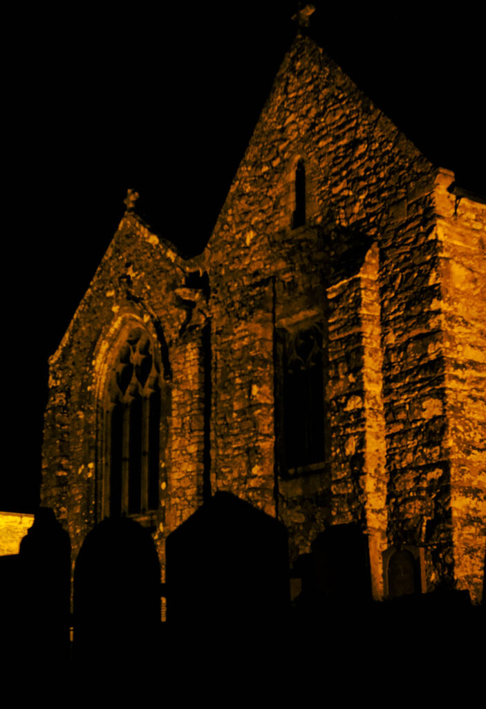
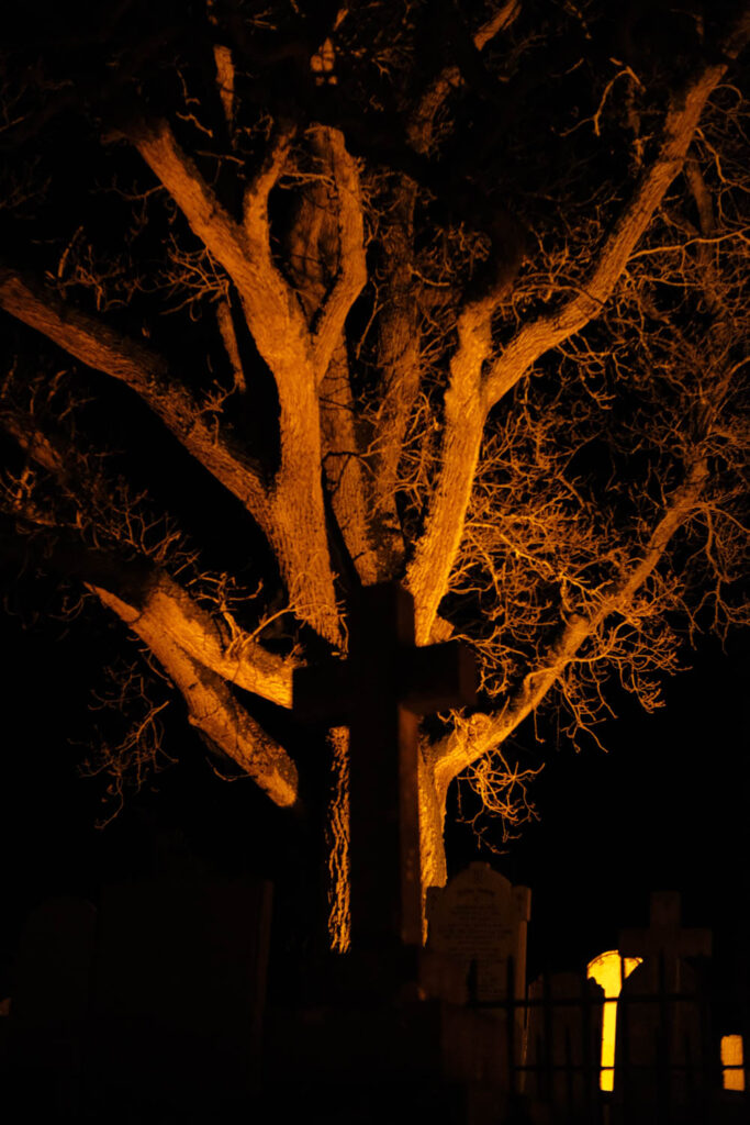
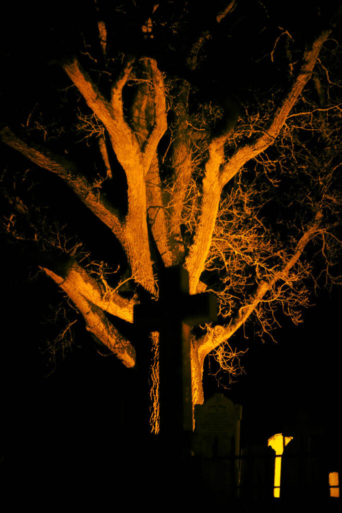
before/after


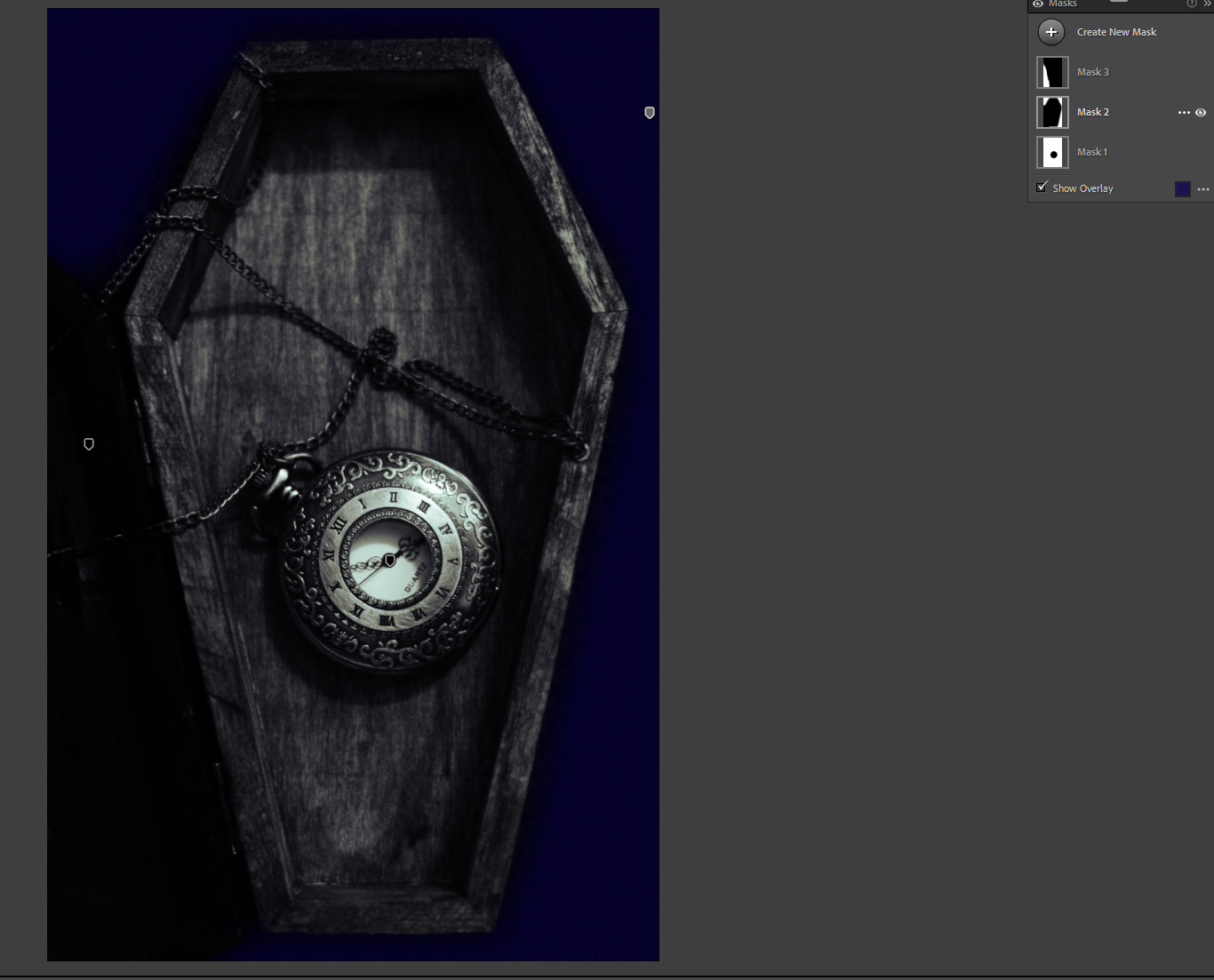
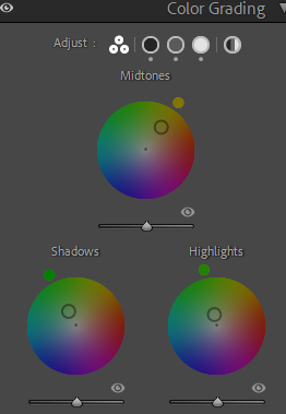
masks
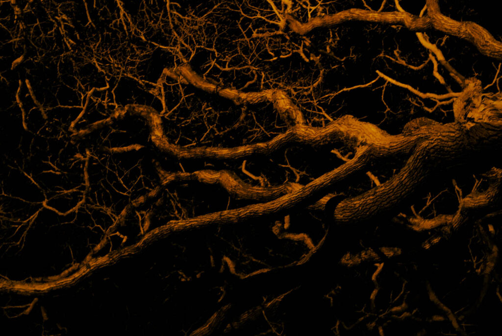
before/after
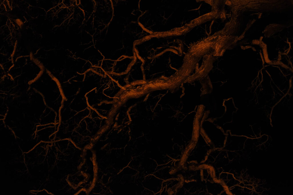
before/after
before/after
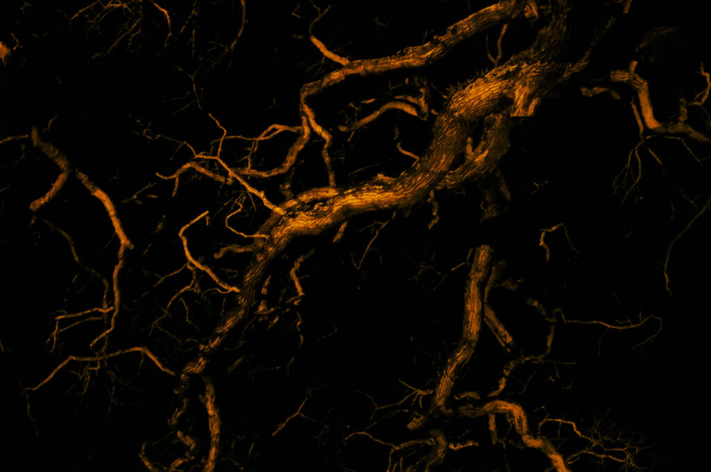
before/after
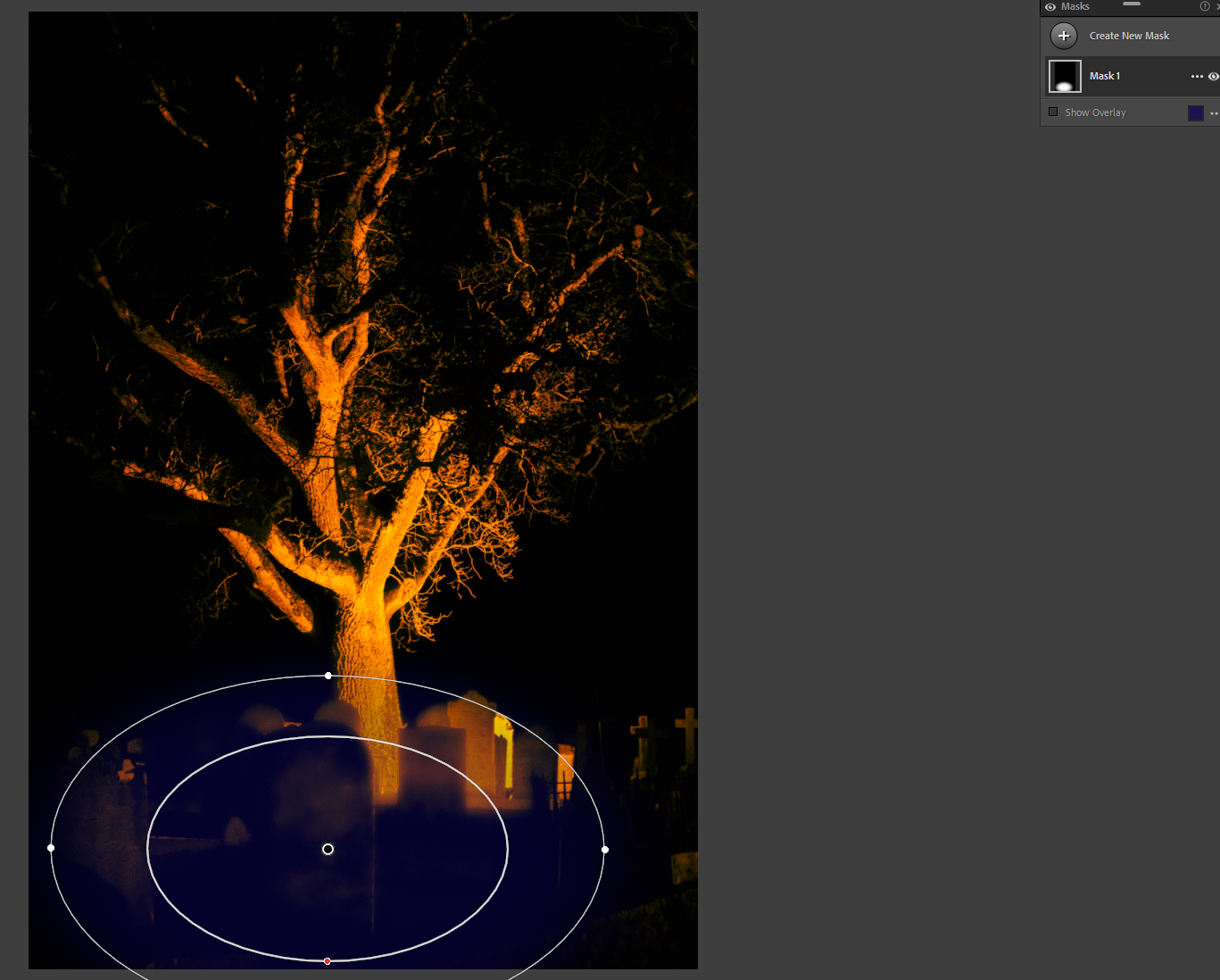
masks
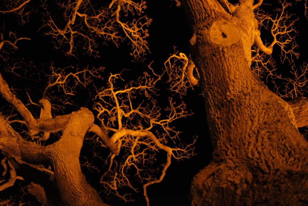
before/after

before/after
masks
before/after
before/after
before/after
before/after
masks
before/after
Michael Kenna

Born in 1953 in Lancashire, England, Kenna originally intended on becoming a priest, but was ultimately drawn to art. He attended the London College of Printing, where he learned commercial photography techniques. Kenna moved to San Francisco in 1977 and began exhibiting in local galleries, developing his hallmark subject matter and high-contrast black-and-white aesthetic. Specialising in long exposure landscapes, Kenna’s work often captures the quiet moments between day and night. He is best known for his black-and-white images of unpopulated landscapes and urban scenes. His black-and-white photography, which sometimes incorporates twilight or the quiet of early morning, emphasizes the interplay of light and darkness in serene and meditative compositions. Often employing long exposure times that he further emphasises in the dark room, Kenna’s work is both picturesque and mysterious. “You can’t always see what’s otherwise noticeable during the day,” he has explained. “With long exposures, you can photograph what the human eye is incapable of seeing.”

https://www.michaelkenna.com/imagearchive.php
Joel Meyerowitz

Joel Meyerowitz was born in New York City and began taking photographs in 1962. Although he has always seen himself as a street photographer in the tradition of Henri Cartier-Bresson and Robert Frank, he transformed the mode with his pioneering use of colour. As an early advocate of colour photography (in mid-60’s), Meyerowitz was instrumental in changing the attitude toward the use of colour photography from one of resistance to nearly universal acceptance. Throughout his career, Meyerowitz has since produced over a dozen books, and a full survey of his career was published by Phaidon in 2010. Additionally, in 1998 he produced and directed his first film, Pop, an intimate diary of a three-week road trip made with his son, Sasha, and his aging father, Hy.
Meyerowitz is known for his use of colour and light, often photographing scenes at sunrise or sunset. His work captures the transitions of light, particularly in the way it shifts through different times of the day. Meyerowitz’s images frequently focus on the golden moments between night and day, showing how light changes the mood and atmosphere of a scene.


I really love these photos. I love the colour contrast within the whole picture, its very calming and relaxing. i believe these photos tell a story and create images in your head. One photo can speak 1000 words.
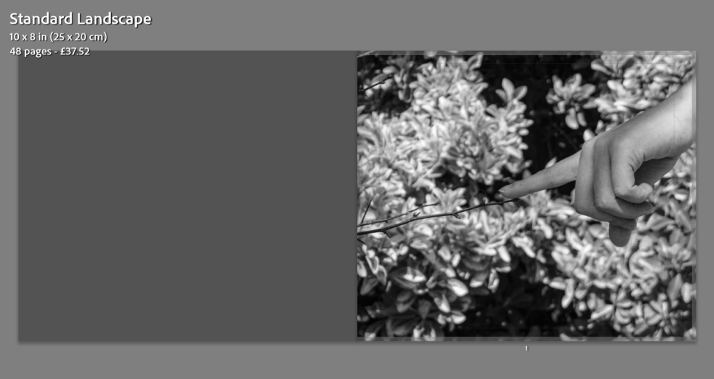
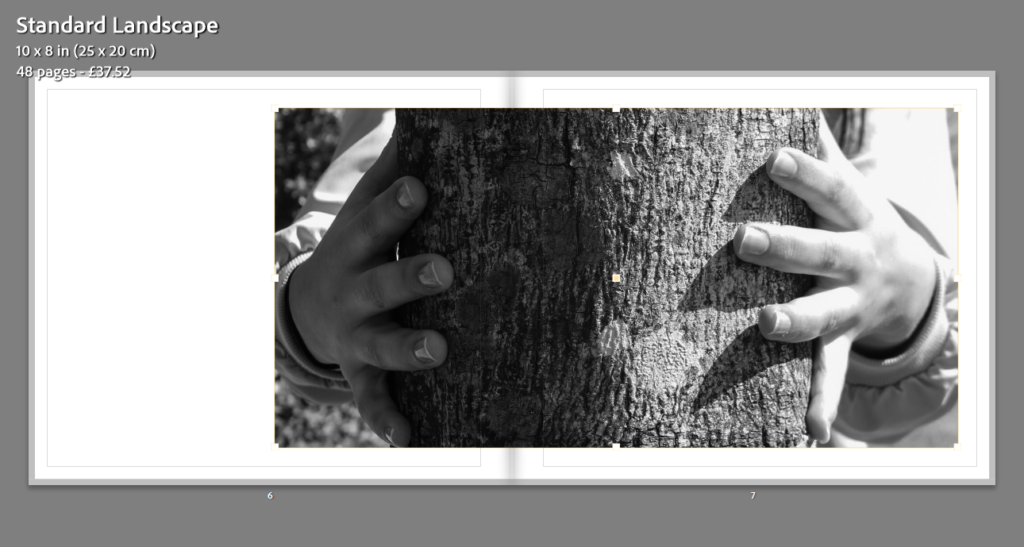
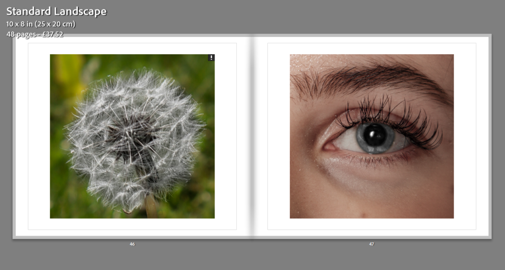
Nature’s Unity.
Natures unity – this is when you picture nature coming together as one. Its when plants and wildlife grow and collectively create a union within themselves.
In this plan, I want it to be straight forward as to what I’m photographing and to know where I’m aiming to take these pictures.
Action Plan
In this shoot ill be aiming to focus purely on nature. I don’t want to go off the theme of trees, plants and anything wildlife.
Juxtaposition of Opposites
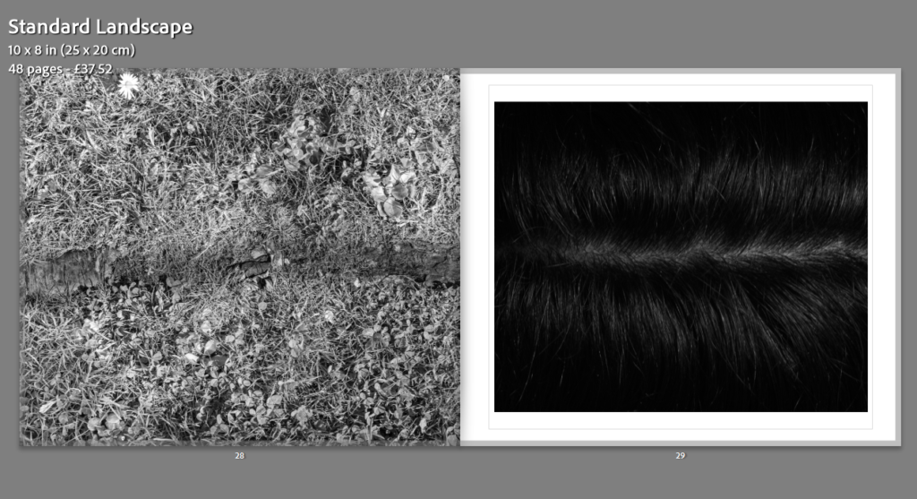
Juxtaposition of Opposites – this is when you show the unity between opposites. e.g. light and dark, old and new, soft and hard.
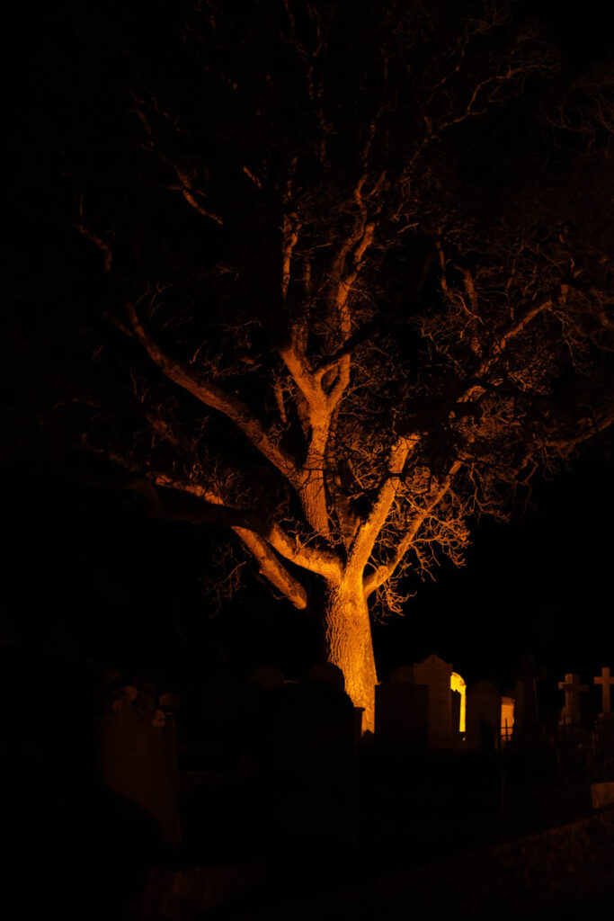
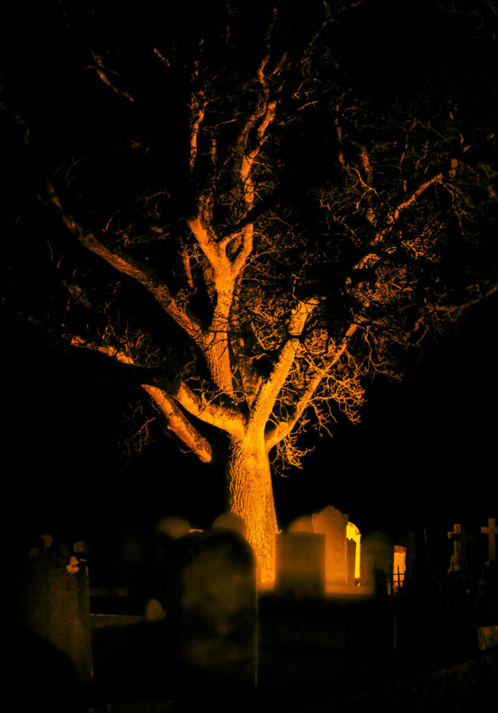
In this plan I want to really focus on light and dark. I really like the idea of showing unity through the morning and the evening, to show the beginning of the day and the end of the day. I like how there’s a metaphor of union in the idea of morning to evening.
Action Plan
In this shoot, ill purposely only aim for light and dark, creating a metaphor for unity.
Symbolic Gestures
Symbolic Gestures – This is when an action is done that creates meaning.
In this plan, i want to focus on capturing the gesture of love. Not necessarily just romantic, but the gesture of caring for another.
Action Plan
In this shoot, ill solely focus on family members and the love they share.
Friendship
Friendship – this a close and mutual bond between individuals characterised by affection, trust, and support. It often involves shared experiences, interests, and values, and can provide emotional support, companionship, and a sense of belonging.
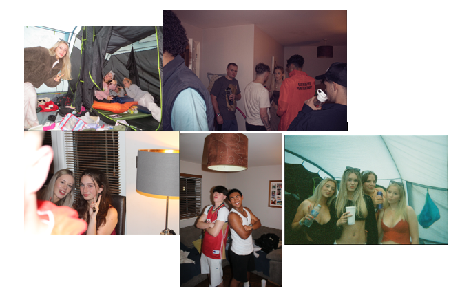
In this plan, i want to focus on capturing the pure details of a friendship. I want two models, so i can truly focus on what a strong bond/friendship actually is. Usually the strongest bonds are formed between two, not a whole group. Even in groups there are tight nip bonds in them.
Action plan
In this shoot, ill focus solely on my two friends.
Nature’s Unity: Focusing on the blending of different elements in nature, like flowers growing together, trees with intertwined roots, or animals interacting harmoniously.
Mood Board.

Juxtaposition of Opposites: Show the unity between opposites; light and dark, old and new, soft and hard. This could be represented through contrasts in architecture, landscapes, or objects. Create a metaphor and deeper meaning in to this.
Mood Board.

Id use night time and day time but the same exact place just different lighting. Growth and Reflection- light and dark can be seen as metaphors for activity and rest, light and introspection, action and reflection. A union between them might symbolize the need for both; active moments of the day and contemplative moments of the night; for personal growth or spiritual development.
“Without darkness, there can be no light. The two are inseparable, like the brush and the canvas.” – Henri Matisse
Friendship: Friendship is a close and supportive relationship between two or more people who share mutual affection, trust, and a sense of companionship. It involves emotional connection, understanding, and support during both good and challenging times.
Mood Board
“A friend is someone who knows all about you and still loves you.”
— Elbert Hubbard
Photoshoot Plan
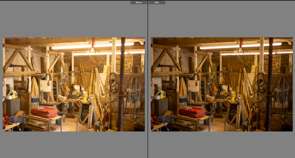
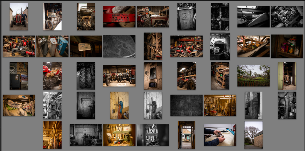
What?- Having completed 3 previous shoots this one is a catch up for any photos I missed or any I think will add to the narrative that I noticed I was missing using editing. It is a mixture of portraits, small detail shots of tractor parts and more photos of the wood workshop/dairy.
How?- Using my 50mm lens will allow me to get closer, or capture images I couldn’t with a long lens. I will start in the barn working my way up each level before the going into the wood workshop/dairy.
Why?- These will be important photos for the book, they are ones I felt I was missing in my previous shoots. I felt I missed human connection with a portrait that was composed rather than a natural. Also a few of the tractor parts, I liked the compositions I saw on the last shoot but the lens was too long to capture it.
Contact Sheets
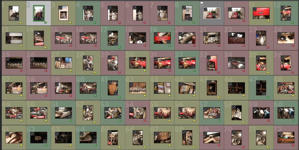
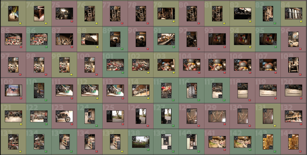
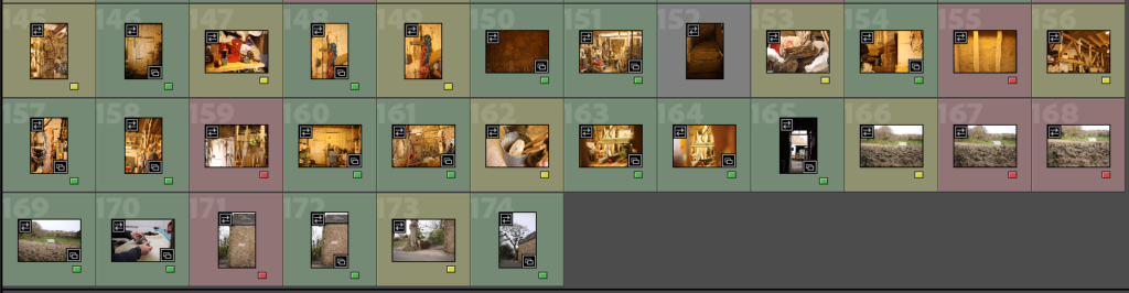
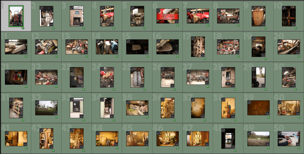
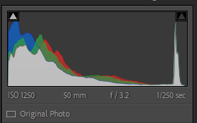
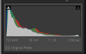
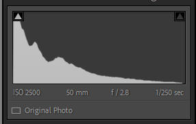
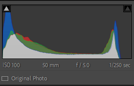
This is the contact sheets of the last photoshoot for the minute. It is a variety of shots I felt were missing from the previous photoshoots. I used a different lens to my 70-200mm I had been using, this photoshoot was done mostly with a 50mm 2.8 lens.
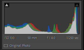
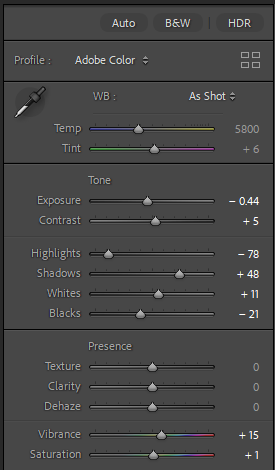
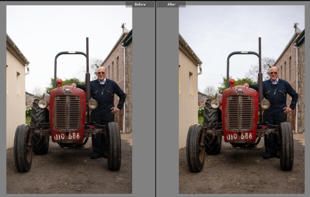
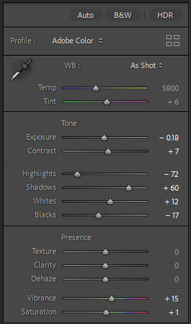
Having looked at the previous shoots I noticed I didn’t have a formal composed environmental portrait. So I set this one up, using the same tractor featured in the working photos from the first photoshoot and asking the subject to stand next to it. He then put his arm on it like he would when talking to someone. To get a good angle I picked a low angle to keep not distort the tractor when using a 50mm lens. To edit it I made basic adjustments to correct the exposure.
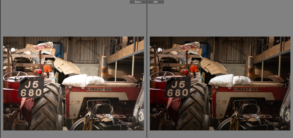
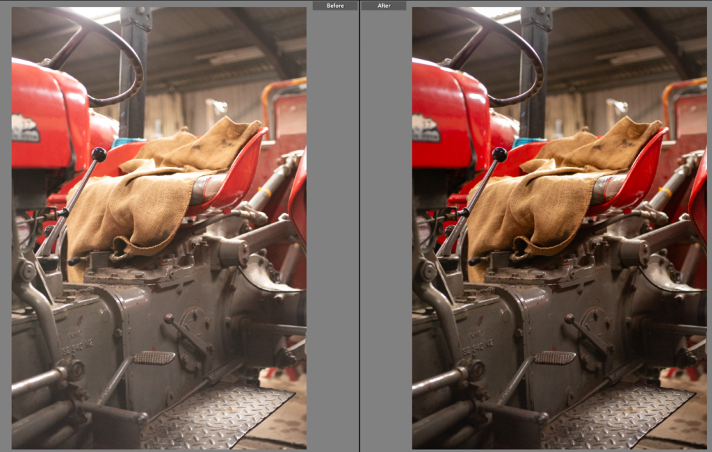
Edit Two

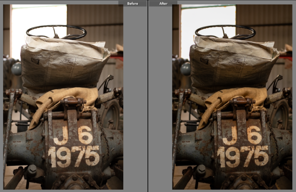
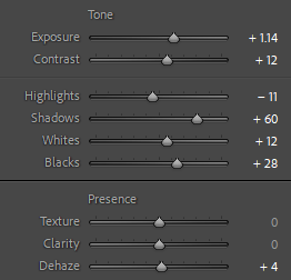
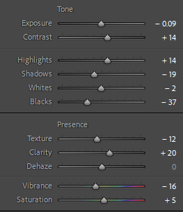
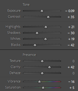
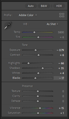
I liked the way the seat, steering wheel and number plate filled the frame on this shot. To get it to fit with the rest of the photos I increased the contrast while decreasing the exposure. This brought out the deeper colours in the photo, highlighting the age of the tractor and the textures of the sack and plastic bag on the seat.
Edit Three
Similarly to the last edit I increased the contrast while decreasing the exposure. This photo was slightly too bright to fit with the rest having been shot at f2.8 so I decreased the highlights on the sliders as this reduces how bright the pillows are.
Edit Four
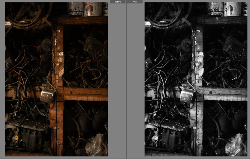
This shot even on a 50mm lens was a close cropped frame. I used the centre of the shelves to highlight the harsh lines and show how organised it is even if it looks chaotic. The things on the shelves aren’t as easy to make out, instead dark in contrast to the lighter wooden cross. I like the harshness of the contrast, making a highly tonal image to fit with the rest of the project.
Edit Five
Again by choosing a high contrast, tonal photo it fits with the rest of the project. I used the highlights to enhance the photo, the highlights add to the shot, highlighting the tire treads, tractor parts and wood.
Edit Six
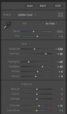
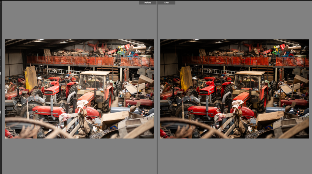
This photo is a great over view of the barn. It gives an insight into the farm, having the foreground filled with the metal elements and the background continues on filled with reds and oranges linking the previous photos and the owners love for Massey Fergusons. I just increased the contrast while decreasing the exposure to get a balanced image, fitting with the rest of the project while still highlighting all the details in the scene.
Edit Seven
This was originally over exposed but to get the textures to stand out I reduced the exposure and increased the contrast and shadows, bringing the texture back to life in the photo. Removing the overexposed parts of the photo.
Edit Eight
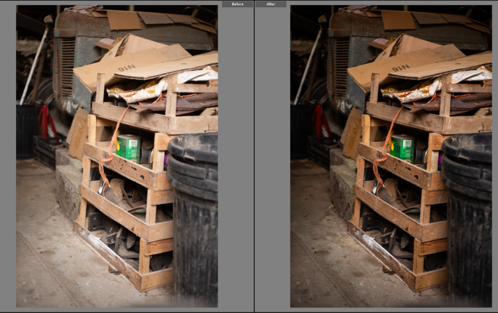
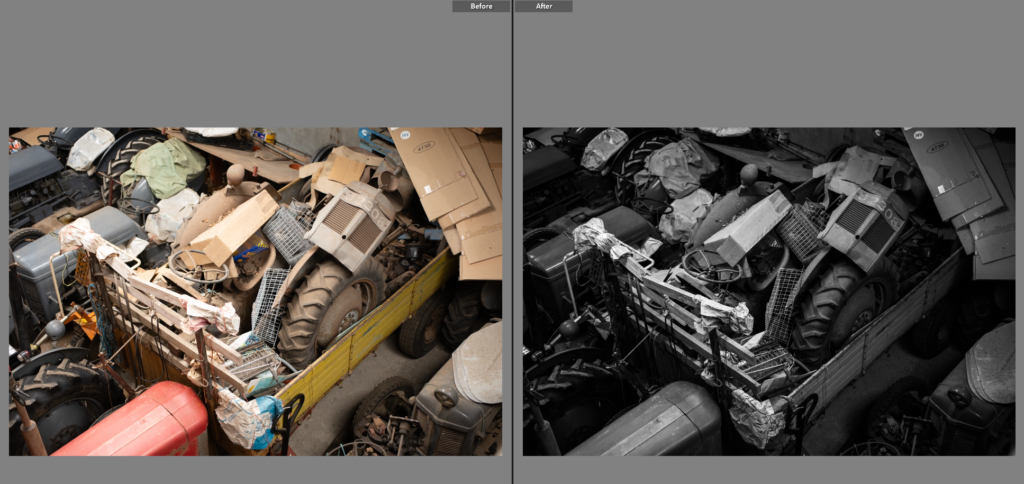
I felt this shot was important to include as it has details, the tractor in the back ground, the potato crates in the foreground and then the bright food cans again making the link to the other photos that have the same food cans.
Edit Nine
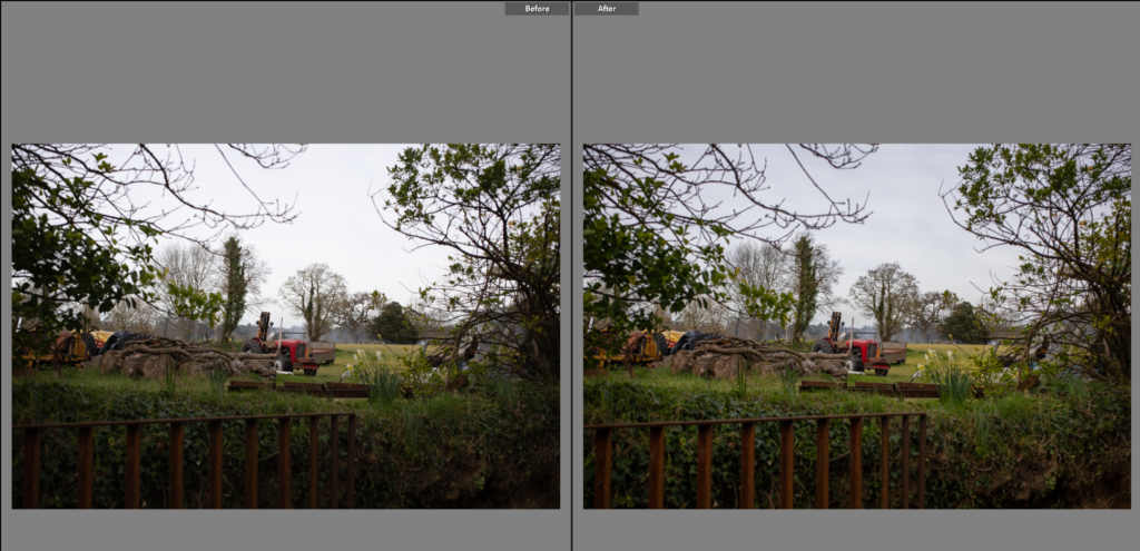
This is a different photo from the rest of the photos from this shoot, I liked how it had the greenery, pulling the tractors and landscape together. The busy top corners of the photo build a frame for the tractor and field. The red contrasts well with the range of greens. I reduced the highlights while increasing the shadows to enhance the depth in the photo.
Edit Ten
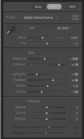
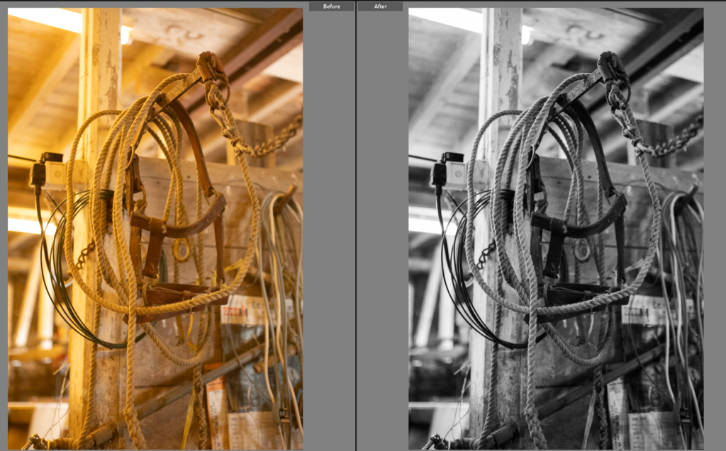
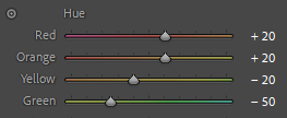
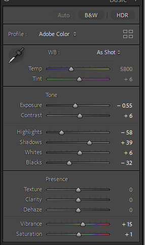
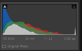
I then went back to detail shots, this is a cow headcollar in the dairy turned wood work shop. The partitions are clear in the corners of the stalls for the cows are visible in the photos. I like the black and white as it removed the yellow tone and enhanced the soft background with the strong lines from the headcollar itself, pulling the focus back.
Edit Eleven
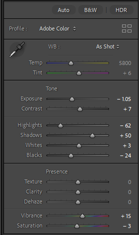
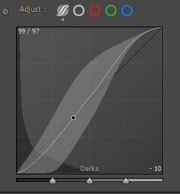
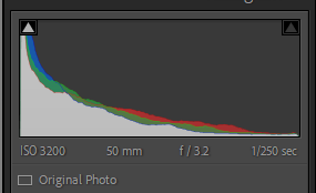
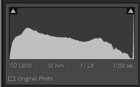
This photo captures the work shop, the wood work shop. Having used the 50mm lens I made use of the 2.8 aperture as the lighting was only yellow, artificial lighting the lower aperture benefitted the photo capturing all the details without noise. However this did create an overexposed image, so I used the sliders to reduce the bright light, while still keeping the details. I also reduced the yellow lighting by moving the yellow slider down to the blue end, neutralising the photo.
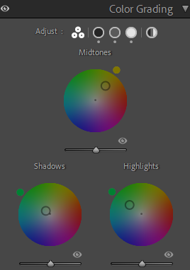
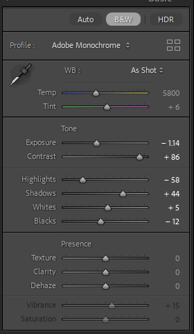
Edit Twelve
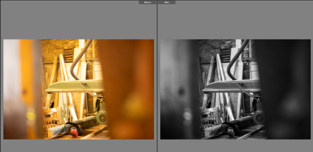
This photo has two large lines on either side of the photo, framing the saw as a small glance at the work shop, creating interest for the viewer. I like the black and white on this image as it highlights the piles of wood at the back, the details on the saw and removes the yellow lighting.
Final Photos
This is a mixture of different photos, some linking better than others, some seemingly completely random. However, these are all photos I had planned to capture, whether it be a composition I had seen on a previous shoot but not had the lens to take it well. Or a photo I wanted to redo from a previous shoot as the outcome wasn’t what I wanted. This mixture of photos encompasses what I’m trying to do with the project, give an insight into Raoul’s life as a farmer. I needed another portrait but a pose one, one in which Raoul was acknowledging the camera. Adding an understanding about the camera, and its importance in the documenting of him and his lifestyle. Having researched the photo book, ‘for every minute…’ I noticed there was a big association with colour and texture, this is also something I liked the idea of from my mood board. So within this shoot I focused on connecting details, repeated textures and photos I could subtlety reference throughout. Like the food cans, bright in colour but if the viewer isn’t looking they will miss the constant reference, it is also a pun to a degree, showing the circularity of the trade, from soil to can to being used to farm the soil in some way again.
Carolle Benitah
Carolle Benitah was born in 1965 in Casablanca, Morocco. She worked as a fashion designer for 10 years and she studied at the École de la Chambre Syndicale de la Couture Parisienne (promotion 1991) and she graduated from École Nationale Supérieure de la Photographie in Arles, France, with the Jury’s distinction in 2015. In 2001 she turned to photography as well, due to wanting to change her career path and life due to challenging personal circumstances at that time in her life and a period of strong personal questioning.
She began taking photographs of her son, herself and her family, so she could document her every day life. Soon she was drawn in by the discovery and the process of her own questioning, so she enrolled herself in art school. During this year she became ill and documented this life experience.
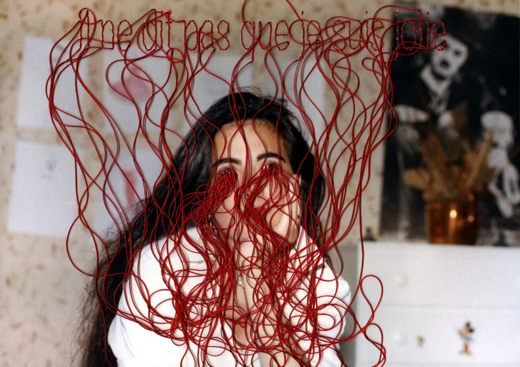
She transformed her photographs into three-dimensional pieces. She used the decorative form of embroidery to present her milieu’s flaws. It is also a metaphor of itself to carolle benitah, because to embroider a photograph it will first make holes in the paper. It is a process. There is something sacrificed to work on a photograph. It’s a violent and painful treatment. ‘I drill, I cut, I erase, I crop and I’ll remove some elements.’ It is also a reflection of the time, the time it will take to embroider each photograph and also the time that has passed between the moment when the photograph was taken and now. It is her way of revisiting her own story with experience and time spent. ‘It’s like crossing the mirror. I go back and I recreate another story.’
During her work in photography she explored memory, family and the passage of time. Often pairing old family snapshots with handmade accents, such as embroidery, beading and ink drawings, Bénitah seeks to reinterpret her own history as daughter, wife, and mother. Her work questions the themes of identity and self construction, while exploring subjects such as family, desire, loss, mourning and confinement. She did this by taking on challenging themes and drew on difficulties from her own past. She also drew on her past as a fashion designer by using materials that populate the domestic world (placemats, monogrammed handkerchiefs, tea towels, wedding trousseau linens, etc.) and trivial objects which she creates and embroiders, she overturns the hierarchy of the arts.
During her work of Photo Souvinirs she began to explore other mediums. She began to embroider setences on paper doilies, phrases that question love and desire.
‘Tell me you love me, tell me once more that you love me, tell me one more time that you love me.’ – This reflects a kind of insecurity and urgency of desire. She continued to explore these obsessions by creating an installation of 11 handkerchiefs embroidered with monograms depicting impossible expectations, such as ‘Im waiting for Mike Brandt, my idol of 10 years old, to come back from the grave and tell me he wants to marry me.’ She embroidered these onto pillows, with an embroidered crown in the middle of the pillow and the phrases around the outside of the pillow.
The work of Carolle Bénitah has been published in magazines such as Leica World, Shots Magazine, Photos Nouvelles, Spot, Center for Photography Houston, Foto Noviny, and Lens Culture, among others.
She then passed away April 1st 2024 due to a short illness at age 59 in Arrondissement, Marseille, France.
About Photo Souvenirs
In her work Photo Souvinirs she used old family archives, snap shots. She chose specific photographs cropped them and embroidered them. In doing so she explored her identity and reconstructed this, as well as exploring the themes of family and difficult experiences in her own life.
She titled her work ‘Photo Souvenirs,’ because it includes three periods: childhood, adolescence and adulthood and the collection of images ends in the early 2000’s when she started documenting her own life. Each period corresponds with a colour. She built an album for each period and in each album there are 15 images. Childhood is represented with red, which is the colour of violent emotions. Adolescences is represented by black, which is the colour of anxieties related to the period, and adulthood is represented with gold, which is the colour of fulfillness in love. She used the colour corresponding thread for her embroideries in each of these periods.
Her series Photos-Souvenirs was also selected to exhibit in FotoFest’s 2014 Discoveries of the Meeting Place showcase of past Biennial portfolio reviews.
A short video about Carolle Benitah, made by another friend, Marie Docher.
Interview (2010)
I started to be interested in my family pictures when I was leafing through a family album and found myself overwhelmed by an emotion of which I could not define the origin.
These photographs were taken 40 years earlier, and I could not even remember the moments they were shot, nor what preceded or followed those moments.
But the photos reawakened an anguish of something both familiar and totally unknown, the kind of disquieting strangeness that Freud spoke about. Those moments, fixed on paper, represented me, spoke about me and my family, told things about my identity, my place in the world, my family history and its secrets, the fears that constructed me, and many other things that contributed to who I am today.
I decided to explore the memories of my childhood to help me understand who I am and to define my current identity.
To begin, I carry out “excavations”. Like an archeologist, I dig out the pictures in which I appear from family albums and the shoe boxes full of photographs. I choose snapshots because they are related to memories and to loss.
These photographs are fragments of my past. I interpret them from a subjective perspective as confessions. I order them, classify them, scan them, then I print them. I don’t do anything directly on the original photo; I transpose this reality on a different paper. Sometimes I crop a detail that calls out to me, and I choose my format. The work of interpretation begins with these steps.
Once these choices of images are made, I start to tell my version of the story. I turn my attention to my own history, sometimes with 40 years of distance and the life experiences that changed my perception of events. The past of a human being, unlike the remains of an antique temple, is neither permanent nor finished, but reconstructed in the present time.
For the next step, I add needlework: embroidery and beads.
Embroidering is primarily a feminine activity. In the past, the embroiderer was seen as a paragon of virtue. Waiting was tied to this activity: women embroidered, hoping for the return of the man to the home. Embroidery is intimately linked to the milieu in which I grew up. Girls in a “good family” used to learn how to sew and embroider — essential activities for “perfect women”. My mother embroidered her trousseau.
There is nothing subversive about this activity, but I pervert it with my purpose.
I use its decorative function to re-interpret my own history and to expose its failings.
The two activities — interpretation and needlework — come together again in a kind of dispute: embroidery is the sign of a good education yet the words that I speak don’t show me to be what I was supposed to be: a well behaved girl, a wise spouse and a loving mother.
With each stitch I make a hole with a needle. Each hole is a putting to death of my demons. It’s like an exorcism. I make holes in paper until I am not hurting any more.
—Carolle Benitah
Her Work
Analysis of 1 Image
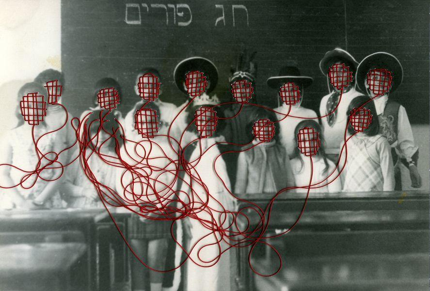
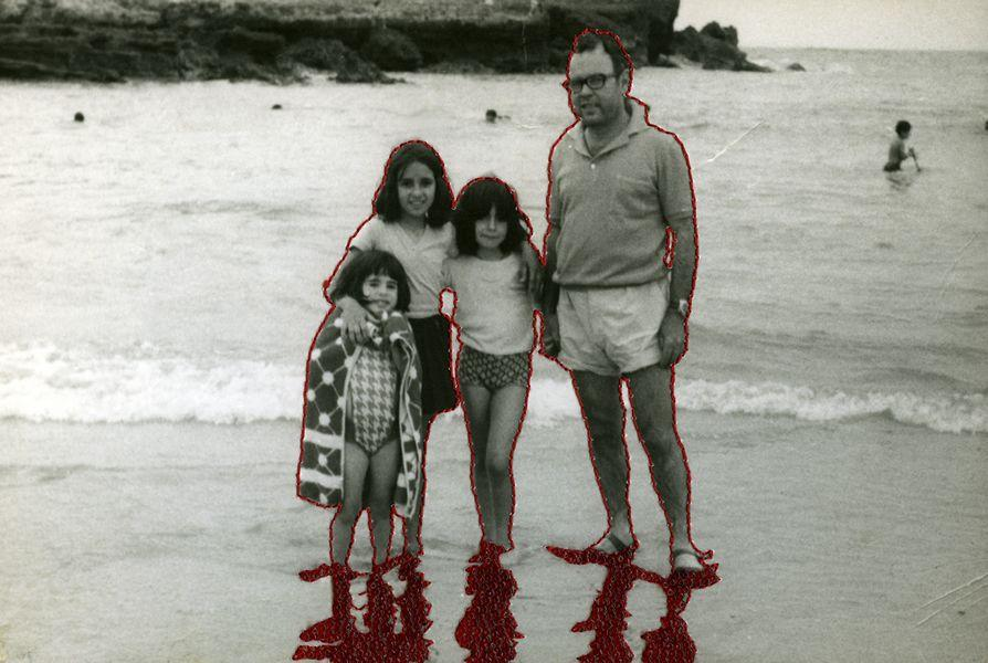
This image is an archive image, which looks to be taken outside on a beach. Therefore, it would use natural daylight as the lighting source. The subjects in the image are posed how they wish, so they have high levels of control and the person taking the photograph also has high levels of control, because they can manipulate the distance of themselves, as well as angles and positioning.
This image is a black and white image with high levels of contrast, due to the light and dark tones throughout. This image also contains the colour red, due to embroidered stitching in the photograph. This creates a three dimensional image, with texture. There is also more texture, due to the two figures, which are cut out and then stuck at the bottom of the page. The arrangement of this archive image was manipulated, due to the deconstruction of the image. Carolle Benitah manipulated this layout, as she arranged the cut out figures and stitching as she wished, which indicates high levels of control. She has also manipulated the cut out figures, so they are stuck outside the frame of the original image. I think the main viewpoint of this image is the red stitched figure, who I believe to be Carolle Benitah. This is the main viewpoint, because the pop of colour leads the eye to this figure. The pop of colour also creates a contrast between the black and white background. All the figures are in the centre of the frame.
The red stitching in this image reflects violent emotions during Carolle Benitah’s childhood, as this archive is also an image from her childhood. The meaning of this image is to explore Carolle Benitah’s childhood and see how her experiences and life has changed over time. She also explores family and identity in these images in her work of ‘Photo Souvenirs.’
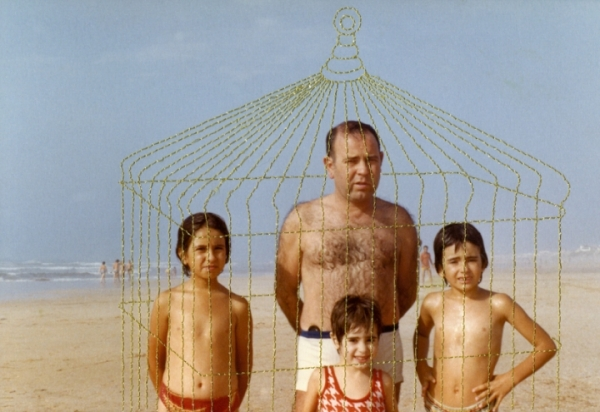
My Inspiration
I am taking inspiration from Carolle Benitah’s work, because I am also using family archives in my work, and I will also be deconstructing them in the same way benitah has. I want to experiment with stitching as well, but in a slightly different way. I want to use stitching to show how my family and I are all connected through blood, DNA, love and similar characteristics. I will also be using red stitching, but instead of it representing violent emotions, like it does in benitah’s work, it will symbolise blood, so it can metaphor my family’s blood line.
I also want to experiment with the concept of time and how families can change and grow over time. Benitah also experienced how her life has changed from when her archives were taken to her current life, while making this work and the embroidery metaphors this, because of the time it takes to embroider a photograph. I want to use this same metaphor in my work.
In order to create these embroidered photographs, I will use photoshop, but I may experiment with actually stitching a hard copy of an image, so I can understand Carolle Benitah work better and the time it takes to do so.
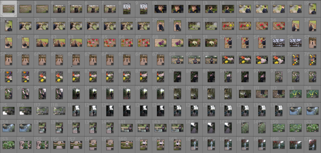
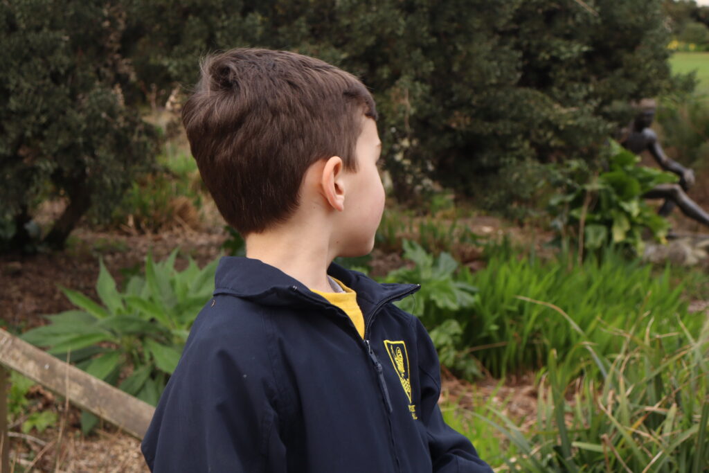
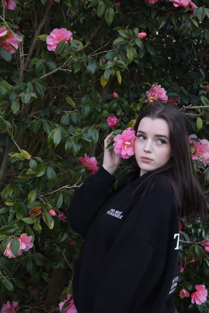
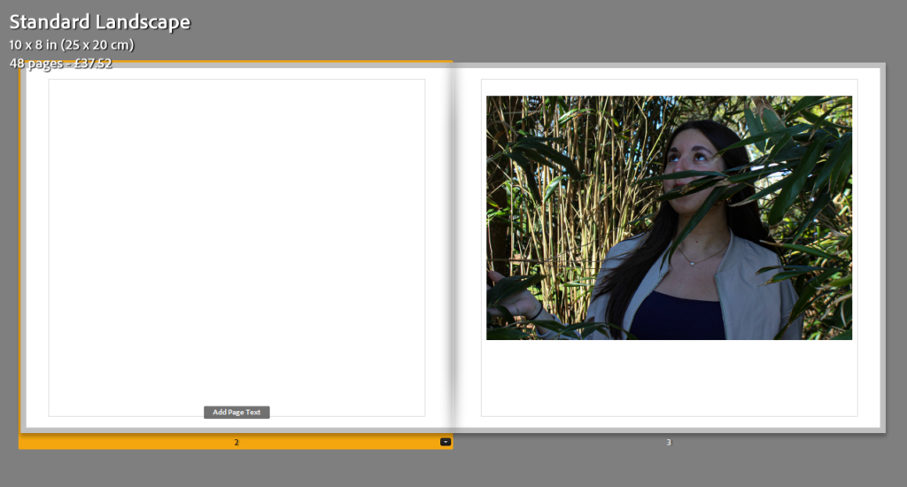
For my photoshoot, explored the theme of unity between humans and nature by taking photographs of people around different features of nature, mostly flowers and grassland, and captured the model interacting with it. I think this photoshoot turned out well as I was able to get a good number of images which turned out as I aimed. However, I would have liked to get more a variety of images with the models interacting with nature in a number of ways so I am going to do a third photoshoot to achieve this.
This photoshoot took place in a park where I was able to capture images with flowers, trees and a pond. I think these photographs turned out well as the vibrant colours of the flowers compared to the soft tones of the model have a strong contrast while looking aesthetic alongside each other. As well as this, I was able to capture models around greenery such as grass and trees. My photographs were able to show the unity between humans and nature which is what I aimed for.
Overall, this photoshoot captured what I had planned and aimed to do while also allowing me to figure out how to expand what types of photographs I shoot. After this photoshoot, I was able to plan and aim to shoot more specific images in the next shoot. I am happy with the photographs produced and glad that this first shoot was able to set me up for a more particular shoot.
Some unedited photos:
Andy Warhol’s work:
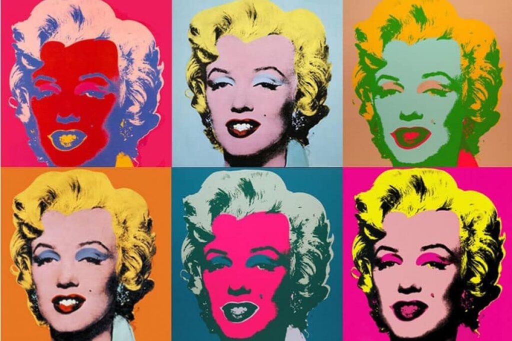
Andy Warhol was an American visual artist, film director and producer. A leading figure in the pop art movement, Warhol is considered the most important artist of the second half of the 20th century. His works explore the relationship between artistic expression, advertising, and celebrity culture that flourished by the 1960s, and span a variety of media, including painting, sculpture, photography, and filmmaking.
Warhol was born and raised in Pittsburgh in a family of Rusyn immigrants, Warhol initially pursued a successful career as a commercial illustrator in the 1950s. After exhibiting his work in art galleries, he began to receive recognition as an influential and controversial artist in the 1960s. After exhibiting his work in art galleries, he began to receive recognition as an influential and controversial artist in the 1960s. His New York studio, The Factory, became a well-known gathering place that brought together distinguished intellectuals, drag queens, playwrights, bohemian street people, Hollywood celebrities and wealthy patrons. He directed and produced several underground films starring a collection of personalities known as Warhol superstars , and is credited with inspiring the widely used expression “15 minutes of fame.” Warhol managed and produced the experimental rock band the velvet underground. Warhol expressed his queer identity through many of his works at a time when homosexuality was actively supressed in the United States.
Warhol has been described as the ” bellwether of the art market”, with several of his works ranking among the most expensive paintings ever sold In 2013, silver car crash (double disaster) (1963) sold for $105 million, setting a record for the artist. In 2022, Shot sage blue Marilyn (1964) sold for $195 million, which is the highest price paid at auction for a work by an American artist. Warhol has been the subject of numerous retrospective exhibitions, books, and documentary films. The Andy Warhol Museum in his native city of Pittsburgh, which holds an extensive permanent collection of art and archives, is the largest museum in the United States dedicated to a single artist.
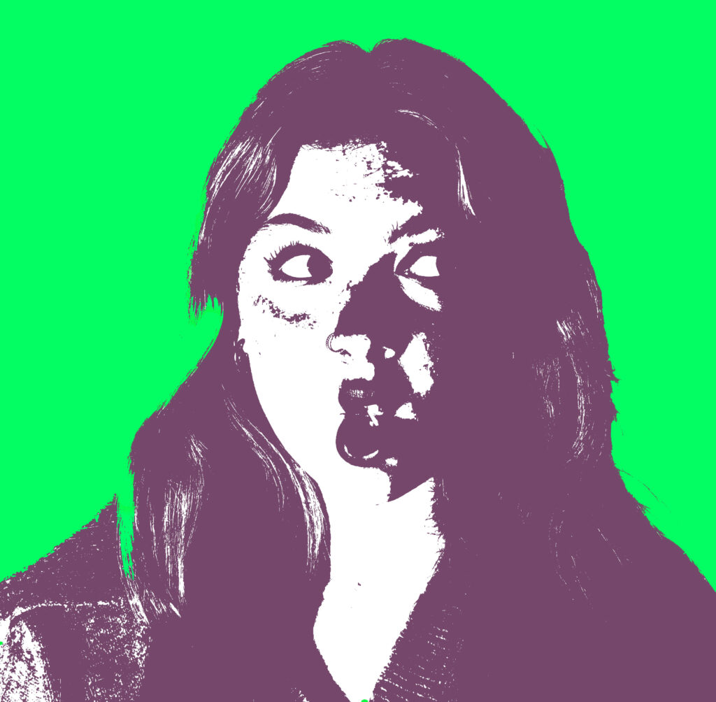
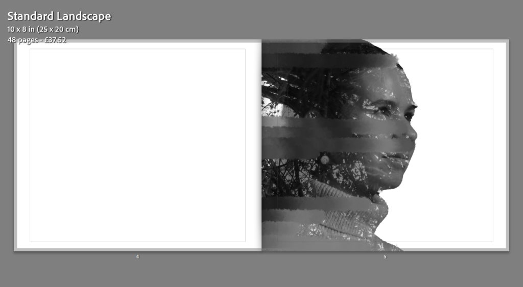
I really like Andy Warhol’s work and would quite like to include it into my work, I could simply just add the pop art filter on top of one of my photos to see what kind of effect it will give, I have a feeling that pop art tends to make a photograph a lot more brighter and happier than it is intended. Pop art tends to be really bright and has many colours involved. I could try and make my photos look more original to m and make each photo look more gloomy and hidden by using a dark filter, that still provides the pop art effect but isn’t filled with colour and more so a controversial look. I would like to take some portraits of my model and simply just experiment with different filters and see what looks best on each photograph that I had taken. The theme of this project is union and i have added another word to my project, “sonder”, the idea that everyone is living a complexed life. The pop art can help identify each emotion of the models face or either hide and this proves the point that you never know what happens in a persons life, its the idea that everything can change within a few minutes or even a few seconds.
My final outcome:
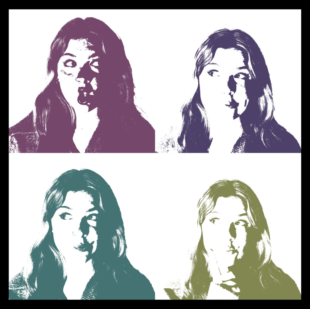
Overall, I do like how this turned out as it looked quite similar to my inspiration photo, though mine does lack a bit of colour. I do believe that a colour can completely change a perspective of a photograph as each colour represents a different emotion. To make my image look even more like Andy Warhol’s work would be to add a coloured background. Each photograph tells a story of what is going on inside the models head and what way they might react to a certain piece of news, it’s a way of showing that everyone has different morals and purposes in life, each individual have a different goal and will achieve it with different timings. Most of the expressions the model is making are quite similar but each photo if different depending on the position the model is sitting in, for example two of the photos are very similar but in one of them the model is tilting her head which creates a whole new perspective of what he model may be feeling, it could be a sense of confusion or possibly a sense of annoyance.
coloured example:
Pages:


Full Book:
Evaluation:
As seen above, these are my final book screengrabs. I am confident in saying that I am very pleased with my outcome. I believe that there are many strengths and some weaknesses in my book. One of my strengths is my structure. The use of quotes and colored and black and white images within my book really shows my creativity and thinking process when creating this book. The use of colored images at the beginning of my book, which is where I show a human figure ‘connecting’ with nature, allows me to set the tone for what my book is about. I purposely did this because I am aware that my Heading on my front page is an uncommon word that many don’t know which encourages audience to research about it therefore allows audience to be much more engaged with my book. Carrying on with my colored images, the structure of the images, is meant to show what connecting with nature is like again, reminding audiences what this book is about.
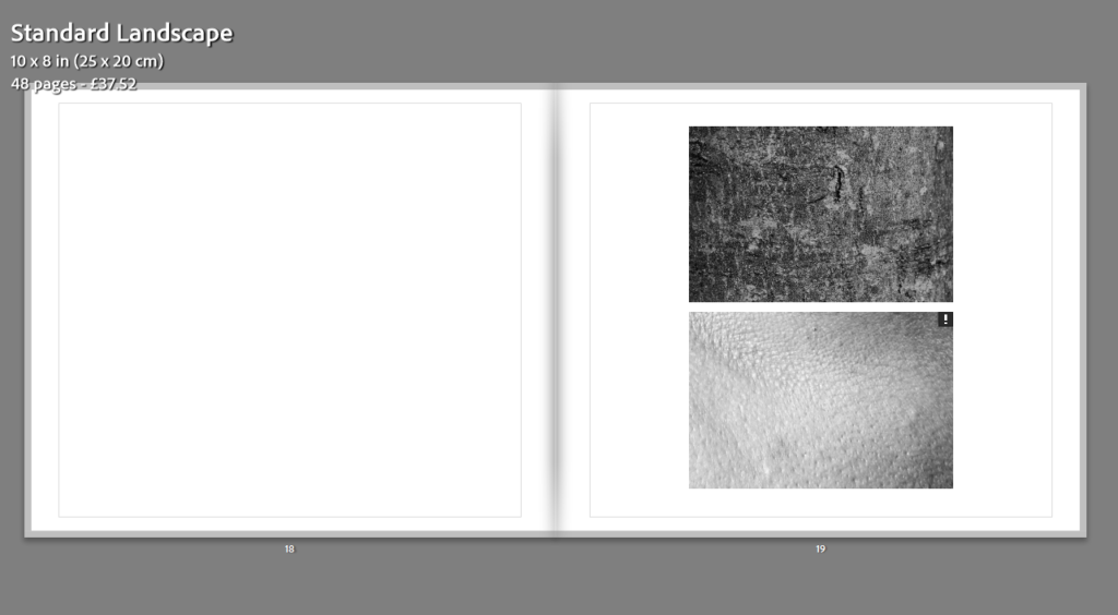
Moving on, another strength of mine is the use of comparison in my black and white images. These images show how connected and related we are to nature. The use of side-to-side comparison allows audiences to clearly and actively realize the connection we have with nature. I have no doubt that the use of side-to-side comparison shows my clear intentions of what I wanted the audience to realize, which I also believe is one of my strengths. Lastly, I am sure that a strength that I show in my book is my title and cover. My cover is fully black, simple but eye catching. The simplicity of the cover allows no distractions and is straightforward. The fact that it is fully black is also engaging because it is not something that is seen regularly in photo books. The title itself is engaging and powerful. It is an uncommon word which strikes curiosity therefore guarantees that audiences will be interested and involved. It is a word that many will have to research about it, which is powerful itself, hence why I believe that my title is a strength in my photobook.
However, there are some weaknesses in my book and improvements are needed. Like the fact that my creativity is minimal. My editing is great but my creativity within my image’s lacks. I could have incorporated more images in my book where I merge nature and humans together, using photoshop. For an example, taking an image of a trunk coming from the side of a tree and then merging an arm of a human coming out of the trunk. I could have also used more colour in my book. Like radical colours and edits of my images. This would ensure that I had contrast and diversity in my images and within my book. Lastly, I mention that one of my strengths in my book is the simplicity of the cover, however it can also be a weakness and a place which seeks improvements. This is because simplicity lacks creativity which some may seek and therefore not engage certain groups of audiences. I could have made my cover more colourful and abstract
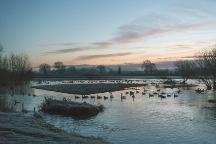
Born in 1950, Jem southern is a British photographer known for his landscape photos situated in the Southwest of England where he lives. His photos have been displayed in galleries across the United Kingdom and the United States such as the Tate St. Ives and the Yale Centre for British Art. Jem Southam describes his photography as “It’s about celebrating the fact that I can be here, that I’m taking all of this in. That all of this is available to us, that the world is such an absolutely, staggeringly extraordinary place to spend some time. We’re so lucky, as humans.” Jem saying this shows that he is grateful for this beautiful world and wants to celebrate that by capturing its beauty
In a review by Joerg Colberg he describes Jem’s photobook ‘the river Winter’ which showcases nature and landscape photos of the River Exe which Jem captured across eight winters. Joerg Colberg describes his landscape photos as ‘intimate’ with him saying “Usually, intimacy is not a word I associate with landscapes. Landscapes usually tend to be sublime, because that’s what is demanded of them. I don’t think many people would think of their garden or backyard as a landscape (unless they’re part of the 1% and own gigantic parts of land). But I think Southam might. I want to think that. I know that I certainly do.”
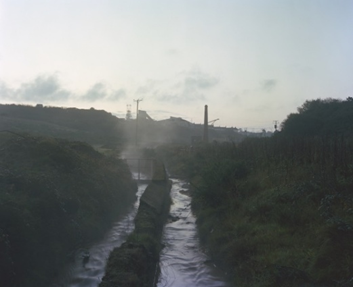
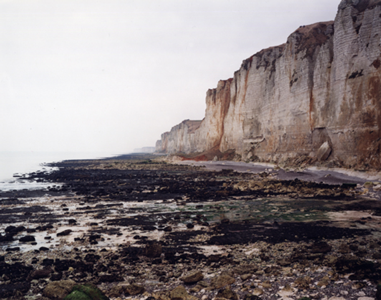
This photo is part of a collection of photos Jem took for his book ‘Rockfalls and Ponds’ published in August 2011 and was also shown in at an exhibition called ‘Before Time: Bleda y Rosa’ in Madrid, Spain a year before the book was published. The book is actually about documenting topographical changes at a location over many months and years to see how the landscape changes over the years due to natural and manmade changes taking place.
The photo uses quite a dull colour palette mainly consisting of browns, greys and backs due to the weather and location the photo was taken at as for this series Jem is focused on documenting the cliffside over time regardless of its beauty, however it is still an interesting photo with the cliffside creating diagonal leading lines which leads the viewer across the coast and into the cloudy horizon. All the rocks on the beach and the rocky cliffside gives the image a hard and rough feel/texture to the photograph however this does somewhat contrast the grey clouds which does soften the image and creates a balance between hard and soft in this photograph but could possibly imply the natural and manmade changes taking place to our natural environment and coastlines.