Personal study prints

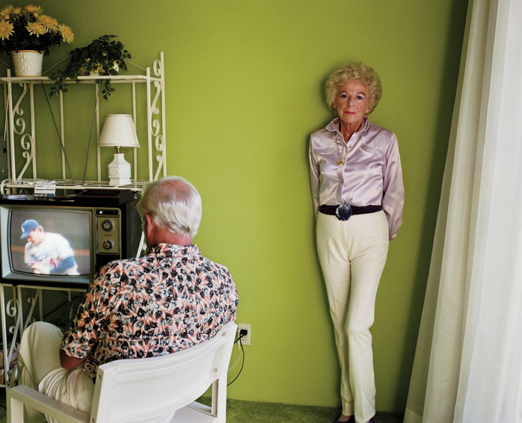
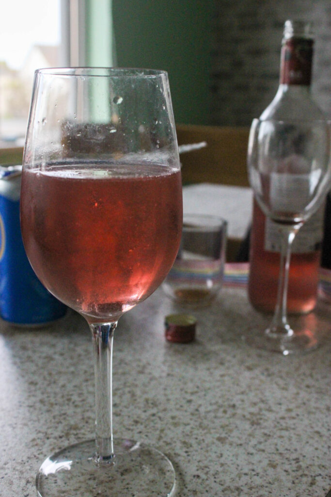
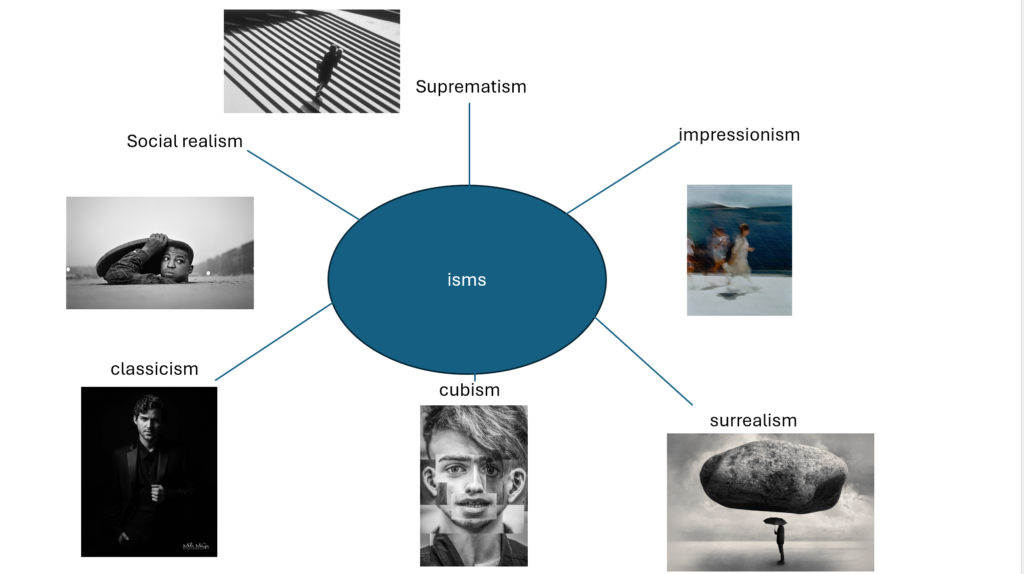
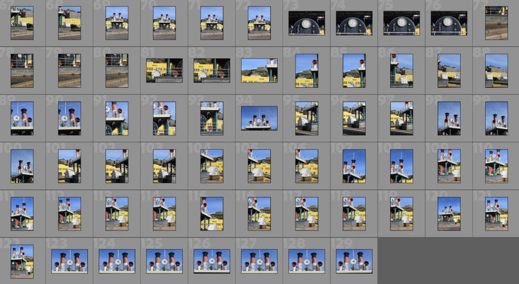
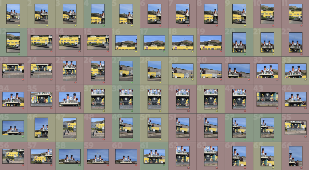
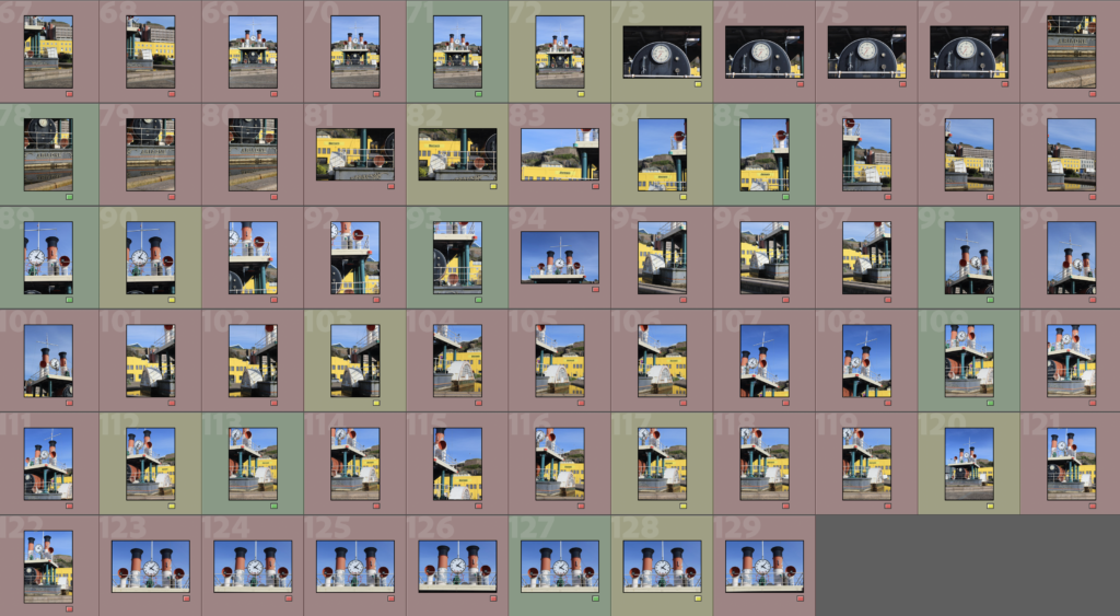
Before I started mounting up my final prints, I decided to use Photoshop to make digital mock ups of how I wanted to arrange my images. This meant that I could experiment with using diptychs or triptychs, for example, before I actually started to stick the images down so that I would be prepared.

I made sure to print images in A3, A4 and A5 so that I would have a range of different options of layouts to go with and I could also have variety in my work.

First:

The first mount up that I was going to do was my A3 one because I already had a brief idea of how I wanted to arrange these two images:

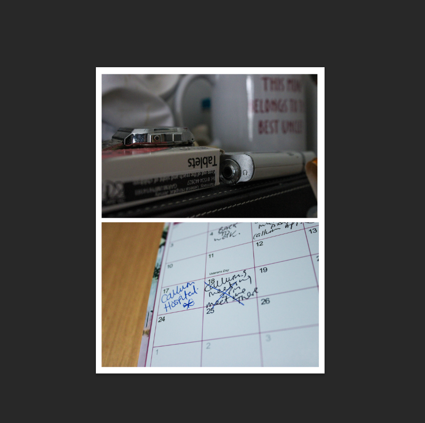
I decided to go with the layout on the right because the image with a lower-exposure was placed on top which I preferred as its darker, whereas the other way around I think that the board looks emptier.

I decided to double mount these, so I first sprayed them onto their own pieces of foam board and cut them out to look like the plan above. However, I then separated them in half so that I could place them on black card as I think that the black emphasized the features of each image more whereas if I kept the images on white, this could have washed them out.
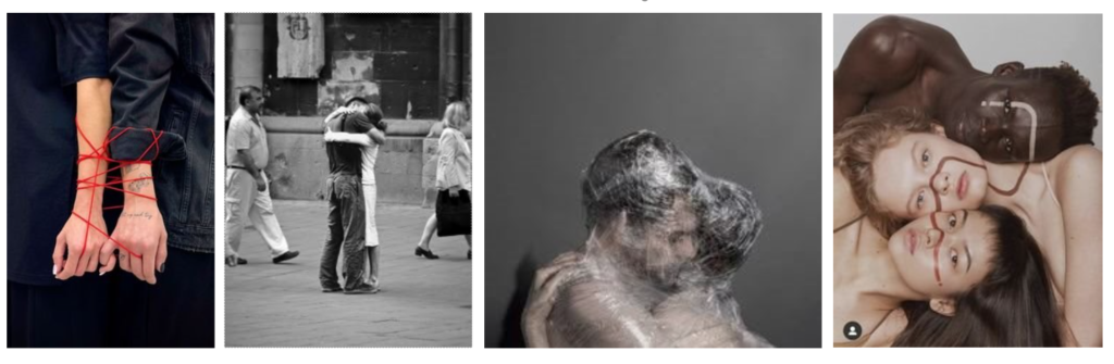
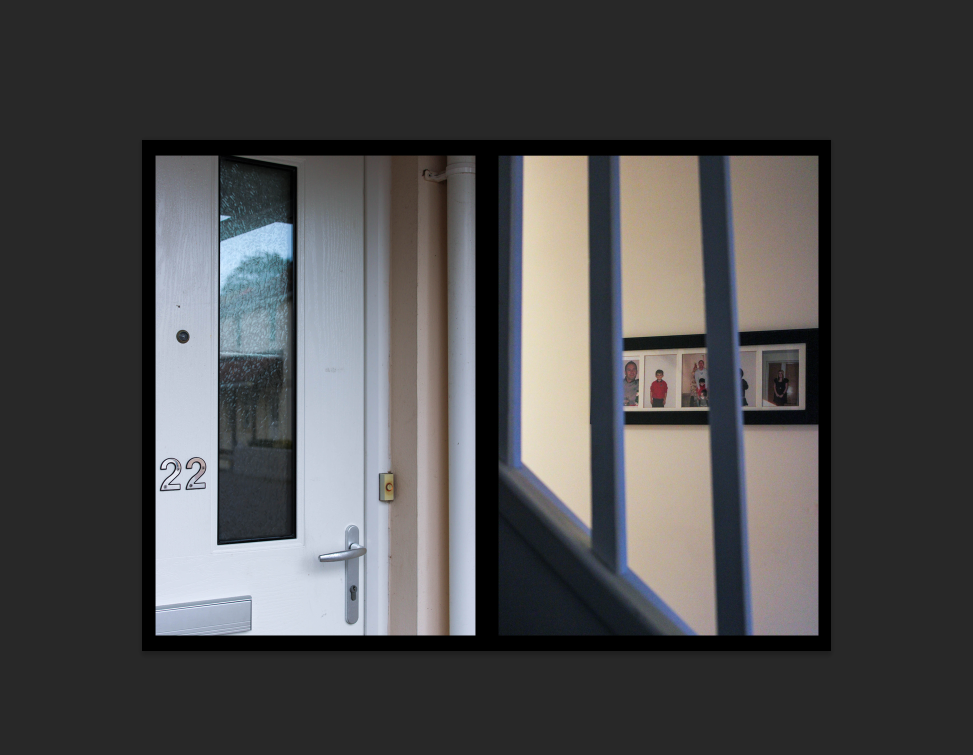
Second:

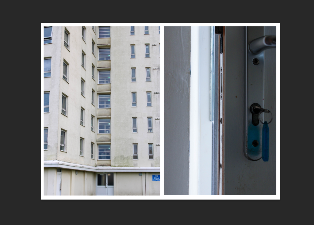
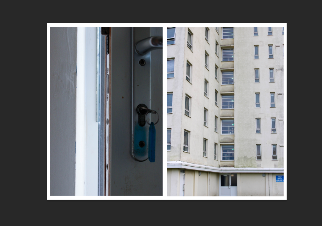
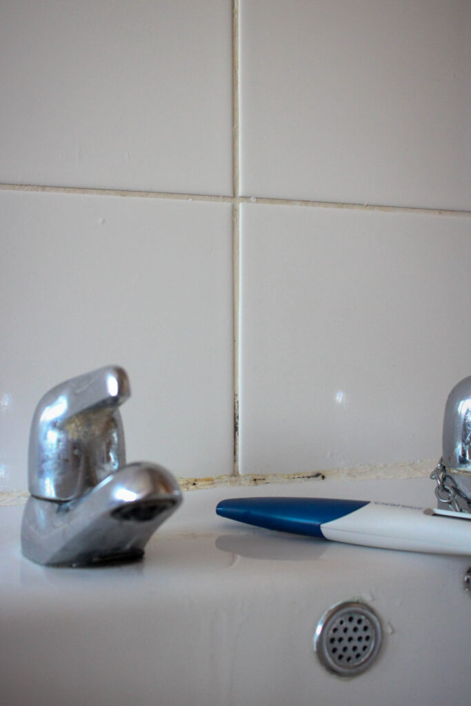
I decided to go with the second option because the key of the door would be in the centre, whereas if I chose the first layout then this leaves a large empty space between the two images as the photo of the door is quite sparse on the left side.

I doubled mounted these onto white card as the images use quite a light colour palette of silvers and baby blues which I think goes better with white, whereas if I used the black then this doesn’t particularly match the aesthetic of the two.
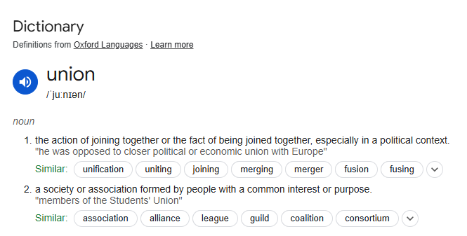
Third:

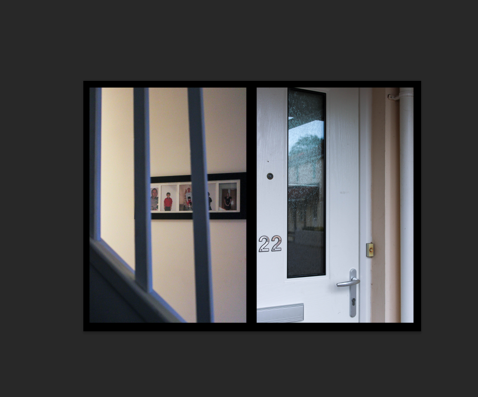
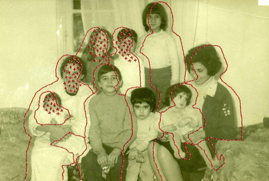
I wanted to place these images onto a black piece of card because I feel that the black made these images look more mysterious and depressing because these were taken during a photoshoot that was to represent the intangible feelings that there are when growing up with someone who is mentally unwell.

I was going to double mount these images but without the white border of the board because I wanted them to be raised above the page and made to be 3D as I feel that this brings the images to life and are become more appealing. Because they aren’t flat on the page, I really prefer this method too because you can see the images being displayed more sophisticated.

However, I had already done two diptychs so I wanted to include another image into this, being one of my archived edits of me and my brother so I experimented with this physically on the page during my layout process.
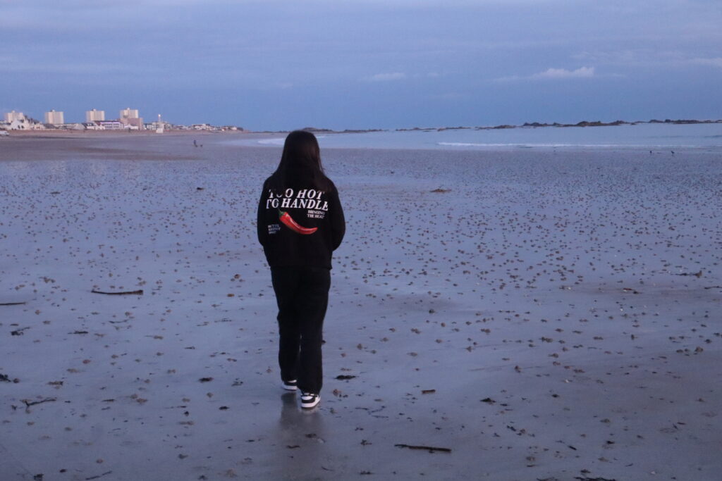
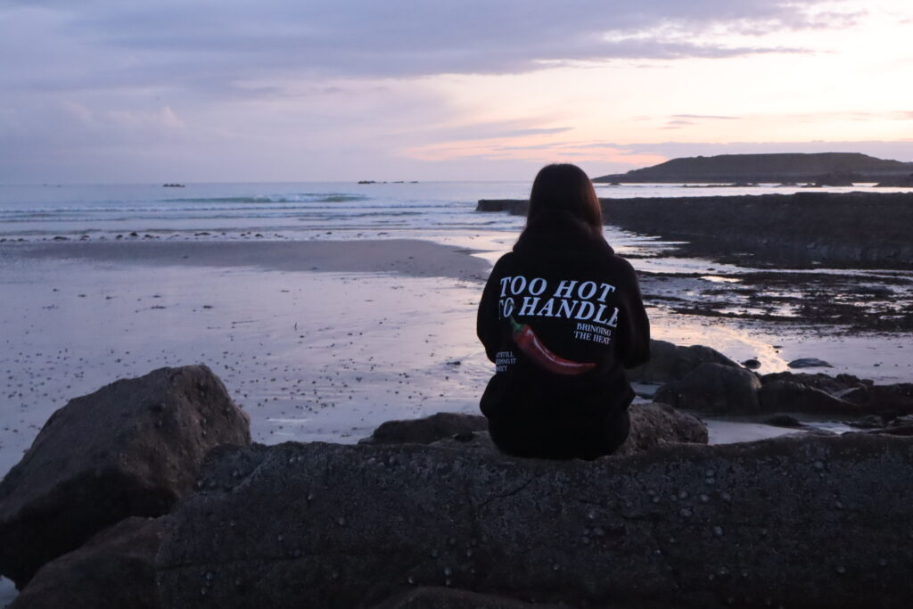
Fourth:

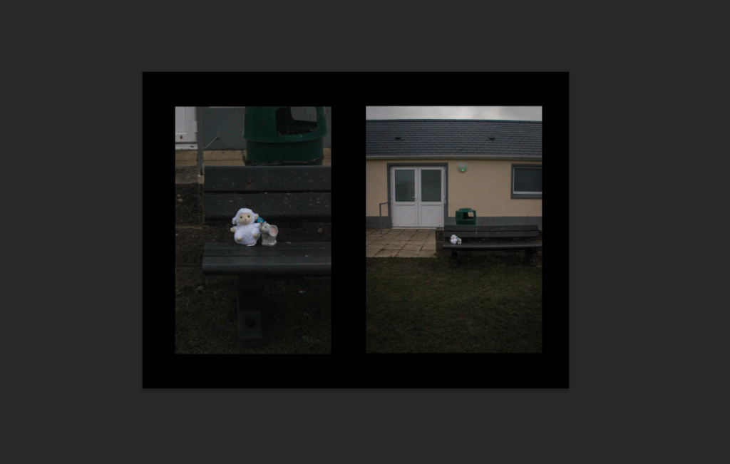
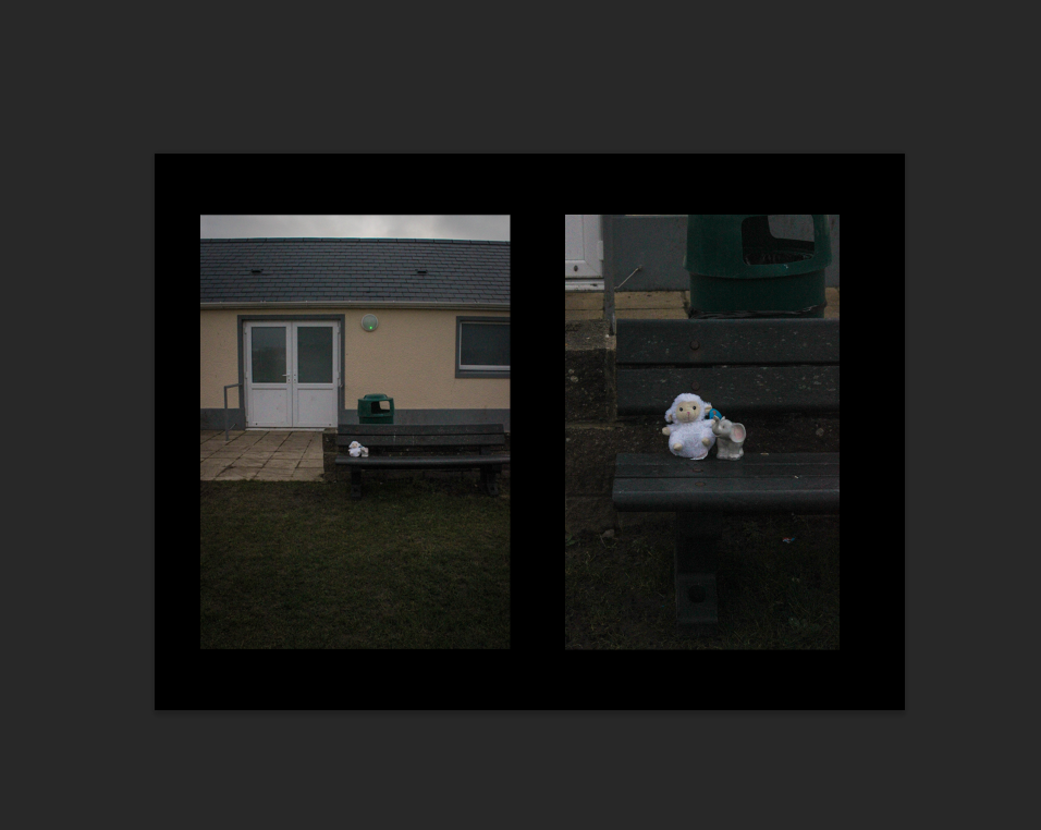
I already knew I was going to do a diptych of these two images as this was my intention during this photoshoot. I wanted to use a black background because the images use a low-exposure so I thought that this would complement the aesthetic of them. I picked the second layout also because this means that the viewer gets a brief overview of the surroundings, however the focus then becomes concentrated and zooms into the fluffy teddy which is something that I think works really well, acting like a process.

Fifth:

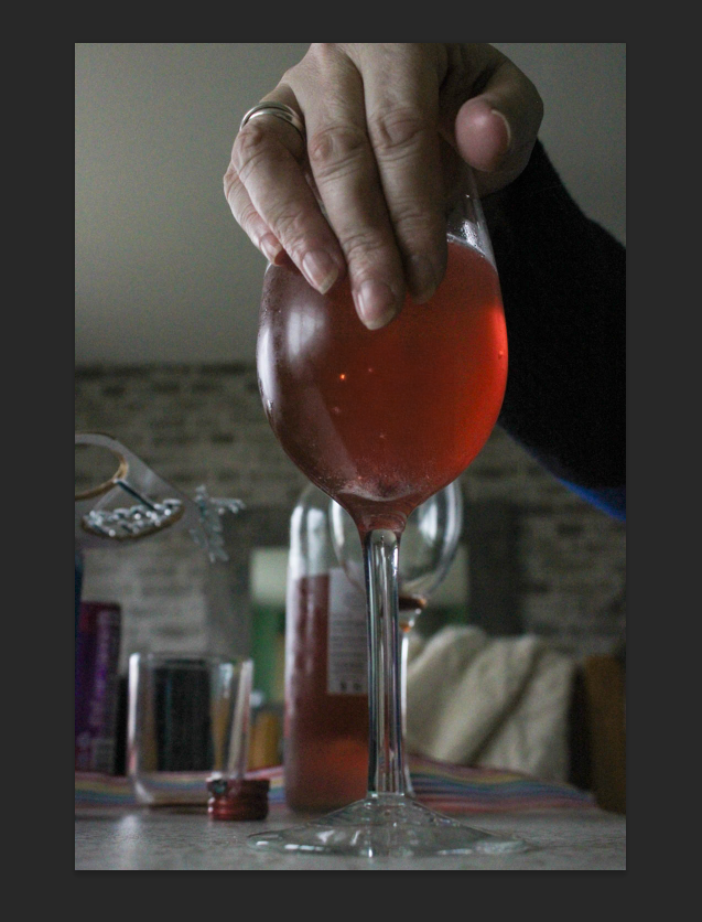
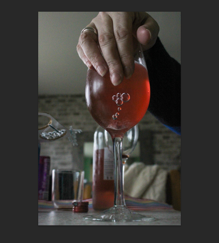
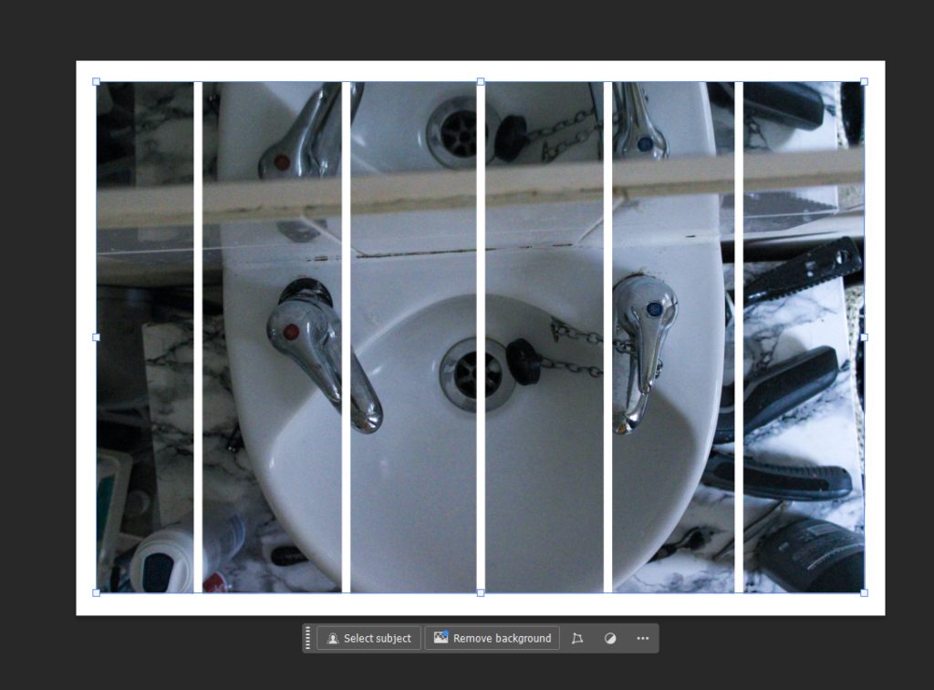
For my fifth mount, I decided that I wanted to display just one image in A3 as I really liked this specific image however it didn’t link with any of my other prints in the way I wanted it to. However, I didn’t want it to just be a plain image because I didn’t want to risk it coming across as quite simplistic, so I began to think about the ways I could distort the photo by cutting it up.

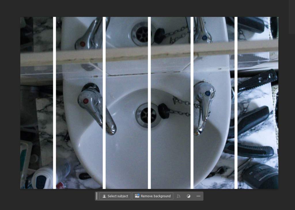
I eventually thought about slicing the image into six sections, as I measured the image to be 42 cm I was able to make each section even by cutting it at 7cm. As the image is showing a diagonal reflection, I thought it would be interesting if I added vertical straight lines to juxtapose this angle seen. I got this idea from initially thinking about slitting it down the middle, however I think that this is quite effective.

I mounted the image onto white foam board as I think that this adds to the illusion of the image and reinforces the distortion that I did as it is raised up off the page instead.

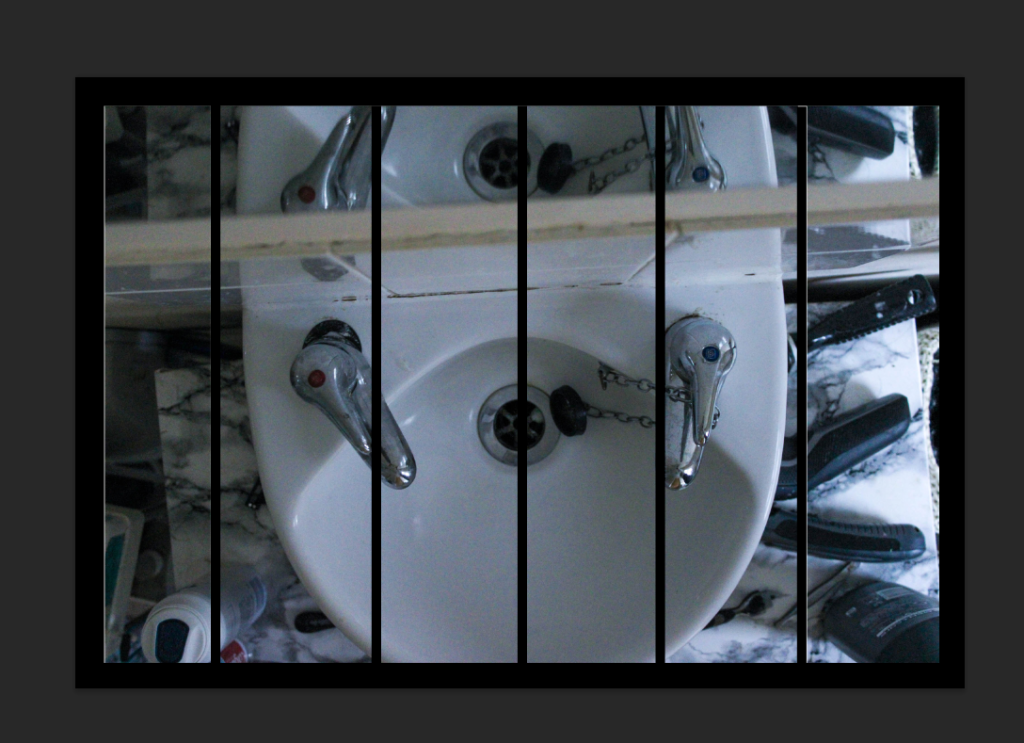
I experimented with both black and white to see which one would be the most suitable. I chose to use the black card because it means the separation lines in the image look more exaggerated and obvious which I think is more effective that if I had used the white.

Sixth:

For my final print, I decided to make a similar diptych to before where I use two images that share the same tonal range and colour, and pair them using solely foamboard to keep it bright I like using this method because it means that the images can become 3D and off of the page so that they can properly be engaged with rather than just looked at.

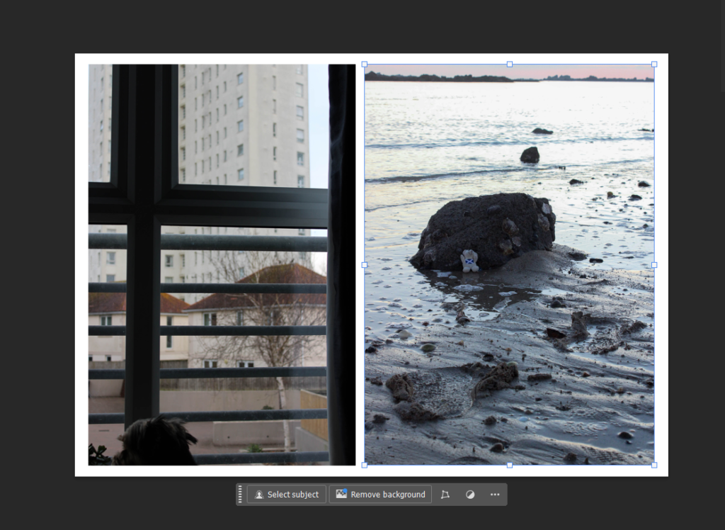
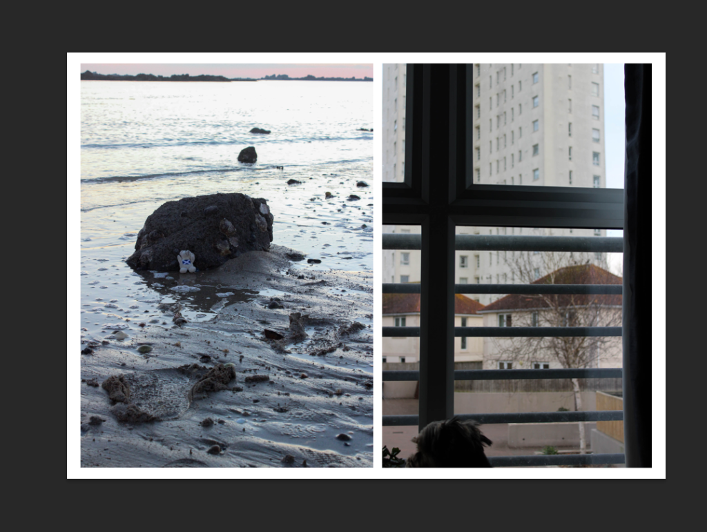
I chose the first layout because I liked the way that the footprints in the right image led towards the dog’s head. I also chose this design because the side of the curtain is caught on the edge of the left image, meaning that this divides the two images more whereas this may have looked strange if I did it the opposite way round.

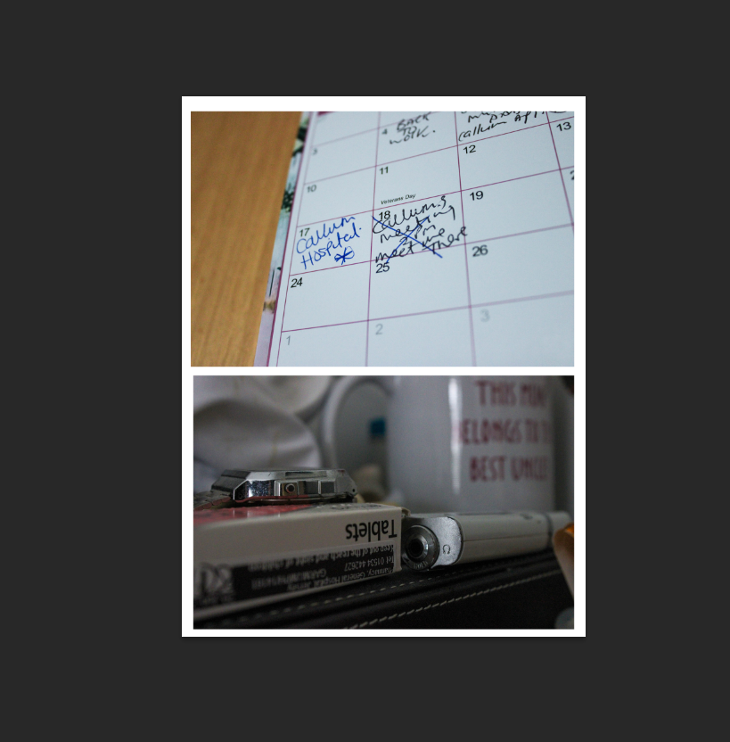
I didn’t end up using all of my prints because I didn’t think that they were all necessary or particularly linked as I experimented with which went with which at the beginning of the mock exam, meaning that some were exchanged out for better options and left by themselves. I think my mounting went really well as I have ended up with 6 different boards that all represent different tones and storylines. For example, my double-A3 board is very explicit in its storytelling as it includes words such as ‘hospital’ and ‘tablets’, meaning that the viewer can make a clear connection between the two photographs and understand the meaning entirely. However, some of my other boards aren’t as obvious, for example my second more is more ambiguous and conceptual, trying to represent an intangible emotion. I also think my planning was very effective in contributing to my final outcomes as it allowed me to really be considerate about my placement of my images. I think this was really beneficial because it means that the process can run smoothly and I can prevent mistakes from happening.

If I were to mount this personal study again, I think that I would like to also include some black and white variations of my work and experiment with them, whether that may be solely black and white or a combination with coloured images too. I would have liked to do this because all of my images are in colour, so it could have been nice to see black and white versions of my images too. I would also have liked to have done a ‘storyboard’, where I would’ve scattered a large combination of images across a big board. This is because it means that the viewer can gather a large insight into what the work is about really easily, for example I could have added detail shots alongside still-life images.

Meaning of ‘union’

Relating words-

Community, alliance, agreement, marriage, partnership, joining, merging, combining, harmony, club, brotherhood, organisation, coupling, gathering, grouping, combination, assemble, reunion, coalition, conjugation, trade union, pairing, connection, uniting 

Potential ideas:

  • Union between people- ​

People coming from different locations, upbringings, backgrounds, cultures etc…​

(as a society we are good at creeating theses communties dispite these differneces)​

​

  • Union within nature -​

How nature relies on its collaboration within itself in order to survive​

(flowers need rain, sun, nutrients in order to grow and survive)​

​

  • Generational union-​

Bonds between grandparents, parents, children family trees ​

(this genration wouldn’t exist if it wasn’t for previous generations â€‹

​

  • Opposites​

The idea that union doesn’t purely mean harmony but rather coming togther dispite differences â€‹

(fire and water, Feminine vs masculine, Humanity vs technology, Hero vs villain

Statement of Intent

My intention for this study is to explore my family, including my extended family, by using archives and at home films that we own. I am using archives similarly to Larry Sultan, so that I can present my family tree and how we are all unified together. I am also using archives, so that I can take inspiration from them and recreate some of the photographs. To recreate some of these photos, I am going to be taking photographs of my mum and my dad, similarly to Larry Sultan, but I am also going to be taking images of my sister, dog and maybe even myself. I am going to be taking staged photographs, as well as some documentary photographs, which is also what Larry Sultan did, so that I can show a range images during this project.

I also would like to explore my mum and dad’s marriage, so that I can present how their marriage has unified there two families and how they have extended the family tree, by bringing my sister and I into the world. I also want to explore my mum and dad’s lives before they were married, or met, so that I can present how the union of marriage can alter the people in the union and their extended family. In order to discover what their lives were like I am going to be asking them questions each and using archives to do so.

I would also like to experiment with collages throughout this project, so that I am able to blend together my photographs and the archive images that I am using. I am going to experiment with lots of different types of collages, including joiners, which I have taken inspiration from David Hockney and more ordinary collages similarly to Larry Sultan. In order to create the joiners, I am going to take multiple images of my chosen subject, but from multiple different angles and at slightly different times, so that I can then print them off and lay them out on the table in whatever unique layout I desire. While exploring with these joiners I am also going to explore the theme of time while doing so, because these joiners take a lot of time to do, which symbolises the time it takes to create a union and how they change over time. I am going to be using archives and my own photographs to present this when making my joiners, as the historical archives and current images can present how time has altered and created more unions.

I would also like to be more creative in this topic and take inspiration from Carolle Benitah. I want to display how our DNA and blood links us together, as we are all a part of each other and share similar characteristics. In order to do this, I want to explore my family tree and create a stitched image that links us all together, similarly to how Carolle Benitah has used stitching in her work. In order to do this, I am going to experiment with creating stitching on photoshop, as well as actually printing off my images and actually stitching them. I also want to create a collage of certain family members faces, so that I can present the huge similarities we all have.

Photoshoot 2

For my second photoshoot, I, again, explored the theme of unity between humans and nature by taking photographs of people around different features of nature. However, this second photoshoot took place at the beach where the model was interacting with the sand, sea and rocks. I was able to get some good images from this photoshoot, although the interactions from the model to the nature didn’t turn out as I had hope but despite this, I was able to shoot some good images. For this photoshoot, the images were taken as the sun was setting making the photographs turn out to be darker. However, this caused a blue hue which I find fits with the location of the beach so even though the shoot wasn’t in the day like I had hoped, I feel it still worked out.

After this photoshoot, it again helped me to figure out more specific types of images I wanted to capture. As well as this, I was able to compare these photographs to the ones from my first shoot and figure out which location worked better for the images and narrative that I was trying to portray.

Some unedited photos:

artist reference- Eddy Perestrelo

Hassan Hajjaj-

Hassan is a Moroccan photographer who is known for his portrait photography that uses a pop art type of style in his images. What’s the idea behind his work? the idea behind it is that he wants to break the wall down between any type of race, culture, gender or origin put simply any sort of discriminatory label that can be put on anyone, in his word there are three things to take away from his work commitment to truth, necessity of play, and pride in one’s origin. Meaning that he wants people to view his images they should embrace where they are from, their sexuality, skin colour etc. which is why i have decided to study Hassan as his images may not be what I’m inspired by but his idea behind them is what got a hold of my interest.

for example an image like this dives into this persons culture and background as traditional African clothing is known for its patterns and its loud colours. and the reason I picked this image is because Its relevant to the work I want to achieve as its got the same concept to what I want to do as his work captures wider social narratives, meaning that his work helps show people different cultures can be unified through a simple photo. another thing that interest me was his influence for his images hip pop, fashion, west African and UK lifestyle, this interested me as he is able to create all these images and mixing in so many different ideas into to one singular photo. which is what I hope to achieve throughout my project but I also want to make sure that I makes sense throughout my project as I don’t want it to look like a bunch of different ideas crammed into one book.

image analysis:

technical:

Lighting: when looking at location of the image I believe its fair to say the images lighting would be natural daylight and when looking at it I wouldn’t say that the lighting has been manipulated in any sort of way. however the border around the image is a big contrast when looking at main colours popping at (red, blue, yellow, green). the image isn’t saturated as your seeing the image for what it is people wearing loud clothing items in the middle of the day.

white balance: when looking at the mix of colours shown in the image i think its fair to say its got both warm and cold colours such red and yellow and blue and green for cold colours. which fits perfectly when looking at the context of the photographer Hassan wants to bring a mix of different cultures as people together he isn’t just doing this with the people he photographs but with the colours he’s showing in the images as well.

Shutter speed: the image contains a short exposure as we don’t see any blur or colours seeming to be over exposed which would be apparent with the amount of colours that are in the image. and there also any recognisable motion blur as everything in the image is clear and focused in the image.

visual:

when looking at this image the visual elements that pop out straight away is the form, colour, and tone as they are the elements that catch your eye straight away we get see a light tone with a ray of colour all over the image and the boarder around it as well serves as the layout of the image making it look like a painting or something that has been framed. In my opinion the image lacks balance as its got so many different colours in one photo as you have red layering a bold blue light and the same on the other end with a bright blue layering over a yellow light.

contextual:

when looking at this image you might just think of it as a crazy fashion shoot with a wide range of things happening in the image (all the colours, what people are wearing). however there’s more to the image that meets the eye when looking at the photographer who took the image Hassan Hajjaj he likes to unify different countries and continents, which explains the amount of colour and type of clothing has been used for these images as it helps show off the Muslim culture he wants to show off and for all we know the people wearing it may not even be of the culture.

conceptual:

the concept behind this fashion photoshoot is the unity of cultures, its expressed in this image though the the location of the image and not just the colours and clothing as its expressing the Muslim culture in a European country this is because the Muslim culture has spread all over the globe but mostly in Europe in places such as France who is home to a lot of designer brands but also lots racist stereotypes due to how diverse the country is. which is why i believe Hassan has done this photoshoot to break the barriers between the issues some of these countries may face because of the diversity in culture and race.

Photoshoot 1

Contact Sheet:

For these two image, my concept was to present this in a diptych format when I began sequencing my photobook, being that this young girl is covering up the documentation of her abuse with makeup. I wanted to photograph this as I think it’s a direct reference to domestic abuse rates which is something that I wanted to cover in my study, however I think hat these two images work very well to provide a storyline like a comic strip, instead of being overly expressive.

I used the flash on the camera to shoot these images because I wanted them to give off the aesthetic as if she was getting her friend to document and take images of what had happened to her which I think has worked very well as it is more relevant, being that victims of abuse try to conceal it so it would most likely be covered up around others unless it wanted to be revealed. This is also why I used a low angle to my subject’s face when shooting because it means that I can conceal her eyes, as if I was hiding her identity from this abuser, so that she can come forward and speak out against what has happened to her.

I also put the image of my subject crying in black and white to see what it looked like as the image had a high contrast beforehand, so I wanted to experiment with a monochrome tone to see if this looked better, however the second image didn’t look as good in black and white.

I like this version too as it has a large tonal range which adds greater depth to the image, however it makes it more difficult for the viewer to distinguish the concept or what it actually is that I am photographing as there is no colour on her face.

  1. Spiking:

These three images were shot to represent the dangers of spiking, where many young women are victimised and taken advantage of due to drugs being put into their drink without their awareness. This results in these women being out of control of their faculties, possibly not being able to walk or speak coherently, which is why I wanted to photograph this as it is such an important issue that doesn’t necessarily get acknowledged as much as others.

I wanted to create a staged scene with various types of alcohol in the background to create an environment that looked similar to a party. Then, I used a wine glass and broke up a vitamin C tablet and put it into the drink as these tablets dissolve and produce a large amount of fizz, enough for me to photograph it before it stopped. I put this into the bottom of the glass and kept it there as an exaggeration of spiking, as whatever would be put into the drink would not be visible in order to minimise the chance of being caught in the act, so that the viewer would be more aware of what my intentions were.

I initially began with shooting from various angles of the glass itself as I wanted to make it appear as if this drink had been left unattended, and this act had occurred whilst they were gone:

As I was shooting this, I could see my idea coming together to be successful however I felt that something was missing. As I shot from various angles, this allowed me to experiment with which direction would produce the best perspective of the tablet fizzing as this was crucial to the concept behind the images themselves. I would say that My favourite image out of this selection here would be the one on the right as the other two have natural lighting in the background which minimises the ‘party’ impression that I was trying to suggest to the viewer.

I used natural lighting for these images, facing away from the window, as this would create diagonal shadows across not just only the the wine glass itself, but create direction in the composition through the background as the objects behind are placed in alternating sequences.

This was my best image out of that selection of images. I decided to ask my mum to place her hand over the top of the wine glass and pretend that she was guarding it from other people and protecting herself from getting spiked. Although this image is explicitly highlighting this issue in comparison to the other images, I think that this is a great way to ensure that the viewer doesn’t become confused about what the intent was behind the image, for example if they don’t initially see the tablet inside then this could lead to the meaning of my image becoming distorted. I asked my mum to do this so that I could use a feminine hand as my study is honing in on the themes inside the Feminism movement, for example her gold ring adds to the composition as it draws the viewers eye from being contrasted to the rest of the foreground.

I used a short depth of field for this image in order to blur the other types of alcohol in the background, however the viewer can still make out what it is and understand that this would be occurring in a social context rather than a personal one. I also think that this is relevant because it can resonate with the way vision may become blurry when alcohol is consumed, or how the eyes of someone who has been spiked may zone out due to having a lack of control over their autonomy. I once again used natural lighting however I moved my positioning to be able to crop the window out so that it wouldn’t be in the background.

I decided to try and experiment with this image to enhance the fizzing on the tablet and exaggerate it a little bit more. It is still visible in the image however I wanted to try and use the Generative Ai tool in Photoshop. However, these images were not that successful as it was quite difficult to find the correct word to generate to get the desired results. This also meant that the fizzing would be as subtle and realistic, but I still wanted to include them here regardless. If I were to shoot this again, I think that I would have put a bit more of the tablet in to create a greater volume of bubbles as I only used half because I didn’t want it to be too obvious or visible.

My experiments:

2. Pregnancy:

For this image, I tried to use a pregnancy test to highlight how the increase in restrictions against abortive care leaves many women and young girls at great risk. I placed the test on the side of the sink as if someone had just taken it and was waiting for the results, however I added a vignette to this image as I feel that this connotes ideas of fear and waiting on edge, being that in many countries if the test came back positive then that woman would have no choice but to become a mother even if she was not ready.

I took many images with the test, trying to arrange it at different angles in my bathroom but I couldn’t execute it well enough as there wasn’t many locations that I could stage it that would look realistic and also allow me to get a good angle or use of depth. If I were to shoot this again, I would have liked to go to a public toilet for example and stage images there because I feel that this would suggest a greater amount of fear, being that the woman isn’t even doing it in her own home out of worry that others will find out.

However, I do still want to use this image as I think that it is good for applying context into my study of Feminism. Additionally, I feel that the taps, specifically the left, have a high contrast between the glow of the reflection against the black circle on the bottom. This is really eye-catching and I think that I just need to sequence this image correctly with another that has a similar concept or message behind it.

statement of intent- Eddy Perestrelo

for my exam project i want to highlight the theme “union” by perusing the idea of social realism by categorising my images as stereotypes. The reason why I want to do this is by breaking down the walls between stereotypes that have been engraved in peoples minds that have become more and more common, for example the idea of sexuality this would consist of challenging the idea “that’s boys clothes” and vies versa. i will also look at stereotypes such as peoples physical appearance, race and cultural diversity by doing the same as previously mentioned challenging stereotypes of the given topics above. why does my idea matter to me? The reason it matters to me is because my entire life I’ve always been around by a diverse mix of people from gay relatives, different cultured friends, and this has lead to many people in my circle being discriminated for the way they look, the way they are, and what they believe in which is why this project is a little more personal to me.

How do I wish to develop my project? For example my first photoshoot will consist of me taking pictures of objects that might be looked at as a something a “Women would wear” or that a “Man would wear” these object will be things such as heels and boots and having the background of the image as blue for the heels and pink for the boots to oppose the view that only a certain gender should be applicable to that sort of footwear. I will also use things such as lipstick and also men and women fragrances and do something similar to the other objects. when looking into sexuality I want to take pictures of people of both genders wearing clothing you wouldn’t particularly associate them with, for example a man wearing a dress and a women wearing a suit or some short of formal attire that men would use. I think it will go hand in hand with the project as it will help paint the picture of what I want to tell people when looking at my project. so i would do the same for all my other photoshoots just oppose the idea of the stereotypes.

when and where do I intend to start my study? I plan to start my study by taking image of the objects I named previously in the studio as will be able to create the best images possible with the lighting and other resource’s available to me in the studio. I also intent on taking some images from home for the gender photoshoot as I’ve got resources at home to take the images I need to take. And for my other photoshoots i will need to go out and take images of people or pictures of things that symbolise what my topic is about (sexuality, diversity, etc).

isms mind map

planning photoshoots- Eddy Perestrelo

what do i want to base my photoshoot around?

I would like to base my project around stereotypes and I believe I would be able to achieve this as I think I will be able to fit it into the context of union.

For my first photoshoot I would like to dive into the idea of gender, I would also do this by looking at gender inclusion, sexuality, and how people interact with each other based on what they think and believe in the context of sexuality etc. for reference the images bellow are what i would like to recreate/ take inspiration from:

however for this image i would like to swap the boots and heels as id like to touch upon the idea of sexuality as previously stated before. i would also like to take pictures of people and how they present themselves and show how “different” they really are, for example i would also like to take images of people of the same gender wearing the complete “wrong things” just like in the image bellow.

i would also like to get an image that symbolises sexuality this could be done by taking an image of something that might represent people that are gay (this could be a rainbow flag etc).

Photoshoot 2

for my second photoshoot i would like to look at race by looking at diversity, inclusion, acceptance and tolerance. by taking images of people who feel like they have experienced something simply because of their skin colour or where they come from. I also want to take pictures of someone that would portray a stereotype of someone’s race and create an image of what there really like i.e what they where eat, what clothes they wear, and just in general there lifestyle.

photoshoot 3:

in my third photoshoot i would like to look into size, this will most likely consist of the clothes people wear and why. For example why people may prefer to use tighter clothes or baggy clothes. i also want to look into physical appearance and link it to there life style, so what people eat, what they do in their day to day life. i believe i can link it to stereotypes as when you look at what someone wears or the way they look will always give you a first thought of what “sort of person” someone is

for example when looking at this image you might wonder why this person is using baggy clothes is it because they don’t like the way they look? or could it be as simple as they just like to wear baggy clothes which is what I want people to think when they see my images . to recreate the image I will taker images of people wearing certain clothes that they might not normally wear and also do the opposite. so I’m planning on taking images of a in shape person in big baggy clothes and in tight clothes to then compare it to someone who might be a little out of shape doing the same thing and putting them side by in my photobook.

UNION: Joiner 3 Photoshoot

Photoshoot Plan

For this photoshoot, I wanted to get many images of the Steam Clock in St Helier to create a joiner. I thought that this would be a good subject for a joiner as it is a landmark at the marina which reflects Jersey’s long association with the sea. This relates to ‘Union’ as Jersey’s economy was built from its maritime history. This maritime history also created unity amongst islanders and with the countries they traded with.

Camera Settings

For this photoshoot, I used an ISO of 100 and a shutter speed of 1/640 so that my images wouldn’t be over-exposed.

Contact Sheet

Image Selection