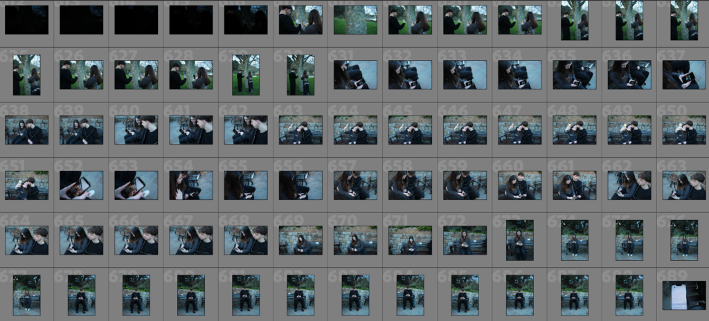
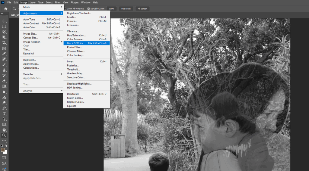
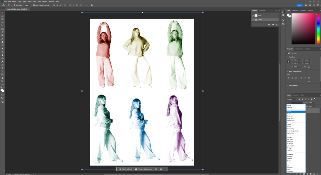
Experiment 1:
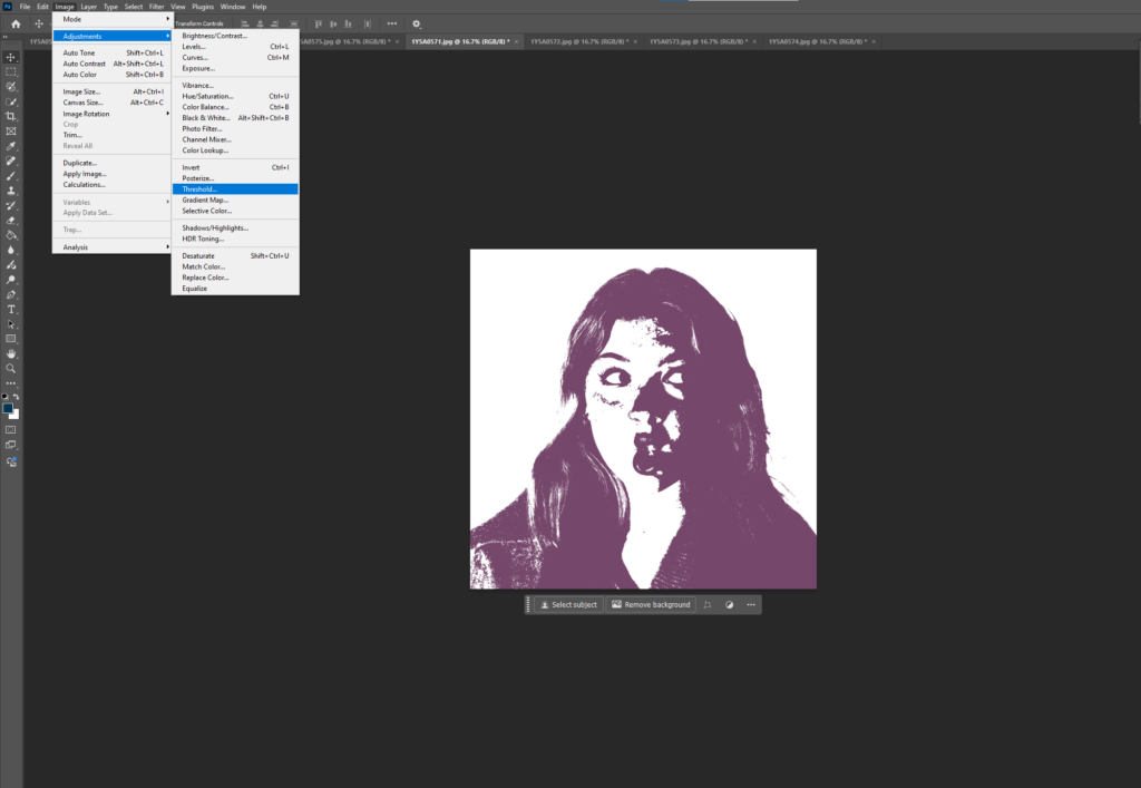
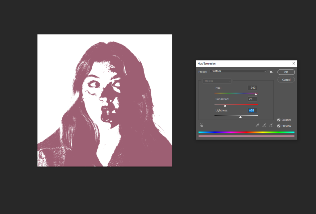
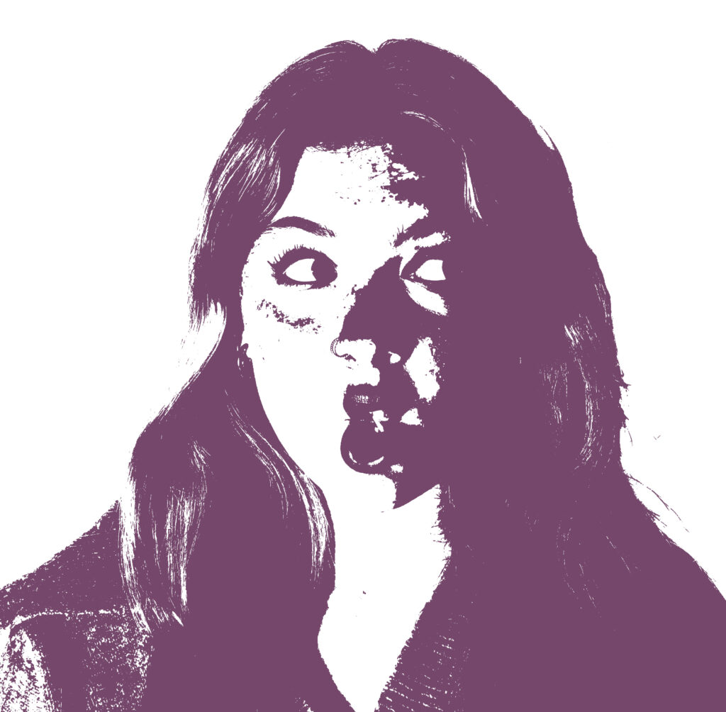
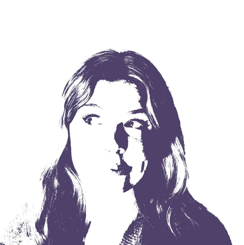
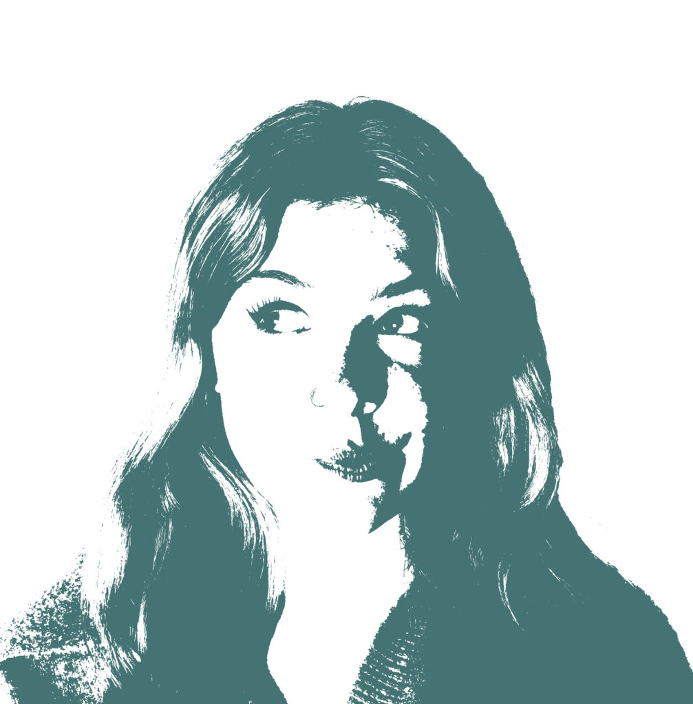
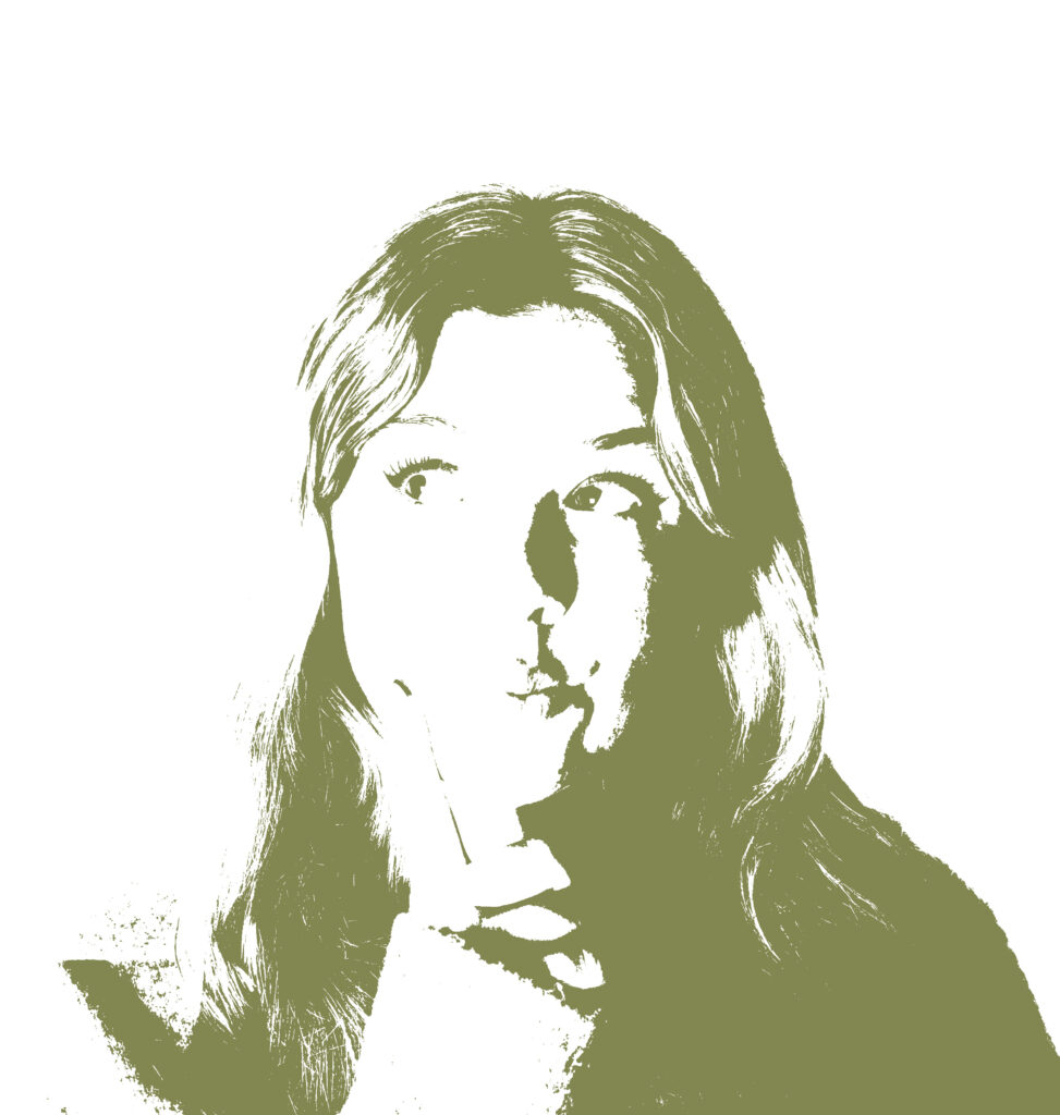
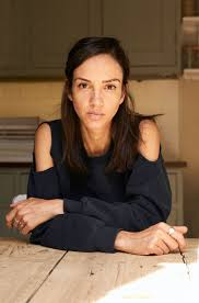
Here I went to photoshop and used the Threshold filter, to make my photo look like it has a gradient effect. I also adjusted the colour to show how it can affect the mood of the image. This experiment is very similar to the pervious one I had tried except I hadn’t added colour before, these photos tend to represent a different emotion. I really like how these turned out as they aren’t just basic portraits after, at first had a different idea of what to use those portraits for, but after messing around in Photoshop I discovered the threshold filter and it made my photos have more of a design to them. As from the photos before you can see I adjusted the hue/ saturation and changed it to colour, this then allowed me to decide what colour looked best on each photograph. I had only taken a fair few photos of the model with a large gap at the top of her head, therefore I wasn’t able to edit multiple photos, if I were to do this experiment again I would simply ask my model to do different poses and make them more unusual, I would also like to get different people in my photos, as I was aimed to do a theme of sonder, the idea that everyone has a different life and everyone in the world is going through something, this makes it difficult to identify if i only use one model, however, though I’m only using one model it could represent the thoughts and fears that this person is going through and how they are different to mine, as the model is posing for the photos thinking of different things while I’m the one editing the photos, thinking of something completely different. I’ve chosen to use specific colours for each specific photo which could have been different if I had asked for the model’s opinion. I would like to get more models involved in my photoshoots to help create meaning. This experiment was inspired by Andy Warhol who also creates very similar photos like these.
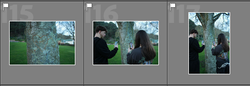
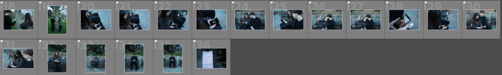
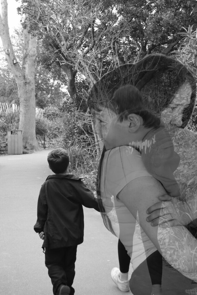
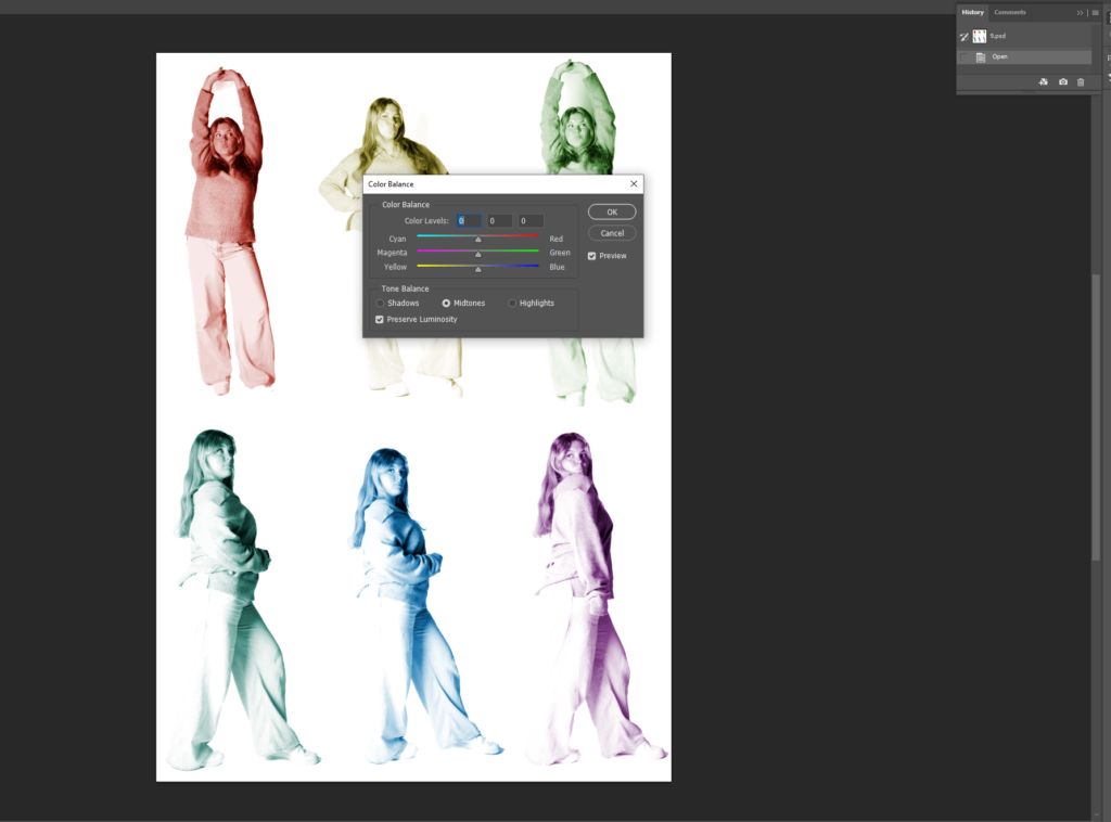
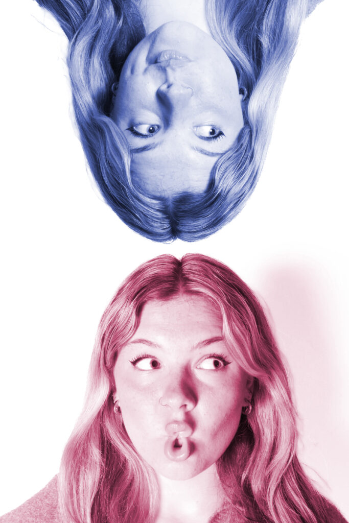
Experiment 2:
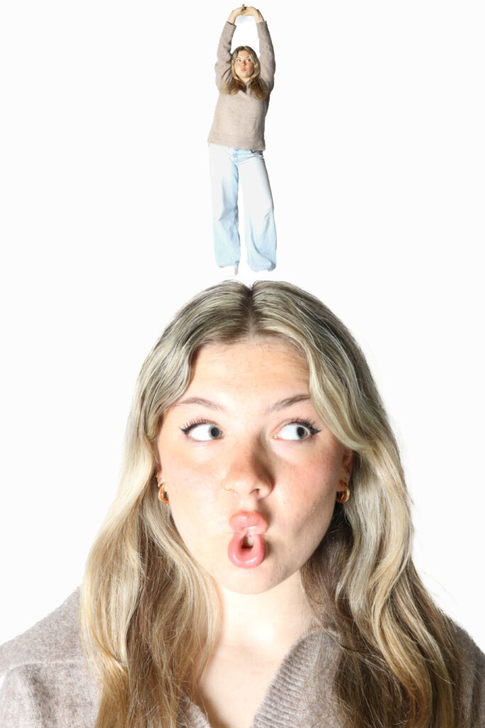
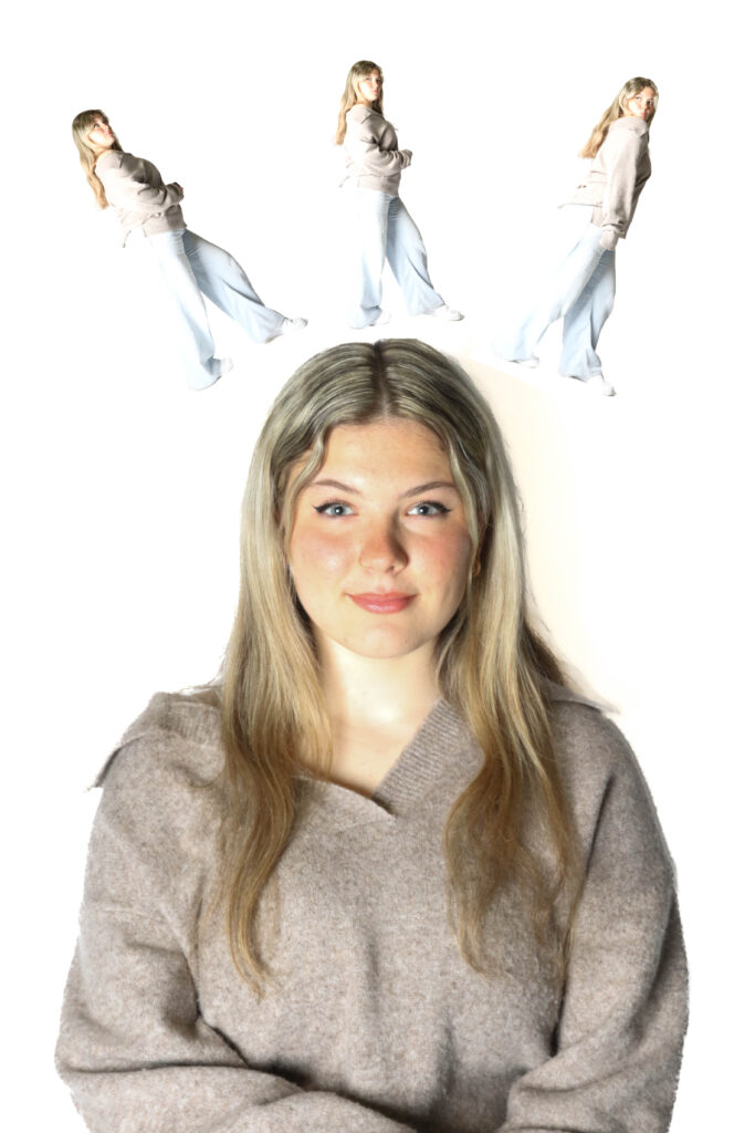
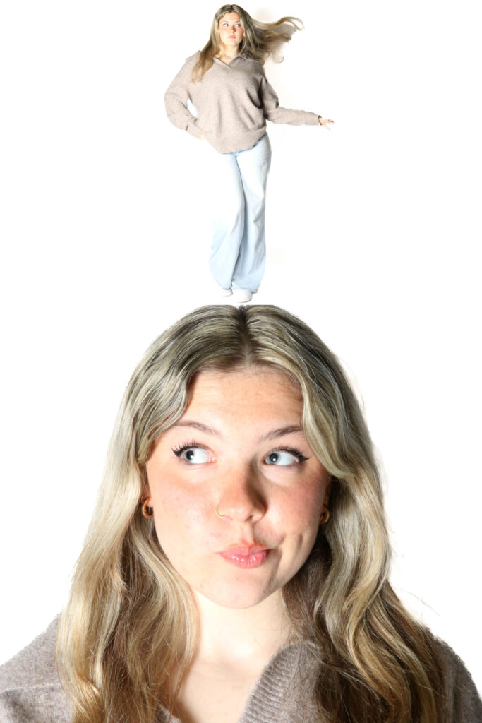
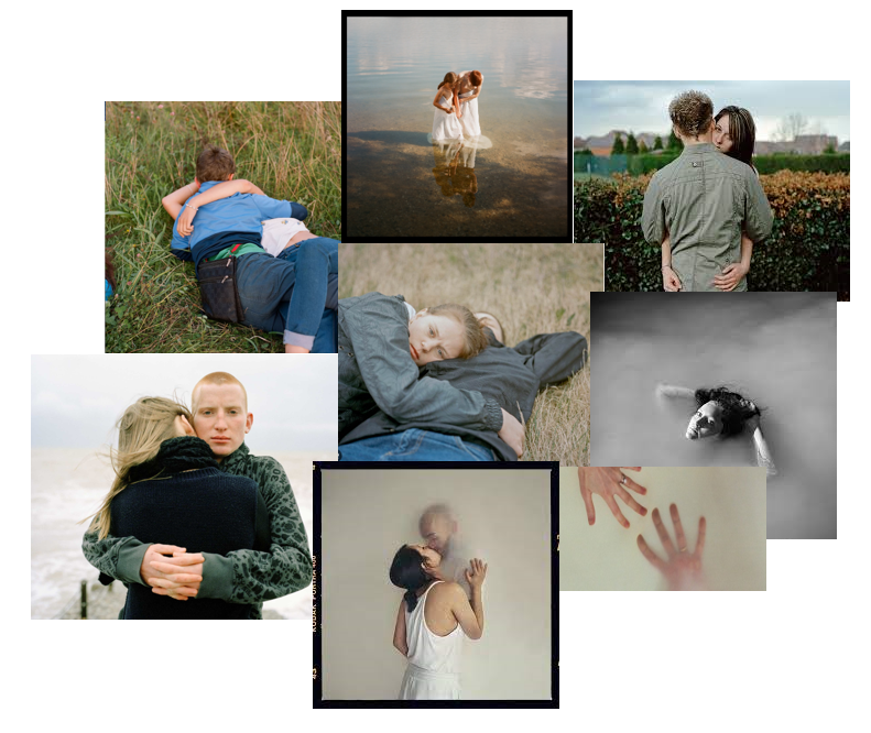
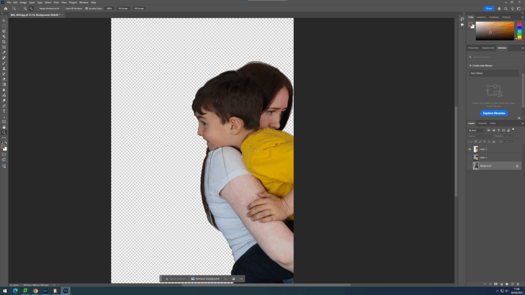
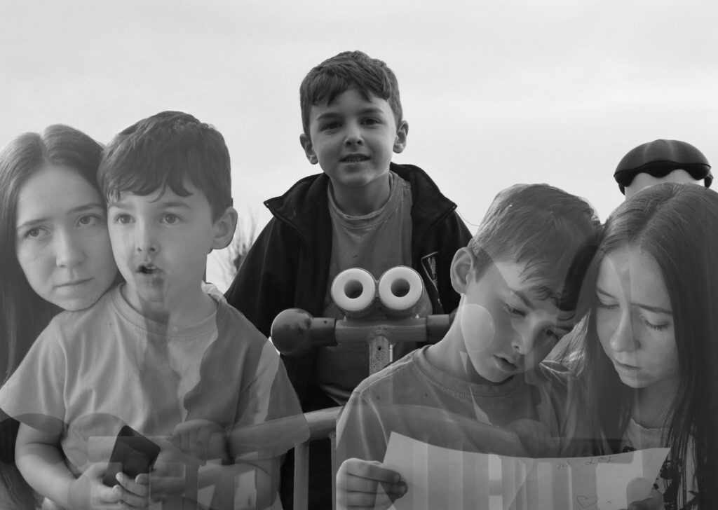
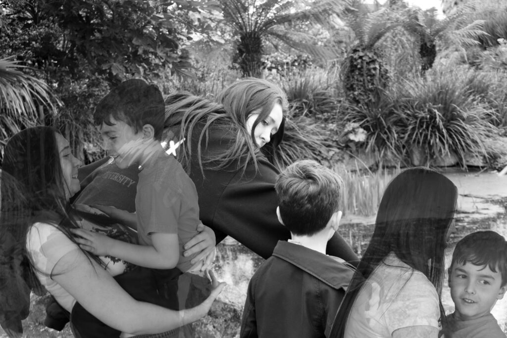
This experiment was inspired by Pinterest, the model has a smaller person (herself) on top of her head. This could represent having different thoughts or different influences changing a person’s thoughts and their idea of living, I really like how this photoshoot turned out, though I did have to do a lot of editing to get rid of the shadow behind the model that was reflecting onto the background. I simply went into Lightroom Classic and used AI to crop out the background, I then changed the exposure on only the background and transformed it fully white. I then repeated this process for each individual photo I wanted to use, then I adjusted each photograph on top of the base photo. I really like how these final photos turned out. But yet again they would have turned out better if I had used different models to show how different people can influence a person’s life and how each person has things going on in their lives that we don’t know about. However, I could perceive these photos as if there are different people on top of the model’s head, these people could be perceived as a negative or positive thing. Overall, I do like ow these photos turned out as they do look very similar to my inspiration pictures. Although I said it would have looked better with a different model, from my inspiration only one model is used in the photograph.
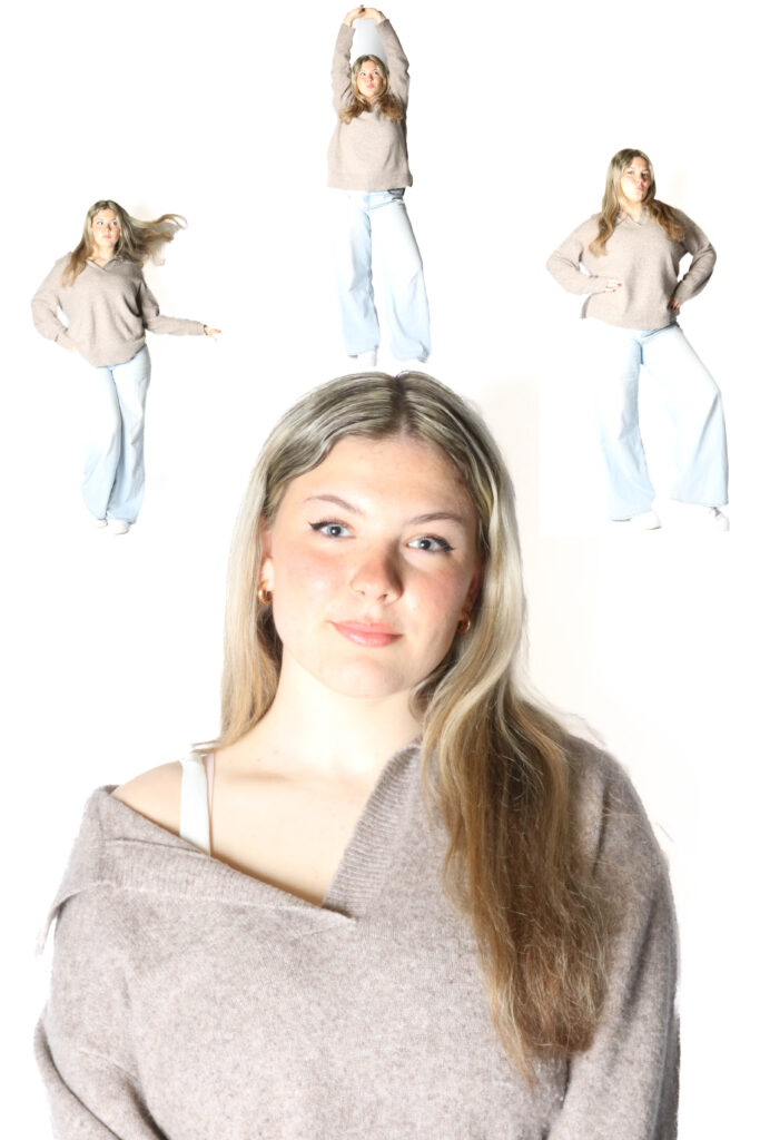
Experiment 3:
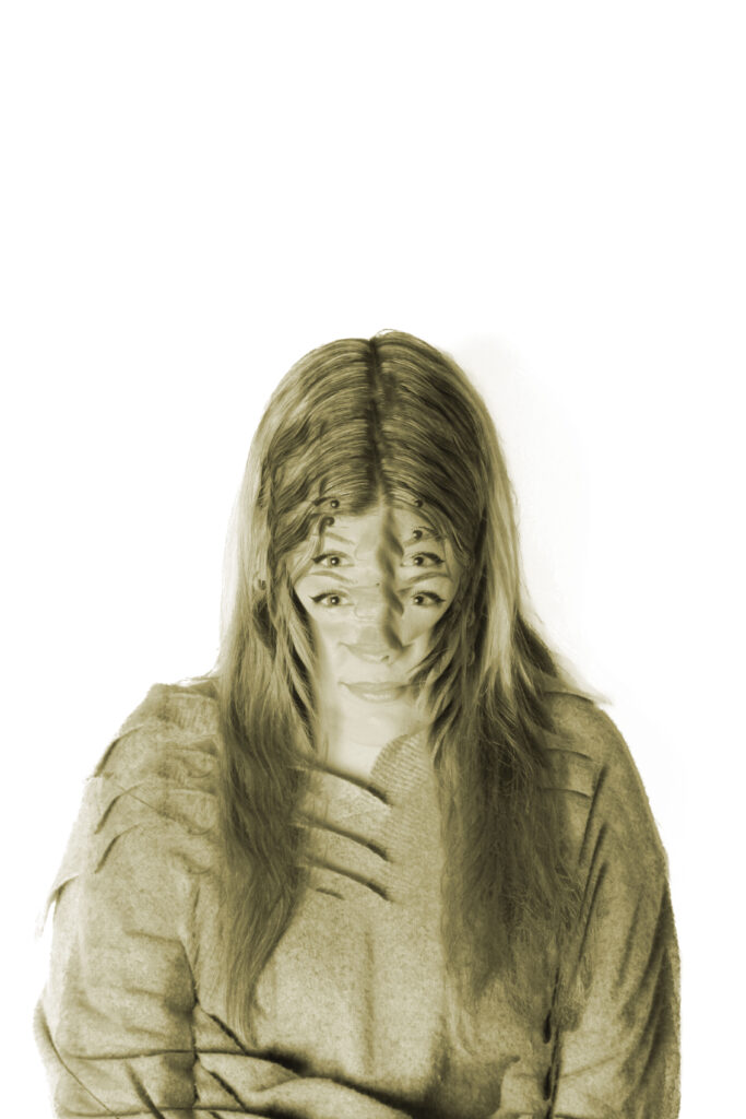
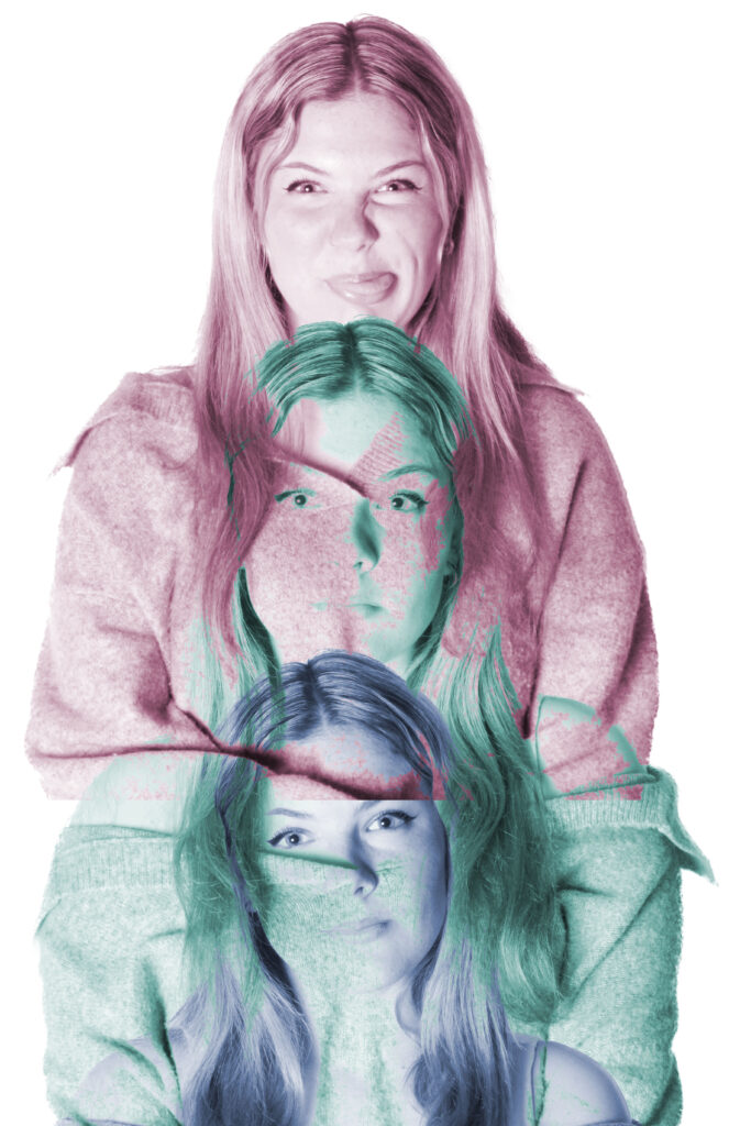
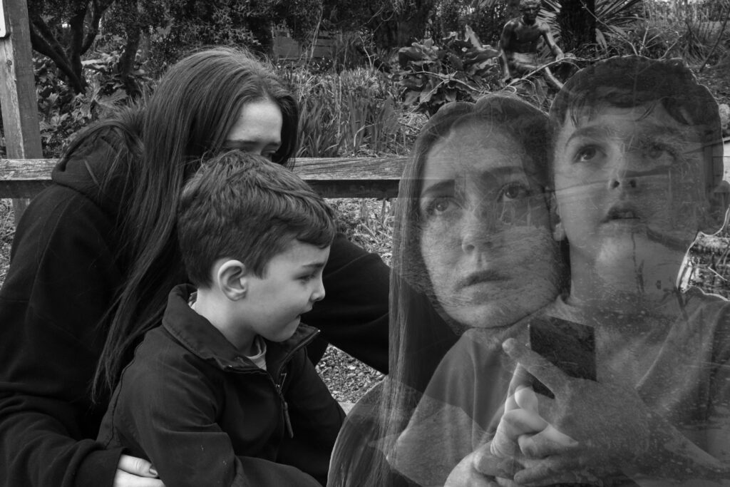
Lastly, I tried to use a blending filter with each of these photos, not really aiming to get a specific concept. I really like how the bottom one on the right turned out as I added all of the photos of the model standing up and doing a pose, I also changed the colour of each of the photos to make it more unique and stand out more. I made sure to make the bottom three on that photo look as if there was something behind them. Also, on the bottom left I simply overlaid each photo and turned one upside down. I also changed the colours of each photo to make it look more interesting and eye catching for the audience. For the top one on the right I added three photos on top of each other using a blending mode, each photo has a different blending mode added to make it have a different effect to it For example the pink photo of the model is quite hard and has a strong sense of colour and saturation whereas the middle blue one is struggling to seem through, the facial expression on the middle photo shows a sense of weakness and sadness, something that is wrong and the two outside photos are showing string happy emotions, there facial expressions are lot more visible, playing that the happiness if over shadowing the sadness and that is the reason people hide their emotions, this can show that this model/ person is going through something but isn’t showing it because they don’t want to be a burden to the others around them, and simply that the people around them have things going on as well. This whole sonder concept has been incorporated into my photos in a subtle way. Lastly the top left photo was purely just an experiment as I layered three photos together and slightly moved each one high or lower than the original, its slightly similar to the photo to its right. In this photograph, the eyes are the most prominent detail shown in total as they show a sense of power and dominance. As I had coloured all my other photos, I thought I would do the same for this one too but make the colour more subtle and less powering, for instance the colour I chose is a dark yellow with an orange shade.
Overall, I was inspired by the Surrealism and Dadaism movement to try and recreate something that is dreamlike and unrealistic. I also wanted to incorporate the sonder theme inspired by union. Sonder means to reflect that everyone around you has their own life and is going through something that you aren’t aware of. It’s a way of showing that everyone is struggling some more than others and some people are better at hiding it than others, it shouldn’t make anyone feel weaker or less important due to their trauma. The main thing I was looking at was people and their emotions and how their emotions were reflected on. Each emotion has its colour but what if you were to switch the colours would the emotion still stand as strong or would I weaken. I believe that if the model shows a strong emotion, a colour won’t be able to change it and can simply only make it look overpowering to simpler.