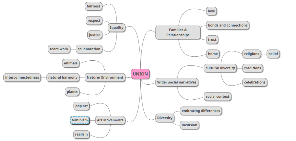
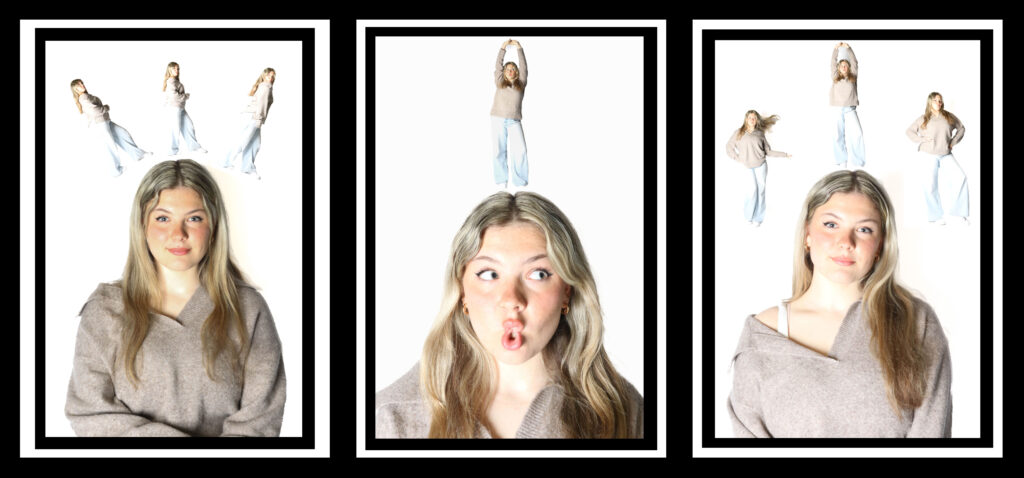
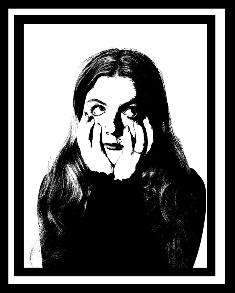
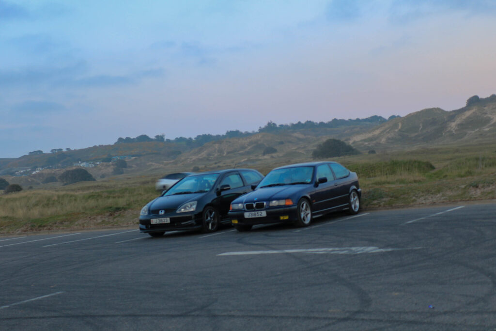
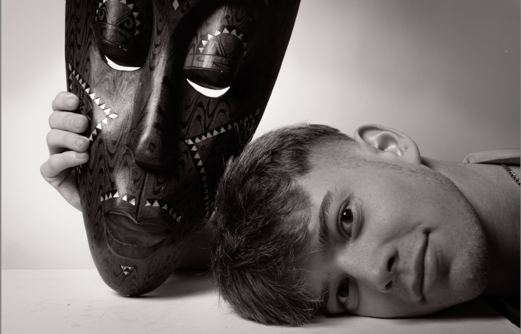
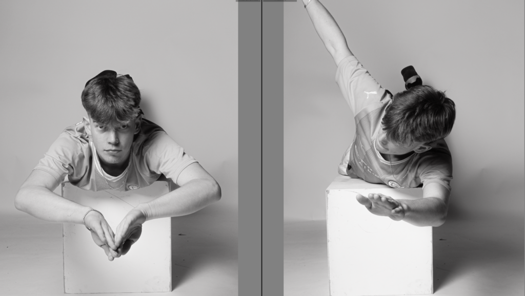
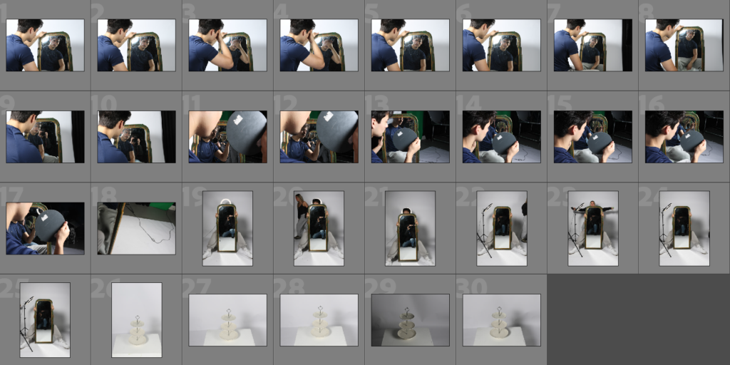
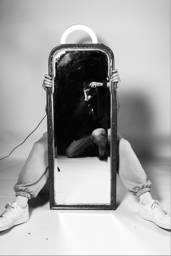
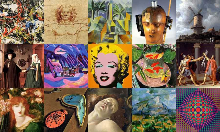
What is “Art Movements”?
Art movement is a style of art with a specified objective and philosophy that is followed by a group of artists during a specific period that may last from a few months to years or maybe even decades. It also refers to when a large number of artists that are alive at the same time mutually accepts a certain, recognizable form or style of art that can be held apart from current styles and methods. This method then becomes extremely popular and goes on to define an entire generation of artists.
How did Art Movements start?
Art Movements started in the 19th century in France. The 1840s and the industrial revolution quickly changed the established art style and methods. The changing political landscapes of Europe and the advent and subsequent boom of the anti-romantic movement in Germany were all at a high. These cultural forces built up into the first known art movement, dubbed realism. As cities grew more artists migrated to different capitals and began to socialize and influence each other. This gathering of artists in the 19th century was steadily focused on Europe and concentrated particularly on Paris. However, artists also grouped in German, Italian, Spanish and Russian cities. This led to the rise of artistic schools of thought, some of which, such as cubism, would turn into well-known art movements. Over time the focus of art movements has moved from France and become less Europe-centric. Many artistic movements in the 20th century started in American cities, Britain, Japan, or other parts of the world.
Some Art Movements and styles:
- Impressionism
- Cubism
- Abstract expressionism
- Baroque
- Surrealism
- Pop art
- Realism
- Romanticism
- Italian Renaissance
- Colour field etc.
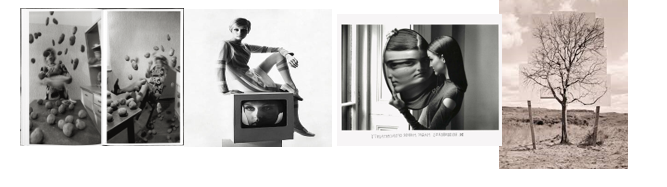
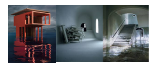
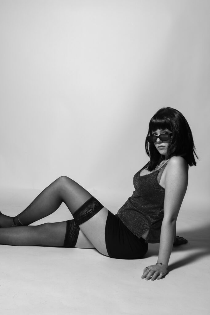
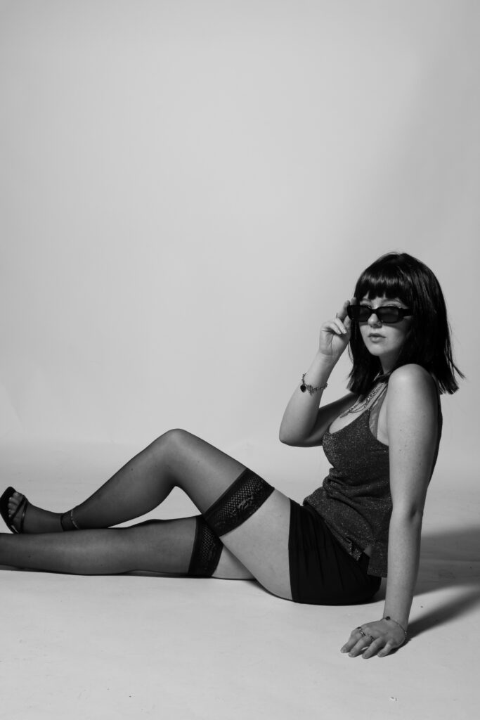
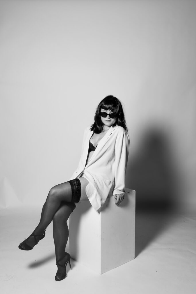
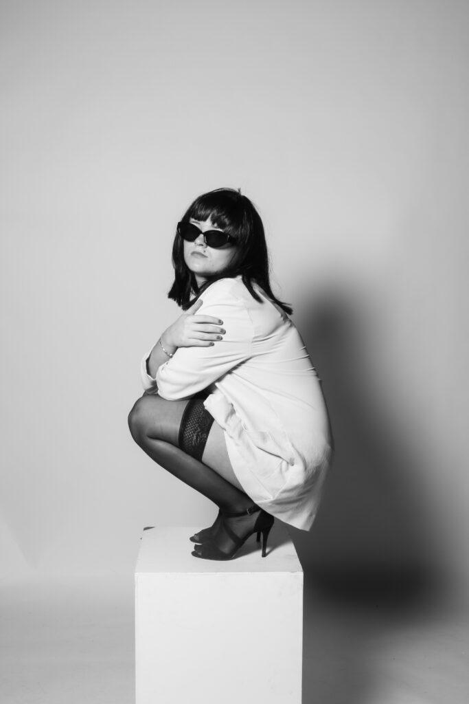
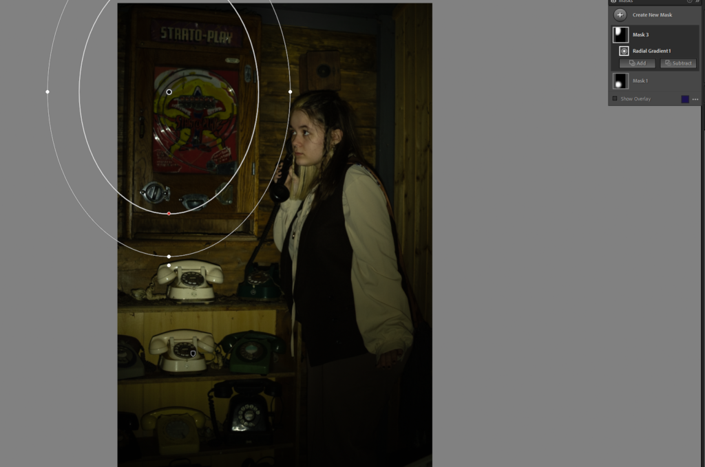
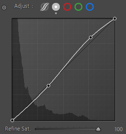
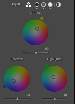
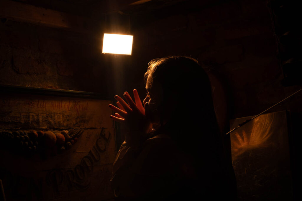
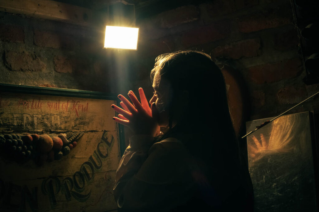
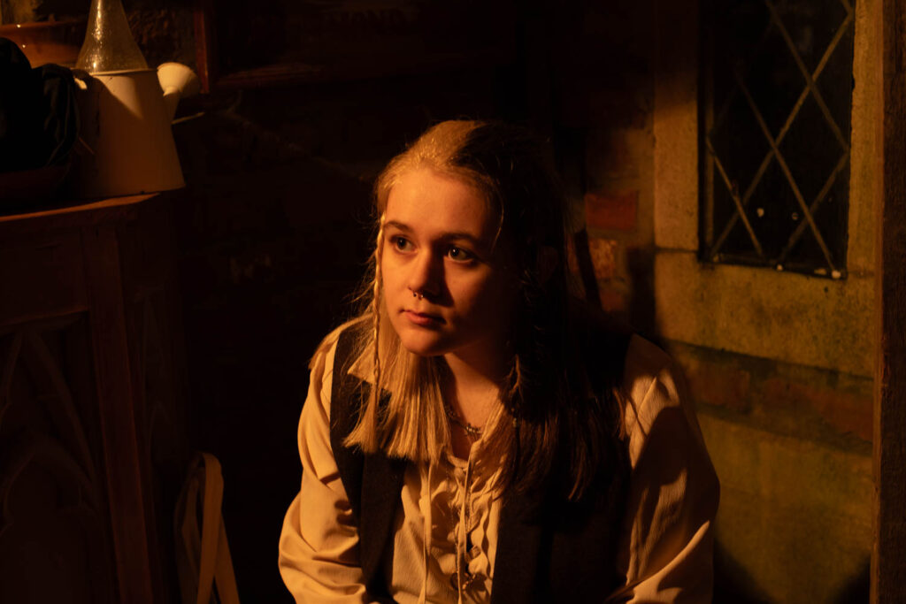
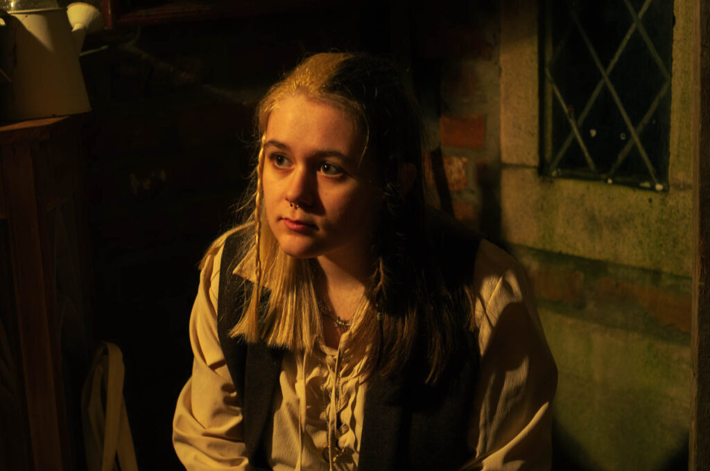
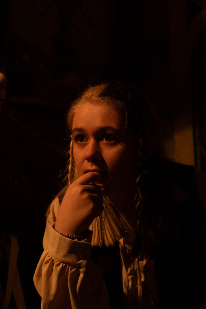
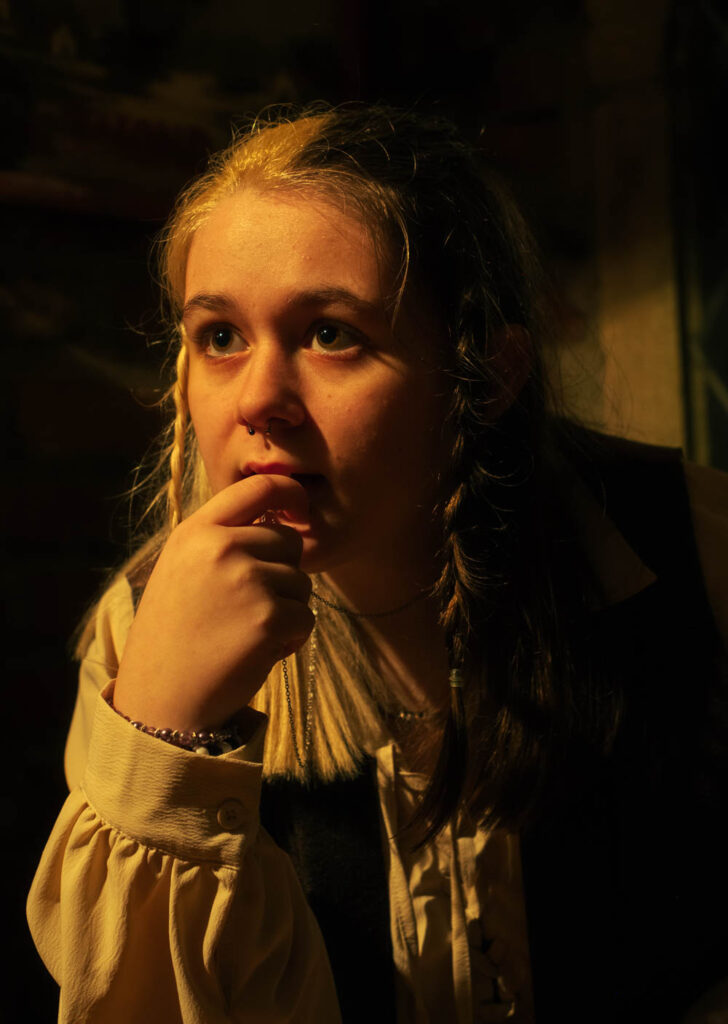
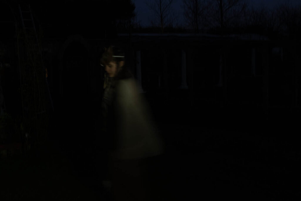
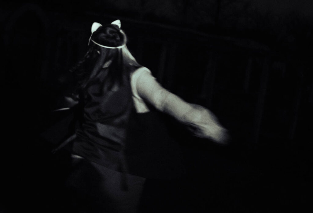
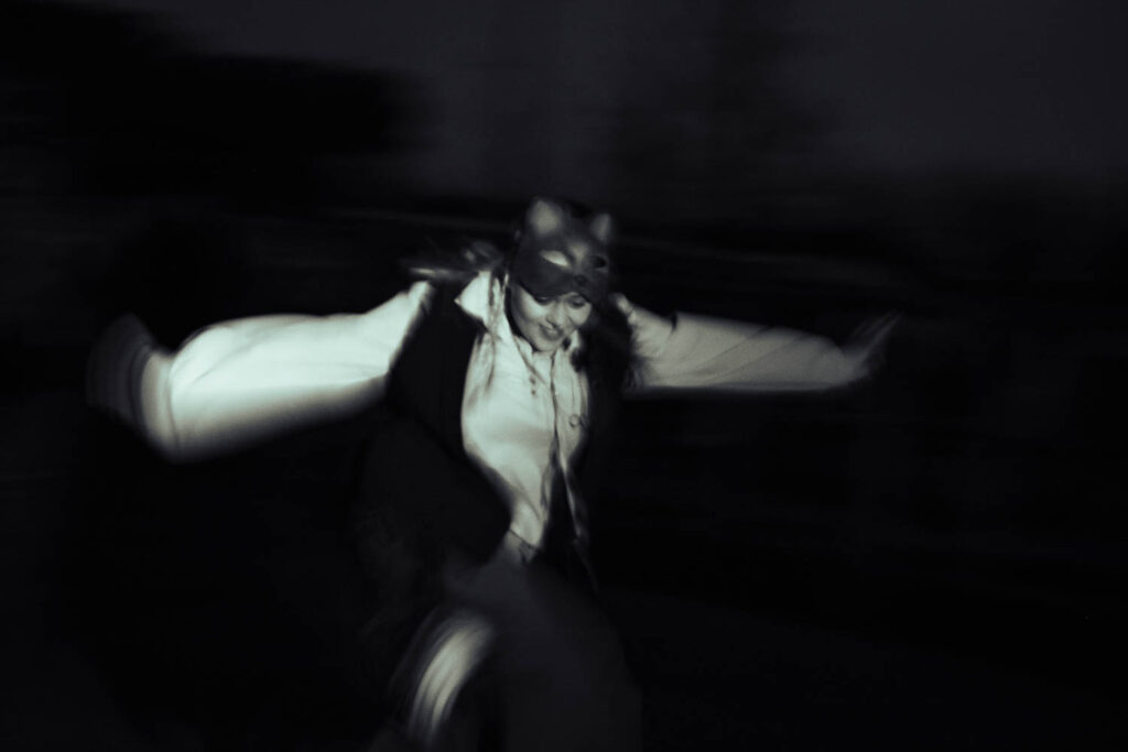
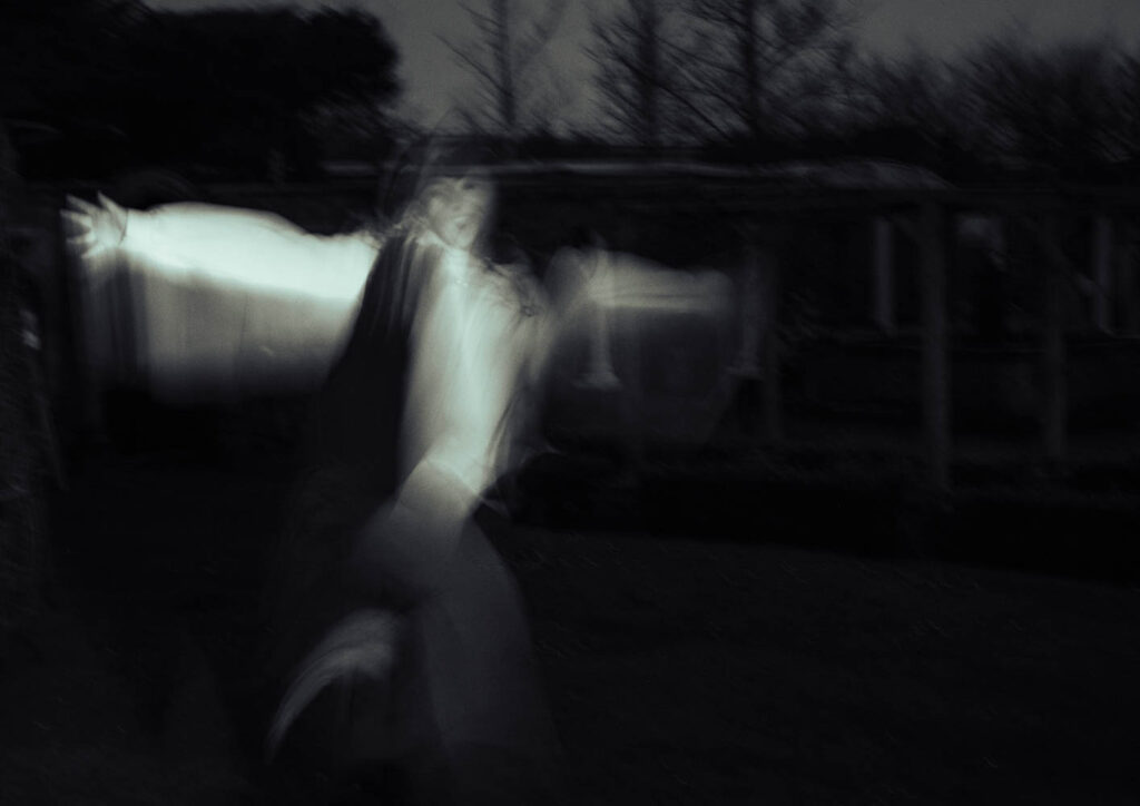
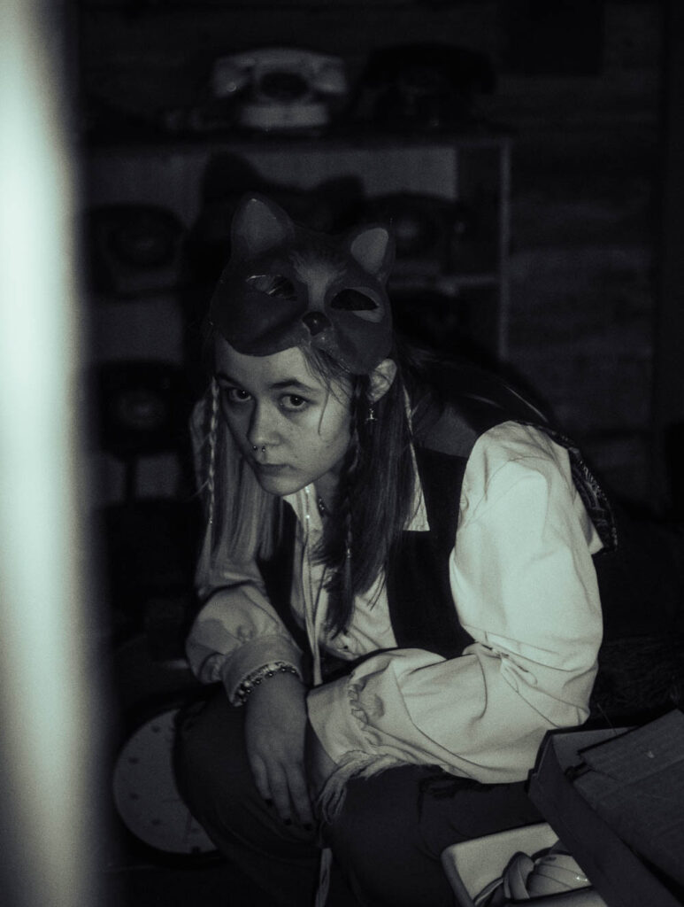
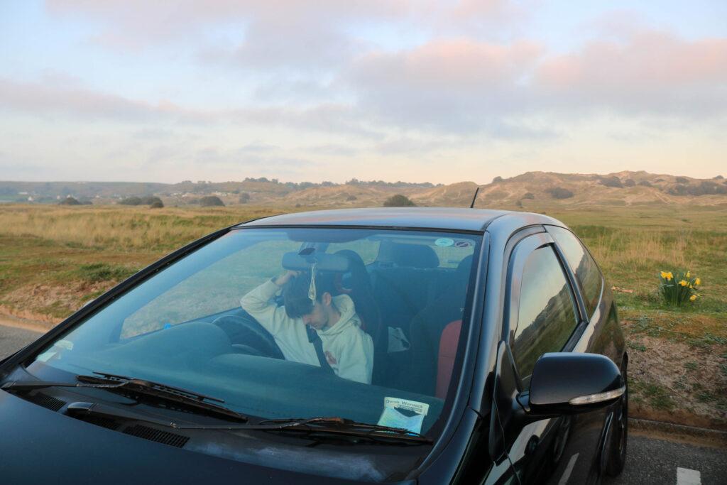
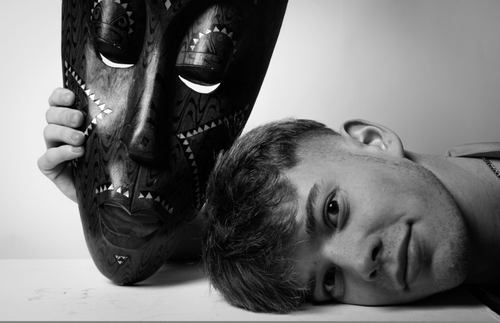
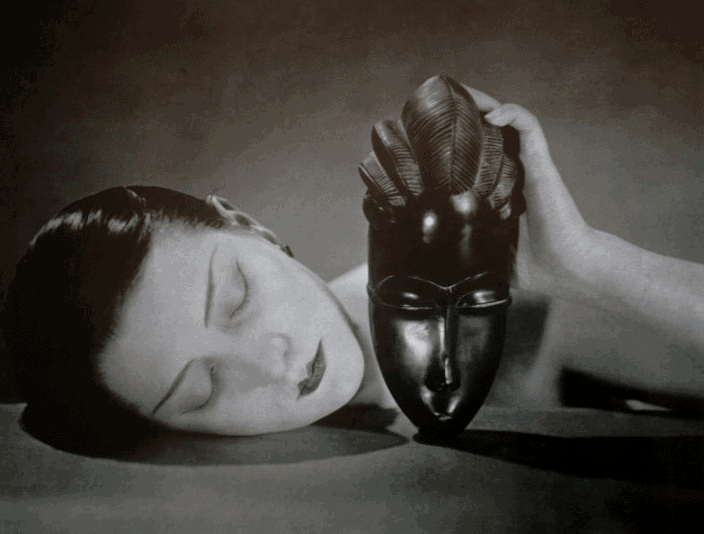
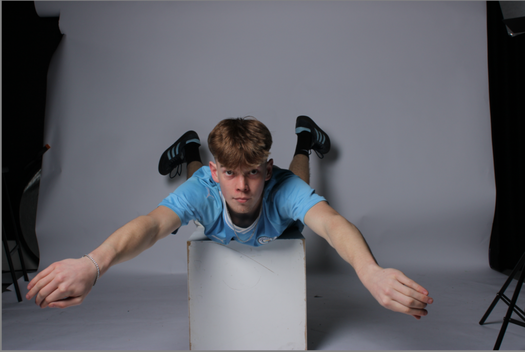
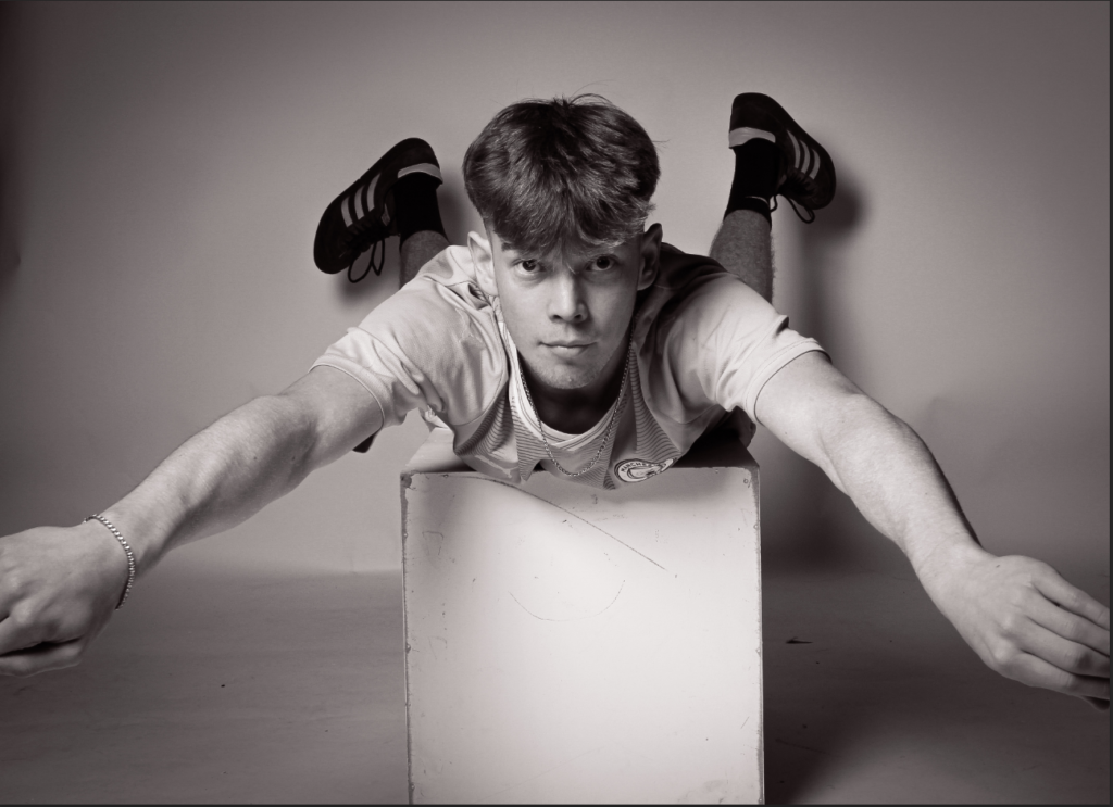
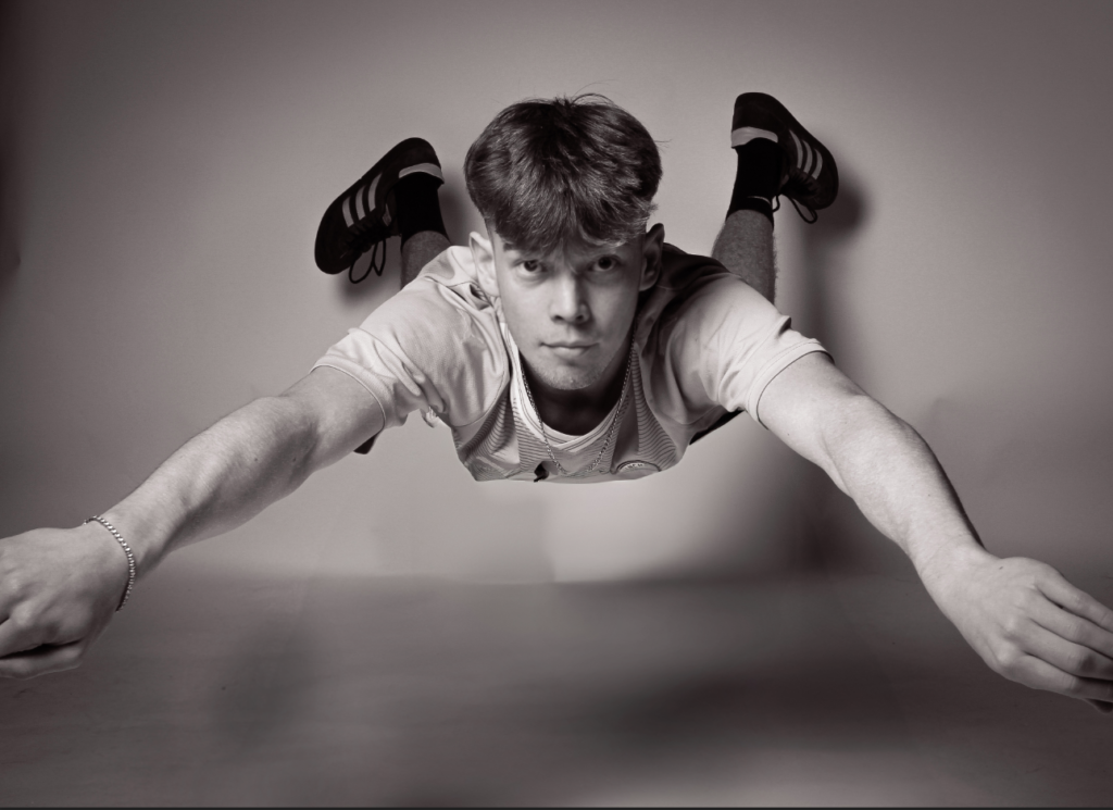
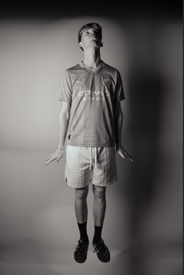
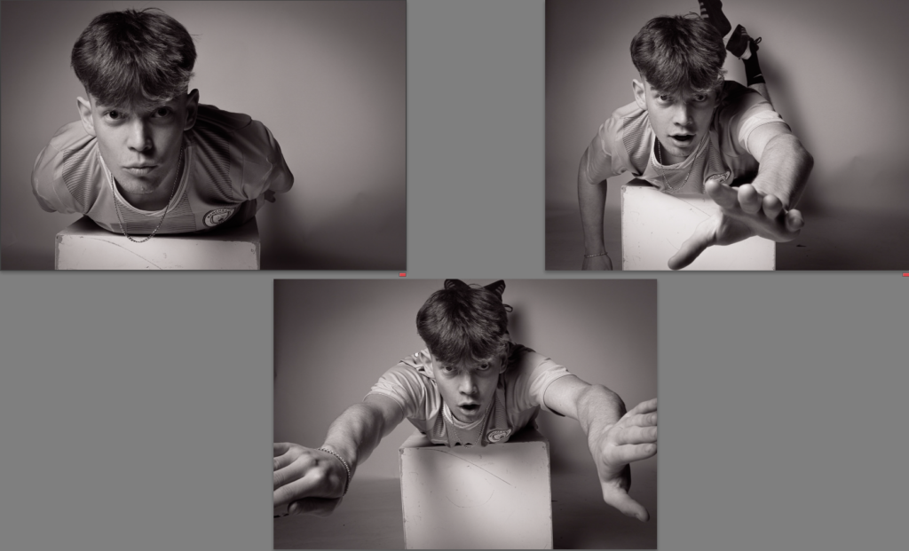
mood board:
I will be analysing individualism, socialism and realism.
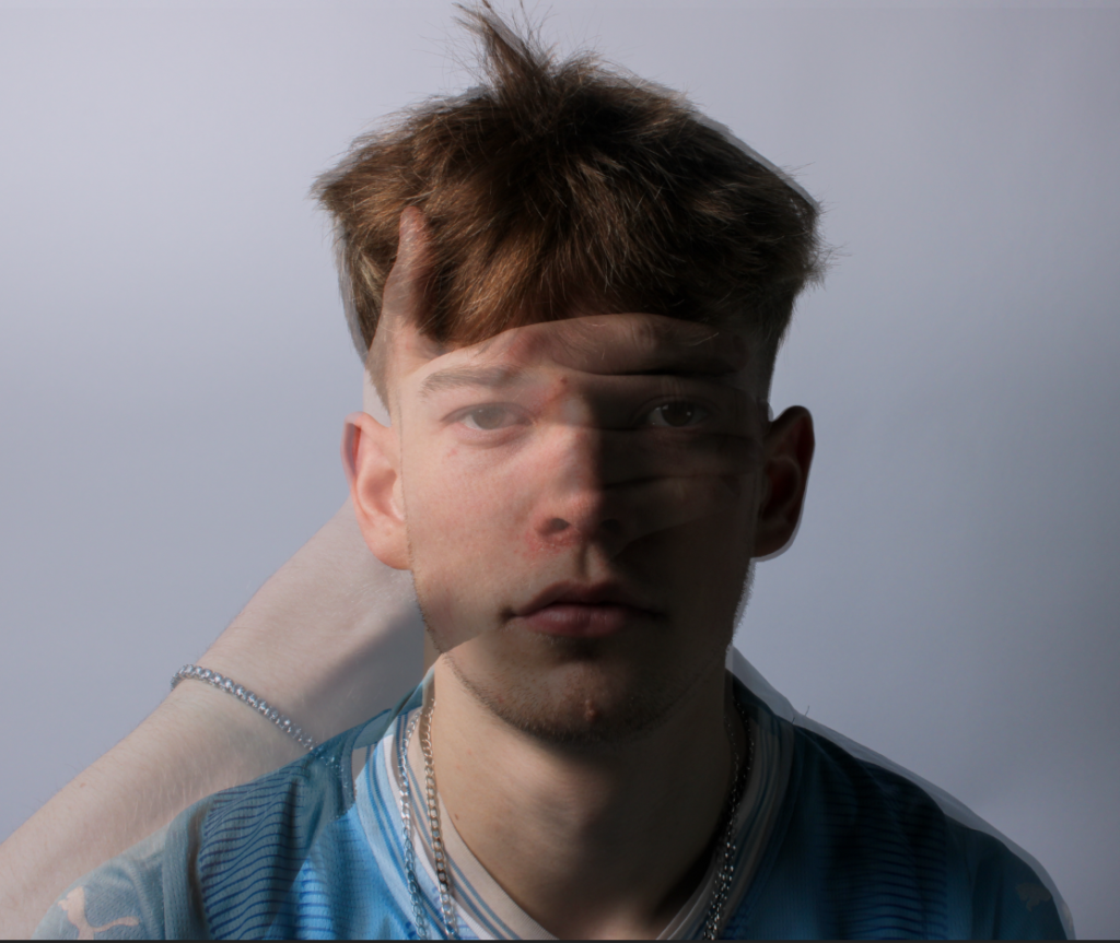
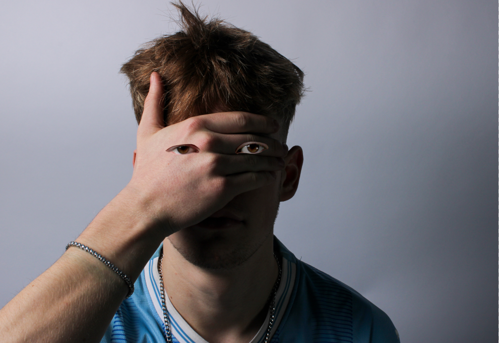
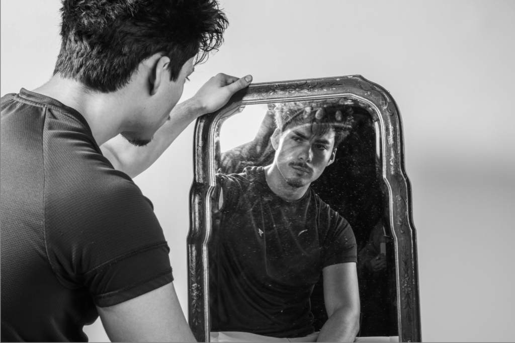
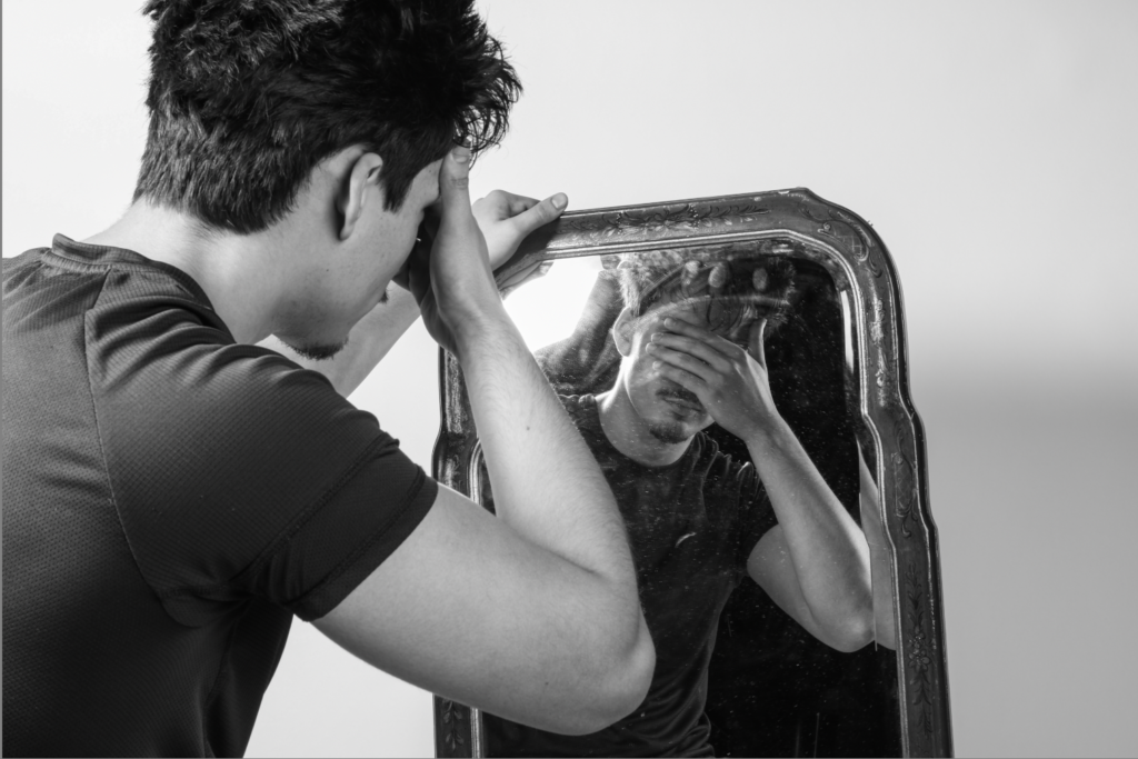
INDIVIDUALISM
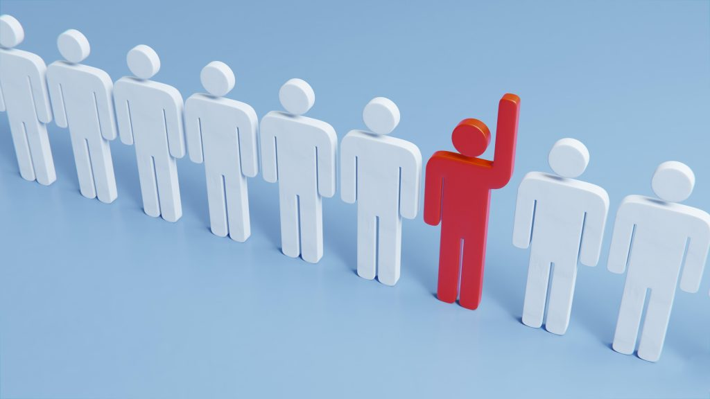
What is “Individualism”?
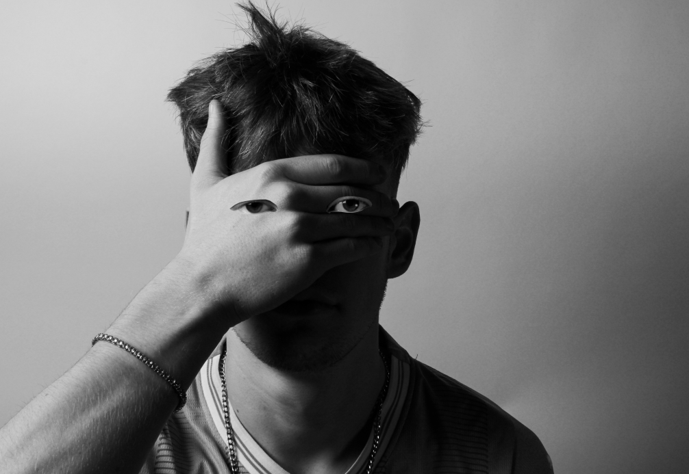
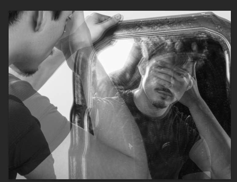
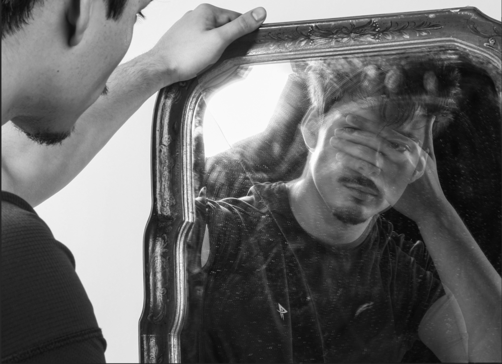
Individualism is all about taking care of yourself; it is the hope and practice that every person is unique and self-reliant.
How does Individualism link to art movements?
Individualism in art movements is linked towards personal expression, where artists focus their attention on their unique perspectives, emotions, and experiences. From Leonardo da Vinci Renaissance’s celebration of the artist’s genius to the emotional depth of Romanticism, individualism has allowed artists to challenge agreements, explore new techniques, and express personal identity.
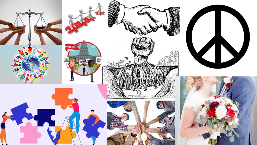
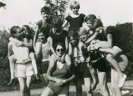
How does Individualism link to the theme Union?
Individualism and the theme of union are linked through the idea that a strong combination can be built alongside the knowledge and respect of individual identities. While individualism focuses attention on personal freedom, and self-expression, it also suggests that when people come together with shared values or goals, their allowance can strengthen the collective. In movements such as social movements, individualism etc, guides people to state their rights, and union provides a structure for individuals to come together, working together toward joint benefits while taking care of personal characteristics. So, individualism and union are connected, where personal freedom and identity builds up to a stronger, more joint effort.
SOCIALISM
What is “Socialism”?
Socialism is a political and economic system which supports public or community ownership of the means of production and seeks to improve inequality by sharing resources and wealth more fairly among people.
How does Socialism link to art movements?
Socialism links to art movements by inspiring the depiction of social struggles, workers’ rights, and economic inequality. Movements like Realism and Socialist Realism using art as a tool to show the lives of ordinary people, while also serving as a means of political expression in socialist policy.
How does Socialism link to the theme Union?
Socialism links to the theme of union by focusing on unity and joint action with workers, to achieve social and economic equality, protect workers’ rights, and challenge the exploitation inherent in capitalist systems.
REALISM

What is “Realism”?
A tendency to face facts and be practical rather than imaginative or visionary.
How does Realism link to art movements?
Realism links to art movements by challenging the idealized a illustration of the past and focusing on everyday life, ordinary people, and social issues. It rejected the romanticized and dramatic themes of Romanticism, instead capturing scenes of poverty, and the struggles of the working class with honesty and detail. Realism influenced later movements like Impressionism which shows a more atmospheric approach if everyday life, and it also influenced Socialist Realism, where art was used to represent the struggles of the working class. Realism’s focus on truth, observation, and the human condition, which helped artists on how to view a picture life and society in subsequent movement.
How does Realism link to the theme Union?
Realism links to the theme of union by focusing on the struggles of everyday people and the importance of social agreement. Artists who explore realism often focus on issues of variations and collective action. These artist paintings contributed to a sense of union and social consciousness, encouraging viewers to share human experiences and the need for social change.