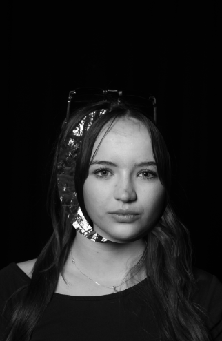
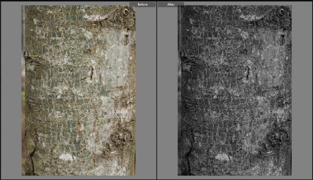
For my project I want to explore the themes of feminism and how through different artists, women can be portrayed in many ways. Including the similarly false reality of how groups of women are perceived through colour and through Pop Art as well as producing image similarly to the layout of a comic book.
This matters to me as I feel strongly towards how women are portrayed in media and how perspectives especially how they are portrayed im media is important, as the same image can be interpreted in many ways.
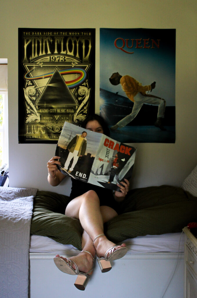
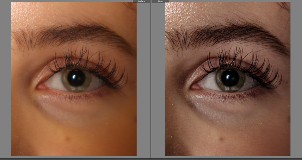
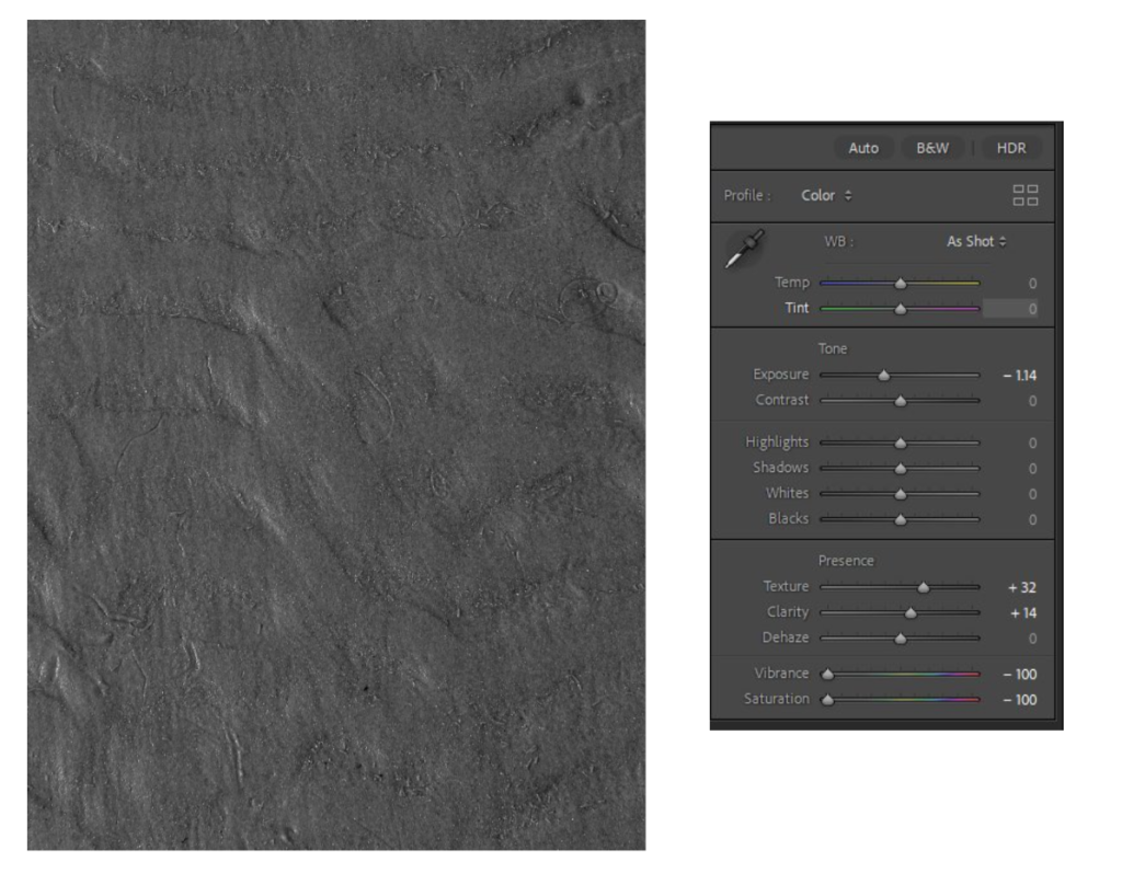
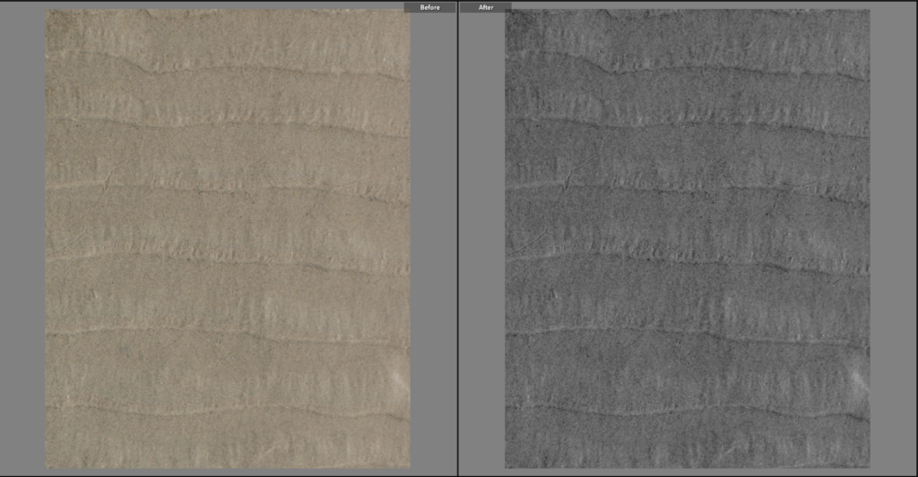
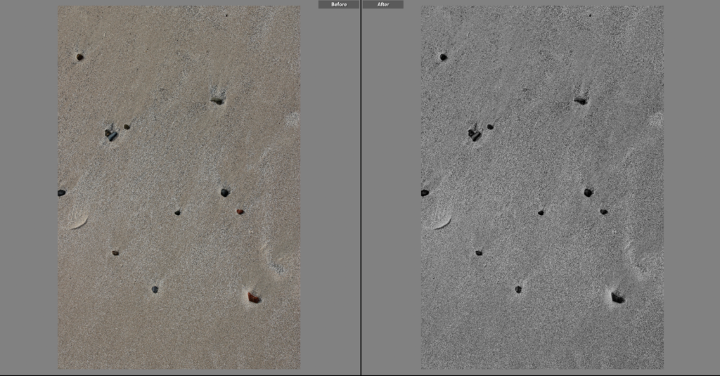
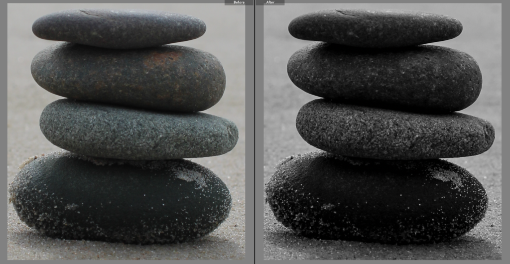
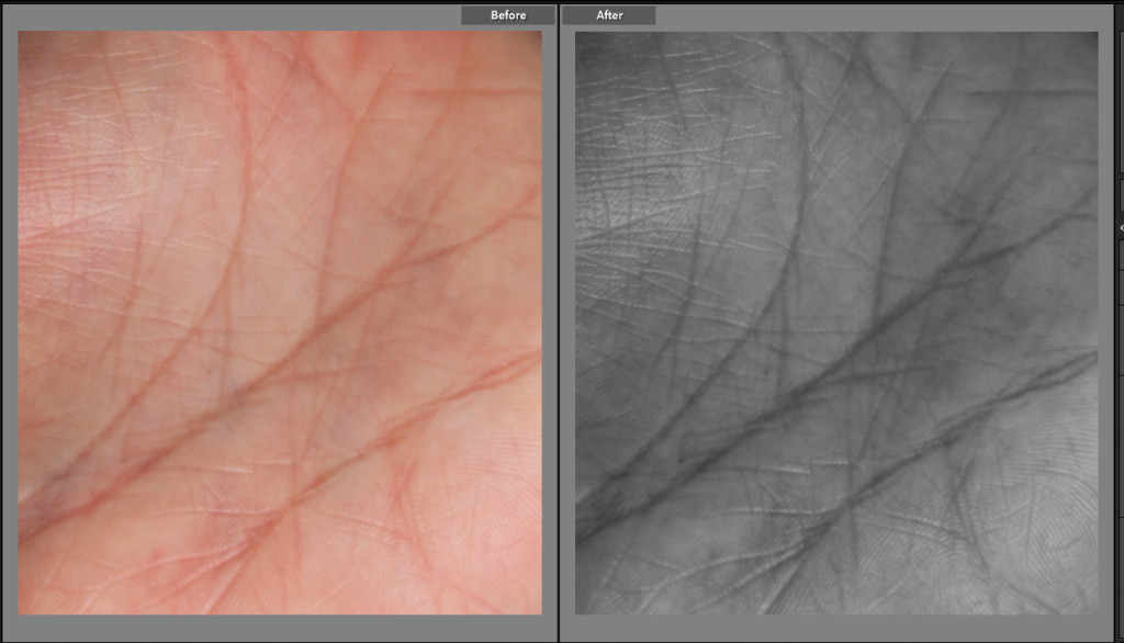
Through the theme of Union I believe that it can relate to my project as my goal is to explore togetherness/ contrasted with perception of the same group of people. I want to explore for the same main goal whilst presenting this group of togetherness and unity through objectification and known as the “male gaze”, therefore making this togetherness challenging to maintain and unite people. I plan to include inspired images through the arts of Roy Lichtenstein and how his art can create a different point of view towards women. I want to include inspired images by Andy Warhol as his famous collaged work includes the photographs of sex symbol Marylin Monroe and Andie. Juxtaposing this, I want to include the inspiration behind Christina Bloom’s work in my own photos as she focuses on the suffragette movement and women who fight for equality, empower and as well flight for other women like themselves. I would like to include her archival work and combine them in my work, potentially putting the work into pop art in itself from it’s monochromatic appearance.
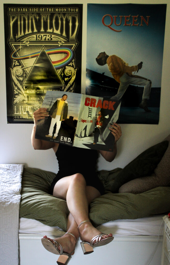
I want to develop my project by creating a collage throughout my presentation of my final work similarly to Andy Warhol with his first step inspired work in order to secondly create his infamous pop art pieces. Before creating his pop art pieces he would create these black and white photo strips, almost like one out of a photobooth, to draw ideas from and almost use it as a “muse”.
For the final project, I want to present my study in a photo book. As a result, I intend to produce many collages of the same pop art inspired images so that I will have a large variety of images that I can pick from as well. I have plans to begin my study for this project as soon as possible to allow me the most amount of time to compete.
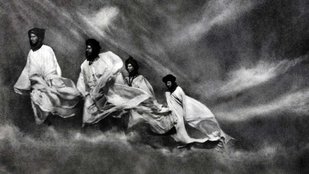
For this photoshoot, I am going to try and convey the idea of how friendships shape our lives and how the presence of friends can make us feel less alone in a world that often feels isolating. I am going to take inspiration from José Ortiz’s piece called the Perfect Present. In his piece, you can see the same man appear multiple times in one image by himself. This image highlights to me the sadness and isolation people may feel who don’t have these vital, supportive friendship groups around them.
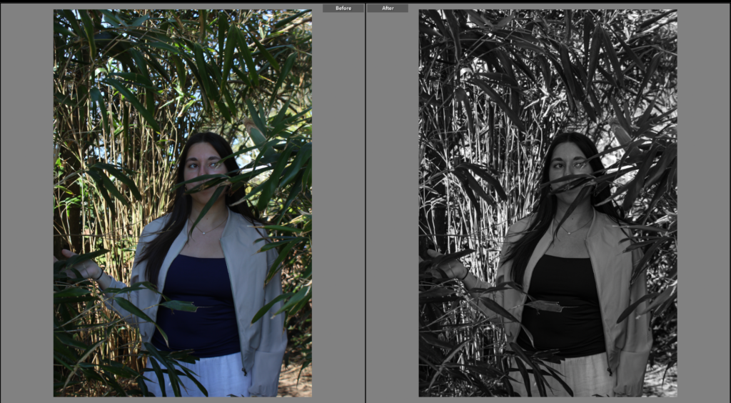
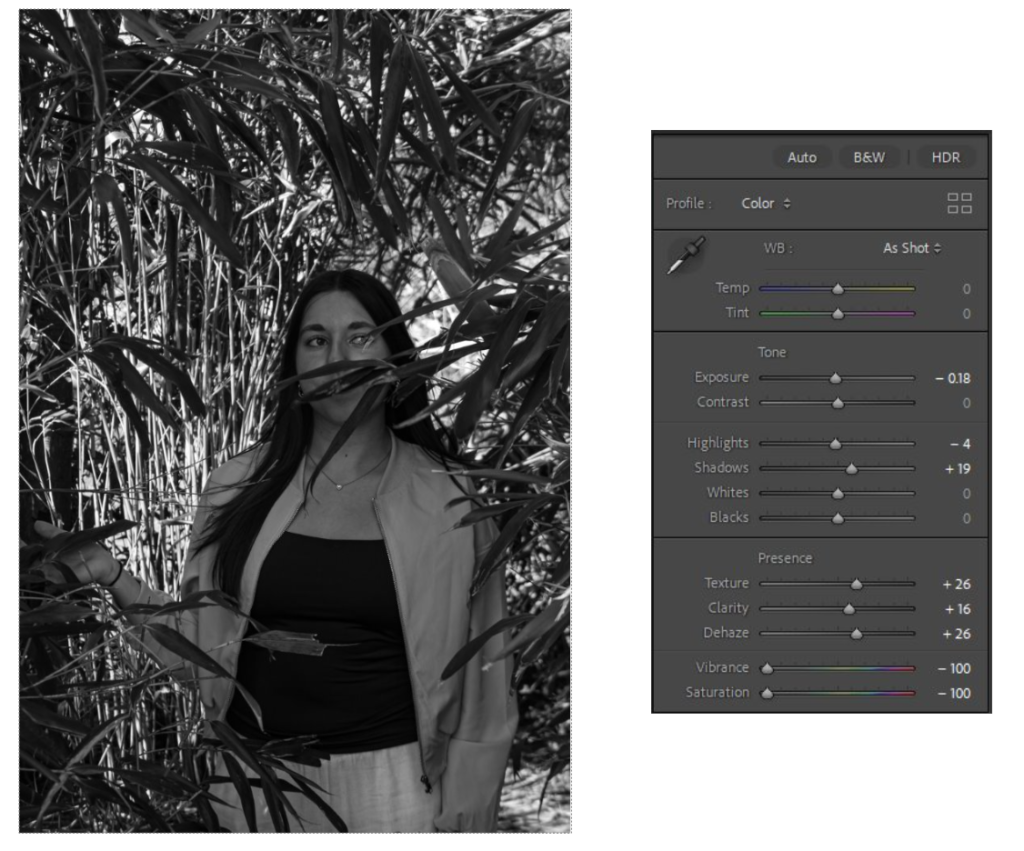
In order to replicate this feeling of loneliness people experience without friends, I am going to begin by photographing my friends together, capturing moments of laughter, interaction and joy in one of their favourite places to hang out; Gorey. I will try to capture candid moments between them in order to ensure they dont look unnatural and that I’m actually photographing the emotions they experience whilst hanging out. Once I have completed this, I will then use photoshop to incorporate the different images of my friends into one image. To achieve this, I will use the quick selection tool to make a cutout of my friends from certain images and then drag those cutouts onto a photograph where I have captured only one of my friends by herself. Next, I will lower the opacity of these cutouts to create translucent figures but leave the singular person in full opacity to convey the idea of them not being with her anymore. There will be a clear contrast between the joy seen in my friends cutouts compared to the image where she is stood alone with her back to the camera. Additionally, I will also make the images black and white to further emphasise this feeling of sadness she is feeling as she is no longer with her friends which brought her happiness. My images will symbolise how we sometimes feel like we are merely specters in our own lives without the presence of those who truly see us. The fact that the figures are made to look like ghosts represents the loneliness many experience when they are disconnected from their friends/ loved ones. Overall, I hope to reflect the importance of connection and friendship in our lives. The images I create will not just be about capturing the joy of being with friends but highlighting the idea of how much we need friendships in order to survive.
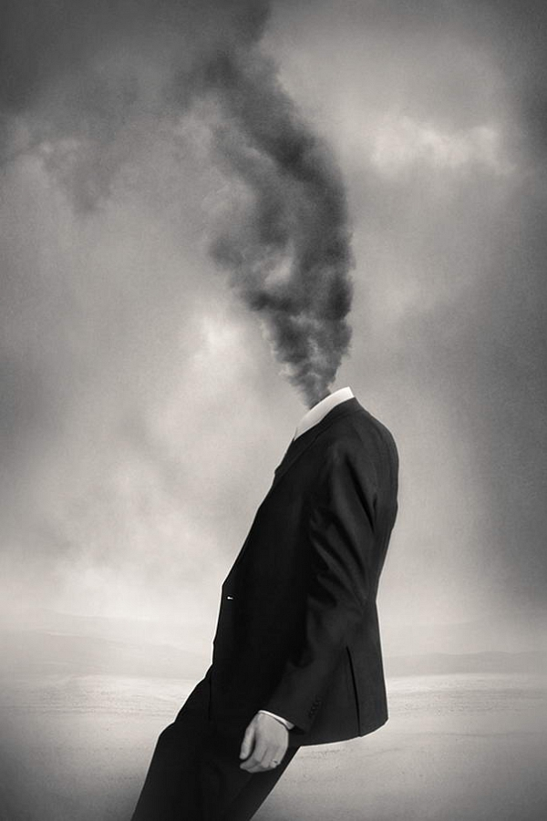
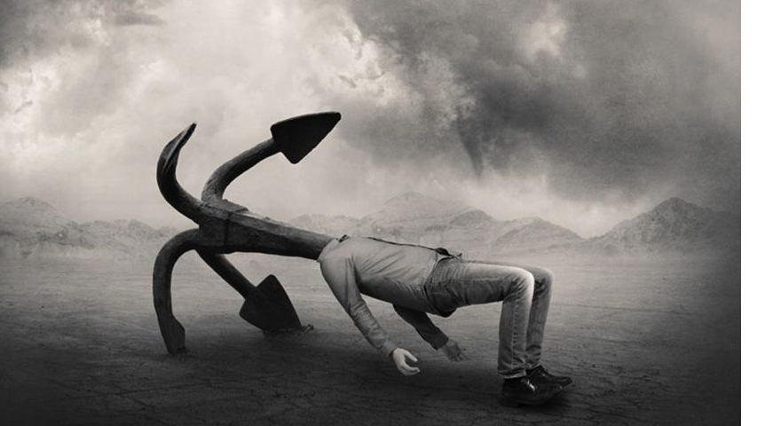
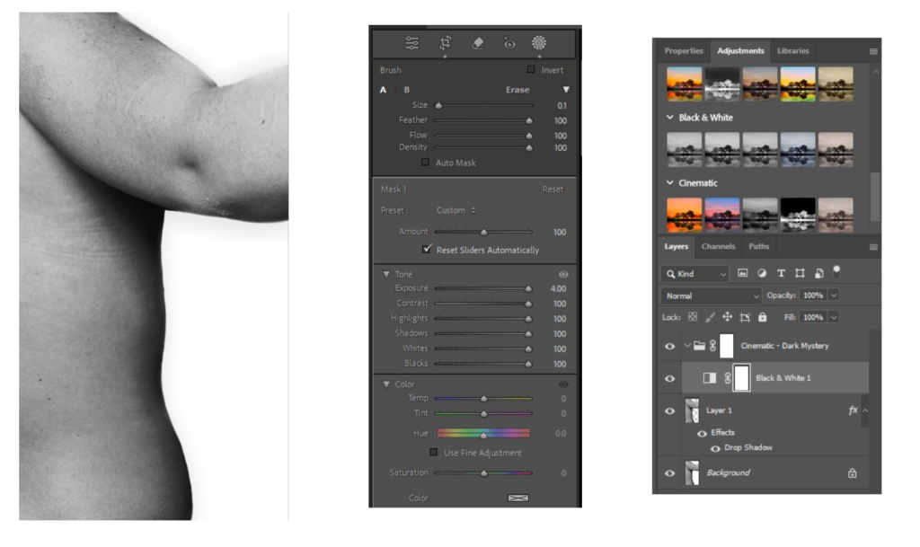
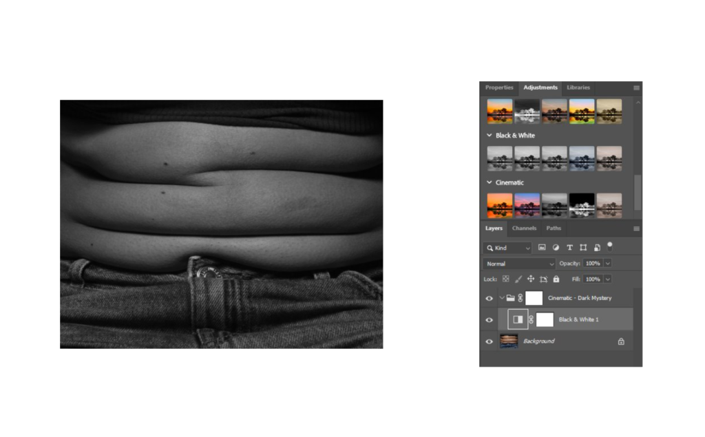
Tommy Ingberg is a self-taught photographer and visual artist known for his work in both fine art and commercial photography, born 1980 in Sweden. Ingberg particularly focuses his photography around surrealism and conceptual imagery. His work often evokes a sense of drama and depth, using bold contrasts and creative compositions to explore themes such as identity, emotion, and the human experience. His photography usually features strong tones and shadows to evoke intense emotions and portray cinematic or surreal quality.
I am using Ingberg as my artist inspiration as I feel his photos evoke deep emotions and I would like to portray this through my photography. I will also be editing my images in black & white to reinforce my inspiration on Ingberg’s photos. I will also attempt to represent unconscious ideas, dreams, and emotions, similarly to Ingberg.
Ingberg: “For me, surrealism is about trying to explain something abstract like a feeling or a thought, expressing the subconscious with a picture. For my work I use my own inner life, thoughts and feelings as seeds to my pictures. In that sense the work is very personal, almost like a visual diary. Despite this subjectiveness in the process I hope that the work can engage the viewer in her or his own terms. I want the viewers to produce their own questions and answers when looking at the pictures, my own interpretations are really irrelevant in this context.”
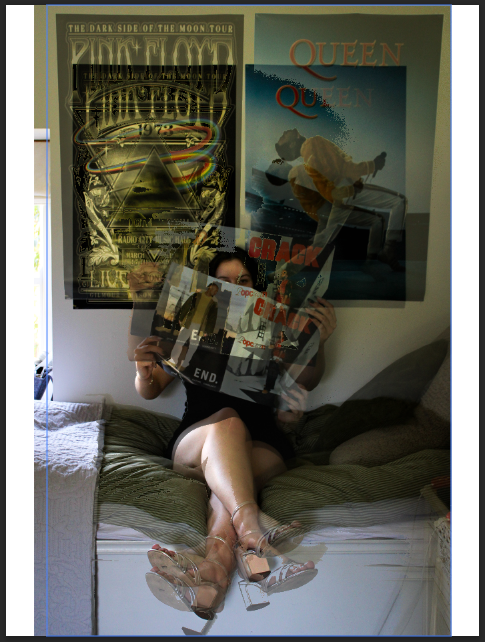
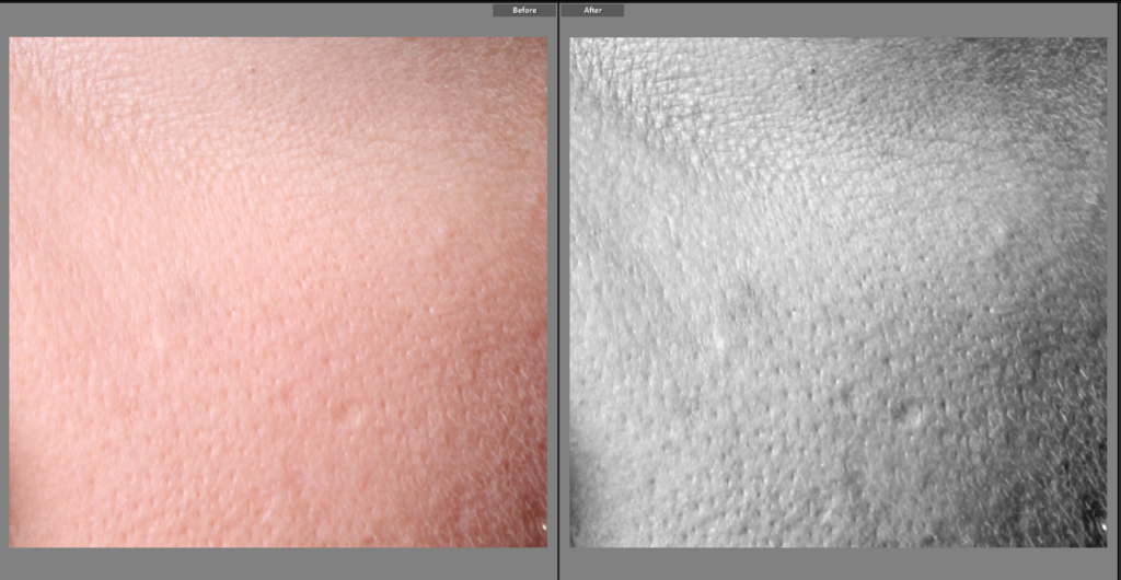
For these edits I wanted to experiment with ways that I could layer my images on top of one another, with you still being able to see the original image behind. To do this I layered two slightly different images upon one another, then altered the blending options which resulted in the background image to be revealed through the gaps created from the blending. This creates an interesting movement as your focus is set on two images that are merged together. This increases the 3-dimentional view as the the portraits are overlapped upon one another, which results in new interesting shadows and formations to revealed.
Photos Used
I found it an interesting effect from the way that the photos had different shadows and highlights, which was then enhanced with they layered effect, as this created more intricate shadows.
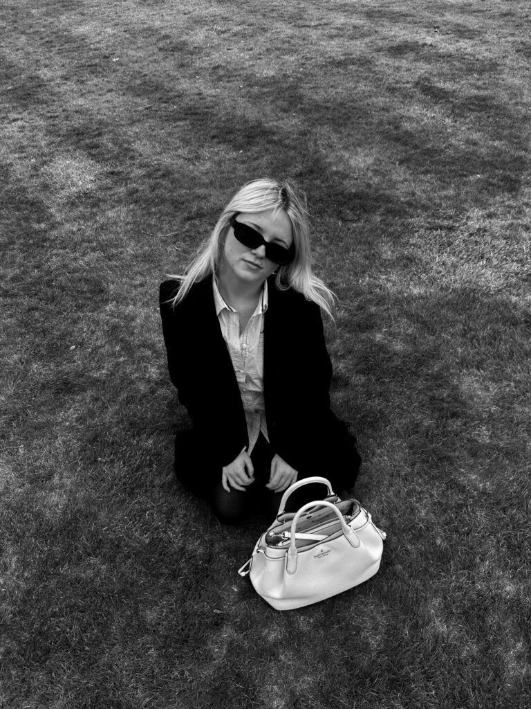
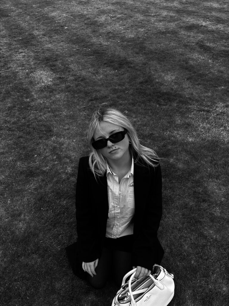
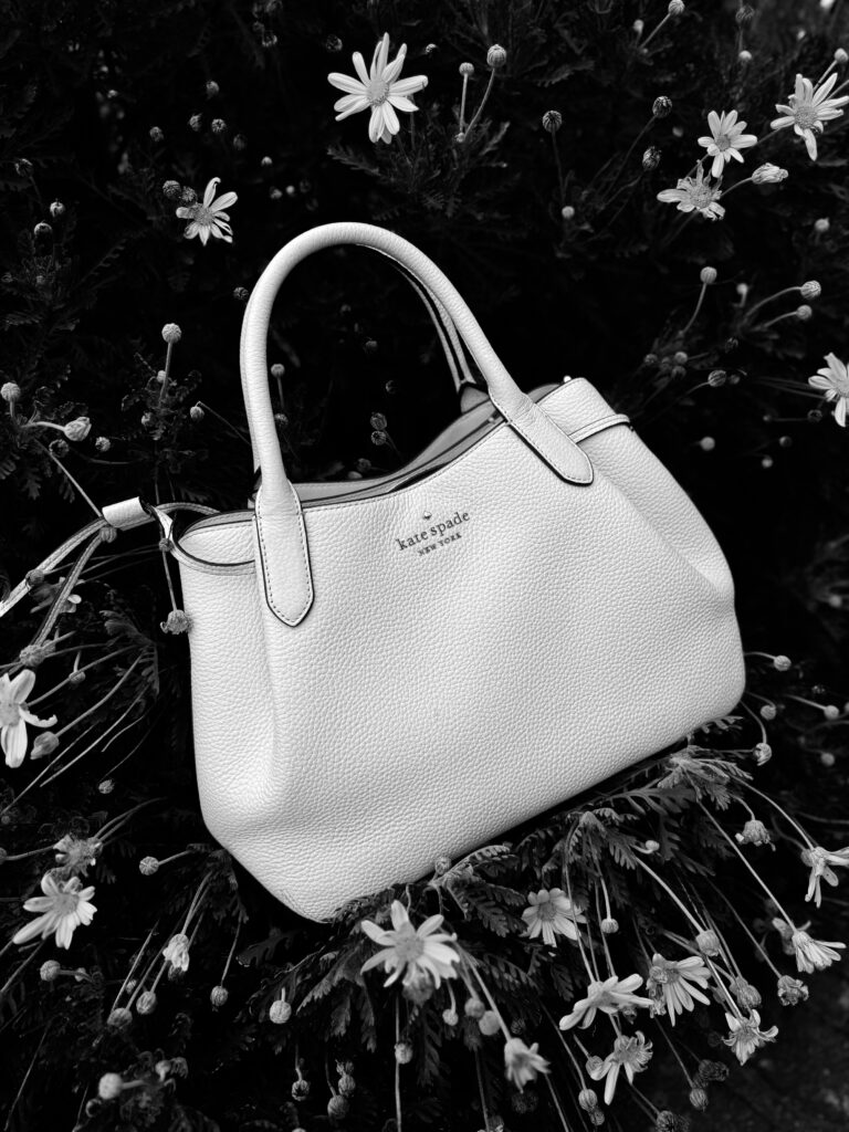
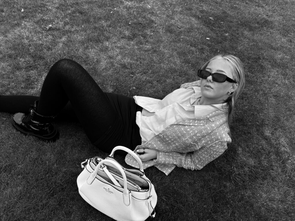
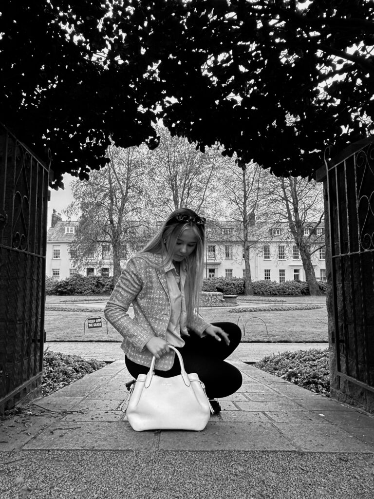
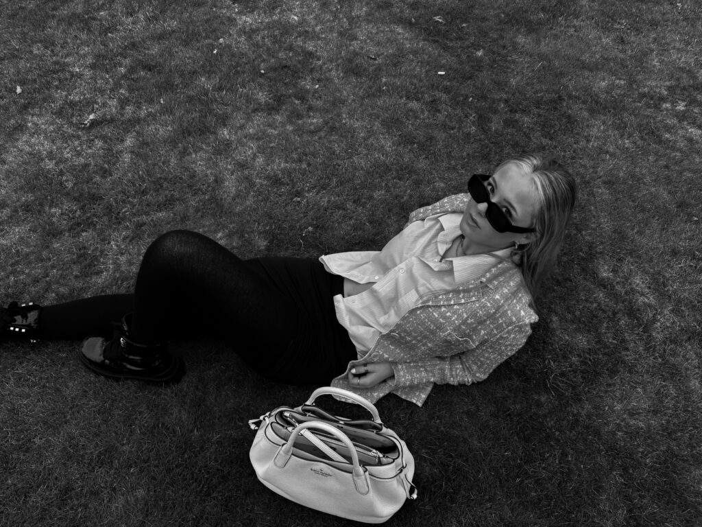
In conclusion, my first photoshoot for this final project was fairly successful, yet not as successful as I had hoped it would be. The main limitations of this shoot were the setting and location, as well as the clothing. Due to my main artist focus being Helmut Newton, I aimed to carry out a shoot exhibiting similar ideas through sophisticated clothing and including a handbag as it resembles Newton’s ideas of glamour, yet also effectively ties into Yayoi Kusama, and this is one of her most important aspects as she collaborated with fashion brands. Despite the limitations of my photoshoot, overall I think it still works well in my final project a it directly ties into themes of fashion and femininity.
What went well:
Has outdoor settings – lots of Newton’s images were taken in urban settings as natural lighting provides a variety of tones.
Clothing and accessories to an extent – subjects presented as glamourous and chic, which links to Helmut Newton.
Good lighting – not too light and not too dark, creates a heavy contrast allowing the outcomes to appear more dramatic.
Areas to improve:
Low camera angles in the images do not present women as powerful, it presents them as weak and vulnerable.
Clothing and accessories to an extent – Helmut’s subjects often wore provocative outfits such as tailored suits and leather jackets. We resembled the high fashion outfits but not in the same way Newton does, I don’t think I look as glamorous and feminine.
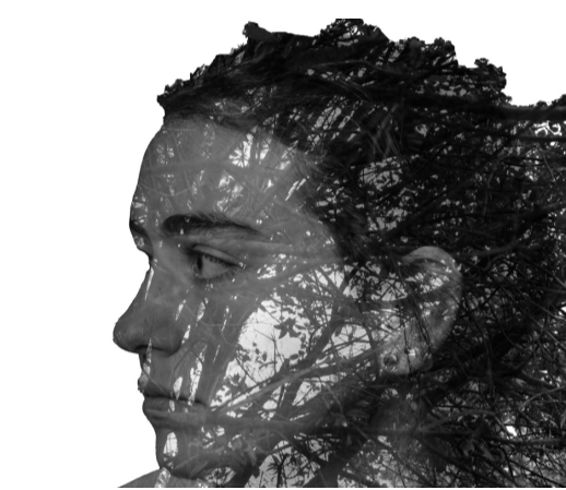
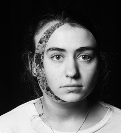
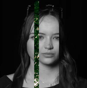
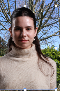
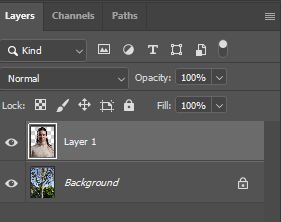
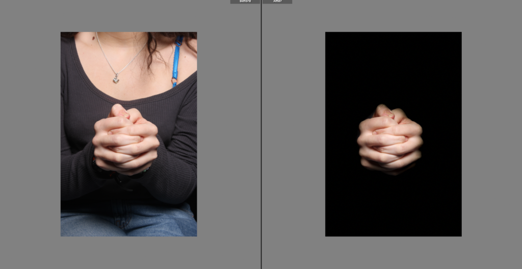
First, I opened photoshop and uploaded an image that was in my folder. After this I pressed on the object selection tool and selected the girl show in the photo. After only her portrait was selected, I right clicked and pressed layer via copy so that I would have a copy of her as shown above.
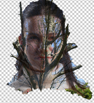
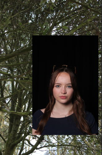
After I opened an image of a tree onto photoshop and using the move tool on photoshop, I dragged the copy of the girl into the image of the tree which then created a layer on top of the image of the tree.
Using the opacity and selecting which type of blending I want, which show on the left where it says normal. I started to play around with the opacity and blending option until I was satisfied.
As you can see, I have played with the opacity and blending modes so that I can produce an image like this. For this image I put the blending option as darker colour and opacity as 83%. Then I flattened the image and used the object selection tool to select only her face and removed the unselected background.
I used the eraser tool to remove any unwanted parts of the image and this is the final product.
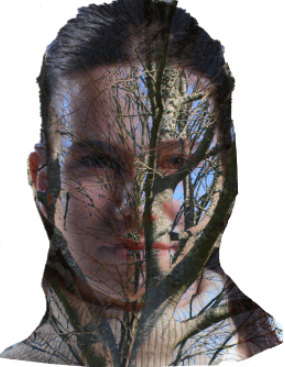
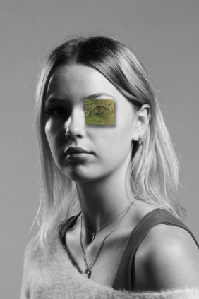
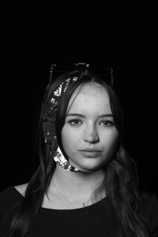
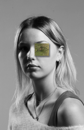
How I made image 4:
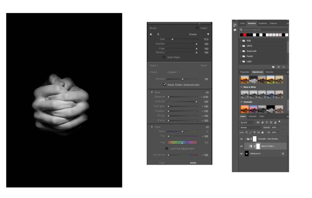
First of all I uploaded an image onto photoshop and pressed adjustments and made the image black and white. Then I uploaded another image which was a tree with what looked like an eye and cropped the image so that the eye looking part of the tree was the only thing showing.
Then I placed the cropped image on top of the black and white image using the moving tool and then added some blending options like a drop shadow and stroke. This was all I did for this image.
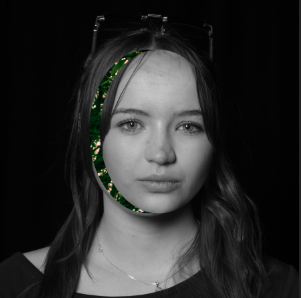
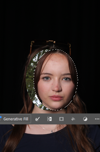
How I made Images 5,6,7,and 8:
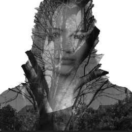
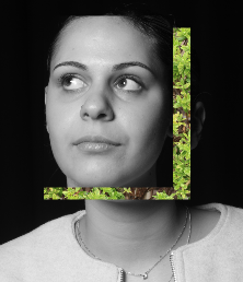
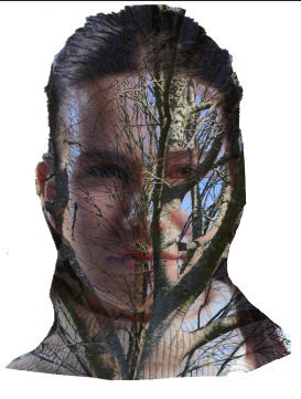
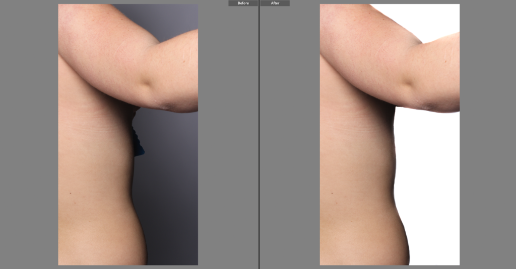
For this image, I uploaded an image of tree branches onto photoshop and them dragged the portrait on top of the image of the branches.
Then I selected a part of the girls face (this could be shaped as an oval, square or even rectangle) , like shown and used the move tool in photoshop to grab the selected part and move it away from the girls face.
Lastly, using adjustments, I placed a black and white filter on my image. This was all I did for this experiment.
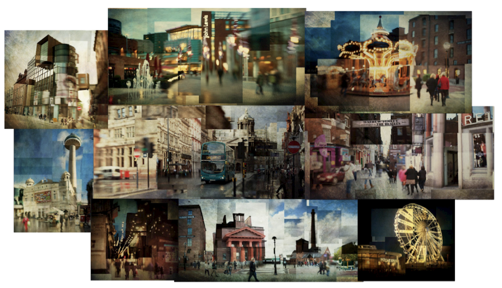
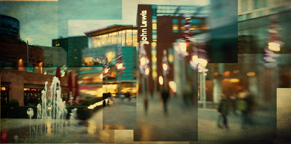
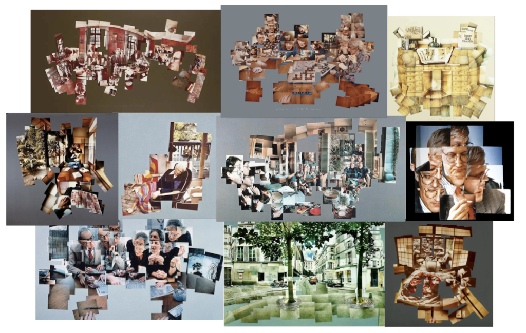
Stephen McNally is a photographer from North West England. He has a passion for landscapes and seascapes. The areas of his work which I have an interest in is his Cubism pieces. By looking at his images, I can see that they have mainly all been taken in Liverpool as I have been there many times. I have selected to study Stephen McNally’s work as I like how his images appear to be a more compelling, visually striking adaptation to photographic cubism. This is due to his use of an optic lens for a blurred effect and his editing techniques. No two fragments of his images appear the same. This adds more depth to the image, providing the viewer with lots of different aspects to engage in.
Interview with Lensbaby
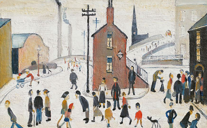
In an interview with Lensbaby, a camera lens company, Stephen McNally stated that his work is inspired by David Hockney and another English artist, L.S. Lowry. He discovered David Hockney’s work when he visited a gallery displaying his joiners and decided to try the technique himself. L.S. Lowry on the other hand, is known for painting urban landscapes of streets with people presented as “matchstick men”. Here is a painting by L.S. Lowry:
McNally attempts to combine these styles in his images. He uses the Lensbaby Composer with Double Glass Optic which is a lens that distorts images and gives them a blurred effect. He stated that he likes to use this lens as it allows him to get a different image from the same shot by moving the lens around. When shooting images to create a joiner, he will stand in the same spot for a few hours, taking over a hundred different shots. He mainly focuses on the things which don’t move such as the buildings and then he photographs the people he wants to include as they pass by. After getting all the images he needs, he will return to his computer to assemble his joiner in photoshop. Altogether, Stephen McNally enjoys creating joiners as he likes to produce images that can’t typically be seen by the human eye.
Image Analysis
This is a joiner by Stephen McNally. This joiner consists of a variety of images which, together, form an abstract image. At first glance, it’s hard to work out what you’re looking at until you look closer and see that all of the images match up to create a street photograph. Each of the fragments of this joiner are all different, some more exposed than others and some blurred. This joiner looks like it was taken after the sun has set on a cold day, potentially due to the combination of cold tones for the sky and street and the warm tones of the lighting and red brick. The texture in this image has been muted by the blur-effect of the camera lens he used. It almost looks as if, from left to right, the intensity of the blur gradually increases, making the forms and lines harder to distinguish. I would say there is no clear focal point in this image as my eyes tend to look at each separate fragment, rather than focus in on one specific subject.
David Hockey
David Hockney’s Joiners
I have chosen to study David Hockney’s work as he is the creator of the term “Joiner” to describe photo collages of a cubist style. I have written about him previously in my Cubism blog post.
Comparison of Photographers
The key difference between Stephen McNally’s and David Hockney’s work is that Stephen McNally has a more abstract approach to photography. He uses a range of exposures and a special effect camera lens to create a distorted image. The subject of his photographs are mostly of street scenes whereas Hockney would photograph personal interactions such as playing a game of scrabble or of his mother sleeping. David Hockney’s approach to cubist photography is much more realistic than Stephen McNally’s as he aimed to mirror the human experience and sense of space in his joiners. Hockney’s joiners also consist of a lot more smaller images which are physical prints that have been glued down together, in comparison to Stephen McNally, who has larger images which have been combined using Photoshop. Although there are many differences in their work, there are a few similarities. The key similarities are such that they both focus on photographic Cubism and they use similar colours and tones in their images, mostly browns, beiges and greys. David Hockney has also produced some street scenes which is Stephen McNally’s focus in his joiners. Finally, when taking a closer look at David Hockney’s joiners, you can see that he also used a range of exposures but it is more subtle than Stephen McNally.
When I create my own joiners, I would like to combine the styles of each of these photographers by creating joiners which look realistic but have an abstract approach to them. I will do this by using a range of images from different perspectives and combining them, presenting each fragment differently, whether it be different exposures or a blur, so that there is a clear indication that my final outcome is more than just one image.
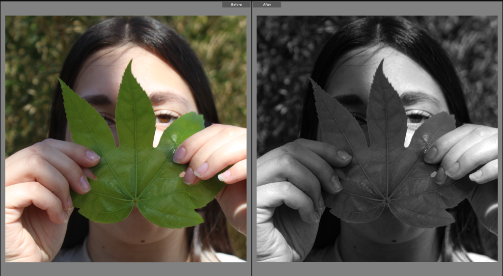
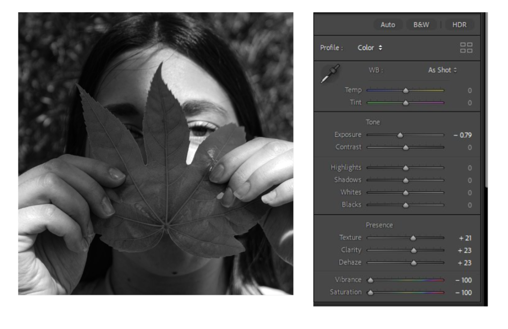
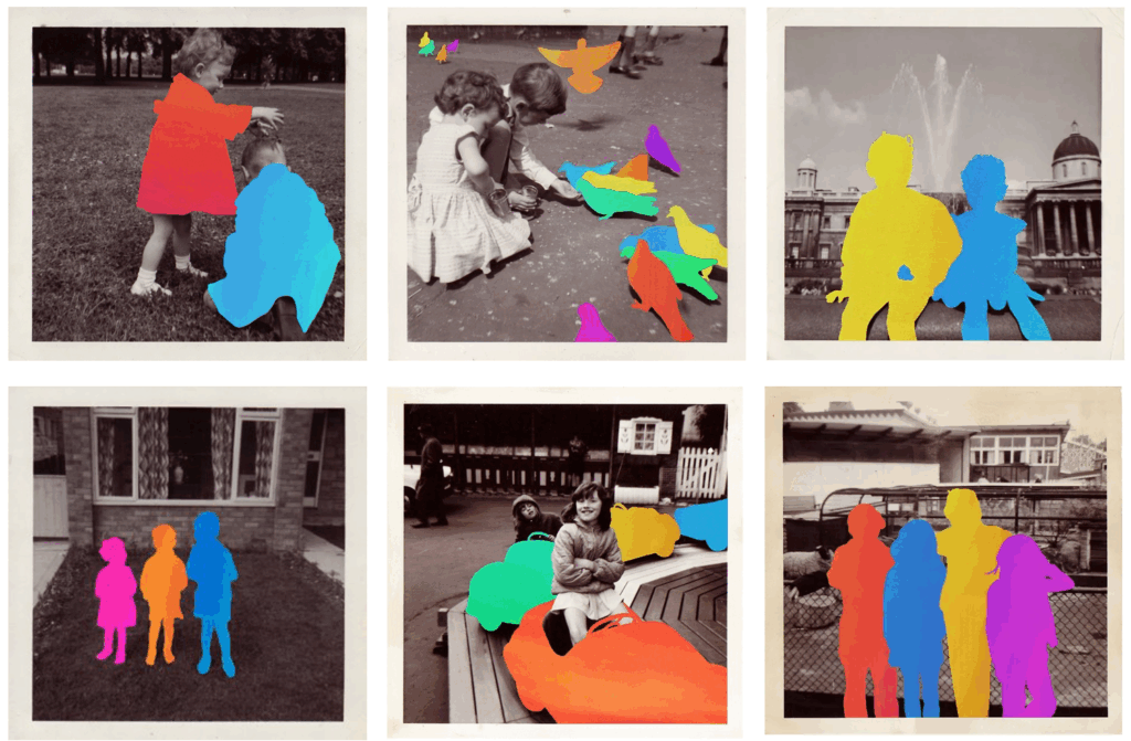
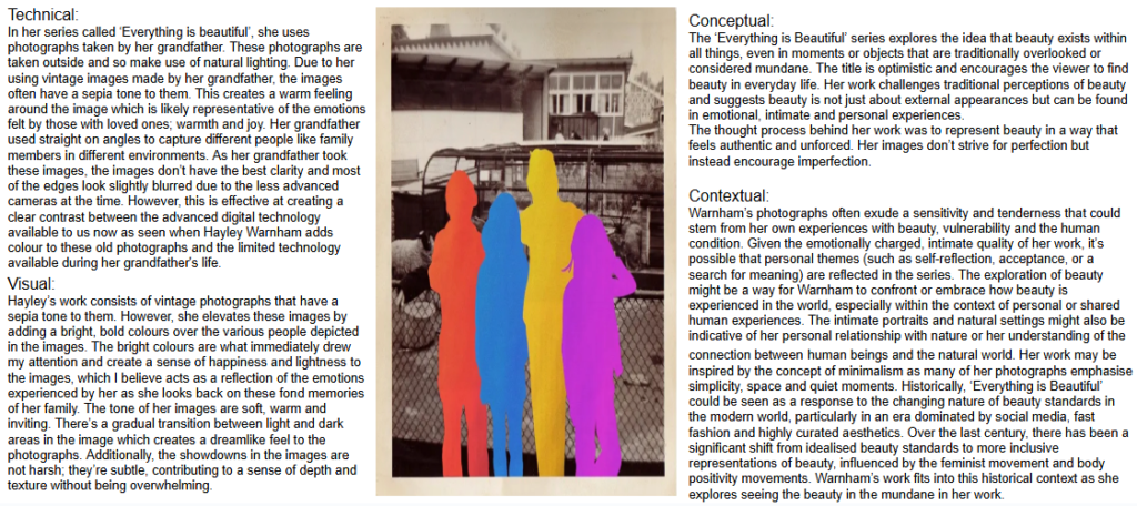
Hayley Warnham is a UK based artist. She is most well known for her collages and photography. Her art takes everyday moments, captured through old photographs, and creates something new and exciting. One of her most famous series is called ‘Everything is Beautiful’. This framework of art involves her blending her families personal history with artistic reinvention, using colour to reinterpret the past. Warnham’s background as a designer and illustrator heavily influenced her photographic work. She graduated the Royal College of Art in 2014 and quickly made a name for herself soon after. She collaborated with various different clients like: Penguin Books, Tate and Computer Arts Magazine. She is currently the Deputy Art Director at Oneworld Publications. She tends to use digital media as a way to engage with and reinterpret the past instead of just a tool. The images seen in the series ‘Everything is beautiful’, comes from photographs taken by Warnham’s grandfather during family holidays to the seaside. Hayley Warnham has stated that the image that holds the most significance to her is a photograph of her mum as a child. She found herself drawn to these faded, nostalgic images of her family’s life, which held a deep sense of history and memory. This admiration for old photographs is what ultimately led to her creating this series. She realised that these worn and grainy images that showed her a raw, unfiltered look at the past sometimes lacked the vibrancy and energy of the present. This sparked the idea in her head to reimagine these family photographs by adding colour and texture to them.
The method she used to create these images involved her blending traditional photography with modern technology, using digital manipulation. She begins with the original black and white photographs, preserving their authenticity while adding layers of digital colour and texture. Through this technique, she brings a fresh energy to the otherwise still images, reimagining them with bright, bold colours that contrast the faded monochrome tones of the original prints. By doing this, Warnham is able to highlight specific elements of the photographs, for example, the various people seen in the image. She wanted to ensure that she would preserve the integrity of the original photographs whilst also being able to experiment with composition and colour to help elevate the images.
The idea behind her body of work was finding and highlighting the beauty in the everyday and the overlooked. Her work encourages her viewers to reconsider their perceptions of what makes something beautiful in the surrounding world. The vibrant colours she adds into her grandfather’s old photographs transforms once mundane scenes into something powerful and interesting to look at. Overall, I believe her work allows her viewers to view things from a different perspective and helps to remind us of the beauty that exists in the smallest and most personal moments.
Image analysis
How she links to Union
Hayley Warnham’s series ‘Everything is Beautiful’ links to the theme of union and friendship through her use of colour and digital manipulation to create new vibrant images from vintage photographs. The vibrant colours she adds into these old, black and white images creates a warm and fun tone to the images. This is similar to the emotions you experience whilst being around your friends. Her work highlights how our connections with others (eg friends) transforms our experiences and perspectives, making the world seem brighter and more meaningful. Additionally, her use of bright, bold colours layered over black and white images create an energy and vibrancy into the once melancholy and muted photographs. I interpret the colours in her work as representing the positive impact relationships have on our lives. For example, friends tend to bring a sense of joy and belonging to individuals, which Hayley has then conveyed through the use of bold colours which make the scenes more lively and engaging (similarly to friendships). I see the transformation from black and white to colour in her work as a parallel to how friendships illuminate the world around us, turning mundane moments into something extraordinary.By enhancing these moments between people with colour, Warnham highlights the significance of connection for humankind. Furthermore, the presence of friends can drastically shift the tone of any situation (just like how the use of colour clearly changes the mood and energy of her photographs). Friendship has the power to take an ordinary moment into something extraordinary. By overlaying colour onto her grandfather’s photographs, Warnham highlights how typically boring, everyday experiences can be made more meaningful and fun when shared with others.
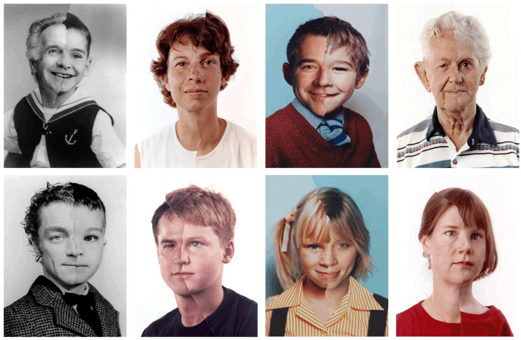
Bobby Neel Adams is an American artist best known for his photographic series called ‘The Family Tree’.Bobby Neel Adams had always been interested in photography since a young age. He had a passion for storytelling visually and photography provided him with a way to explore and capture moments in time. He was drawn to the idea that photographs could transcend mere representation and believed they could be used to explore deeper narratives of human experience, memory and transformation. He aspired for his work to not only capture the essence of his subjects but to also reflect on the different connections between individuals, time and family. His series ‘The family tree’ was inspired by his fascination with the passage of time and its effect on human beings. In this series of images, it involves him using photographic manipulations to juxtapose the faces of individuals at different points in their lives, creating a connection between generations. The photographs feature two images of a subject at two different ages, which he then blends together to highlight the similarities and differences between his subject’s younger and older selves. He creates his images by overlapping the faces of an individual with their parents, grandparents or great grandparents. His images allow his viewers to reflect on their own family histories and begin to understand how we are shaped by the people around us and those who came before us. In this project, he wanted to explore how individuals are connected across generations through biological inheritance and shared experiences. His work suggests to me that family is an evolving part of one’s identity as he explores the physical and emotional marks we leave on one another and the relationships that define us. Bobby Neel Adams creates his photographs by combining his different images together in a darkroom. He overlays two photographs of people at different ages or generations, carefully manipulating the images so that they seem to blend together seamlessly resulting in a singular portrait showing half of a face from both the older and younger generation.
Image analysis
How he links to Union
One of the key concepts seen in his work is the idea of aging. I think this links to the theme of union as by showing how time inevitably leaves its mark on every individual throughout his work by merging different generations together, he explores the idea of the aging as something that binds all of us together, regardless of background or any differences we may have. His series called ‘The family tree’ also links to the theme of union as he explores the importance of family and relationships beyond it eg friends, in shaping our identity. While his work mainly explores themes of family, aging and legacy, it also touches on the broader concept of unity and how the bonds we share with others ( whether that be biological or chosen), all influence who we are. However, his series mainly looks at the union of family members across generations as he creates visual representations of the interconnectedness between different generations throughout his work. These images depict the continuity of life within family and the different, shared traits and experiences that are passed down over time. His work highlights the union of generations and how they help form one’s identity physically and emotionally. I think his work is portraying how everyone is shaped by their ancestry, carrying forward not only physical resemblances, but also emotional and cultural legacies of those who came before them. However, I believe this idea of family union can also be expanded to the union of friends and how they equally play a role in shaping who we are. While bloodlines play an undeniable role in shaping identity, the people we choose to surround ourselves with (eg our friends) also become a core part of our story and have an equally important impact on us. Adams’s work can be seen as a reflection of how union (in any form) helps individuals evolve. For example, although family members are linked through their shared genetic and heritage, friends also contribute to our development through their support, experiences and perspectives. I think the blending of faces seen in his images act as a metaphor to show how these different relationships all act together to influence who we are as individuals. Additionally, the contrast between old and young faces in his images suggests to me the importance of friendship during childhood, adolescence, adulthood and old age as these friendships act as a vital support system and help us to adapt and grow as time passes and we begin to change. This idea of the importance of friendship in forming who we are has inspired me to recreate his images but by combining pictures of my different friends together instead of them with family members.