Face exhibition and national portrait gallery

What is The Face Magazine ?

The face magazine celebrates iconic fashion images and portraits from The Face, which is a youth culture and style magazine that has shaped the creative and cultural landscape in Britain. The magazine also launched the careers of many leading photographers and fashion stylists, who were given the creative freedom to radically reimagine the visual language of fashion photography. The exhibition brings together the work of over 80 photographers, including Sheila Rock, Stephane Sednaoui, Corrine Day and many others. From 1980 to 2004, The Face played a vital role in creating contemporary culture. Musicians features on its covers achieved global success and the models it championed, including Kate Moss who became the most recognisable face of the time. The Face magazine relaunched in 2019, and the magazine continues to provide a disruptive and creative space for image makers, championing fresh talent in photography, fashion, music and graphic design.

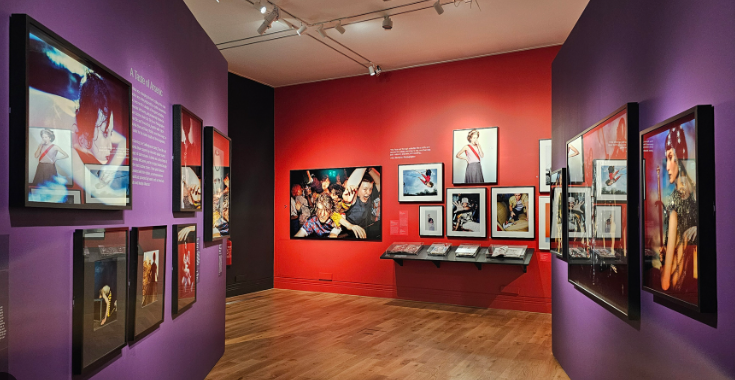
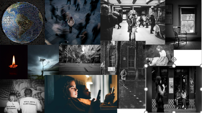
The Face exhibition shows over 80 photographers work that is unique and different and shows how the styles of all there photography differs from each other.

What inspired the Face Magazine ?

The Face a British music, Fashion and culture monthly magazine originally published from 1980 to 2004 and then relaunched again in 2019. The magazine was first launched in May in London by Nick Logan who was a British Journalist and had been editor of New Musical Express and Smash Hits. He is best known for having founded the Face magazine which forged a new “lifestyle” sector in British publishing in the 1980’s and 1990’s.

Union – Ideas

Notes of other ideas:

  • Merging Forms: Bodies, Objects, Transformation, Etc.
  • Mirrored Realities
  • Symbol Objects
  • Shared Dreamscape
  • Union Beyond Time & Space: E.g. Friends or lovers existing in different eras or dimensions yet still reaching for each other & are always reunited.
  • Union of Self from Different Realities
  • Fields
  • Photographer Brooke Shaden
  • Photographer Daria Endresen
  • Photographer Nicolas Bruno
  • Liminal
  • Analog Horror Aesthetic
  • Uncanny
  • Dreamcore
  • Dreams/Nightmares Vs. Reality

Photoshoot 1: Gorey

For this photoshoot, I went to Gorey with my two friends to take photographs of them whilst they were doing various things such as dancing with each other and playing in the park. I wanted to try and capture them in a way that didn’t look staged and so I didn’t give them any instructions on how I wanted them to pose. This allowed for more natural images that really reflected their friendship. Once I had taken all of my images, I then imported them into Lightroom and used a specific system to narrow them down. I began by giving each image either a white flag (if I wanted to use them) or a black flag (if I knew I didn’t want to use them). Next, I used the filter tool to only make my images with white flags visible and then began rating these images on a scale from 1-5 (1 being the worst and 5 being the best). I then began to adjust the exposure, contrast, highlight, shadow, white, black and clarity of each image I had previously given 4 stars or higher.

I then noticed that some of my images had shadows in due to the sun being behind and casting a shadow onto the ground in front of me. In order to fix this, I decided to open up these images into Photoshop and use the remove tool in order to make the shadows disappear seamlessly. I think this makes my images look cleaner and means that the shadow doesn’t take away the focus from my two friends seen in the centre of the image.

These are the final edited images from my photoshoot. Overall, I am happy with how they turned out. Overall, I feel the shoot was successful in capturing my friends in a relaxed, semi natural way. One of the key elements I focused on was ensuring that the photos didn’t feel forced or overly posed, which allowed their personalities to shine through more authentically. Rather than giving specific posing instructions, I let them interact with each other and their environment, which resulted in moments that felt more genuine and candid.

In terms of lighting, I chose to photograph them in a way that allowed the natural light to illuminate their faces and make them the focal point of each shot. The direction of the light was critical in this process because I wanted to avoid harsh shadows and ensure that the subjects were well lit. The sun not only highlighted the details but also helped to create a positive and uplifting tone in the images which reflects the warmth and closeness of their friendship, capturing the essence of who they are as individuals and as a group.

However, next time I photograph my friends I would like to do it in the studio. This is because working outside with unpredictable weather sometimes limits my creative freedom. By working in the studio, I will have more control over the lighting and mood of my images. Additionally, in the studio, I will be able to focus more on each individual friend, exploring their unique personalities through more intimate, personal photographs. I feel that it is essential to understand each of my friends in their own context in order to gain a greater appreciation for their friendship.

Photoshoot Plan – Coco Moore

What am I going to Photograph?

  • Couples
  • street photography
  • lonely chair
  • social media
  • single people
  • crowded space
  • buildings
  • fields
  • candle
  • single flower
  • lonely tree

Who am I going to photograph?

  • couples I know
  • friends
  • strangers on the street

When?

  • this week after school
  • during school
  • Weekend

Where?

  • Town
  • streets
  • coffee shops
  • fields
  • studio

Exact Photoshoots I have in mind.

  • couples in town
  • single person in crowded street
  • single person looking on dating apps
  • single person next to couple on bench
  • couple, one on phone other looking annoyed
  • couple in field
  • street photography
  • lonely tree
  • bad weather

Photoshoot plans for this week.

Wednesday: Go into town, take photos of my friends who are a couple, and have them pose as images similar to inspirational old images of couples, and juxtapose it.

I will use photos like this as inspo:

Thursday: I plan to do another photoshoot in town, but of street photography, of couples around town, stranger living their life, maybe even buildings of things that show what social media is doing to affect our whole society by brainwashing them.

Friday: I will go into the studio, and take photos of objects that are symbolic. Skull, roses, phone, emojis, dating apps,

Saturday: I want more photos of couples looking at other couples on social media, showing one another, being jealous or comparing themselves. I will have a photos of them looking at another couple on their phone, showing their partner, and then replicating what they have seen. then i want to show how messaging can also cause people to be confused by not understanding tone and have a photos of a text where one partner means it in a nice way and the other takes it in a bad way. And jealousy and trust issues, one partner texting someone and the other looking over wondering who they are texting. And more photos of the couple holding hands or cuddling and taking photos of it to post on social media. maybe even a photo of their phone.

This will be part of my editing but I really want to take a photo where its just the couple side by side, and one couple is looking at the text and has an upset face when the other is looking at it happy, but the texts are faintly opaque and edited above them so the viewer of the image can observe, how they are reacting to the text.

Union Mood board – Coco Moore

Photoshoot 2: Studio

I conducted this photoshoot in the studio with two of my friends as I wanted some images that weren’t of siblings and instead use friends as its still a relationship and therefore a union. This was a short shoot and I didn’t get many photos.

These two images were my favourite from the small shoot and I am planning to mount them both together.

Evaluation of photoshoot:

This was my shortest photoshoot as it wasn’t very planned prior to the shoot. I think the few images I got worked well to represent the twos relationship as I have captured them talking, laughing and smiling together which demonstrates their friendship and how they are a union. However, as this was short photoshoot I think it doesn’t make much sense as Alannah and Ethan’s shoots are a much larger part of my project. however I still plan to print two of these images so that my final prints include all my photoshoots.

Research and analysis of other photo books

Introduction:

In order for me to have a guide for my project, I need to research about different books so that I can have a clear image of what I want to do. Doing this, it will help me find the structure or ideas I want to convey in my book and therefore help me produce my book. This will also enable me to have a head start on my book and know exactly what I am doing. So I have looked through 2 books and one magazine, this research will help me immensely with my book and these 2 books and one magazines will be like guide for me when I’m producing and constructing my book.

Book 1: ‘This equals that’ by Jason Fulford and Tamara Shopsin

In this book, I looked at the comparison and contrast within this book. I liked how the authors linked two polar opposite images by things like colours, shapes and shades. This was something that I wanted to take into consideration when producing my book.

Book 2: Hold the line’ by Siegfried Hansen

In this book, I liked the minimal comparison that the author showed in his book. I liked how two pages connected in some way. It was smooth and compact. There was always something that complimented the two images that were side to side. I really like this because the structure of the book was smooth and complimentary. This was something I really wanted to do in my book.

Magazine 3: ‘Love and Rebellion’ by Hautlieu newspapers

Although this magazine is quite all over the place, I really liked the fact that the magazine had black and white images but also coloured images. I also really liked the ‘collage’ theme this magazine had and how some of the page spreads had comparisons. These two factors where factors that I took into consideration before producing my book.

Artist Case Study 2 – David Sims

Mood Board

Who is David Sims ?

David Sims is a renowned British Photographer and director known for constantly pushing the boundaries of fashion photography with his incomparable approach; setting a benchmark for a new generation of photographers. David Sims has exhibited widely, including a solo exhibition at the institution of Contemporary Art, London. His work is held in the permanent collections of the Victoria and Albert Museum in London, suggesting that his work is very treasurable and valuable.

What/Who inspired David Sims ?

David Sims first worked as a Photographers assistant with Robert Erdmann and Norman Watson. He was taken on by a photography agency and his work began to feature in editorial pages of magazines. He has also worked in advertising, creating images for brands. He then started his career in 1985, shooting for i-D after having assisted the two photographers. Sims really started his career in the fashion photography industry when he was called upon to shoot for Calvin Klein and CK’s 1993 campaigns featuring Kate Moss.

Image Analysis

This is one of the Loewe photos that David Sims took as part of the 2022 campaign with Anthea Hamilton. He does many photo shoots for brands including Prada, Gucci, Loewe and fashion magazines like Vogue and Bazar so his photography is well known and recognisable. The colour in this image is very bold and powerful and makes the model, centre of attention as soon as you look at the photo due to her being sat on a bright orange pumpkin. The lighting in this photo is directly in front of the model and the pumpkin so that her face is bright and luminous for the photo, the light has also been strategically placed so that it adds highlights to the pumpkin which makes the ridges more defined almost acting as leading lines towards the model as the main focal point of the image. The texture in this image is very clear and crisp and allows the viewer of the image to see everything in detail from the grass in the background to every part of the pumpkin in the foreground. However the background is slightly blurred which makes the Loewe Brand stand out really clearly and look very bold and contrasts against the slight blur making it very known what brand is being advertised. The overall concept of this image is very appealing and inviting as a viewer for the brand because of the bright orange that draws your eye in to the image and its unique individual idea of having the models on pumpkins which is interesting and intriguing to the viewer.

Why I’m using David Sims?

I’m using David Sims as my second artist case study because he takes advertising images for well known, luxury fashion brands that are located outside rather than in a studio. My images are going to be taken at historical locations around Jersey and I’m going to do a fashion shoot at every location in different styles of clothing, because David Sims is a fashion photographer and does most of his photo shoots outside he works perfectly for one of my artist case studies.

UNION – Mind Map and Mood Board

Mood Board

Mind Map

Ideas

My ideas are to take fashion shoots with outfits from different eras to show the many different styles I’m then going to take these fashion shoots at different locations on the island that are known places for tourists in Jersey such as La Hogue Bie and Corbiere lighthouse, I’m also going to go to the white house down at St Ouens and Gorey Castle where I am going to take these photos inside the castle. I might take clothes for this shoot that are a very old style to match the old interior of the castle or I might do modern clothes to contrast against the old building as well.

Isms –

Futurism photo images

Futurism

Its an artistic movement that strongly rejected traditional forms and embraced the energy and dynamism of modern technology. Futurism is an Italian movement , launched with the publication of Filippo Tommaso Marinetti’s Le Futurism in a French newspaper in 1909. It was characterised by its aggressive celebration of modern technology, speed and city life.

Types of Futurism

There are many different types of Futurism such as speed, energy, aggression, force, lines, crowds and new technology. These were things that were heavily celebrated as they showed power and aggression.

For example heavy metal and lines showed aggressive power and ferocity which is what they wanted because it made them look dominant but also influential. Images such as scaffolding and building material suggest this aggressive power.

New Technology

Futurism in New Technology is a forward thinking ideology that embraces change, innovation and progress. It seeks to influence the future by envisioning bold, imaginative and often unconventional ideas. Futurists believe in the transformative power of technology to create a better future for humanity.

Speed

Futurists were so inspired by speed because the car was one of the most iconic futurist symbols of vitality and world changing technology advancement. The futurists created a myth of a new world order around technology and speed.

Energy

These are the different types of Futurism Photography and they are all very powerful, strong forms of photography. These images all show strength and aggression which is what Futurism is all about.