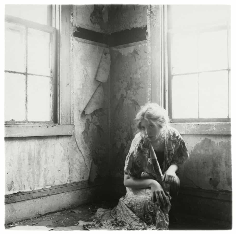
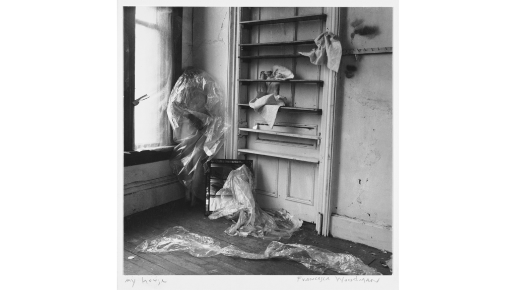
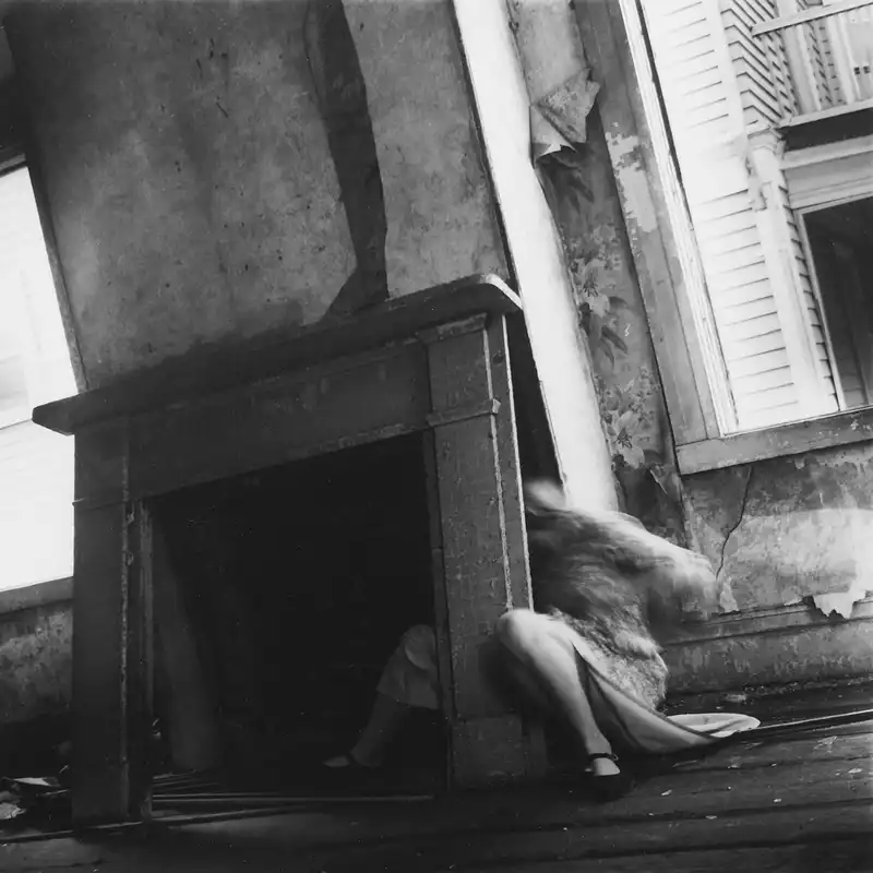
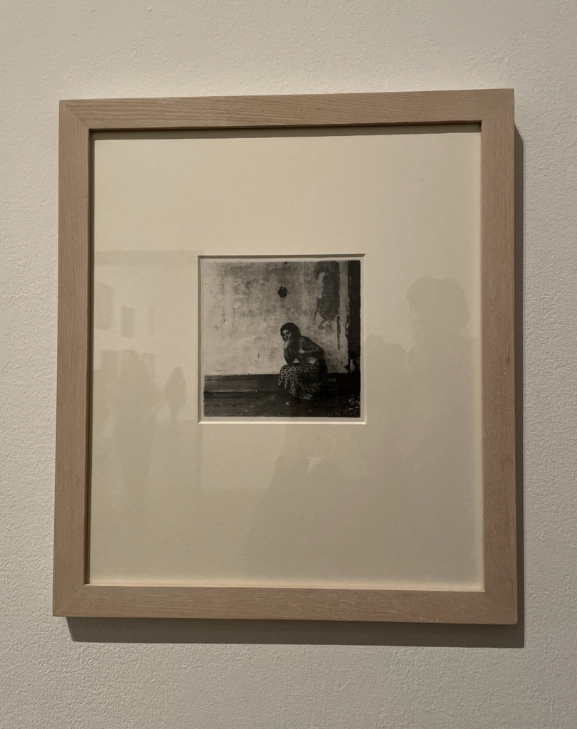
Francesca Woodman was an American photographer who was surrounded by art from a young age – her father was a painter and her mother was a ceramicist. When she was 13, Woodman was given the camera which she used to create her first works. The archive of her work features over 800 black and white photographic prints, a large portion of these being self-portraits, each photograph carefully considered and choreographed in empty studio spaces and abandoned buildings. She sometimes would utilise pieces of furniture as props, along with using wallpaper and shadows to conceal herself. Woodman has stated, ‘I show you what you do not see – the body’s inner force. You cannot see me from where I look at myself.’
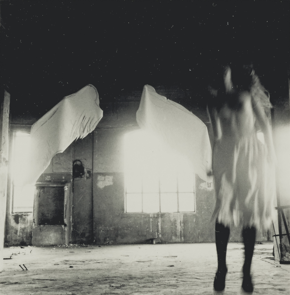
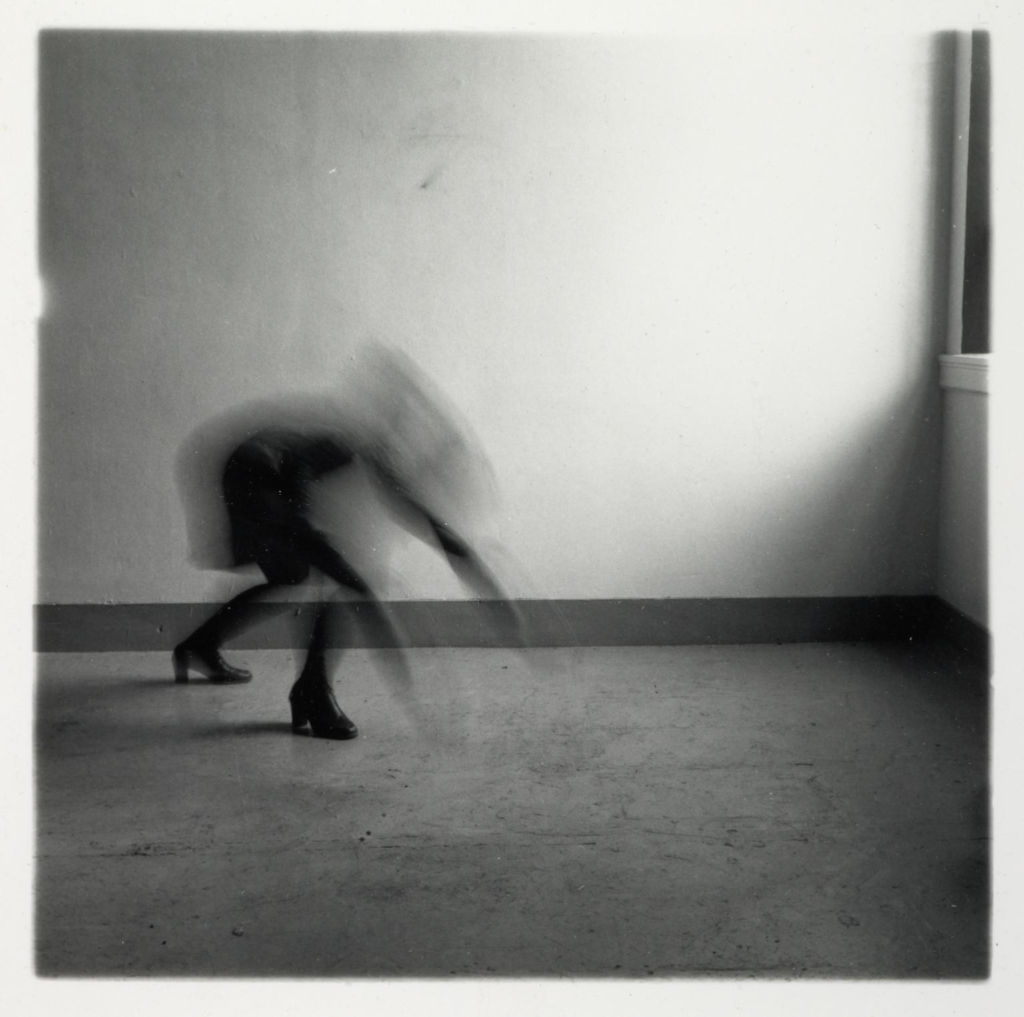
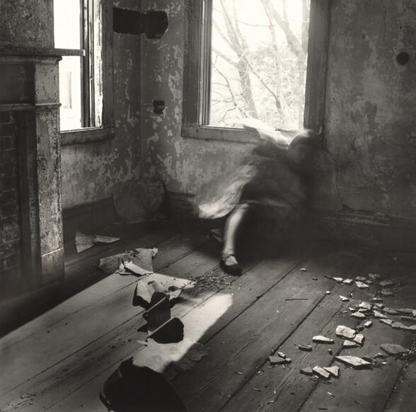
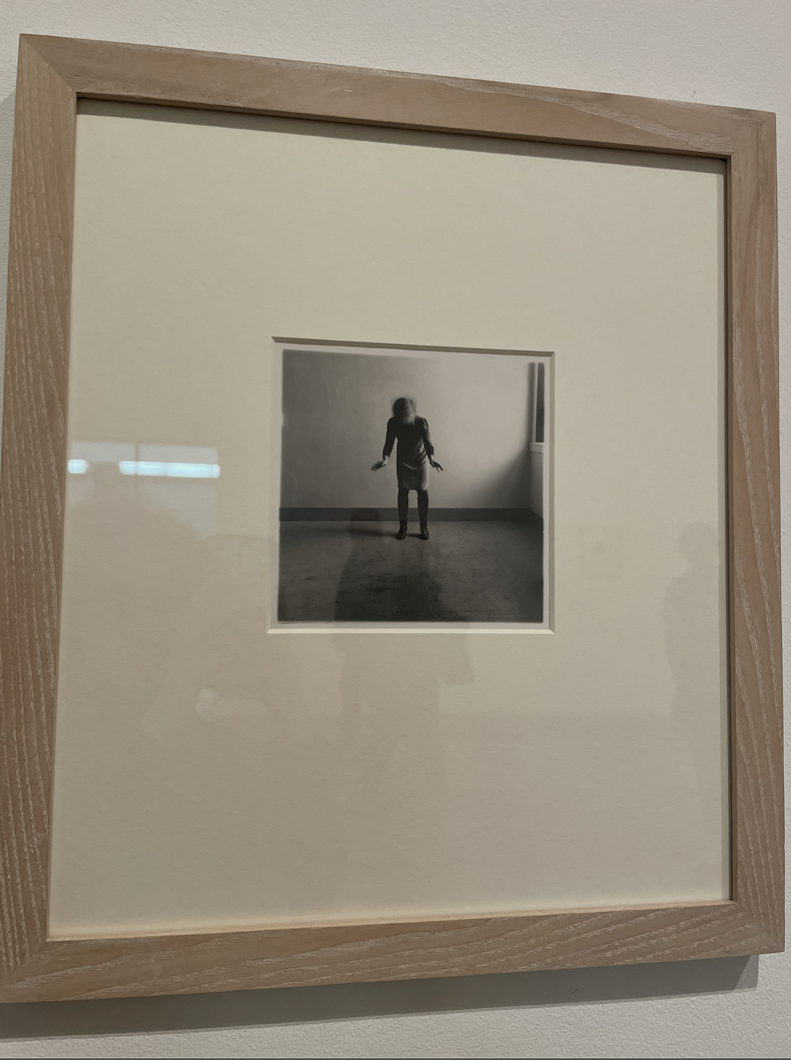
Francesca Woodman studied at Rhode Island School of design, where she developed her photographic style, often working in empty rooms, she stated, ‘I’m interested in the relationships that people have with space’. Woodman experimented with longer exposures, the dichotomy of her movements ranging from subtle to more drastic blurring of her figure. These were created by simple gestures such as shaking her head, creating mysterious and blurred proportions that contrast with the sharpness of surrounding details.
While studying in Rome, Woodman lived near a bookshop which specialised in surrealism, inspiring her to research artists associated with the movement. She embraced some of the characteristics of surrealism, such as dream-like compositions and chance.
Woodman’s use of Gothic tropes as a commentary on the photograph as a place of subjective confinement can be seen throughout her work. A critical version of Woodman’s work is Abigail Solomon-Godeau’s association of the House series (1976), ‘In these photographs the woman’s body is practically devoured by the house … Swallowed by the fireplace, layered over by the wallpaper, effaced, occulted, Woodman presents herself as the living sacrifice to the domus.’
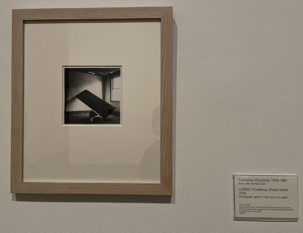
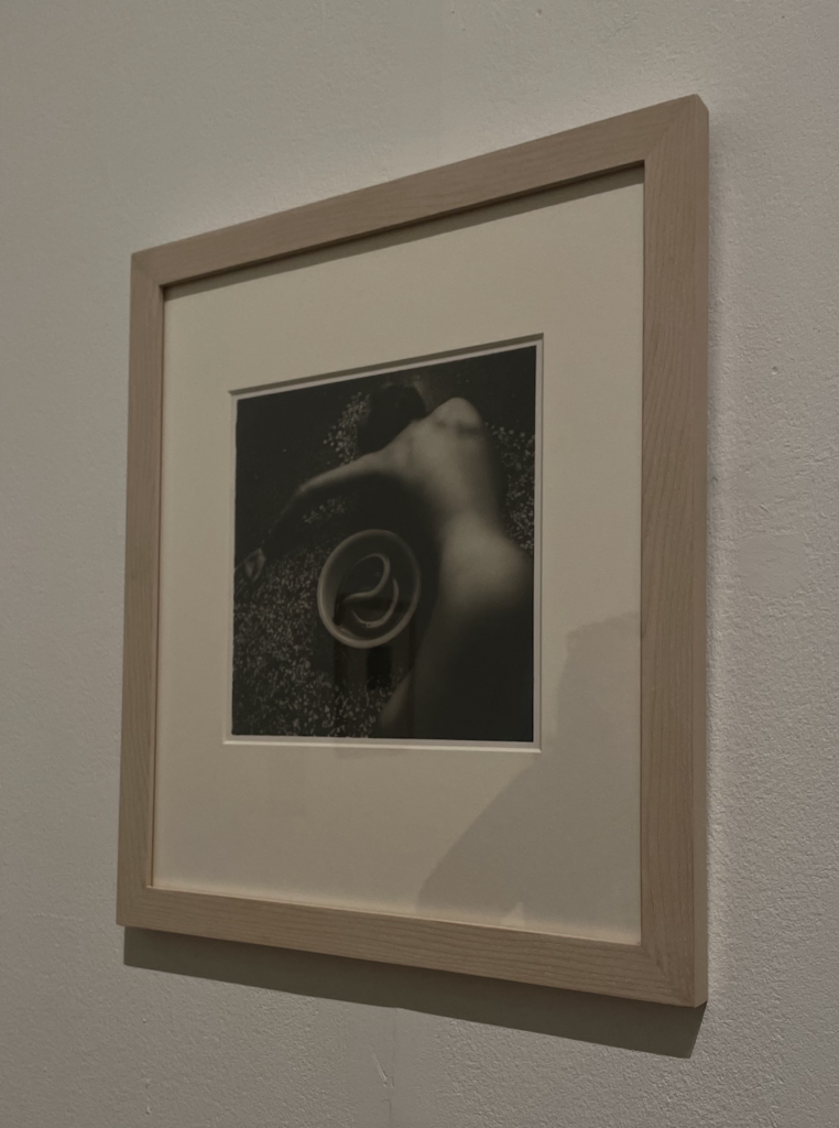
A look at Francesca Woodman’s exhibited work:
I had a look at Francesca Woodman’s prints at the Tate Modern, and I was specifically interested in the way she uses her surroundings as props to conceal herself and the movement in her photography, which I feel invites the viewer to question the way we see ourselves and are perceived by others.
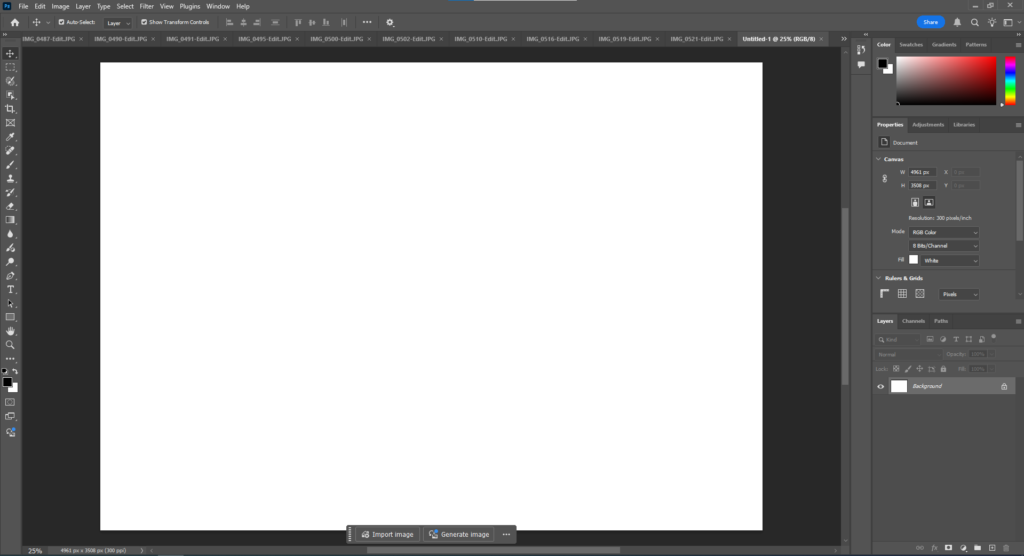
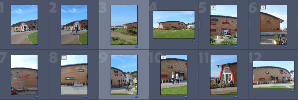
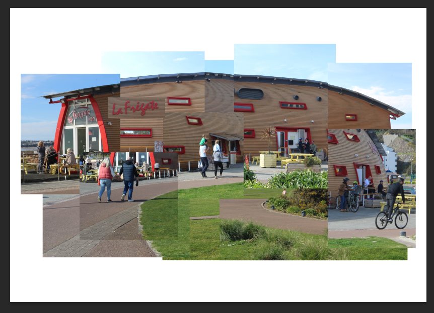
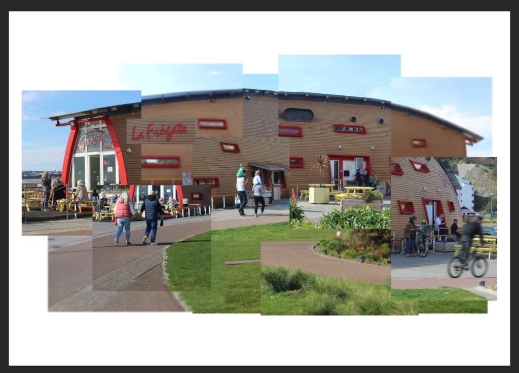
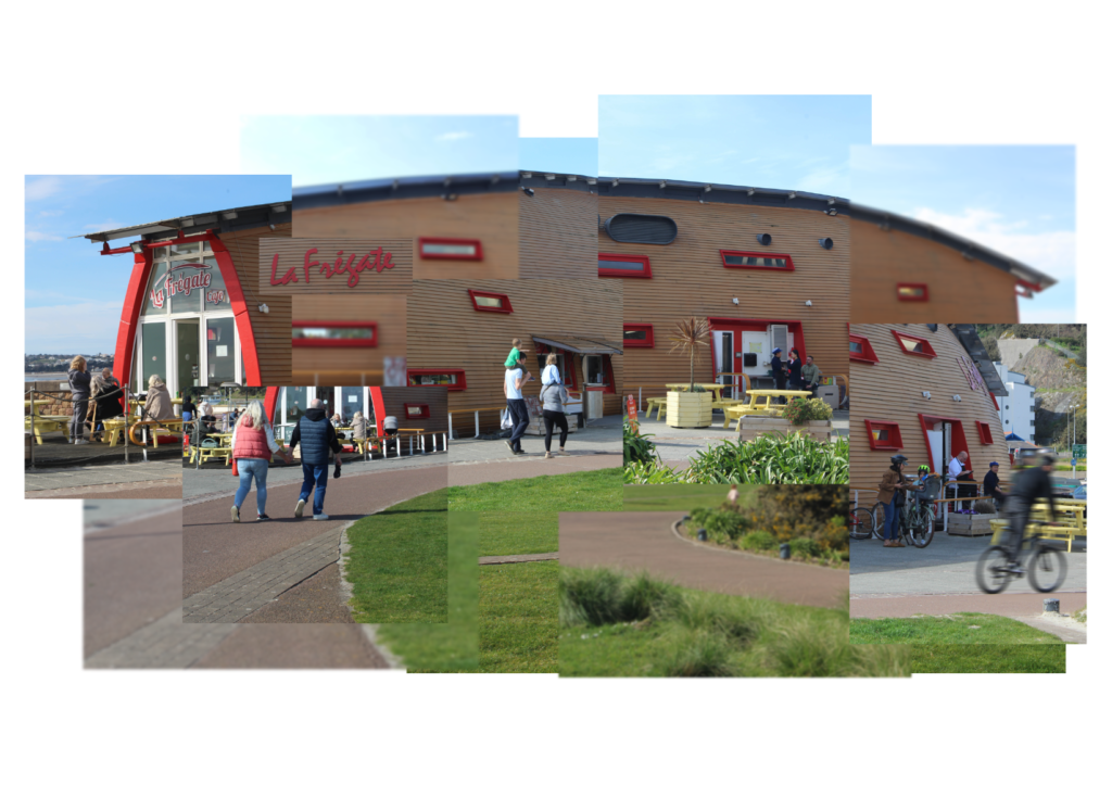
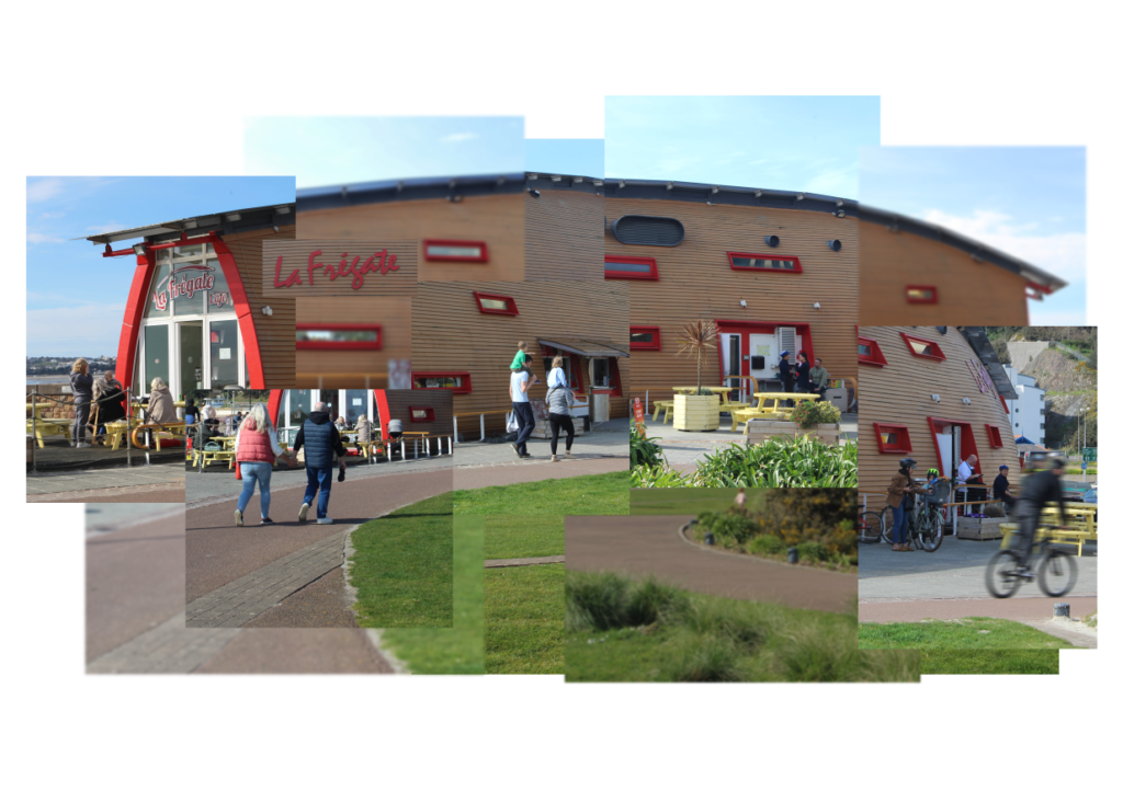
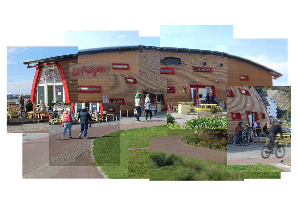
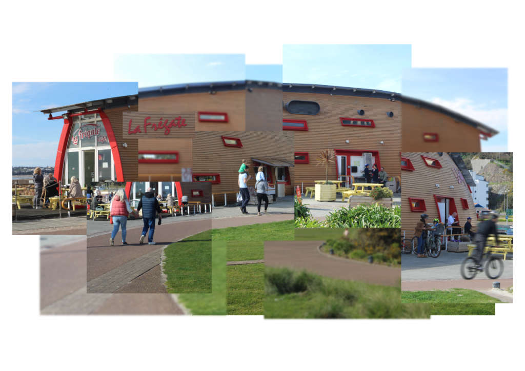
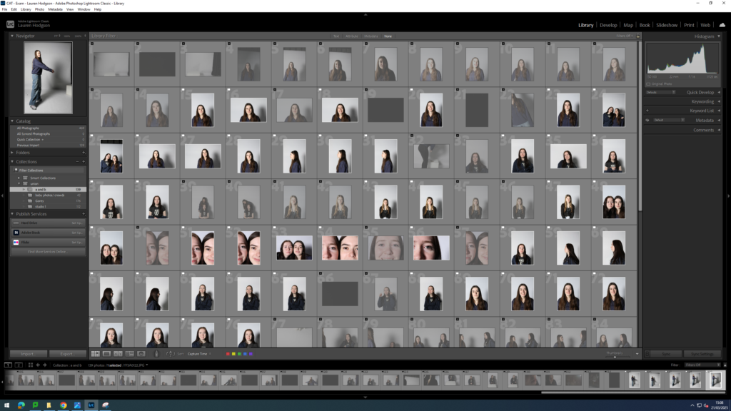
I started off by creating a new document on Photoshop, an A3 landscape sheet. I had also opened all the images in Photoshop which I set as green in Lightroom.
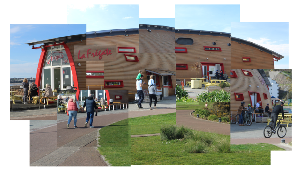
I then made a quick mock up of how I would like my joiner to look before any photos have been edited. I made this using Adobe PowerPoint.
For each of the images I used for this mock up, I colour coded them as blue in Lightroom Classic so that it will make my process easier.
I then cropped each of the images in Lightroom to be the same as how they were on the PowerPoint slide.
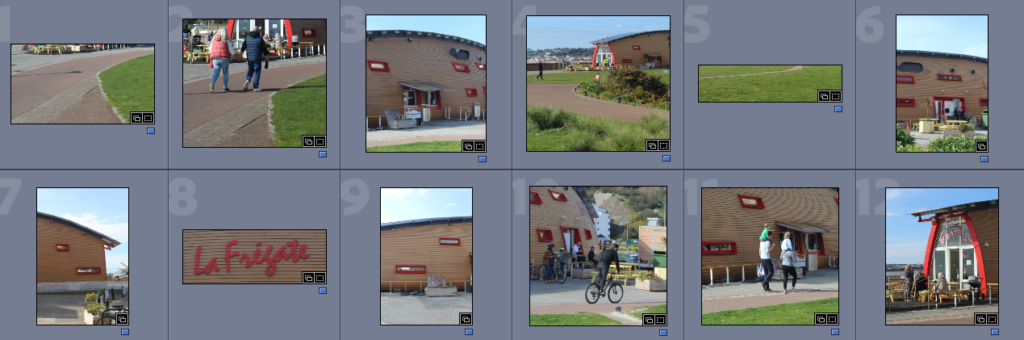
I then opened these images in Photoshop and organised them like how I did on PowerPoint.
After making sure I liked how the images were laid out, I began to individually edit each of the images. I also added a gaussian blur to some of the images and a motion blur to the guy on the bicycle.
I then began to alter this even more until I was happy with it.
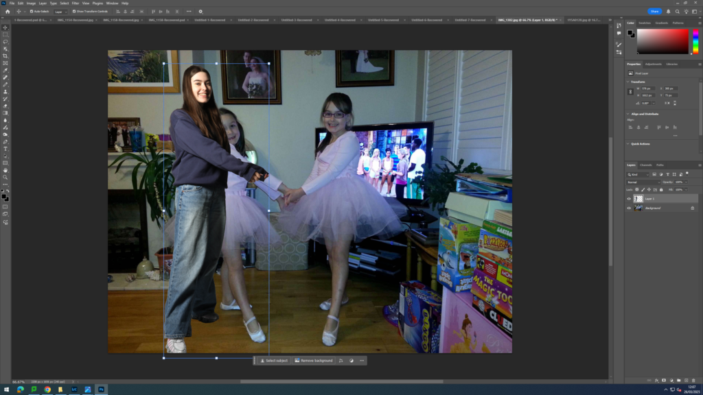
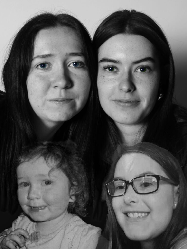
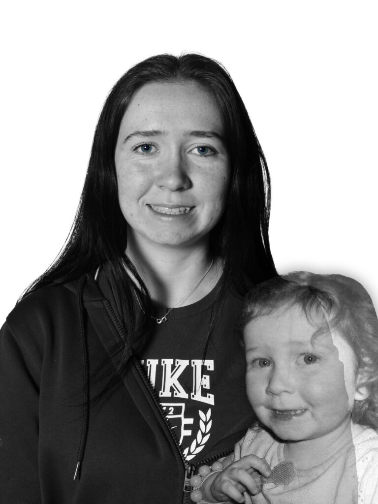
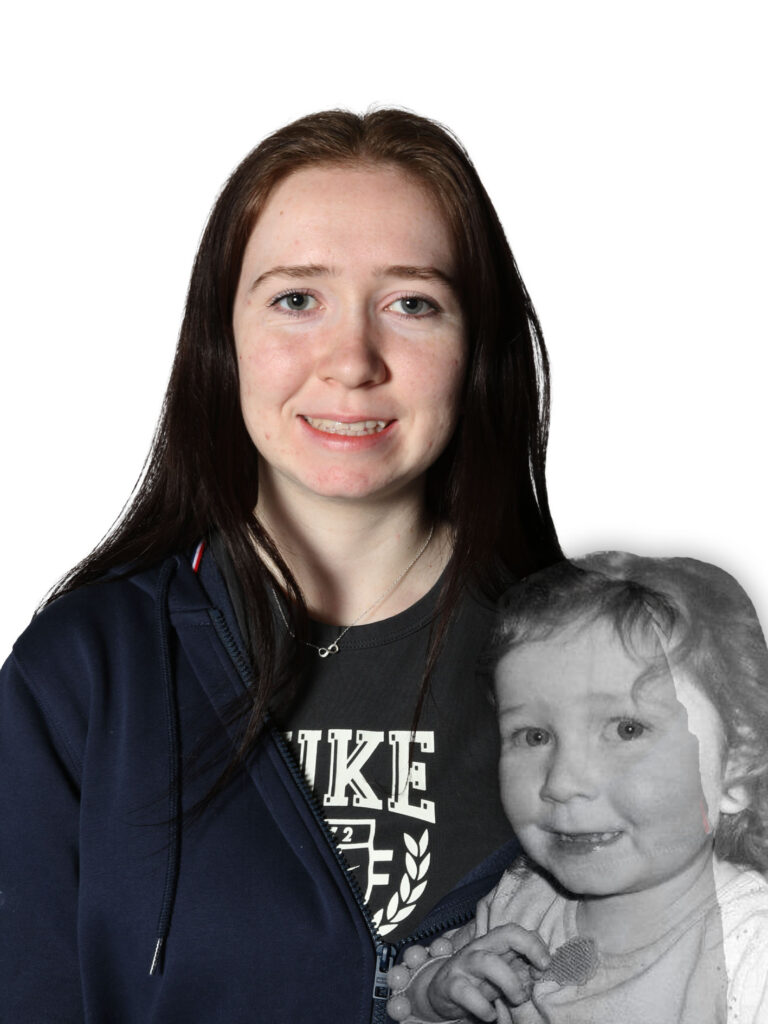
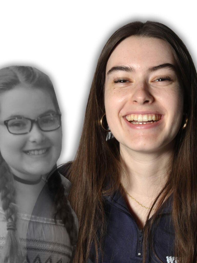
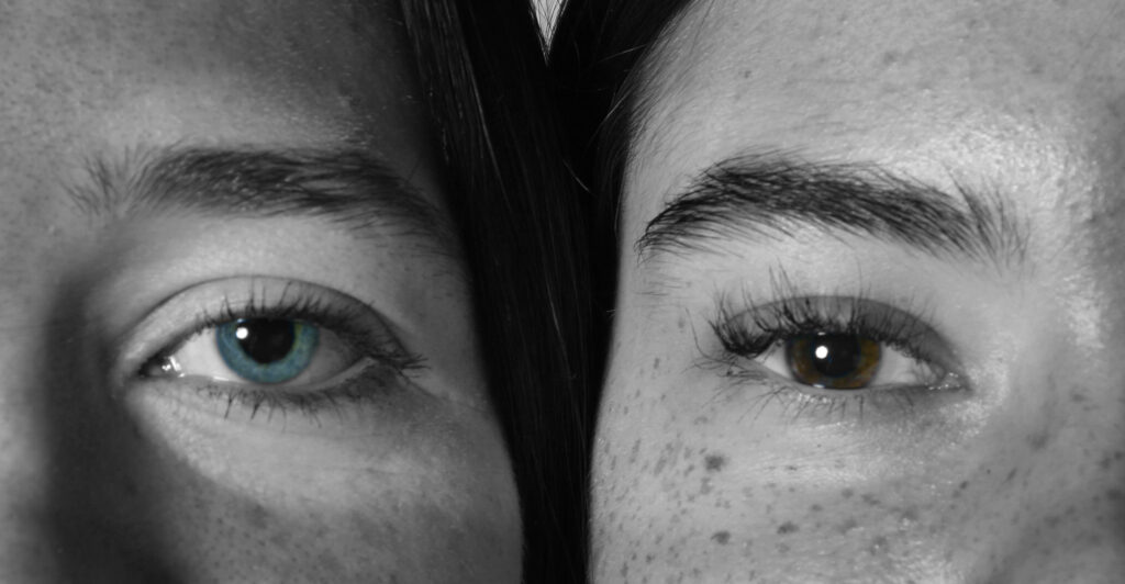
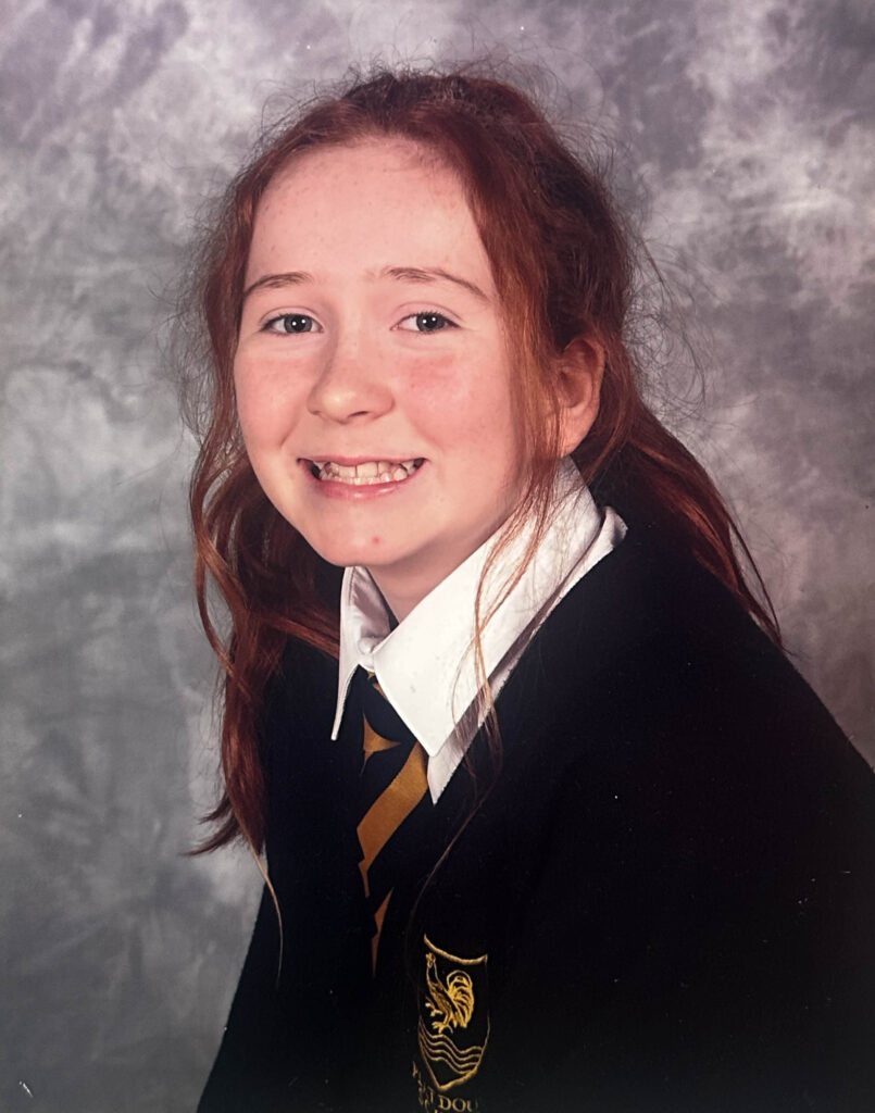
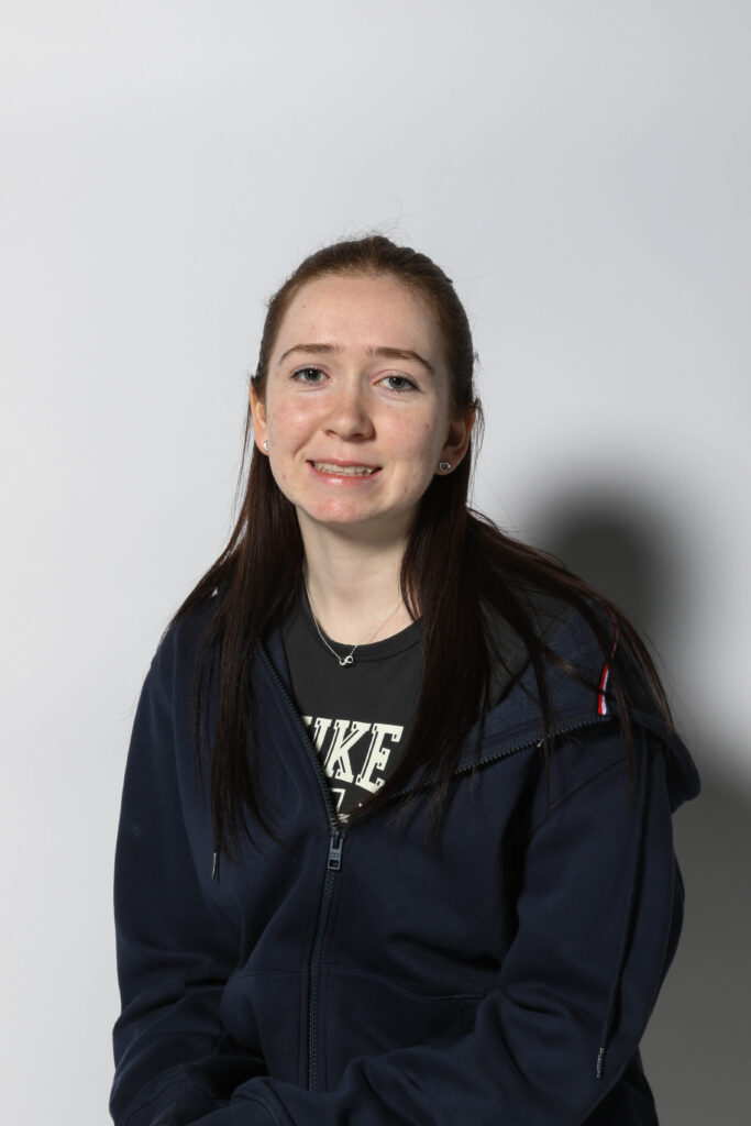
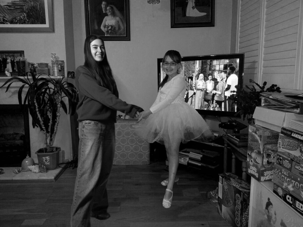
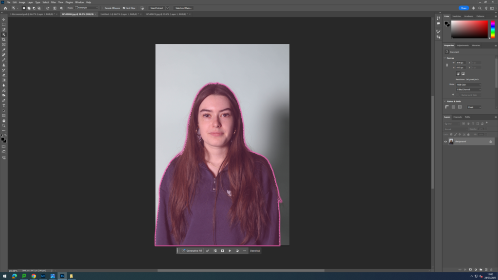
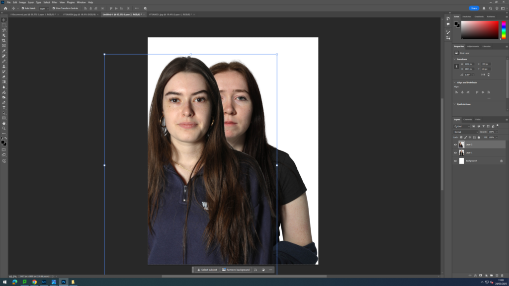
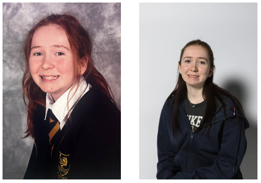
For this photoshoot, I went into the studio with my two friends and took images of them individually and together. I did this as I wanted to explore who they both are as individuals and capture their personalities and how although they may differ in this sense, they still are able to be close friends. I positioned in different ways like: getting them to face to the side, straight forwards, hugging each other and placing their heads next to one another. I then also got my friends to recreate some of their baby images. For example, I got one of my friends to recreate her primary school photographs and got her to make her hair like seen in the older images. I decided to do this as I wanted to create a side by side image showing how they have both changed over time. Additionally, I also got one of my friends to recreate an image of her and her sister dancing together when they were younger. The idea behind this was to cut out the image of her recreating the pose now and add it into the old image to create a photograph that looks like she’s dancing with her younger self. The main focus of this photoshoot was to create a visual relationship between their younger self and now.
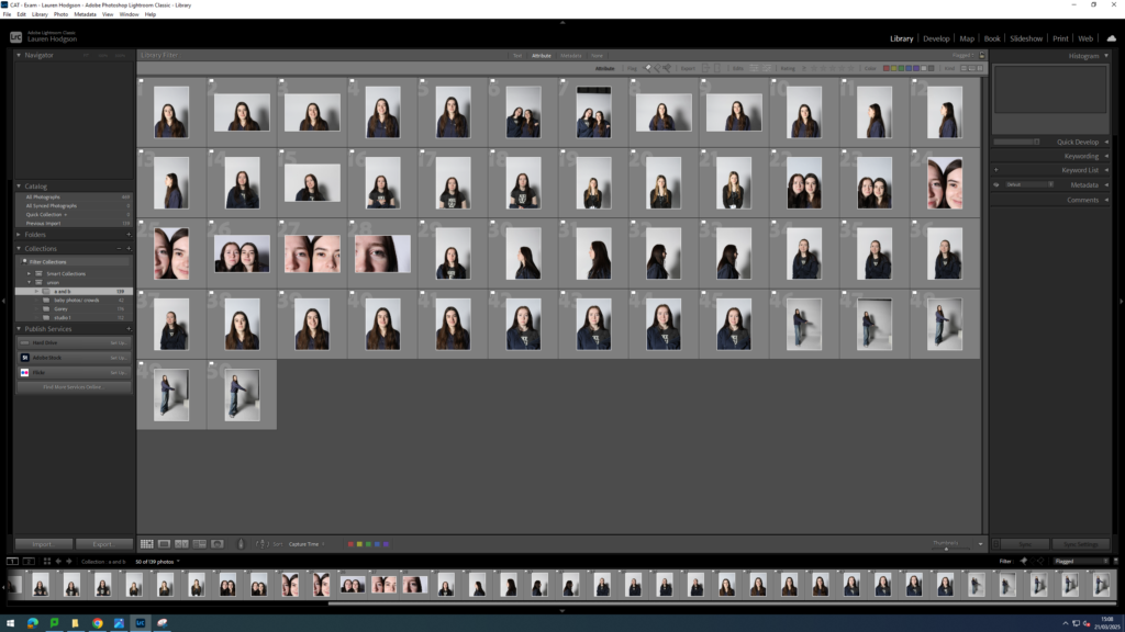
Once I had completed this photoshoot, I then imported my images into Lightroom and began narrowing them down using the same system I normally do. This consists of me first giving each a white flag or black flag (white for want to use and black for not going to use). Next, I turned on the filter setting and changed it to flagged so I could only see the images assigned with a white flag. I then gave all of these images a rating out of 5 (5 being the best and 1 being the worst). I decided to edit the exposure, contrast, white balance etc of the images I gave a 4+ star rating to.
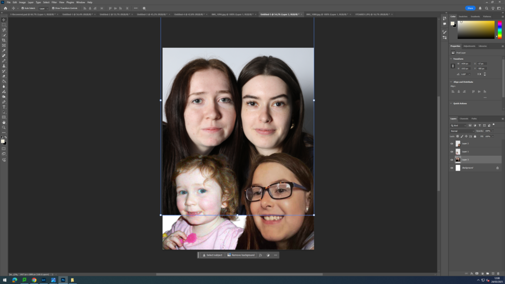
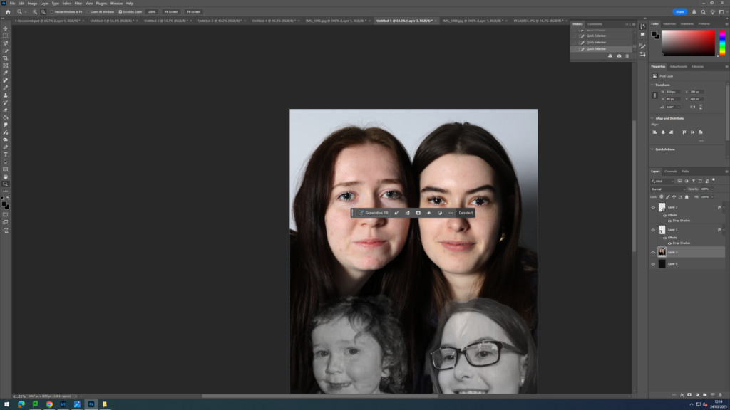
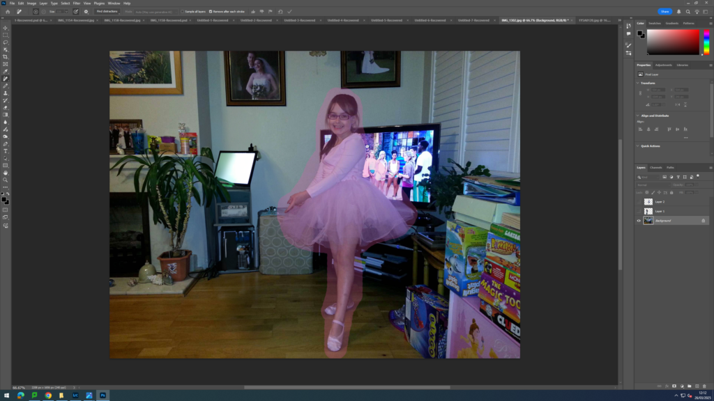
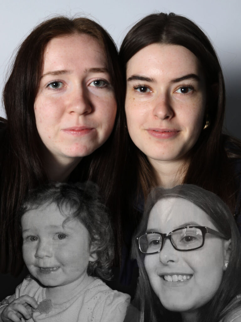
I then further experimented with different manipulation techniques by opening up my images on photoshop and creating images where I incorporated photographs of my friends now and when they were younger all into one image. I then made these images of my friends when they were younger into black and white and lowered the opacity of them to convey the idea that these are their past selves and creating a comparison of how much they’ve grown individually and together.
I also used the quick selection tool to drag a cut out I had made of my friend recreating a dance pose she was doing in an old photograph from her childhood to make it look like she is dancing with her younger self.
Final images:
These are my favourite final images I created when experimenting with different tools and ideas on photoshop. I think this photoshoot was successful in portraying the journey they have both gone through as people as they have evolved from small children to adults. I also liked this photoshoot as it allowed me to have a lot of creative freedom and turn these once boring portraits into something more unique and challenging.
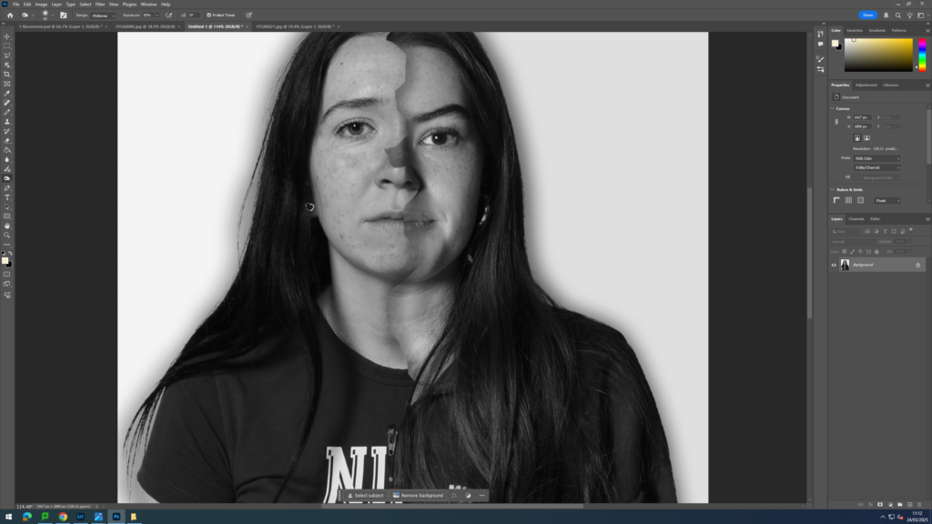
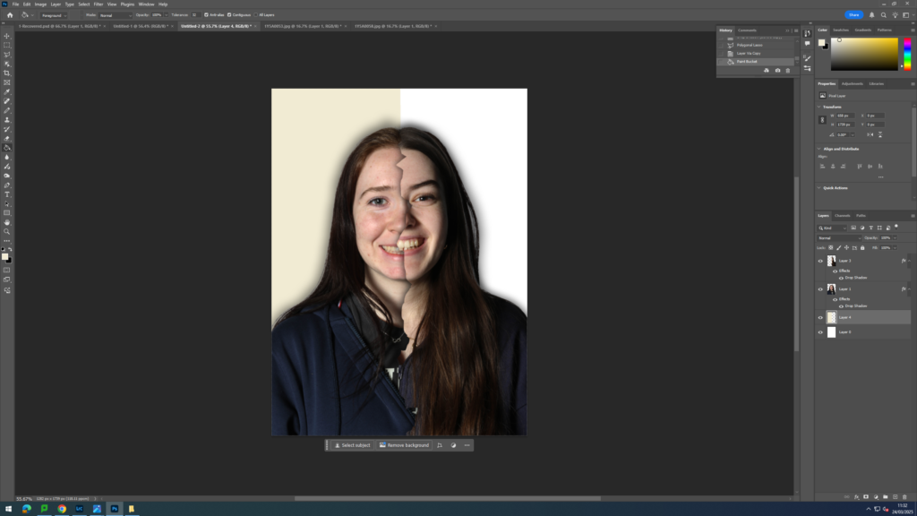
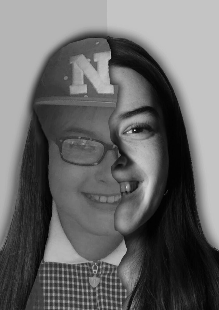
Bobby Neel Adams inspired:
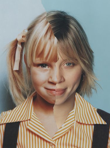
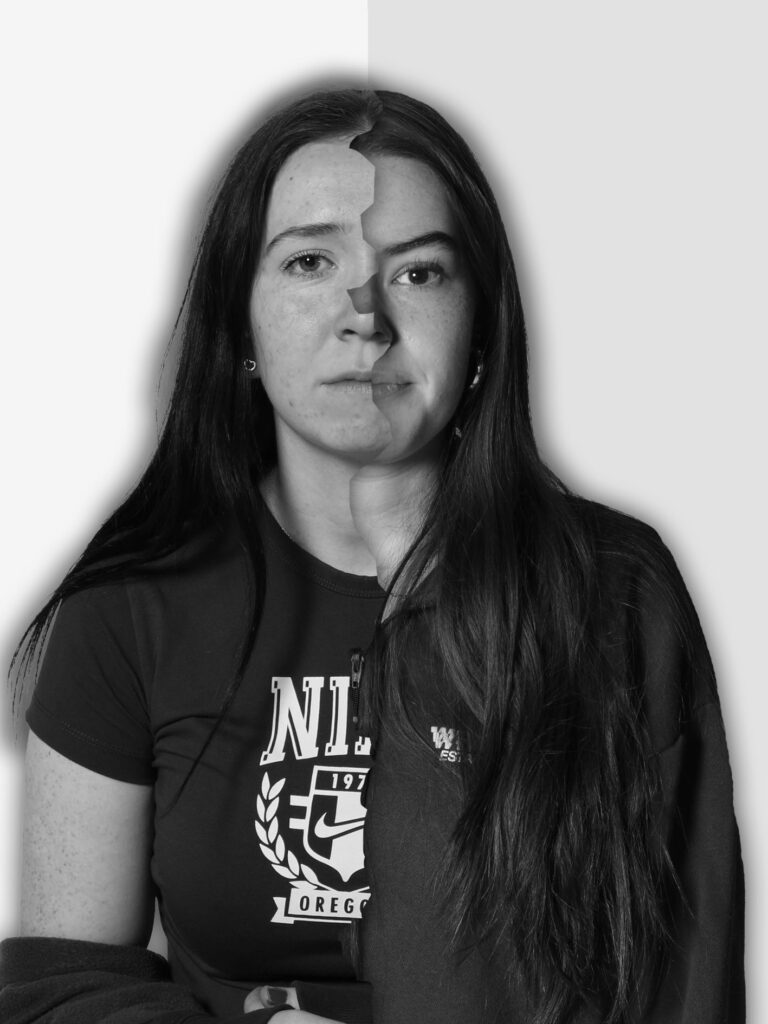
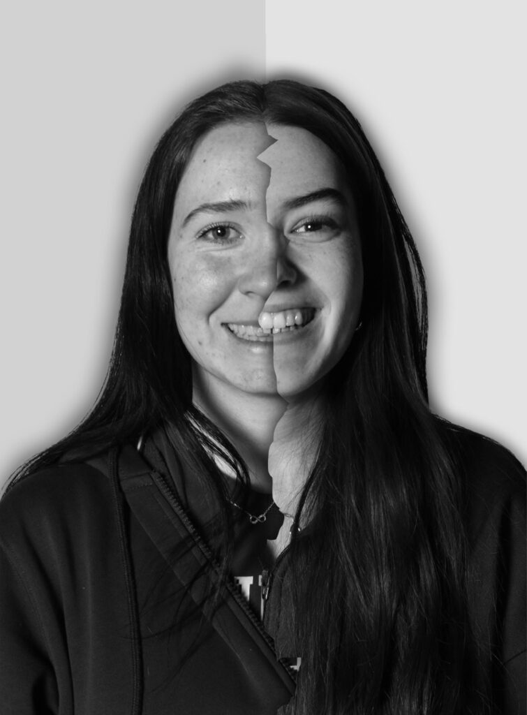
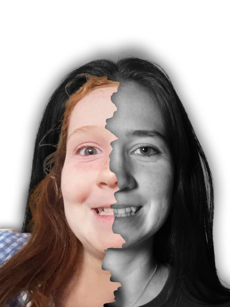
I then decided to recreate the work of Bobby Neel Adams using these same studio portraits and images of my friends as children that I had previously taken. In order to replicate his work, I first began by opening up the two different images: one of my friend now and one of her as a child. I then used the quick selection tool to cut out only them from the images. Then, I dragged both of these cut outs onto a plain piece of A4 paper. Next, I used the magnetic lasso tool to make a rip like shape down the centre of the image and brought this around the studio image. I then pressed layer via copy and hid the layer that had the full studio image in. This made it so that I now had a split image: showing one half of my friend when she was younger and one half where she is older. I then added a drop shadow to both of the cut outs. This created depth in my image and made the rip down the centre more pronounced. I also decided to split the background in half and give the baby image side a more yellow toned background to create the illusion of the image being vintage and old. After I had done this for both of my friends separately, I then decided to create my own version of his concept by adding half of one friends face and half of my other friends face together.
This is the image by Bobby Neel Adams that inspired my idea
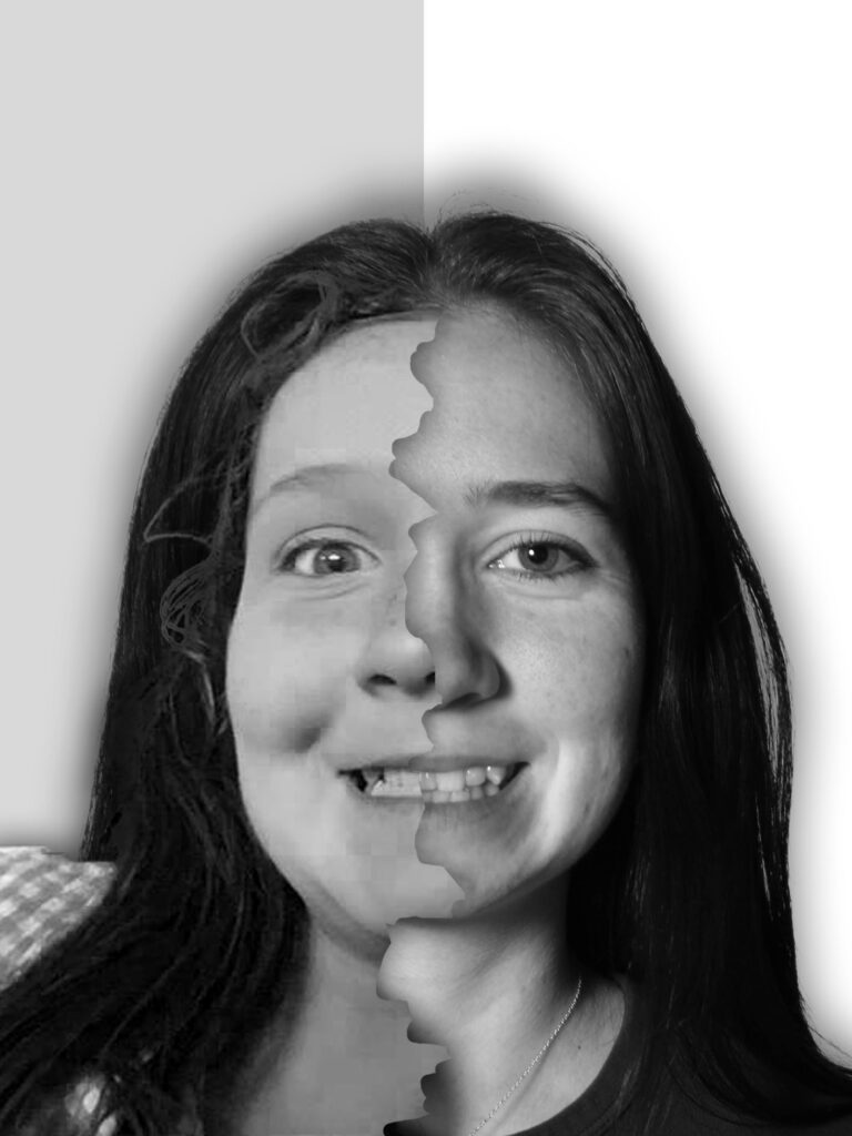
Final images:
Overall, I think I managed to successfully recreate the work of Bobby Neel Adam’s in a way that’s explores the friendship between my two friends. By combining younger versions of my friends with their current selves, it creates a sense of nostalgia to my images while also highlighting how they’ve grown/ evolved over the years. I think it was crucial to highlight how although they have changed a lot since they were younger, their friendship has remained strong and consistent. It also shows how strong friendships can endure all physical and personal transformations. Additionally, I also like how I adapted him work and made it more personal to my work by combining two different people together instead of just one person at different ages. By adding my two friends together, you can start to see similarities between them (as people often become a product of who they hang out with) but you can also appreciate the differences between them. I experimented with making some of my images in colour and some in black and white as his work often varies in this sense. However, I prefer the images in black and white as it enabled me to blend the two different faces together more smoothly as in colour, the difference in lighting was more prominent and made the final image look a lot less seamless and smooth. One improvement I would make to this photoshoot is getting my friends to recreate the exact same faces they were pulling in their childhood photographs to make the link between the two more smooth and clear. This would also mean that my work more closely replicates Bobby Neel Adam’s’ work as he gets his subjects to act out the poses they were pulling in their childhood photographs which leads to an overall better final image.
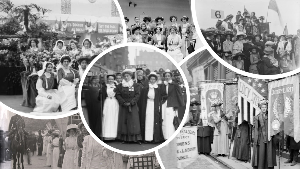
Christina worked from the 1903-39 under the professional name Mrs Albert Broom, and was assisted throughout her career by her daughter Winifred. Broom documented topics including the suffrage movement and military life, and was official photographer to the household brigade. Her photographs regularly appeared in publications including The Tatler, The Sphere, and The Illustrated London News, and were self-published as picture postcards during the height of this industry. A selection of Broom’s work was exhibited at the Gallery in the 1994 exhibition Edwardian Women Photographers. Many of her suffragette subjects are also represented in the collection of the Museum of London, which is planning a retrospective of Broom’s work for autumn 2015.
Born in Chelsea in 1860, Broom took up photography while living in Streatham in the early 1900s as a way to make money for her family after her husband injured himself and several previous business ventures failed.
She started by selling photographs of Buckingham Palace as postcards and later became the country’s first female press photographer, notably photographing soldiers heading to fight in World War One and the Suffragette movement.
Streatham Society secretary Mark Bery organised the talk, and believes Broom is a fascinating figure in Streatham’s history.
He said: “Christina is one of many famous well-known former residents of the area. She is of particular interest as she was a female photographer at a time when the profession was dominated by men.
“The talk will highlight how Christina managed to break into the male dominated world of photography and cover the people and events depicted in her photographs.”
Broom was undoubtedly a pioneer but many believe she does not get the recognition she deserves.
Art historian PL Henderson, who holds a particular interest in women’s art and photography, believes this is due to sexism present within the arts.
She said: “I believe Christina Broom was one of the most significant photographers of her era and indeed of the 20th century itself.
“As a woman she was a pioneer in the field and as a photographer she was remarkable in her ability to focus on subjects of particular relevance. Her body of work is invaluable and I don’t believe she has been acknowledged enough.
“The main reason is that the recording of history has not served women in many areas of the arts well. Women were often labelled as amateurs despite their obvious talents and even success.”
The talk, to be held on March 29, will largely focus on her suffragette photography, which the Museum of London describes as “some of the best photographs” of the campaign for votes for women.
Henderson said: “I think because Broom was sympathetic to the cause of the suffragettes and as a woman this enabled her greater access to the females involved, the protests and associated events.
“I’m not sure anyone else could have documented the movement so intensely and insightfully. Broom’s work is definitely hugely significant as the visual material she created uncovers not only the movers and shakers of the movement but also the range of happenings surrounding the suffrage issues as the true social-political documentary and press photographer she was.”
Anna Sparham, a former curator of photography at the Museum of London and writer of Soldiers and Suffragettes: The Photography of Christina Broom, believes Broom’s significance is remarkable considering her background.
She said: “Her work overall managed to incorporate topographical street photography, portraiture, incredibly important news events over the course of the Great War, the Suffrage campaign, Royal deaths and coronations and society events in south west London, in particular, such as the annual boat race, which she photographed for over 30 years.
PICTURE PERFECT: Broom’s photography is considered by many as the most important of the suffragette movement (Source: Museum of London/Christina Broom collection)
“She had no formal training or a privileged network. She carved out a role within the profession, teaching herself how to photograph, through sheer determination and skill, paving the way for other women to follow.
“Where, who and how she photographed leaves an important legacy for British photography.”
The talk will be delivered by Beverley Cook, curator of social history at the Museum of London, and Sparham believes it will provide invaluable insight into Broom’s life and work.
She said: “I worked alongside Beverley for over 15 years, and I know she will deliver an excellent, exceptionally well-researched talk. As an expert curator on the suffrage movement as a whole, Beverley will brilliantly aid people to place these images of the campaign in context.
“It is vital to keep her work in the eye of new generations, continuing to write about her and placing her in context with her contemporaries, both men and women, and perhaps those she inspired. Or maybe even continues to inspire.”
Henderson added: “I think raising the profile of Broom in this way is fantastic. It’s not only educational but fascinating to discover and reclaim previously undervalued amazingly creative people and realise the extent of their work and talents.
“It can only benefit and enrich all of us and Broom certainly deserves our attention.”
You can find out more information about Beverley Cook’s virtual talk for the Streatham Society here.
Featured image credit: Museum of London/Christina Broom Collection
I think this photographer work well to in relation to my project as the theme of feminism and the suffragette movement is really prominent.
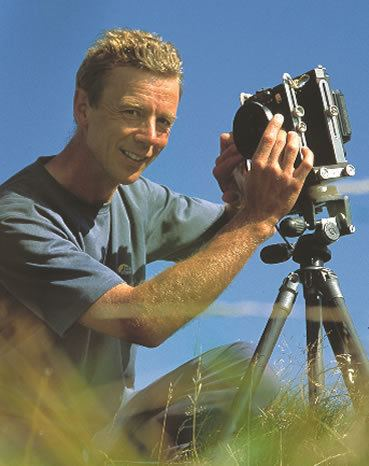
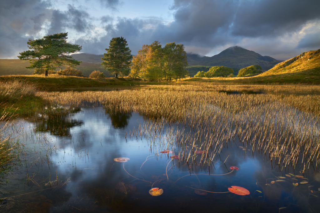
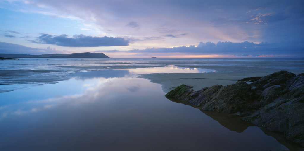
Joe Cornish is a British Photographer known for his beautiful landscape photos which he takes with his large format camera.
Born in Devon UK, Joe studied Fine art at the university of Reading. After his degree he moved to America to train to be a photographer’s assistant. After that in 1982 he moved to London and became a freelance assistant but shorty after he ended up becoming a commercial photographer.
Joe’s love and passion for nature began in 1990 when he made the photographs for the book ‘In search of Neptune’ by Charlie Pye-Smith which was created for the national trust in celebration of their coastline 25 years after they managed to successfully acquire over 900 miles of English coastline to preserve and look after. Charlie Pye-Smith described this as “What would have been lost were it not for the Trust does not bear thinking about.” This was really where Joe’s passion for nature and natural landscapes began as after working on the book for the national trust he continued to do freelance work for them. Three years after the book he moved to North Yorkshire by the moors where he has photographing the landscape around the moors for over 20 years.
Joe Cornish sees his work as a reflection for the search of beauty in nature and in landscape and doesn’t view his work as creative, rather as himself being determined and his love for nature. “Nature is far more curious, incidental, intuitive, organic, asymmetrical, inventive, extravagant, unpredictable and experimental than I could ever be. All I need to do is truly pay attention to it with my whole being.”
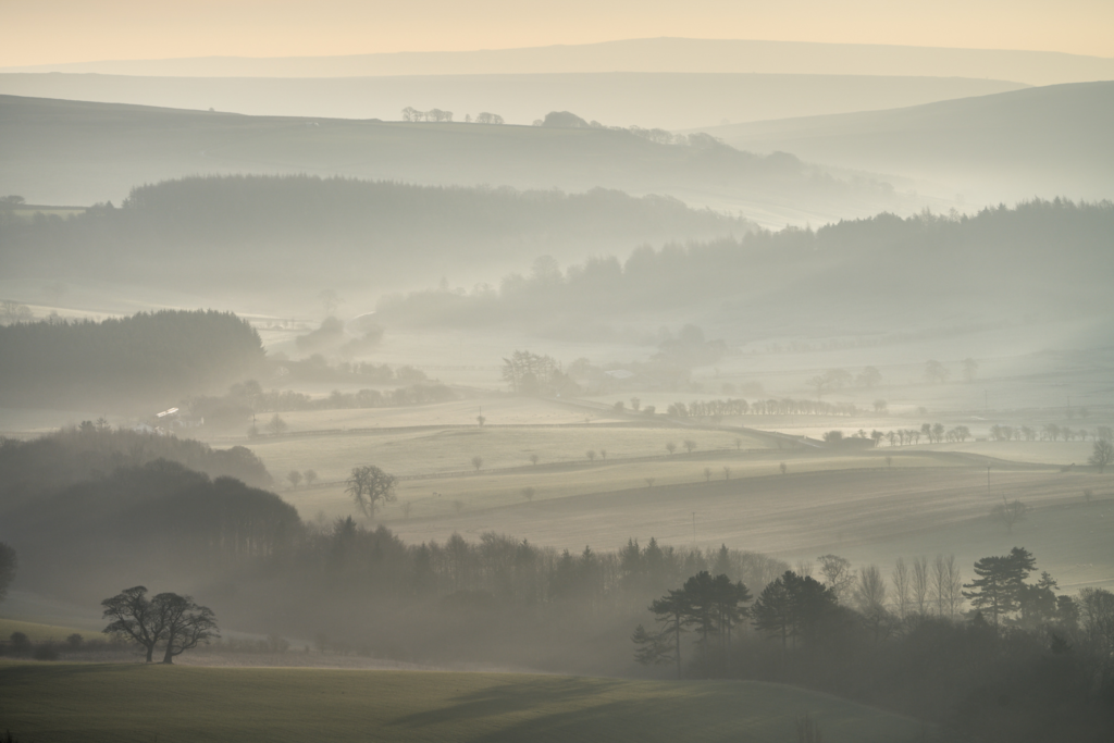
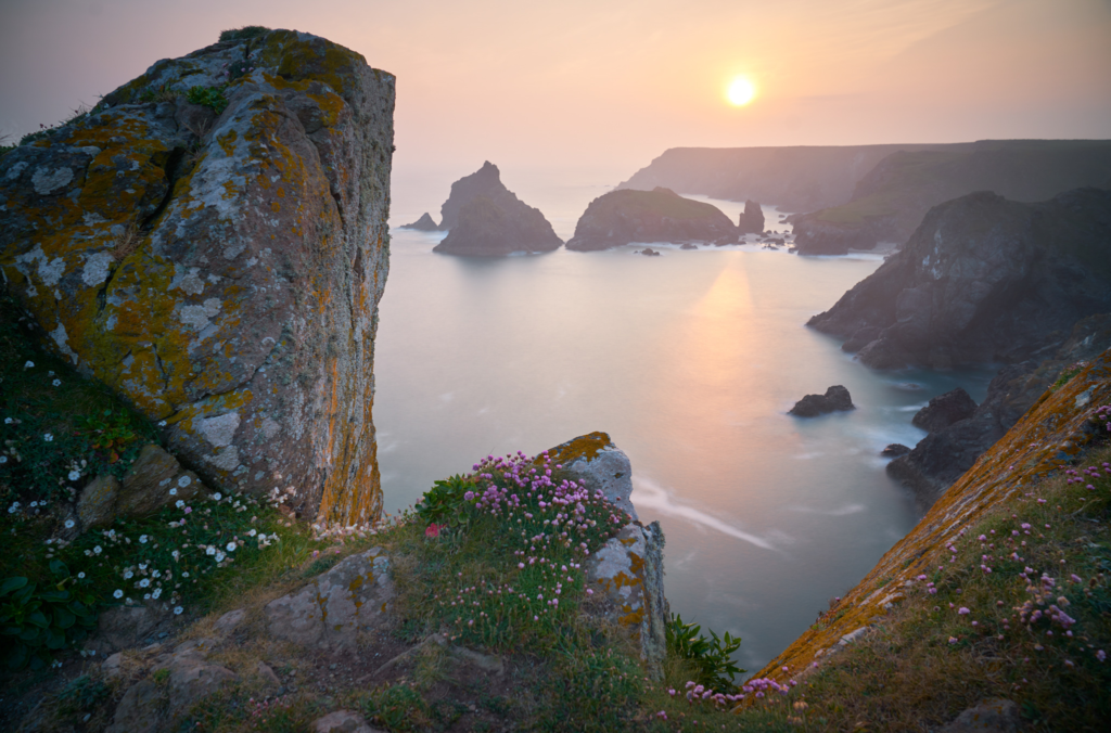
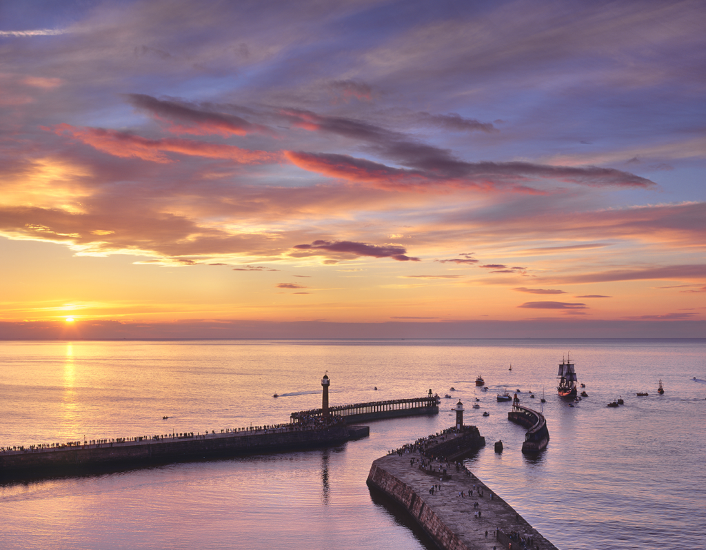
His website focuses on nature and landscape photos from his collections ‘homeland‘ which are photos taken in the England where he is from as well as Scotland and Wales. The collection called ‘travel‘ which includes these types of photos he takes but when he is abroad. He also has a collection called ‘Metaphoric/Metamorphic‘ which is a more experimental approach of photography which includes close up photos of rocks, ice and water as well as photos of trees/tree trunks.
Joe cornish has had a lot of success and achievements. In 2006 the British photography magazine: Amateur Photographer gave him the Power of photography award. He was also on the judging panel for the Wildlife Photographer of the Year and has hosted some of the Natural History Museum’s Photography events.
Photos taken by Joe Cornish
Joe cornish image analysis
This photo is taken by Joe cornish in his series of photos called ‘Homeland’ which are landscape photos in the UK where he was born and lives, this photo is from the subcategory ‘England, South’ which contains lots of landscape photos as well as photos of the stunning sea and cliffs in the area such as the white cliffs of dover which are a natural landmark in the area protected by the National Trust. Joe would have have photographed this area when he helped make the book in search of Neptune for the national trust.
The photo is taken with a wide angle lense to help capture the vast seascape as well as using a clear lense and a low iso to capture sky and reflection to create little to no grain in the image and helps make the sky and reflection look soft and smooth which also contributes to the overall feel of the photograph. The temperature of the image is cool with the blue colours and the dimness in the foreground and right of the photo which adds to the contrast and depth. The photo also uses pastel colours with the white blues and the yellowy orange in the sky, this helps add to the beautiful aesthetic and the natural beauty creates a spiritual emotional connection with nature which the romanticists deeply valued. The beauty of nature is what Joe Cornish may be trying to achieve as he enjoys and appreciates nature hence why he spends a lot of his time photographing it.
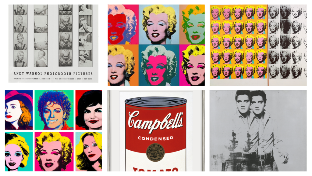
Andy changed the way we see the world and the way the world as well as the way the world looks at art. With Andies observation of cultural trends, from his rise to Pop Art fame in the early 1960s up until his death in 1987, Andie identified the images and aesthetics shaping the consumer driven post war American experience and transformed what he saw into a sophisticated yet accessible body of work.
He invented new ways of image making, expanding what was considered fine art, and also a new kind of artist, one who merged art and life, and treated painting, photography, filmmaking, writing, publishing, advertising, branding, performance, video, television, digital media—and even his own persona—as equally valid terrain for creative experimentation. Often lost in his own celebrity and myth is the fact that he is widely considered one of the most important post-war artists of the 20th century.
For this photoshoot, I will be taking photographs of my two friends in the studio. This will allow me to have more control over the lighting of my images as I can adjust where its coming from, the warmth of it and the brightness. I hope to create some more thoughtful and planned images instead of only relying on candid images as they don’t showcase my photography skills and camera techniques. During this photoshoot, I want to take a range of images of my friends by themselves and together. I want to ensure that when they are together in the image, they are smiling and looking happy to convey the tone of their friendship and in the images where they’re by themselves, they have a neutral or slightly sad expression on their face. This is to highlight the difference in emotions they experience when together versus when apart. Additionally, I also want to get my models to recreate some of their childhood images I have taken in my previous photoshoot. For example, I will get Alannah to recreate her school photograph by getting her to tie up her hair as seen in the original image, facing the same direction, and having the same facial expression as she did back then. I then plan to create a comparison by putting her baby image and current image onto one piece of paper side by side. This will give my viewer a short insight into how she has changed over the years. Furthermore, I would also like Beatrice to recreate her childhood photograph in which she can be seen dancing with her little sister. However, as I want to show how she has changed over time, I will be getting her to recreate her sister’s pose in the image and then cutting out this new image of her recreating her sisters pose and putting it on top of the original image to create a final image where it looks like she’s dancing with a younger version of herself. Finally, I then want them to recreate a photograph of the both of them when they were younger now. This will ensure that I have shown how both of them have changed individually and their friendship as a whole.
I will then take some images inspired by the artist Bobby Neel Adams who merges images of young people with their older parents/ grandparents. I will be creating something similar to this by merging the images of my friends when they were younger with images of them now. In order to do this effectively, I will try and get the camera a similar distance away from their head as seen in the original images and get them to try and copy the faces they were pulling in their childhood photographs as closely as possible. This should help make the blending between their two faces as smooth as possible. However, one problem that may occur when trying to complete this idea is the fact that I didn’t get any straight-on images of Beatrice by herself. This means that it will be hard to make a seamless blend between an image of herself in the past and an image of herself now as it would involve me having to zoom up very close on an old image of her, which will lead to a poor quality image being next to a very sharp, good quality image. I will try and fix this problem by putting the childhood picture in Lightroom and increasing the texture and clarity although this may not fix the problem entirely.
For this project’s theme of union, I am focussing on the unity between nature and humanity. Unity can be defined as the act of joining together or the fact of being joined together. My aim is to be able to show the deep yet often overlooked connection between humans and nature. I also want to highlight the harmony that once existed between humans and nature, which in some ways has been lost and emphasise that it should be restored.
I will be photographing a model, in multiple outdoor locations to have a variety of images. These locations will include parks, beaches and woodland. This will allow me to capture different aspects of nature such as the trees, leaves, grass, sand and sea showcasing the physical and symbolic unity between the subject and their environment. I will, for some shots, direct the model’s movements and poses to create a sense of connection, whether through touch, immersion or interaction with natural elements.
I have taken inspiration from Sian Davey’s project ‘The Garden’ which consists of photographs of people in a beautiful garden surrounded by trees, leaves and flowers. However, my images will differ due to the different locations and the style of photography I will use. When taking my images, I will instruct the model on behaviours and actions to ensure the poses are efficient.
After the images are taken, I will experiment with different cropping techniques to find the best way to present my images. I will also edit the images, adjusting things such as exposure, white balance and shadows to enhance the images. My final selection of images will be printed and mounted on foam, with variations in presentation – some as singular images and others arranged in sequences to highlight visual connections.
Through this project, my aim is to elicit a sense of unity and appreciation for nature, encouraging viewers to reflect on their relationship with the natural world.
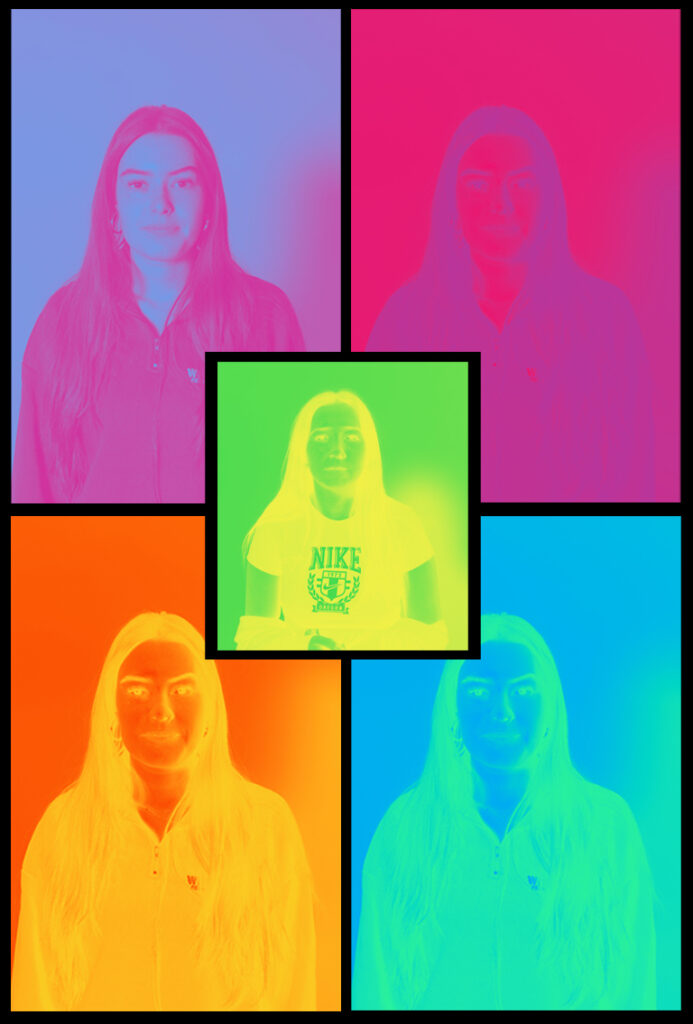
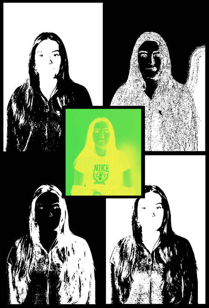
For my project, I am going to create images on photoshop to correlate to the title of my project of union. the concept of my images is to create different ways to present union in my photos. I will use photoshop to merge images together or to resize images smaller and larger to create an illusion of union. I will use photoshop to make all my images black and white because I like the idea of all the images being the same colour to create a sense of union. I also like the idea of having my images black and white because I feel as though it creates a sense of mystery and leaves the viewer to create their own narrative to what they think the story of the images are about. I am also going to create series of images that go together so that I can present them together and create a sequencing story through them. I like the idea of union and I can infer that it is the idea of people coming together and being united. It shows togetherness and friendships and also the idea of peoples differences coming together to be as one. I would like to represent the idea of union through my photoshop edits:
For my first photoshoot edit, I am going to attempt to create four images to display them all together. I am going to use a portrait image and a picture of hands that I took purposely for this idea. I am going to edit the image of the hands onto the face and use the opacity tool to blend both of the images together to ensure that the face is still seen through the hands. To create four different images like this, I am going to use the same images but I am going to change the style of opacity and see which ones look the best. I am also going to put all these images black and white as I feel this makes the image more powerful and effective to the viewer because it will have a mysterious and gory feel to them. This way I can display the images all together and create a sequencing narrative to the images.
For the second photoshop edit, I am going to create two images that are the same but reflect each other to create a line of symmetry. I am going to do this by using the images I took in the studio of the person standing sideways looking down and slowly lifting her head up whilst still being photographed at each position her head moves in. I also took the same images of the girl facing the other way to enable me to create two images that are the same but facing the opposite way. I am going to transfer these images onto photoshop to enable me to edit them. Once I have them onto photoshop, I am going to layer each of the images on top of each other, after I have done this I am going to use the opacity tool again to create an image of mystery. I am also going to put these images into black and white to stick to the theme of my project. I think this will be really affective because the image will give the illusion that the girl is moving in slow motion or it could create the idea that its her imagination or thoughts exiting her mind.
For my third photoshop image I am going to create three images that all correlate to each other. I am going to use my studio portraits that I took for this project and transfer them onto photoshop. Once I have done this, I am going to use an image that shows a girl looking down and the same girl looking up. I am going to make one big and one small as though it is a duplicate of herself looking at one another. I am going to experiment with the images and decide if they should stay facing each other or if I should place it so it looks as though they are facing away from each other. Once I have done this, I am going to keep the smaller image full opacity and change the opacity of the large image slightly less to create an idea of thoughts and feelings being presented. I am going to do this on a white background to ensure that the images stand out to be the focus point of the image. I am going to do this two more times experimenting and trying different ways to create similar but different ways to show the idea of union.
When displaying my images, I am going to ensure that I have chosen the most appropriate colour for my images. I will likely use black card to display my third photoshop edits as they have a white background on the images, therefore using black card for the background will help the images stand out because of the contrast. This will allow them to have a main focus point for the image and allow then viewer to get a good view of the details of the images.
I am going to use surrealism when creating my images. This is because I feel as though this is the best way to create union by having dream-like images to capture a sense of union. I also like the idea that I can use my imagination to create images. I think surrealism is the best way to present my images as I feel as though I can create unusual and made up images that wouldn’t be possible in real life. I like this idea because it allows be to get creative and show the different ways I can display images using the initiative of union. I am inspired by Tommy Inberg and his creative mind and the way he presents photos using his imagination. I also like the way he makes his images meaningful to him yet allows the viewer to create their own narrative to what they think the meaning behind his images are. He has a broad imagination and creates images that could never be real in life which makes his images fascinating to look at and to think about the deeper meaning behind them.
Dada (/’da:da:/) or Dadaism was an anti-establishment art movement that developed in 1915 in the context of the Great War and the earlier anti-art movement.
Hugo Ball, 22 February 1886 – 14 September 1927) was a German author, poet, and essentially the founder of the Dada movement in European art in Zurich in 1916. Among other accomplishments, he was a pioneer in the development of sound poetry.
Dada emerged from a period of artistic and literary movements like Futurism, Cubism and Expressionism; centered mainly in Italy, France and Germany respectively, in those years. However, unlike the earlier movements Dada was able to establish a broad base of support, giving rise to a movement that was international in scope. Its adherents were based in cities all over the world including New York, Zürich, Berlin, Paris and others. There were regional differences like an emphasis on literature in Zürich and political protest in Berlin
Prominent Dadaists published manifestos, but the movement was loosely organized and there was no central hierarchy. On 14 July 1916, Ball originated the seminal Dada Manifesto . Tzara wrote a second Dada manifesto, considered important Dada reading, which was published in 1918. Tzara’s manifesto articulated the concept of “Dadaist disgust”—the contradiction implicit in avant-garde works between the criticism and affirmation of modernist reality. In the Dadaist perspective modern art and culture are considered a type of fetishzation where the objects of consumption (including organized systems of thought like philosophy and morality) are chosen, much like a preference for cake or cherries, to fill a void.
The shock and scandal the movement inflamed was deliberate; Dadaist magazines were banned and their exhibits closed. Some of the artists even faced imprisonment. These provocations were part of the entertainment but, over time, audiences’ expectations eventually outpaced the movement’s capacity to deliver. As the artists’ well-known “sarcastic laugh” started to come from the audience, the provocations of Dadaists began to lose their impact. Dada was an active movement during years of political turmoil from 1916 when European countries were actively engaged in World War I, the conclusion of which, in 1918, set the stage for a new political order.
Wikipedia Contributors (2025). Dada. Wikipedia
Subversive and irrelevant, Dada, more than any other movement, has shaken society’s notions of art and culture production. Fiercely anti-authoritarian and anti-hierarchical, Dada questioned the myth of originality, of the artist as a genius, suggesting instead that everyone should be an artist and that almost anything could be art. Surrealism, constructivism, Lettrism, situationism, Fluxus, pop and Op Ar, conceptual Art and Minimalism: Most twentieth-century Art movements after 1923 have traced their roots to Data. Dada works still have as radicality and freshness that attracts today’s culture jammers and disrupters of life as usual.
Dietmar Elger and Uta Grosenick (2016). Dadaism. Koln, Germany Taschen.
Kuenzli, R.E. (2015). Dada. London: Phaidon.
Hannah Hoch:
Hannah Höch: 1 November 1889 – 31 May 1978) was a German Dada artist. She is best known for her work of the Weimar period, when she was one of the originators of photomontage. Photomontage, or fotomontage, is a type of collage in which the pasted items are actual photographs, or photographic reproductions pulled from the press and other widely produced media.
An important element in Höch’s work was the intention to dismantle the fable and dichotomy that existed in the concept of the “New women”: an energetic, professional, and androgynous woman, who is ready to take her place as man’s equal. Her interest in the topic was in how the dichotomy was structured, as well as in who structures social roles.
Other key themes in Höch’s works were androgyny, political discourse, and shifting gender roles. These themes all interacted to create a feminist discourse surrounding Höch’s works, which encouraged the liberation and agency of women during the Weimar Republic (1919–1933) and continuing through to today.
Wikipedia Contributors (2019). Hannah Höch. [online] Wikipedia. Available at: https://en.wikipedia.org/wiki/Hannah_H%C3%B6ch
In 1912, Hannah Höch began to study at the Kunst-gewerbeschule in Berlin. Later she transferred to the Staatliche Lehranstalt des Kunstgewerbemuseums. In 1915, during this period, she met Raoul Hausmann. Both were at that time associated with the circle centring on Herwarth Walden’s gallery Der Sturm. Through, Hausmann, she subsequently made the acquaintance of the Berlin Dadaists. Johannes Baa-der gave her the title “Dadasophess”, a friendly allusion to her lover, the “Dadasopher” Raoul Hausmann. The “h” at the end of her first name was added by Kurt Schwitters in 1921, on the grounds that it made her name palindromic, like the Anna in his Merz poem “An Anna Blume’.
Hannah Höch was a collector. In her hidden-away summerhouse in her garden in the Heiligensee district of Berlin, she assembled numerous documents, materials, and records of Dadaism, arranged them according to a system comprehensible only to her, and thus preserved many ephemeral witnesses to the movement over the decades. After her death in 1978, the Berlinische Galerie acquired the archive and arranged it on more scholarly principles. This 1922 collage My Domestic Mottoes (Meine Haus-sprüche) is also a collection of Dadaist souvenirs. The Dadasophess Hannah Höch was never a theoretician. She preferred to leave definitions of position to others, first and foremost her lover Raoul Hausmann. The collage also has room, however, for many other of her friends and fellow-Dadaists. My Domestic Mottoes is Hannah Höch’s little ironic self-portrait as reflected in quotations from Kurt Schwitters, Hans Arp and Johannes Baader. The collage comes across as a sort of pin-board, on which the background is formed by various papers with decorative patterns, photographic depictions, scientific illustrations and a detail of a map. The mechanical motif of the ball-race appears here too. And once again she has not so much composed her materials as simply added them one after the other. As already in the Incision with the Dada Kitchen Knife through Germany’s Last Weimar Beer-Belly Cultural Epoch, the beholder can find her self-portrait here too, hidden between the other elements of the collage. On top of the papers stuck to the cardboard, Hannah Höch has written some pithy Dadaist slogans and signed them with the names of their authors. “Only an undecided mixture is dangerous” derives from Raoul Hausmann; “Let them say they don’t know where the church tower stands” is a quotation from Kurt Schwitters’ poem “An Anna Blume”. And the insight “Dada polices the police” is due to Richard Huelsenbeck. It is through these slogans, carefully written out in neat handwriting, that the work gets its vitality. By 1922 the Berlin Dadaist movement had already broken up. Its individual members had begun to go their own ways or to forge new coalitions. One such project in September of that year was the “International Congress for Constructivists and Dadaists”, held at the Bauhaus in Weimar. Hannah Höch’s personal relationship with Raoul Hausmann also broke up. In her Domestic Mottoes she had united all the Dadaists once more: Hans Arp from Zurich, the Hanover Merz artist Kurt Schwitters, and the Berliners Richard Huelsenbeck, Walter Serner and Raoul Hausmann. She herself is looking somewhat shyly from behind a pale grid. The collage preserves those Dadaist mottoes which were to accompany her artistic work in the subsequent decades of her life. Even though in the future Hannah Höch was to devote much more of her time to painting once more, the principle of photomontage and collage continued to characterize her artistic output.
Kuenzli, R.E. (2015). Dada. London: Phaidon
“I wish to blur the firm boundaries which we self-certain people tend to delineate around all we can achieve.”
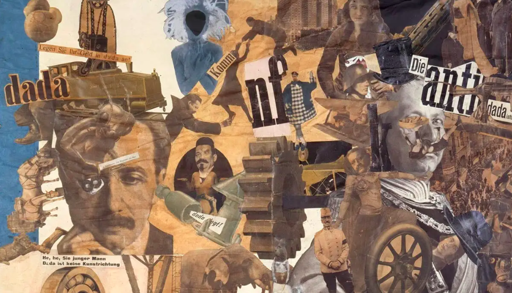
Photo Analysis:
Although this isn’t a photograph, and it is a montage, it helps to see what artists back in the day used to do with their art. I really like how they place some random objects together, the aim of Dada is to challenge the social norms of society, and purposefully make art that would shock, confuse, or outrage people. It’s seen as a different style of art. Dada was an art movement formed during the First World War in Zurich in negative reaction to the horrors and folly of the war. The art, poetry and performance produced by Dada artists is often satirical and nonsensical in nature. I really like how the background of the photo is bright and elevating, it adds a contrast to the rest of the objects in the surroundings. This montage is clearly showing the power of different objects put together and it shows asense of make believe things put together. The whole aim of Dadism is to capture the horrors and the truth of the second world war and this photo is doing exactly that. The people seems to be wearing some sort of armour, something a soldier would wear in the war. Though there is also another person who seems to be wearing some sort of dress, there body has been messed around with and slimmed down. Almost as if different peoples bodies have been put together, at the bottom of the image there is grass that has been put in black and white. Most of the objects added to this montage are quite colourless and faded away and the bright background helps to bring everything else back to life. The first person on the left is clearly wearing an armour suit with a sword but has miss proportioned legs and feet compared to the rest of the body. The use of the arms adds emotions, some sort of worry or caution to the surroundings, while the face is a mask, the person is hiding their identity or possibly hiding from the world of war, they are trying to escape the reality whereas the person on the right is clearly some kind of dancer or ballerina, the use of the big puffy skirt, with the slim waist and the expression on the face, all together both people have different types of purposes on this page, just like they did back in the past, men during the war had to fight and not show any of their fears, they had to put on a mask and fight for their country whereas stereotypically women stayed at home and did the cooking, they didn’t have to get their hands dirty. This could be the representation that the artists is trying to put out. Though I’m not too sure what the grass could represent between the two people. For the person on the left the grass could be a symbol of a familiar surrounding, as the war is mainly outside on a battle field surrounded by the grass, but for the other person on the right I’m not too sure what the grass could represent, it could be a symbol of the happiness before or after the war, the idea that war is finished and the grass is slowly becoming healthy again or that before the war the grass was an important factor to that specific country, it could also just be the ground so that the people aren’t floating. Overall I would say that this photo has an interesting representation of the war and uses quite dull colours to represent the dark time and the background being bright makes everything else stand out and look more visible.
What is Dadaism? Some explanations and definitions. (n.d.). Available at: https://learn.ncartmuseum.org/wp-content/uploads/2019/01/What-is-Dadaism_0.pdf