
Outcome 1:
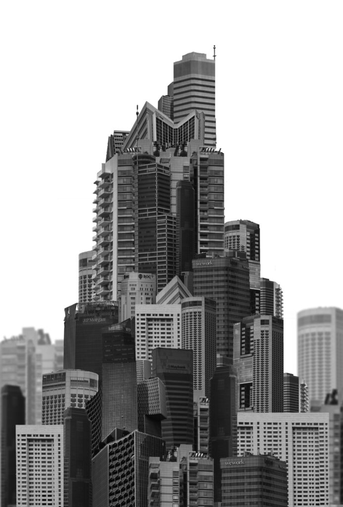
For my first attempt at creating the building collage I used the single landscape image and cut up a number of buildings. I arranged these on top of the image to fill in space and make the image look more full. I tried to make the outside of the frame look rounder than the inside like seen in futurism and Vorticism however with every building being shot at the same angle the image overall looks too flat for my liking. For my second try I decided to use more angled images where the perspective is different. Additionally I tried adjusting the contrast of the images to be more extreme.
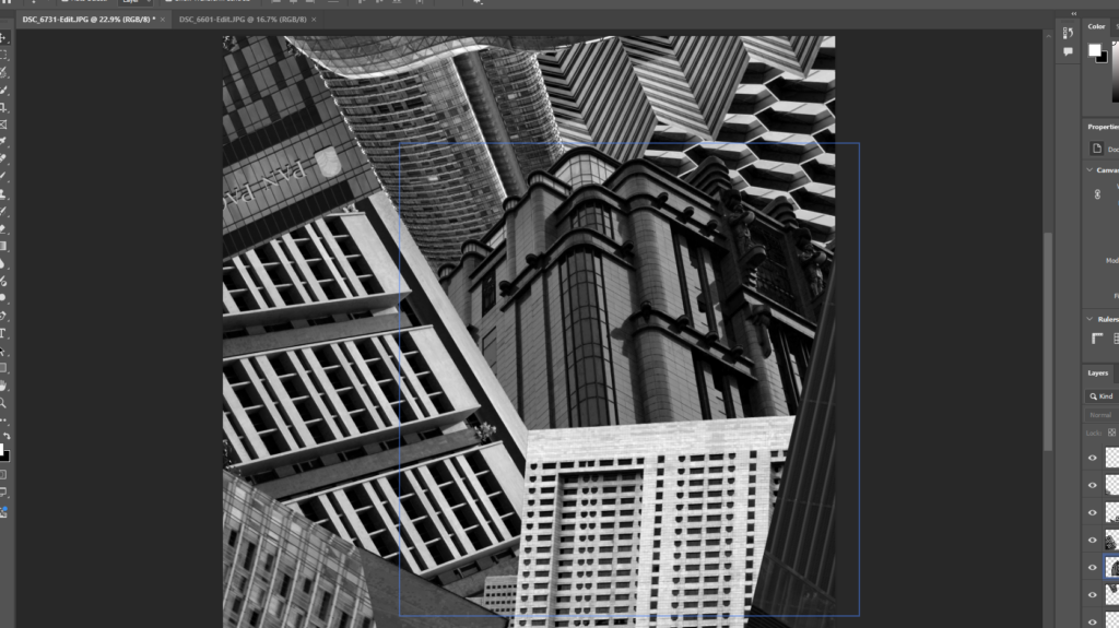
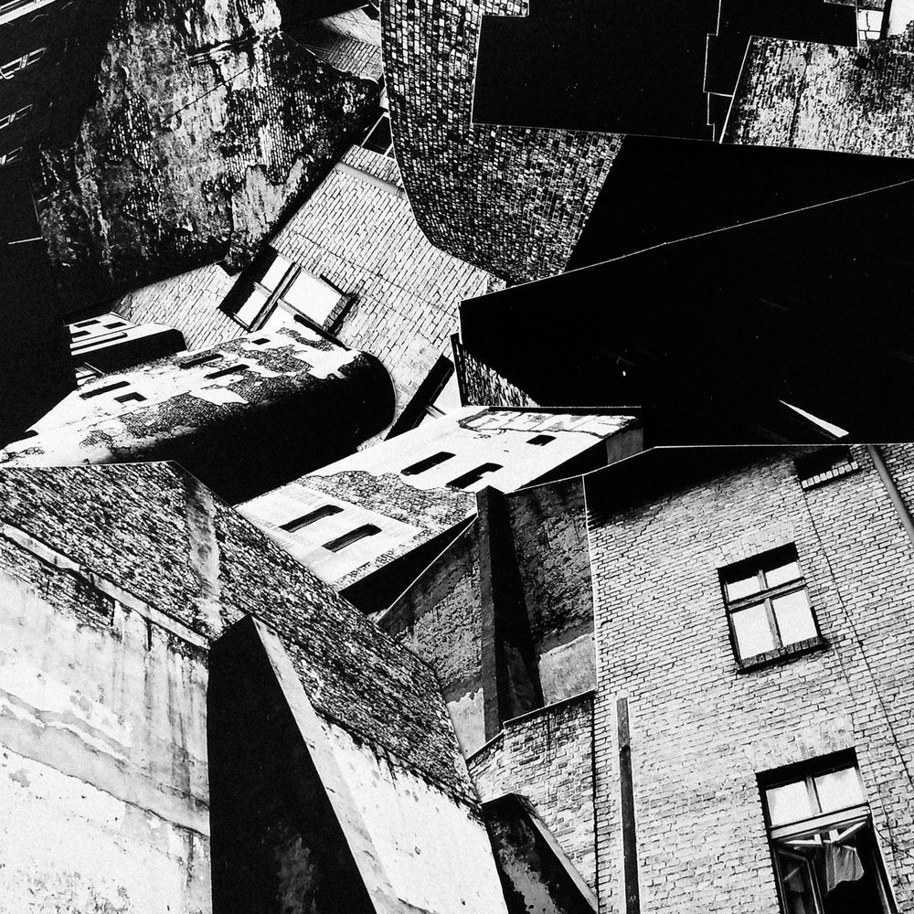
I tried lining up different buildings to create something which flowed better with different textures. I used fewer buildings so each on could be larger in the frame.
Final Outcome:
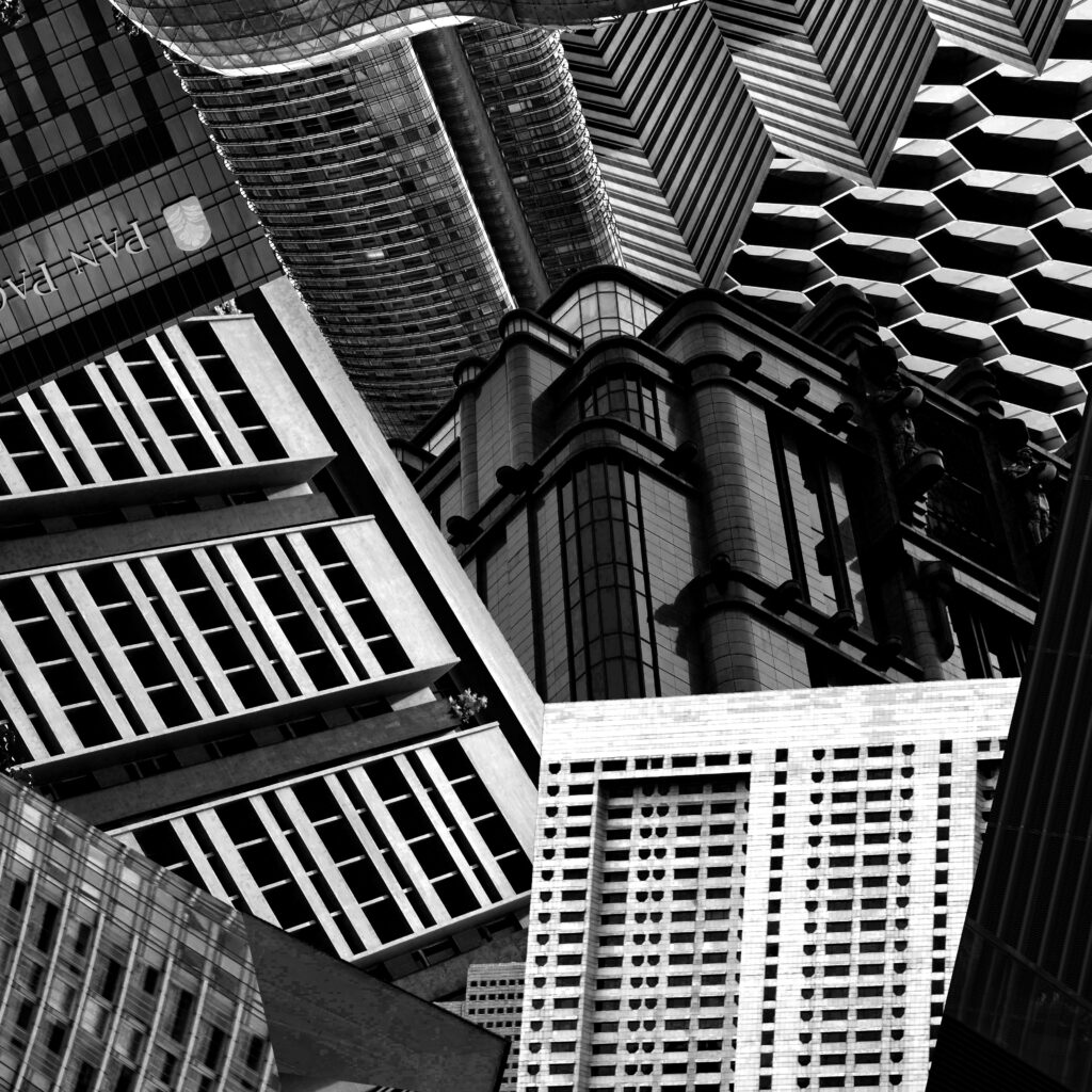
This outcome looks far better than the first. I think is due to a number of reasons, the most important being the addition of angled buildings. Additionally each building links to one another and I even combined a few to create different shapes. The variety of textures looks more unique and each building is larger with so few in the same frame. To improve this image I would have added more texture to the bottom left corner to balance the top right and maybe tried one without a recognisable building instead so it was made up of only background textures instead.
Outcome 2:
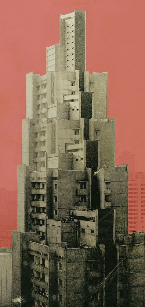
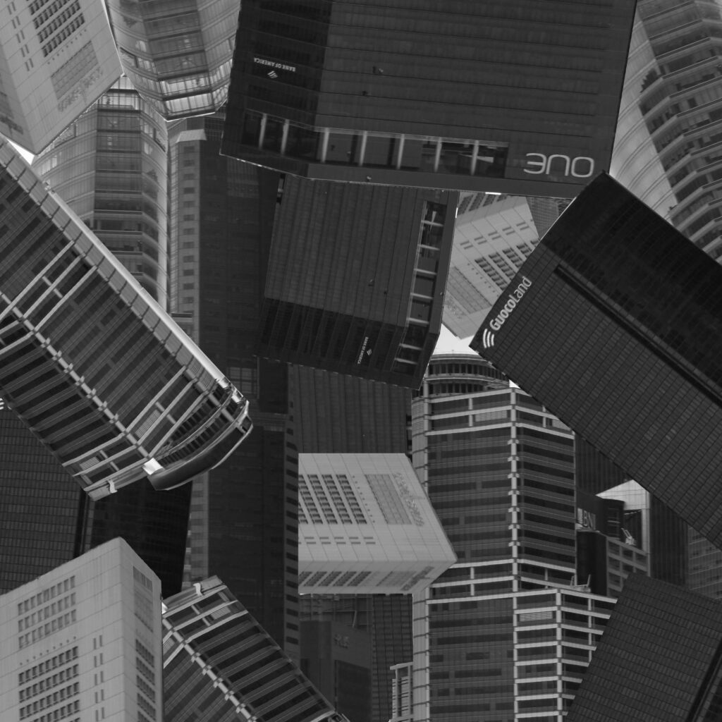
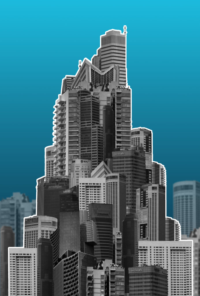
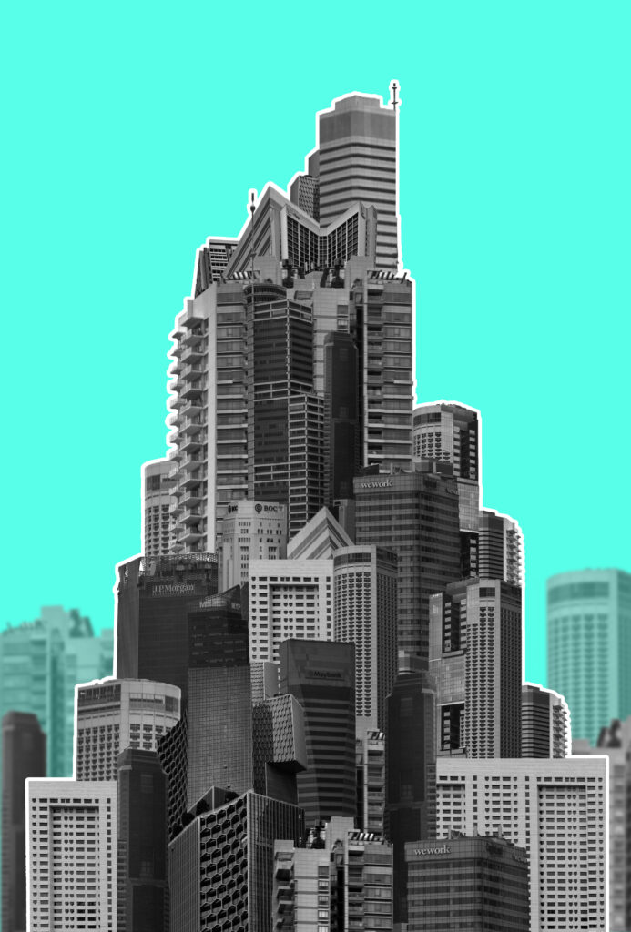
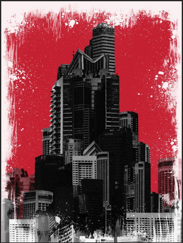
While the original image is a single building I wanted to create a mega-structure made with multiple faces of different buddings so it looks choppier and messier without much thought like many modern buildings appear. I will create a colourful background like this one since I think it will resemble a magazine cover which I would like to experiment with for a potential zine/flyer I might make. An artist who creates work similar to this is Michael wolf however I wanted the focus to be on the eventual top of the building as opposed to the elongated parts.
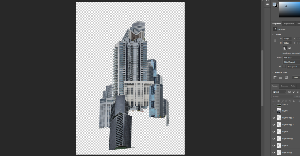
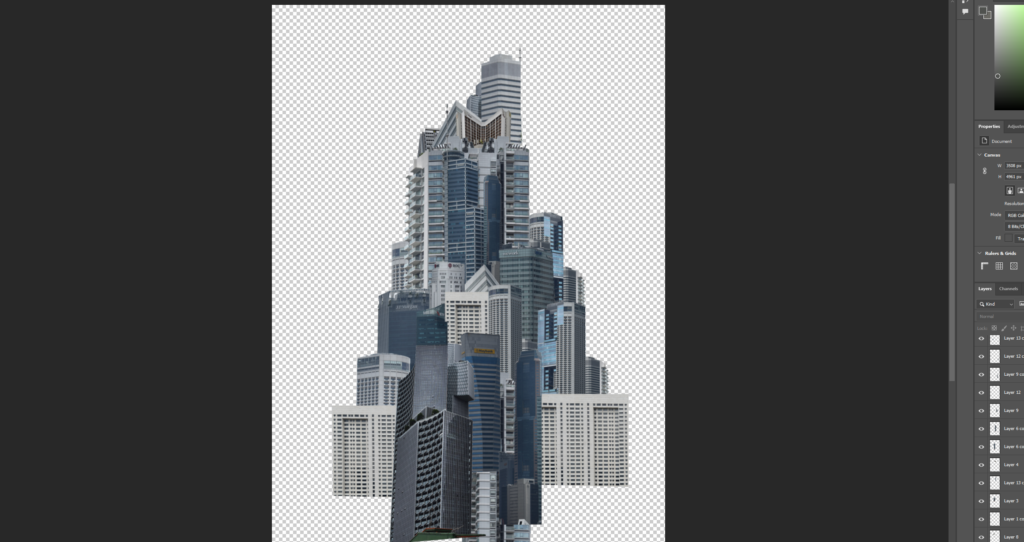
I combined most images from my second photoshoot and chopped out the buildings. I began building them up into a general triangular shape pointing upwards.
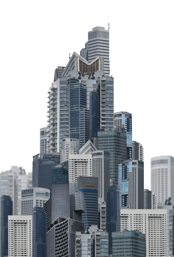
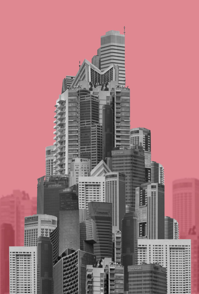
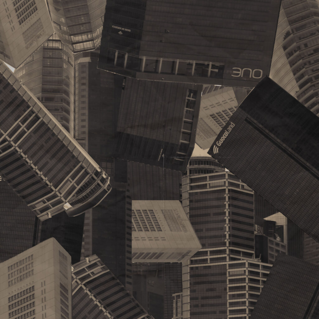
I tried to add some sort of background to make the structure seem larger and something actually on location in a city. I made the opacity lower and blurred them slightly. I added a colour to the background to see how that would turn out and also tried black and white. Without a colour in the background the background buildings blend into the shape better and don’t look as obviously separated. The black and white buildings look better with the colour background as it pops more but I think that If I tried colour with a background that fit better It would look more coherent. I also tried moving the background buildings in front of the colour with a lowered opacity so that they looked more similar to the main structure but still visible different.
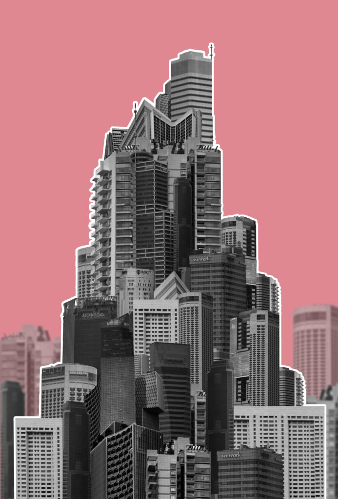
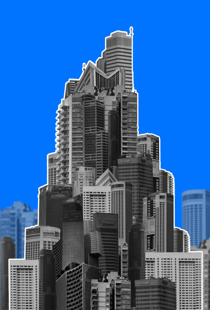
When trying to make the structure stand out I also tried an outline. I think that if I added more graphic elements this approach could work for a cover while the other approaches would work better as a print out/page spread. I tried a few other colours also:

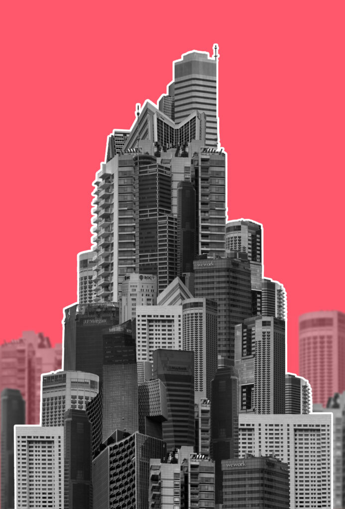
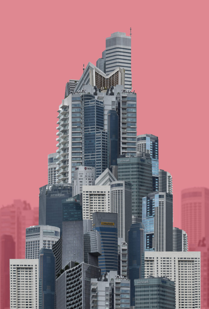
Final Outcomes:
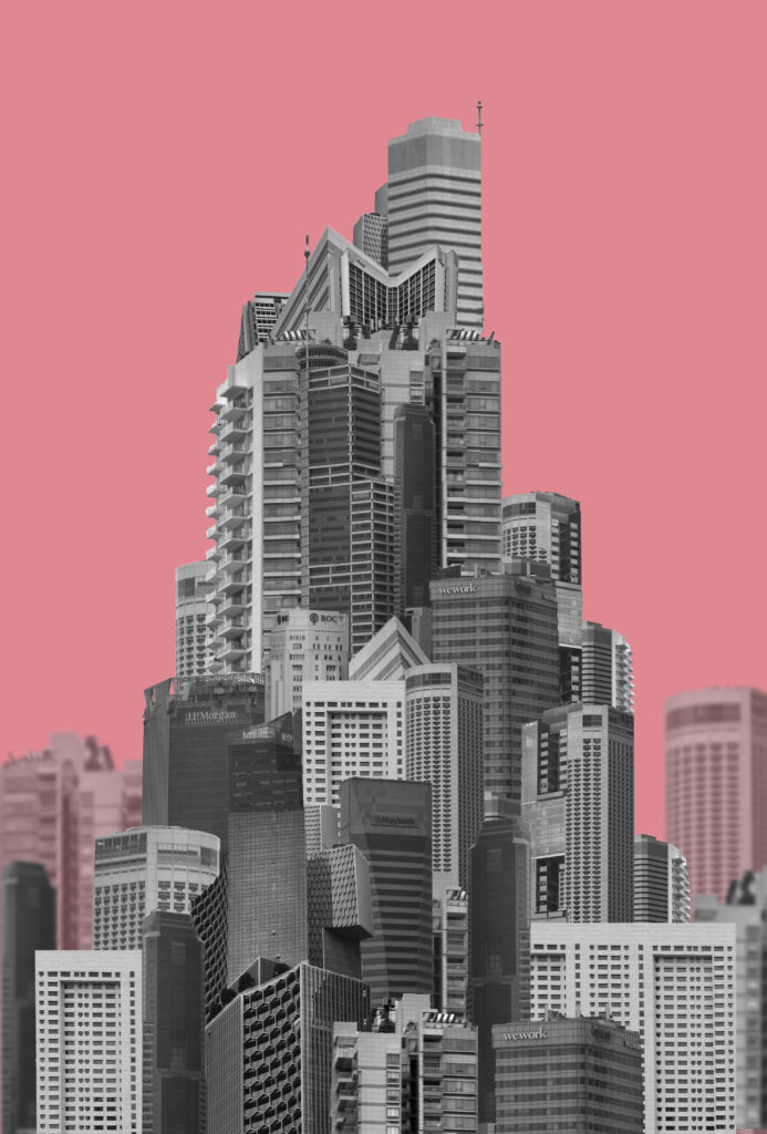
I will be using the orange one as the cover for my magazine since the colour is bright and the outline makes the shape jump out. The pink one however I will be printing out as a final image. I like these two as my final outcomes as the colours, orange and pink, are used as various warning colours.
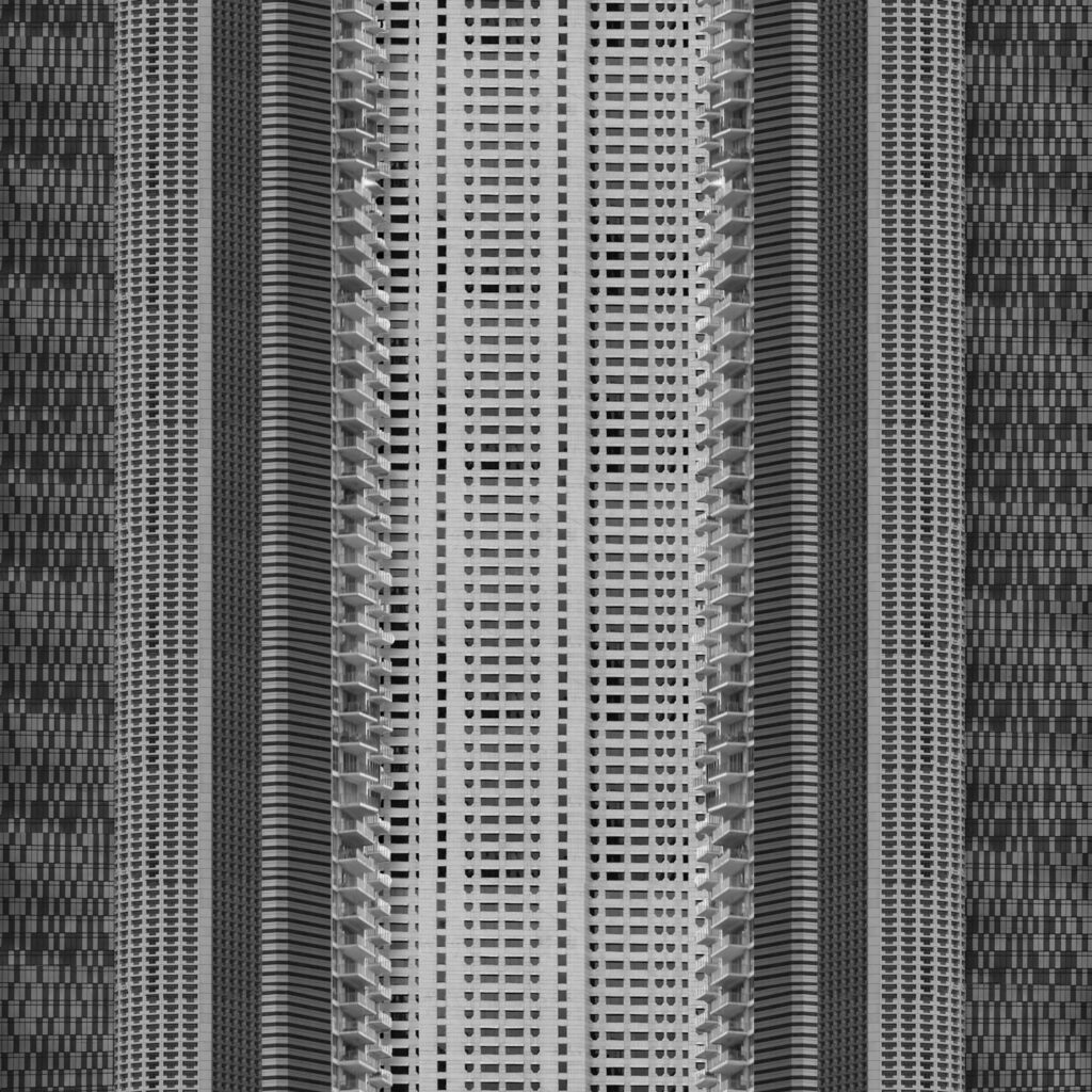
Outcome 3:
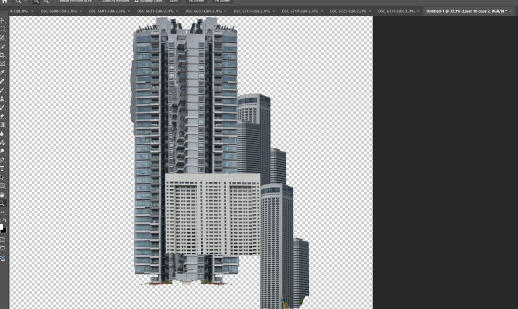
Inspired by Michael Wolfs ‘architecture of density’ I elongated buildings by cutting out faces in photoshop and stacking them on top of each other to create a landscape of stretched buildings.
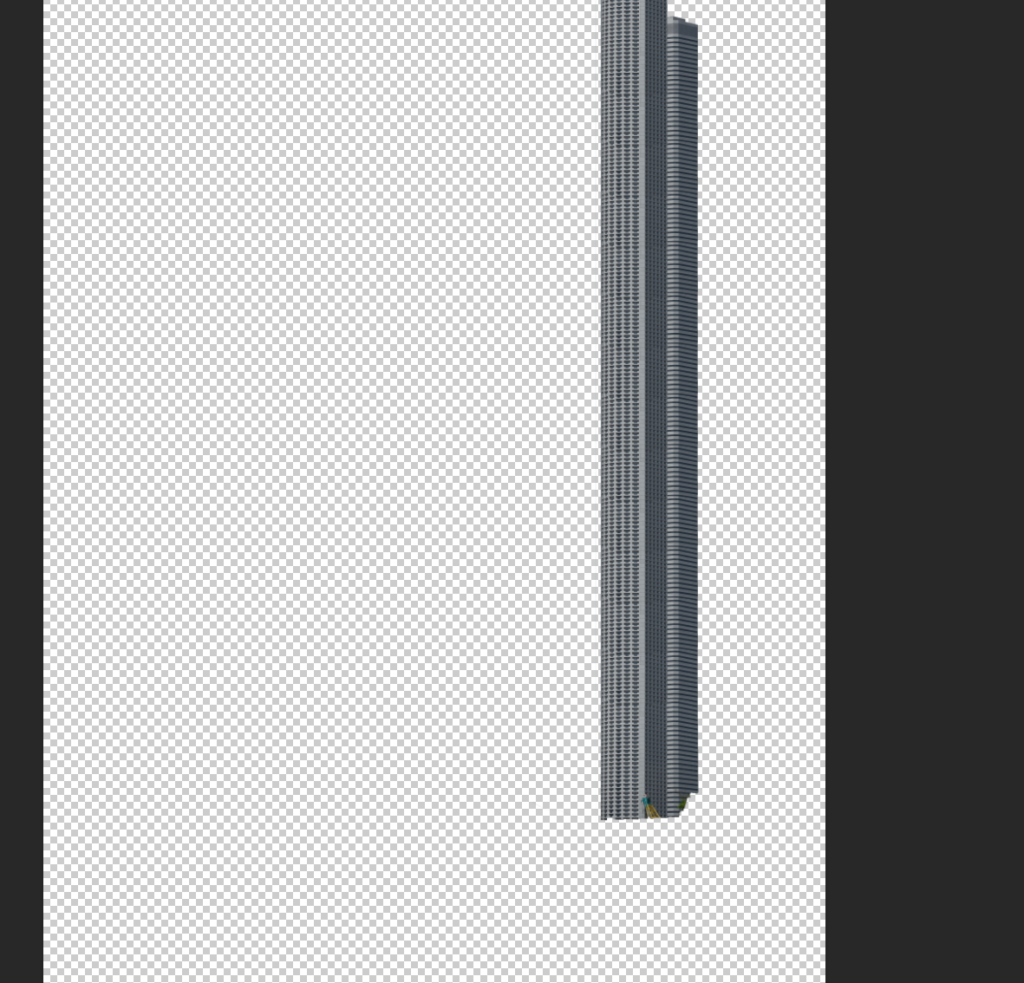
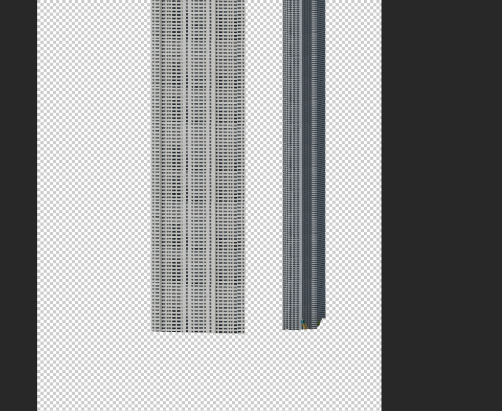
I started by stretching individual buildings before arranging them all together. I created multiple copies of the same building and arranged them together on top of one another to try and seamlessly create a longer version. The first arrangement didn’t have much thought behind the arrangement of the images which I fixed when creating the second arrangement which looked more symmetrical like a real block of flats.
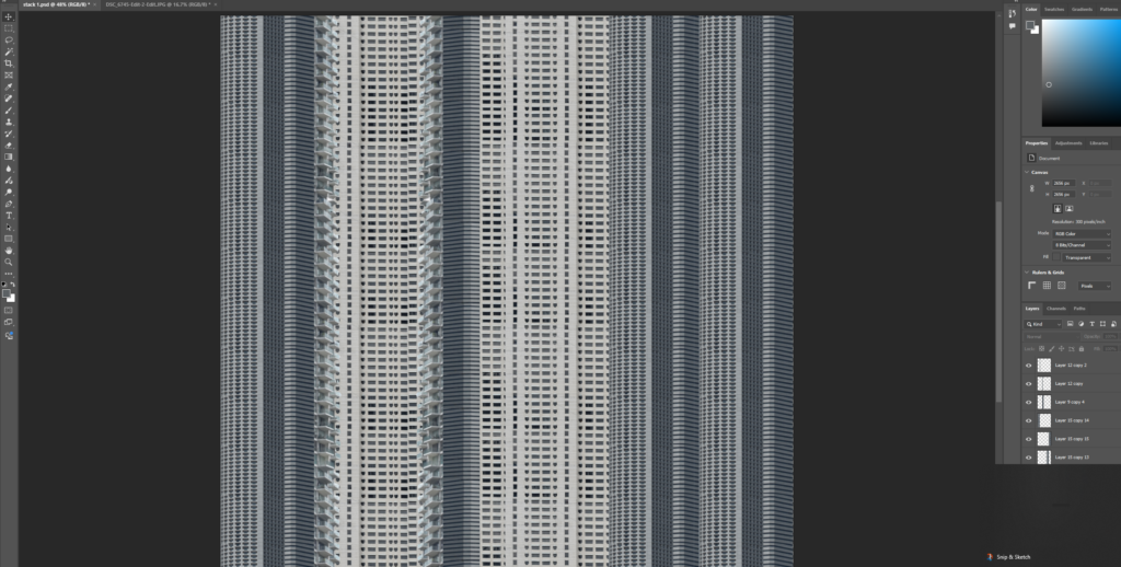
I began laying them all out together into stripes and tried both black and white and colour. I didn’t like how the colour one looked so I opted for black and white instead.

I like both arrangements for different reasons. The first one shows the messiness of arrangements of buildings while the second looks a bit more realistic. I arranged these images into squares because I wanted to show how far cityscapes spread both upwards and outwards as they expand.
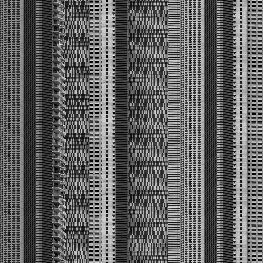
Final Outcome:
Overall I choose this one because I liked the more realistic approach over the more random assortment. I created a better contrast between buildings by adding a drop shadow also so that the image didn’t look so flat. I like how top is not in sight as it creates the effect of the building being infinitely tall which is similar to how some of these buildings feel.
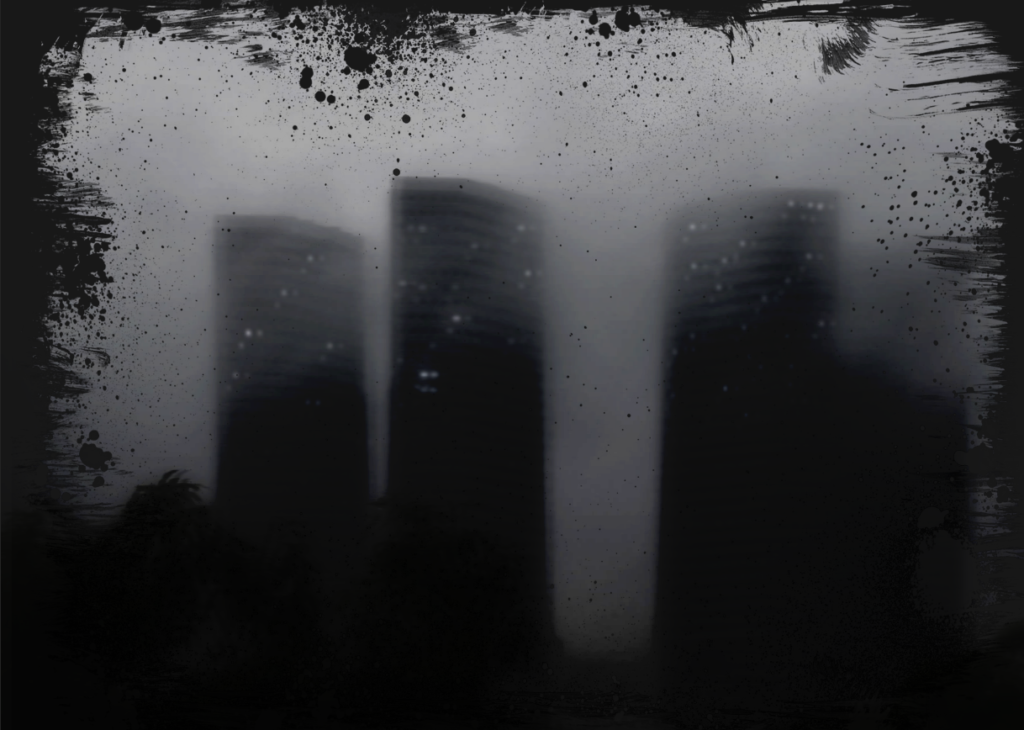
Outcome 4:

Using the frame:
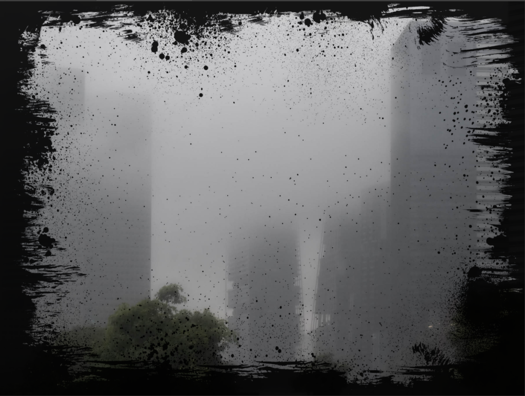
I wanted to experiment with frames so I started with one frame and compared 2 different blending modes to see the different outcomes.
the first blending mode was overlay:
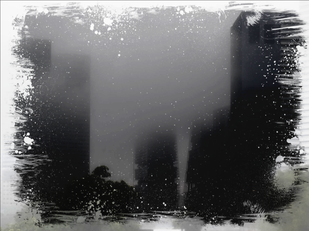
Overlay darkened the images which I thought looked best with the Smokey landscape. It made the image look darker like night photography which I decided to develop further.
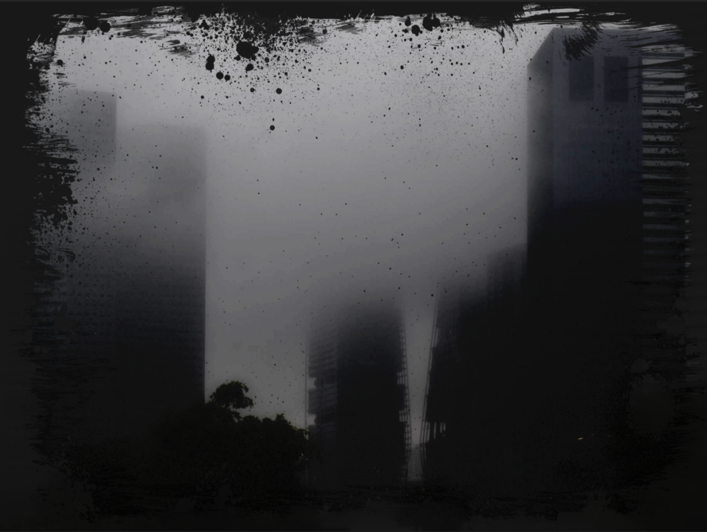
Blending mode 2, Subtract:
Subtract removed the white centre of the frame while keeping the full dark frame. Since both modes create different effects I decided to combine the two to create a darker image with the black frame.
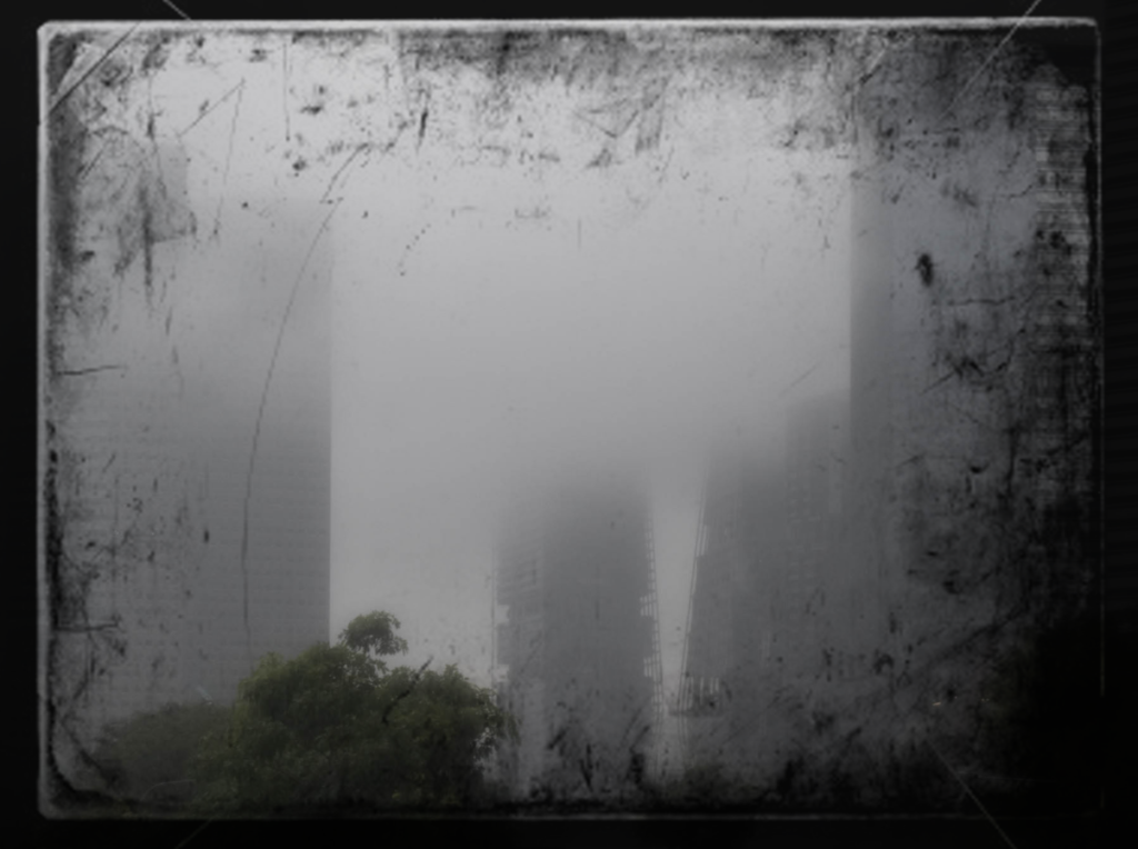
I liked how this turned out but it was missing something so I decided to try a different frame which resembles a damaged negative:

The outcomes turned out different as this border cut out the corner but otherwise sat close to the edge.
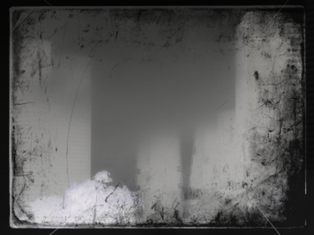
I didn’t like this one a much so I decided to try the first frame with a different image and add lights to better resemble a night-time image. I like how both the few lights looks as well as the light flares. The light flares resembles more like Lewis Bushes images and when I added the multiple exposures I think it better resembled Lewis bushes. Overall however I prefer how the fewer lights looks as its simpler and I didn’t blend the middle sun light very well.
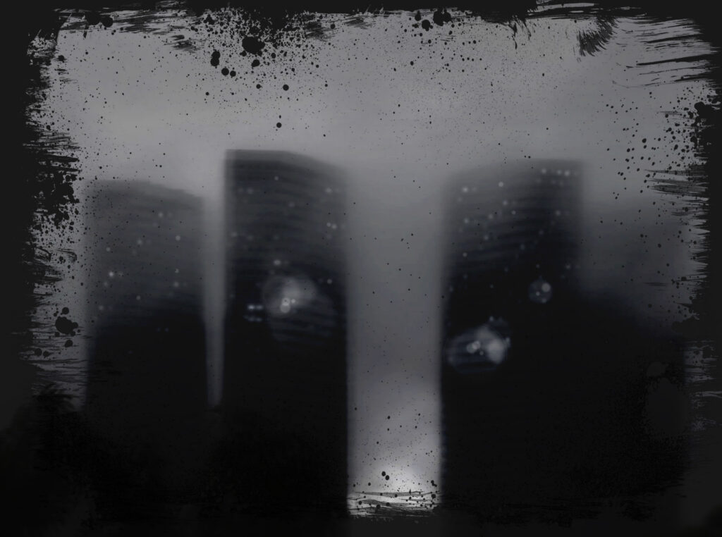
Final Outcome:
I like this outcome because its dark and grey which creates a gloomy appearance. I think it develops that original hazy dull image into something a bit more sinister and ominous. To contrast with this, the lights I added creates a soft light which makes the buildings seem more approachable. If I was going to develop this idea further I would have set the image to be centred because while I like this outcome and how it fades into the frame, I think using the frame as what it is to highlight the centred image would look better. Additionally I would try adding a few more small window lights or explore making the multiple exposures clearer.