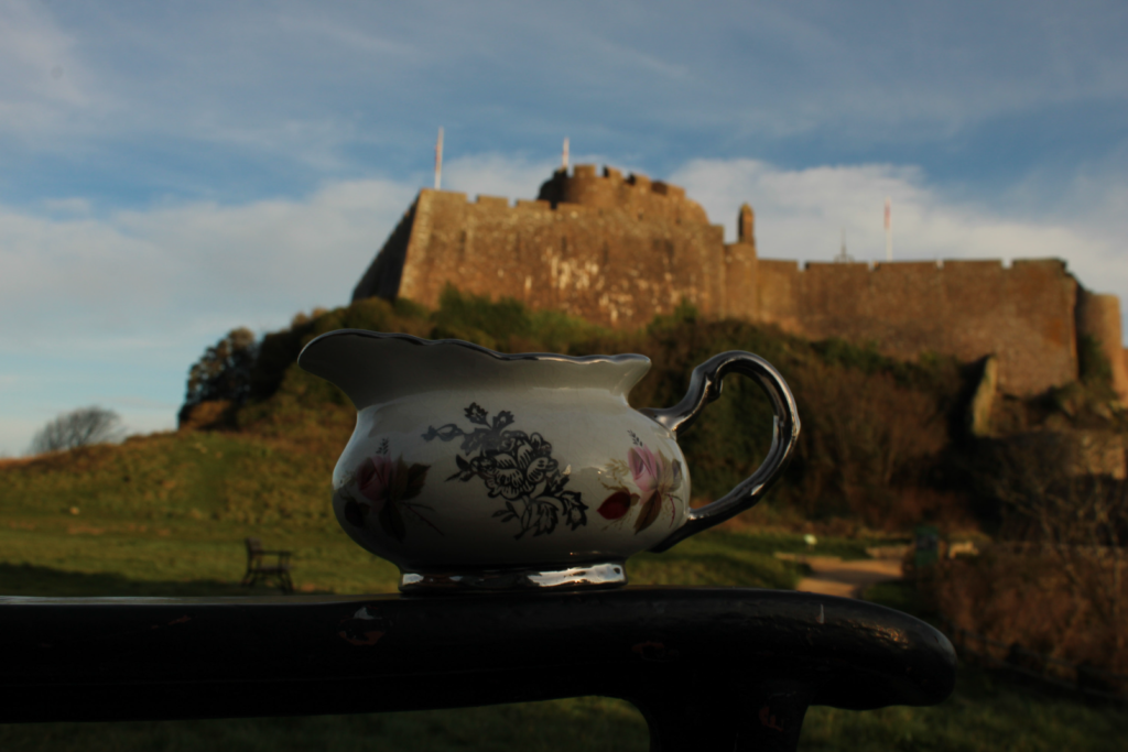
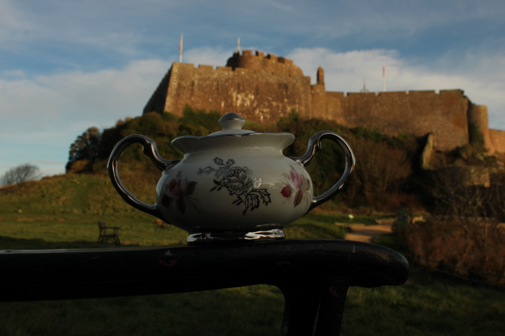
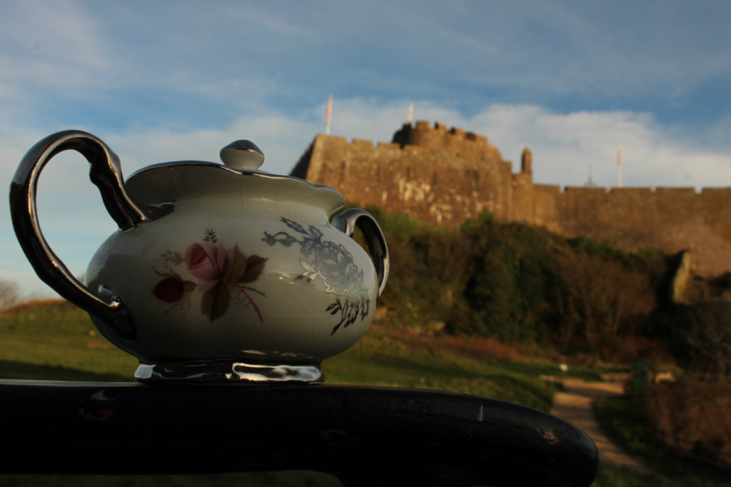
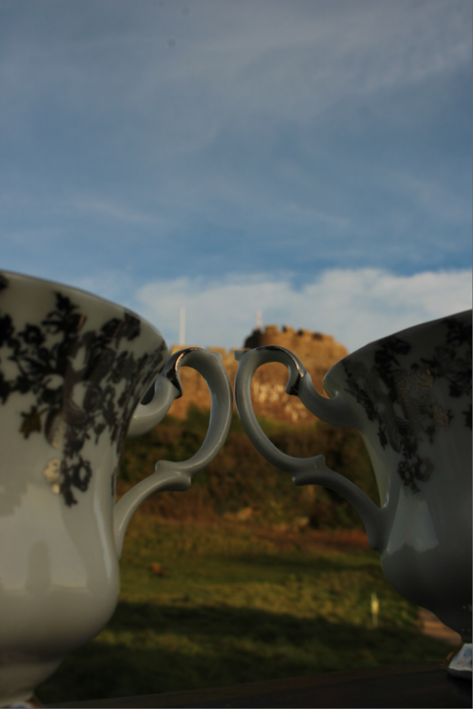
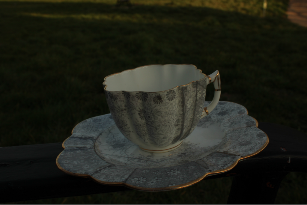
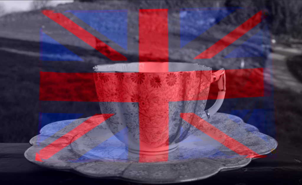
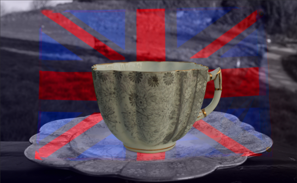
My second photoshoot, I drove to Gorey Castle, had a bag of different mugs, cups and plates that looked very British. I sat down on this bench in front of the castle and did different angles aiming up towards the castle but focusing on the cups and plates with the castle behind in blur. I selected the white balance to be cloudy and I also experimented in shade mode, this is because half of the castle was in shade but half of it was in the cloudy-sunny day.
These are the camera specs I chose to use to take the photographs.

I did a Low ISO of 100 which allowed my camera to not take in much light whilst also making the photograph less grainy. I made the F-stop, f/13, which allowed the background to be blurry but I didn’t have to do a very high f-stop because the background was so far away it already blurred it.
These effects on the camera, allowed my images to come out like these, which is what I was aiming for.
I then started to edit these images using Photoshop and adding layers of the union jack flag over the top. I chose to do this because I wanted to implant the union jack flag/colours on to the images, but I didn’t know how so I experimented around resulting in these.
Then, I tried to edit the London Pride Pump image I took at The Beaumont Inn. But again, I was experimenting around with different editing tools and ideas with the image, starting with just highlighting the word ‘London’, with keeping the other colours and background all the same resulting in this.
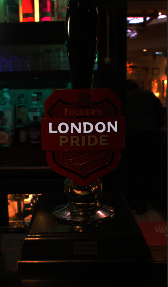
But, didn’t like it so then I edited the whole photograph to be in black and white with a hint of red, grainy photograph, resulting below, but I wanted to focus on the fact that the shield around the words ‘Fuller’s London Pride’, was RED, the union jack’s main colour.
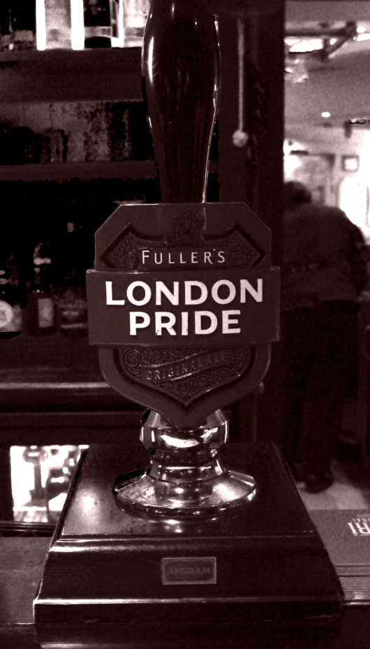
So as I was doing my final images and came across it again, I edited it by keeping the whole image in black and white, but using the colour selection tool on Lightroom to only select red as the whole shield was a strong red, perfectly representing brits and England. I then used a brush tool with 0 saturation and brushed over areas that still had colour in the background and also in the reflection of the pump. Resulting in the bottom image.
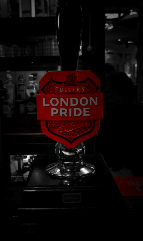
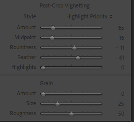
I decided to keep the red napkins on the bottom right still in colour in the red, because it adds more to the final image instead of just one part red, there’s two, so the viewer’s attention will get attracted more and easier. I did add a vignette again which helped the red napkins fade in to the image and not just standing out, also the vignette helped the background with all the glasses and lights around the London Pride Pump.