Contact sheet:
Firstly, I began by either rejecting or flagging them. This is very efficient as it keeps all my images organised by which ones I preferred.
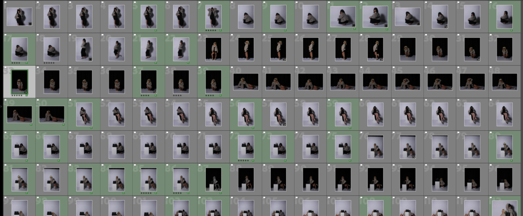
This is because I can filter them by showing flagged only. Ultimately disregarding my rejected images to be time efficient for my next step. My next step is to put the images I wish to edit and wish to develop further into green. The green images demonstrate which images I am going to edit for my finalised exam project.
Leading to, selected images that I definitely like and believe are worth editing. This is beneficial as it decreases my amount of images into a small selection, that is efficient for my project and fit my end goal. Making it much more time-efficient and easier for my next steps.
Editing & Experimenting
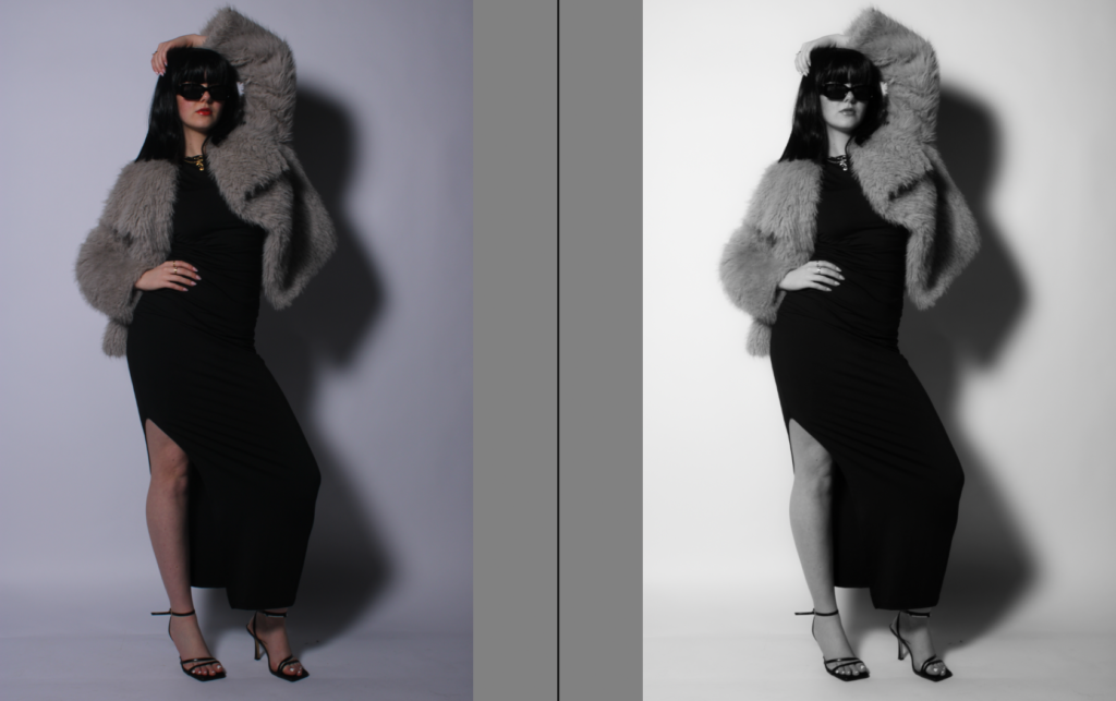
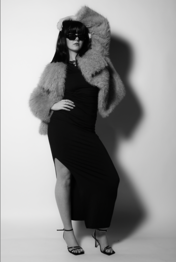
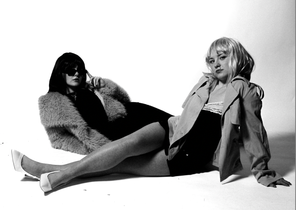
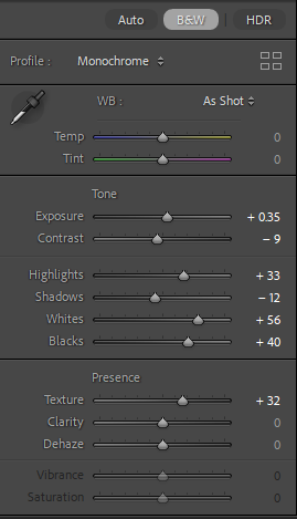
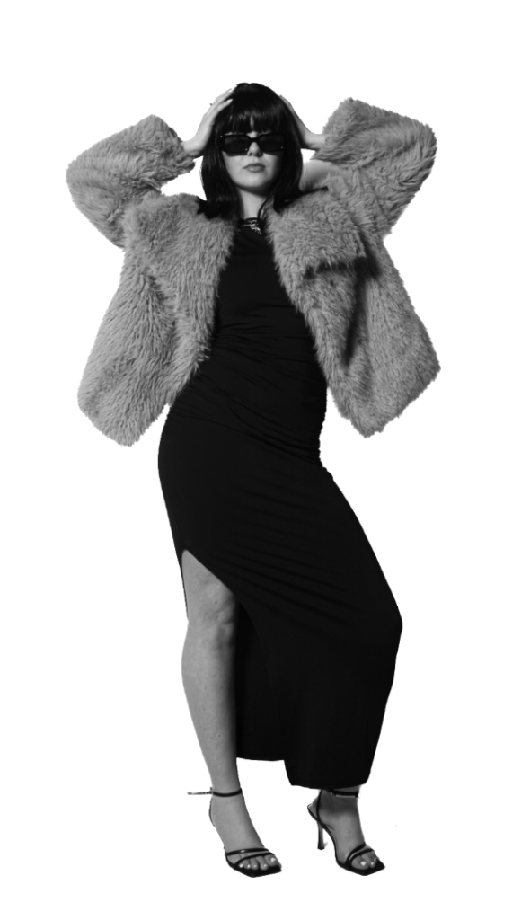
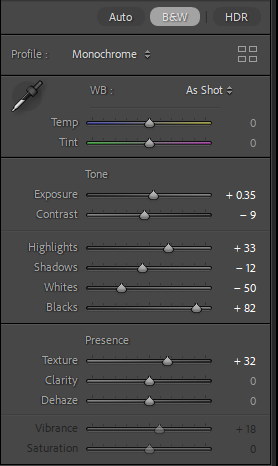
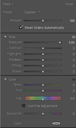
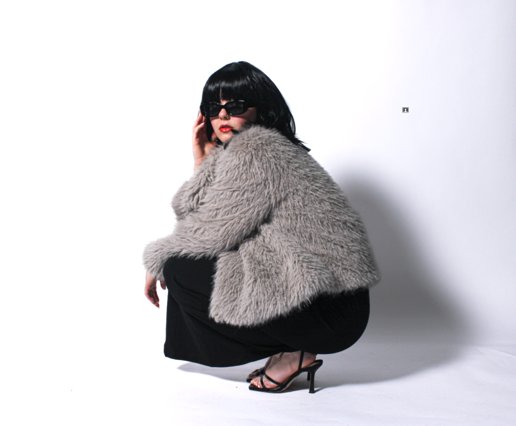
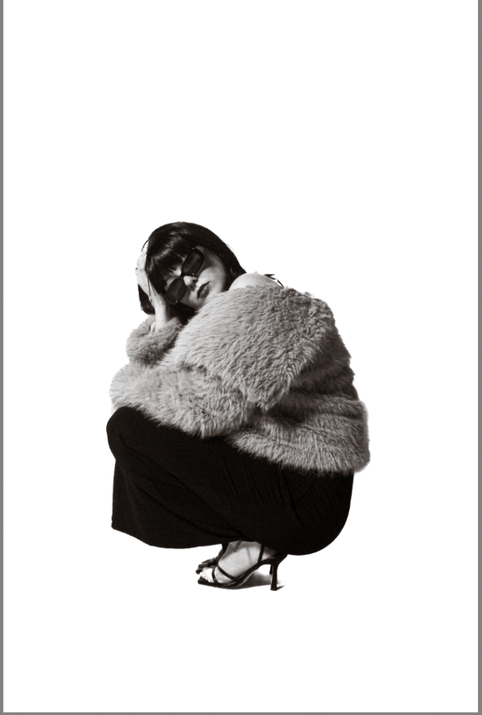
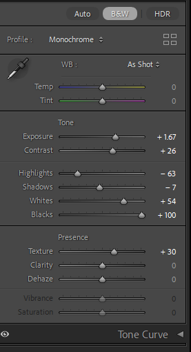
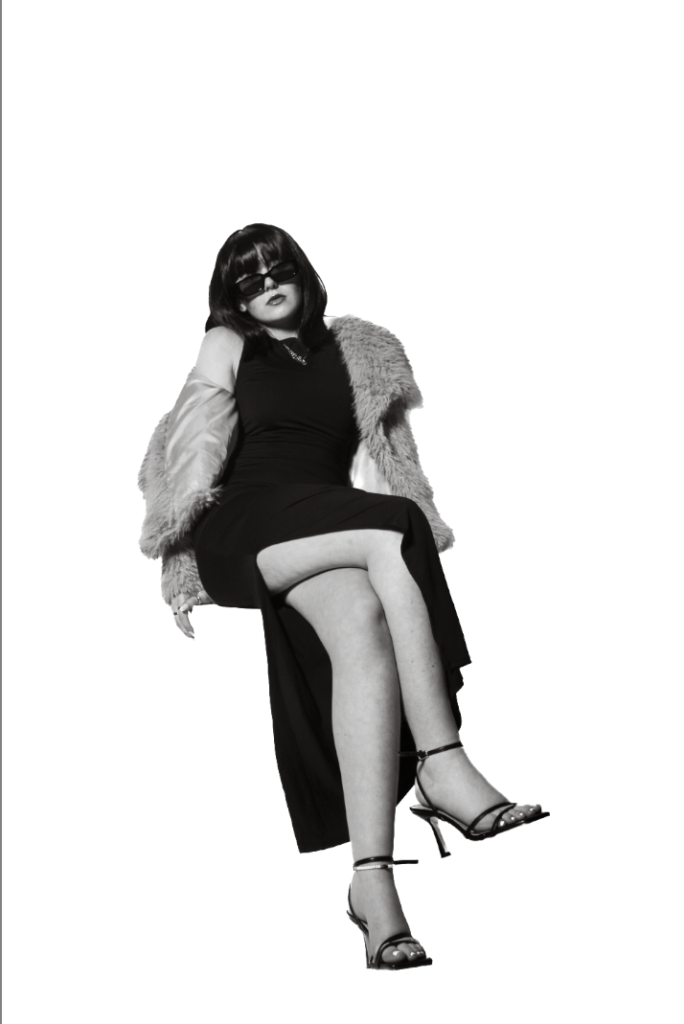
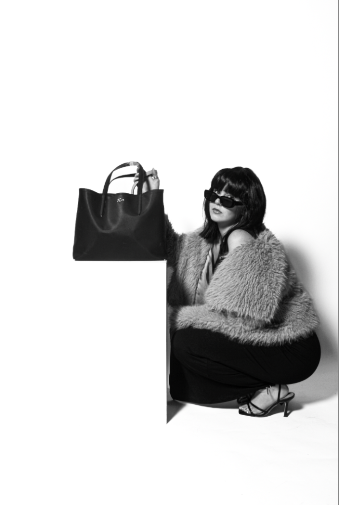
I began by increasing exposure to lighten up the background significantly. But the correct amount, not too much so the medium does not become too bright or unfocused. My next move, was to increase the contrast to make certain elements stand out against the exposure. This is to make these two balanced. This created more depth in the shadows, making it more eye catching and even professional, which is our aim. By increasing the highlights, the backdrop became a lot whiter and brighter which is needed to look more professional, and also to make the subject stand out and contrast against it. To increase the depth of the shadows even more, I slightly increased the shadows, but again not too much as I wanted it too look natural yet eye catching. The increase in whites, emphasised the background, therefore emphasising the shadows. Almost, I decreased my blacks so the subjects clothing, wig and shadows were not too deep so it looked somewhat real. Lastly, I decreased the texture to make the medium’s legs look more fake and surreal as Newton did portray a certain beauty standard, ultimately being unrealistic. Finally, I decreased the clarity to make the glamour fur coat to look more detailed and real, almost to look like a model is advertising it.
Experimentation –
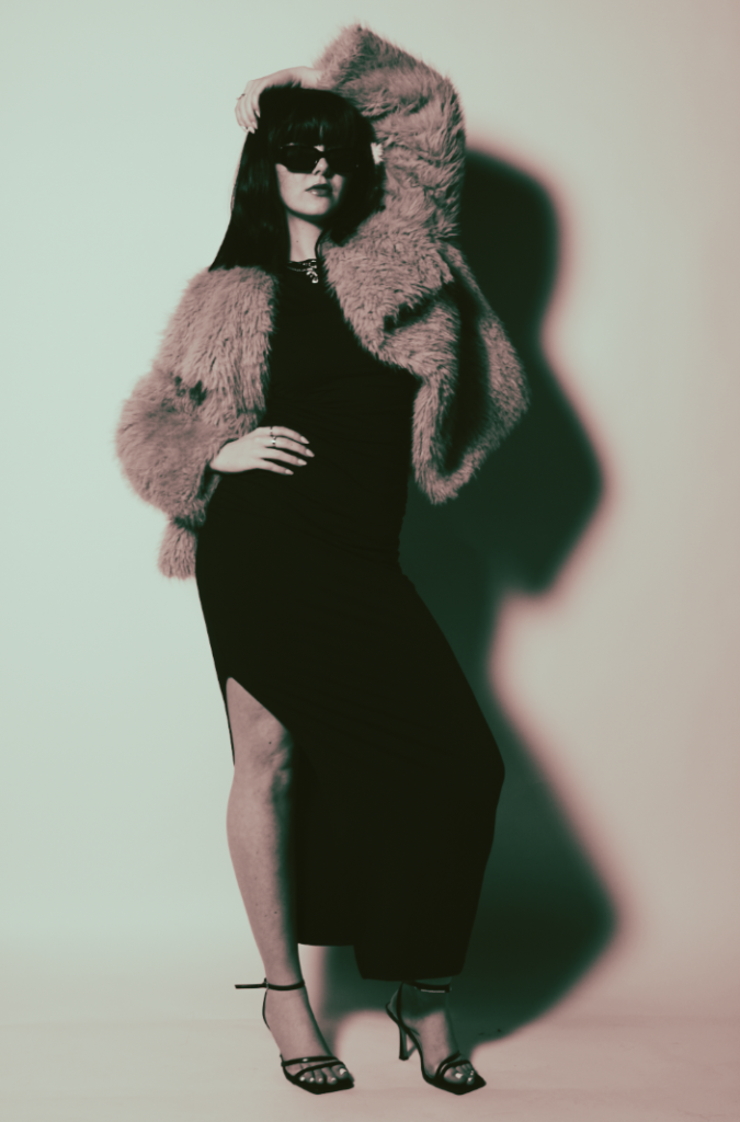
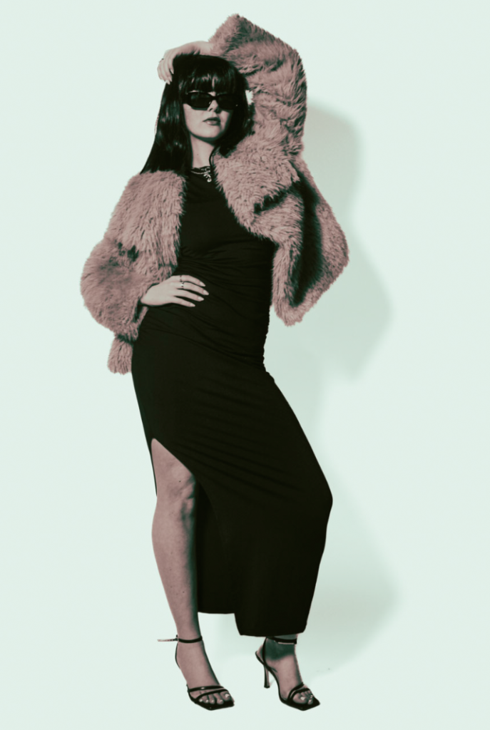
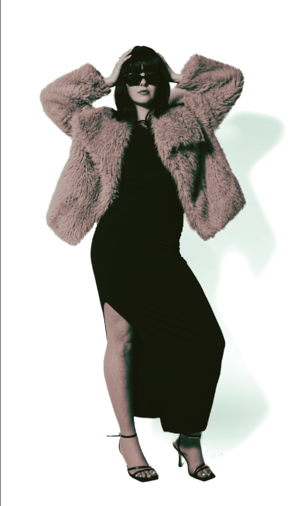
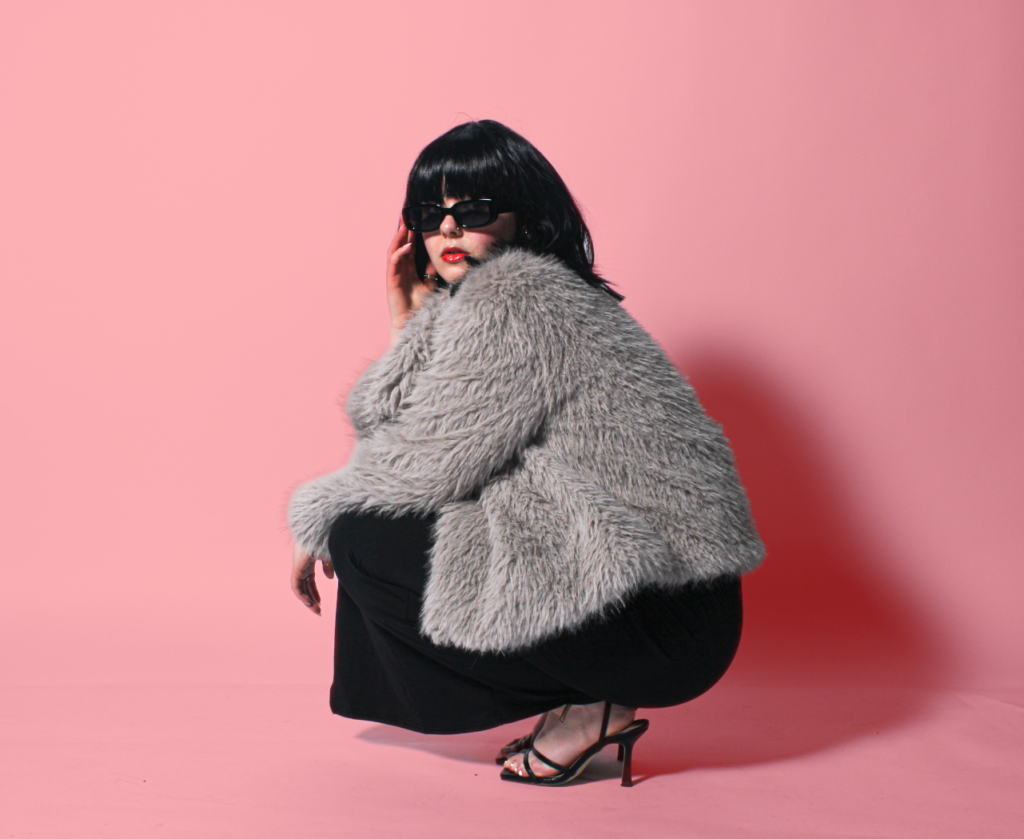
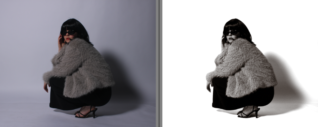
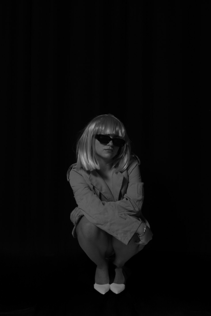
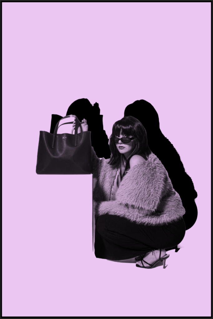
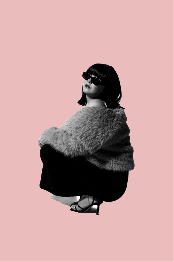
I personally quite like this, as it is quite unique and different. I think the filter makes it less dull and more quirky. I really like how the shadow has an outline of pink, making it very eye catching to look at. Just like how Kusuma’s work is very unique making it different. Although, I like both as they portray and express very different aspects and elements. The filter is style cinematic CN10 which my theme is suppose to look very theatre like, staged and carefully crafted and cinematic, hence the wigs and very unrealistic props.
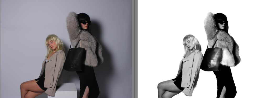
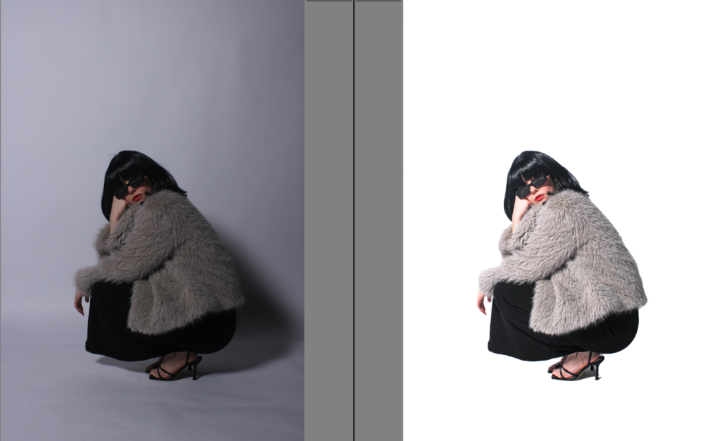
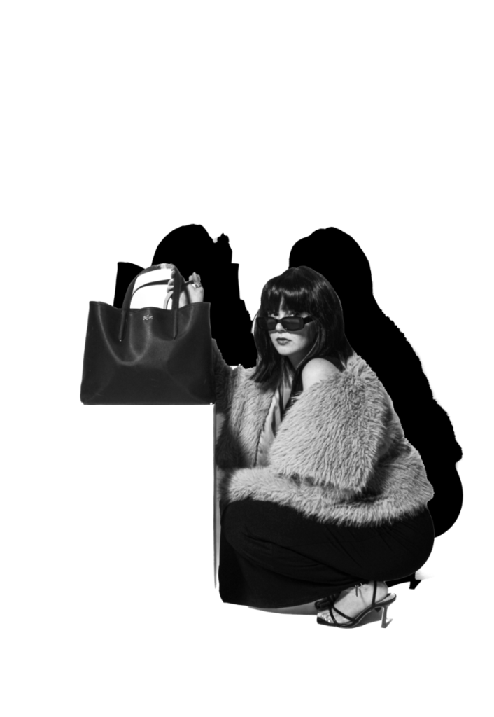
Getting rid of the shadows-
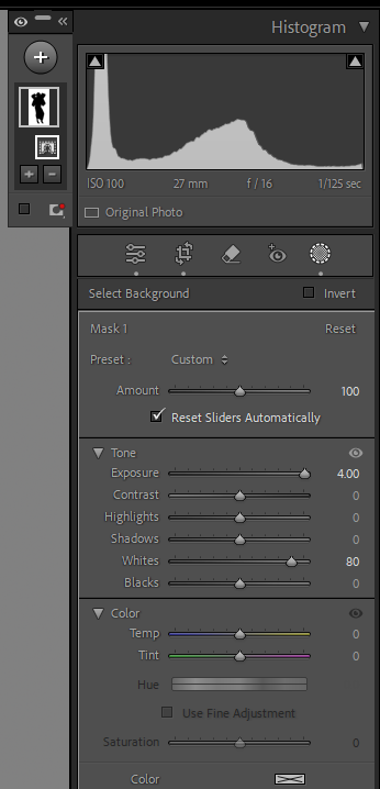
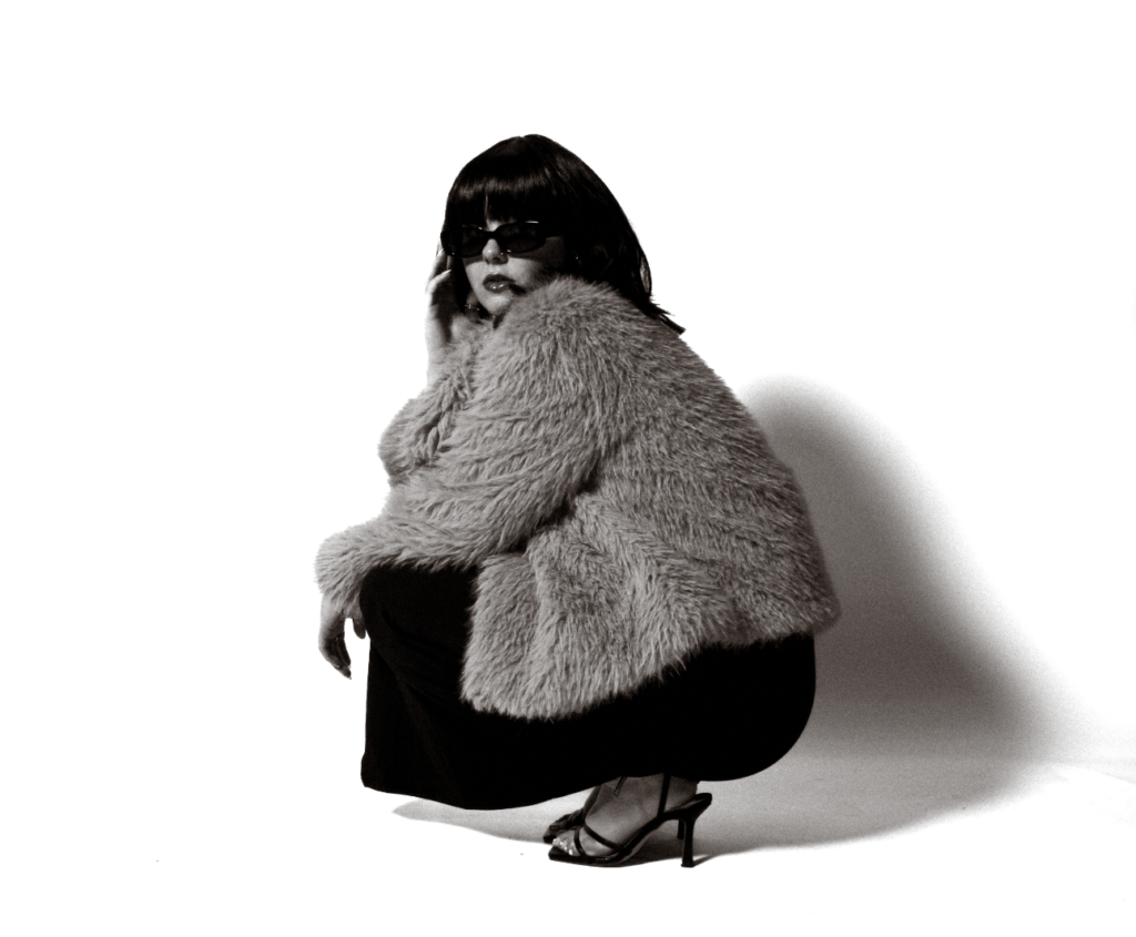
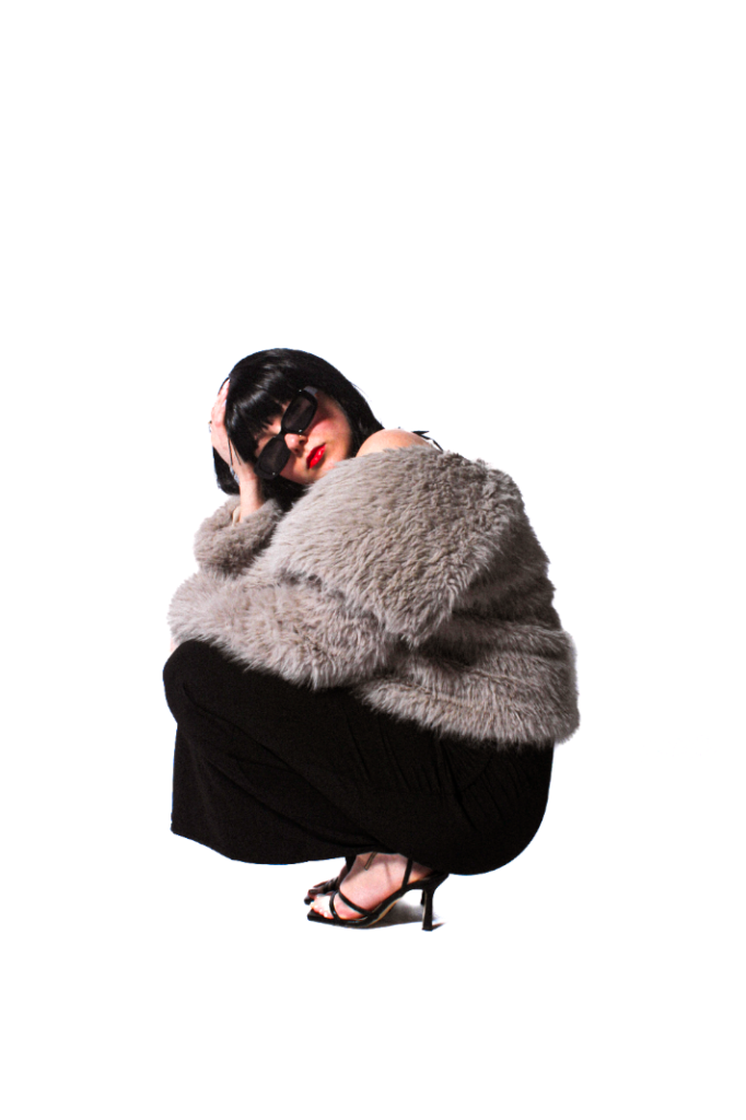
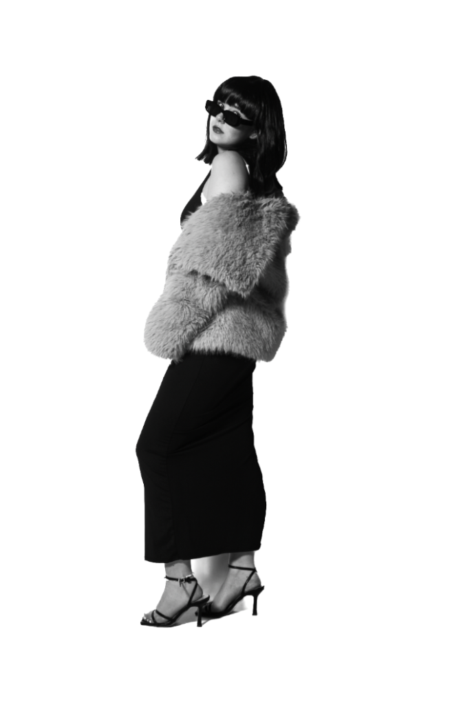
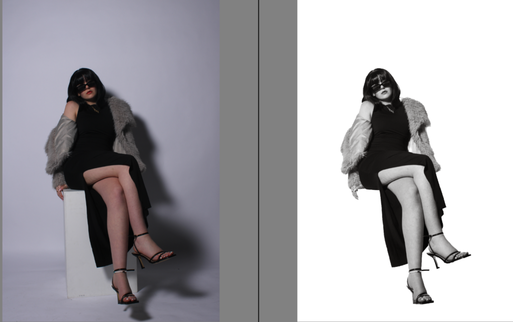
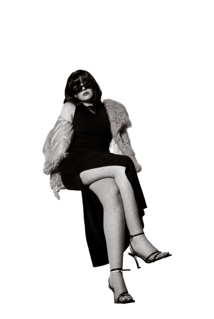
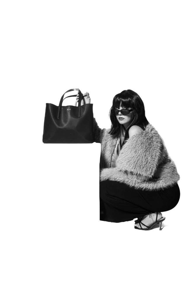
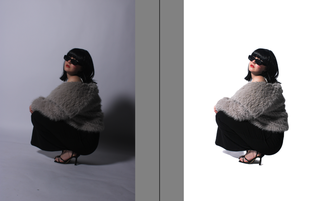
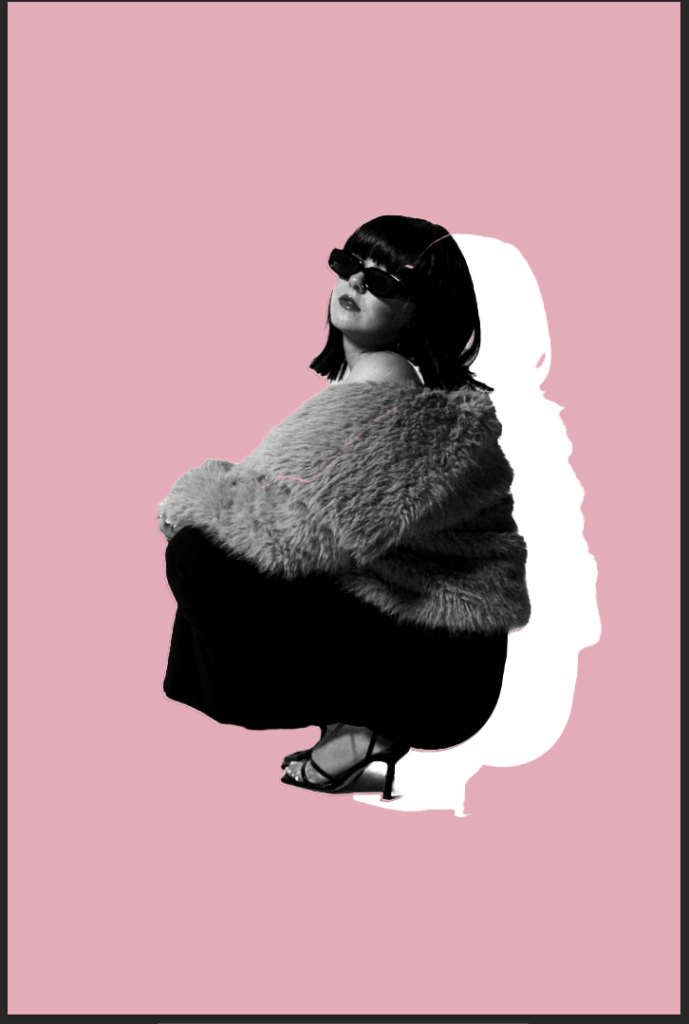
First, I did this by editing her by herself, and then clearing the background. Although it does not get rid of the shadow completely, it keeps it on a very subtle aspect. I personally like this, as it is making the subject the main element of this image. Making her stand out boldly which I personally think suits this type of cinematic photography I have decided to aim for. Due to the aim of making it a luxurious and glamour aesthetic, the clothing is a massive part of this theme. It is almost to look like a fashion shoot with an aspect of wealth. To make this more clear, I increased the texture so you could see the ruffles in the dress to make that more realistic. This also made the wig look more realistic and the fur coat more more texturized. I think this definitely did a lot. Due to the discarding of shadows, the subjects body shape was more noticeable. Another thing to emphasise this was to decrease the blacks to make the ruffles and fur texture more obvious and clear. making the subjects body shape more eye catching. Which is significant as Helmut Newton focused on body size, specifically a certain type causing beauty standards. However, he also added to the revolution of women in the media. Making it more normalised for women to be in the main-stream fashion media which I think this photoshoot gives an aesthetic of. The filter CN10 adds an aspect of uniqueness which links to Yayoi as she was known for her unique beliefs around the body and the female identity.
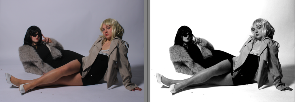
Overall, I think it depends on what I am trying to aim for, which is why I am experimenting to see what I prefer. If I wanted my images to look as if they have came from a more artistic perspective, I will keep the shadows, and experiment with them. However, on the other hand if I wish for my photographs to come from a more fashion photoshoot surrounding women in media that is suppose to look professional, which differs more to my old project, then I will discard the shadows. the reasoning of the shadows is because my subject is standing too far back in the studio against the white backdrop. Although, one thing I do definitely like more from experimenting is the more texture and decrease in blacks to make the subjects clothing more clear and vibrant.
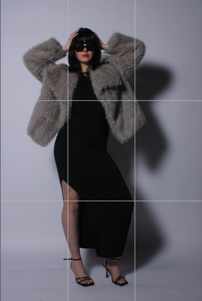
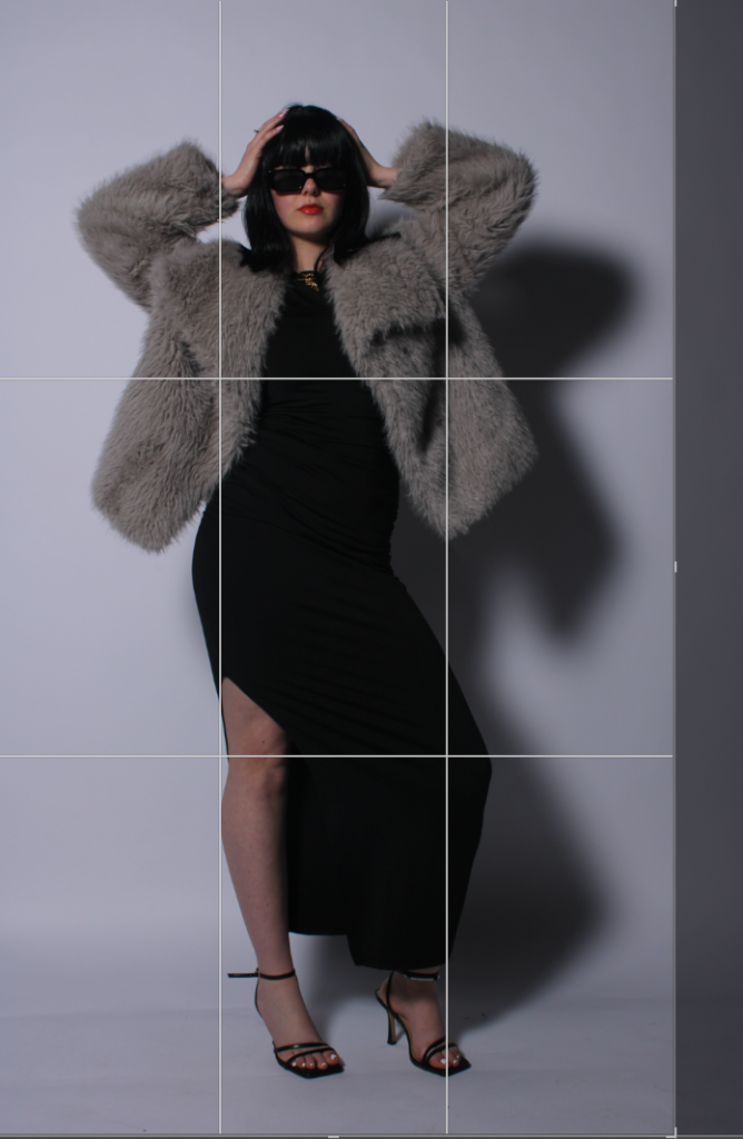
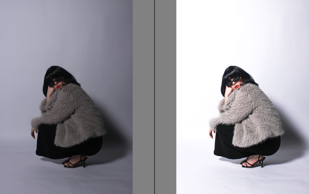
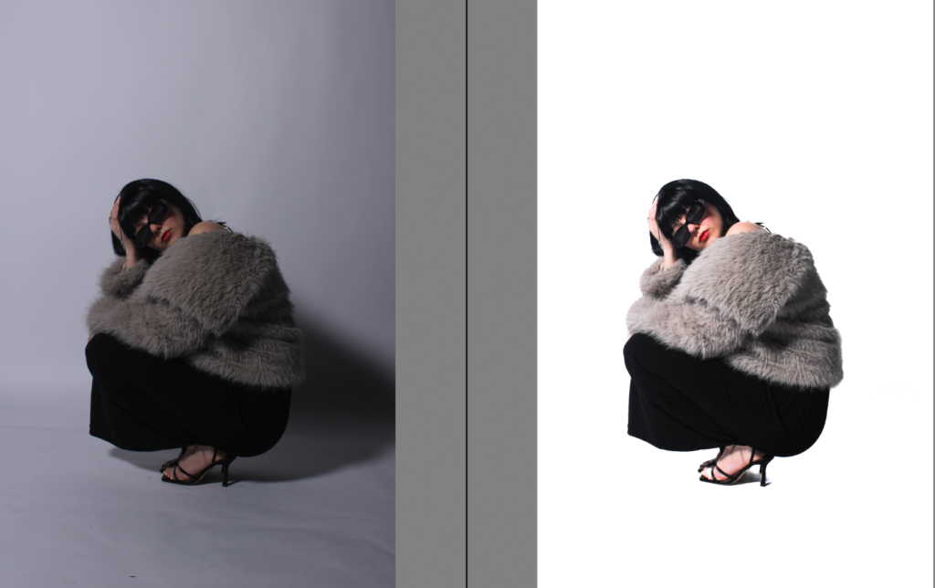
Using this tool and the rule of thirds, I could immediately tell that the subject was not in the centre, making it look un-professional.
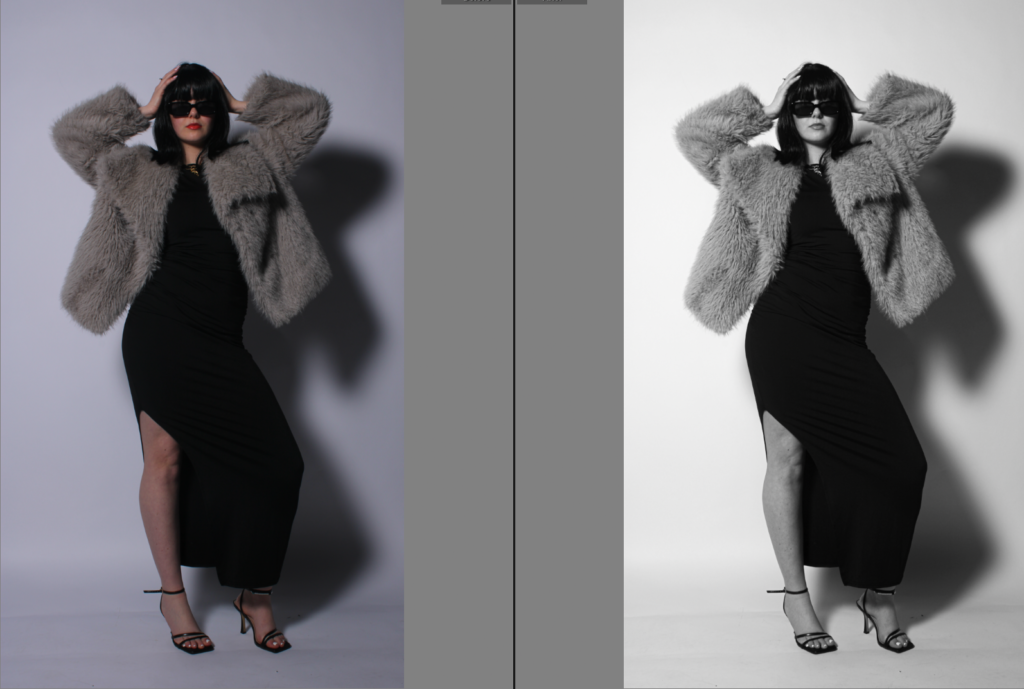
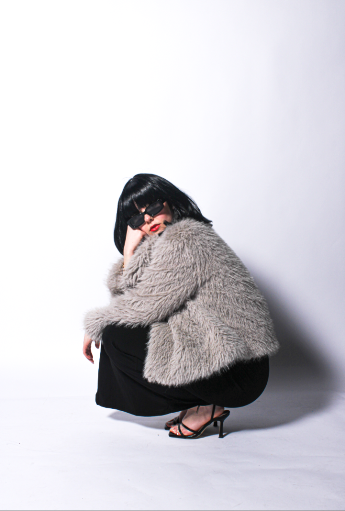
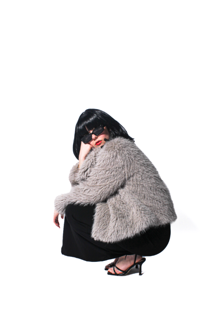
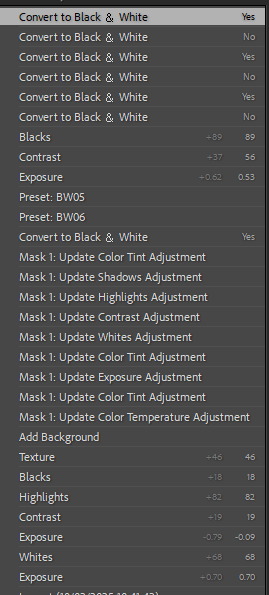
Most of my editing will stay the same, however I will experiment with different filters to see which one I prefer the most. Within this image, I really like it in colour as the red lip symbolising femininity really stuck out to me and I really liked the contrasting with the wig and the black dress with the fur coat in-between.
Detecting the background –
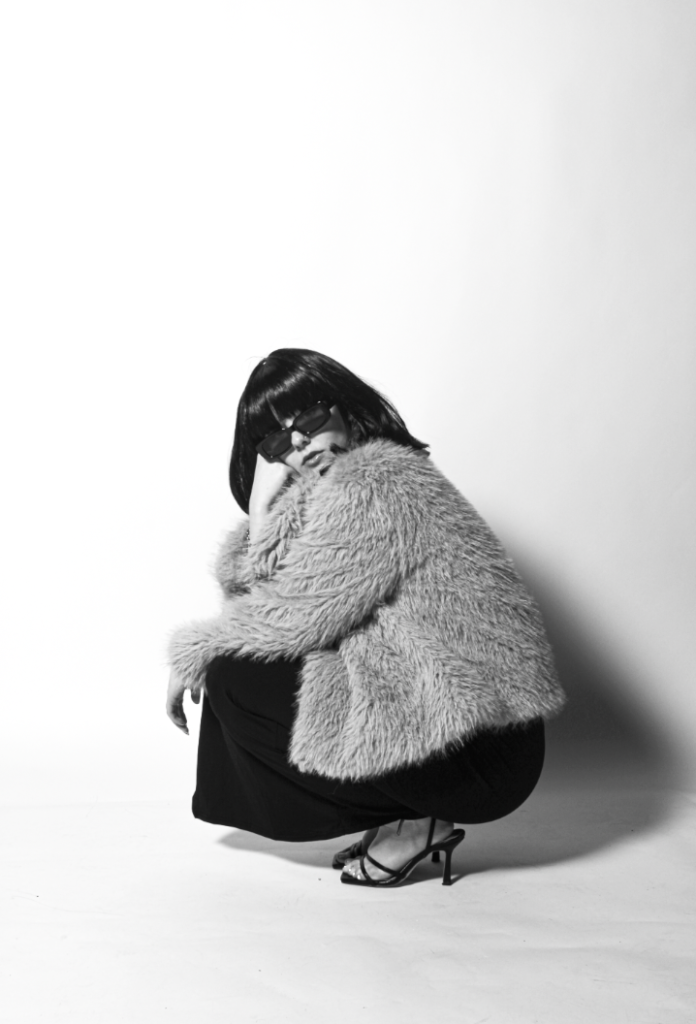
I really liked this filter at of most of the ones I have experimented on so far, this is the BW11 which I think makes it look very retro and vintage which I really like.
In colour:
With BM11 b&w filter-
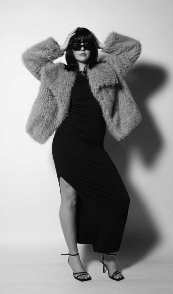
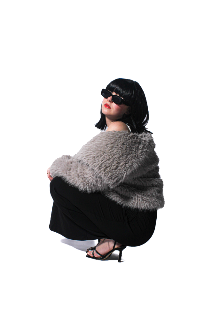
I definitely prefer this image in black and white as the originals subject’s skin tone does not make the red lipstick as bold, therefore, after putting it in black and white and using a BW06 filter, the subjects facial features are more deepened and richer, allowing a viewer to notice it more as it is very significant to my photoshoot.
BW11:
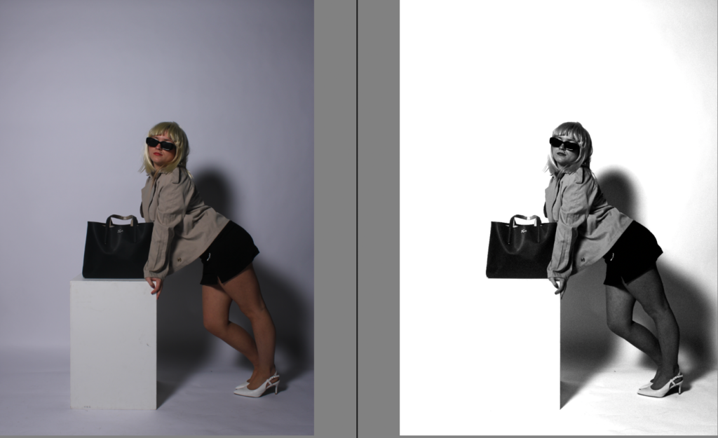
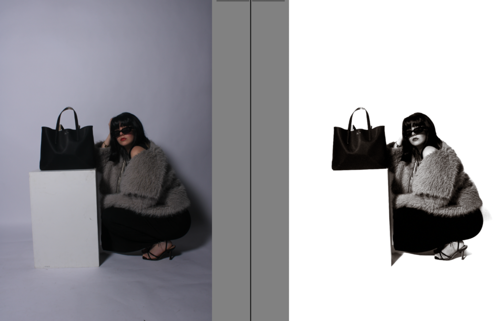
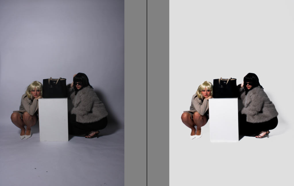
Experimenting using photoshop to change the backdrop-
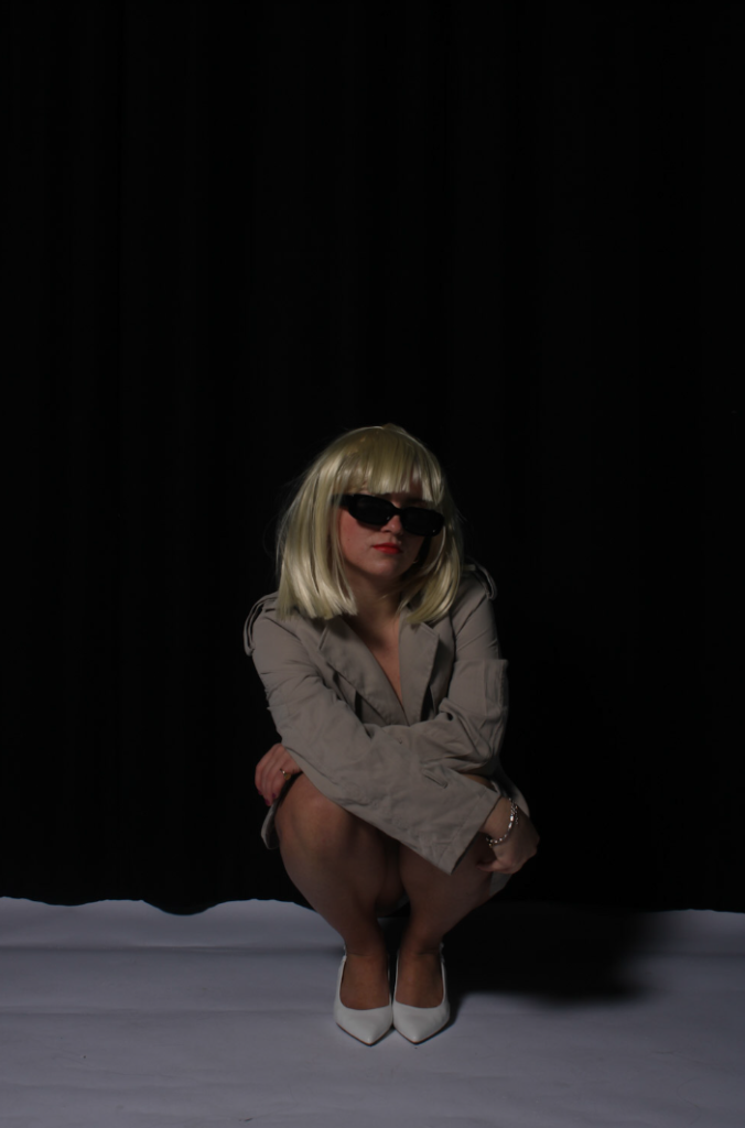
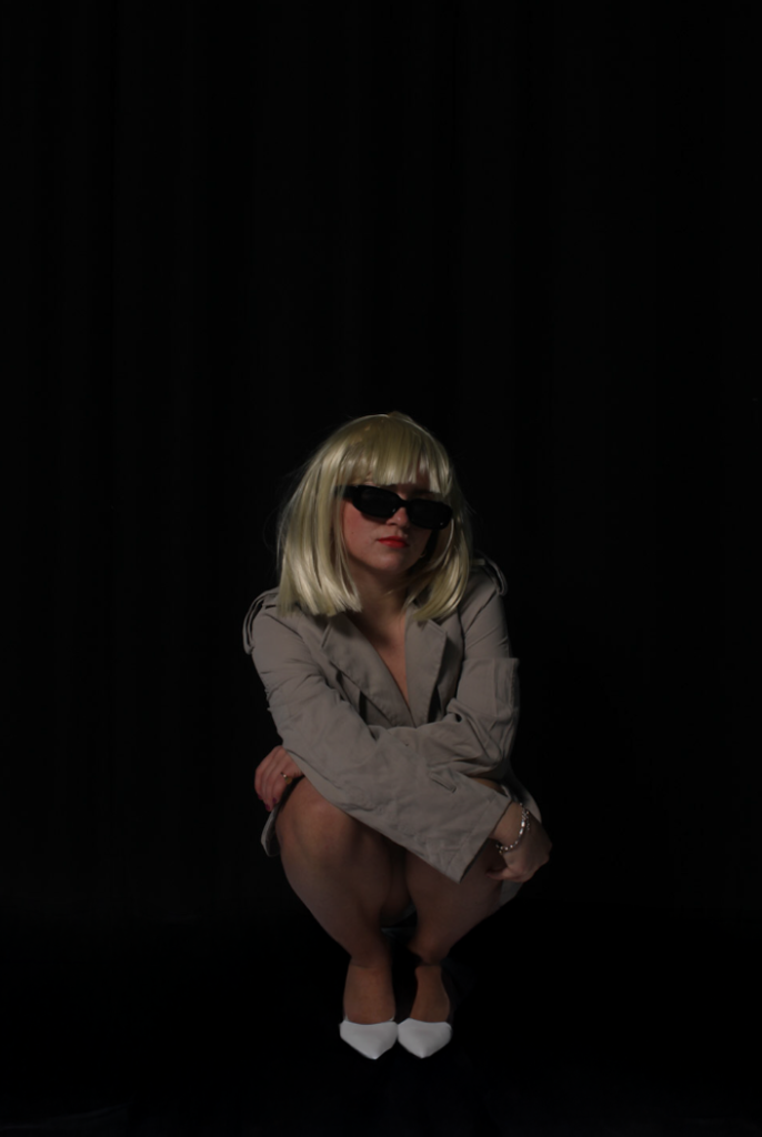
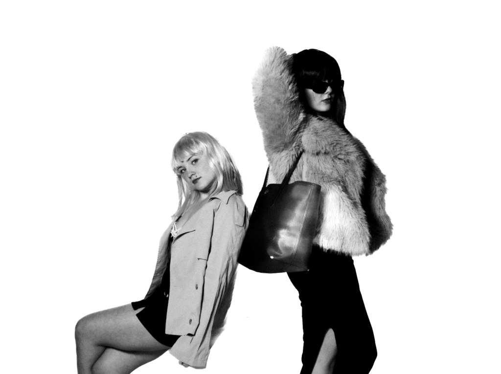
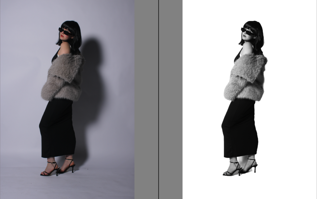
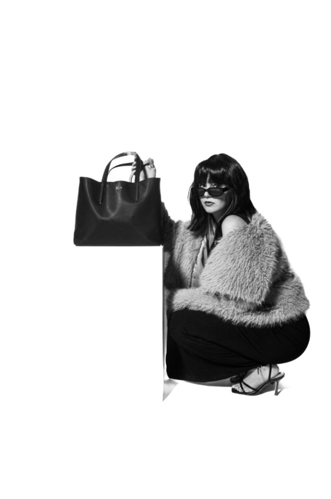
I personally think here, I have experimented however I have learnt for my next photoshoot, to use a white backdrop to make the subject stand out rather than the black one. I did this because I thought my blonde wig wouldn’t stand out against the white background as much. However, the white backdrop overall looks more professional and emphasises the medium to stand out significantly.
Using BW06-
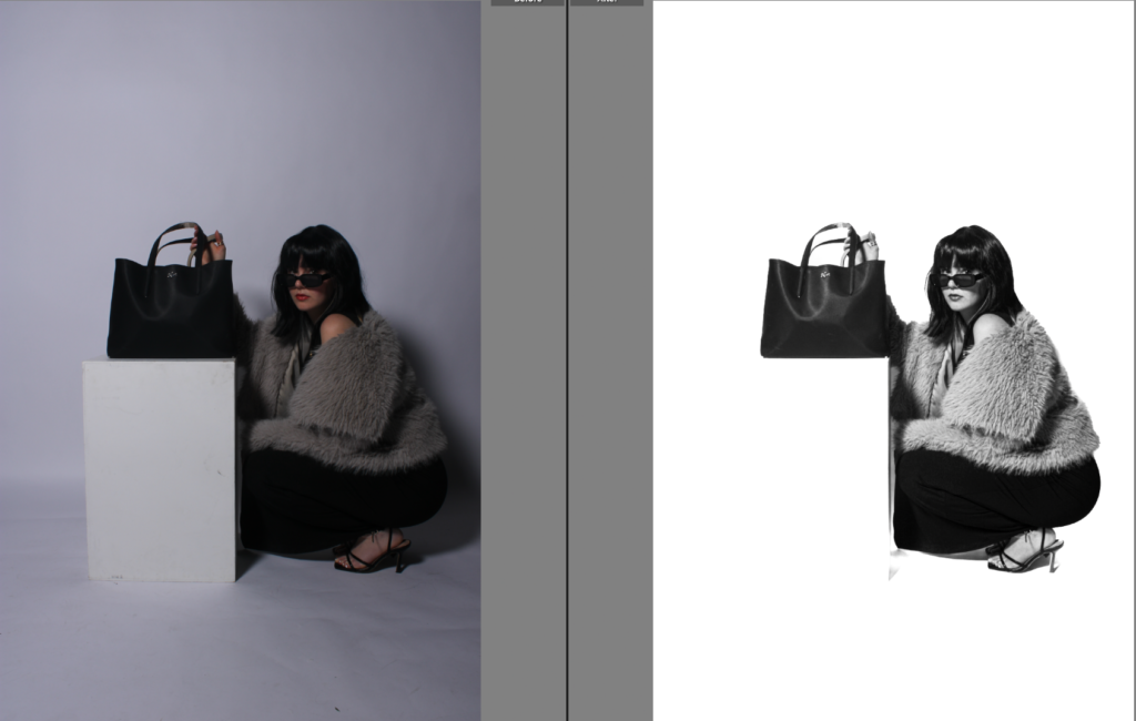
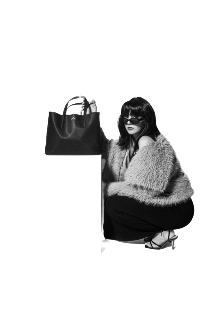
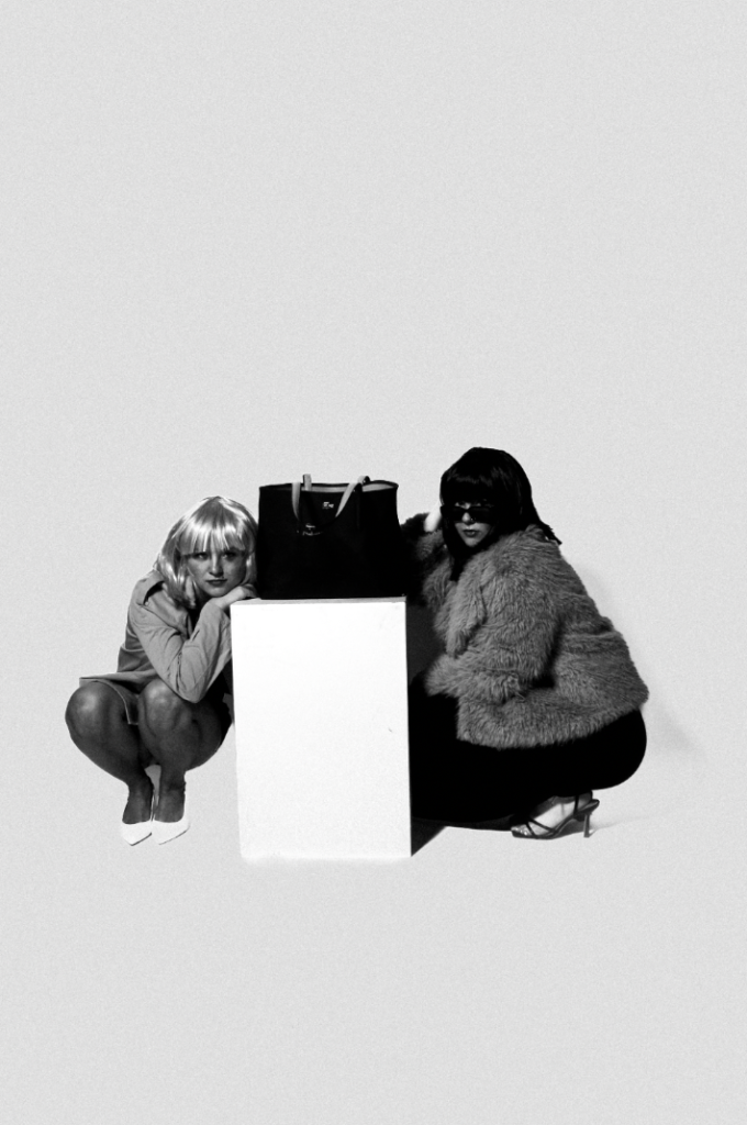
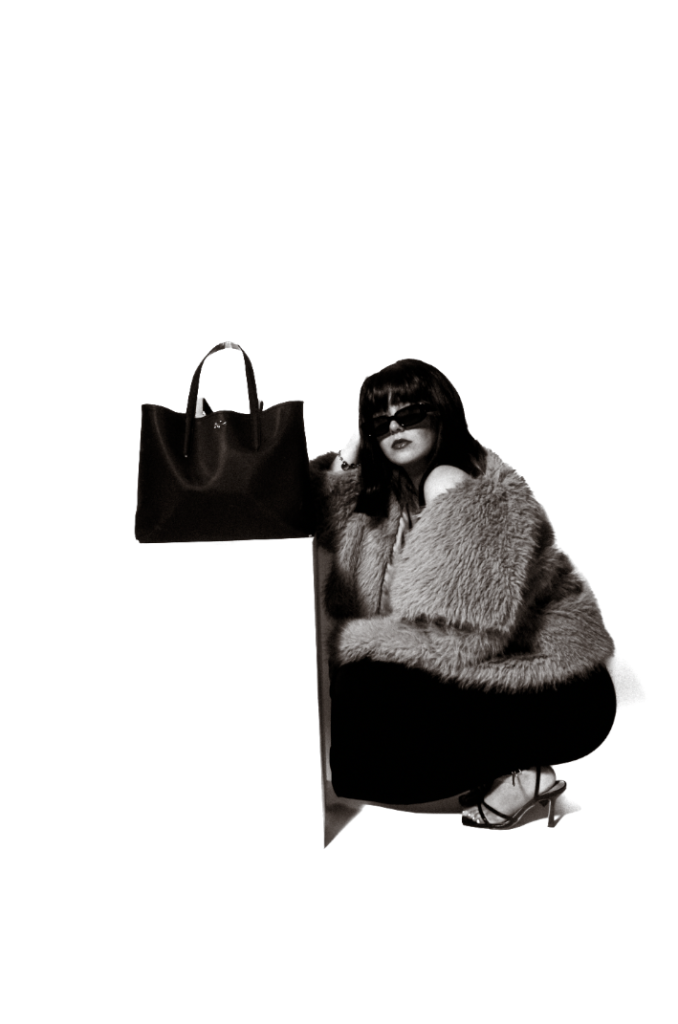
Experimenting in photoshop to see if I can create the illusion of the bag floating by rubbing in white around the shadows and line of the bag stand.
After experimenting, I came to the realisation that because of my subjects clothing such as the fur coat. It would be challenging for me to make it look realistic as I would have to go around every strand of fur which is almost impossible. However, I believe each experiment is significant as I learn and gain experience each time. Therefore, this was my final outcome for this image.
Experimentation in photoshop:
Colour overlay and stroke:
Experiment
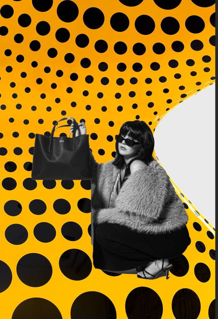
Yayoi Kusuma inspiration-
BW11 filter:
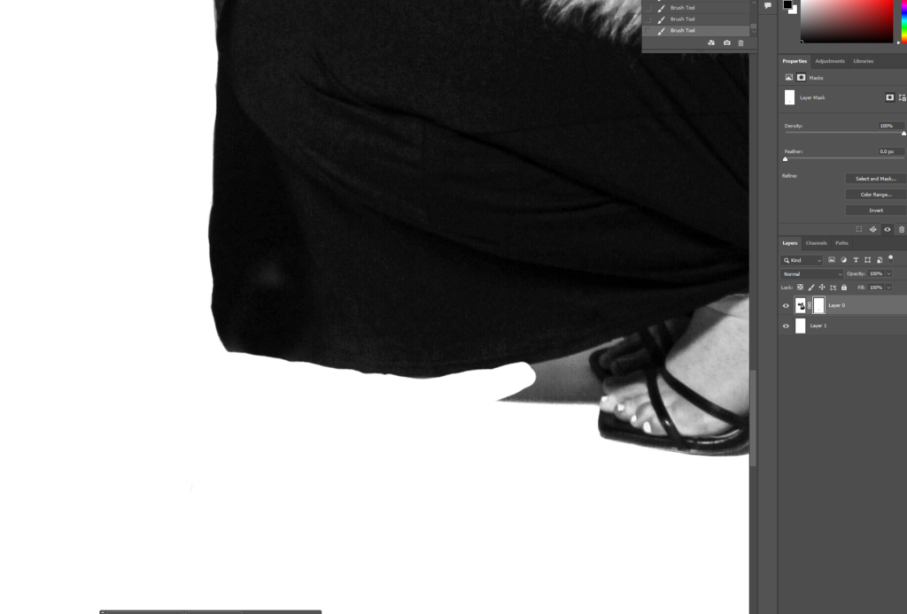
Using the eraser tool, I got rid of the shadow below the subject’s feet.
BW10: