
My best images:

Evaluation:
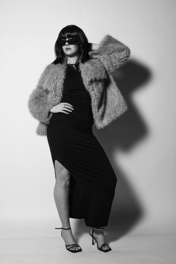
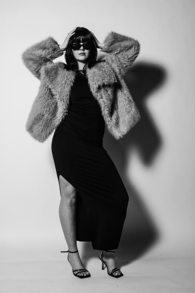
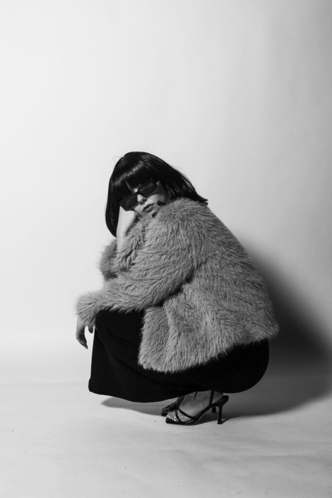
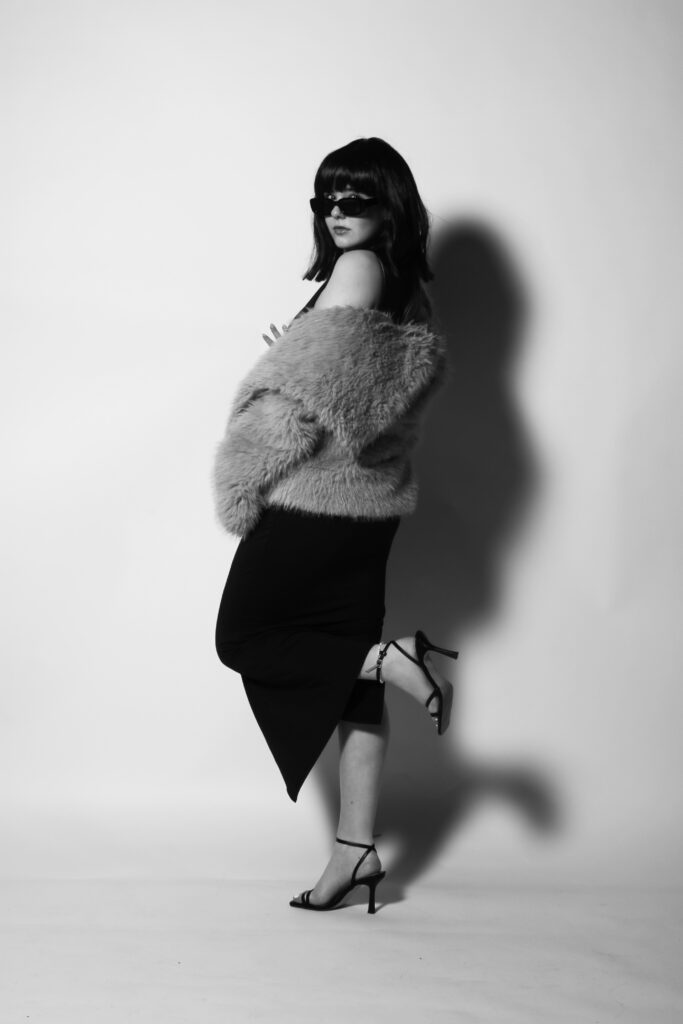
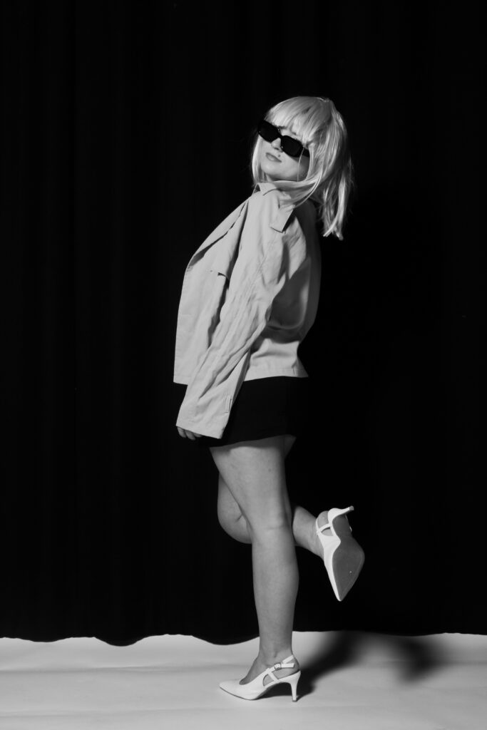
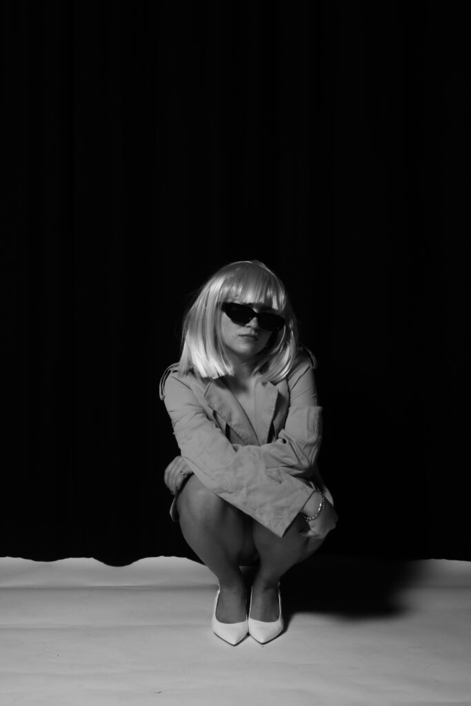
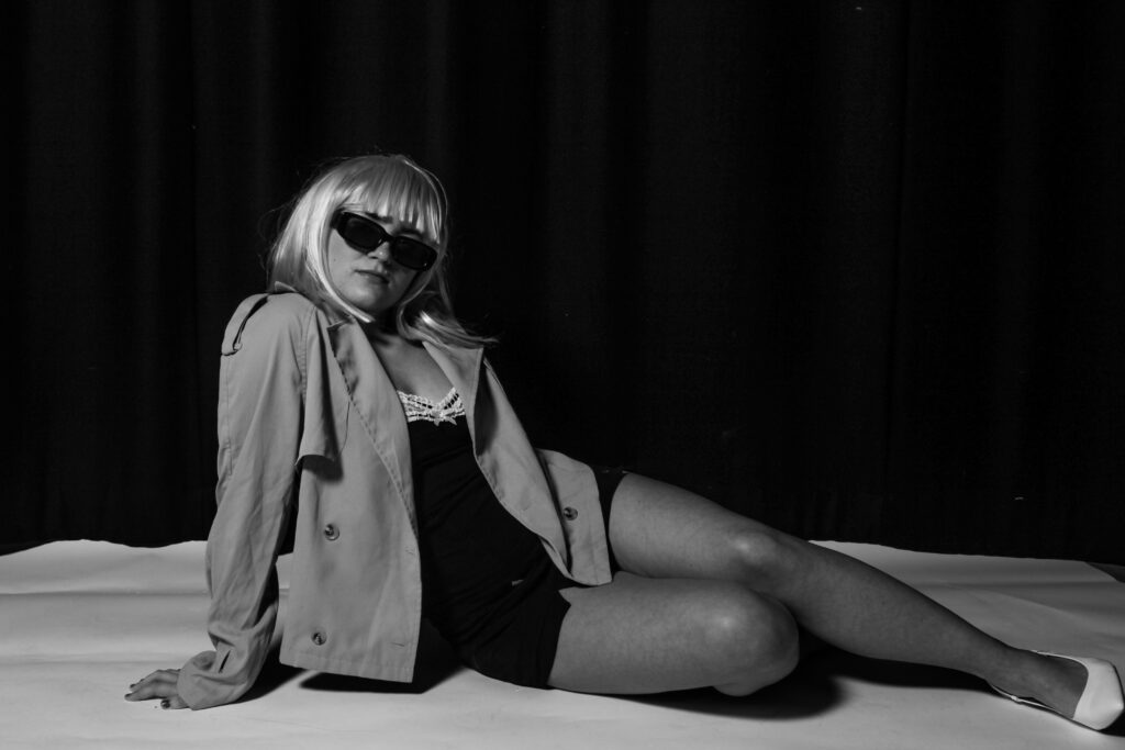
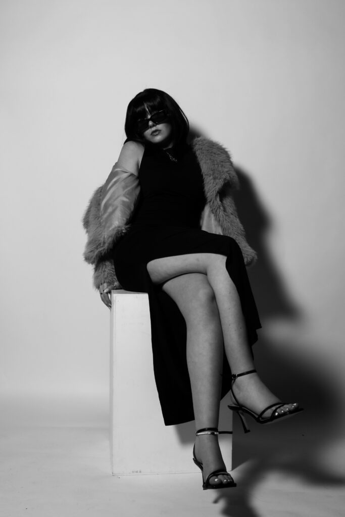
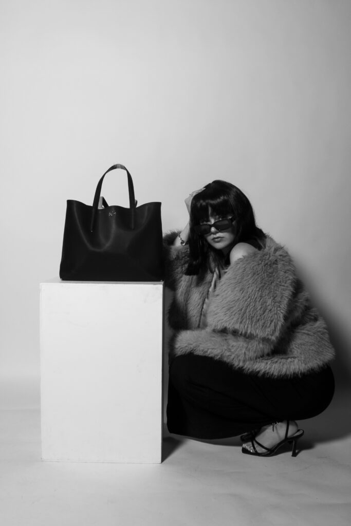
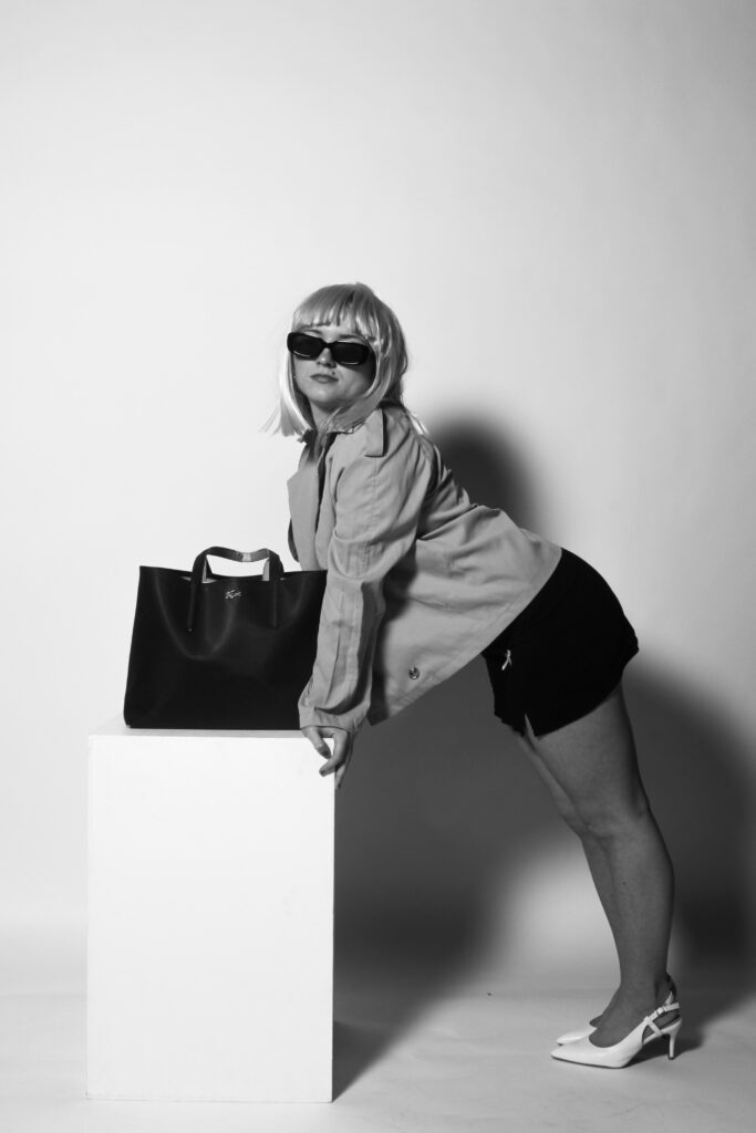
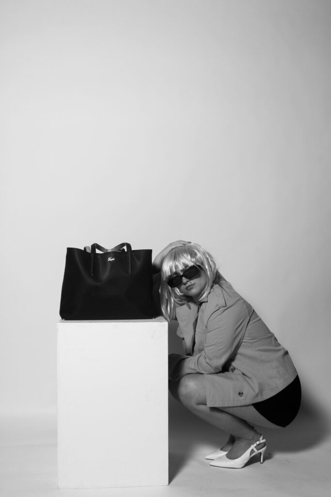
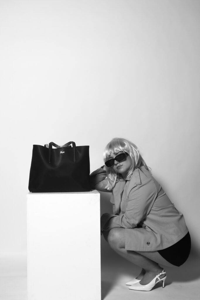
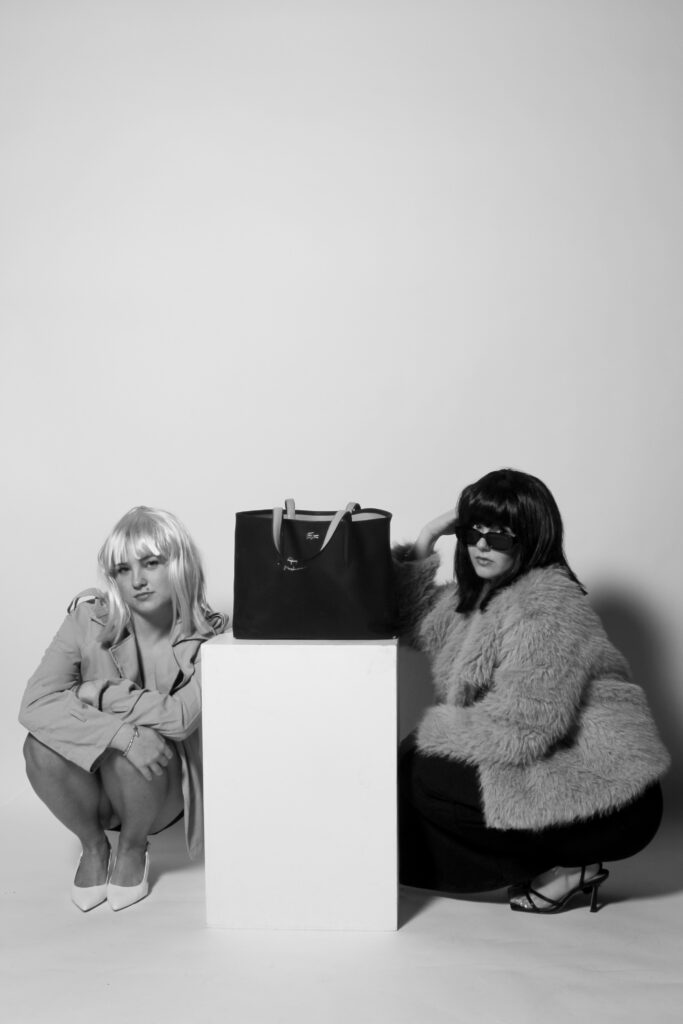
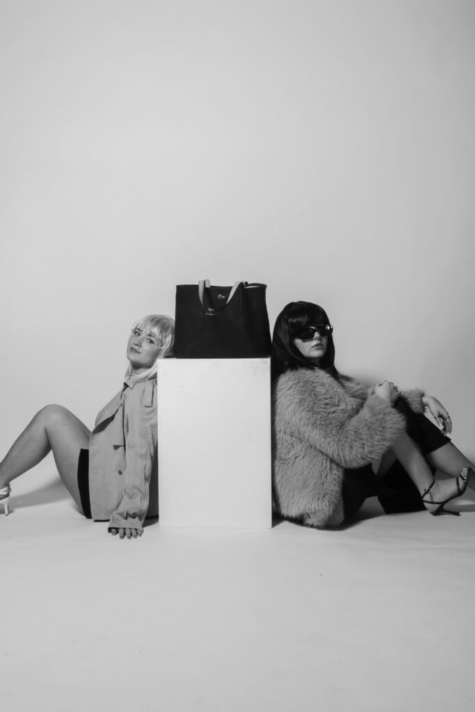
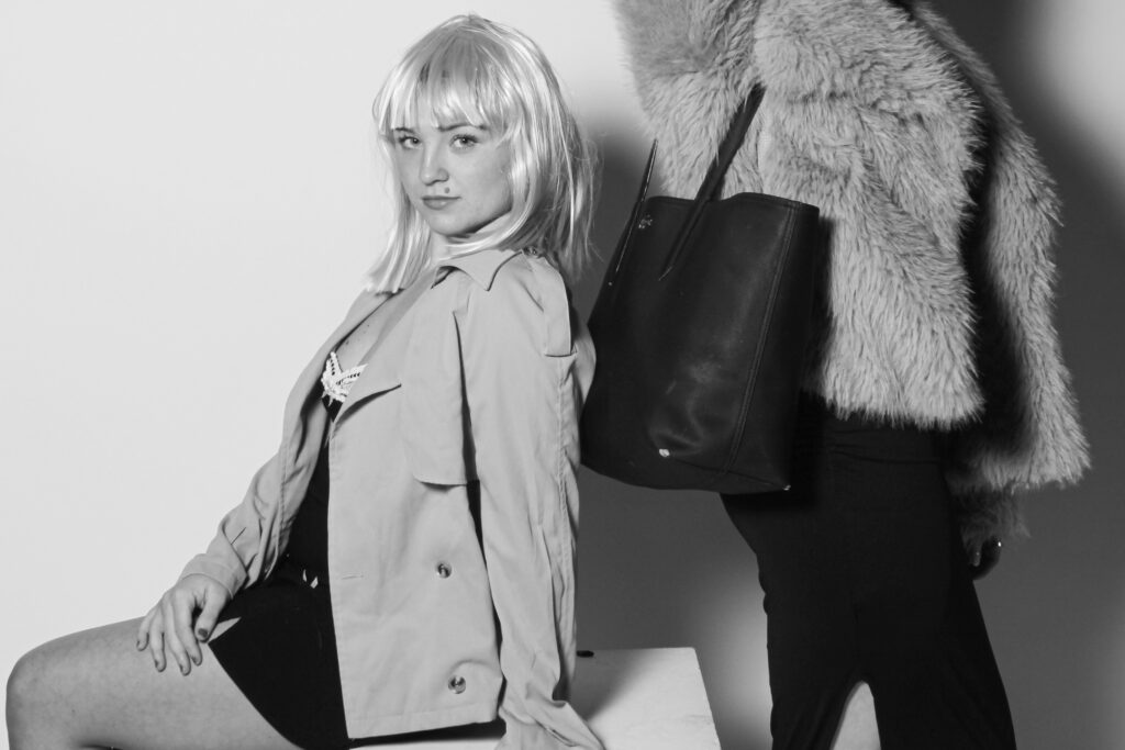
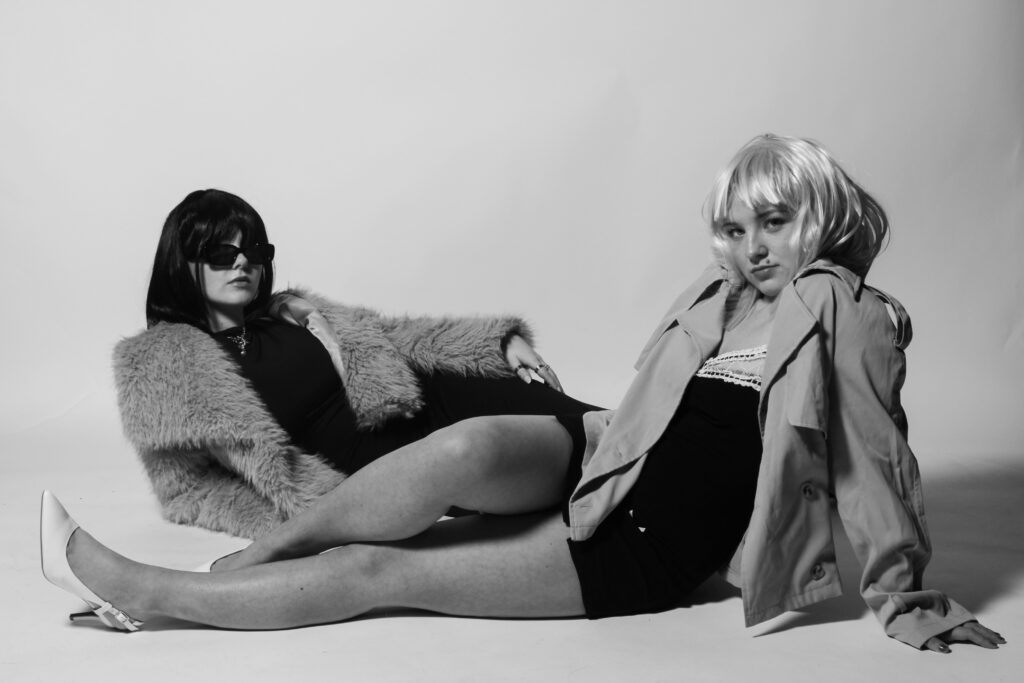
In conclusion, I believe this photoshoot was significantly more successful than the first one I executed. This is mainly due to the costumes and props used as they have more of a direct link to my artist inspirations and the overall aim I am trying to achieve through my project, while giving it a realistic approach as well as linking to historical contexts of the 1960s. The use of the wigs creates a raw sense to my shoot, where the viewer can immediately tell the time period I am reflecting on, they also help disguise my personal identity and allow me to touch on roles of other people in the 60s, which almost makes it appear representative to those women who were trying to overcome traditional expectations.
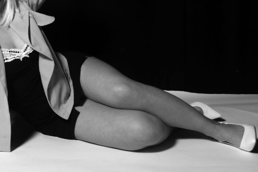
This shoot was captured in the photography studio, with effective lighting positioned right in front of the camera, which gives a more staged approach due to the brightness of the flash. The backdrops are plain, either white or black, which is a very important factor as it allows each image to look more fitting to a magazine. This is the aim I was going for as the viewer can really focus on the content within each image, and it will prevent their eyes from wandering throughout it. I think the idea of just having one main subject in the foreground against a plain background is the most effective way of carrying out a shoot, while also making it look more professional and well thought through.
Similar to my first photoshoot, I also included the large black handbag as an important prop, allowing it to even be the main subject in some of the images. This is because I feel that my shoot mostly has links to Helmut Newton, as the subjects are dressed accordingly to his shoots, as well as the black and white filters which also follow similar themes. By including the handbag, I am able to also resemble Yayoi Kusama’s work as this is one of her main focuses, working with fashion brands. I firmly believe the use of the box in most of the images is very effective too, as it allows for a bigger variety of poses surrounding it, and by placing either the models or the props on it, it is easy to immediately interpret what I want the viewer to focus on, and which elements I am trying to emphasise within each image.
What went well:
- Setting and background – makes my images look more professional and more fitting to be in a magazine, rather than being outdoors in public.
- Wigs, costumes and props – by disguising myself and playing the role of other people, I feel it tells more of a story and will allow the viewer to connect with my work on a deeper level by seeing close resemblances.
- Has clear and visible links to both of my artist studies, while also having my own unique approaches, showing my understanding of each artist but being able to tell stories through my own work.
Improvements that can be made:
- Stick to white backdrops – by using only white backdrops, it gives more of an organised approach as the differences between each image will be interpreted quicker and they will look more effective if they all had the same background. The black takes away a sense of liveliness within the images, making them appear darker and not allowing the clothes to stand out.