
Barbara Kruger is an American conceptual artist, notably known for her collaging for black-and-white images with declarative captions overlaid in white text highlighted by a bold red. Born in 1945, Newark, New Jersey, Kruger attended Syracuse University briefly, followed by Parsons School of Design in New York City alongside other photographers such as Marvin Israel and Diane Arbus. At the age of just twenty-two, Kruger had already became head designer within a year of working for Condé Nast Publications at Mademoiselle magazine, pursuing graphic design.
Her Work:
Barbara Kruger was on TIME magazine’s list of the world’s ‘100 Most Influential People of 2021’
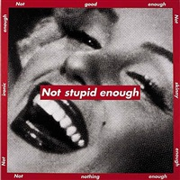
Barbara Kruger inhabits the use of cultural critique in bold colours and writing in order to judge the stereotypical behaviours within consumerism, using femininity as the basis for many of these images where she utilises this in brief yet specific political criticisms. In this language, she deliberately uses personal pronouns, specifically ‘you’ and ‘I’ to incorporate the viewer into the piece and address them alongside the media and political leaders in an authoritative and direct way.
“Direct address has motored my work from the very beginning,” Kruger said. “I like it because it cuts through the grease.”
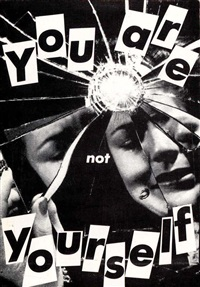
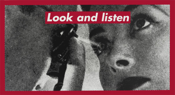
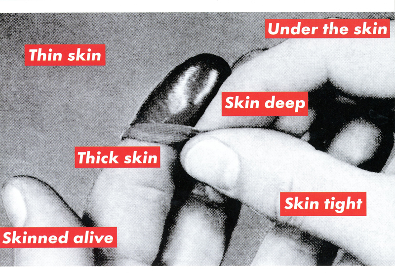
This stemmed originally in the early 1970s where she began presenting her work in the galleries of New York where she was predominantly working in the mediums of paint and weaving. This left Kruger feeling unfulfilled by her work, believing that it lacked meaning, leading her to quit creating art wholly in 1976 for a year. When she returned to her creation of art in 1977, she began to drift into the style of photography and text collaging. This enabled her to develop into her signatory style of large black-and-white images that were contrasted heavily by typically using red-banded text. These were images of the past that she had found and recycled and narrated them with interrogatory phrases using text styles of mainly Futura Bold or Helvetica Extra Bold.
On top of this, Barbara Kruger has incorporated video works, audio works, written criticisms, exhibitions, the designing of products (T-shirts or mugs) into her diversified portfolio of work. Alongside this, she has also taught numerous classes and developed projects within the public eye. These consist of billboards or bus wraps to further her message of cultural critique at a larger scale.
“I work with pictures and words because they have the ability to determine who we are, what we want to be and what we become,” she has said.
Barbara Kruger’s work is striking in order to prompt the viewer, and the entirety of society, to reflect on the systems that contain us, and rethink the roles that they play in their surroundings and wider civilisation. To name a few, Kruger’s work challenges and address a variety of social, cultural and political issues, questioning the members of assigned authority within the media and politics that are perceived to suppress the individual differences and identities that are unique to each person. Just some topics that she challenges are:
- Gender and identity
- Consumerism
- Feminist theory
Her photographic responses to the discourses of justices, values, fears and hope are open to all ages which is what makes these images so diverse and interpretive to everyone that views them. For example in 2015, Kruger joined forces with over 400 American high-school students in an art and writing project entitled “Whose Values?”, urging teenagers to stay vigilant and aware of the complex issues within modern society.
By raising uncomfortable questions in such a direct manner, Kruger criticises those staying complacent in the face of unjustified structures in a persistently relevant way which unnormalizes the cultural discourse and lack of cultural and general representation of specific groups in marketing and media. Many of these issues go ignored due to the obedience against what we perceive to be an authority figure or those that have been placed upon a pedestal in society to be perceived as simply ‘better’ than the general public, however by encouraging people to be sceptical or critical of the messages we receive daily, this can act as a catalyst for societal change. By influencing others to not only question their place and confines in the community, as well questioning those who are a façade, this means that the world can be visually transformed through art.
Her feministic approach:
Kruger’s take on feminism provides a brand new perspective on the movement as a whole through it’s alternate, interrogative nature of fighting against patriarchal views for the right of choice over a woman’s own body. Her work repeatedly dives into these preconceived notions and stereotypes about women, especially in the media, and actively opposes them through her direct addressing to the viewer.

Barbara Kruger has been producing examples for feminist art for over 40 years, looking into a multitude of issues within this movement from the bodily right to safe abortions due to there still being a lack of women having bodily autonomy, to the toxic culture in society that holds women at unrealistic standards, leading to the male gaze on women which nods towards the violence that is endured following this.
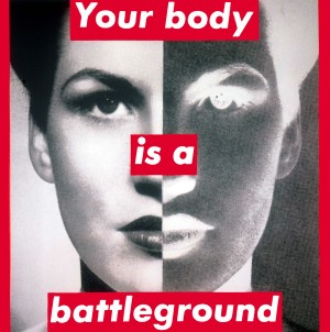
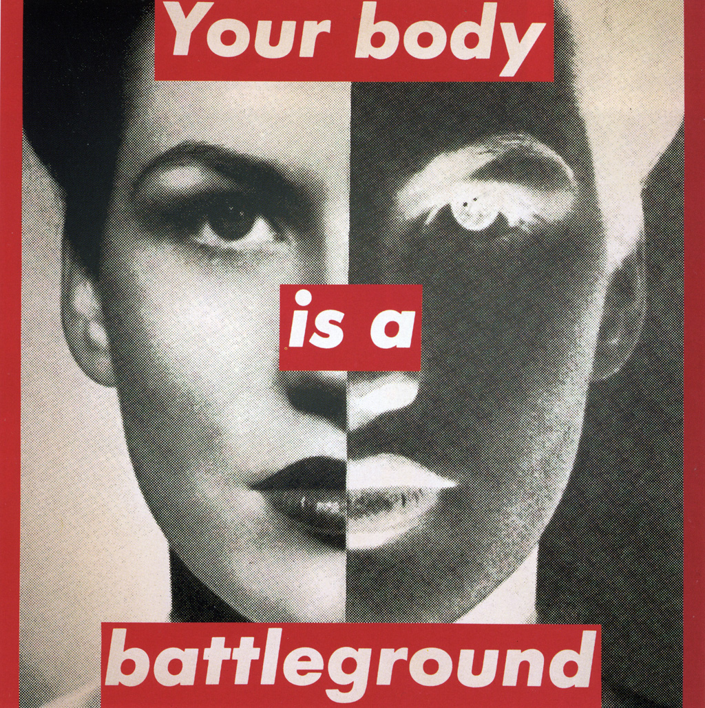
In 1989, Kruger produced a poster of ‘Your body is a battleground’ for the Women’s March on Washington in protest against the restrictions of abortion. This was extremely controversial, making it still relevant in today’s society as it stepped outside of the fixed notions set about the right to a innocuous abortion, still holding significance in the discussions of this subject to this day. As abortion becomes illegal in more countries, such as the United States as of recent, this image from 1989 still is one of the core pieces of this matter because of it’s harsh and direct revealing of reality.
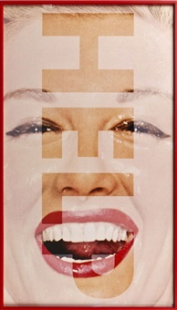
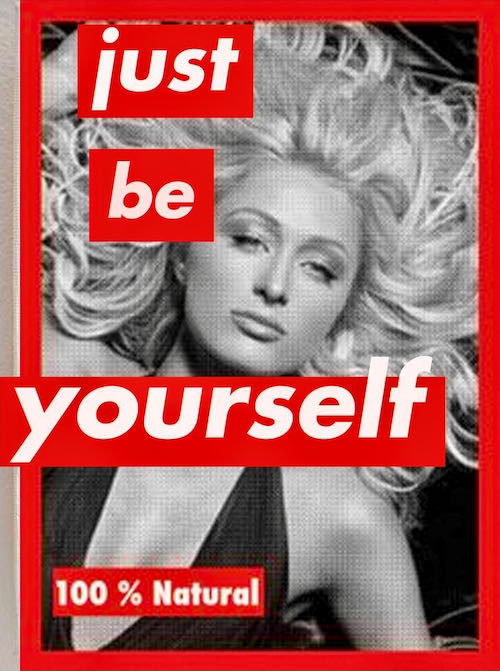
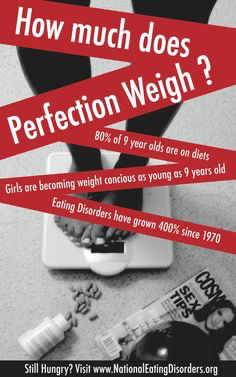
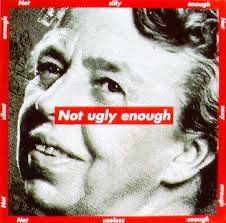
Kruger has also explored the Feminist concept through her dissecting of gender roles set in civilization, specifically the way that women are compared against falsified perceptions of what a woman ‘should look like’. This exploration zooms into the concept of female perfection, in particular facial features or physical structure. This uses powerful slogans to mock and ironize the slogans that the media slam against women, especially in the public eye, and how this ricochets into the general public where women are compared to these airbrushed images on magazine covers and on television.
This image highlights the set standards of attractiveness in Western culture, being the US, as it uses an airbrushed image of Paris Hilton across the floor. This is juxtaposed by an ironic phrase which mocks the inaccurate portrayal of women in media and represents the societal expectations that these false perceptions have caused even. This is an extremely common layout in true fashion and beauty magazines where the cover is edited in a way that is unachievable, leaving women to be compared against and have their self-esteem lowered.
As the slogan uses neutral language where a gender cannot be distinguished, this hints at how women are also highly likely to attach to these standards whether this may be consciously or unconsciously. Regardless, the constant reminder of this is demeaning to women and can be detrimental to self-esteem. The main concern behind these is that young girls will begin to see these magazines and compare themselves against what they perceive to be real and true to a lack of understanding, meaning that this could be extremely dangerous on such an impressionable mind into developing mental illnesses if this becomes an obsession, such as depression or eating disorders due to internal conflicts of trying to fit into this false idea of what they believe will be expected of them from others.
As Kruger used to work in magazines for print and graphic design, this was the motivation behind her creating traditional-looking magazine cover layouts, and pairing them with these powerful slogans that relate/ are the same as what would have been seen on one of these fashion or beauty magazines. This sarcasm allows Kruger to display how ridiculous the ideology behind these magazines is, and points the finger towards the media and marketing industries who are enablers in the psychological and physiological suffering of millions of young girls and women around the world who have access to this.
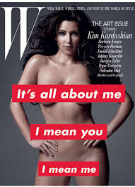
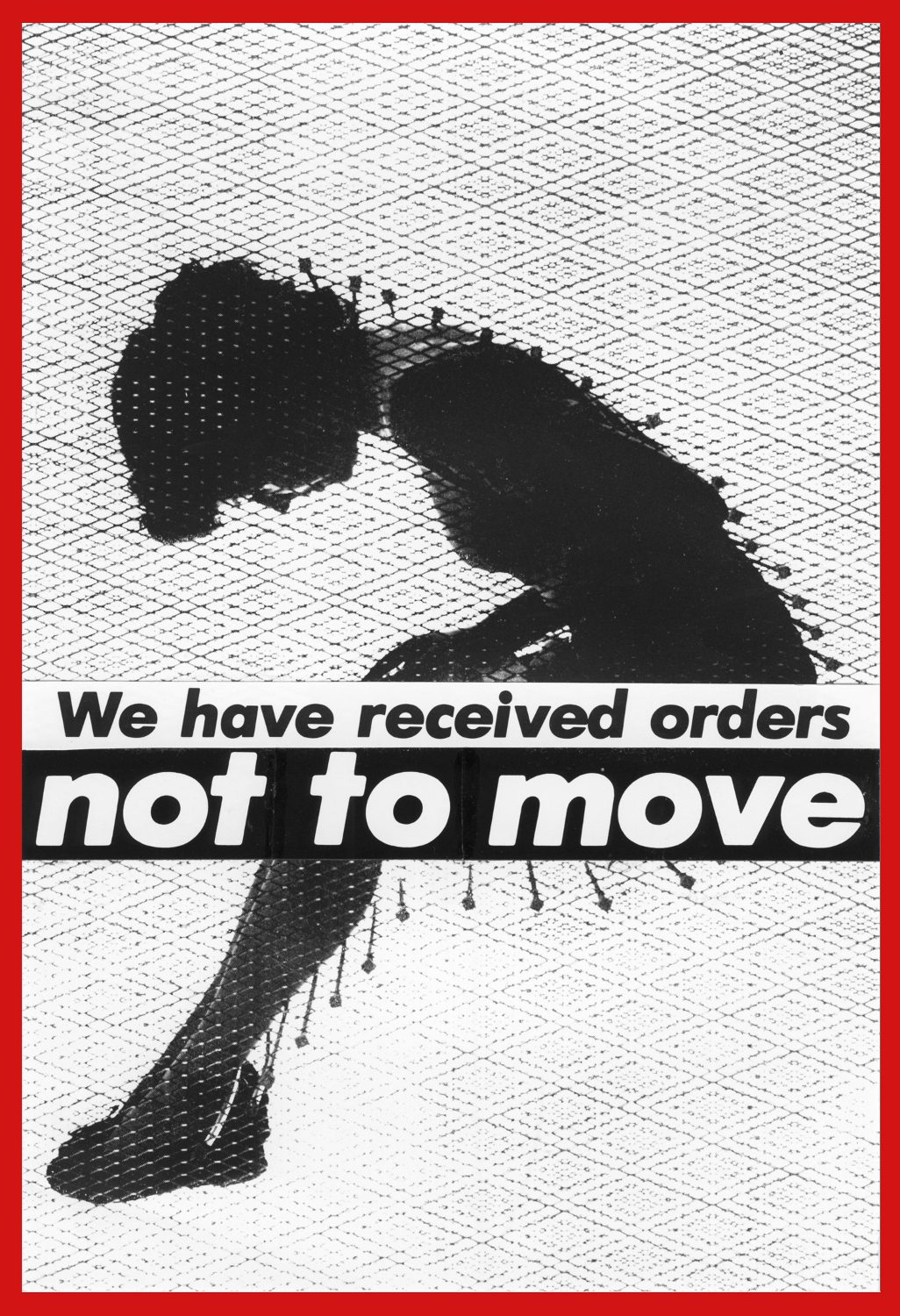
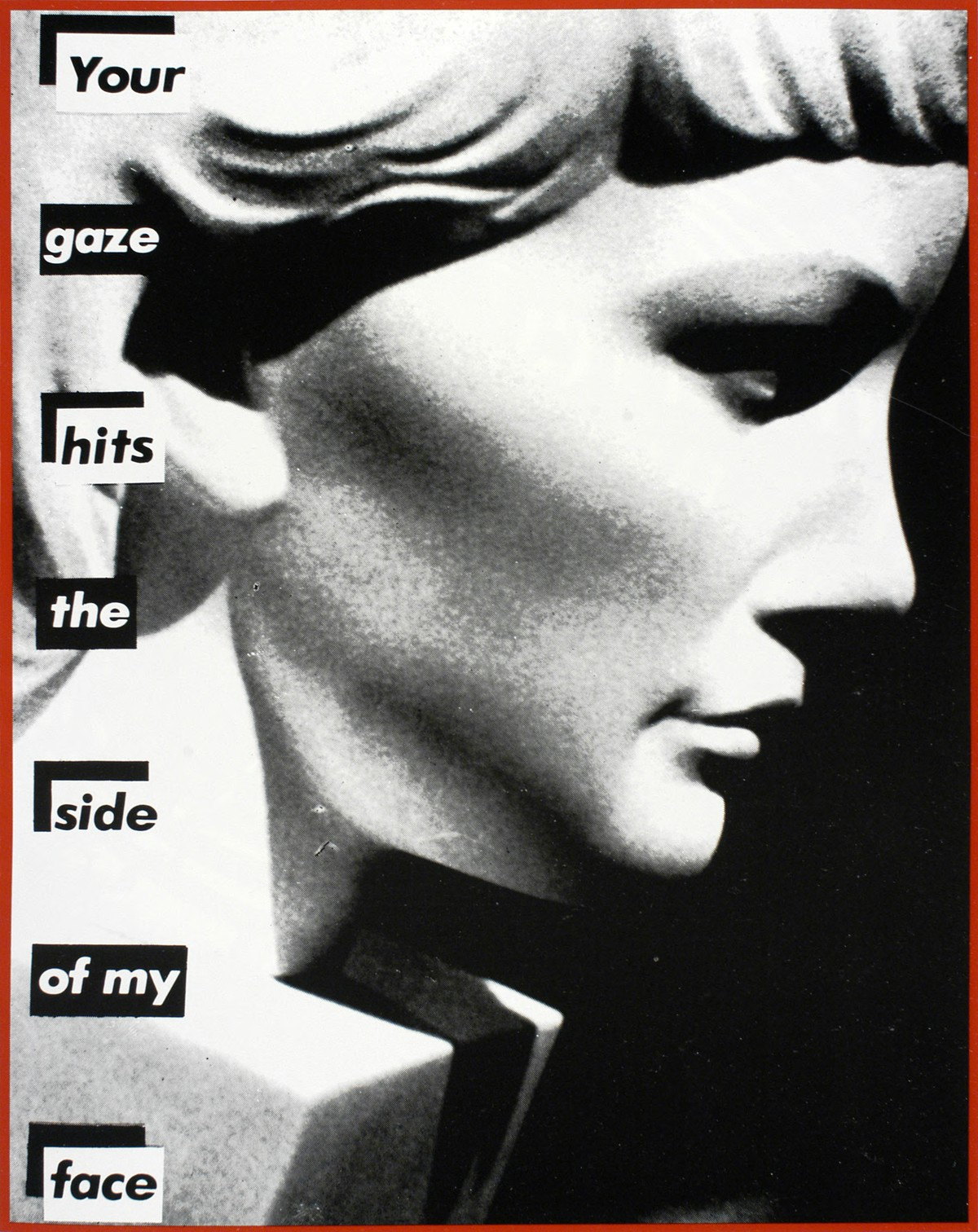
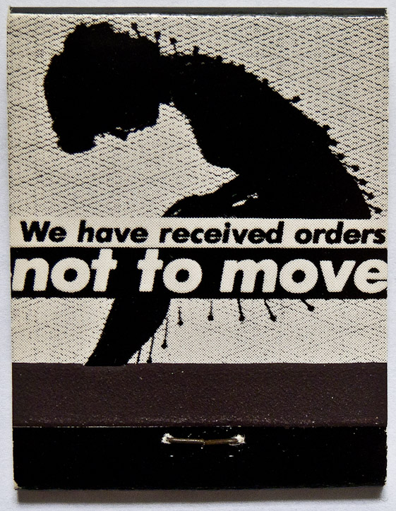
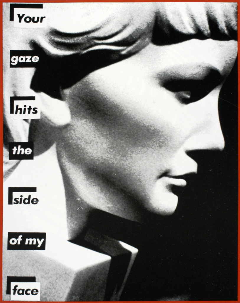
This image above was directed specifically at gender appropriation, with this being a rather infamous front cover of the W magazine. To just name a few more concepts, Kruger looks into the repercussions of the male gaze on women in ‘Your gaze hits the side of my face’ (1981) alongside the blatant exposure of the bodily entrapment of women in a mid-twentieth century society entitled ‘We have received orders not to move’ (1982).

Analysis:
This image is monumental within Kruger’s feminist art, being curated around 3 decades ago as a poster for the Women’s March on Washington in 1989 in protest against the restrictions that cause women to lack bodily autonomy, and how the female anatomy is still a political topic of discussion rather than having control over your person. The image ‘Your body is a battleground’ has a monochromatic tonality in the image, using highly contrasted black and white, which allows Kruger to build a consistent aesthetic. This is juxtaposed by the bold red slogans aligned in a row in the centre where she uses Helvetica Extra Bold in a white in order to dramatize this direct message, with the use of the personal pronoun ‘Your’ in order to address the viewer in a firm manner. This portrait of a woman can be seen to correlate with the dead-pan aesthetic as she stares into the camera, devoid of emotion, to communicate the sternness of Kruger’s message. However, the exposure is split in a line down the centre of the entire image, creating positive exposure on the left and negative on the right – generating an inverted effect as the viewers eyes move across the image. This could be interpreted as the suggestion that the work of the feminist movement is far from over, making this extremely relevant in the social context of today as abortion banning increases in the United States. This could also be a nod to breaking out of the set stereotype against women, especially in the 20th century when the fixed mindsets about what women were capable of was instilled and integrated heavily in society, to finally take away this act of modesty set in place to appease men in society. This image was revolutionary and extremely controversial because it implicitly conveys this underlying message of beginning to fight and stand up for themselves because if they didn’t, who else was going to?
As the negatively exposed side inverts all of the light on the woman’s face, this makes her stare more darting and almost unnerving towards the viewer as the brightness means that it is entirely visible. The piercing nature of this stare means that it acts as an almost ‘secret message’ to the women who view this image to really question their places not only in wider society, but in domestic settings too. At this time, this would have been extremely motivational for women to finally unite and step outside of the confines of these stereotypes. However, I feel that this image is highly suggestive of not only the fight to gain control over their own bodies and have the ability to make educated decisions about it, but also has a notion towards sexual abuse and assault. The noun ‘battleground’ means a place or situation of strife and conflict, conflict being where this restriction against abortive care comes in because this decision would rely on the men within the government system making active decisions about women’s body without the input of those who will be affected. But, this also connotes ideas of fight and defence against enemies or unwanted people entering the area, calling attention to how male violence needs to be defended against. Because of all of these conflicting issues and topics regarding women’s bodies, predominantly men in authoritative positions, this acts as a message for change and calls on the rest of women in society who may have experienced these things, and announces that enough is enough. Kruger also edits a vertical border using the same shade as red as the text, leading the viewers eyes to follow the direction of the message.
I am going to incorporate the techniques of Barbara Kruger in my own work by using the components of her aesthetic, being highly contrasted black and white images that are juxtaposed by red-banned text. One of my first photo ideas is to get my subject to stand in the centre of a road at night with many coats on as this relates to the way women’s bodies are sexualised, especially in the media, as well as the idea that women should be completely covered and not show any skin because of the actions and impulsivity of men. I am going to shy away from the more magazine cover-looking images because I don’t feel that this style will compliment my other photoshoots that are more specific, however I may end up adding a couple of these. I would like to take images that are more realistic to show truth and reality through staged scenes, instead of solely focusing on irony against the media.
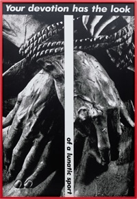
I also would like to include some images that refer to the representation of women in society, for example using statues like Kruger sometimes incorporates into her work, and utilising this to convey messages about the lack of recognition or knowledge about the achievements women have reached in history. I think this will work extremely well because it provides a different perspective to accompany my portrait images.
References:
https://www.thebroad.org/art/barbara-kruger
https://www.artnet.com/artists/barbara-kruger
https://www.vidyalai.com/blog/barbara-kruger-artwork-gender-identity-consumerism-themes-ib
Katie, excellent blog posts on artists references, analysis and contextual studies. Now focus on producing photoshoots and create new images in response.