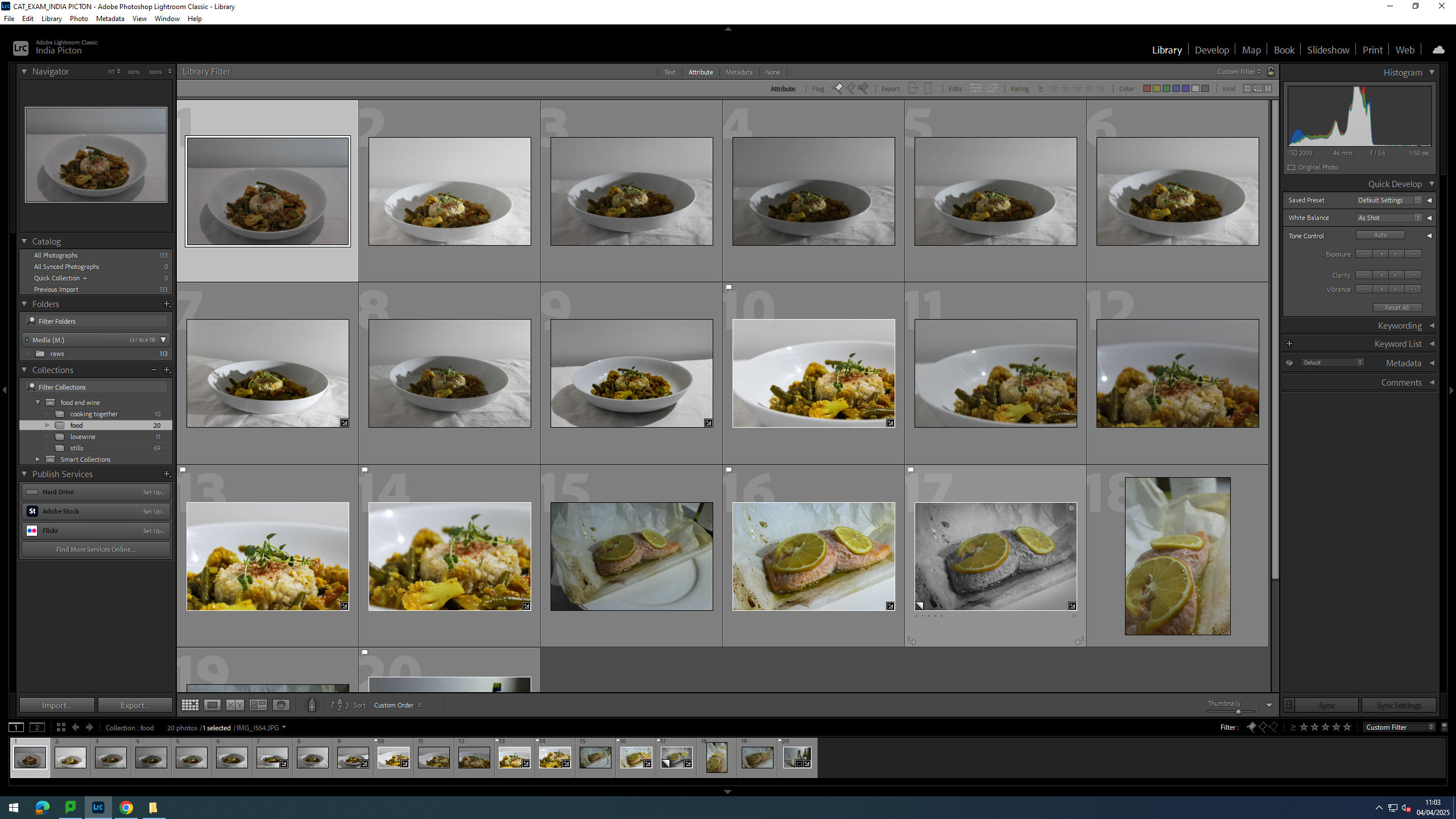
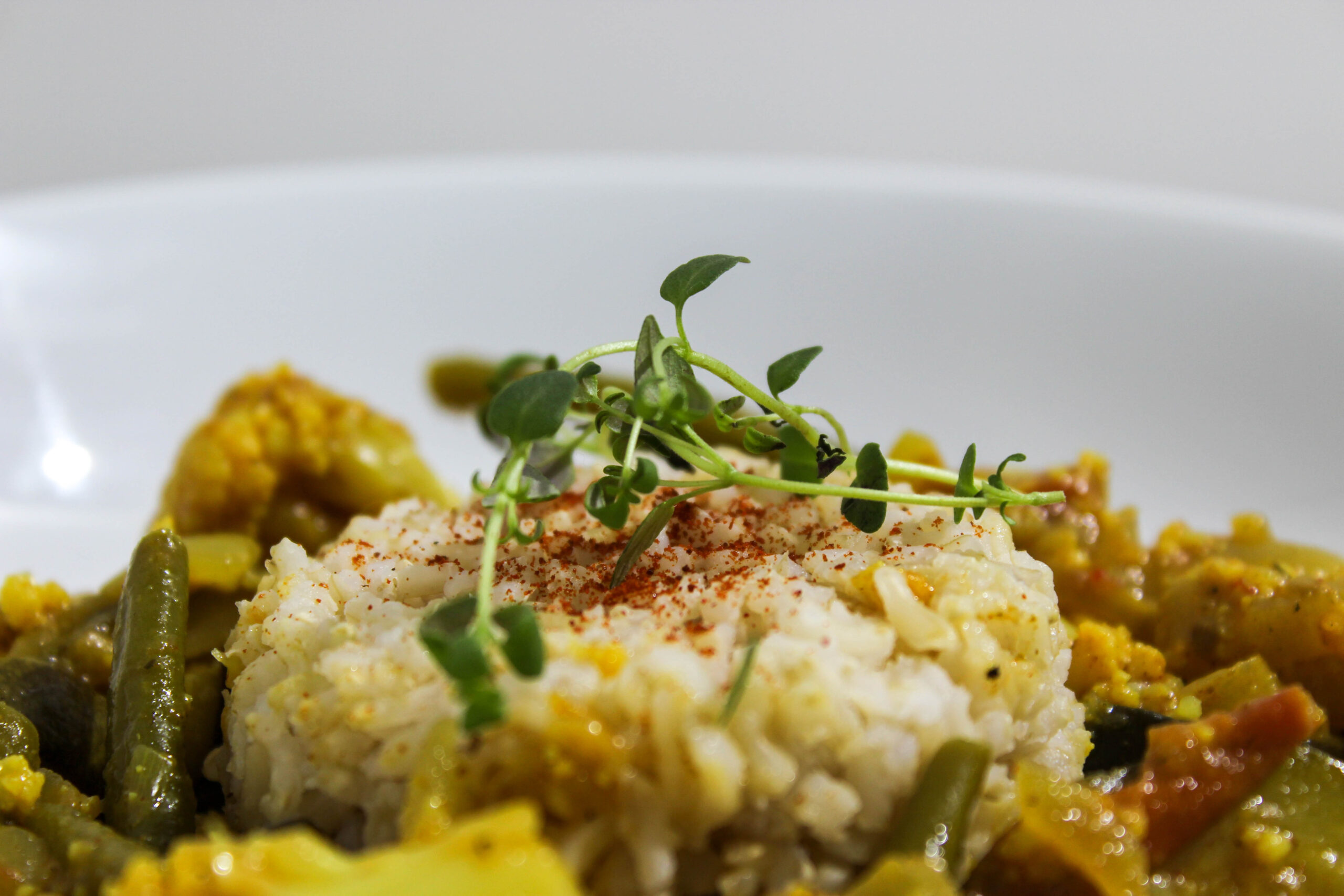
For this shoot I wanted to get some shots of meals plated up.
Contact Sheet
I ended up taking 19 photos over a 2 days.
Editing
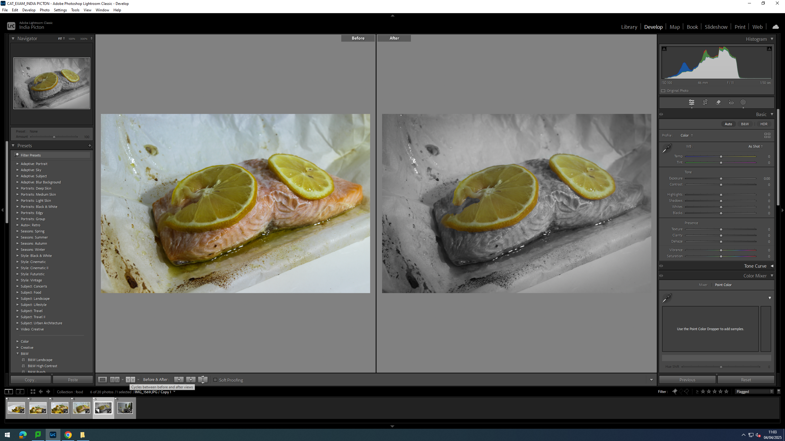
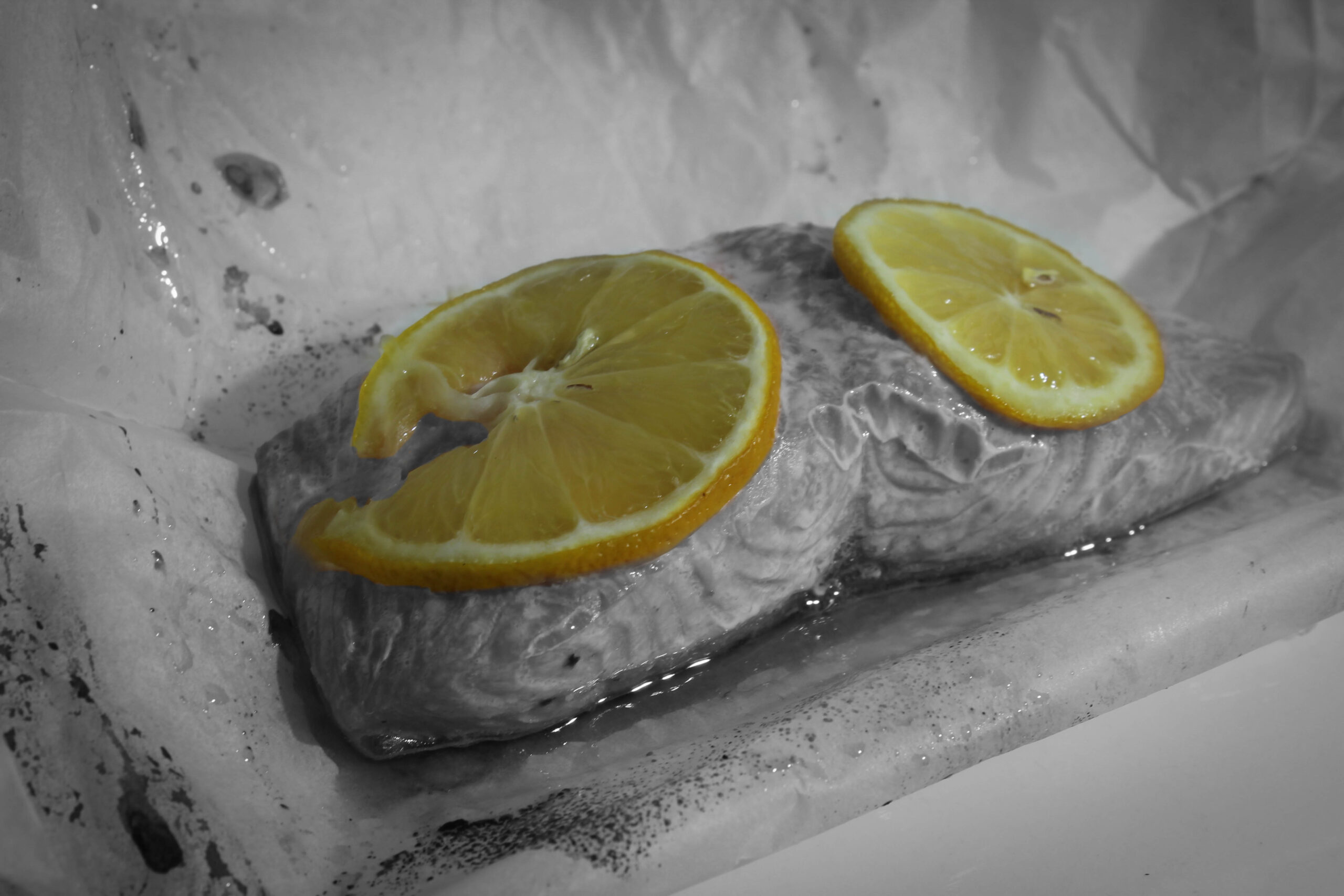
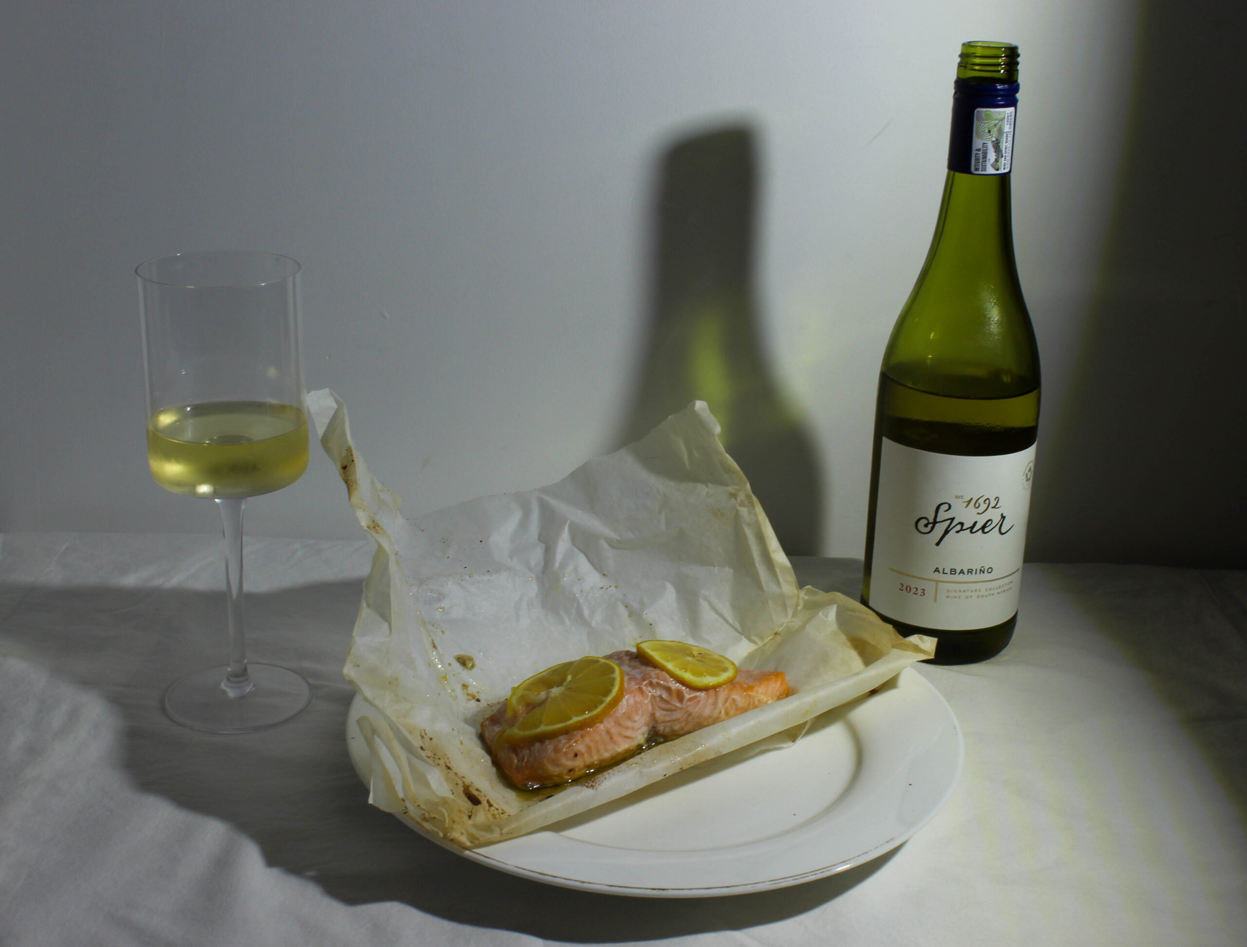
For this image of a piece of salmon, I felt that the lemon on top was muted and I wanted it to really stand out so I isolated the lemons and made the background black and white with a bit of vignette to add sort of a smoky feel.
Finals
This is probably my favourite image from the whole project. It is a simple lay out with an bottle and glass of wine and a piece of salmon cooked in paper. However so much thought went into the design of this photo, such as where the glass stood in relation to the shadows the way the bottle casts a green shadow over the wall adding more depth the the image and extending the backdrop further, pushing it away.
Evaluation
I did really enjoy this shoot, getting to try out more lighting ideas by using my dads heavy duty work light, altering brightness and the angle that it shone from. If I had to do it again, I would expand the shoot over several more days.
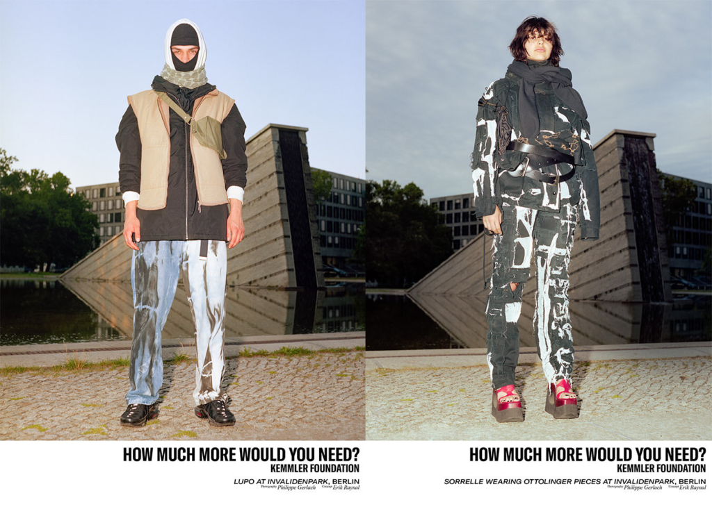
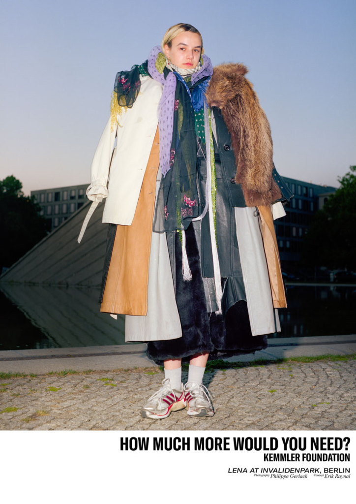
Gerlach’s involvement in “How Much More Would You Need?” aligns with his broader interest in the complexities and contradictions of consumer culture. This particular work was featured in Glamcult, a well-regarded platform and publication that often focuses on modern day fashion, art, and culture. In this work, Gerlach examines the idea of overconsumption in the context of beauty, luxury, and fashion. The title “How Much More Would You Need?” directly challenges the viewer to question their relationship with products, particularly beauty products and clothing. It’s directed at the desire to always have more even when you may not need it. This desire can be fed by social media as you see that others have a product it causes you to feel as if you also need it. The phrase invites us to reflect on how much we truly need versus how much we are encouraged to have. The series focuses heavily on makeup, fashion, and other consumer goods, often presenting them in a manner that seems to amplify their power. Through this approach, Gerlach critiques the way that these products are marketed to us — as symbols of status, identity, or even self-worth, this is done largely through social media. His photographs may look glamorous and glossy on the surface, but there’s an underlying meaning about the emptiness of this constant consumption. His work in Glamcult invites the viewer to reflect on the addictive cycle of desire that consumer culture holds, encouraging a deeper questioning of why we consume and how much we actually need. The images from this series could be seen as an exploration of how brands and the media manipulate us with promises of fulfillment through consumption, while, at the same time, never truly satisfying the consumer. By engaging with the subject of overconsumption through the lens of high-end fashion, beauty, and lifestyle products, Gerlach’s work becomes a pointed and visually compelling critique of the modern world we live in, where more is often seen as better, but rarely fulfills deeper emotional or spiritual needs.
Image analysis
In this image the model is wearing multiple items of clothing. All of which as stacked in a way which causes the image to look bulky and very busy. It shows how people own too much items due to overconsumption and a main contribution to this is social media. The background of the image is blurry which makes the model the centre of attention.
How will I respond?
In my response to Philippe Gerlach I will photograph either myself or a family member wearing multiple layers of clothing such as jackets or hats. This will link the the idea of overconsumption and show how much stuff people own and make them question whether they really need it all. I will then use these images to create a magazine, similar to the glamcult magazine. It will include products, as well as fashion. However these products will be presented in a way which will make the viewer question the amount of products one person needs, in the same way Philippe Gerlach has photographed his images.
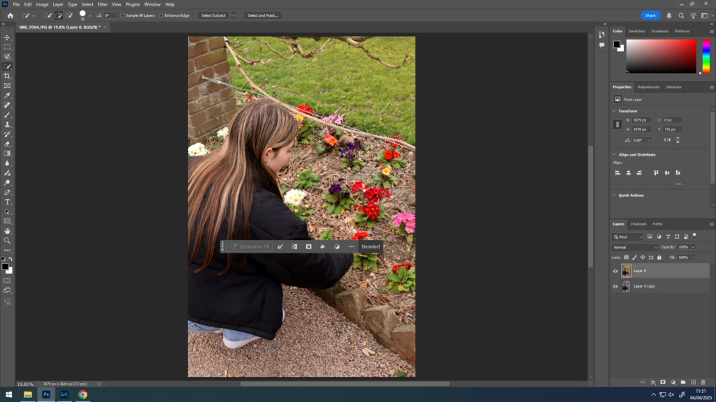
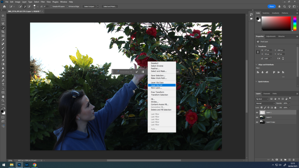
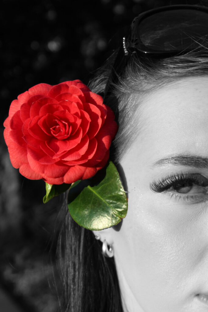
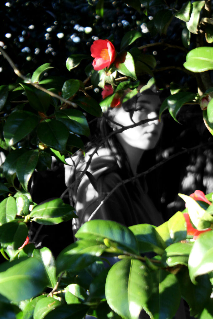
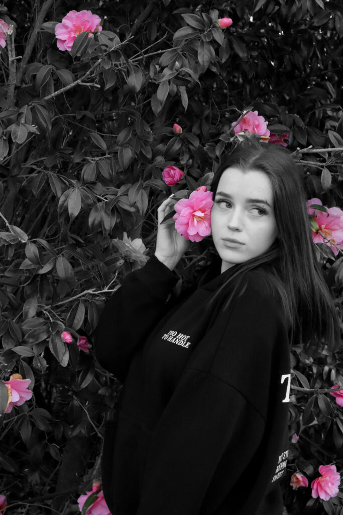
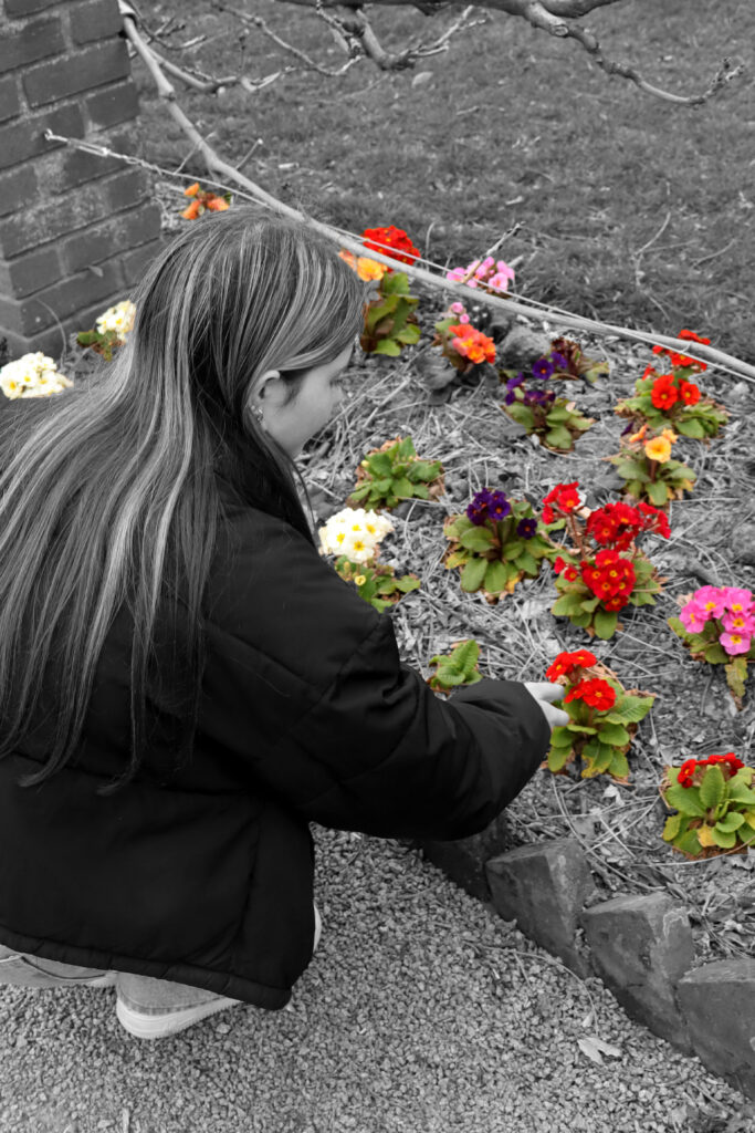
For this project on unity, I decided to manipulate some of my final photographs to present the unity between nature and humankind in a unique way. To achieve this, I duplicated my original image, making one black and white while the other remained in colour. I then used the quick selection tool to cut out parts of the coloured image that I wanted to keep, which was the vibrant, coloured parts of nature so that they could stand out from the rest of the black and white photograph. I think my final edits turned out just as I had hoped. I like that the contrast of the bright colours of the flowers and leaves within a black and white image draws the viewers attention to those specific details while also letting the black and white image to stand out too.
I think that these edits turned out really well as for the most part, they are clean, precise edits which make the original image more individual and attention-catching. The bold colours compared to the black and white background was a successful choice which will add to my project.
Photobooks are one of the many ways that photographers present a project of images targeting a certain topic. This is typically used by photographers when the concept is storytelling, as this particular method means that the images can be linked stronger through the layout. Multiple images can be compiled into one page or displayed individually, and can bleed right to the edge of the page or placed in strategic ways such as in the corner.
The layout of a photobook is extremely important because this plays an active role in ensuring that there is a consistent narrative across the body of work being presented. This is because the way that the images are linked together has an impact on the overall reaction of the viewer. For example, as the sizing and number of images can be varied, this means that a photo can be paired with a smaller one to extract certain emotions from the viewer as it can be used in a metaphorical way – such as the smaller image being less significant. Text is also sometimes incorporated into phonebooks which means that contextual information about the images can be provided so that the direct interpretation can be highlighted, whilst also being able to provide opinions or quotes which can contribute to the overall aesthetic of the book itself.
For my final study, it is important for me to deconstruct a photobook so that I can gain inspiration for not only the internal layout as this will give me a starting point for the placement of my images, but also the external aesthetic being the front page. The front page is one of the most important factors contributing to a successful photobook because it is what will draw the viewer in, being that this is the first initial impression that the viewer will have before actually looking at the contents.
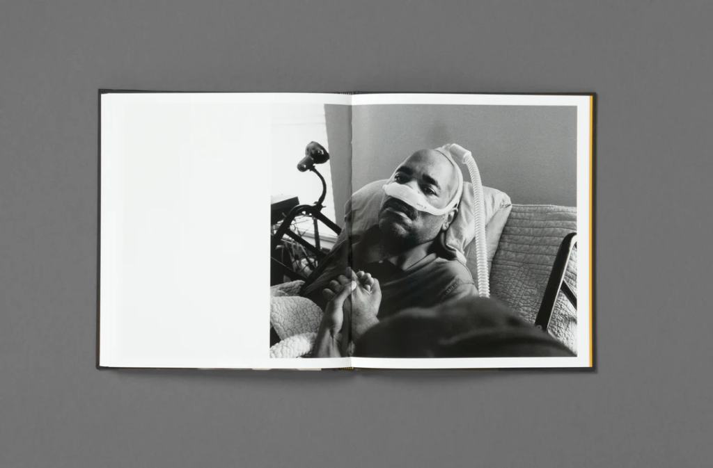
I have chosen to look into Rahim Fortune’s I Can’t Stand to See You Cry, being that I really liked the overall aesthetic to the photobook as well as it being relevant to the theme of Union due to it’s exploration of community and relationships during a time of vast environmental and health crises, using his own personal experiences to highlight this.
Rahim Fortune’s – I Can’t Stand to See You Cry
“A year and change into father’s diagnosis, his nightly calls began to become more frequent. My sister and I, his youngest children, spent countless hours in his room caring for him as his body gave up. Many nights we’d leave his room both knowing his condition was getting much worse, but we chose to say nothing of it.” – Rahim Fortune
Fortune uses ‘I can’t stand to see you cry’ as an exploration of Texas and its surrounding states in America, looking into the people who reside in this complex landscape. This allows him to analyse close relationships between family and friends, whilst also showing the absence of relations with strangers. In the midst of the COVID-19 pandemic, this photobook unravels how the community works together in order to maintain grace through difficult external issues, being environmental too. This work stems from Fortune’s own personal experiences too, where he attempts to unpack his own identity through an authentic approach during a cross-country move, the loss of his father and civil unrest, reflecting on the past events of his life and how this may shape his future. By having a holistic viewpoint in this photobook, Fortune’s images are able to highlight the conflict between public life and private life, looking at the issues in everyday life that are deeply rooted in the landscape around him.
Fortune describes this second book of his to be a culmination of the last five years of “Black love, photography and history”. (Anothermag)
‘I can’t stand to see you cry’ was initially intended to be a documentation of the progression of his father’s illness, being hospitalised three times for Amyotrophic Lateral Sclerosis (ALS) as Fortune watched his father’s body fail him repeatedly before he passed away. Much of the work was curated in the past year however one photo does go back to 2016, where he comments that “It’s like a film noir Western of my life,”. As his father’s health declined, this was parallel with the country’s as the pandemic began to take millions of lives. Whilst this was happening, the recognition of police brutality and racial violence surged, specifically after the murder of George Floyd. This injustice motivated millions to join and march in the fight against this brutality, paving the way for people to come together and stand up against feeling unsafe around those whose jobs purpose is to provide protection and security. Fortune took many images during this period, especially when him and his sister would be spending long hours by his father’s bed, which were informed by the ongoing events in society as well as the thoughts that his father had about them.
Fortune grew up in the South, being born in Austin, Texas, and examines the convergence between cultural traditions and the personal expression of an individual by utilising the themes of belonging, community, identity and representation.
Fortune has similar works to this that work under similar principles, being rooted in family history and dynamics. For example, he self-published an artist book entitled ‘Oklahoma’ which also entails challenging the reality behind the persistence of racial inequality as well as economic disparity. however, this work doesn’t entirely seek to argue and criticise, but also seeking healing from events of the past.
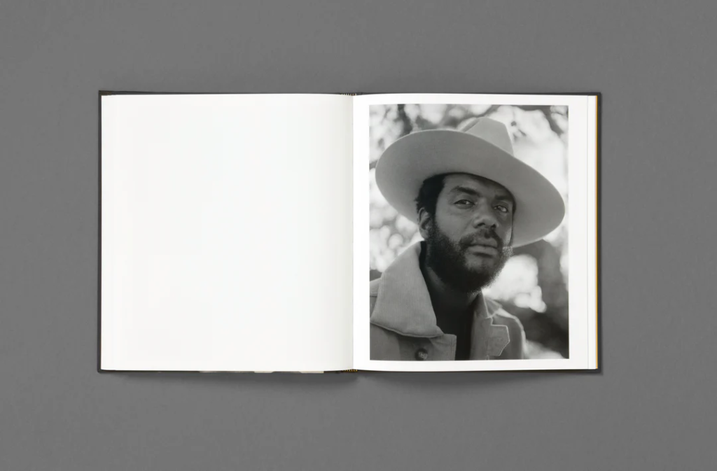
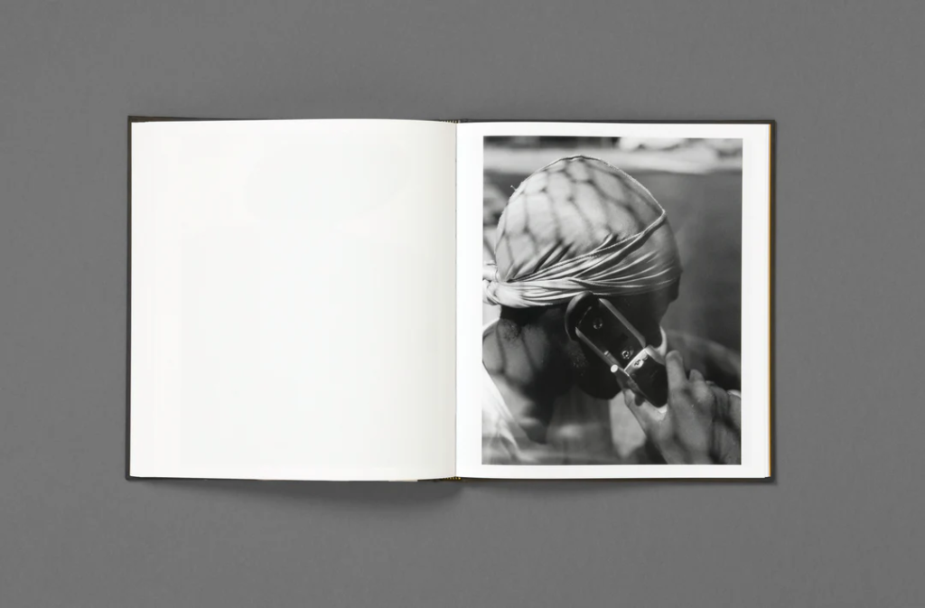
Rahim Fortune employs a black and white tonality across all of his images in the photobook where the images are seen to have a high contrast. These images a quite contemporary, including informal portraits of couples as well as images that document the Southern surroundings that he grew up in around Texas – his home town. His photographs are infiltrated with this culture, consisting of portraits of family, friends and occasionally strangers too on the street which makes it appear as if the viewer is simply crossing paths with these people in the street.
Portraiture images
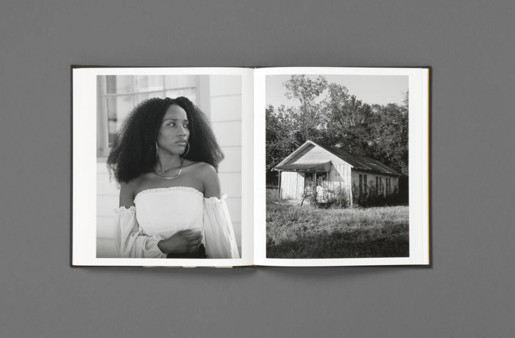
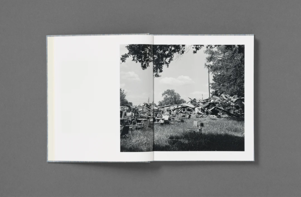
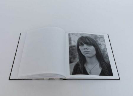
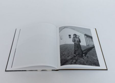
One way that Fortune lays out his images is by placing a vertical image on a double page spread by itself. This means that the viewer’s sole focus is on this one image, emphasising its significance to the narrative of the story that he is trying to depict. This also means that we, as the viewer, can try to interpret the image individually; for example asking who she is, why she has been photographed, or what her backstory is. However, Rahim Fortune doesn’t do this with all of his images as this would reduce the consistency of the storyline within his photobook and make it more difficult for it to be conveyed. The more significant or better composed images would be by themselves as this means that they can speak for themselves.
Double page spreads
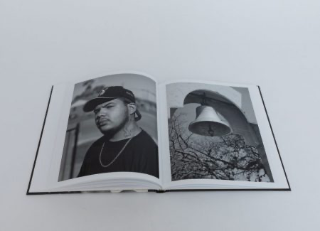
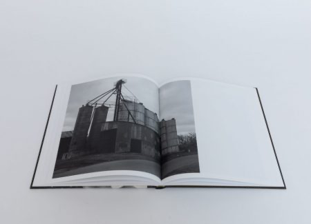
For example, Fortune creates double page spreads and pairs together different styles of images to create contrast in his work. As some of Fortune’s images consist of him zooming into particular and specific aspects of the environment, here being a bell, this means that he can pick apart small sections of his surroundings that has both significance to the Southern culture and his own personal experiences of growing up in Texas, as well as wide landscape shots to provide geographical context. I really specifically like this example here, as the bell goes in the same direction as the subject’s head. This means that there’s a sense of direction across this page where the viewer’s eyes can flow easily between the two images. This also just contributes to the overall linking of the two images as it just creates a more sophisticated aesthetic.
3/4 spread
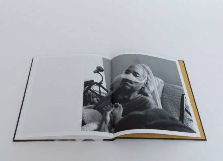
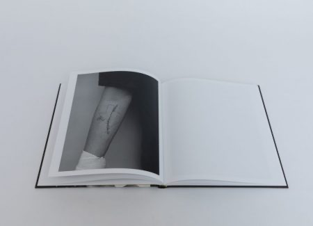
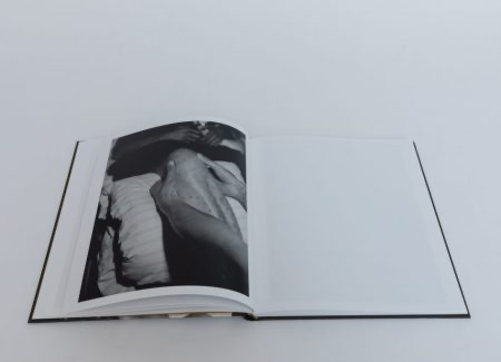
Fortune also utilises this layout for his images, where a horizontal image bleeds onto the other page. This makes the images become more dynamic as it is increases the complexity than just keeping the image on one page or using one image on a double page spread. This is actually one of the last few images in the book, showcasing the progression of his father’s illness. Fortune showed this tender and emotional moment on purpose at the end of the book as this was originally going to focus on the process of looking after his father, however further talks with his publisher allowed him to evolve this into a deeper and more holistic reflection. However, Fortune does still take ambiguous images to suggest that the family is dealing with supporting a loved one with serious health-related trauma before this near final image to link a face to this suggestive content, for example there is a photograph of an empty bed with medical equipment surrounding.
More image types that Fortune incorporates are landscape images, which can be further categorised. For example, many industrial structures are shot as a nod towards the way that these buildings are detrimental to the environment, as well as residential houses or abandoned, run-down buildings. Further social factors are also incorporated, being a close up shot of an arm with a tattoo outlining Texas, paired with a freshly stitched scar, to show the pain and hardships that Fortune may have faced whilst growing up here, however the addition of the stitches suggests healing from events of the past. Additionally, there is a blurry shot of people running during the Black Lives Matter protests following the murder of George Floyd to show how this was forthcoming to the millions taking a final anti-racism stance, fighting as enough was enough.
There are so many different emotions being provoked in this photobook, demonstrating the strength of a community in areas of both vulnerability and connection.
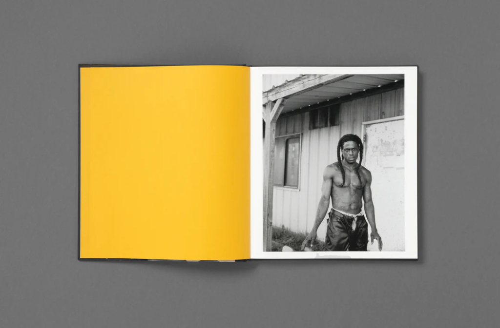
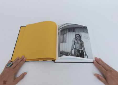
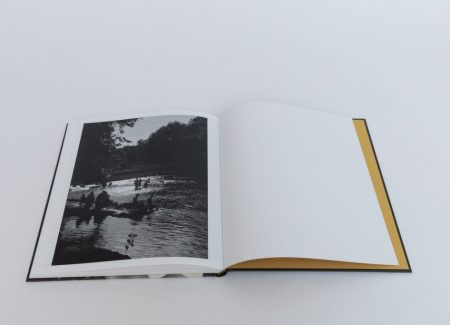
The first and last images are extremely vital to the narrative of the photobook as this can act as a summary or overview. Greeted by bold yellow endpapers, this means that the first impression that we get is an organised one as this slowly comforts the viewer into the book. This is then followed by a photograph of a man named Billy outside a house, giving a direct stare into the lens of the camera, meaning that the viewer is engaging with a subject as soon as they begin to look at Fortune’s work. Contrasted by this, the end photograph is wholesome, where both children and adults can be seen relaxing in a swimming hole next to a bridge on a hot summer day. This leaves as a reminder of the beauty of life, referring to paintings of the Romanticism era and connoting ideas of the sublime from its portrayal of sunlight reflecting off the water in a hopeful way.
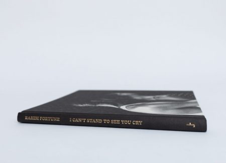
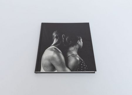
Fortune’s name and title is written in gold letters on the spine of the book, as well as the title on the back of the book in the centre, pairing this with the endpapers to keep this yellow consistent throughout. I really like that this has been incorporated as the images are all in black and white, meaning some colour is still present. Fortune uses a black embossed hardcover with 112 white pages which means that the cover is tightly linked to the aesthetic of the images. The title ‘I can’t stand to see you cry’ adds a sense of vulnerability to the book, suggesting that this could’ve been something his father would say to him as his illness progressed. However, this could also be relevant to reinforcing the concept of community that is expressed highly in the images, being that we never want to see our loved ones cry, as well as strangers too. Fortune also does not use text or captions on any pages, leaving the images to speak for themselves by being striking without any interruptions. The front cover is actually an image of Fortune and his partner, as he embraces her in his arms to connote love and relationships with others.
I can’t stand to see you cry is an incredibly thoughtfully designed photobook which allows a specialised insight into the Southern culture and community that helped shape Rahim Fortune into the person he is today. This acts as an announcement of representing his background and taking charge of the way this is perceived, providing a balance between the documentation of the pain Fortune had experienced at a time that coincided with the entirety of America, as well as the strength a community has when working together, signifying hope and promoting healing.
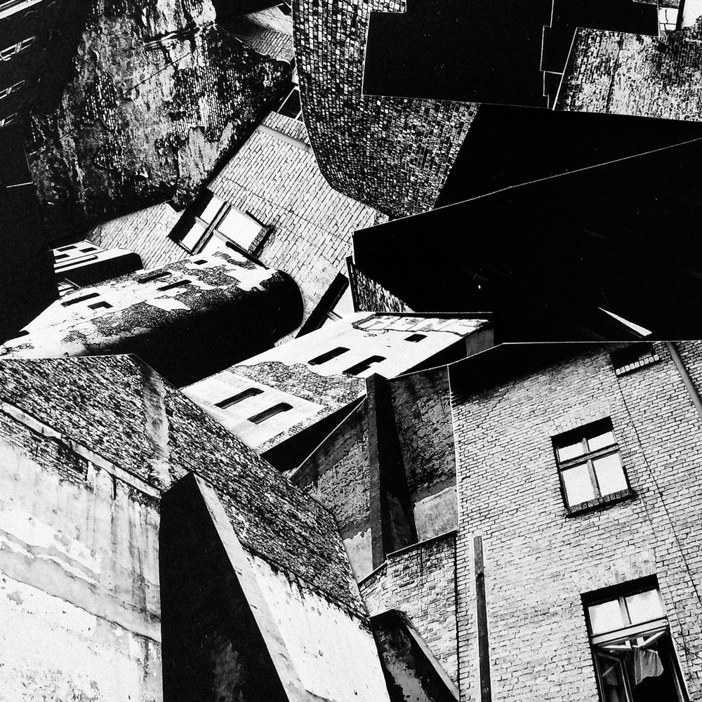
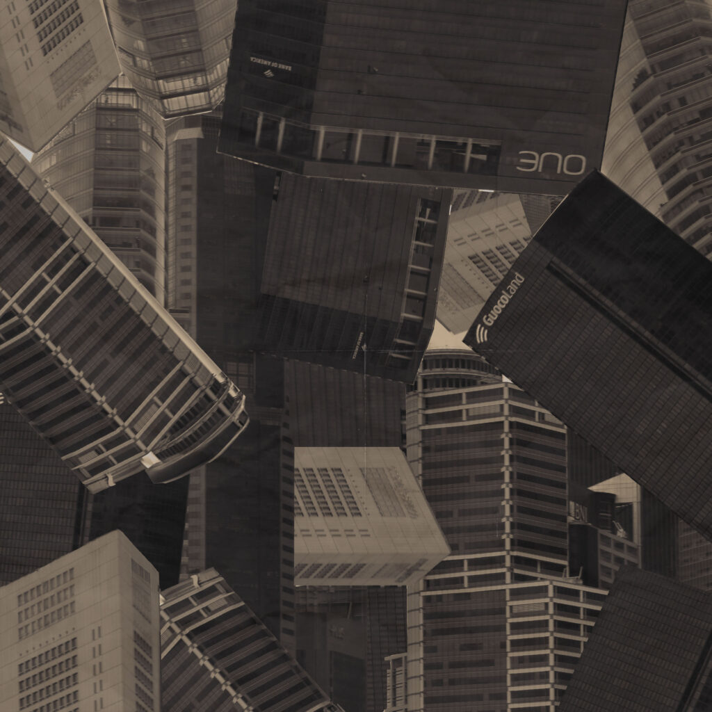
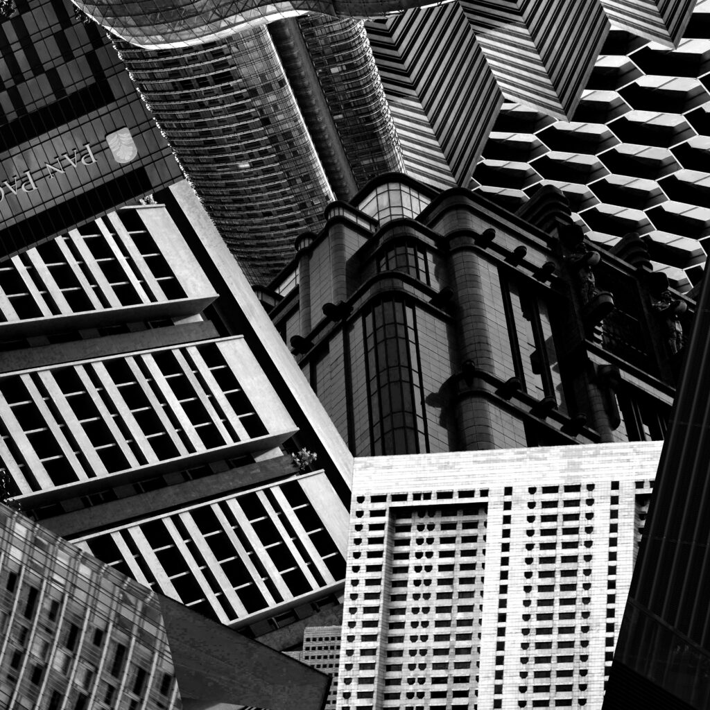
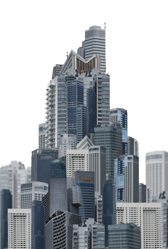
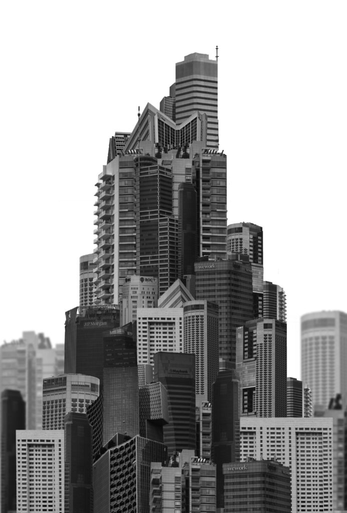
For my first attempt at creating the building collage I used the single landscape image and cut up a number of buildings. I arranged these on top of the image to fill in space and make the image look more full. I tried to make the outside of the frame look rounder than the inside like seen in futurism and Vorticism however with every building being shot at the same angle the image overall looks too flat for my liking. For my second try I decided to use more angled images where the perspective is different. Additionally I tried adjusting the contrast of the images to be more extreme.
I tried lining up different buildings to create something which flowed better with different textures. I used fewer buildings so each on could be larger in the frame.
Final Outcome:
This outcome looks far better than the first. I think is due to a number of reasons, the most important being the addition of angled buildings. Additionally each building links to one another and I even combined a few to create different shapes. The variety of textures looks more unique and each building is larger with so few in the same frame. To improve this image I would have added more texture to the bottom left corner to balance the top right and maybe tried one without a recognisable building instead so it was made up of only background textures instead.
Outcome 2:
Inspiration
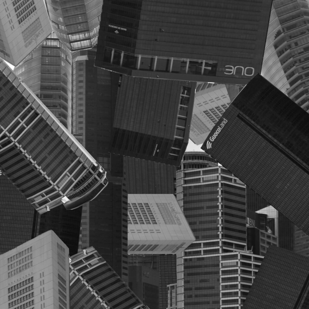
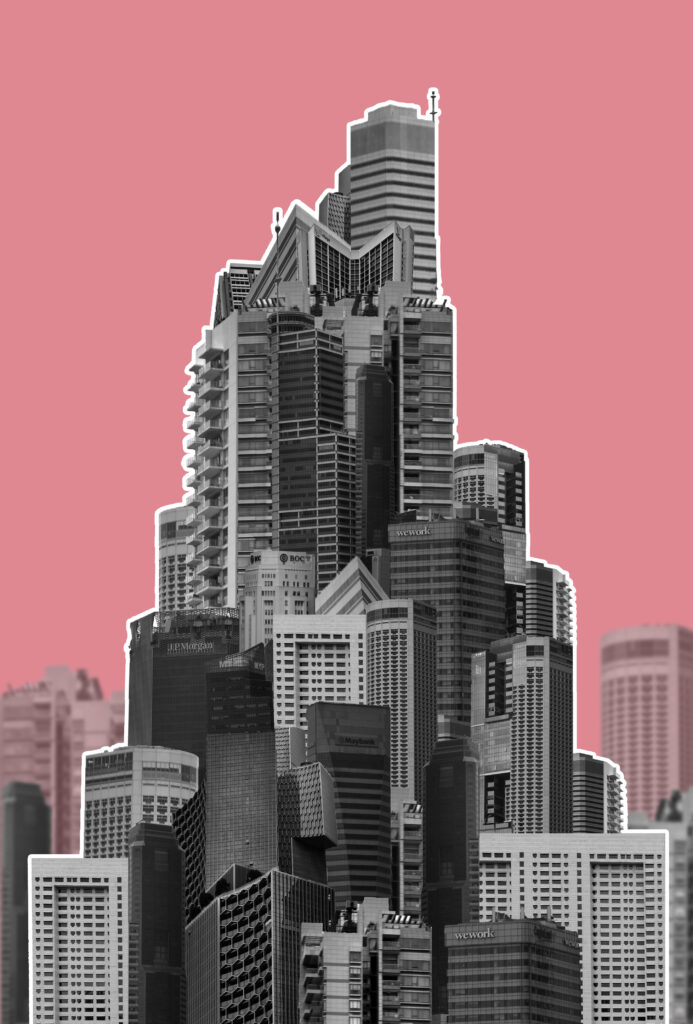
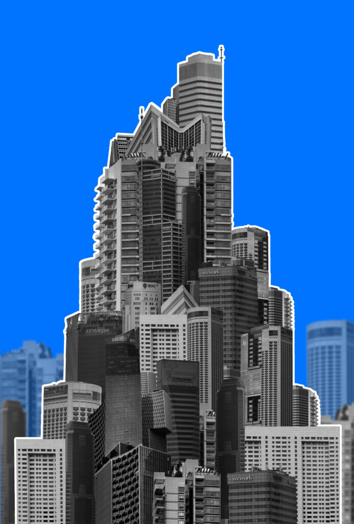
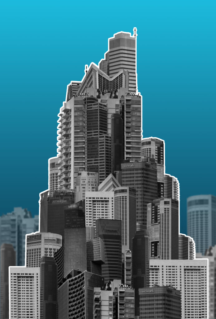
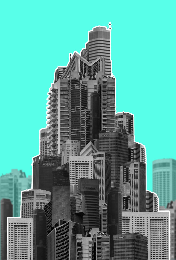
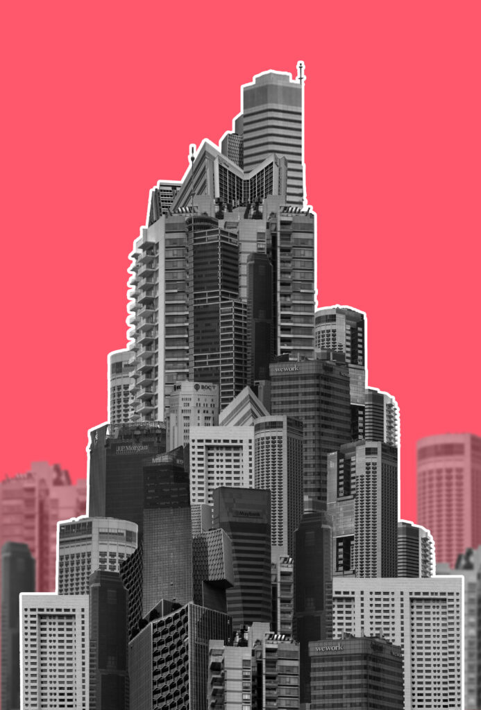
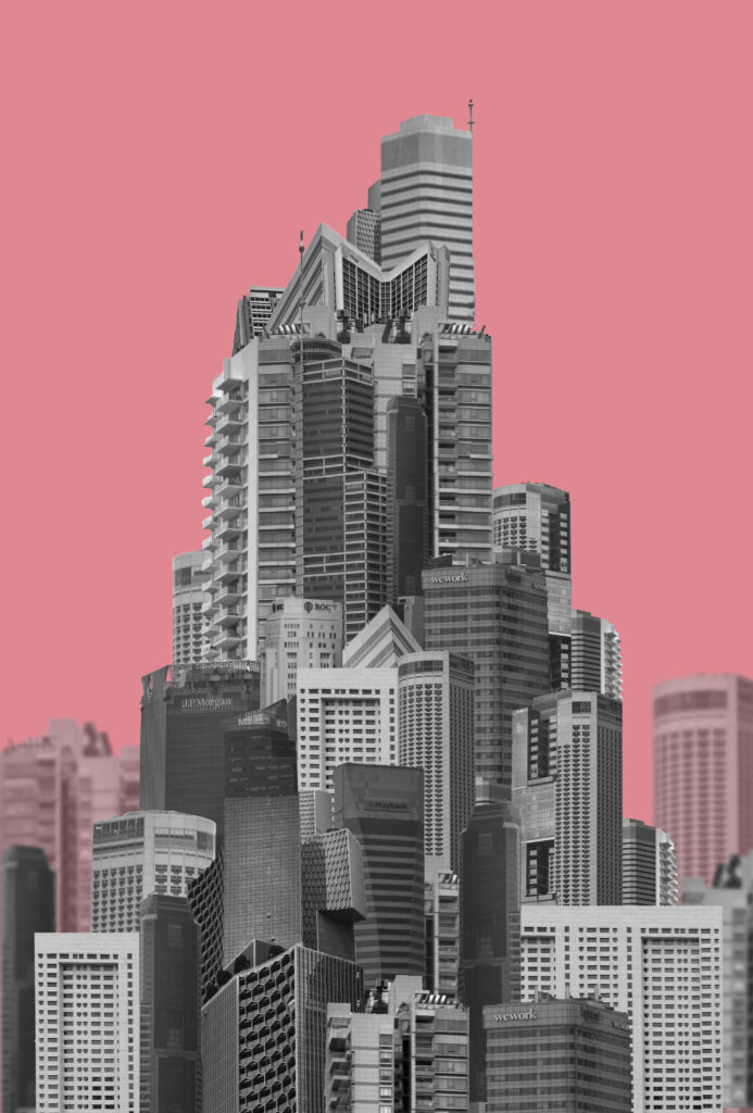
While the original image is a single building I wanted to create a mega-structure made with multiple faces of different buddings so it looks choppier and messier without much thought like many modern buildings appear. I will create a colourful background like this one since I think it will resemble a magazine cover which I would like to experiment with for a potential zine/flyer I might make. An artist who creates work similar to this is Michael wolf however I wanted the focus to be on the eventual top of the building as opposed to the elongated parts.
I combined most images from my second photoshoot and chopped out the buildings. I began building them up into a general triangular shape pointing upwards.
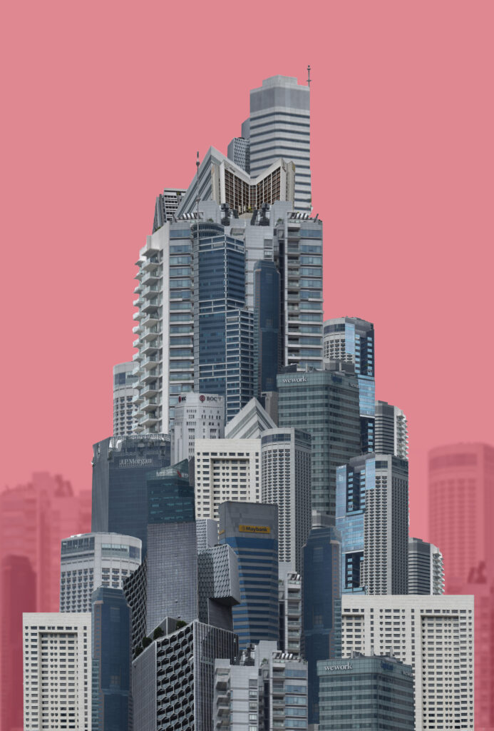
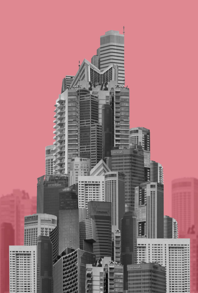
I tried to add some sort of background to make the structure seem larger and something actually on location in a city. I made the opacity lower and blurred them slightly. I added a colour to the background to see how that would turn out and also tried black and white. Without a colour in the background the background buildings blend into the shape better and don’t look as obviously separated. The black and white buildings look better with the colour background as it pops more but I think that If I tried colour with a background that fit better It would look more coherent. I also tried moving the background buildings in front of the colour with a lowered opacity so that they looked more similar to the main structure but still visible different.
When trying to make the structure stand out I also tried an outline. I think that if I added more graphic elements this approach could work for a cover while the other approaches would work better as a print out/page spread. I tried a few other colours also:
Final Outcomes:
I will be using the orange one as the cover for my magazine since the colour is bright and the outline makes the shape jump out. The pink one however I will be printing out as a final image. I like these two as my final outcomes as the colours, orange and pink, are used as various warning colours.
Outcome 3:
Inspiration
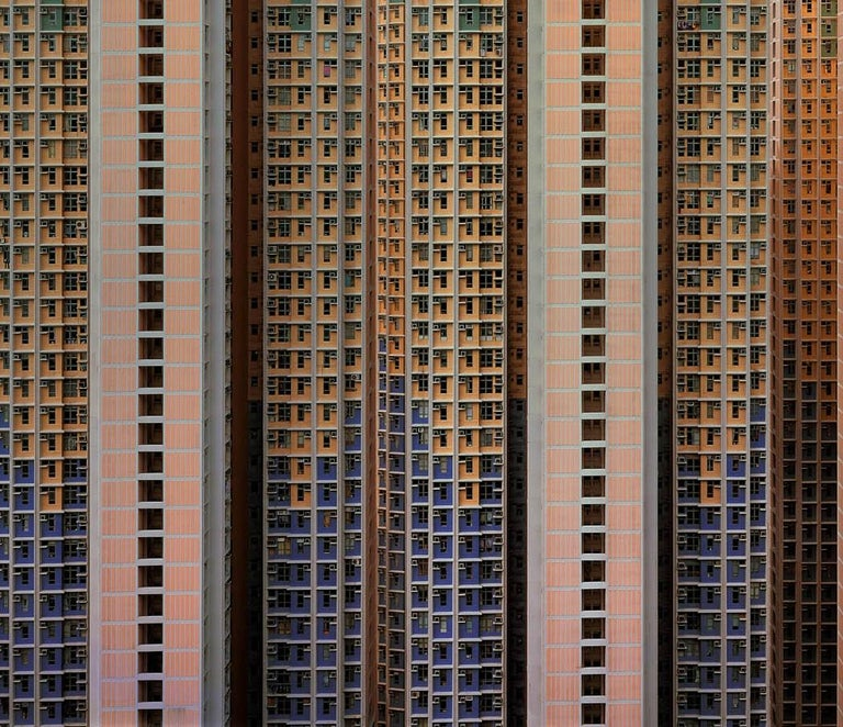
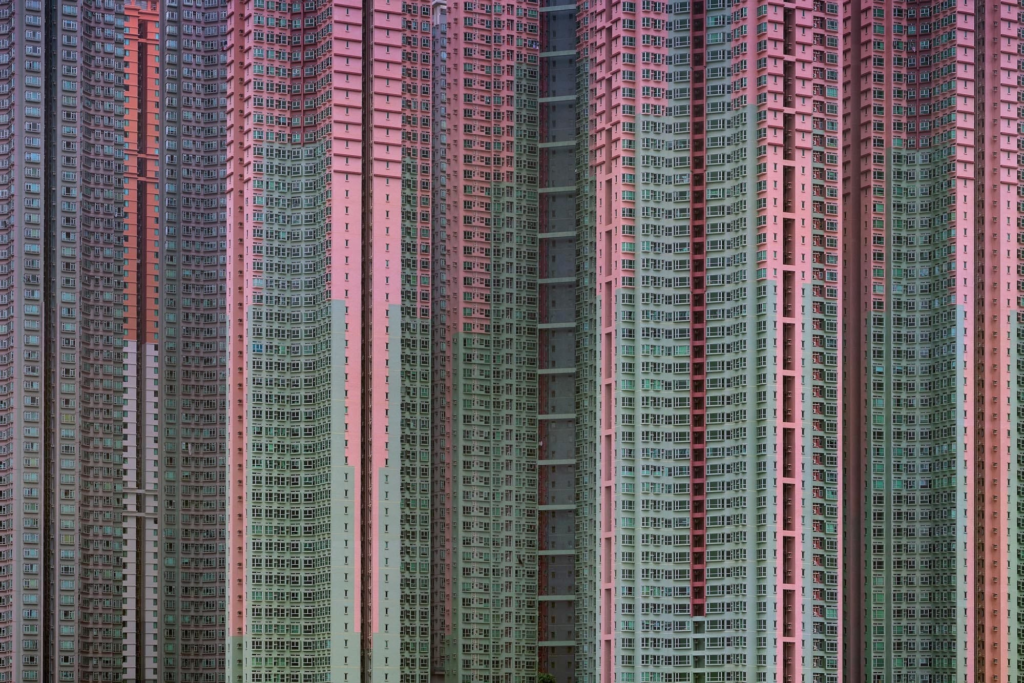
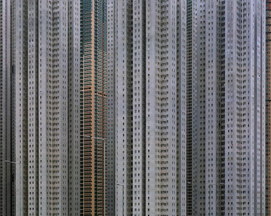
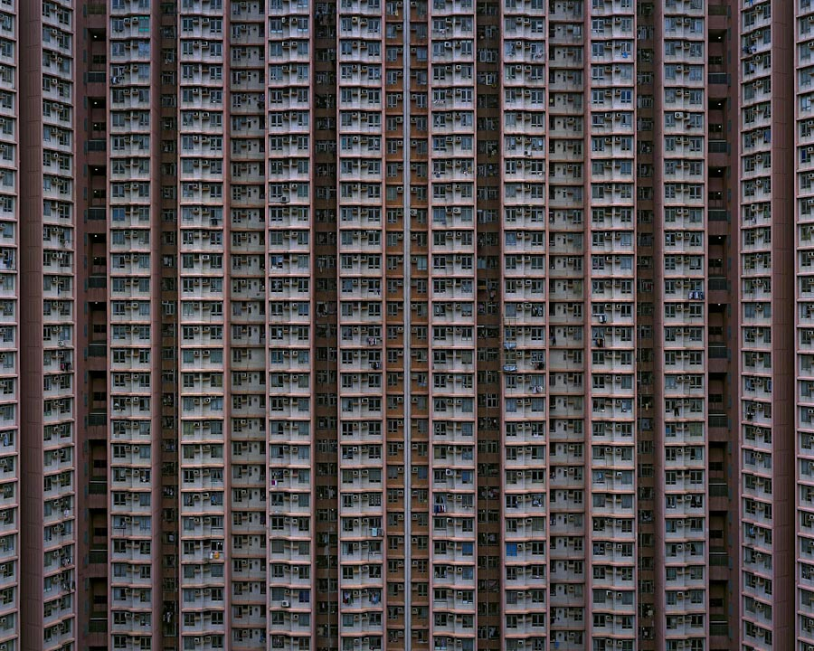
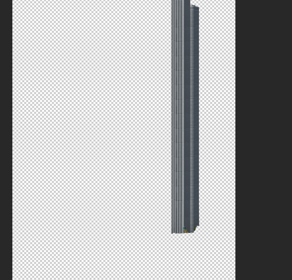
Inspired by Michael Wolfs ‘architecture of density’ I elongated buildings by cutting out faces in photoshop and stacking them on top of each other to create a landscape of stretched buildings.
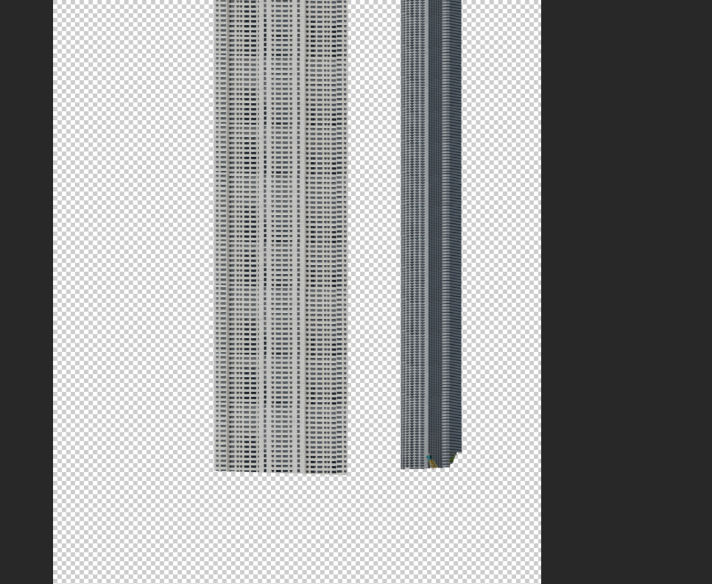
I started by stretching individual buildings before arranging them all together. I created multiple copies of the same building and arranged them together on top of one another to try and seamlessly create a longer version. The first arrangement didn’t have much thought behind the arrangement of the images which I fixed when creating the second arrangement which looked more symmetrical like a real block of flats.
I began laying them all out together into stripes and tried both black and white and colour. I didn’t like how the colour one looked so I opted for black and white instead.
I like both arrangements for different reasons. The first one shows the messiness of arrangements of buildings while the second looks a bit more realistic. I arranged these images into squares because I wanted to show how far cityscapes spread both upwards and outwards as they expand.
Final Outcome:
Overall I choose this one because I liked the more realistic approach over the more random assortment. I created a better contrast between buildings by adding a drop shadow also so that the image didn’t look so flat. I like how top is not in sight as it creates the effect of the building being infinitely tall which is similar to how some of these buildings feel.
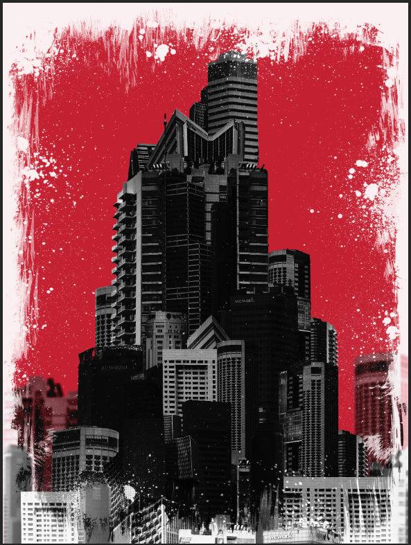
Outcome 4:
Inspiration
Using the frame:
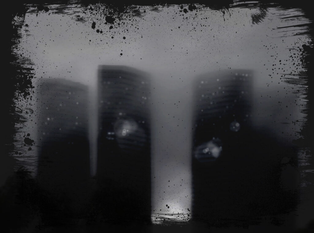
I wanted to experiment with frames so I started with one frame and compared 2 different blending modes to see the different outcomes.
the first blending mode was overlay:
Overlay darkened the images which I thought looked best with the Smokey landscape. It made the image look darker like night photography which I decided to develop further.
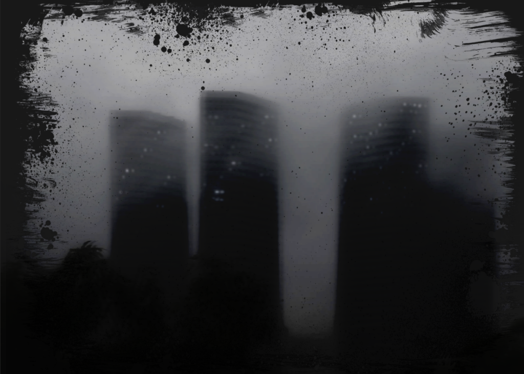
Blending mode 2, Subtract:
Subtract removed the white centre of the frame while keeping the full dark frame. Since both modes create different effects I decided to combine the two to create a darker image with the black frame.
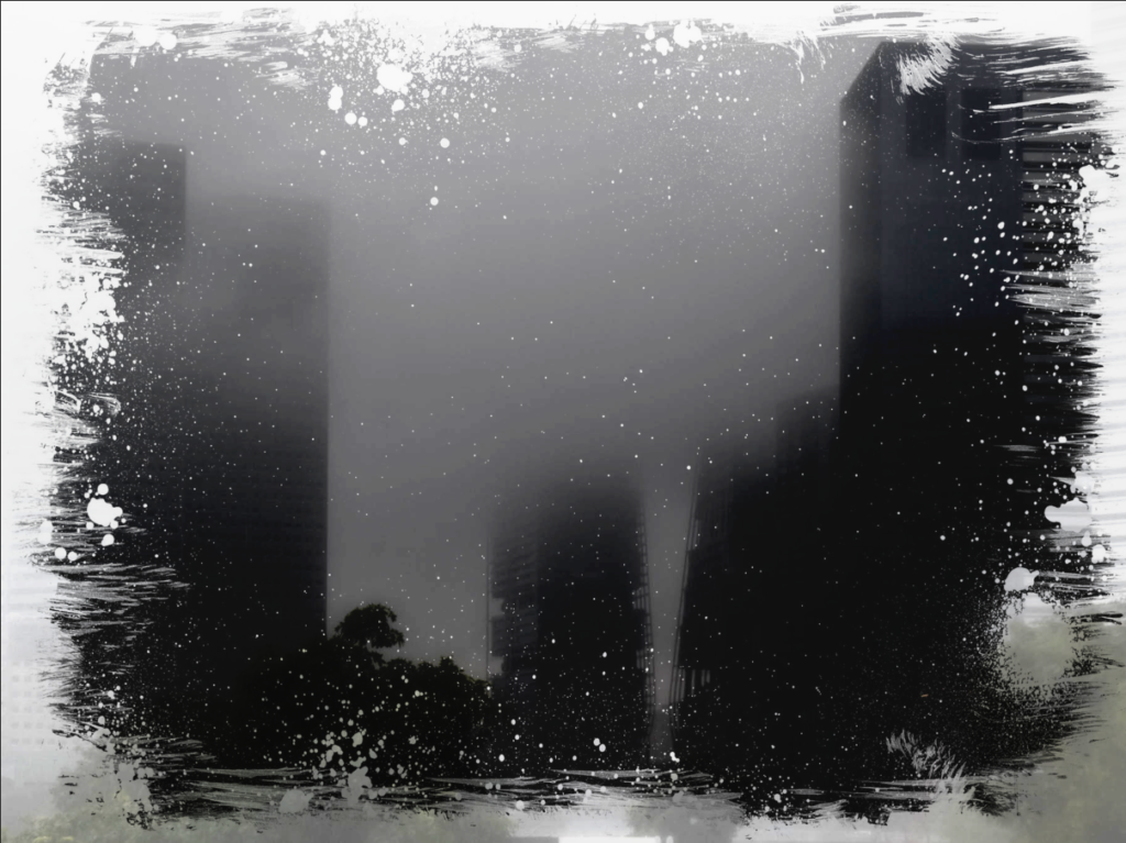
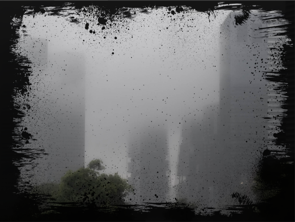
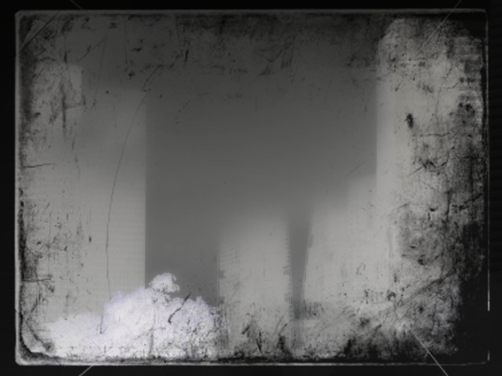
I liked how this turned out but it was missing something so I decided to try a different frame which resembles a damaged negative:
The outcomes turned out different as this border cut out the corner but otherwise sat close to the edge.
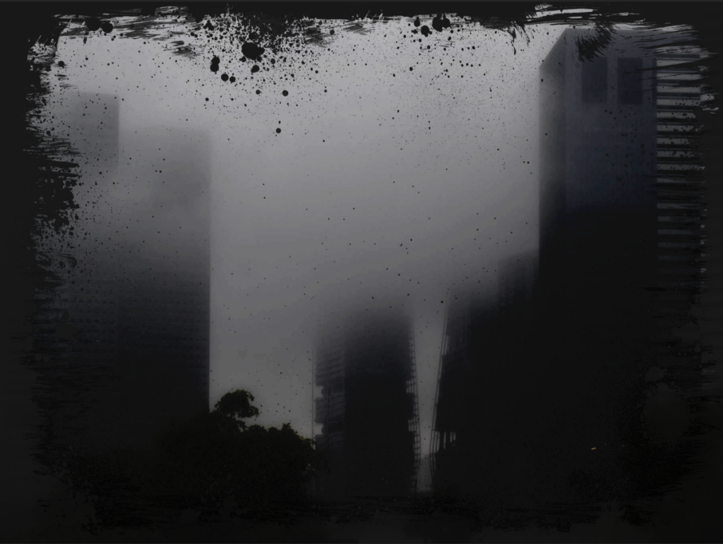
I didn’t like this one a much so I decided to try the first frame with a different image and add lights to better resemble a night-time image. I like how both the few lights looks as well as the light flares. The light flares resembles more like Lewis Bushes images and when I added the multiple exposures I think it better resembled Lewis bushes. Overall however I prefer how the fewer lights looks as its simpler and I didn’t blend the middle sun light very well.
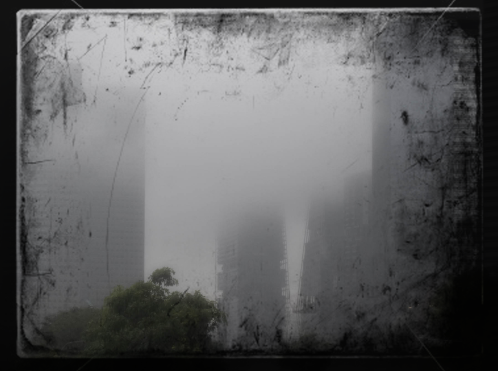
Final Outcome:
I like this outcome because its dark and grey which creates a gloomy appearance. I think it develops that original hazy dull image into something a bit more sinister and ominous. To contrast with this, the lights I added creates a soft light which makes the buildings seem more approachable. If I was going to develop this idea further I would have set the image to be centred because while I like this outcome and how it fades into the frame, I think using the frame as what it is to highlight the centred image would look better. Additionally I would try adding a few more small window lights or explore making the multiple exposures clearer.
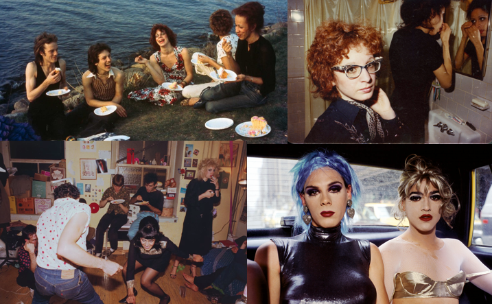
Goldin was born on September 12, 1953, in Washington, D.C. She started taking photos at a young age and went on to study at the School of the Museum of Fine Arts in Boston. She is an American photographer known for her personal, raw, and often candid images that explore themes of relationships, identity, and vulnerability. She is particularly famed for her work documenting friendships, and the complexities of human connections, often featuring her own experiences and those of her friends. Goldin’s work is known for its firm images of subjects in intimate, sometimes challenging moments, covering topics like sexuality, love, pain, and the struggles of life.
One of her most famous works is “The Ballad of Sexual Dependency” (1986), a series of photographs that chronicles her life and the lives of her friends, catching the raw emotions of their relationships. The series, accompanied by a soundtrack, shows issues of addiction, abuse, love, and loss. Nan Goldin’s photoshoots connect with the theme of socialism by documenting the lives of individuals, struggling with addiction or social isolation, while emphasizing the values of unity.
Alfred Stieglitz was an influential American photographer and art promoter, widely recognized for his role in elevating photography to a fine art form, who was born on January 1st, 1864, in Hoboken, New Jersey, USA and died on July 13th, 1946, in New York City, USA. He was also a key figure in modern art, championing various movements and helping to shape the American art scene in the early 20th century. By presenting the world as he observed it and focussing simple, uncomplicated images, Stieglitz’s early work explored realism. But his later work moved beyond common realism into more abstract and symbolic fields, particularly in his Replacements series and his connection with Pictorialism. Therefore, even if realism played a significant role in his photography, Stieglitz eventually stretched the limits of the medium by combining artistic expression with realism.
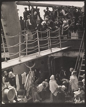
“The Steerage” (1907)
Technical
Stieglitz’s techniques, which showed clarity, and accuracy in his images while rejecting as Processing too much of Pictorialism, formed the basis of his realistic approach.
Large-Format: Stieglitz used large-format cameras, which allowed for detailed images, presenting the realistic images.
Natural Light: He used natural light in many of his photographs, so how realism by allowing the natural elements of light and shadow to show the atmosphere of the image.
Visual
Structure: In many of his portraits, landscapes, and street scenes, the subjects are un-posed, reflecting the natural world as it appeared.
Framing of Everyday Scenes: Where ever his photoshoots where taken Stieglitz’s framing showed a sense of everyday realism. Things weren’t idealized or romanticized.
Contextual
Early 20th-Century Social Realities: The photograph was taken at a time when immigration to the United States was at a peak. The image shows the disparity between the wealthy first-class passengers and the immigrants in steerage. It reflects the class division and social inequality.
Modernist Movements: “The Steerage” is often viewed as a significant work in the history of modernist photography. By focusing on everyday people, Stieglitz was connecting his work with realism while also making simple documentary photography.
Conceptual
Human Experience and Immigration: The photograph’s focus on people’s faces, clothing, and physical postures offers a visual story about the immigrant experience. Stieglitz’s photograph shows the lives of everyday people, showing them in different places and occasions. This shows the realism of the moment to a more deep understanding on human dignity and struggle.
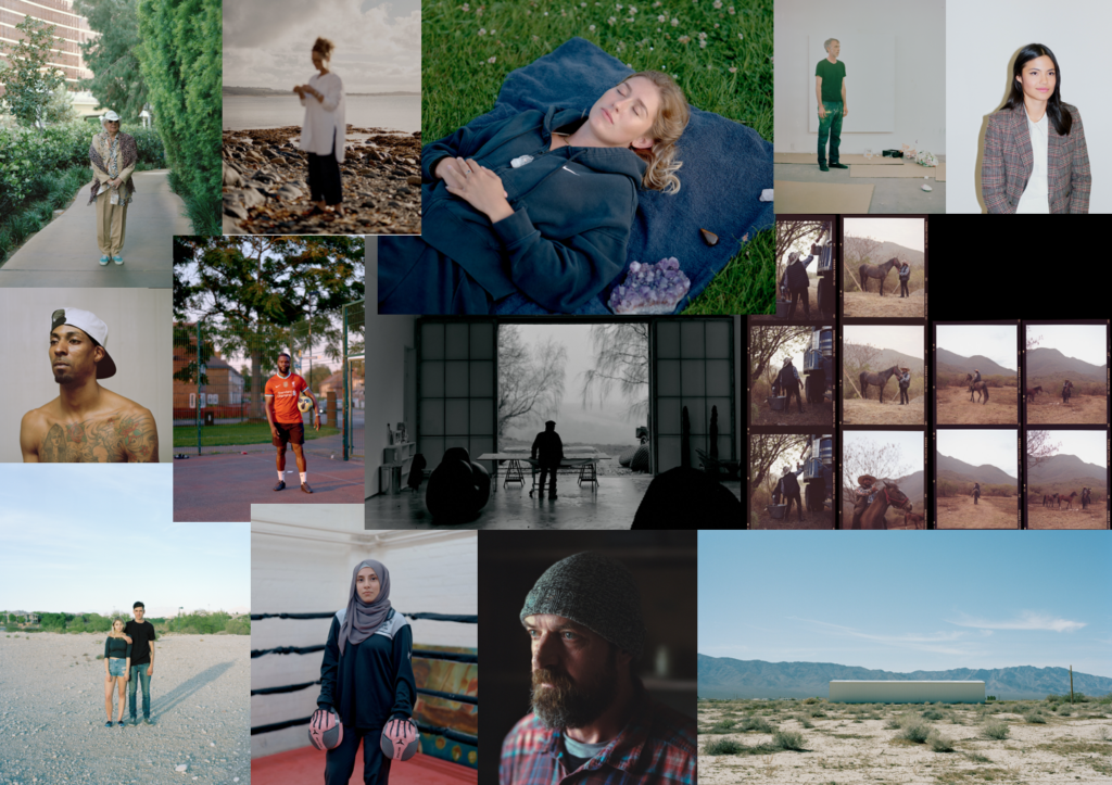
James Bannister is a Documentary, Portrait and Editorial photographer based in the UK and working internationally. His work has been seen in publications such as It’s Nice That, The British Journal of Photographic, The Royal Photographic Society and Harper’s Bazaar. James Bannister explore individualism because he wants to show and explore peoples personal identity. The most recent photographer assigned to produce new work for the camera brand, Leica, in partnership with 1854, Bannister’s still portrait own a sense of movement: inspired with the scents, heat, and textures that surrounded him when he pressed shutter. For the forthcoming Leica commission, the UK-based photographer is assigned the challenge of creating a particular body of work centred on ‘individualism’ – a perfect match for his extensive investigation of the medium. By focussing on themes of individual identity, independence, and the conflict between self-expression and social expectations, James Bannister’s photography explores individuality.
“You can’t compartmentalise anything creative because it’s about getting out of your own way, and letting what’s inside of you come out” – James Bannister
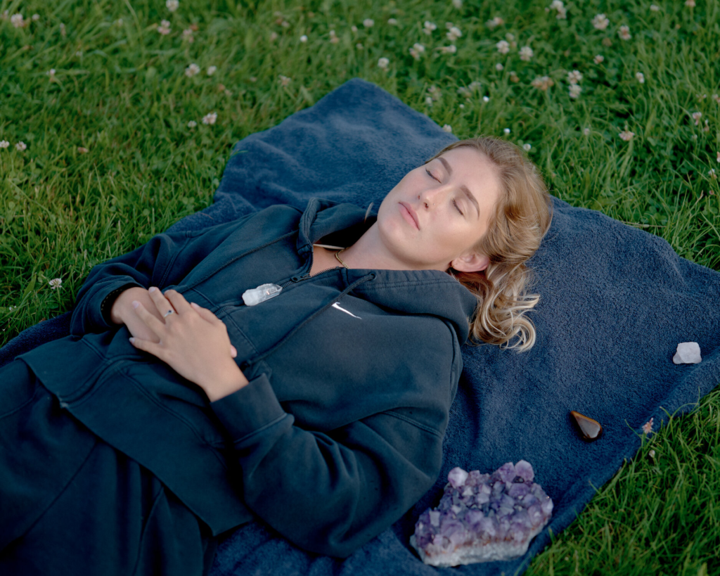
Image Analysis:
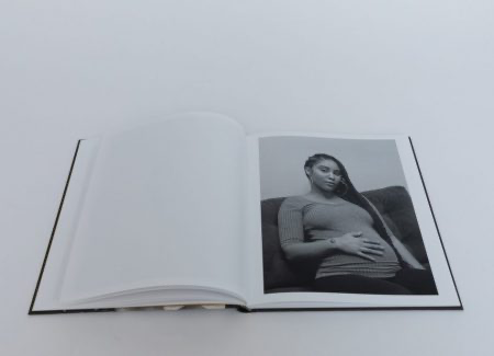
This image from James of a girl lying on the floor with her eyes closed represents individualism through its quiet mood. The girl seems to be in her own world and at peace. The closed eyes suggest a deep self observation and space away from ay type of drama and social expectations. Her hands on her stomach shows she is comfortable, steadiness and calmness. Bannister’s use of light and shadow lifts this view of individuality, focusing on her presence as an independent and free girl. This photograph shows individualism as the girl chose peace ad her inner world other than a crowed own.
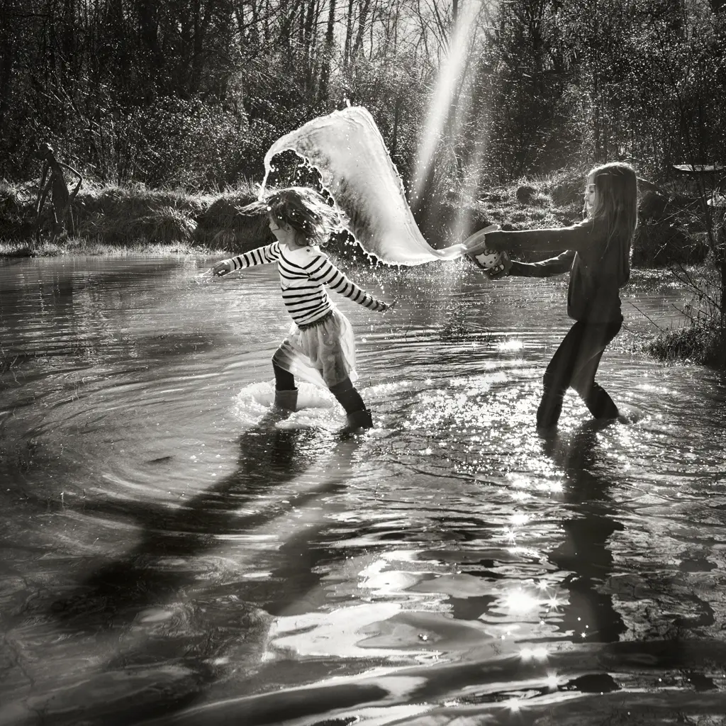
Alain Laboile was born on May 1, 1968 in Bordeaux, France. Through his art work he celebrates and documents his family life. He bought a digital camera in 2004 to document his sculpture, but later became focused on his family instead. Alain Laboile’s family photos connect with the theme of socialism by focusing on joint values, mutual support, and equality within the family, showing lifestyle where family members work together, share responsibilities, and more interconnected society.
Alain Laboile is independent and well-known for his timeless and personal black-and-white photos of his family in the countryside, natural environments, especially his six children. His pictures, of his children playing everywhere freely in the outdoors, show the simple joy and innocence of childhood. His photography expresses that the natural world and family have a close bond and that they enjoy everyday. With his emotional photographs that have appeared in papers and international exhibitions, as he is well-known. People all across the world appreciate his art because of his ability to inspire strong feelings through upfront moments, natural light, and the lasting significance of family.
Image Analysis:
Alain Laboile’s children are playing together in a river. Them freely playing give a sense of joyful freedom. The black-and-white photograph highlights the sibling’s relationship, while the natural water represents both freedom and purity. The quiet, private environment is made better by the soft light coming through the trees and the shadows falling on the river, and a lack of any outside distractions allows the attention to be entirely on the kids and their time together. Unposed and full with affection, this picture captures the essence of family, a short but meaningful bond that cuts over space and time.
I want to explore the themes individualism, Socialism and Realism because these themes have a insight of how people relate to themselves, society and the world around them. Individualism shows the emphasizes of personal freedom and self – expression, allowing to show people understanding more the difference and complexities of identity. By exploring Individualism it then follows the route of Realism as people have different environments and daily life routine which most of the time shapes then as a person. By exploring Realism it will help show a understanding that people have different life routines and most people could like them or hate them. ne of the places people spend more time at is work, so taking images of people at work will show realism since its a big part of their life and they have to do it. Realism can also connect to Socialism since both show peoples environments. Socialism focus on wellbeing, equality, community. It shows how socialising can be amazing but sometimes people prefer to have some time for themselves. Socialising most of the time is healthy if your around the right people. By combining these themes, it creates a narrative that explores personal identity, social environment and human nature.
Why it matters to you?
Exploring Individualism, Socialism and realism matters to me because it gives me a understand ad it helps me show other people the understanding of society and human identity and the difference of them.
How you wish to develop your project?
To develop my project I will try to select each subject and environment that reflects each theme. For Individualism, ill focus on portraits, different expressions and what they love doing or here they love going most which most of the time can shown peoples personality. For Socialism, capturing groups of people or even just trios doing community activities shows unity. And for Realism un-posed moment, nature and environment.
When and where you intend to begin your study?
I intend to begin my photoshoot exploring exploring individualism socialism and realism soon after exploring my artist refences photoshoot a bit more to get more ideas of different type of portraits, etc, to take. I hope to then start my photoshoot by going out with friends and see where it takes us. Focusing of exploring socialism and realism more since we going to different locations.