Category Archives: Uncategorised

Filters

Author:
Category:

Virtual Galleries

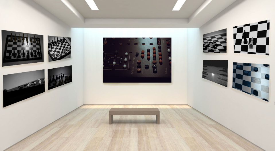
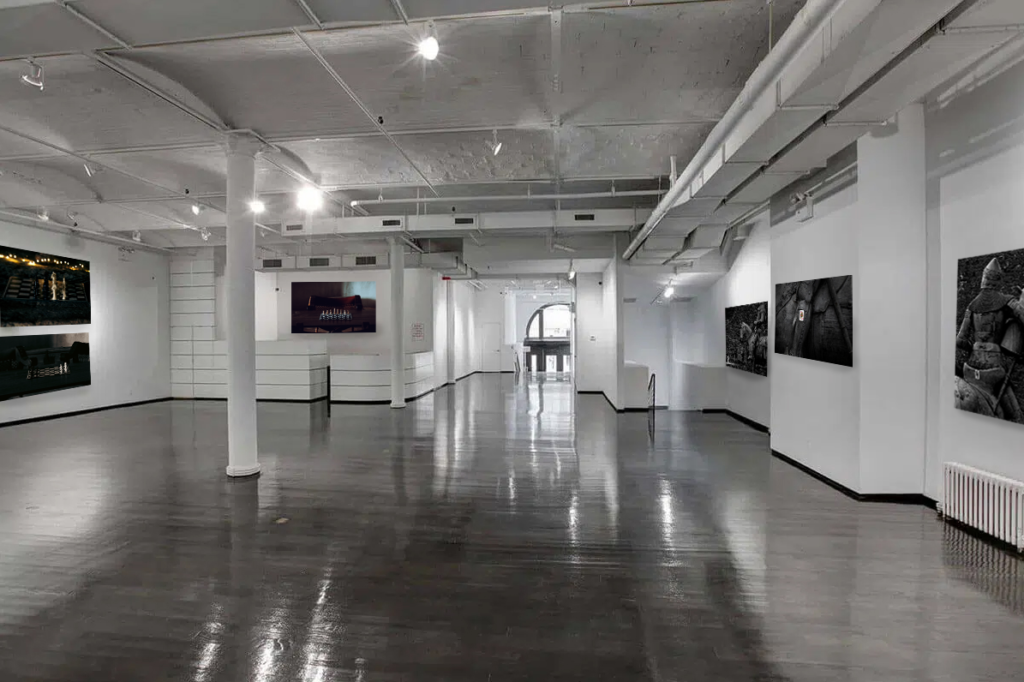
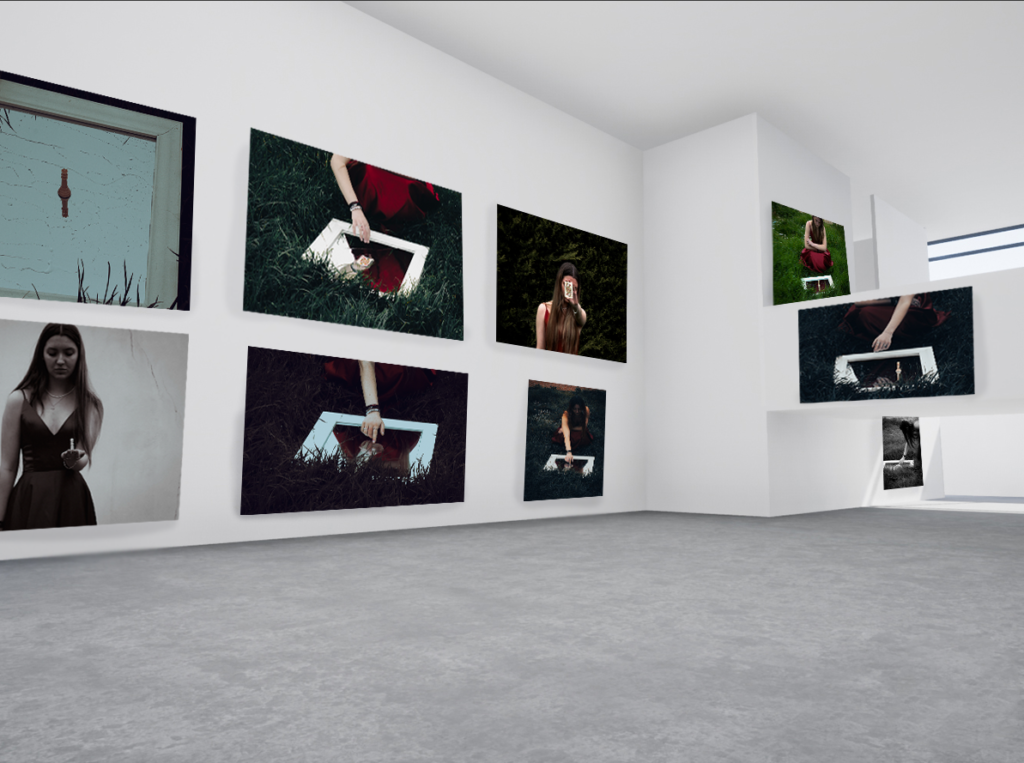
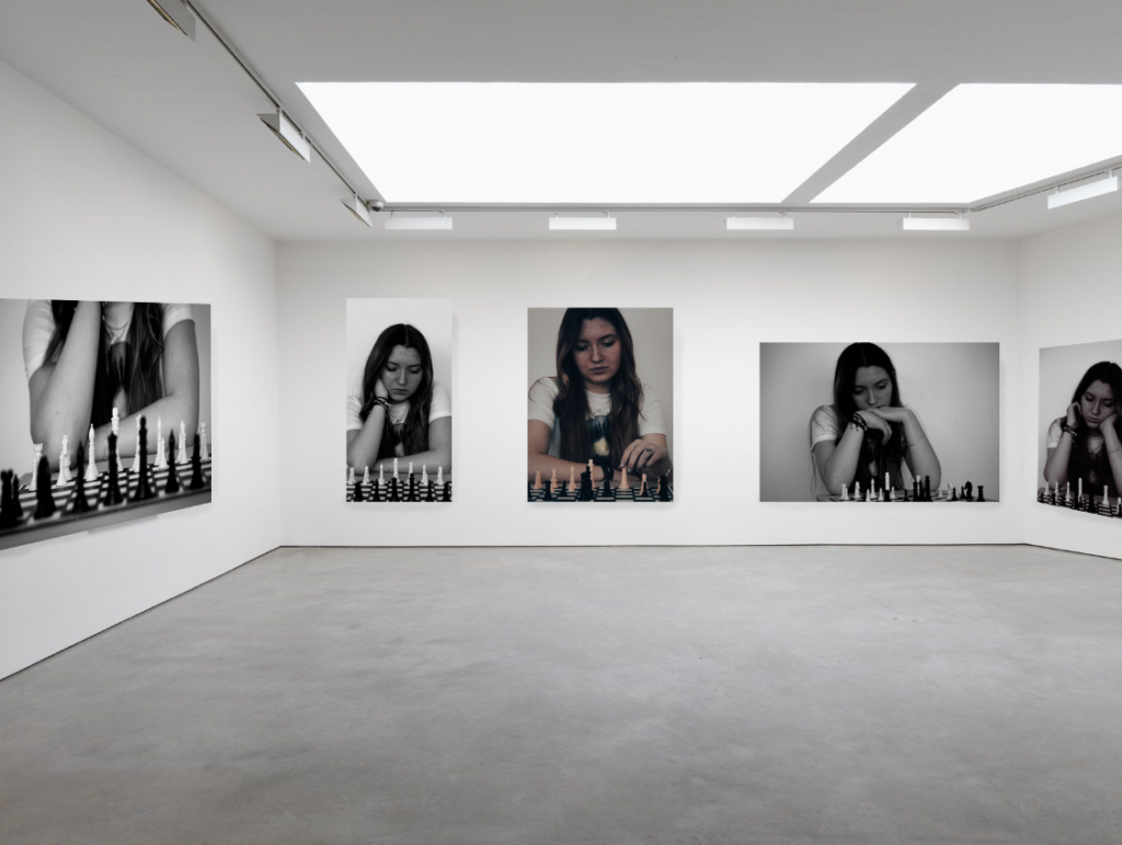
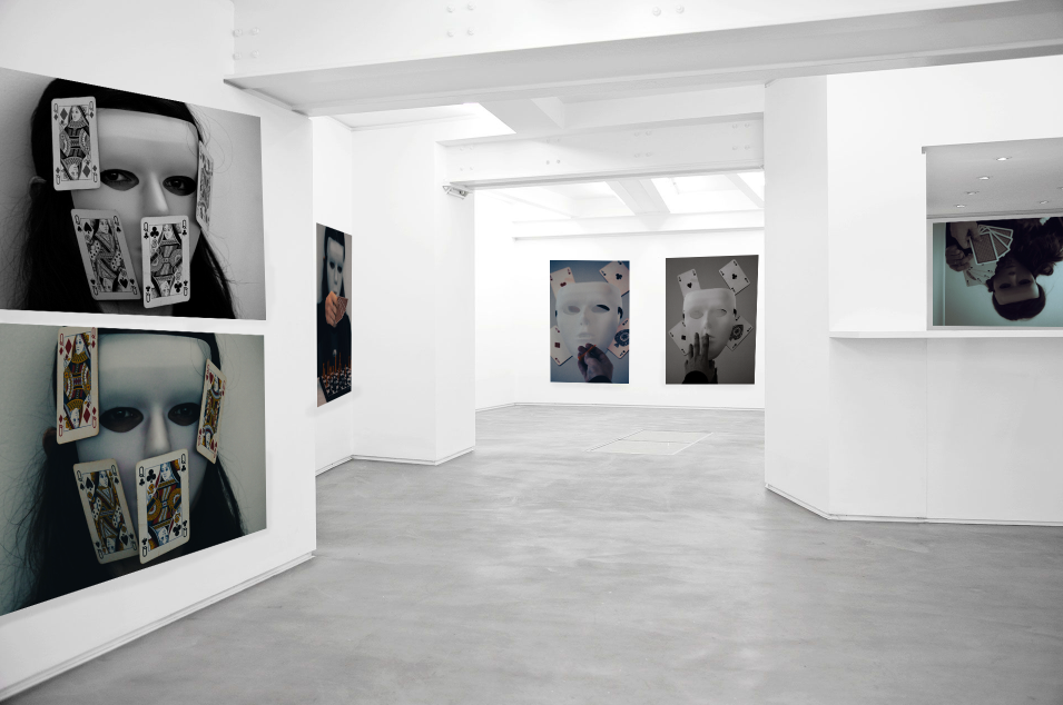
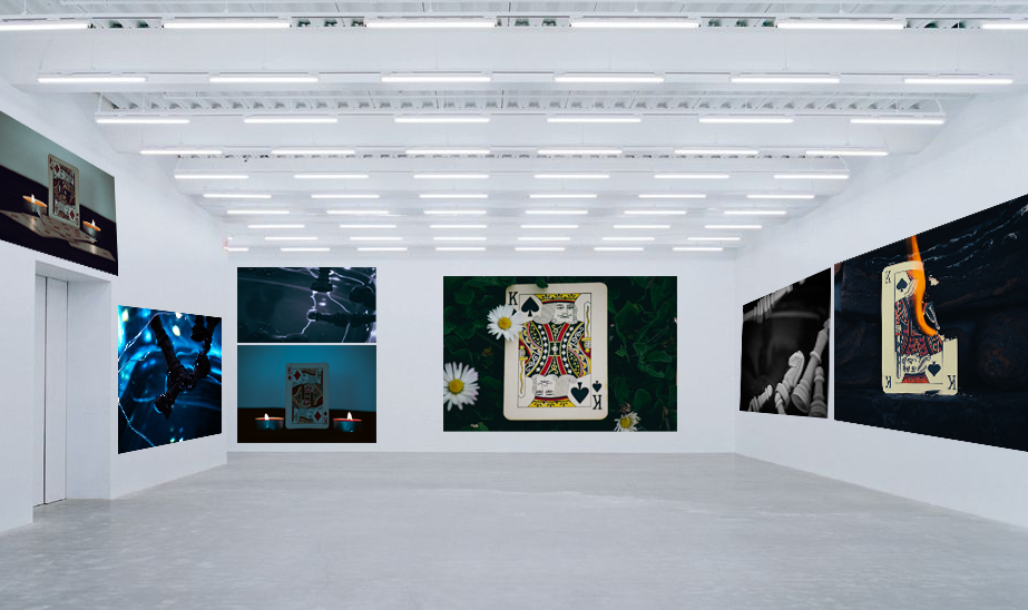
Theses virtual galleries display each of my photoshoots in a more formal setting in order to represent what they would look like if they were to actually be used in a gallery.

In order to create these virtual galleries, I used stock images of empty galleries in photoshop before pasting my own images in them and distorting them in order to make them appear more realistic. To enhance the feel of the images even more I decided to go in with the burn tool to add shadows and depth to them as well as the smooth tool to blend it in.

With this gallery I wanted to display some of my best images from my playing pieces shoot. I really like how the images all go together due to the muted colours and black and white tones in them, which is something that I had planned when editing them. I also like the contrast against the light room of the gallery, causing my photos to stand out even more.

For this gallery I selected a more greyscale one as to link in better with the castle aesthetic of my second photo shoot. I think this one also turned out well and manages to capture the feel of a proper gallery.

For my third gallery I picked a more plain one as to showcase more of my photographs. While I still like this image overall I feel as though the amount of images makes it feel a little cluttered, especially when compared to the plain flooring.

I think that this gallery captures my fourth shoot really well, showcasing my best portrait images, with each of the photos connecting due to the link of chess. I also like how I put the coloured image in the centre, making it stand out among the other black and white images.

This is my favourite gallery that I have made so far due to the layout as well as the colouring linking the images together. I think the mask photos work well when displayed against a plain background with bright lighting due to the images already being quite dark.

Lastly, for my element shoot I attempted to bulk together the images by colours, creating a sort of gradient from a more vibrant blue to a more muted one. Similarly to my mask shoot I like how the my photos contrast against the white background and lights, helping them to stand out more.
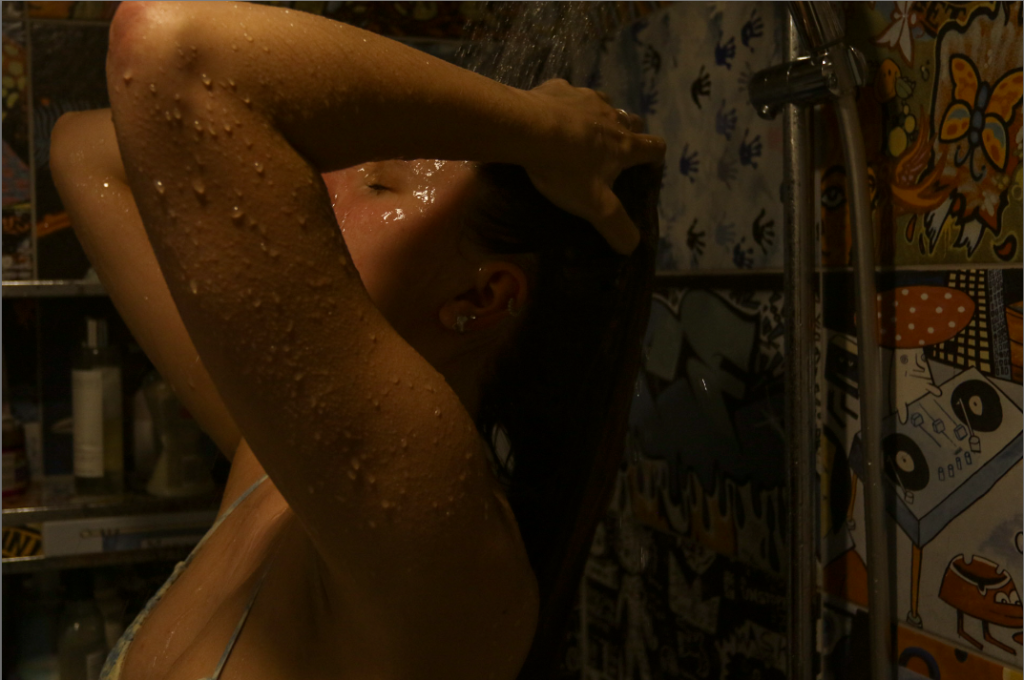
FINAL IMAGES & COPARISON FROM SHOOT’S 4, 5 & 6

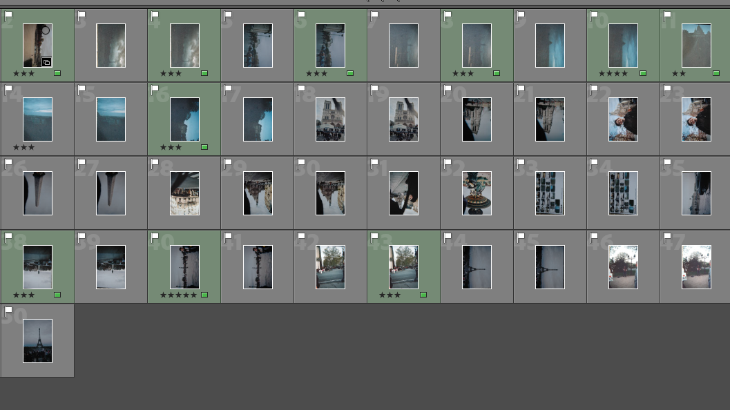
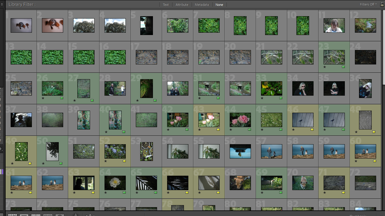
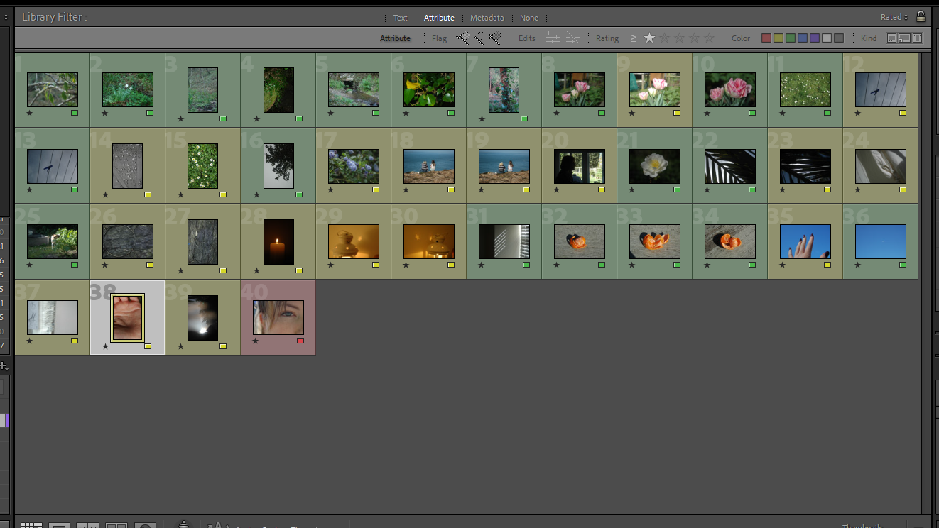
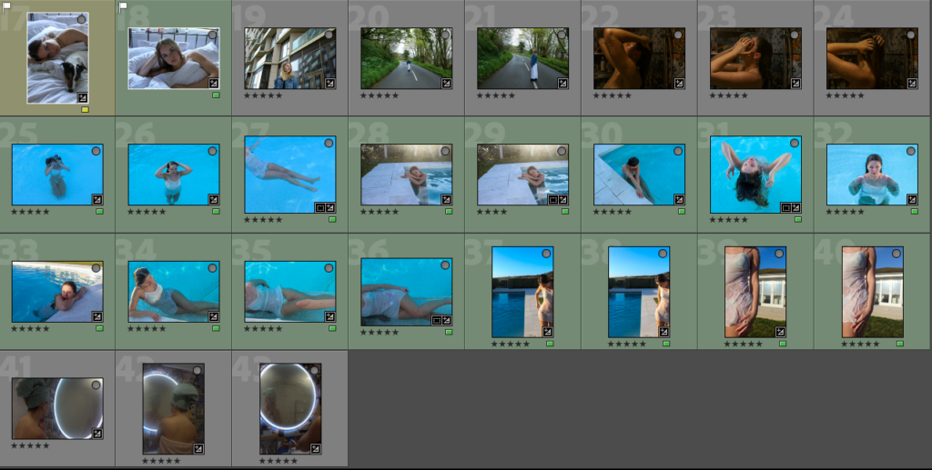
Once again, to chose my final images I rated them and colour coded the ones that I wanted to use so that I could easily distinguish my best images.

FINAL IMAGES:

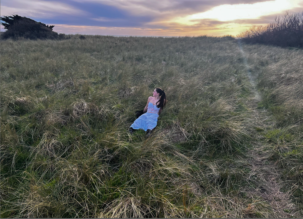
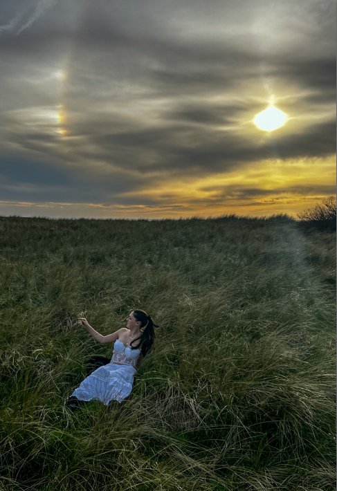
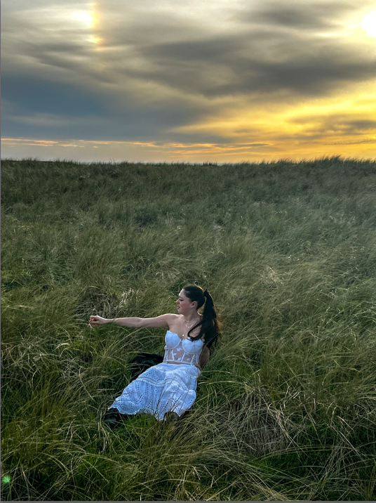
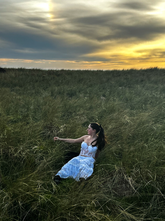
The two images above

IMAGE COMPARISON/ ANALYSIS:

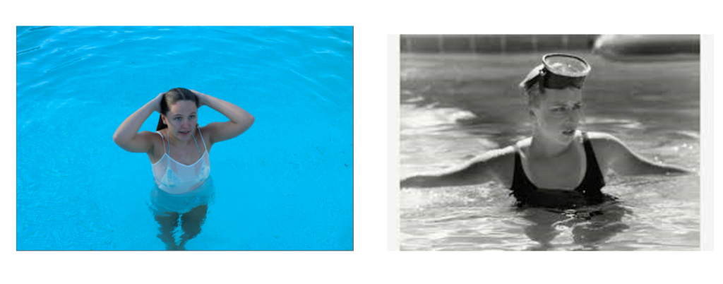
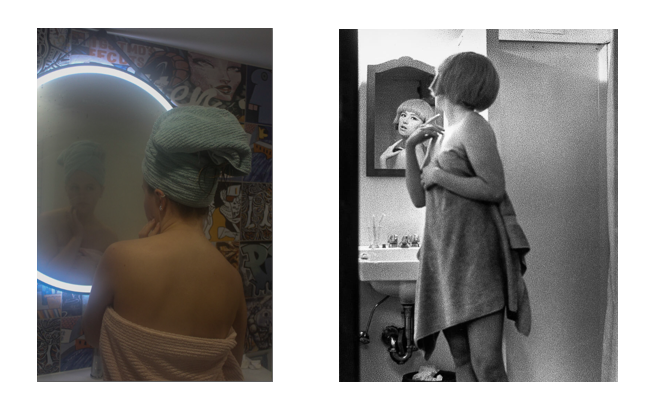
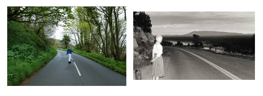
Cindy Sherman (Right) My own interpretation (Left)

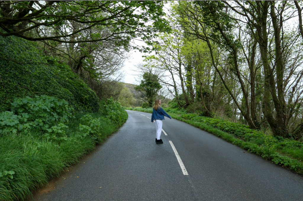
I chose to re-create this image by Cindy Sherman as it can be seen as the ‘fear of the un-known’ as it is a long windy rural road in which the person viewing the image doesn’t know where its leading to. In addition there can be many un answered questions about both my own interpretation and Cindy Sherman’s image like; where is she going? What is she waiting for? & Where will the road go?

Evaluation:

Overall, I think that these shoots came out really well. I have captured many images which are similar to my artist reference’s, furthermore many of them have my own interpretation. I believe that I have stuck to the theme of observe seek and challenge well as i have kept the conception of the ‘gaze’ through out all six shoots.

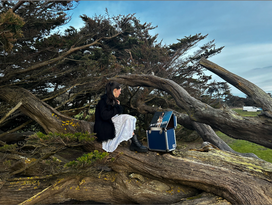
PHOTOSHOOT FOUR

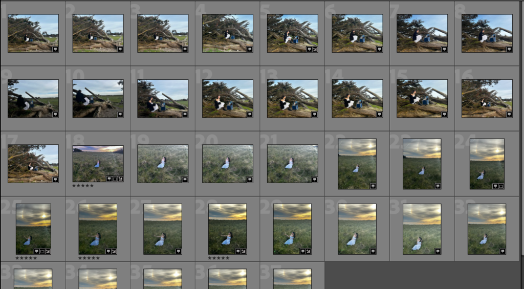
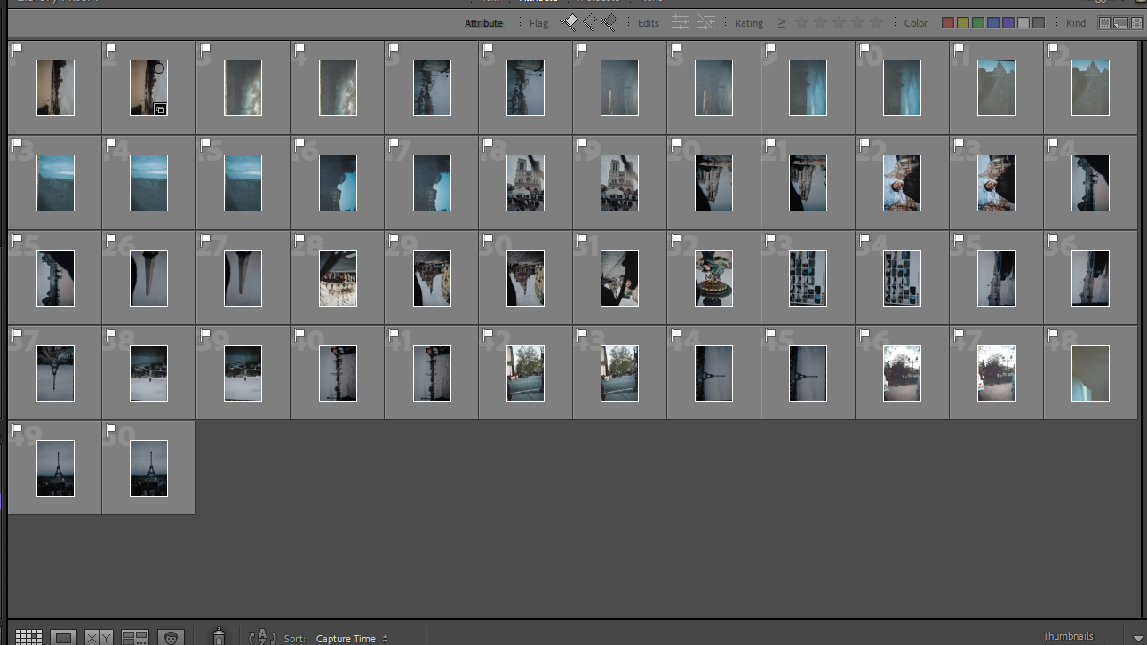
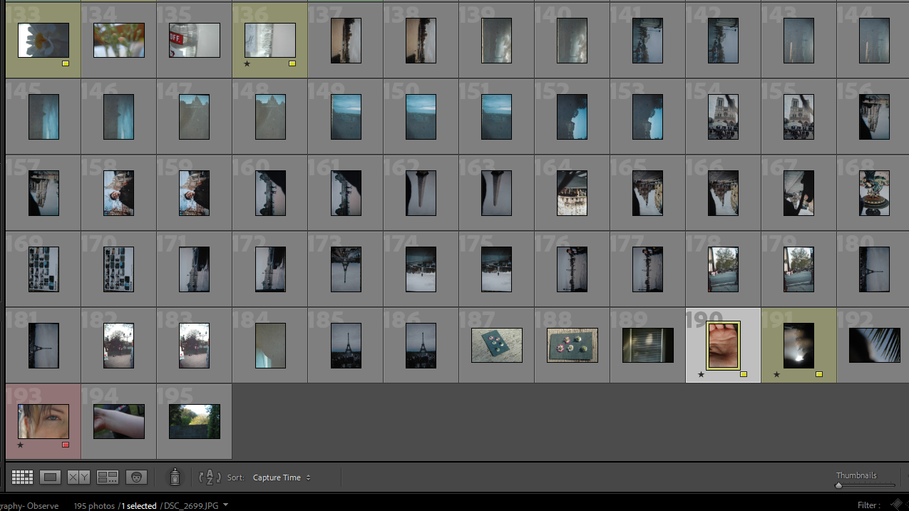
CONTACT SHEET:

SELECTING BEST IMAGES:

Rated my images using the stars; 5 being the best.

Video Collage – Process

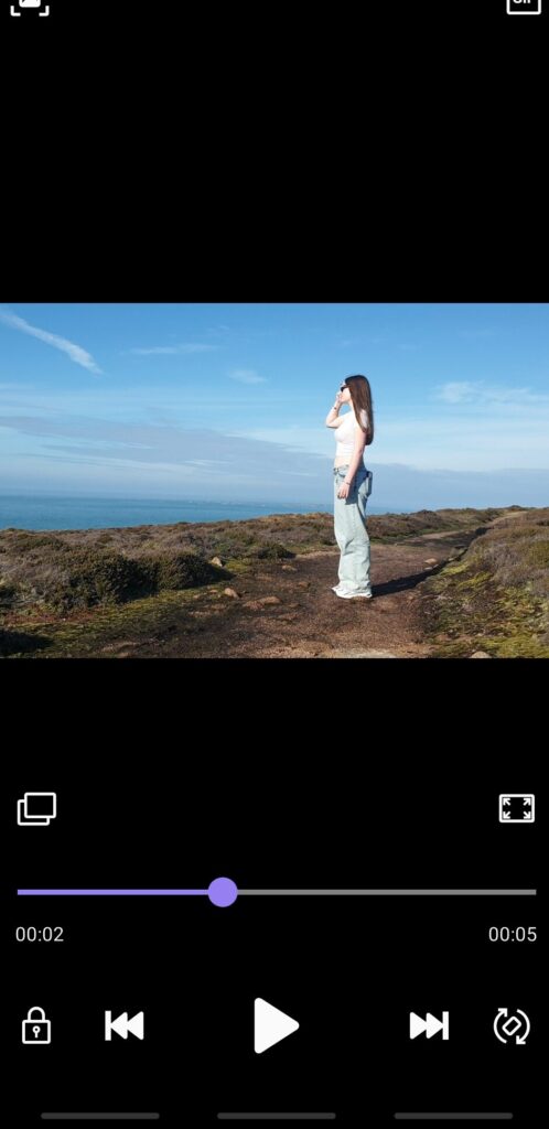
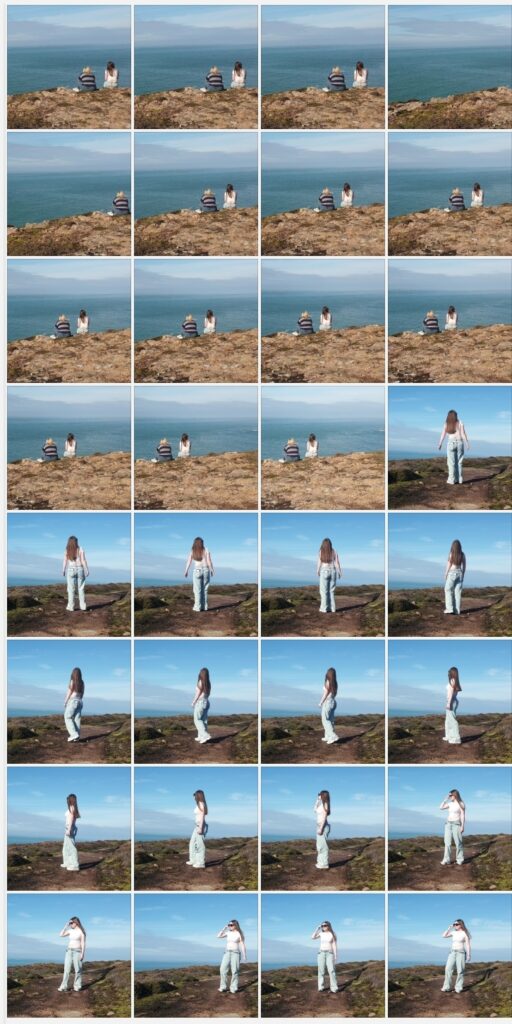
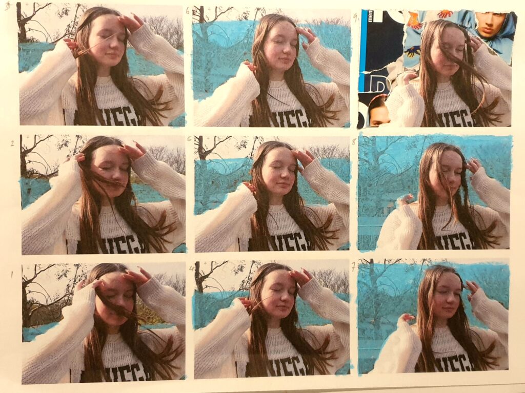
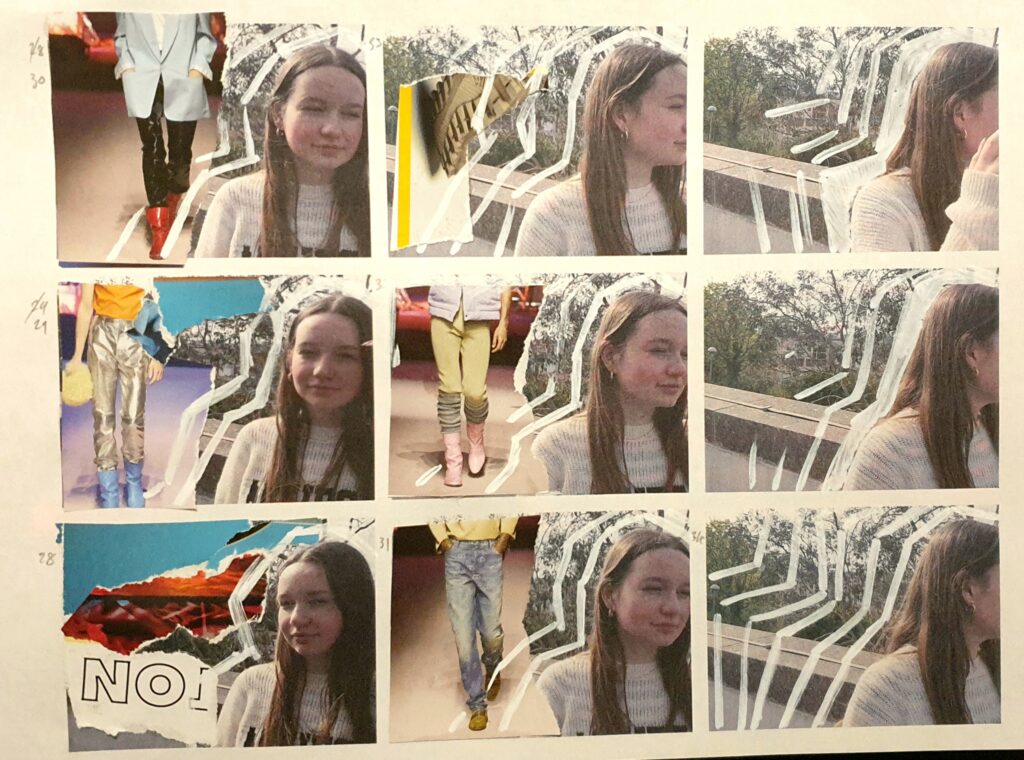
I originally started with multiple short videos which I then converted into singles images used as ‘frames’ at about 3 frames per second.

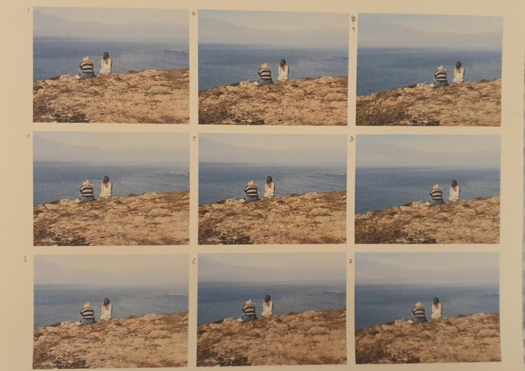
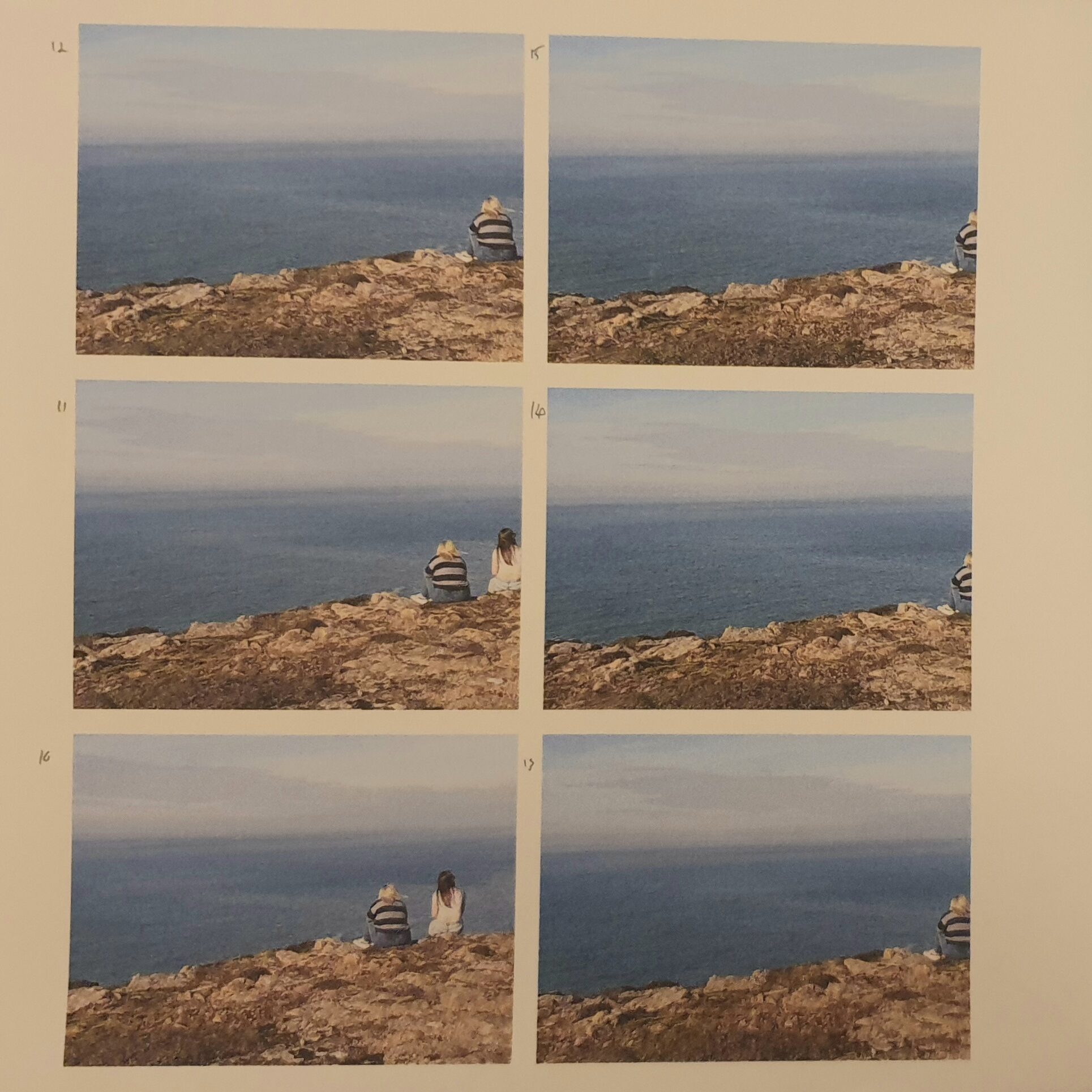
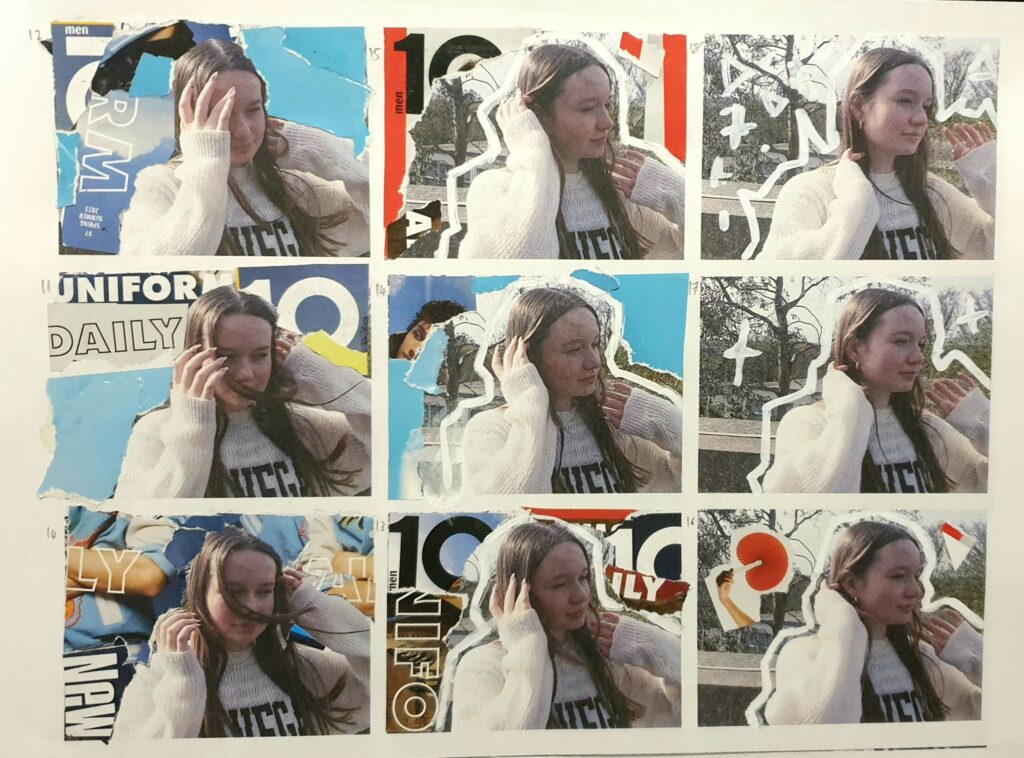
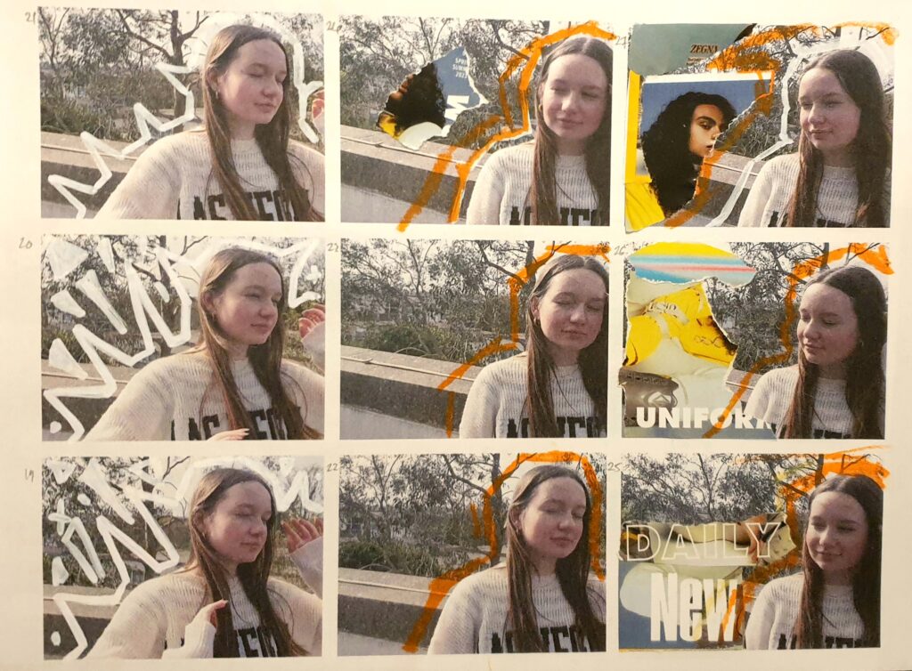
I printed the ‘frames’ 9×3 on A4 paper to make it easier to collage and paint over top of them.

I for the collage i found fashion magazines – filled with models that would represent the current beauty standard and what we are meant to find attractive and deem as beautiful. Mickalene Thomas’ approach to image making is my inspiration for this section of my project.

Throughout the frames I tried to make both the collage and paint move along with the figure – creating smoother movement whilst still adding interest.

Editing – Photoshoot One

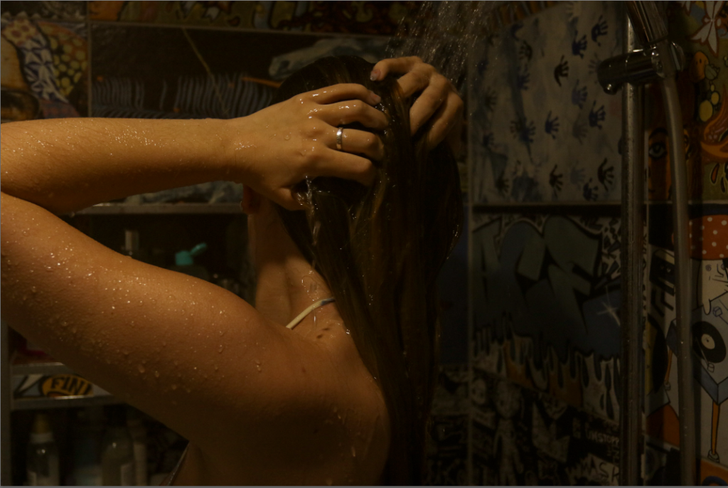
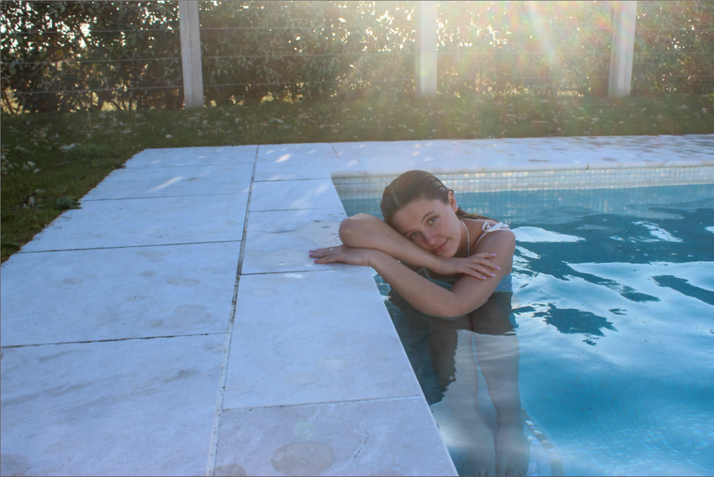
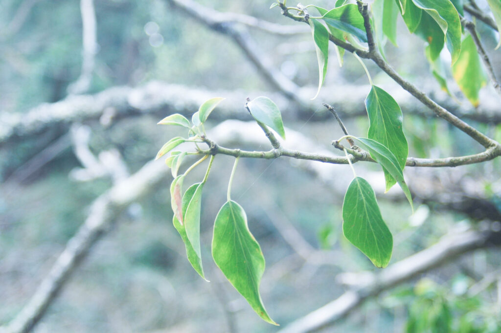
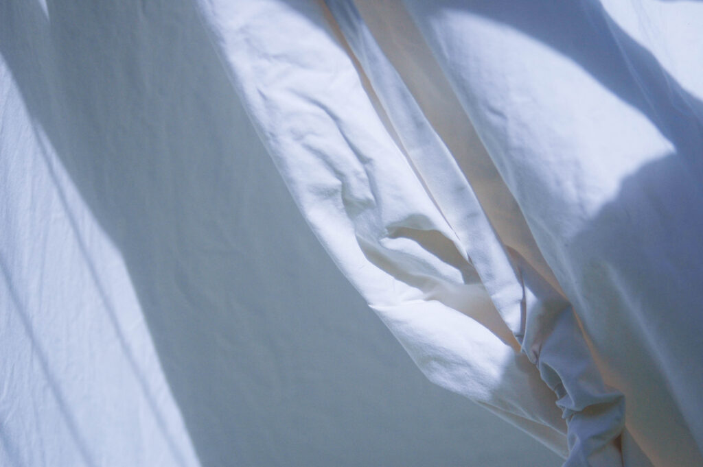
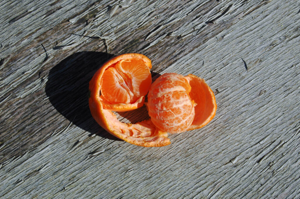
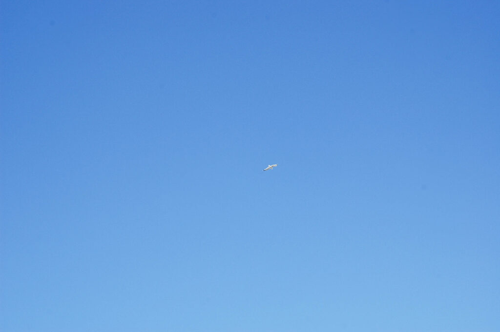
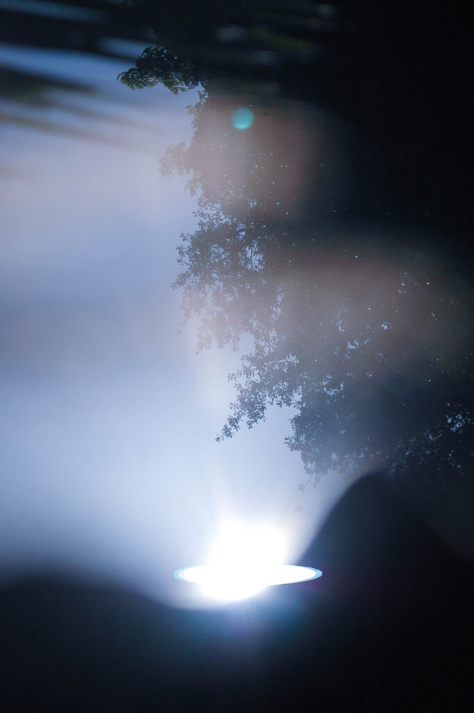
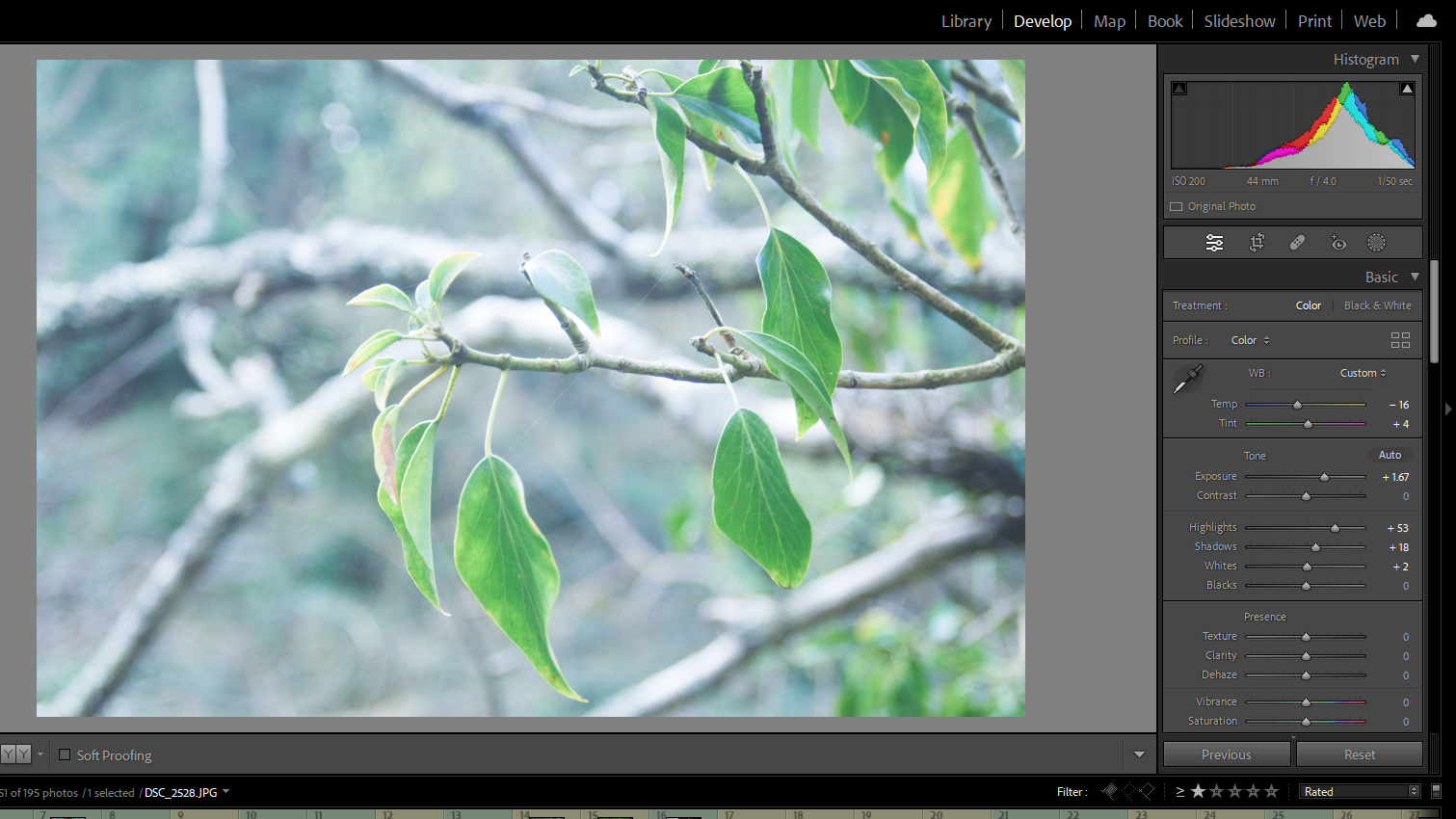
When editing this set of images I want to emulate the quality of Rinko Kawauchi’s images.

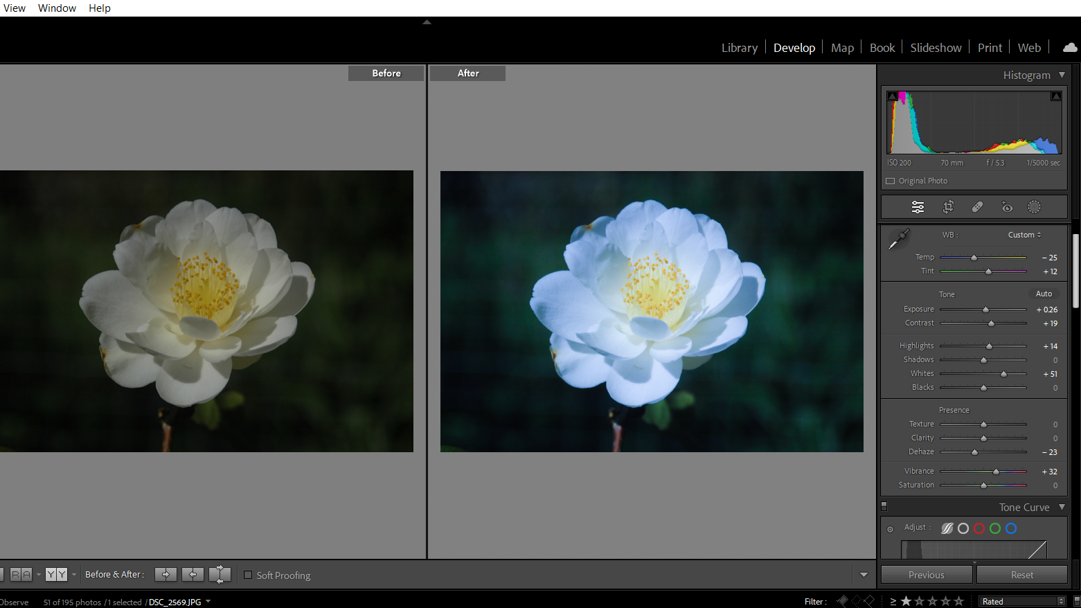
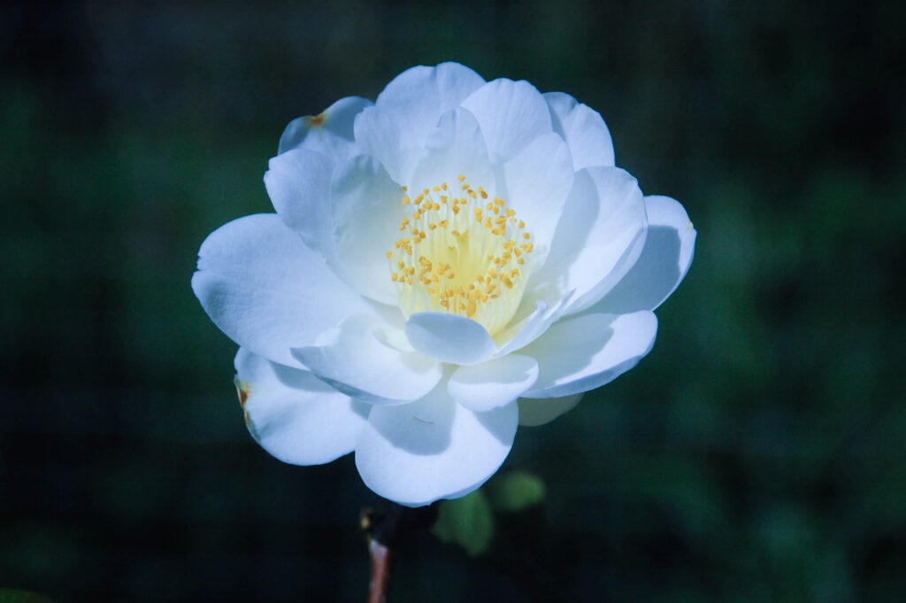
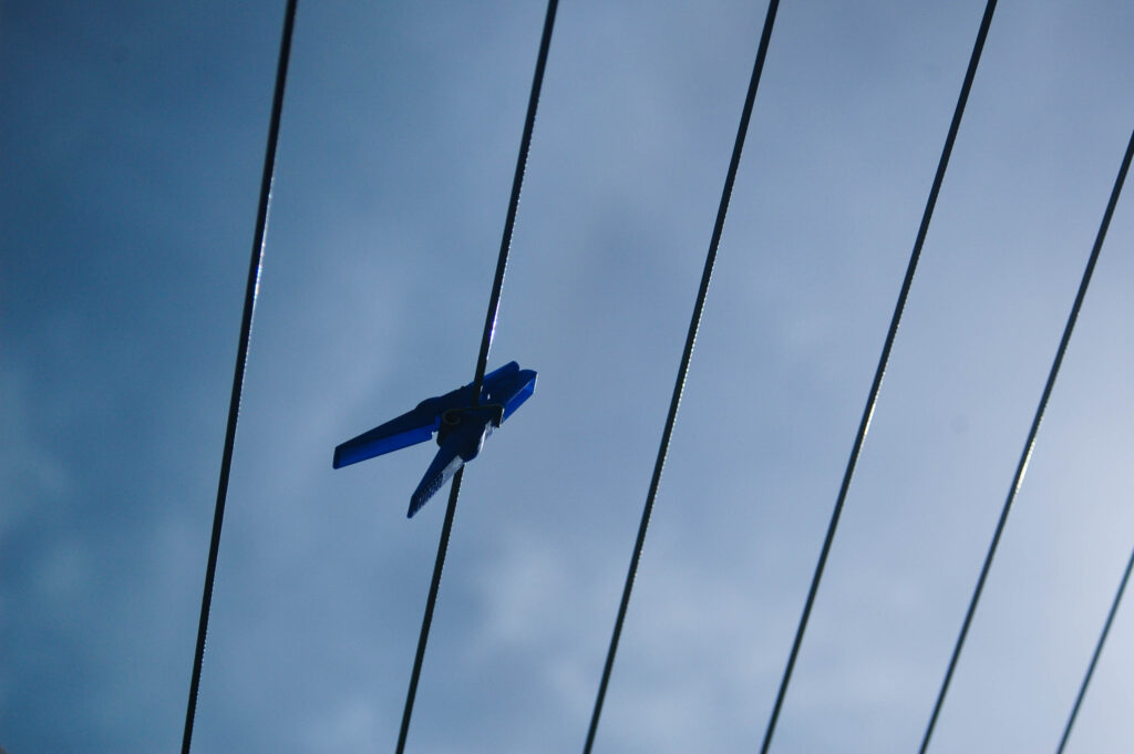
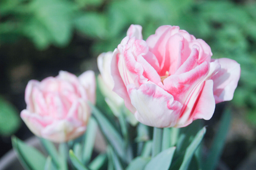
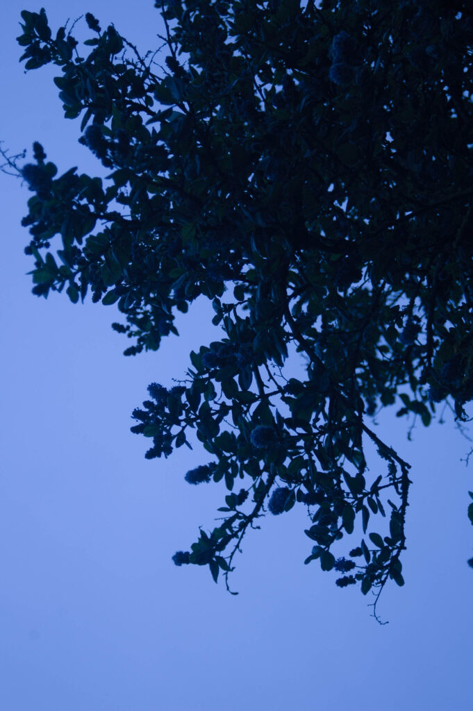
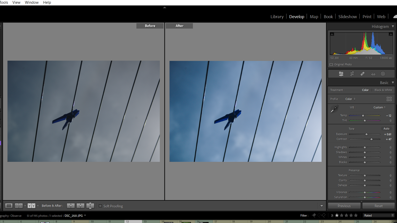
I adjusted the exposure to match Kawauchi’s often over exposed work – I also changed the colour grading of the the images to have a blue tint much like Kawauchi’s work.
Adjusted the Vibrance and saturation to recreate the glow that Kawauchi’s work has.

Photoshoot Three

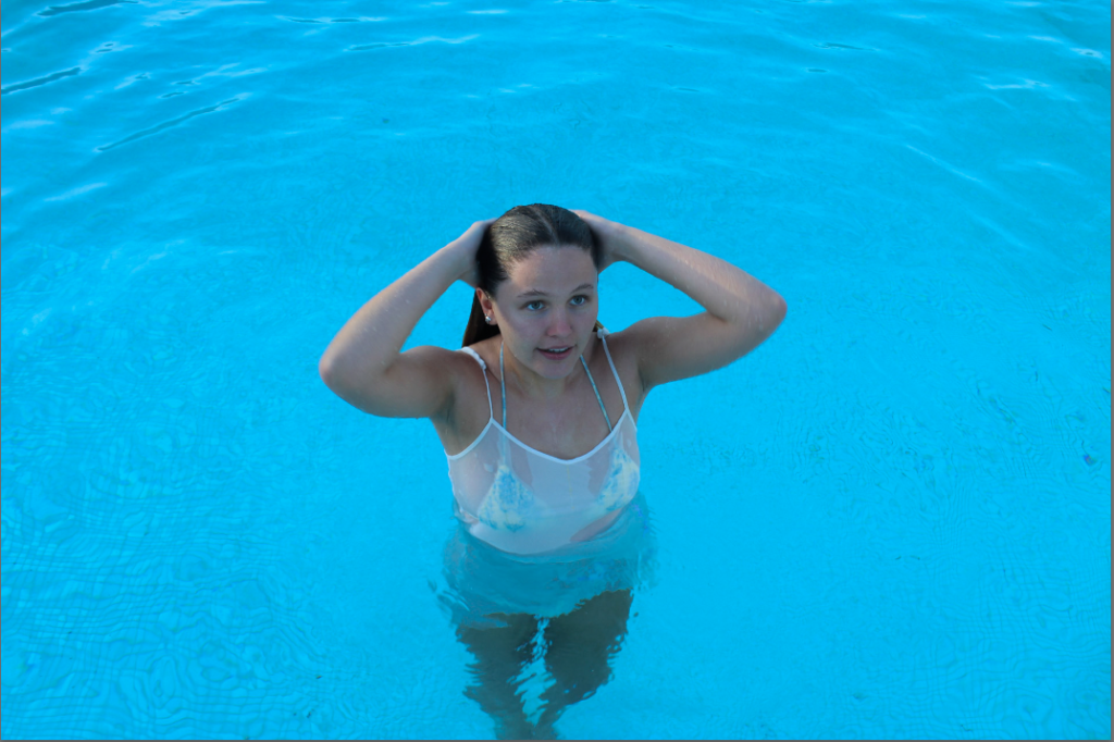
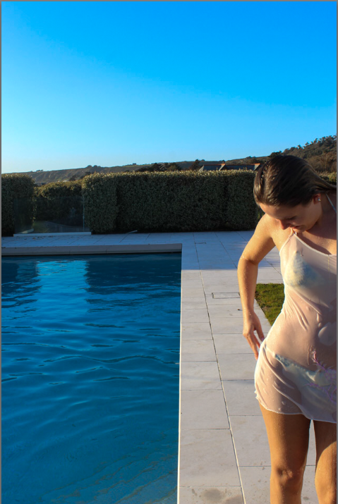
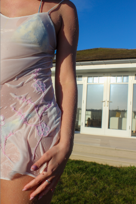
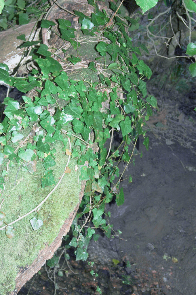
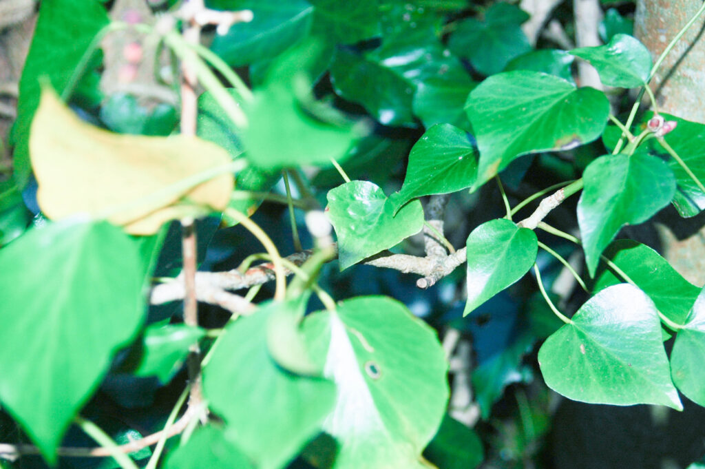
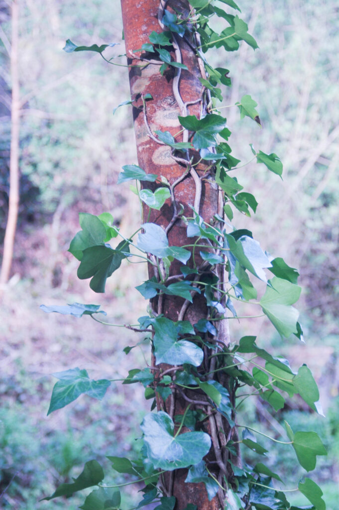
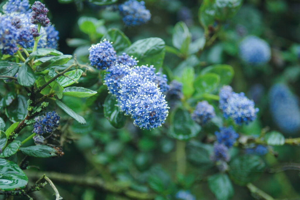
Photoshoot one focused on the natural world and small details within it, Taking pictures of the coastline and my friends in nature.
Photoshoot Two + Selection

These photos were all taken on a disposable film camera whilst on a trip to Paris.

Mixed Media Animation / Video Collage

Animation is the process of making still models, pictures, and drawings appear to be moving by showing images in close succession to create the illusion of movement. Video collage animation is a form of animation created by splicing together real photos, illustration, magazine cut-outs and various animation techniques. I intend to use this to create a short video/gif – I will do this buy taking video and breaking it down into images which can then be printed. I will collage and use various photomanipulation techniques, paints ect, over these images. When put back together in sequence it should create the illusion of movement.

Inspiration + Examples:

Mixed Media Animation (Collection) (youtube.com)

From a Man Mixed Media Animation (Young Thug) (youtube.com)

Mixed media animation (Law of Averages) (youtube.com)

Photoshoot One + Selection

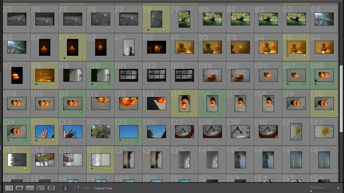
Contact Sheet

Selection

Sorted by colour before editing.

I choose the images that i think best represented Rinko Kawauchi’s style and approach to image making.

Artist Study – Rinko Kawauchi

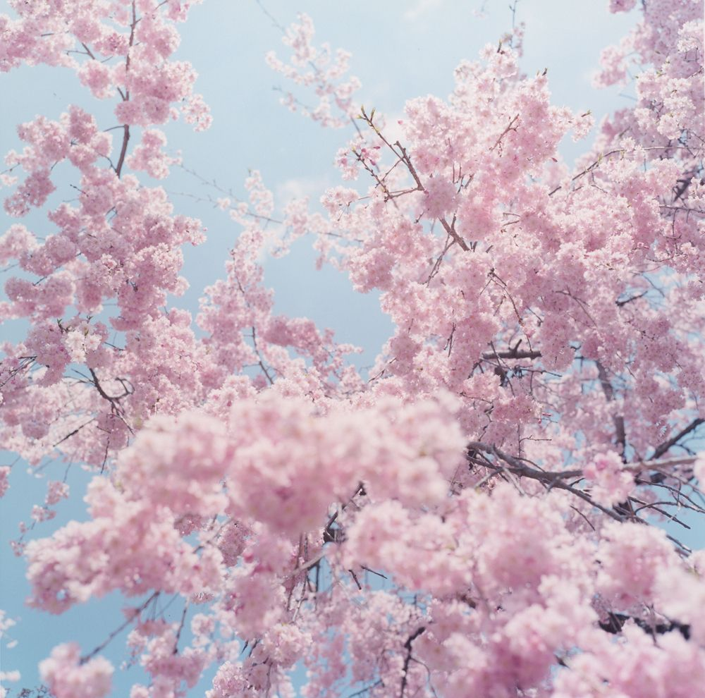
Rinko Kawauchi born 1972 is a Japanese photographer best known for her, images of the of the mundane and everyday life. Her photographs often have a bright radiant effect using a shallow depth of field with flash creating an over exposed image giving a dream like quality. The soft pastel colours of her work also give a serene feeling helping to present the ordinary as something sublime. Her work is rooted in the ideals of Shinto philosophy – Shinto is the ethnic religion of the people of Japan. According to Shinto all things have a spirit or a ‘kami’ so therefore nothing is ‘too mundane’ to be photographed and appreciated; There are four affirmations in Shinto: tradition and family, love of nature, physical cleanliness, and matsuri (festivals in which worship and honour is given to the kami). Kawauchi tries to capture “small events glimpsed in passing,” – she never goes out with an idea of what to photograph only taking pictures of that which interests her – her work is spontaneous and a reaction to the world around her.
Her work stretches over a large number of subjects – from flowers and the ocean, to streets and walls. She gained success in her field very quickly after the release of her first 3 photobooks in 2001: UTATANEHANABI, and HANOKO. Her 2011 photobook ‘Illuminance’ explores the ideas of dreams, temporality and the divine.

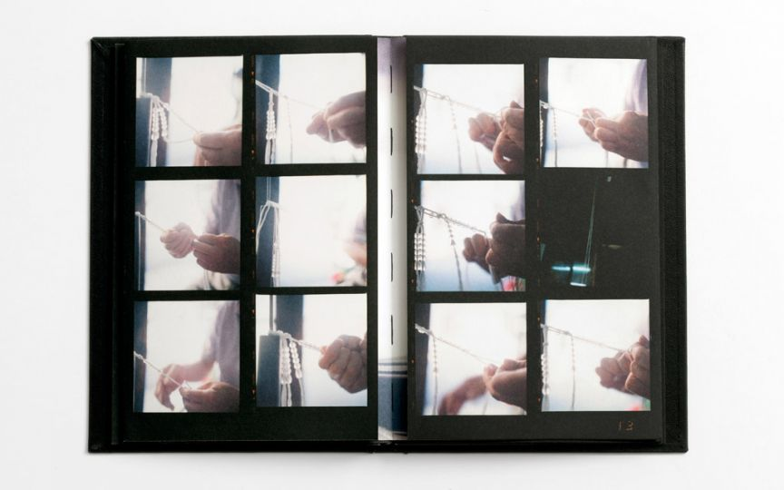
Kawauchi puts a lot of thought into how she sequences her photobooks with images paralleling each other in composition over multiple page spreads – these juxtapositions creating a natural flow between her images. Much of Kawauchi’s is taken on a medium format Rolleiflex film camera meaning that instead of taking multiple images and choosing from the best she instead must use single takes – she describes this as a form of daily visual journaling she often writes poetry alongside her images often being nonsensical outside of the context of her work ‘the drinks of color beautiful delicious in his hand’. Her work as a particular focus on light with her images having a shallow depth of field and frequently being over exposed with lens flares, this helps to create the almost ethereal feeling of Kawauchi’s images.

I chose to use Rinko Kawauchi as inspiration for this project as I think her work fits my theme of finding beauty in the mundane and small things I also like both her aesthetic and practical approach to photography trying to take unstaged images in the moment.