All posts by Scarlett Sargeant

Filters

Author:
Category:

FINAL PROJECT EVALUATION-

Overall, I have thoroughly enjoyed this project. I am very pleased with the outcome of final project, and I am proud of how both my final book and prints have turned out.

I believe that I have explored the theme of Observe, Seek & Challenge well by choosing my own interpretation through the idea of the Male Gaze as it includes the observation of females and seeking them in an objectifying and limiting manner. Furthermore, the male gaze challenges the progression of how women are being seen and depicted in current time when compared to the past.

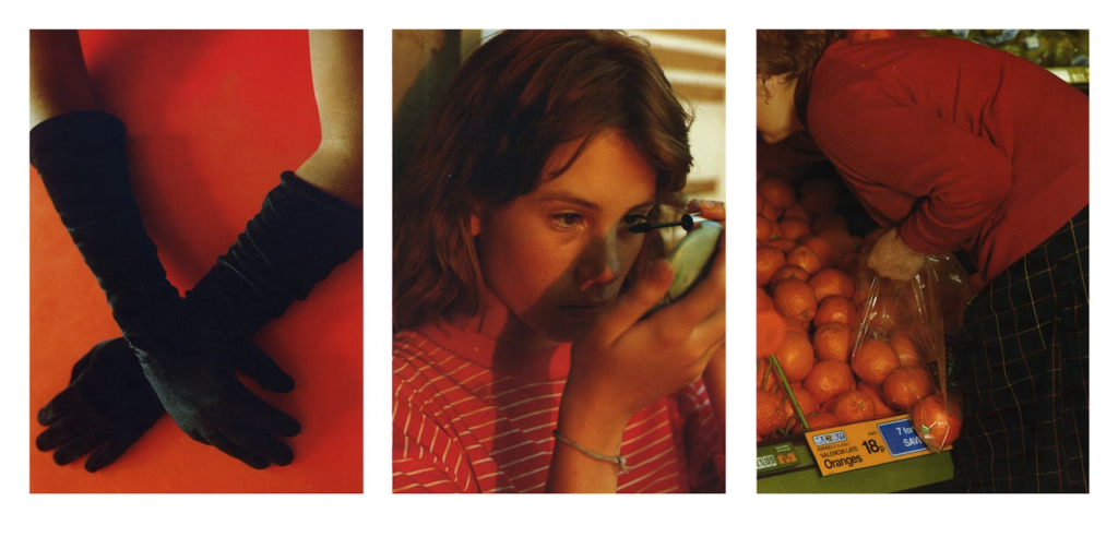
In addition, I enjoyed the process of researching and finding artist references which matched with my idea of observe, seek and challenge. I thought it was interesting learning about the stories behind the photographers and their series of images as it helped me view their images in another light. Cindy Sherman was a huge inspiration to me as her ‘untitled film stills’ were mainly based on the male gaze and how women can be objectified by men, however it also shows the strength behind women’s eyes. Furthermore, Nancy Honey’s work which I took inspiration from explores the coming of age females which is an empowering moment of life for women as you learn to love your body as it changes.

Moreover, watching my mood boards come to life through the process of taking images has by far been the most enjoyable experience of the whole project. I overcame many challenges throughout this process by improvising with what ever I had at the time, however, took it all as a lesson to improve my work and to know what to do the next time. I also enjoyed the process of finding models and positioning them in order to get the best outcomes and exploring with both artificial and natural lighting to create different types of effects and shadowing. With each shoot I did, I aimed to re-create at least one or two of my artist reference’s images to point me in the right direction to then create my own interpretation of their work.

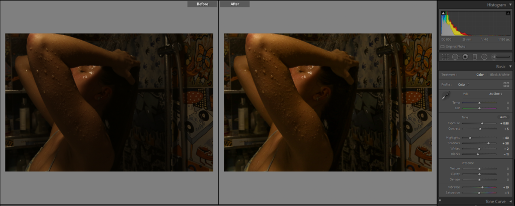
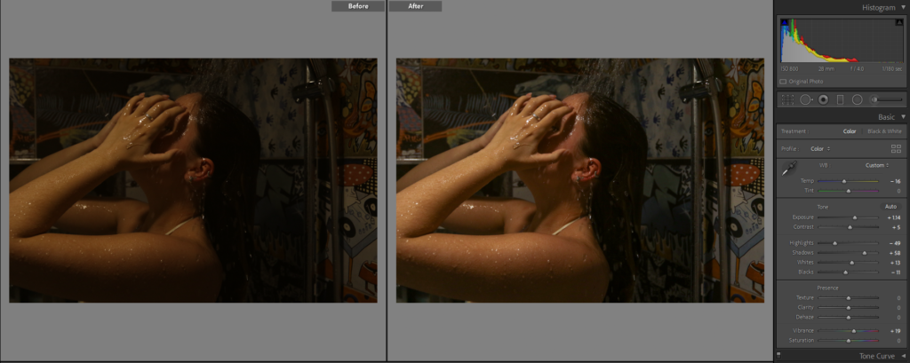
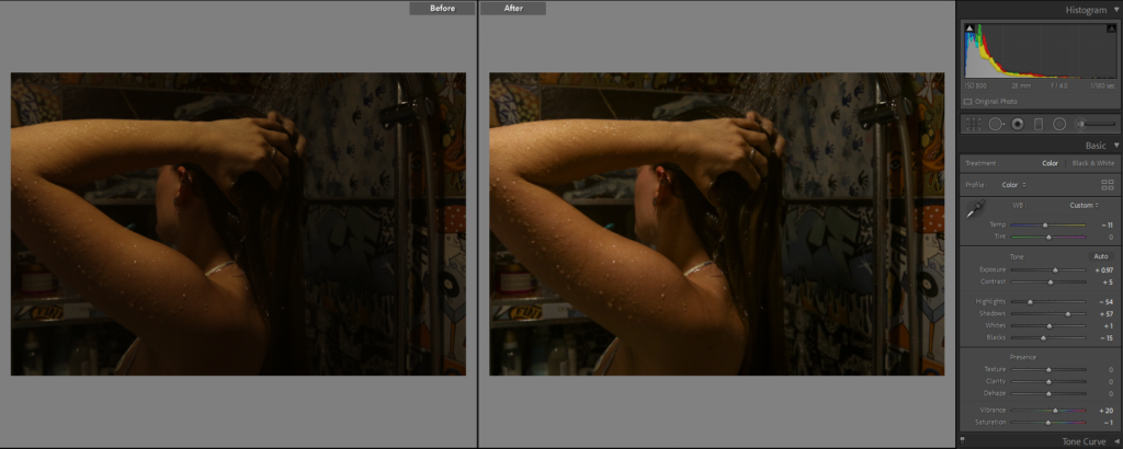
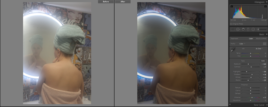
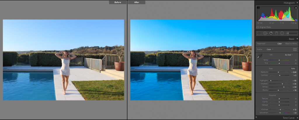
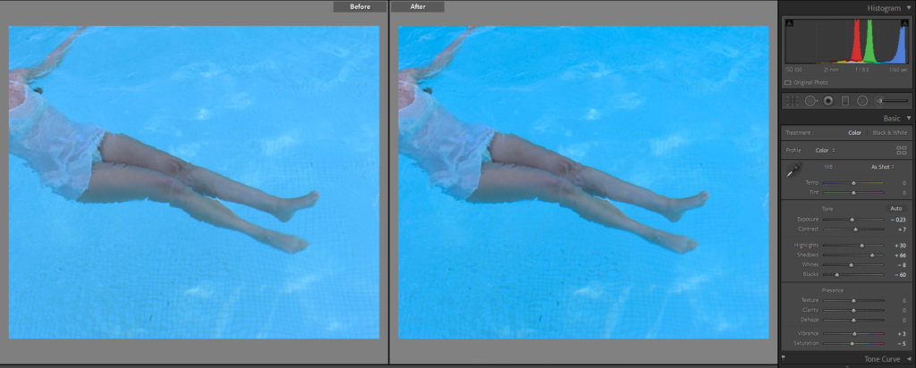
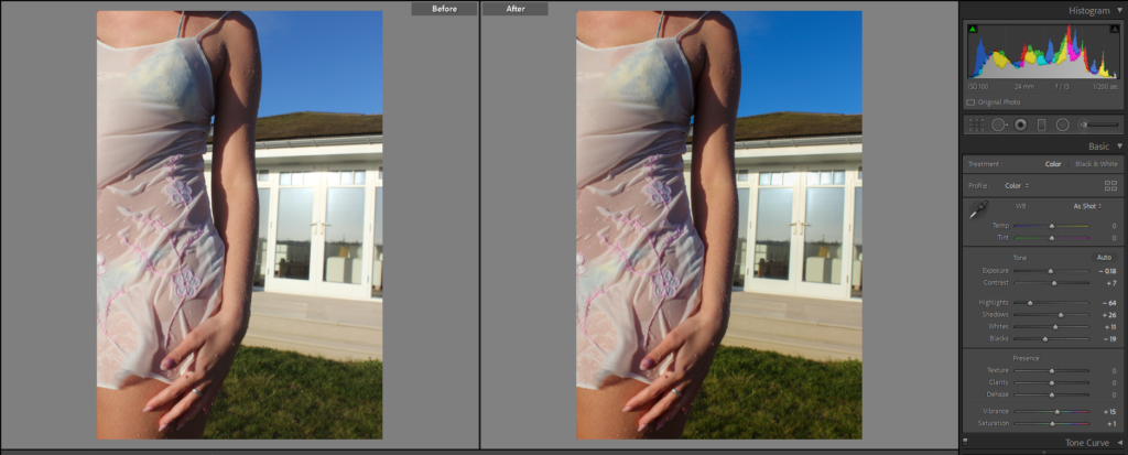
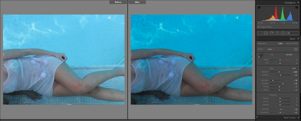
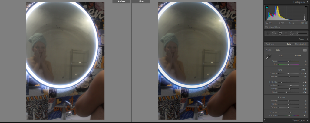
To edit my images I used Adobe Light Room to create the best version of each photo. At times this was a repetitive and time consuming process as I would have to sift through hundreds of images of each shoot to select which ones I wanted to edit and select for my final images. However, watching my images which were dull becoming more vibrant and defined was satisfying and fulfilling to do.

My favourite part of this whole project has been the mounting and framing up of my images. I enjoy this process as it was physical and practical and allowed me to have creativity to show my work and see how other people will view it. To present my images, I made window mounts which creates a black frame with a white border to allow images to stand out. Further more, I created two collages on foam board and spray mounted images onto it.

All together this project has been a very enjoyable experience. I have loved seeing all of my hard work come together in a format in which other people can enjoy. There has been some challenges, however, they were resolved and overcome and I am pleased with the outcome of my work.
VIRTUAL GALLERY:

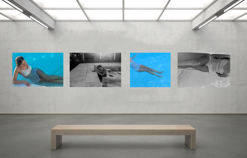
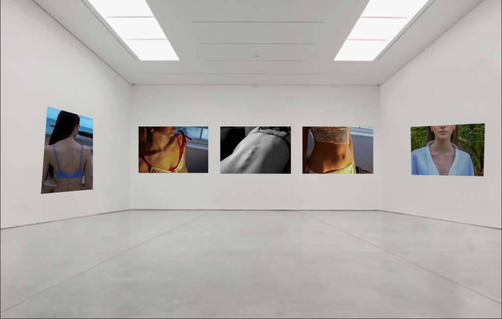
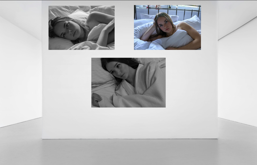
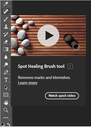
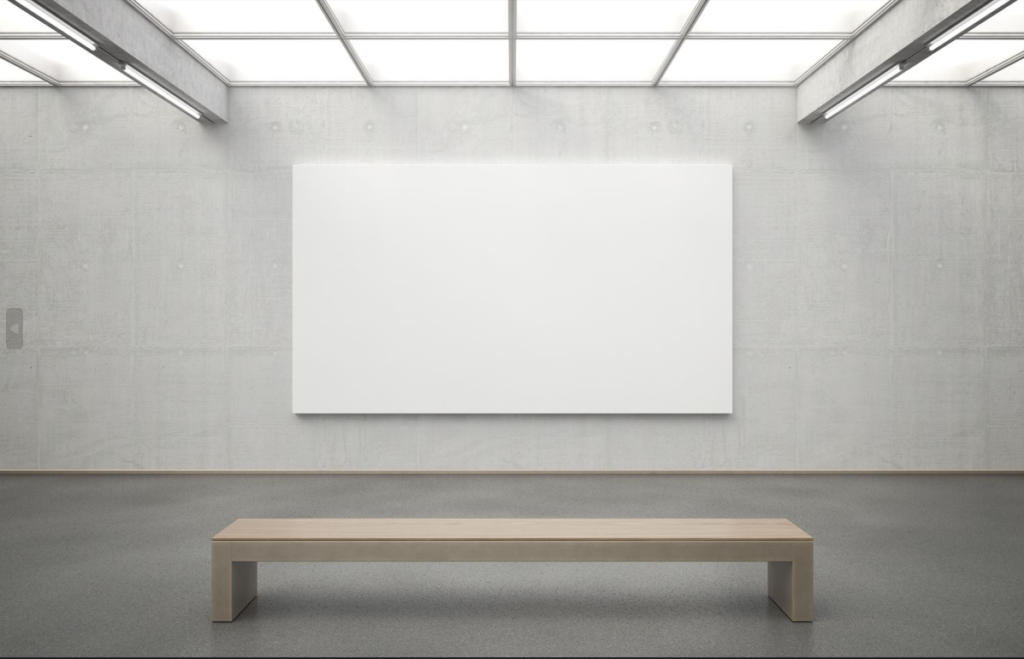
To create my virtual gallery I used Photo Shop and the gallery images which were given to us in the exam. For the galley image below, I had to edit it to remove a white plate from the background in order to make it look like the images are laying flat onto the wall. I did this by using the ‘spot healing brush tool.

For the images which are placed on an angled wall I used the ‘distort’ method’ to move the image and re-size them to the wall, making the closer edge longer and the further away edge shorter to give the illusion that it is lying flat onto the wall.

PHOTO BOOK:

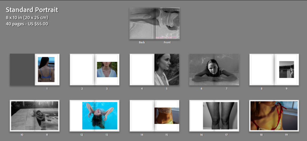
here is a link to my book : https://www.blurb.co.uk/projects/12091694/upload_complete?first_visit=true

Narrative: What is your story?
Describe in:

  • 3 words

Empowering, Feminism, Girlhood

  • A sentence

Empowering females with their bodies.

  • Design of book:
  • Size: Standard Portraits
  • Cover: Hardcover Image Wrap
    • Paper Type: Premium Matte

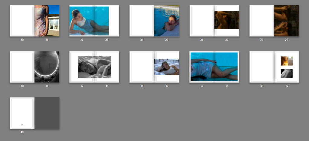
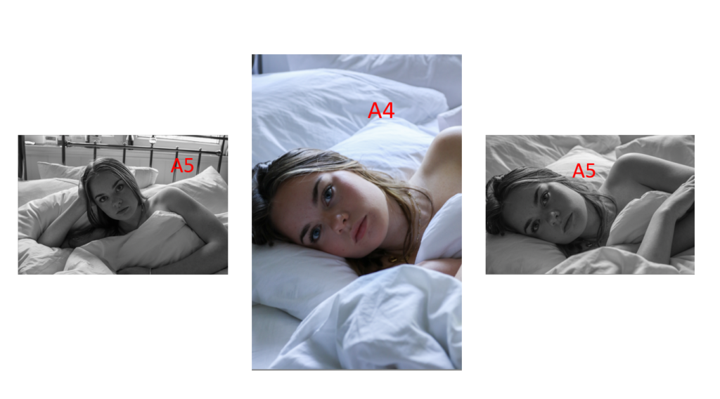
I am calling my photo book ‘The Male Gaze’, the title of my book is in a light pink colour which carries on with the theme of stereotyping women. It contains a series of images which I have taken across 40 pages. I have chosen to create my book in portrait as it fits my portrait images better. Moreover, I have chose the sequencing of these images in a way in which each image will have a corresponding/ similar image on the next page. While placing the images into a book format in Light Room I did have to re-edit some photos to make sure that the tones flowed through each page. For example, with my black and white images, I had to adjust the black levels and the exposure, where as with the colour photos taken in the pool, I ensured that the colours of the water where all matching. Furthermore, I am pleased with the outcome which is shown in the screenshots above as it corresponds with my own interpretation of the theme of Observe, Seek & challenge.

Experimenting with my photobook:

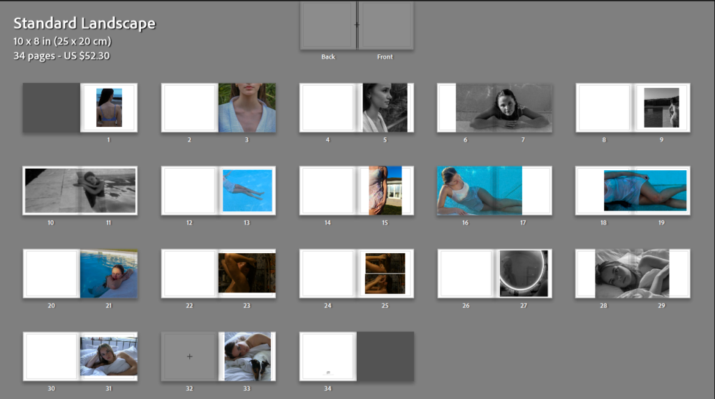
I experimented with my book in landscape, however, i decided to switch to portrait as II believe it suits my portrait images better.

RESONING BEHIND MY PHOTO BOOK:

My photo book is based on the photographic gaze and more specifically the male gaze. The male gaze is a feminist theory by Laura Maulvey which is based on how women are seen and depicted to satisfy the needs and wants of men. I have picked this subject as I believe it ties in with the theme of observe seek and challenge as the male gaze includes the observation of females and seeking them in an objectifying and limiting manner. Furthermore, the male gaze challenges the progression of how women are being seen and depicted in current time when compared to the past.

The images that I have taken and chose to use in my photo book show both the strength and vulnerability in which Women as a whole hold. Some images show parts of the female body that some men desire which feeds into the stereotype of the male gaze however, the thought and meaning behind this book and the series of images has a deeper meaning to it. I chose this topic as many females find themselves changing their appearance to gain male validation. However, the images which i have taken are purely for the confidence of the people involve and to show that not everything has to be viewed in the terms of the male gaZA.

PRINTS LAYOUT:

Collage:

For both of these collages I will be presenting them on foam board which will be white and placing the images on with spray mount to ensure that they do not lift at all.

 Triptych:

For both of these layouts I will be creating Window Mounts for. I will be doing this by using a piece of card and using a bevel knife to create the angled cuts, by using this it will create a soft white boarder around the images.

PHOTO BOOK DECONSTRUCTION:

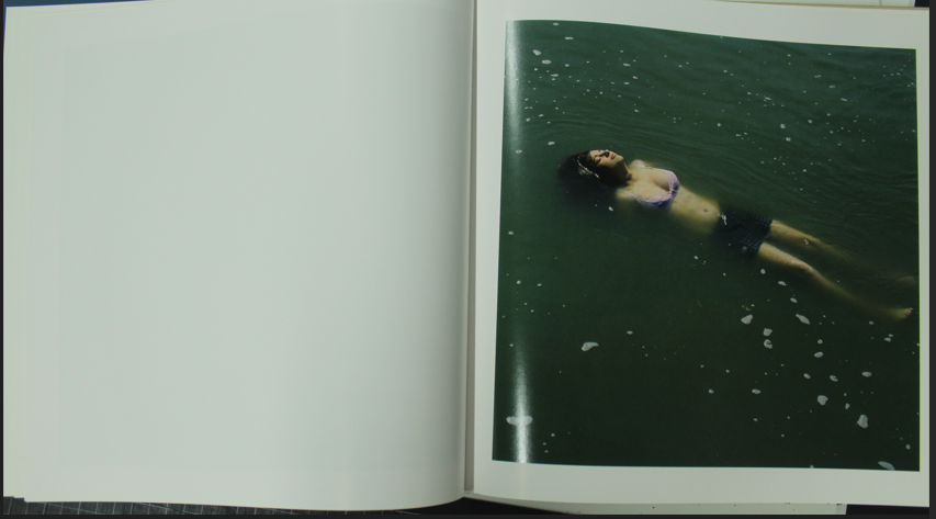
My photo book layout is inspired ‘The Illusion Of An Ever Lasting Summer’ by Alessandra Sanguinetti. I like how in her book there is mostly only one photo on one page of a spread as i think it allows the viewer to really look and focus on the image which is in front of them and to appreciate the image without getting distracted by another. Furthermore, all the images in this book have a white boarder around them. This is something that I have taken inspiration from, however, don’t want for all of my images as I would like to add some differentiation into my book by using a handful of double page spreads and some images in ‘full bleed’ meaning that it will cover a whole page with no boarder. I am further taking inspiration from the hard copy from Alessandra Sanguinetti’s book.
Alessandra Sanguinetti- The Illusion Of An Everlasting Summer
My Book

In addition, I have also taken inspiration from Nancy Honey’s book ‘Woman To Woman’ as she sets her images out in tryptic formats, therefore I have some one of my final print lay outs in a tryptic format.
Nancy Honey’s tryptic layout from Woman To Woman

FINAL IMAGES & COPARISON FROM SHOOT’S 4, 5 & 6

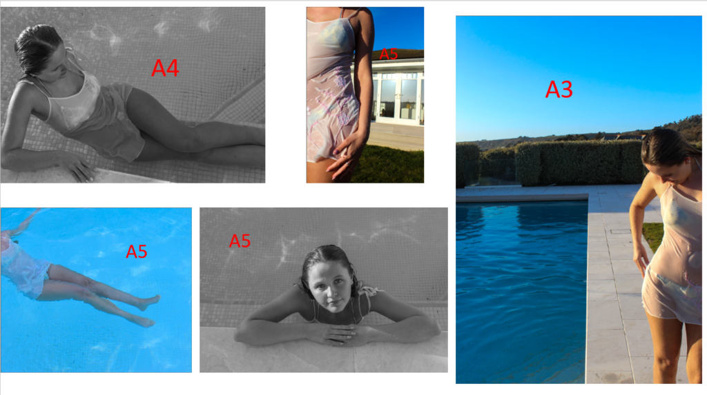
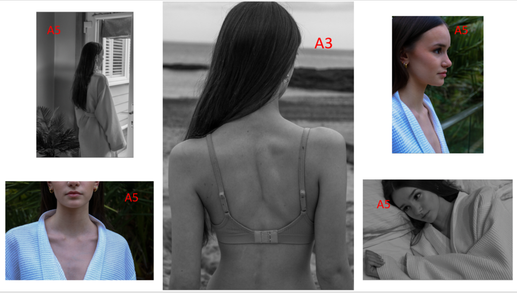
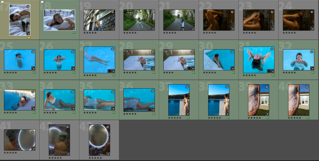
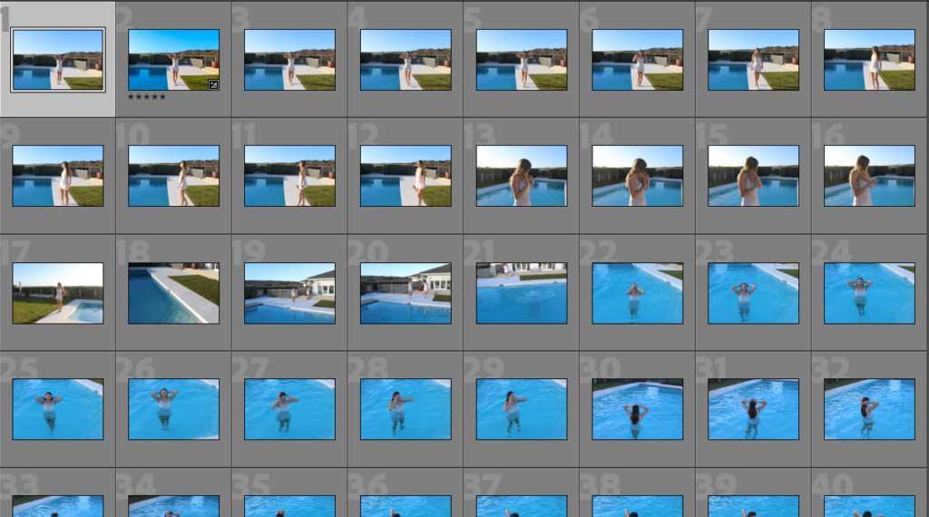
Once again, to chose my final images I rated them and colour coded the ones that I wanted to use so that I could easily distinguish my best images.

FINAL IMAGES:

The two images above

IMAGE COMPARISON/ ANALYSIS:

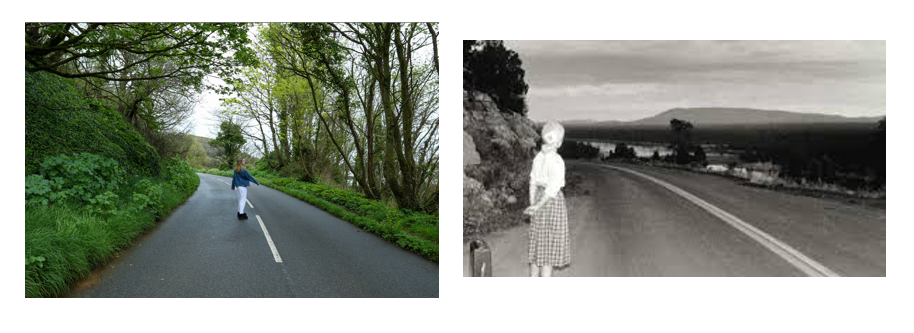
Cindy Sherman (Right) My own interpretation (Left)

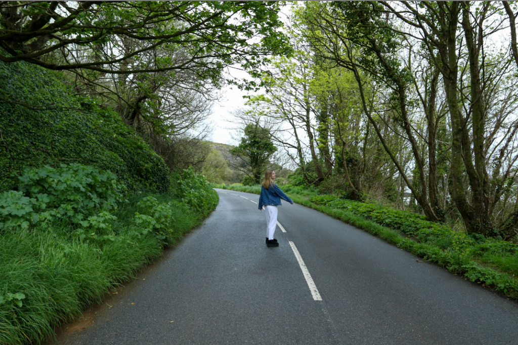
I chose to re-create this image by Cindy Sherman as it can be seen as the ‘fear of the un-known’ as it is a long windy rural road in which the person viewing the image doesn’t know where its leading to. In addition there can be many un answered questions about both my own interpretation and Cindy Sherman’s image like; where is she going? What is she waiting for? & Where will the road go?

Evaluation:

Overall, I think that these shoots came out really well. I have captured many images which are similar to my artist reference’s, furthermore many of them have my own interpretation. I believe that I have stuck to the theme of observe seek and challenge well as i have kept the conception of the ‘gaze’ through out all six shoots.

PHOTOSHOOT SIX:

Plan:

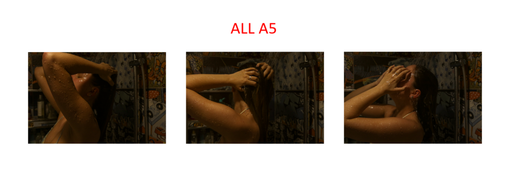
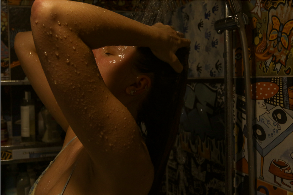
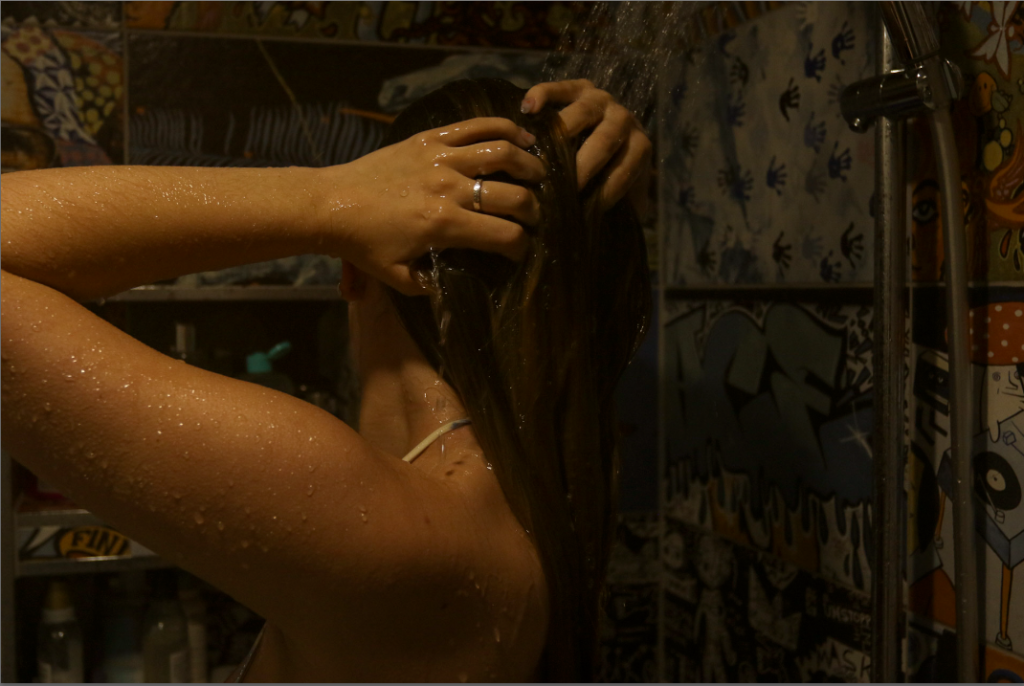
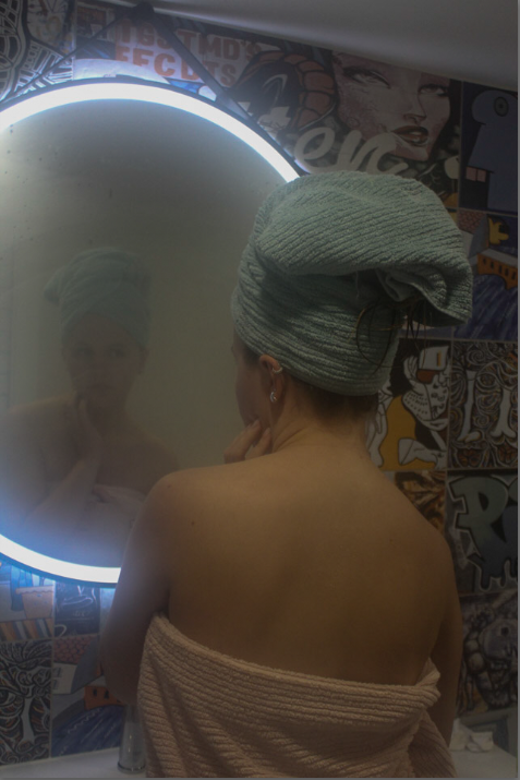
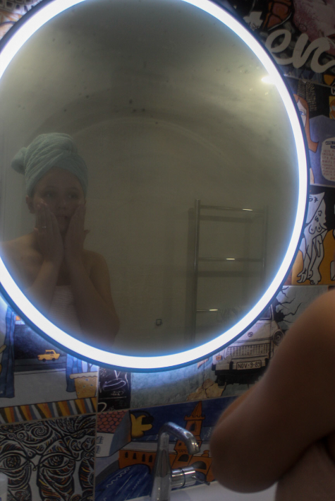
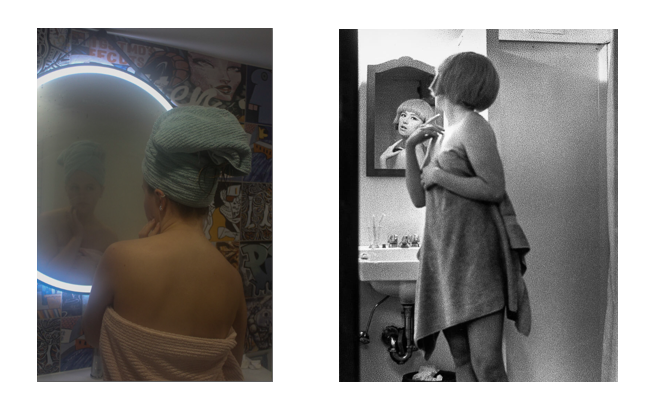
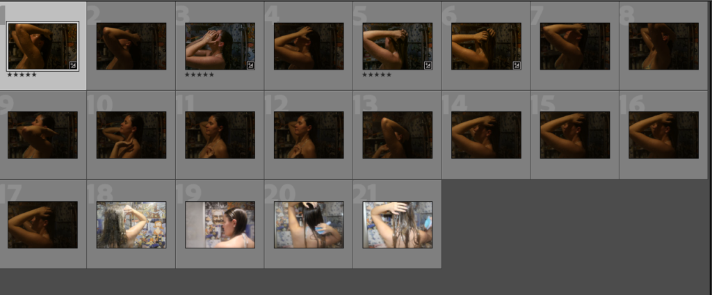
In this shoot I am again referencing Cindy Sherman. I am wanting to get images of a model in the shower to show the vulnerability of women which tends to be portrayed a lot through the male gaze. I am planning on making the bathroom as dark as possible with one light shining from a high position onto the model.

Contact Sheet:

Editing Process:

Evaluation:

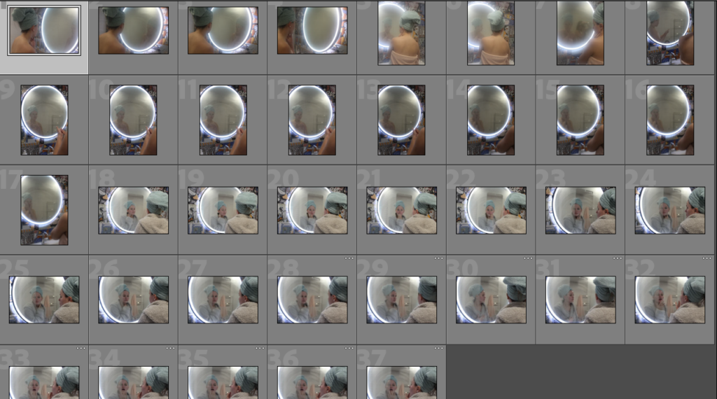
I believe that this went well, I like how there was steam on the mirror as it creates a sense of mystery. The images are similar to Cindy Sherman however not the same. I like how my images show the vulnerability and beauty of being a girl.

PHOTOSHOOT FIVE:

Plan:

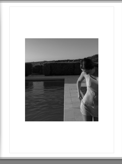
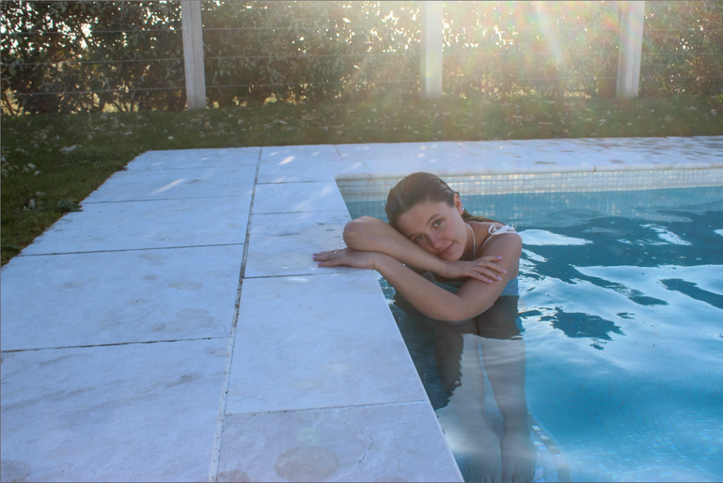
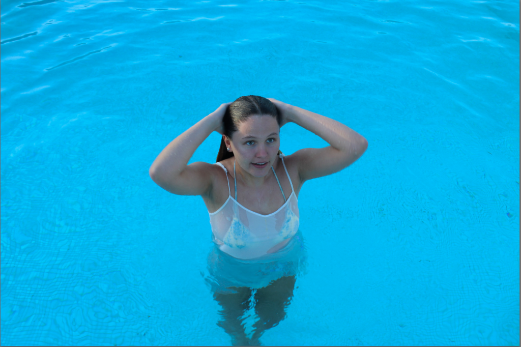
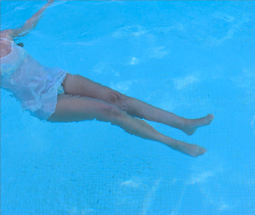
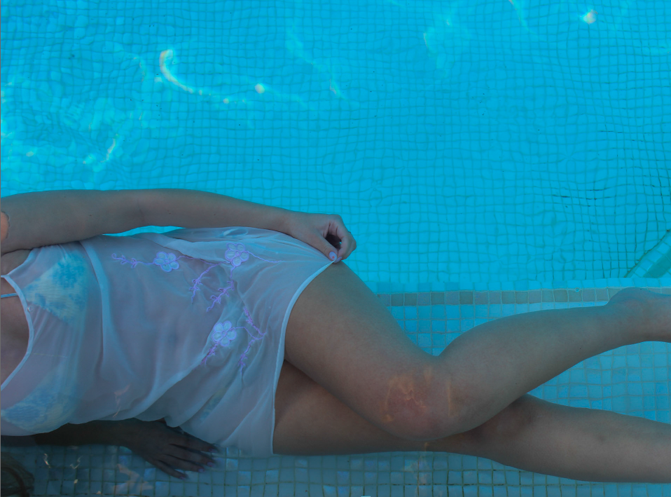
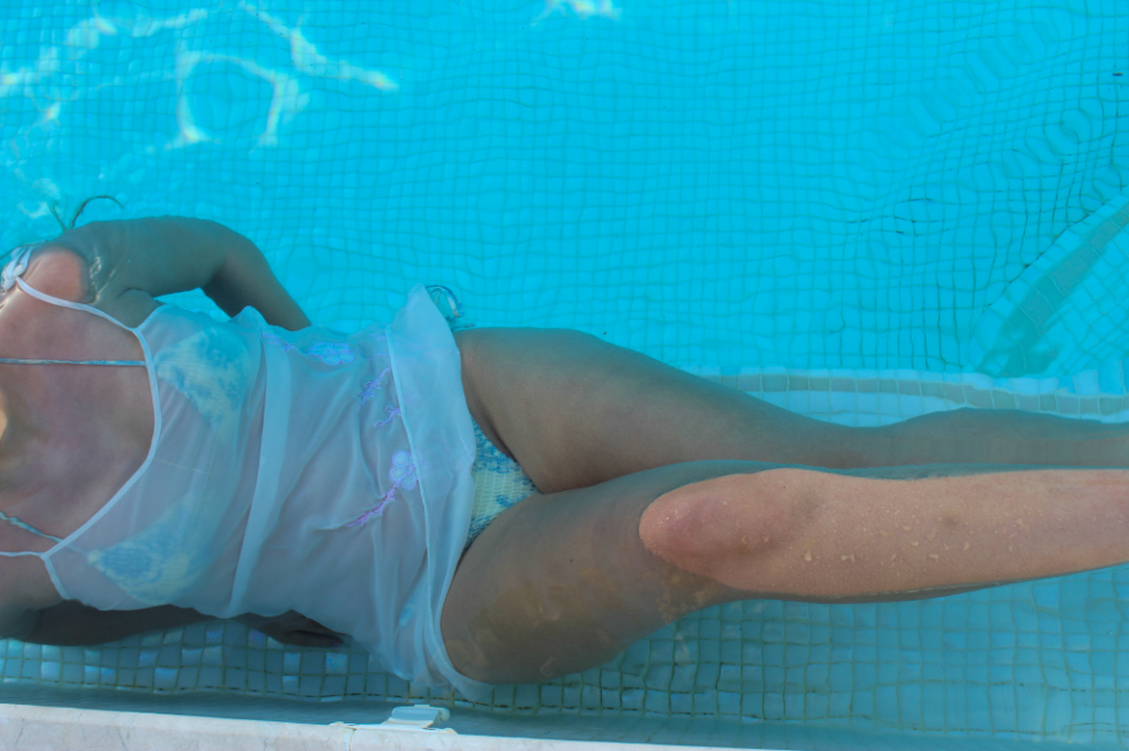
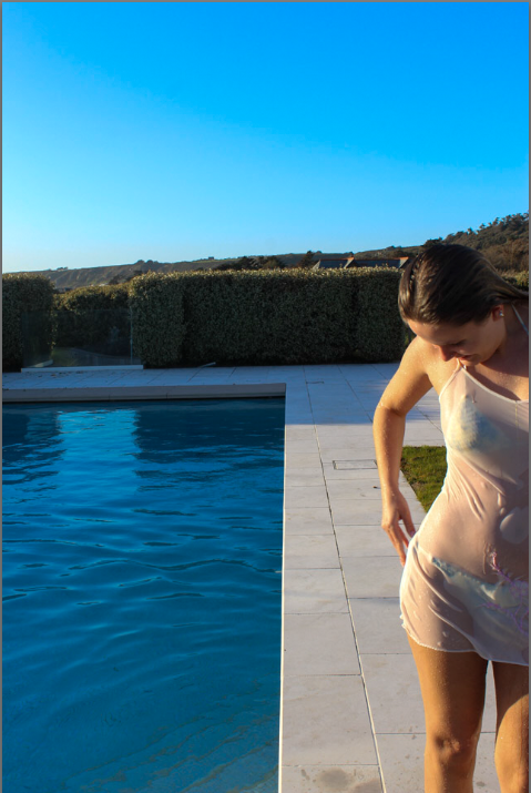
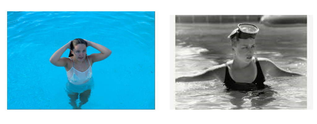
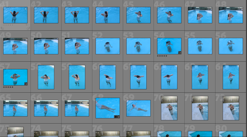
For this shoot I plan on taking photos in the water to recreate some of Nancy Honey’s images. I also plan on taking some images with my own interpretation to create some variances too. I will be using natural lighting, and plan to do it on a sunny day so it is bright.

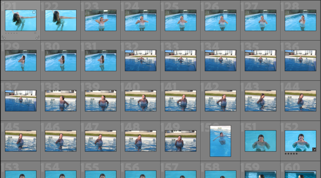
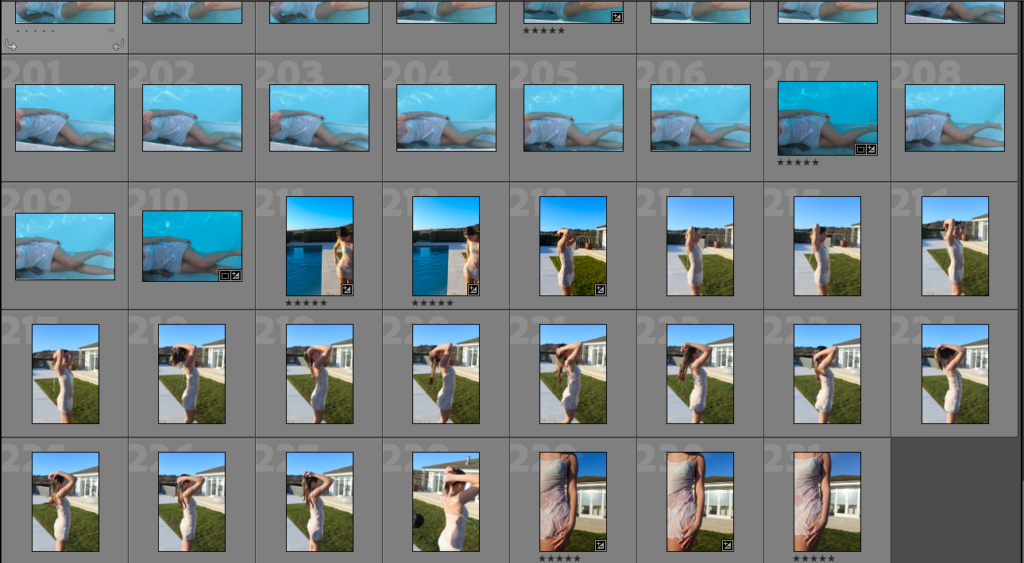
Contact Sheet:

Editing Process:

PHOTO SHOP EDITING:

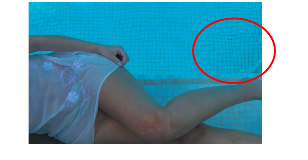
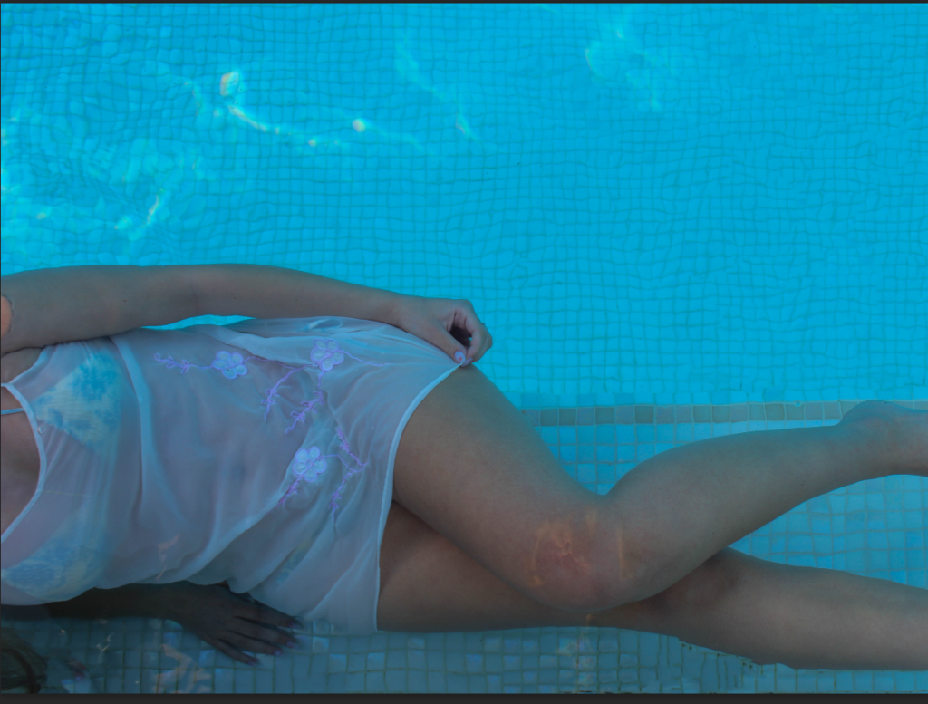
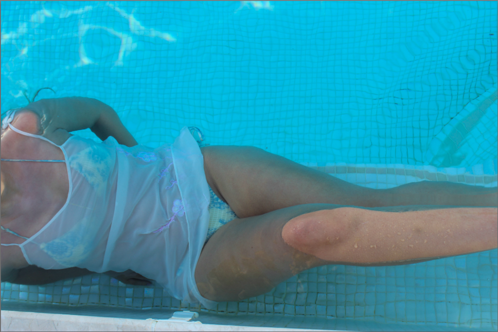
To remove some of the dirt from the bottom of the pool I used photoshops Spot Healing Brush Tool:

AFTER:

BEFORE:

AFTER:

Evaluation:

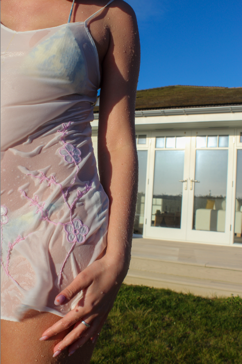
I t6hink this photoshoot came out really well and I am very happy with the final results. By the model wearing a sheer dress, it creates texture to the images as well as the reflection of the water on the bottom of the pool.

Photoshoot Four:

Plan:

For this photo shoot I plan on going to an urban area with tall buildings to re-create Cindy Shermans untitled film stills. I plan on taking the photos from a low angle to get the upper half of the models bo

Contact Sheet: