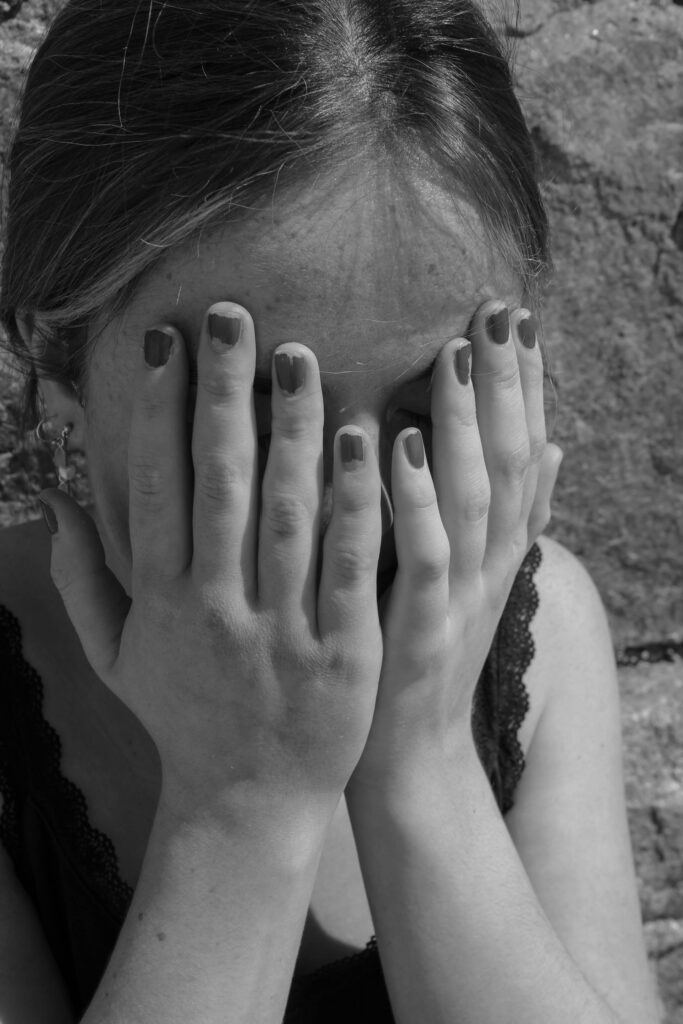
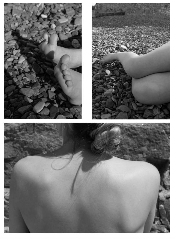
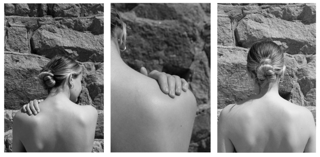
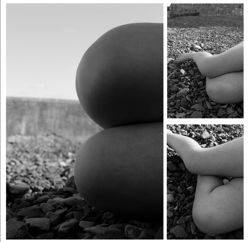
Final outcomes
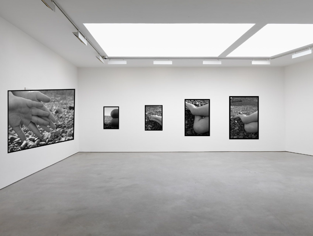
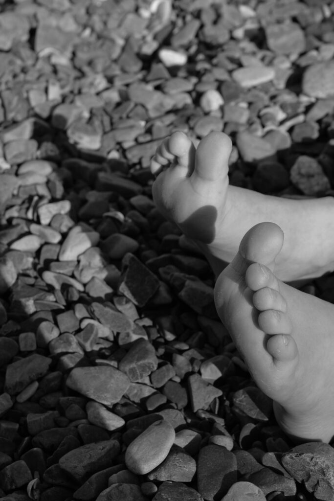
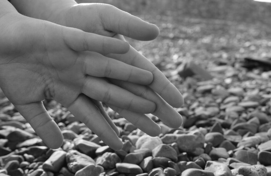
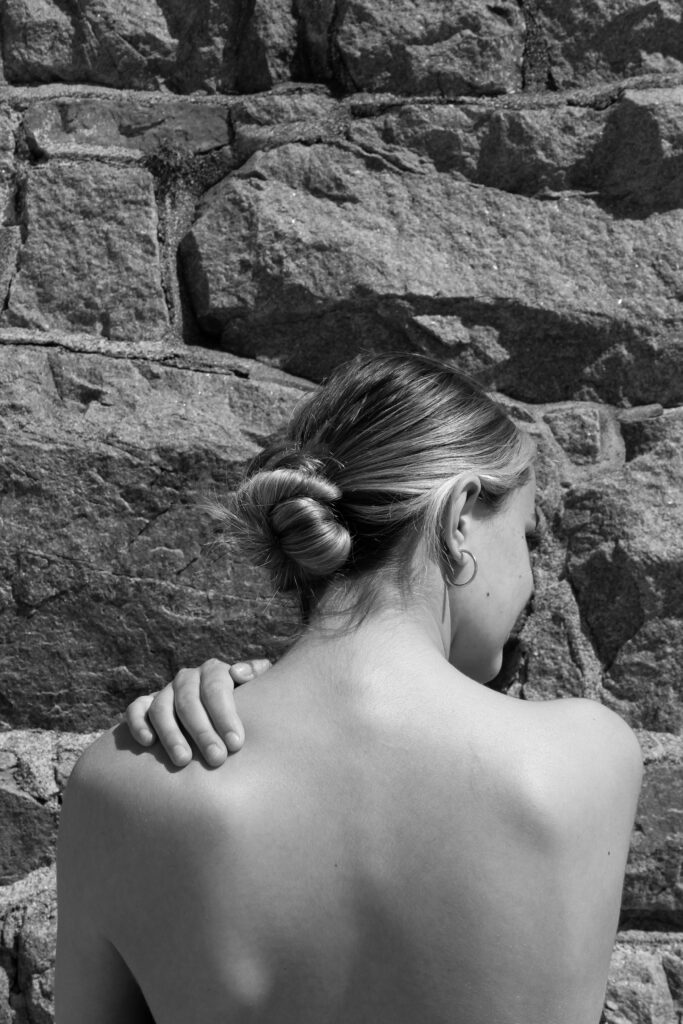
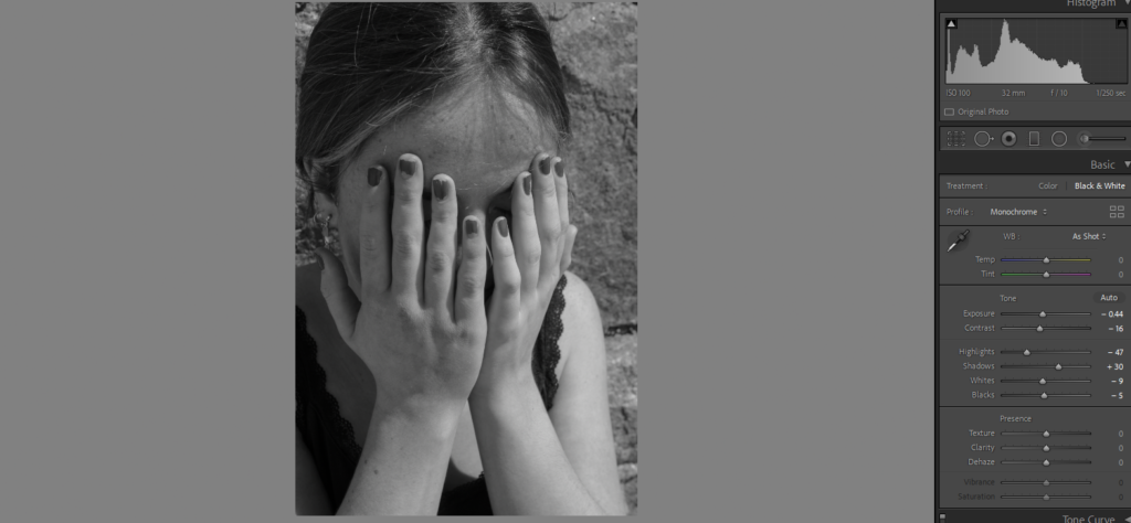
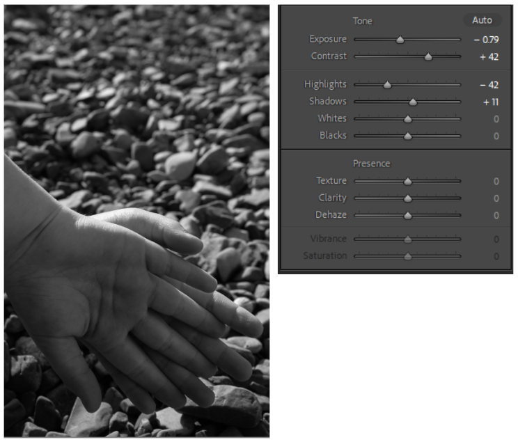
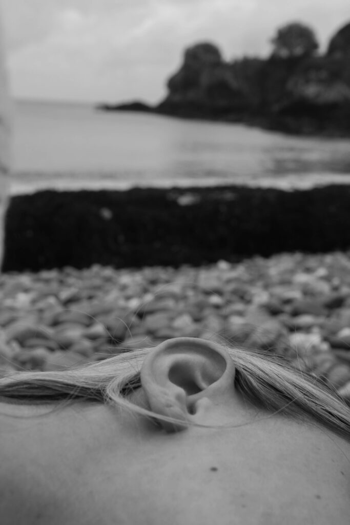
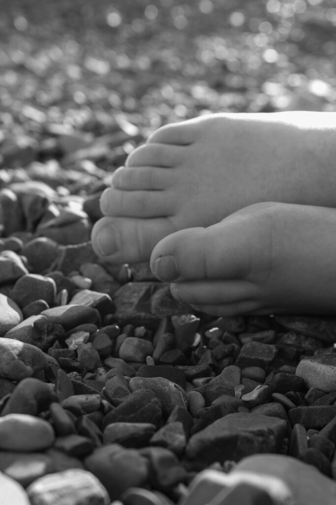
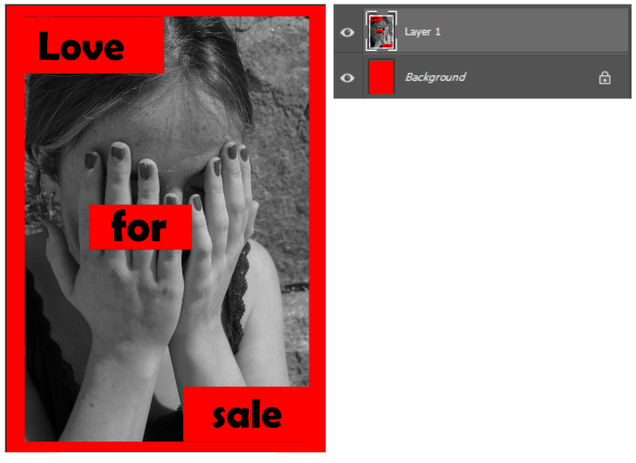
Outcome 1
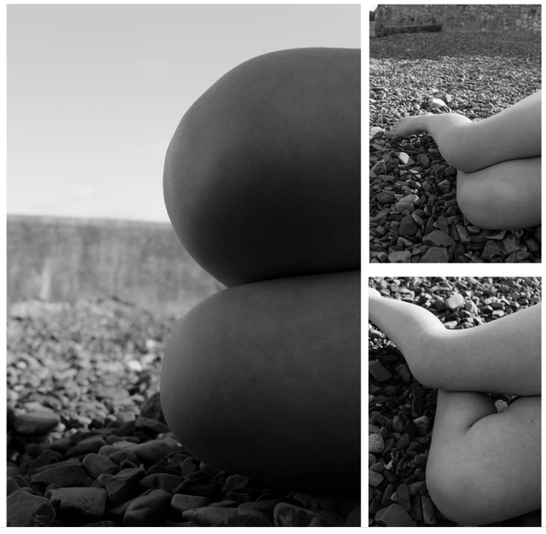
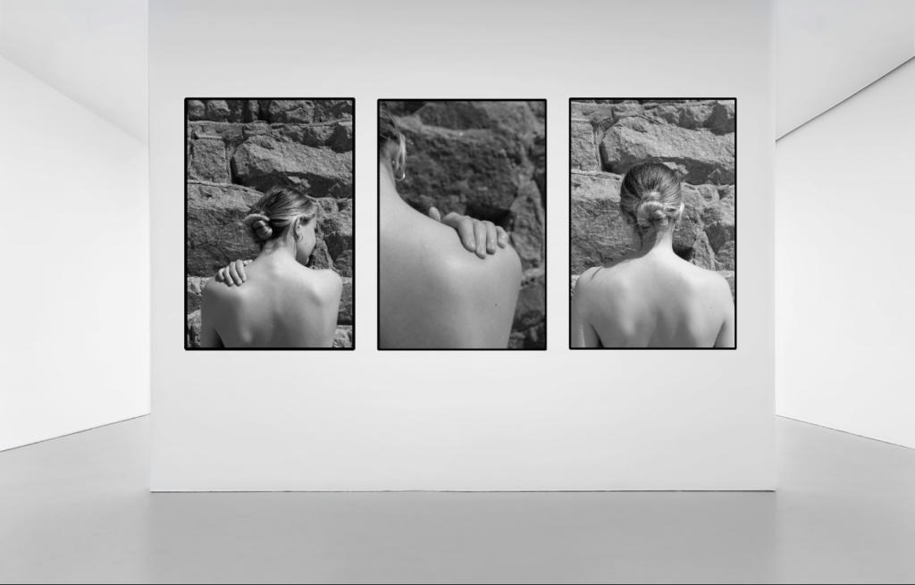
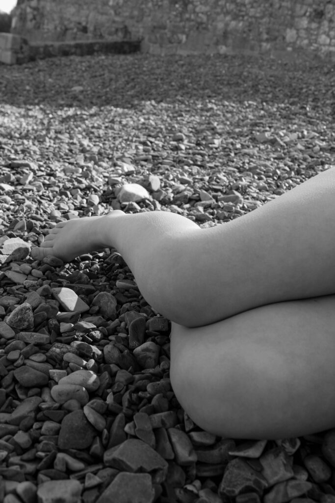
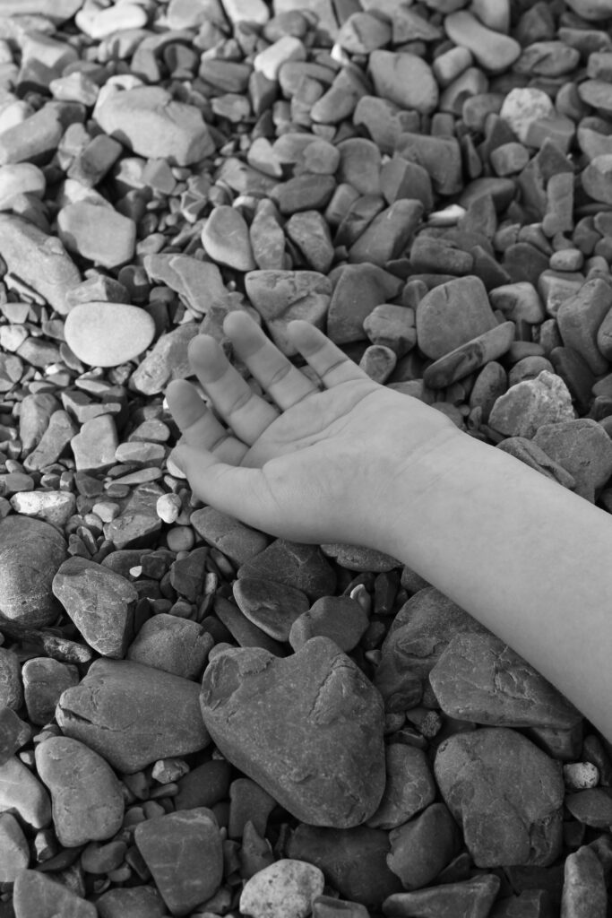
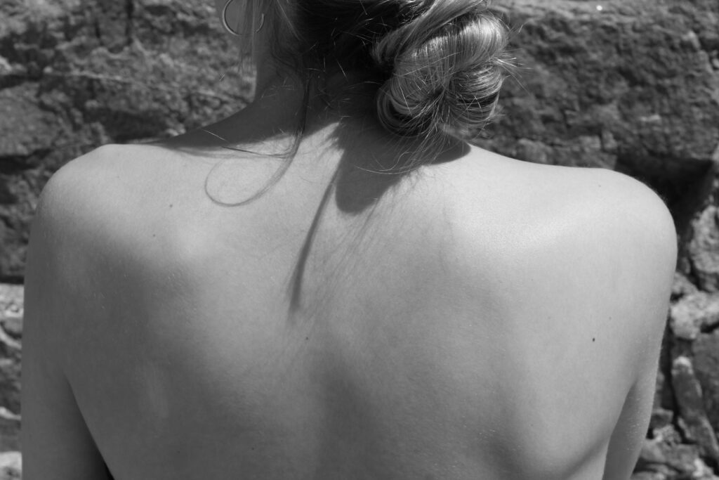
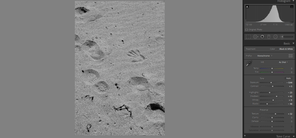
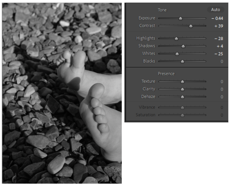
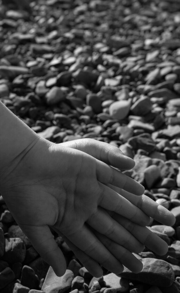
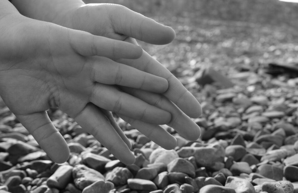
Outcome 2
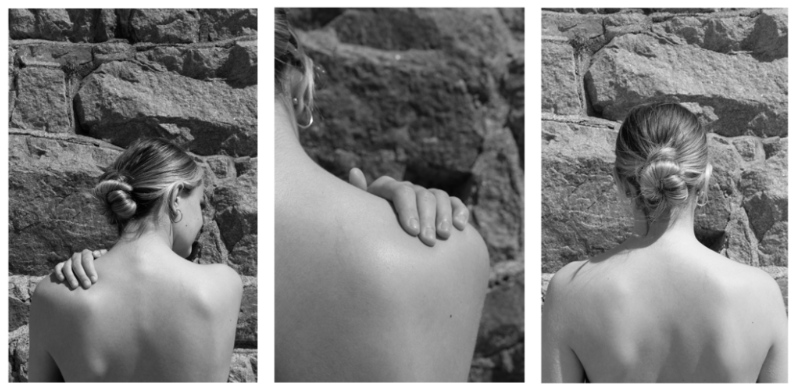
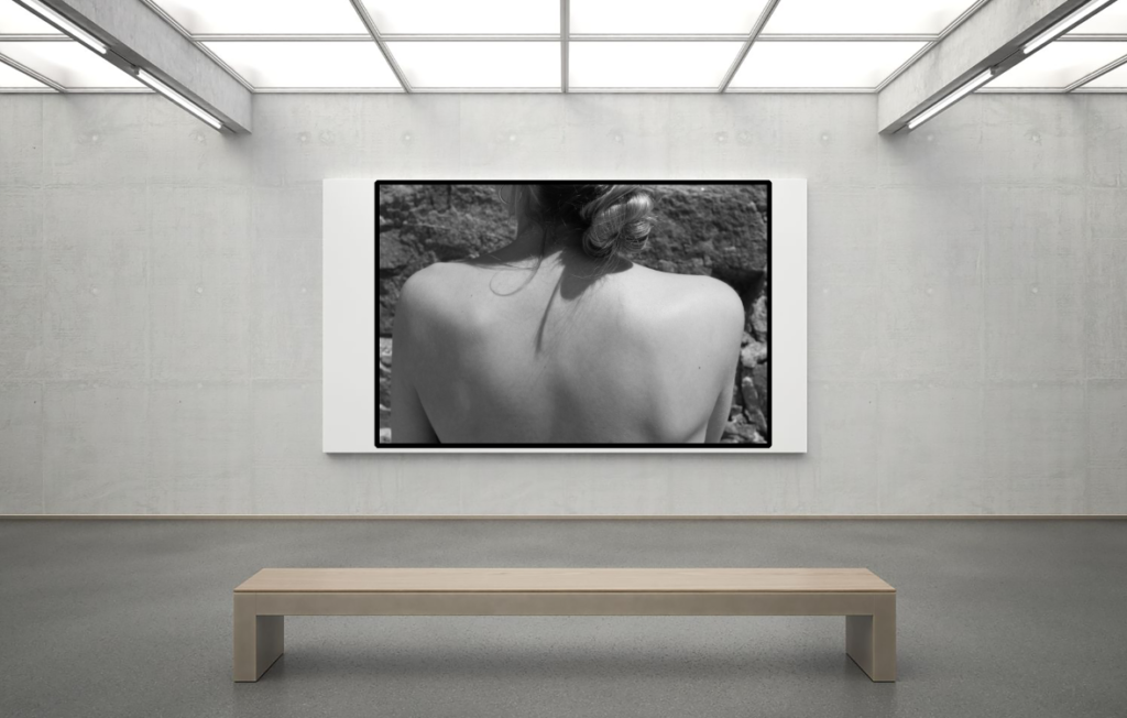
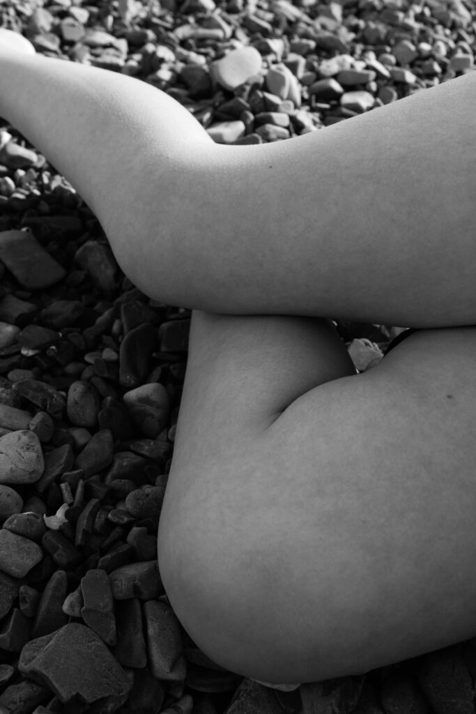
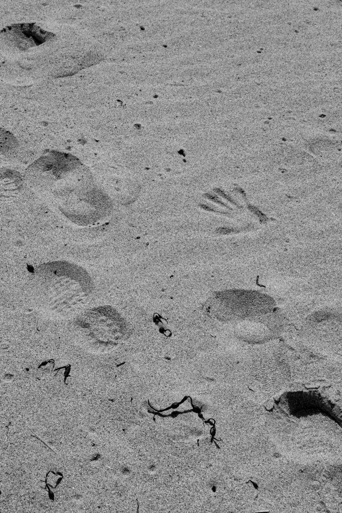
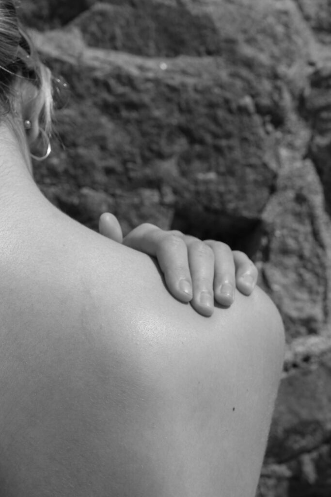
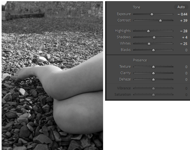
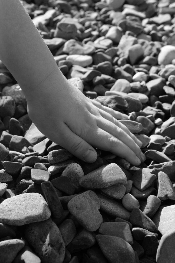
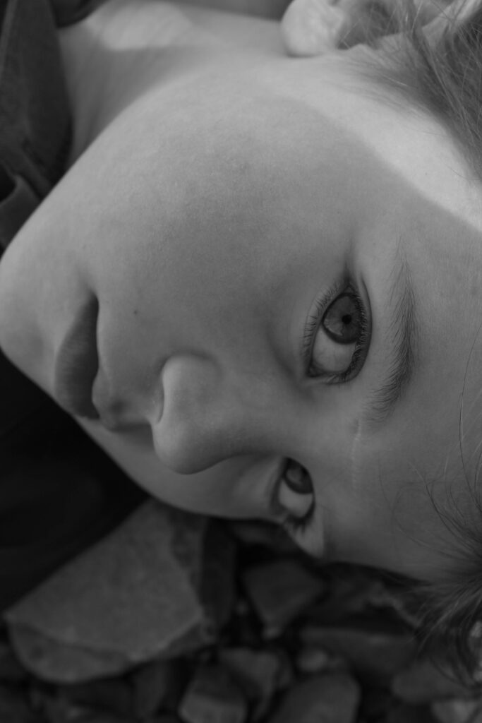
Outcome 3
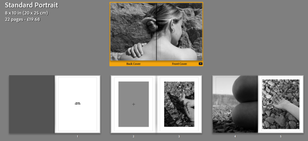
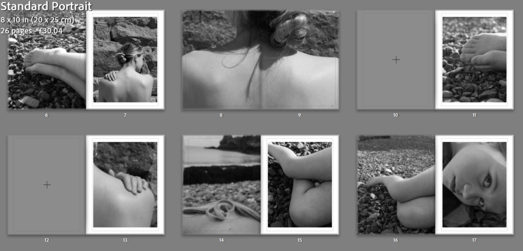
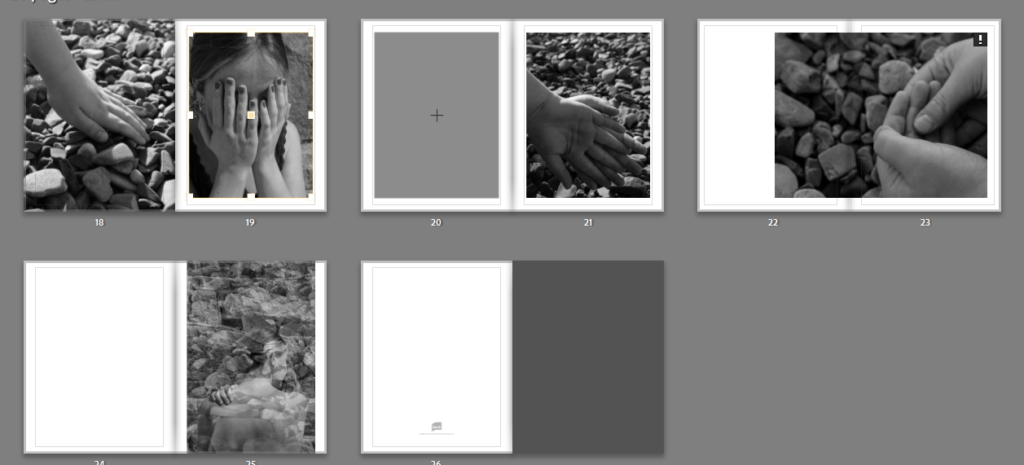
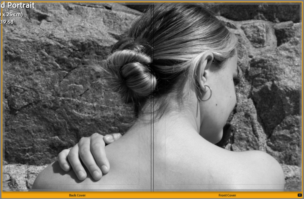
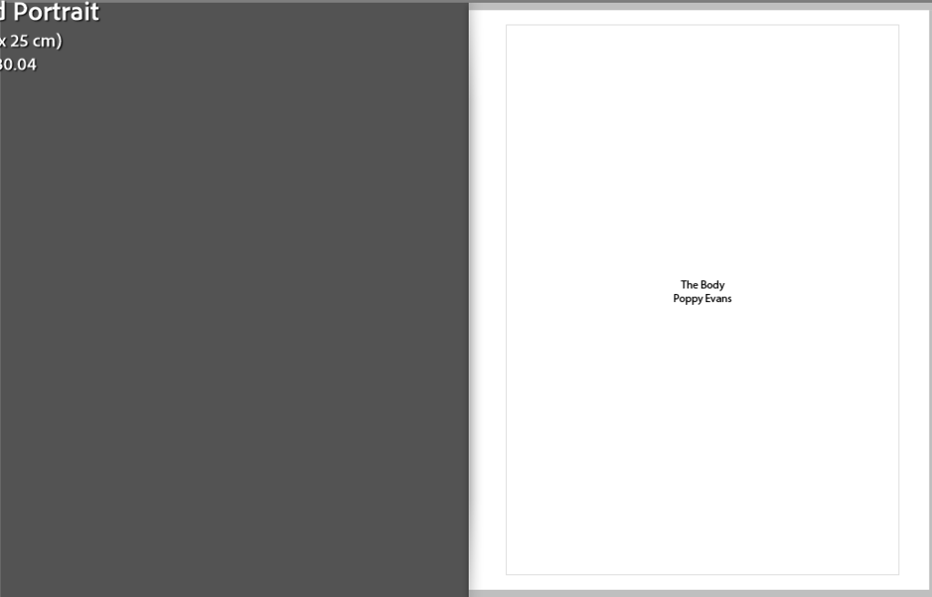
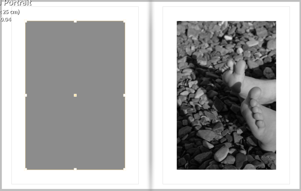
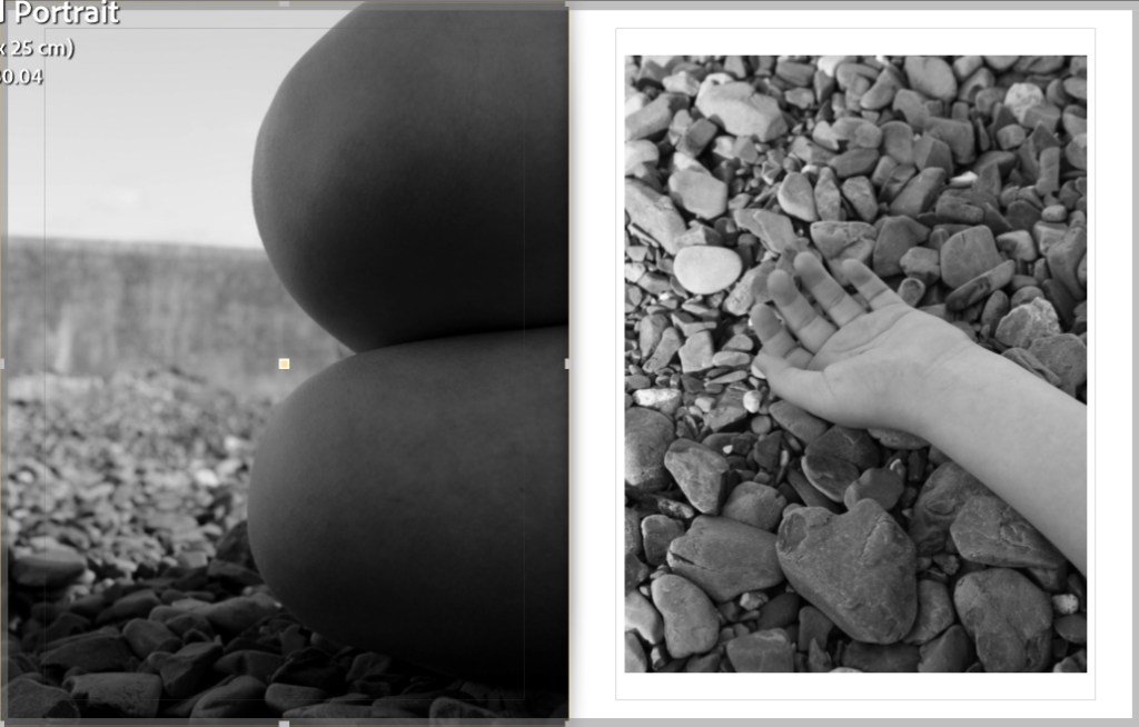
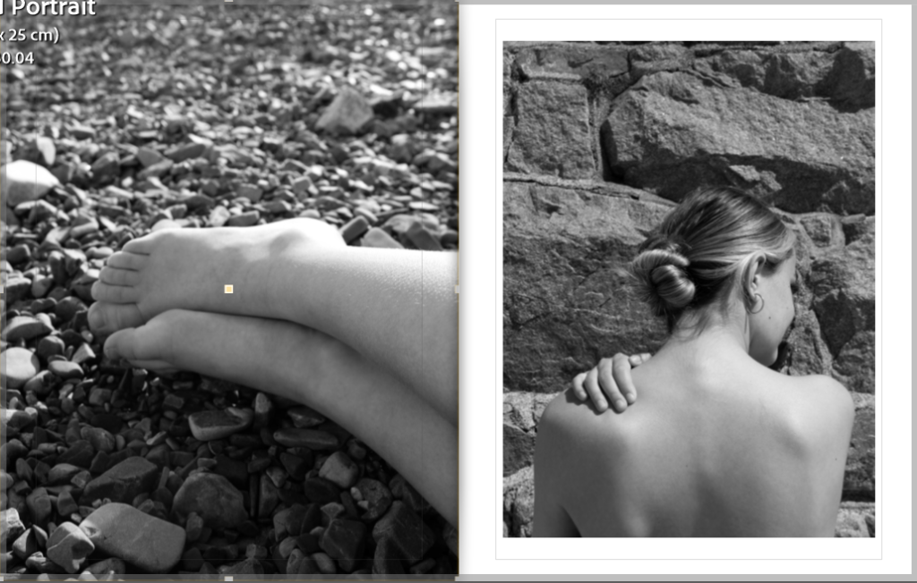
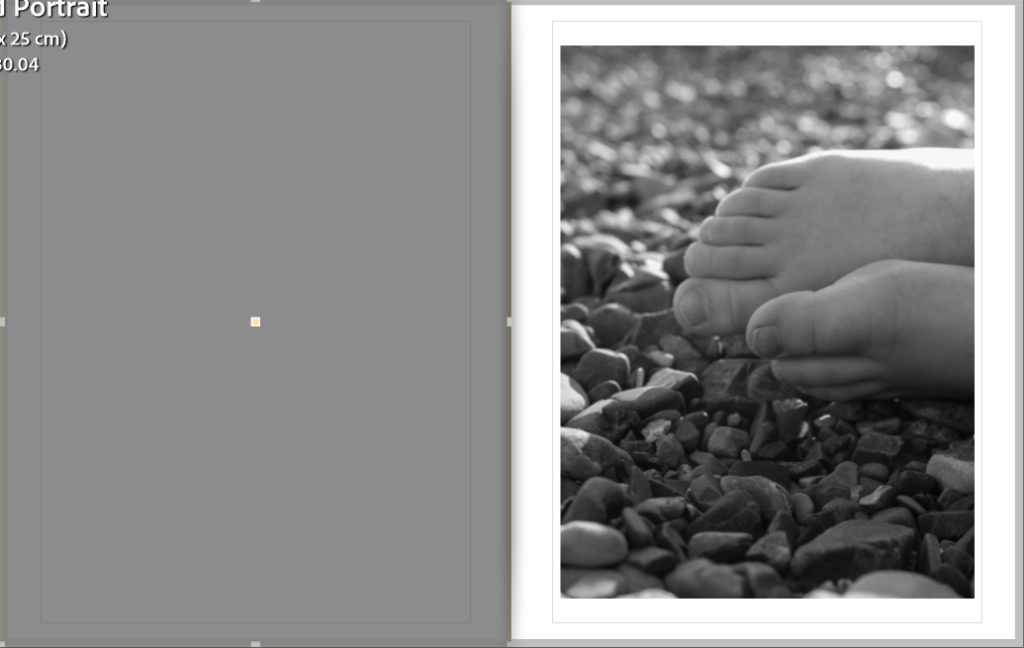
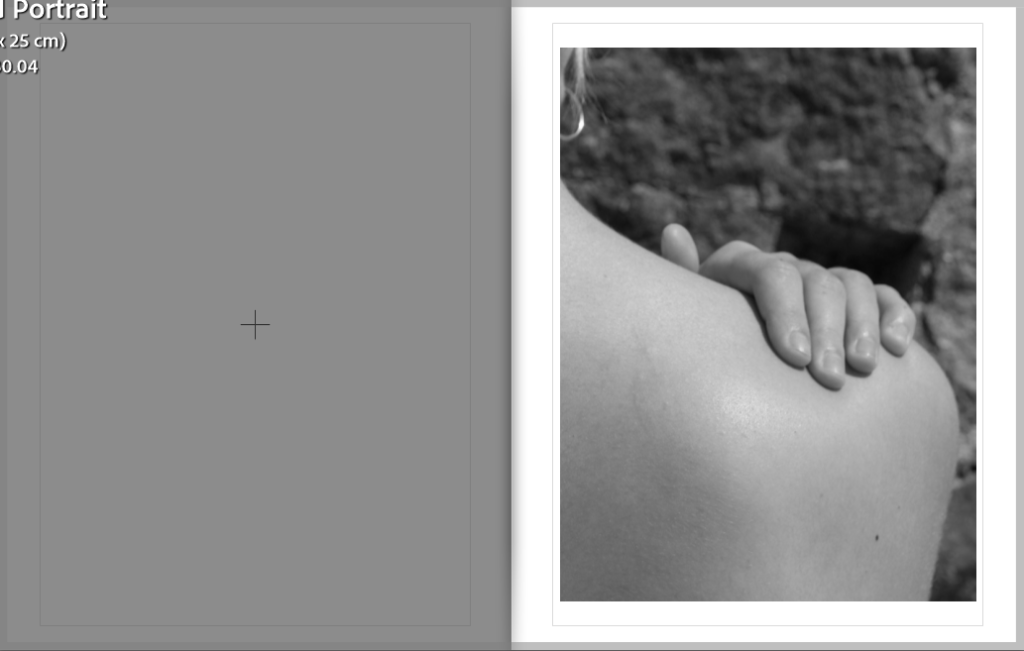
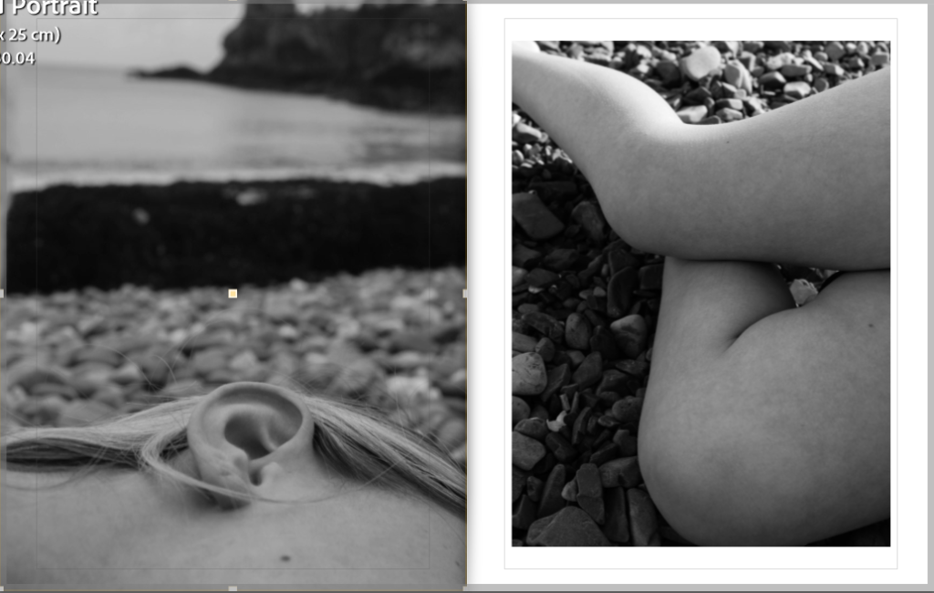
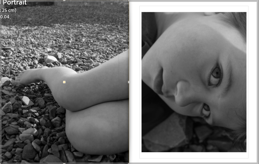
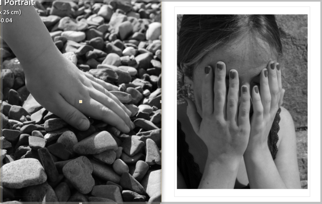
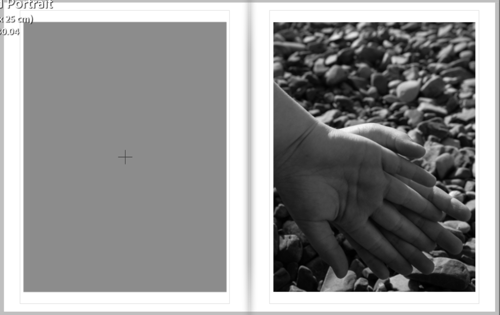
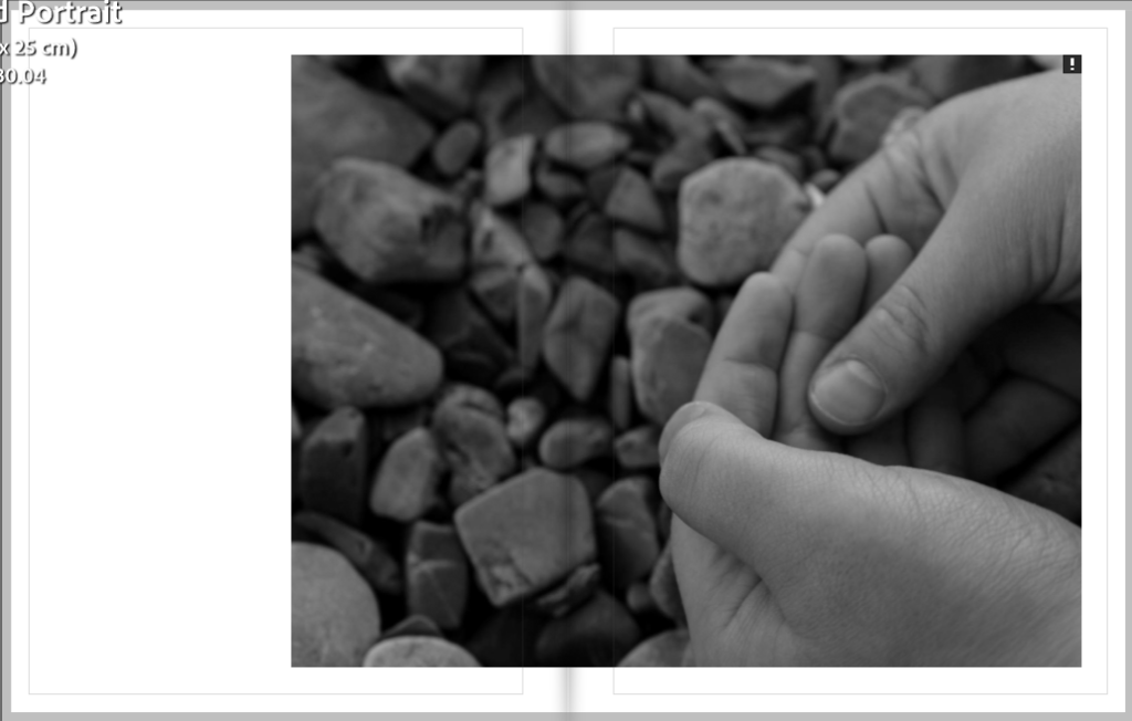
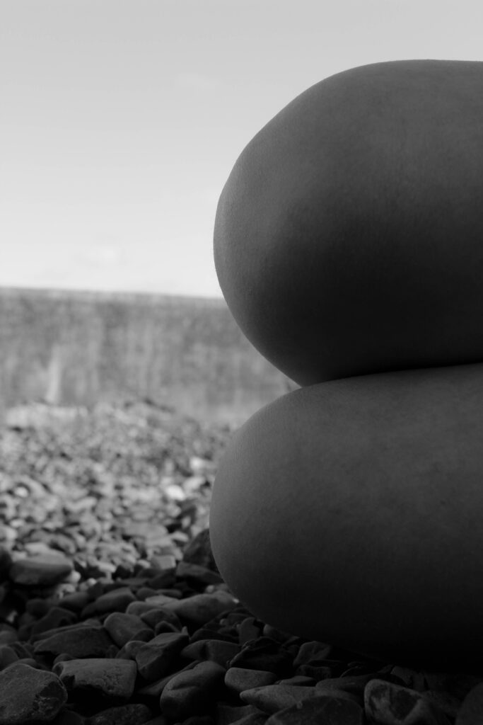
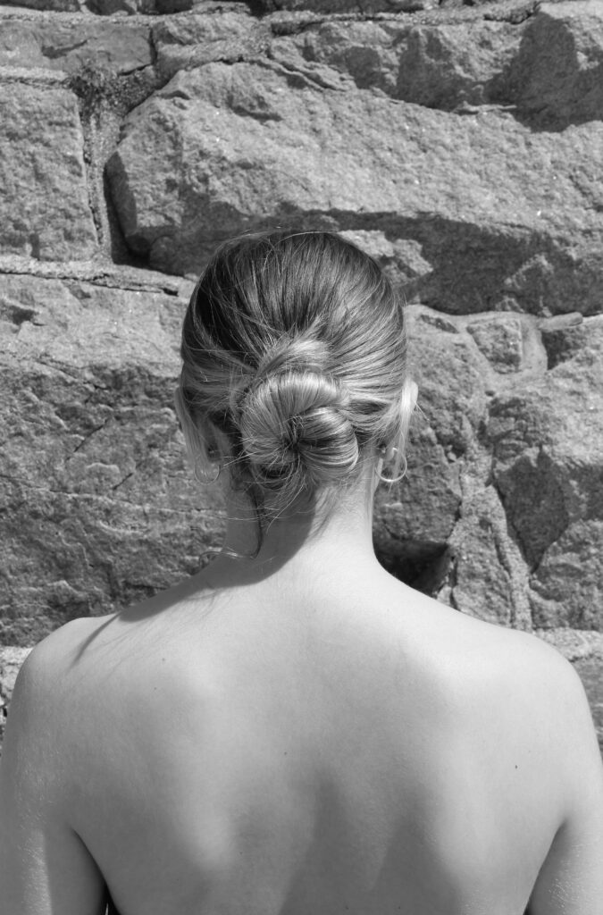
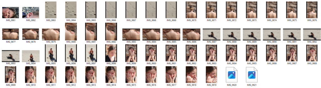
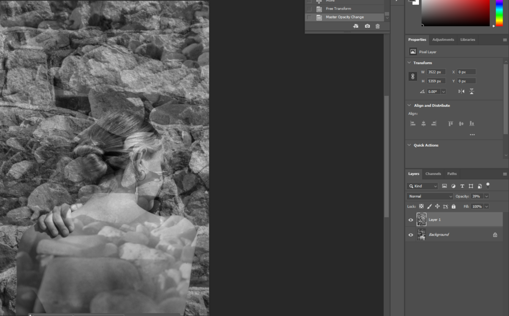
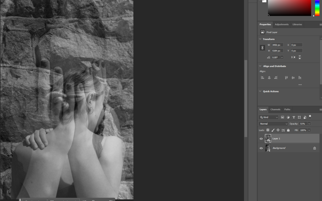
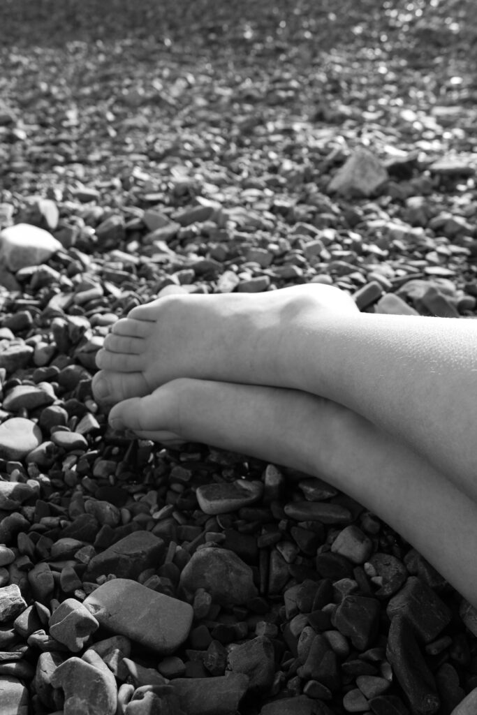
Out Come 4 Photobook
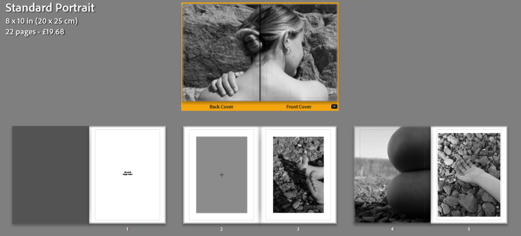
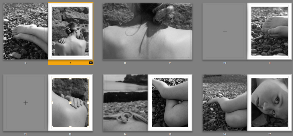
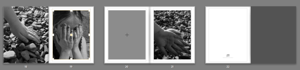
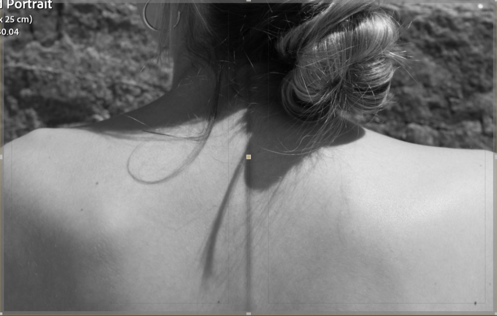
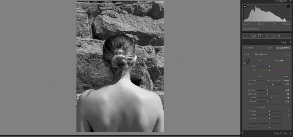
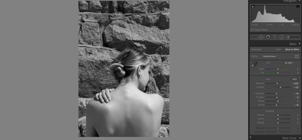
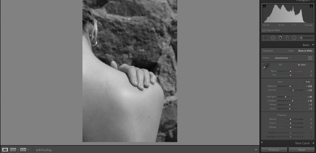
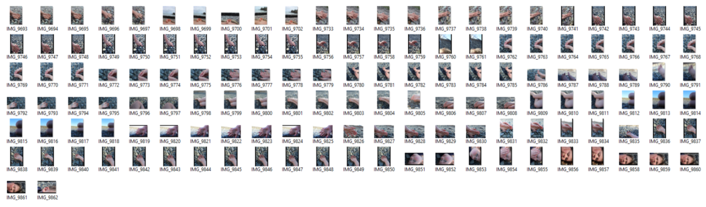
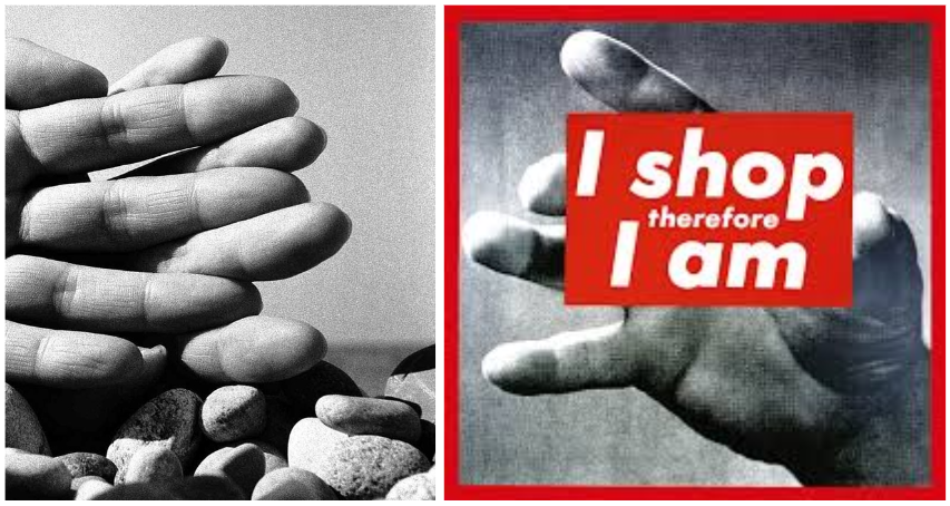
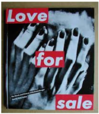
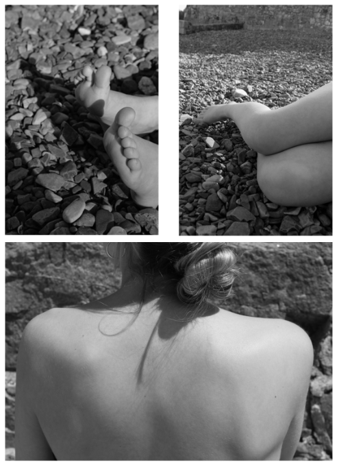
Overall I am really happy with my final outcomes. They show some of my best images in a neat and simple but effective way. By creating a mock up before hand ensured that I had a plan and could choose the sizing of the images rather than just choosing random sized images and deciding on the day which could have meant my outcomes wouldn’t have worked. I realised my intentions as I already had the concept of abstract images of body parts with a background inspired by Bill Brandt. I also had an image in my head of what I wanted my outcomes to look like. I used different sized paper A3, A4 and A5 which helps to create more contrast and variety in my work. My references to the artists Bill Brandt and Barbra Kruger link more into Brandt work as the visual and conceptual aspects of my work carry the same themes and ideas as his work. Some of the things I mainly took from his work was the lighting as well as positioning of the camera and the details of the body parts. I think that visually my images came out very well and work nicely as a set. Technically they are not very difficult images to make in fact they are very simple but do create a good image. If I was to change or do anything differently I would make sure to do some more shoots and create different types of images which still carry the same theme but create a bit of contrast. I would also try and bring in one of the other themes as I mainly focused ‘observe’. I also created a photobook which contains all of my final selected images from my shoot. Having a photobook allows for me to create a story from my images.