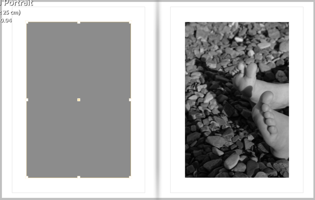
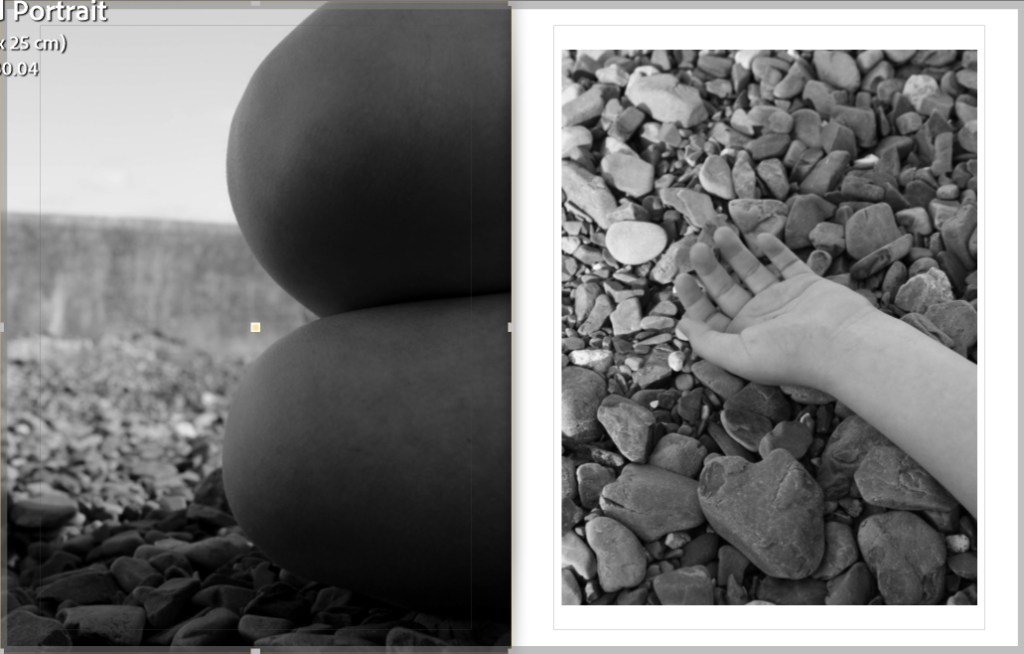
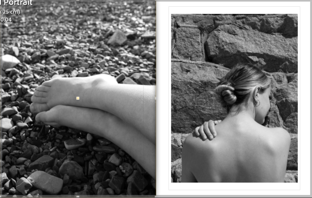
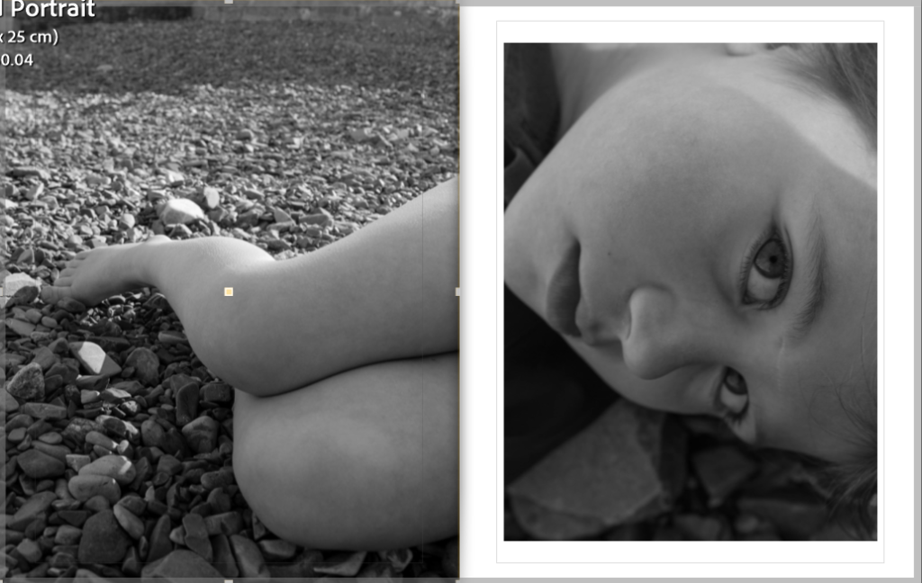
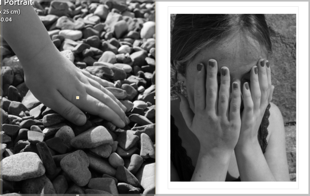
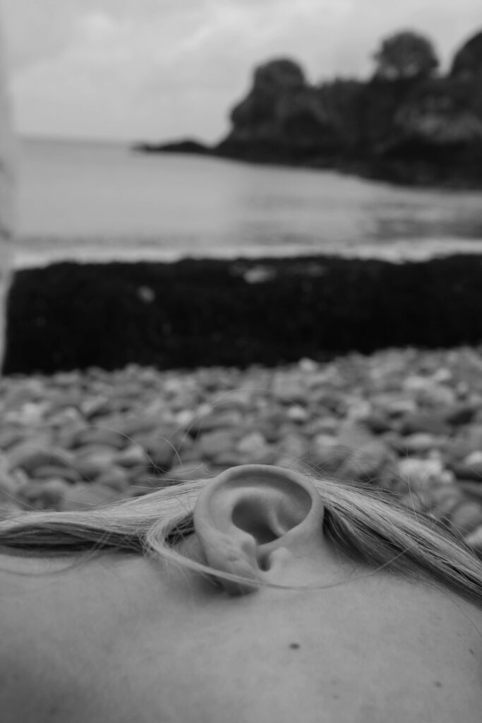
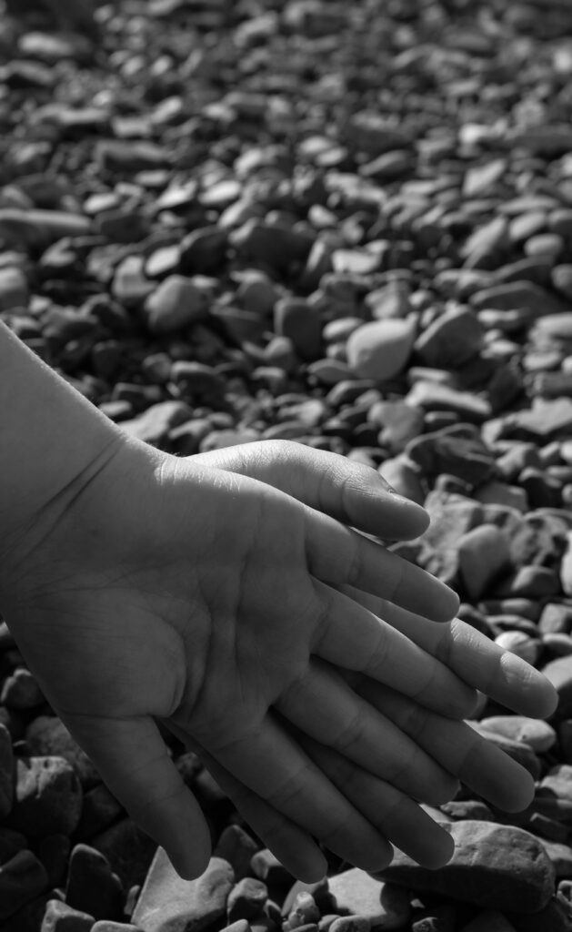
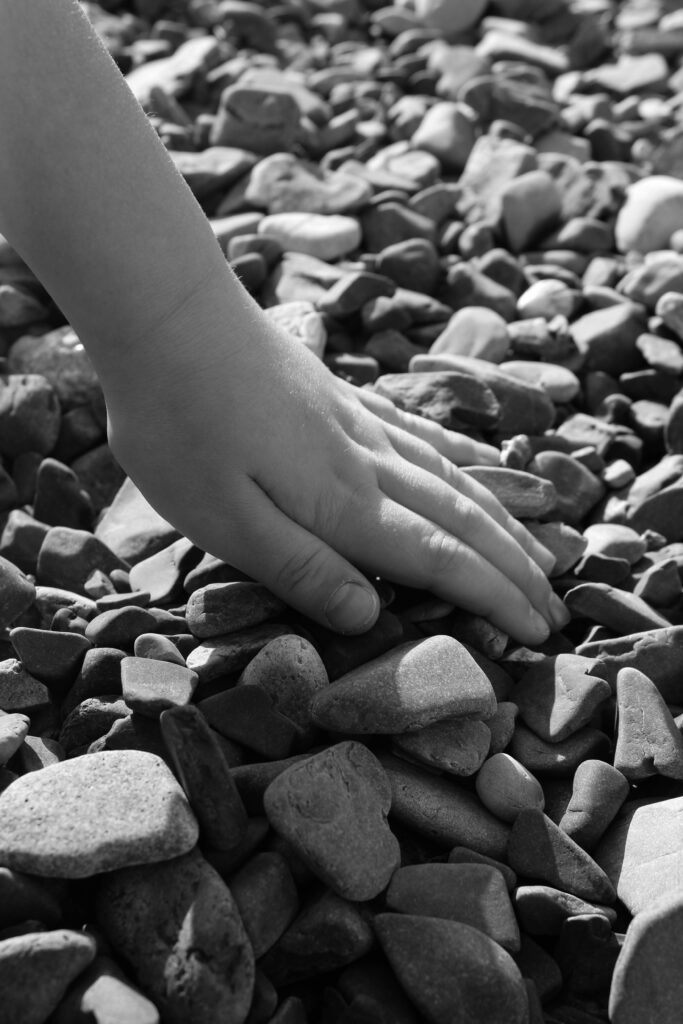
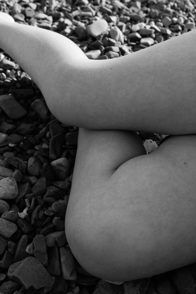
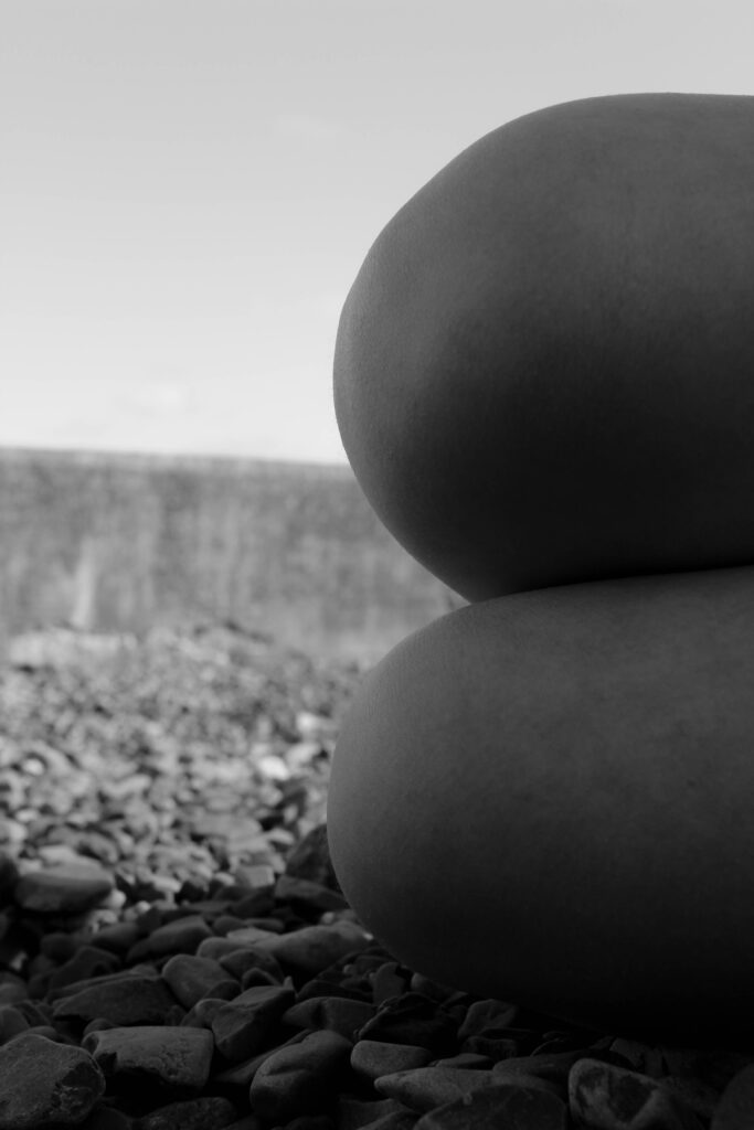
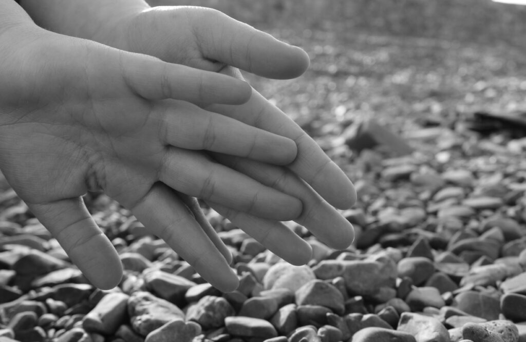
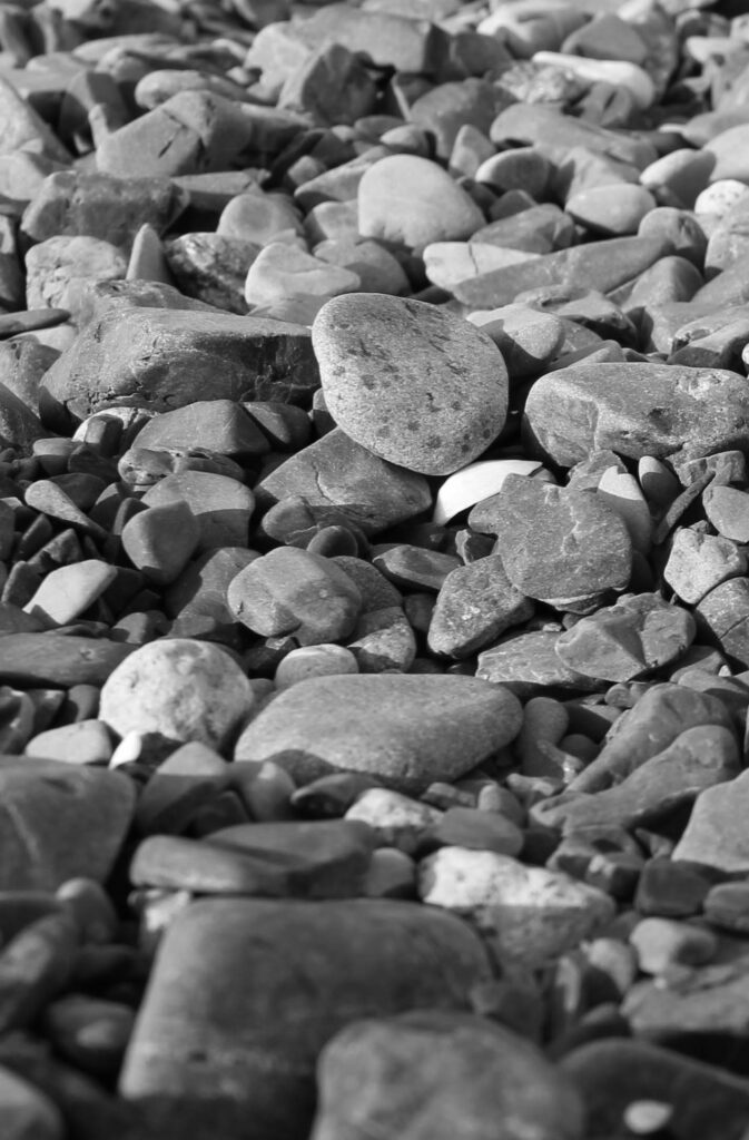
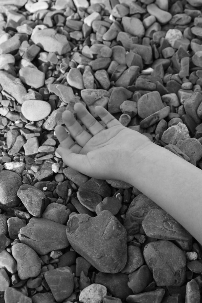
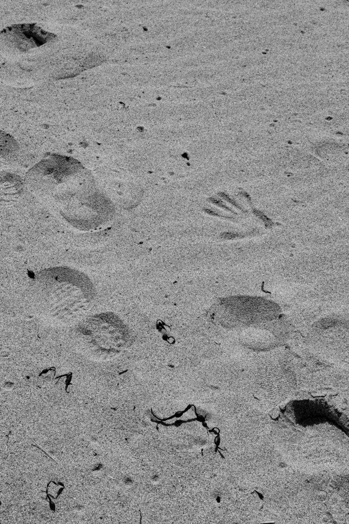
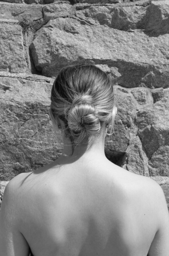
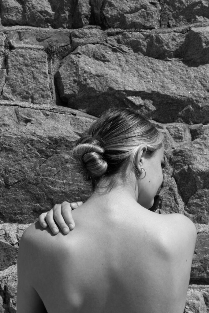
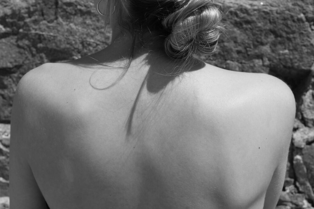
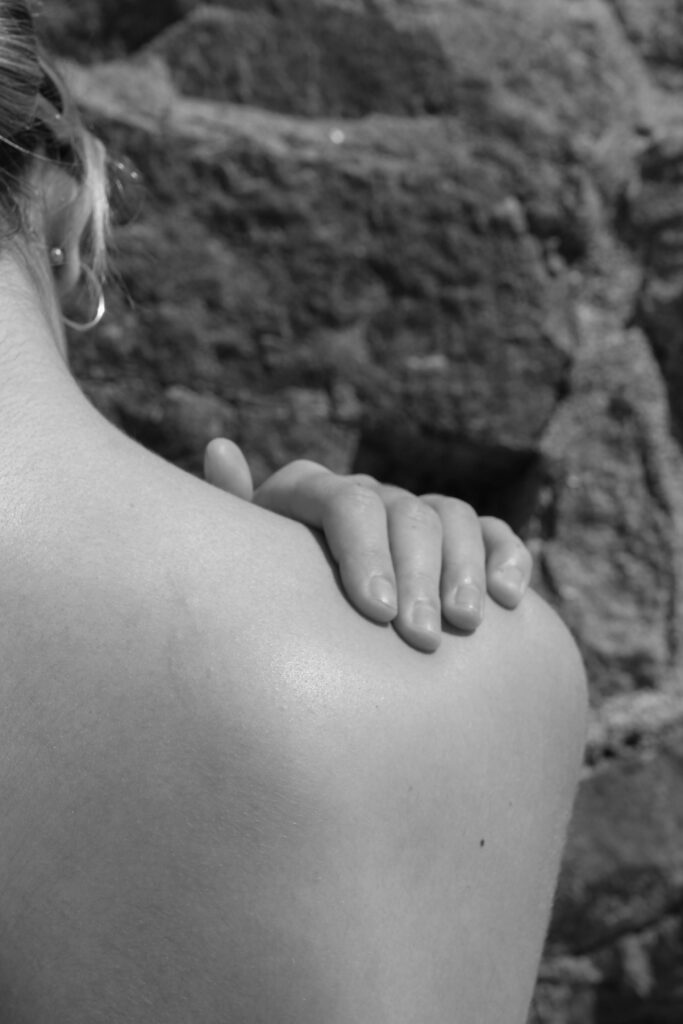
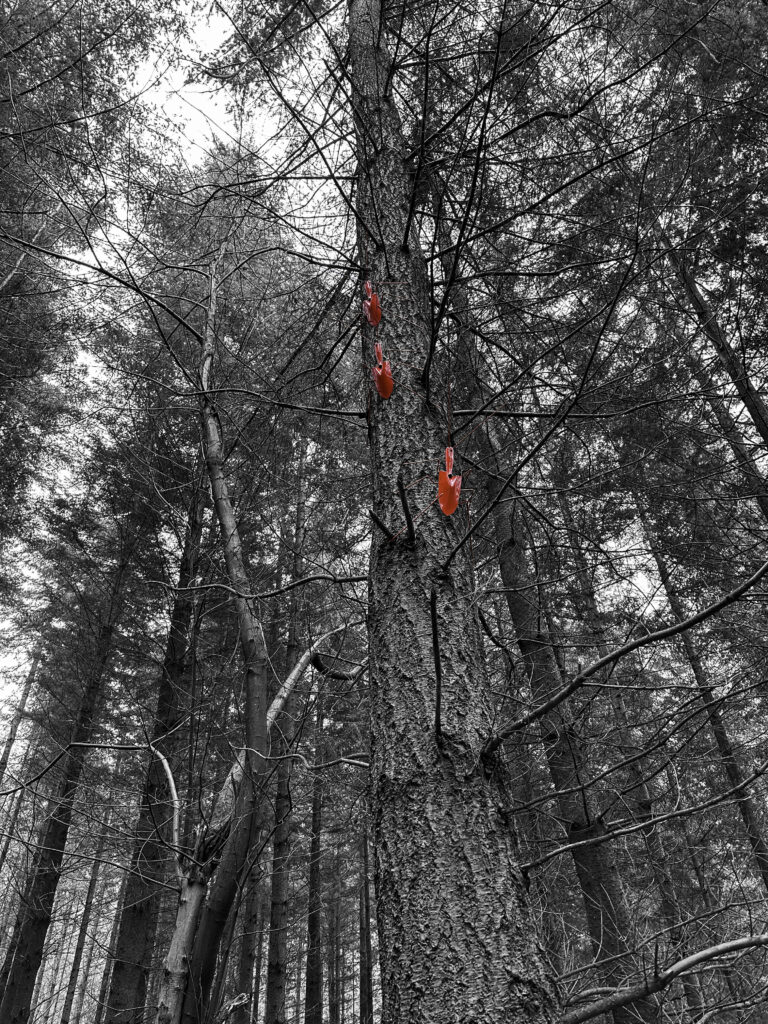
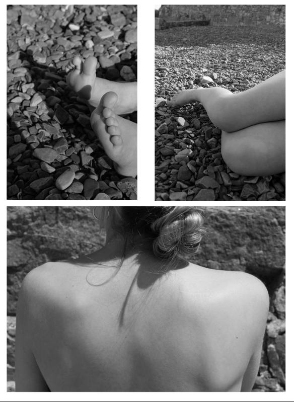
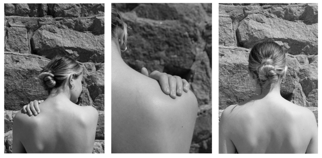
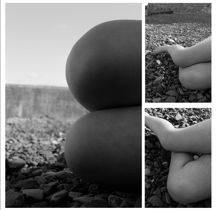
Observing body parts such as arms, legs, hands, feet and back with a background of mainly on the beach.
Style
Taking inspiration from Bill Brandt’s images of body parts I will look to create my book in a simple but effective way.
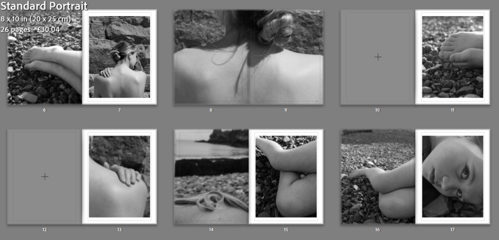
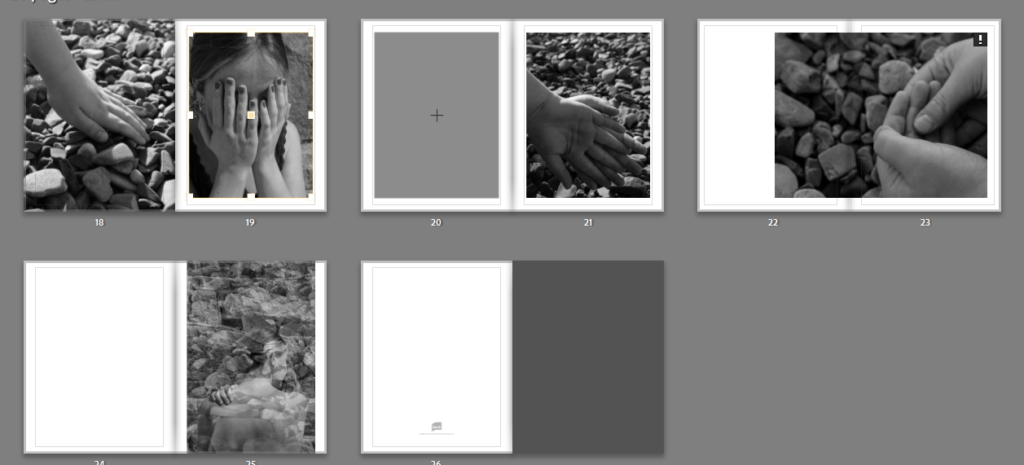
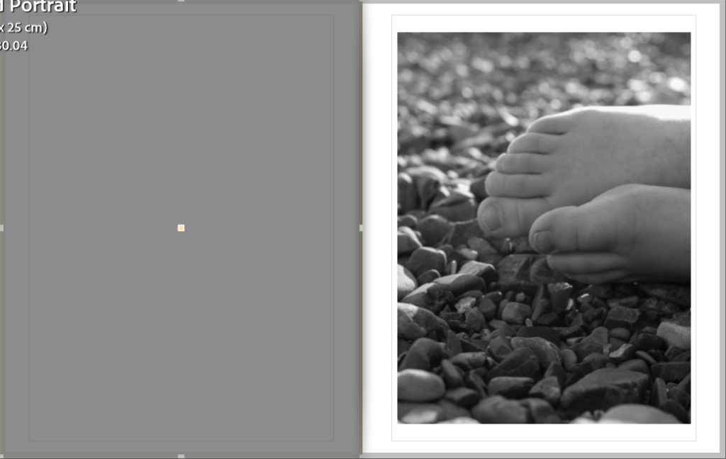
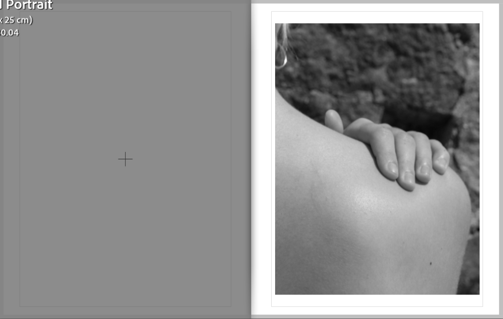
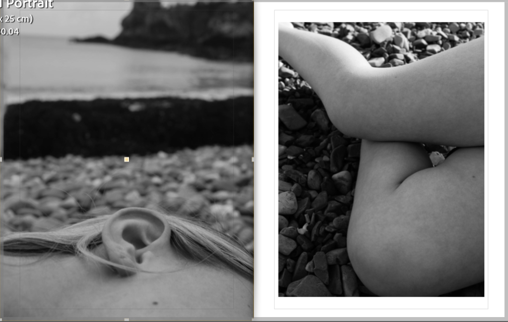
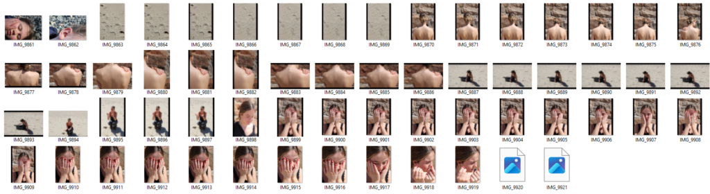
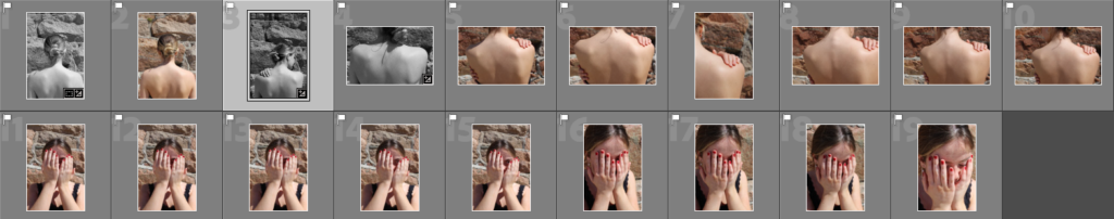
Selected images for book
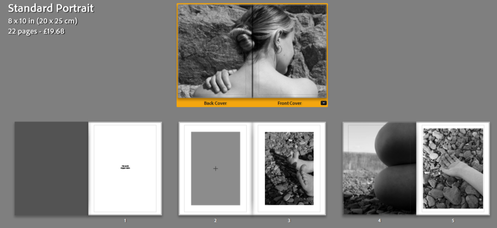
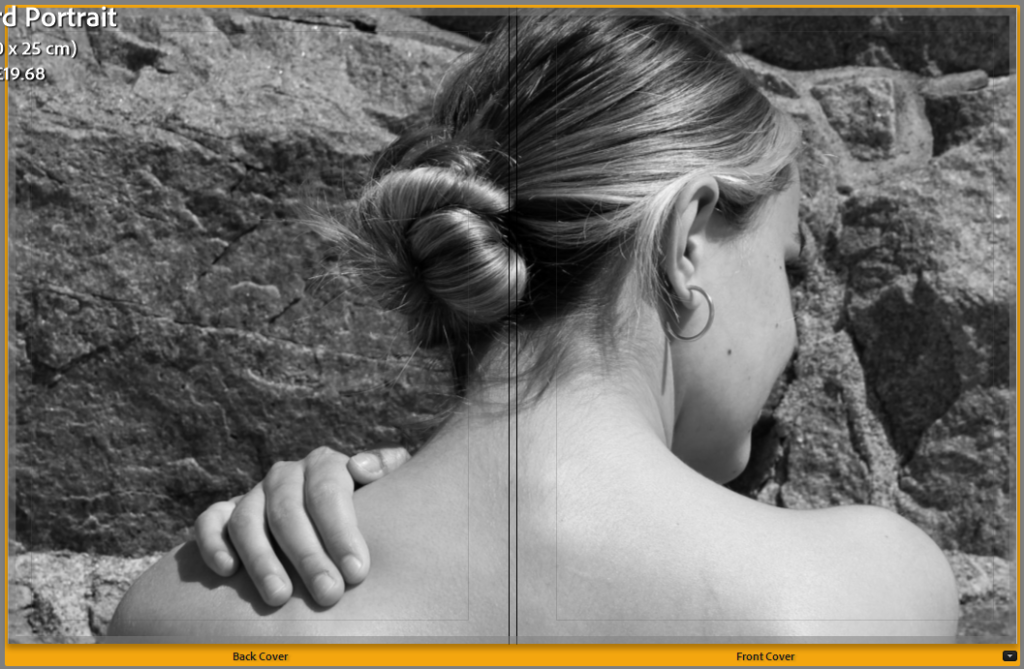
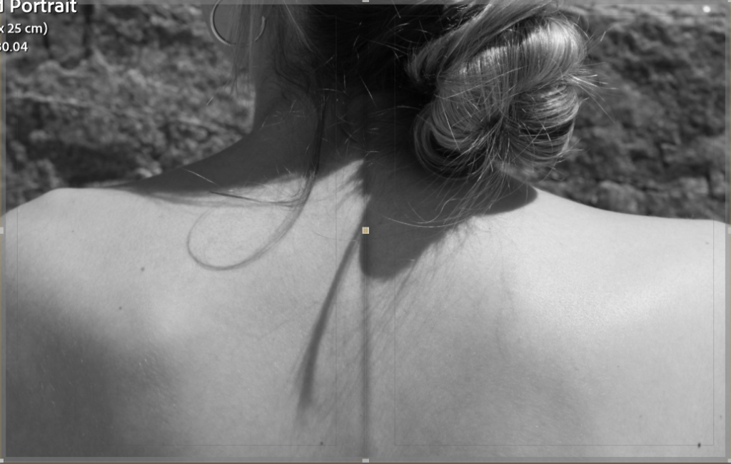
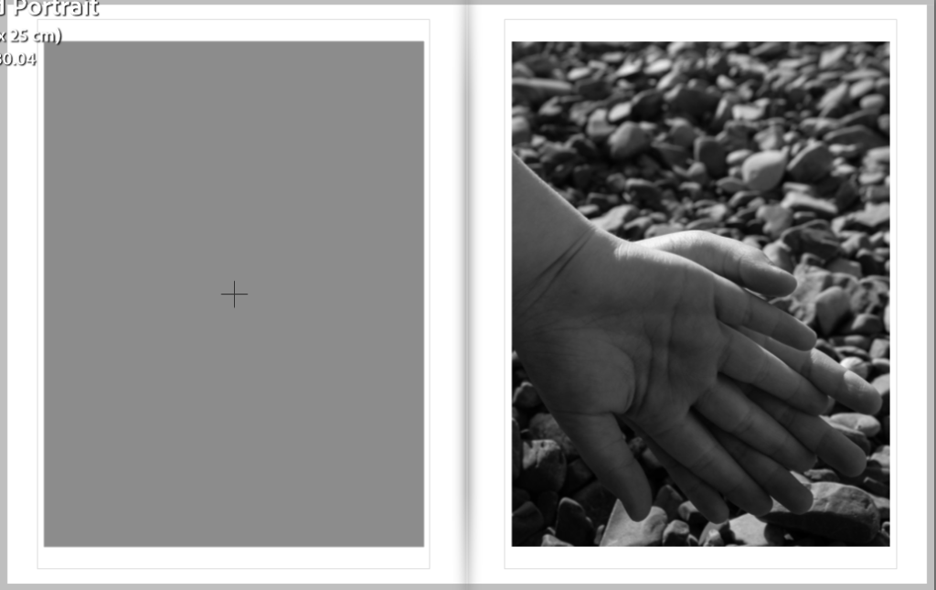
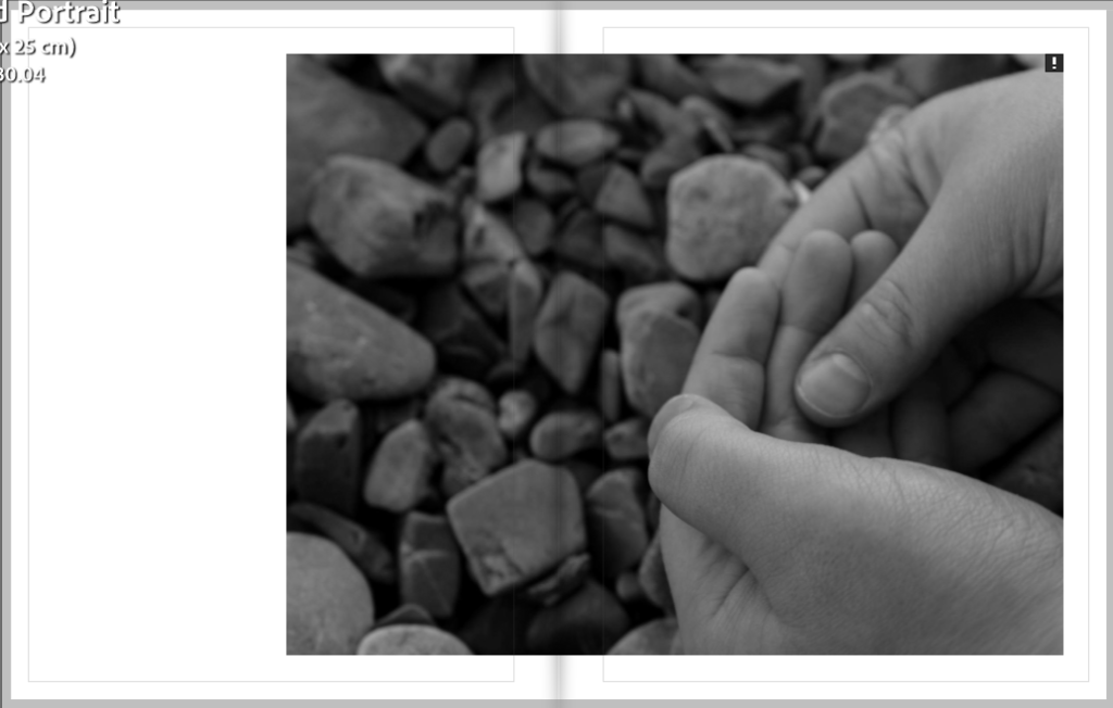
Selected layout of my images, in standard Portrait.
Each Page
Evaluation
I have decided to lay out my images in the book in a way which works and creates a nice collection which all links together. It also nicely links into the theme of ‘observe’, as I explored and took inspiration from Bill Brandt by observing the human body by taking images of arms, legs, hands, feet, backs and faces. Overall, I am happy with the way my book turned out I think that the layout flows nicely throughout and starts to create a story. As I don’t have more than 30 images in my book I decided to go for the soft cover which means it will be more of a magazine.
How do my images fit into the theme of Observe, Seek and challenge?
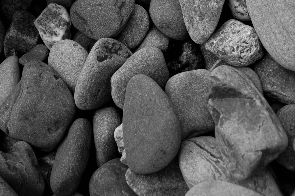
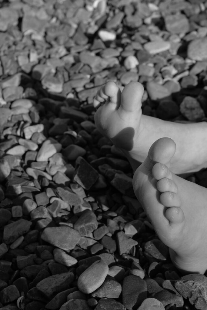
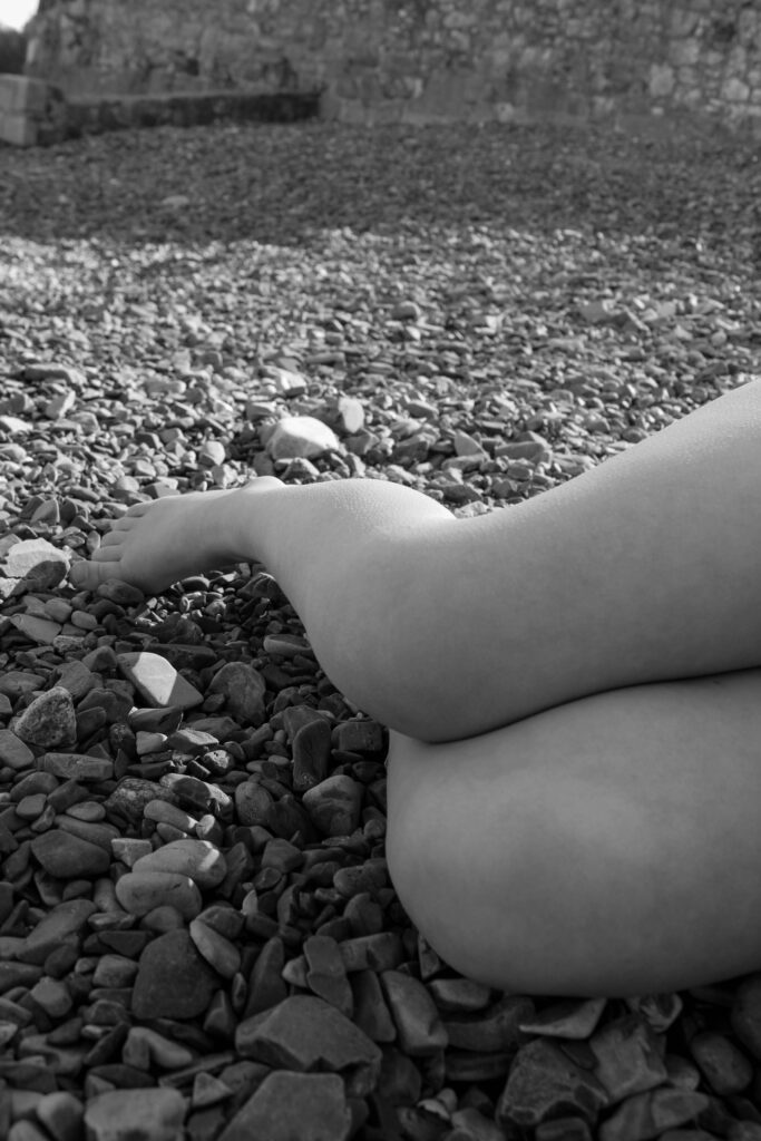
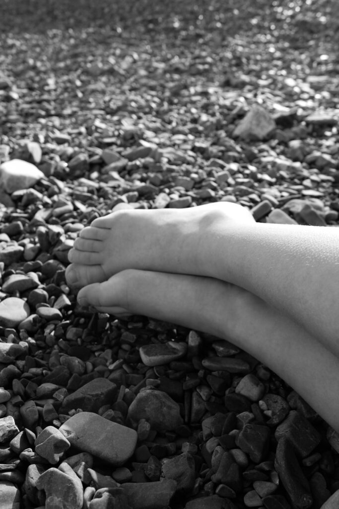
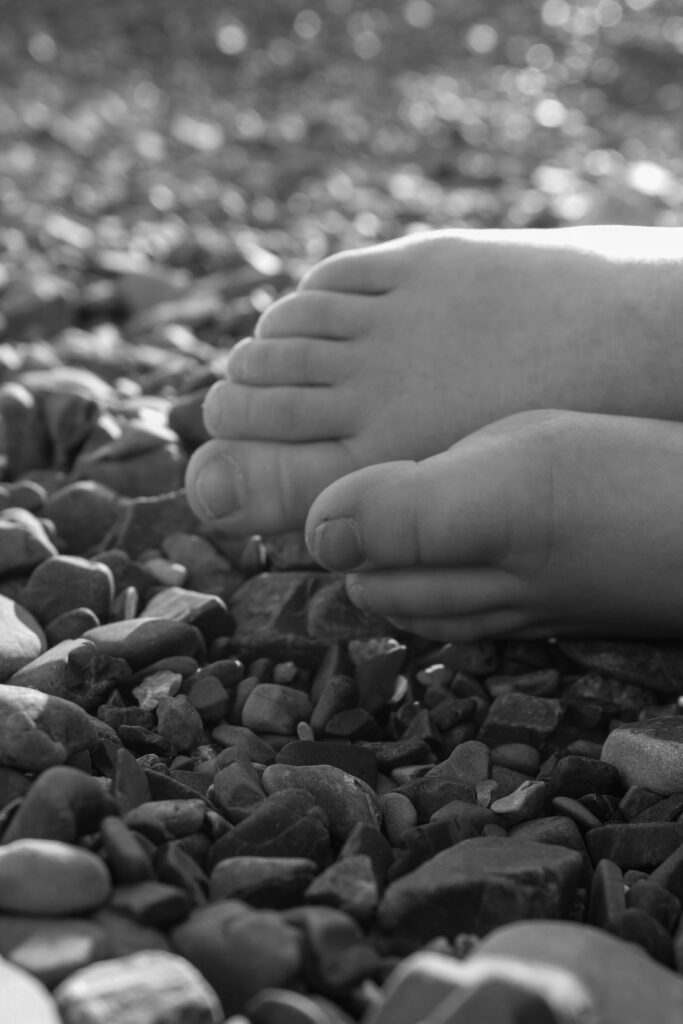
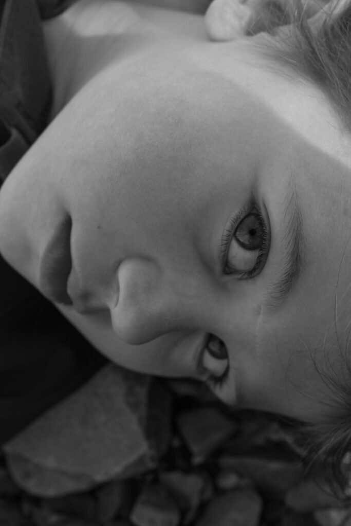
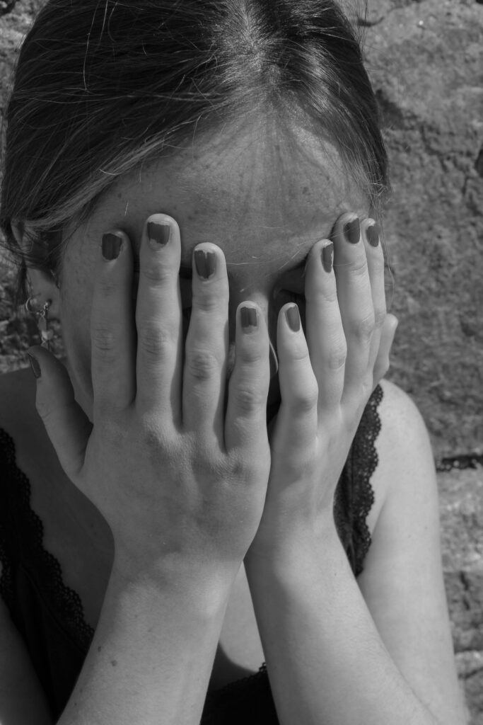
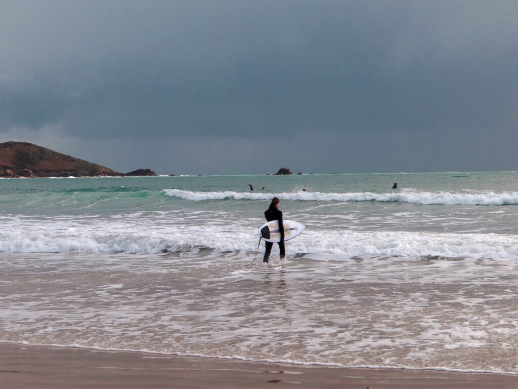
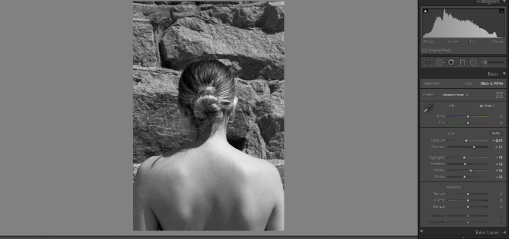
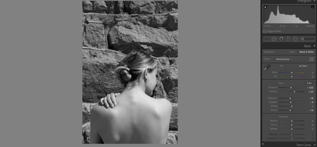
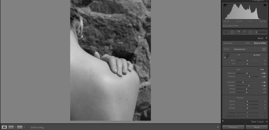
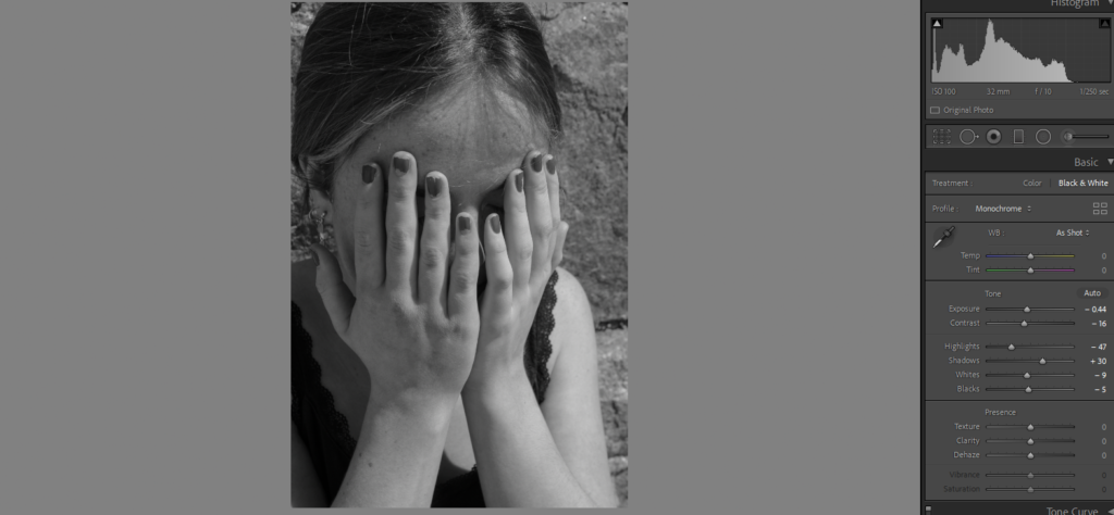
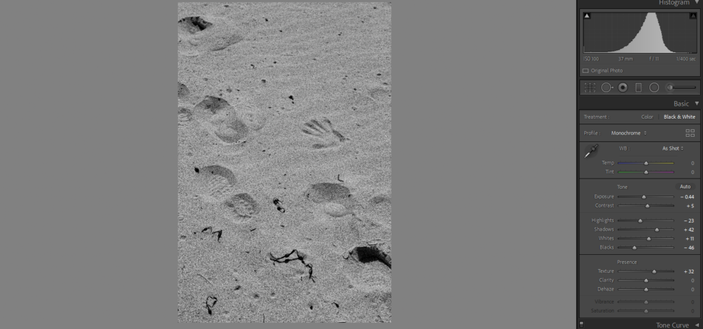
From research and exploring I found Bill Brandt’s work of body parts in an abstract way interesting. I thought that incorporating his work into this theme would work with ‘Observe’. I decided to take the idea of observing the body from photographing body parts but to make it interesting I went down to beaches which had pebbles. By having more of a landscape rather than just a white background creates more contrast and allows for more shadows. I also decided to change all of my images into black and white to make sure they all flow in a nice way to create a story. My first shoot was more inspired by Bill Brandt with images which are more simple whereas my second shoot is more inspired by Barbra Kruger with more emotion behind them. By ‘observing’ the body I ensured all the images are close up and capture every detail, for example the hands you can see all the small details. To present my images I will make a series of foam boards with my best images, I will also be making a photobook which will display all of my best final images from my shoots.
This is a mood board I have compiled of some of Nan Goldin’s works. Born in Washington in 1953, Nan Goldin is an American photographer and activist. Now living and working in New York City, she explores LGBT subcultures, moments of intimacy, the HIV/AIDS crisis and the opioid epidemic through her works. Her first exhibition, in 1973, highlighted the gay and transgender communities. This work was inspired by her love for drag queens. While she was 18, she lived in downtown Boston with a group of queens and created her work ‘Ivy wearing a fall, Boston‘. Goldin said that her “desire was to show them as a third gender, as another sexual option, a gender option. And to show them with a lot of respect and love, to kind of glorify them because I really admire people who can re-create themselves and manifest their fantasies publicly. I think it’s brave“. This links to the ‘challenge’ element of the observe, seek, challenge theme, as Goldin is capturing these individuals from an admirable and respected perspective. She is challenging stereotypical views of sexualities.
Upon attending the School of the Museum of Fine Arts, Goldin was advised to return and create additional photographs of the drag queens. She expressed that she felt her work wasn’t the same as it was while living with the queens. I believe this shows how it is much easier to create successful, influential images of a community when you are part of it yourself or involved otherwise. By living with these queens, Goldin was able to gain perspective by being integrated into the community. This shows how by having access to the people you’re photographing, and being able to form a connection with your subjects, you can create impactful and meaningful images. The outcomes of this are more realistic and allow a sense of comfort to be established during the image making process, as they are familiar with the photographer.
My own project consists of me taking photographs of my friends. This is a part of my own community, and I have known most of them for a very long time. This connection with the subjects allows me to create images which are more realistic of the teenage girl experience as well as allowing them to feel comfortable in performing for the eccentric photographs I plan on creating.
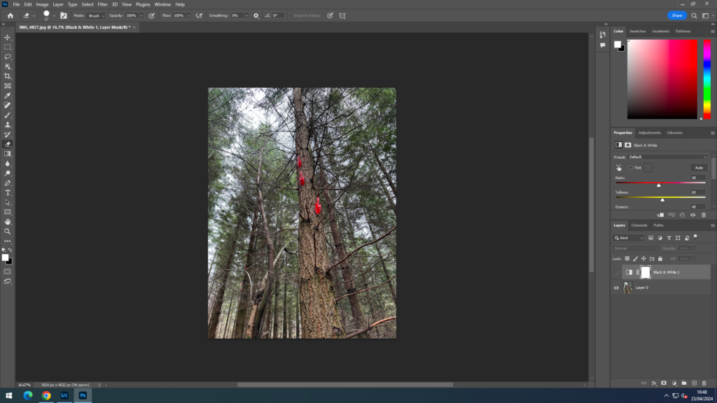
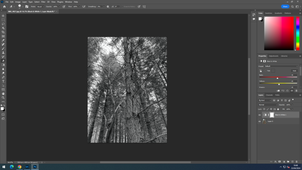
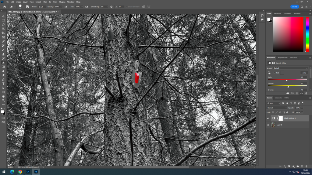
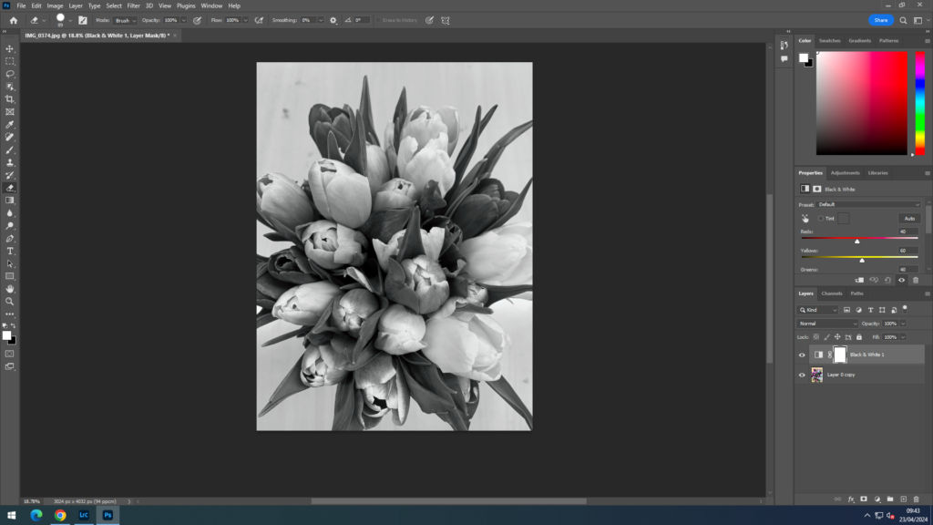
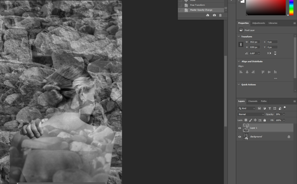
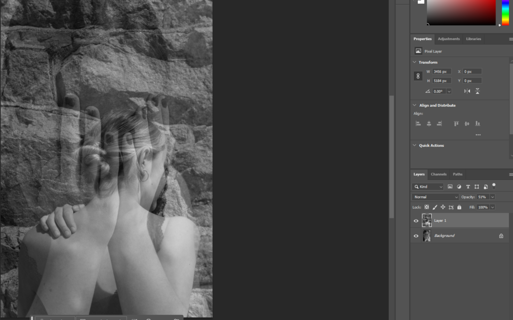
For my first experiment, I took one of my images and opened it on photoshop. I then duplicated the layer and made the top image black and white. I then used the rubber tool to begin rubbing out the top layer where I wanted the image to be in colour.
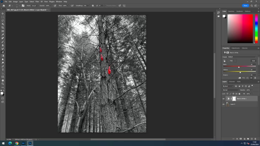
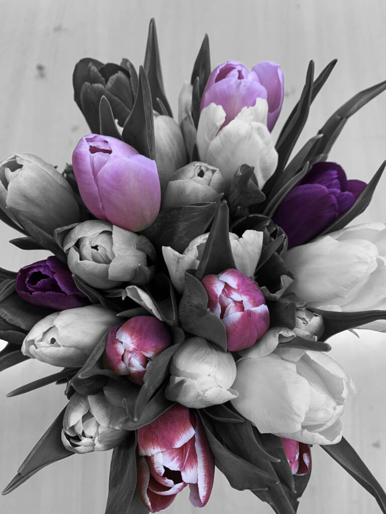
final image:
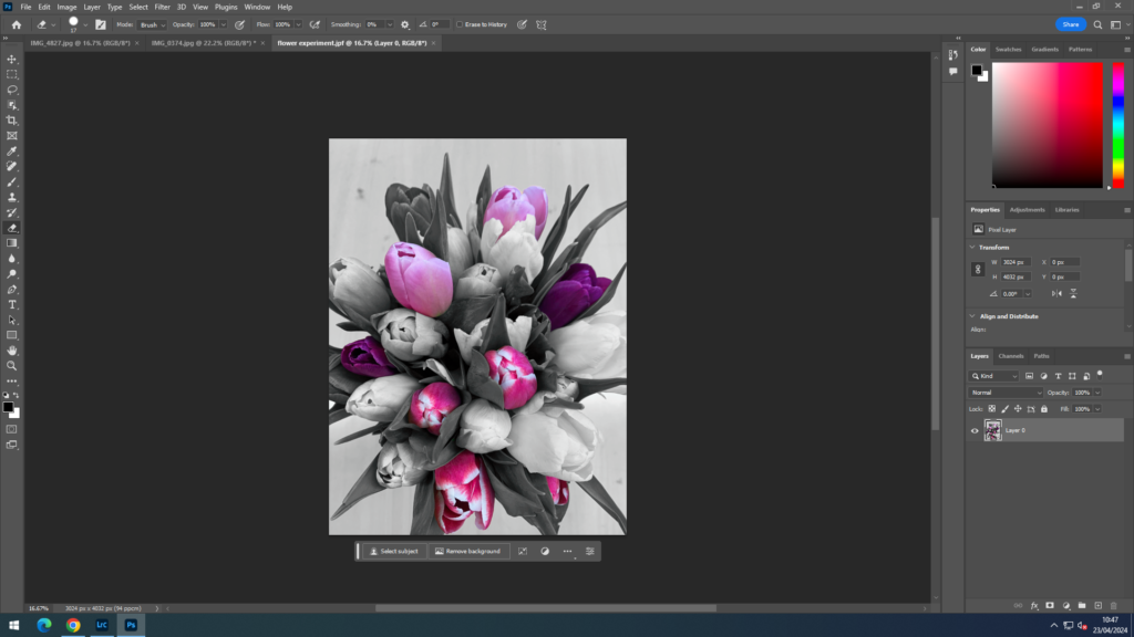
For my second experiment, I used the same process.
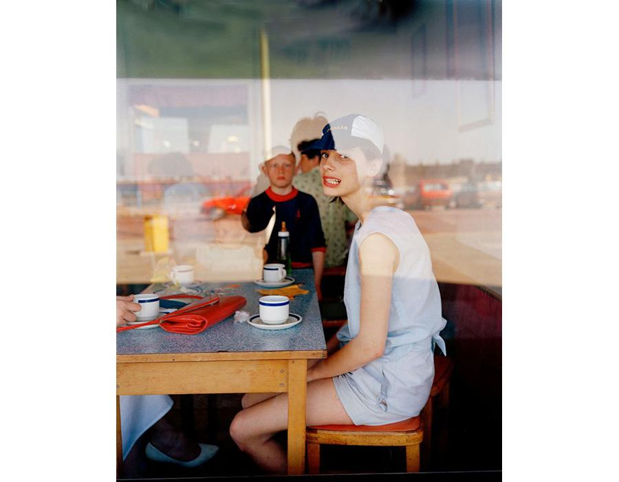
Above is a moodboard I have put together consisting of some of Tom Wood’s works. Tom Wood is an Irish photographer born in County Mayo 1951. His work consists of street photography, as well as portraits and landscapes based in the UK. He photographs a number of things; “on the streets, in pubs and clubs, markets, workplaces, parks and football grounds” of “strangers, mixed with neighbours, family and friends.” His most influential work is his photographs produced of Liverpool and Merseyside.
A quote from Tom Wood’s website of Tyler Whisnand states, “But Mr. Wood is not making photographs for a gallery. He is creating a diary of what he sees without being an intrusion.” This quote demonstrates the documentary style of his work and shows how Wood is producing this photographs for his own benefit. By capturing this pictures, he creates documentation for himself of where he has been and individuals he has encountered. It is evident through his outcomes that he always manages to make his subjects appear relaxed and at ease. He builds an element of trust with his subjects, like the trust of a family member, to create these natural-looking and inspiring images.
Wood captures passing moments in time, communicating an element of realism within his work. He documents moments which might not have been meant to be seen, capturing life and people in their natural elements. He photographs a vast amount of people and places, thus feeding into the nature of street photography which captures the ordinariness of everyday life.
I believe Wood’s work fits into the topic of observe, seek, challenge as he is constantly observing everything through his lens and capturing small fleeting moments, similar to Henri Cartier-Bresson’s ‘decisive moment’. By observing and photographing strangers and acquaintances in the streets of the UK, he captures the multiple realities of the streets from a unique, creative viewpoint. He seeks to create a community with the people he takes photographs of. He makes the people feel comfortable and develops a special relationship between the subject and the photographer, shown through the development of his nickname “photie man”.
This is a photograph captured by Tom Wood called ‘Grimace Girl’. It is a nicely composed image focussing on the subject of the girl facing the camera. It is obvious that the photograph has been taken through a window, as you can see the reflection through the glass. By taking the photo through the window, the reflection created allows the viewer to get a sense of location and background to the image. Though without the reflection you’d still be able to see inside the restaurant, the reflection adds to the location where you can see cars in the background.
The photograph is vibrant and colourful, making the image appear fun and joyful. What I like most about the image is that it has both elements of candid and staged methods. As you can tell, the girl is aware she is being photographed as she is looking directly into the camera. However there are still elements of realism and other factors which are not controlled, like other people in the background who are also enjoying their meals. I hope to capture images like this within my own photo making process as I believe it can create a fun aspect to the photographs and add a sense of realism, communicating documentation of real life.
The theme given for the final project is “Observe Seek Challenge”. This is a very broad theme which can be interpreted in many different ways. By breaking it down into three individual words, I have been able to construct an idea of how I want to capture this theme in my project. By focussing on verbs “observe” and “seek” I can interpret the prompt as ways of exploration and perception. This links to elements of the human gaze, identifying the role that gender plays in our perception of the world around us. ‘The male gaze’ is a term which has developed from acts of feminism, depicting how men view women. It suggests a heteronormative view which reduces women down to that of sexual objects which exist for a man’s pleasure. However, there is arguably an ameliorative counterpart constructed of women’s view of other women. The ‘female gaze’ is a term developed which aims to oppose the negative stereotypes developed by men. It aims to view every woman as a whole, to emphasise her, to appreciate her sense of identity as an individual. It creates a sense of respect, allowing emotion and intimacy to be appreciated instead of ridiculed.
My initial idea was to capture photographs depicting the teenage experience, showing life go by day-to-day. I wanted to communicate the sense of growing up and show elements of identity which are formed through exploration of yourself, seeking comfort. However, I have slightly shifted my focus to that of teenage girls. I believe I can be more successful with this as it makes the project more personal to me. By taking inspiration from previous projects (i.e., Identity, Femininity vs. Masculinity) I want to make portraits of my girl friends and portray our lives and a sense of girlhood. Through the ideas of perception and the different types of ‘gaze’, I aim to create images which portray both sides of the male and female gaze. I want to capture photographs which are slightly eccentric, emphasising and exploring the sexual nature of the ‘male gaze’. I can do this through ideas of ‘femme fatal’ which is a woman who is attractive and seductive. This can include capturing images using props like lipstick, wine glasses, cigarettes, etc. However, I also want to show aspects of hyperfemininty and innocence, which is another view of women created by men. For this I can use themes of floral and nature, dressing my friends in flowy dresses or skirts which are white to reflect the ideas of ‘innocence’.
In addition, I will capture images which are more realistic of teenage girls. These are achievable images which I can take comfortably in normal gatherings between friends. This can be just normal hangouts, or even getting dressed up and doing makeup for example. This will portray ideas of girlhood and the teenage girl experience. For my outcomes of this project, I will select few final prints to frame and mount. I also want to create a photobook as my final outcome, allowing me to create documentation and story element of girlhood. A photobook creates a story and it communicates an intended message, my book will show young girls who are developing into womanhood. It will also show how these girls still have their childlike tendencies.
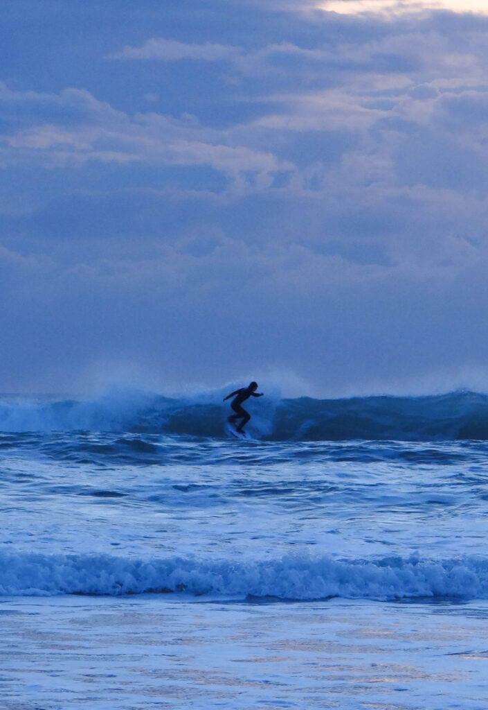
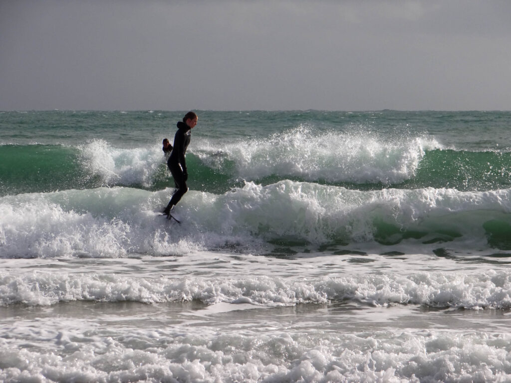
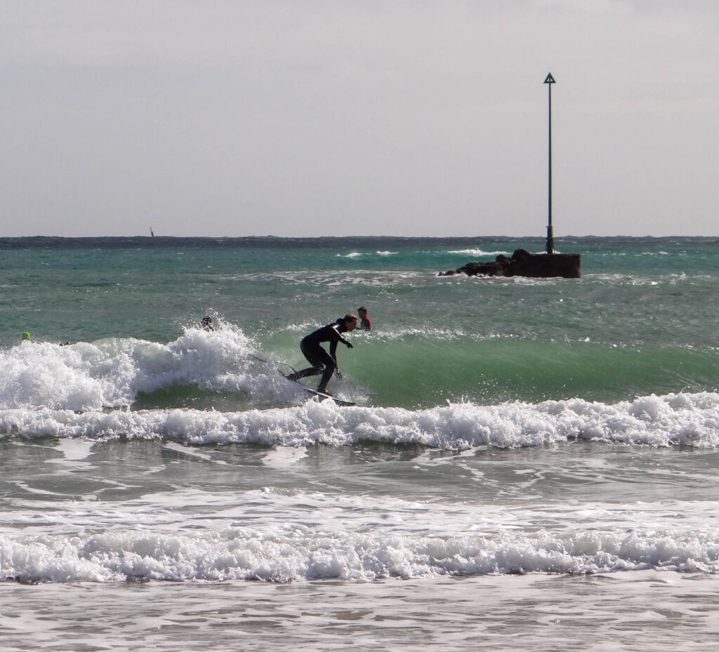
My second shoot was done at the beach in St Clements along the coast road. Carrying on from my first shoot I decided to do another shoot at the beach to carry on the same theme. I will also be turning all of my images into black and white to incorporate Brandt and Kruger’s work which is mainly black and white.
Editing Process
I am happy with the way my images have turned out, they link well with my first shoot and create a nice collection of images. Changing the images into black and white creates depth and contrast making all the images have the same colours and tones.
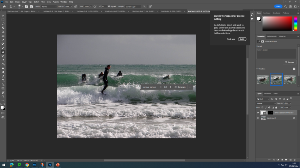
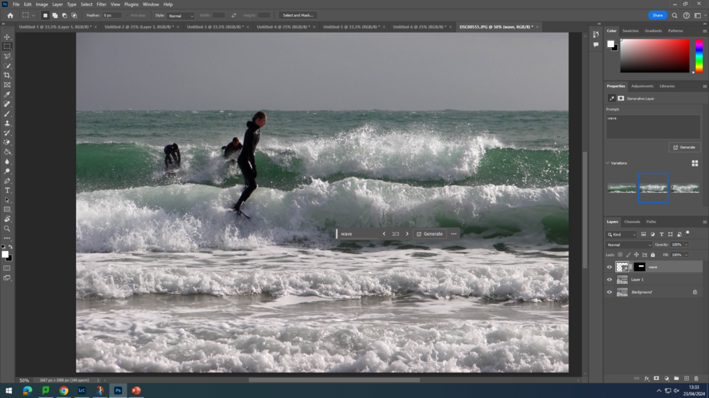
Further Editing on Photoshop
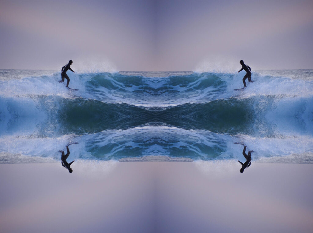
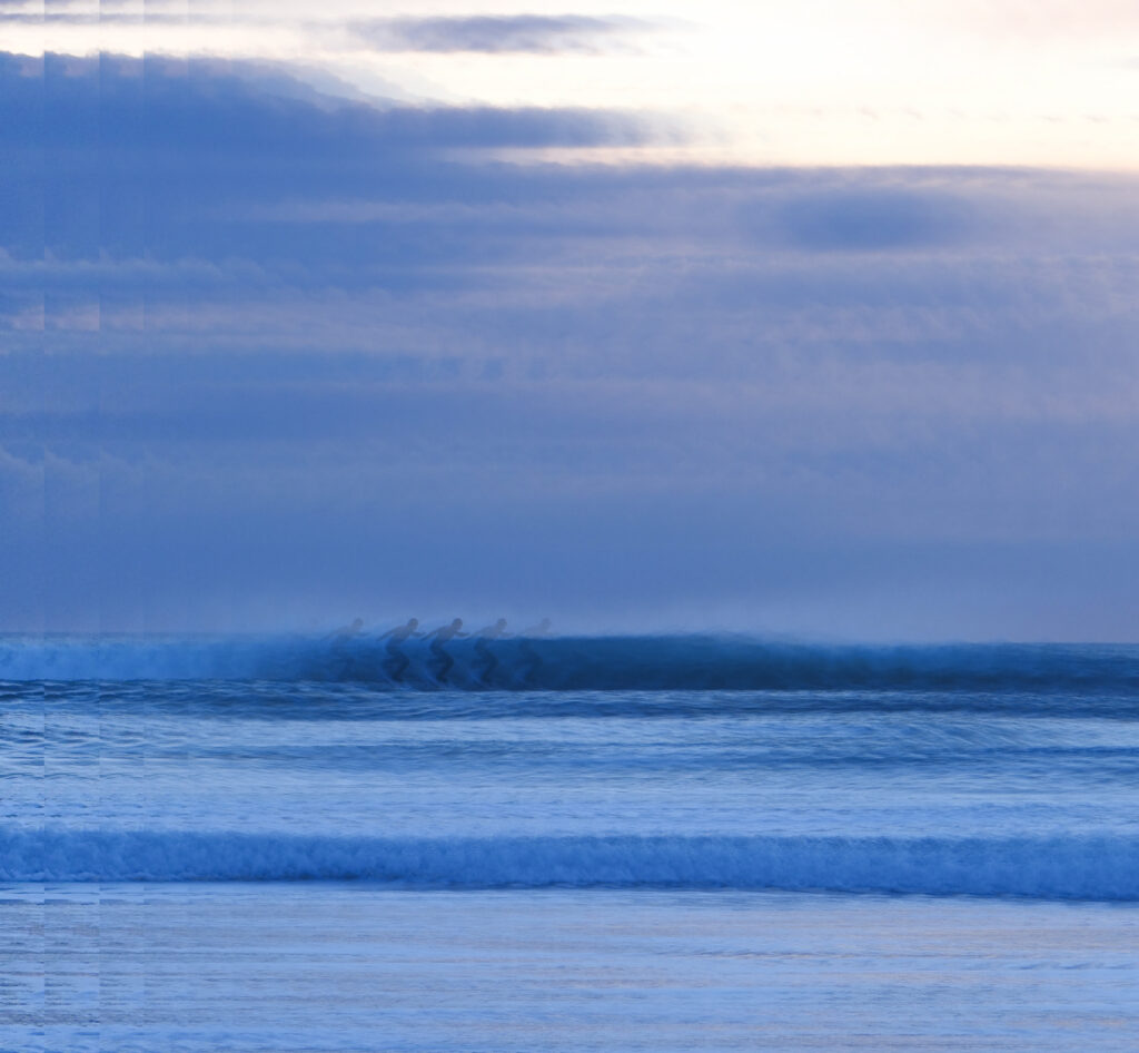
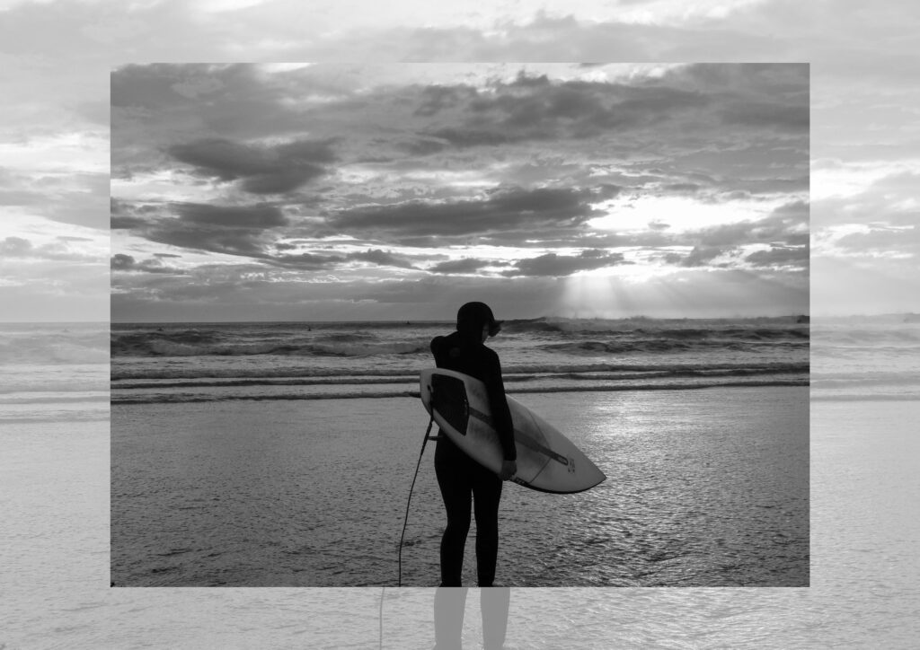
To create this I used a background image and put another image on top and changed the opacity to have the bottom image showing through at the same time.
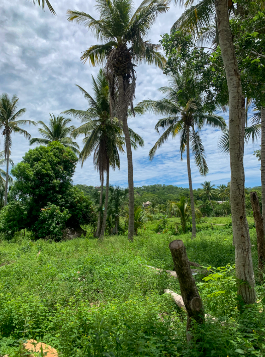
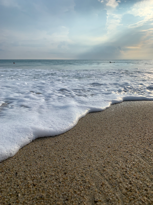
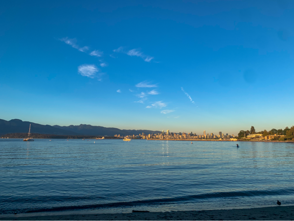
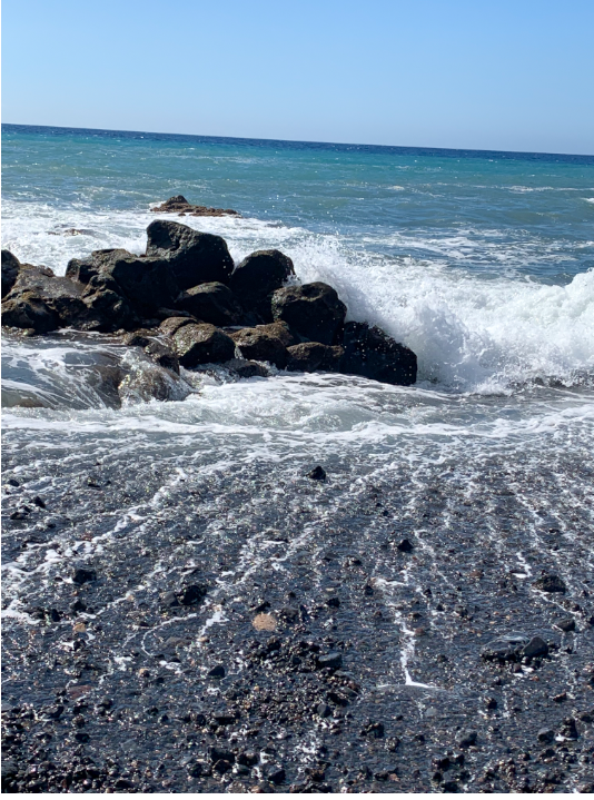
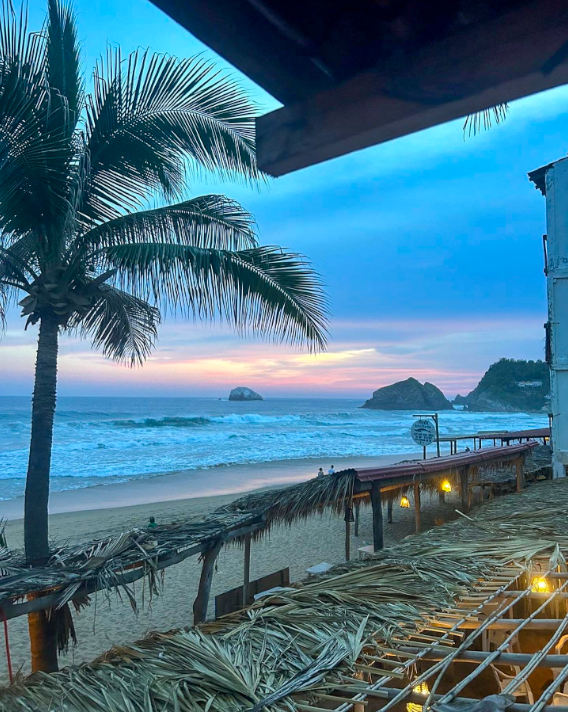
A few of the images that I want to include in my Photobook are old Archive images that I have taken over the years, My reasoning behind using these images is because I feel like my use of images in nature would be very restricted due to living in Jersey CI. This is because, even though we do have wildlife I feel that a lot of my images would be very repetitive due to us having a limed range of wildlife in this small island. So I am planning on using images from some of my previous travels outside jersey to really incorporate the beauty of nature around the world. Some of these images would of been taken in Spain, Canada and Mexico which would give my photobook a wider range of the uniqueness of nature in different continents around the world rather than being restricted to a small 9 by 5 mile island. I am using these images from inspiration by Marsel van due to his research into wildlife and the images that he has taken while traveling.
I edited all of these images with the increase of vibrance, shadows and dehaze to really elaborate on the beauty of nature. Due to my Previous images of technology being dystopian I wanted to make my landscape images of nature more appealing in the photobook so that the viewer automatically gets drawn to them.
Final edited Images
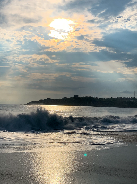
I edited all of these images with the increase of vibrance, shadows and dehaze to really elaborate on the beauty of nature. Due to my Previous images of technology being dystopian I wanted to make my landscape images of nature more appealing in the photobook so that the viewer automatically gets drawn to them hence the seeking nature part in my Ideas.
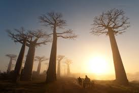
Image comparison with Marsel Van
The image that I made on the left represents the Image on the right of Marsal Vans work. There are multiple similarities between our two pieces such as our vocal points being a tree with the sunset in the background. Though there are also differences such as How Marsal vans image is a lot warmer in tone than mine due to the orange and yellow shades that cover his picture where as My image is a lot cooler surrounded with blue shades from the sky and sea. At first glance the two images look as they have no relation but in further inspection the similarities are evident though they tell two different stories.
Conclusion
In conclusion I am very happy with how these images turned out with my editing on Lightroom as I feel that really capture the eye and shows the beauty of nature around the world. I am also happy and confident with my Idea of using these archive images as due to the bead weather in Jersey Ci I am struggling to get some really captivating and vibrant shots so I am glad that I am not restricted. Though I may not use all of these images in my final book I am happy with the selection.