These specific five images that i picked out from Sherman’s work are the ones i have re created as shown above. Overall i would say i have successfully attempted to play with Cindy Sherman’s style after going by a specific plan and focusing on the mis en scene and clothing. The only major difference would be that Sherman’s images have a more vintage black and white tint on them.
For this first photoshoot I will be creating a set of images in response to Cindy Sherman, I will attempt to re create them as much as I can.
HOW?
I will use specific props and clothing items such as suitcases, handbags and long flowy dresses to match the aesthetic that the woman in Cindy’s pictures create.
WHEN?
As these pictures will be in black and white it doesn’t limit me as to what time of day i should take the pictures however a few will be taken outside therefore i will be taking those specific images in daylight. I do plan on taking all the pictures in the day anyway.
WHO?
Using my friend which i will provide with outlifts, probs and makeup.
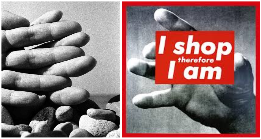
The two artists have some similar images, Brandt uses body parts in black and white and Kruger also uses body parts and adds coloured borders words. Kruger has a slightly different message to Brandt as she tackles the everyday assumptions of contemporary society. Whereas Brandt has more of a Surrealists approach and in his project focuses mainly on body parts. Kruger uses a more varied range of images from peoples faces, art work, body and other staged images. Brandt uses mainly arms and legs on pebbles at the beach. His images being black and white create contrast and deep shadows. By taking inspiration from the artists I will incorporate them into my photoshoots.
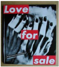
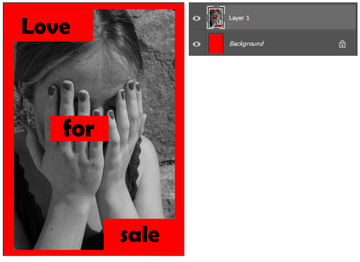
By using photoshop I experimented with trying to create work similar to her work by using the red banners on top of images. Now that I compare the images I would have changed the writing into white rather than black. I would also need to take some more images in her style to have the same effect as she has. As I don’t have many other images in her style I was limited to the amount I could produce.
What makes Klein so different to my other chosen artist, Henri Cartier-Bresson, is that his approach to his subjects is far more up-close-and-personal. He doesn’t shy away or hide his camera, choosing to remain unseen by his subjects, but instead he shoots from directly in their faces, often causing a visible display of outrage from some, and a deliberate playing up to the camera from others.
William Klein was born in 1926 in New York City. He served in World War II, first in Germany and later in France, where he chose to settle after being discharged. He then studied painting with Fernand Léger at the Sorbonne in Paris, before moving on to his photographic career, beginning in fashion with Vogue. He won the Prix Nadar in 1957 for New York, a book of photos of his hometown, despite his lack of formal training in photography. He was also ranked 25th on Professional Photographer‘s list of 100 most influential photographers.
This article by Laird Borrelli-Persson from June 2022 explores Klein’s fashion career from the perspective of Vogue itself.
As well as producing over 250 television advertisements, he directed his first feature film in 1966, Who Are You, Polly Maggoo?, which was a satire mockumentary on the world of fashion….
… followed by numerous documentaries, including Grands soirs et petits matins (1978)…
… and Muhammad Ali, the Greatest (1969).
I was very consciously trying to do the opposite of what Cartier-Bresson was doing. He did pictures without intervening. He was like the invisible camera. I wanted to be visible in the biggest way possible.
My analysis of ‘Gun 1‘, taken by Klein in New York in 1955.
“…It’s fake violence, a parody. I asked the boy to point the gun at me and then look tough. He did, and then we both laughed. [I see it] as a double self-portrait. I was both the street kid trying to look tough, and the timid good little boy on the right.”
Overall, after searching thoroughly, I could not find any real criticism of William Klein’s work. There was a lot of criticism at the time of its publication, however, as it broke all the rules of photography. Nowadays, this kind of disobeying the rules has had an amelioration. It now symbolises a pioneering and revolutionising spirit; someone who wasn’t afraid to change people’s minds. This is, of course, a worthy interpretation, as it is what Klein achieved. However, it does lead to a lack of diversity in interpretations as people are now afraid to criticise this work because they fear being attacked or (worse still, in the rather precocious areas of the photographic community) seen as if they ‘do not understand’ his work and are merely amateurs. I find that, as ‘Sebastian’ (the author of the article I read as criticism of Henri Cartier-Bresson’s work) stated, there is often an unspoken rule that famous and admired photographers such as Klein and Cartier-Bresson cannot be criticised. Those who would criticise are seen as ‘amateur’ and so their opinion is not worthy. This is not true, of course, as anyone who views an image is a consumer and therefore their opinion matters, so to only worship and praise the work of these photographers is to create a stifling culture of non-criticism and non-discussion. Discussion and debate is, after all, what stimulates society and to be without it is to lack individual intelligence and thought.
Jan Roald is a Norwegian photographer who lives in Elvemyrkroken in Norway. He offers his photography services for hire, allowing people to contact him for photo assignments.
His typical style is contrasted black and white images, though he photographs a range of styles such as landscape, portrait, still life etc. He does, however, take some images in colour if the client requests it.
Roald’s work relates to the themes of observe, seek and challenge due to his photographs always observing something or someone through the lens. He also links to seek as he aims to find interesting layouts and compositions for his images. also linking to challenge as he challenges himself to take the best photo he can.
Why I chose the artist
I chose to use Roald as an artist reference due to his album ‘is the life also a chess play’ which he created in June 2019. His album includes photographs of chess pieces in an almost castle like setting where he uses his surroundings to create interesting looking still life images.
I would like to create this using different game pieces. I plan to do this by visiting one of the castles in Jersey and taking the board game pieces with me. From there, I would use the different aspects of the castle, such as the cobble floor or castle walls, to create interesting still life images.
I would also like to create interesting images by creating different effects with the pieces, using different elements in order to imply different meanings behind the images.
Image analysis
– Jan Roald, ‘Is the life also a chess play’.
I chose this image in particular due to the potential meanings behind the images as well as the effective composition of the photo.
To begin with, we are able to see a snake on the board which helps to highlight the size of the chess pieces. The snake could be a symbolism since throughout history snakes have been used to represent themes such as death, wisdom and health. However, now days when referencing snakes we picture stealth and deceitful, so when applying this to games it could be used to symbolize cheating. The connection between the snake and the game becomes stronger when you take into account the colours, the opposing side being black which is the same as the snake.
If we turn our attention to the photo as a whole, there is a lot to it that can catch our eyes. For example, the shadows of the pieces and the black pieces in the background all help to set the scene of the image making it more enjoyable for the viewer to look at.
From my review and reflection of Bill Brant and Barbra Kruger i have decided to take the word ‘observe’ and use it to observe the human body. After looking at Brants images of hands, arms and legs on the beach I want to take similar pictures. To further develop my project I will include some work similar to Kruger, by taking inspiration from her it will link back to the idea of the female gaze as a lot of her work is on tackling the everyday assumptions of females in contemporary society.My take on her work will be a modern day approach. The female gaze is a feminist theory term referring to the gaze of the female spectator, character or director of an artistic work, but more than the gender it is an issue of representing women as subjects having agency. Kruger’s work shows aspects of the female gaze in her work, such as images of women with quotes like ‘your body is a battleground’. I also look to take images of things other than the body such a weird shaped fruit and vegetables. By photographing this it may resemble the body it also allows me to break up my project from just being about the human body.
My images will mainly be staged so that i get the outcome that I want. Once i have got all of my images i want to create a photobook presenting all my best images from shoots.
I have photographed some of the archived photos I might want to use for my photobook. I made sure to use the ones that I will present a change in, and am able to recreate or link with my new images.
Black and Whites
Coloured
France
More coloured (early 2000s)
I want to focus my photobook on the change in my grandmother and grandfathers relationship over time, and how time affects it. These images are around the time my grandfather was diagnosed with cancer, passing away in 2005. Showing the different time periods in the archives presents the change, and how death and time affects people and their image.
Overall, I am not going to use all of these images, however a few of them will work with the images I take, and link.