Category Archives: Uncategorised

Filters

Author:
Category:

final print evaluation

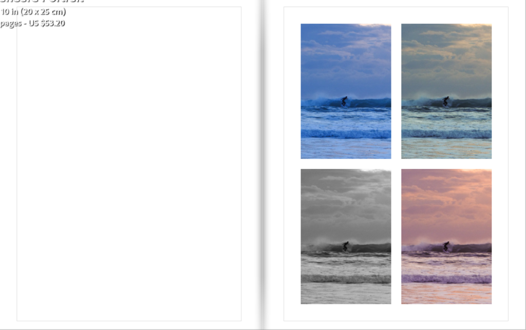
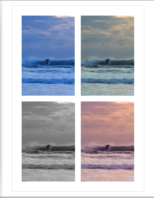
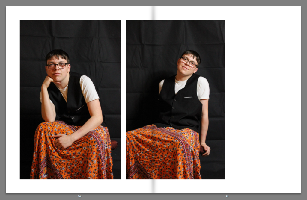
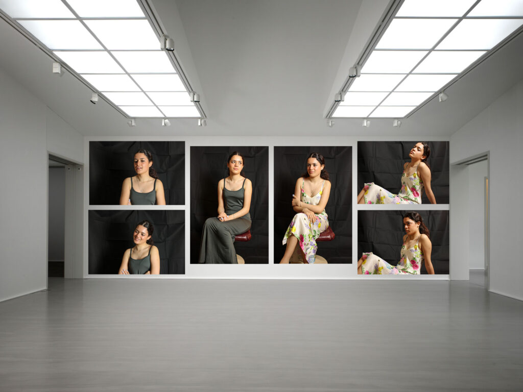
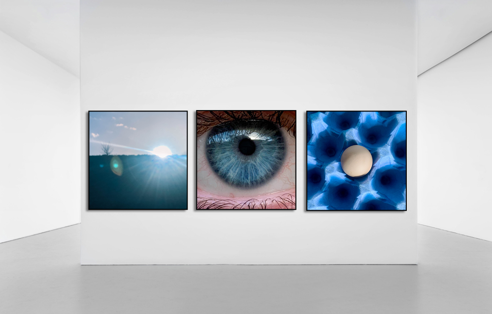
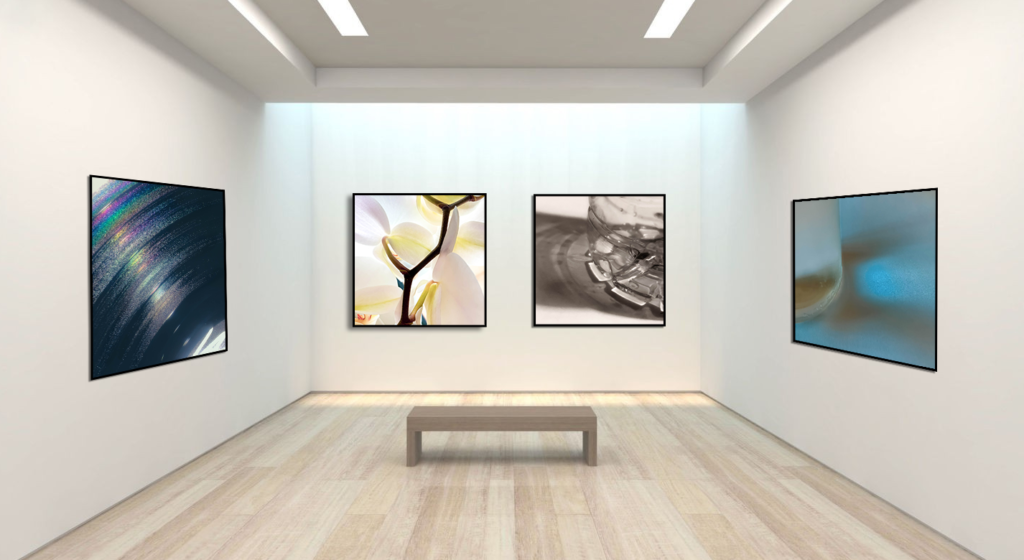
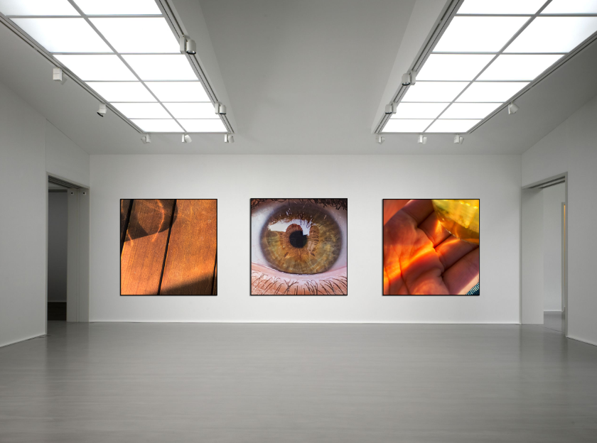
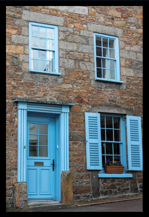
Along with making a photobook, I chose to make some final prints for my project as another way of presenting my work. I make a total of six final pieces using ten of my best images and think they turned out well. I think that I used a variety of my images to show a snippet of my project as well as showed a variety of colours and ways to present them. I am happy with how each of my window munts turned out and think that the first one with the four images is my favourite as it is very bold and draw viewers in catching their eye immediately. I think that the last three also turned out well and as they are simple it allows you to focus solely on the image and its colour as opposed to how it has been presented.
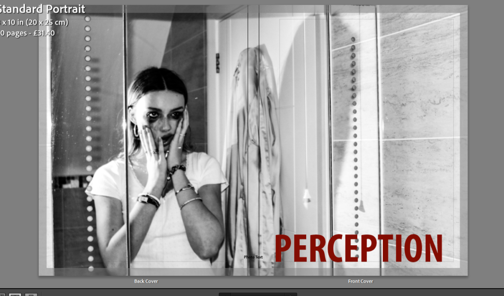
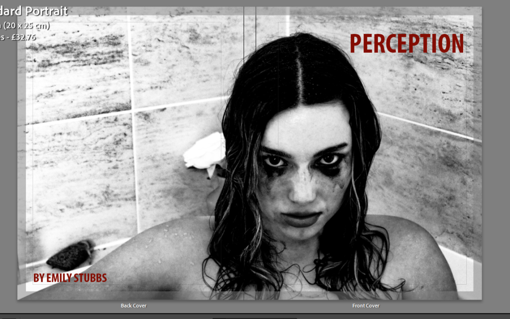
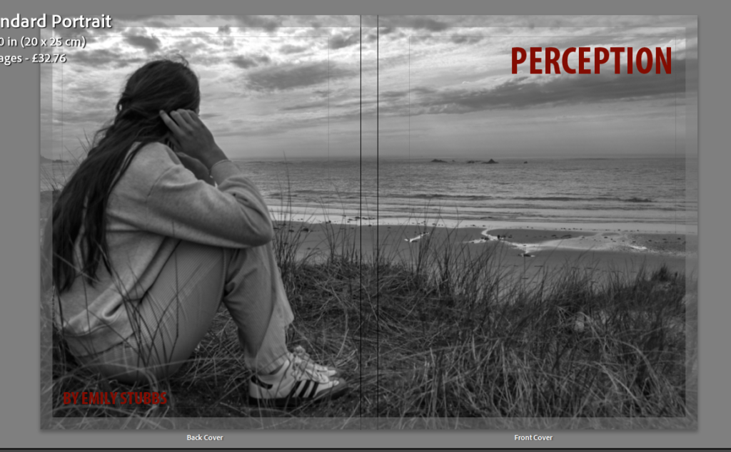
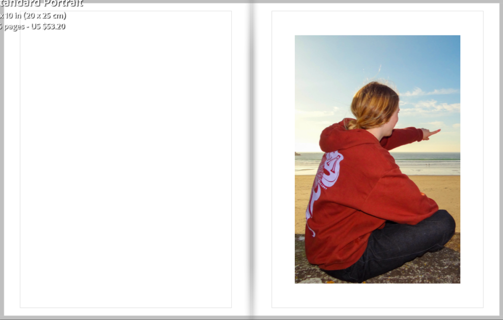
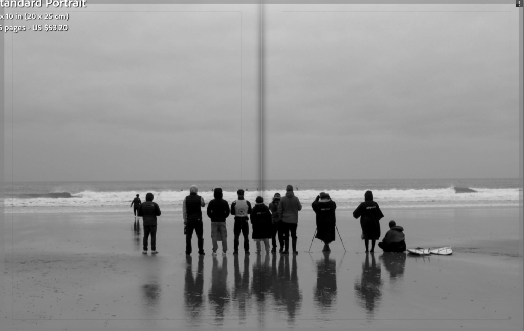
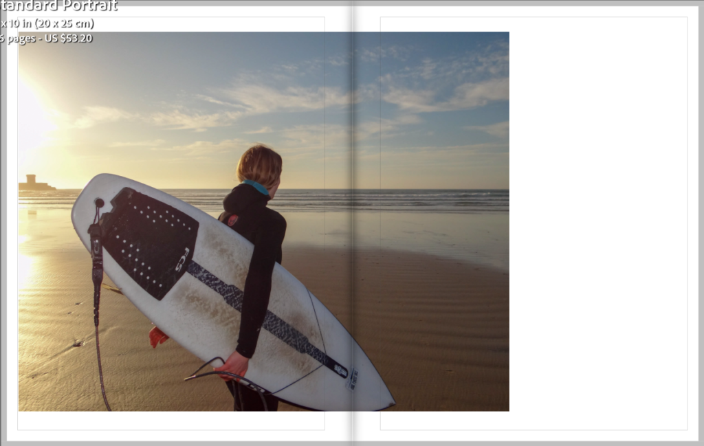
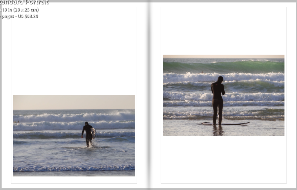
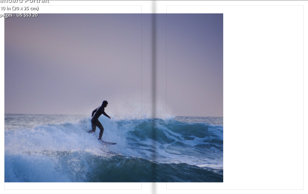
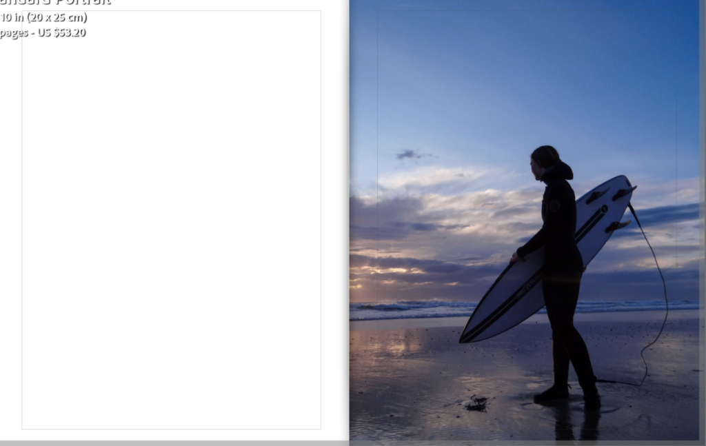
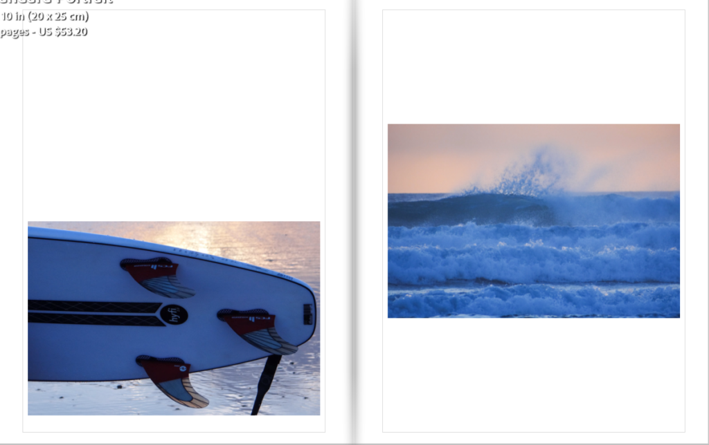
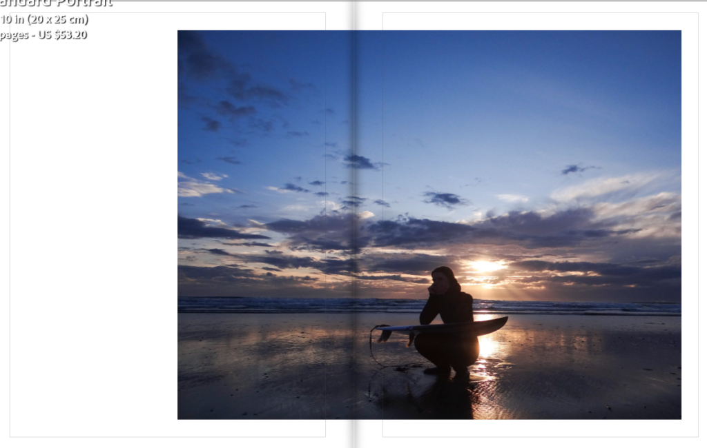
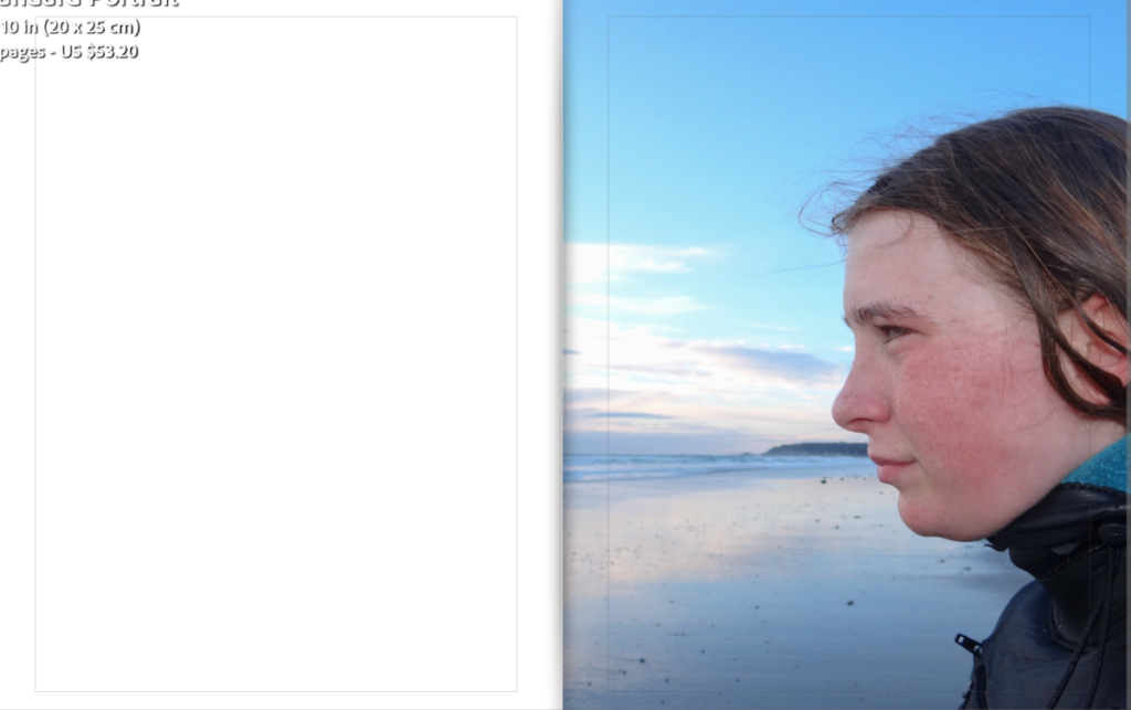
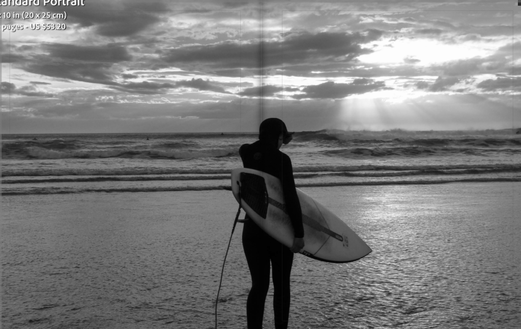
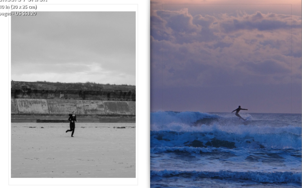
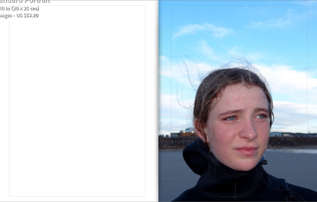
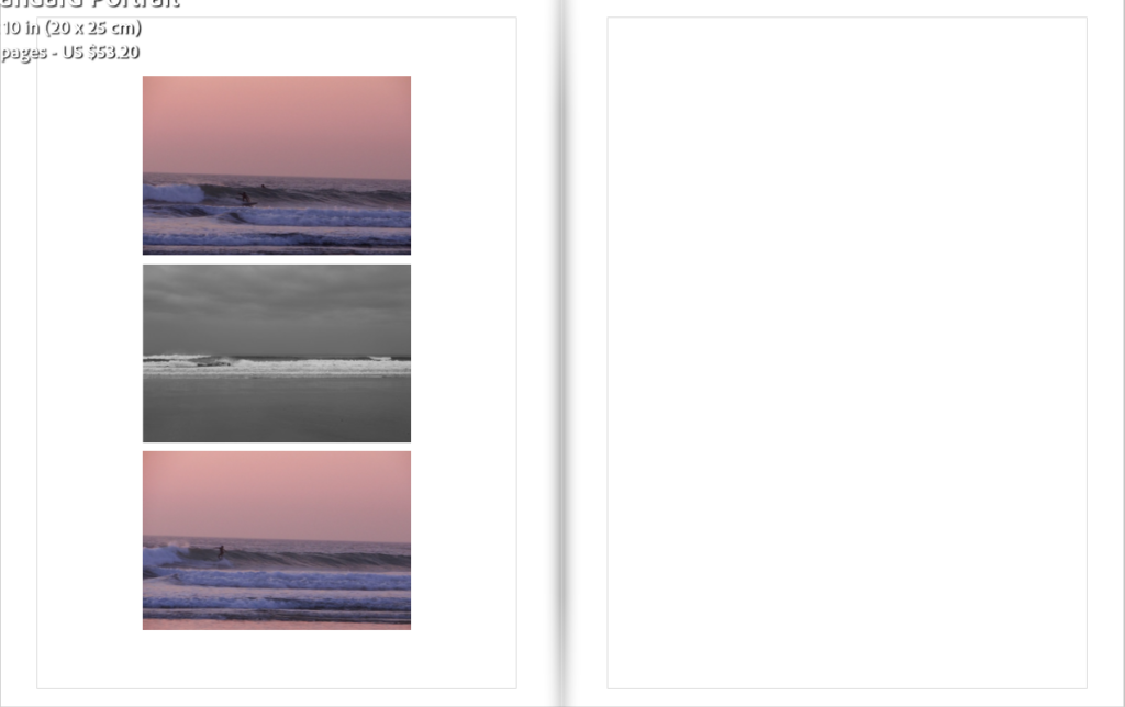
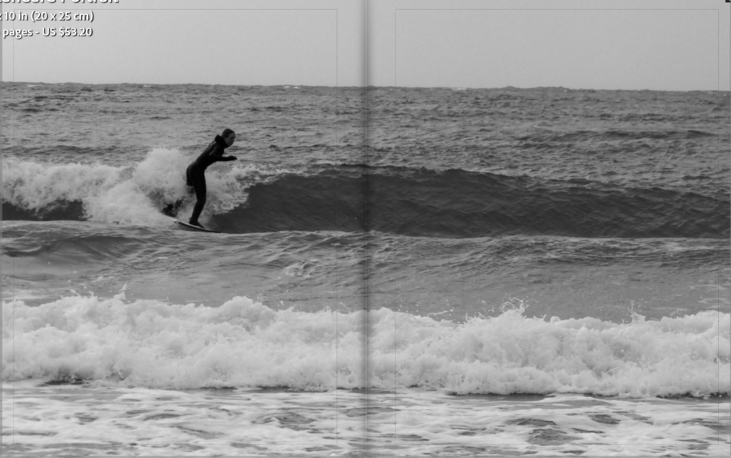
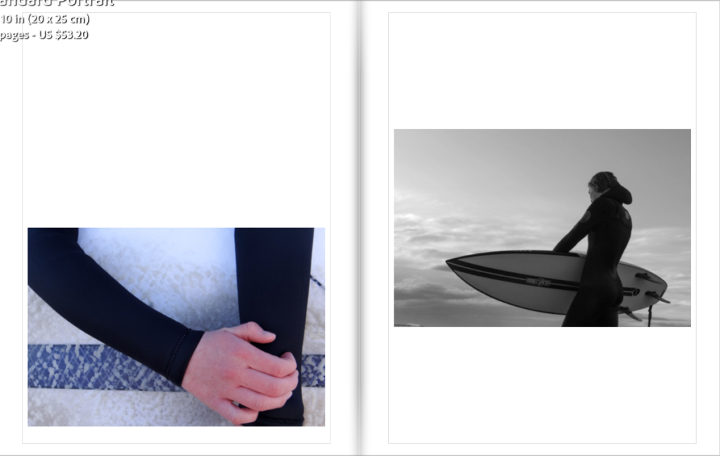
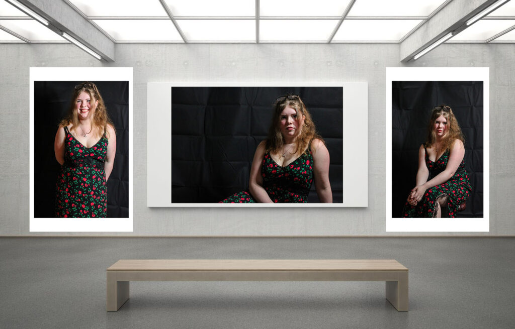
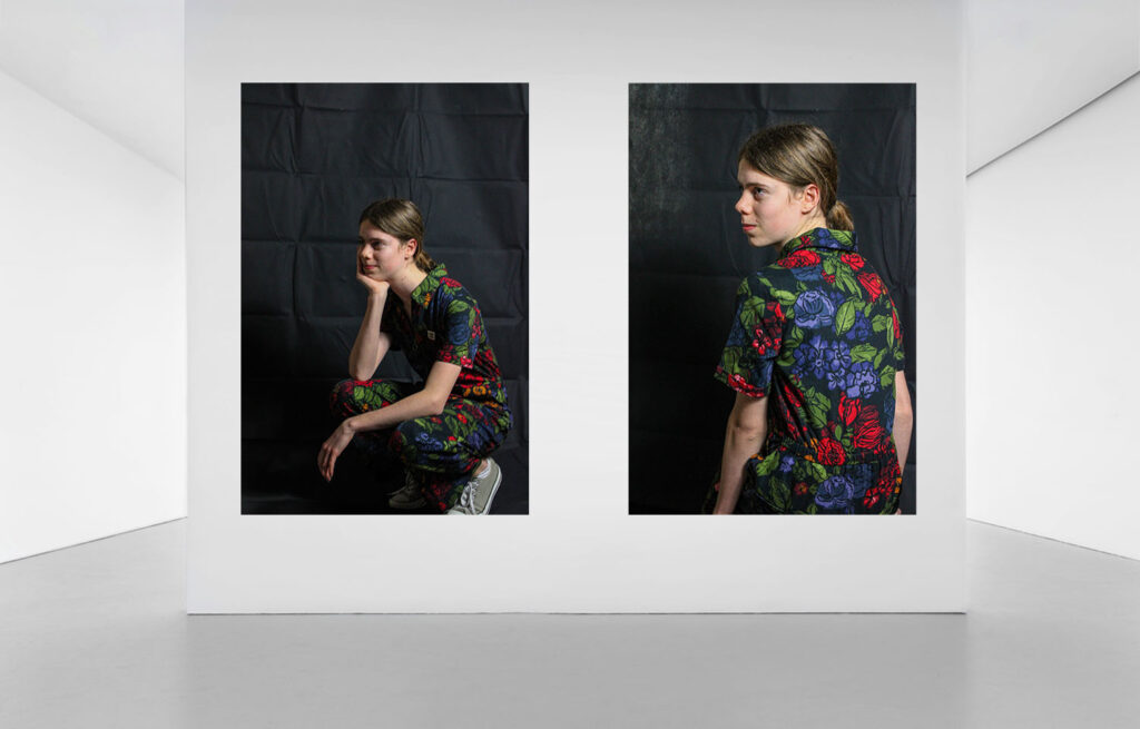
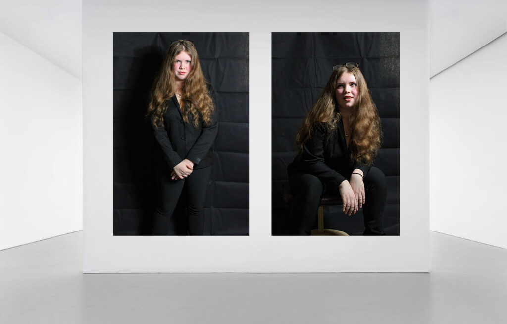
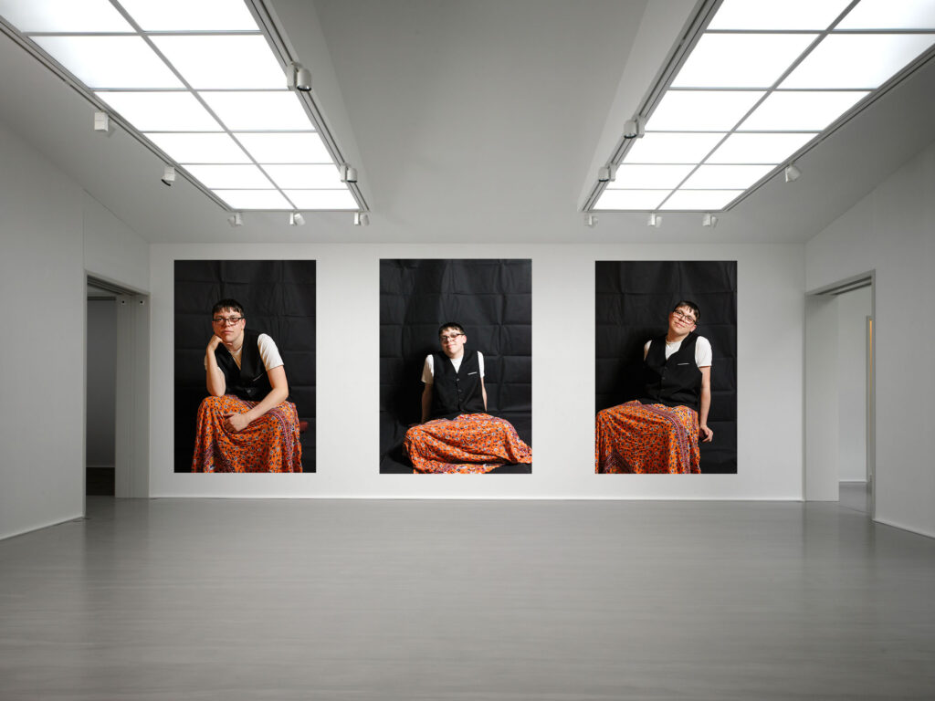
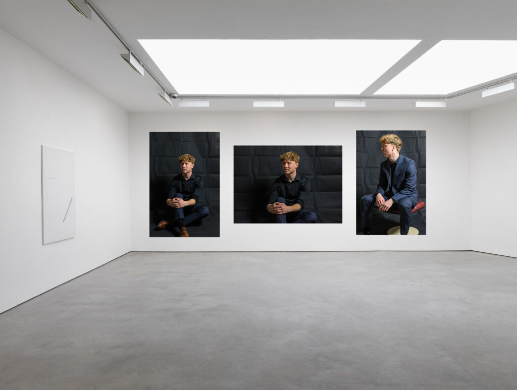
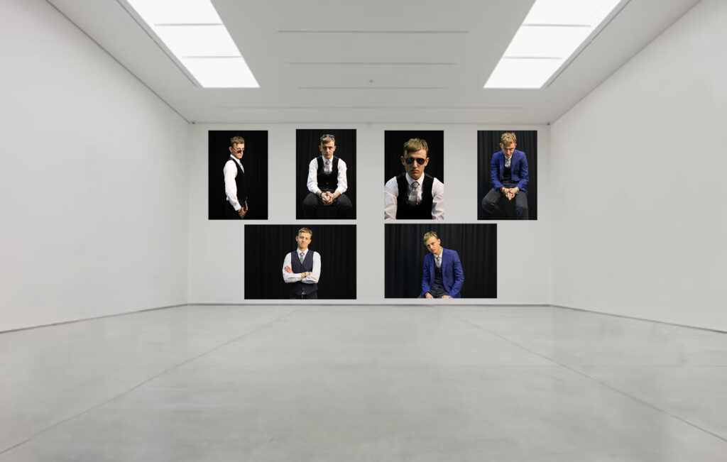
mini mock-ups:

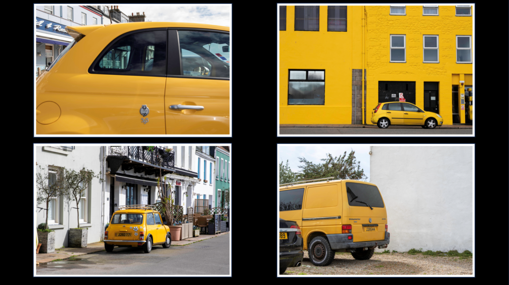
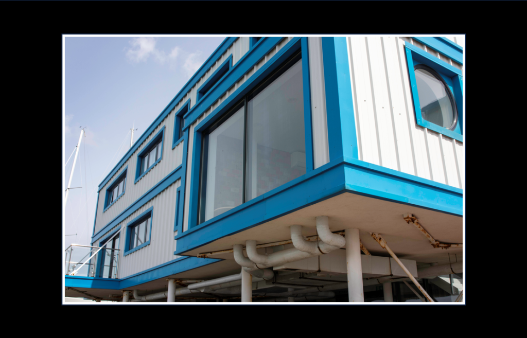
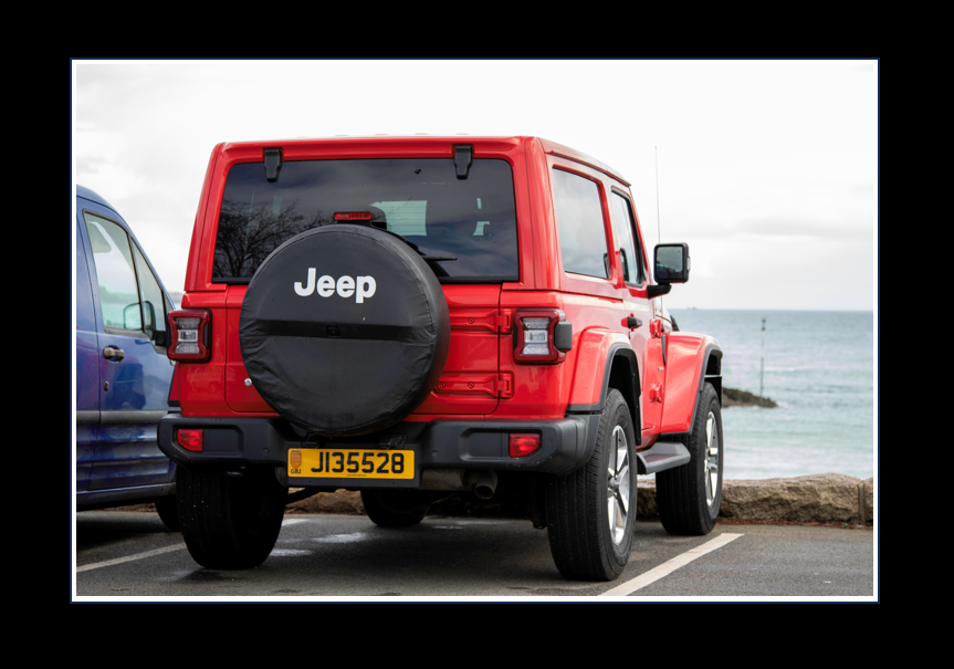
For my first three final prints I chose to make window mounts for them by taking a piece of thick black card and made measurements on the back to ensure that my image would be centre and that the cut out was the perfect size. I then used a ruler and an angled knife to make the cut outs and then used masking tape to hold the images in place on the back. I think all three of these turned out really nicely and the frames make the images stand out more.

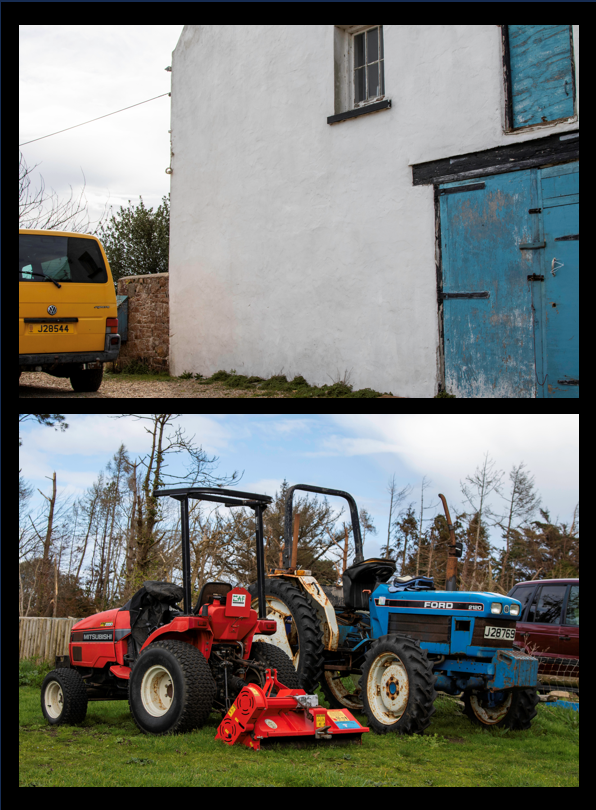
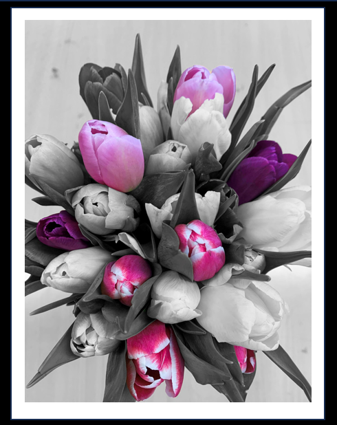
For my last three final prints I used spray mount to stick them onto some foam board and then used a ruler and craft knife to make sure they were cut out straight. On one of them I left white boarded as I thought it made the flowers stand out more and pop. With the other two I cut them right to the edge of the image. After that I then used double sided stick tape to back them on the same black card as the window mounts. I think all tree of these turned out well and they really focus on the colours in the images which I like.

Photobook Cover

For the cover of my photobook I wanted to create something unusual rather then just using a singular image.

I experimented with different images of eyes, edited them differently and made a montage that could be used as a cover.

On lightroom I imported it as the cover to see what it would look like.

However, I realised this didnt match the contents of my book and felt a bit random so I tried some other options.

My final decision:

I decided on this image as I liked the way this outcome matched the title as the girl is looking out (perceiving) and how the layout of the image fits the format nicely. The monochrome makes the burgundy text stand out and creates a clear contrast ensuring it is easy to read.

Virtual gallery

Before:

After:

Final photobook layout

Overall I am happy with the final result of my photobook. I made sure to tell a story/ ‘day in a life’ of my sister surfing by presenting my images in a certain sequence. I also managed to portray the surf culture with the variety of layouts that I used keeping the designs simple.

Creating my photobook

Images that have the potential to be in my photobook

I started by placing my favourite images on each page, using ‘1 page’ layout designs to keep it simple as I was unsure on how I wanted to lay my images out on each page. Once I had the images I wanted I started to experiment with the page designs by adding more than one image on the page and using double page spreads.

Layout1

This is my first layout for my photobook. I wasn’t happy with it as it had too many images which made the book feel crowded and busy, which doesn’t fit the laid back approach the surfing community has. I also felt that the book didn’t flow or tell a story as too much was going on with random images placed. I decided to copy this book layout in Lightroom and adjust it to something I was more happy with.

Layout 2

I began by taking out the pages and images I thought were didn’t fit in to the story I was trying to tell or that were irrelevant. Once I had narrowed down my images I started to rearrange the order/ sequence of the images so they told more of a story. I experimented with various page designs until I was happy with how the book flowed.

I created some abstract images in the book, while experimenting with various layouts. An example of this is where I used the same image but changed the temp and tint on Lightroom.

I chose to create pages with a single image on it with a blank page next to it to break the book up so it didn’t get too bust like my first design. It also demonstrates a break in the surf as there are times when you’re waiting for the next set of waves to come.

As well as having pages with multiple images on it I wanted to have some double page spreads as they are simple but effective which links to the surf culture of having a simple life.

The book tells the story of my sisters day when she surfs. Pages 1-21 demonstrate her first surf of the day.

Pages 22-36 demonstrates her second surf.

When choosing the order of my images I had to make sure they suited on another and flowed together to prevent the book looking like a mess of random photos.

My photobook

Here is a link to my photobook “Imitation”.

Photobook Final Outcome

Here is an online link to my photobook: L’Expression de Soi

How I set up the layout of my photobook:

How I ended up presenting my photobook:

Title page and back cover
Page 1 Opening page
Pages 2-3
Pages 4-5
Pages 6-7
Pages 8-9
Pages 10-11
Pages 12-13
Pages 14-15
Pages 16-17
Pages 18-19
Pages 20-21
Pages 22-23
Pages 24-25
Pages 26-27
Pages 28-29
Pages30-31
Pages 32-33
Pages 34-35
Pages 36-37
Pages 38-39
Pages 40-41
Pages 42-43
Pages 44-45
Pages 46-47
Pages 48-49
Pages 50-51
Pages 52-53
Pages 54-55
Pages 56 – Closing Page

Evaluation of Photobook:

When starting this project, I knew I wanted to make a photobook as a final outcome but I was unsure of how to present it, I had two options:

  1. Present it in a way that shows the development of the gender spectrum, starting from one end of the spectrum e.g. femininity and gradually going through into the other end of the spectrum e.g. masculinity.
  2. Present it in a way that shows my own thoughts on gender identity and the confusion that comes with trying to find my own gender identity.

I chose the 1st one as I thought the 2nd one may be too personal and might not come across in the way that I would’ve wanted it to.

Throughout the book, each image represents a different part of the gender spectrum, starting with femininity and finishing with masculinity. As part of this the “androgynous” part of the spectrum is well represented which could possibly be to do with the fact that I present myself as androgynous at the majority of times.

This project/book is one of the most personal ones I have done yet as I feel like it really shows some insight into my personal thoughts on gender and gender stereotypes. I really enjoyed developing this project because of how personal it was and how much fun it was to go against stereotypes whilst producing the images.

Virtual Gallery

For the virtual galleries, I chose to represent a similar narrative as the book. Using each person’s different shoots and creating a different virtual gallery for each one. Like in the book, I kept the concepts of “masculinity”, “androgyny” and “femininity” separate in the different galleries.

Femininity 1
Femininity 2
Androgyny 1
Androgyny 2
Androgyny 3
Androgyny 4
Masculinity 1
Masculinity 2
Masculinity 3
Masculinity 4
Masculinity 5

Final Project evaluation

Overall my project presents a captivating exploration into the black and white world of urban environments, masterfully capturing the interplay of light and shadow. My photographs encapsulate the raw energy and timeless essence of the urban landscape, transforming mundane cityscapes into evocative images that ignite the imagination


The consistent use of black and white in your series demonstrates a clear intentionality and artistic vision. Converting hues to grayscale facilitates a more pronounced emphasis on form and texture. I manipulate contrast to achieve bold imagery that characterizes the essence of each urban setting.

my technical knowledge is evident through the crispness and sharpness of my photography. The exposures are meticulously balanced, ensuring that both highlights and shadows are rendered beautifully within the image. The employment of wide-angle lenses provides an expansive field of view, drawing the viewer into each frame.

The primary focus of my project lies in the element of shadows. Shadows play a pivotal role in my images, often acting as a visual counterpoint to the contrasting areas of light. They add depth, intrigue, and a sense of mystery to the images. You capture shadows in their diverse manifestations—elongated due to harsh sunlight, solidifying into defined patterns, or completely obscuring the structures they touch.
My images thrive on the interplay between light and shadow. i understand the profound impact of light illuminating urban landscapes, The posts and beams of buildings cast long shadows, while delicate sunlight creates highlights that illuminate textures of exposed brickwork or graffiti. Your photographs highlight the ever-shifting nature of both light and dark competing for visual dominance.

The project demonstrates an extraordinary ability to reveal the rich textures and details embedded within urban settings. This allows viewers to connect with the images on a deeper level, drawing forth an emotional response and, at times, even prompting a sense of nostalgia.

The innovative approach to urban photography showcased in my work is able to forge an undeniable emotional bond between viewers and each image. These monochrome images evoke feelings of melancholy, contemplation, and intrigue, leaving a lasting impression that lingers long after the image has been viewed.

In summary, the project is a bold collection of black and white urban images that effectively captures the essence of cityscapes using subtlety and intention, leaving viewers with a rich and lasting emotional connection. My composition, technical skill , and creative exploration of light and shadow elevates my project to a truly captivating and immersive experience.

virtual gallery

I used the ‘distort’ tool to position some of the pictures as if they are on a sideward wall:

I used the drop shadow tool to create a shadow behind the “frames”:

As well as creating a “frame” around the image with the stroke tool: