Category Archives: Uncategorised

Filters

Author:
Category:

Male gaze

Gaze – the way the artist and sitter look at each other, and the way we as viewers look at the person portrayed.

Male gaze – The male gaze is the act of depicting women and the world from a masculine, heterosexual perspective that presents and represents women as sexual objects for the pleasure of the heterosexual male viewer.

In photography we often find that women are reduced to being just sexual objects that appear as accessories to a larger composition. The classic example of a sexually posed woman next to a product in an advertisement is a good example of how the male gaze functions in photography and society.

‘Men act and women appear. Men look at women. Women watch themselves being looked at’ – John Berger

Artist reference – David Llada

David Llada is a 46 year old journalist, organizer, photographer and author born in Asturias, Spain and currently residing in Donostia-San Sebastian. Majority of his work goes towards promoting chess and was even the editor-in-chief of American Chess Magazine for a while in 2018. Llada also has published a book called ‘the thinkers’ which is a visual tribute to the game of chess, showcasing the emotions, exertions and desires of the players.

Llada has been an official photographer in countless events with his photos helping to bring awareness to the game of chess across the world, even being recognized by other chess photographers as one of the best.

‘I am particularly impressed by his quick perception, his ability to spot and also anticipate those crucial moments that make a photo memorable.’Niki Riga

What I like about David, first of all, is his enormous interest and devotion to his work and chess players. Secondly, his brilliant skills and technique, and his desire to be perfect. And finally, his attention to details.” – Eteri Kublashvili

I chose Llada as one of my artists as I am very fond of the attention to detail in his images. He is able to create interesting and meaningful images which focus on the players and their expressions which is something I would like to recreate in my own images.

While expression is a key point in his photographs, we can also tell a lot about the subject by their body language, such as when they touch their face it could signal worry or surprise etc. I also admire how he is not only able to capture the emotions of the player but also the details of the game.

Llada links to the theme observe, seek and challenge as he observes the players of the game, watching as they challenge each other all while seeking to win.

In this image, we are able to see the worry and hesitation shown on player’s face as she carefully observes the game in front of her. The way her hand is placed over the other indicates that she’s about to make her move but is holding back, presumably rethinking or reanalyzing the board.

We are also to tell a lot about the image by looking at the board in front of her, we can see that she has less pieces than the opposing player, suggesting that she is at a disadvantage. However, looking to the bottom right of the image we can also see the pieces both players have lost, such as the bishops and queens, giving us slightly more insight to the game. For example, both players have lost their queens which is a powerful piece in the game, suggesting they’re equally matched.

Overall, the image provides us with the story of their match and when we pay close attention to the details of it we can begin to unwrap and visualize what the photograph is trying to showcase.

https://www.chessbase.in/news/David-Llada-turns-40

Observe, seek and challenge

For this theme i decided to look at each individual word and find inspiration form what ideas came to mind when thinking of these prompts. Here are some of my initial ideas:

Observe – For observe I started thinking about how we percieve the world we see on a day to day basis which to me included things like how we are presented in the media, street photography, fashion, makeup etc.

Seek

For seek I thought about it in the sense of a personal aspiration for example like peoples desires etc and how I could portray this in an artistic and creative way.

Challenge

For challenge I started to think about beauty norms and what is expected of people. This inspired me to look for the opposite, for the weird and unique. This includes people with different features or creative makeup and costumes. I also related it to body stereotypes and how we can challenge the idea of a ‘perfect body’.

Final ideas:

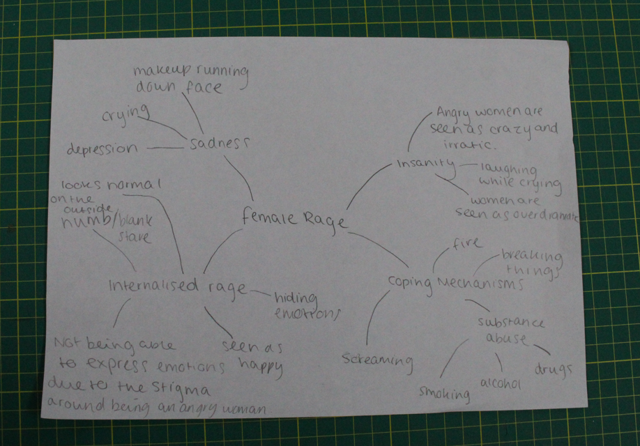
In the end i looked over all the ideas i had thought of from the theme/prompt and came up with the idea of focusing on female rage. This idea inspired me as there are various different ways it can be portrayed and I thought that would be an interesting concept to explore.

Moodboard + Mindmap

Statement of Intent

Our exam project themes are Observe, Seek, Challenge. I’ve chosen to study the theme of Seek and explore abandoned and derelict locations. My interpretation of the theme seek will be trying to find and pick out places that have been left to sit by themselves, places that aren’t put to use anymore. For example the bunkers around Jersey, the abandoned hospital, the derelict places along the railway walk. I’ve chosen to photograph these things as I think it’s interesting to seek these places but also fid out the background history of them; why have they been abandoned? How long have they been sat there? Who left them like this?

Above is a mood board of photos that would be ideal for my project. I am taking inspiration from images like this, however, it may be difficult to have as interesting outcomes as those images as Jersey doesn’t have a lot of places that are particularly ‘abandoned’. Although, there is quite a few derelict areas such as, from all the bunkers that aren’t in use anymore to houses that have either not been finished getting built or have no one living in them and are boarded up. These sorts of locations I plan on photographing and experimenting with different angles ect.

In terms of composition for my photos, I will be carefully framing my images from different heights and angles, however I won’t be arranging anything as I want to photograph places how they have been left; showing the conditions they have been abandoned in. As my photos will be all based outside, if not outside then inside a building, either way I won’t be using the photo studio for any of my images. Therefore, my photos will all be taken in natural lighting, no staged images.

I plan on leaving all my images in colour, rather then in black and white, however I will edit my images to correct parts of them. Ideally, I want to present my final images in a photobook.

Comparing Artists

Romain Veillon & Matt Emmett

Matt Emmet and Romain Veillon are documentary based photographers. Both of which are specialized in a practice called ‘urbex’ (meaning urban exploration). They travel around the world exploring man-made structures which are abandoned or hidden from the general public. Their work is both eerie and apocalyptic, however there is a few differences between them.

Matt Emmett’s work

Romain Veillon’s work

The first thing I want to compare, and what I believe is a significant difference in their work is the theme. Matt Emmetts work appears very modern, not so much the settings he is photographing as they are all old and abandoned, but the quality of his work. His images are quite under exposed but not to the extent where they are too dark. The colours and tones in his work are very sharp. However, Romain Veillon’s work on the other hand is very light. There is a fairy-tale aura about his work. This photo in particular (below) there appears to be abandoned fair rides. The merry go round may remind the viewer of their childhood, which is now over, it has been left abandoned. This also foreshadows the fact those memories are over.

I think Matt Emmet’s photographs are of seeking the beauty of these abandoned places, showing how he can photograph and edit the images in smart, tactical ways. However, Romain Veillon’s photographs are revealing the story behind these abandoned places.

Matt Emmett includes a lot of symmetry in his work, such as spirals, squares, circles ect. He uses the light to his advantage, creating patterns and repetitive shapes. Below is an example of when he has done this:

Emmett very clearly takes precaution with his images, he carefully choses which angle to take the image from, the lighting and composition are big elements when it comes to his work. Emmett’s photographs become very appealing to a viewers eye as there are regular patterns and motifs, not only just photographing abandoned places within nature, he also uses shape and symmetry to make his images more interesting.

On the other hand, Romain Veillon’s work is less tactical and just shows the scenes as they are. Veillon’s photos show abandoned buildings but sometimes with other objects in the image, objects of which could tell the viewer something about the building or setting. He is photographing to show viewers exactly how it has been left and why.

Both artists use natural lighting in their work as they are based in outdoor environments. However, Emmett’s work is very tonal and eerie, there’s darker colours in his photos, whereas Veillon’s work is softer; the colours and tones within his work are lighter.

PHOTOSHOOT TWO – image comparison

NANCY HONEY:

MY IMAGES:

This is challenging as you need three different subjects and locations to pull together one image which have got to still have a common theme throughout all three images. For example i used the theme green, mirrors and the top. I also tried to include a sense of femininity by adding the ballet shoes. The sunlight gleaming onto the girl whilst she’s wearing the top – links with the sunlight also reflecting onto the top (on its own). I like how the wind is blowing the ribbons on the ballet shoes as it is pointing as the same direction as the sun coming through the shutters. I strategically placed the shoes on a mirror table next to the grass this correlates with the theme green and juxtaposes with the mirror in the other picture. When editing these images i used lightroom and put a green tint on each image to saturate it slightly and bring out the green colours.

Although this can be quite time consuming and has to be carefully planned out, I still aim to develop more images in this style (three to make one) as its different to what I’ve experimented with before and it fits with the theme observe, seek and challenge.

Paris Photoshoot – contact sheet

These photos were taken across Paris, but mostly in the centre. I photographed tourist areas, such as the Pantheon and the Eiffel Tower, and the Sacre-Couer, as well as various metro stations.

New York Photoshoot – contact sheet

These images were taken mostly in central Manhattan, with some in Central Park, and some taken from the Hudson River. I am happy with a lot of these images and I think the lighting managed to work really well for me, considering the time of year.

London Photoshoot – contact sheet

I don’t have many photos from London, and a lot of them were taken with the intention of using them for typologies so they do seem similar in places for this reason.

I do have other images of London but unfortunately these are all taken on a phone camera and for this reason I don’t think I will use them. Because there aren’t many images from London, I am less likely to include them in the final product, but hopefully I can make them work.

Amsterdam Photoshoot – contact sheet

These photos were taken in the centre of Amsterdam, the train station, along the river, and on the river itself. I like a lot of them and I think that they show a lot of the typical essence of the city.