Category Archives: Uncategorised

Filters

Author:
Category:

Observe, Seek and Challenge- Photoshoot 3

For this photoshoot, I decided to take landscape photographs of the abandoned St. Saviour’s Hospital, formally named the Jersey Lunatic Asylum, to contrast with the self- portraits I have taken. I decided to do this to experiment with different photographic styles for this project, linking in a historical building with the topic of hysteria.

Research

The foundation stone for the asylum was laid on Saturday 29 July 1865 and opened in 1868. The institution was named the Jersey Lunatic Asylum, and was called this for nearly 100 years. However, in 1952, the name was changed to the Jersey Mental Hospital and then in 1963, when attitudes began to change towards mental health, the current name, St. Saviour’s Hospital, was adopted.  The architect was Thomas Gallichan, who was responsible for the design of other States projects such as the Royal Court House and the General Hospital. Unfortunately, he drowned while bathing in 1866 and never saw the asylum completed.

The original architect’s drawing for the lunatic asylum

The States Assembly were extremely reluctant to spend money on a purpose-built lunatic asylum, and Sir Robert Percy Douglas Lieutenant Governor of Jersey was forced to intervene since Whitehall complained about the lack of care of islanders with learning disabilities and mental health issues. The states were first criticised in 1847, yet still took nearly 20 years to act on Whitehall’s complaint. Having convinced the States to finally build the asylum, Douglas was also instrumental in selecting Queen’s Farm at St Saviour as the ideal site, negotiating the lease of the farm and land from the Crown for £84 per annum.

The asylum used to hold an annual picnic, during which it would take its ‘inmates’, as the press described them, on an excursion around the island. Each year, the papers reported the fine weather and good behaviour of the patients, but it sounded like a somewhat stiff and rather militaristic affair, with the patients called back to their vehicles with a bugle call, at the sound of which they would all fall in.

The main part of the hospital closed when a new facility opened in 2014 and it was left unused until the decision was made to sell the building and site. Unfortunately, this attracted the interest of vandals, who broke a window and started a fire inside the building in January 2017. There have been several proposals to sell the site, which is said to be worth as much as £15 million.

Contact Sheets

Sub- Selection

Making selections

I have begun to make selections across my photoshoots to find the ones that are worth editing, as I have nearly 2,000 images and cannot possibly edit them all.

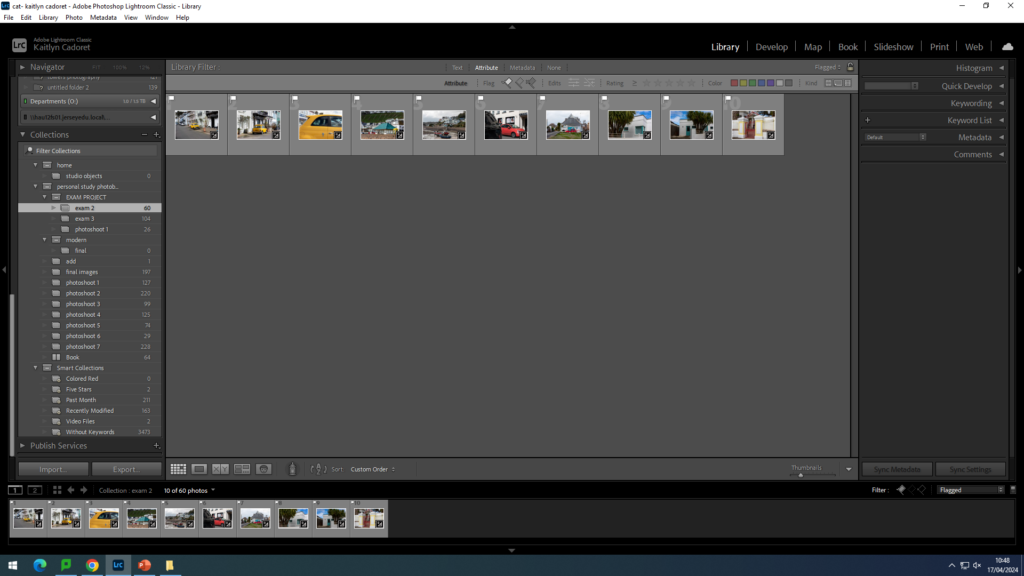
Using the ‘Flag as picked’ and ‘Flag as rejected’ tools in Lightroom, I am able to pick out the images I would like to edit, which I can then filter later on. I am choosing the best images based on their aesthetic quality and their relevance to my overall intentions.

For Amsterdam, I picked a total of 54 images for editing.

For Athens, I picked a total of 80 images for editing.

For Edinburgh, I picked a total of 21 images for editing.

For London, I picked a total of 16 images for editing.

For New York, I picked a total of 59 images for editing.

For Paris, I picked a total of 32 images for editing.

From the plane journeys, I picked a total of 24 images for editing.

For St Malo, I picked a total of 43 images for editing.

For York, I picked a total of 30 images for editing.

That makes a total of 347 images.

photoshoot two

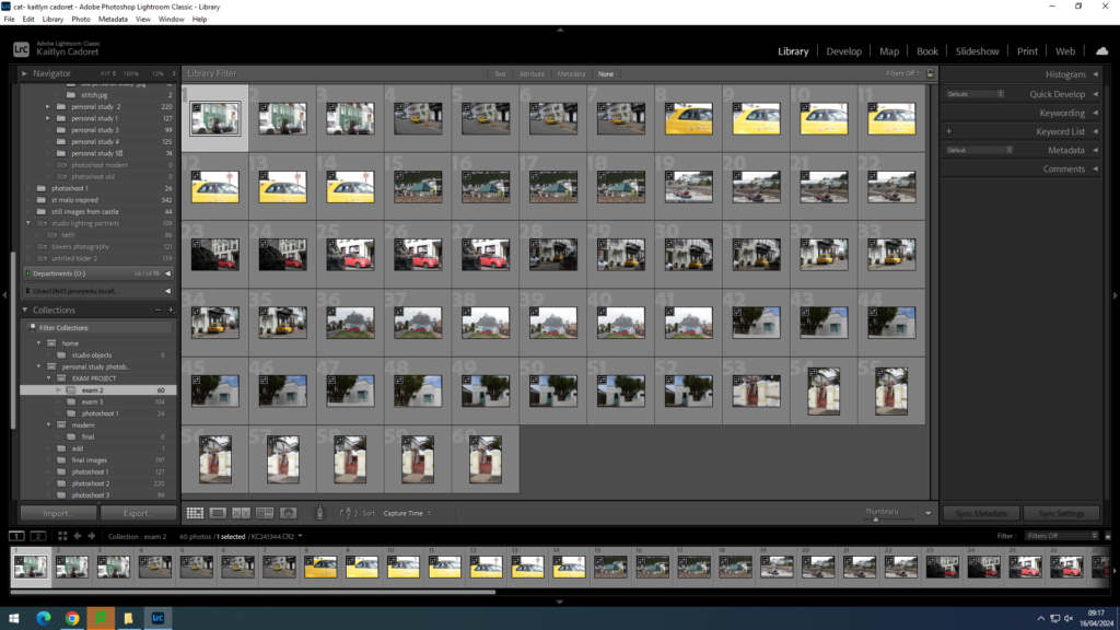
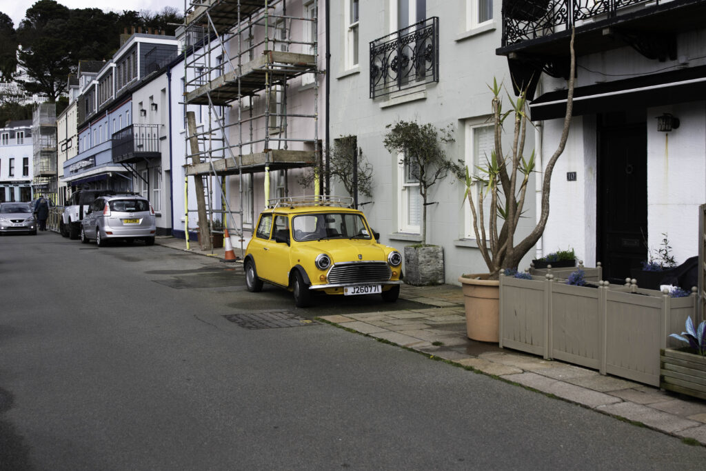
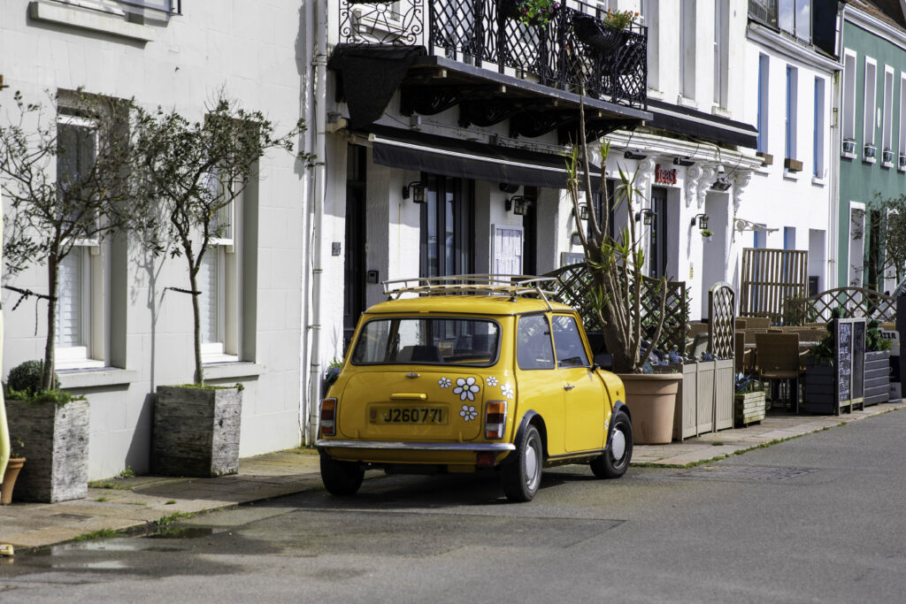
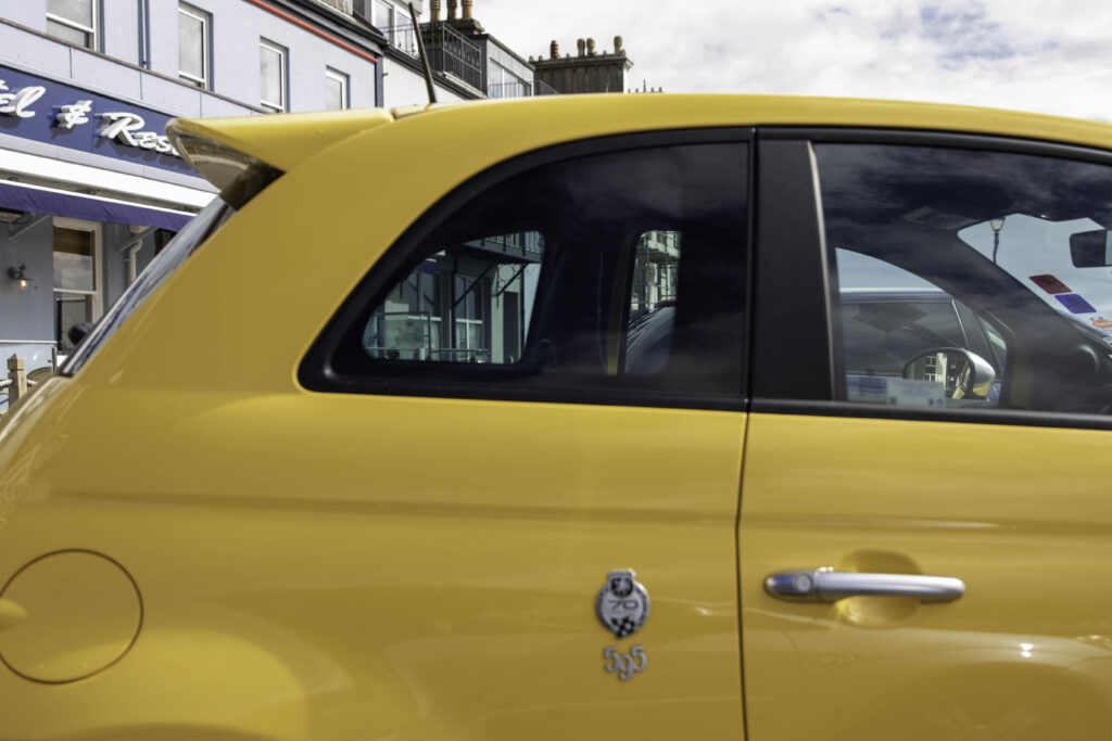
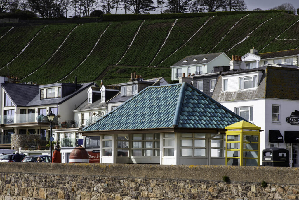
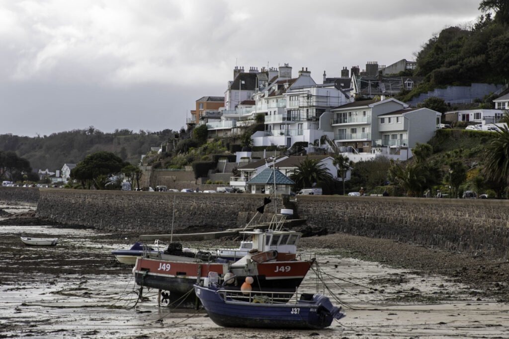
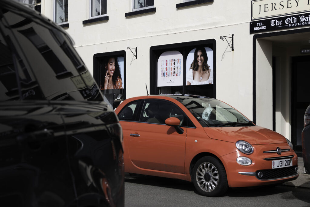
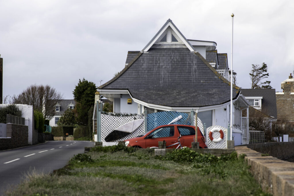
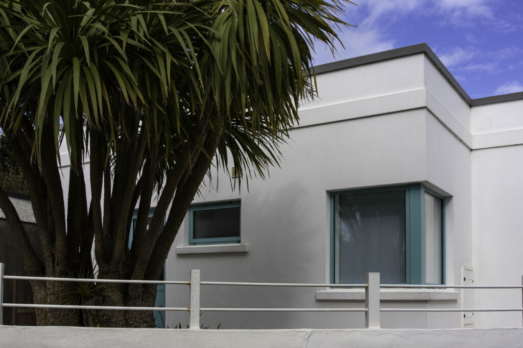
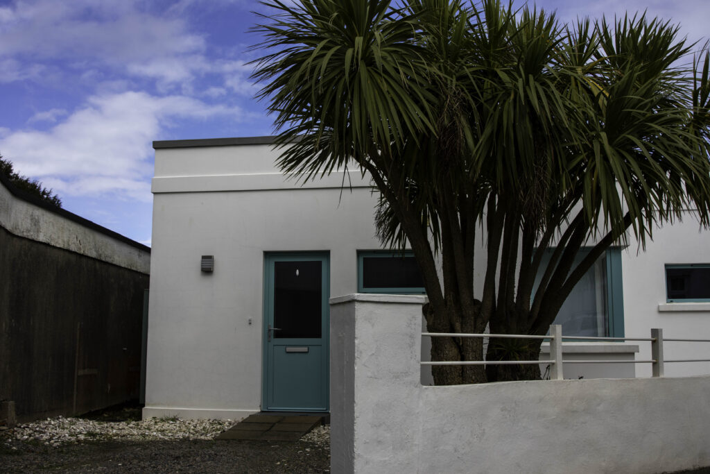
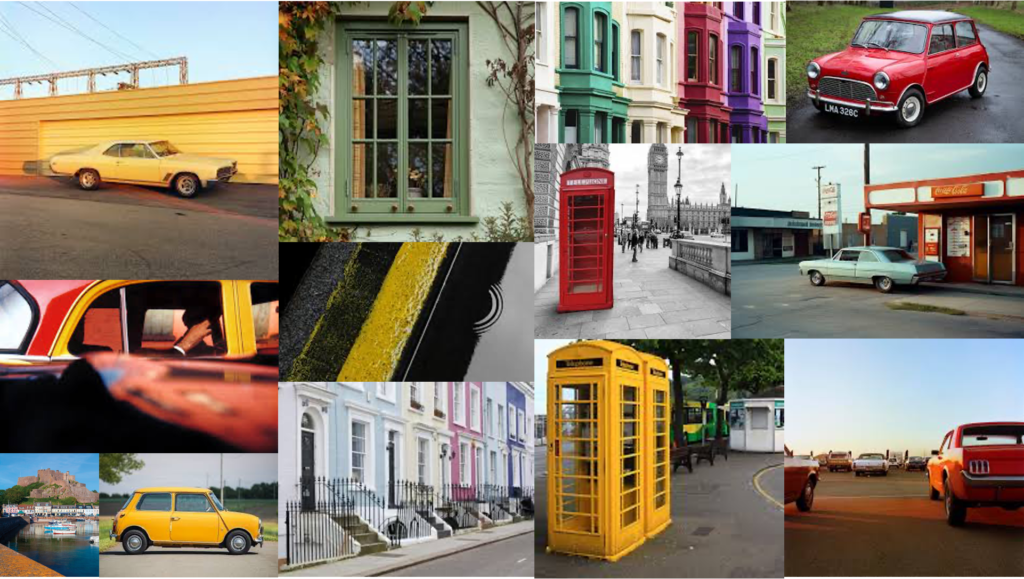
For my second photoshoot, I focused on the east of the island, particularly Gorey and focused on cars and buildings of bright colours or containing coloured parts.

began to edit

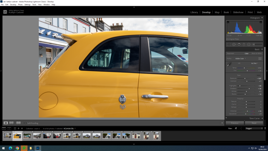
Once I had selected my images I used the ‘develop’ tab to begin editing them to particularly enhance the colour and straighten my images as well as make sure they were clear and in depth.

final images:

Overall, I am happy with this photoshoot. Whilst I didn’t come out with as many images as I would have liked to, I think that the images I did produce fit with my project and I am very happy with them.

Photoshoot 3 – Costume photos.

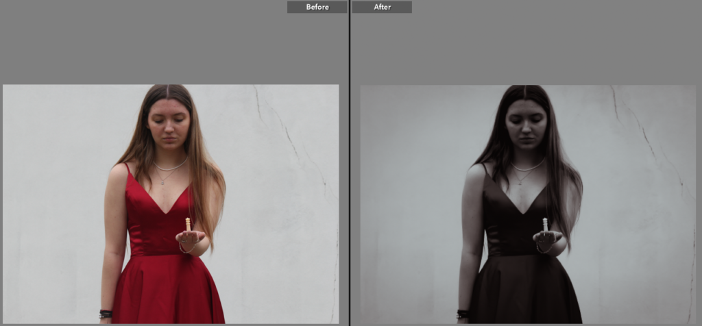
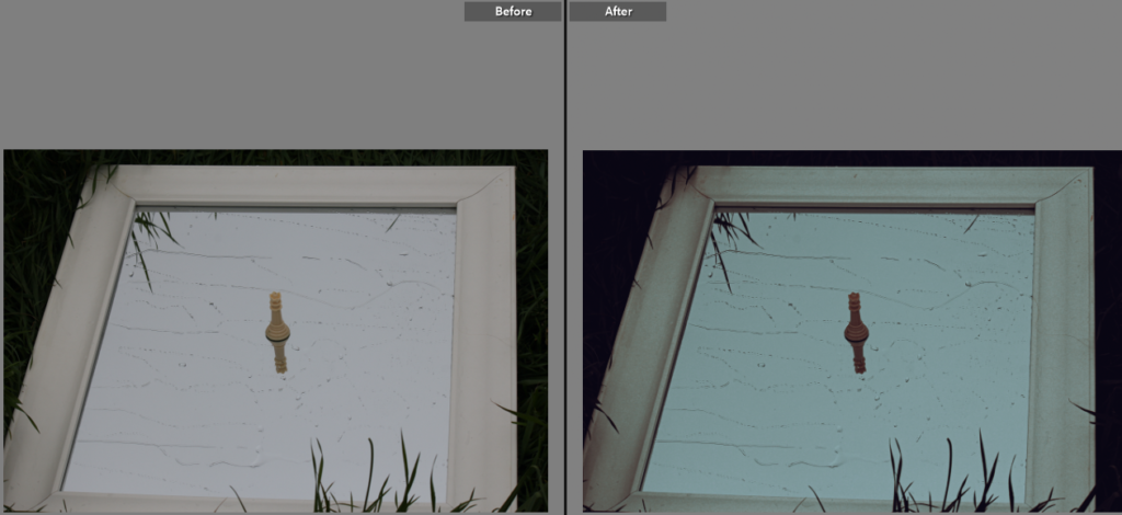
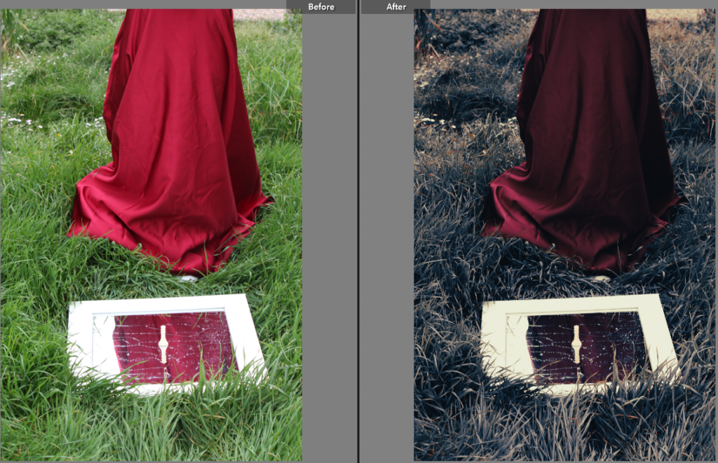
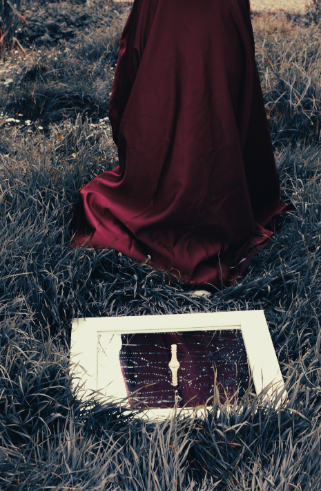
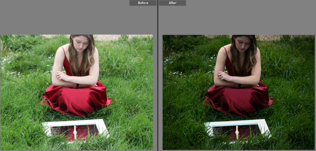
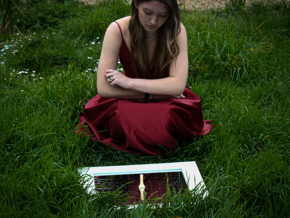
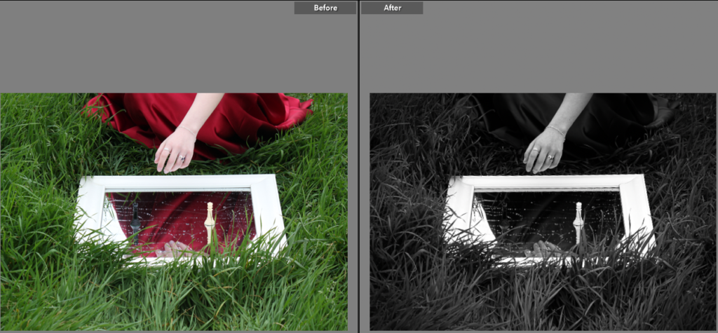
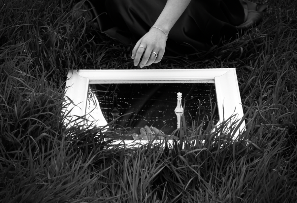
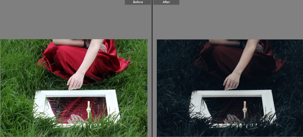
This shoot was taken in my garden and uses a mirror in order to show how the queen, in both chess and cards, is reflected in real life. I had my friend wear a red dress in order to stand out against the background when I lower the exposure of my images to stick with the theme across all my shoots. The red also helps to link her together with the card, showcasing the connection between the two.

This shoot was heavily inspired by Claude Chaun as she is well known for creating portraits that often reflect some kind of meaning in them, mainly how gender is stereotyped. In my case, I aim to reflect how we seek to gain power in games in order to win, for example in chess the queen is the most powerful piece in the game.

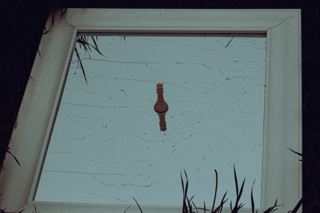
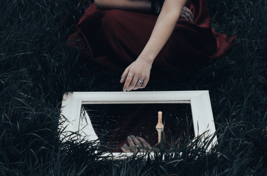
I chose this image as one of my best since the muted tones really help to draw attention not only to the redness of the dress but also the playing piece in the center. I also think that the droplets of water on the mirror help act as lines which draw our attention back to the queen piece. The mirror also being framed by the grass helps to create a sense of texture to the image, making it more interesting and pleasing to look at.

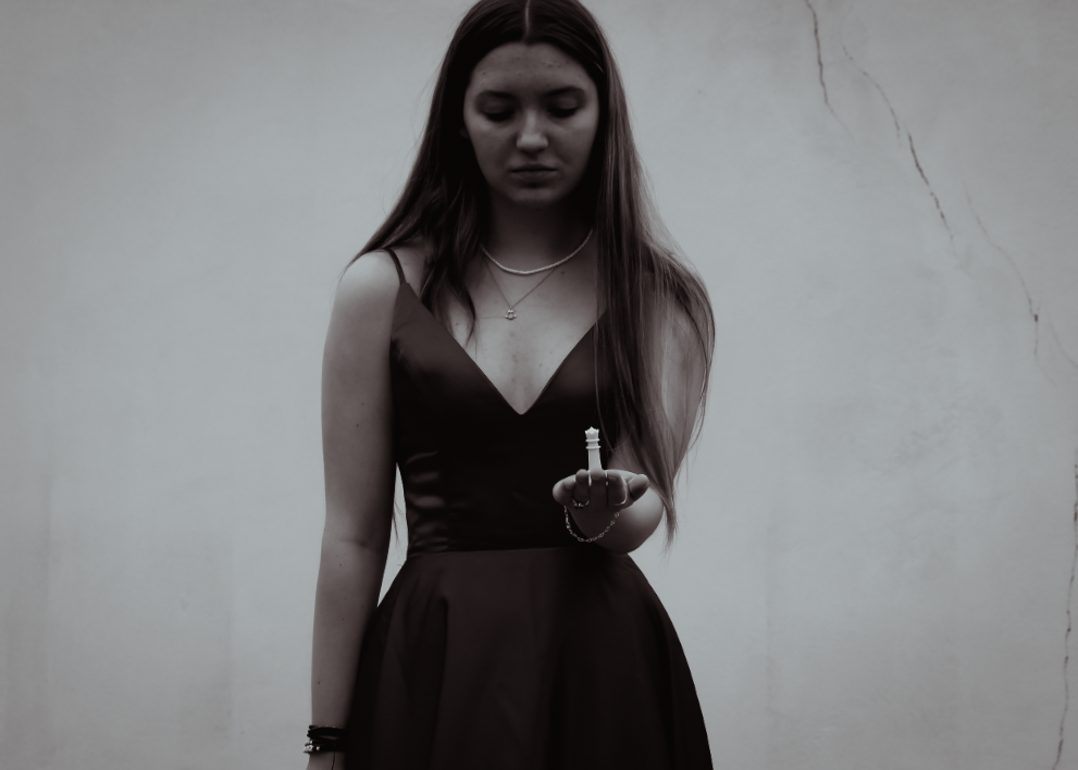
With this image, I toned down the vibrancy of the colours in order to make the photo feel more dramatic which, in turn, draws the viewers attention to it. I additionally think that the composition of the image was done successfully, I mainly like how we can see hesitation in her body language through the use of her hand getting ready to grab the piece, linking to how we hesitate and think through our moves before acting during games.

Here I once again really like the composition and layout of the photo, the hedge background making the image seem more dramatic and potentially linking to chess in the way that they are sometimes used to block paths the same way we use pawns to block our opponents move. I once again kept the colours muted and the contrast high which in my opinion worked really well here.

I selected this as one of my best images as I am fond of the simplicity of it. The crack in the wall helps to symbolize a sense of vulnerability or weakness and when paired with the chess piece in her hand we can infer that she may be on the brink of losing. I also like how the white background makes her the main focus of the image with nothing else to distract us.

Lastly, I really like how we are able to see a lot of detail in this image, from the way the water on the mirror ripples to the contrast in black and white tones. I also think that having the image in gray scale works really well for this image as it helps to highlight the mirror in the grass as well as the model herself, making them the key focus points.

photoshoot 2 plan

For my second photoshoot, I am going to focus on the Gorey area mainly on the harbour. I am going to look for cars which are brightly coloured as well as any houses that I may see. I think that I am going to look mainly for colours that you wouldn’t normally see for cars such as yellow and pink, as well as bright colours such as red and green.

inspiration:

Photoshoot 2 – Castle photos.

For this photo shoot I went to Gorey castle with my board games as well as some blue tack. Once there, I walked around the castle to find different locations which would serve the purpose of linking to the playing pieces of the board games. In order to create some of these shots I stuck the pieces down using the blue tack so I could compose the image in a way that would appear interesting to the viewer.

The main purpose of these images is to show the connection between the game pieces and the real life representation that can be found in a castle setting as well as to link to my artist reference Jan Roald. When editing these photos I once again kept the image tones to be muted while also creating some photographs to be monochrome in order to be able to connect all my photos together.

I selected this image as one of my best photos as I am very fond of how the colourful card contrasts against the dark metal of the knight. I also like how we can see the details of the knight, helping to provide texture to the photograph and ultimately making it interesting to look at.

I really like the composition of this photograph and that the black and white tones of the image help to make the details stand out more, for example the white in the brick. I am also fond of the placement of the card as it helps to highlight the connection between it and the statue.

Similarly to the photo above I am very fond of the placement of the playing piece and that the connection between the knight chess piece and the horse statue becomes very evident. Once again, having the photograph in black and white helps to highlight the details of the image, leading it to be one of my best photographs.

With this image I kept the tones muted to link it to my other photographs however I feel as though this helped to showcase a more medieval/old timely feel to the image. I am also keen on the lighting here as it helps to highlight the chess board as well as the chair.

Lastly, I liked the lighting once again here as the fairy lights in the background. I also think that overall the composition of this image is successful, with the stone table contrasting against the chess board.

Photoshoot 1 – Playing pieces.

This photo shoot aims to use lighting in order to make the game pieces appear more interesting. This, in turn, will balance out the other more complex images making it more visually pleasing for the viewer, since having too much going on will confuse the viewer on where to direct their attention. I took these images at home, creating a set up studio and using a floor light to create my lighting.

For editing, I plan to keep the consistent theme throughout all my shoot’s of having my photographs contrasted and the colours more muted down to make the images more aesthetically pleasing to look at as well as creating a connection between them.

I have selected this photo as one of my best images due to the way it focuses our attention onto the playing pieces through the lighting and the blurring of the opposing pieces. I also really like the amount of detail that can be seen here, for example the reflection on the board, as well as the angle that the image was taken.

This is one of my best images as I find it appears very clean and concise. While there inst a whole lot going on in the photograph itself I think it is still very successful in how nothing takes our focus away from the playing pieces. It also doesn’t feel crowded which means it will be a useful image to have when paring it up beside a more complex.

I chose this image as one of my best images also due to the composition and layout of it. While lighting isn’t a key factor here, the way that the checker’s pieces are sprawled out across the board creates an interesting arrangement that draws in the viewers attention.

Here we are able to see the texture of the board as well as how the lighting highlights the left side of the board, casting the shadows of the chess pieces. Overall, I think that the image is visually pleasing and provides us with a good account of the aesthetic of the game. I am also fond of the angle that the image was taken since I feel as though this helps to create more dramatic feel for the image.

Lastly, I selected this photograph since I find the muted colours create a more calming feel which contrasts against the many different games being shown in the picture. I also find the lighting here to be engaging and helps the viewer to focus their attention so the rest of the image doesn’t become too distracting.

Observe, Seek and Challenge- Photoshoot Plans 3&4

who, what, where, when, how

Photoshoot 3:

who: The photos will be of the abandoned St. Saviour hospital, linking to Matt Emmett’s work and the theme of madness within my project.

what: I will take photos of the building and its surroundings, capturing it from different angles.

where: I will all be completed at the site of the hospital, and I will make sure to walk around to capture all its sides.

when: I will complete this photoshoot on a duller day, when light isn’t harsh and doesn’t distract from the rough beauty of the architecture.

how: I will use a digital camera and simple settings, capturing good quality images of the place.

Photoshoot 4:

who: The photos will be of me, specifically close up portraits, linking to femininity and hysteria- especially the emotions surrounding these topics.

what: I will take close of portraits of my face and upper body.

where: I will be doing this photoshoot in my room, against a blank wall.

when: I will complete this photoshoot at any time, as it is inside so weather has no effect.

how: I will use a digital camera and a slow shutter speed, causing the photos to have a double exposure, much like Woodman’s images, creating a disturbing mood within the pictures.

Shoot 5

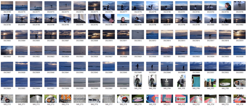
Contact sheet

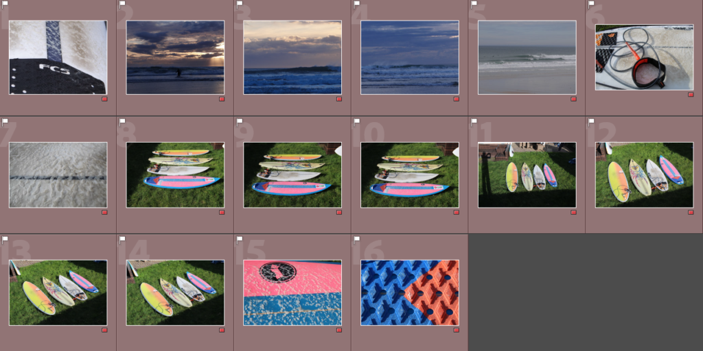
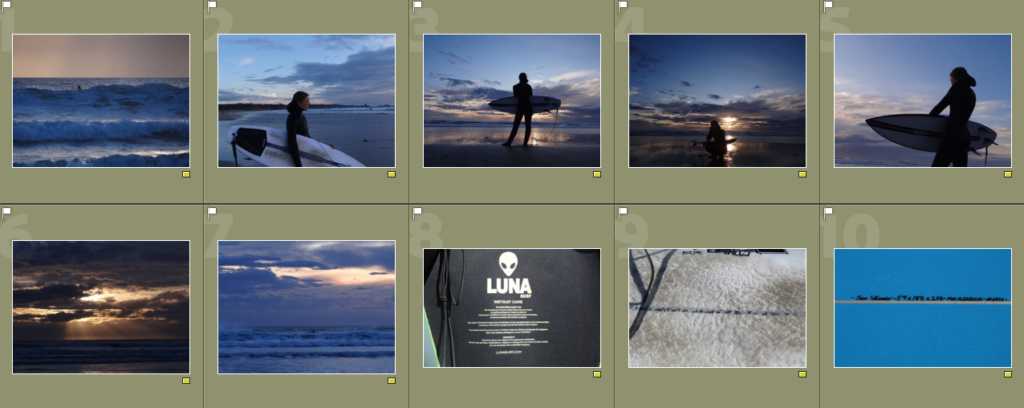
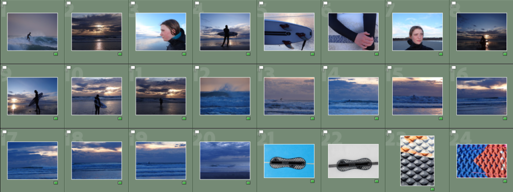
The first set of images were taken at st. Ounes during sunset and inclued action shots as well as environmental portraits. The second set of images are of the surfboards as I want6ed to experiment taking some abstract images such as close up shots of the wax on the board.

Image Selection
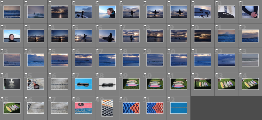
Flagged images

Rating my images

I was very happy with the out comes from this shoot as I managed to get some action shots as well as environmental portraits. I also liked how the sunset allowed me to take some silhouettes and added to the composition of the images.

Shoot 4

I took these images in my sisters room, focusing on all the surf related objects within her room such as medals, trophies, posters, surf books and magazines. As well as taking photos of her room, I also took photos of her surf equipment (boards and wetsuits.)

Image selection

Flagged images

Rating my images

I wasn’t very happy with the outcomes from this shoot but will edit the few images that I do like as they add to the whole collection of images within the ‘day in the life’ of my sister.